Color Me Pink 色情是为色服务,情色不是

February 26, 2020 2020年2月26日

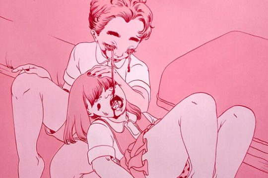
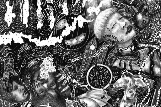
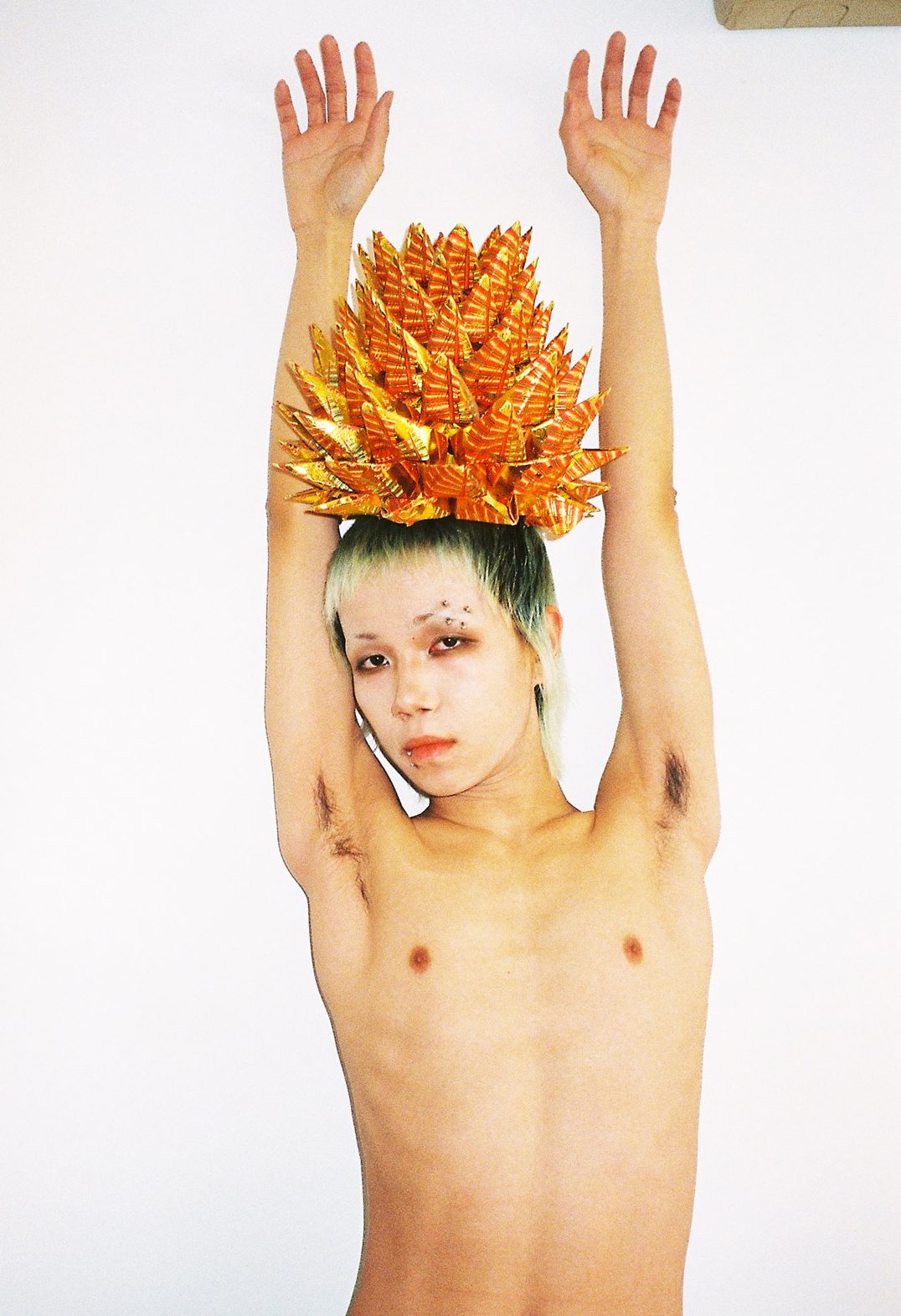
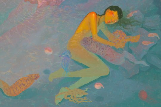
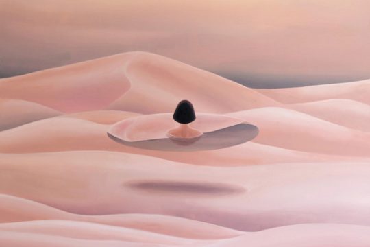
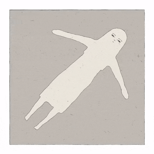
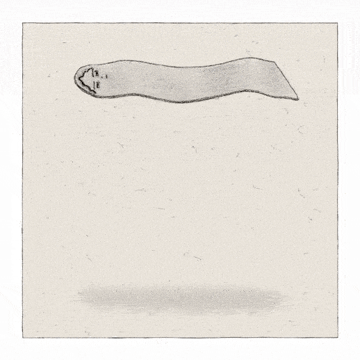
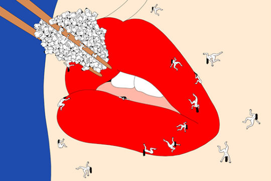
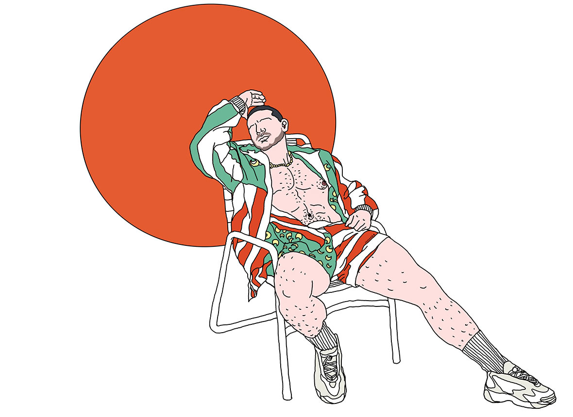
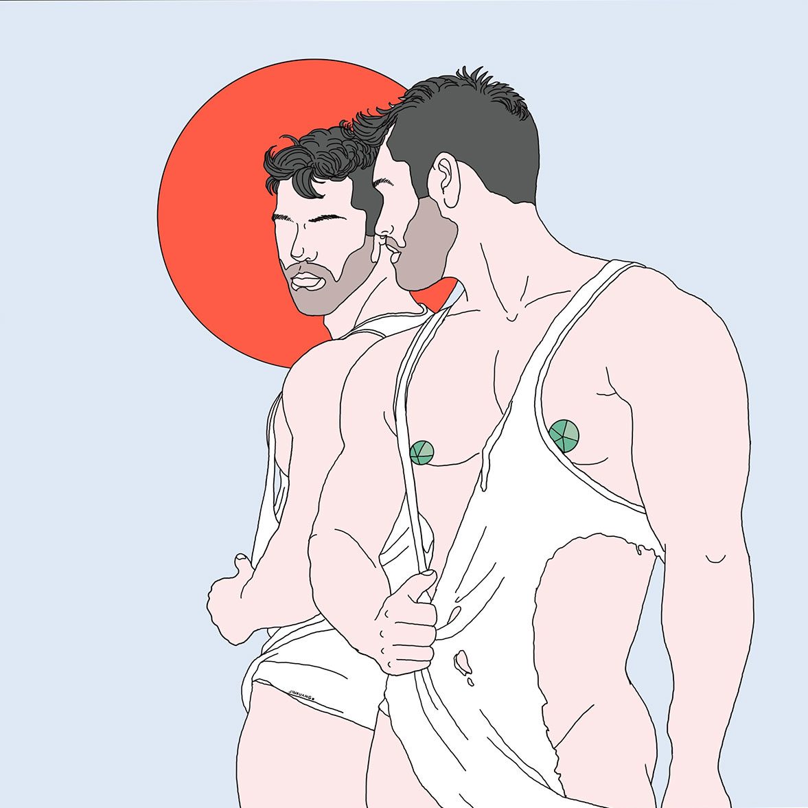
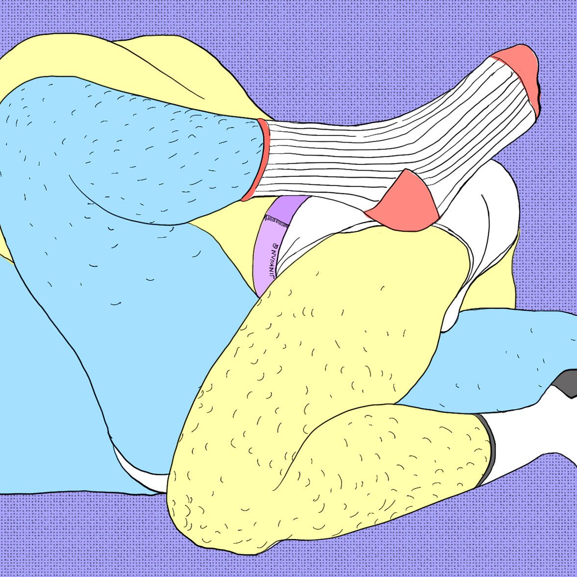
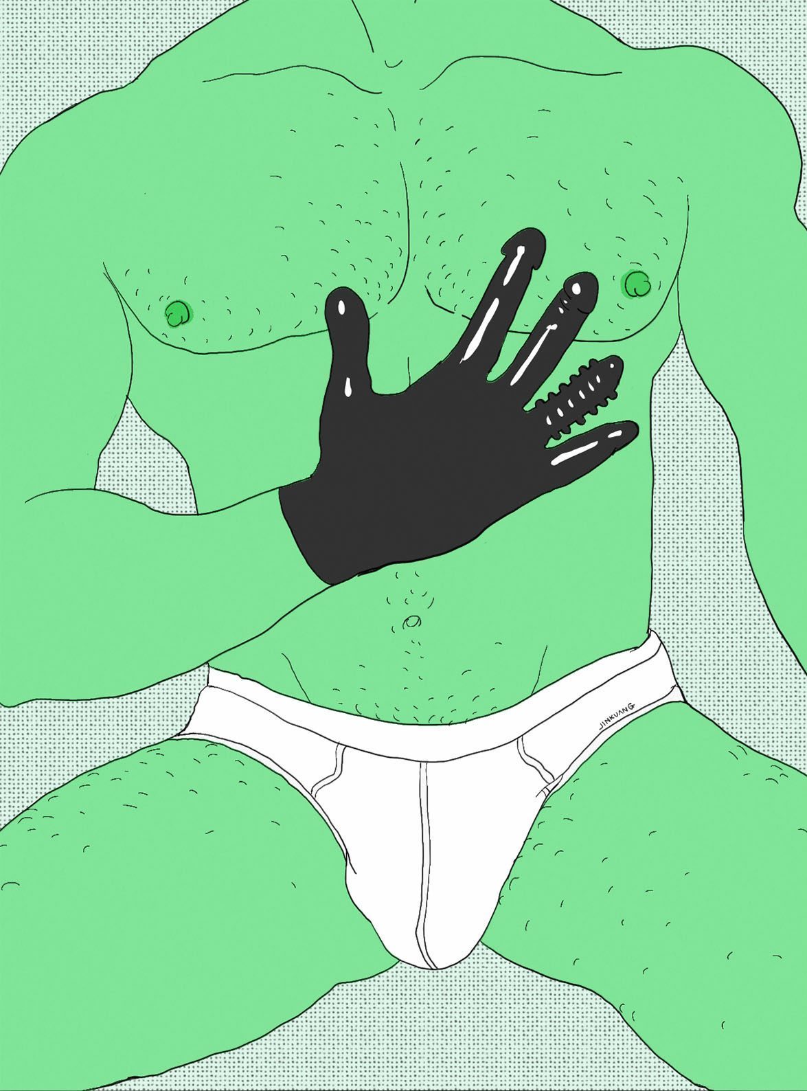
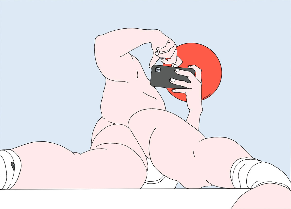
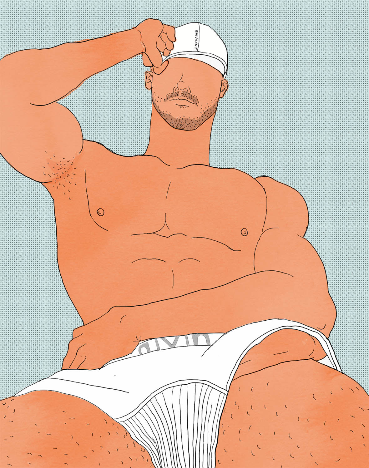
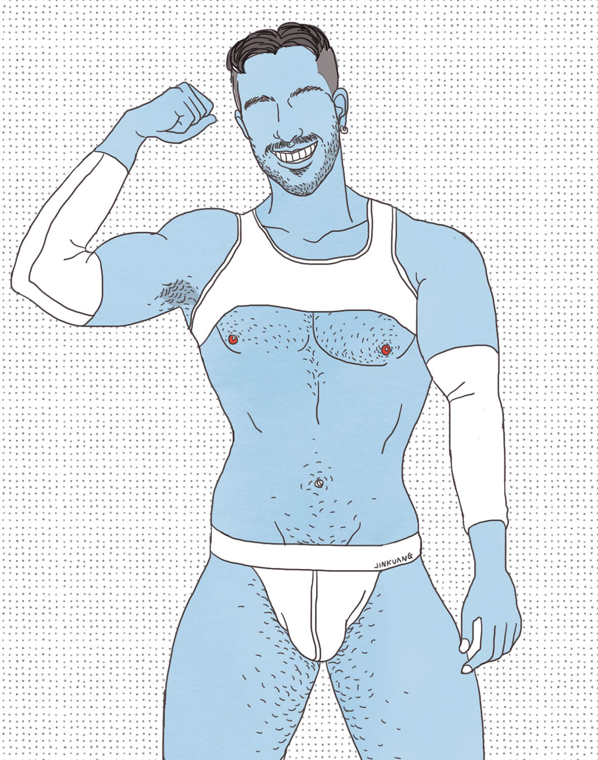
Chinese illustrator Jinkuang’s work can be best described as avant-garde smut. It’s art that elevates the normal into the suggestive. A pair of loose-fitting boxer briefs wrapped around a set of muscular thighs, drawn in a palette of unexpected tones, teases at a world of fleshly pleasures. This playful approach adds a touch of levity to the sexually charged works, giving them more than carnal appeal.


如果说要用一句话概括金矿的作品,可以说是“一种小清新的情色插画”。它们是稀松平常的细节,却又带着一丝隐隐的挑逗感——比如宽松的内裤总搭配着紧致的臀部肌肉,而肉体却被赋予了各种颜色的可能。这种轻盈,正是他的魅力所在。世人各有燥热,但在他笔下的世界,荤腥也似青涩。 

To Jinkuang, there’s a fine line between the erotic and the pornographic. Through his calculated use of color, he looks to temper the crudeness of the content. Vibrant hues, like cerulean blues, saffron yellows, lavender purples, and lime greens shade in his scantily-clad characters. While desire and sexuality are indeed the subject of his illustrations, he insists that the work is “never meant to be X-rated.”

Jinkuang’s art is an outlet for his desires, and it’s rewarding to know that others have felt as aroused as he was while drawing. “Some of my followers have messaged me, saying that they’ve been really turned on by my illustrations,” he grins. “I suppose it’s like my sexual desires never quite went away. They were just transplanted into my art.”


在金矿的理解中,色情跟情色还是有区别的,他在试图努力用颜色消解平衡那种色情感——天蓝、明黄、苹果绿、丁香紫,这些跳脱的颜色和裸露的人体结合起来,并不显得“违和”。金矿说,他想表达的是情色跟欲望,而不是“纯粹的色情”。

“有读者给我发私信说,他们看相册引起了自己的生理反应。”金矿笑说,别人能通过画作去感受到他当时的性欲,并且被感染了,他会很开心。“这一切就好像,我当时排解了我的性欲,但是他们没有消失,而是转移到我的插画里了。”

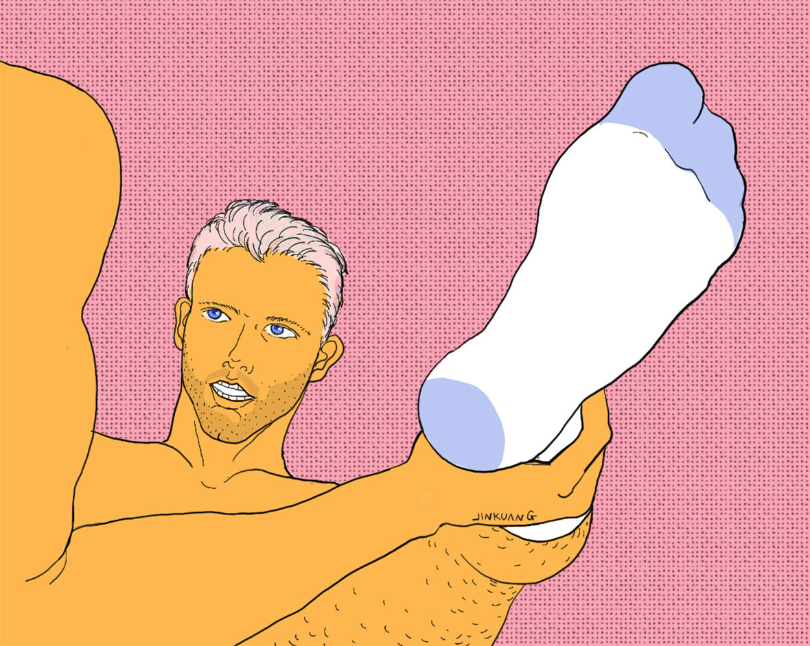
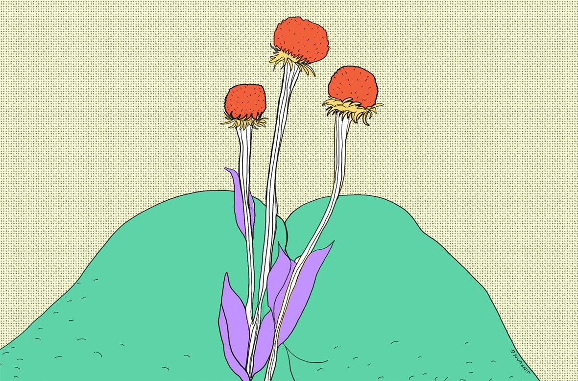
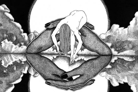
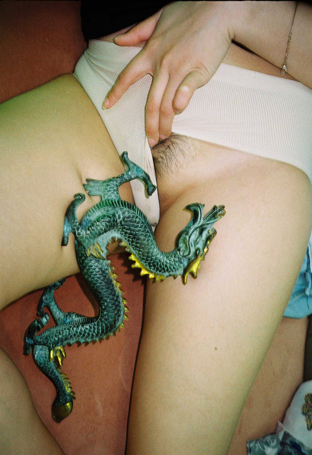
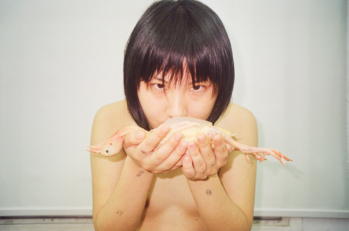
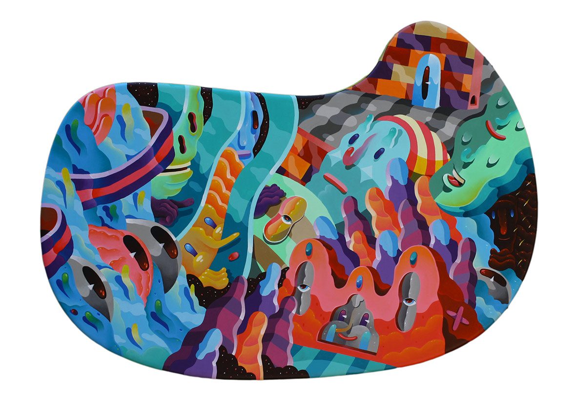
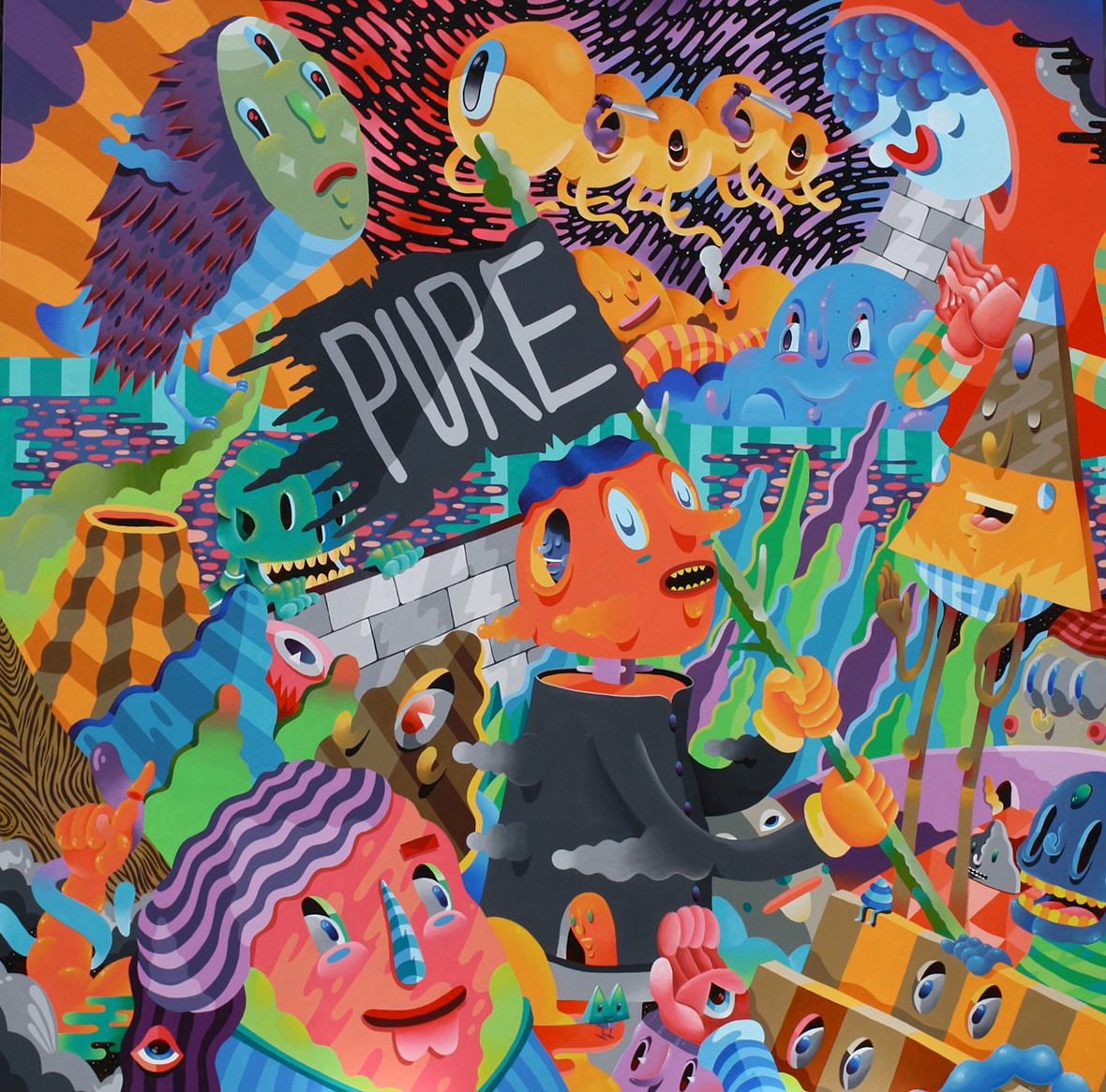
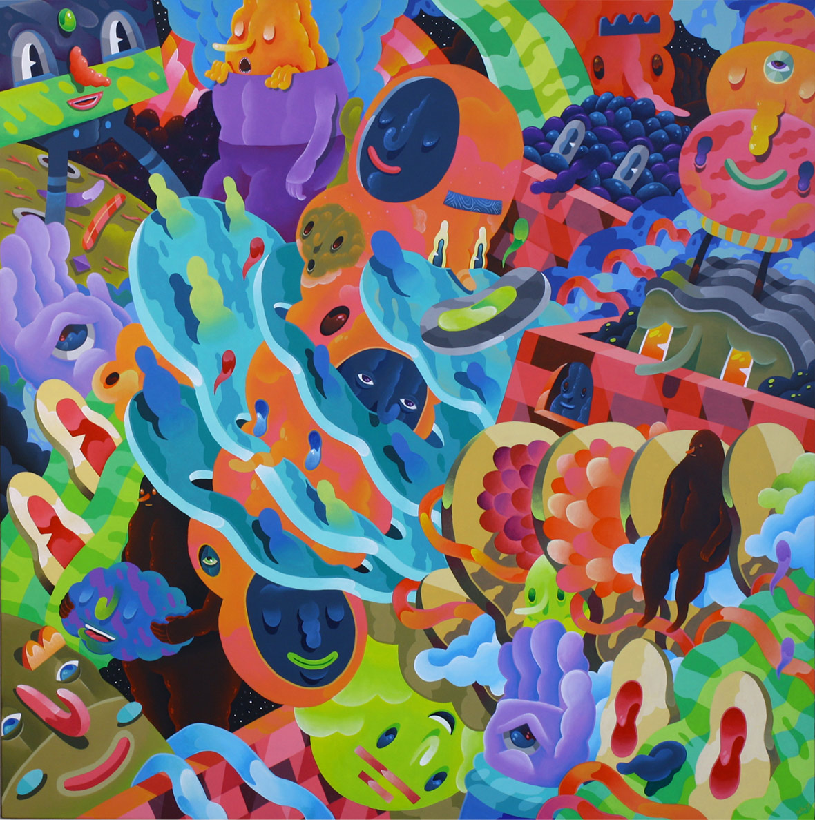
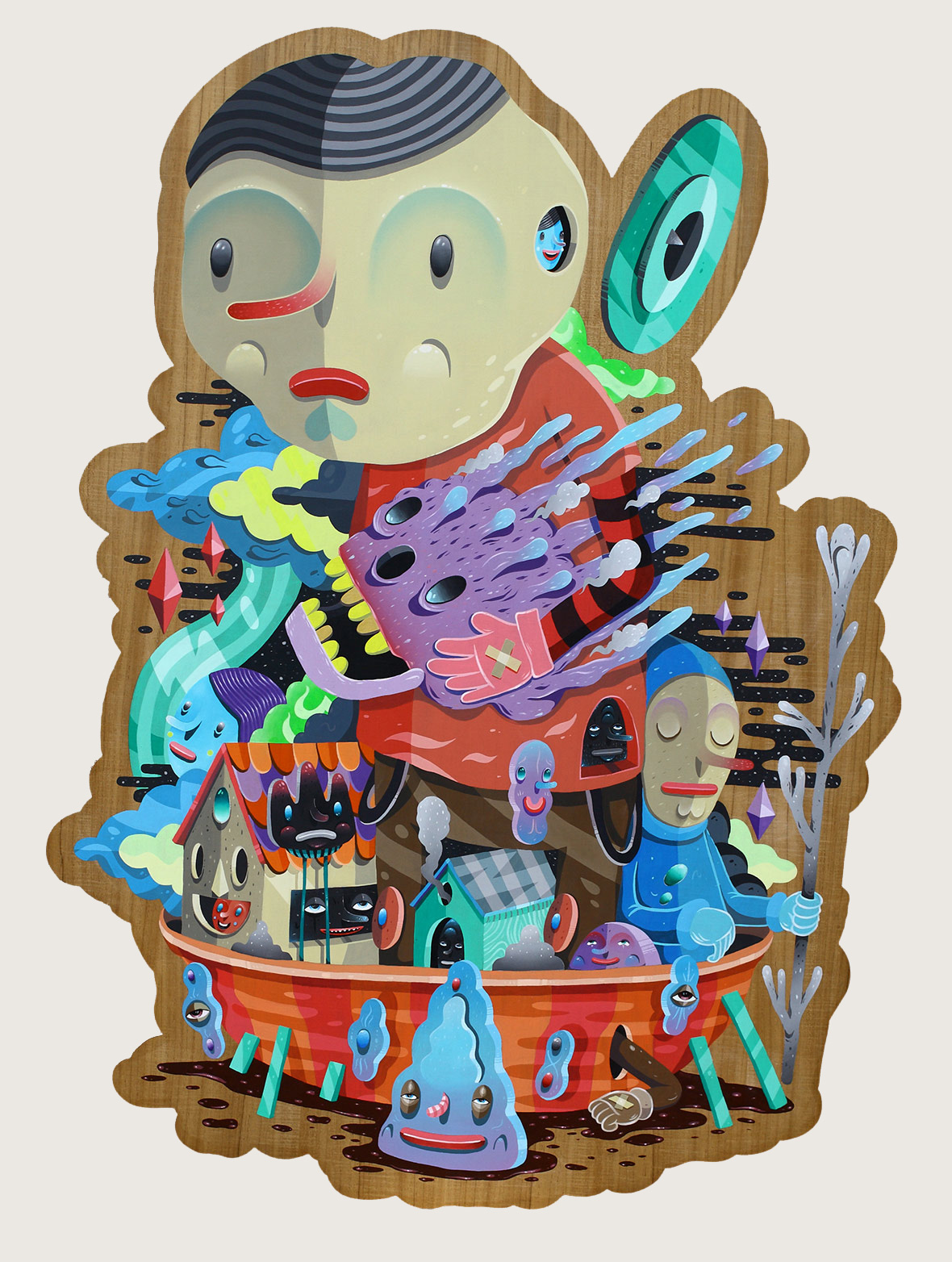
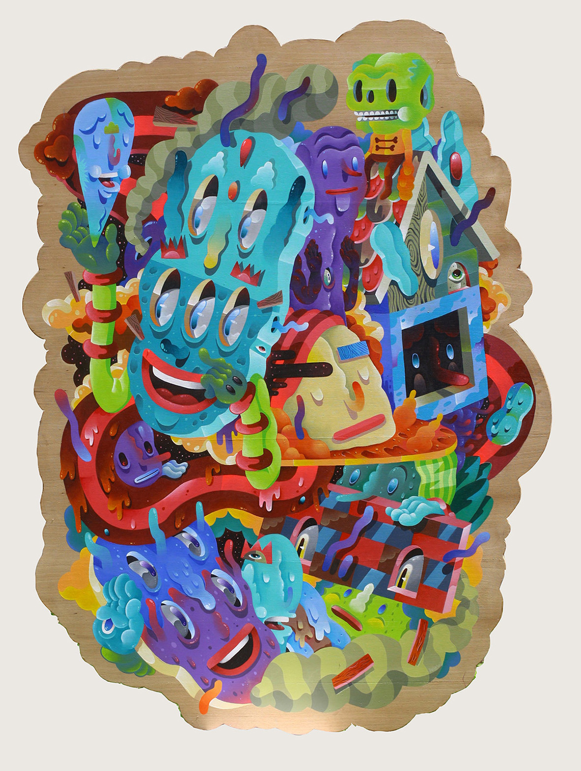
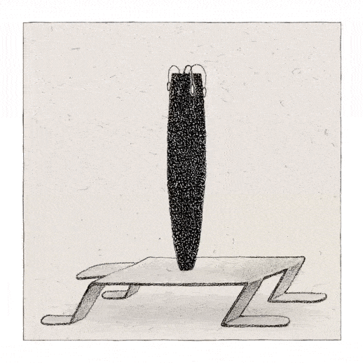
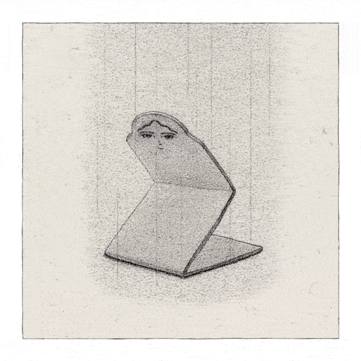
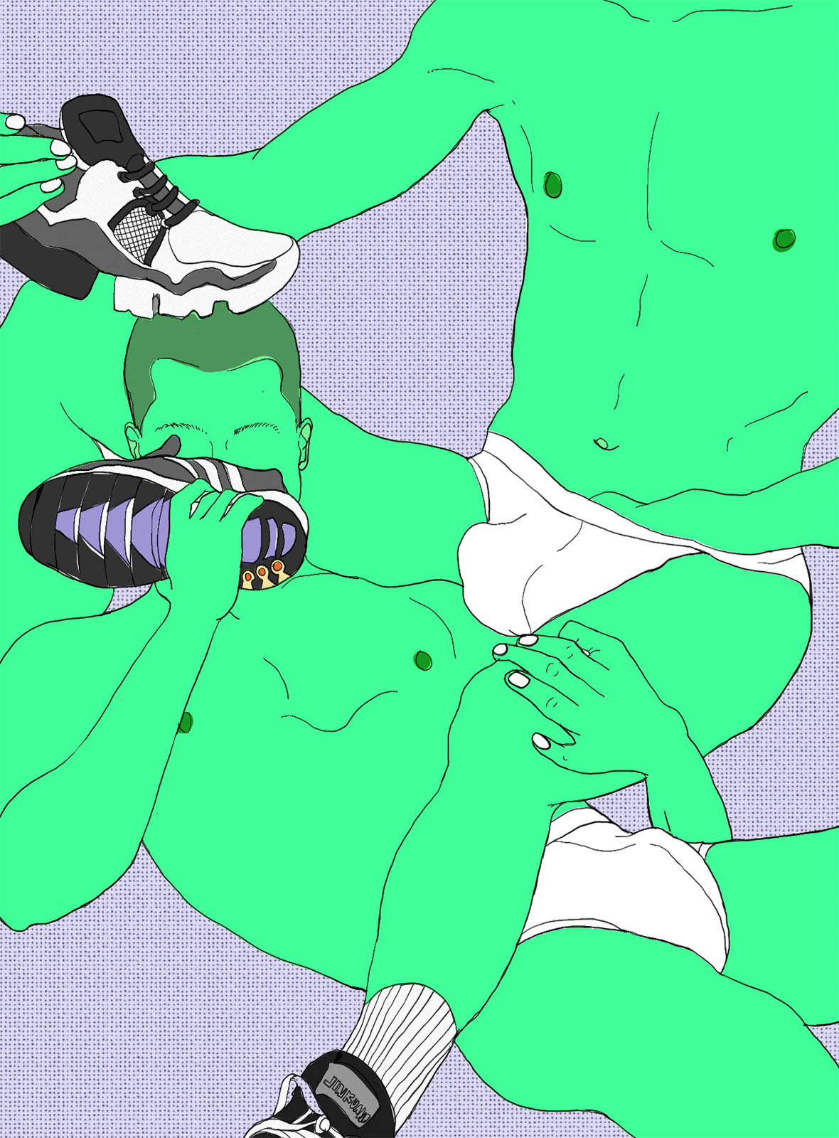
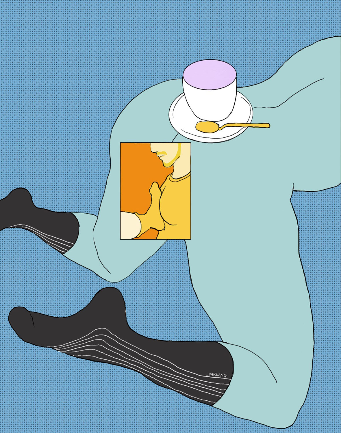
Often on a whim Jinkuang draws an everyday object, such as shoes, socks, fruits or flowers. Sometimes these are allusions to body parts, sometimes they’re just fetish objects. If there’s a particular item he’s especially fond of, he might even build out an entire series revolving around it. “I like examining the overlooked parts of daily life,” he says. “I think there’s tremendous potential within these delicate moments.”


鞋子、袜子、水果、象征性器的花朵,这些日常却细腻的物件,就是金矿的插画里始终贯穿着的“fetish”。“我比较容易喜欢那些更贴近生活的更细小更日常的东西,觉得那里面有很宏大的内容。”金矿说,这些小细节往往也是他开启一个大系列的源头,如果是他比较喜欢的创作主题,就会有意识地在之后的创作里全部加上第一张画里让他开心的必要元素,直到厌倦。

Despite the homoerotic nature of Jinkuang’s art, he’s gained an unexpected following of female fans in recent years. He’s grateful that his work appeal to them, believing that societal norms have, for too long, dictated that women shouldn’t freely embrace their sexuality. Through the lens of art, a woman’s appreciation of sex can somehow feel more appropriate. “I’m not actually trying to make any grand statements about specific social issues or inspire change,” he adds. “But maybe the existence of my art is enough. Maybe it can encourage some people to fully be themselves.”


尽管所画的内容都发生在男性之间,但相册在女性群体中引发的片片涟漪,也让金矿有所触动。受限于文化的束缚和对纯色情的反感,很多女性并不能直面情欲。但相比赤裸裸的色欲,被艺术消解过的情色艺术则相对包容得多。“我其实未必有在创作的同时想到过去呼吁、或倾注什么社会力量,但存在的本身,对别人来说或许就是一种鼓励吧。

Like our stories? Follow us on Facebook and Instagram.


Weibo: ~/金矿3HB
Instagram: ~/shouxingxx


Contributor: Chen Yuan
English Translation: David Yen


喜欢我们的故事?欢迎关注我们 Neocha 的微博微信


微博: ~/金矿3HB
Instagram: ~/shouxingxx


供稿人: Chen Yuan
中译英: David Yen 

A Font of Inspiration 一套字,一座城

February 26, 2020 2020年2月26日

Writing is a vehicle for thought, and the shape and design of words has long been both a field of study and a powerful symbol of culture. Every font or character set, from the earliest pictograms to contemporary comic books, has its own beauty. Through their form and their color, words can convey freshness and vitality.

Kaukau, a visual studio in Shanghai, takes an irrepressible delight in font design, one that’s visible in all their works. “We want to make words into images that convey our concepts,” says Zifei Li, who co-founded the studio with her Malaysian partner Kefeng Lee. The two met at design school in the Netherlands years ago, then ran into each other by chance again in Shanghai. “Because we’d known each other for so long, and got along so well, we thought it was time to do something together. Basically we exchange ideas, use what works, and figure out how to move forward.” The concepts they seek to convey are not fixed or monotonous: in both commercial projects and their own works, they use colors and patterns that highlight their team’s multicultural and multilingual integration. Even details like serifs and curlicues are liable to change in unexpected ways.


文字是思维的载体,而一直以来,文字的形态也作为一门学问出现在人类社会,其本身就是文化有力的象征。单从中国汉字的角度而言,你会发现历代每一种字体都有独特讲究,最早甚至可以追溯至象形文字。当今社会,字体更作为一种具象化的标志,变换各种各样的形态,延续着鲜活的生命力。

视觉工作室 KAUKAU 成立于上海,自 2018 年以来,他们的作品透漏出对字体设计难以掩饰的喜爱。我们更希望能把文字作为一种图像,来传达我们想要的概念,设计师李梓菲(Zifei Li)说道。她与马来西亚设计师李克丰(Kefeng Lee)在荷兰读书时便认识,又因机缘巧合相遇在上海,由于多年相识,又在多方面很合拍,我们觉得是时候一块儿做一些事情。基本上我们都是一起讨论,发挥所长,摸索着来。而单一且固定的设计不是 KAUKAU 希望传达的理念,无论是商业项目、还是他们个人的作品,字里行间中丰富的色彩与图案,都强调着团队多文化、多语言融合的背景。哪怕一个偏旁部首都显得格外灵活。

In 2019, beyond the team’s commercial projects, the Kaukau team devoted part of their energy to a series of printed works titled Be Kaukau. This project compiled photographs, propaganda, advertisements, images from the web, and film and television stills to create a rough impression of two cities: Pyongyang and Shanghai. “In the project, we try to infuse these everyday images with subjective meaning, in order to lead the viewer to feel the contrast between visual memories and actual experience,” says Li.


在过去的 2019 年中,除了团队商业项目以外,KAUKAU 将一部分重心放在了《BE KAUKAU》系列出版物。该项目基于采用了摄影、城市宣传印刷物、网络图片、影视作品画面以及当地广告等信息,搭建出设计师对两座不同城市的记忆。项目中,我们尝试用主观视角,重新赋予这些日常图像内涵。带观众感受图像记忆和与真实感受之间的反差。

Be Kaukau 《Be KAUKAU》
Be Kaukau (Pyongyang) 《Be KAUKAU》平壤

The design for Pyongyang comes from a 2014 street photography project shot there, and the formal font and monochrome palette conveys a sense of the strict social environment of the city. The design for Shanghai uses a modern font—created in collaboration with the Malaysian type design studio Hurufand a collage with high-contrast colors to create a sense of dynamism.


《BE KAUKAU》系列出版物由平壤和上海两座城市构成,前者的设计来自一份 2014 年平壤街头摄影档案,新闻字体和单一的颜色来呈现,表达了一种严肃的社会环境;而后者,则运用了摩登字体和高对比色的剪贴画,营造出活跃的气氛。

Be Kaukau (Shanghai) 《Be KAUKAU》上海

Kaukau Studio believes that typography ultimately needs to serve its content. The Shanghai design contains what appear to be words in a Western language, but in fact, they’re the lyrics to the classic Cantonese ballad “Shanghai Bund,” written in a romanization to convey the city’s blending of cultures. (As the lyrics scroll by, they lay out an open storyline for the viewer. “The font set is inextricably bound up with the city’s memory,” says Li enigmatically. “Not only the image, but also the font, as a part of the image, remains in our memory.”


KAUKAU 工作室深信,文字终归要服务于内容。《BE KAUKAU》上海部分的字体设计由 KAUKAU 与马来西亚 Huruf 字体工作室合作完成,看似西方语言单词,实则是粤语经典曲目《上海滩》中歌词的拼音。随着歌词的推进,为观众铺出开放式的故事线。而之所以用拉丁字母来呈现,是为了表达上海这座城市在不同文化之间交融并进的步伐。李梓菲说道:这套字体与城市的记忆有着不可分割的联系:除了城市图像之外,字体也作为图像的一部分被我们记忆。”

Font Corners 《字体角》
Font Corners 《字体角》
Font Corners 《字体角》
Font Corners 《字体角》

As they delve into the connection between cities and typography, Kaukau is continuing to find their way toward new projects. Font Corners, their newest project, finds inspiration in Shanghai’s Yuyuan Road. Large and small square frames seek to evoke a bird’s-eye view of the dense, narrow street pattern of old Shanghai. The dynamic form brings out the changing face of the length of the street over time. “City scenes that are easy to overlook in day-to-day life have become our design concept. We dig up these hidden notions and turn them into visual products, conjuring people’s memories of the city.”


在研究城市与字体之间联系的过程中,KAUKAU 正在进一步摸索与深化。在字体角》系列作品中,工作室以上海愚园路为灵感,大大小小的方框欲还原老上海狭长密集的街道样式,动态的形式呈现整条路时过境迁的面貌。日常容易被人们忽略的城市面貌已成为我们的设计观念。我们挖掘这些潜在的内容,并把它们化为视觉产物,唤起人们对于城市的记忆。

Kaukau Studio’s poster design for Hejing Studio KAUKAU 为贺晶工作室创作的字体设计

Design concepts like these have helped score them multiple design awards, while building a solid commercial reputation. The Yuyuan Road series, and their font design work with Hejing Studio, has earned them a Certificate of Typographic Excellence from the Type Directors Club. And since their founding, they’ve launched collaborations with Radio Europe, the Amsterdam Symphony Orchestra, the Rotterdam Film Festival, the Venice Biennale, the China Film Directors Association, and the art center Tank Shanghai, along with other institutions and brands. “Both in our commercial and in our cultural work, we emphasize effective communication. We’ve got to maintain our enthusiasm in the face of all possibilities, and not stop growing.”


这样的的设计思维模式,帮助他们斩获各类国际设计奖项,同时在商业获得出色的口碑。近日,KAUKAU 凭借 “愚园路字体角” 与曾为贺晶工作室的字体设计,获得了 TDC(Type Directors Club)的 “杰出字体排版认证书”(Certificate of Typographic Excellence),同时入选字体设计年鉴(TDC,The World Best Typography)。KAUKAU 也因此受邀参加了该奖项第 66 届全球巡展(TDC66)。

而成立至今,他们已与欧洲广播电台、阿姆斯特丹交响乐团、荷兰鹿特丹电影节、威尼斯建筑双年展、中国电影导演协会、上海油罐艺术中心等等机构与品牌都展开过合作,李梓菲说:不管是商业类还是文化类的工作,我们看重的都是信息传达的有效性。我们需要保持面对一切可能的热情,并不停进化自我。

Works by Kaukau and the Korean Design Studio Pa-i-ka are currently on display at the independent publishing space Protopaper in Xi’an. 

Address:
Shiji Dongyuan, Bldg. 4, no. 201
Yanta District, Xi’an
Shaanxi Province, China


目前,KAUKAU 与韩国设计工作室 Pa-i-ka 的作品正在西安独立出版平台 Protopaper 进行展出。

地址:
陕西省西安市雁塔区
试剂东苑4号楼201室
中国

Like our stories? Follow us on Facebook and Instagram.


网站: www.kaukau.design
Instagram: @kaukau_design


Contributor: Pete Zhang
English Translation: Allen Young


喜欢我们的故事?欢迎关注我们 Neocha 的微博微信


网站: www.kaukau.design
Instagram: @kaukau_design


供稿人: Pete Zhang
中译英: Allen Young

You Might Also Like你可能会喜欢

Art of the Jeepney 超改巴士

February 24, 2020 2020年2月24日

It’s rush hour in Metro Manila, which means gridlocked streets for several hours. The city is one of the world’s most congested. Within this tangle of cars and scooters and stationary running motors, one type of vehicle stands out from the rest: the jeepney.

Jeepneys are a uniquely Filipino mode of public transportation that appeared after World War II, which left the country’s infrastructure severely damaged. After the war, American troops left behind Willy Jeeps—the ubiquitous four-person green jeeps of war-movie fame—as it was costly to ship them home. Locals set about retrofitting them to meet their transportation needs. Though they were born as a temporary solution, they’ve now become a mainstay across the country. Most of the original jeepneys are out of commission, and the ones found on the road today were produced by local car manufacturers in the years since.


马尼拉是世界上最拥挤的城市之一,这里市中心的交通高峰时段,路上往往会堵车好几个小时。在被小车、踏板车和各种车辆挤得水泄不通的路上,一种交通工具的身影尤其突出,那就是吉普尼巴士。

吉普尼巴士是菲律宾所特有的公共交通工具。这种巴士出现在二战之后,当时菲律宾整个国家的基础设施严重受损。战后,美国军队留下了许多 Willy Jeeps。由于运回美国的成本太高,这些汽车经过当地人的改造,使这种在战争片里经常出现的四人座绿色吉普车变成了一个能用来满足日常需求的交通方式。虽然最初吉普尼只是作为临时的交通解决方案,但现在,这种巴士依然是菲律宾各地常见的交通工具。如今,路上行驶的吉普尼是原来的报废车辆,它们经过当地汽车厂的改良被重新投入使用。

A typical jeepney can carry about 20 people in the back. People sit on twin benches facing each other, with a few others hanging off the back if it’s packed. The base fare is 10 pesos, or around US $0.20, and they travel just about anywhere you need to go. In a country with limited bus routes and an even smaller rail line, it’s often the only affordable way to get where you’re going, unless you’re willing to pay premium rates for a taxi or ride-hailing app. Once you climb on, you hand your cash to another rider and they pass it down to the driver, who then counts out change and sends it back down the line, often while driving. The ceilings are low and the windows are difficult to see out of, especially when crowded. Rain, heat, and fumes from nearby traffic easily enter the cabin, and in some of the more dilapidated jeeps, so does its own exhaust. When your stop comes, you call out to the driver or knock on the ceiling and jump out, sometimes directly in the middle of the street.

Jeepneys are often blamed for adding to Manila’s congestion, seeing as how their drivers often swerve across lanes to pick up customers and make frequent stops. But with the increase in population and rise in personal automobile ownership, the megacity is groaning under the strain now more than ever.


一辆吉普尼通常大约可以乘搭 20 人。乘客们通常会面对面坐在车内两侧的长椅上,满座后,还会有一些乘客趴在巴士的后架上。只用花上 10 比索(约一块四人民币)的车费,就能将你送往各个目的地。在这个公交线路不多、铁路有限的国家,吉普尼是人们唯一经济实惠的出行方式,否则就要乘坐昂贵的出租车或网约车。上车后,你只需将车费交给另外的乘客,由他们挨个传递到司机手里。司机一边开车,一边数要找回的零钱,再将钱交给乘客,原路返还到你的手中。车顶很低,乘客很难将头从窗户伸出去,尤其在人群拥挤的时候。雨水混杂着热气和四周车辆排出的尾气钻进车内,一些甚为破旧的吉普尼巴士,本身的废气也会窜进来。到站时,你可以大声告诉司机或敲敲车顶,有时你有可能会在马路中间下车。

很多人认为吉普尼加剧了马尼拉的交通拥堵问题,因为司机常常因为载客而突然变换车道,停车也比较频繁。但是问题可能没那么简单:随着私家车保有量的增加和人口的爆炸式增长,这座大城市的马路越来越喘不过气来。

Jeepneys are best known for their gaudy bodywork, covered with a mix of pop-culture imagery, Catholic symbols, and Americana art like flags, US monuments, and more. It’s a bizarre mix that attests to the country’s history of colonization. One of the best places to spot these roving canvases is Aurora Boulevard, a major thoroughfare in Quezon City where throngs of jeepneys pass through day and night, and it’s where we first heard about Giele Nicola, one of the most revered jeepney artists in town.

The art found on Jeepneys differs a bit from area to area, but the vehicles Nicola works on and many others around Aurora feature modifications like designs cut into the mud flaps, ornate metal wiring around the brake lights, and LED lights that glow from the undercarriage and inside the cab. Back wheels are raised while the front axle is dropped low, showing off cartoonish hood ornaments and unnecessary, prolific antennas. Even the inside of the wheel wells are often painted with glow-in-the-dark paint.


吉普尼以其华丽的车身而闻名,上面布满了各种流行文化图像、天主教图案以及美式旗帜、美国标志性建筑等文化元素。这种奇怪的组合也了揭示出一段菲律宾被殖民的历史。欣赏这些 巡回画布的最佳地点之一是奎松市的奥罗拉大道(Aurora Boulevard),那里从早到晚都能看到吉普尼巴士在路上穿行。也正是在这里,我们第一次听说了 Giele Nicola,他是当地最著名的吉普尼艺术家之一。

城市中每个区域的吉普尼艺术都略有不同,Giele 和奥罗拉地区的艺术家在设计时喜欢对吉普尼进行车体的改装,例如切入挡泥板的设计、在刹车灯四周环绕金属线、为底盘和车内装饰的 LED 灯。他们降低前轴,升高后轮,将卡通风格引擎盖设计和纯粹装饰性的天线设计公示于路人。就连车轮拱板内也常常涂满了荧光的染料。

Nicola’s garage is in Marikina, on the eastern end of Aurora Boulevard, down a quiet residential backstreet where jeepneys line the sidewalks. On the day of my visit, four jeeps were crammed inside the open-air garage, as a group of men huddle under a canopy to the side. One of them is Nicola, airbrushing a portrait of Jesus on a loose side door. A compressor hose from his nozzle leads to a running engine placed on the ground, itself attached to an old car that hasn’t seen the road in years.

Nicola has been at this for 20 years now. He got his start at 19, freelancing for Morales Motors, a well-known jeepney manufacturer that operates their own body shops. But even before that, he often painted bicycles and jeepneys for fun, working freehand with a brush in the traditional jeepney one-stroke style, which is handwriting style of flat brush calligraphy. Impressed with his work, Morales brought him on board, but within a year he decided to open his own garage. “Jeepney art was on the rise back then,” he said, barely glancing up from his work. “It was a lot simpler then, and just starting to evolve. The jeepney industry was at its peak, with garages and artwork everywhere.” Over the years, he’s become known for specializing in hyper-realistic paintings. But his garage does everything, including metalwork and repairs.

Nicola opened the garage with his partner Arturo Cinco, who goes by the alias Rokba. The two met at Morales Motors when they were both still teenagers. Rokba specializes in custom decals, which he cuts out freehand and applies in layers. They can be up to six feet wide and two feet high, with a dozen different colors. “I never did any other kind of art,” he says. “Jeepney art was my passion and my hustle from the start.”


Nicola 的车库位于奥罗拉大道东端的马里基纳(Marikina),一个安静住宅区里的小巷。路边就停着一排的吉普尼车。我去参观车库那天,露天车库里停着四辆吉普尼车,一群人挤在旁边的遮篷里。其中一个就是 Giele,他正在用气笔给一块被拆解下来的车门喷绘,上面画着耶稣的肖像。气笔的压缩空气管连接着地上的发动机,而这台发动机本身则是来自一辆报废多年的旧车。

Giele 从事这个行业已经有 20 年,他从 19 岁开始给当地一家著名的吉普尼制造商 Morales Motors 干私活。但早在此之前,他也常常在自行车和吉普尼车上找点乐子。那时候,他喜欢用平刷的字体书写方式,在吉普尼车身上一笔划过。他当时的的作品令 Morales Motors 印象深刻,并受邀加入团队。但是一年后,他决定开设自己的车库。那时候吉普尼艺术正在兴起。他头也不抬地说道,“相比现在,吉普尼艺术刚开始流行的时候要简单很多。在吉普尼行业的全盛时期,吉普尼艺术和车库遍地都是。这些年来,他凭借超现实主义的风格绘画而闻名。

除了绘画和改装,Giele 的车库提供金属加工、维修等各种服务。该车库是他和合伙人 Arturo Cinco (又名 Rokba)共同创办。他们年轻时在 Morales Motors 一起工作认识。Rokba 擅长制作贴花,通常情况下,他会先用手剪出图案,再一层层贴在车上。这些贴花可能达 6 英尺宽、2 英尺高,拥有十几种不同的颜色。我从来没做过其他艺术。一直以来,吉普尼艺术就是我的热情和动力所在。他说。

For years, business boomed. A full customization, with all the bells and whistles, costs around $4,000 and takes two weeks—a good racket, considering that it’s about what the average family makes in a year. As more garages appeared, the market became oversaturated, but business took a significant dive a couple years ago. In 2017, the government announced a modernization program that would phase out most of the classic jeepneys with newer models. (Jeepneys are classified as “public utility vehicles.”) Under the original plan, jeepneys that are 15 years or older would no longer be allowed on the street by 2020.

The new jeepneys are meant to be cleaner, safer, and more accessible for the elderly and disabled. They use modern engines that spew fewer emissions. A few different models, which resemble minibuses more than traditional jeepneys, are already running along a few routes, and they are undeniably more pleasant to ride in. Beyond improving the lives of those already dependent on jeepneys, the policy aims to attract new riders who might otherwise contribute to the daily congestion with their private vehicles. Proponents hope that cleaner vehicles, improved routes, and more accountable drivers will help ease the city’s traffic woes.


好几年来,吉普尼车库的生意几经红火。一套完整的改装设计,加上所有的花哨装饰,花费大约在 28000 人民币左右,耗时两周时间——普通家庭一年的收入相比,这是很不错的收入。但随着越来越多车库的出现,市场变得过份饱和,在几年前他们的生意急剧下降。2017 年,当地政府宣布了一项现代化方案,使新型车辆逐步淘汰大部分的传统吉普尼巴士(吉普尼被列为公共交通用车)。根据这个方案,超过 15 年的吉普尼车到 2020 年将不能再在街上继续行驶。

新型吉普尼巴士会更环保、更安全,也更方便老年人和残疾人乘坐。它们将采用现代化的引擎,以减少废气排放。其中一部分新车已经投入使用,与传统的吉普尼相比,它们看起来更像正儿八经的小型巴士。而毫无疑问,它们乘坐起来也更加舒服。除了吸引那些喜欢搭坐吉普尼的乘客之外,这项政策还希望能够吸引平时开私家车的人,因为私家车过多也是造成交通拥堵的隐患之一。这项政策的支持者希望,更清洁的车辆、更完善的路线以及更负责任的驾驶员将有助于缓解这座城市的交通困境。

Yet the plan isn’t without its critics, and jeepney drivers have gone on multiple strikes to protest. Drivers who wish to keep their jobs were required to upgrade to one of the newer models, but so few have done so that the government has delayed the deadline for another year. Jeepneys that pass a “roadworthiness test” are given an additional year’s lease on life. It’s not difficult to see why there’s such a lack of compliance: the required costs of a new jeepney model range between $32,000 and $44,000, but most drivers only make around $10 per day. The government has developed a loan scheme to help fund the transition, but it’s restrictive and leaves many owners with no assistance. Some critics argue that for the plan to be realistic, the transportation sector would need to be state-run.

Amidst all the traffic issues, the culture and art of the jeepney are a distant afterthought and the future for artists like Nicola and Rokba is wildly uncertain now. Much of the industry that’s grown up servicing and decorating traditional jeepneys could disappear, including Nicola and Rokba’s garage. “Everyone is affected,” Nicola says. “It’s not just us. It’s the barkers who corral riders to empty seats for change. The drivers and mechanics. The garages. Everyone.”

When asked what they’ll do next, the duo’s answers offered a glimpse of their resilience and optimism: Nicola says he’ll focus on his tattoo business, which he already does now on the side. Rokba just laughs: “I’ll get some rest.”


但是对于这项政策也招来了很多批评的声音。吉普尼司机多次罢工表示抗议。想要保住饭碗的司机就要更换新车,但很少司机这样做,为此政府不得不将最后期限推迟一年。通过 车辆适用性能测试的吉普尼车将可以获得额外一年的行驶寿命。不难理解为什么那么多人不愿意接受这项政策:新的吉普尼车型价格为 20 至 30 万人民币,但大多数司机每天收入只有 70 块。当地政府制定了一项贷款计划来为过渡期提供资助,但条件限制很多,许多司机都无法获得帮助。一些批评者认为,要让这项计划得到落实,就要让交通运输行业国营化。

在面对这些交通问题时,人们忽略了吉普尼的文化和艺术,对 Giele Rokba 这些艺术家来说,未来充满了不确定性。那些与传统吉普尼车维修和装饰相关的行业可能会逐渐消失,包括 Giele Robka 的车库。每个人都会受到影响。”Giele 说,不仅是我们,为了应对政策我们或许要将所有人都赶走。包括司机、机械师,车库,所有人。” 

当被问及将来有何打算时,他们却很灵活和乐观 —— Giele 表示他将把重心放在自己的纹身事业,这也是他现在已经在做的工作;而 Rokba 则笑着说:我要先给自己放个假。

Like our stories? Follow us on Facebook and Instagram.


Contributor: Mike Steyels
Photographer: Jilson Tiu
Chinese Translation: Olivia Li


喜欢我们的故事?欢迎关注我们 Neocha 的微博微信


供稿人: Mike Steyels
摄影师: Jilson Tiu
英译中: Olivia Li

You Might Also Like你可能会喜欢

Emotive Vessels 熟悉的陌生人

February 21, 2020 2020年2月21日

Taiwanese artist Fan Yanting creates ceramic art that feels human. His pottery wares—etched with faces and given endearing backstories—are as expressive as they are functional. Though the stories are often just composed of single lines of text, they conjure vivid imagery of relatable people: the face on a flower vase belongs to a stern but kind-hearted school principal, a trio of coffee mugs represent three quarrelsome brothers, while a hungry daydreamer is perched at the edge of a dessert tray.


台湾艺术家樊彦廷所打造的陶艺往往被赋予人性。它们各自诉说一段有趣的故事,由内至外地流露出几分人情的味道。这些陶瓷作品既富表现力又不失实用性:校长严厉而慈祥的脸浮现在花瓶上;三个喋喋不休的兄弟围成一个咖啡杯套装;痴狂梦中人的形象则映现在甜点托盘的角落。

Faces have long fascinated Fan. Sometimes a stranger may look inexplicably familiar, in a way that makes others feel at ease. It’s not always rational or grounded in reality. “When people see different faces, they project their own ideas onto them,” he says. “Maybe a face will remind someone of an old friend, a family member, or the coffee shop owner down the street. By leading viewers to experience everyday items that have different faces, I hope to explore this phenomenon in my work.”


一直以来,樊彦廷着迷于形形色色的面庞。有时候,路上的陌生人也会散发出莫名的熟悉感,令人感到自在。但这样的邂逅在现实生活中或许并不常见。他说:“每个人看到不同人脸的时候会有不同的回忆投射。你或许会想起某个朋友、家人、每天买咖啡的老板。藉由引导人去体验不同的人脸生活器,注入不同却很个人的情感投射。”

Fan has never received any formal art training. In fact, he’s only worked with ceramics for a year. But this inexperience has proven to be a virtue—through an approach that’s more intuitive than technical, he creates work that trades the over-polished presentation of fine art for something free and unassuming. “I empty my mind when I’m sculpting the human faces,” he says. “I might plan the pottery shape and maybe where I’d like to position the face, but I don’t start with specific character designs in mind.”


樊彦廷从未接受过任何正式的艺术教育。实际上,他接触陶瓷也只有短短一年的时间。但这种经验的缺乏却反倒成为一种优势——他在创作时可以更凭感觉,而非遵循技术。没有了过度的精雕细琢,反倒为作品增添了一份自由与含蓄。他解释说:“我在做人脸雕塑的时候其实是很放空的,只有器形是有规划的,以及人脸的位置有思考过,但雕塑本身是没有任何角色设定任何投射。”

A lack of a background in art has also given Fan a unique perspective on the relationship between artist and medium. He doesn’t just see the clay he works with as inanimate material, but instead recognizes it as a collaborator. To him, each new work is the beginning of a new relationship; as he and the clay familiarize themselves with one another, the relationship will grow and net  surprising creative results.


缺乏艺术背景也让樊彦廷以一种独特的视角来看待艺术家与艺术媒介之间的关系。在他眼中,粘土被赋予生命,是与他共同创作的伙伴。对他来说,每一件新作品都是一段新关系的开始;创作过程中,他与粘土的关系从相互播种到萌芽开花,最终结出令人惊喜的创意果实。

Though more modern techniques exist, Fan insists on hand sculpting, a technique that relies only on the artist’s two hands. It’s a process that often yields uneven edges and dimpled textures. But these imperfections, left as they are, lend his art an extra human touch—much like people, the imperfections are part of what makes them so unique.


尽管如今新式的陶瓷制作方法层出不穷,但樊彦廷依然坚持手工雕磨。这种仅仅依靠双手就能完成作品的手艺活,其过程往往也会形成不平滑的边缘和纹理。但正因为这些手工留下的缺陷,成就了它们,也为樊彦廷的艺术品增添了不少人情的味道。要知道,这世上金无足赤,人无完人,而我们每一个人也因此变得独特。

Like our stories? Follow us on Facebook and Instagram.


Instagram: @oldfan_pottery
Facebook: ~/做陶的老樊


Contributor & Photographer: David Yen
Chinese Translation: Olivia Li


喜欢我们的故事?欢迎关注我们 Neocha 的微博微信


Instagram: @oldfan_pottery
Facebook: ~/做陶的老樊


供稿人与摄影师: David Yen
英译中: Olivia Li

You Might Also Like你可能会喜欢

Fantastic Creatures 你看画的时候,画也在看着你

February 19, 2020 2020年2月19日

Naoto Hattori is a visual artist from Yokohama whose works leave viewers wide-eyed with surprise. Rabbits, cheetahs, unicorns, and other real and mythological creatures become unrecognizable in his paintings. Their outlandishly oversized eyes, crystal clear with a muted iris, reflect an outline of the scene around them like a miniature oil painting.

Though he doesn’t work with specific subjects or themes, Hattori relies on art to depict emotions that he’s unable to convey through words alone. “I want to dedicate these works the emotions I felt when making them,” he says. “I want to express myself through these imaginary animals.”


端看日本横滨艺术家 Naoto Hattori 的作品,你会觉得诧异。兔子、猎豹、独角兽……那些你熟悉万分的动物们忽然变得陌生:它们被画上了巨大到夸张的眼睛,晶体透彻澄明,虹膜却色彩纷繁,像玻璃般倒映着油画一般的剪影。

Naoto 喜欢用形象化的表达去描绘无法用脑海中的文字表达的情感,他的画没有特定的主题,只是“想把所画之物留给当时的情感,用想象中的动物表达自己”。

An animal lover, Hattori has a thirteen-year-old dachshund. “I take pictures and videos of my dog every day, but I don’t often paint him,” he says. He portrays the expressions of these creatures more graphically by leaving behind human thoughts and feelings and imitating the experience of animals.

“They can open their eyes to look at the viewer,” Hattori says. Gazing at these creatures gazing back at you is an odd and compelling experience. “Maybe the painting itself sees you as a strange creature. You each become something that can exist.”


作为一个动物爱好者,Naoto 自己拥有一只 13 岁的腊肠犬。“我每天都拍很多狗的照片和视频,但不太画它们。” Naoto 说,通过模仿鸟类和野兽的感受,并抛弃人之为人的想法与感受,就可以更直观地描绘出画布上动物的神态。

而至于那特别灵动而深邃的大眼睛——“它可以睁大眼睛观察观看它的人。”Naoto 说。在观察和被观察时,你都会觉得面前的画怪诞而有趣,“但其实画作本身可能也将你视为奇怪的生物。彼此变成可以存在的东西。”

He explains: “Once you pick up and look at these fragments of my subconscious feelings and jumbled memories, the images become something that exists within your mind. When I portray them through my own ‘filter,’ giving them life through painting, anyone can see them. They take on a visible form.”


“一旦你拾起并观察到潜意识中情感和混合记忆的片段,图像就会变成存在于你体内的东西。”Naoto 如此解释道,“当我通过自己的‘滤镜’将其描绘出来,从而绘画作品以赋予其生命时,任何观看者也都可以观察到它,让画成为有形的东西。”

Hattori doesn’t often paint from his dreams, but whenever he sees something strange in his sleep he quickly makes a note, which might then serve as the foundation of a future painting. He says the process of conceiving a work can expand his view on the world. “I’m interested in the mysterious, unfathomable questions—life and death, the meaning of existence, the flow of consciousness,” he explains. “There’s a sense of mystery to the ancient cave paintings, idolatry, enormous archeological ruins that have stood the test of time. Back then artists were like the genome, leaving their works for future generations.”


Naoto 说他很少画下自己的梦境,但每当他在梦中见到奇怪的场景时,就会尽快写下备忘然后以此为基础作画,而整个构思的过程就会扩大他的世界观。“我对人类根本无法理解的未知领域感兴趣——生与死,存在的意义,意识的流动。”Naoto 说道,“古老的洞穴壁画、神像和考古遗迹经受了时间的洗礼,充满了神秘感。那个时代的艺术家像基因图谱一样,将作品留给一代代人。”

Hattori wants people to view his works from multiple perspectives. “I don’t have a need to be universally loved, so I’m very happy if just a few people who see the world as I do can understand my art. I’m constantly creating new works, which then travel the world and end up in someone else’s hands. Even though I’m at one end of the world, my paintings can spread out to the four corners of the earth. My art is a proclamation of life, a testament to my existence in the now. That’s what motivates me to create.”


Naoto 希望人们能从多样而自由的角度去观看他的作品。“我没有打算被大众普遍爱戴的心理,所以会很高兴有一个个像我这样理解世界的人来理解我的作品。我孜孜不倦地作画,而画作最终能越过大海,飞过千山,直到传到某一人的手里,虽然只能在世界的一端生活着、创作着,但作品却会蔓延去世界各地。我的艺术是对生活的宣言,是对我之存在的证明。这正是激发我创造的动力

Like our stories? Follow us on Facebook and Instagram.


Website: www.naotohattori.com
Instagram: @naoto_hattori
Facebook
: ~/naoto.hattori


Contributor: Chen Yuan
Chinese Translation: Allen Young


喜欢我们的故事?欢迎关注我们 Neocha 的微博微信


网站: www.naotohattori.com
Instagram
: @naoto_hattori
脸书
: ~/naoto.hattori


供稿人: Chen Yuan
中译英: Allen Young

Trash Photography 谢谢你,垃圾

February 17, 2020 2020年2月17日

“I’m not a photographer, and I don’t want to become one,” says Lao Xie Xie with a laugh. “I just use a camera as a tool to make real what I have in my mind.” If that’s true, then his mind is a sublime and seamy place. The bare-skinned models and butcher-shop scraps, cropped to look like something out of a 90s punk zine, feel calculated to shock. No wonder he often labels his work with the hashtag #trashphotography.


“我不是摄影师,我也不想成为摄影师。”Lao Xie Xie 笑着说,“相机只是我的一个工具,用来表达我内心的想法。”如果真是这样,那么他的内心会是一片即神圣又晦涩的境地。赤裸的模特和肉店边角料的拼贴,看起来就像是 90 年代的朋克杂志,带来深思熟虑后的视觉冲击,难怪他喜欢用 “#垃圾相册” 来为自己的作品贴上标签。

Lao Xie Xie—the pseudonym means something like “Mr. Thank You”—didn’t start taking pictures until 2019, when a friend gave him a used Olympus Zoom 105, a film camera from the eighties that still stamps every image with the date in boxy orange numbers. The analog equipment lends his work an unpolished look, like snapshots caught on the fly. Yet most of his photos are at least partly planned. “Usually I have something in my mind that I know can work, a sort of preview in my brain,” he explains. The rest springs organically from the setting. “When I shoot, I go freestyle, using what I find at the location, and my connection to the model.”


Lao Xie Xie 这个佚名意为 “谢谢先生”,他从 2019 年开始摄影,起因是一位朋友赠送的一部二手 Olympus Zoom 105 相机。这部 80 年代的胶卷相机会在照片上标记橘黄色的数字日期,拍出来的作品往往带有一种粗糙、即兴的质感,就像是在运动中定格的快照一样。但事实上,他的大多数照片多多少少都经过精心设计。他解释道:“我一般会先确定好想拍的效果,在脑海里有一个预览。”之后,就看现场的自由发挥,“拍摄的时候,我喜欢搜寻场地内可利用的道具,带着我跟模特之间的默契,进行即兴创作。”

A case in point is the photograph of a woman crouched in front of a pile of discarded Ofo bicycles. She wears a glossy chartreuse gown with a matching hairband and looks straight at the camera with a skeptical expression. Hand on the seat, body leaning slightly forward, she exudes a dynamism that sets her apart from the static background of stacked bicycles. There’s nothing casual about the shot: she’s not dressed for a ride, and the bicycles are out of commission. Rather, it’s a deliberate study in form and color whose strength lies in its lines of tension and echoing yellows and greens.


譬如在一幅女模特靠在一堆废弃 Ofo 共享单车前的照片当中。女人身穿鲜亮的淡绿色长裙,搭配相同颜色发带,一脸狐疑地直视镜头。她的手放在车座上,身体略微前倾,流露出一种活力,与背景中堆叠在一起的单车形成对比。这种对比也并非偶然:她的着装绝非骑行所用,而显然这些单车也已经报废。这种有意安排的形式和颜色,通过线条对比的张力、黄色与绿色的呼应呈现。

Lao Xie Xie didn’t always plan out his compositions. “In the beginning, when I started to take pictures, I wasn’t happy with some of my shots, so I started photoshopping them and making collages,” he explains. He still uses collage to create effects that would otherwise be impossible, such as pasting a man’s facial features on his chest. Mostly, though, he’s shifted his attention to the advance preparation. “Now I try to focus more during the shoot. I don’t do as much post-production, just some color correction.” In one photo, a shirtless man wearing a giant Chinese lantern on his head stands in a small room strewn with trash. It’s another odd, visually compelling contrast, and the effect arises entirely from the composition, not the editing.


Lao Xie Xie 也是在最近才开始计划性的拍摄。他说:“刚开始拍照片时,拍的一些照片我自己不太满意,就开始后期修图,制成拼贴画。”他现在还是会通过拼贴来呈现一些照片所无法达到的效果,例如将一个人的面贴到他的胸部。不过,Lao Xie Xie 目前更关注照片的构图方式。他说:“现在,我会尽可能关注拍摄的过程。而不会再做过多的后期,顶多调色而已。”在他的一张照片中,一个光着膀子的男人头顶硕大的中国灯笼,站在满布垃圾的小房子前,形成另一种古怪但夺人眼球的对比。整张照片的效果完全来自构图,而不是后期编辑。

Red lanterns and stacks of discarded bicycles point to another key aspect of Lao Xie Xie’s photography: his use of conspicuously Chinese elements. “There’s a strong aesthetic in China that’s totally different from other countries,” he says. “I like to play with these elements because I think they’re very beautiful, and people outside don’t know about them.” Of course, dragons or New Year’s decorations are familiar enough even in the West, yet other elements, like chicken’s feet or pig’s trotters—two traditional delicacies that foreigners don’t always appreciate—are indeed unfamiliar outside China. Lao Xie Xie uses them in a playful spirit, for example by framing a model’s face in claws. He highlights their raw, campy beauty, and shows how such markers of Chinese-ness aren’t inherently traditional or conservative, but can also be part of a “trash” aesthetics of urban street culture. His interest in these elements may have something to do with his own outsider status: despite claiming in an interview to have grown up in a poor village in Sichuan, he’s not Chinese but European.


“红色灯笼” 和 “成堆的废弃单车” 点出了 Lao Xie Xie 的摄影作品中的主打色调 —— 中国元素。他说:“中国有一种区别于其他国家的强大审美。我喜欢用这些元素创作,一方面是好看,另一方面,这些都是其他国家比较陌生的事物。”当然,西方国家对 “龙” 或 “新年装饰” 这些元素都已经十分熟悉,但依然还有很多他们不了解的中国元素,例如 “鸡脚” 或 “猪蹄”,这是两种传统的中国美食,但许多外国人都不知道,或避而远之。Lao Xie Xie 喜欢以一种玩乐的精神来呈现这些元素,例如用鸡爪沿模特的脸部轮廓堆叠。他在作品中突显着这些元素原始的、浮夸的美,向人们展示这些中国元素绝不只有传统或保守的一面:它们也可以成为另一种城市街头文化的 “trash” 美学。他对这些元素的兴趣可能与他的局外人身份有关:尽管在一次采访中,他声称自己在四川某个贫穷的村庄长大,但他其实不是中国人,而是欧洲人。

Lao Xie Xie seems focused on honing his style and exploring a repertoire of subject matter. Maybe one day he’ll embrace the title of photographer—after all, the medium seems to suit him. Maybe one day he’ll even admit that he’s not Chinese. What’s clear for now is that this newcomer has an eye for the unusual and an irresistibly sordid imagination.


现在,Lao Xie Xie 正专注于打磨自己的风格,尝试探索各种题材。也许有一天他会欣然接受摄影师这个头衔——毕竟,这些创作媒介和他自身的文化背景也很相符。但毋庸置疑的是,这位摄影新秀有着相当独特的视角以及令人难以抗拒的粗劣臆想。

Like our stories? Follow us on Facebook and Instagram.


Instagram@lao_xie_xie


Contributor: Allen Young
Chinese Translation: Olivia Li


喜欢我们的故事?欢迎关注我们 Neocha 的微博微信


Instagram@lao_xie_xie


供稿人: Allen Young
英译中: Olivia Li

Cuddly Chaos 纸板上的童趣梦谣

February 14, 2020 2020年2月14日

Hendra Harsono is an Indonesian artist creating nonsensical worlds populated with child-like, zany characters. Through his paintings, illustrations, and sculptures, he shows his eye for the absurd, incorporating colorful motifs drawn from both Indonesia and the larger world.

Floating homes, long-legged jelly-like creatures, magical brick walls, and many other absurd creatures cover his canvases. His figures seem like something out of a Hayao Miyazaki film, only more psychedelic, and despite the chaos around them, they have a look of contentment or indifference.


印尼艺术家 Hendra Harson 创造的奇妙世界里,充满了如孩童般滑稽的角色。他融合来自印度尼西亚和世界各地的多彩图案,通过绘画、插图和雕塑作品,向世人展示自己眼中荒诞的视线。

飘浮的房子、果冻形状的长脚怪物、拥有魔法的砖墙和其他许多奇妙的生物充斥在他的画布。Hendra 笔下的角色像是来自宫崎骏的电影,但不同的是,他的风格更迷幻。尽管画面里一片混乱,画中的角色却流露着称心满足或毫不留意的面孔。

Born in 1983, Harsono, or Hehe, as he’s known in the arts scene, grew up in the agitated period between the late-1980s and 1990s. It was a time when foreign culture, mostly from the U.S. and Japan, began to spread throughout Indonesia, as well as a time of intense—and sometimes violent—economic, social, and political turmoil.

“I was fortunate to live well and could enjoy my childhood reading manga, playing video games, and collecting action figures,” says Hehe. “But life was prosperous and anxious at the same time.”

Hehe studied at the Indonesian Art Institute of Yogyakarta. At first, he mostly doodled with pen and paper, since these were the cheapest materials he could find, and spent endless hours in internet cafes. He was interested in how toys, graffiti, and illustration could add to the fine arts.


Hendra 在艺术圈里又以 Hehe 的名字为人熟知。他出生于 1983 年,成长于 80 年代末和 90 年代的动荡时期。在那个年代,以美国和日本文化为主的外国文化刚开始在印尼传播;同时,那又是一个局势紧张的年代,甚至是暴力的年代,充满着经济、社会和政治动荡。

我很幸运能过上很好的生活,看漫画、玩电动游戏、收集手办模型让我的童年非常令人享受。但这样的生活往往也是丰富与焦虑并存的。”Hehe 说道。

Hehe 曾就读于日惹印尼艺术学院( Indonesian Art Institute of Yogyakarta)。起初,他把大部分功夫花在了简笔画上,因为纸、笔是他能找到最便宜的创作材料,此外他还喜欢在网吧里消磨时光。如何将玩具、涂鸦和插画融入进纯艺中,是他在那个时候最感兴趣的事情。

Today, more than fifteen years later, he works in a variety of different media. He prefers canvas, and he often paints large-scale works up to three meters wide. Yet he still feels he has much to learn. “If the canvas is the artist’s playroom, then I haven’t explored all its corners,” he says. Hehe also works with ink on paper and cardboard, with acrylic on wood boards, and automotive paints on brass plates. His corrugated cardboard works are especially appealing since they preserve the labels and tags of their previous lives.


15 年后的今天,他的创作媒介已经十分多样化。他最喜欢在画布上创作,经常画出宽达 3 米的大幅作品。然而,他仍然觉得自己有很多东西需要学习。如果说画布是艺术家的游戏室,那么它的所有棱角还需要我去摸索。他说道。此外,Hehe 也会利用油墨和纸或硬纸板、丙烯酸颜料和模板,或是汽车涂料和黄铜板的搭配进行创作。他的瓦楞纸板作品尤其有趣,通常这些作品往往会保留瓦楞纸板原本的标签和标记。

“Everything starts with a scribble. Then it’s a matter of determining if it’s a painting or a three-dimensional thing. Every medium has its language,” he says. Hehe has also brought his weird characters into the third dimension, in acrylic and paper sculptures. Cartoons and urban toys have always been his major inspirations: in fact, his style could be described as cartoons refracted through his memories and emotions. “Different objects have different meanings depending on the context,” he says. “What I find interesting is bringing them to life and making them communicate as we do.”


一切都是从乱涂乱画开始的。然后,我会决定到底想让它成为一幅画,还是制作成三维立体作品。每种媒介都有自己的特色。他说。Hehe 还将那些奇怪的角色制成三维的丙烯酸作品和纸雕。动漫和城市玩具一直是他的主要灵感之源:事实上,他的艺术作品更像是通过记忆和情感投映而成的动画片。根据不同的情境,不同的事物会有不同的含义。他说道,“如果能赋予它们生命力,并能像人类一样交流起来,那一定是一件非常有趣的事。

Occasionally, Hehe creates works with a specific message in mind. For instance, the hand with a mouth and eyes represents a tool to propagate dubious information in the age of social media. Another character has no hands or arms as if to say that some things are simply out of reach. Another recurrent theme is a floating home with large eyes, which he sees as a double for his studio, the place from which he observes the world outside.


Hehe 在创作时偶尔会预先确定作品主题。例如,一只有嘴和眼睛的手掌寓意社交媒体时代用来传播信息的工具;一个没有双手的角色仿佛在说,有些事情只能望尘莫及;而另一个经常出现的主题则是一幢有着大眼睛的飘浮房子,代表着他的工作室,那里是他洞察外面世界的地方。

Despite his global interests, Hehe can’t help adding nuances to his work that are specific to Indonesia. A patient eye can find many references to local textures, patterns, and colors. Everywhere there’s a sense of profusion and confusion. “The world I create is the same world we live in now,” he says. “The only difference is that I add colors and imagination to it.”

Hehe’s work is currently on show in the group exhibition Use Your Illusion, at Edwin’s Gallery in Jakarta. The show will continue until February 16.


尽管他对世界各地的文化都很感兴趣,但 Hehe 尤其希望用本土特色为自己的作品增添细节。他的作品中,你会看到病人的眼中充斥着印尼特色的纹理、图案和颜色,带着一种缤纷、混乱的感觉。我笔下的世界与我们的生活环境是一样的。他说,唯一的区别是,我在这个世界里留下了更多色彩和想象力。

目前,Hehe 的作品正在雅加达的 Edwins 画廊群展《Use Your Illusion》(发挥你的幻想力)中展出。此次展览将持续到 2 16 日。

Like our stories? Follow us on Facebook and Instagram.


Website: www.hendrahehe.com
Instagram
@heheworks


Contributor: Tomás Pinheiro
Chinese Translation: Olivia Li


喜欢我们的故事?欢迎关注我们 Neocha 的微博微信


网站: www.hendrahehe.com
Instagram
@heheworks


供稿人: Tomás Pinheiro
英译中: Olivia Li

You Might Also Like你可能会喜欢

The Villainess 恶魔女的自述

February 13, 2020 2020年2月13日

The end of the decade sees us firmly in a new golden era for music videos. Although they’re not the only way for musicians to blow up, having an engaging music video definitely gives artists an advantage in cutting through the noise. Japan’s Nina Utashiro is someone who clearly knows how to do just that. A newcomer to the rap scene, she has a solid resume in photography, fashion styling, writing, and creative direction. Under her Thirteen13 alias, she combines a dozen different ideas into her music videos, bringing horrorcore rap together with cinematic visuals, couture fashion, and a powerful sense of transgression.


二十世纪一零年代的尾声,我们亲眼目睹着这个音乐视频的黄金时代。尽管音乐视频并不是音乐人唯一炸开锅的道具,但绝对是夺人眼球的有力方式。来自日本的 Nina Utashiro 非常明白这一点,并且知道该怎么做。作为说唱场景的新晋音乐人,Nina 有着坚实的摄影、造型、创意和写作根基。她与创作团队 Thirteen13 一道在音乐视频中加入的很多个人想法,将恐怖核说唱(horrorcore rap)裹挟在影院级别的视觉效果、时装造型之下,带着十足的叛逆劲儿,让人一饱眼福。

“Originally, the Thirteen13 project was going to be anonymous, but my background and look are clear advantages,” she says. Music videos have become her passion. “Sometimes the video concept even comes first and the music comes after,” she says. “I’m a very visual person, and creating the video is really my favorite part.” It’s made her realize that executing other people’s ideas isn’t fulfilling enough anymore. While she’d like to collaborate with others in the future, she wants full control now.


“起初 Thirteen13 团队的名字并不打算公开,不过视频中我的造型和布景的确非常抢眼,” Nina 说道。目前,拍摄音乐视频已经成为 Nina 热衷的事。“有时候,音乐视频的概念甚至要比音乐本身早一步出现”, 她说,“我是一个很在乎视觉的人,创造视频是我最喜欢的环节。”这也让她意识到执行别人的想法并不能满足自己,尽管未来她愿意与更多人合作,但目前的 Nina 更喜欢一手操盘的感觉。

A still from Blood 《Blood》片段截图

In her newest video “Omerta,” she plays with taboos, gleefully spilling secrets. It’s not quite a music video, and instead splices a couple of different segments of partial songs with faux interviews. The comical interviews are simply shot but highly stylized and filled with bright colors, while the music scenes are aggressive and dark. She raps in low ASMR tones over hardcore club music and rusty industrial beats while stark lighting casts heavy shadows on her costumes and sets.

In “Blood,” which is her most complete vision, Utashiro’s character is seen in a series of costumes, with repurposed high fashion outfits, intricate nails, and detailed set design. She takes vengeance on a collection of victims, which is reflected in the lyrics as well, where she lashes out at those who’ve taken advantage of her.


在 Nina 最新的音乐视频《Omerta》中,她大玩禁忌,兴高采烈地散播着深奥的秘密。《Omerta》并不完全像是一部真正意义上的音乐视频,而是在音乐的不同段落穿插了虚假采访内容。有趣的采访镜头看似简单,但其实每一位受采访者都被精心装扮,艳丽的色彩与激进、暗黑的音乐场景形成鲜明对比。音乐部分中,伴随着强烈的先锋俱乐部之声与锈迹斑斑的工业节奏,Nina 细碎的低吟试图让听众到达颅内高潮;画面里,阴冷的光线照射在她的衣服和布景上,投射出沉重、可怖的阴影。

在音乐视频《Blood》中,Nina Utashiro 所扮演的角色身穿一系列服装,其由高端时装重新改造而成,加上精致的指甲彩绘和布景设计,是 Nina 迄今为止最具完整性的视觉作品。视频中展现多个施害的残酷行径,其实是抨击那些曾经占过 Nina 便宜的人,同样也体现在歌词中。

Her foray into rap hasn’t been without controversy. Some critics have dismissed her as an Instagrammer and told her to stick to fashion. “Otaku culture is big here in Japan, so it’s all about finding what you like and sticking to it. That’s never been what I do. I do a lot of things. But you can’t be behind the scenes as a rapper, so now my face is out there.”

Utashiro’s appearance has always stood out. As a German-Japanese kid growing up in Tokyo, it was impossible for her to forget she was unlike her peers. “Japan is extremely homogeneous. Everyone knew me because my name and face were different,” she says. “It’s not good or bad, but the concept of independence was given to me at a very young age. I was always very solitary.”


不过,她对说唱的尝试并非毫无争议。一些键盘侠并不为她的 Instagram 买账,他们劝 Nina 乖乖去做时尚。“宅男文化在日本十分盛行,他们在于找到自己喜欢的一样东西并坚持下去。 那从来不是我要做的,我要做更多的事情。但是作为说唱歌手你不能总在幕后,所以你才看到现在的我。”

Nina 的造型往往更为突出。作为一名东京长大的德裔日本姑娘,忘记自己与同龄的差别似乎不太容易,“日本是一个非常同类分化的国度。所有人都知道我的名字和面庞和大家不太一样,”她说,“这样的现象并没有好坏之分,但我很小的时候就被灌输了独立的思想。因此,我总是感觉很孤独。”

Listen to some of our favorite tracks from Thirteen13 below:


点击即可试听 Thirteen13 的几首精选歌曲:

In middle school, she was drawn to metal, partly in opposition to the hypocrisy she saw in her father’s Catholic side of the family. “They were extremely intense, so I was rebellious towards them. My dad bordered on being a white supremacist. I was confused because he was married to my mom, a Japanese woman. I still don’t understand that. My mom was the polar opposite, accepting of everybody.” Always looking for the positive side of things, she says her father provided a model of what not to be. But she’s still lashing out at them, and the metal influence remains a part of her life. Her Thirteen13 persona is demonic and purposely antagonistic towards the church.

After her parents divorced, Utashiro moved with her mother to Manhattan, where she went to public high school at 16. It was life-changing. “My school was mainly black, Latino, and Chinese. I didn’t understand poverty, I had never seen drugs. I’d never experienced diversity,” she recalls. “In New York, there’s this level of respect for different cultures that doesn’t exist in Japan. But I got myself in trouble at school. Everyone was saying the n-word to each other and I didn’t know where it came from. I said it and my friends were like, ‘Look bitch, you can’t say that word.’ It was one of the best and hardest experiences of my life.” New York was also were she fell in love with hip hop, a constant in her ever-evolving creative identity. She graduated high school early and quickly went on to study at Columbia University where she began her exploration of fashion.


中学时期的 Nina 沉迷于重金属音乐,部分原因是因为她希望用这样的音乐形式,来对抗父亲的天主教式家庭中的虚伪一面。“那段时间家人的关系非常紧张,我对他们来说也太过叛逆。我的爸爸基本上算是一个白人至上主义者。所以我不明白他为什么要娶我妈妈,一位日本女性。我妈妈是极端主义的反对者,她接受任何身份的人。” Nina 一直寻找身边事物的积极方面,她认为自己的父亲是一个负面案例,提醒她什么不该做。但她依然对父亲曾经的举动感到愤怒,金属音乐对她的影响将会持续至她整个人生。而她在 Thirteen13 打造下的恶魔人设,则是为了刻意与教堂做对。

父母离婚之后,Nina 和她的妈妈搬去了曼哈顿,十六岁时去了公立高中念书,在那里彻底改变了她的人生。“学校的学生主要以黑人、拉丁人和华人构成。入校之前,我从未理解过贫穷,从没见过毒品,也从未体验过多样性融合的文化,”她回忆道,“在纽约,尊重文化差异的举动在日本是不存在的。但我在学校也遇到过一些麻烦,所有人都在说 N 字开头的脏话,我也不知道这词儿是从哪儿冒出来的。当我把这词儿说出口的时候,身边朋友却对我说, ‘小娘们儿,这词儿你可不能说’。那是我人生最棒也是最艰难的时刻。” 纽约也是 Nina 爱上嘻哈音乐的地方,是她不断发掘的创造力的地方。早早从高中毕业之后,她进入了哥伦比亚大学,开始了对时尚的探索。

Utashiro believes her multiethnic background gives her an advantage, even if some people don’t know what to make of her. In Tokyo, where she returned at age 21, her heritage and style are misunderstood. “People think I have sex a lot. There’s a lot of slut shaming here,” she says. Her style is very sexually forward, and she’s unashamed of it. It’s a direct challenge to conventional gender roles in Japan, but it’s not a political move, she just does as she feels. “In all honesty, I’m a little selfish. I’m not trying to change anyone’s mind. But if they do, that’s cute too.”

In the end, she doesn’t care what anyone thinks. “I should be more considerate of my audience but I’m not saying anything for them, it’s for me. Because I need to get it out. The people I’ve always looked up to are living their true selves, doing purely what they enjoy.”


Nina Utashiro 认为自身的多民族身份会带来一些优势,甚至会带来一些人们会对她身份的好奇心。Nina 在二十一岁搬回了东京,她的作品和造型常常遭到人们异样的眼光,“人们会觉得我是一个喜欢滥交的人。在这里经常会有很多女德之类的东西存在,”她说。Nina 的造型极具性感并且不加掩饰,直接朝着日本女性角色的传统发起冲击。但这政治无关,她完全出于自己的想法和感觉。“老实说,我有点自私。我并不想改变任何人的观点。当然如果别人和我做了同样的事,那也是可爱的。”

归根结底,Nina 不在乎任何人对她的看法。“视频中我会更考虑到我的观众,但这并不是说为他们准备一切,一切的出发点还是我自己。因为我想把我内心的事物表达出来。我尊敬那些按照自己意愿活着的人,关心那些做自己真正喜欢的事情的人。”

Like our stories? Follow us on Facebook and Instagram.


Website: ninautashiro.com
Instagram
@ninautashiro
YouTube: ~/thirteen13


Contributor: Mike Steyels
Photographer: Riku Yamashita
Chinese Translation: Pete Zhang


喜欢我们的故事?欢迎关注我们 Neocha 的微博微信


Website: ninautashiro.com
Instagram
@ninautashiro
YouTube: ~/thirteen13


供稿人: Mike Steyels
摄影师: Riku Yamashita
英译中: Pete Zhang

Emotional Band-Aids 情绪伤口上的“邦迪”

February 12, 2020 2020年2月12日

Solitary figures, short pencil strokes, and a muted palette give a touch of melancholy to the works of Taiwanese illustrator and animator Pei-Hsin Cho. Cho, who graduated in 2019 from the Visual Communications department of London’s Royal Academy of Arts, describes herself as a shy, introverted person. She finds creative material in her own feelings as she seeks a better understanding of herself through her art.


形单影只的人、单线条的笔触,加之不饱和的色调,让她的插画和动画作品仿佛都弥漫着一股淡淡的忧伤。去年刚从英国皇家艺术学院的视觉传达系毕业的卓霈欣,形容自己是内向的害羞者,以自己所反复经历的日常情绪为创作的内容,试图以这样的方法来进行自我理解。

“In the culture and environment I grew up in, I had a strong sense that physical health was much more important than mental well-being. Emotions deemed negative, such as sorrow, anger, or jealousy, were especially avoided,” says Cho. Through her creativity, she works through these emotional snags, harnessing the thoughts and feelings that lead to self-hatred as something motivational. These conversations with herself have led to real changes in her life.


“在我的成长环境与文化中,我很强烈的感受到身理健康被重视的程度远大于心理健康,尤其是那些被定义为负面的情绪更常被避而不谈,如悲伤、愤怒、忌妒。”卓霈欣说。在创作的过程中,她梳理了这些长期捆绑并且导致自我厌恶的想法、情绪,把它们内化成自己的动力,并渐渐作用于生活上的实际改变。

Like many of her works, the series Shoegaze Into is a study in metaphor. A figure fluttering in the air at the mercy of the wind, or a rock that opens up to reveal teeming activity, serve as visual manifestations of her negative emotions. Cho believes that art can do more than allow an artist to vent their feelings. It can offer real catharsis, and lead to changes in their life.


和她其他的作品一样,卓霈欣的作品系列《Shoegaze Into》含有很多譬喻与象征性的符号。比如波浪形的人、正在内部骚动的固体……这些扭曲且不安的意象正是她对负面情绪的形象化诠释,她相信图像创作不只能做到单纯抚慰、抒发情绪,它能带给创作者的是实际的自我治疗并改变生活。

Since Cho sees art as both a means of expression and a path to healing, she wants her drawings to give viewers a similarly emotionally beneficial effect. “I’ve gradually become convinced that so-called negative feelings are messages from our body, misinterpreted by our minds, to alert and assist us when something important is happening,” she says. “And I increasingly think that such feelings should be faced squarely. I hope my works can convey them.”

Since she can’t change the environment or the culture she grew up in, Cho hopes her drawings and animations can nudge viewers into a conversation with themselves about negative feelings. “Hopefully it can give viewers a sort of ‘band-aid’ for their lives, a reminder that these wounds are there and need to be tended, not ignored. And I hope that after viewers realize this, they can subtly and profoundly understand the emotions in their lives. I hope people learn how to feel better by embracing the bad feelings.”


对她来说,创作是抒发与自我疗愈的一件事,所以卓霈欣希望她的画能带给观者一样的情绪调节作用。“当我渐渐认为这些所谓的负面情绪,是身体为了在事件发生当下所提醒与帮助我们的讯息,却常常被大脑误解,我更认为应该正视它们,并希望在我的作品中传递。”

在无法改变环境与文化的前提下,卓霈欣希望她的作品能够带给观者的是开启对于负面情绪的自我对话——“以柔软的方式成为观者生活中的邦迪,它提醒了观者这个情绪伤口在那里、需要被照顾而非忽略它,并期待观者在意识到以后,能够细微并深入的了解困扰自己生活的情绪,进而‘通过感受糟糕而感受情绪’。”

Like our stories? Follow us on Facebook and Instagram.


Website: peihsincho.com
Instagram
@peihsincho


Contributor: Chen Yuan
English Translation: Allen Young


喜欢我们的故事?欢迎关注我们 Neocha 的微博微信


网站: peihsincho.com
Instagram
@peihsincho


供稿人: Chen Yuan
中译英: Allen Young

Fishing for a Future 一切现状,是我们造成的

February 10, 2020 2020年2月10日
Sea Escape (2018) 231 x 365 cm / oil on canvas 《Sea Escape》(2018) 231 x 365 厘米 / 布面油画

Vibrant colors jostle for attention as overgrown weeds, plastic garbage, and fishermen vie for space in the hectic, discordant compositions of Ronson Culibrina. These oil paintings depict the Filipino artist‘s lakeside hometown, which has been heavily impacted by pollution and overuse.


在一片纷乱的色彩中,杂草丛生,垃圾遍地,渔民们与这片乱象竞相生存,种种不和谐构成了 Ronson Culibrina 的作品。这些油画描绘了他的家乡菲律宾,由于污染和过度开发,那里的风景正在消亡。

Mainland Quest (2018) 122 x 152 cm / oil on canvas 《Mainland Quest》(2018) 122 x 152 厘米 / 布面油画
Vain Aquatic Capital (2018) 122 x 152 cm / oil on canvas 《Vain Aquatic Capital》(2018) 122 x 152 厘米 / 布面油画

Culibrina grew up on an island in Laguna de Baý, a lake east of Metro Manila where a third of the megalopolis’ fish is sourced from. The town primarily earned its livelihood through fishing and trading, but over the years, industrial and agricultural runoff and plastic pollution have choked the waters. In addition, the onset of climate change has brought up droughts that have sped up the growth of algae bloom, which have made the water harmful for humans and animals.

In Culibrina’s paintings, dense clusters of water hyacinths are tangled with piles of bright plastics and fishing wire. Fisherfolks, children, and clean-up crews are shown amidst the colorful chaos. These scenes draw attention to real-life issues faced by his lakeside community and ask viewers to consider the consequences of inaction.


Ronson 在拉古纳德湾的一个岛上长大——作为马尼拉城三分之一的鱼类来源,这个岛镇一向以来主要通过捕鱼和贸易谋生。但随着时间的推移,工农业废水和塑料污染阻滞了这片水域。此外,全球气候变暖导致区域性缺水情况的出现,这也加速了有害海藻的繁衍。

在 Ronson 的画中,密集的水葫芦簇拥着成堆的塑料亮片和钓鱼线。纷乱的景象中,混杂着渔民、孩子和清洁工。这些画面引起了人们对社区现实问题的关注,并呼吁观者思虑不作为的后果。

Sa Palangnoy 1 (2019) 61 x 86 cm / oil on canvas 《Sa Palangnoy 1》(2019) 61 x 86 厘米 / 布面油画
Sa Palangnoy 2 (2019) 61 x 86 cm / oil on canvas 《Sa Palangnoy 2》(2019) 61 x 86 厘米 / 布面油画
Daungan (2019) 61 x 76 cm / oil on canvas 《Daungan》(2019) 61 x 76 厘米 / 布面油画
Sa Pritil (2019) 61 x 76 cm / oil on canvas 《Sa Pritil》(2019) 61 x 76 厘米 / 布面油画

The situation has become so bad that even boats have a hard time navigating through the polluted waters; fish have also become much more difficult to catch and raise. Many locals have left in search of a better life elsewhere, but not everyone is fortunate enough to do so.

In Culibrina’s recent exhibition, Maselang Bahaghari, he highlights the plight of those who are unable to leave by depicting fishing nets covering vast, negative spaces. “It’s an infinite texture, a device of entrapment, just like the current condition of the locals in our island, many are imprisoned and unable to move forward,” he says.


在这片水域,情况已糟糕到甚至船只都很难航行;而捕鱼业也更加难以捕捞和饲养鱼类。许多当地人已经离开,到别处寻找更好的生活,但不是每个人都足够幸运能这样做。

在 Ronson 近期的展览《Maselang Bahaghari》,他用了渔网填满了作品上通常会留白的空间,象征了那些无法离开当地的人们的困境。“这是一种可以无限延展的纹理,它是一种诱捕装置,就像我们岛上当地人的现状一样,许多人被禁锢于此,无法前进。”他说道。

Palaot 1 (2019) 61 x 76 cm / oil on canvas 《Palaot 1》(2019) 61 x 76 厘米 / 布面油画
Daungan 2 (2019) 61 x 76 cm / oil on canvas 《Daungan 2》(2019) 61 x 76 厘米 / 布面油画

The pandemonium of Culibrina’s work is symbolic in itself. “The composition is often a reflection and representation of the tension that has built up between the locals, immigrants, and nature,” he says, referring to climate migrants, which has become an increasingly common phenomenon in the Philippines due to an increase in storm activity. “It’s also a general interpretation of how all of us individuals struggle. Whether at work, as a family, or the environment we’re in.”


Ronson 作品中呈现的混乱本身就带着象征意义。“我的构图往往反映了当地人、移民和自然之间的紧张关系。”对此,他指的是日益普遍的环境移民问题。“无论在工作中,家庭中,还是我们所处的环境中,这种描绘也是对我们每个人如何挣扎的普遍性诠释。”

Salva Vida (2018) 231 x 365 cm / oil on canvas 《Salva Vida》(2018) 231 x 365 厘米 / 布面油画
Littoral Zone (2018) 152 x 152 cm / oil on canvas 《Littoral Zone》(2018) 152 x 152 厘米 / 布面油画
Sea of Change (2018) 152 x 152 cm / oil on canvas 《Sea of Change》(2018) 152 x 152 厘米 / 布面油画
Above Sea Level 2 (2018) 152 x 213 cm / oil on canvas 《Above Sea Level 2》(2018) 152 x 213 厘米 / 布面油画

While Culibrina’s art is based on local environmental issues, he hopes for his work to be viewable in a universal context: “We all have a responsibility to the planet we live in. My works are about the current state of our environment as a whole, not just my hometown.”


虽然 Ronson 的艺术是基于当地环境问题而创作的,但他希望他的作品能呈现更多的普世意义:“我们都对我们所居住的星球负有责任。我的作品是关于我们整个环境的现状,而不仅仅是我的家乡。”

Like our stories? Follow us on Facebook and Instagram.


Website: www.ronsonculibrina.com
Instagram
: @ronsonculibrina


Contributor: Mike Steyels
Chinese Translation: Chen Yuan


喜欢我们的故事?欢迎关注我们 Neocha 的微博微信


Website: www.ronsonculibrina.com
Instagram
: @ronsonculibrina


供稿人: Mike Steyels
中译英: Chen Yuan

You Might Also Like你可能会喜欢