All posts by whit

Kurasu Kyoto

October 6, 2016 2016年10月6日

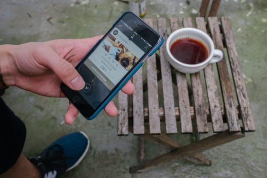
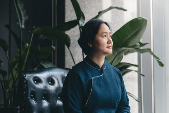
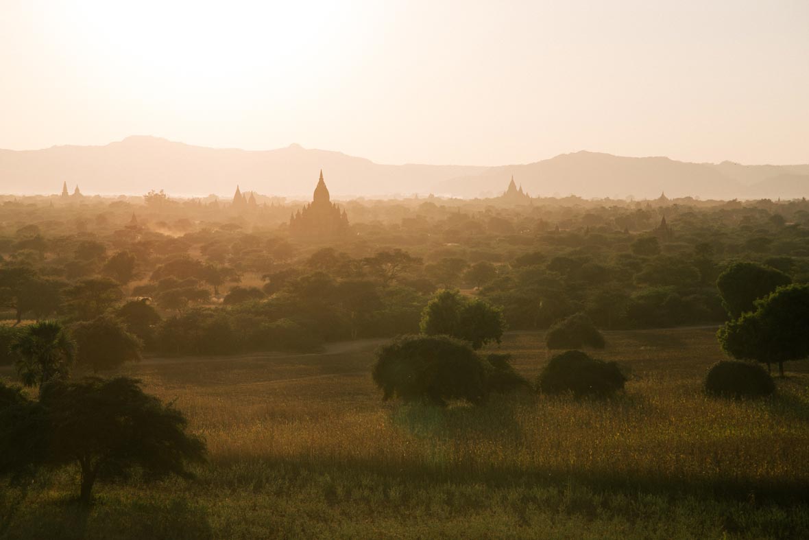
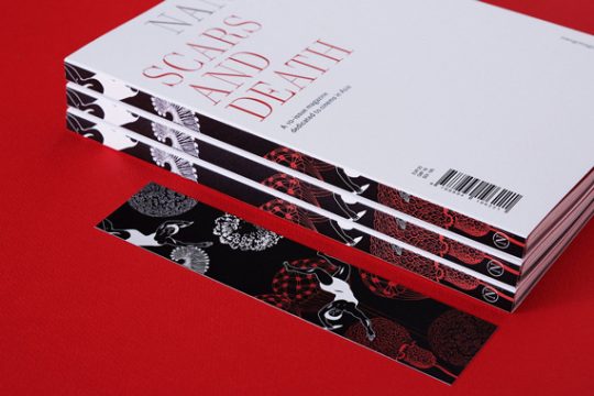
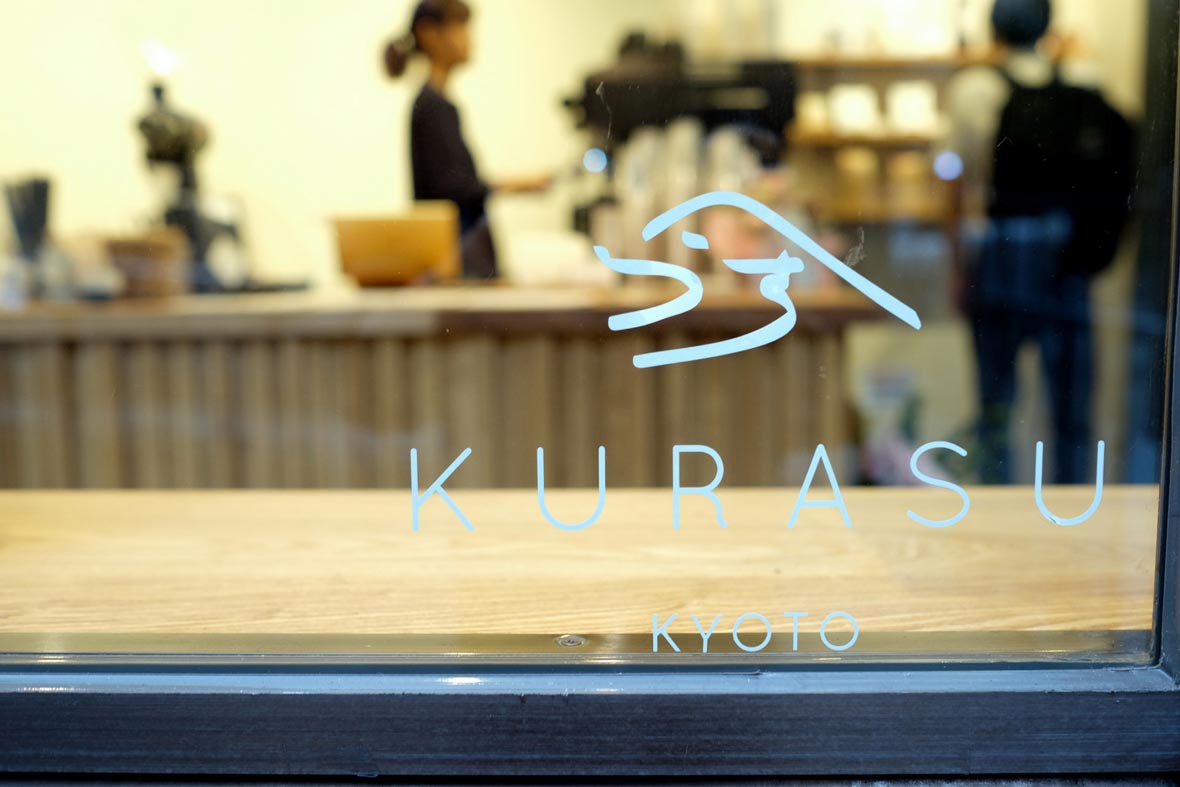
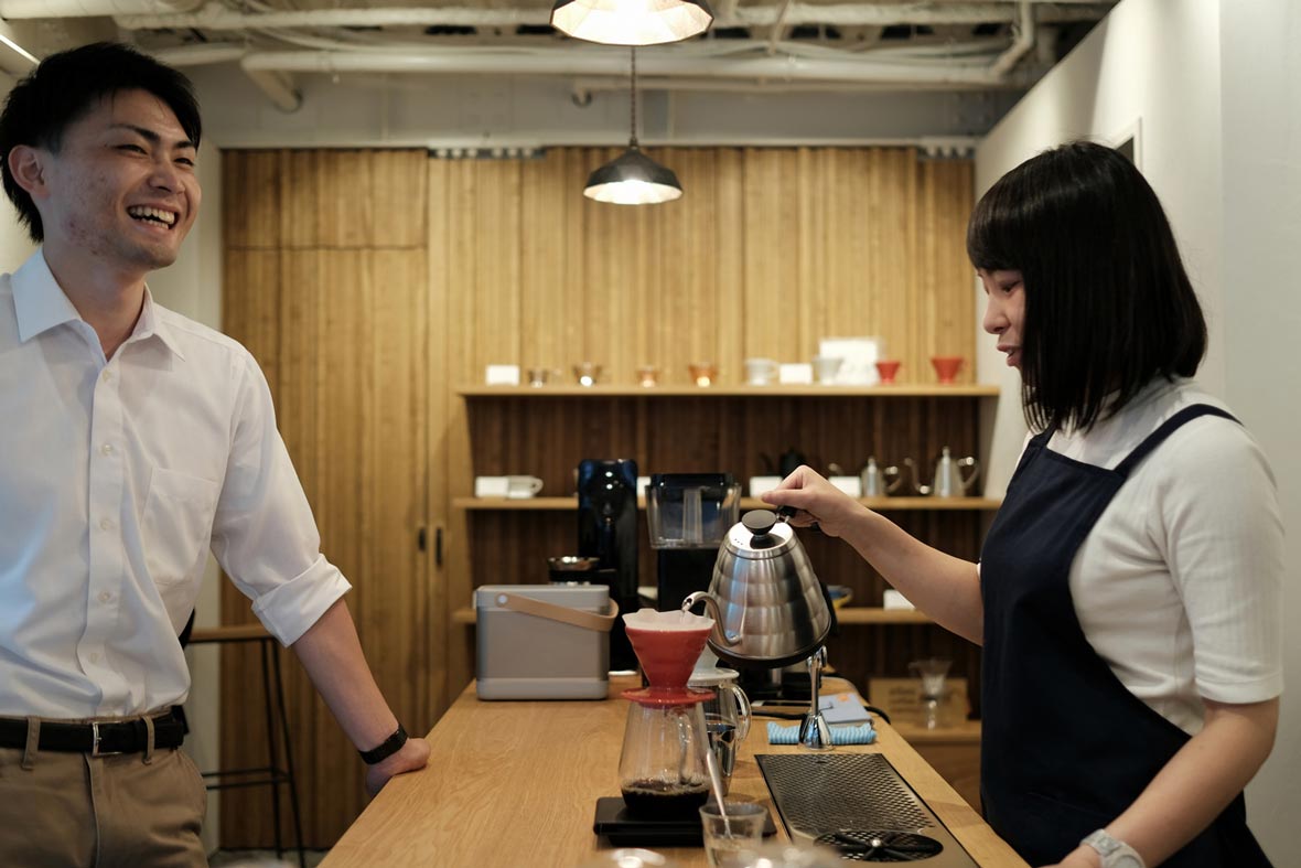
In 2013, Yozo Otsuki made a career switch from investment banking to curating Japanese homewares after relocating to Sydney, Australia. In a matter of months, Yozo launched Kurasu, an online retail space that carefully curated the very best of Japanese ceramics, textiles and coffee equipment. Within the last three years, Kurasu began to specialize in coffee, with products ranging from accessories, filters and even a coffee subscription. This year, Yozo returned to Kyoto, Japan to bring his passion and vision to the forefront of the Japanese coffee industry. In August 2016, the aptly named café and gallery space, Kurasu Kyoto, opened its doors. Neocha spoke with Yozo recently to uncover his thoughts on Japanese coffee and the last three years of sharing Kurasu with the world.


大槻洋三氏は、2013年にオーストラリアのシドニーに移住し、投資銀行業務から日本の家庭用品のキュレーターへと転身しました。その後わずか数カ月で日本の家庭用品や繊維製品、コーヒー器具のみを取り扱うネットストア「Kurasu」を立ち上げました。当サイトは、ここ3年でコーヒー用品を取り扱うようになり、フィルター、付属品、そしてコーヒーの定期購入サービスへと広がりました。今年に入り大槻氏は京都に帰郷し、日本のコーヒー業界の最前線に彼自身の情熱とビジョンをもたらしました。そして今年の8月、その名にふさわしいカフェ&ギャラリースペース「Kurasu Kyoto」がオープンしたのです。この度Neochaは、日本のコーヒーについてや、過去3年で世界に広げることができた「Kurasu」への思いについて大槻氏に取材しました。

Neocha: Why the name Kurasu?

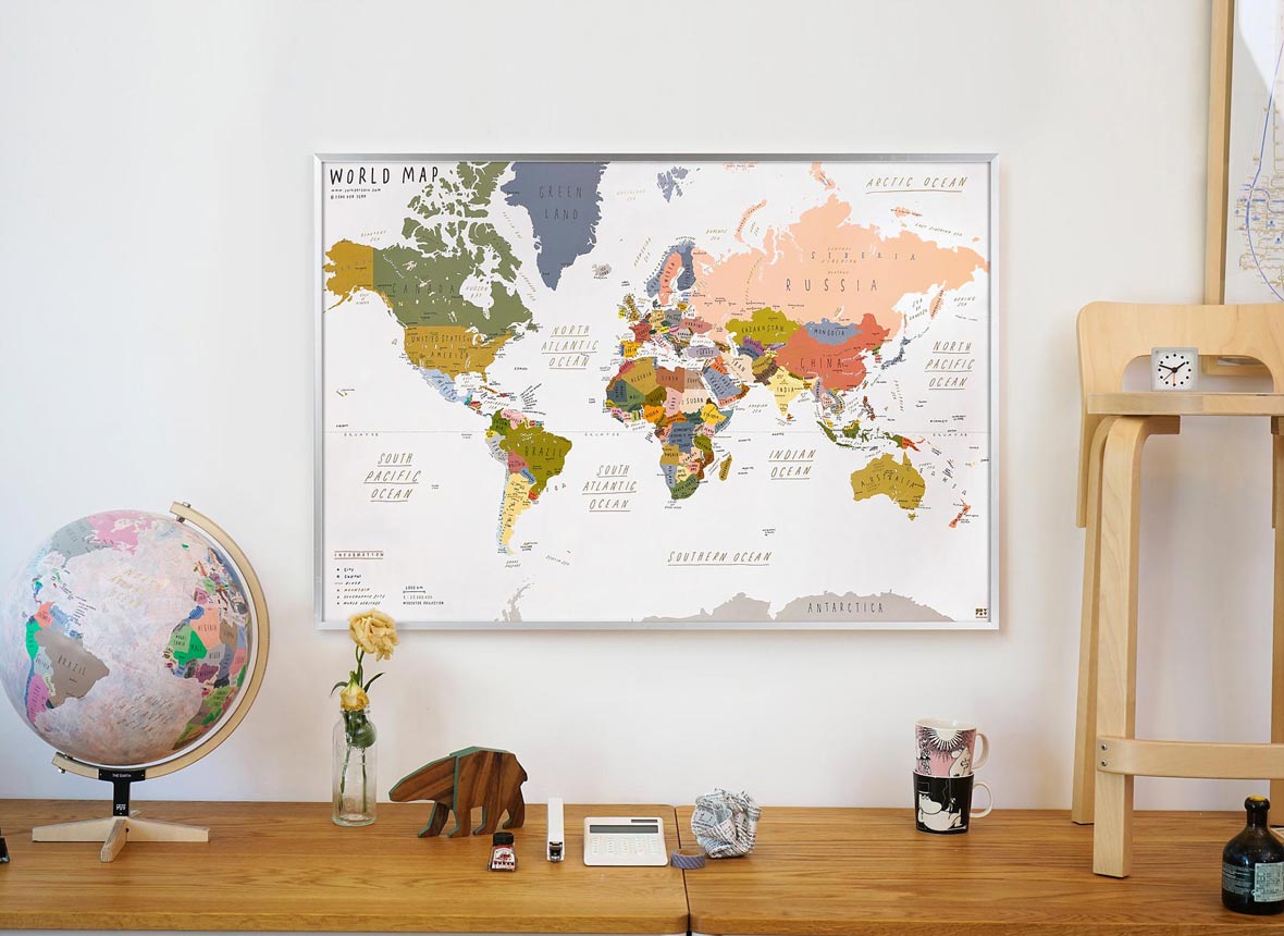
Yozo: Kurasu means “to live” in Japanese. We started as more of a lifestyle store selling homeware goods such as Japanese cups, ceramics, textiles and a small selection of coffee equipment. The name Kurasu stuck as we transitioned to specialising in coffee over the last three years. The meaning behind Kurasu has evolved with our business and it now represents a “lifestyle with coffee”.


Neocha: Kurasuを立ち上げたきっかけをお聞かせください。

Yozo: 「Kurasu」とは日本語で「暮らす」を意味します。日本のカップ、陶磁器、繊維製品、コーヒー器具の希少なコレクションなど、当時はむしろ家庭用品を販売し、ライフスタイルに合うお店として始めました。ここ3年でコーヒー専門店に変わったとしても、「Kurasu」という名はそのまま残しました。「Kurasu」という言葉の裏にある意味は事業と共に進化し、今では「コーヒーのあるライフスタイル」を表しています。

Neocha: How did you get started in the coffee industry?

Yozo: I was living in Tokyo and in between jobs after four years in finance. I felt that I could see a future in the coffee industry, and personally, I couldn’t see myself staying in the same job in finance down the road. Around this time, my wife had the opportunity to move to Sydney with her company. We saw this as a new adventure and made the move not long after.

While in Sydney I was lucky to be able to personally connect with a lot of creative minds, especially many in the design field. I came to the realisation that Japanese design and products were highly regarded by a lot of people. The downside is that they’re hard to come by in Australia and can be very expensive. It was a light-bulb moment for me, so I decided to start an online store selling Japanese homewares. Things have naturally expanded from there. I would’ve never imagined it would get this far after just three years.


Neocha: コーヒー業界ではどのように事業を始めたのでしょう?

Yozo: 当時は東京に住んでいて、金融業界で4年間働いたのちに新しい仕事を探しました。この業界では将来的に何かよいものをしっかりつかめると感じていたものの、その道を続けていく自分の姿を想像できませんでした。その頃、妻が働く会社に付き添いシドニーに移住するという転機が訪れたのです。新たな経験だと捉えた私達は、それからまもなく移住しました。

シドニーにいた頃は、創造力豊かな人達と触れ合う機会に恵まれ、特にデザインの分野で多くの出会いがありました。そのような機会から、日本のデザインや製品が非常に高く評価されていることに気づいたのですが、商品をオーストラリアで入手するのがとても難しい、あるいは非常に高価なものでした。そこから、日本の家庭用品を販売するオンラインストアを始めるように思いついたのです。それ以降は何事も自然に広がり始め、3年でにこれほどまで広がるとは夢にも思いませんでした。

Neocha: How do you see the coffee scene in Japan? How does the quality and culture compare with the rest of the world?

Yozo: Japan has a deeply rooted coffee culture that is quite unique. Dark roasts and drip coffee is the popular choice out here. Like many artisan crafts, the process and the techniques can be quite meticulous, which I believe is influenced by Japanese traditional tea ceremony. Tea-drinking shops, or kissatens, like the now-closed Daibo Coffee or Satei Hotou, really show off the beauty of Japanese coffee culture. Every step is calculated, flawless, and graceful. At the same time, these places have unfortunately been on a steady decline due to franchises like Starbucks, coffee offerings from convenience stores, and canned coffee.

That’s where specialty coffee spaces like ours come in. It’s starting to be recognised as the next wave in Japanese coffee culture. I believe the future of Japanese coffee will be the coexistence of newer generation specialty coffee and traditional kissaten, where quality is of course sought after but it’s coming from different perspectives.


Neocha: 日本のコーヒー環境をどのように捉えていますか?他の国々と比較して、品質や文化はどうでしょう?

 Yozo日本には、とても深いルーツで独特のコーヒー文化があり、中でもダークローストのドリップコーヒーが人気です。多くの職人技と同じく、作り方の手順と技術は細かい部分にまでこだわり、これは伝統的な茶道に根付いたものだと思います。すでに閉店してしまいましたが、大坊珈琲店のほか、茶亭羽當といった喫茶店は、日本のコーヒー文化の美を象徴するお店です。すべての手順が計算され、完璧かつ上品です。

と同時に、スターバックスのようなフランチャイズ店をはじめ、コンビニのコーヒーや缶コーヒーに流れる若者層にとっては、残念ながらそういった喫茶店は着実に衰退の途にあります。

そのような中で、私達のようなスペシャルティコーヒーを取り扱う専門店が勢いづき、日本のコーヒー文化の次世代の波として認識されるようになったのです。日本のコーヒーの未来は、視点が違っていたとしても品質にこだわるという共通点を持つ、次世代のスペシャルティコーヒーと伝統の喫茶店が共存していくものだと考えています。

Neocha: Tell us about your journey leading up to the opening of Kurasu Kyoto.

Yozo: Kurasu Kyoto was a natural progression as we sold coffee equipment and a coffee subscription service that allowed us to gain a solid network with roasters all around Japan. It made sense to have a space that showcased our high quality beans and equipment. I always had something like this in mind and it finally solidified in April. Things moved fairly quickly, allowing us to open in August 2016.


Neocha: Kurasu Kyoto開店までの経緯についてお聞かせください。

Yozo: Kurasu Kyotoは、コーヒー器具やコーヒーの定期購入サービスの販売を経て、日本全国でコーヒーを焙煎する人達との強いネットワークが確立するという、とても自然的な流れでした。良質な豆や器具を披露するだけの意義があったのです。そのような思いはいつも頭の中にありました、その考えがようやく今年の4月に固まり、後はとんとん拍子に物事が運び、8月に開店できたのです。

Neocha: What are the favourite parts of your café? What do you hope for customers who experience Kurasu?

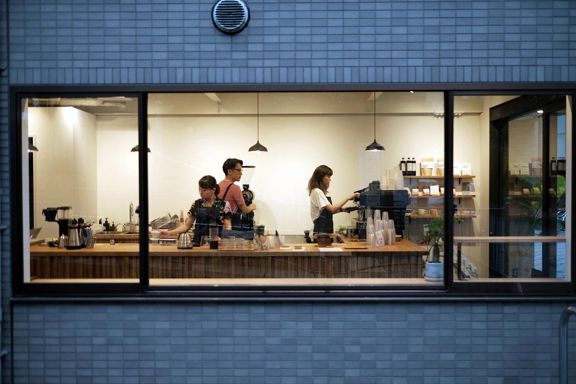
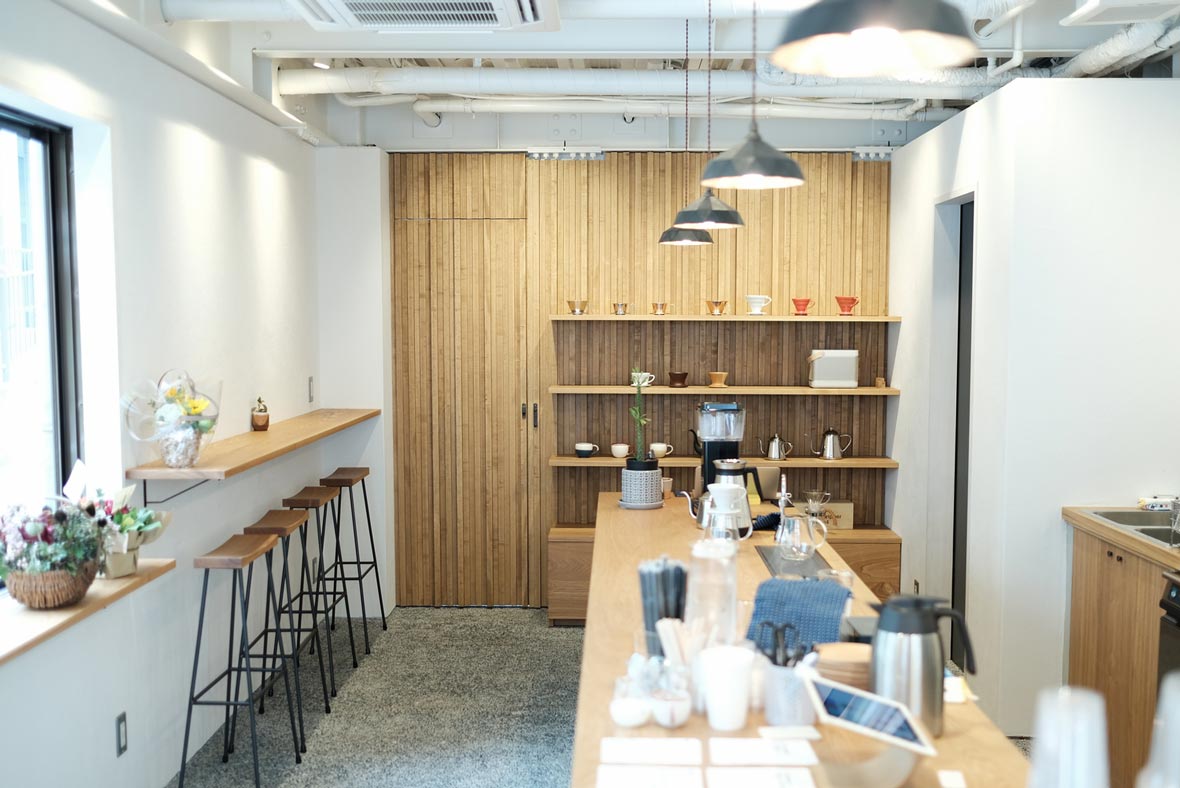
Yozo: For the café, we love the integration of both Japanese and contemporary design. Pebble floors used for traditional Japanese outdoor flooring are mixed with our clean wooden countertops. The gallery wall houses handmade brass pendants by Futagami, a brand founded in 1897. We really wanted to showcase Japanese craftsmanship in the shop.

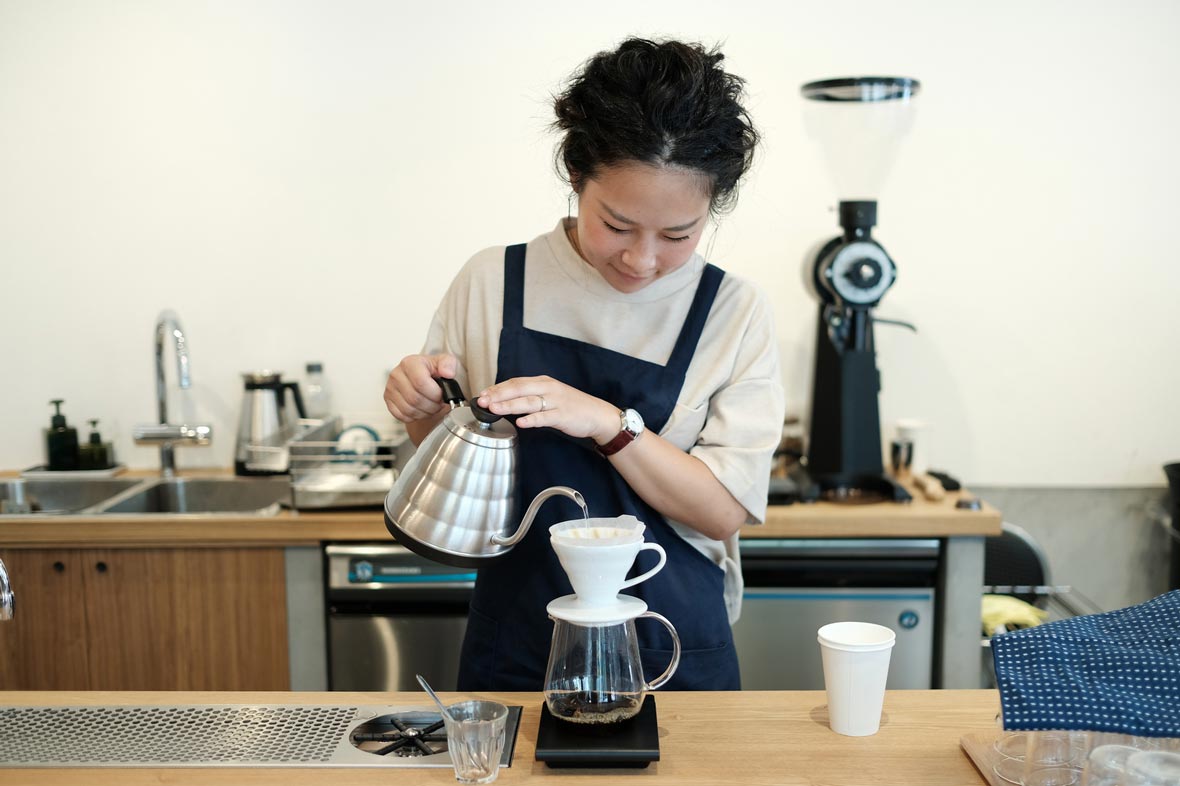
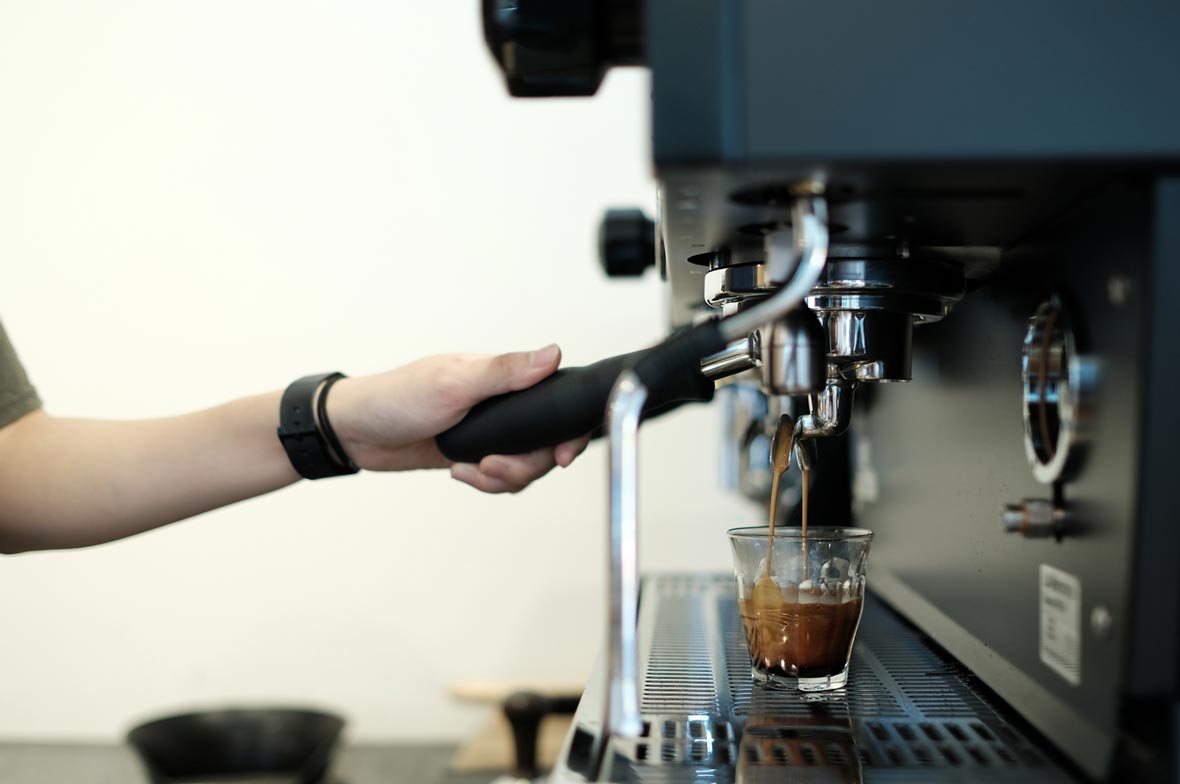
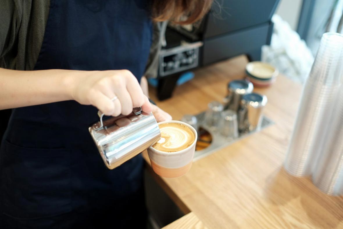
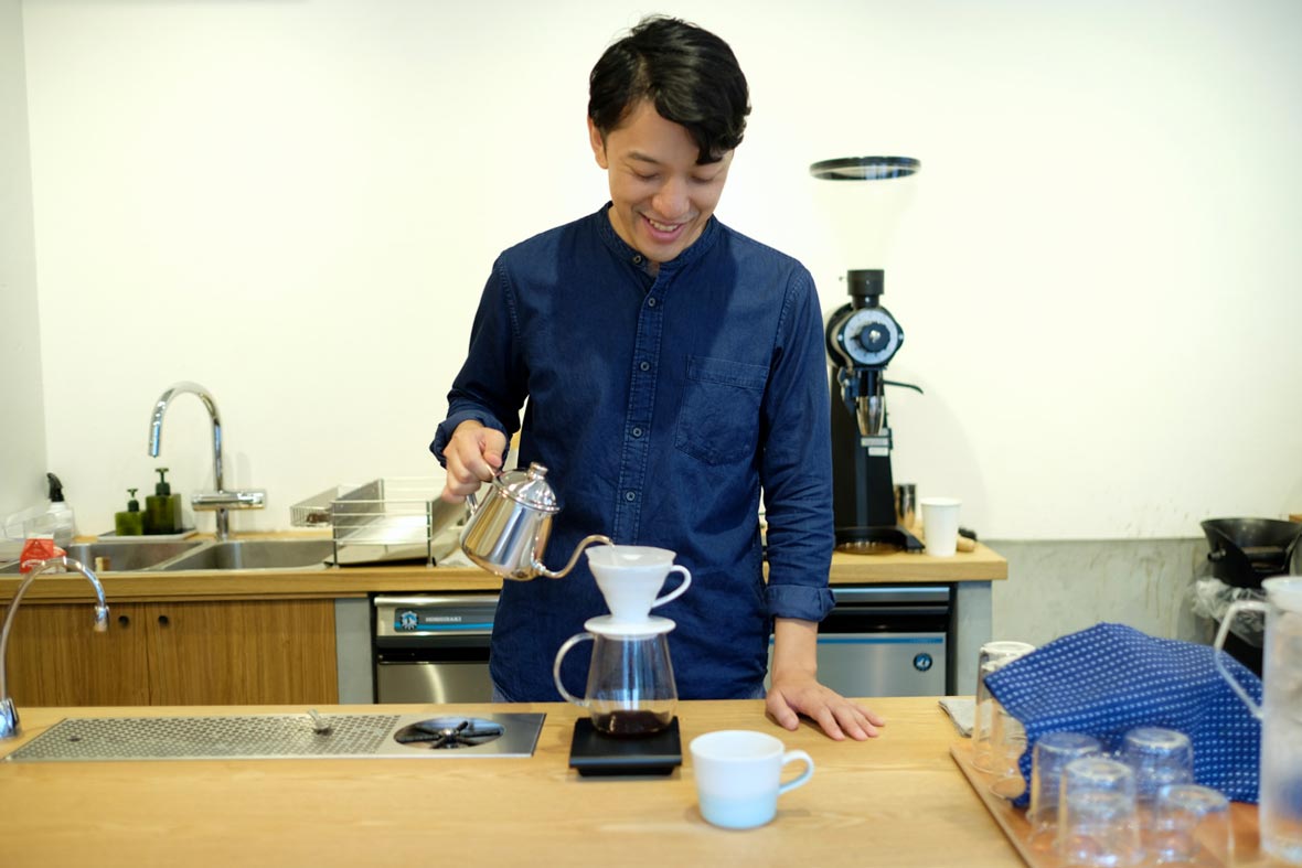
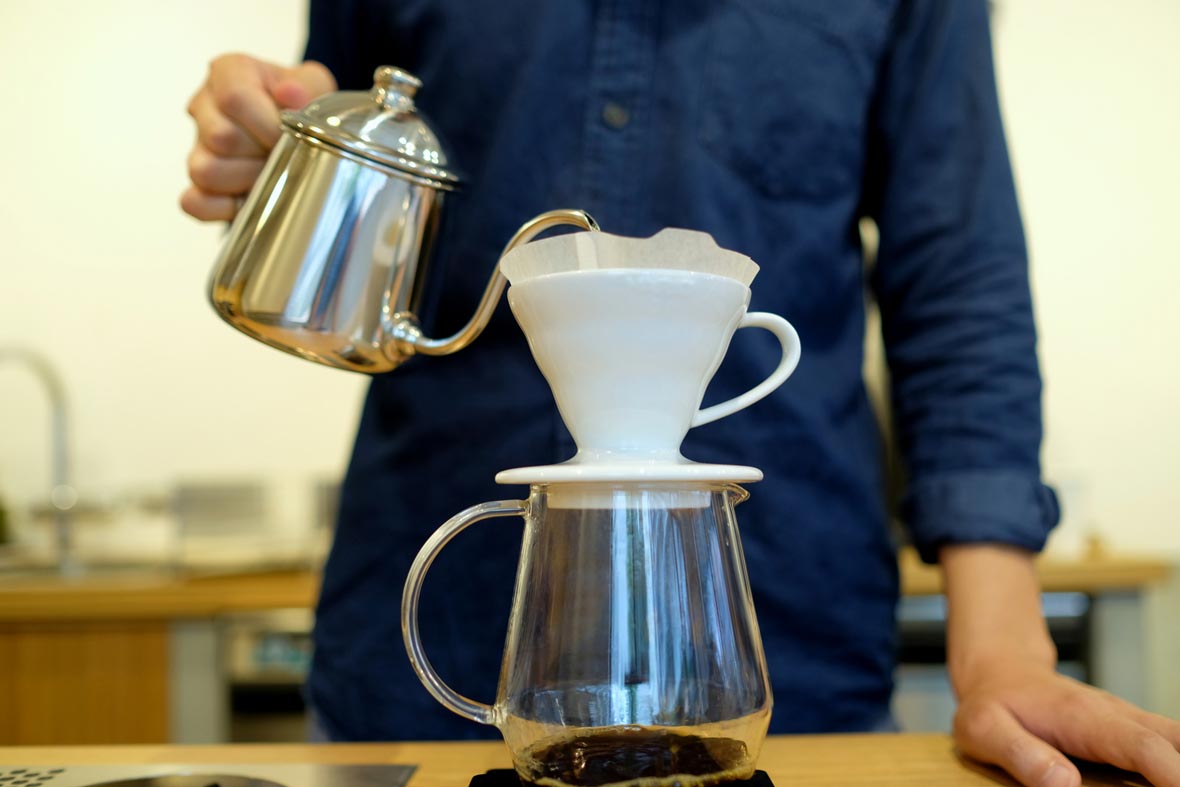
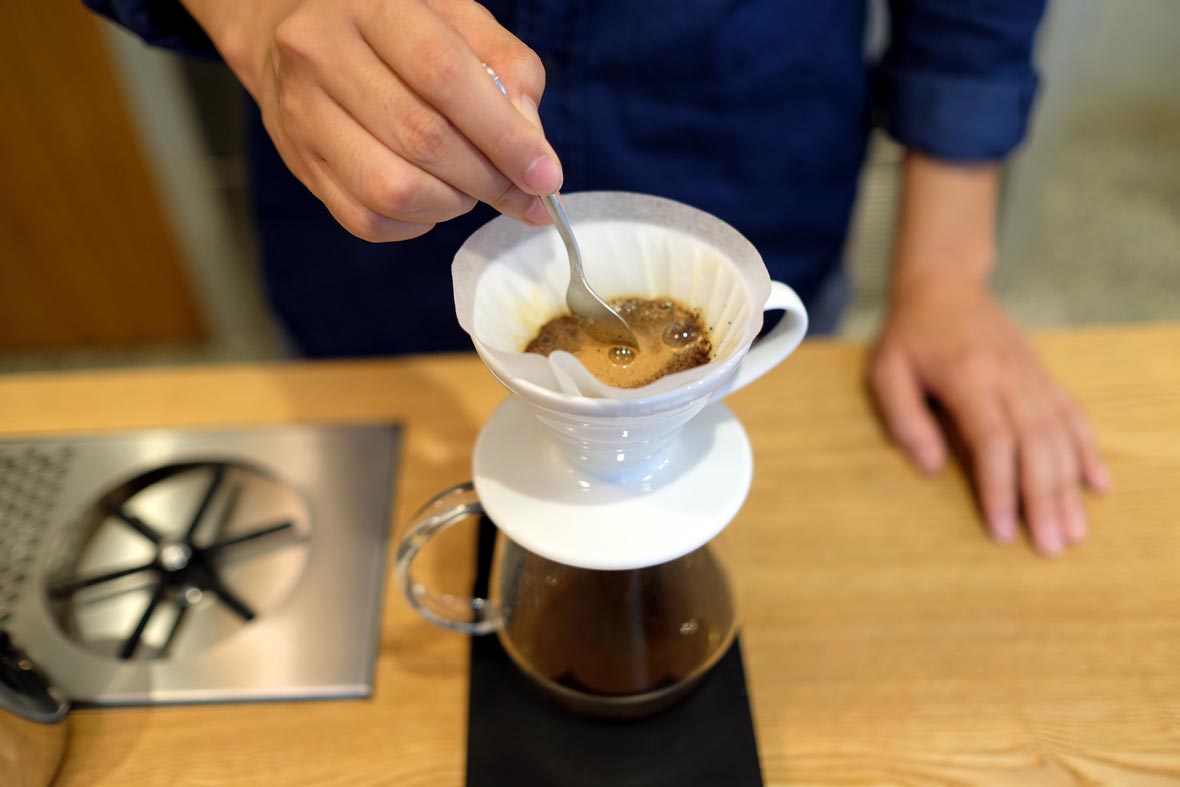
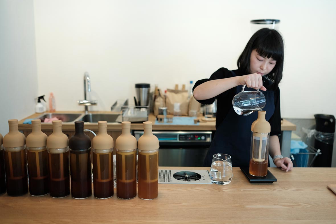
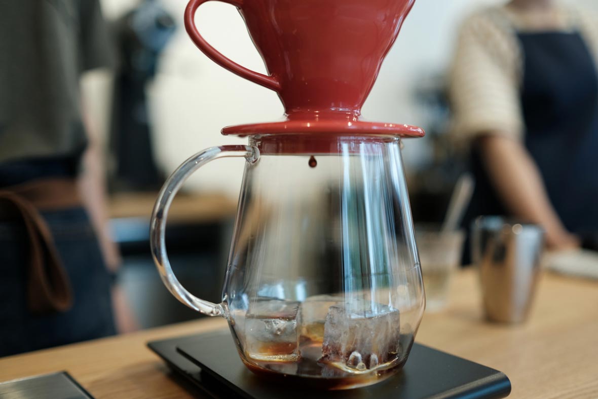
We use Japanese coffee equipment for pour-over coffee, while for espresso, we operate a La Marzocco Linea PB custom black paint with an EK 43 grinder. We’re very proud of our gallery space – there are tons of amazing Japanese coffee equipment on show. We want people to come and feel the beauty of these products and test their performance as well. We want Kurasu to be the hub that connects Japanese coffee culture to the rest of the world, as well as introduce coffee from the rest of the world to Japan.


Neocha: 当カフェの一番お気に入りの点は何でしょう?Kurasuのお客様に望むことは何でしょう?

Yozo: カフェでは、日本的なデザインとコンテンポラリーなデザインとの組み合わせがとても気に入っています。日本伝統の屋外フローリングに使われる小石を敷き詰めた床は、当店の清潔な木のカウンターと調和しています。ギャラリーの壁には、1897年創業の真鍮鋳物メーカーの「二上」による手作業の真鍮製ペンダントランプが飾られています。日本の工芸品を店内で展示することが強い希望でした。

当店では、エスプレッソにラ・マルゾッコ・リネアPBカスタムブラックとEK43グラインダーを使用する中、プアオーバーには日本のコーヒー器具というように使い分けています。自慢のギャラリースペースには、素晴らしい日本のコーヒー器具が多数展示されています。お客様には、これらの製品の美しさを肌で感じていただき、その性能をお試しいただきたいと思っています。Kurasuが、日本のコーヒー文化と世界をつなぐ拠点となり、世界中のコーヒーを日本に紹介する場となることが私達の願いです。

Address:
552 HIgashiaburano-koji cho,
Shimogyo Japan

Hours:
8:00am ~ 6:00pm

Website: kurasu.kyoto


Contributor: Whitney Ng
Images Courtesy of Yozo Otsuki


住所:
下京区油小路通塩小路下る東油小路町552
京都 日本

営業時間:
08:00~18:00

ウェブサイト: kurasu.kyoto


寄稿者: Whitney Ng
Images Courtesy of Yozo Otsuki

You Might Also Like你可能会喜欢

Life After the Youth Olympics

October 2, 2016 2016年10月2日

At the close of another Olympic year, the monumental venues that once housed the cheers of tens of thousands of spectators become hollow spaces as the host city shifts back to a pace of normality. Some host cities have managed to breathe new life into these spaces – once the epicentre of the Summer Olympics of 2012, London Stadium has been converted into a multi-use facility and the new home of English Premiership team, West Ham United. Likewise, the Fisht Olympic Stadium for the Sochi Winter Olympics is still in use today and is now undergoing renovations in preparation for the 2018 FIFA World Cup in Russia. However, the same can’t be said for the 2004 Summer Olympics host, Athens, with the Faliro Olympic Complex, the Helinikon Complex and the Aquatic Centre all left derelict and in ghostly ruins.


随着今年奥运会的结束,主办城市回归正常人流状态,些可容纳成千上万激情澎湃观众的巨型场馆就变成了泛人问津的空旷之地。一些主办城市正通过加瓦添新,将这些空间好好利用起来:2012年伦敦夏季奥运会的主会场“伦敦碗”就改造成为一个多功能公共设施,也是英国英超球队、西汉姆联队的比赛新场地。同样,索契冬奥会的菲施特奥林匹克体育场现在依然在使用,目前正在翻新施工中,为2018年在俄罗斯举行的世界杯做准备。但是,同样的方法在2004年的奥运会主办城市雅典却行不通,Faliro Olympic Complex, Helinikon Complex还有Aquatic Centre等场馆都摒弃在一旁,任其荒废。

Nanjing, China was the official host city for the 2014 Youth Olympic Games with the Nanjing Youth Olympic Games International Convention Centre acting as the main reception venue. The complex was intrinsically designed by the late Zaha Hadid and her team at Zaha Hadid Architects – it remains as a shining example of functional architecture that can continue to serve great purpose even after its Olympic debut.


2014年青年奥林匹克运动会在中国南京举办,主会场青年奥林匹克运动会国际会议中心由扎哈·哈迪及其建筑与室内设计工作室负责设计。这个主会场堪称此类建筑的典范,不仅能够承担专门的大型盛事主会场用地,还能在奥林匹克首秀之后,有效地发挥其他功效。

The design for the Nanjing Youth Olympic Games International Convention Centre was centred around the merging of a series of contradictions into one cohesive structure. Polar opposites such as black and white, brightness and dim, truth and falsity, as well as yin and yang were symbolically incorporated into the venue. Due to the lack of natural lighting present within the building, creating artificial lighting that streamed through the entire convention centre was paramount. The team hoped to showcase “Flow and Energy”. “Flow” being the extension of light and its movement between surfaces and “Energy” being the source for flow. Light is the interdependence and interlacement of “Flow” and “Energy”. The result of this vision is a six-story tall building that spans 194000m2, complete with a 2,181 seater Conference Hall, 505 seat Concert Hall and four multi-purpose rooms.


青年奥林匹克运动会国际会议中心的设计理念在于将一系列对立的元素融入在统一的建筑中:黑与白、明与暗、虚与实、阴与阳……这些充满意象性的元素汇集于此。由于室内无法获取足够的自然光,贯穿整栋建筑内的人工照明显得尤为重要。设计团队希望展示“流动”与“能量”的照明效果,“流动”是光线的延伸,是层面的乐章,“能量”是“流动”的源泉。光就是“能量”与“流动”的相互依存和相互交织。想象一下这种照明的效果,在这个面积覆盖达19万平方米的六层高的建筑体,并拥有可容纳2181个席位的会议厅,505个席位的音乐厅以及四个多功能厅。

The main Conference Hall plays host to various conferences, musicals, plays and presentations throughout the year – however, unlike most performance spaces, there are no spot lights fixed onto the ceiling. This was an intentional move to preserve Hadid’s original design, allowing “Flow” to be represented by the luminous white fixtures. Instead, the space is affixed with densely covered LED luminescence film, allowing for the theatre lights to change gradually.


主会议厅可常年举行大型会议,音乐剧,剧院演出及发布会,但是与大多数常规剧院不同的是,天花板上没有设置任何功能灯,这是为了保持Hadid的原创设计理念的特意之举,目的是在白色发光体中展示“流动”的美感。在照明上,主要采用嵌入空间的LED发光薄膜,能让剧院灯光产生渐变效果。

The Concert Hall additionally has luminous ribbon-like surfaces, which serve as both decorative and functional lighting. The fixtures not only provide environmental lighting for performers on stage, but they can also be altered to suit the performance atmosphere. Lighting operators are given ample flexibility across both spaces to alter luminance and visual focus in order to enhance each performance and presentation.


音乐厅增加了表层飘带状的发光体,用于装饰和功能性照明。在舞台正上方的功能灯在演出时也会为场上提供必要的环境光,以增加气氛,同时飘带通过自身变化也能营造氛围。在空间和视觉调控上,这些照明灯都有很大灵活性,能够为每一场演出和展示调节气氛。

Hadid’s intention was to guide visitors through the space with well-placed lighting that would essentially “follow” each person and guide them like a map. Dimming controls were put into place in all public areas; the diamond shaped lights can also be altered from the primary lighting circuit. Each open space epitomises the design and lighting team’s intention to create a venue showcasing how light and space can co-exist and compliment each other.


Hadid希望在空间通过巧妙的照明设置,让光线自然而然的流动赋予所有人可及之处,并进行道路引导。在所有公共区域中都放置了调光控制;钻石菱形状的定制灯也能通过主调光回路进行改变。每一个开放空间都是包括灯光、设计等整个团队的心血之作,旨在打造光与空间相互依存,相互衬托的经典场馆。

Much like the Bird’s Nest from Beijing’s 2008 Summer Olympics, which has been repurposed for football matches and the upcoming 2022 Winter Olympics, Nanjing’s Youth Olympic Games International Convention Centre continues to host exhibitions, conferences, performances and attract architect enthusiasts and visitors from around the world.


就像北京2008奥运会的鸟巢还能作为足球比赛场地以及用于2022届冬季奥运会,南京青年奥林匹克运动会国际会议中心也仍能继续举办展览、会议、演出,并吸引全球建筑爱好者和游客的观光。

Contributor: Whitney Ng
Images Courtesy of He Shu


供稿人: Whitney Ng
图片由舒赫提供

You Might Also Like你可能会喜欢

Every City Has a Bloodline

September 23, 2016 2016年9月23日

Think of your daily commute – that twice a day round trip bringing you from point A to point B on the road (nearly) always travelled. For the vast majority of big city dwellers, public transport is not only a thrifty choice, but also one of convenience and efficiency; in a city populated by the millions, traffic can be time crippling. This journey has become one of our most consistent daily rituals – it’s almost like our bodies become systematically aware of when to alight and the number of minutes it takes to walk through an interchange. Seoul-based Art Director Kim Ji-Hwan of ZERO PER ZERO design studio, describes subway systems as the “bloodline” of each city – the crux that seamlessly links people and places together.


매일 반복되는 출퇴근을 생각해보자. A 지점에서 B 지점까지 길을 따라 (거의) 항상 여행하듯 매일 왕복한다. 대부분의 대도시 거주자들에게 대중 교통이란 단순히 저렴할 뿐만 아니라 편리하고 효율적이기도 한 교통수단이다. 따라서 대중 교통을 이용한 여정은 이제 우리 삶의 일상적인 의식 중의 하나가 되어버렸다 – 우리의 몸은 거의 조직적으로 어디에서 하차해야 할 지 그리고 인터체인지를 걸어 나가는데 몇분이나 걸릴 지 이미 아는 듯하다. 서울에 소재한 제로퍼제로 디자인 스튜디오의 김지완 아트 디렉터는 도시의 지하철 시스템을 도시의 “혈관” – 사람들과 장소를 매끄럽게 연결하는 중심점 – 이라고 부른다.

In 2006, Kim spent a year in Japan as an exchange student at Tama Art University; his stay in Tokyo fuelled his interest in subway lines, fascinated by how each transit system could feel so familiar and foreign – a feeling that hinged completely on one’s own understanding of the city. Whilst at Tama, Kim was inspired to create an infographic map of the famed Tokyo Metro system, which was to become the first of many maps in his City Railway System series. Ten years later, his studio, ZERO PER ZERO have produced infographic maps that span major cities around the world, including Tokyo, New York City, Seoul, Paris, Beijing, Osaka, Barcelona, Berlin, Amsterdam, London and Hokkaido.


2006년 김지완은 Tama Art University의 교환 학생 자격으로 일본에서 1년을 보냈다. 도쿄에서 보낸 시간 동안 그는 지하철에 관심을 갖게 되었다. 그는 각각의 교통 시스템이 얼마나 서로 비슷하면서도 상이한 지에 대하여 매력을 느꼈다. Tama에서 공부하는 동안 그는 저명한 도쿄 메트로 시스템의 인포그래픽 맵을 만들어야겠다는 영감이 들었다. 었덨다. 그것이 그의 “도시 철도 시스템 (City Railway System)” 시리즈의 여러 맵 중 첫번째 맵이었다. 10년 후, 그의 스튜디오인 제로퍼제로는 도쿄, 뉴욕, 서울, 파리, 북경, 오사카, 바르셀로나, 베를린, 암스테르담, 런던과 홋카이도를 포함하는 전 세계의 주요 도시들을 아우르는 인포그래픽 맵을 제작 해 냈다.

Kim has an ingrained affinity with Tokyo, stating that the original map is still his favourite – the Tokyo map was given a fresh update this year, entitled New Tokyo. Amongst the twists and turns of each city’s railway system, Kim has thoughtfully included tourist attractions and iconic sites to give map owners a true sense of each city’s space. Each ZERO PER ZERO map is characterised by a motif that symbolises each individual city. Osaka’s motif is especially interesting, as the map also features neighbouring cities, Kyoto, Kobe, Nara and Wakayama. Inspired by the octopus in Osaka’s famous local snack, Takoyaki – “In this map, the Osaka metropolitan area is visualised as an octopus with the head being Osaka and the legs sprawling out to the other four cities.”


도쿄에 대한 깊은 애정을 가진 김지완은 아직도 도쿄 오리지널 맵에 가장 애착이 간다고 한다. 도쿄 맵은 올해 새롭게 개정되어 “뉴 도쿄”라는 이름으로 선보였다. 각 도시의 철도 시스템을 적절히 변형하는 가운데도 김지완은 도시의 관광 명소와 상징적 장소들을 지도에 사려깊게 배치하여 지도를 보는 사람들로 하여금 도시 각 공간의 진정한 의미를 깨닫게 한다. 제로퍼제포에서 제작되는 모든 맵은 각 도시를 상징하는 모티브를 형상화하였다. 이중 오사카의 모티브는 특히 흥미로운데, 지도적 측면에서 오사카 맵은 인근의 교토, 코베 나라 및 와카야마까지 소개하고 있다. 오사카의 유명한 지역 음식인 문어, 타코야키에 영감을 받아 제작된 이 맵에서 문어의 머리에는 오사카 메트로폴리탄 지역을 표현하고 4개의 다리는 다른 4개 도시로 퍼져 나가는 모습을 하고 있다.

New Tokyo and Tokyo - Inspired by the “Rising Sun” on the Japanese flag.
신 도쿄와 도쿄 – 일본 국기의 “떠오르는 태양”을 모티브로 제작
New New York City and New York City - Inspired by Milton Glaser’s "I♥NY" logo.
신 뉴욕과 뉴욕 – 밀톤 글레이저의 "I♥NY"을 모티브로 제작
Seoul - Inspired by the bends of Han River. 서울 – 굽이져 흐르는 한강을 모티브로 제작
Paris - Inspired by the iconic Eiffel Tower. 파리 – 파리의 상진인 에펠탑을 모티브로 제작
Beijing - Inspired by the Chinese character, 中. 베이징 – 중국 한자中자를 모티브로 제작
Osaka – Inspired by the Octopus and Takoyaki. 오사카 – 문어와 타코야키를 모티브로 제작
Barcelona - Inspired by famous Spanish architect, Antoni Gaudi. 바르셀로나 – 저명한 스페인 건축가 안토니 가우디를 모티브로 제작
Berlin - Inspired by the city’s symbol, the Bear. 베를린 – 시의 상징인 곰을 모티브로 제작
Amsterdam - Inspired by the Dutch symbol, the Tulip. 암스테르담 – 더치의 심볼인 튤립을 모티브로 제작
London - Inspired by the Union Jack. 런던 – 유니언 잭을 모티브로 제작
Hokkaido - Inspired by the city’s world famous powder like snow. 홋카이도 – 세계적으로 유명한 파우더 눈을 모티브로 제작

Kim hopes that his maps can serve as both a helpful guide for new visitors and a long lasting reminder of the beauty in each city for those who call it home. The commute may be just a slither of time in the day, but it is also the best time to zone out and reflect on the beautiful city that surrounds you.


김지완은 그의 맵이 도시를 방문하는 사람들에게는 가이드로서의 도움이 되고 그 도시에 사는 사람들에게는 도시의 아름다움을 오랫동안 기억에 남는데 도움이 되기를 바란다. 하루에 있어서 출퇴근은 그저 의미없이 흘려 보내는 시간이라고 생각할 수도 있다. 하지만 그 시간은 자신이 머물던 지역에서 벗어나 자신을 둘러싼 아름다운 도시의 모습을 감상할 수 있는 최고의 시간인 것이다.

Websitezeroperzero.com


Contributor: Whitney Ng


웹사이트zeroperzero.com


기부자: Whitney Ng

You Might Also Like你可能会喜欢

Modern Revival of Calligraphy

September 20, 2016 2016年9月20日

In a world where email, instant messaging and social media rule modern day communication, writing by hand has taken a back seat, often reserved for rushed shopping lists and meeting minutes. Long before we learnt to touch type with our thumbs, written word took shape through calligraphy, differing across cultures but still serving the same important purposes; communication between parties and the preservation of the world’s most important manuscripts.


在这个电子邮件、即时信息和社交媒体铺天盖地的世界里,手写这件事早已退居其后,通常只用于匆匆写下购物清单或者进行会议记录。早在我们学会拇指触打文字之前,手写文字就已经形成书法,在不同的文化体系中尽管有所不同,但都同样有着重要的意义:政党机关里的信函沟通,全球最重要的手稿存留。

Lettering by hand has almost become a lost art, kept alive by dedicated practitioners who are now few and far between. At the forefront of this modern revival is Kuala Lumpur-based calligrapher and hand letterer Sharon Tan, widely known by her online moniker @ronnycakes.


手工字体设计已经几乎成为一种失传的艺术,在零星的虔诚爱好者中存留一线生机。这场当代复兴浪潮首当其冲者之一,便是居住在吉隆坡的书法家和手写字体设计师Sharon Tan,以网名@ronnycakes为更多人所熟识。

“I began dabbling in calligraphy some time in April 2015. At the beginning, there was this manic and obsessive energy to practice and achieve perfect script – I spent two to three hours every night after work practicing my drills, strokes and writing quotes.” Sharon’s calligraphy journey could be likened to a pursuit for perfection – fuelled both by a hunger to truly hone the craft and the therapeutic reward that came with every stroke.


“我从2015年四月开始涉足书法。最开始的时候,浑身都是疯狂练习、执着于达成完美手稿的能量——我每天下班后都会花两三个小时进行练习,注重每笔每划,练字成句。” Sharon的书法之路堪称追求完美——如饥似渴地打磨练习,最终的一笔一划都能投以让人身心愉悦的回报。

The first few weeks were difficult, as she learned her way around new tools and coaxed herself into an entirely new form of writing. After six months of rigorous practice, she ran her first every calligraphy workshop, realising a personal dream to share her knowledge and passion for lettering.


最初的几周颇为难熬,因为她在用新的工具探索其道路,并不断引导自己尝试全新的书写形式。在经过半年的艰苦训练后,她创办了她的首个书法研讨班,实现自己的梦想——分享她对字体书写的知识和热爱。

Sharon cites her body of work as a series of spontaneous creations and an extension of her practice sessions. She encourages all of her students to approach calligraphy as an art form by beginning with the basics and building up to a solid foundation in order to branch off into other forms of contemporary lettering; she herself began by studying the Engrosser’s Script method.


Sharon表示她作品的主体就是一系列随性的创造和其长期练习的一种结果。她鼓励她所有的学生将书法视为一种艺术形式来学习,从最基础的练习开始,夯实基础,才能在此之上衍生出当代手写字体的其他表现形式。她自己就是从学习Engrosser’s Script的方法开始的。

In addition to lettering, Sharon also loves to combine calligraphy with watercolour illustrations to create whimsical mixed media pieces that are inspired by travel, literature and childhood nostalgia.


除了手写字体,Sharon还喜欢把水彩插画融入其书法中,创造出一种特立独行的混搭型作品,而那些灵感有的来自旅行,有的来自文学,还有的来自童年的怀旧情怀。

She also describes Kuala Lumpur’s art scene as a thriving environment, with calligraphy slowly making its way to centre stage. Calligraphy has a very niche local following in Malaysia, which has been steadily gaining traction in recent years. “I think that certain people appreciate the art of good penmanship, but not necessarily everyone. Some find it as a luxury that is hardly worth spending on. Others wonder why we spend so much time and money on something that can be reproduced by a computer!”


她还认为吉隆坡的艺术市场发展欣欣向荣,书法正在慢慢走向中心舞台。在马来西亚,书法在当地人中自有一个市场,并在近年来稳步发展,得到越来越多的关注。“我想特定的人群会欣赏这种精致的书法艺术,但未必会达到人人都接受的地步。有的人觉得那是一种与付出不成正比的奢侈之物,还有人会质疑:为何要如此费时费力去做一些用电脑就能批量复制的东西。”

In between holding down a full time job and co-owning a wedding photography business, Sharon sees calligraphy as an opportunity to push her creativity and collaborate without constraints. Previously, she’s worked with Stabilo, a German stationery manufacturer; Swatch, a swiss watch brand; and MUJI – such projects have allowed her to explore new techniques and create freely. As one of Kuala Lumpur’s most dynamic young artists, Sharon continues to blaze the trail for budding calligraphers in Malaysia and around the world.


在全职工作和合营的婚礼摄影生意之间,她将书法视为一个推动自己的创意和自由合作的一种机会。此前,她曾与德国文具制造商Stabilo、手表品牌Swatch以及MUJI等开展合作,在这样的项目里,她得以大胆地去探索新的技术和发挥天马行空的创造力。作为吉隆坡最具活力的年轻艺术家之一,Sharon将继续在书法之路上,为马来西亚以及世界上其他地方成长中的书法者们,开辟道路。

Instagram@ronnycakes


Contributor: Whitney Ng


Instagram@ronnycakes


供稿人: Whitney Ng

You Might Also Like你可能会喜欢

Exploring Bagan

September 18, 2016 2016年9月18日

Sarah Ong and Eu-Jinn Teh are the husband and wife duo behind The Silver Lining, an awe-inspiring space in which the couple share their collective love for “life, people, gatherings, nature, creativity and art.” The pair recently travelled to Myanmar, to explore the country in which Sarah’s parents grew up before immigrating in 1971. This journey brought Sarah and Jinn to the peak of ancient temples, into the thick of bustling local markets, and floating through Old Bagan on a hot air balloon. Below, they relay some of the highlights of their Myanmar travel log and share a few travel tips for enjoying the very best of Bagan.

Once home to over 10,000 temples, the otherworldly historical city of Bagan is not to be missed. More than 2,000 of these ancient and unmistakable pagodas still stand, and walking amongst them seems to transports you back to the 11th century when Bagan was the thriving capital of the Pagan Empire. The temples are mostly dedicated to Buddha, although dotted with the odd Hindu shrine, range vastly in size from imperious monuments several stories high to tiny stupas that only allow one or two people inside at a time. The smoky atmosphere (attributable to the numerous household cooking fires in the area) and entirely unique landscape makes every single sunrise and sunset a breathtakingly different experience.

Present-day Bagan is separated into three distinct regions – Old Bagan, New Bagan and Nyaung Oo. Old Bagan is the heart of the old city where you’ll find most of temples. There are a number of hotels and resorts but they tend to be pretty pricey. New Bagan was essentially created by the government to prevent locals from living in and among the temples and is honestly fairly bland and characterless. There are many very affordable places to stay In Nyaung Oo, and the town is a fun 20 minute bike ride from Old Bagan. It is also home to F.I.T. Street where you will find a number of great restaurants to eat. You can get to and around Old Bagan by foot, bicycle, electrical bicycle (E-bike), car and even horse cart if that so tickles your fancy.

The number one experience is a hot air balloon ride that takes you on an unforgettable, peaceful sunrise glide over the heart of Old Bagan, just high enough that you feel like you could graze the very top of the Dhammayangi Temple. There are three ballooning companies, all of whom cost roughly the same, setting you back a hefty $350 USD per person, a worthy price for the experience.

For another magical sunrise experience that’s completely free, cycle to Bulethi Pagoda at the break of dawn to catch the balloons wafting by. This is still a relatively unknown sight, and definitely worth becoming a morning person for. Must-see pagodas include Shwesandaw during sunset (expect crowds and tour buses but also a sunset that will make you forget about them all), Dhammayangi, Ananda, Htilominlo, Sulamani, and Manuha Paya (for its giant reclining Buddha). The best thing to do is just generally get lost in and amongst these ancient structures and just go wherever your exploring feet take you.

Nyaung Oo Market is also worth a gander. Beyond the food market, there are many beautiful fabric stores. The region is known for their exceptional lacquer ware, an ancient craft that originated from China. It involves a labour intensive process that consists of building up over 20 layers of various naturally occurring substances to create beautiful and very hardy pieces, which can range from very functional bowls and plates to purely ornamental art pieces. There are, as always, cheap knock-offs but search out a place called Lotus Collection in New Bagan to find an artisanal studio versus a number of the larger factories that give off a “mass-produced” feel.

Bagan is accessible by air, road, rail and boat, depending on where you’re coming from. Coaches are available and are a good way to see the countryside but can take a long time (around ten hours from Rangoon/Yangon). Be sure to bring along your camera, a pair of energetic legs for cycling and pagoda climbing, a bit of extra cash for an unforgettable balloon ride, and your best mingalaba (a Burmese greeting that means “May your day be filled with auspiciousness!”) to soak in and explore Bagan, a truly historical and spiritual centre of Myanmar.

Website: thesilverlining.co


Contributor: Whitney Ng

You Might Also Like你可能会喜欢

The Beauty of Screenwriting

January 7, 2016 2016年1月7日

In Thai, nang is the idiomatic word for film or cinema. Generally used in Thailand to refer to any performance that involves light and a screen, the term became the fitting name for a newly released bi-annual print magazine that details budding cinema culture around Asia. The first issue of NANG‘s ten-part publication covers the often “mysterious and marginalized” profession of screenwriting.


“Nang”来自泰语中意为“电影”的词语,在泰国被用来指所有涉及到灯光和屏幕的表演。对于一本关注亚洲地区最新电影文化的双年刊杂志,《NANG》显然是最合适不过的名字。第一期的杂志共分为10部分的内容,专题讲述常被人们视为”神秘和非主流”的编剧专业。

In addition to specializing in Asian cinema, NANG sets itself apart from other publications by remaining print only. Editor-in-Chief Davide Cazzaro states that the print medium has “undisputable beauty, tactility, and permanence,” which “will best amplify the voice of the visual and textural materials that make up every issue.” NANG is printed in Sweden with the cooperation of Göteborgstryckeriet and Arctic Paper, allowing the team to print in the most environmentally friendly manner possible.


《NANG》致力于关注亚洲电影行业,且仅于平面印刷发行,这是它区别于其它杂志之处。在主编Davide Cazzaro看来,平面印刷作为一种媒介,有一种“无容置疑的美、触感和恒久性”,可以”充分突显出每一期杂志中的视觉设计和纹理材料”。杂志团队与印刷公司Göteborgstryckeriet和纸业公司Arctic Paper合作,在瑞典以最环保的方式来印刷《NANG》。

At the helm of the inaugural issue is Ben Slater, a Singapore-based guest editor. This issue revolves around the subject of screenwriting and features a collection of in-depth interviews that showcases 13 writers and writer-directors from around Asia, including Indonesia, the Philippines, Singapore, South Korea, Malaysia, Thailand, and Iran. “While films may be famous or successful, the writers remain in the background, and yet their work is vital to the process of creating cinema.”


第一期杂志以编剧为专题,由新加坡客座编辑Ben Slater 负责,包括了对 13 编剧或编剧兼导演人的采访,他们分别来自印尼、菲律宾、新加坡、韩国、马来西亚、泰国和伊朗等亚洲地区。”一部电影可能会一举成名或大获成功,但编剧始终在幕后默默工作。然而,他们的工作对一部电影来说是至关重要的。“

This 120-page inaugural issue features screenplay excerpts from Mary Is Happy, Mary Is Happy, Kisah Paling Gengster (Gangster Wars), Shahrzad, The Handmaiden, Laskar Pelangi, Rainbow Troops, Unlucky Plaza, Water Lemon, Imbisibol (Invisible), Taklub (Trap) and Tropical Malady.


第一期杂志共有 120 页,里面涵盖了多部电影剧本的节选,包括《玛丽真快乐》(Mary Is Happy, Mary Is Happy)、《Kisah Paling Gengster》(黑帮战争)、《Shahrzad》、《小姐》(The Handmaid)、《彩虹战队小学》(Laskar Pelangi)、《霉运大厦 》(Unlucky Plaza)、《Water Lemon》、《隐形》(Imbisibol),《塔克洛班的困境》(Taklub) 和《热带疾病 》(Tropical Malady)。

Issue 1 of NANG is now available in the Neocha Shop in limited supply.


《NANG》Issue 1 限量发行,现已于Neocha商店发售。

To pay via PayPal or international credit card, please check out through our Shopify. To pay with AliPay or WeChat, please visit our Weidian.


如需使用PayPal或国际信用卡支付,请转至我们的Shopify页面;如需使用支付宝或微信支付,请至我们的微店

/**/


“编剧”《NANG》Issue 1

¥180

立刻购买

Details:

  • Year of Publication: 2016
  • Edition Size: 1500
  • Number of Pages: 122 (including front and back cover)
  • Size: 17 x 24 cm
  • Binding: Swiss binding
  • Printing: Offset (Hybrid Print Technology)
  • Paper: Munken Kristall 400 g/m², Munken Lynx 120 g/m², Munken Kristall Rough 100 g/m²
  • Price: $25

详情

  • 出版年份: 2016年
  • 发行量: 1500
  • 页数: 122 页 (包括封面和封底)
  • 尺寸: 17 x 24 厘米
  • 装订: Swiss binding
  • 印刷: 平版印刷(混合打印技术)
  • 纸张: Munken Kristall 400 g/m², Munken Lynx 120 g/m², Munken Kristall Rough 100 g/m²
  • 价格: ¥180

Website: nangmagazine.com
Facebook: ~/NangMagazineAsia
Instagram: @nangmagazine


Contributor: Whitney Ng
Images Courtesy of NANG


网站nangmagazine.com
脸书~/NangMagazineAsia
Instagram@nangmagazine


供稿人: Whitney Ng
图片由NANG提供

You Might Also Like你可能会喜欢