Neocha developed the visual identify for the launch of a new premium natural soda brand called PAO.
PAO is China made with 100% natural ingredients sourced locally and regionally.
From exotic fruits to fragrant teas and rare botanicals, PAO selects and blends the very finest ingredients to create truly unique and delicately extracted flavor expressions.
Visual identity work included the main brand logo, colors / fonts, key flavor icons, label, bottle / packaging, etc., as well as Chinese copywriting.
The logo mark is a is a hybrid character comprised of the Chinese words for “run 跑” and “bubble 泡,” Both words share the phonetic pronunciation of “POW,” which in Chinese pinyin is PAO.
“跑” captures the energy and uplifting spirt of the drink, while “泡” captures the refreshing quality of its bubbly carbonation and effervescence. The core task of the client brief was for us to find a way to combine this storytelling in a singular logo mark that could anchor the overall brand visual identity / packaging.
该套视觉设计包括:品牌logo、字体设计与配色、主打口味图标、标签、瓶身与外包装设计等,也包含了所有的中文文案。
品牌logo的创意点来自将中文字的“跑”与“泡”进行结合,其发音与中文的“跑”和“泡”发音一样,都发声“POW”,汉语拼音是PAO。
China-made premium, natural sodas…drinks with character!
LABEL DESIGN
KEY FLAVOR ICONS AS BOTTLE CAPS
EMBOSSED GLASS BRAND LOGO
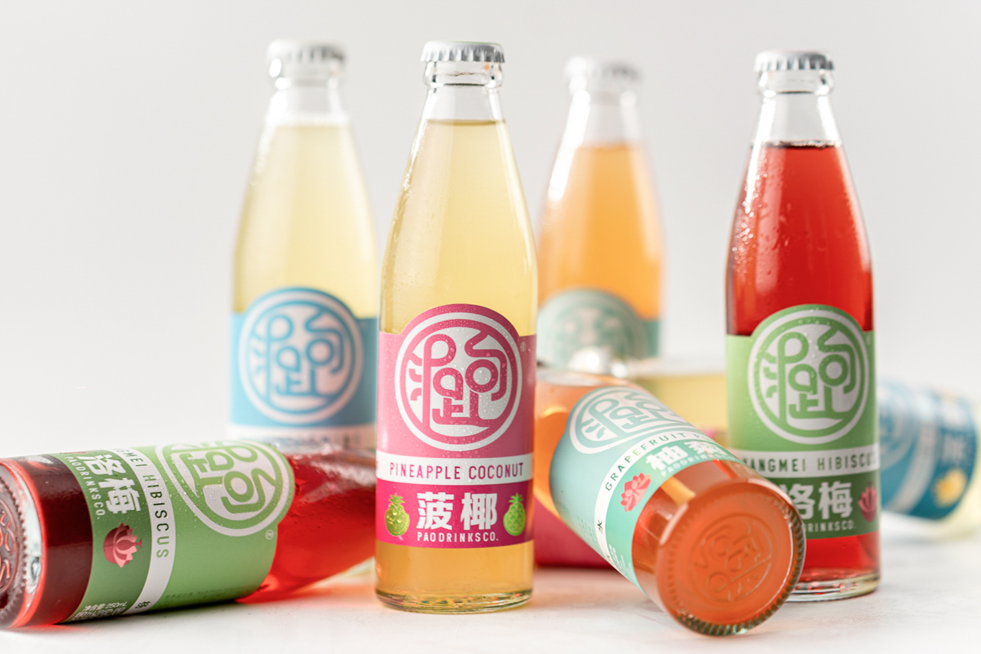
YANGMEI HIBISCUS / 洛梅
Made with Zhejiang yangmei & Yunnan hibiscus
Tart, fruity, & tangy / 由浙江杨梅与云南玫瑰茄茶制作,浓郁酸果味道
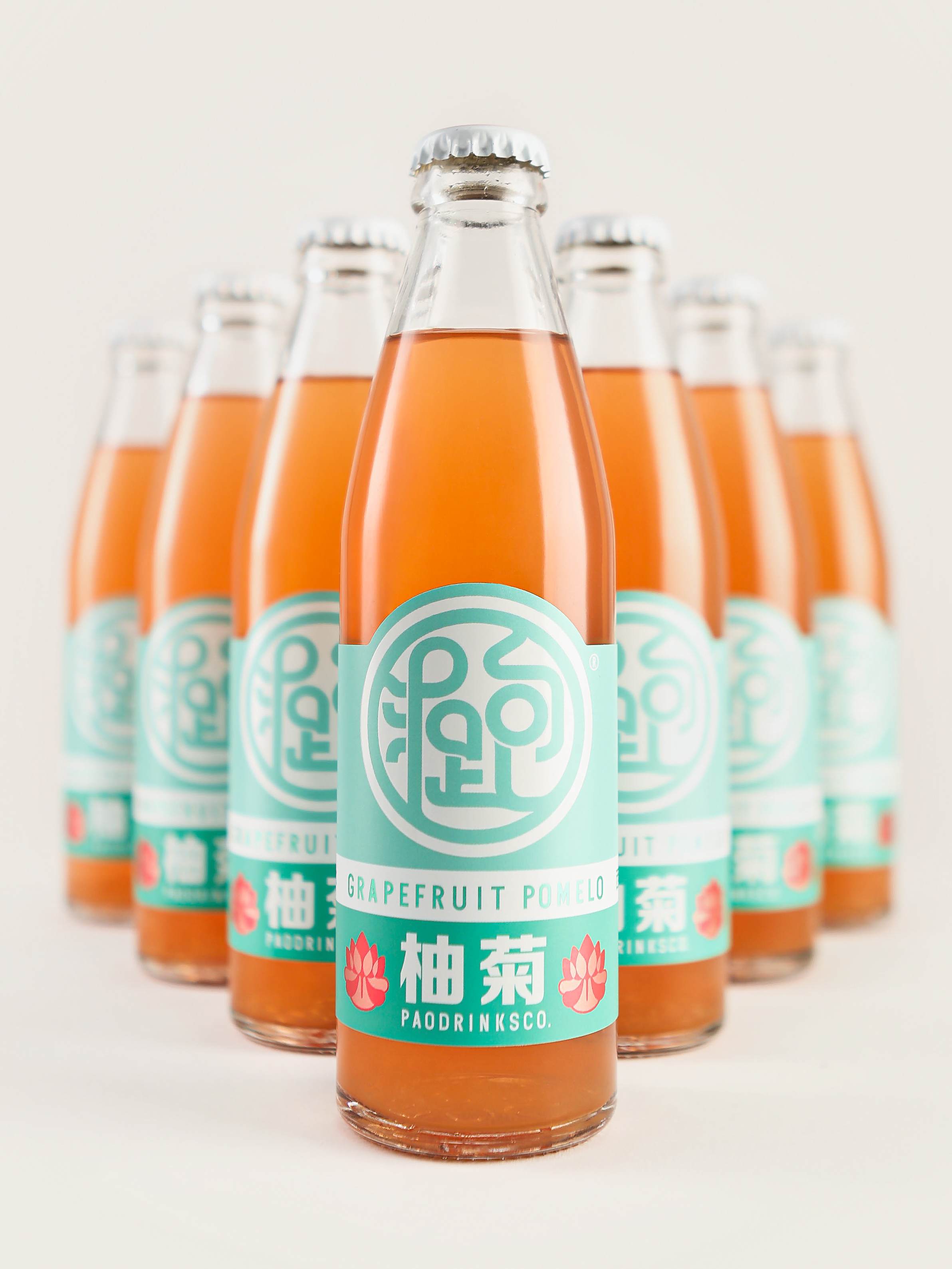
GRAPEFRUIT POMELO / 柚菊
Made with Fujian grapefruits & Yunnan Chrysanthemum
Juicy, dry, & bittersweet / 由福建红西柚与云南菊花茶制作,味甘甜略带苦
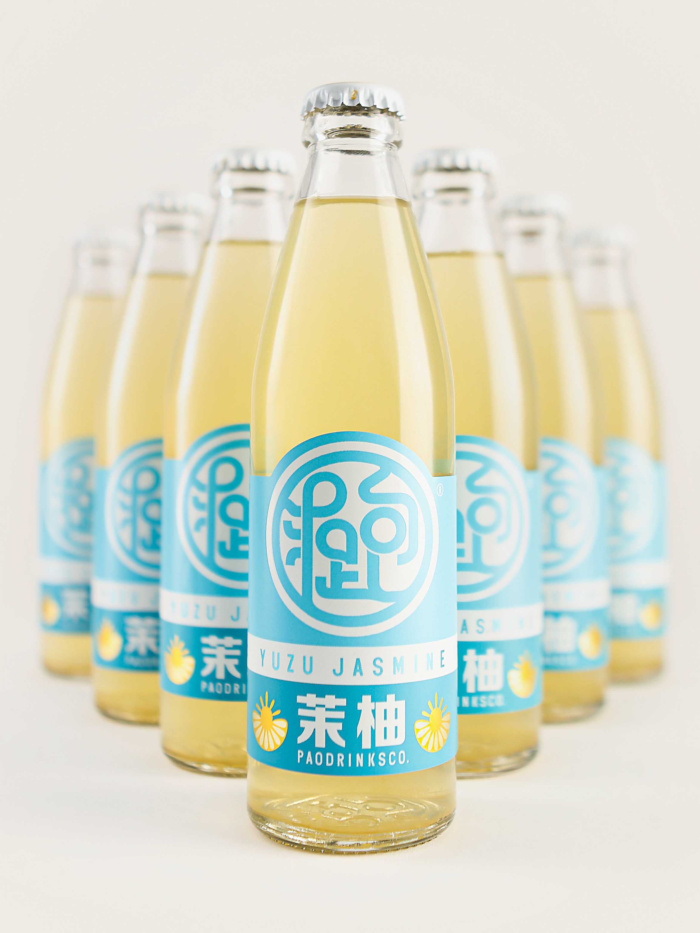
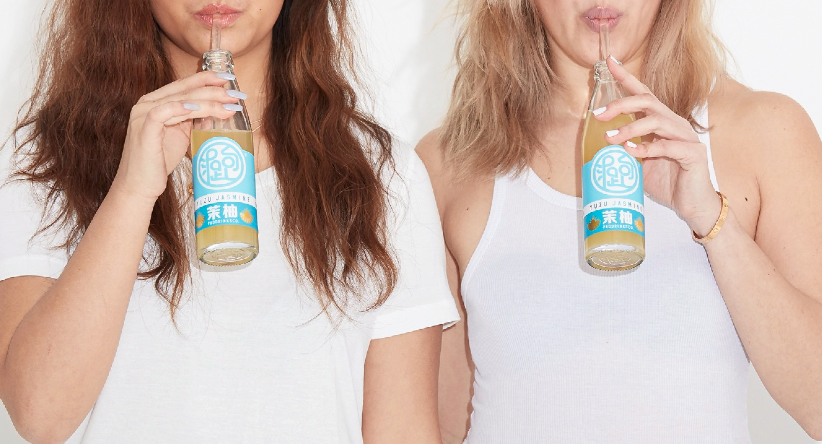
YUZU JASMINE / 茉柚
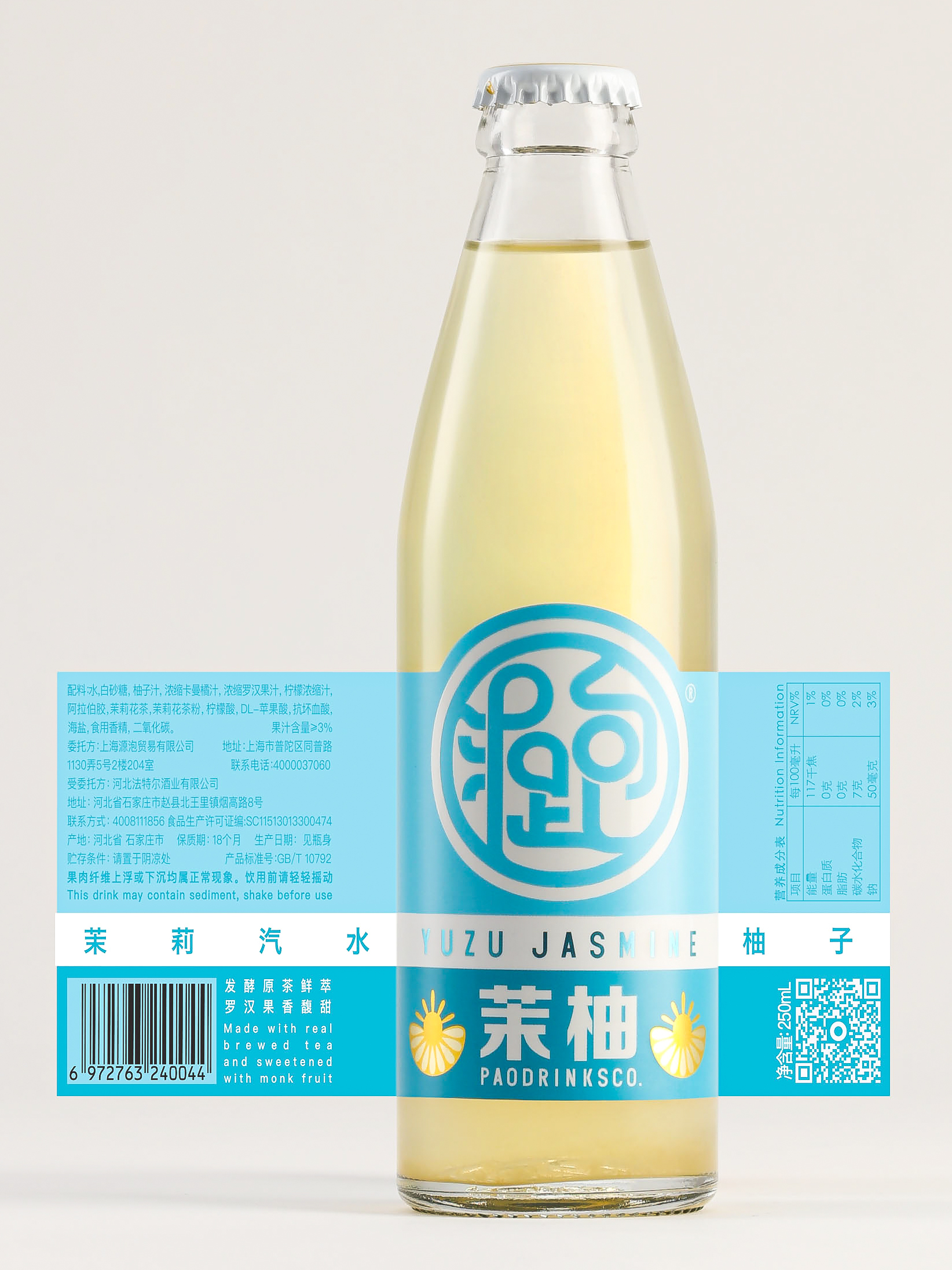
Made with Hunan yuzu & Huangshan jasmine tea
Zesty, dry, & fragrant / 由湖南柚子与黄山柚子茶制作,香味润口