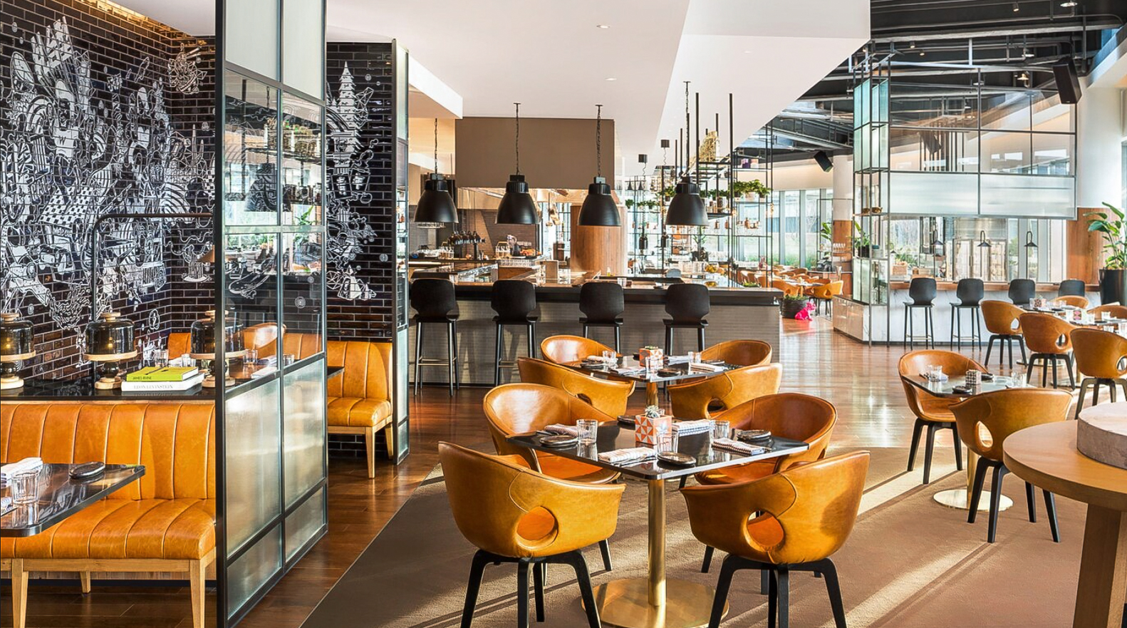
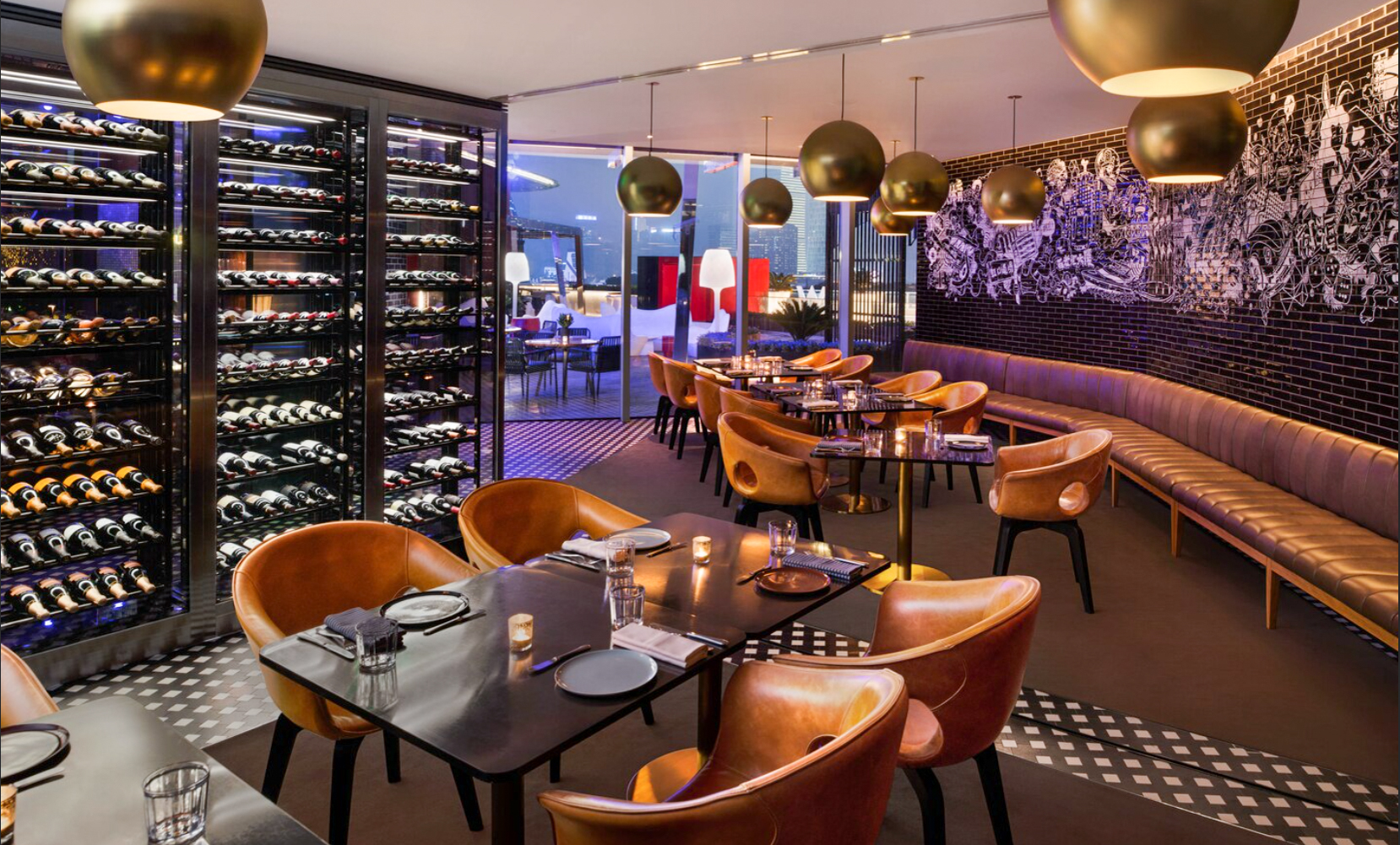
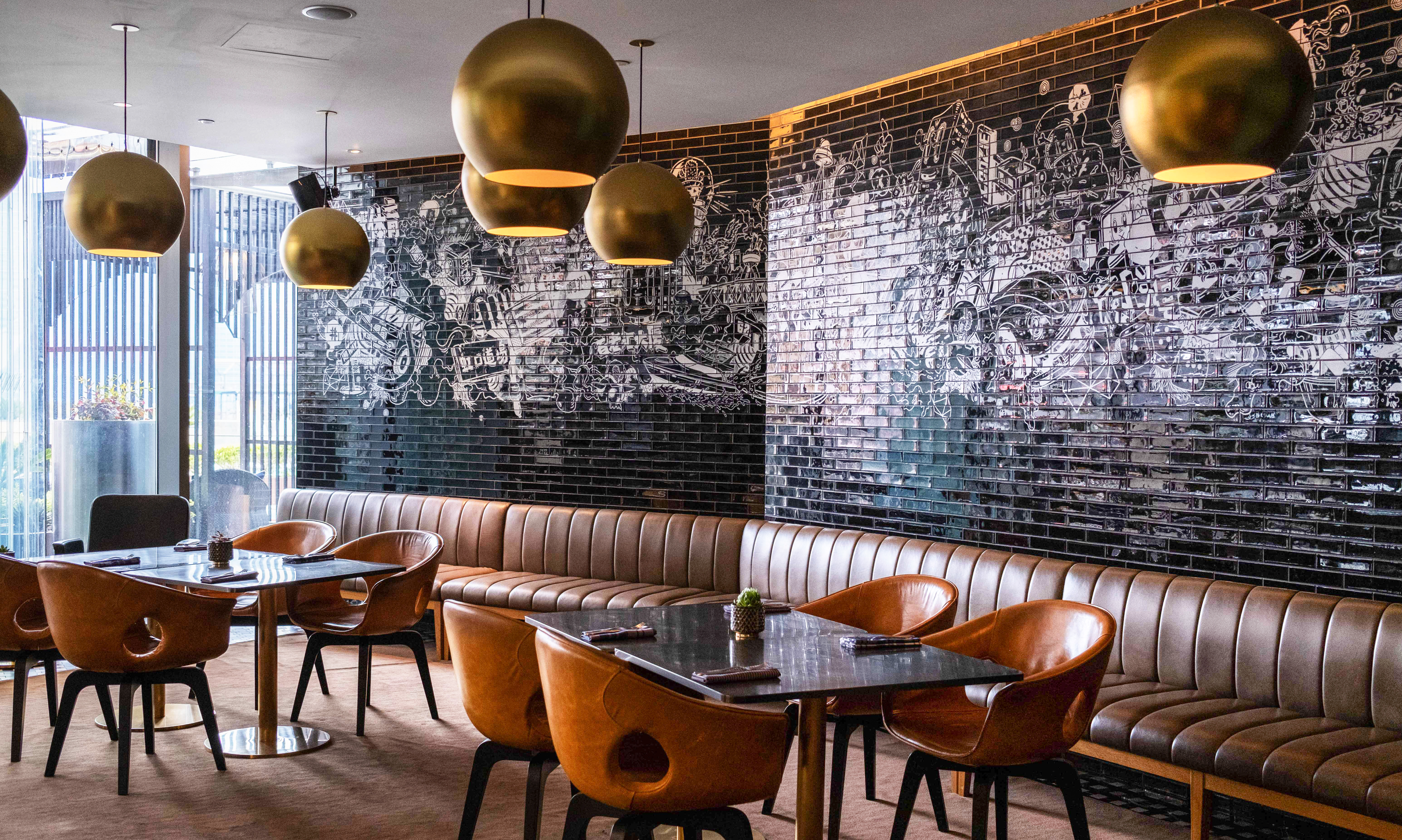
W Hotel Shanghai tapped us to create interior mural installations and artwork for its restaurant The Kitchen Table. Our task was to translate the essence of one of the world’s cultural capitals into a destination that is both hyper-local and yet distinctively “W.”
The W Shanghai hotel narrative theme, “Captivating Contrasts,” was influenced by the uniquely Shanghainese culture of haipai, which embraces both traditional Chinese culture and Western culture. Layering vibrant interpretations of historical, physical, and social context into the fabric of the hotel’s experience enables The W to at once draw upon and give back to the city.
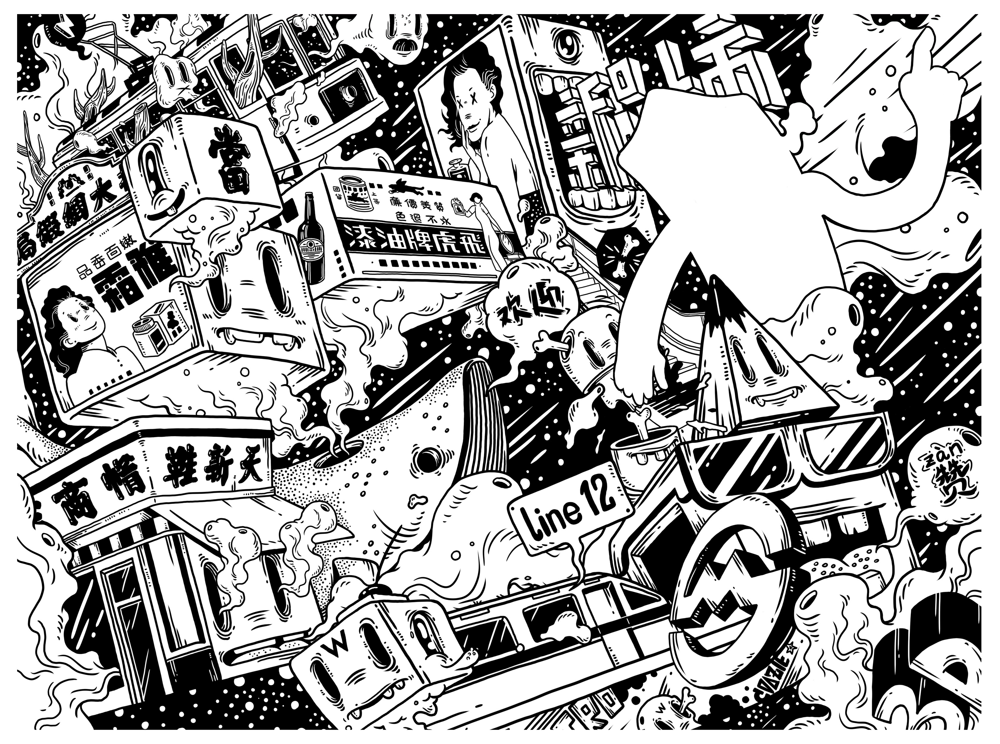
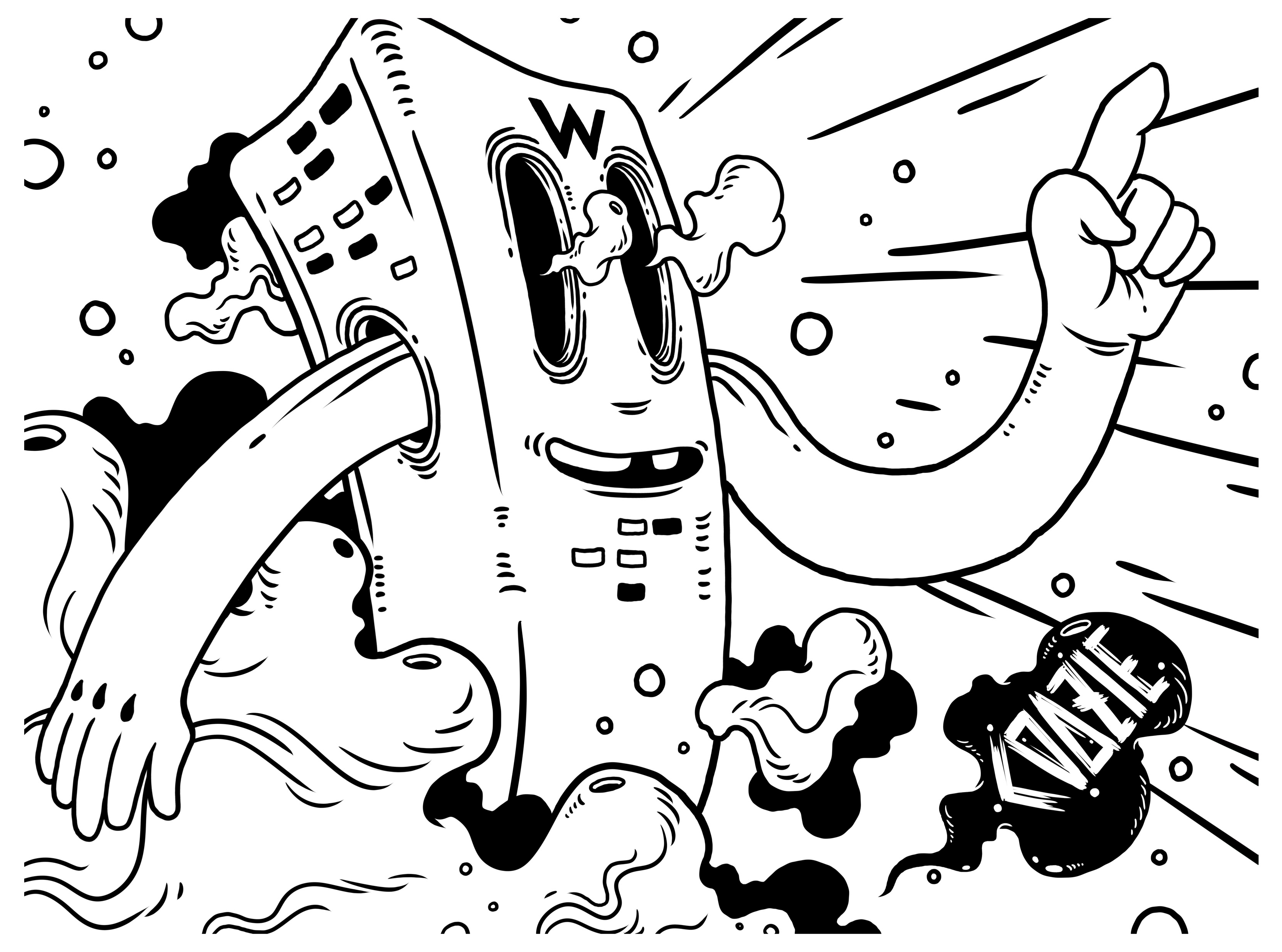
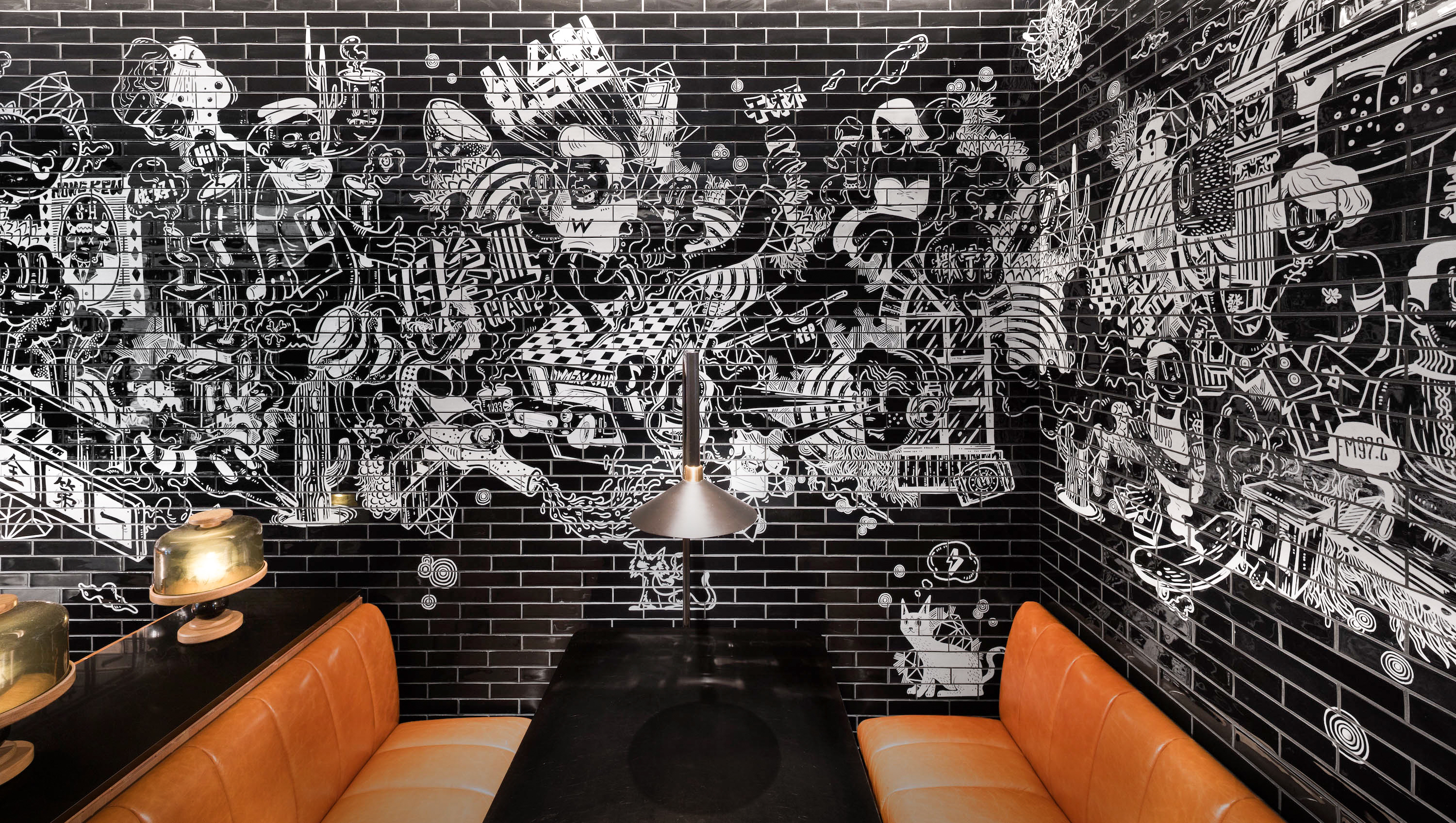
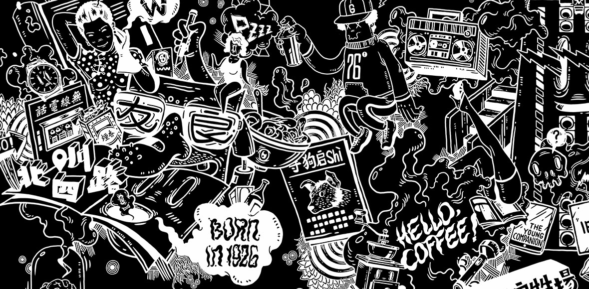
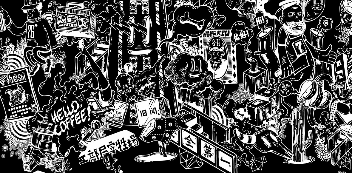
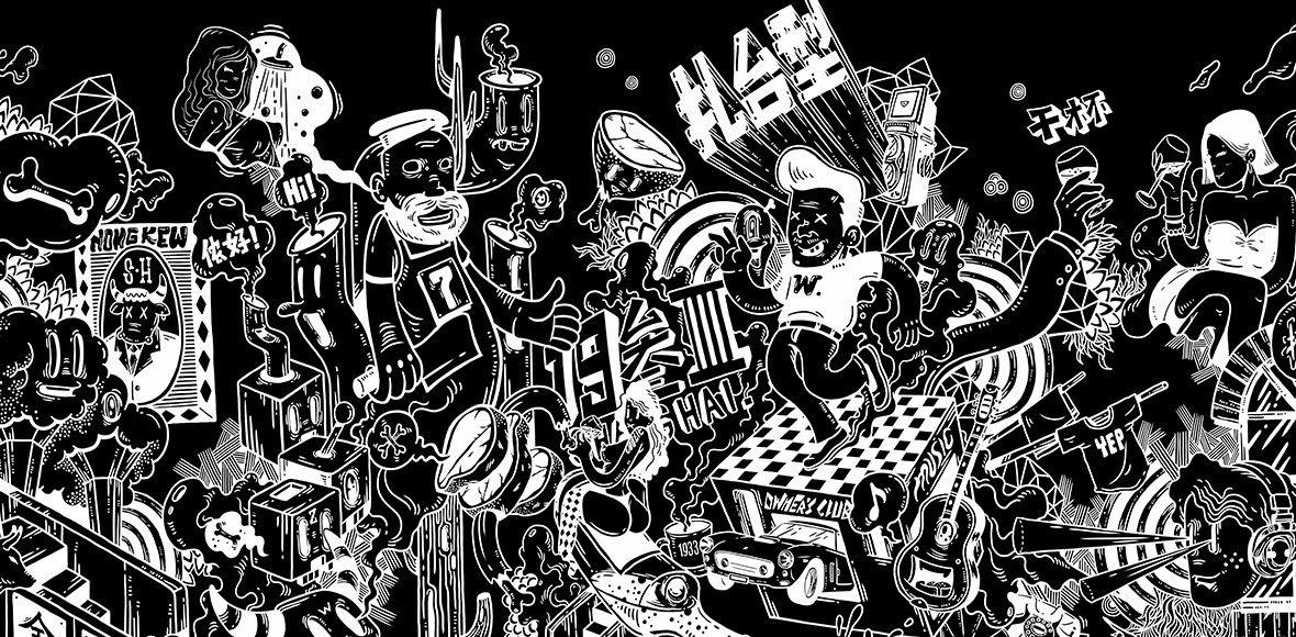
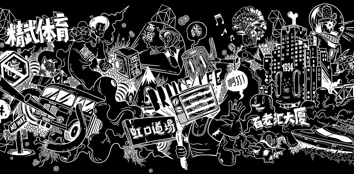
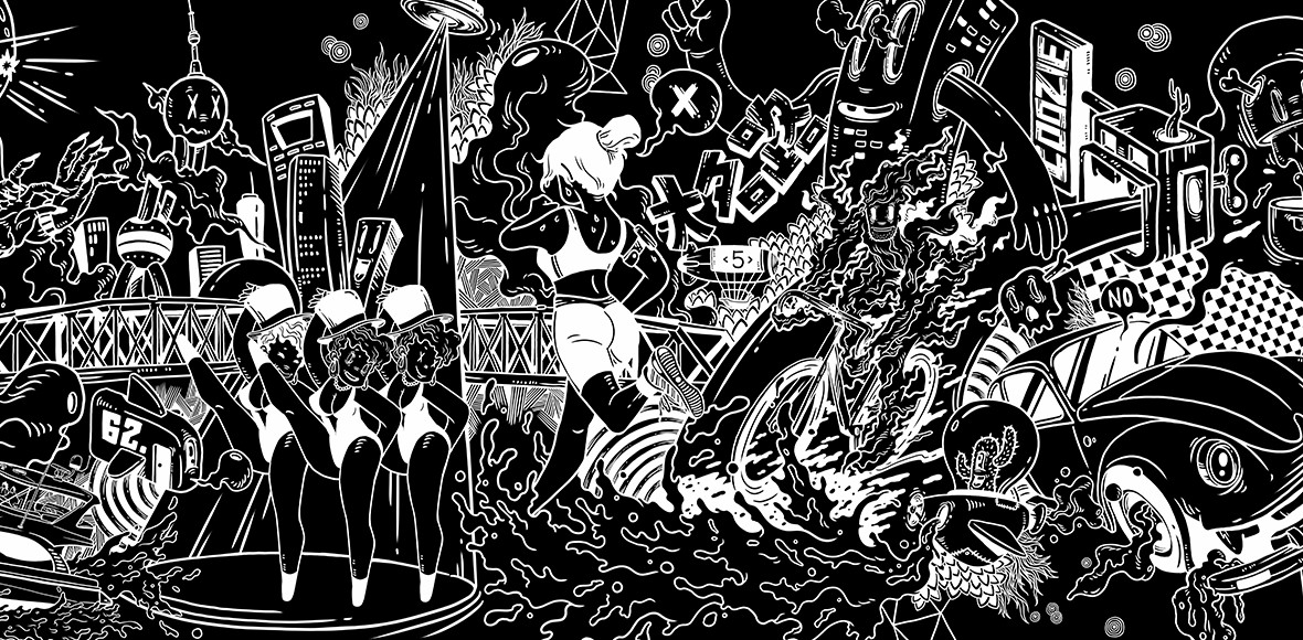
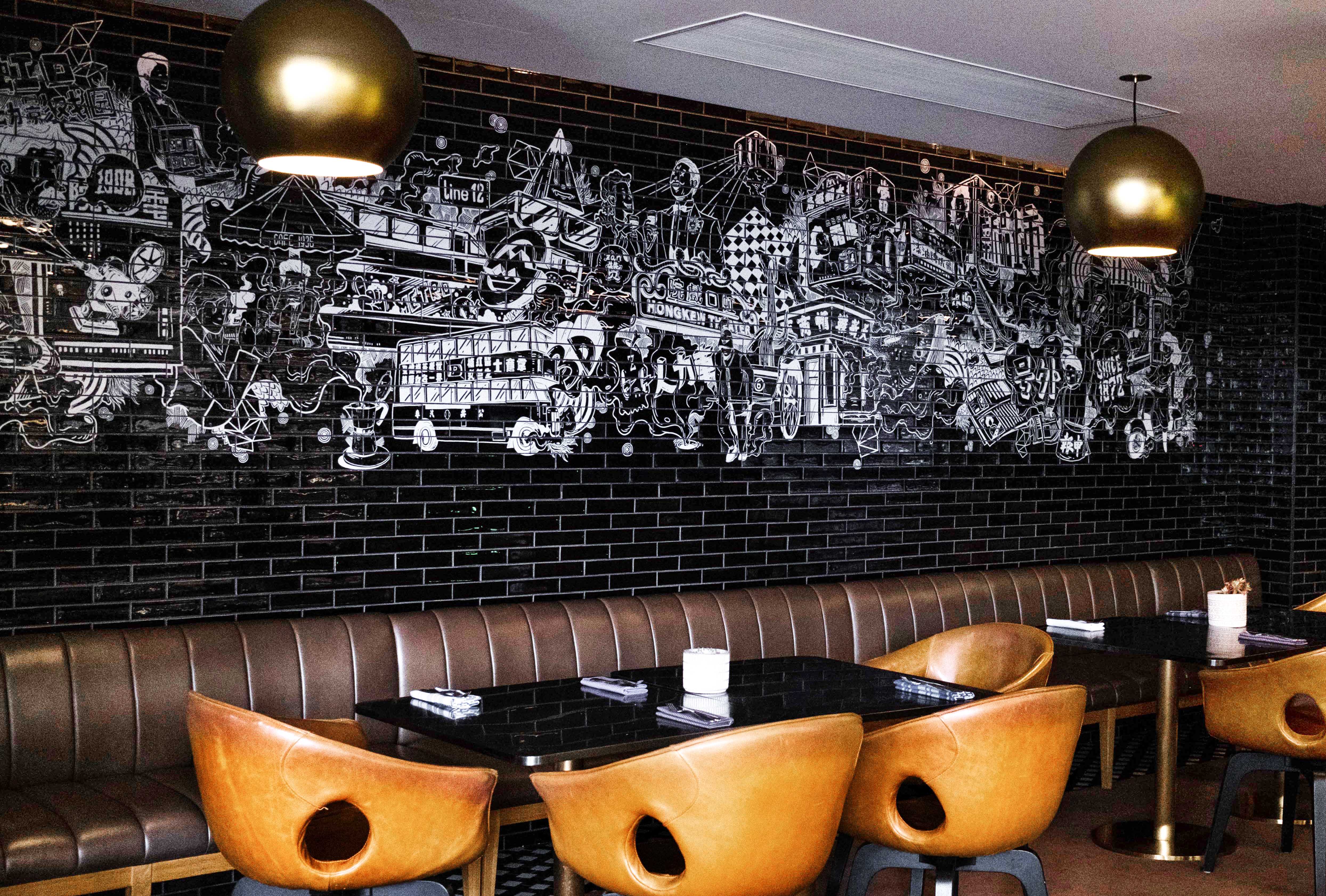
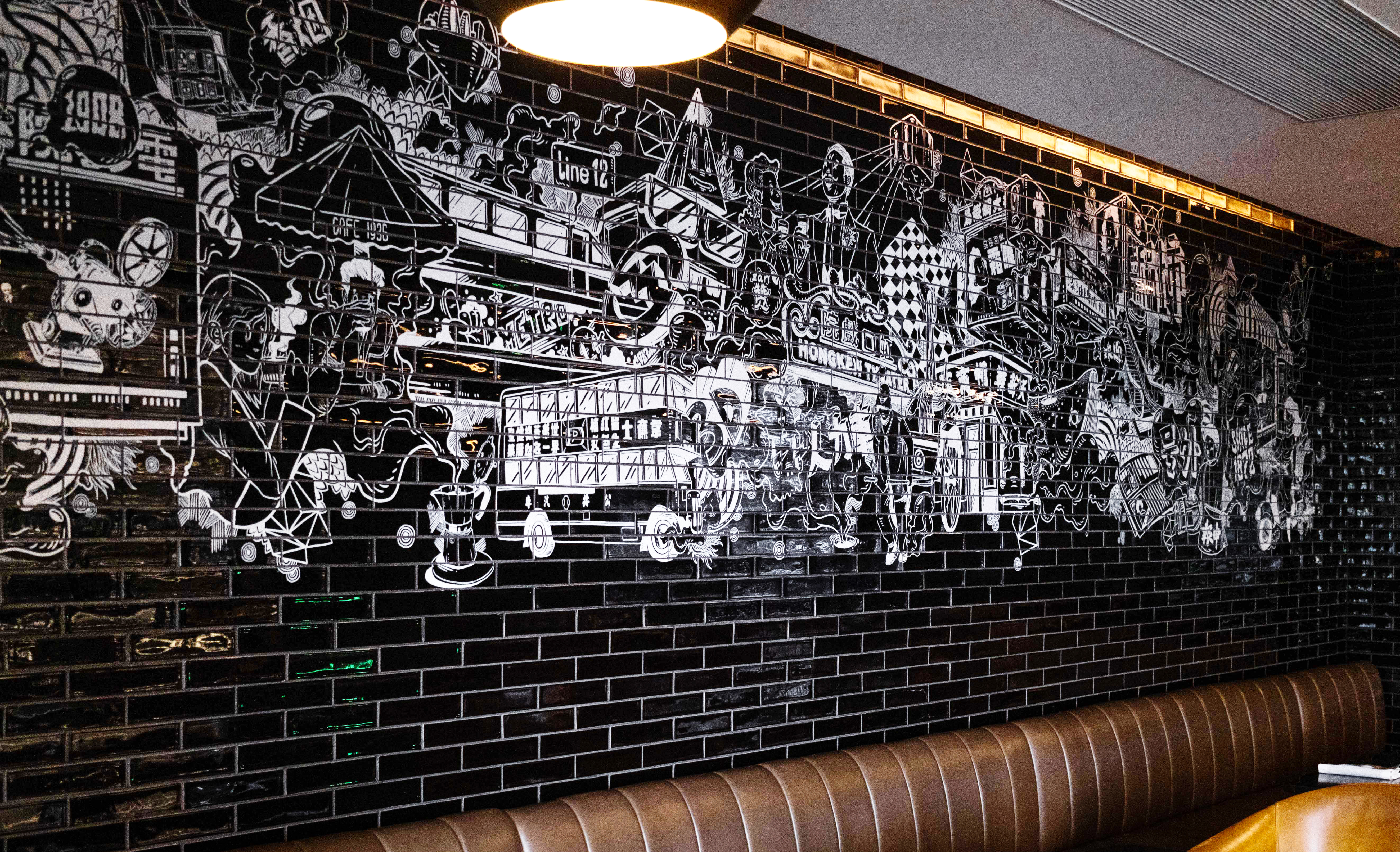
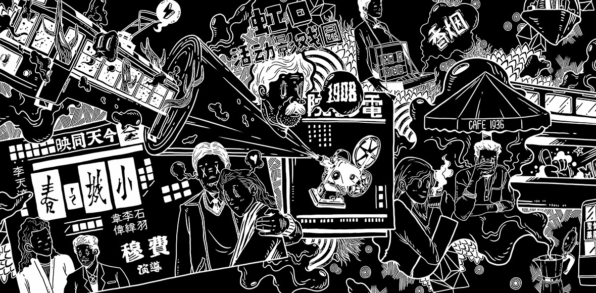
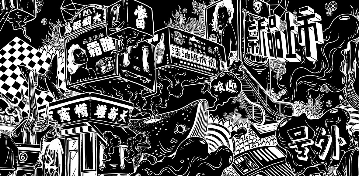
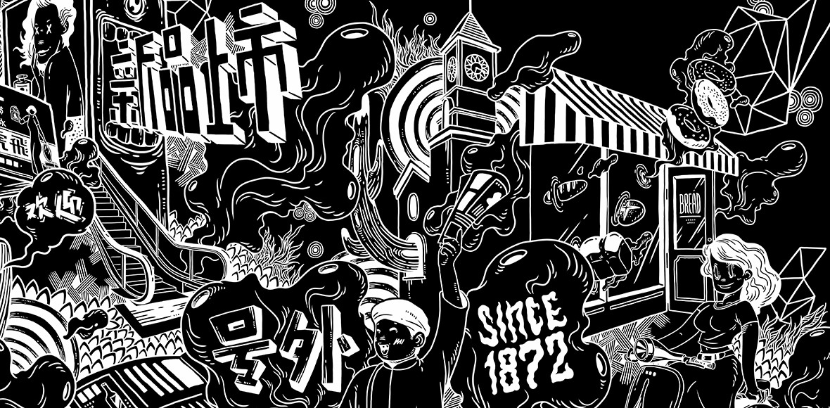
Within this context, we created a multi-wall “narrative” mural installed on handmade tiles titled Hongkou Tales. Storytelling within the three-part illustrative collage celebrates the culture, history, and legends of the past 110 years of Hongkou District, where the hotel is located. The artwork also works to interpret the collision between the East and Western culture, creating a passionate journey through time and space.
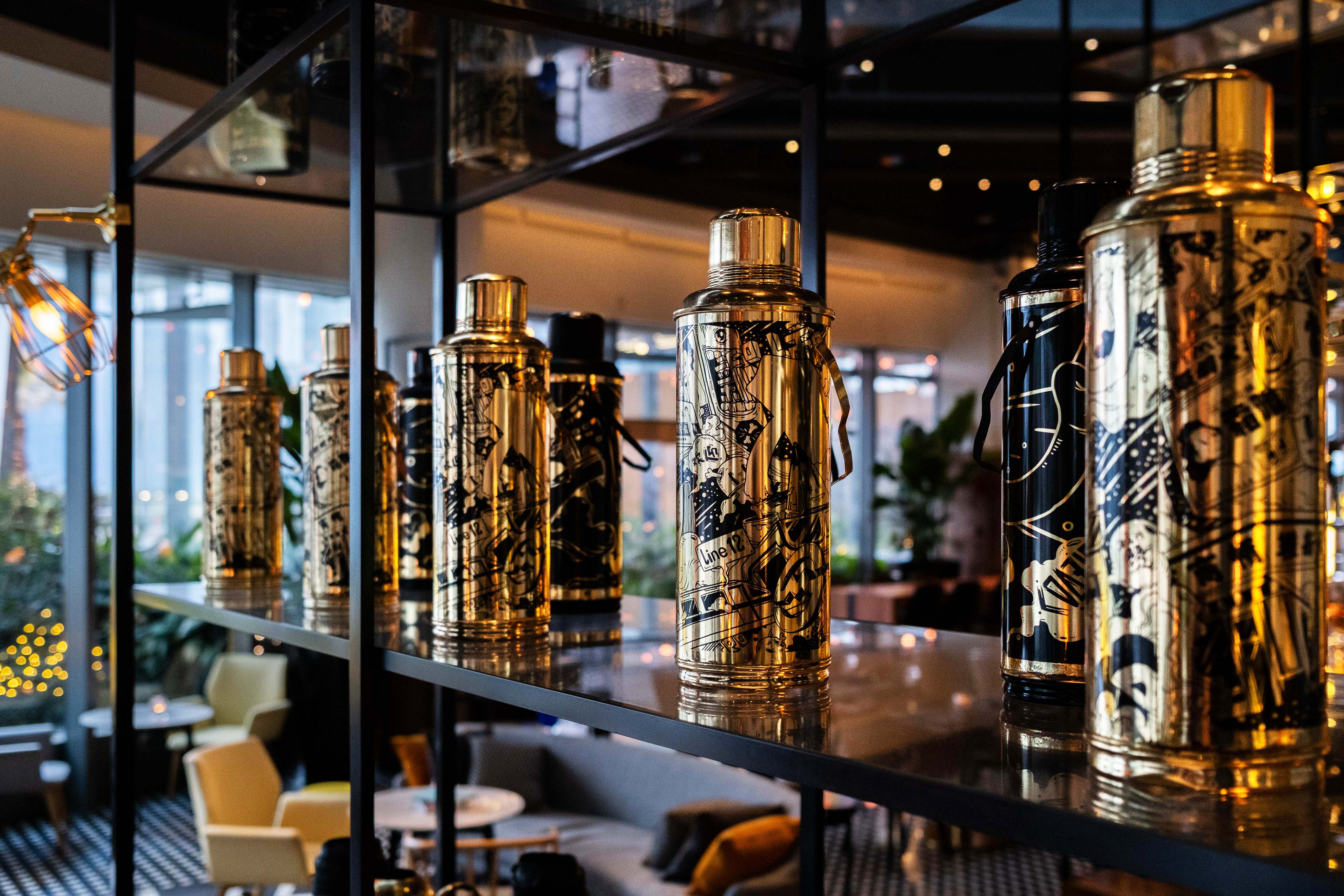
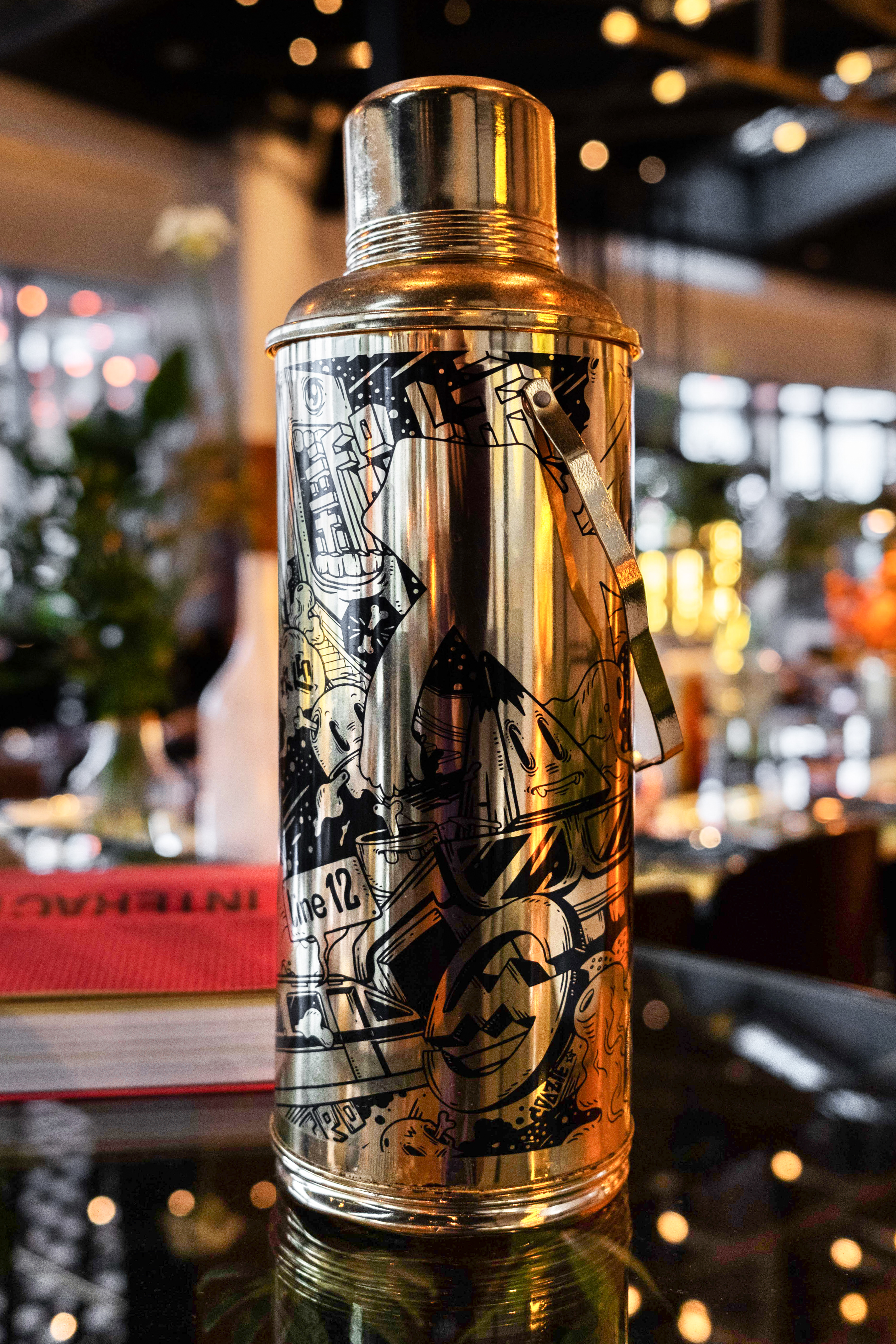
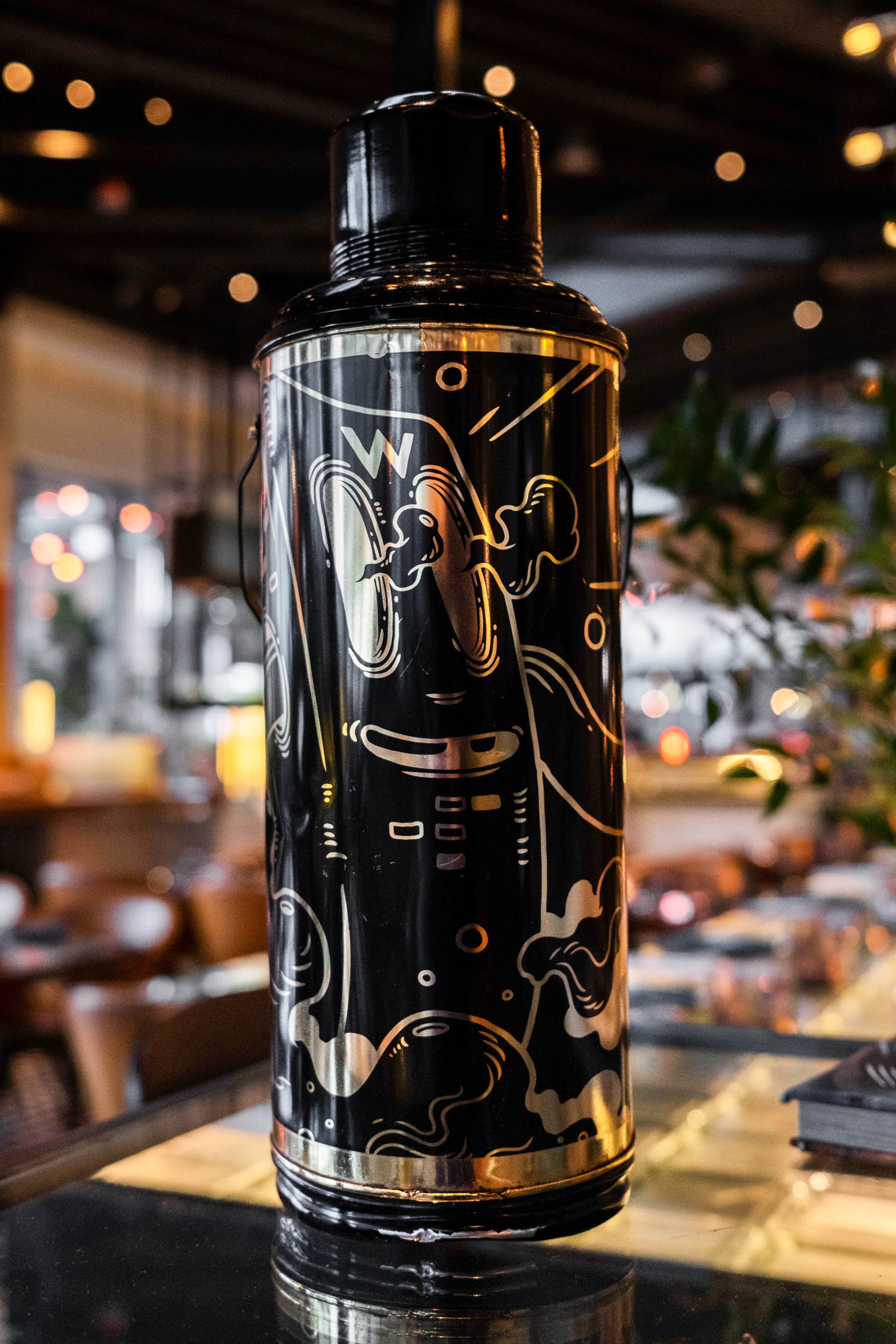
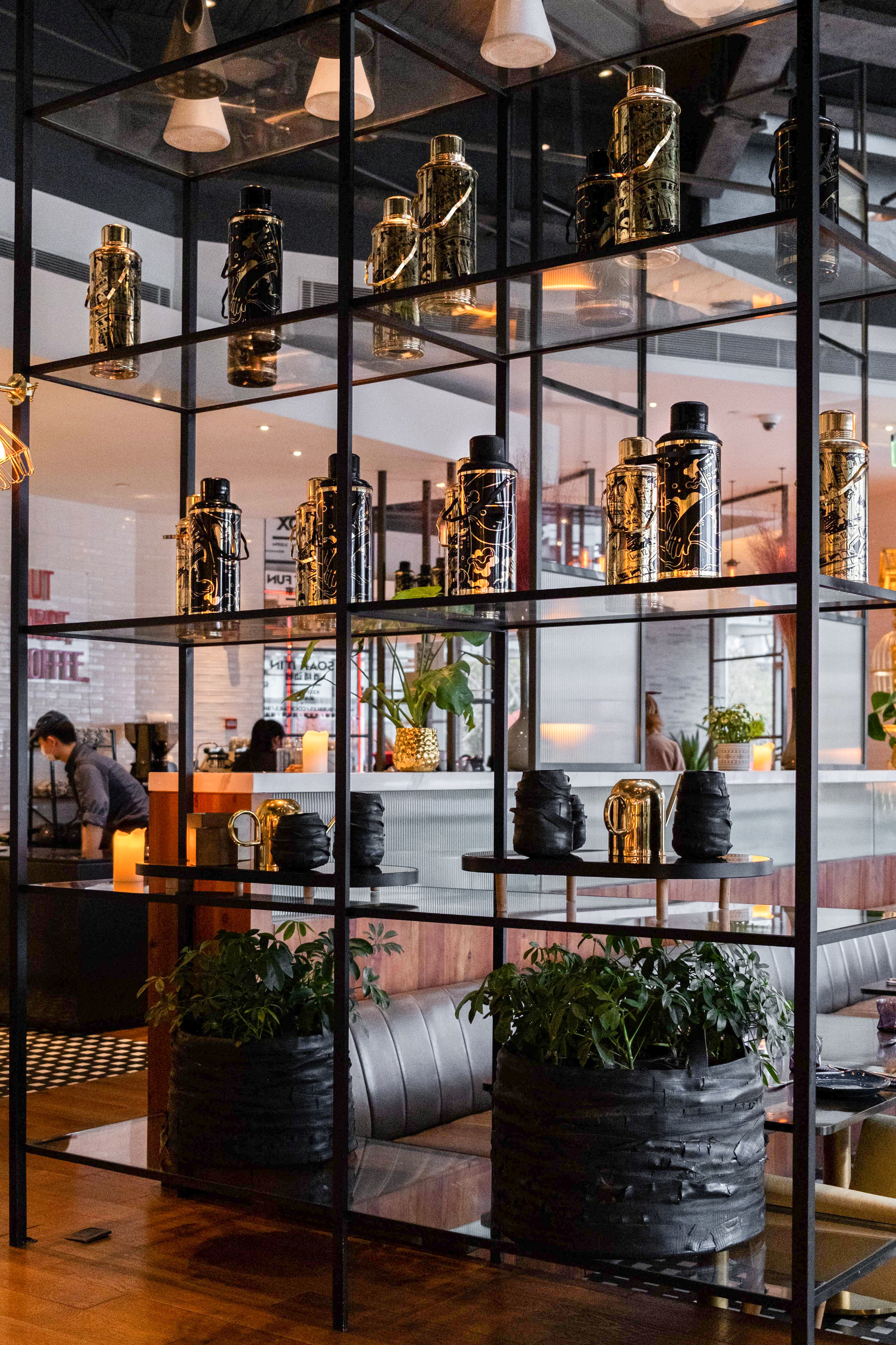
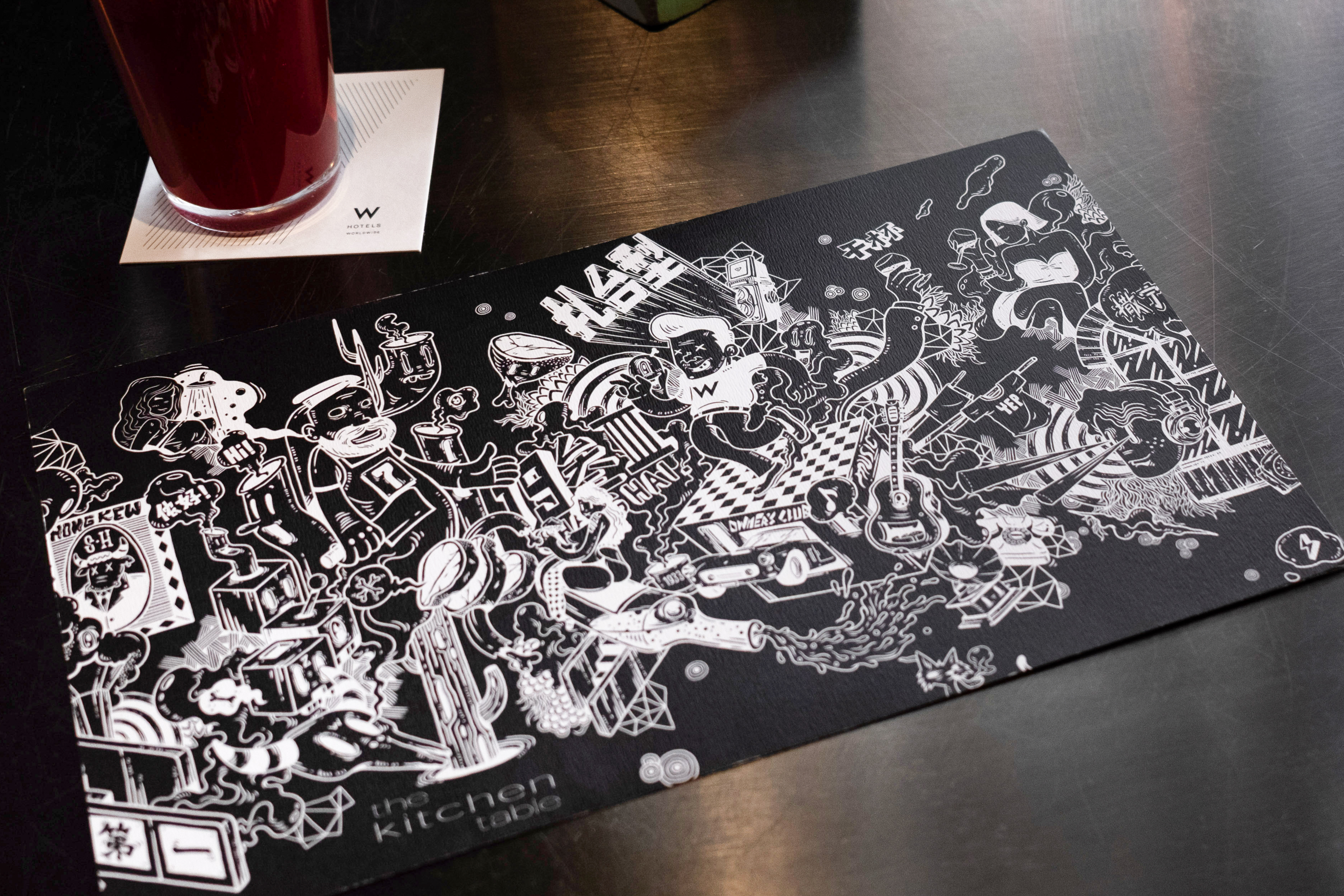
Further, we created visual touch points throughout the restaurant that linked to key elements and characters from the murals, via cocktail shakers, traditional Chinese thermos, table placemats, etc.
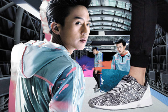
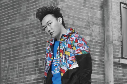
We collaborated with renowned Shanghainese artist Coozie to bring alive the final illustrative treatment.
上海W酒店委任我们为其餐厅The Kitchen Table 创作室内壁画及艺术装置。我们创意重点是要将这座世界文化之都的精髓以本土化的方式进行处理并保留“W”的独特品牌理念。
本次上海W酒店的故事主题为 “迷人反差”,该主题受上海独特的海派文化所影响,充分融合中国传统文化和西方文化。将历史、自然和社会背景的生动诠释分布到酒店的每一层体验的结构中,使W能够回归城市。
基于上述主题,我们创作了一幅名为“虹口故事”的叙事长壁画。故事分为三部分,分别以插图拼贴形式讲述了酒店所在虹口区过去 110 年的文化、历史和传说。作品还诠释了东西方文化的碰撞,创造一场穿越时空的激情之旅。
此外,我们将主要元素贯穿于整个餐厅的各个细节,比如鸡尾酒调酒瓶、保温瓶、餐桌垫等,这些都与壁画人物紧密联系,以增加代入感。
我们与上海知名艺术家 Coozie 合作,力求创作出一副栩栩如生的海派故事。
HONGKOU TALES – WALL 1

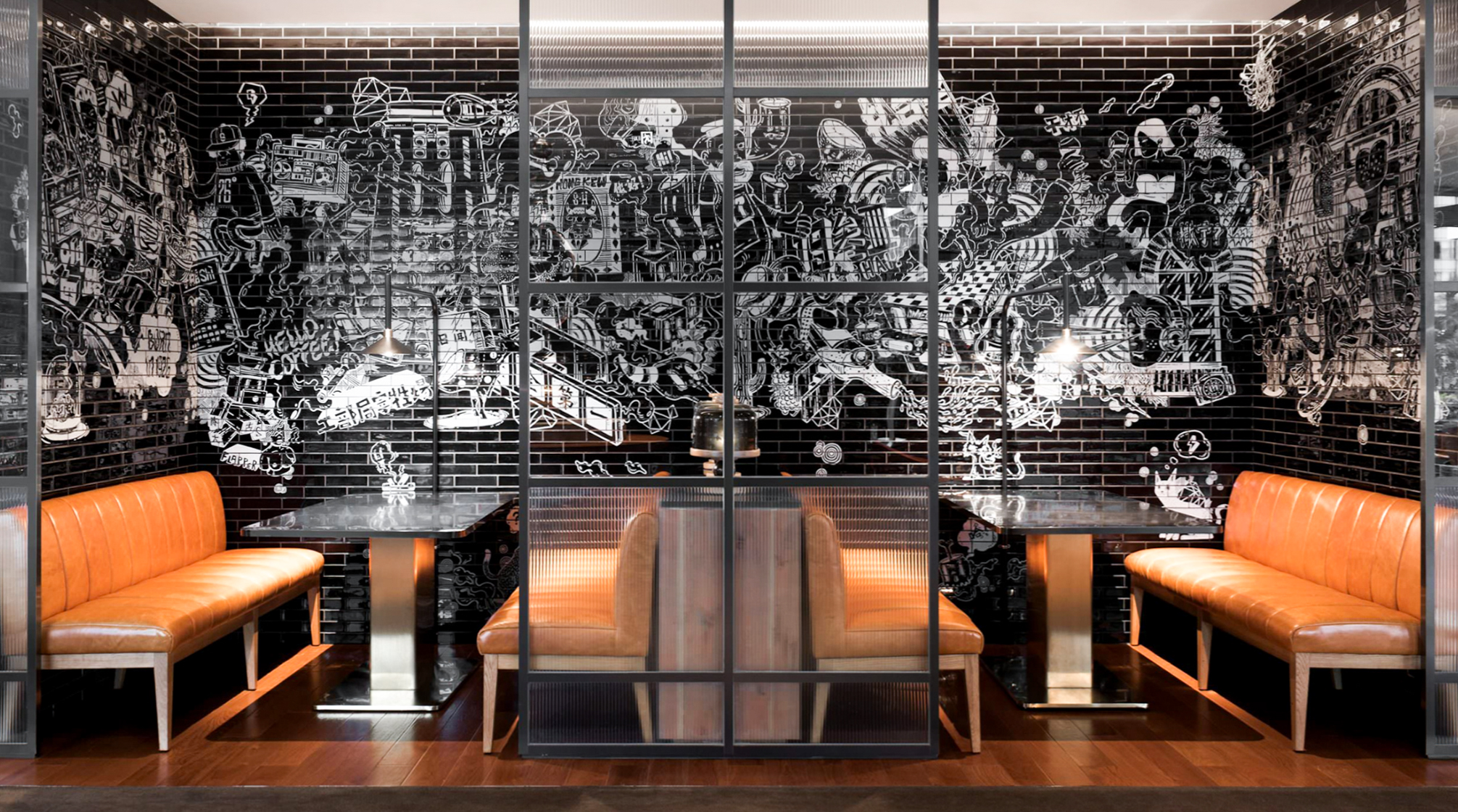

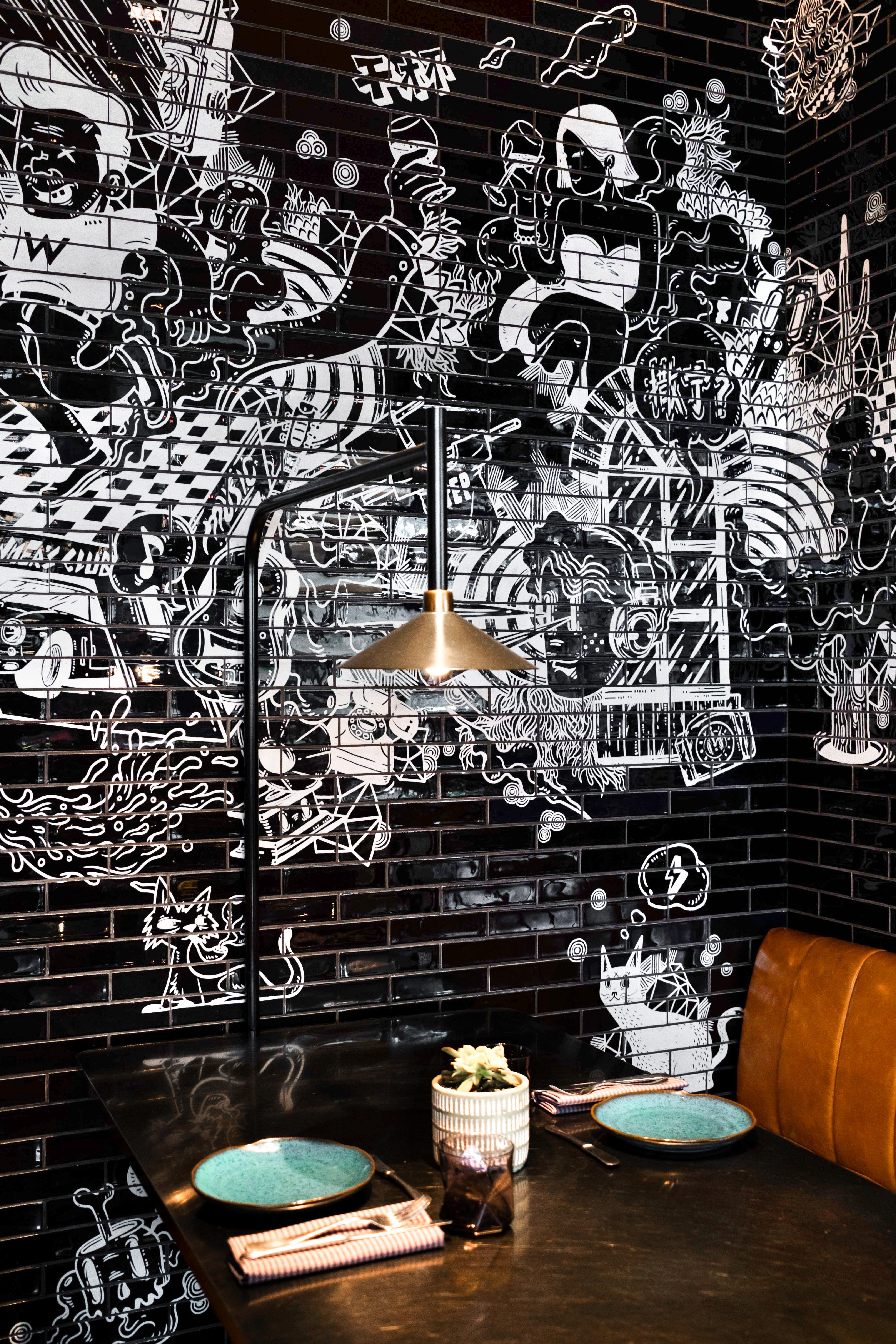
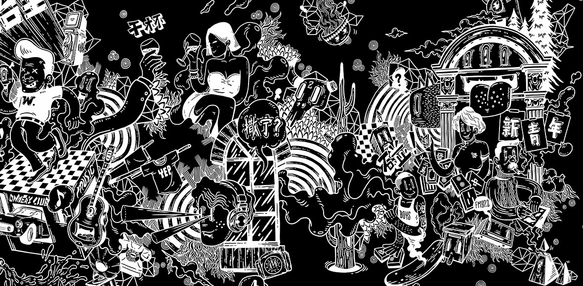
HONGKOU TALES – WALL 2

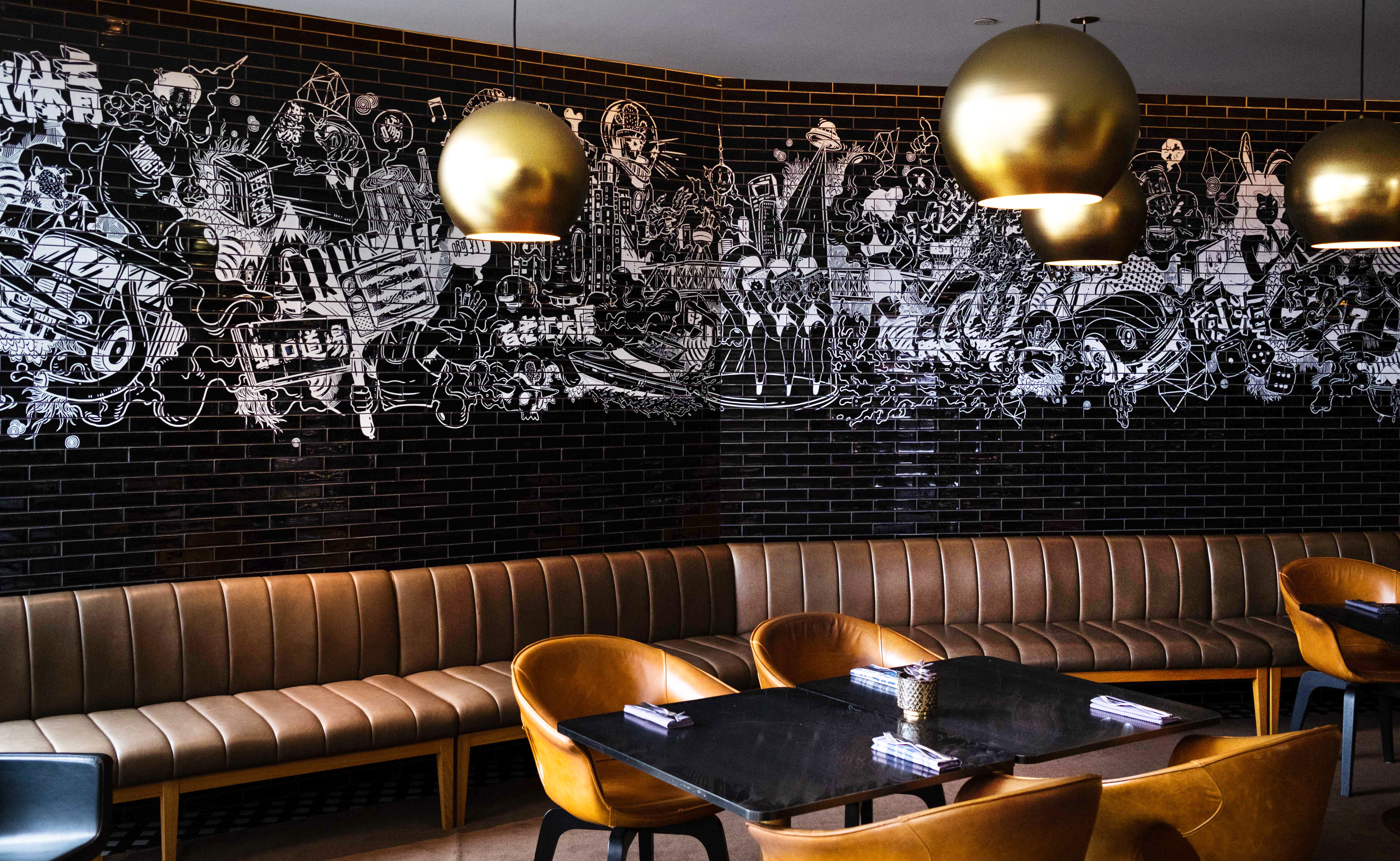

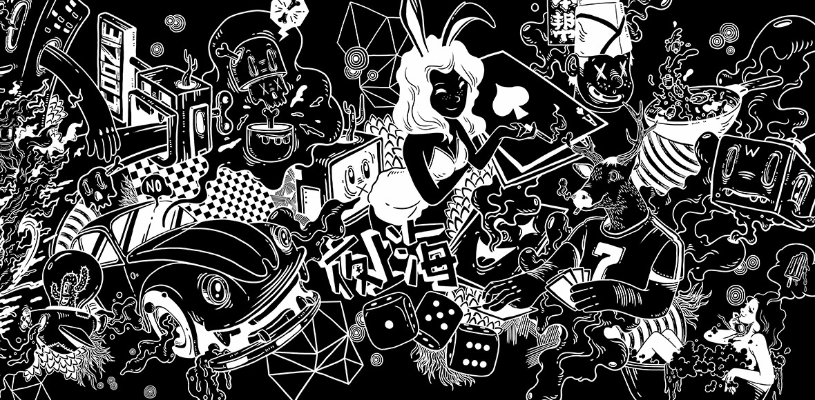
HONGKOU TALES – WALL 3


HOT FLASKS, COCKTAIL SHAKERS & PLACEMATS