Think of your daily commute – that twice a day round trip bringing you from point A to point B on the road (nearly) always travelled. For the vast majority of big city dwellers, public transport is not only a thrifty choice, but also one of convenience and efficiency; in a city populated by the millions, traffic can be time crippling. This journey has become one of our most consistent daily rituals – it’s almost like our bodies become systematically aware of when to alight and the number of minutes it takes to walk through an interchange. Seoul-based Art Director Kim Ji-Hwan of ZERO PER ZERO design studio, describes subway systems as the “bloodline” of each city – the crux that seamlessly links people and places together.
매일 반복되는 출퇴근을 생각해보자. A 지점에서 B 지점까지 길을 따라 (거의) 항상 여행하듯 매일 왕복한다. 대부분의 대도시 거주자들에게 대중 교통이란 단순히 저렴할 뿐만 아니라 편리하고 효율적이기도 한 교통수단이다. 따라서 대중 교통을 이용한 여정은 이제 우리 삶의 일상적인 의식 중의 하나가 되어버렸다 – 우리의 몸은 거의 조직적으로 어디에서 하차해야 할 지 그리고 인터체인지를 걸어 나가는데 몇분이나 걸릴 지 이미 아는 듯하다. 서울에 소재한 제로퍼제로 디자인 스튜디오의 김지완 아트 디렉터는 도시의 지하철 시스템을 도시의 “혈관” – 사람들과 장소를 매끄럽게 연결하는 중심점 – 이라고 부른다.
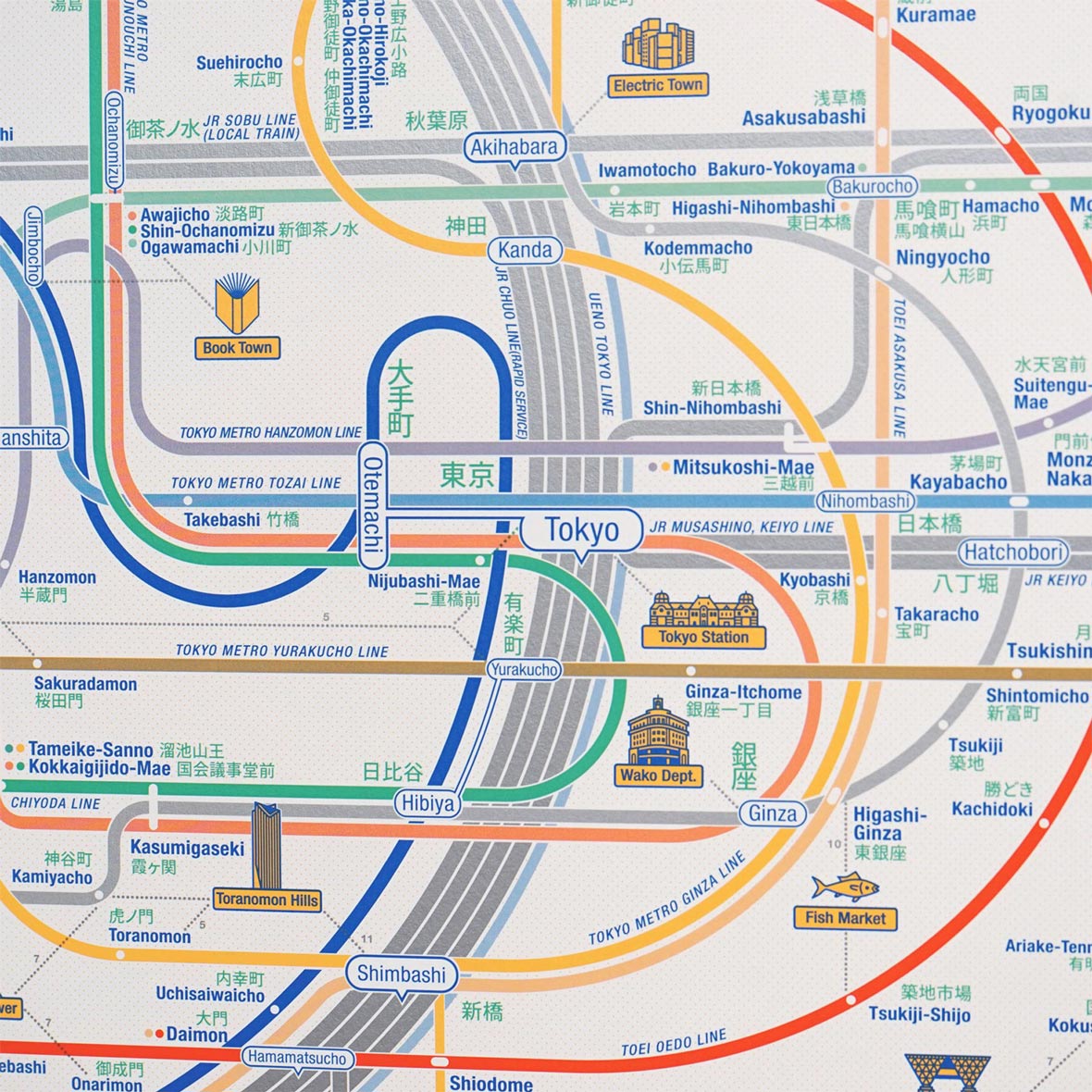
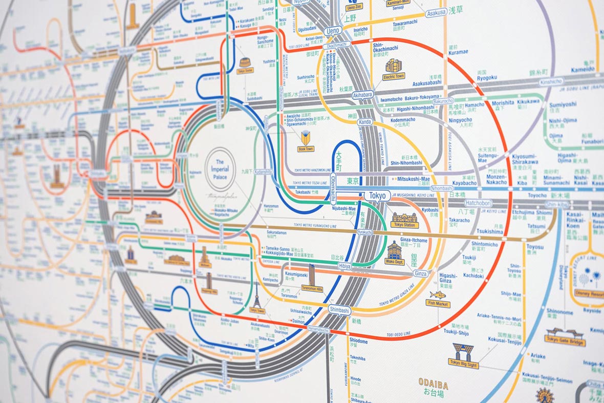
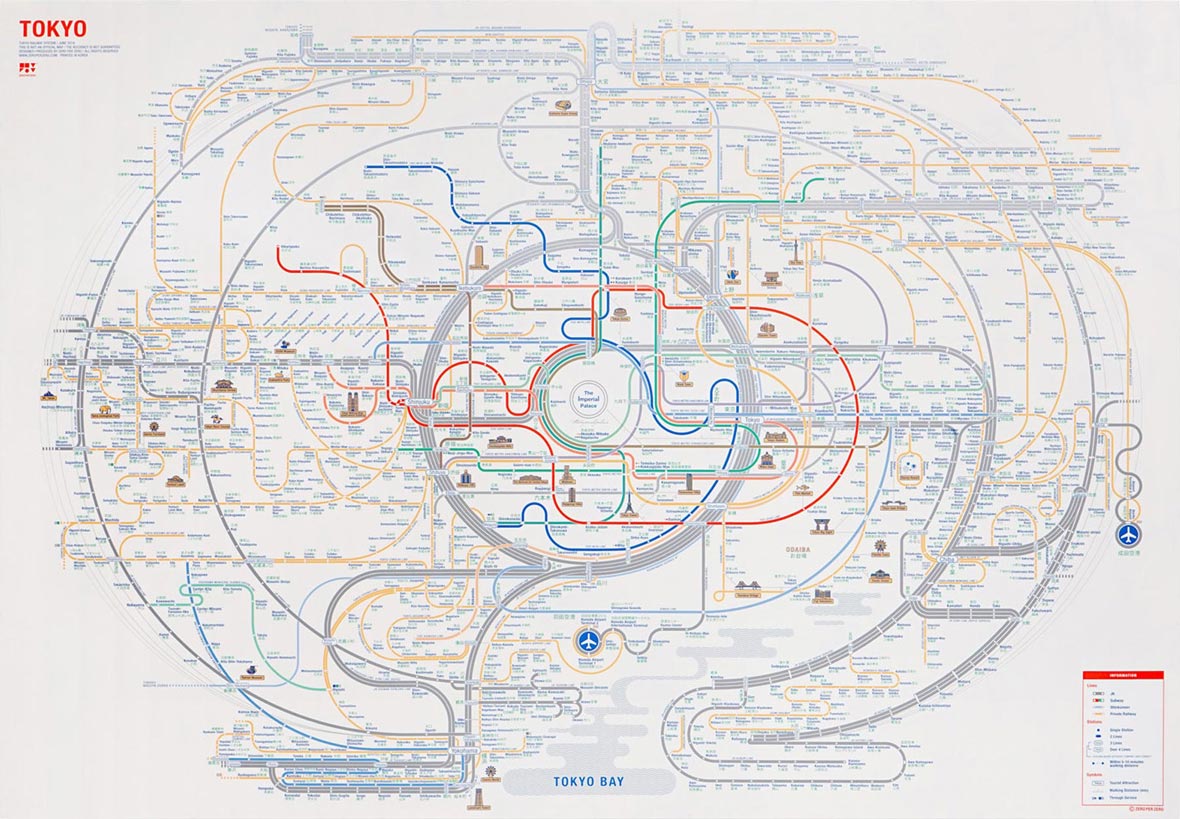
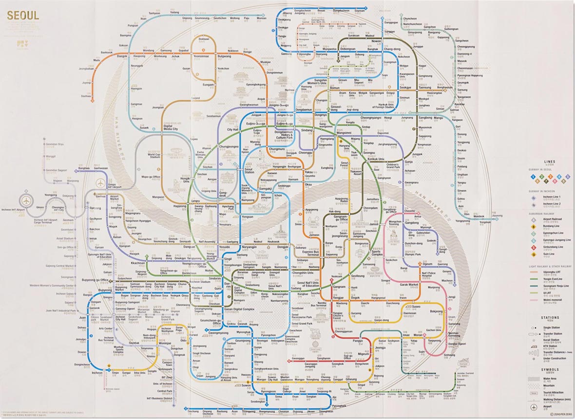
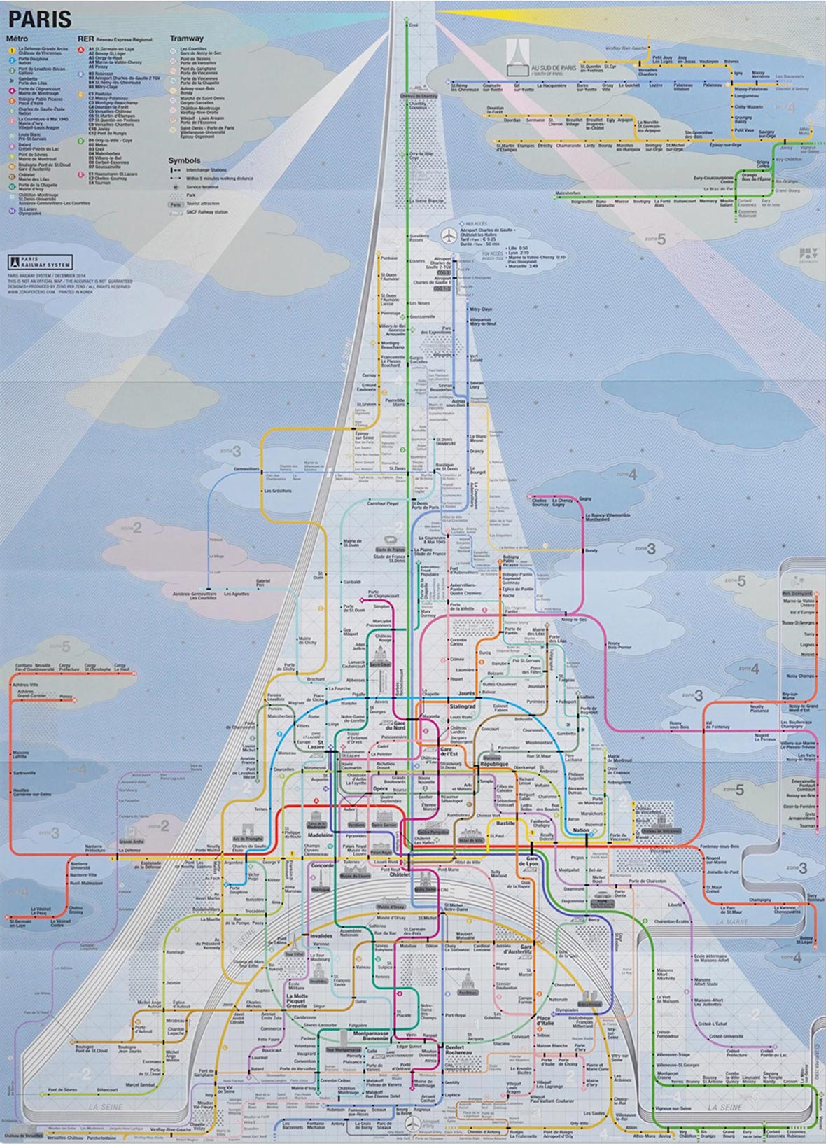
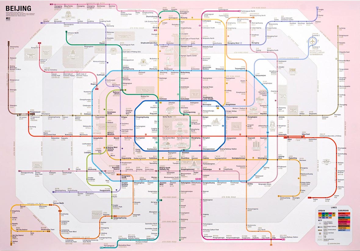
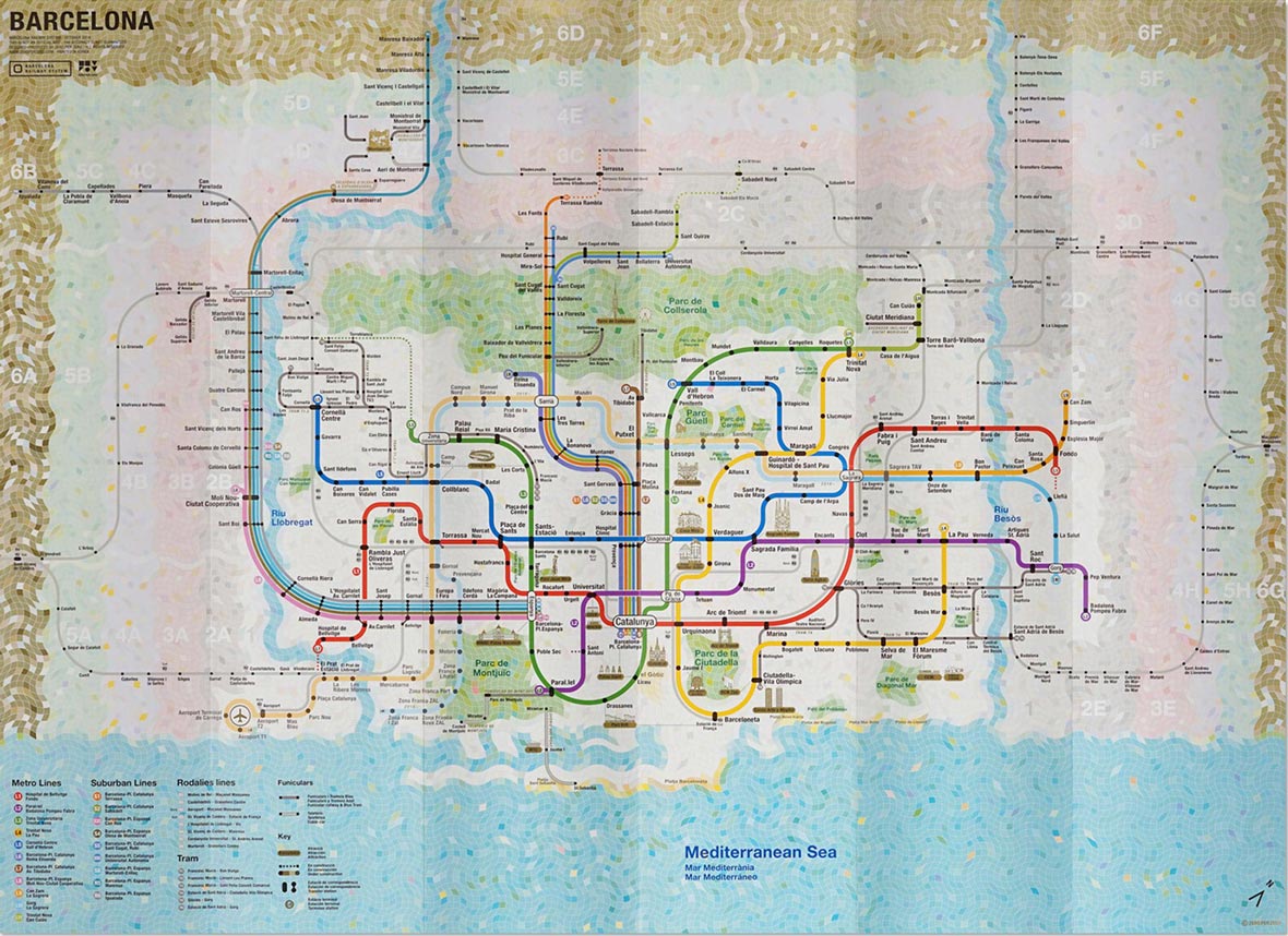
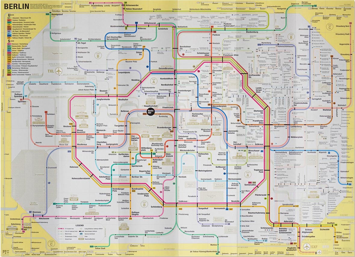
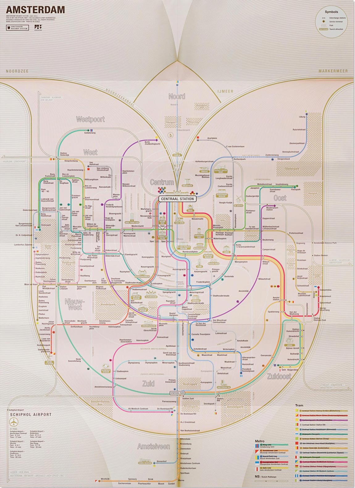
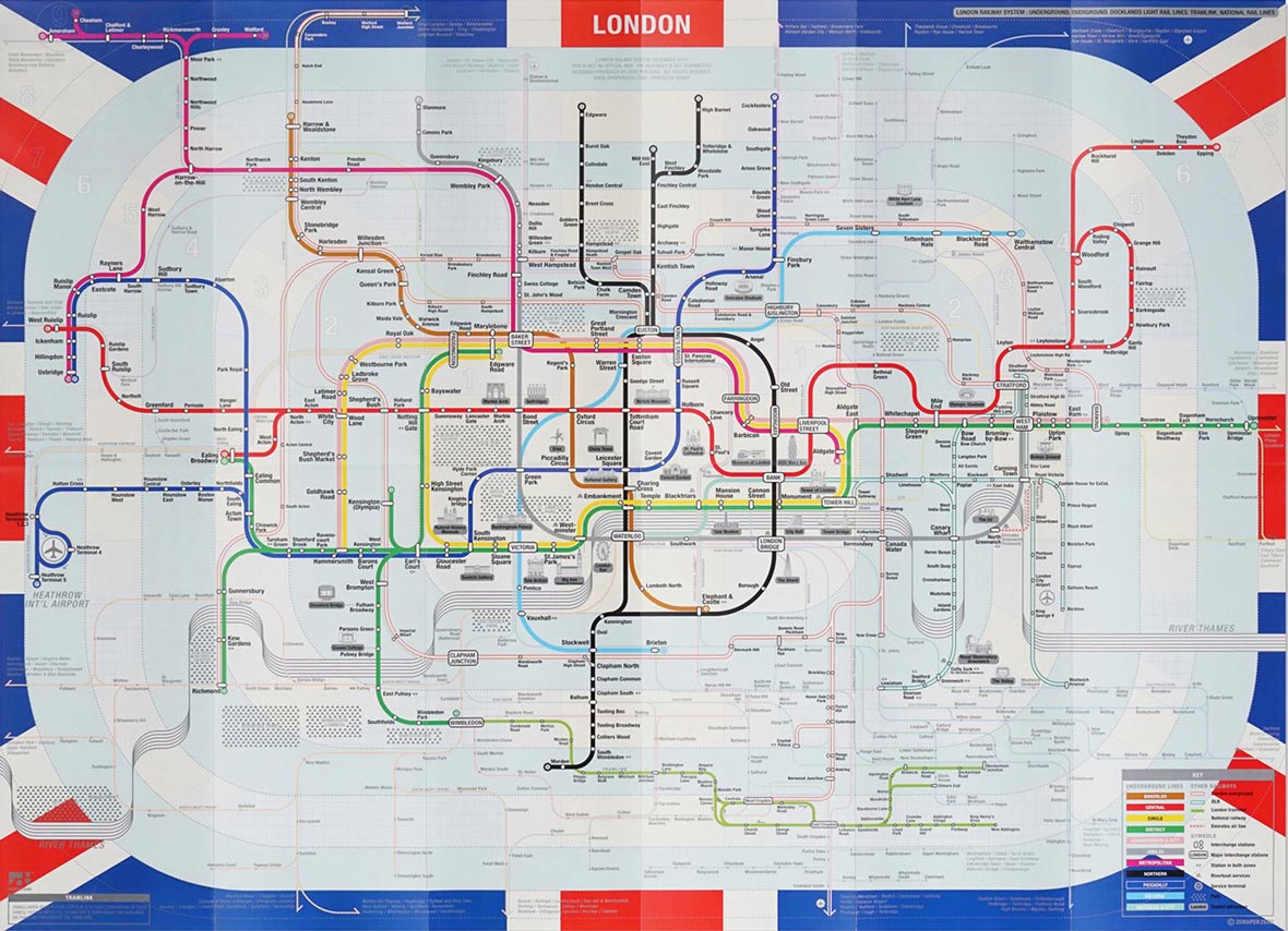
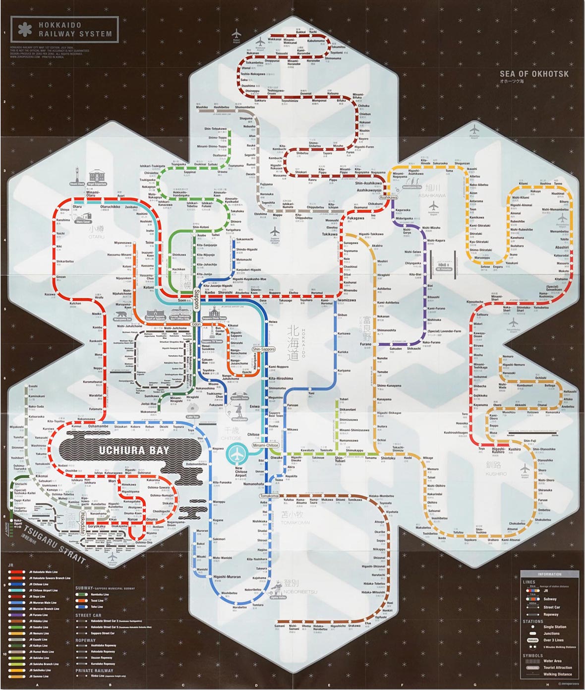
In 2006, Kim spent a year in Japan as an exchange student at Tama Art University; his stay in Tokyo fuelled his interest in subway lines, fascinated by how each transit system could feel so familiar and foreign – a feeling that hinged completely on one’s own understanding of the city. Whilst at Tama, Kim was inspired to create an infographic map of the famed Tokyo Metro system, which was to become the first of many maps in his City Railway System series. Ten years later, his studio, ZERO PER ZERO have produced infographic maps that span major cities around the world, including Tokyo, New York City, Seoul, Paris, Beijing, Osaka, Barcelona, Berlin, Amsterdam, London and Hokkaido.
2006년 김지완은 Tama Art University의 교환 학생 자격으로 일본에서 1년을 보냈다. 도쿄에서 보낸 시간 동안 그는 지하철에 관심을 갖게 되었다. 그는 각각의 교통 시스템이 얼마나 서로 비슷하면서도 상이한 지에 대하여 매력을 느꼈다. Tama에서 공부하는 동안 그는 저명한 도쿄 메트로 시스템의 인포그래픽 맵을 만들어야겠다는 영감이 들었다. 었덨다. 그것이 그의 “도시 철도 시스템 (City Railway System)” 시리즈의 여러 맵 중 첫번째 맵이었다. 10년 후, 그의 스튜디오인 제로퍼제로는 도쿄, 뉴욕, 서울, 파리, 북경, 오사카, 바르셀로나, 베를린, 암스테르담, 런던과 홋카이도를 포함하는 전 세계의 주요 도시들을 아우르는 인포그래픽 맵을 제작 해 냈다.
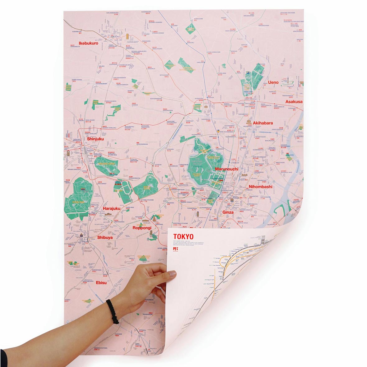
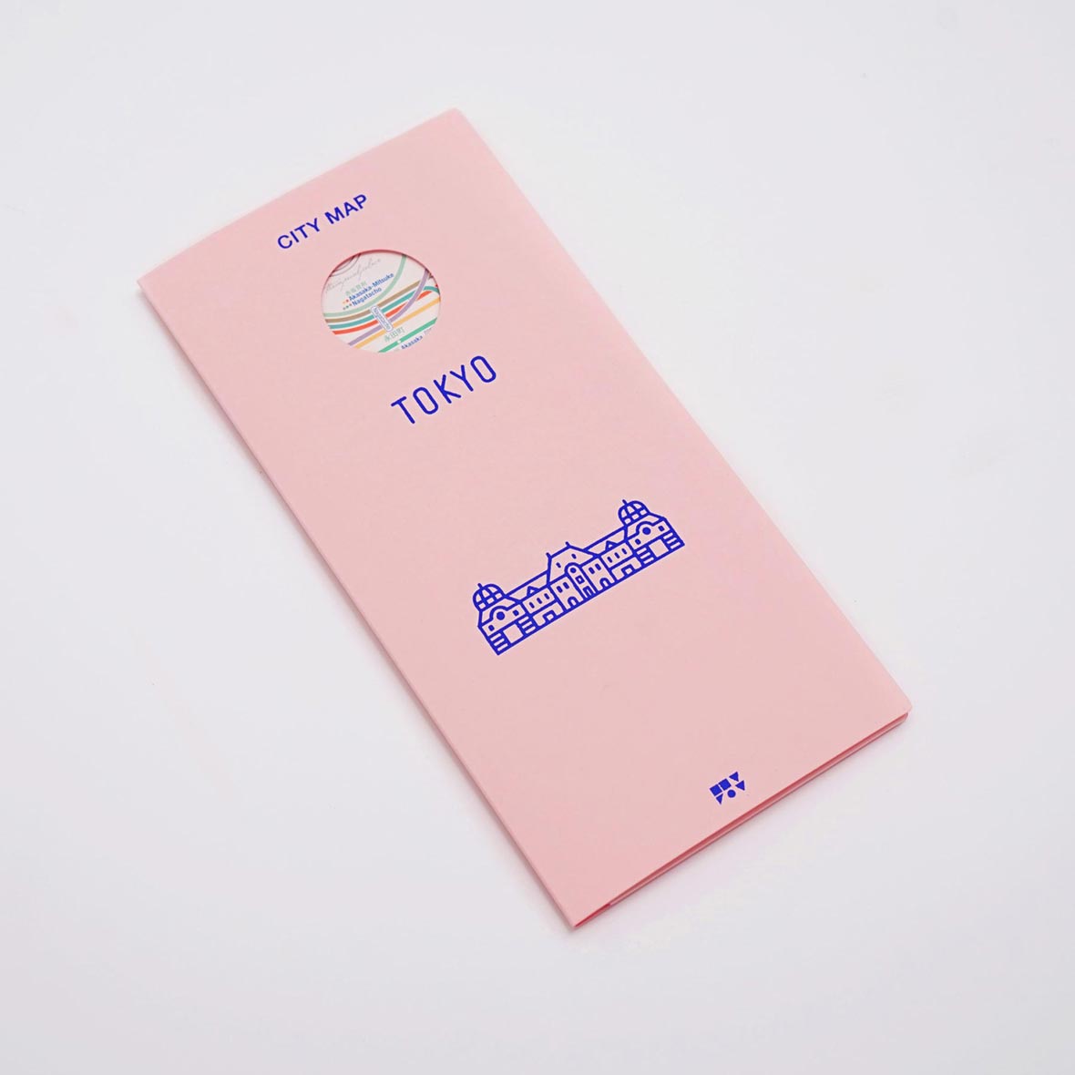
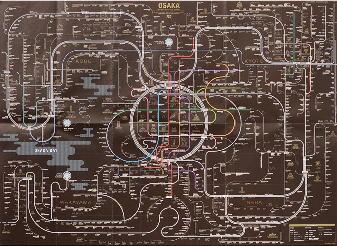
Kim has an ingrained affinity with Tokyo, stating that the original map is still his favourite – the Tokyo map was given a fresh update this year, entitled New Tokyo. Amongst the twists and turns of each city’s railway system, Kim has thoughtfully included tourist attractions and iconic sites to give map owners a true sense of each city’s space. Each ZERO PER ZERO map is characterised by a motif that symbolises each individual city. Osaka’s motif is especially interesting, as the map also features neighbouring cities, Kyoto, Kobe, Nara and Wakayama. Inspired by the octopus in Osaka’s famous local snack, Takoyaki – “In this map, the Osaka metropolitan area is visualised as an octopus with the head being Osaka and the legs sprawling out to the other four cities.”
도쿄에 대한 깊은 애정을 가진 김지완은 아직도 도쿄 오리지널 맵에 가장 애착이 간다고 한다. 도쿄 맵은 올해 새롭게 개정되어 “뉴 도쿄”라는 이름으로 선보였다. 각 도시의 철도 시스템을 적절히 변형하는 가운데도 김지완은 도시의 관광 명소와 상징적 장소들을 지도에 사려깊게 배치하여 지도를 보는 사람들로 하여금 도시 각 공간의 진정한 의미를 깨닫게 한다. 제로퍼제포에서 제작되는 모든 맵은 각 도시를 상징하는 모티브를 형상화하였다. 이중 오사카의 모티브는 특히 흥미로운데, 지도적 측면에서 오사카 맵은 인근의 교토, 코베 나라 및 와카야마까지 소개하고 있다. 오사카의 유명한 지역 음식인 문어, 타코야키에 영감을 받아 제작된 이 맵에서 문어의 머리에는 오사카 메트로폴리탄 지역을 표현하고 4개의 다리는 다른 4개 도시로 퍼져 나가는 모습을 하고 있다.

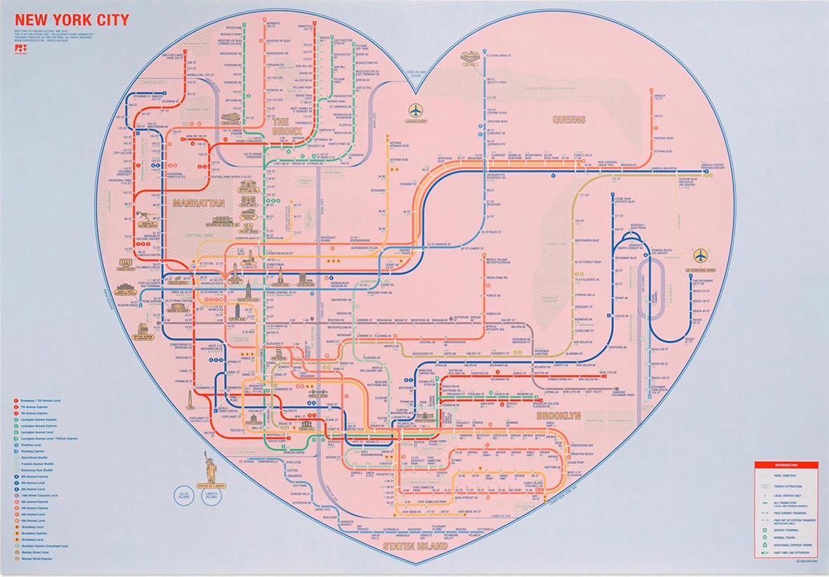
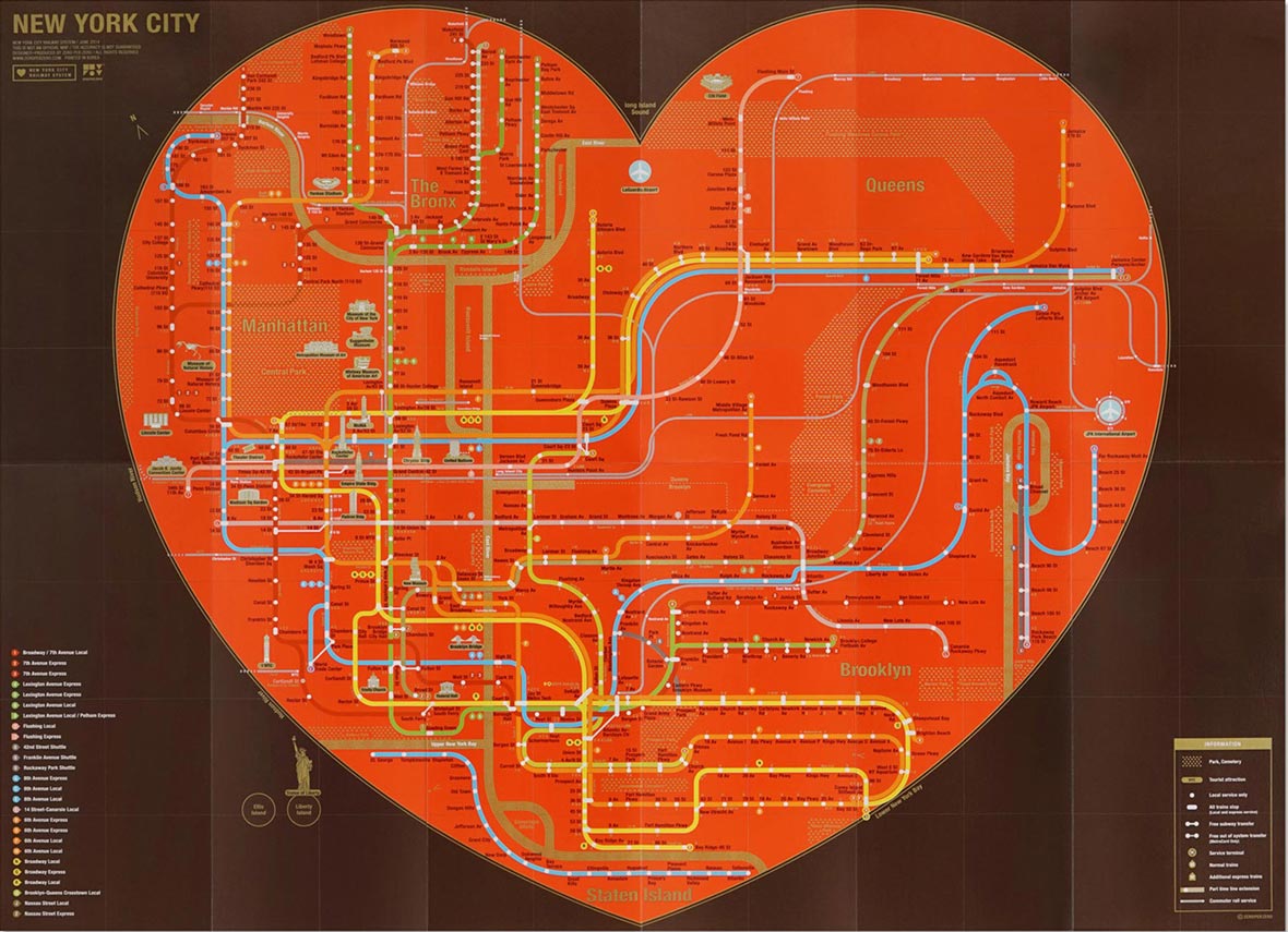
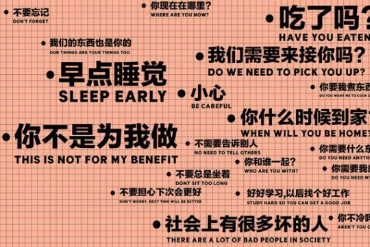
Kim hopes that his maps can serve as both a helpful guide for new visitors and a long lasting reminder of the beauty in each city for those who call it home. The commute may be just a slither of time in the day, but it is also the best time to zone out and reflect on the beautiful city that surrounds you.
김지완은 그의 맵이 도시를 방문하는 사람들에게는 가이드로서의 도움이 되고 그 도시에 사는 사람들에게는 도시의 아름다움을 오랫동안 기억에 남는데 도움이 되기를 바란다. 하루에 있어서 출퇴근은 그저 의미없이 흘려 보내는 시간이라고 생각할 수도 있다. 하지만 그 시간은 자신이 머물던 지역에서 벗어나 자신을 둘러싼 아름다운 도시의 모습을 감상할 수 있는 최고의 시간인 것이다.