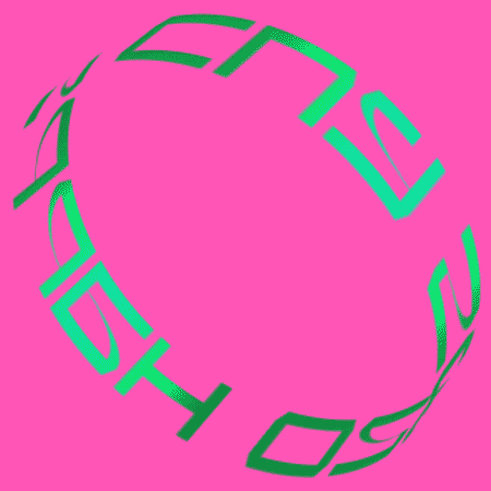
Writing is a vehicle for thought, and the shape and design of words has long been both a field of study and a powerful symbol of culture. Every font or character set, from the earliest pictograms to contemporary comic books, has its own beauty. Through their form and their color, words can convey freshness and vitality.
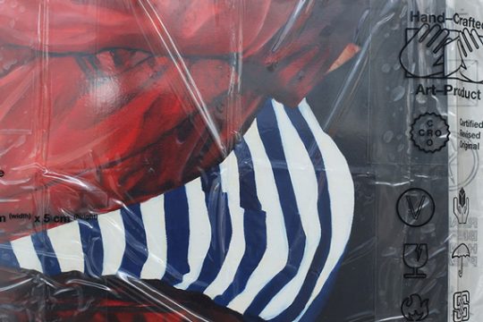
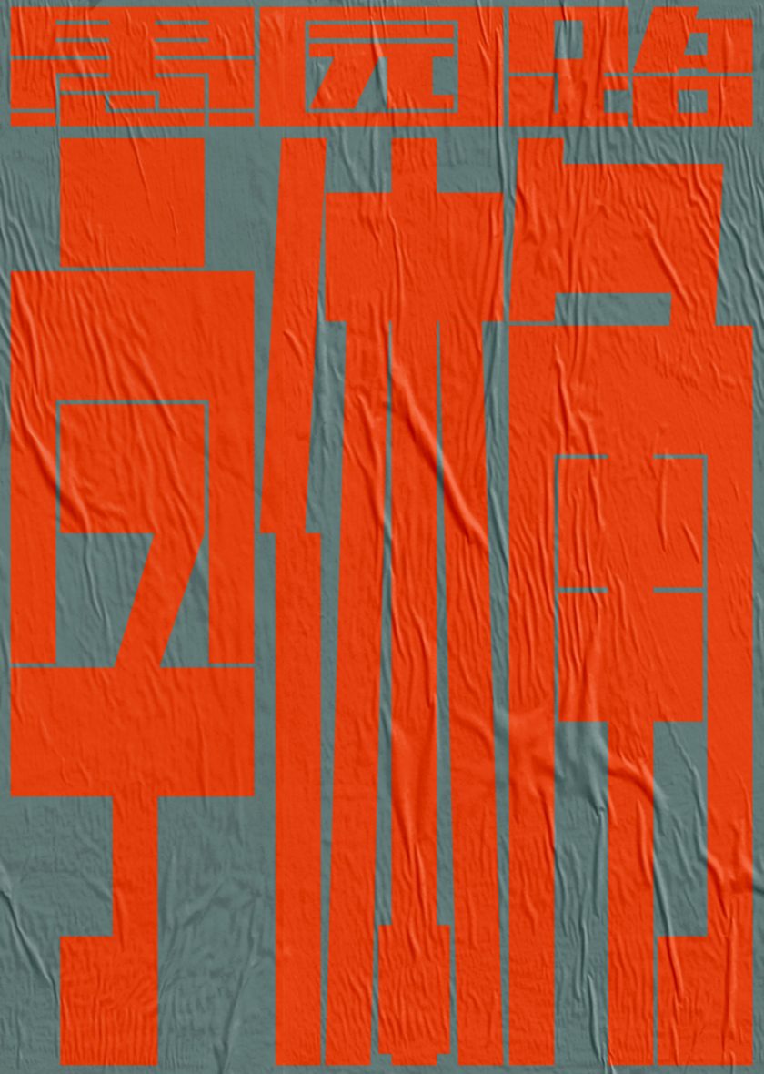
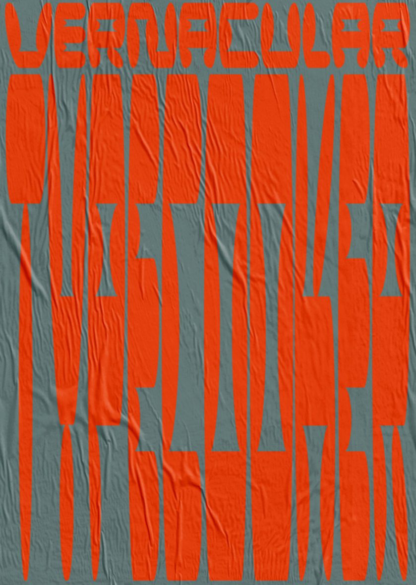
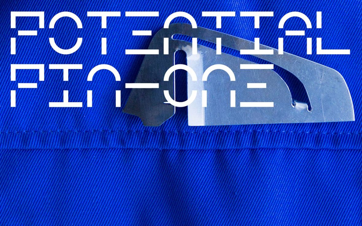
Kaukau, a visual studio in Shanghai, takes an irrepressible delight in font design, one that’s visible in all their works. “We want to make words into images that convey our concepts,” says Zifei Li, who co-founded the studio with her Malaysian partner Kefeng Lee. The two met at design school in the Netherlands years ago, then ran into each other by chance again in Shanghai. “Because we’d known each other for so long, and got along so well, we thought it was time to do something together. Basically we exchange ideas, use what works, and figure out how to move forward.” The concepts they seek to convey are not fixed or monotonous: in both commercial projects and their own works, they use colors and patterns that highlight their team’s multicultural and multilingual integration. Even details like serifs and curlicues are liable to change in unexpected ways.
文字是思维的载体,而一直以来,文字的形态也作为一门学问出现在人类社会,其本身就是文化有力的象征。单从中国汉字的角度而言,你会发现历代每一种字体都有独特讲究,最早甚至可以追溯至象形文字。当今社会,字体更作为一种具象化的标志,变换各种各样的形态,延续着鲜活的生命力。
视觉工作室 KAUKAU 成立于上海,自 2018 年以来,他们的作品透漏出对字体设计难以掩饰的喜爱。“我们更希望能把文字作为一种图像,来传达我们想要的概念”,设计师李梓菲(Zifei Li)说道。她与马来西亚设计师李克丰(Kefeng Lee)在荷兰读书时便认识,又因机缘巧合相遇在上海,“由于多年相识,又在多方面很合拍,我们觉得是时候一块儿做一些事情。基本上我们都是一起讨论,发挥所长,摸索着来。” 而单一且固定的设计不是 KAUKAU 希望传达的理念,无论是商业项目、还是他们个人的作品,字里行间中丰富的色彩与图案,都强调着团队多文化、多语言融合的背景。哪怕一个 “偏旁部首” 都显得格外灵活。

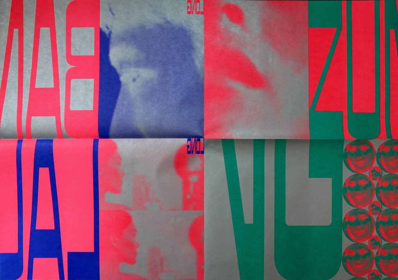
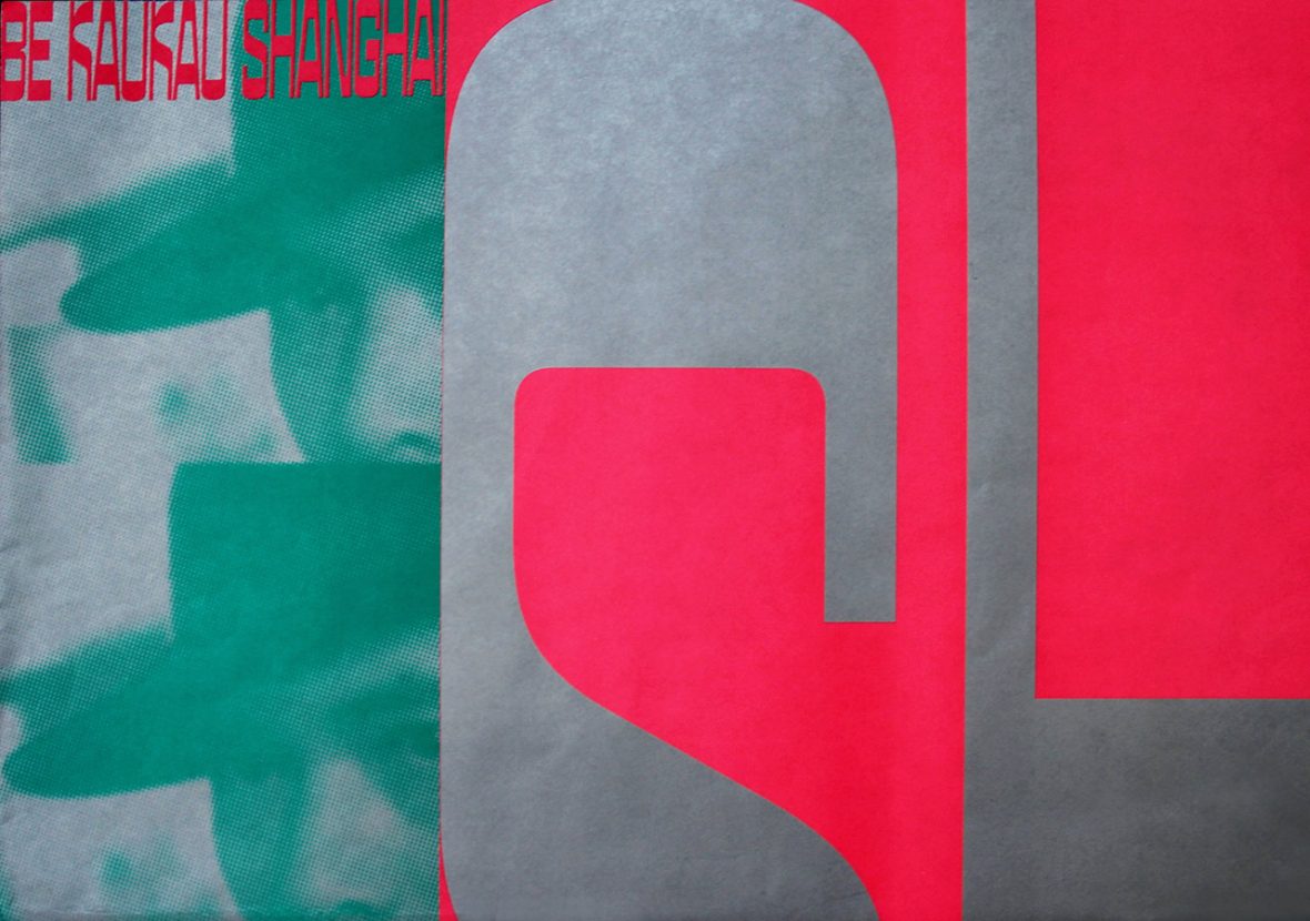
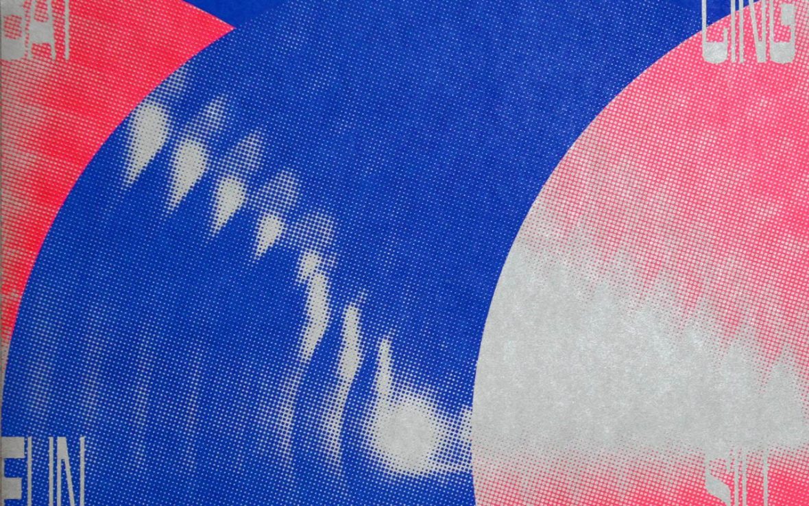
In 2019, beyond the team’s commercial projects, the Kaukau team devoted part of their energy to a series of printed works titled Be Kaukau. This project compiled photographs, propaganda, advertisements, images from the web, and film and television stills to create a rough impression of two cities: Pyongyang and Shanghai. “In the project, we try to infuse these everyday images with subjective meaning, in order to lead the viewer to feel the contrast between visual memories and actual experience,” says Li.
在过去的 2019 年中,除了团队商业项目以外,KAUKAU 将一部分重心放在了《BE KAUKAU》系列出版物。该项目基于采用了摄影、城市宣传印刷物、网络图片、影视作品画面以及当地广告等信息,搭建出设计师对两座不同城市的记忆。“项目中,我们尝试用主观视角,重新赋予这些日常图像内涵。带观众感受图像记忆和与真实感受之间的反差。”
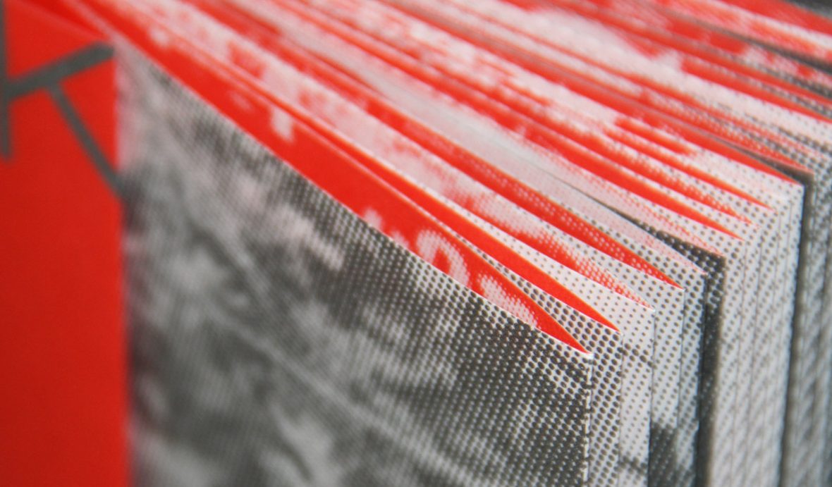
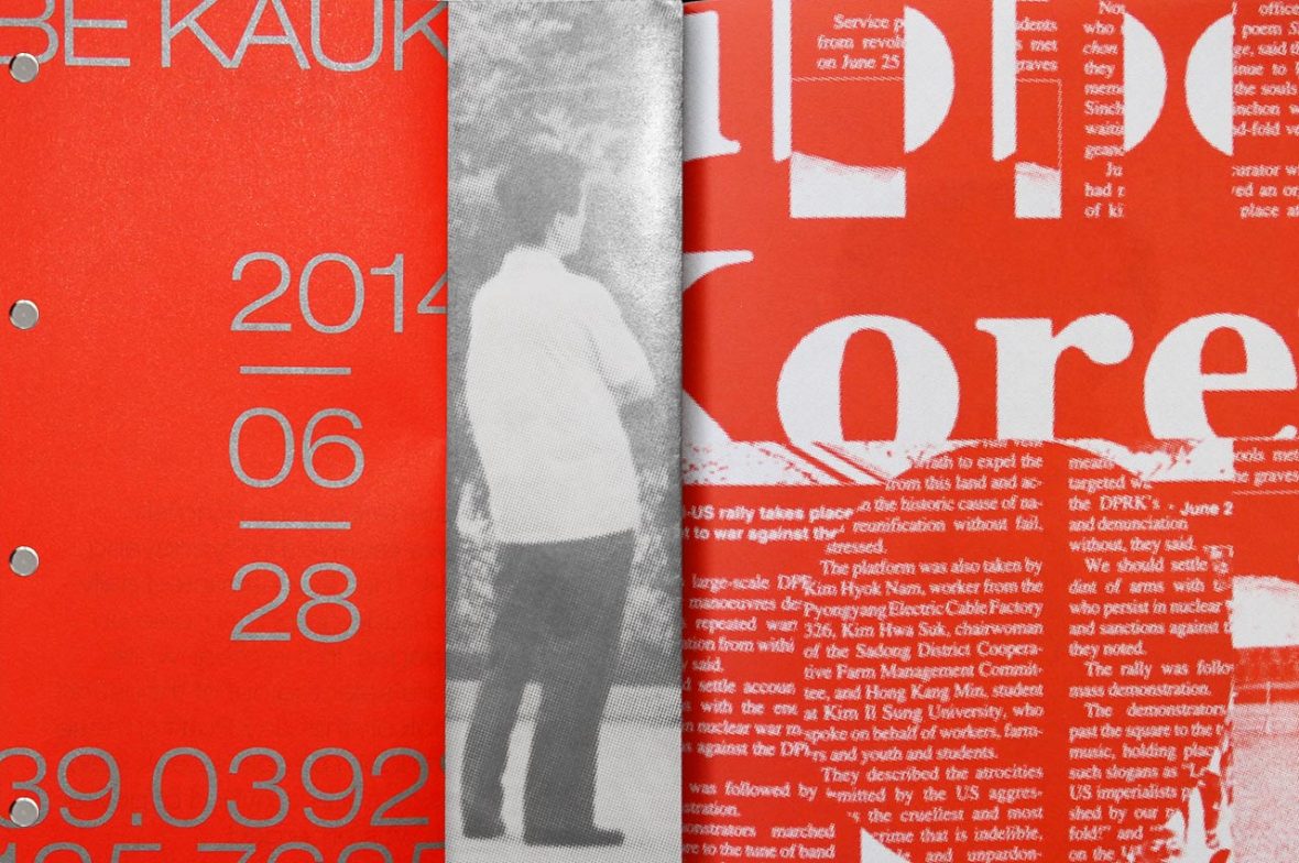
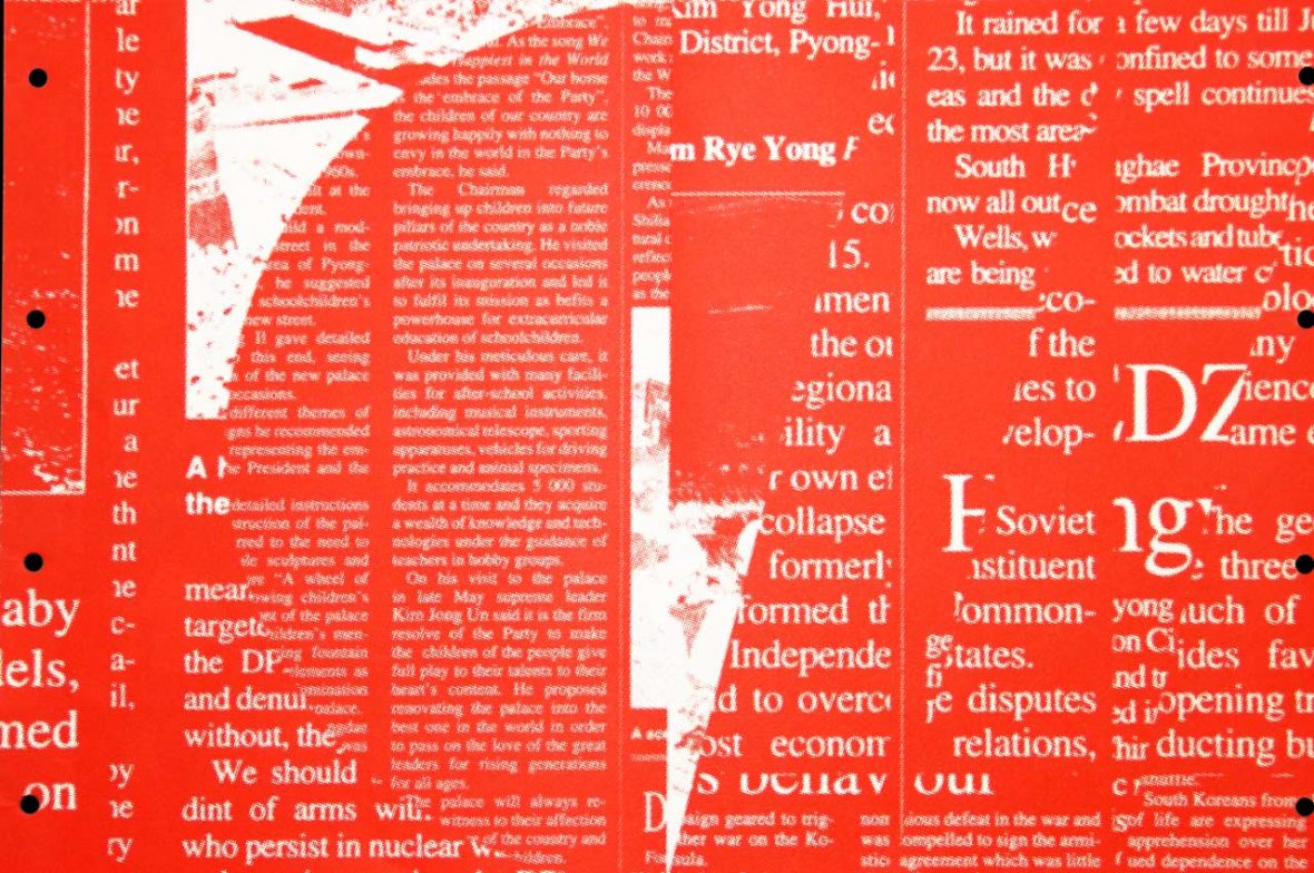
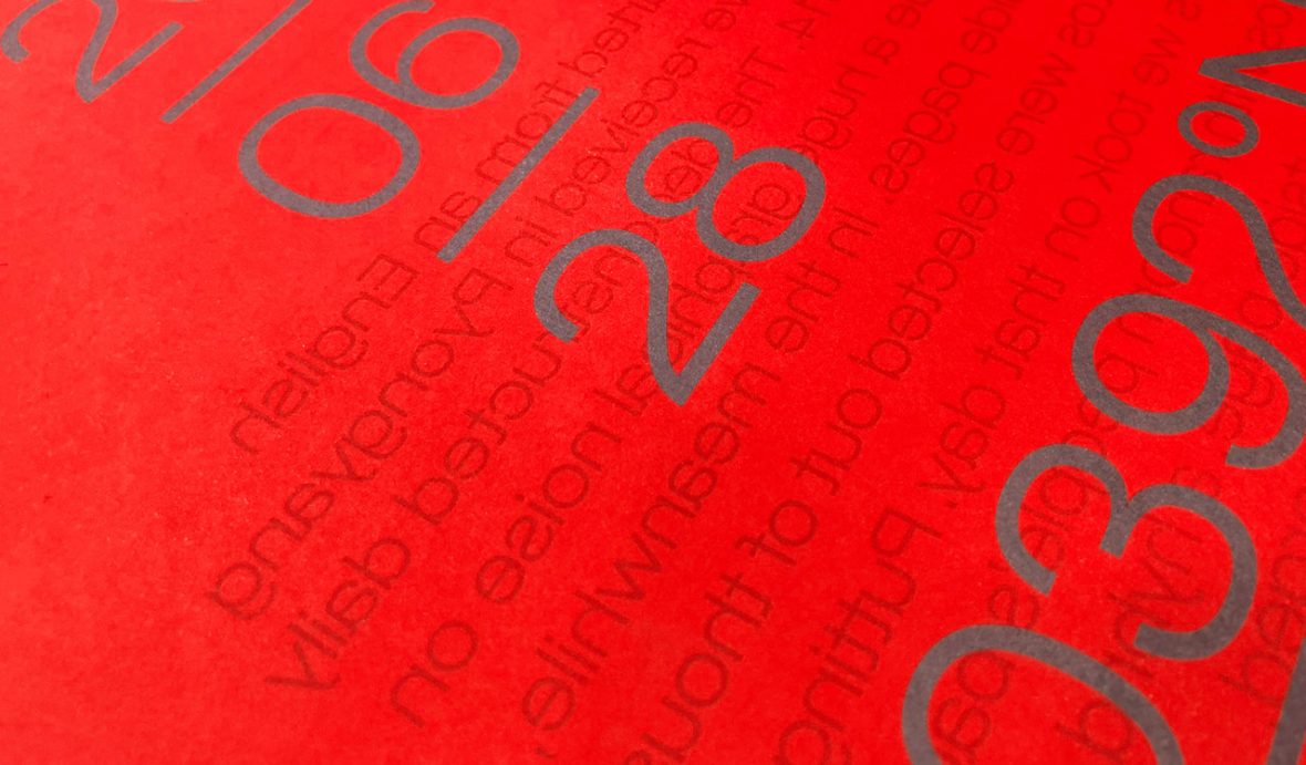
The design for Pyongyang comes from a 2014 street photography project shot there, and the formal font and monochrome palette conveys a sense of the strict social environment of the city. The design for Shanghai uses a modern font—created in collaboration with the Malaysian type design studio Huruf—and a collage with high-contrast colors to create a sense of dynamism.
《BE KAUKAU》系列出版物由平壤和上海两座城市构成,前者的设计来自一份 2014 年平壤街头摄影档案,新闻字体和单一的颜色来呈现,表达了一种严肃的社会环境;而后者,则运用了摩登字体和高对比色的剪贴画,营造出活跃的气氛。
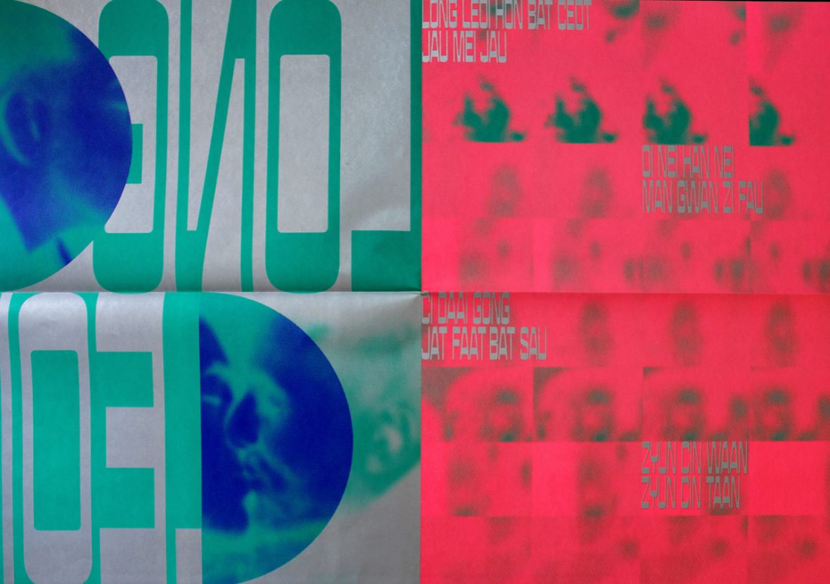
Kaukau Studio believes that typography ultimately needs to serve its content. The Shanghai design contains what appear to be words in a Western language, but in fact, they’re the lyrics to the classic Cantonese ballad “Shanghai Bund,” written in a romanization to convey the city’s blending of cultures. (As the lyrics scroll by, they lay out an open storyline for the viewer. “The font set is inextricably bound up with the city’s memory,” says Li enigmatically. “Not only the image, but also the font, as a part of the image, remains in our memory.”
KAUKAU 工作室深信,文字终归要服务于内容。《BE KAUKAU》上海部分的字体设计由 KAUKAU 与马来西亚 Huruf 字体工作室合作完成,看似西方语言单词,实则是粤语经典曲目《上海滩》中歌词的拼音。随着歌词的推进,为观众铺出开放式的故事线。而之所以用拉丁字母来呈现,是为了表达上海这座城市在不同文化之间交融并进的步伐。李梓菲说道:“这套字体与城市的记忆有着不可分割的联系:除了城市图像之外,字体也作为图像的一部分被我们记忆。”
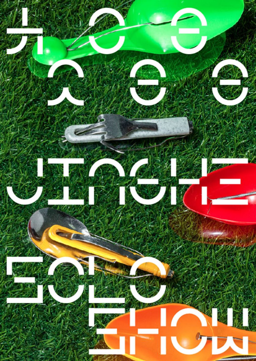
As they delve into the connection between cities and typography, Kaukau is continuing to find their way toward new projects. Font Corners, their newest project, finds inspiration in Shanghai’s Yuyuan Road. Large and small square frames seek to evoke a bird’s-eye view of the dense, narrow street pattern of old Shanghai. The dynamic form brings out the changing face of the length of the street over time. “City scenes that are easy to overlook in day-to-day life have become our design concept. We dig up these hidden notions and turn them into visual products, conjuring people’s memories of the city.”
在研究城市与字体之间联系的过程中,KAUKAU 正在进一步摸索与深化。在《字体角》系列作品中,工作室以上海愚园路为灵感,大大小小的方框欲还原老上海狭长密集的街道样式,动态的形式呈现整条路时过境迁的面貌。“日常容易被人们忽略的城市面貌已成为我们的设计观念。我们挖掘这些潜在的内容,并把它们化为视觉产物,唤起人们对于城市的记忆。”

Design concepts like these have helped score them multiple design awards, while building a solid commercial reputation. The Yuyuan Road series, and their font design work with Hejing Studio, has earned them a Certificate of Typographic Excellence from the Type Directors Club. And since their founding, they’ve launched collaborations with Radio Europe, the Amsterdam Symphony Orchestra, the Rotterdam Film Festival, the Venice Biennale, the China Film Directors Association, and the art center Tank Shanghai, along with other institutions and brands. “Both in our commercial and in our cultural work, we emphasize effective communication. We’ve got to maintain our enthusiasm in the face of all possibilities, and not stop growing.”
这样的的设计思维模式,帮助他们斩获各类国际设计奖项,同时在商业获得出色的口碑。近日,KAUKAU 凭借 “愚园路字体角” 与曾为贺晶工作室的字体设计,获得了 TDC(Type Directors Club)的 “杰出字体排版认证书”(Certificate of Typographic Excellence),同时入选字体设计年鉴(TDC,The World Best Typography)。KAUKAU 也因此受邀参加了该奖项第 66 届全球巡展(TDC66)。
而成立至今,他们已与欧洲广播电台、阿姆斯特丹交响乐团、荷兰鹿特丹电影节、威尼斯建筑双年展、中国电影导演协会、上海油罐艺术中心等等机构与品牌都展开过合作,李梓菲说:“不管是商业类还是文化类的工作,我们看重的都是信息传达的有效性。我们需要保持面对一切可能的热情,并不停进化自我。”
Works by Kaukau and the Korean Design Studio Pa-i-ka are currently on display at the independent publishing space Protopaper in Xi’an.
Address:
Shiji Dongyuan, Bldg. 4, no. 201
Yanta District, Xi’an
Shaanxi Province, China
目前,KAUKAU 与韩国设计工作室 Pa-i-ka 的作品正在西安独立出版平台 Protopaper 进行展出。
地址:
陕西省西安市雁塔区
试剂东苑4号楼201室
中国
Like our stories? Follow us on Facebook and Instagram.
网站: www.kaukau.design
Instagram: @kaukau_design
Contributor: Pete Zhang
English Translation: Allen Young