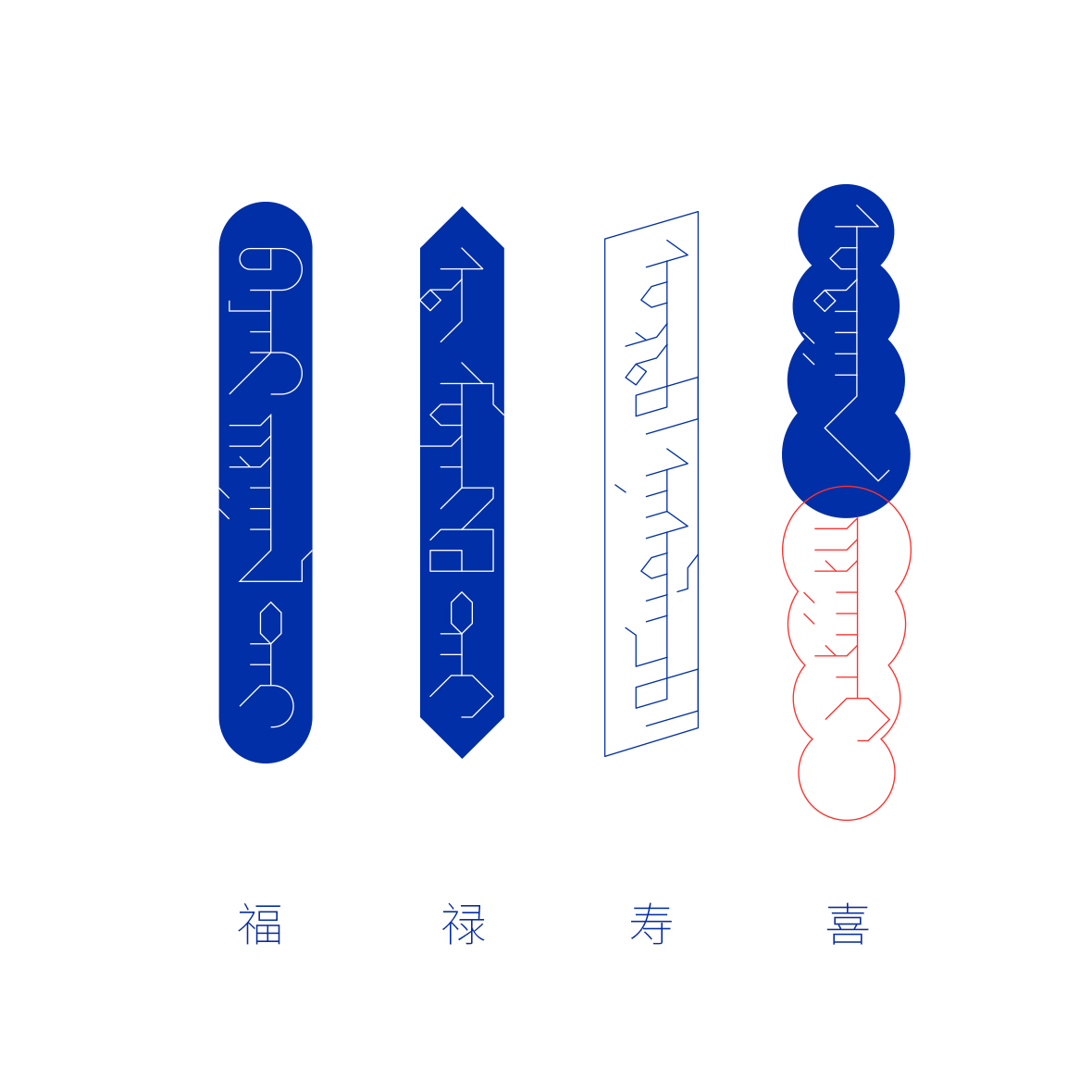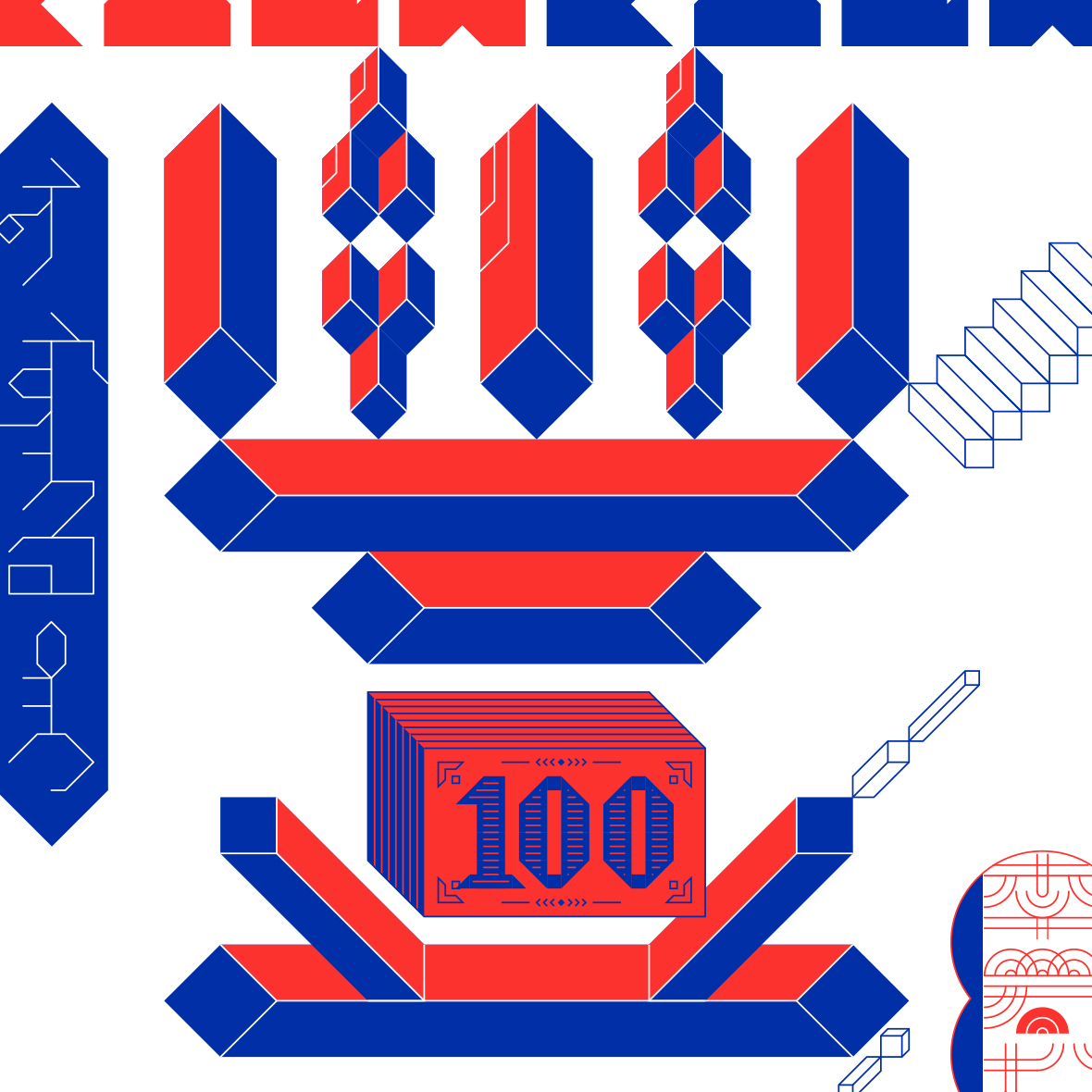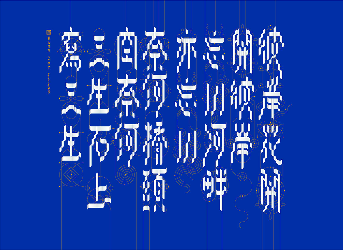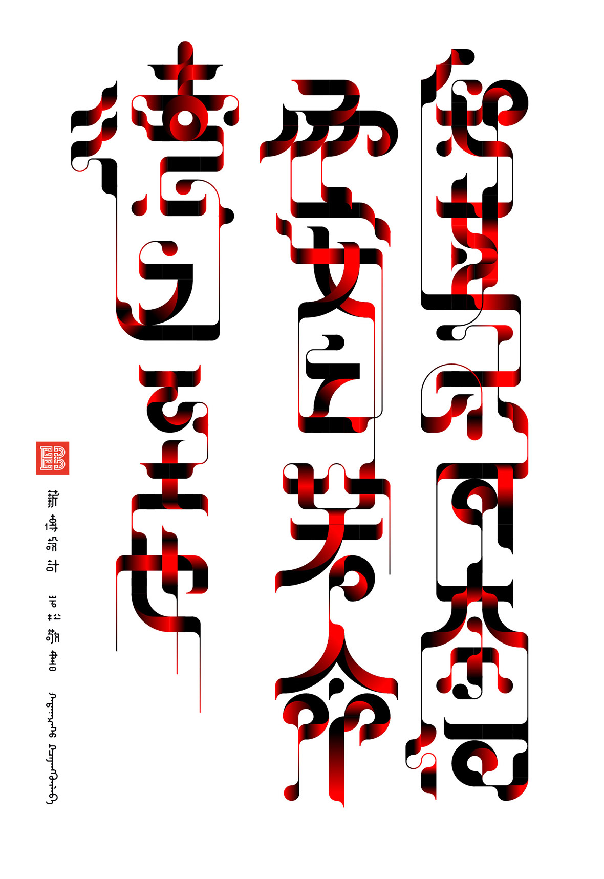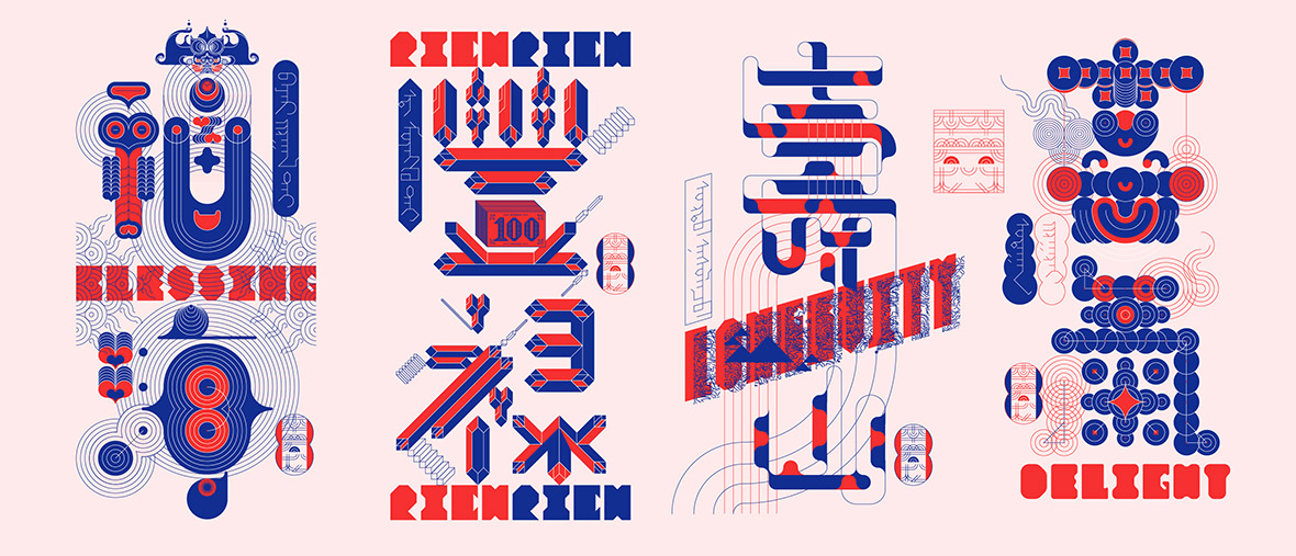
In celebration of Chinese New Year, Beijing-based graphic designer Liam Lee recently released a poster comprised of the Chinese characters fu (福), lu (禄), shou (寿), and xi (禧). The significance of these four characters comes from their appearance on spring couplets and their widespread usage as an auspicious greeting for family and friends during New Year celebrations. Lee deconstructs the familiar blessing into individual characters and restructures them into separate phrases to expand on their meaning. Fu, forms fu hai (福海), which means a world of happiness; shou forms the phrase shou shan (寿山), which is a blessing for longevity; xi forms xi qi (喜气), which means jubilant delight; and lu forms the phrase feng lu (丰禄), which wishes for good fortune and wealth. As a call out to his own Mongolian ancestry, Lee also included a Mongolian translation alongside each Chinese phrase.
这一组汉字设计海报,来自蒙古族的图形设计师李岩松(Liam Lee),图中呈现的是“福、禄、寿、禧”四个汉字,寓意着对美好生活的期盼和祝福,而李岩松从新的角度出发,使用新的设计技法,做了一次不同的尝试——将 4 个单字组词为“福海、寿山、喜气、丰禄”,同时加入了蒙古文字释义。这种独特的平面构成 + 数学几何造字的方法,是李岩松步入设计之途的十余年里逐渐形成的个人风格。
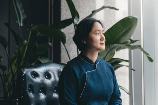
Being a veteran designer who’s worked in graphic design for over a decade, this latest project is an impressive showcase of how his unique compositional style and eye for geometry has developed over the years. While graphic design is his bread and butter nowadays, prior to his official foray into the field, he worked alongside Yue Xin in 2001, a trailblazer in the world of Chinese type design. “I was also exposed to the works of Nod Young around that time, so it’s safe to say these two have greatly influenced all of my design work, and for that, I’m immensely grateful to both of them,” he says with a warm smile. “Even though many of my designs are heavily influenced by calligraphy, I actually don’t come from a background in the discipline. I’m first and foremost a graphic designer, but I enjoy and feel inspired by calligraphy of all forms. When I work, I often find myself referencing the stroke order, pen movements, and composition of old Chinese calligraphy.”
对汉字图形设计的热衷,源于 2001 年,李岩松当时与设计前辈岳昕老师共事,正式接触了字体,“之后(我)偶然看到前辈 Nod Young 闹老师的设计作品,受到很大启发,借此向两位老师致敬。”李岩松笑说,“虽然作品常以‘字形’示人,但我不是一个字体设计师,而是个图形设计师。我也没有专门练过书法。只要是写得好看的书法,我都喜欢。我创作的时候会参考书法的运笔、连笔、动势、构图。”
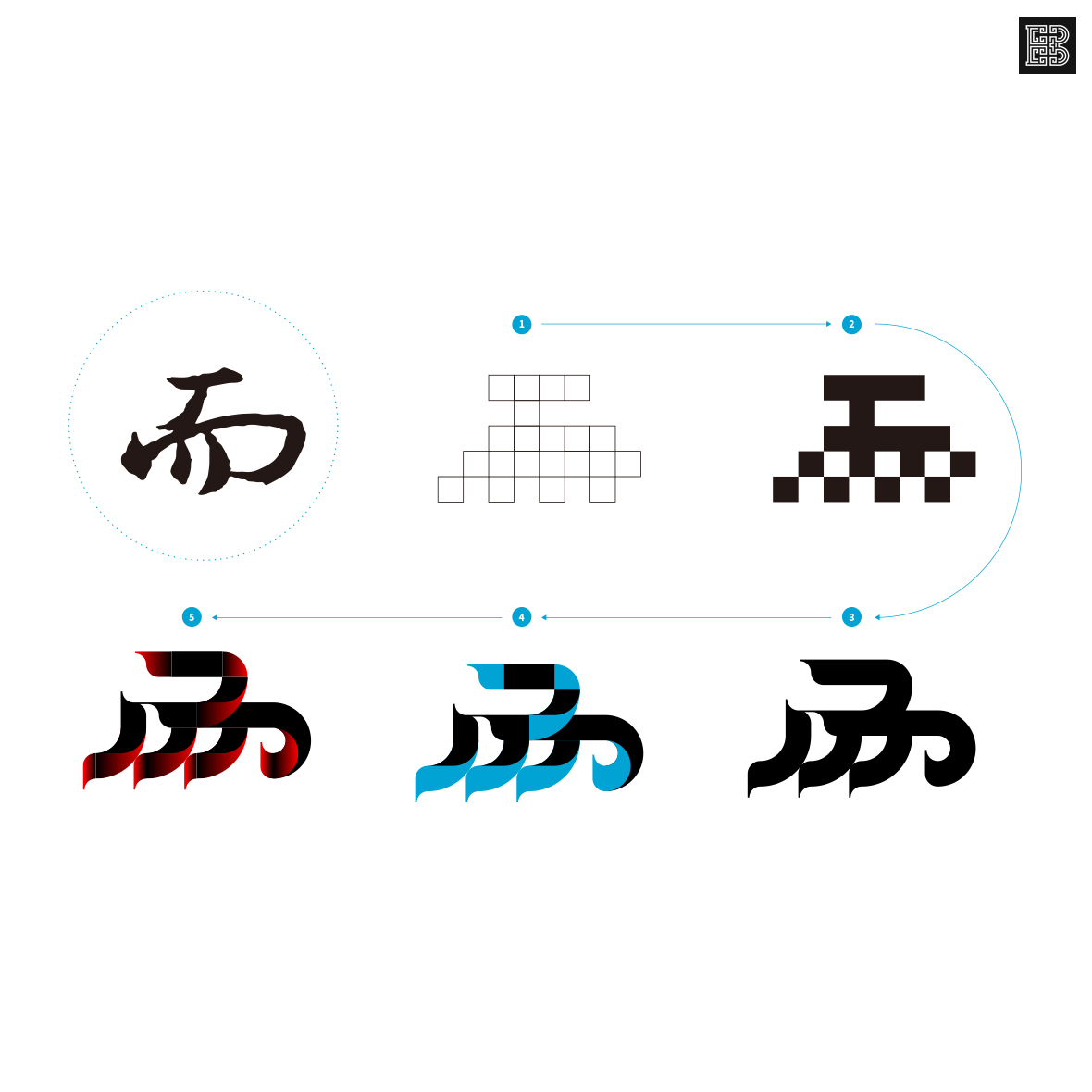
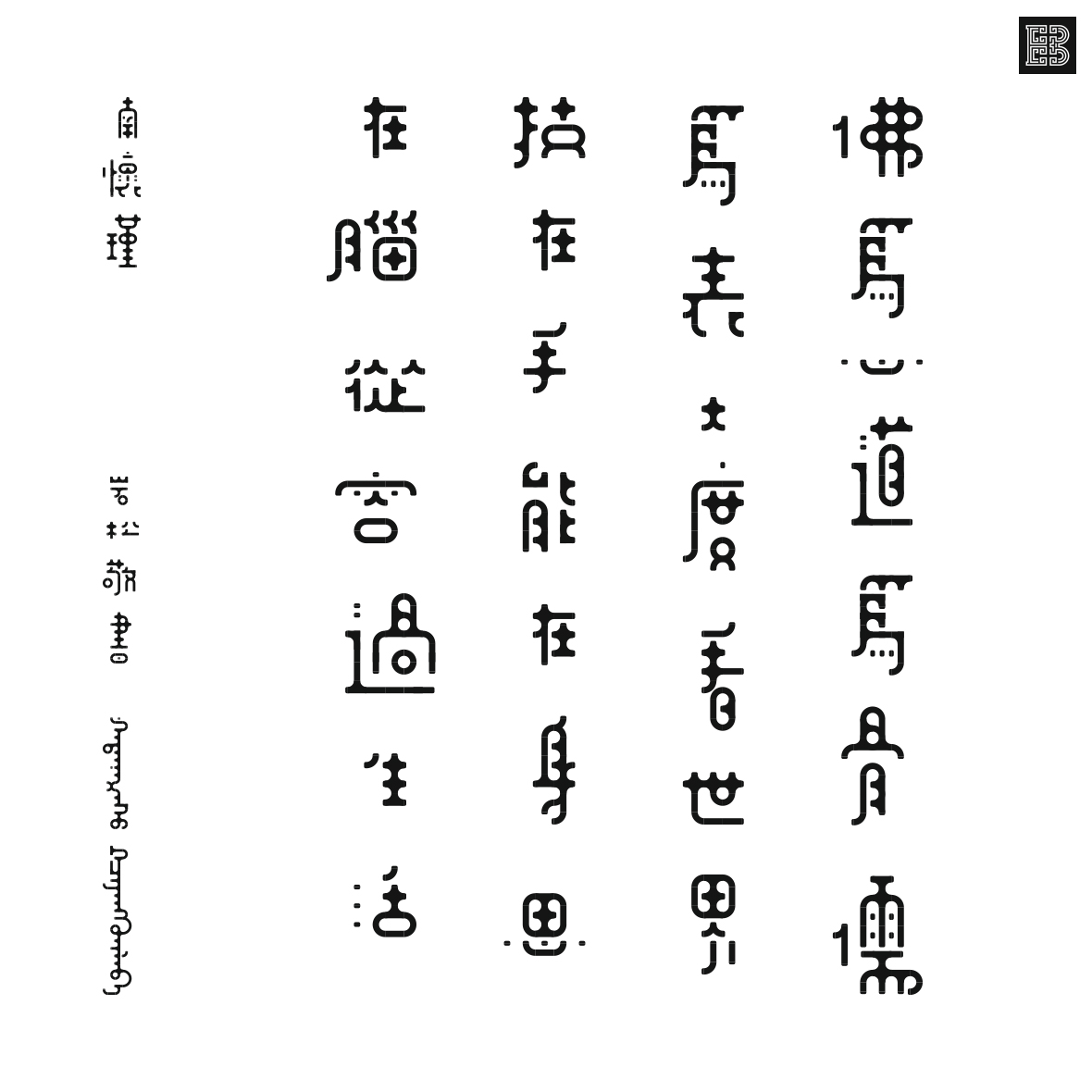
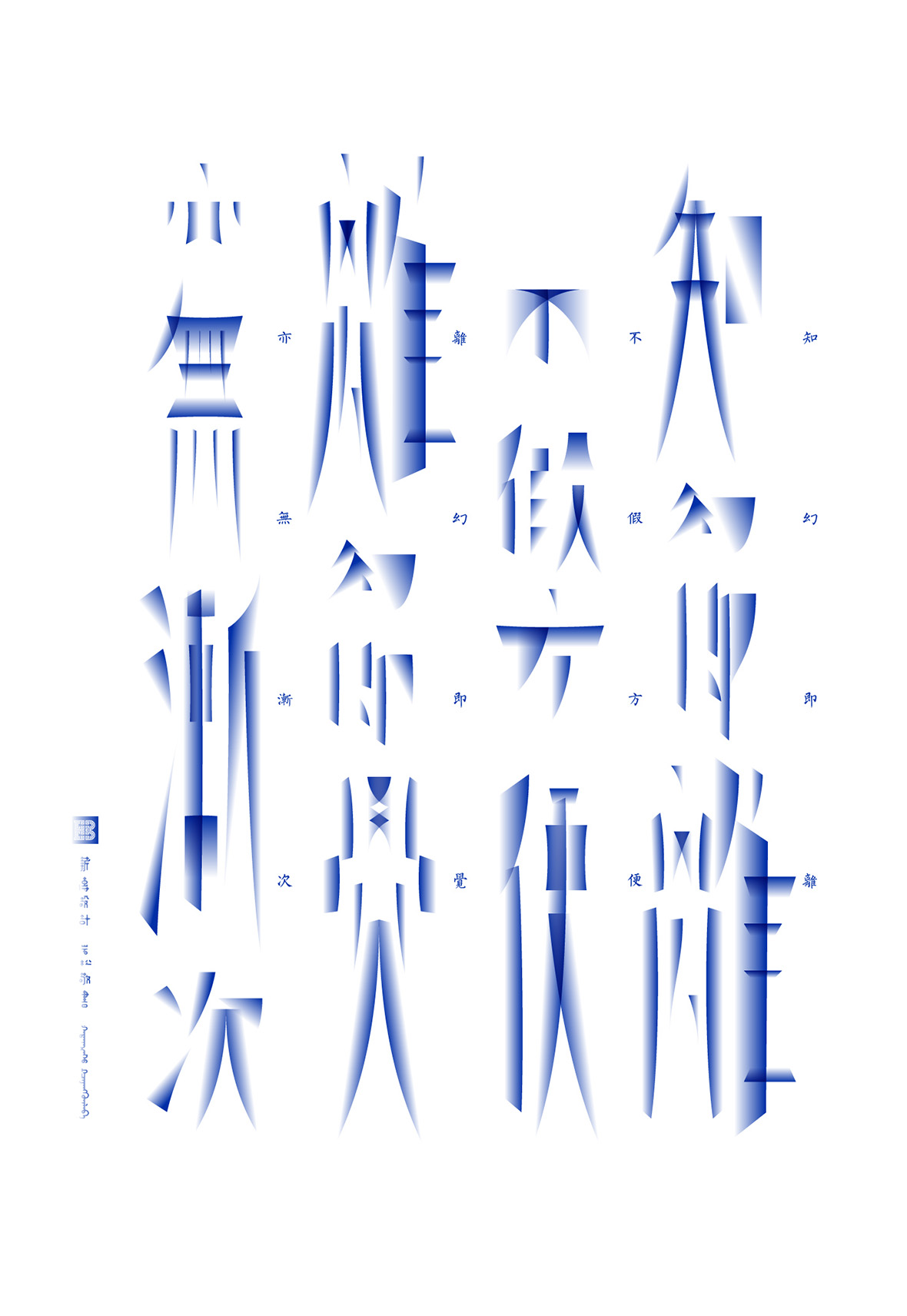
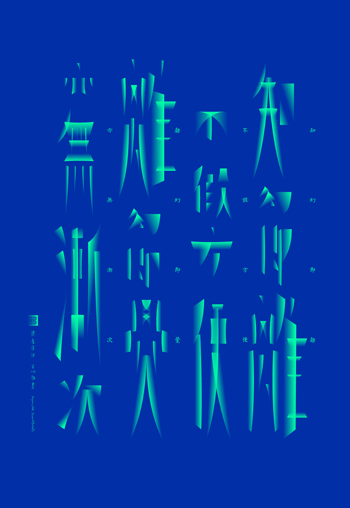
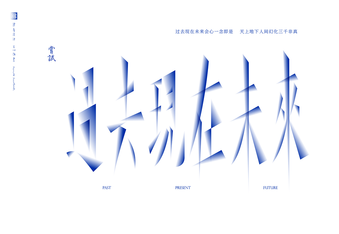
As the result of his diverse influences and an ongoing passion for a wide variety of calligraphy, Lee’s designs rarely stick to one uniform aesthetic. He unabashedly extracts concepts and techniques from graphic design and wields them as building blocks for his calligraphy-inspired works. “I especially like to design in grids – any shape or density,” Lee explains of his methods. “I work and think in geometric shapes but I like to try and conceal specific patterns in my end design. I like to keep it interesting by experimenting and seeing what I can come up with.”
因此,李岩松的设计并不仅仅拘泥于同一种格式,此后也一直在尝试用平面构成的技法结构汉字,将汉字视作若干几何图形单元像积木一样拼插组合。“我特别喜欢在网格里做设计,各种形状的网格,我可以把网格做的非常密集,我觉得在网格里用一种几何化的规律做设计然后再将规律隐藏起来,这是一件非常有趣的事。”

