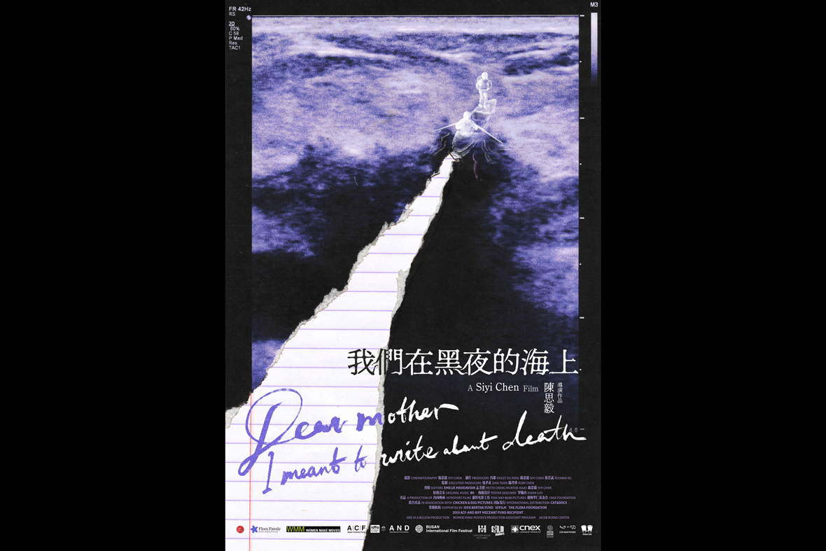
Across the purple waves of an ultrasound print out, two spectral figures set sail on a boat. In their wake, the surface rips, revealing a notebook page beneath—a symbol of the blank space that viewers are expected to fill in themselves. This is the movie poster for the upcoming Sino-US film Dear Mother, I Meant to Write About Death—a documentary by filmmaker Chen Siyi that casts a lens on her mother’s experience with breast cancer. The poster was designed by Changsha-born artist Luo Xiran, a recent graduate from the Maryland Institute of Art who, since 2017, has been in love with designing movie posters.
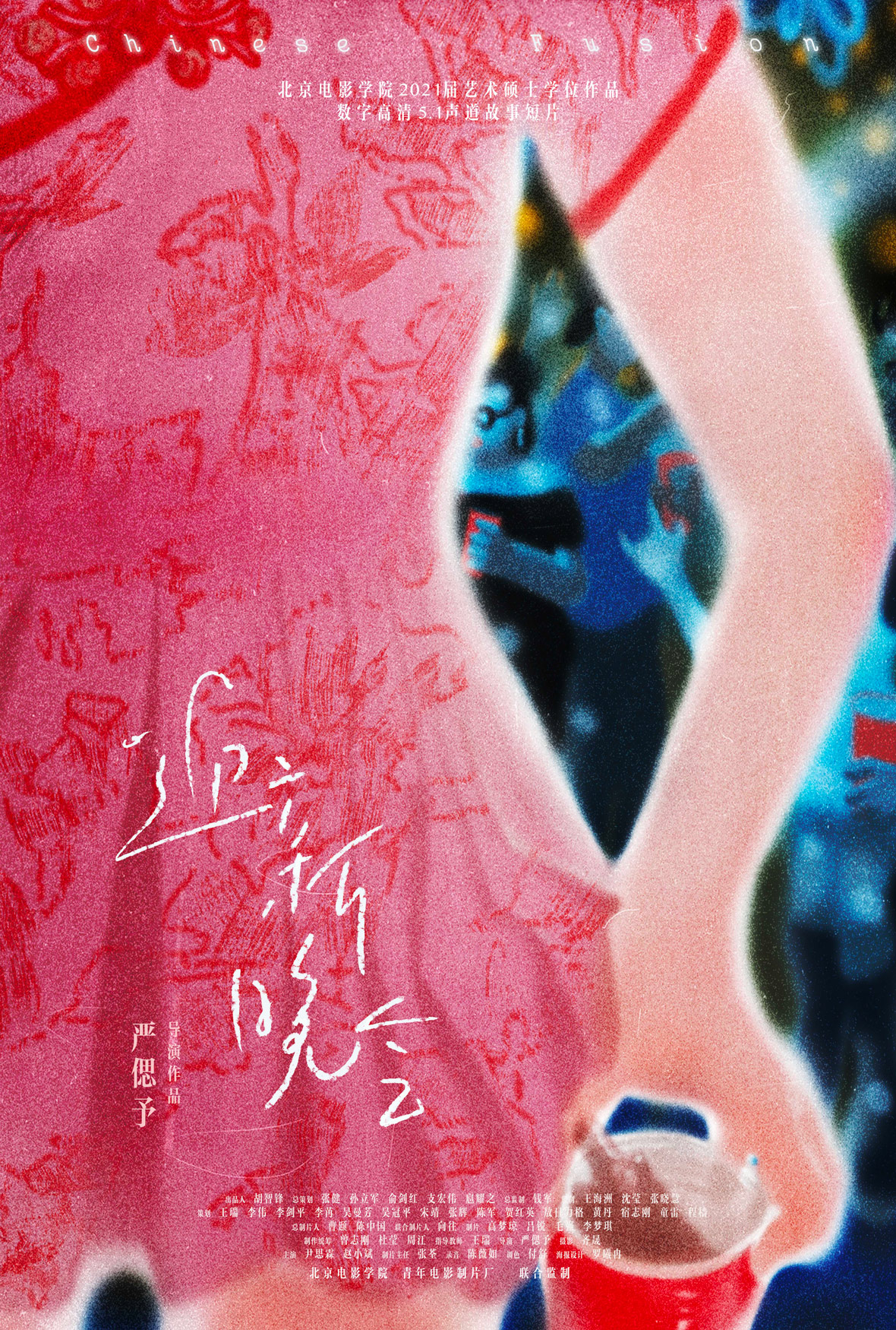
在今年十月即将到来的韩国釜山电影节上,中美合作纪录片《我们在黑夜的海上》(Dear Mother, I Meant to Write About Death)入围“广角亚洲短片竞赛单元”,该片由青年导演陈思毅执导,讲述她自己在得知医生母亲身患乳腺癌后回国探望的故事,横跨六年时间完成。在以乳腺B超作为背景的电影宣传海报上,蓝黑色影像化作汪洋,一艘乘坐两人的孤舟款款向前,船身划过的痕迹撕开一行行留白的笔记,等待着观众在影片中慢慢填写。
海报的作者是来自湖南长沙的罗曦冉(笔名:萝卜咚),今年她刚刚从美国马里兰艺术学院插画实践系研究生毕业。2017 年,在收到一位来自北京电影学院朋友的合作邀请后,她开始尝试电影海报的创作,如今已为二十多部大大小小的影片担任海报的原创设计,并想要把该领域当作自己未来的事业。
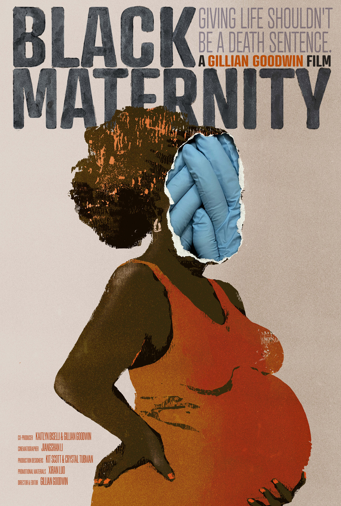
More than simply a credit sheet for a film’s directors, actors, and producers, movie posters are the “face” of a film, forming the audience’s first impression of the movie. With the evolution of cinema, movie posters have been a staple visual accompaniment to the art form. Its importance can’t be understated. Many directors and production houses even commission multiple artists to work on a single poster in order to select the one that best captures the tone and story of the film. “Movie poster are condensed stills that should capture the entire film,” says Luo. “The end result crystalizes artist’s understanding and interpretation of the film.”
海报是电影的“门脸”,是观众对电影的第一印象,是对电影本身的“概括总结”。自十九世纪末电影的问世以来,电影海报一直盛行至今。除去片名、导演、演员、制片方、合作方等等关键信息外,海报需要同时具备一下子抓住故事情节和观众眼球的视觉特点。为了足够“对味儿”,一些片方甚至不惜邀请多位艺术家围绕一部影片制作不同版本的海报设计,摄影、数字、插画等等类型层出不穷。“电影海报是高度浓缩的静态影像,每一张都是阅读理解的产物”,罗曦冉说道,在经历与多位客户的合作过后,她深信海报是一种带有服务性质的设计,它所服务的对象是电影和观众群体。

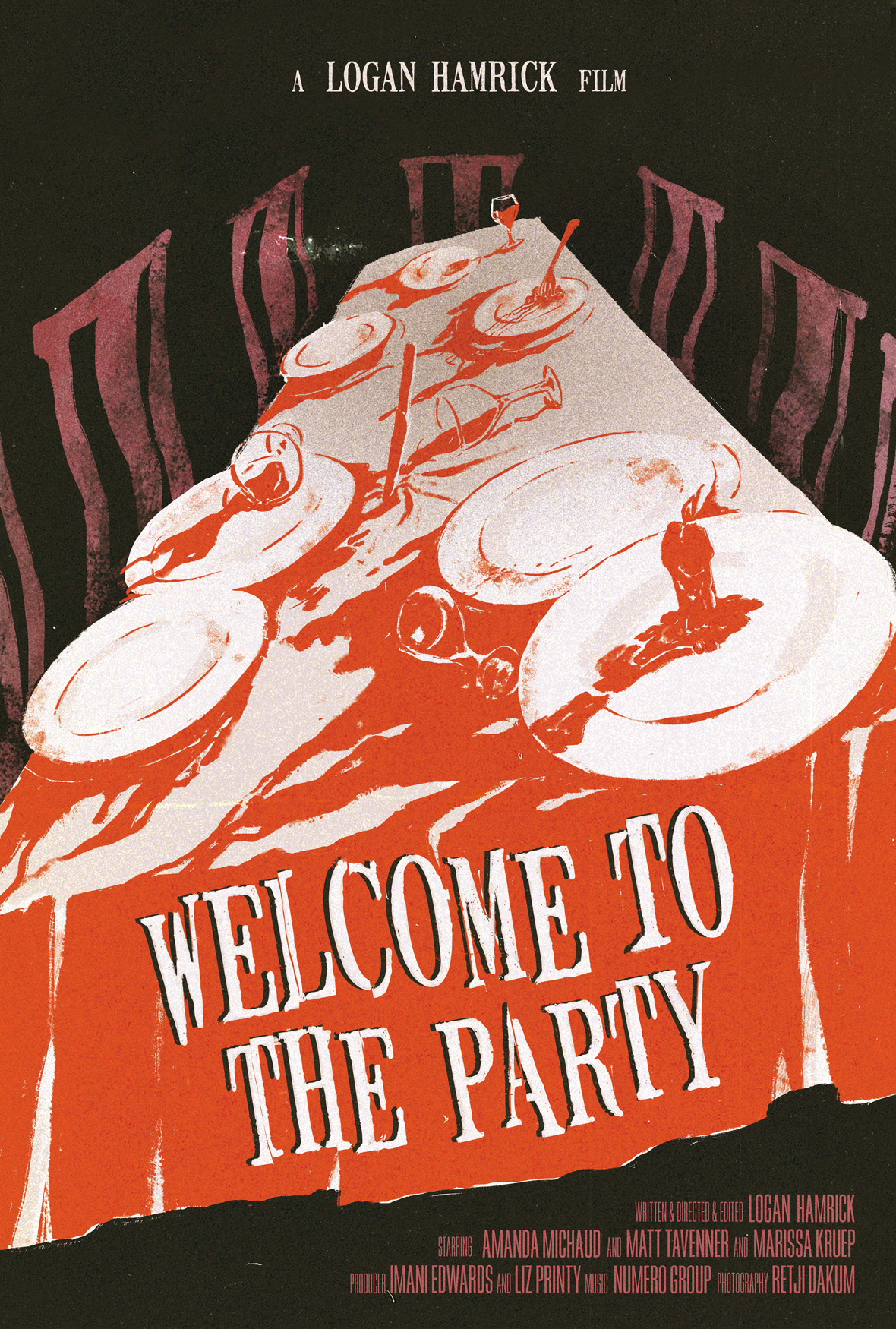
Luo’s poster designs are unlike the posters of typical blockbuster productions. They’re a lot more restrained, relying on hand-drawn illustrations or even simple collages to create something memorable. The simplicity with which she approaches the medium feels natural—there’s a soothing elegance to her one-frame visual narratives.
Luo says her aesthetic is inspired by both renowned movie poster artist Akiko Stehrenberger, who approaches her illustrations with a designer’s eye. Directors with an affinity for telling stories around family, normal life, and femininity—such as Éric Rohmer, Naoko Ogigami and Ann Hsu—hold a place close to her heart, and their storytelling methods are also quite influential to her work. Aside from these artistic influences, she believes that her own feminine intuition and eye for detail plays critical parts in her creative process. “I’m a practical person, and I like creating around subjects that are feel like a part of ordinary life,” Luo says. “I’m the more interested in the relationship between people.”
与常见的商业类型电影海报不同,罗曦冉的作品没有华丽的视觉效果,或是浓重、激进的后期痕迹,反倒是以朴实、真挚的手绘或拼贴打动旁人。其带来的第一感受是舒服、质朴、自然而然,又像是小说内页,引人入胜又打算娓娓道来。海报上那些对人物与场景的描绘,处处展现细腻与柔情。
这当中一部分原因是受到电影插画海报领域翘楚 Akiko Stehrenberger 的启发,她的设计思路影响了罗曦冉的创作;另一部分原因,则是她作为女性,对于生活的那一份细致入微的观察力,“我是一个比较实际的人,喜欢贴近日常的题材,我还是对人和人之间的关系比较感兴趣。”而在罗曦冉所列举的片单中,侯麦(Éric Rohmer)、荻上直子、许鞍华等围绕家庭、伦理、生活、女性主题创作的导演,皆是她的心头好。


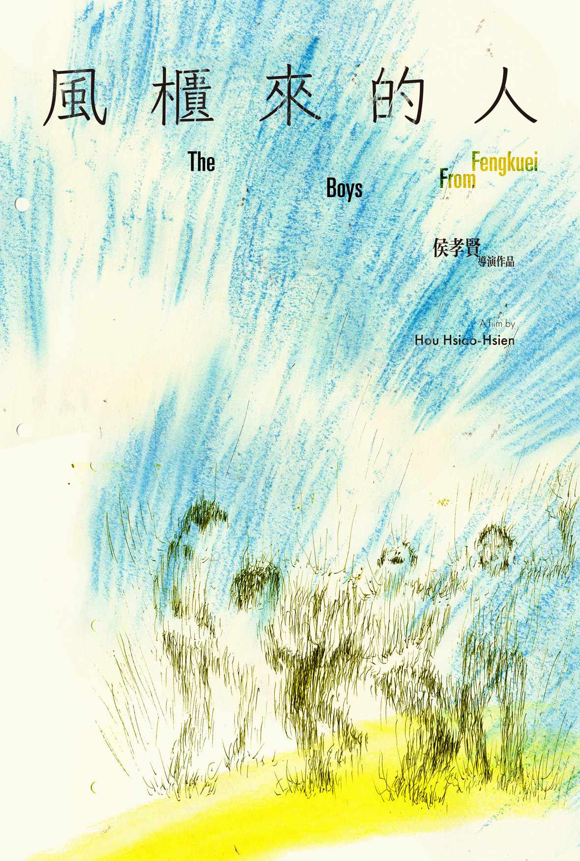
Luo’s creative process centers around the mindset of less being more. When looking to capture the core of a film, she believes that the most minimal approach is best. For example, in an homage poster for director Hou Hsiao-Hsien’s The Boys from Fengkuei (1983), line work resembling windswept tall grass form the outlines of the four protagonists. The frenetic scrawl also serves to capture the complexity of the featured characters: the sense of confusion, anxiety, and melancholy felt when they found themselves outside the comfort zone of their hometown. For her homage to director Tsai Ming-Liang’s Vive l’Amour (1994), shades of pink cover nearly the entirety of the poster and the three main characters. They appear almost smothered by the color, a visualization of the intoxication and encompassing feeling of love. While these artworks capture the overall vibe of the film, Luo also leaves plenty to the viewer’s imagination. “I often consider how to convey the core message while allowing room for the audience to think and interpret it for themselves,” she explains. “I aim for simplicity and concision, but I also want to leave an impression through artful ambiguity.”
在罗曦冉的创作思路里,减法往往比加法更能令人印象深刻。很多时候,她更希望通过极致简单的手段,将影片的核心思想精准把握。例如在她私下为了练手,重新制作的 1983 年侯孝贤执导影片《风柜来的人》的海报中,缭乱如野草般的线条,勾勒着几位少年的轮廓,将几位小镇青年前往城市时的迷茫、焦灼、不甘、悲伤等复杂心态埋藏在数屡叶草之下;再如同为练手的《爱情万岁》海报设计中,醉人的粉色将三人包裹,在交代三人之间可能发生的关系同时,留给观众“爱能包容一切”的直观感受。这种即精准又有所保留的创作方式,在保证与影片内容契合的同时,留给观众想象的空间,“我在创作中,会考虑如何在确保穿搭核心信息的同时,留给观众更多思考与理解,如何言简意赅、但又不缺乏趣味,这种暧昧不明的感觉,是我想要的效果。”
However, some art films or documentaries pose a challenge. The straightforward narrative can make it difficult to distill the full story into a singular frame. When faced with this, Luo believes that communication is key to achieving the best work. Whether it be repeat discussions with the directors or producers, she believes in dedicating enough time to understanding the film’s message. She also enjoys straying from her hand-drawn approach and even taking her work into the realm of the surreal through collages or playful typography.
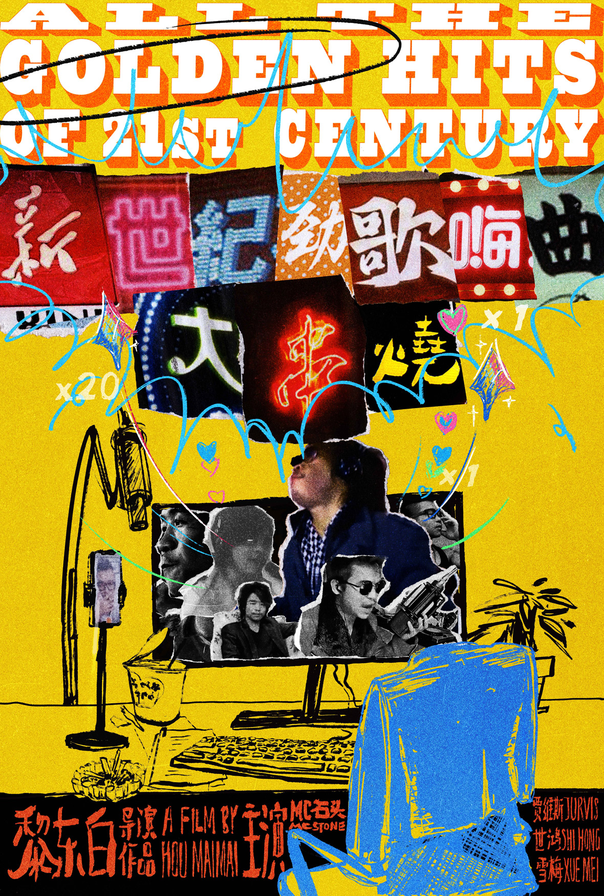
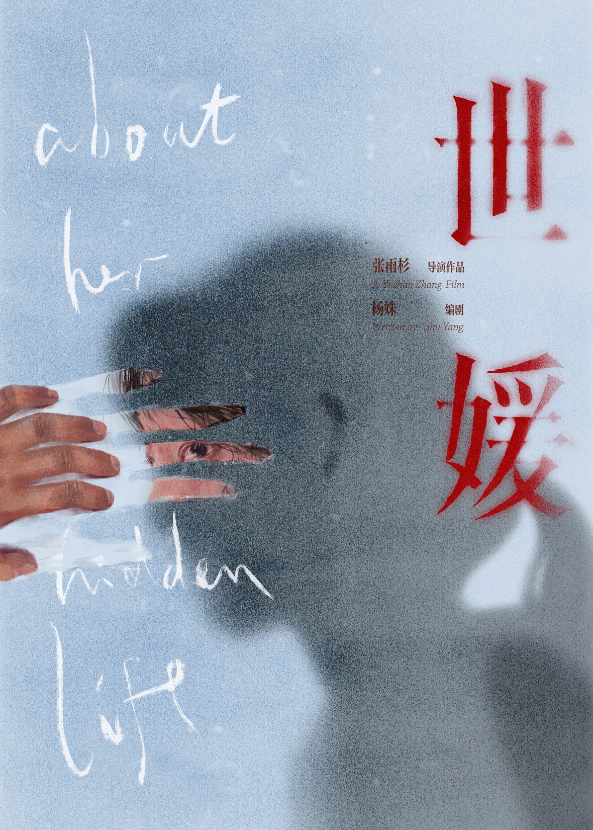
Of all the posters that Luo has created, her design for the Chinese documentary All the Golden Hits of 21st Century (2022) is perhaps the most unique. The poster aesthetic is a sharp pivot from her previous work, employing a number of portrait cut-outs in a collage format. The film, directed by Lai Dongbai, tells the story of how a former county internet singer has managed to keep up with the times through his discovery with the Kuaishou app. In order to capture the kitsch flavor of rural China and the hodgepodge sights of the Chinese countryside, Luo assembled the film title by cobbling together Chinese characters from photos of store signage. “I’m very interested in type design and I enjoy trying something new in each poster to find the right type,” she says. “For me, the type design part is just as important as the illustration.”
然而,多数文艺、纪录或生活片的叙述方式形同散文,想要从中获得最具代表的画面并不容易。为此,罗曦冉在创作前需要和导演、制片人进行充分沟通、并反复观看影片。通常,她还会对海报进行一些超现实的改动,譬如有趣的拼贴、电影标题的字体。此外,电影里频繁出现的道具,人物的外貌特征,有特殊意义的环境,都可以成为设计的一部分。
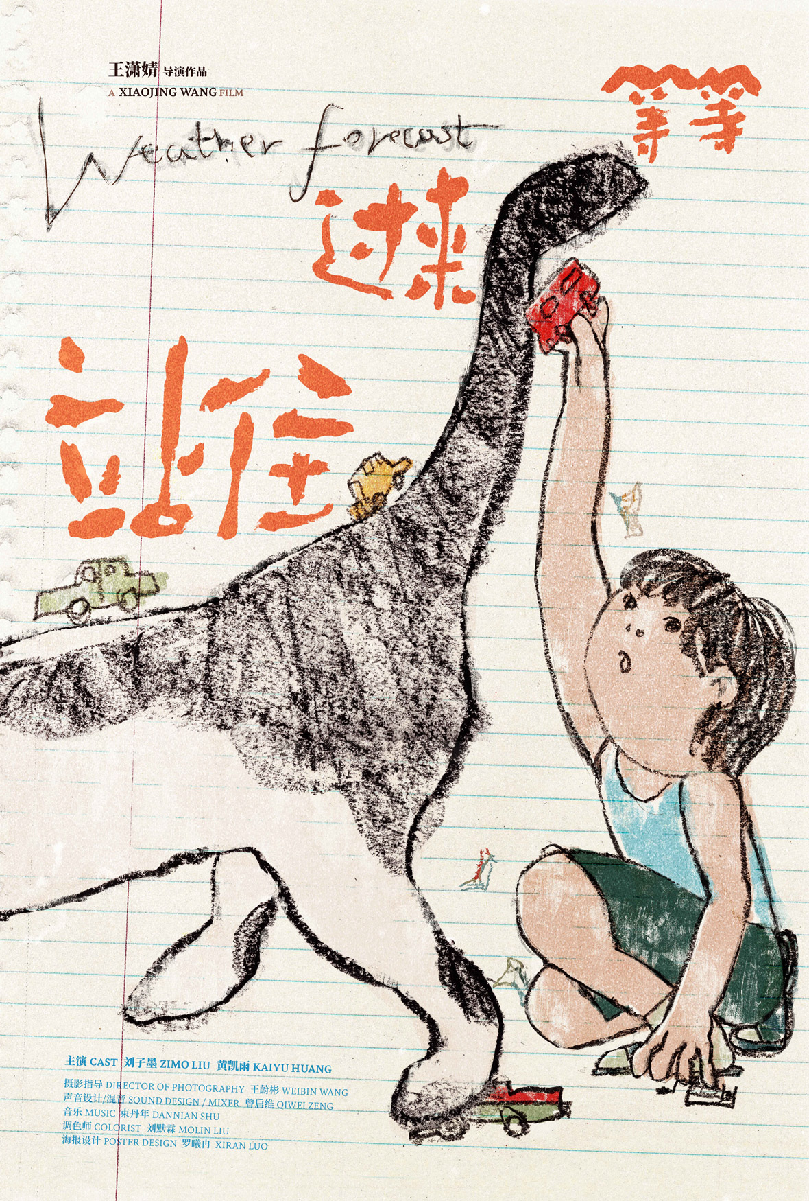
在罗曦冉所创作过的电影海报中,《新世纪劲歌嗨曲大串烧》的海报设计无疑是特别的存在。整幅海报一改以往大量手绘风格的运用,以纷杂的拼贴迎人。在她看来,这次创作算是突破了个人的舒适圈。该纪录片由黎东白执导,讲述了一位来自县城的昔日网络歌手如何在当下顺应时代,孵化快手视频账号的故事。为了营造出中国“土味”、以及小县城里大杂烩式的景观,罗曦冉以影片中出现的店铺招牌为灵感,在网上找到许多带有“标题”里出现对应字的店铺招牌,最后将它们撕开、打印、拼贴,“味道一下就正了”,罗曦冉说道。
她通常会精心设计每幅海报上出现的字体设计,尽可能融入整体视觉或将观众轻松带入到影片情绪,她接着说道:“我对字体的兴趣很大,希望在每一张海报里都有新的尝试,找到合适的搭配。对我而言,字体设计的部分跟插画创作的部分一样重要。”
Under her delicate touch, Luo’s posters capture each film’s essence and emotion in a succinct way. Much like the types of films she creates posters for, she hopes that her work can help people appreciate the minutia of life in a new light.
Although poster commissions alone cannot sustain Luo’s livelihood, she has no plans of stopping. She believes that with time, she’ll get to where she needs to be. “Movie posters require more design-oriented thinking, and it’s not personal creation—it needs to achieve more than give myself creative satisfaction,” she says. “I hope my poster art can be seen and understood by people of all ages.”
罗曦冉的作品像是温柔地从荧幕上撕下的一页页、在理性对待剧情逻辑的同时,糅合自己对电影的感性理解、在无多赘述的线条下埋藏着人世间的不凡。在目前看来,电影海报设计虽然不能维持罗曦冉的生计问题,但她希望不要把这门技能丢下。她相信随着时间的推移,自己的作品将与客户和观众的关系愈发融洽且明朗,她说:“我觉得电影海报设计的本质是设计,并不是个人创作,它的服务性要高于我的个人意志。我希望我的电影海报是可以被更多年龄层的人看懂并接受。”
Like our stories? Follow us on Facebook and Instagram.
Instagram: @l_o_boood
Weibo: ~/萝卜咚lobod
Website: ~/XIRAN LUO
Contributor: Pete Zhang