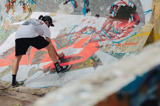
The street art scene typically incentivizes graffiti writers to drop letter art for more abstract and character-centered murals. But a small subset of writers progress into large, typography-driven works, a method often referred to as calligraffiti. The common root in lettering makes it an obvious transition, though it’s less popular than conventional street art. An even less-explored field is calligraffiti based on non-Latin alphabets, and Taipei’s CreepyMouse is one such artist keen on combining Western and Eastern written cultures.
时下的街头艺术中,越来越多涂鸦艺术家放弃字体涂鸦,转而创作更抽象和专注于人物形象的壁画作品。然而,有少数派的涂鸦艺术家却剑走偏锋,选择创作更大型的字体涂鸦作品,即所谓的“书法涂鸦”(Calligraffiti)。涂鸦与书法都根源于字体设计,因此两者的融合也算是水到渠成。字体涂鸦本来就不如传统街头艺术那样备受关注,而其中更加冷门的莫过于非拉丁字母的书法涂鸦。来自台北的 CreepyMouse 正是专注于此领域的涂鸦艺术家,尤其热衷于结合西方和东方的书法文化。
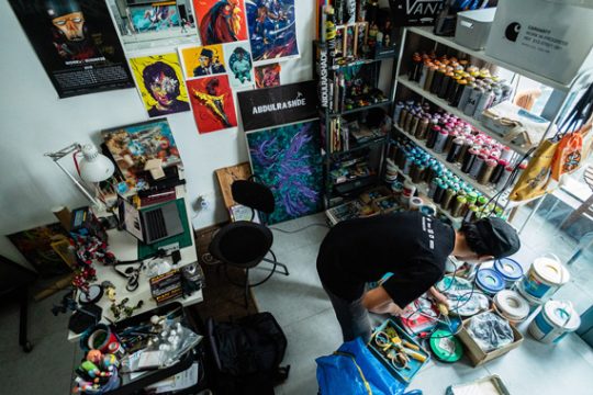
CreepyMouse, whose given name is Tsai Song Ting, got his start painting the streets of Tainan. Under the cover of darkness, he joined high-school classmates as they caught tags around town while he took photos. “Once they asked if I wanted to write my name, and I pressed my first cap; I just couldn’t stop,” he laughs. His graffiti name is a reference to those early days when they crept around silently, getting up on walls while others slept.
CreepyMouse 原名蔡松廷,最早是在台南街头开始创作涂鸦。高中的时候,他和同学常常趁着夜幕,在镇上四处留下签名 tag,而他则在一旁拍照。“有一次他们问我,要不要也写写我的名字,于是我第一次按下喷漆,从那以后,我就一发不可收拾了就无法停下来了。”他笑着说道。他的涂鸦名字“CreepyMouse”正是指就源于从他们以前那些趁着夜深人静偷偷摸摸,在墙壁创作涂鸦的日子。

He eventually moved on to more traditional burners, painting colorful and intricate pieces inspired by traditional U.S.-style graffiti, something he still indulges in from time to time. But CreepyMouse’s curiosity about the Latin alphabet led him to Gothic calligraphy, a style of script that grew to prominence in Western Europe between the 9th and 15th centuries. This style captivated him and quickly became his primary area of focus. “I was mainly learning on my own using the internet, checking out other artists’ work while trying to create something new out of those influences. Some friends also helped point me in the right direction.”
后来,他开始创作更传统的 burner 作品(指“精制壁画”),色彩缤纷、精繁复杂的涂鸦风格,深受传统美式涂鸦的影响,这是他至今仍然热爱的涂鸦风格。之后,出于对拉丁字母的兴趣,CreepyMouse 认识了哥特体书法,这是一种在 9 至 15 世纪期间在西欧流行开来的字体。这种字体让他如此着迷,很快便成为他潜心专研的字体风格。“我主要都是通过网络自学,看看其他艺术家的作品,然后试图从中创造出一些新的东西,我的一些朋友也给了我一些很好的意见。”

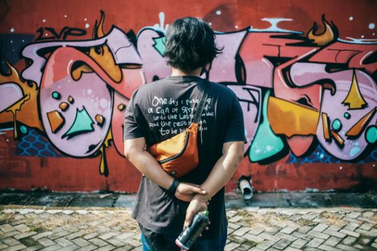
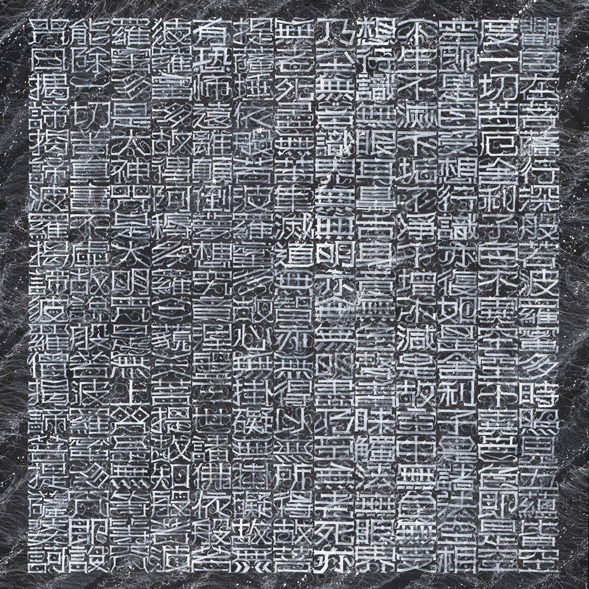
While Western ideas intrigued him, CreepyMouse was equally interested in incorporating his own culture into his art. As an experiment, he began applying what he’d created based on Gothic styles to Chinese characters. “It just works!” he grins. Although he still does some lettering in English, the majority of his work is now written in Chinese.
虽然 CreepyMouse 对西方文化颇感兴趣,但亦同样热衷于将自己国家的文化融入到艺术作品中。之后,他甚至开始尝试将哥特体风格应用于汉字中,“效果竟然很不错!”他笑着说道。虽然偶尔仍会使用英文字体,但他现在大部分作品都是用汉字创作的。

Although CreepyMouse is a minority as a graffiti-based artist working in non-Latin scripts, he’s joined by some interesting company. In Brazil, pixadores cover entire skyscraper facades with tags based on Runic scripts and heavy-metal-inspired fonts. In Japan, Mami combines Japanese calligraphy with lessons in scale learned from American-style tagging, and Tacos is a French graffiti artist raised in Shanghai who paints in a “graffuturism” style using Chinese characters. Writers like Gas and Reset in Chengdu and Boms in Hong Kong also get creative with Chinese characters.

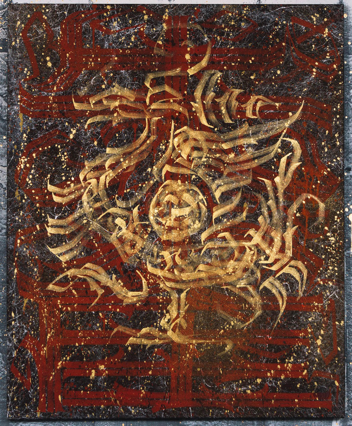
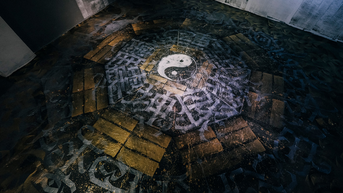
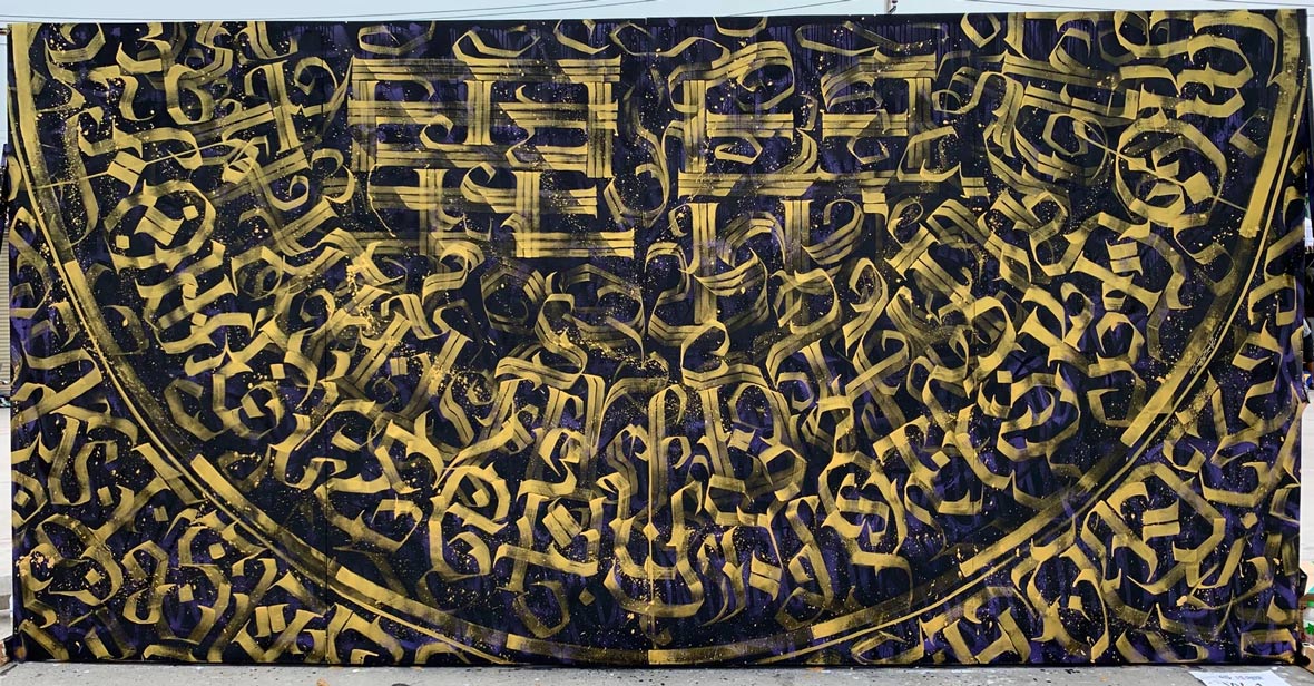
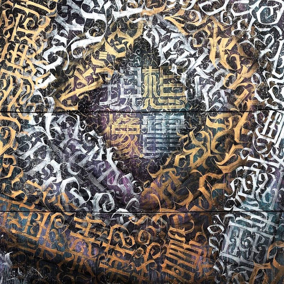
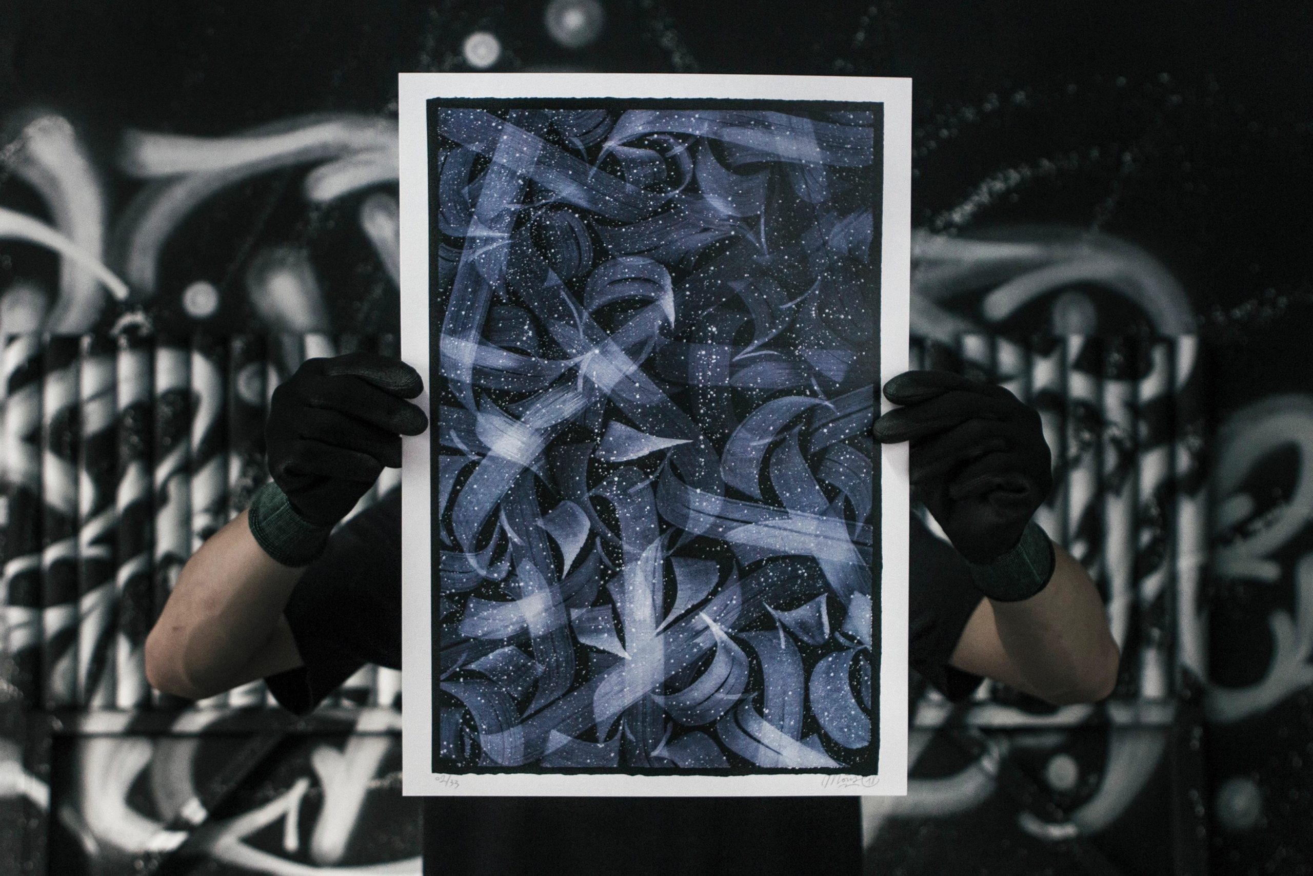
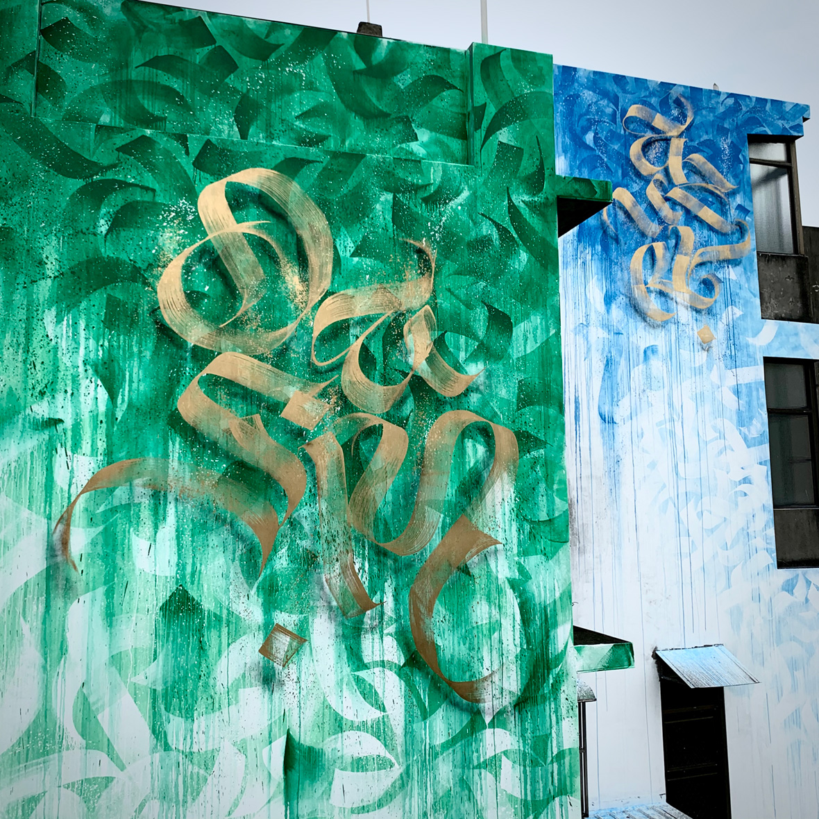
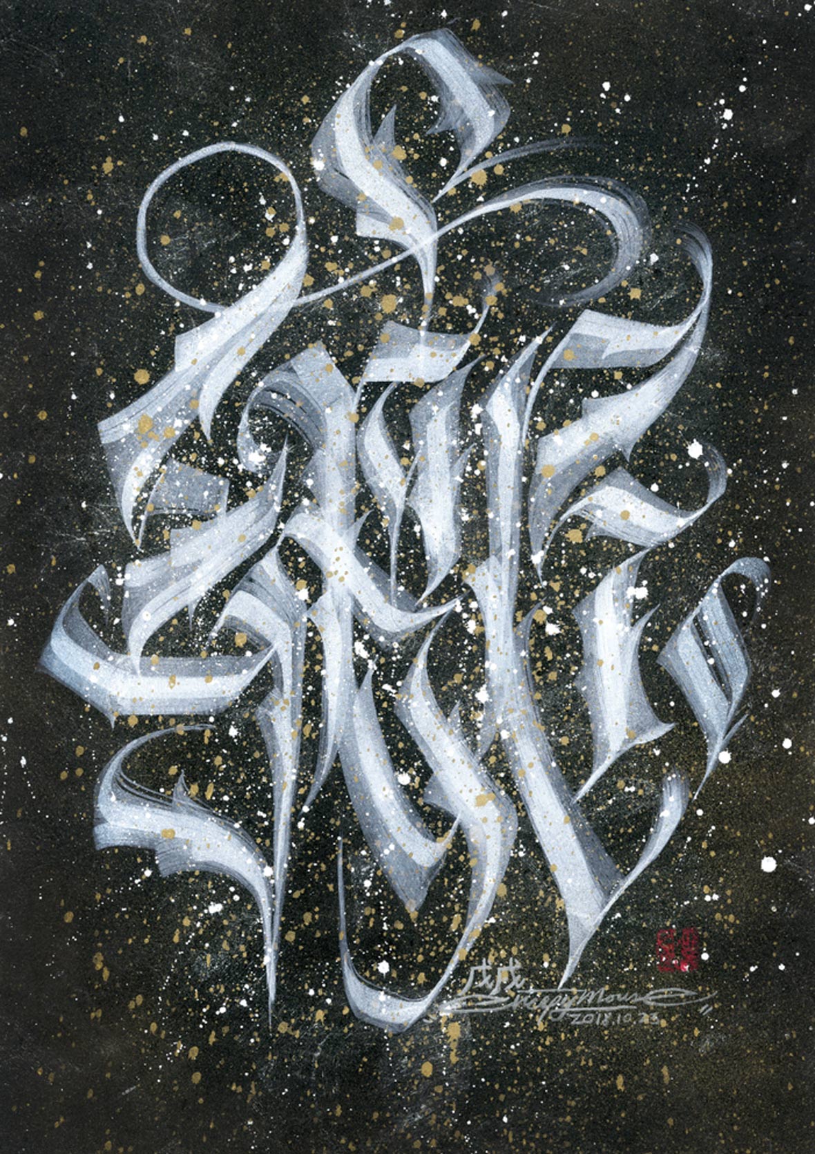
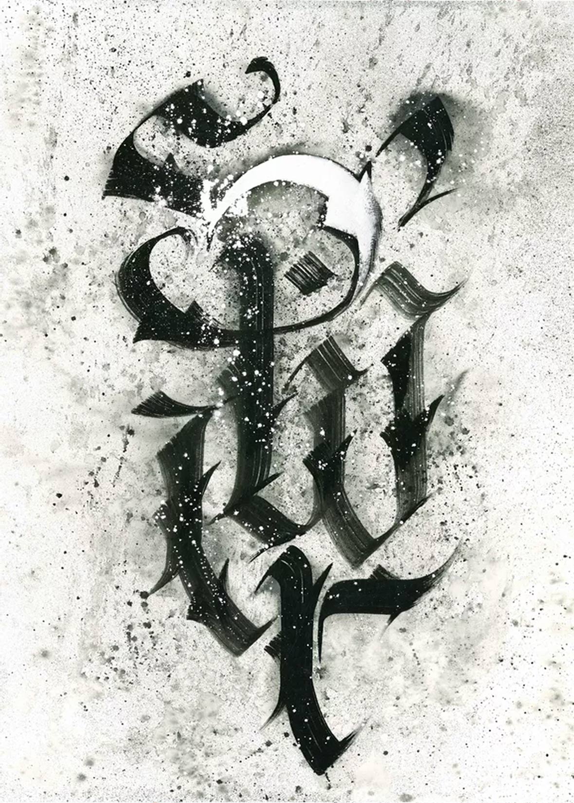
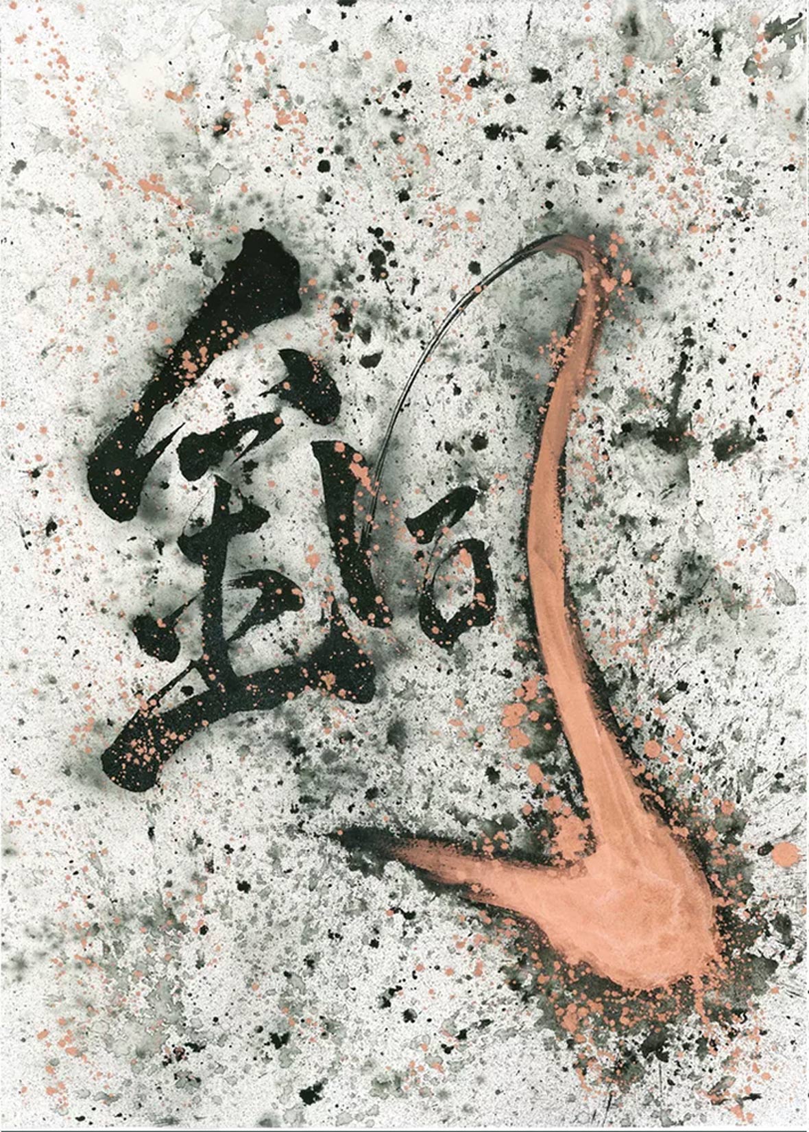
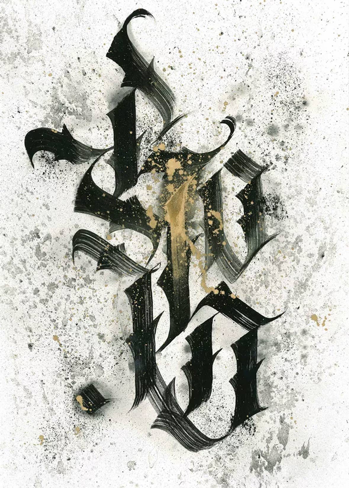
CreepyMouse dispenses with the pop-art color schemes so popular within the contemporary street-art circuit and instead hones in on two or three colors per piece. But this doesn’t detract from the works’ power—instead, it seems to lend an increased aura of intensity to the paintings. The golds radiate more vibrantly and the reds glimmer with deeper contrast when they’re allowed to take center stage. Even when working in black-and-white, an energy pulsates as his letter work becomes the beating heart of the piece.
And visualizing energy is important. With many styles of calligraphy, the movement of each stroke can be a defining aspect. The different weight and pressure of every stroke are ways for CreepyMouse to express himself on his own terms. “Many things in life can make me feel angry, but I’m able to vent those emotions peacefully through artwork,” he says. He balances these aggressive strokes with passages and text pulled from serene sutras or song lyrics. “They let my heart find peace.”
CreepyMouse 摒弃当代街头艺术圈的流行艺术配色,而选择以两到三种颜色来创作每一幅作品。颜色种类的减少并没有削弱作品的力量,相反,这反而令他的作品呈现出更强烈的气氛,没有过多的色彩干扰,金色看上去更活力四溢,红色则突显鲜明反差,在画面中显得更瞩目抢眼。即使是黑白色的作品,这些字体也仿佛是作品跳动的心脏,涌动着一股蓬勃的能量。
透过视觉效果传达出力量感很重要,对于各种风格的书法,一笔一画的动态有着决定性的影响,CreepyMouse 正是通过每一个笔画的重轻与压力来表达自我。“生活中有许多让我愤怒的事情,但我可以通过艺术,冷静地宣泄这些情绪。”他说道。咄咄逼人的强劲笔触,却书写着平静人心的经文或歌词,相互之间抵消平衡,“让我的内心重拾平静”。
Like our stories? Follow us on Facebook and Instagram.
Website: www.creepymouse.art
Instagram: @creepymouse1
Contributor: Mike Steyels
Chinese Translation: Olivia Li