With music recording unbound from physical restrictions and floating around the digital ether, what good is a cool CD case or liner notes? If today’s vinyl craze is any indication, people still value that physical connection. Creating album packaging is still Taiwanese designer Wu Jianlong’s main area of work, and considerations to their tactility is front and center in his designs. Even though nobody really buys physical CDs anymore, they still have their merits: “Physical albums are like business cards for musicians,” he says. As valuable as these are in themselves as art objects, he’s taken what he’s learned with album design, expanding into poster art and even sculptural pieces using similar materials and aesthetics.
It was music and movies that inspired Wu to become a designer. “Browsing the racks at music and video shops to soak in the cover designs—this deeply influenced me.”
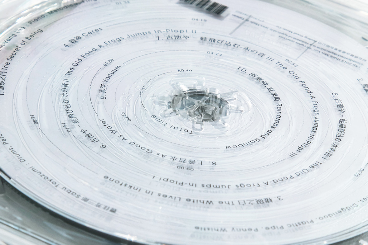
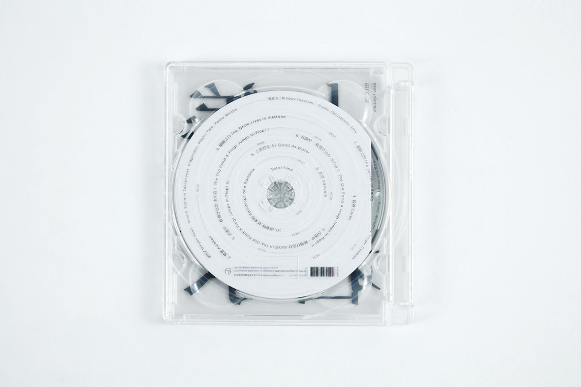
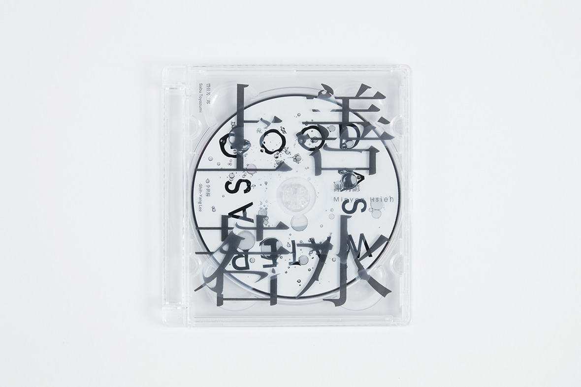
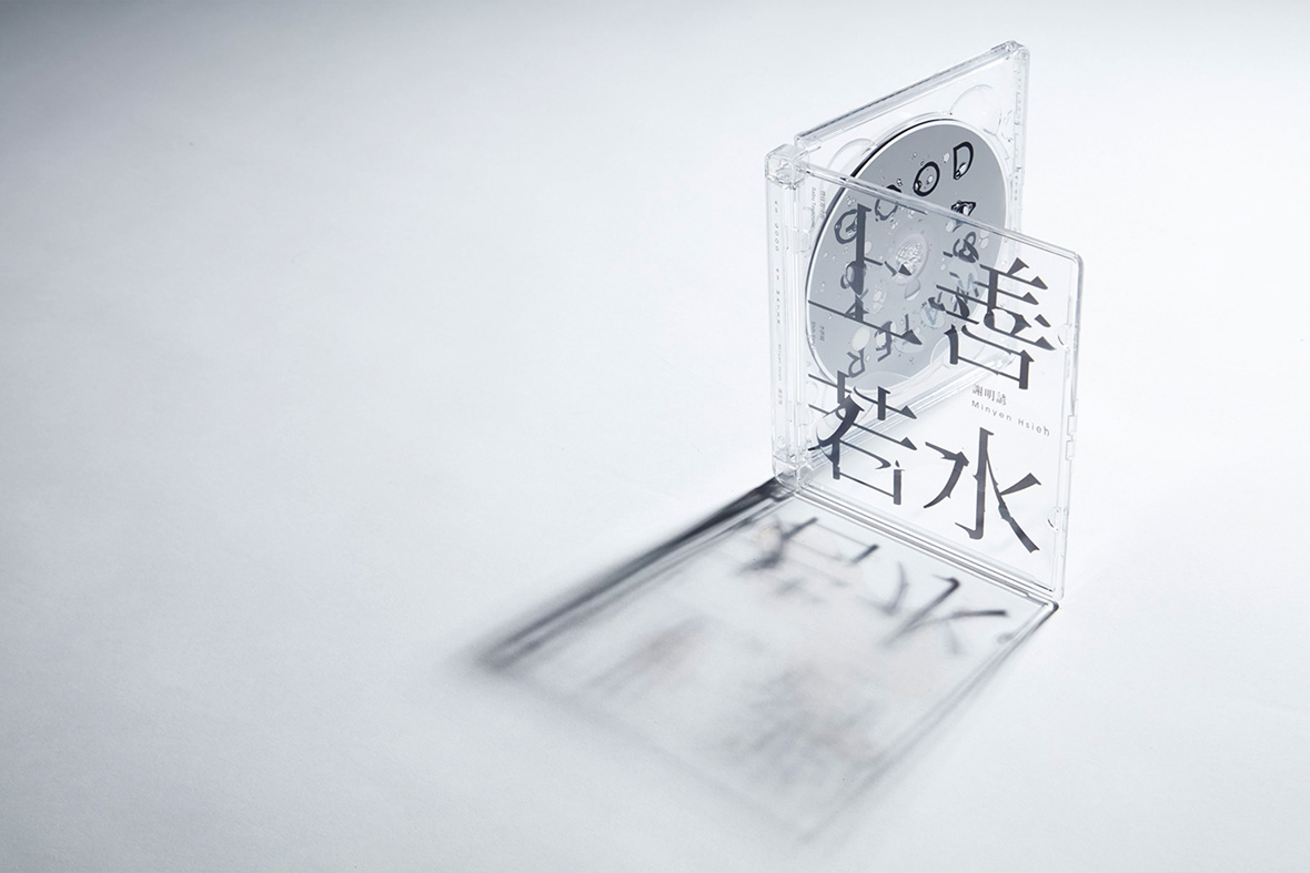
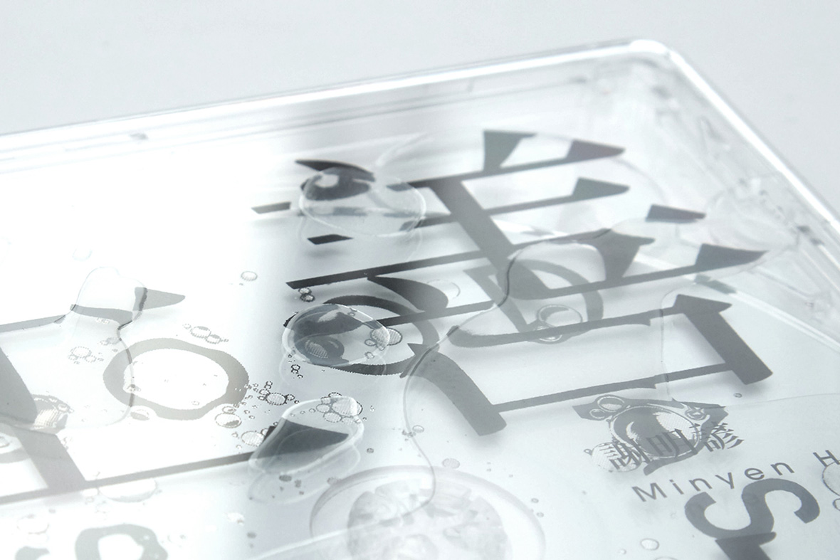
The physical qualities of jewel cases and CDs are clear starting points for Wu. Literally. He excels in his use of translucency and returns to it frequently. His design for Taiwanese saxophonist Minyen Hsieh’s As Good As Water plays on the album’s theme of water, which has been visualized as puddles and droplets that seem to sit atop the see-through case. The artificial fluids distort the text beneath, just as real water would.
吴建龙化名 FK WU,与很多设计师一样,最早是受音乐和电影的启发,而决定投身于设计领域,“经常会去逛音像店,对货架上的封面设计流连忘返,这些经历对我影响很深。”
吴建龙在设计时喜欢从塑料 CD 盒和 CD 碟的物理特质入手,且尤其擅长半透明设计。他以水为主题,设计了台湾萨克斯乐手谢明谚的专辑《上善若水》。他别出心裁地在透明外壳上设计了水滴和涟漪,达到了以假乱真的效果。

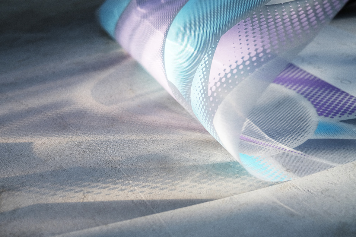
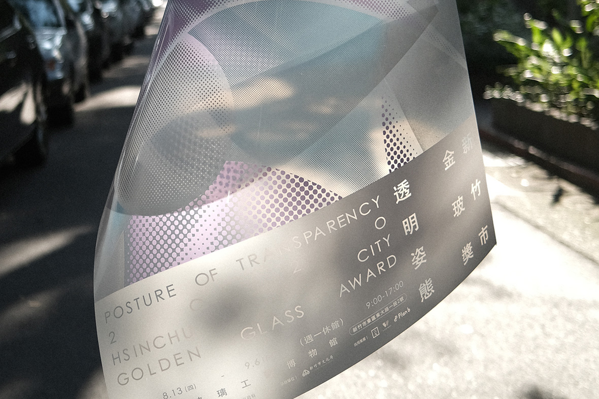
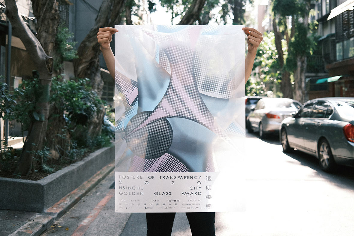
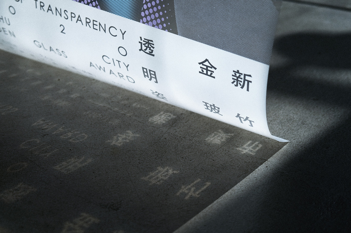
His poster for Posture of Transparency, a glass-art exhibition held in Hsinchu, is also translucent, printed atop a material that allows light to partially pass through: “Transparency is an illusion; sometimes it might be transparent like a liquid, other times it might be like plastic,” he says. “You can add a sense of layers with transparent materials.”
此外,他为新竹玻璃艺术展 “透明姿态” 创作的海报同样采用了半透明设计,他说:“透明是一种幻觉,可以是液体,也可以是塑料。你还可以通过透明材料,制造出丰富的层次。”
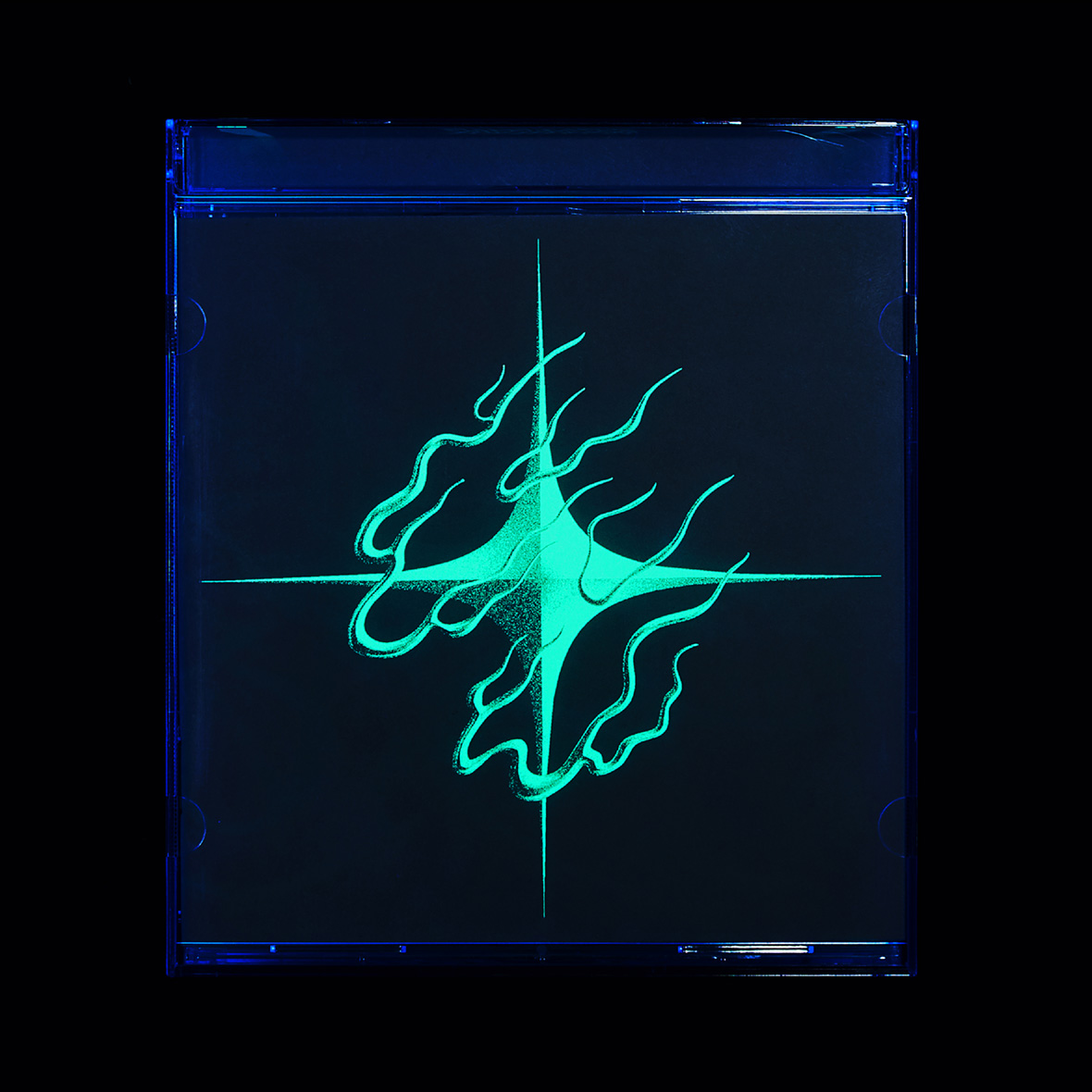
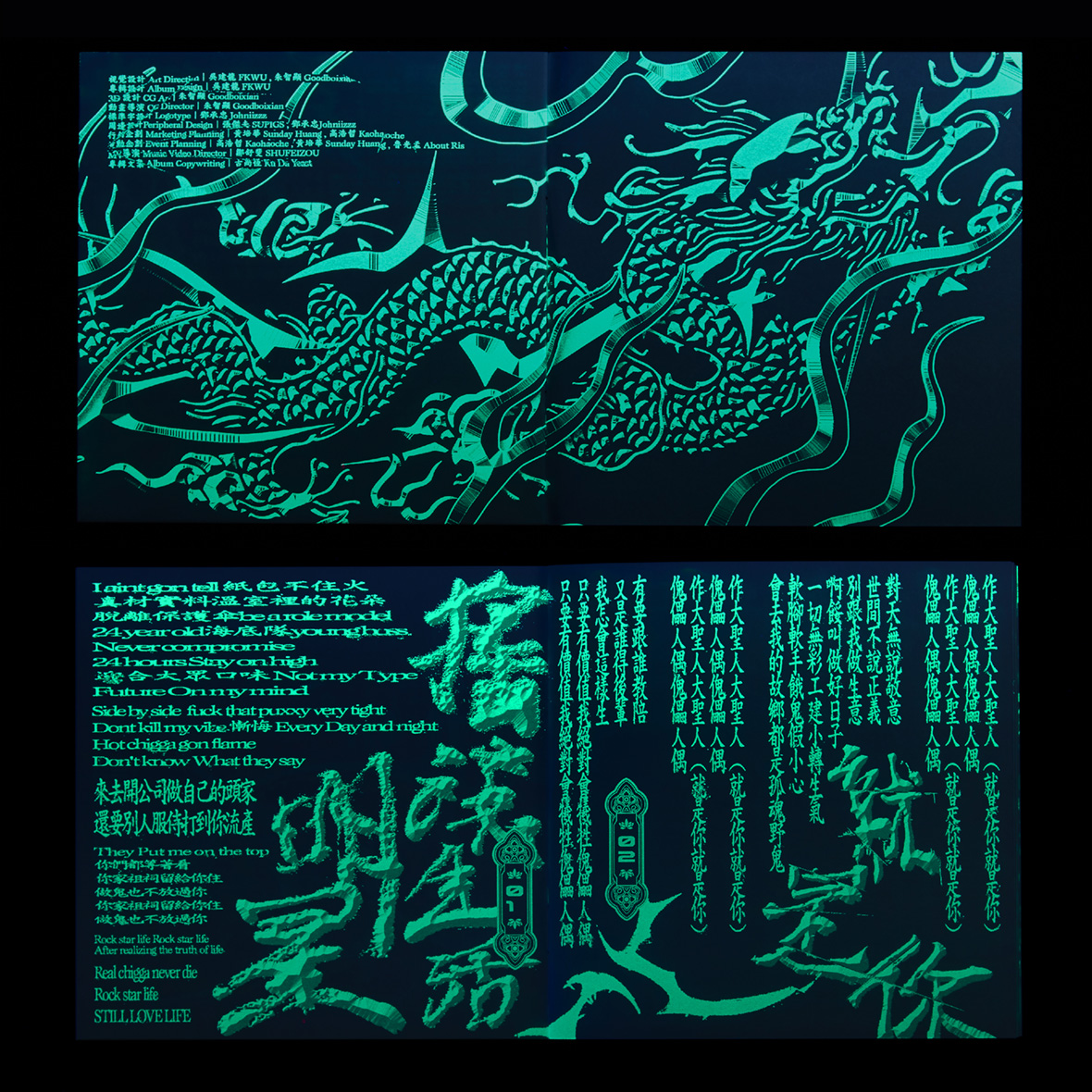
Wu is fond of different types of visibility. The UV-ink stamp used to verify ticket holders at concerts served as inspiration for Taiwanese singer HUSH’s album, which appears entirely blank in regular light. Only under blacklight does the full design reveal itself. UV ink is an idea he’s also played with on a few other personal works.
透明效果、多层透视,是吴建龙偏爱的设计特点。他曾以 UV 发光油墨印章作为创作灵感,为台湾歌手 HUSH 设计专辑封面。这类油墨通常被用在音乐会入口,盖在观众的手臂,作为购票凭证。在普通光线下,专辑封面看上去空白一片,只有在黑光灯下才能显现出完整的设计。UV 发光油墨元素,也同样被应用在他的许多作品中。
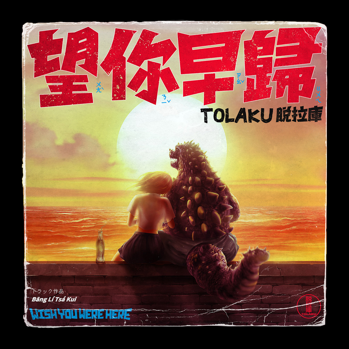
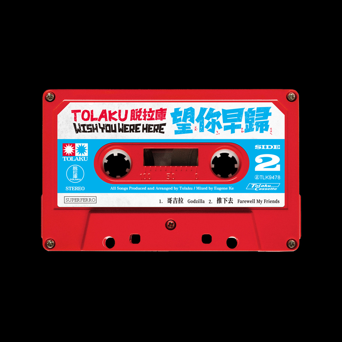
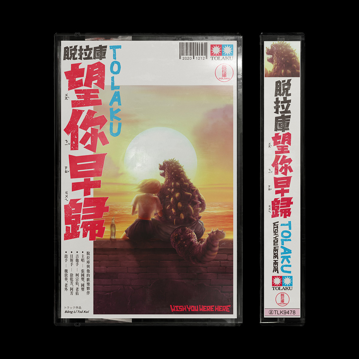
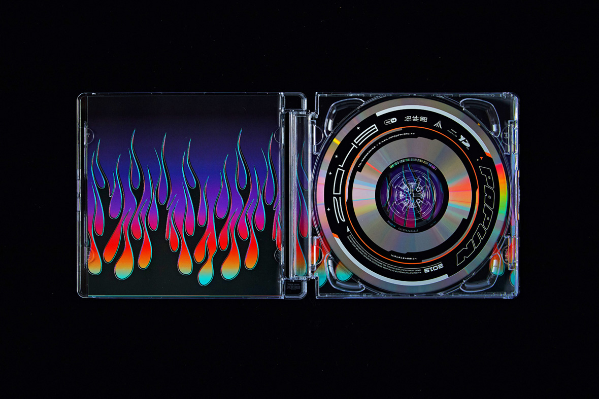
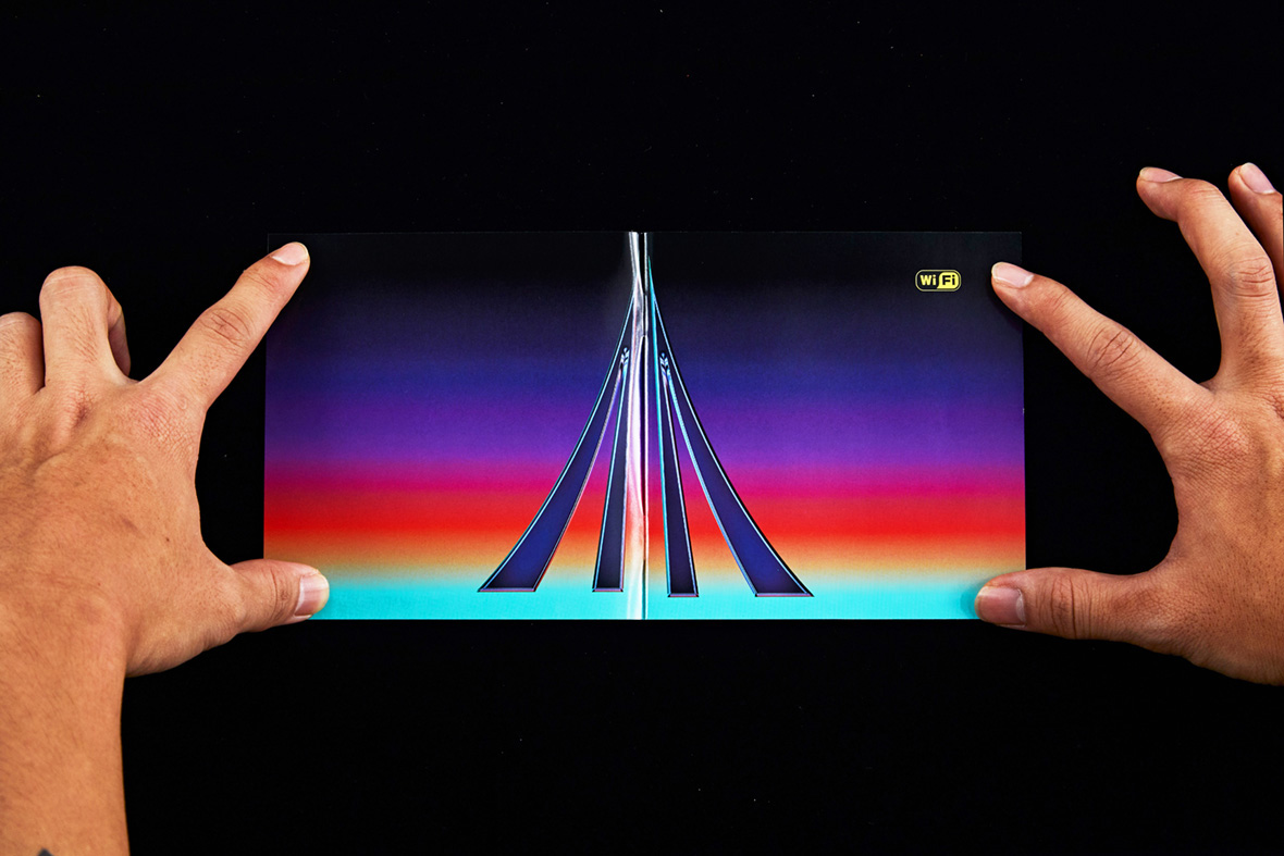
Wu’s love of retro sci-fi is also front and center in his work. The typeface and artwork for pop singer Tolaku’s release of his album Wish You Were Here is a direct reference to early Godzilla films. For rock band Papun’s album 2049, he features a customized Delorean from Back To The Future. But modern science fiction also serves as creative fodder, and he cites it as being foundational to the metallic aesthetic he’s known for. “The weapons that characters used in sci-fi and the general futuristic aesthetic of those movies, all of that still influences my work today,” he says. “I also think the material just looks dope.”
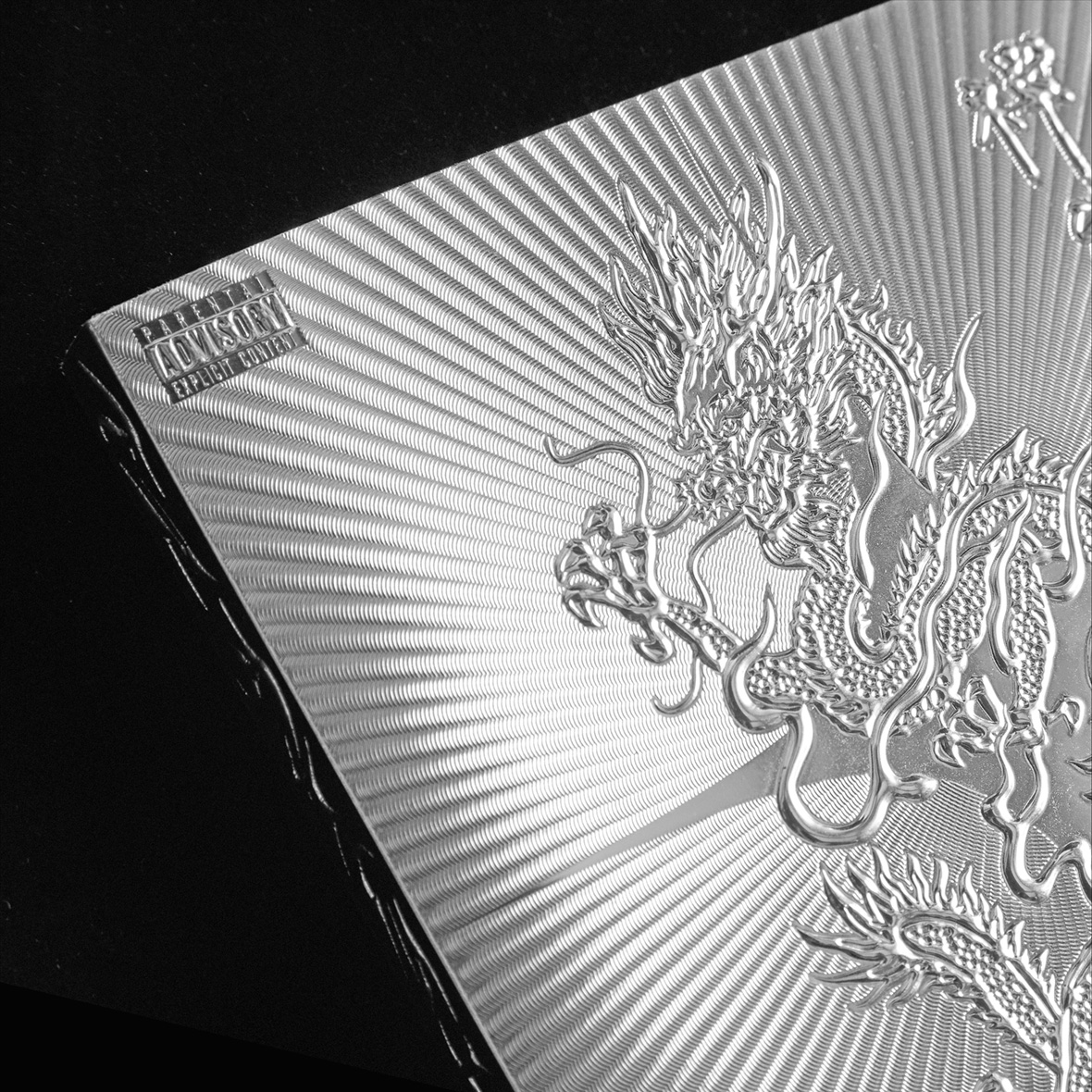
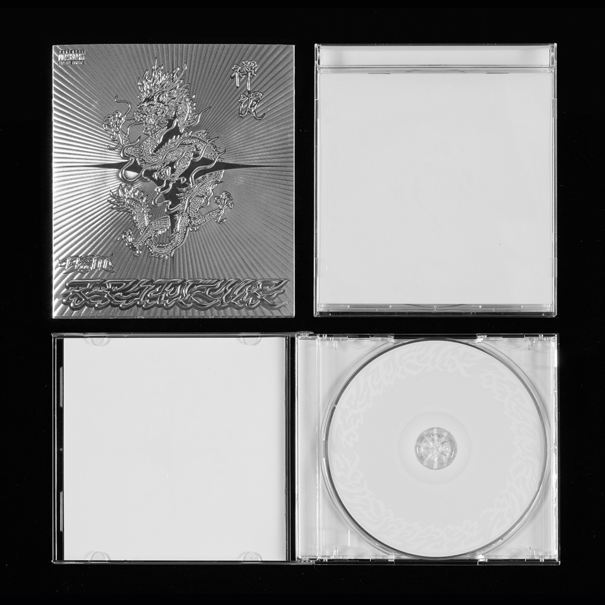
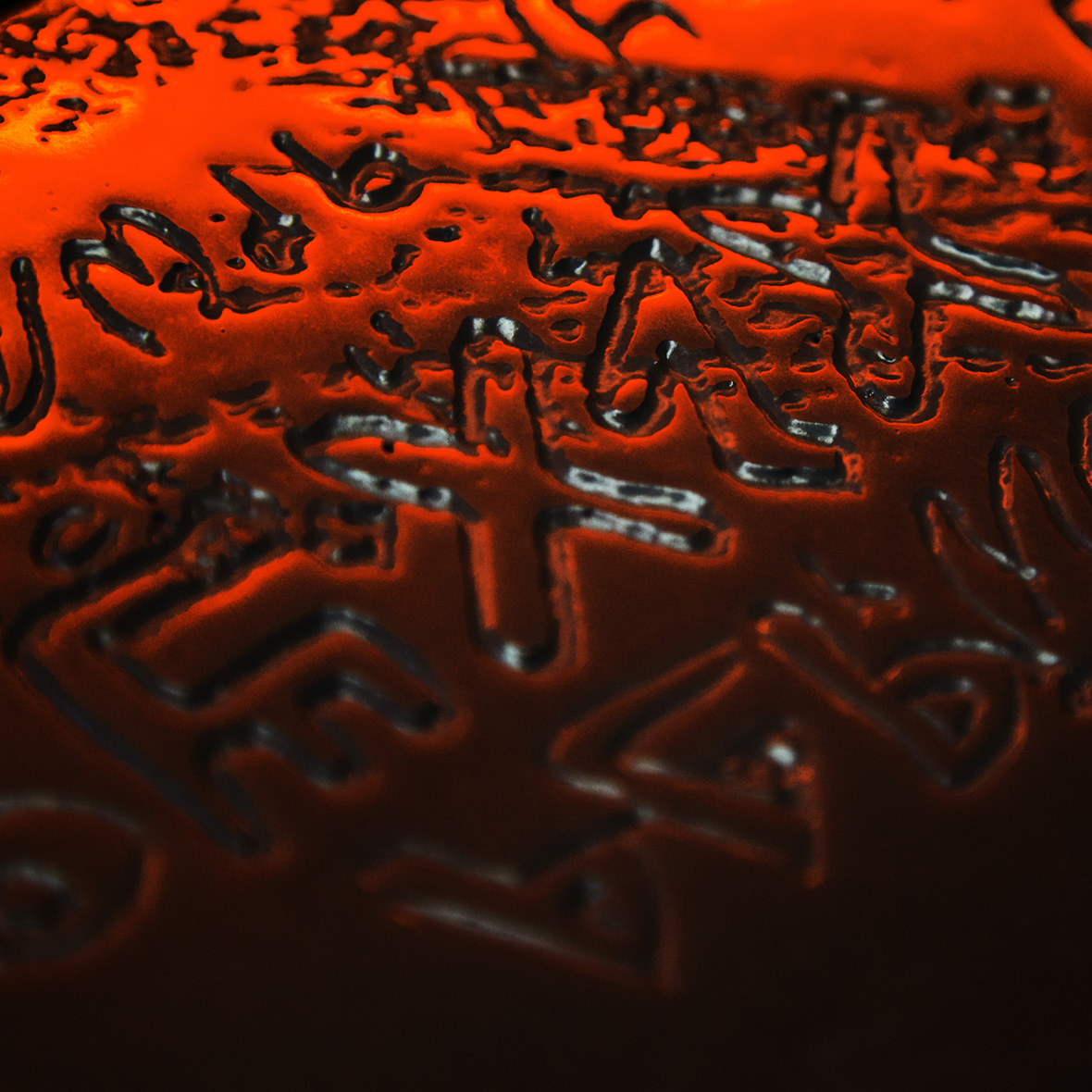
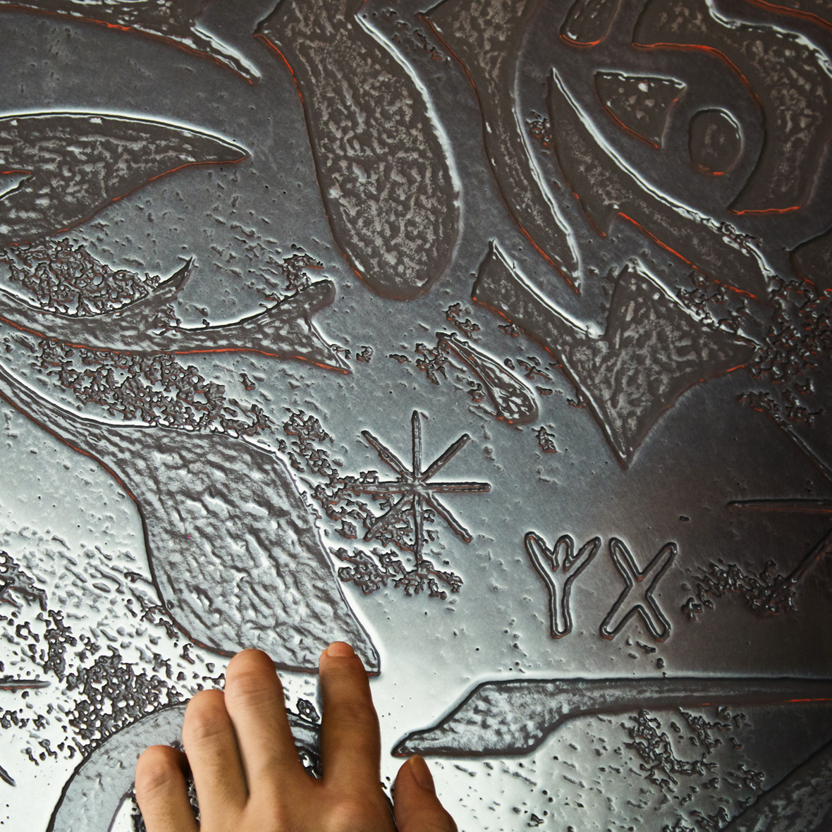
The metal-inspired designs are some of Wu’s most distinct works to date. His latest album design for rapper K-how’s Zenwave is an embossed foil cover that looks like an artifact straight from the future. (He uses UV ink on the inside as well.) When viewed online, it almost resembles CGI.
不难发现,吴建龙对复古科幻充满喜爱。在他为台湾流行乐团 脱拉库Tolaku 的专辑《望你早归》所设计的字体和平面中,就参考了早期的哥斯拉电影;而在台湾摇滚乐队 怕胖团PAPUN BAND 的专辑《2049》中,吴建龙又借鉴了电影《回到未来》中经典的德罗宁汽车造型。现代科幻片也是他的创意来源,在他看来,这类影片促成了他对金属感材质的偏爱。他说:“科幻片中的角色所使用的武器以及影片中普遍的未来主义美学,所有这些一直影响着我的创作,而金属这种材料本身就很酷。”
金属风格设计也是吴建龙设计中鲜明的一大亮点。在说唱歌手 K-how 的最新专辑《Zenwave》中,吴建龙就设计了一套浮雕铝箔封面,让整张专辑看起来就像是来自未来的工艺品。(专辑内页也同样加入了 UV 发光油墨元素)倘若在电脑上观看设计原稿,那几乎可以算得上是一幅 CGI 作品了。

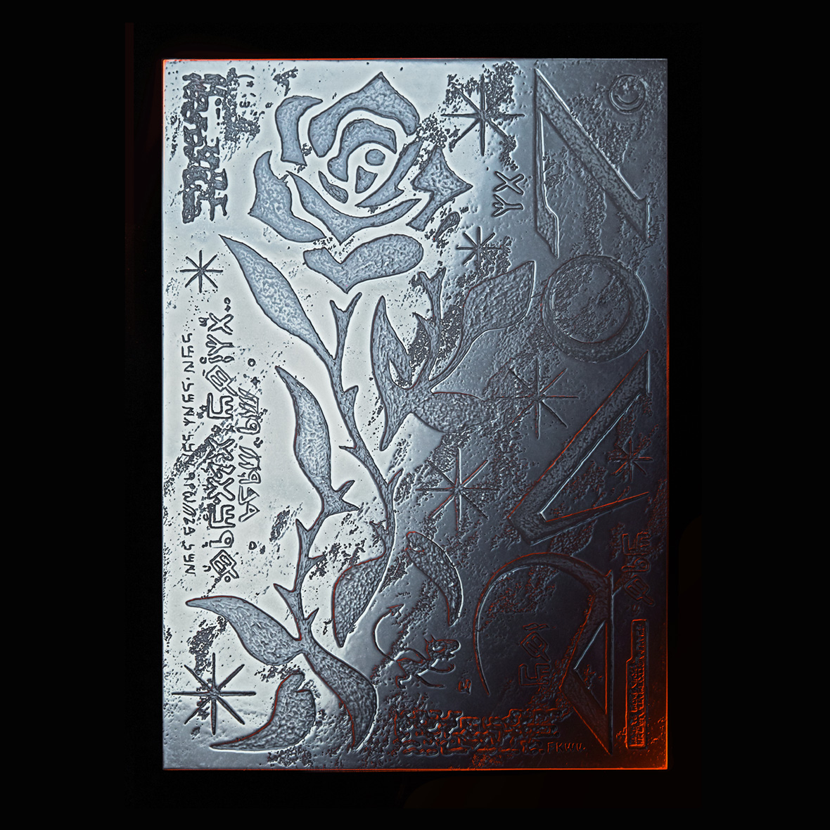
The piece Wu had manufactured for an exhibit at P_L_A_C_E gallery is his most ambitious metallic design to date. He created a three-foot-tall embossed metal sheet that gleams brightly, and it and had to be mechanically lifted to the upper floor where it was hung. “The theme for that show was to depict utopia, which for me is love,” he says. “I used metal to portray my idea of love.” Although seemingly cold in regular light, passion exudes under the warm, red light he chose to display it under. His piece builds on the lessons learned from past album designs and elevates these devices to new heights.
Wu’s work continuously builds on the past, a testament to the fact that dated mediums and techniques shouldn’t be considered any less relevant just because technology has moved on—they just need to be reimagined.
此前,在台北遇•场PLACE画廊的一次展览中,吴建龙创作了他迄今为止最雄心勃勃的金属作品,那是一块近一米高的浮雕金属板,光彩熠熠,被高高地悬挂在展厅。他说:“那次展览的主题是乌托邦,对我来说,乌托邦就是爱。我选择用金属材质来描述我内心的爱情观。” 普通光线下,这件作品看起来冷峻,而作品底部增设的暖红色灯光,传达出一种燃烧的激情。这件作品的创作立足于他以往的专辑包装设计经验,并提升至全新的高度。
正如他的其他作品所示,科技进步不代表必须抛弃旧的技术或日益边缘化的媒介——它们也可以切合时宜,甚至被加以利用,最终以全新的姿态公示于众。
Like our stories? Follow us on Facebook and Instagram.
Instagram: @fkkwu
Contributor: Mike Steyels
Chinese Translation: Alice Zhang