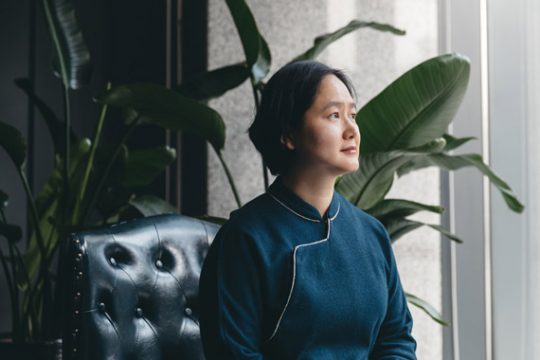
Over the course of eight years, RIGI Design has developed into an impressive multifaceted design company. Founded by Kai Liu, the company now employs a roster of talented young designers that all contribute to the spectacular work RIGI is so well known for. Their aesthetic is unique and undeniably well polished. With a focus on warmth, simplicity, and the human element, their designs revolve around making real connections with people. Kai Liu had a vision of creating a space that both suitably matched and properly conveyed the temperament of RIGI. Their new office in Shanghai’s Changning district is the project that resulted from that vision. The aesthetics and design concepts they employed for this new office are similar to their other projects, which skillfully invoke emotions through an air of simplicity.
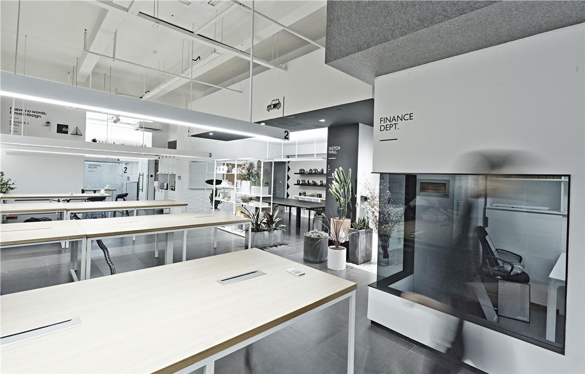
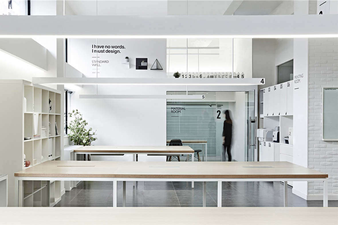
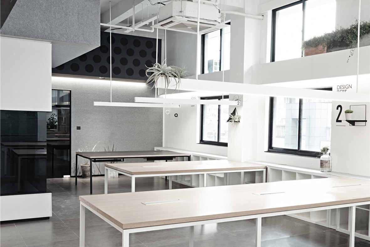
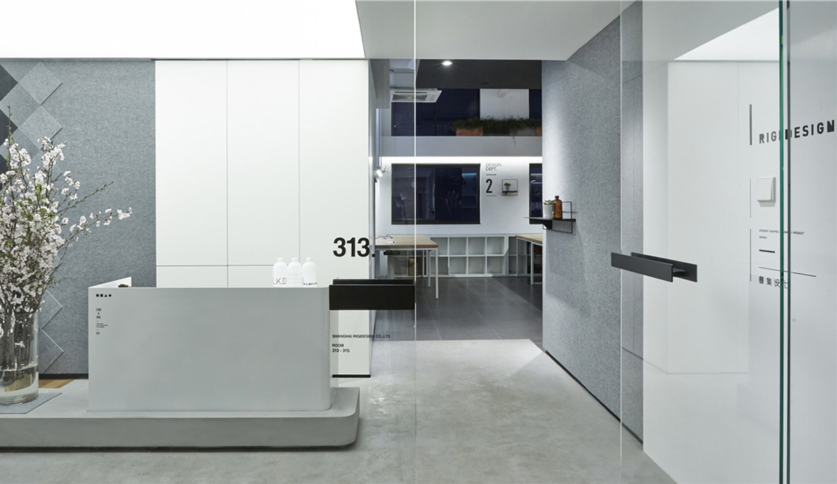
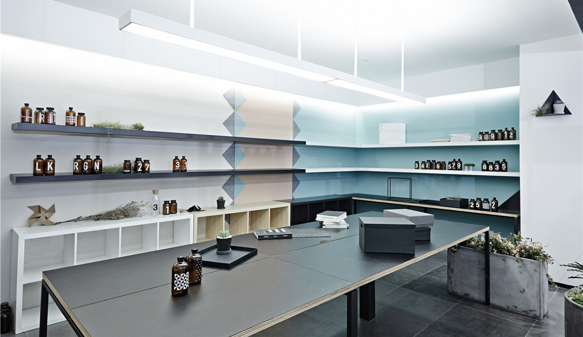
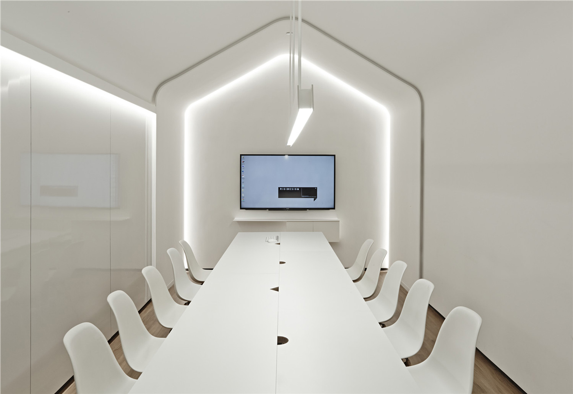
The office space began in a rather plain rectangular space, with natural light only available from one side of the building. After careful consideration, the space was divided into a few different areas: an open office, an independent office, a lab space, a meeting room, a material room, a small showroom, and a reception area. Different design approaches imbued each different area with its own identity and unique characteristics. The meeting room was originally an abysmally tight room with only a height of four meters, a cramped space that’s not ideal for meetings. Eliminating the stereotypical meeting room designs, they created a pitched roof with chamfered edges and a light that radiated from the nooks of the wall. These design choices work in tandem to alleviate the unwanted sense of the room being too narrow.
新办公室原有空间相当方正,所在楼宇为单面采光。经过反复思量后,整个空间分为了几个不同的区域:开放办公区、独立办公区、产品实验室、会议室、材料室、展示厅,以及接待处。每个区域都融入了符合其功能定位和独特气质的不同设计元素。会议室所在之处,原为层高仅有4米、狭长至极的空间,作为会议空间不甚理想。为了消除会议室给人的固有印象,设计师将会议室顶部设计为圆角斜顶造型,同时将光源设置在墙面凹槽内以营造放射性灯光效果。这些设计细节均意在都是为了减少原来空间的局促感,营造轻松的氛围。
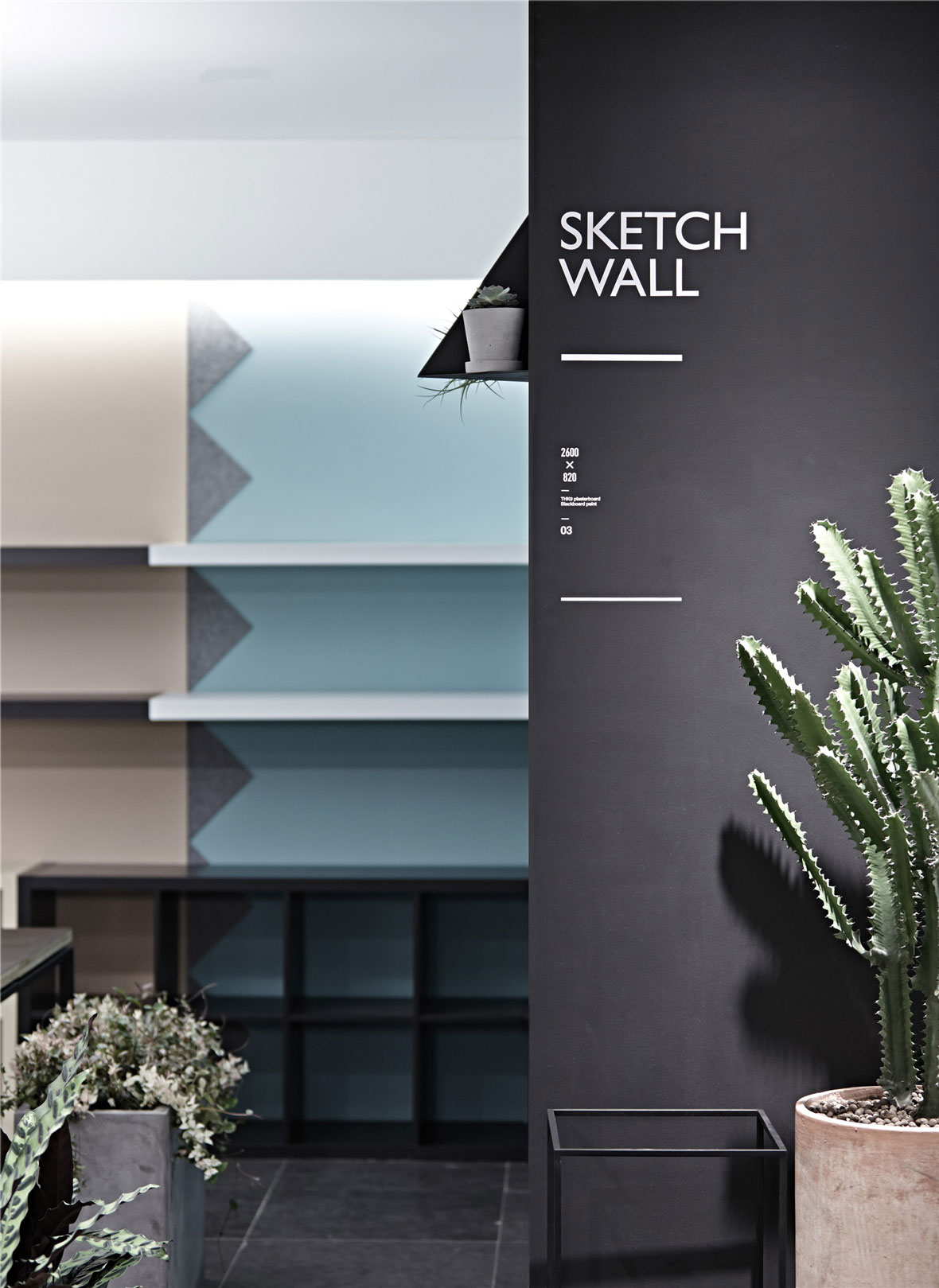
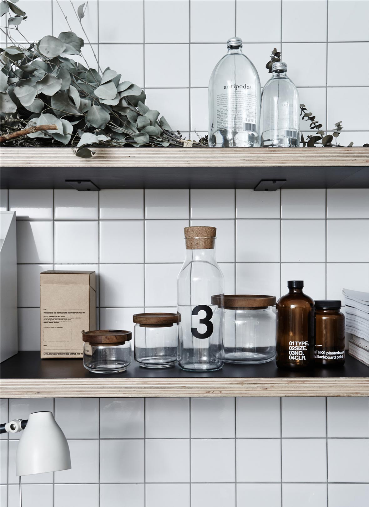
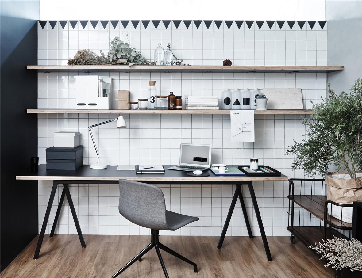
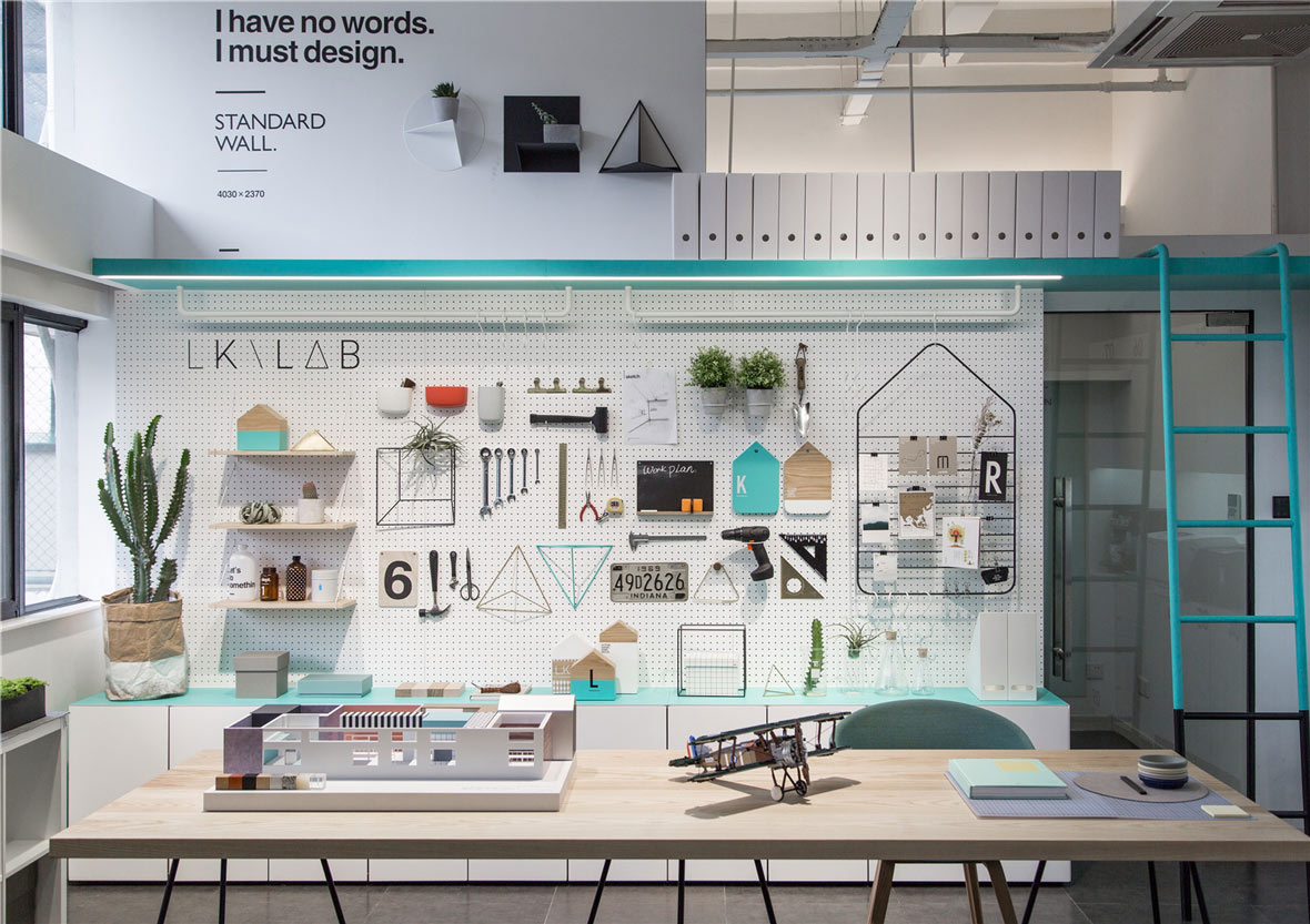
Another one of their more unique areas is LKLAB, their designated lab space. This area is set aside for Kai Liu and other designers to gather and build models or put some of their favorite objects on display. This space was born out of Kai Liu’s belief that designers shouldn’t be overdependent on computers, but rather create with their hand and eyes in order to create good sketches and models. Kai Liu also believes that a sense of dimension is important for interior designers, so in order to hone and develop the designers’ sense of dimension, many of the furniture and walls in the new offices are marked with their respective dimensions.
另一个更能体现他们的设计风格的是LKLAB, 也就是LK实验室。这里是刘恺及设计师们在一起制作模型、陈列心爱之物的场所。之所以要建造这样一个实验室,是因为刘恺坚信设计师不能过多依赖电脑的信念,而应该依靠眼手并用去创造出好的草图和模型。此外,刘恺还认为作为室内设计师,对空间的感知很重要。为了培养设计师们精准的空间感知,新办公室里很多墙面和家具上都被标注上了尺寸。
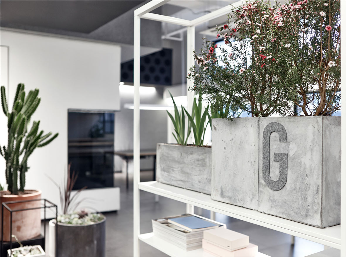
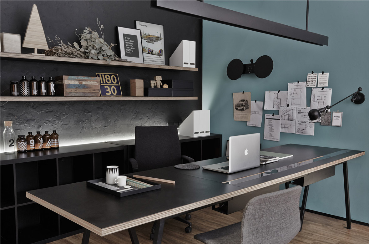
RIGI’s color choices were thoughtful and played a big part in forming their ideal ambience. Their colors sought to establish a calming mood that wouldn’t feel too harsh or intrusive. To achieve this, they opted for contrasting, desaturated colors. But even with all the work and thoughtfulness poured into the design of their new office, they’ve never once deviated from their original mindset, which is the belief that more important than the space itself is the staff that will be working within the space and all the future stories and designs that will come with the people.
在用色方面,RIGI也相当用心,并通过色彩营造出他们的理想空间氛围。他们的用色意在营造一种令人平心静气的气氛,力图避免太过强烈或者太过于具有干扰性。因此他们选择了低饱和度的对比色彩组合。当然,新办公室的所有设计理念和心思全部都构建于RIGI的设计初衷:人永远是设计的灵魂,做和人有关系的、有趣的、有故事的设计。
