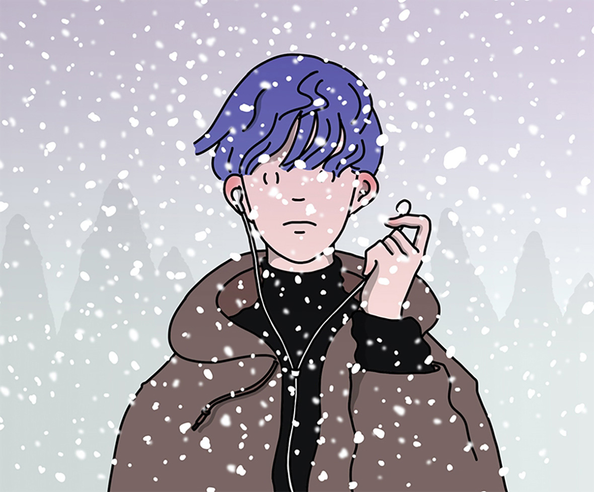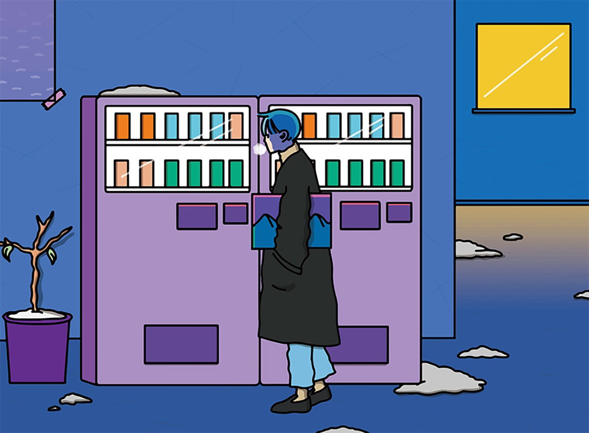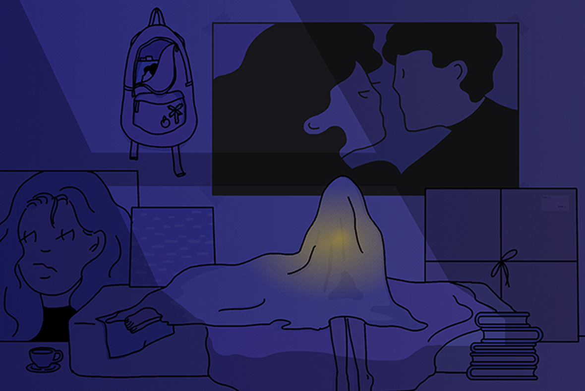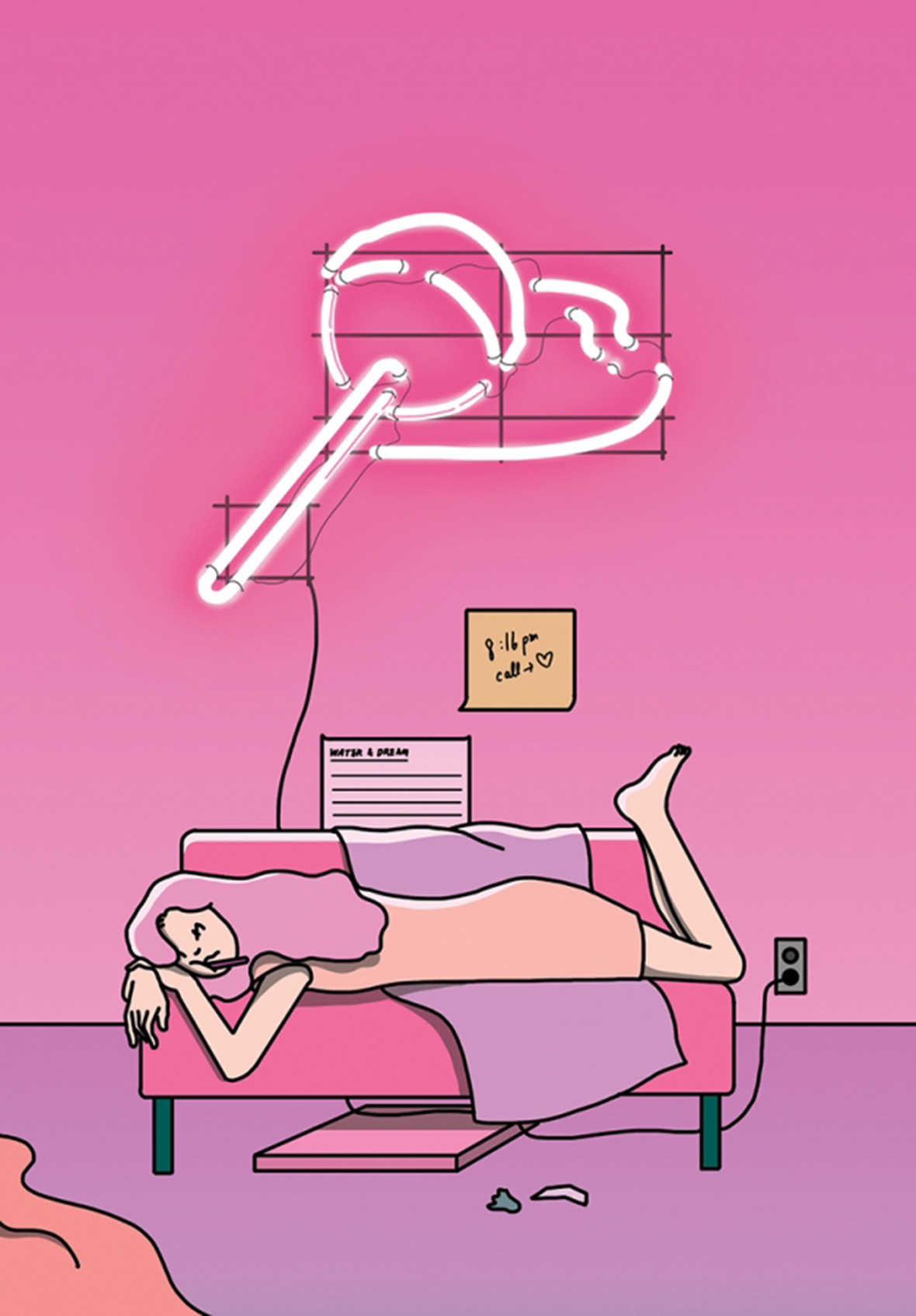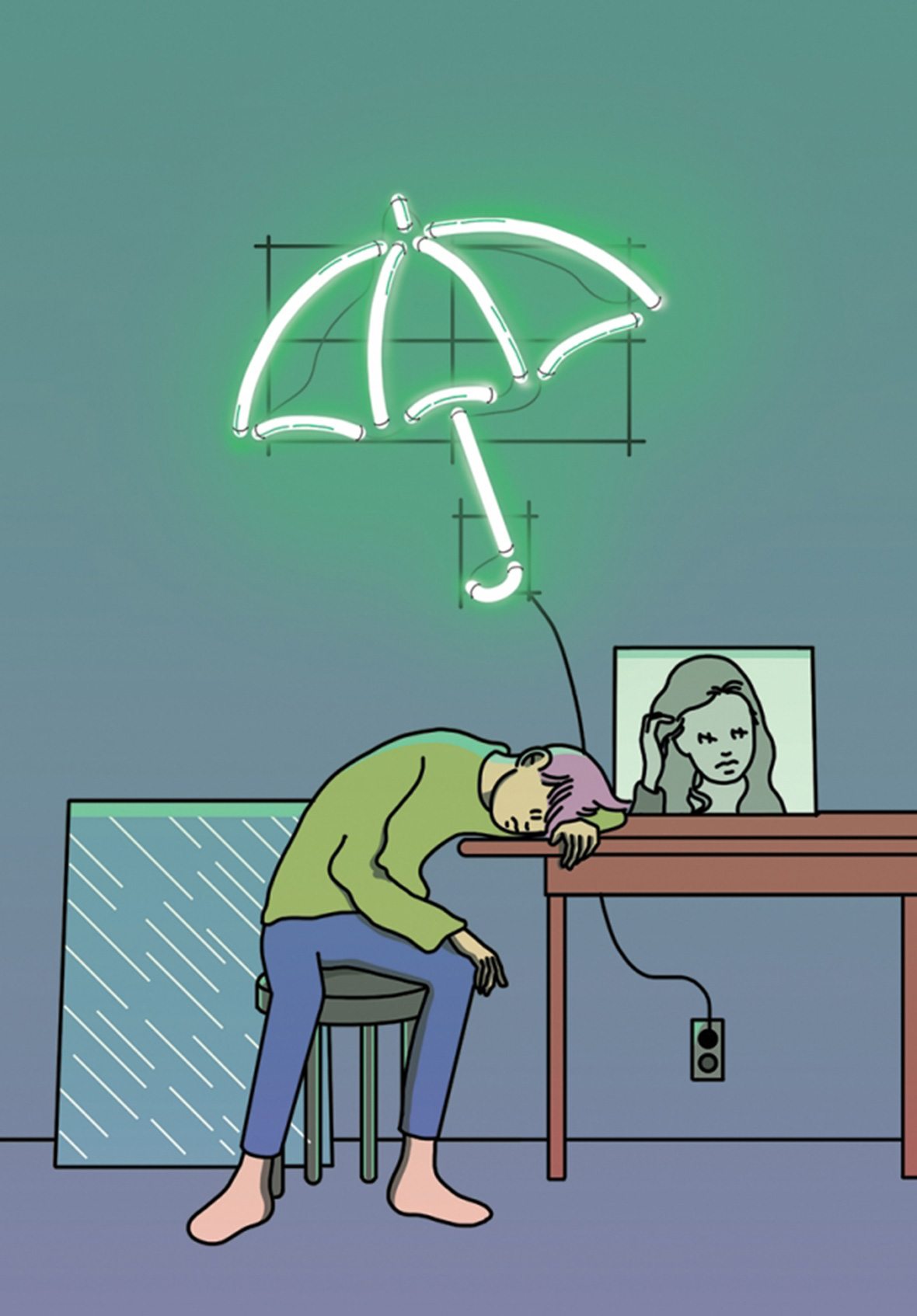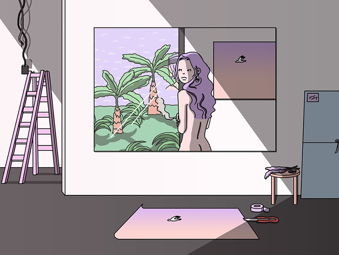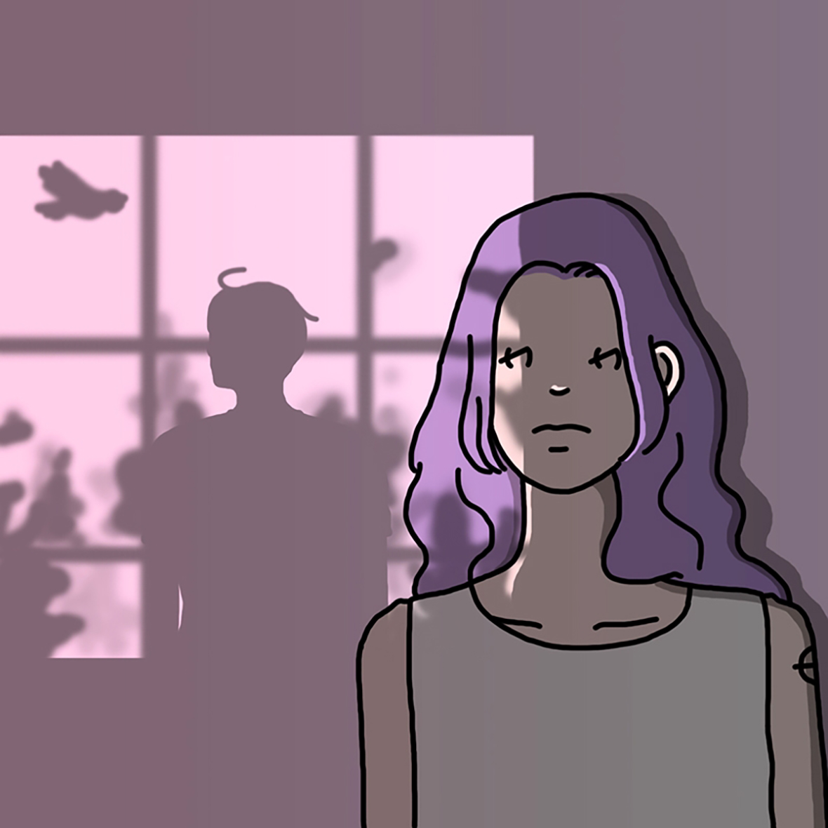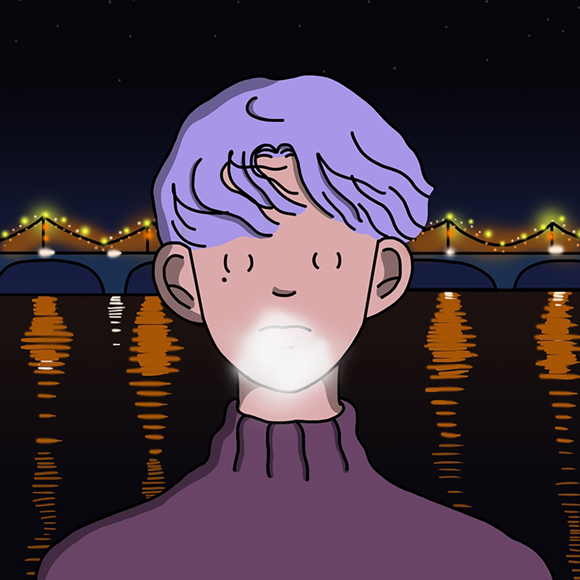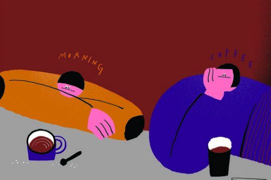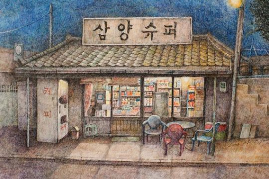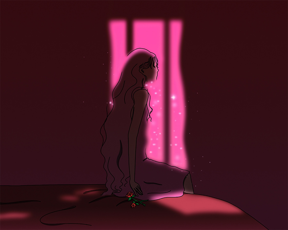
Korean illustrator Shin Morae‘s work has dazzling gentleness. She takes slices of life from the young generation and places her characters in everyday settings: at home by the window, out in the street, and under the glow of neon lights.
韩国插画师 Shin Morae 的作品,温柔得很耀眼。她很擅长截取当下年轻一代的生活片段,把画中人搬到寻常的生活场景:家中窗前、街头路边、霓虹灯下。
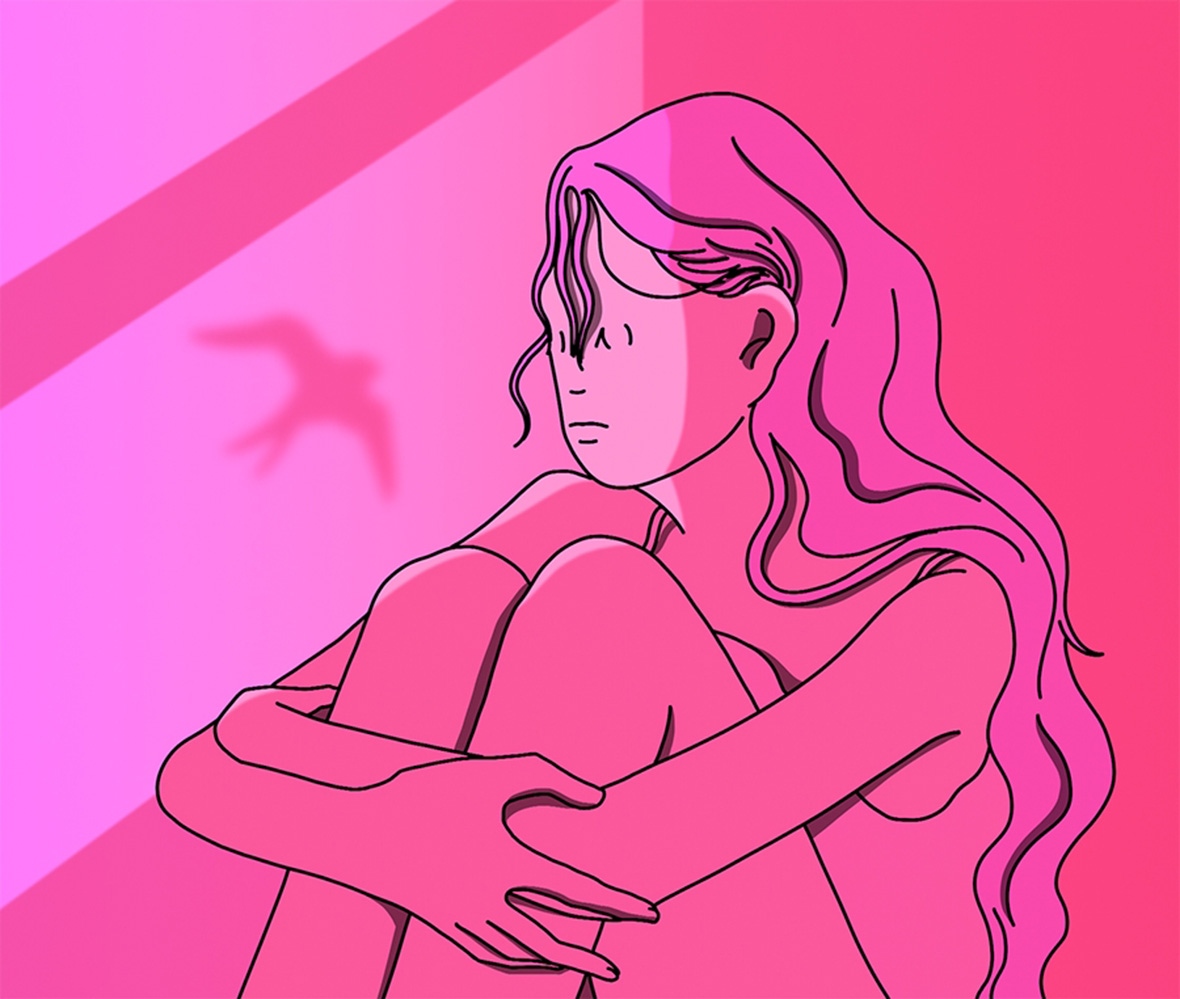
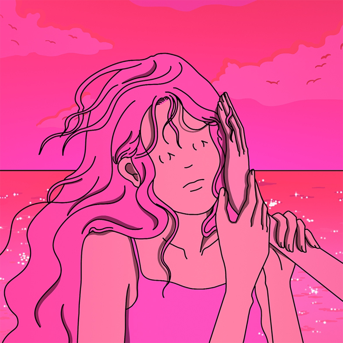
Shin’s drawings often use backdrops of pink, powder blue, or violet. “I don’t like pink, I just think it’s a good ‘material,'” she explains. “My drawings are a little depressing, so I need to tone that down through color. And pink is the best color for conveying a sort of funky mood. “
在粉红、粉蓝、粉紫构建出的色调背后,Morae 却说,“我不喜欢粉色。我只是认为它是个很好的‘材料’。因为我的画有些太忧郁,我需要用颜色来中和一些。而粉色是最能表达这种奇怪心境的颜色。”
She wants her work to resonate with others, so she cleverly combines color and urban youth culture with a highly interactive observational style. “Usually I start by writing in my notebook, then do the drawing with digital software,” she says. “The writing stage puts the emotions in. I want people to read my drawings the way they read an article.”
她希望能够通过自己的插画唤起他人的共鸣感,所以巧妙地将颜色和都市青年文化穿插到作品之中,再用一种观感互动性极强的方式表达出来。“通常我会先写笔记,然后再用数码软件来画画。写的过程也是让情绪带入的过程。我希望人们会像读文章句子那样,去读我的画。”
