This story is part of a content partnership and media exchange between Neocha and MAEKAN. To see more of MAEKAN’s content on Neocha, click here.
Typefaces are to text what accent and cadence are to speech: they create an immediately recognizable “voice.” Thanks to digital typography, designers have access to tens of thousands of different typefaces, each of which can steer a project in a different direction and give it a different visual identity. Don’t like the fonts on offer? You can always create your own — you just need to design some 250 characters, including upper- and lower-case letters and punctuation. If you’re working in a language like English, that is.
But what if you’re a designer working in Chinese, creating a typeface that needs tens of thousands of characters to be considered “complete”? How do you tackle a project that’s bound to outlive you, and why even start in the first place?
I sat down with Caspar Lam, of the New York-based studio Synoptic Office, to talk about his team’s new typeface, Ming Romantic, and the challenges of Chinese font innovation.
本篇文章来自新茶媒体合作伙伴 MAEKAN 的内容交换。在 Neocha 上阅读更多 MAEKAN 的文章,请 点击此处。
字体设计之于文字,就像声调和抑扬顿挫之于一篇演讲来说一样重要,同样都提供后者一个能轻易被辨识出来的 “风格”。归功于数位排版,设计师现在可以在网上接触到上千万种不同的字体,让作品的视觉风格更加多元化。但如果你还是找不到想要的字体呢?你还有另一种选择:设计出 250 个大小写字母和标点符号,创建属于你自己的字体。当然了,前提是你用的语言是英语。
但是,如果你是一名中文设计师,创建一套数位的中文字体则需要设计出上千万个不同的字元,才能称得上“完整”。要如何完成这项说不定一辈子都做不完的工作,更重要的是,为何一开始还选择去做这件事?
我带着这样的疑问来到了纽约设计工作室 Synoptic Office,和字体设计师 Caspar Lam 一起讨论 明日体 的构思,以及在设计中文字体时所面临的挑战。

It all began with a simple enough request.
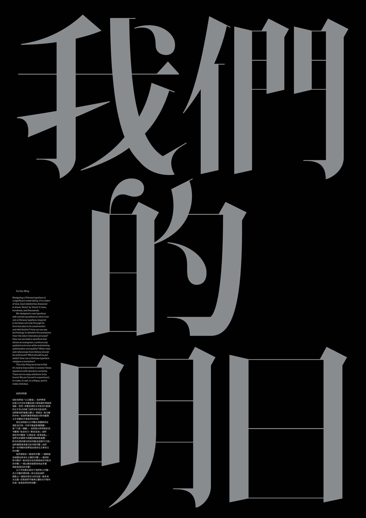
Before founding Synoptic Office, while working at a design studio, Lam was tasked with finding a romantic Chinese font for his client, Vogue China, which was looking something akin to Didone — an unadorned, modern typeface characterized by a striking contrast between thin horizontal and thick vertical lines.
The problem? No such type existed.
这一切都始于一个简单的提问。
在创立 Synoptic Office 之前,Caspar 曾在纽约一间工作室工作。当时他在为客户《Vogue China》寻找一种风格浪漫的中文字体,类似 Didone 字体这样的设计——简洁、现代、横竖笔画的对比强烈,竖线要细,而横线要粗。
问题是,并没有这样的中文字体。
After completing the project with Vogue China, Lam discussed the idea of creating a font with Synoptic’s co-founder and creative director, YuJune Park, and their design team, which included Abby Chen, Dustin Tong and Gabriela Carnabuci. “We were sitting together in a room and we said, ‘Oh, why don’t we make a Chinese typeface?’” Lam recalls. “How hard could that be? Literally, it was that naive.”
Thus began Synoptic’s five-year journey to explore and reinvent the way modern Chinese typefaces are created.
结束这个项目后,Caspar 与工作室共同创办人暨创意总监 YuJune Park 以及其团队成员,包括设计师 Abby Chen、Dustin Tong 和 Gabriela Carnabuci,一起讨论了设计字体的想法。Caspar 回忆说:“我们坐在一个房间里,讨论着 ‘我们为什么不自己去制作中文字体?这能有多难呢?’ 我们当时的想法就是这么天真。”
就这样,Synoptic Office 开启了一项长达五年的项目,重新探索和塑造了中文字体的设计方式。
Ming Romantic came about from a combination of circumstance, curiosity and, as Lam concedes, “youthful optimism.”
The team originally wanted to include an accompanying Korean typeface in a similar style, a plan they abandoned within the first month, once the enormity of the project became apparent.
Why? Several factors make creating a new Chinese typeface exceedingly difficult, many of which have existed since antiquity.
For starters, written Chinese is vast and intricate.
This complexity gives the script its richness, but it has also hindered its ability to make full use of technological innovations that elsewhere proved transformative.
明日体是對周遭环境的審視、好奇心、以及 Caspar 所说 “年轻的乐观主义” 结合之下的产物。
团队最初原本還计划创建一款类似风格的韩文字体。但是在项目开始的一个月后,他们就放弃了这个想法,因为很快他们就意识到这个项目的艰巨性。
为什么?创建新的中文字体之所以如此困难有很多原因,其中一些原因甚至可以说是自古以来一直存在的。
首先,汉字的数量非常庞大,结构复杂。
这种复杂性既丰富了语言,同时也阻碍了它像其它语言一样充分应用于新兴科技。
For the Western world, the impact of the printing press was huge. It’s probably a simplification, but when every book had to be copied by hand by a team of monks, a machine that could churn out Bibles at the pull of a lever was revolutionary.
It led to the greater dissemination and democratization of knowledge in the West. And as printing technology progressed, so did the typefaces conceived to meet different design challenges, such as cost-saving italics, which allowed a printer to fit more letters onto a block.
对于西方国家来说,印刷技术的影响是巨大的,毕竟在一个只能手抄《圣经》的时代,突然出现一个拉一下开关,就能大批生产出畅销书的机器,在当时绝对称得上是一项革命性的发明。
打印机的出现让知识得以在西方国家更大范围地传播出去。随着印刷技术的不断发展,字体设计也在不断向前推进,以迎合更多不同的设计挑战。例如,人们发明斜体字,让打印机可以将更多字母装入同一个方格,以节省成本。
“If they created a block for every character, that’s also a huge undertaking. You needed an emperor or somebody with a lot of money hire a lot of people to do this type of work and sustain it.”
“如果你为每个字都创造一个方格,那将是一个巨大的工程。你首先需要一个像皇帝一样富有的人的资助,才能去雇用一大堆人来做这件事。”
These developments would eventually lead to the first “modern” Roman typefaces, Bodoni and Didot, with their sharp serifs and high contrast between vertical and horizontal line weights. The set of typefaces that descend from these two, collectively known as Didone, would also become the conceptual basis for Ming Romantic.
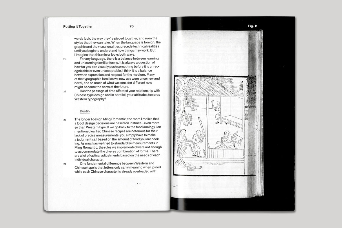
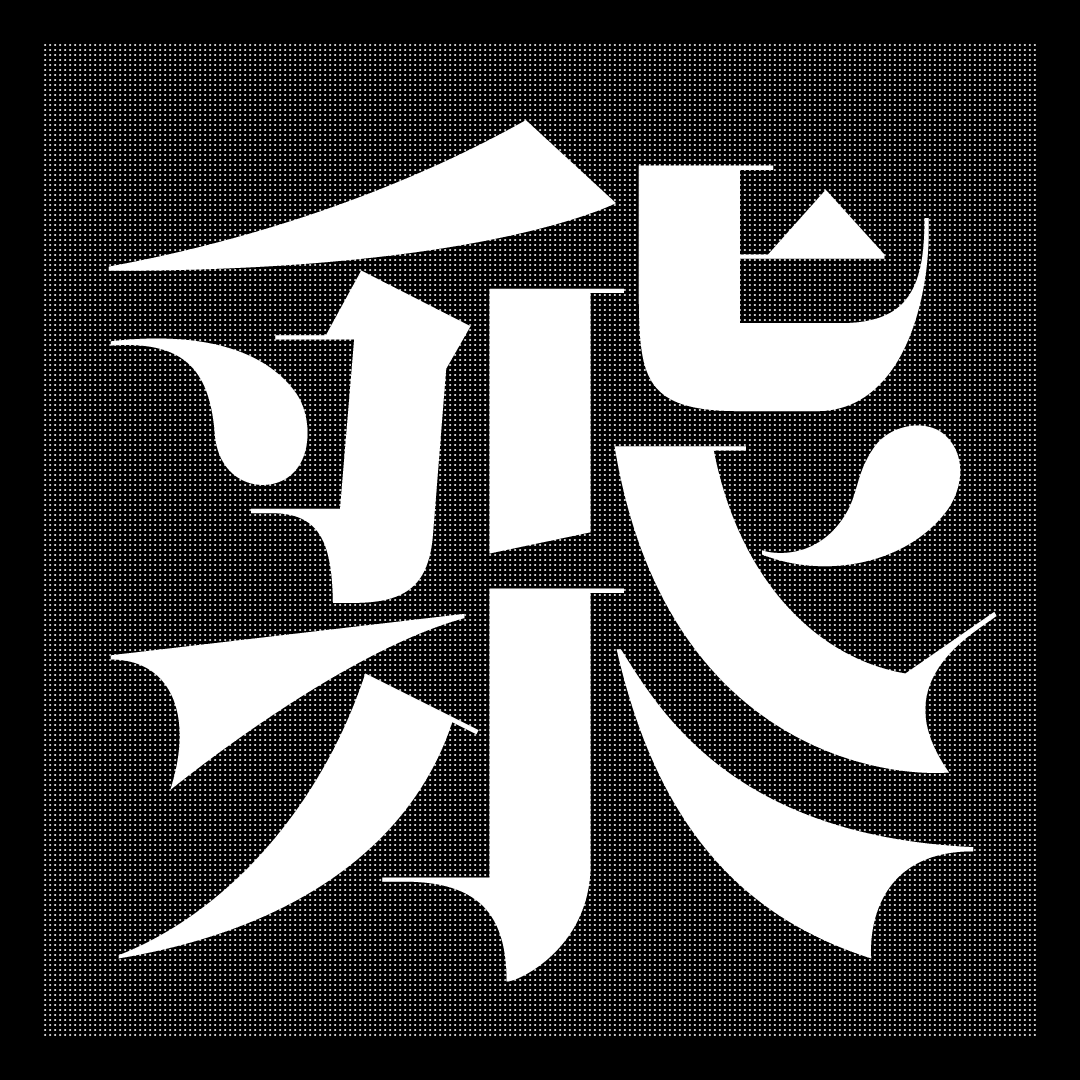
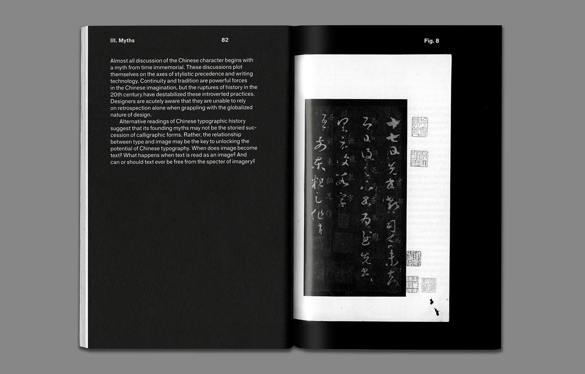
In case you’re wondering why it’s called Ming Romantic, it’s named for the dynasty during which ceramic, wood, and bronze movable type gained popularity, in a marked a shift away from calligraphic script styles based on brush strokes. And the Mingti typeface, also named for this period, marked the starting point for their exploration.
Although movable type was invented in China as early as 1040 AD, printing was long limited by the costs of producing large character sets.
Individual characters or even whole texts were carved onto woodblocks, which were then inked and stamped onto paper, in a process known as xylography. But this process required the support of a wealthy patron such as the emperor. If there was no block for a given character, a new one had to be carved.
发展到后来,诞生了第一批现代罗马字体 Bodoni 和 Didot,这些字体有着明显的衬线、和强烈的横竖线粗细对比。以这两种字体为基础发展的字体都被统称为 Didone,同时也是明日体的灵感之源。
也许你会想知道为什么取名为 “明日体”,它的命名取自明朝。在这个朝代,陶瓷、木材和铜板活字印刷术得到了广大的普及,意味着中文字体开始有了不同于手写书法字体的风格转变。同样的 “明日体” 也标志了一个世代,是对中文字体重新探索的开端。
虽然活字印刷术早在公元 1040 年就在中国被发明和使用,但关于中文印刷业及字体的后续发展,最大的限制因素是生产如此大量字符模具,随之而来的巨大成本。
在古代,人们喜欢在木版刻上文字或整篇文章,然后再将印有墨水的木版压印到纸上,这一过程被称为 “木版印刷术”。但这背后需要相当雄厚的资金支持,通常只有皇帝才做得到。因为这项工作必须有人随时待命,一旦木板被用完了,就必须马上再雕刻一个新的出来。
And a similar issue persists today. A non-designer can do a quick browse of DaFont and find tens of thousands of different typefaces for English, but a committed search of similar sites for Chinese will yield only a fraction of that number — even as the demand for new Chinese typefaces has grown.
While an alphabetic typeface can be created by a single designer with sufficient passion or compensation, making a usable Chinese typeface requires a team of designers working together over several months — or in Synoptic Office’s case, several years.
This is because a typical Western typeface needs only about 250 characters, a number that includes the alphabet in upper and lower case, punctuation marks, and special characters like currency signs and the ampersand.
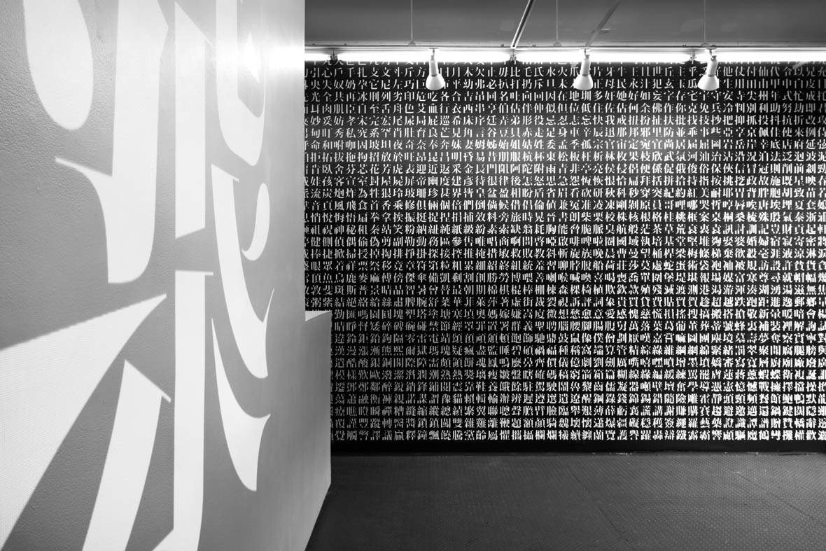
The problem is that a modern Chinese typeface needs those Roman characters along with 2,500 to 3,000 common-use Chinese characters to be useable for simple texts such as titles.
As it happens, the 250 or so Western characters used in most Chinese typefaces are included for completeness and are usually copied from other typefaces. The results are Roman characters that are jarringly out of place next to the Chinese typeface, something of a bastardized Times New Roman. Lam and I joked that these characters look like an afterthought, a job left to a hapless intern.
But for a typeface intended for professional use – for body text, for example – where the variety of characters is bound to be greater, thousands more are needed. Some estimate that as many as 80,000 are needed for a typeface to truly be considered “complete.”
同样的问题至今仍然存在。即使你不是设计师,也能在 DaFont 这样的字体网站上轻松找到成千上万种英文字体。但是當搜索中文字体时,结果却廖廖无几。然而人们现在对于新的中文字体的需求正在与日具增,也有越来越多人愿意资助这项工作。
要创建新的罗马字母字体,只要有资金资助和足够的热情,一位设计师单枪匹马就能完成这项工作。然而,要创建一款可用的中文字体仍然需要一个团队的设计师工作好几个月,或是像 Synoptic Office 这样,努力了数年才行。
一般来说,西方字体只需要大约 250 个字符,其中包括大写和小写字母、标点符号以及其他特殊符号如$或 &。
问题是在现代中文里,除了需要那些罗马字符外,光要写出一个简单的标题,就需要 2500到 3000个常用中文字符了。
大多数中文字体中附带的 250 个西方字符只是为了确保其完整性,通常都是直接借用其它字体的。结果是两者摆在一起看起来极不协调,像是一种变异的 Times New Roman 字体。Caspar 和我开玩笑,这些被借用的字符感觉就像是一个倒霉的实习生,被派去收拾別人的烂摊子。
但是对于一款用于专业用途的设计字体,譬如用在正文部分,字符的种类一定要更丰富才行。起码需要超过八万个字符以上,才能算的上 “完整”。
“Theoretically, you could work on this forever, because the character set is so huge. If we want people to use it quickly, maybe we should set expectations and say ‘well, maybe we won’t complete it on the first go.”
“理论上,你可以花上一辈子的时间去设计,因为中文字实在太多了。如果想要人们可以更快的使用到,也许我们应该换个方式,不用一次就全部完成所有的字。”
It bears mentioning that Synoptic Office isn’t a type foundry – that is to say, they don’t create typefaces full-time. I asked Lam how they executed a project of such magnitude in the background, while working on other jobs, over five years.
He began by comparing approaches used by type foundries. One of these involves writing a character by hand, scanning it into a graphics program and live-tracing it. But as Lam notes, this was not a suitable approach for Ming Romantic, as their design aim was to distance it from handwriting and instead explore typography.
Taking a page out of the software development playbook, Synoptic is releasing Ming Romantic in successive versions. This means the team’s work can be published even before it’s complete – and with so many characters left to go, it can be hard to pinpoint when that will be.
值得一提的是,Synoptic Office 并不是一间专门的字体设计公司,他们没办法投入所有时间来做这件事。于是我问 Caspar,他们是如何在五年多的时间里,利用工作之余持续进行一个如此大规模的项目?
他首先跟我比较了字体设计公司和 Synoptic Office 使用方法的不同。其中一种方法是先手写,扫描进绘图软件里再描图。但是正如 Caspar 所说的,这种方式不太适合明日体,因为它的设计精神本来就是要摆脱手写字型,以去探索更多印刷字体的风格。
Synoptic Office 则是采取分阶段,以不同版本推出的发布形式。这意味着字体可以在完成前就先曝光,毕竟这个项目要完成的字符如此之多,很难精确的预定出具体的完成日期。
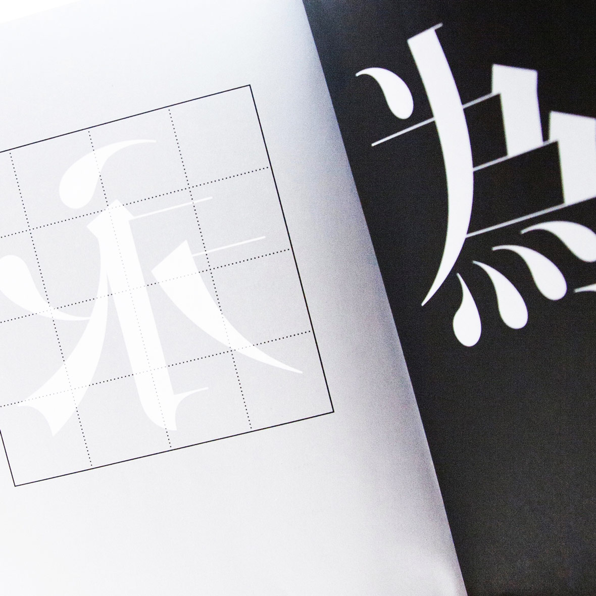
Yet even with the advantages of graphic design software and scripting languages that can produce characters with similar elements based on successful iterations, individual characters still need to be finessed or adjusted to be visually pleasing, Lam explains.
That means carving out time every day for drawing a character on a blank grid on a screen. In the beginning, the time commitment meant the net output was maybe only one to three characters a day.
These characters sit on a large master list that the team goes through over and over again until items are completed, with milestones set in increments of 500 characters.
Intrigued, I ask him how the team celebrates.
“With a cup of coffee,” he laughs. “Or maybe just walking around, because it takes a toll on your eyes. I already have very bad eyesight, so you can feel your eyes degenerating after a while, and you know that this is actually not good for you in the long run!”
Besides the consistency of the entire character set, Lam points out another crucial criterion – Does it look Chinese?
“After the initial explorations were done, it became a little more robust and efficient. Because then you could copy a lot of the forms you drew previously and then modify them for forms that are similar,” he says.
因为绘图软件和脚本语言的帮助,他们可以依据重复的笔画元素去创作更多字符。但是 Caspar 解释说,即便如此,他们仍然需要一个一个字去加工处理或调整,视觉上才能达到一致平衡,让人看得舒服。
这意味着他们每天要抽出时间在电脑上绘制字符。一开始,他们每天只能做一至三个字符。
“最初试验工作的阶段完成后,工作流程就变得更加顺畅和高效率。因为你可以复制之前绘制过的偏旁,然后在做类似字符时直接在它的基础上修改就行了。”
团队把这些所有字符列成一份工作清单,过了一遍又一遍直到项目完成。每完成 500 个字符,对他们来说都算得上是一个里程碑。
有趣的是,当我问团队会如何庆祝时,他笑着说:“就喝杯咖啡。或者是起来走走,因为这项工作挺伤眼睛的。我的视力本来就不好,过了一段时间又感觉到视力在退化。长远来看,这其实对健康不是很好。”
但是,除了要针对所有字符的一致性进行测量和调整之外,Caspar 还指出另一个关键的标准——新的字体看起来够像中文吗?
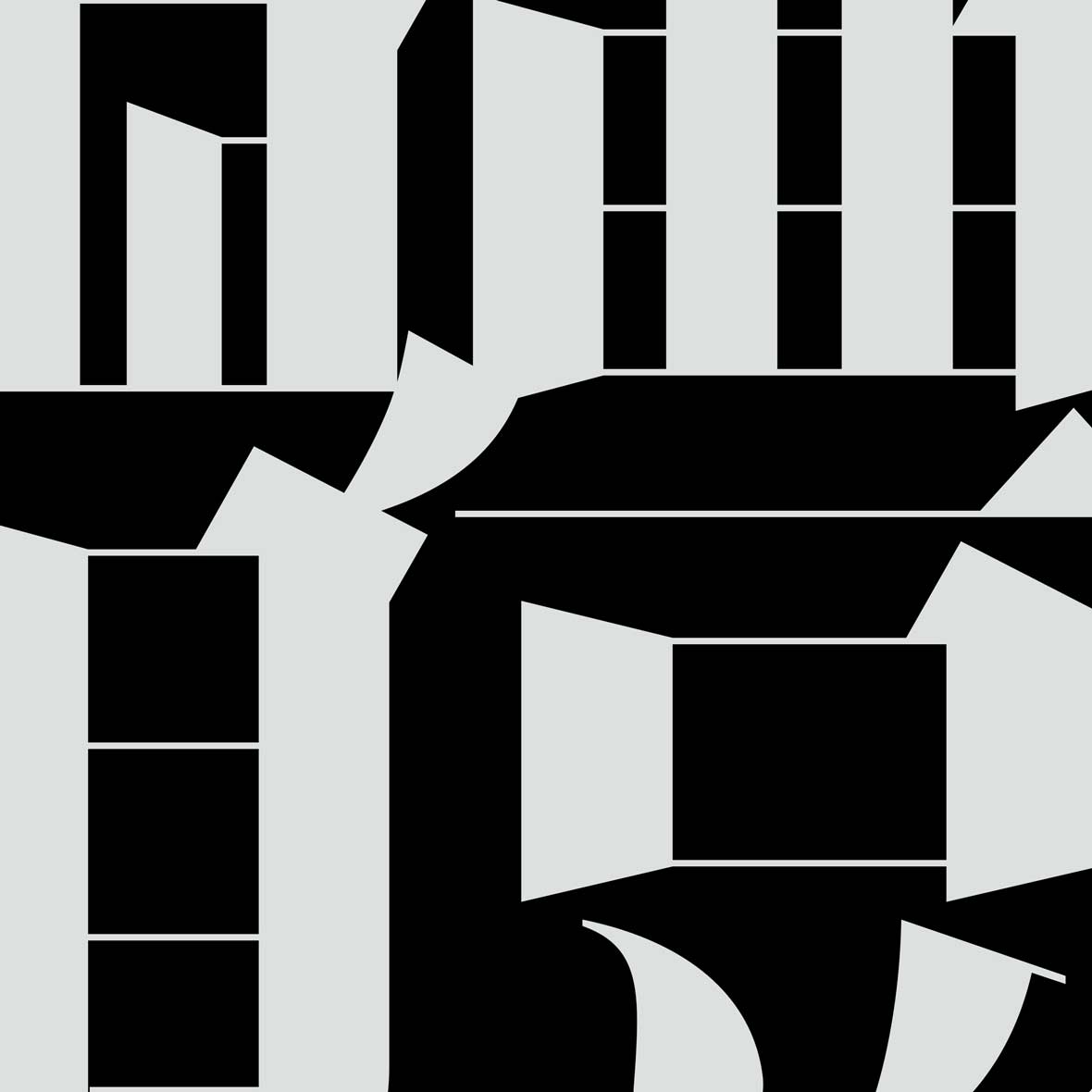
Contrary to a popular myth, Chinese characters are not pictograms. Over 80% of characters are logosyllabic (or pictophonetic, if you prefer). What that means, simply, is that a typical character contains an element that hints at its meaning (the character’s “radical”), and an element that hints at its pronunciation.
In their countless combinations, these elements take on slightly different shapes and proportions that the design has to account for. What’s more, not only do characters have to follow universal visual design principles, they also have to look authentic.
As someone whose Chinese handwriting, acquired at university, looks like the legible but clumsy penmanship of a child, I don’t have the lifetime of practice necessary to judge authenticity.
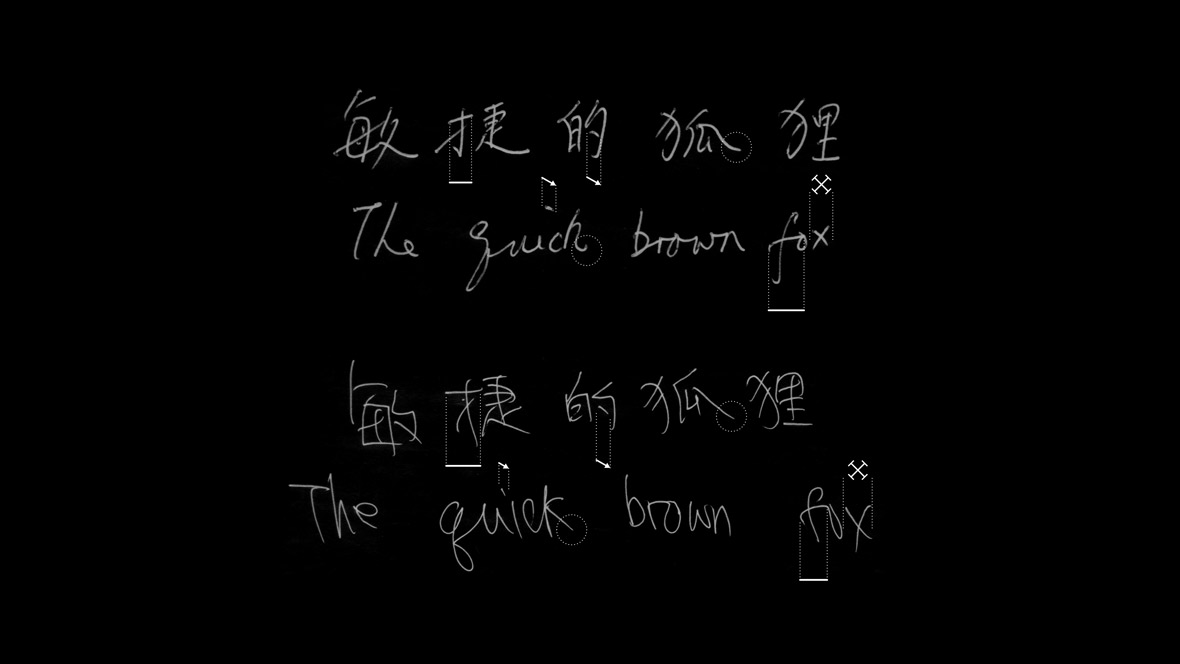
But authenticity is important, and to show why, Lam mentioned the contrasting case of writing by Chinese learners of English. Sure enough, a glimpse at some writing samples shows a few extra features that are decidedly not native to English handwriting styles. These anomalies are pretty easy to spot, especially if you’re just working with the standard 26-letter Roman alphabet.
For example, you’d likely think something was off if the capital ‘D’ in Delaware appeared as small as the adjacent lower case ‘e.’
With so many “moving parts” in a character, in both typography and writing, there are a lot of extra things that could look off to the Chinese eye. This made creating Ming Romantic more daunting, but also more interesting.
人们向来有个误解,以为每个汉字都是 “图画” 一样的象形字。但其实超过 80%的中文字都是意音文字,或者说是形声字。大部分中文字由不同的 ‘偏旁’ 组成,有些偏旁表示发音,有些则表示意义。一部份的字仅由一个偏旁组成,一部份则由不同偏旁共组、或者是延伸的变体。
在这些由无数种偏旁组合出的中文字中,偏旁的形状、大小比例、位置会稍有不同,都会影响到字体的设计。除了要符合客观的美学要求,更重要的是,它们必须拥有 ‘正宗性’,也就是看起来要够像中文字。
由于我自己一直到大学才开始学写中文,写字看起来就像小学生那种一笔一划、很生疏。我可能还没有资格去判断明日体是否真的像正宗的汉字。
但这件事却很重要,例如在一些英文的书写样本中,你可以察觉到一些不符合传统英文手写的装饰细节。这些不对劲的小地方很容易就能被发现,特别是当我们用标准的 26个罗马字母时。
例如, Delaware 这个单词的大写字母 D 与相邻的小写字母 e 一样大时,即使这是字体的设计意图,你也能看出有点不对。
中文字里面有这么多组合的部分,不论是印刷体还是手写体,更为容易出现让你觉得去看來奇怪的小地方。这也让设计明日体的过程充满更多难关和乐趣。
“We wanted to pursue it because it was such an interesting topic for us. In our studio, we tend to pursue projects that we find to be of cultural relevance and of cultural interest.”
It would be unfair to suggest that the point of Ming Romantic was simply to see how a Chinese typeface could be created from scratch. Aside from the practical challenge of producing a typeface through more intuitive and efficient methods, Ming Romantic also poses a stylistic, and even cultural challenge to the existing visual norms of printed Chinese.
Despite the small but growing body of innovative Chinese typefaces, Chinese culture remains heavily attached to its history in the calligraphic arts for its expressiveness.
Lam describes a sort of “mental barrier” in the Chinese context, offering the example of his family and friends’ questions about Ming Romantic.
When they’d ask what kind of calligraphic face he was working on, he’d have to explain the difference between typography and calligraphy: the former has “an aspect of mechanical reproduction and product,” while the latter is a means of personal expression.
It’s this ingrained attachment to an esteemed tradition that makes giving the two arts “their space” a great, if unacknowledged, challenge for Chinese typography.
“我们之所以投入这件事,是因为它对我们来说非常有趣。我们喜欢做与文化相关或具文化意义的工作。”
如果说明日体,仅仅是为了试验看看中文字如何从头开始创作,这是不恰当的。除了一一克服创建中文字体的困难,明日体的创作尝试用更直观、更有效的方法去制作中文字体。这在视觉设计、甚至文化领域上都是一大挑战,也是对现存中文视觉规范的突破。
尽管中文设计字体目前为数不多,但有在逐步成长。其中很多设计都包含书法的元素,这项传统艺术凭借其丰富的表现力,始终是中华文化的代表。
Caspar 指出人们对于汉字有一种 “认知上的障碍”。他举例道,当他与家人朋友谈论自己在创建明日体时,他们都会问他是在研究哪种书法。这时他必须解释印刷体和书法之间的区别,前者是 “机械复制的产品”,后者是 “个人表达的手段”。
正是对这种根深蒂固的想法进行质问,使得区分这两种字体艺术,成为一个尚未被人们意识到的挑战。
“Even Chairman Mao was a calligrapher. It’s a very reactionary activity for a revolutionary, but it highlights the sort of myth we have as part of our cultural identity, or who we are as Chinese.”
“就连毛主席也是一位书法家。对于他这位革命家来说这是一种相对保守的行为。但书法确实强调了一种文化上的身份认同,充分说明了 ‘我是一个中国人’ 的概念。”
As the first combination of traditional Chinese characters and a high-contrast modern Western typeface, Ming Romantic is an exciting development, but Lam points out that history isn’t entirely devoid of similar attempts.
When he and Park discussed their font at the Typographics 2016 design festival, they showed many remarkable examples of typefaces from the 1950s and after – a relatively unrecognized heritage of Chinese experimentation in typography.
“Experimentation in Chinese type has a somewhat rocky history, because Chinese has tended to allow the forms which are considered canonical, while the rest of the experimentations tend to get buried,” he explains. Outside the art and design worlds, the visible lack of provocative Chinese fonts in everyday life seems to confirm this.
“So you always hear about the great calligraphers or the things that worked. And the things that haven’t worked, you have to search really hard to find them.”
作为中文传统字体和西方现代字体的首次结合,明日体是中文印刷字体中一次令人兴奋的发展。但 Caspar 说其实之前早就有过类似的尝试。
当和 YuJune 在 Typographics 2016 设计节上讨论明日体时,他们展示了1950年代以来许多重要的字体设计案例。这些字体可以说是中文印刷体被埋没的文化遗产。
“中文印刷字体的发展并非一帆风顺,因为中国自古以来只鼓励符合常规的东西,而其余实验性的设计往往会被埋没掉。”他解释道。在艺术和设计界之外,日常生活中很难看到有趣的中文字体。这正好印证了 Caspar 所说的。
“所以你总是能听到人们在谈论哪位伟大书法家,或是哪些已经成功的事迹。而那些还没成功的,你往往要很努力、花上更多力气才能找得到。”
To fully grasp the impact of an achievement like Ming Romantic, you could think of it this way: how many projects fail to reach their full potential, or are never even started, because they lack a typeface to express their visual identity? It’s as if you only had, say, Times New Roman, Arial and (perish the thought) Comic Sans at your disposal.
While Lam stops short of suggesting Chinese design would “mushroom” if it had more typefaces for its creative energies, he does believe more typefaces would allow for more directions and greater freedom. For now, he can proudly count Ming Romantic as the first Didone-style Chinese font and celebrate the end of the first leg of a much longer journey.
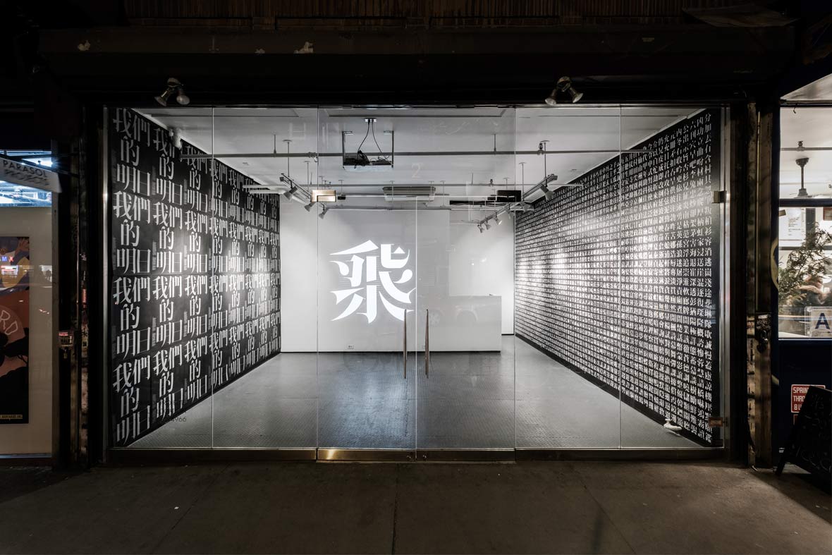
At the time of this writing, Ming Romantic’s initial release, unveiled in New York on February 1st, included 2,300 traditional characters in three weights.
要真正明白明日体的成就,你可以这样来思考:有多少失败的设计项目尝试做到跟他们一样的事情、或根本还没开始,因为缺乏合适的字体基础来符合设计上的需求。这就好像跟你说:你当然可以自己设计,但只能用 Times New Roman、Arial、Comic Sans 这三种字体来做一样。
虽然 Caspar 并未明说,但如果中国能有更多创新字体来引导其创作能量,中文设计字体的发展会更快速。更多的字体选择可以为设计作品提供更多方向和创作空间。现在,他们可以自豪地把明日体称为第一款 Didone 风格的中文字体,团队也终于可以庆祝,在这一段漫长旅程中取得了阶段性的胜利。
在写这篇文章的同时,明日体于2月1日在纽约推出第一版,一共收录 2300个繁体字,三种不同的粗细版本。
After our chat, I asked Lam by email what was next for Ming Romantic. Aside from taking some much-needed rest to distance and reflect on the project, he mused about a potential simplified Chinese version, subject to demand.
True to Ming Romantic’s original spirit, there may even be bolder explorations down the road.
“One idea which I find fascinating is exploring ‘ligatures’ in the typeface,” he writes, referring to combinations of two or more characters into one, such as in Æ. But in light of the very history that inspired Ming Romantic, that could be a slippery slope.
“In some way, this is a dangerous idea because ligatures have their origins in handwriting, and going too deeply into this area would turn a typeface into a script.”
上次见面后,我又发了邮件问 Caspar 明日体的下一步计划是什么。Caspar 表示,除了打算休息一下,也要继续思考明日体更多可能性,例如创建简体字的版本。
忠于创建明日体的初心,他们之后可能会有更大胆的作为。
“我还有一个想法一直很感兴趣,那就是字体中的 “连字”。指的是将几个字元组合成一个字元,类似英语的Æ。但有鉴于当初启发他们创建明日体的那些经验,这种想法可能会带来 ‘滑坡效应’。
“某种意义上说,这是一个危险的想法,因为连字起源于手写体。如果在这个领域继续深入,这一款印刷字体可能会再次变为手写体。”
Media Partner: MAEKAN
Contributor: Nate Kan
Images Courtesy of Synoptic Office
媒体合作伙伴: MAEKAN
供稿人: Nate Kan
图片由 Synoptic Office 提供