This story is part of a content partnership and media exchange between Neocha and VSCO. Their membership program, VSCO X, is designed to help you reach your creative potential. Take the next step in your creative journey by starting your free 7-day VSCO X trial today and gain access to the complete VSCO preset library, the newest editing tools, and inspiring educational content.
Low contrast editing can help create a washed-out feel that preserves detail with subtle shifts in hue and tone. If you want to balance out harsh, contrasty light or a new look to try, these three tips show different approaches to creating low contrast looks of your own.
本篇文章来自新茶媒体合作伙伴 VSCO 的内容交换。VSCO X 是一个专门帮助摄影爱好者发挥创造潜力的会员项目。现在就开启你的 7 天免费 VSCO X 试用创意之旅,即可获得的 130+ 预设滤镜,以及新的编辑工具、视频编辑和教程内容。
通过微调色相和色调来创作低对比度的照片,可以在不失细节的同时营造出一种怀旧的褪色感。如果你想要把强烈的光线中和掉或是尝试新做法,以下三个小技巧将向你展示创建低对比度的不同方法。
1 — The Valence preset pack / 使用 Valence 滤镜预设包
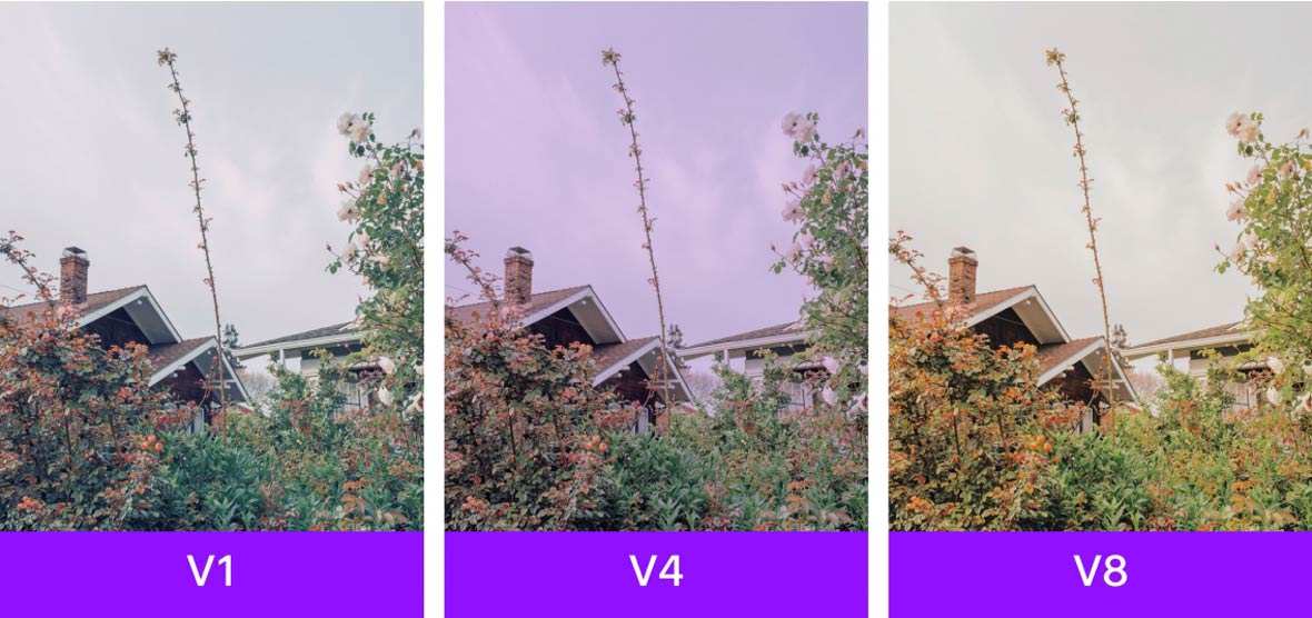
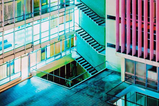
The Valence (V1–V8) preset pack was made with low contrast in mind. Each one has a unique tone and feel, often adding a soft, colored tint to images. V1 creates a cool blue look, V4 is pink, and V8 adds warmer tones. If you want something more subtle, try starting with V5, or reduce the strength of a preset by tapping it again after applying it to an image.
Valence(V1-V8)滤镜预设包本身即设置了较低的对比度,每一款都带有不同的颜色氛围,能为图像添加一股柔和的多彩色泽。V1 偏蓝色、V4 呈粉红色、V8 则多了一层暖色调。如果你想要让画面再细致一点,尝试从 V5 开始,或者在套用滤镜后再次点击来降低滤镜的预设强度。

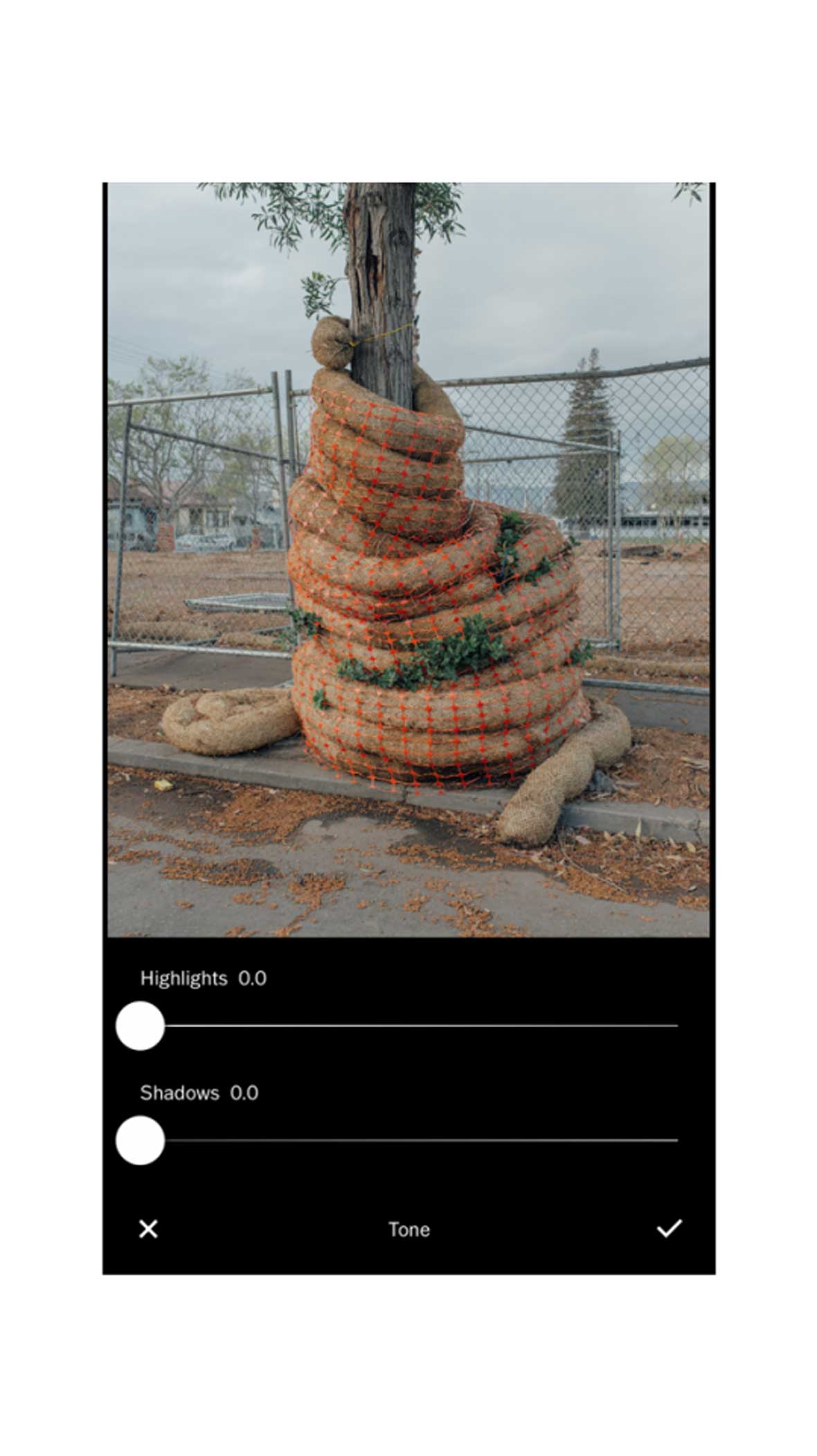
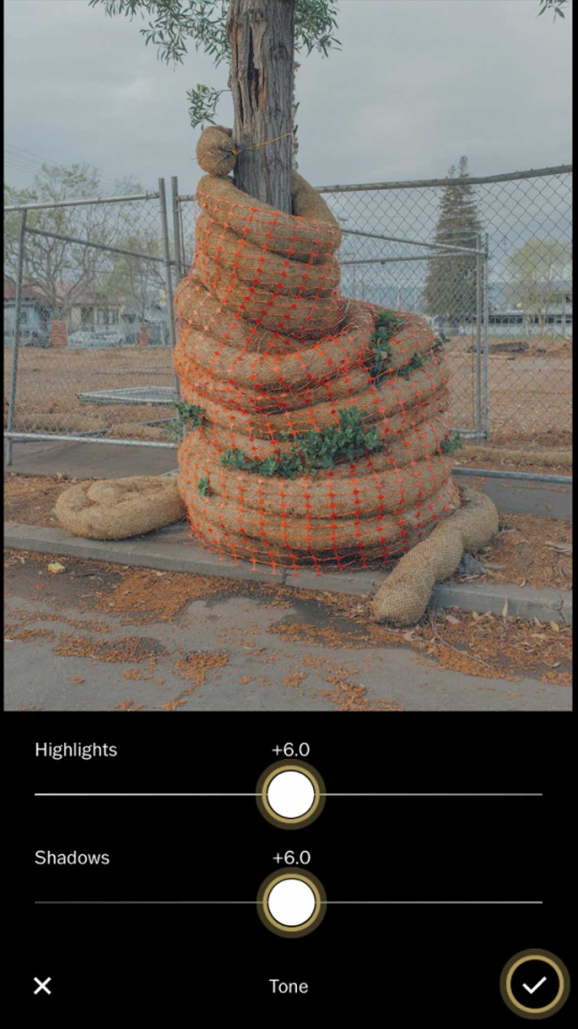
2 — Contrast and Tone tools / 对比和调色工具

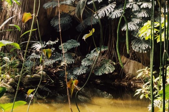
The Contrast tool is an obvious choice for experimenting with these looks. Try reducing Contrast a little at a time and combine it with the Tone tool. Try to preserve as much detail as you can in both the dark and bright areas.
使用对比度工具是最直接的做法。一次调降一点点对比度,并与调色工具一起使用。试着在明处和暗处保留越多细节越好。
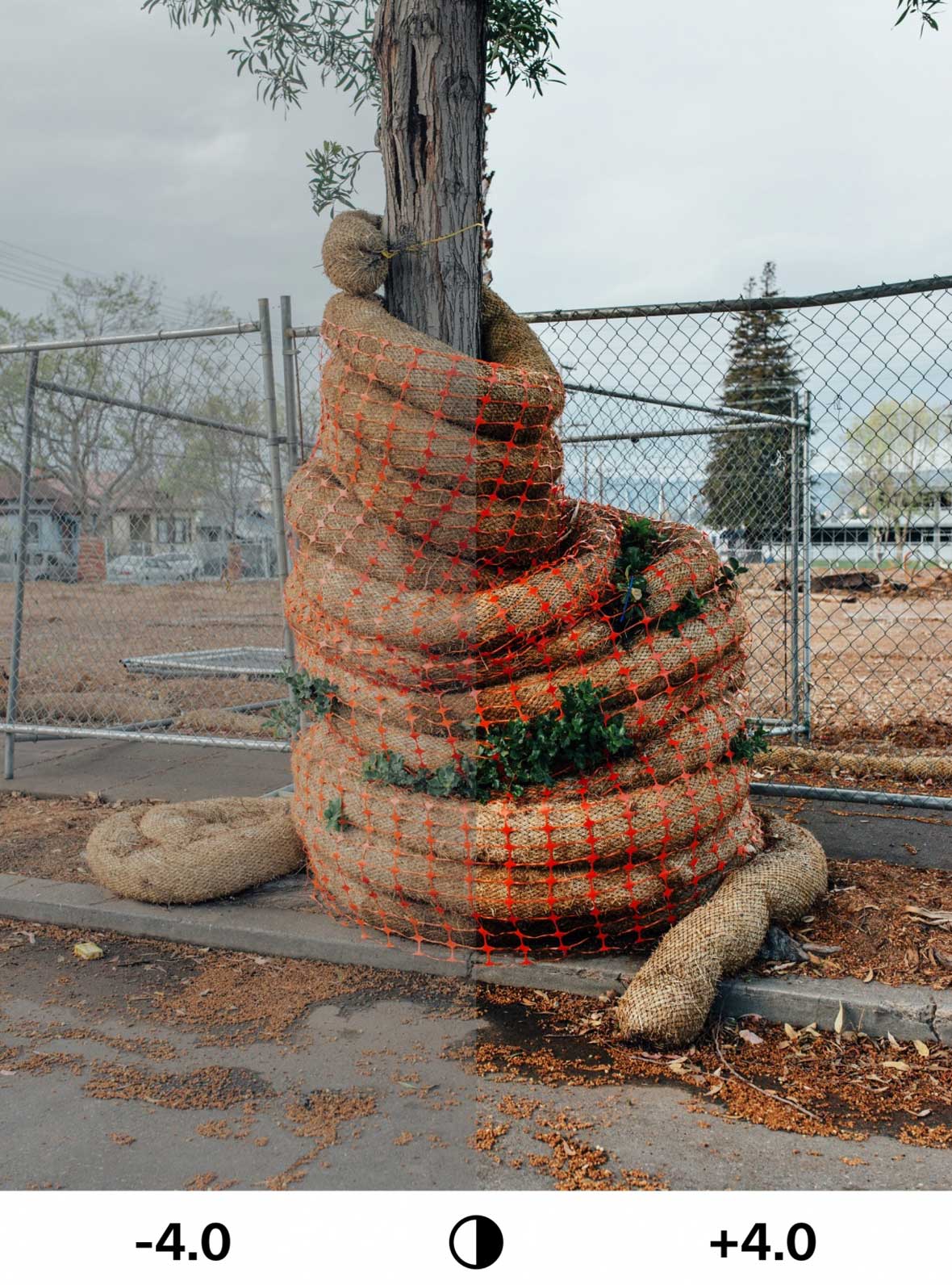
The Tone tool gives you control over both shadows and highlights. Low contrast images are known for maintaining detail across both bright highlights, as well as dark shadows. Incrementally increasing these sliders can help save these areas of detail.
使用调色工具来掌握照片中的明处和暗处。慢慢地移动高光(Highlights)和阴影(Shadows)滑块,低对比度可让细节共存在明亮和黑暗里。
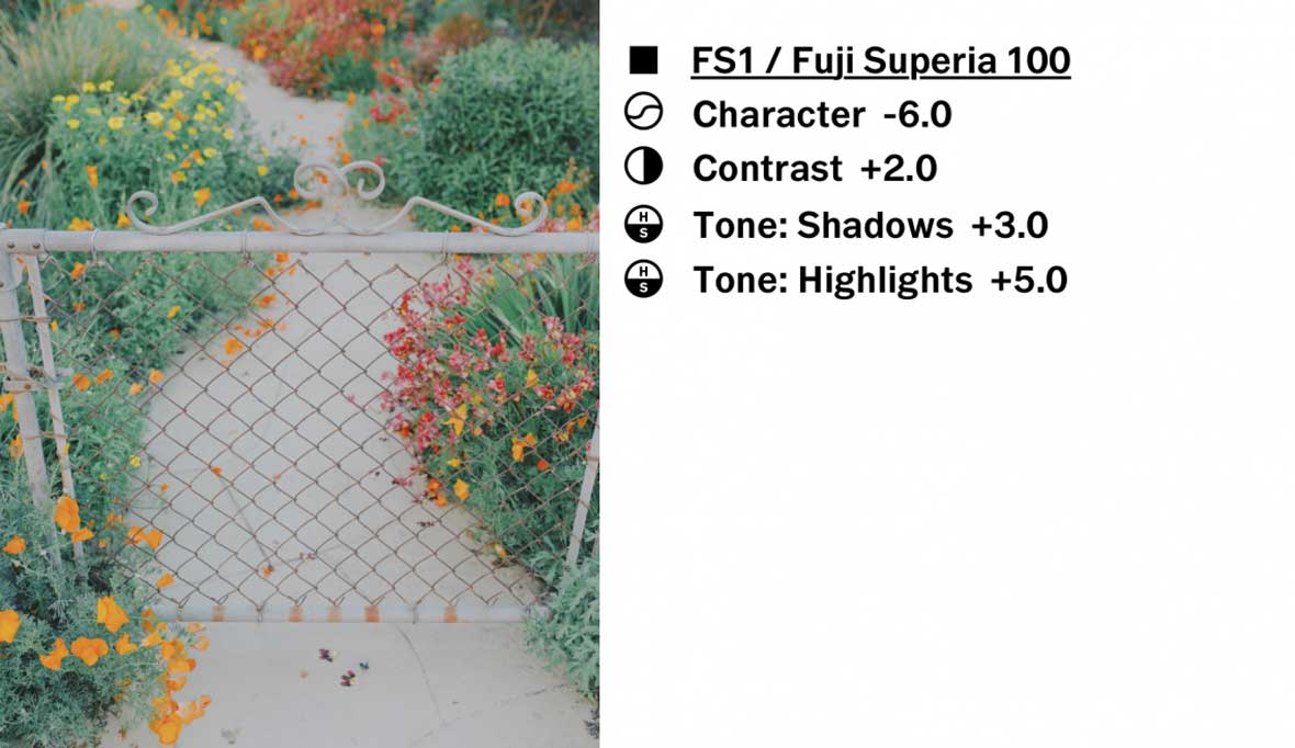
3 — Character and Film X / Film X 系列滤镜和字符调整工具
If you want a low contrast look that is reminiscent of vintage film, using Character and Film X is your best bet. By using the tools mentioned before in conjunction with reduced Character, you can achieve unique low contrast looks. To access Character, tap on a Film X preset again after applying it to an image. For this approach, try starting with FS1 (Fuji Superia 100) or KP3 (Kodak Portra 160VC).
Film X 胶片模拟滤镜系列可以让你创作出复古电影般的低对比度照片。通过使用先前提到的工具,以及拉低字符(Character)工具,就可以实现独特的低对比度外观。将滤镜应用于图像后再次点击就可以找到字符工具。建议你可以从 Film X 系列里的 FS1(Fuji Superia 100)或 KP3(Kodak Portra 160VC)开始。