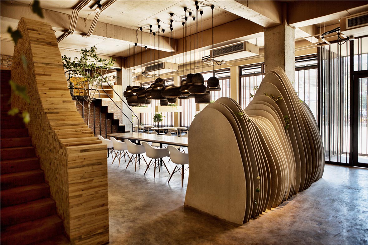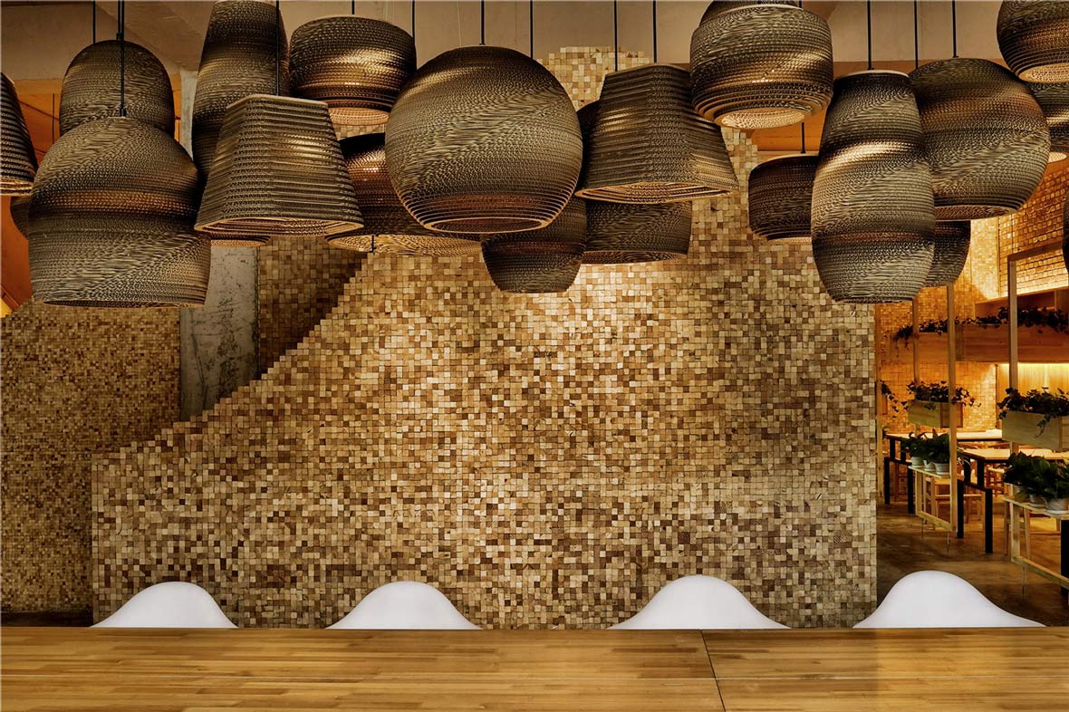
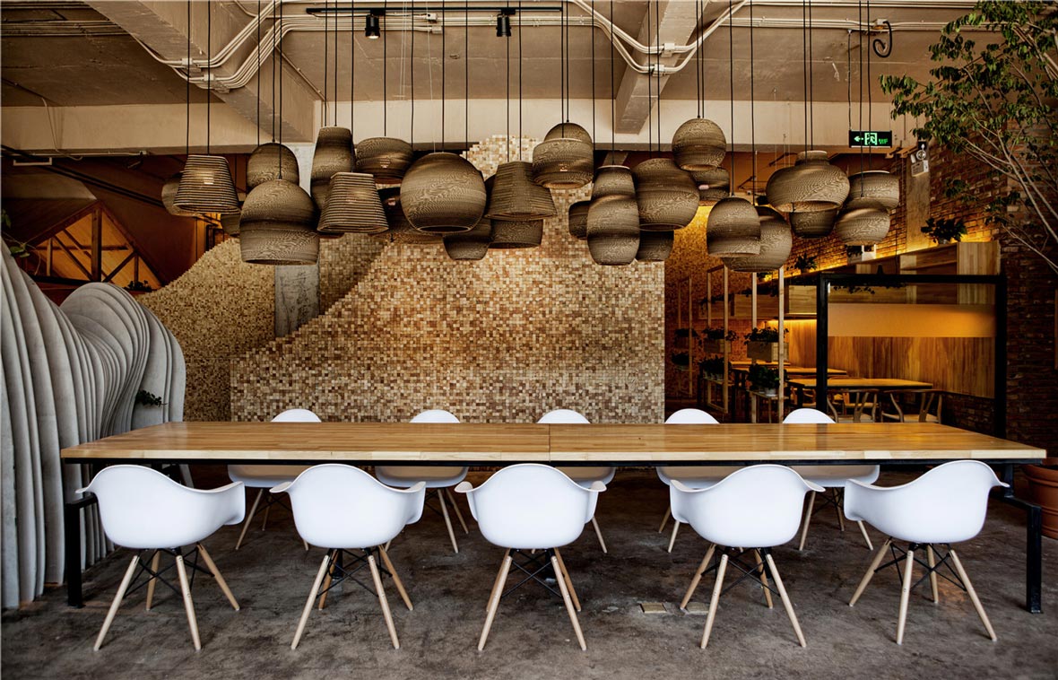
Located in East Beijing, Shan Café was first conceived when its owner wanted to convert the first and second floors of an office building into a café with a large open area, which would encourage customers to stay and communicate freely. Since the client also enjoyed the mountains, the space was specially but subtly designed to hint at mountain landscapes and the great outdoors.
山咖啡位于北京东侧,最初业主想利用办公楼一、二层构建一个空间开阔的咖啡馆,让顾客随意逗留,自由沟通。由于业主喜欢山野的环境,因此希望在空间设计时能够巧妙嵌入山林和户外元素,享受自然的美好。
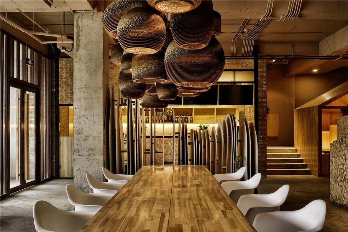
The budget to design and construct the café was a bit limited, so only commonly attainable materials were used. One anomaly of the space was that its first level was 3.8 meters high, which is too high for one floor, but not really high enough for two. So the design of the space turned out to be full of challenges for the Beijing studio Robot 3, who were tasked with the project of bringing Shan Café to life.
由于咖啡馆的预算和施工经费有限,所以只能用常见的材料进行建构。整个空间有一处有意思的地方,其层高非常特别,有3.8米,做单层太高,两层又比较紧张。对于接手了这个项目的北京Robot 3工作室来说,怎么构思这样的空间使之焕然一新并融入活力,确实充满挑战。
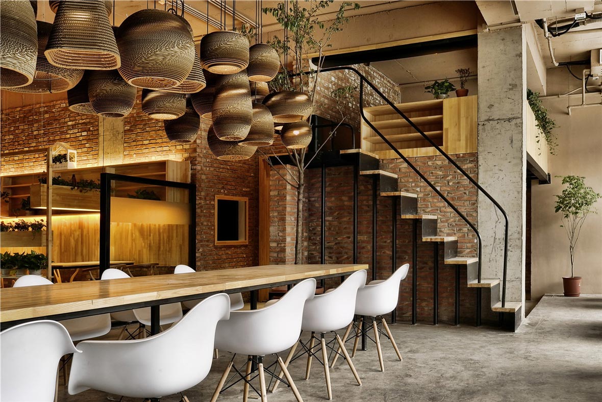
The word shan, meaning mountain in Chinese, reminded the designers at Robot 3 of a poem written by Su Shi: “From the side, a whole range; from the end, a single peak; Far, near, high, low, no two parts alike. Why can’t I tell the true shape of Lu Shan? Because I myself am in the mountain.” The poem would give the designers a crazy idea to dig down one meter at the center of the entire space, and then build a large mezzanine over it.
Shan Café的“Shan”在中文中就是“山”的喻义,这让设计师想到苏轼的一首诗:“横看成岭侧成峰,远近高低各不同。不识庐山真面目,只缘身在此山中。”于是突发奇想地在空间的中央部位向下又挖了一米,然后在上边建立一个夹层。
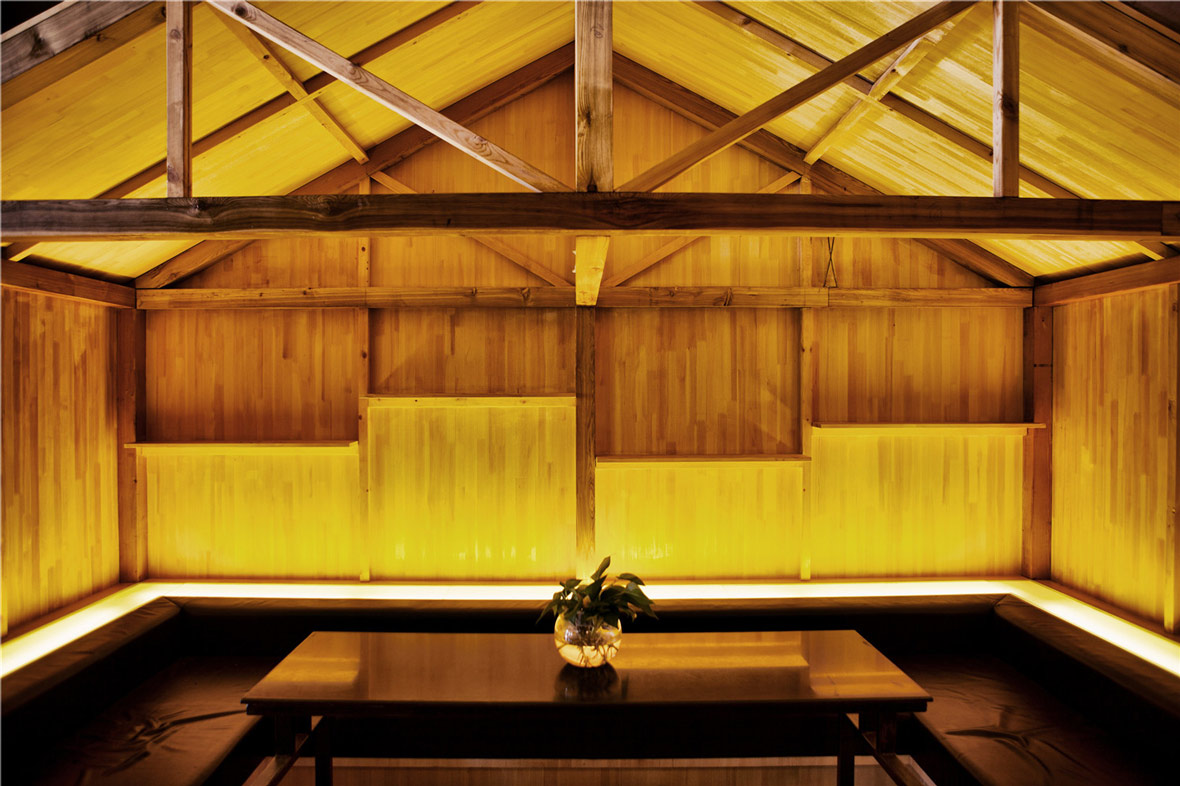
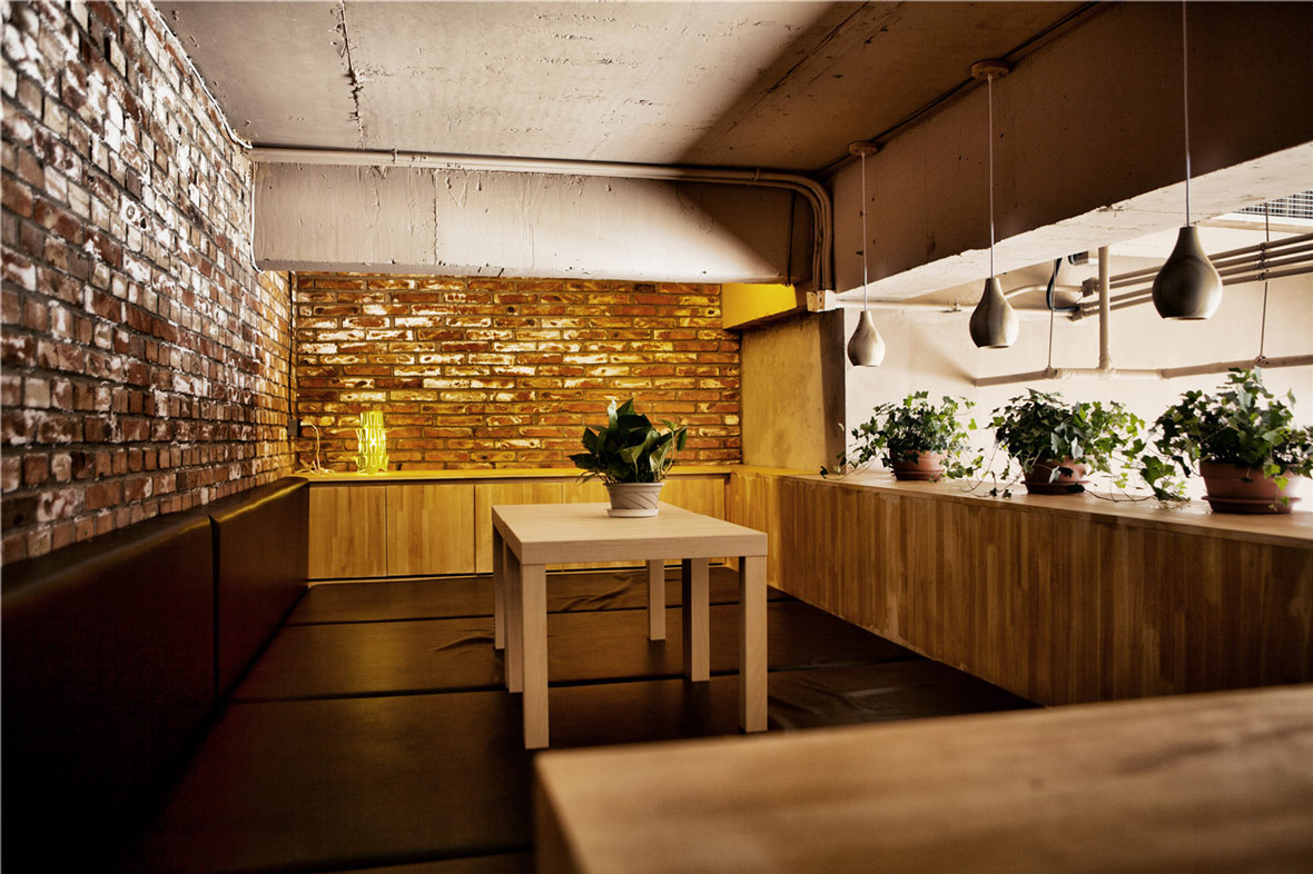
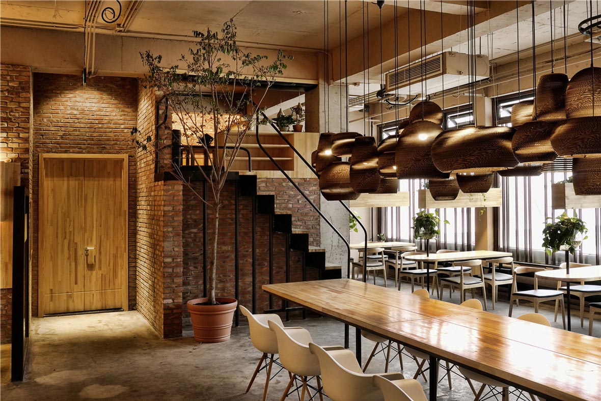
When customers walked into the lower level through the mezzanine, it would very subtly simulate the experience of “walking into the mountain”. The floor height of the mezzanine is quite low, so once inside it, customers could only sit or lie down, which makes it a good area for chatting amongst a couple of friends. Under the stairs which lead to the second floor, there is a log cabin.
当顾客通过夹层向下步入挖出的“负一层”时,营造出来一个仿若“走进山林”的特别空间体验。另一处夹层空间较矮,顾客进去后只能在里边坐着或躺着,但非常适合三两朋友在此闲逸聊天。在通往二层的楼梯下面做了一个小木屋。
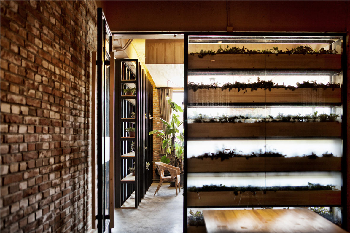
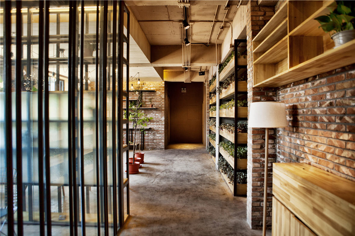
The second floor is divided into several small areas, but instead of building solid partitions, Robot 3 made shelves stacked with rows of green plants. As the plants inevitably would grow, the space would also change with the passage of time. Design features such as this and the choice of construction materials were all carefully considered to maximise the flexibility of the space and to enhance the feeling of comfort for visitors. Here is a space that, despite being in downtown East Beijing, effectively evokes the airiness and openness of the great outdoors.
二层划分了几个小空间,Robot 3没有用实体的隔墙,取而代之的是绿色的植物搁架。随着时间流逝,绿植恣意生长,形态变迁。无论是诸如此类的设计特色还是在建筑的选材方面,都是设计师的精心安排,最大程度发挥空间的灵活性,让来访者如沐春风。尽管此地位于北京东侧的繁华市区,却仍能打造大自然的空间流动之感和开放自由之美。
Website: robot3.com
Contributor: Leon Yan
Photographer: Xi-Xun Deng
Photos Courtesy of Robot 3 Studio

