The Shape of Nostalgia 精彩在“Wow“

February 24, 2022 2022年2月24日

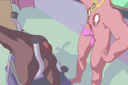
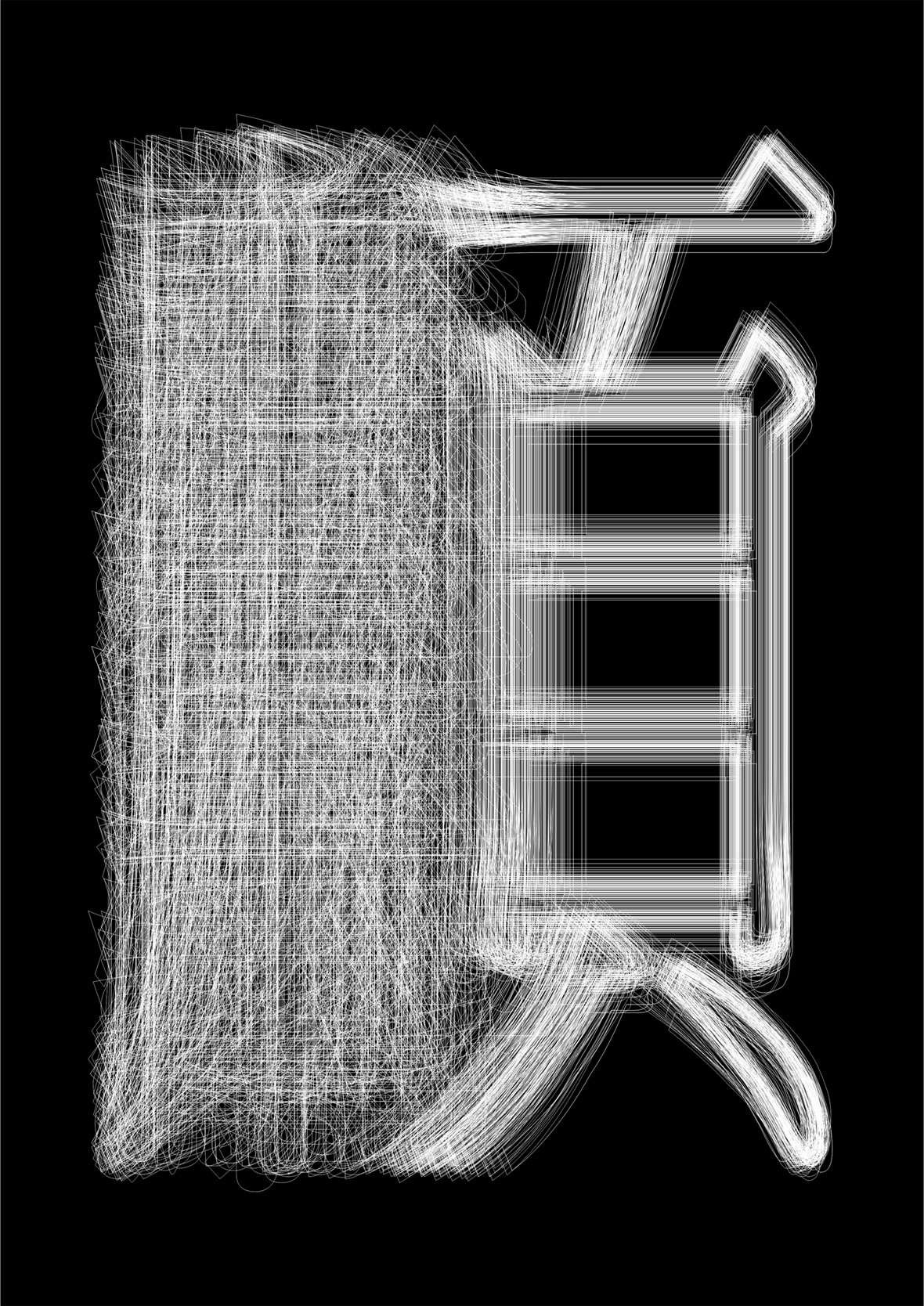
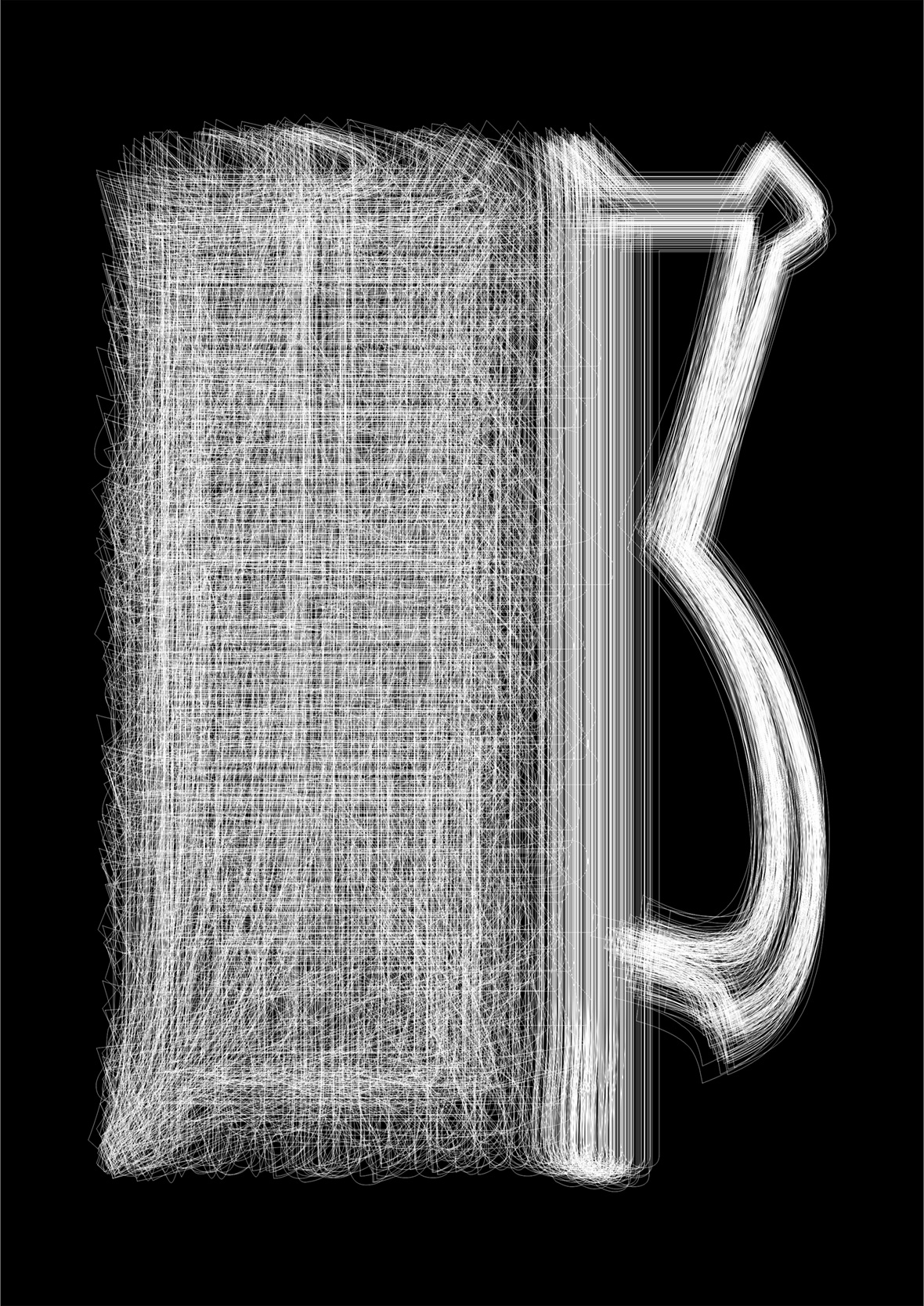
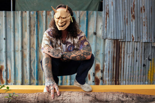
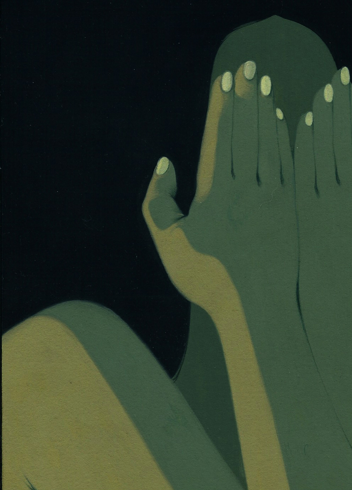
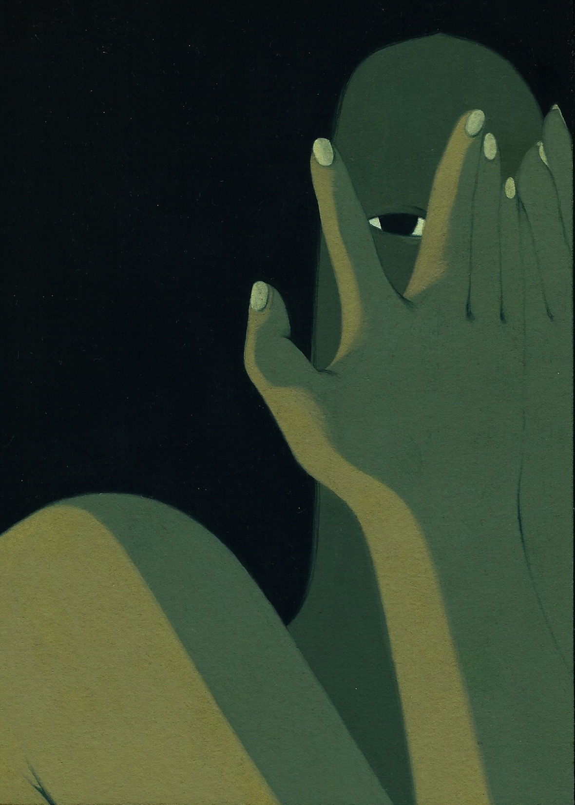
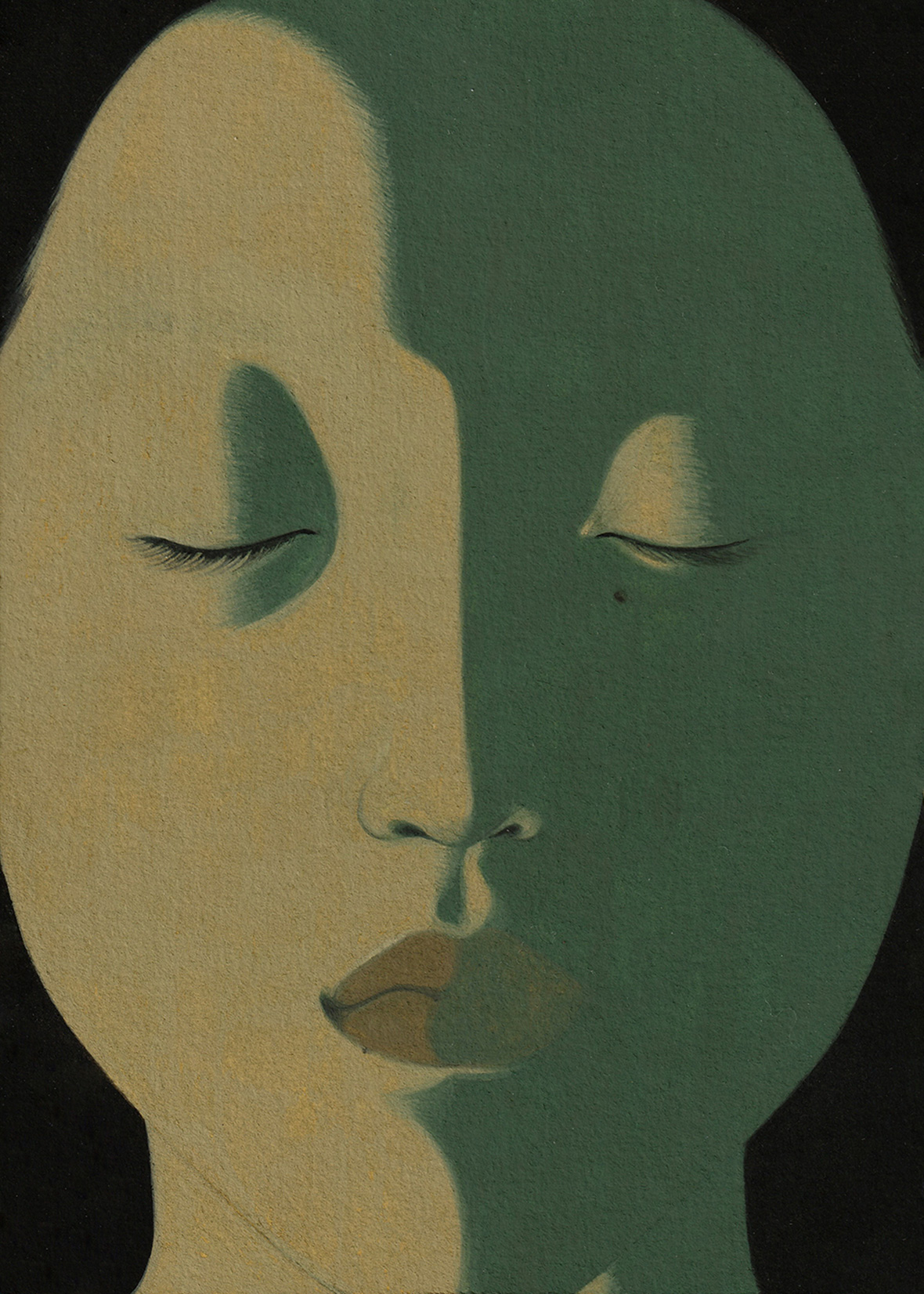
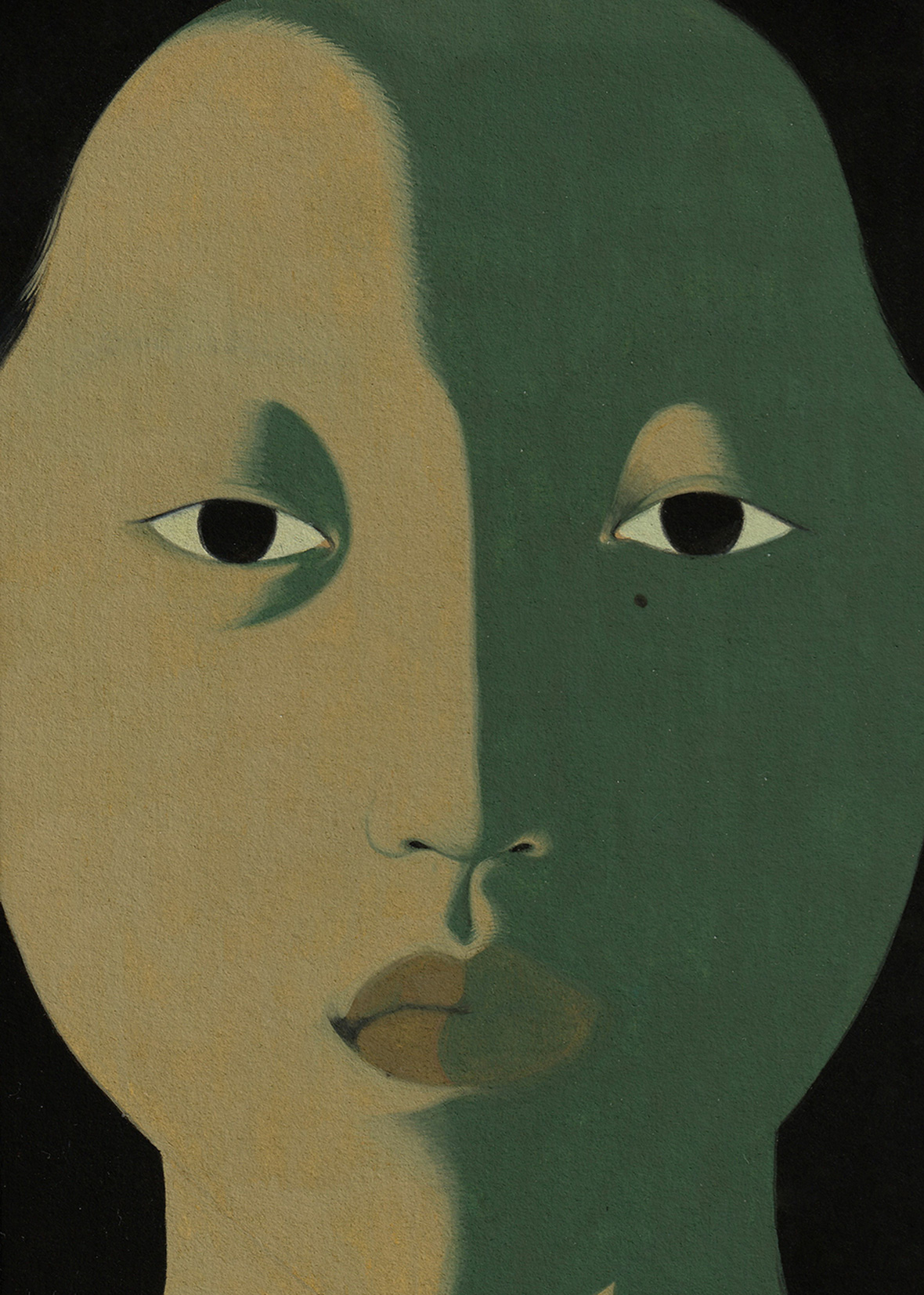
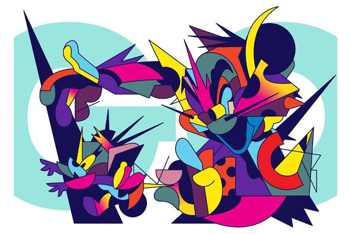
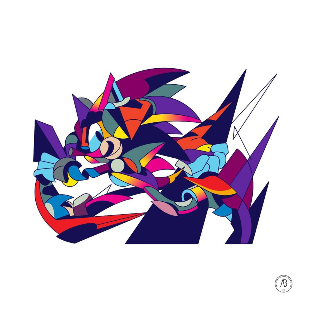
Jagged spikes and angular forms splay every which way, forming the recognizable silhouettes and shapes of iconic cartoon characters. Sonic the Hedgehog is dashing away, glancing back with a mischievous smirk; Astroboy has arms outspread as he blasts off from his rocket-propeller legs; and Tom has finally done it—Jerry’s tail is clutched between his fingertips, and he’s seconds away from snatching up the elusive mouse. These reimagined cartoons are the works of Thai artist Pichet Rujivararat, better known by his moniker Tikkywow.


如激光般犀利的笔触正延伸出一个个为人熟知的卡通角色:疾速奔跑的刺猬索尼克;正穿梭于云霄的铁臂阿童木;《猫和老鼠》中的汤姆猫这次终于要成功了,两只猫爪已牢牢地抓住了杰瑞命运的咽喉。这些重新构想的卡通人物出自泰国艺术家 Pichet Rujivararat 的手笔,他有另一个圈内熟知的艺名“Tikkywow”。

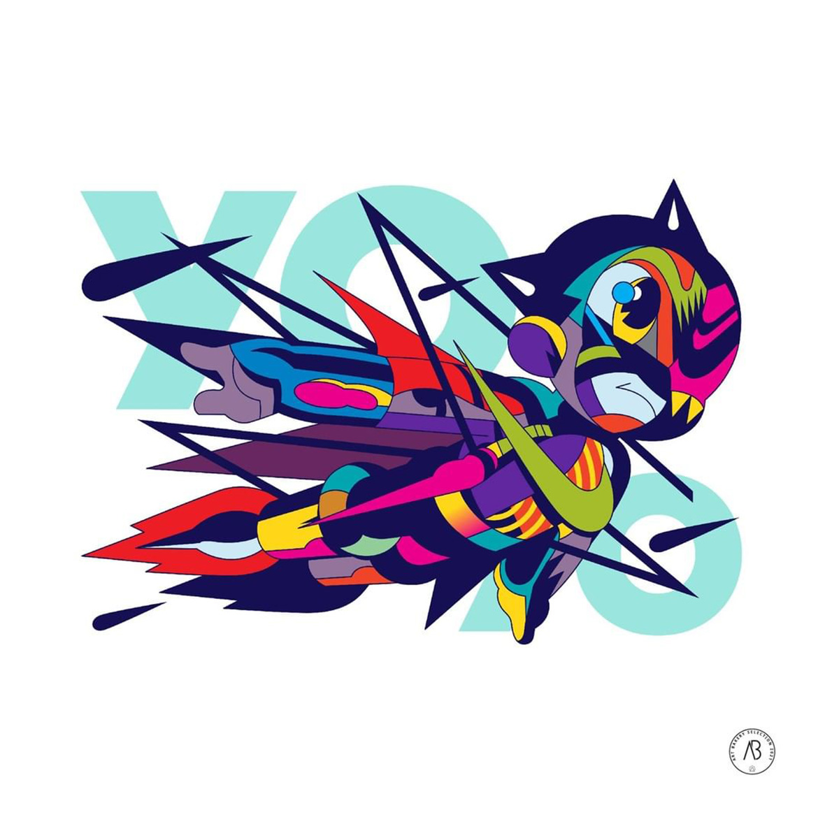
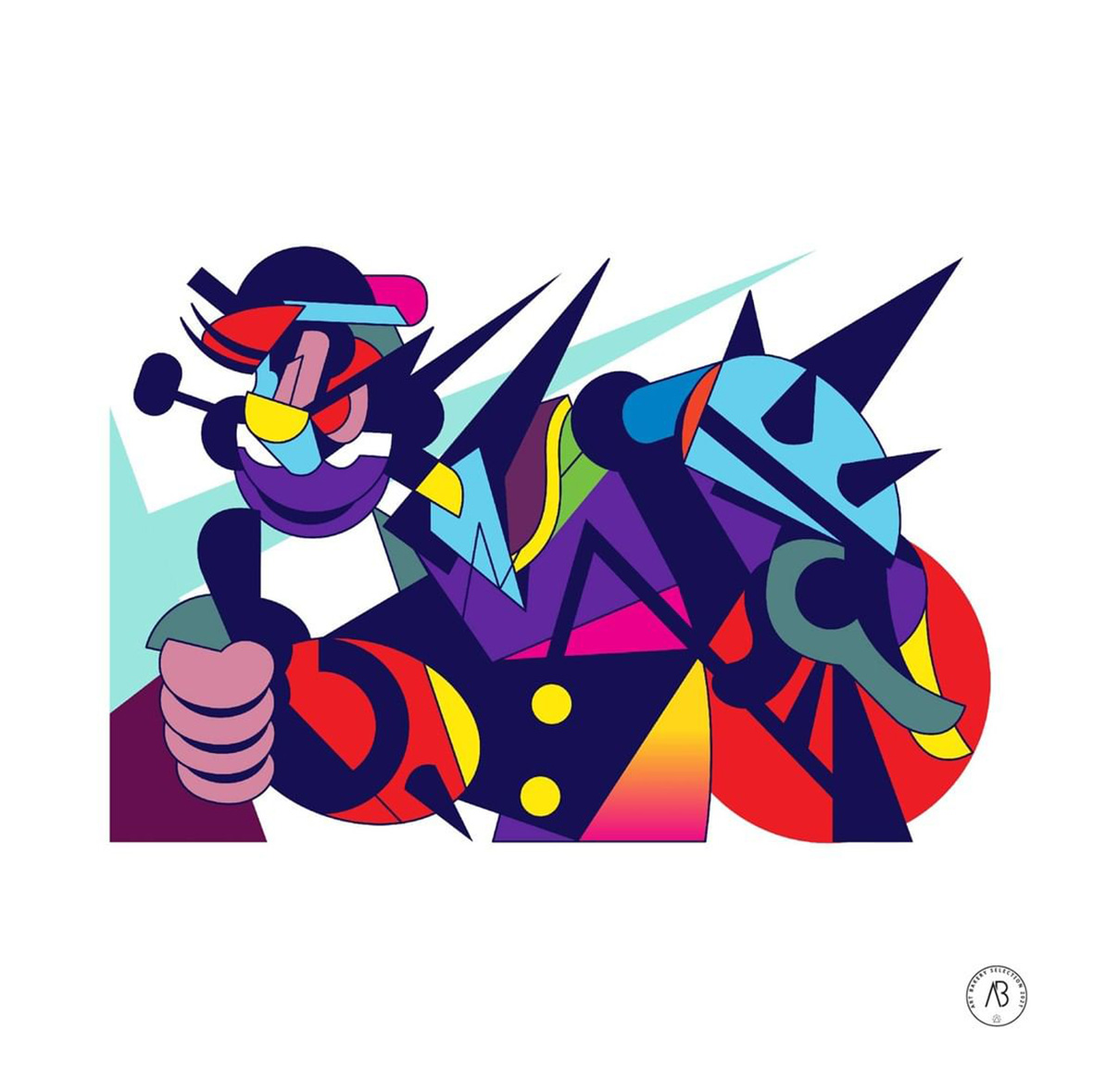
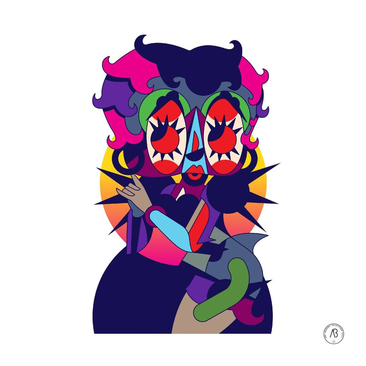
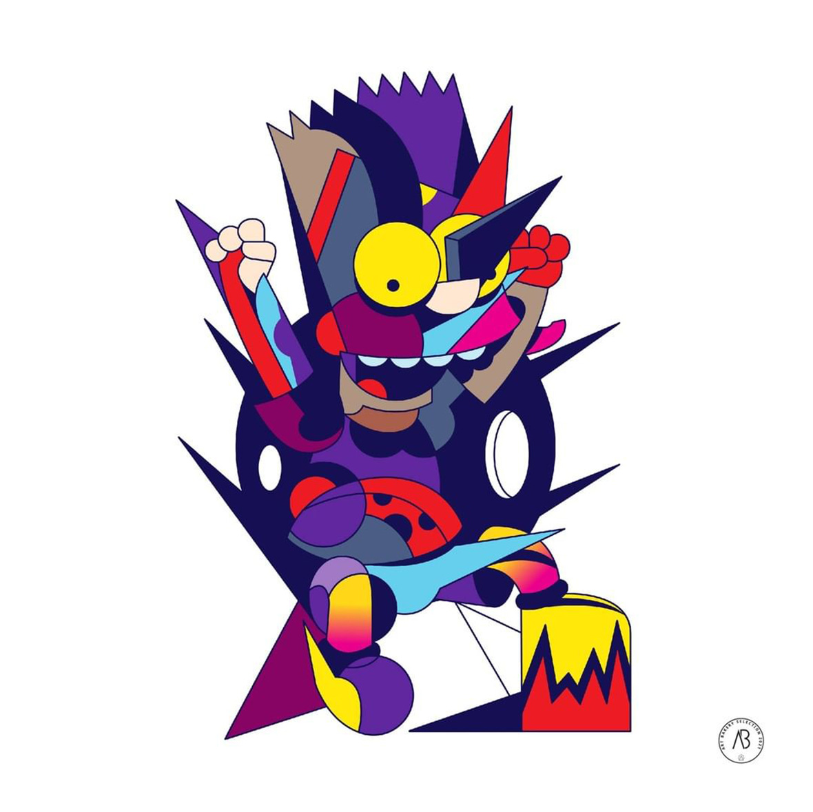
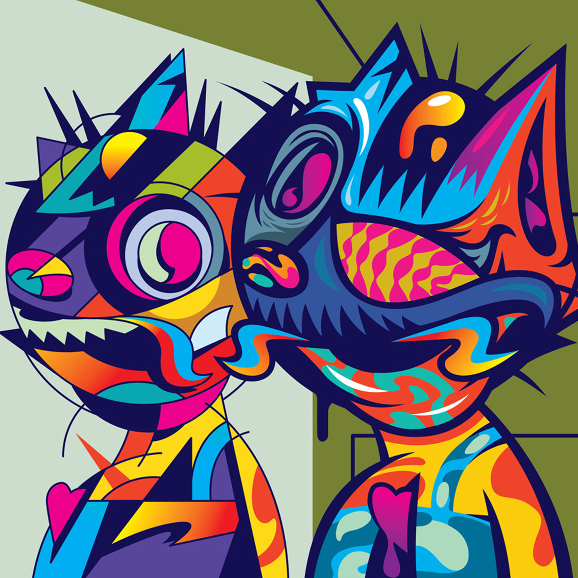
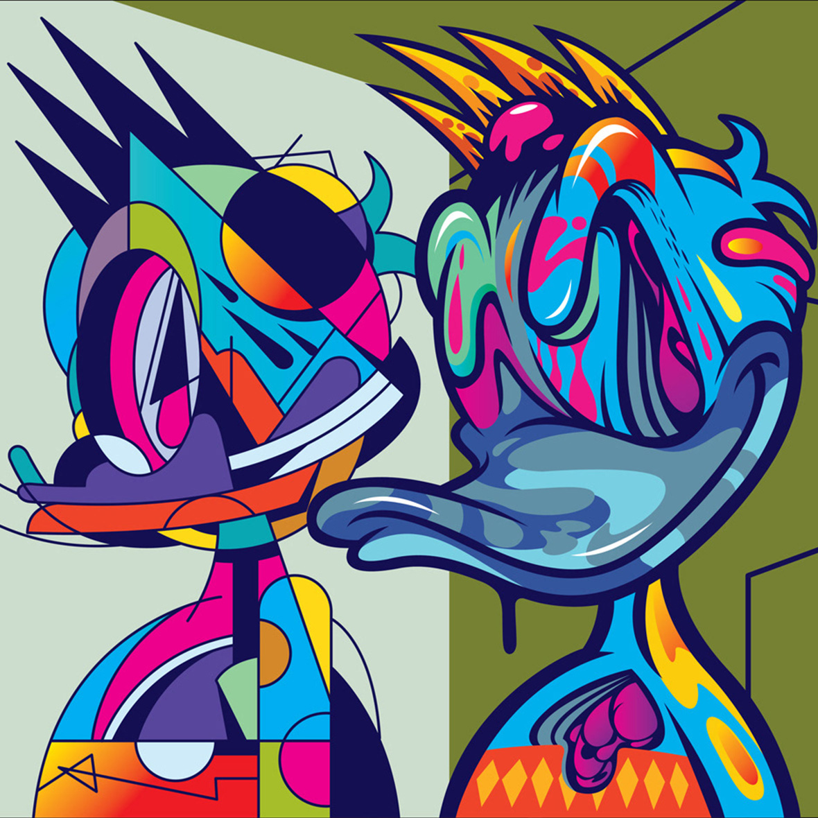
Cartoons were a big part of Rujivararat’s childhood. As an only child, he spent countless hours in front of the television. These animated shows he watched have left a deep impression. Today, fictional characters from around the world—such as Bart Simpson, Doraemon, Shotaro Kaneda, and more—have made cameos on his canvases. Though they’re easily identifiable, they’ve been reimagined in a distinct, pop-art style that feels utterly different from their original designs. “Even as I got older, the things I watched as a kid are still vivid in my memory, and I’m still interested in them,” Rujivararat laughs. “They taught me how to tell stories in fun and colorful ways.”


卡通,是 Pichet 童年回忆的重要部分。作为家里独生子,他经常连续数小时霸占电视机遥控。这些回味无穷的动画片,对他日后的艺术创作带来深远影响。各式各样的卡通角色现身于他的作品中,譬如辛普森一家、哆啦A梦、金田正太郎等等。虽都是家喻户晓的卡通人物,但经过 Pichet 的重新演绎,让这些角色呈现出全新的风格,看上去与原始角色判若两人。他笑着说:“现在已经过了看动画的年纪,但这些角色像是活在了我的记忆中,他们教会我如何以丰富有趣的方式来讲故事。”

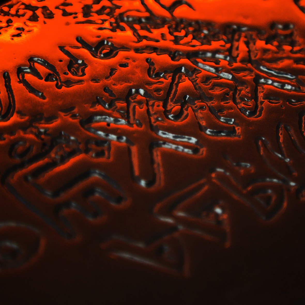
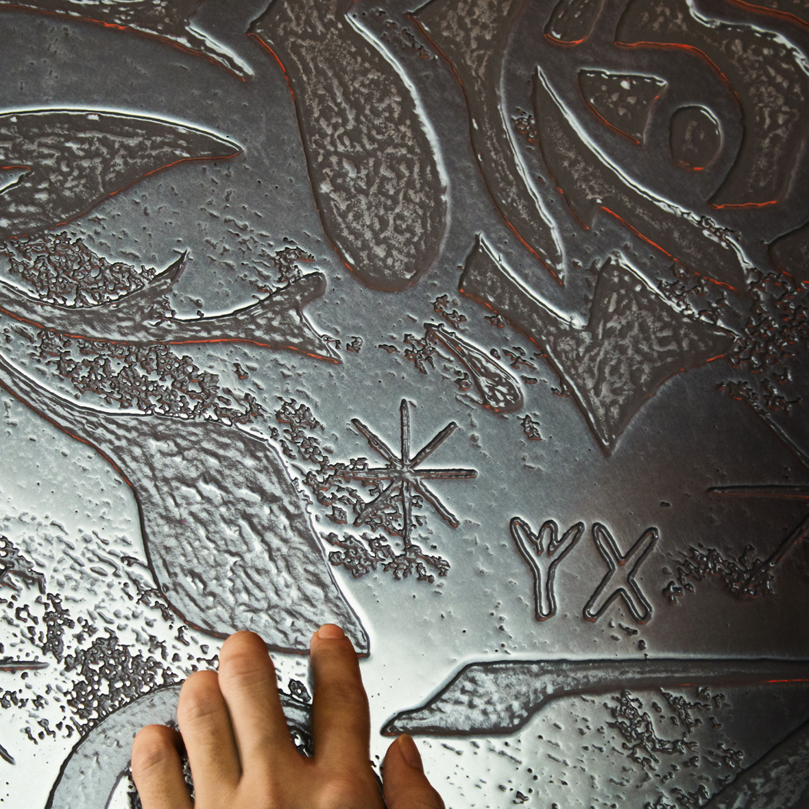
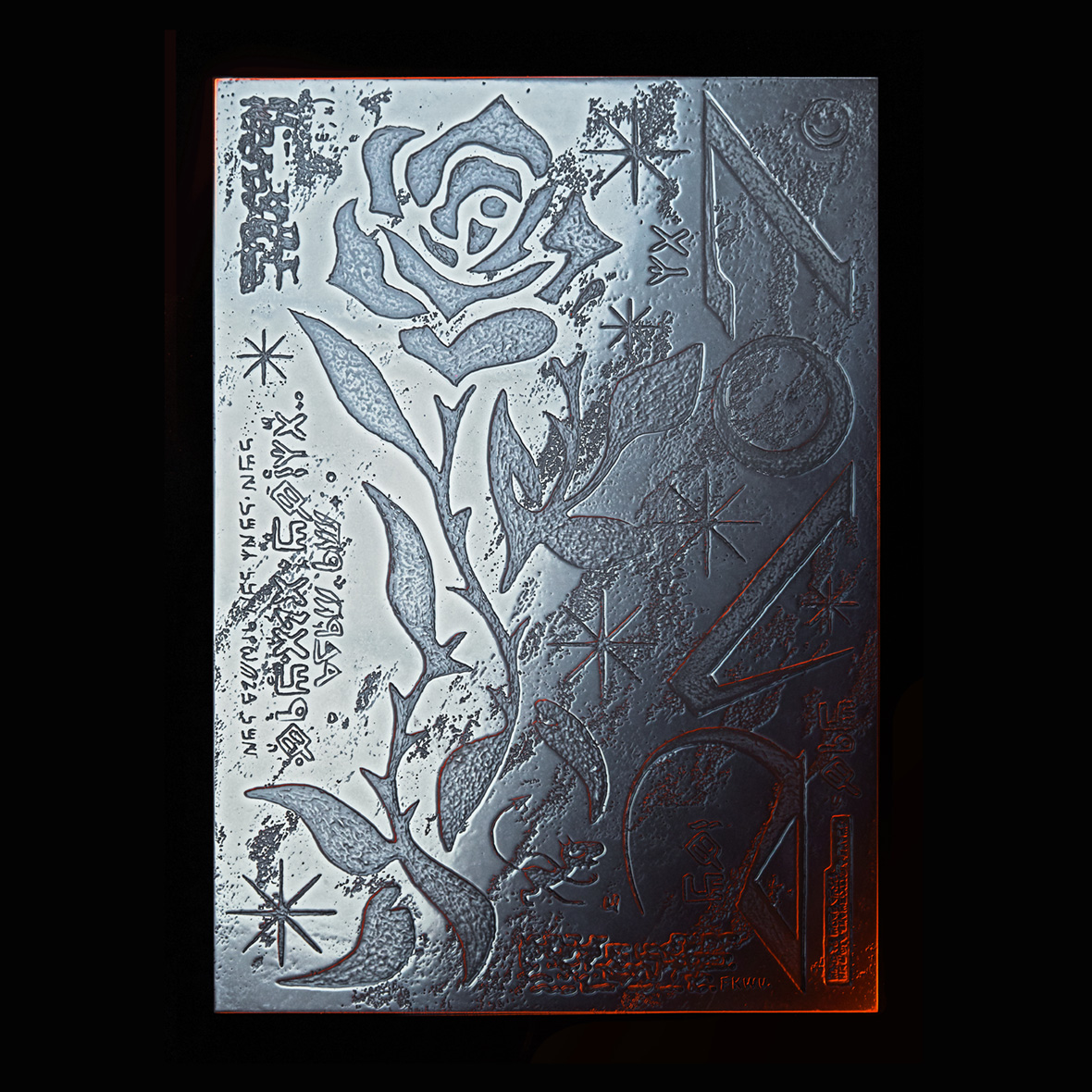
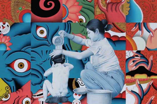
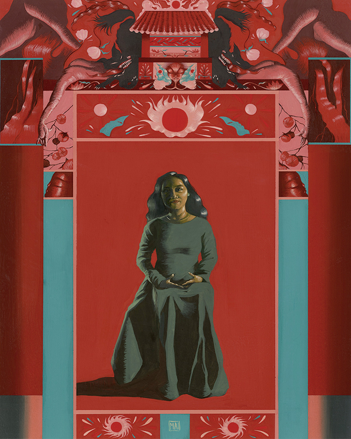
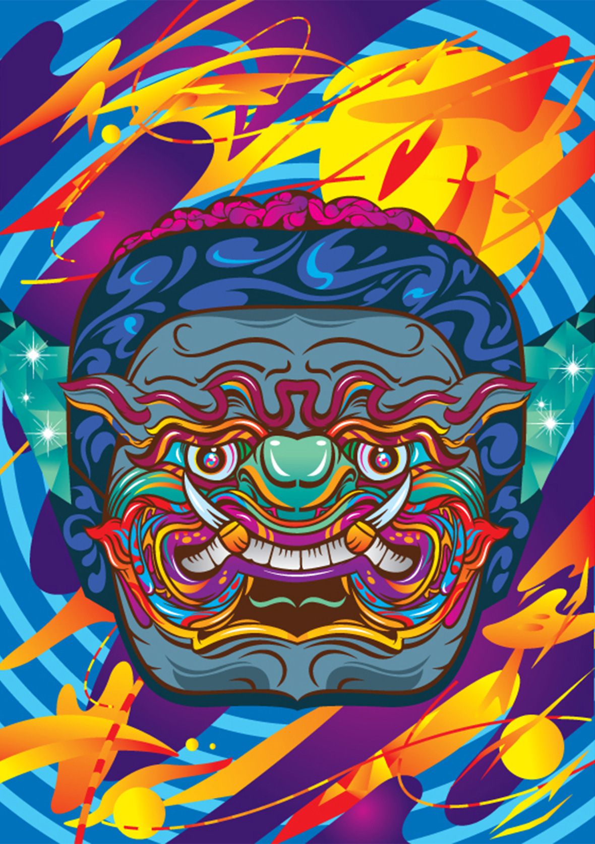
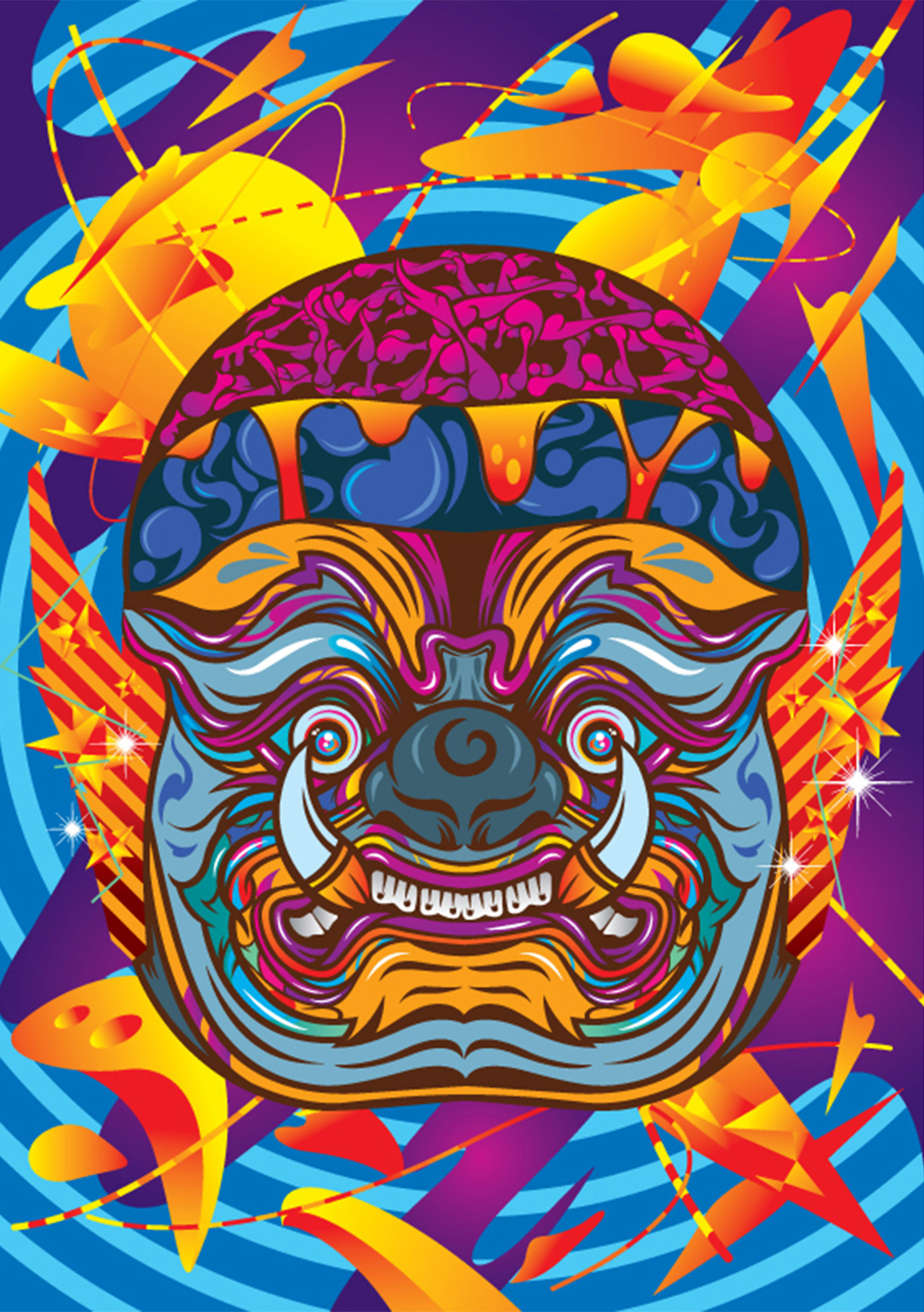
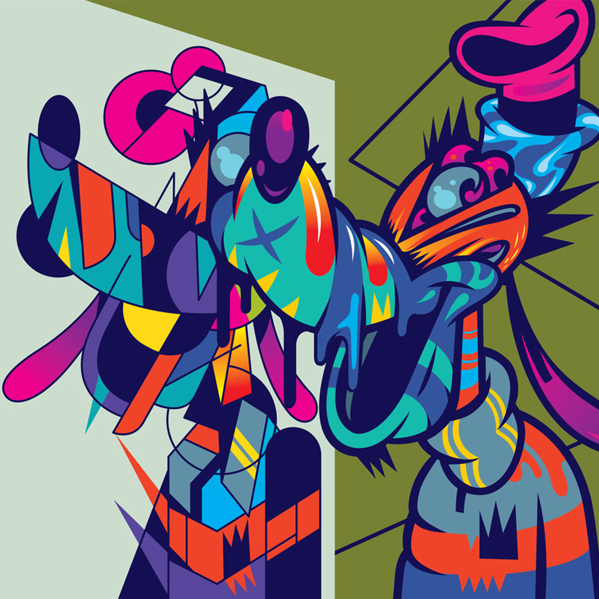
Aside from international cartoons, Thai culture has been an equally powerful source of influence for Rujivararat. In 2011, he created Yak, a series that he now considers as the bedrock of the unique aesthetic he’s now known for. The project consisted of various portraits of the yaksha, Buddhist deities believed to ward off evil spirits. In Thailand, the yaksha is considered a symbol of power and protection. Through unconventional shapes and psychedelic colors, Rujvararat reenvisioned these deities in a contemporary format. “I love Thai culture and have the most fun creating works inspired by Thai culture,” he says.


除了动画片,泰国当地文化在他的创作中也占有很大的比重。2011 年,Pichet 创作了《Yak》系列,该系列奠定了他日后的创作风格。其中包括了多幅夜叉(yaksha,佛教中驱除邪恶的神灵)的肖像重塑。在泰国文化中,夜叉是力量与保佑的象征。通过非常规形状和迷幻色,Pichet 以现代风格重构了夜叉。“我热爱泰国文化,以泰国文化为灵感的创作往往是最有趣的,”他说道。

The similar technicolor palette that began with Yak persists across his work today, though his usage of colors is even more polished now. Rujvararat explains that the palettes he now employs are based on the colors he associates with Thailand. He believes these color choices also imbue his work with positivity, which is something he’s eager to bring more of into the world. “I’ve made art in black-and-white before, but after doing it for a while, I started feeling depressed,” he says. “I wanted to change my perspective and started using brighter colors. I now always think about the colors I use and what emotion I want it to convey.”


从《Yak》开始,他的作品便一直延续了鲜艳色彩的设置,并在日后的打磨中渐渐娴熟。Pichet 解释说,作品中所有色彩都和泰国息息相关,并认为鲜艳的色彩能为作品注入不少积极的能量,这也是他的愿望——为世界带来更多积极的方面,感染更多人。“以前创作过黑白作品,但没过多久,我便感到单调。于是,想换一种创作思路,想注入更多明快的色彩。以至于现在每创作一幅作品之前,我都要先考虑颜色的运用,以及不同颜色所带来的情绪。”

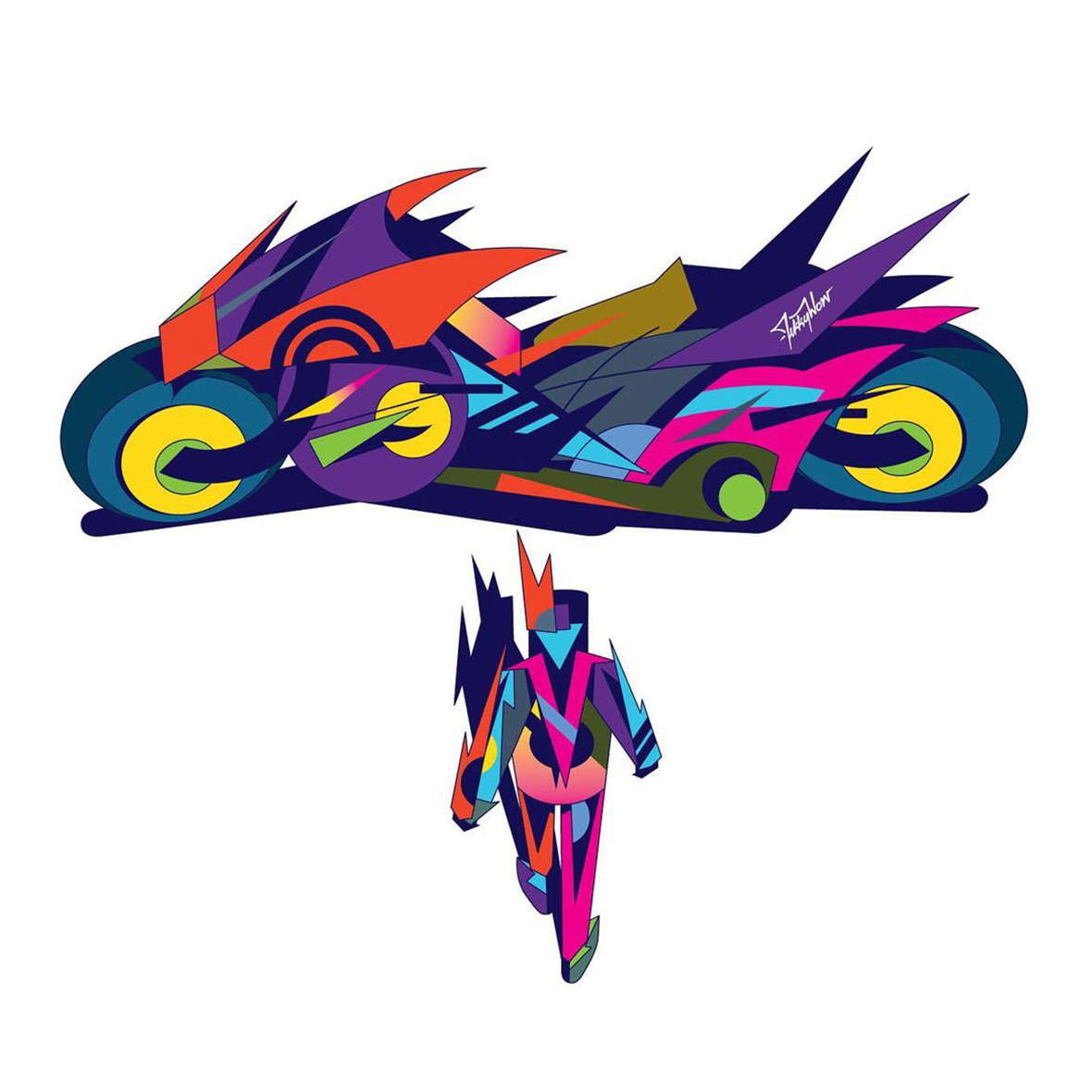
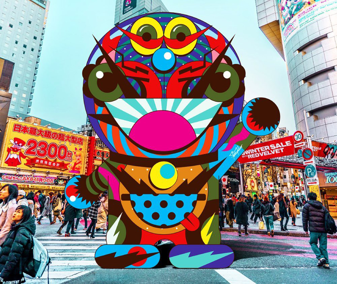
Rujivararat is an artist not bound by mediums. Whether it be digital illustrations and streetside murals or life-sized sculptures and pocket-sized toy design, the materials and methods he works with are hardly important to him. He’s open to new ways of presenting his art, even unveiling a VR exhibition for the first time in 2021.

Ultimately, he just hopes to get his riotous works in front of more eyes, and as his artist moniker suggests, leave them with a singular reaction: “Wow.”


Pichet 不希望自己被创作媒介捆住手脚。无论是数字插画、街头壁画,真人大小的雕塑或是小型玩具设计,他一直乐于尝试不同的创作媒介。2021 年,他还首次办了个人的 VR 展览。

Pichet 希望让更多人看到自己五花八门的作品形式——正如他所取的笔名“Tikkywow”那样,让每幅作品都能获得“Wow”的一声惊叹。

Like our stories? Follow us on Facebook and Instagram.


Instagram: @tikkywow
Behance: ~/tikkywow


Contributor:  David Yen
Chinese Translation: Olivia Li


喜欢我们的故事?欢迎关注我们 Neocha 的微博微信


Instagram: @tikkywow
Behance: ~/tikkywow


供稿人: David Yen
英译中: Olivia Li

You Might Also Like你可能会喜欢

Expressive Textures 透明姿态

February 22, 2022 2022年2月22日

With music recording unbound from physical restrictions and floating around the digital ether, what good is a cool CD case or liner notes? If today’s vinyl craze is any indication, people still value that physical connection. Creating album packaging is still Taiwanese designer Wu Jianlong’s main area of work, and considerations to their tactility is front and center in his designs. Even though nobody really buys physical CDs anymore, they still have their merits: “Physical albums are like business cards for musicians,” he says. As valuable as these are in themselves as art objects, he’s taken what he’s learned with album design, expanding into poster art and even sculptural pieces using similar materials and aesthetics.


如今,线上流媒体音乐横行已久,这不禁让人思考,精心设计的实体唱片包装和内页究竟还有存在的必要吗?而就在近几年,人们对黑胶唱片的热情开始升温,说明实体并未离我们远去。对于台湾设计师吴建龙来说,唱片包装设计至今依然是他的主要工作,从视觉到纹理,这些都是他创作的重心。“对于音乐人来说,实体唱片就像是他们的名片,”他说道。事实上,专辑设计本身也是艺术品,在此基础上,吴建龙还将他在专辑设计方面的经验延伸到了海报设计,以及雕塑作品上。

It was music and movies that inspired Wu to become a designer. “Browsing the racks at music and video shops to soak in the cover designs—this deeply influenced me.”

The physical qualities of jewel cases and CDs are clear starting points for Wu. Literally. He excels in his use of translucency and returns to it frequently. His design for Taiwanese saxophonist Minyen Hsieh’s As Good As Water plays on the album’s theme of water, which has been visualized as puddles and droplets that seem to sit atop the see-through case. The artificial fluids distort the text beneath, just as real water would.


吴建龙化名 FK WU,与很多设计师一样,最早是受音乐和电影的启发,而决定投身于设计领域,“经常会去逛音像店,对货架上的封面设计流连忘返,这些经历对我影响很深。”

吴建龙在设计时喜欢从塑料 CD 盒和 CD 碟的物理特质入手,且尤其擅长半透明设计。他以水为主题,设计了台湾萨克斯乐手谢明谚的专辑《上善若水》。他别出心裁地在透明外壳上设计了水滴和涟漪,达到了以假乱真的效果。

His poster for Posture of Transparency, a glass-art exhibition held in Hsinchu, is also translucent, printed atop a material that allows light to partially pass through: “Transparency is an illusion; sometimes it might be transparent like a liquid, other times it might be like plastic,” he says. “You can add a sense of layers with transparent materials.”


此外,他为新竹玻璃艺术展 “透明姿态” 创作的海报同样采用了半透明设计,他说:“透明是一种幻觉,可以是液体,也可以是塑料。你还可以通过透明材料,制造出丰富的层次。”

Wu is fond of different types of visibility. The UV-ink stamp used to verify ticket holders at concerts served as inspiration for Taiwanese singer HUSH’s album, which appears entirely blank in regular light. Only under blacklight does the full design reveal itself. UV ink is an idea he’s also played with on a few other personal works.


透明效果、多层透视,是吴建龙偏爱的设计特点。他曾以 UV 发光油墨印章作为创作灵感,为台湾歌手 HUSH 设计专辑封面。这类油墨通常被用在音乐会入口,盖在观众的手臂,作为购票凭证。在普通光线下,专辑封面看上去空白一片,只有在黑光灯下才能显现出完整的设计。UV 发光油墨元素,也同样被应用在他的许多作品中。

Wu’s love of retro sci-fi is also front and center in his work. The typeface and artwork for pop singer Tolaku’s release of his album Wish You Were Here is a direct reference to early Godzilla films. For rock band Papun’s album 2049, he features a customized Delorean from Back To The Future. But modern science fiction also serves as creative fodder, and he cites it as being foundational to the metallic aesthetic he’s known for. “The weapons that characters used in sci-fi and the general futuristic aesthetic of those movies, all of that still influences my work today,” he says. “I also think the material just looks dope.”

The metal-inspired designs are some of Wu’s most distinct works to date. His latest album design for rapper K-how’s Zenwave is an embossed foil cover that looks like an artifact straight from the future. (He uses UV ink on the inside as well.) When viewed online, it almost resembles CGI.


不难发现,吴建龙对复古科幻充满喜爱。在他为台湾流行乐团 脱拉库Tolaku 的专辑《望你早归》所设计的字体和平面中,就参考了早期的哥斯拉电影;而在台湾摇滚乐队 怕胖团PAPUN BAND 的专辑《2049》中,吴建龙又借鉴了电影《回到未来》中经典的德罗宁汽车造型。现代科幻片也是他的创意来源,在他看来,这类影片促成了他对金属感材质的偏爱。他说:“科幻片中的角色所使用的武器以及影片中普遍的未来主义美学,所有这些一直影响着我的创作,而金属这种材料本身就很酷。”

金属风格设计也是吴建龙设计中鲜明的一大亮点。在说唱歌手 K-how 的最新专辑《Zenwave》中,吴建龙就设计了一套浮雕铝箔封面,让整张专辑看起来就像是来自未来的工艺品。(专辑内页也同样加入了 UV 发光油墨元素)倘若在电脑上观看设计原稿,那几乎可以算得上是一幅 CGI 作品了。

The piece Wu had manufactured for an exhibit at P_L_A_C_E gallery is his most ambitious metallic design to date. He created a three-foot-tall embossed metal sheet that gleams brightly, and it and had to be mechanically lifted to the upper floor where it was hung. “The theme for that show was to depict utopia, which for me is love,” he says. “I used metal to portray my idea of love.” Although seemingly cold in regular light, passion exudes under the warm, red light he chose to display it under. His piece builds on the lessons learned from past album designs and elevates these devices to new heights.

Wu’s work continuously builds on the past, a testament to the fact that dated mediums and techniques shouldn’t be considered any less relevant just because technology has moved on—they just need to be reimagined. 


此前,在台北遇•场PLACE画廊的一次展览中,吴建龙创作了他迄今为止最雄心勃勃的金属作品,那是一块近一米高的浮雕金属板,光彩熠熠,被高高地悬挂在展厅。他说:“那次展览的主题是乌托邦,对我来说,乌托邦就是爱。我选择用金属材质来描述我内心的爱情观。” 普通光线下,这件作品看起来冷峻,而作品底部增设的暖红色灯光,传达出一种燃烧的激情。这件作品的创作立足于他以往的专辑包装设计经验,并提升至全新的高度。

正如他的其他作品所示,科技进步不代表必须抛弃旧的技术或日益边缘化的媒介——它们也可以切合时宜,甚至被加以利用,最终以全新的姿态公示于众。

Like our stories? Follow us on Facebook and Instagram.


Instagram: @fkkwu


Contributor: Mike Steyels
Chinese Translation: Alice Zhang


喜欢我们的故事?欢迎关注我们 Neocha 的微博微信


Instagram: @fkkwu


供稿人: Mike Steyels
英译中: Alice Zhang

Where Mushrooms Grow 梦游菇境

February 17, 2022 2022年2月17日

The art of Pat Frades is unmistakable–simply look for the mushrooms. Mushrooms that look enticing enough to touch, but up close take on a more surreal character. Her playful sculptures center around fungi that come in a range of unnatural colors, sprawling stalks and forms, and otherworldly coral-like formations. Some spores grow out of human body parts and vice versa, body parts grow out of vivid clusters.

Mushrooms have been a relatively common motif in contemporary art. Artists like Jemila MacEwan, Nour Mobarak, and TJ Shin incorporate mushrooms in their works, evoking their capacity to grow in different environments. Frades takes inspiration from a more whimsical realm: the psychedelic experience.


无一例外,Pat Frades 的雕塑作品都和蘑菇有关。这些蘑菇外表大都鲜艳明亮,引诱人向前触摸。仔细一瞅,你还会发现大量超现实元素,它们色彩各异,四下蔓延,形似珊瑚,如梦如幻。与此同时,人体部位在当中若隐若现。当代艺术中,蘑菇是常见的图案。Jemila MacEwan、Nour Mobarak 和 TJ Shin 等艺术家都将蘑菇大量融入到自己的创作中,强调其在多种环境下的强大生命力。然而,Pat 的灵感则取自蘑菇更为梦幻的一面。

Frades has long been fascinated by mushrooms. She was particularly intrigued by psilocybin mushrooms—a hallucinogen that leads to altered mind states. Hearing secondhand accounts from others who’ve taken them, she envisioned an experience out of this world. After trying them herself, she discovered something more profound than mere trippiness. They helped her see the world in a completely different way, unearthing a deeper connection between humans and nature. In her art, mushrooms represent the comforting thought that everything is truly brimming with life.


在很多影视著作中,蘑菇都带有梦幻、奇幻的色彩,例如《爱丽丝梦游仙境》等等。Pat 希望自己有朝一日也能进入那般幻境。在亲自尝试迷幻蘑菇后,她更深刻地理解了人与自然间的联系。在她的作品中,蘑菇象征着世间万物的勃勃生机,这无穷的生命力宽慰人心。

In her early days as an artist, she would sketch graphite illustrations that fused mushrooms with human forms. It wasn’t until she stumbled across artist Stephanie Kilgast, who was an active name on YouTube and Skillshare, that she would discover clay sculpture, a medium she’s been working in ever since. Another influence she cites is The Last Of Us video games, where a fungus breeds an infection that causes a viral zombie-esque outbreak. The half-human, half-fungus creatures in the game inspired Frades to create her own human-mushroom hybrids.


创作初期,Pat 用石墨绘制人形蘑菇。后来,她受到线上媒体艺术家 Stephanie Kilgast 的影响,开始接触泥塑。她还提到,《美国末日》(The Last Of Us)系列电子游戏也是她的灵感来源之一。游戏中,某种蘑菇导致病毒性传染病爆发,人们只要与其接触就会变成蘑菇丧尸。这些半人半菇的丧尸给予了 Pat 灵感,使她开始创作人菇合一的作品。

The artist’s inquiry into mushrooms was initially scientific, spurned by an interest in their psychological effects. While sculpting, she would often reference botanical illustrations as well as real mushrooms she would grow with DIY spore kits. This detail-driven eye allowed her to imbue each cap and stalk with immaculate details culled from their real-life counterparts. The erratic growth patterns of her clusters suggest organic growth rather than any deliberate composition. One might look at her sculptures and think of them as real plant life, but upon close inspection, they appear as outlandish as they are delightfully colorful.


Pat 对致幻蘑菇造成的心理影响充满好奇,希望能以科学的视角来探其究竟。在创作过程中,她时常参考植物插图以及她亲自在皿中培育出来的蘑菇。她注重细节,力求完美,还原菌盖和菌柄等每个细节。此外,她还希望展现蘑菇的自然生长状态,因此这些蘑菇向四面八方自然伸展,就像真正的植物。仔细看,丰富的颜色却带来超乎想象的观感。

Much like how mushrooms thrive in symbiosis, Frades finds joy in collaborating with other artists. Collaboration presents both a challenge in the work’s conception, but also a relief knowing she isn’t alone while creating. In her work Retrospect Memory with painter Jane Cuevas, the 2D and 3D merge as mushrooms grow from a colorful portrait’s hair, mouth, and ear. She meets the delicate yet macabre aesthetic of Mariel Garcia in works where her brightly colored spores grow out of skeletal body parts. In a photography series with Aia Solis, Frades herself becomes the base as mushrooms grow around and seemingly from her own body. Her creativity flourishes in having to seamlessly adapt her striking sculptures to another artist’s style. The challenge is a welcome one and underscores the notion that mushrooms can grow anywhere.


正如大自然中不同物种之间共生的关系,Pat 也从与其他艺术家的合作中收获益处。合作带来创作上的挑战,合作也是某种慰藉,使她知道自己并非孤军奋战。在她与画家 Jane Cuevas 合作完成的作品《回忆》(Retrospect Memory)中,蘑菇从平面角色的头发、嘴巴和耳朵上长出,实现了一次 2D 和 3D 项融合的作品;在与 Mariel Garcia 合作的作品中,蘑菇在人体骨架中生长,体现着精致且惊悚的审美情趣;在与摄影师 Aia Solis 合作的一组相片中,Pat 自己化身为模特,蘑菇在她身边四下蔓延,与身体融合。合作中,Pat 有时需要对自己的风格进行调整,这算作是一种挑战,也强调了一个事实:蘑菇可在任何地方恣意生长。

Full realism is not something Frades targets in depicting mushrooms. Instead, she seeks to capture their essence while imbuing her own surreal touches. Mushrooms grow out of clasped hands, fingers sprout from a dense mass of alien fungi, and a severed hand walks on its index and middle finger as mushrooms sprout from its wrist. Some of these works may seem grotesque at first glance, but there’s also a sense of peace and harmony in the way these elements exist in relation to each other. One does not dominate the other and they intertwine, appearing to grow as one organism.


Pat 力求抓住事物本质,再缀以超现实主义,为作品注入奇幻色彩:拳头中生长的蘑菇、菇丛中的手指、可以直立行走的“蘑菇手”。虽然乍看下奇异怪诞,但作品中各个元素和谐共存,相互交融,形成有机的整体,也带给观众平静、祥和的感受。

The grotesque qualities of her work can perhaps be seen as a visualization of the stigma around magic mushrooms. While psilocybin mushrooms are known as one of the most harmless drugs, many see them as dangerous—a gateway to addiction and harder drugs. Some doubt their supposed health benefits; others judge those who take them and the culture it spawned. But for Frades, who’s taken the time to understand them, the experience offered by psilocybin goes beyond recreational. She witnessed the way mushrooms helped a loved one improve their mental health and provide peace of mind. With her own experiences in tow, she views them not as a drug, but a form of medicine—one that has the potential to help a lot of people.

It’s this potential that she ultimately seeks to highlight through her art. The strangeness, intricacy, and harmony in her works reflect an awe for nature. Where there are mushrooms, there is life. And in the art of Pat Frades, life is celebrated where the smallest and most curious of wonders grow.


从某种角度来看,Pat 的作品像是对致幻蘑菇具像化的表达,也是她对致幻蘑菇偏见的一次挑战。尽管这种蘑菇是对人体伤害最小的毒品之一,但许多人还是将其视作危险品,认为它会使人上瘾进而尝试更易成瘾的毒品。有些人质疑它是否真的有益健康;还有些人戴着有色眼镜评判食用致幻蘑菇的人以及促成这种现象产生的文化。对于 Pat 来说,致幻体验带给她的不仅仅是快乐,她还亲眼目睹过致幻蘑菇帮助她的一位朋友重拾健康心理和平静心态的经历。在她眼中,致幻蘑菇是药物而非毒品。

有蘑菇的地方就有生命,作品中的怪诞、复杂与和谐恰恰反映了艺术家 Pat 对自然的敬畏之心。在她的作品中,这些看似微不足道却极不寻常的小生命茁壮生长,唱响一曲对生命的礼赞。

Like our stories? Follow us on Facebook and Instagram.


Instagram: @patfrades_


Contributor: Mara Fabella


喜欢我们的故事?欢迎关注我们 Neocha 的微博微信


Instagram: @patfrades_


供稿人: Mara Fabella

La Nuova Dolce Vita 在港影发展的历程上开跑车

February 16, 2022 2022年2月16日


无法观看?前往优酷

This story is part of a content partnership and media exchange between Neocha and MAEKAN. To see more of MAEKAN’s content on Neocha, click here.


Over the course of his career, Frank Liew has held several different titles.

Before his current role as Chief Marketing Officer for Blackbird Concessionaires, an authorized Ferrari dealer based in Hong Kong, he played an important role in New Zealand through his boutique Qubic as well as developing the local car scene.

Quite the capable writer and storyteller himself, Frank has become an important generation of car enthusiasts who carry on the legacy and story of the Prancing Horse. Speaking from Hong Kong, he shared the process behind creating a series of short films for the new Ferrari Roma released at the end of June.

The series, dubbed La Nuova Dolce Vita (lit. “The New Dolce Vita”), strikes the perfect balance between unveiling the timeless design of the car as well as penning a love letter to Hong Kong cinema through three different time periods. The automotive world is undergoing some interesting transitions but as you’ll see with La Nuova Dolce Vita, the story is far more complex than the introduction of a new sportscar.


MAEKAN: Can you introduce yourself and what you do?

Frank: My name is Frank Liew, and I am the Chief Marketing Officer for Blackbird Concessionaires. Inside this capacity, I oversee the combined functions of our group’s Marketing, Communications, Creative and Events Production arms, which we employ in developing strategy, content, and experiences for the Blackbird Automotive Group’s Ferrari business. For this particular project, I was also the director of the films.


本篇文章来自新茶媒体合作伙伴 MAEKAN 的内容交换。在 Neocha 上阅读更多 MAEKAN 的文章,请 点击此处


Frank Liew 曾拥有很多不同的头衔。

在成为法拉利香港正式授权代理商 Blackbird Concessionaires 的首席营销官之前,他曾在新西兰开设一家名为 Qubic 的精品店,也曾涉足当地汽车行业。

Frank 本人是一位出色的讲述者,作为传奇汽车品牌法拉利的拥趸者,他也为这匹“赛马”打造出一整套精彩绝伦的故事。坐标香港,Frank 正要为我们介绍最近他为法拉利推出的一系列短片,一起来看看我们的对谈。

该短片系列取名为“La Nuova Dolce Vita”(译为新甜蜜生活),为法拉利新款车型套上了经典的外衣,同时致敬了跨越三个不同时期的香港电影,完成了一次恰到好处的融合。当前的汽车行业正在经历一些有趣的转变,但正如“La Nuova Dolce Vita”所呈现的那样,影片要讲的故事远不只是一台新款跑车。


MAEKAN: 能介绍一下你自己和你的工作吗?

Frank: 我是 Frank Liew,现在是 Blackbird Concessionaires(法拉利跑车官方香港代理商)的首席营销官。我主要负责监督公司的营销、传播、创意和活动制作,为 Blackbird Automotive 的法拉利业务制定策略、内容和客户体验。在这次短片项目中,我担任导演一职。

MAEKAN: How would you describe the Blackbird Concessionaires’ relationship with Ferrari?

Frank: Well, first and foremost, we are the sole official dealer of Ferrari cars and after-sales in Hong Kong and Macau. We have the great privilege of working with Ferrari’s head office on a number of different initiatives, given our close relationship to the brand and its key individuals in Italy.

This has been a relationship that was cultivated over a number of years, and we’re honored to have Ferrari’s trust in being able to produce world-class content, such as last year’s Ferrari P80/C one-off project and documentary, which we won the Best Short Documentary award at the 2019 International Motor Film Festival.

Having been with the business since day one, it’s been a pretty interesting journey, especially knowing that we represent our region of the world, which is sometimes still underrepresented on the world stage I feel.


MAEKAN: Blackbird Concessionaires 与法拉利之间是一种怎样的合作关系?

Frank: 首先,我们是法拉利在香港和澳门唯一的官方汽车和售后服务代理商。我们和法拉利品牌及其意大利总部的关键人物都有着很密切的来往,很荣幸能与法拉利总部开展多项合作。

双方的关系拥有多年的积累,很开心能获得法拉利的信任,为品牌打造世界一流的内容。2018 年我们给法拉利跑车 P80/C 创作项目和纪录片,还拿到了 2019 年国际汽车电影节最佳短篇纪录片。我从一开始就参与了这个项目,整个过程十分有趣,更重要的是,我们所代表的是一个比较少机会在世界舞台上发声的地区。

MAEKAN: Can you talk a little bit about the catalyst for this series?

Frank: Well, there were a number of factors that led to the discussion of this particular project. First off, it’s of no surprise to many of us that the first half of this year presented an unprecedented challenge for brands all over the world, given the global pandemic and the abrupt halt of the global supply chain.

With so much uncertainty in the air, a lot of marketers were faced with a never-before-seen challenge of revising their calendars and product offerings. I mean, let’s be honest, it was complete chaos. Events were being canceled en masse, countries were being shut down. Brands, on the whole, erred on the side of caution, and for good reason. We were first approached by Ferrari about developing this in January/February of this year, initially as a brief on how we could “virtually” launch the car, given the world’s lockdown procedures.

Now, the Roma represents a huge milestone in Ferrari’s design language and product offering, but given health ordinances that were changing by the month, it meant that it would be difficult to follow the traditional format of a huge in-person launch with hundreds of clients and prospective owners in attendance.

I mean, overall, the pandemic forced the automotive industry to drastically rethink its marketing processes, especially with the cancelation of all the major Auto Shows worldwide. From there, it became a discussion on how we could think of a way to creatively present this product, give it the gravity and impact it deserves but to also maintain an engaging, innovative product messaging.

So in a way, we tried to turn a negative into a challenge on how to deliver something truly positive. And what we ended up with is presenting a multi-medium campaign that encompassed original film content, illustration work, a three-week pre-launch social media and digital roll-out, culminated by a multi-day private physical preview event format that kinda tied the whole thing together. When we had to give the final green light to all production in April, it was a bit of a gamble, but one that I’m glad to say paid off.


MAEKAN: 能谈谈促成此系列影片的契机吗?

Frank: 促成这个项目的因素有很多。2020 上半年,全球疫情和供应链的突然中断对全球品牌造成了前所未有的挑战。

由于存在诸多未知变数,许多营销人员在时间安排和产品服务方面都面临严峻挑战,一切手头工作乱作一团。大量活动被取消,各个国家陷入封锁。理所当然,品牌变得格外谨慎。2020 年初,法拉利第一次就这个项目联系我们,考虑到世界各地的封锁措施,品牌希望我们能以“线上的方式”来发布这款车型。

Roma 标志着法拉利的设计语言和产品的一个重要里程碑,但在疫情阶段,想按照以往那样邀请数百名嘉宾和潜在客户来参加大型线下发布会变得特别困难。

总的来说,疫情迫使汽车行业不得不重新思考其营销手段,尤其是在全球各大车展都已被取消的情形下。我们不断思考如何找到一种创意方式来展示这款车,并赋予它应有的震撼和影响力,同时又能传达出引人入胜和创新的产品信息。

从某种程度上可以说,我们将消极的局面变成一次挑战,去努力达成一些积极的效果,最终打造出一个结合多方媒介的宣传方案,包括了原创影片内容、插图作品以及为期三周的发布前社交媒体推广,最后以一个持续多天的私人线下预览活动形式,将各方面的工作串连起来。4 月份正式上线时,我们都很忐忑,但我很高兴我们的努力没有白费。

MAEKAN: What’s your own personal affinity towards Hong Kong film?

Frank: So I’m a re-transplant back to Asia. I was born in Taiwan, I spent my formative years in Singapore, and then my schooling years in New Zealand where I started my career in the late 90s, well, early 2000’s, before I took the opportunity to relocate to Hong Kong about 9 years ago.

Growing up in the 80s and 90s with the Internet in its nascent years, you didn’t really have much to rely on in terms of understanding what was happening in Asia, or anywhere else in the world for that matter. I mean, we only had what we could find and what we could get our hands on—TV, magazines, music, and yes, films. Films were a respite to all this.

I remember shaping my entire view of Hong Kong and, by association, Asian culture almost entirely through the lens of films and popular culture. Films, in a way, changed and even dictated our standards for so many things—success, life, love, heroes, and villains. It allowed me to have some kind of anchor to the world which I was supposed to have come from—if that makes any sense.

I think many people who were transplanted to a Western world in their youth will probably relate to this—we cling onto these things like cultural lighthouses. I was thoroughly obsessed with Stephen Chow’s films, Chow Yun Fat in God of Gamblers, John Woo’s action films, the Gu Wuk Jai Young & Dangerous series. And if these formed my impression of what Hong Kong life was like, then surely it must have been the same for thousands of others in my generation and time all over the world.


MAEKAN: 你个人和香港电影之间有何渊源?

Frank: 我是一名亚裔回流移民,出生在台湾,在新加坡长大,然后去了新西兰读书,一直到 90 年代末和 2000 年代初,在新西兰开始了自己的职业生涯。后来大约在 9 年前,我又移居香港。

80 和 90 年代,互联网才刚刚起步,要了解亚洲或世界其他地方所发生的事情依然并不容易。我们能找到和接触到的途径只有电视、报纸、杂志、音乐,当然还有电影,电影带给了我们很多安慰。

在我记忆中,我对香港乃至亚洲的文化的印象几乎都来自电影和流行文化。在某种程度上,电影改变甚至决定了我们在许多事情上的标准,譬如成功、生活、爱情、英雄和反派,或许可以说,它让我对根源有了基本的认识。

我觉得很多在年轻时移民到西方国家的人可能会对此有共鸣,这些东西是我们所紧紧抓住的文化灯塔。我很喜欢周星驰的电影,还有《赌神》中的周润发、吴宇森的动作片和古惑仔系列。我想,很多世界各地的人,都是从香港电影开始了解这座城市的。

MAEKAN: For the unfamiliar, what impact do you think HK film had on the global entertainment industry during its heyday?

Frank: Undoubtedly, Hong Kong film brought the Asian zeitgeist to the world. I cannot think of any other medium of its time being able to share the stories of how they lived, how they loved, and the tales they wanted to tell. I mean as an outsider, it was fascinating for me to see. I never noticed it back then, but looking back at the films now, all the continuity errors, the rather corny effects and the rough-and-tumble level of production really exposed a certain level of authenticity and tenacity when it came to making a film in Hong Kong.

Many of these guys didn’t have professional training or film school degrees. They didn’t have the huge studio budgets of the West—instead, they improvised, you know, performing their own stunts. Kung-fu choreographers came from Cantonese opera, guys improvised camera moves and tricks to establish action and story.

They didn’t learn it in a class; they learned it out on the set. And the result of this is that they built this entire cottage industry inside their own little ecosystem, one that exists to this very day. Essentially, if you watch the entire catalog of Hong Kong’s film masterpieces throughout the years you’ll literally see it improve film by film.

So on a larger scale, this kinda represents the sheer determination of the Asian work mentality. They were almost learning it as they went, passing their knowledge from one generation to another generation of filmmakers. And it’s that master and student mentality—you know the sifu and apprentice. That’s an integral part of learning a trade in Hong Kong, and there’s a certain kind of beauty to that—learning by trial and error.


MAEKAN: 你觉得鼎盛时期的香港电影对全球娱乐产业带来怎样的影响?

Frank: 毫无疑问,香港电影向世界展示了亚洲的时代精神。我想不出有任何其他的媒介能像电影这样去分享亚洲本地人们的生活、爱情以及他们的故事,这些内容对于像我这样的外人来说很有意思,很值得一看。我当年没注意过,但现在回想起来,那些穿帮镜头、粗劣的特效、参差不齐的制作水平其实在一定程度上暴露了当时香港电影行业的真实性与顽强。

这些拍电影的人中有许多人压根没接受过专业培训,也没有电影学院学位。他们没有欧美那样巨额的拍摄预算,但他们擅长即兴创作和表演各种特技。他们从粤剧找来功夫编舞师,即兴创作一些运镜和技巧,来呈现动作和故事。

他们没有去上过专业的课程,都是在片场边拍边学,最终在一个本地电影生态圈里建立了作坊式的电影行业,这个生态圈一直存在到今天。如果你完整观看过这些年来那些有名的香港电影,你会发现电影的水准其实一直在逐部提高。

往大了看,这其实代表了亚洲人一种坚韧不拔的工作心态。他们几乎都是边拍边学,将学到的经验一代代地流传给下一代的电影人。更像是一种师傅和徒弟的关系。这是在香港学习一门手艺的必经之路,这种传统里有一种魅力,那就是在错误中不断去摸索。

MAEKAN: There are quite a few different juxtapositions taking place with this series (i.e. modern car, old school backdrop). Was there a particular challenge when it came to managing these different layers?

Frank: I remember when we first viewed the car in Rome at the end of 2019, I had a moment with one of the lead designers of the project. And I asked him who he envisioned in his mind when he first put pen to paper, I mean I was hoping to glean some information on the demo or psychographics of its intended buyer, that’s a very important thing for marketing, but instead, he said perhaps the most Italian thing anyone could say, “it is for those who appreciate timeless design.”

But you know what, that really stuck with me that’s the reason why I’m telling you that answer now. The car’s design form adheres to the concept of purity—doing away with unnecessary forms or embellishments. It’s supposed to look like it was carved from a single block of metal.

So if you take a step back and just glance at the car, I felt this, as a form, could exist 30 years in the past or 30 years in the future. So this explains why we developed this concept of placing the car anachronistically throughout the three-part film over three clear eras of time but to also add the tribute to iconic film as an additional layer on top of it.

It’s supposed to also reflect the timeless nature of the Roma’s form. But one thing I will say is, primarily, this film is a story about the two characters, a triptych plot arc that tells us how they came to be, and exploring the ideas of romance, beauty, and most importantly, enterprise and determination. I’ve spoken earlier on this being a huge part of the Asian psyche—before enjoying the obvious fruits of their labor.

So in a way, the Roma is a voyeur to all this and plays a prominent if not slightly secondary role before coming into full form at the end of Part Three.


MAEKAN: 这组影片中呈现了很多不同的对比元素(比如现代汽车与复古背景),处理这些不同层次时有没有比较困难的地方?

Frank: 我记得 2019 年底我们在罗马第一次看到这辆车,当时我和项目一位主设计师聊过一次。我问他,当他第一次下笔设计时,他在脑海中所设想的车主是怎样的一个人,因为我想收集一些关于目标买家群体或心理特点的信息,这些信息对营销来说很重要;但是,他给了我一个非常意大利人的回答,他说:“这辆车是为那些懂得欣赏经典的人所设计的。”

他的这句话给我留下了很深刻的印象,这也是为什么我现在要跟你说。这款车的设计充分体现了纯粹至上的概念,摒弃一切不必要的形式或装饰,看上去就像是从一整块儿金属上雕刻而成的。

看这辆车,你会觉得它的外形既可以说是来自 30 年前,也可以说是来自 30 年后的未来。这是我们影片概念的来源,通过三段影片,将这款车分别置于三个不同时代,同时致敬经典电影作品,丰富系列的内涵。

影片主要围绕两个角色展开,分成三段故事剧情,探讨关于爱与美的主题,更重要的是,体现积极进取与不屈不挠的精神。我前面也提过,这是亚洲人身上很突出的一些品质,通过努力付出得到收获。

与此同时,Roma 汽车是影片的最大主角,它始终在一旁默默见证着这一切,直至在第三段影片结尾展露全面的车身细节。

MAEKAN: Talk us through the Easter eggs in the film.

Frank: There are numerous Easter eggs that I hope film junkies would be able to pick up on. So, I’m going to try and break it down, film by film. Starting with part one—clearly, this is a nod to Wong Kar Wai’s epic masterpiece In the Mood for Love, generally considered one of the greatest pieces of Asian film of all time, of course with the expert cinematography of Christopher Doyle.

Now, in the opening scenes, there’s a lot of mystery—you’ll notice in the original film there’s a lot of shots of backs of heads, which was a little bit strange because it went against the conventional wisdom of the time, overlapping bodies and face and it gives this sense of crowdedness—which we all know is an integral part of Hong Kong life and something he executed perfectly in his film.

There’s also a lot of “frame-in-frame” shots, which means, the actors are framed inside smaller frames inside the shot. A lot of the original’s film tension was in the “will they, or won’t they” moments, you know, tense romantic scenes in sometimes crowded areas—in our film, it was inside a crowded tram. And we decided to take a shot at recreating that feeling, the first contact between our two lead characters—developing a growing closeness between them as the short film progressed.

Thankfully, we had a different type of resolution compared to the first film.

Now in the second film, the tribute is more to an entire genre of film, one that was invented in Hong Kong and went on to influence so much of the world. I mean that, obviously, was kung fu films, popularised by the infamous Shaw Brothers studio, which was a monolith in Hong Kong film production in its heyday of the 1970s. So after some careful research and speaking to cinematographers of the time, we actually found the location where they shot many of their films, including the 36th Chamber of Shaolin, which is today the Clearwater Bay Country Park.

We obtained the proper permits, and we scouted almost the exact backdrops in key moments of that film. To top this off, our props department also located an Arriflex 35 that was used in the period to shoot these films, which added yet another layer to those with a keener eye. So all the props — including that little ‘rice box’ in the lunch scene are actually from the period we are referencing. It was all in the very small details that we wanted people to notice.

For the last film, the Easter eggs were more nuanced in our tribute to perhaps every teenager of the 90s favorite film—A Better Tomorrow (1986), John Woo’s film that launched Chow Yun Fat’s career and gave birth to that legendary character “Mark Gor” (brother Mark).

You know, people have emulated this character for years since that film. But since we were approaching resolution in our plot arc with our lead characters, the tribute was mostly encased within the male lead character’s wardrobe and mannerisms—the match in his mouth, the silver tie with the striped shirt, his hair—and that very infamous “corridor walk” scene with the trench coat, which you’ll also remember from God of Gamblers (1989) too.

At the end of the film though, the credit roll itself is a tribute to that film. The choice of the typeface, the prominence given to everyone’s Chinese names was a tribute to the way they were presented in films of that era. And the music was heavily inspired by the film, which I hope people will pick up

on. However, for the most part, though, the last part was about finally reaching a resolution to our character’s love story, that sense of accomplishment and celebration, and the reveal of the Ferrari Roma.

So I wanna point out that there’s a lot of balance in the films as well. You’ll see overall, the couple gets most of the screen time in the first part, where the Roma gets most of the screen time in the third part. Also, in the beginning, the man tries to be the dominant character and makes the first move to hold the woman’s hand, while the final shot of our two characters sees that process in reverse, she initiates the move to hold his hand, as she becomes the dominant character in their relationship by becoming a star in their plot arc. The collaboration in the center is that balance point.


MAEKAN: 跟我们聊聊影片中的彩蛋。

Frank: 影片中有很多彩蛋,等待着影迷的发现。首先是第一段影片,显然是在致敬王家卫执导的经典作品《花样年华》,这部电影被奉为有史以来最伟大的亚洲电影之一;除此这外,还有对杜可风拍摄风格的致敬。

影片开场就充满东方的神秘感,运用到原作电影中有很多人物背影的镜头,这种拍摄手法其实是与当时的主流做法背道而弛的,所以会令人不解,重叠的身体和面部形成一种拥挤感,正如我们所熟悉的香港生活,他在电影中完美地体现了这一点。

另外还有很多“画中画”镜头。原作电影里很多紧张感都来自男女主角在人来人往的环境中那些“暧昧不清”的时刻,而在我们的影片中,这些场面换到了拥挤的电车里。我们想尝试重现这种氛围,这是两位主角之间的第一次接触,随着短片的推进,二人的关系也越来越亲密。幸好,与原作电影相比,这部影片会有不一样的结局。

第二段影片更多的是向一种电影流派的致敬,一种诞生于香港,继而推广到世界很多地方的电影流派,也就是功夫片。这类影片不得不提的就是邵氏电影公司,是香港电影行业在 1970 年代鼎盛时期的巨头电影公司。我找来那个时代的摄影师深入攀谈,联系了当年他们经常用来拍摄电影的场地,最后选择了原来《少林三十六房》的拍摄地进行拍摄,即今天的清水湾郊野公园。

系列拍摄过程中,很多场景都来自电影中的画面。更妙的是,我们的道具组还找到一台当年电影圈内常用的 Arriflex 35 摄影机,带给资深影迷十足的惊喜。所有的道具,就连午餐场景中的那个小“饭盒”都来自那个时代。

最后一段影片的彩蛋要更加微妙,所致敬的影片是几乎所有 90 年代年轻人都很喜欢的《英雄本色》(1986),这部由吴宇森执导的电影让周润发一炮而红,缔造了“小马哥”这个荧幕世上的传奇。

自《英雄本色》上映以来,“小马哥”一直被模仿,从未被超越。我们短片的致敬主要围绕“小马哥”的着装、举止,例如嘴叼火柴的形象、条纹衬衫搭配银色领带、发型等等,还有身穿风衣穿过走廊的经典场面。

就连影片最后的片尾谢幕段落也参考了这部经典。字体的风格、突出的中文姓名等等,都重现了那个时代电影的特点。另外,音乐部分也深受这部电影的启发。不过,这段影片主要是为两位角色之间的爱情故事划上圆满的句号,展现成就和喜悦,为 Roma 车型揭幕。

该系列影片讲究首尾呼应,达成一种平衡感。在第一段影片中,大部分镜头都给到情侣,第三段影片中,镜头的焦点又回到 Roma 车上。另外,一开始时,男主角试图成为主导的一方,主动去握女主角的手;而影片最后一个镜头却刚好相反,变成女主角去主动握男主的手。因为在影片中,女主通过努力成为明星,因此成为了两人关系中的主导者。系列拍摄的关键,就在于不断去寻找剧情上的寻找平衡点。

MAEKAN: What was the process like of getting sign off for this?

Frank: So, Ferrari is perhaps the most well-known Italian brand in the world, and with that comes a great responsibility to do the brand justice, and therefore, rightfully so, they have entire departments dedicated to brand compliance.

I had to present this concept and the boards along with our concept for the physical event to multiple layers of management, but thankfully, as I’ve said before, we enjoy a very positive relationship with key people inside the company, which allowed them to place a certain level of trust in our work and our standards. These kinds of projects, it’s a two-way street, ultimately. We have to give, and they have to give something back at the same time too. But ultimately, I’m happy they appreciated us for what we could do for them, and we delivered our best.


MAEKAN: 获得品牌方的认可有什么感想?

Frank: 法拉利可以说是世界上最知名的意大利品牌,所以要求自然也更高,责任也更重大,品牌本身也设立了专门的部门,以保证合规方面的工作。

我要将整个概念、故事板以及我们的线下活动概念展示给各级管理层。但正如我之前所说,我们很庆幸能与品牌内部的关键人物保持着非常愉快的关系,所以他们也比较信任我们的工作和标准。说到底,这类项目就像一条双行道,双方都必须相互付出。我很高兴他们对我们的工作表示了满意,我们也尽了最大努力来完成这个项目。

MAEKAN: Can you talk a little bit about the team involved?​

Frank: To give another layer to this whole production, the entire team came from the professional Hong Kong film industry, from our producers and PAs to our DoP and the camera and lighting team.

Many of these people worked on Hong Kong feature film sets and are even second-generation film industry workers, who were able to also bring advice to the table on small nuances—such as how crews had their lunch in the 1970s period of the second film, what equipment was used on set back then, and so forth. Many people here in the film industry learn their jobs on the job, and it shows. Their experience is invaluable.

As a director, it’s my job to find people whom I can rely on so everyone has their duties on set. I always like to say to people that a film crew operates almost like a military unit sometimes. Everyone has their specialist skill, and once combined, like Voltron, we use them all to get to the mission’s goal. This is now the 3rd time I’d worked with my DOP Derrick Fong, and we have a great workflow now between us in where I can express my vision, and he understands how to build that and the mechanics of that shot with the camera team.

The same goes for our producers, our post-production people, and so forth. We rely on each other to get the job done. As creators, it’s absolutely right that we need to be able to continue to produce inspiring, innovative work, but we also need to maintain the brand’s goal at the finish line. This is where collaboration comes in.


MAEKAN: 你能介绍一下参与的团队吗?

Frank: 为了呈现更高水准的制作,整个团队都是来自香港电影行业的专业人士,包括制片人、制片助理、摄影指导以及摄影和灯光团队。

他们中的许多人都曾在香港电影片场打拼,甚至有的是香港第二代影人,所以能够提供很多细节上的建议——比如在第二段影片中,关于 1970 年代工作人员如何吃午餐、当时片场所用的设备等等。在电影行业,许多人都是边工作边学习,他们的经验非常宝贵。

作为导演,我的工作是找到可以信赖的人,让员工各司其职。我经常跟别人说,摄制组的运作其实和军队很像。每个人都有自己的专业技能,一旦结合起来,就能像战神金刚 Voltron (5个狮型机器人组成的机器人战士,译注)一样,齐心协力来实现任务目标。这次的摄影指导是 Derrick Fong,这是我和他之间的第三次合作,彼此之间已经熟悉,只要我说出自己的想法,相应的镜头马上就可以兑现。

制作人、后期制作人员等等也同样如此,通过相互信赖来完成工作。作为创作者,我们需要不断去挖掘一些鼓舞人心的点子,同时也需要实现品牌的目标。这就是合作的意义。

MAEKAN: In the age where branded content is still in flux, what does it mean for you to present such an unorthodox presentation?

Frank: Well, first off, I’m glad you noticed that it isn’t just another way of presenting “branded content” because the intention wasn’t to make it just like every other branded piece of film. It means a lot that Ferrari was willing to place their trust in us to do something unorthodox.

I made sure from the beginning that everyone understood that first and foremost this is an artistic project—that where possible, we shouldn’t have to compromise on the film production aspect, for the sake of the product. I mean the formula for a car launch is generally pretty simple, it’s a grand flashy event, there are exciting adrenaline-filled videos, loud noises, lots of beautiful decor with beautiful people, culminated by a grand unveiling of a car in front of a whole bunch of customers and press.

This time though, we approached every aspect of it just like we would to any film production with castings, fittings, storyboard, location scouting, post-production treatments. I mean, I always say this, if you want to see fast people in fast cars doing fast things—there’s a lot of that on the internet and a lot that is beautifully shot. But this was really us trying something different. To tell a love story, but one that also starred the Roma.


MAEKAN: 在品牌内容瞬息万变的时代,对你来说,以这种突破常规的方式来打造品牌内容意味着什么?

Frank: 首先,我很高兴你没有把它归为通常的“品牌内容”,因为我们不只是想制作一部普通的广告影片。法拉利愿意信任我们这种“不走寻常路”的做法,这对我们来说意义非凡。

我从一开始就确保每个人明白,这首先是一个艺术项目,所以,无论如何,我们绝不能为了产品而在影片制作方面作出妥协。大多数汽车宣传的套路都非常简单。举办一场盛大豪华的活动,播放一些活力四射的视频、热热闹闹的场面、令人眼花缭乱的漂亮布置和面容姣好的模特,最后让新车在一大群客户和媒体前隆重揭幕。

但这一次,我们在每一个方面都完全按照电影制作的方式来处理,包括选角、试装、故事板、外景勘查、后期制作。正如我经常说的,如果你只是想看一些很酷的人开车飞驰,做一些很酷的事情,网上有很多这样的东西,而且很多都拍得很漂亮。但我们想尝试不一样的东西。我们想讲一个爱情故事,一个由 Roma 参与演绎的故事。

MAEKAN: Is there something in particular about the Roma that aligns with this idea behind the film?

Frank: You know, maybe we should’ve started with this question, haha. So the overarching global product message for the Roma is “La Nuova Dolce Vita”—the new Dolce Vita.

So La Dolce Vita refers to a period of Italian cultural renaissance, primarily centered around Rome in the ’50s and ’60s and spoke of appreciating beauty, pursuing elegance, and generally living a full, rewarding life. So that period was immortalized in the legendary Italian cinema of its time, which is where it ties into our concept of our own tribute to our film industry.


MAEKAN: Roma 有哪些地方是与电影背后的理念一致的吗?

Frank: 也许我们一开始应该先从这个问题开始说起,哈哈。Roma 在全球的产品信息是“La Nuova Dolce Vita”(La Dolce Vita),即甜蜜新生活。

“La Dolce Vita”是意大利的一个文化复兴时期,以 50 年代和 60 年代的罗马为主,指的是欣赏美、追求优雅以及过上充实而有意义的生活,当年的很多经典意大利电影永远地记录下这一个特别的时代,我们也由此有了这次以影片来致敬香港电影行业的概念。

MAEKAN: How does a brand like Ferrari, that’s so rooted in tradition and innovation, move forward sensibly and in a balanced manner?

Frank: Hmm… Carefully. I think that’s the best way to put it. It’s not an easy challenge when they have to be custodians for a brand that is so celebrated for its heritage—there are very few brands, especially in automotive with such an unbroken lineage such as Ferrari, which is why they rightfully hold on to their heritage and past accomplishments. But over the last few years, there has been a push from the factory to try and align a more forward-facing strategy for the future.

So, this is my personal view only. They do this with one foot in the past and one in the future. Product-wise, every generation sees a quantum leap in technology that’s filtered down from their racing programs, and you have to remember, that Ferrari is a racing company, first and foremost.

You’ll see this technology in the interior and the all-new TFT display in the Roma. I think Ferrari always lets the product lead the brand message. And with that, the brand follows, and the trickle-down effect is more innovative communications campaigns, content production, and event experiences that are born from this drive. But as I said, this is my personal opinion only.


MAEKAN: 对于像法拉利这样兼具传统与创新的品牌,应如何明智而平衡地往前发展?

Frank: 小心谨慎,三思而行,这样说可能是最合适的。对于法拉利品牌来说,要守护自身如此悠久显赫的品牌历史绝非易事——尤其是在汽车领域,很少有品牌像法拉利这样拥有如此完整的品牌传承,这也是为什么他们一直在坚守品牌的传统、以及过往的成就。而在过去几年间,制造商方面也一直努力想转换更具前瞻性的战略,以适应未来发展。

这只是我个人的看法。他们的应对办法是一只脚站在过去,一只脚站在未来。在产品方面,每一代的车型都能看到从赛车领域提炼出来的技术。别忘了,法拉利首先是一家赛车公司。

关于这一点,你可以从 Roma 的内饰和全新的 TFT 显示屏中看得出来。一直以来,法拉利都是用产品来传达品牌信息。在产品的基础上,进行品牌推广,通过涓滴效应,由此催生出更具创新性的广告宣传、内容制作和活动体验。但正如我所说,这只是我个人的看法。

Website: www.blackbird-automotive.com
Instagram: @blackbirdautomotive


Media Partner: MAEKAN

Contributor: Eugene Kan
Chinese Translation: Olivia Li
Images Courtesy of Blackbird Automotive


网站: www.blackbird-automotive.com
Instagram: @blackbirdautomotive


媒体合作伙伴: MAEKAN

供稿人: Nate Kan
中译英: Olivia Li
图片由 Blackbird Automotive 提供

You Might Also Like你可能会喜欢

Midnight Oil 倘若希望之路是一片汪洋

February 15, 2022 2022年2月15日

Calm, endless seas reflect a cold moon and bleak skies in the paintings of Bao Vuong. The French-Vietnamese artist recreates the perilous seaward journey his family was forced to risk decades ago. Each painting aches with tranquility and intrigue, depicting a voyage into the unknown on the path to a better life. Their destination is hidden from sight behind the nighttime horizons, but so is the point of departure behind them. Despite a yawning unknown, there’s comfort to be found.


Bao Vuong 是一名越南裔法国籍画家,他再现了几十年前与家人被迫踏上的那段充满艰难险阻的航程。画面上,总是一望无际的海面,以及天空中一轮冷月,带来暗淡阴郁的氛围,其中的静谧和神秘令人神伤。仿佛为观众讲述一艘客船,为了抵达幸福的彼岸,在汪洋中徐徐前进,驶入未知。船的目的地被无边暗夜淹没,始发地早已远远地消失在地平线。然而,除了那令人压抑的未知,Bao 还希望观众从中获得慰藉。

Vuong is a 43-year-old painter born in the southern Vietnamese city of Vinh Long. At one years old, his family fled the country as the north claimed victory in the American War. His father, who fought in the southern army, feared being thrown into a reeducation camp, so like many others, they escaped by sea. It’s estimated that nearly 800,000 Vietnamese boat people survived the journey, while hundreds of thousands more didn’t make it.

His family hid in the country for six months before finally setting out under the cover of darkness. Vuong says pirates attacked their group three times, robbing them and raping the women before they finally reached the shores of Malaysia. But they were turned away by the coast guard and sent back out to sea without supplies or water. It was only thanks to rain that they survived before being rescued by another ship. They ended up in Indonesia and were eventually accepted by France as refugees.


如今 43 岁的 Bao 出生于越南南部城市永隆。他还在娘胎里的时候,美国与友军南越在越战中失败。一岁时,他全家逃离了故乡。他的父亲曾是一名为南越效力的将军,父亲担心战败后会被关入改造营。因此和许多人一样,父亲带着家人从海上逃离越南。据估计,约有八十万越南人成功乘船抵达了其他国家、另有几十万人在途中丧命。

过了半年隐姓埋名的隐蔽生活后,Bao 一家人趁着夜色驶离故土。他回忆一行人途中曾三次遭受海盗袭击,匪徒不但劫走了他们的财物,还强奸了结伴同行的女性。一波三折,他们终于抵达了马来西亚海岸。可当地海岸巡逻拒绝他们上岸,只好又重返海面,此时的他们早已弹尽粮绝。往后更为痛苦的日子里,幸好天公作美,雨水使他们不至于渴死。有一天,Bao 等人终于被一艘货船搭救。他们成功到达印度尼西亚,最后以难民身份进入法国。

“My mother didn’t tell me any of this until I was 23 when my family was back in Vietnam for a holiday,” Vuong relates. “I became obsessed with the idea of representing the refugees’ story. The story of my mother. My story.”

To reclaim these tales of heartbreak and survival, he started The Crossing series in 2017. The collection of lampblack oceans in the dead of night captures the dreadful experience they were forsaken to. He evokes the feeling of an impenetrable darkness, one that piles onto the grief of these displaced people and their constant fear of perishing at sea.


“23岁时,我同家人回越南度假。直到那时,母亲才跟我讲述了家族那段漂泊的历史”,Bao说道,“也正是从那时起,一个想法开始萦绕在我脑海,挥之不去:我要讲述越南难民们的故事,我自己的故事。”

2017 年,Bao 开始了《The Crossing》(横渡)系列绘画。系列中的每一幅作品,都是一望无际的海面,黑压压一片,使人喘不过气,带观众联想当年令人揪心的经历,感受那无尽的黑暗之中,流离失所的苦楚以及对丧命海底的忧惧。

Most of his paintings are created with a singular color. The varying thickness of the paint and textures that Vuong works with create a luminosity and shape. Thinner layers of paint in the sky give the effect of moonlight. Below, thick layers are carved with palette knives to form the waves. The gobs of paint can take months or even years to completely dry, and the details etched atop them create texture for ambient light to reflect off. The appearance of the paintings change depending on the position of the light source, the color of the light, and the angle viewers see it from. “These are paintings that are always changing; ‘elusive’ I would almost say,” Vuong explains.


Bao 的大多数作品都以单一颜色绘就。画中景物的亮度与质感,往往通过颜料的厚度变化、或是画笔走向来呈现。月光下泛起的亮光由浅色颜料涂抹,再用调色刀雕磨海上的波涛。这些颜料可能需要数月甚至数年的时间才能完全风干。Bao 用小刀在颜料上刻画出细节,让光线在作品上体现出更好的层次。因此,画面的视觉效果随光源位置、光源颜色以及观众位置的改变而发生变化。Bao 说:“画面时时刻刻都在产生着变化,会因环境而变得难以琢磨,就像难民的原行一样,充满未知。”

Despite the horrifying journey he strives to recount, there’s a silver lining. Vuong believes the sea is more than a place of loss and sadness. He grew up in towns by the sea and says the ocean comforts him. His parents even tell him “water” was his first word. Working on the paintings is also meditative, and as he paints thousands of small waves line by line, he often finds himself in a kind of trance.


曾经那段不寒而栗的经历,也让 Bao 从中收获。他相信,除却失去与痛苦,大海还有着更深远的意义。他从小海边小镇长大,大海给他带来了慰藉。就连他的父母也曾告诉 Bao:他孩提时期学会念的第一个词语便是“大海”。他认为创作也是沉思的过程。就在成千上万道浪羽被画下的同时,自己早已沉浸其中了。

Vuong says his family struggled for decades in this unspoken darkness, weighed down by an unexpressed pain. While their brutal experiences are central to the paintings, his art captures more than just trauma—it’s about triumphing over it: “My work is an allegory about overcoming darkness in general,” he explains. “I think that we all have very dark days in our life, and we all have a light inside us to follow. This light helps us to keep going, to keep crossing the ocean of life. Reflections of light on my paint strokes represent shimmers of hope that give birth to a survival instinct, echoing the promise for a better world.”


Bao 表示他的家人们在过去的几十年里因这段不为人知的往事而挣扎,这种痛苦一度使他们颓丧。尽管多数作品反映了家族的悲惨经历,然而伤痛并非这些画作的唯一主题,战胜伤痛也是他想要传达给观众的重要信息。“我的作品是战胜黑暗的寓言”,他解释道,“我认为每个人都会经历暗淡无光的日子,然而,我们心中总有一道光,为我们指引方向。它鼓励我们不断前进,穿越人生的汪洋。我作品中的反光象征着希望,它强化了人们的生存本能,也代表着我们的世界终将变得更加美好。”

Like our stories? Follow us on Facebook and Instagram.


Website: www.baoartworks.com


Contributor: Mike Steyels
Chinese Translation: Alice Zhang


喜欢我们的故事?欢迎关注我们 Neocha 的微博微信


网站: www.baoartworks.com


供稿人: Mike Steyels
英译中: Alice Zhang

You Might Also Like你可能会喜欢

Radical Radicals 万字归一

February 10, 2022 2022年2月10日

As the saying goes, a picture is worth a thousand words. In the work of Taiwanese designer Huang Jenwei, this adage becomes quite literal.

In a project titled Hanzi Gong, he’s created black-and-white posters assembled from 18,046 Chinese characters out of the Kangxi Dictionary—the definitive dictionary of imperial China between the 18th and early 19th century. Each artwork revolves around a radical, the foundational component of written Chinese. Certain radicals are more widely used in the language, and in Huang’s series, the number of words that incorporate each radical can be delineated with how opaque each letter is. The more characters that are layered on, the denser the frame—some are almost a solid white, while others are translucent grays.

Take, for example, the radical “wood” ( 木), which is used in 1043 characters in the Kangxi Dictionary. Stacking them all together, Huang forms a near-impenetrable, cocoon-like entanglement of white lines. As the radical sits in the same place in every character, it’s the only part that’s easily legible. The rest of the character is familiar yet foreign.


俗话说得好,一画胜千言。这句话在台湾设计师黃任蔚的作品中得到了最直接的诠释。

在名为《汉字宫》的项目中,他创作了一系列黑白色作品,依据 18 至 20 世纪初的中文权威字典《康熙字典》中的 18,046 个汉字进行组合,每一幅作品都围绕一个偏旁部首展开创作。偏旁部首是构成每个汉字的基本单位,不同偏旁的常用程度各有不同。在这个系列中,每个偏旁所组成的汉字数量可以从画面的透明度来分辨。层叠的汉字越多,透明度也就越低,越能说明该偏旁在汉字中出现频率的高低 —— 因而在画面上,有的作品看上去是近乎实心的白色,而有的则是半透明的灰色。

例如,字典中呈现了 1043 个包含偏旁“木”的汉字,黃任蔚把这些汉字堆叠在一起,共筑一个几乎无法穿透的画面,如丝缕交缠的蚕茧一般。黃任蔚在汉字的选择上,尽量让偏旁位于每个字的同一位置,让偏旁成为画面上唯一尚可辨认的部分。

1043 characters with the radical (木), meaning "wood," appear in the Kangxi dictionary. 作品共摘取《康熙字典》中 1043 个带有“木字旁”的汉字
118 characters with the radical zhōu (舟), meaning "boat," appear in the Kangxi dictionary. 作品共摘取《康熙字典》中 118 个带有“舟字旁”的汉字

Hanzi Gong was inspired by a simple idea: throughout our lives, we experience countless emotional ups and downs, and language is one of the most frequently used mediums in expressing these experiences—but what if language itself could experience and express emotions of its own? What might that look like?

For the project, a total of 51 radicals were given a similar treatment. Through these typographic abstractions, Huang explores the emotionality of the Chinese written language, and how its expressive qualities still very much persist in a digital format.


《汉字宫》的灵感来自一个简单的想法:在生活中,我们会经历无数的情绪起伏,而语言是我们最常用的表达媒介之一;那么,如果文字从外表本身也有能够自陈其说,它们的外观会发生怎样的变化?

这个项目一共对 51 个偏旁部首进行了类似的处理。通过字体排版形成抽象图案,黃任蔚在当中探索了中文字体的情感性,以及其情感表现力的延续。

1168 characters with the radical shuĭ (水), meaning "water," appear in the Kangxi dictionary. 作品共摘取《康熙字典》中 1168 个带有“三点水”的汉字
153 characters with the radical mén (门), meaning "gate," appear in the Kangxi dictionary. 作品共摘取《康熙字典》中 153 个带有“门字头”的汉字
389 characters with the radical shí (石), meaning "stone," appear in the Kangxi dictionary. 作品共摘取《康熙字典》中 389 个带有“石字旁”的汉字
170 characters with the radical dāo (刀), meaning "blade," appear in the Kangxi dictionary. 作品共摘取《康熙字典》中 170 个带有“立刀旁”的汉字

In Chinese calligraphy, the weight, length, and angle of different brushstrokes can convey mood and emotion. However, it’s typically thought that these expressive qualities are missing when they appear as computer fonts. Huang doesn’t believe this is necessarily the case—though they may not convey the full range of personality of handwritten formats, there’s still a level of emotionality to be found. “Every individual ideographic Chinese character can express moods, traits, and aspirations,” he explains. “It’s a form of expression that’s uniquely Chinese.”


在中文书法中,笔触的力度、长度和角度都可以传达出情绪和情感。但大多数人认为,当文字以计算机字体的形式出现时,就会失去这些表现力。黃任蔚却不这样认为,在他看来,虽然计算机字体不如手写字体那样有着丰富细腻的个性,但仍然能够传达一定程度的情感。他说道:“汉语中每一个表意文字都能传递情感、棱角或是某种期盼。这恰恰是汉字的独特之处。”

738 characters with the radical jīn (金), meaning "metal," appear in the Kangxi dictionary. 作品共摘取《康熙字典》中 738 个带有“金字旁”的汉字
529 characters with the radical zhú (竹), meaning "bamboo," appear in the Kangxi dictionary. 作品共摘取《康熙字典》中 529 个带有“竹字头”的汉字
283 characters with the radical shān (山), meaning "mountain," appear in the Kangxi dictionary. 作品共摘取《康熙字典》中 283 个带有“山字旁”的汉字
370 characters with the radical huŏ (火), meaning "fire," appear in the Kangxi dictionary. 作品共摘取《康熙字典》中 370 个带“火字旁”的汉字

For the project, Huang settled on a Songti typeface, which can be considered the Chinese equivalent of sans-serif. Compared to Kaiti or Heiti fonts, he believes Songti is a font more grounded in everyday life, offering a certain level of relatability for readers. He also sees it as most closely resembling the typeface found in earlier versions of the Kangxi dictionary. “It’s a common font, often used in commercial prints,” he notes. “Heiti, due to its thick strokes, is more solemn; Kaiti is sensual and emotive; and Songti strikes a balance—it’s a font that’s structured, legible, and expressive.”


创作之初,黃任蔚决定采用宋体开启这个项目。中文宋体与英文中无衬线字体(sans-serif)相似。而之所以选择宋体,是因为相比于汉字楷体或黑体等类型字体,宋体更贴近日常生活,亦是生活中最常见的汉字字体,更容易让观众产生共鸣。另外,宋体也最贴近于《康熙字典》早期版本中的字体。他解释道:“宋体很大众化,像是在一些商务印刷出版中,都很常见。相比之下,黑体的笔画厚重,给人一种庄严的感觉;楷体很拟人化,注重情感和感性;宋体的笔画很平衡,拥有清晰、规整的结构,拥有平铺直述的特点。宋体的结构会比楷体还来的精练、方正,而黑体笔画厚度一致性高,却无法表达汉字一撇一捺的精神。” 在他看来,每一种字体背后,都被赋予了特别的感受:楷体(感性)、宋体(理性感性兼具)、黑体(理性)。

528 characters with the radical xīn (心)—meaning "heart"—appear as a left component in the Kangxi dictionary. 作品共摘取《康熙字典》中 528 个带有“左心旁”的汉字
208 characters with the radical xīn (心)—meaning "heart—appear as a bottom component in the Kangxi dictionary. 作品共摘取《康熙字典》中 208 个带有“心字底”的汉字

Of the entire project, Huang’s favorite posters are the two revolving around the radical xīn (心), meaning “heart.” Unlike most other radicals, xīn (心) comes in varying forms and positions. At times, it appears as a bottom radical, while other times, it appears on the left. One particular character of interest made with the radical xīn (心) is xìng (性)—a common Chinese suffix that turns verbs and nouns into adjectives. It’s used to describe a certain essence or quality, such as emotionality (gǎn xìng 感性), rationality (lǐ xìng 理性), and variability (biàn huà xìng 變化性). Other characters that incorporate the xīn (心) radical are similarly meaningful to Huang, especially those used to speak to different states of the human condition.  “It’s a radical used in characters that help express our inner selves—whether it be our mood xīn qíng (心情) or our thoughts sī niàn (思念),” he says. “It’s an essential part of expressing what it means to be human.”


在整个项目中,黃任蔚最喜欢以“心”这个部首创作的两幅作品。不同于大多数其他部首,“心”在构成汉字时往往会呈现不同的形式、并放在不同的位置,有时在文字底部,有时则出现在左偏旁位置。在含部首“心”的汉字中,有一个字十分特别,那就是“性”,这个字常用作后缀,加在动词和名词后面,变成形容词,用来形容某种特点或品质,如感性、理性、变化性等等。对于黃任蔚来说,带有偏旁“心”的汉字总是意义非凡,尤其是用来形容人类情感、状态的时候。他说:“无论是‘思念’或‘心情,带有‘心’字偏旁的字往往更具有人情味,可以描述人类细腻的情感。”

552 characters with the radical (女), meaning "woman," appear in the Kangxi dictionary. 作品共摘取《康熙字典》中 552 个带有“女字旁”的汉字
199 characters with the radical (页), meaning "page," appear in the Kangxi dictionary. 作品共摘取《康熙字典》中 199 个带有右偏旁“页”的汉字
841 characters with the radical shŏu (手), meaning "hand," appear in the Kangxi dictionary. 作品共摘取《康熙字典》中 841 个带有“提手旁”的汉字
216 characters with the radical (邑), meaning "city," appear in the Kangxi dictionary. 作品共摘取《康熙字典》中 216 个带有“右耳刀”的汉字

Huang cites Russian abstract painter Wassily Kandinsky as a source of influence, pointing to philosophies outlined in his 1926 book Point and Line to Plane. In it, Kandinsky meditates on the emotionality of painting and how simple lines can infuse an artwork with drama and force. Huang believes these concepts apply to Chinese writing as well. The lineage of the language means each character comes with meaning that has persisted and evolved with time, though these subtleties are often only intelligible with a thorough understanding of Chinese history and etymology. “Chinese is one of the four oldest scripts in the world, and the only one that’s still in use today,” he says, “The cultural history of the Chinese written language gives each character a lot of depth and meaning.”


黃任蔚在创作上借鉴了俄罗斯抽象画家瓦西里·康定斯基(Wassily Kandinsky)的创作思想,并引述了他在 1926 年出版的《点、线和面》(Point and Line to Plane)一书中的理念。书中,康定斯基讲述了绘画的情感性,以及简单的线条如何为艺术作品注入戏剧性和力量。黃任蔚认为,这一理念也同样适用于汉字。汉字源远流长,意味着每个汉字都蕴含着传统、深远的意义、以及时间推移的过程,只不过这些微妙之处通常需要对中国历史和词源有深彻的认知才能够理解得到。他说:“汉字是世界上最古老的四大自源文字之一,更是其中唯一沿用至今的文字。作为华人悠久的历史文化遗产,每个汉字背后都蕴含很多深意。”

305 characters with the radical (目), meaning "eye," appear in the Kangxi dictionary. 作品共摘取《康熙字典》中 305 个带有“目字旁”的汉字
743 characters with the radical kŏu (口), meaning "mouth," appear in the Kangxi dictionary. 作品共摘取《康熙字典》中 743 个带有“口字旁”的汉字
324 characters with the radical niăo (鸟), meaning "bird," appear in the Kangxi dictionary. 作品共摘取《康熙字典》中 324 个带有“鸟字旁”的汉字
223 characters with the radical (日), meaning "sun," appear in the Kangxi dictionary. 作品共摘取《康熙字典》中 223 个带有“日字旁”的汉字

But even without an exhaustive grasp of Chinese etymology, people who can read the language are still able to find personal meaning in each character. Depending on the individual viewing the artwork, they may spot different components emerging from its complex layers, and thus, identify specific words. This is entirely by design. “The Chinese written language has human qualities, in that they’re both everchanging and unchanging at the same time,” Huang says, noting that it’s all a matter of perspective. “Ultimately, the abstraction of these characters is an expression of the fluctuation of life and emotions.”


纵使缺乏对汉字词源的深入了解,只要看得懂中文,观众仍然可以在每个汉字中找到自己解读的意义。在欣赏黃任蔚这些艺术作品时,每个人可能会从复杂的层次中看到不同的字形,从而辨识出不同的汉字,而这也是艺术家本人有意为之,他指出这主要取决于观看的角度:“汉字就像人一样,动则千变万化;静则永恒不变。以抽象来表达汉字是具有生命力与情感变化的一种方式。”

Like our stories? Follow us on Facebook and Instagram.


Behance: ~/jenweihuang


Contributor:  David Yen
Chinese Translation: Olivia Li


喜欢我们的故事?欢迎关注我们 Neocha 的微博微信


Behance: ~/jenweihuang


供稿人: David Yen
英译中: Olivia Li

Jailhouse Ink 监狱纹身,打破观念的囚禁

February 8, 2022 2022年2月8日

Tattoos have long held a tainted reputation, often being associated with the criminal world. In some cases, it’s true. Jail tattoos have always been a part of the culture. But once somebody has paid their debt to society, should they be judged further? If something has criminal roots, can it still be appreciated by the wider public? These are issues that Filipino tattooist Ian Marinda deals with, as his work is inspired directly by Filipino jail-style tattoos. They’re characterized by black linework, cartoon characters, chunky typefaces, and lettering with sign-painting influences—signature elements of tattoos from jails across the Philippines. 

Marinda, who’s widely known by his childhood nickname Dabs, grew up in the shadow of the notorious Manila City Jail. Just blocks away, its spherical cells wrapped in a tight square by informal housing can be viewed plainly from the taller buildings in the neighborhood.

Marinda studied multimedia arts at university, and although he never finished, it was a local professor named Auggie Fontanilla who introduced him to the world of tattoos and encouraged him to pursue it full time.


人们对于纹身的评价向来毁誉参半,时常将其和违法犯罪挂钩。在某些情况下,这种联系不是空穴来风,例如影视作品中监狱场景中的角色身上往往都是虎头龙翼,而监狱纹身也的确作为纹身文化的一部分出现。但,既然罪犯已经为自己的违法行为付出了代价,他们还应在其他方面再被指摘吗?如果某事物的来历和法外世界有联系,那么它还能被普罗大众所接受吗?菲律宾纹身师 Ian Marinda 的创作灵感直接来源于菲律宾监狱纹身,上述问题是他在创作中长久以来关注的重点。监狱纹身由黑色线条绘就,内容多为卡通人物,拥有厚实的线条设计,受到纯手工招牌风格的很多影响 —— 而这些都是菲律宾监狱纹身的典型特征。

Ian 的艺名是 Dabs,来自童年时期的绰号。他小时候的成长环境距离臭名昭著的马尼拉城市监狱仅相隔几条街的距离,从高层住宅向监狱望去,拥挤逼仄的圆形牢房尽收眼底,周边杂乱地围着一系列非正规建筑。大学期间,Ian 攻读的专业是多媒体艺术。尽管他未能顺利毕业,但当地一位名叫 Auggie Fontanilla 的教授将他引入了纹身的世界,并鼓励他成为一名全职纹身师。

Ian Miranda
Ian Marinda working on a customer in his studio Ian 正在为一名顾客创作

“I went on to apprentice for Dyani Lao, who pushes Philippine mythology in his tattoos. He inspired me to find a style for myself that was explicitly Filipino,” Marinda recalls. “Former prisoners rebuild their lives in our neighborhood, so I’ve always been surrounded by the tattoos. I was able to take photos and study their process. Ex-inmates tell me that the foundational elements come from Pinoy komiks and the fonts are from hand-painted billboards on old cinema posters. They say the style is called Guerero or Tatong Oblo.”

The jail’s nickname is Oblo, which is Manila slang for “loob,” itself Tagalog for “inside”.

Marinda explains that different gangs and prisons each use their own signs and symbols, but the style is basically the same across the country.


“随后我师从 Dyani Lao,学习纹身技艺。Dyani 是当地资深纹身艺术家,从二十多年前便开始纹身,他将菲律宾神话与纹身融为一体,并以这种方式促进神话的推广。在他的启发下,我希望找到属于自己的风格,也要带着浓厚的菲律宾特色”,Ian回忆道,“已经刑满释放的前犯人们在我家附近开始了崭新的生活。因而,我所在附近的许多人身上都有纹身,我也用镜头记录下这一切,观察他们重获新生的整个过程。他们曾告诉我监狱纹身的主要灵感来源是菲律宾漫画,而字体则沿袭了旧电影院海报手绘广告语的文字风格。人们把这种风格称作 Guerero 或 Tatong Oblo。当地人把监狱称作是 “Oblo”,取自马尼拉俚语单词 “loob”,在他加禄语中是“内在”的意思。

Ian 解释道各个帮派和监狱都有自己专用的标志和符号,但风格在全国范围内都大同小异。

The 29 year old has never been incarcerated himself and his father is even a police officer, but Marinda has a deep concern for the struggles faced by those caught in the system. He hopes to give back to his community by bringing jailhouse-inspired tattoos to the greater public and reducing the stigma that surrounds them. He believes that by cultivating a newfound appreciation and understanding for the aesthetic, public opinion might be swayed. “Tattoos are discriminated against in general, but it’s up to us how we react and to educate our people,” he says. “People who get acquitted or have already served their prison time just want a new life but have to deal with discrimination, sometimes because of their tattoos. It’s not only a challenge for them to get new jobs, but they’re pointed at like monsters to scare little children, and I think that’s unfair.”


二十九岁的纹身师 Ian 从未入过监狱,他的父亲还是一名警察。然而,他却时常关心起深陷囹圄的囚犯们。他希望将监狱风格的纹身进行推广,由此回馈社区。Ian 相信通过培养大众对于监狱纹身的接受能力,人们对于改过自新的罪犯的态度会发生扭转。“通常,有纹身的人会被区别对待。在如何应对这一问题以及如何通过引导来改变现状上,纹身师拥有主动权”,他表示,“那些被无罪释放或已刑满释放的人们只想重获新生。然而,他们不得不与纹身等因素带来的歧视目光相抗争。对他们来说,想要找到工作已非易事,人们为了吓唬小孩子还会对他们指指点点评头论足,就好像他们是怪物一样。我认为这并不公平。”

Since the style is heavily inspired by gang references, his tattoos can lead to misunderstandings sometimes. One artist from a different part of the city who got a tattoo from Marinda says he was challenged by someone accusing him of being in a particular gang because his tattoo resembled their set. He said he had to take out his phone and show the accuser pictures from his photo album to prove he had no gang affiliations.


帮派中常见的视觉元素是 Ian 纹身灵感的重要来源,这倒是让他的作品曾造成误会。住在城中另一地区的某位艺术家是他的客户,他表示自己曾被人怀疑是某帮派成员,原因竟是他的纹身与某帮派专用纹身相似。无奈之下,艺术家只好掏出手机向对方展示自己相册里的一些生活照以证清白。

Image Courtesy of Ian Marinda 图片由 Ian Marinda 提供

One way Marinda directly gives back to his neighborhood is by offering cover-up tattoos. Inexperienced street kids in the area often tattoo themselves at a young age using amateur tools with bad results. So he offers to give them a fresh cover-up piece for only the cost of materials like gloves and paper towels. He also offers cover-ups for their gang tattoos as well.


作为回馈社区的方式之一,Ian 经常为人们将不想要的纹身进行再次加工或填盖,这种方法被称之为 Cover-Up。经验不足的街头小子,常在年少时用简陋工具为自己纹身,却往往带来不尽如人意的后果。因此,Ian 会为他们在原有纹身的基础上绘制遮盖纹身,其收费低廉,仅仅相当于手套和卫生纸等材料的成本。此外,新纹身还可用以覆盖之前的帮派图案。

A local inked by Ian Marinda 一名当地人身上的纹身,由 Ian 创作
A close-up of Ian Marinda's work on one of the locals Ian 为当地人创作的纹身,细节图

Many within the community support Miranda’s work. Taking a walk down the street from the live-work studio that he moved into recently, people are happy to lift their shirts and roll up their sleeves to show off Miranda’s work; many inked with multiple pieces. At the motor pedicab station where his cousin works, everyone has gotten work done by Miranda, and they brandish them like badges of honor.


周围许多人都对 Ian 的作品表示支持。他新迁入的工作室集工作、生活于一体,那里门口总是人来人往,大伙儿沿街而行,欣然撩起自己的上衣或袖子向大家展示他们的纹身;不少人身上多个纹身相映成趣 —— 这些都是 Ian 的杰作。就连 Ian 在三蹦子车站工作的亲戚身上也纹着他的作品。他们自豪地摆动身躯,仿佛纹身是一枚枚荣誉勋章。

A close-up of Ian Marinda's work on one of the locals 一名当地人身上的纹身,由 Ian 创作
A local inked by Ian Marinda 一名当地人身上的纹身,由 Ian 创作
A pedigrab driver sporting Ian Marinda's work 一名三蹦子司机身上绘有 Ian 创作的纹身
A close-up of Ian Marinda's work on the forearm of a pedicab driver 三蹦子司机前臂纹有 Ian 的作品,细节图

“Prison tattoos didn’t come from a void, they’re the creative expression of people deprived of freedom,” Marinda says, admiring them while acknowledging their troubled roots. “I’m not trying to glorify crime, but our justice system is classist. Only the rich can afford justice here.” He hopes that his work will draw attention to the issues surrounding the carceral system.

Conditions inside Filipino prisons are brutal. The Philippines has the second most overcrowded penal system in the world, which is 450 percent overcapacity, housing more than 200,000 people in space built for only 40,000. Seventy-five percent of the detainees haven’t even been convicted and are just awaiting trial, many for years. At the country’s main detention center, one in five inmates die annually. “It’s inhumane and needs to be reformed,” Marinda says. “I want to help change the narrative about the people who’ve been trapped within this system. The bigger criminals are still walking free.”


Ian 认为,“监狱纹身的出现是有来由的,它们是被剥夺自由的人们富有创造性的表达。”他佩服他们的创造和才华;与此同时却也承认他们错综复杂的过去。他表示:“我不是在为犯罪行为洗白,我想说的,是我国监狱系统长久以来滋生的歧视现象。只有富人才能享有真正意义上的公义。”因此,Ian 希望借自己的作品引发公众对监狱系统一系列问题的关注。

在菲律宾,牢房的生活条件十分艰苦,监狱“超载”率居全球第二:一座可容纳四万人的监狱,却关押了二十多万犯人,“超载”率高达 450%。其中 75% 的人还未被定罪,正在等待庭审,有些人一等就是数年。在菲律宾的主要拘留中心,那里每年都有五分之一的在押犯人死亡。Ian 说:“这一切惨无人道,改革势在必行。希望能改变社会对他们的舆论,让人们意识到真正罪不可赦的罪犯可能至今还逍遥法外。”

Like our stories? Follow us on Facebook and Instagram.


Instagram: @daaaaaaaabs


Contributor: Mike Steyels
Photographer: Jilson Tiu

Chinese Translation: Alice Zhang
Additional Images Courtesy of Ian Marinda


喜欢我们的故事?欢迎关注我们 Neocha 的微博微信


Instagram: @daaaaaaaabs


供稿人: Mike Steyels
摄影师: Jilson Tiu

英译中: Alice Zhang
附加图片由 Ian Marinda 提供

Defiant Gazes 缴械投降,只需要一个眼神

February 3, 2022 2022年2月3日
A close-up ofI Want to be Less Afraid 《我不需要再多恐惧》(2020)细节图,来自 《逐月者》 系列

A girl looking at you, looking at her—is it voyeuristic if an invitation is implied? For Ta Quynh Mai, the feminine body is branded with the politics of looking. In this attention-deficit economy, the Vietnamese artist approaches her art with a mindful eye, calling for tenderness and patience in the act of viewing. The women she paints are soft yet brooding, exposed but never self-conscious. Within the muted palette of her canvases, a portrait of the artist emerges.


那女孩看着你、你望着她 —— 如果其中暗含邀请的意味,还能算是不怀好意的窥视吗?在越南艺术家 Ta Quynh Mai 眼中,女性身体往往被贴上了被凝视的烙印。在这个缺乏专注的时代,她以细腻的心灵洞察身边事物,来博取观众的耐心和柔肠。她所描绘的女性温柔而深沉,赤裸却坦然自若。在素雅之下,隐约可见艺术家的内心世界。

Tower (2021) from the Blue Girl series 《塔》(2021)来自《蓝色女孩》系列
What's Felt Cannot be Seen (2021) from the Blue Girl series 《看不到我是种怎样的感觉》(2021)来自《蓝色女孩》系列

Stillness pervades Ta’s work, a reflection of the artist’s own introverted personality. She demands little from the audience but rather lets the works speak for themselves. Her laid-back attitude often contrasts the angst and restlessness that simmers beneath the canvas—the women of her paintings seem haunted by a persisting sense of discontent.

Ta typically portrays her characters in an intimate solitary. Though alone, they are never lonely—her subjects find thrill in confronting the viewer, in implicating them, and in questioning their gaze. These women live for no one but themselves. They know they’re being watched but refuse to cover up their nude bodies out of shame, and no matter whatever they may be doing, they continue without interruption. Ta’s women are uncompromising in their determination of being true to themselves. Their defiant gazes, varied skin tones, and confident body language paint a clear picture—femininity isn’t unidimensional.


收敛、克制的感觉萦绕在 Mai 的作品中,折射出她的内向个性。她不会对观众作严苛要求,而是让作品自己说话。与此同时,又有一种焦虑和不安冉冉升起 —— 她笔下的女子似乎总是被一种不满的情绪所困扰。

Mai 喜欢让笔下的角色处于私密的孤独状态,她们与观众对视,吸引又质疑观众的凝视。这些女性为自己而活,也清楚知道自己正被他人凝视,反倒不会感觉羞耻,更不会因此而遮蔽身体,她们只是不为所动地我行我素,坚定不移地做着最真实的自己,展现十足的自信。高傲的目光、多样的肤色和自信的肢体语言清晰地表明:女性气质并不单一。

An untitled work from the An Open Door series 未定名作品,来自《一扇敞开的门》系列
Pleasure (2021) from the Blue Girl series 《满足》(2021)来自《蓝色女孩》系列
Ten of Swords (2021) from the Blue Girl series 《十把剑》,来自《蓝色女孩》系列
An untitled work from the An Open Door series 未定名作品,来自《一扇敞开的门》系列

In Pleasure from 2021, one of Ta’s iconic blue girls cuts across her palm with a sword as she kneels nakedly on the tiled floor. In Ten of Swords, long claymores skewer another woman laying on similar tiles. The viewer is made to bear witness to these sacrificial rituals, implicating themselves in the privacy invasion of these women. Eerily enough, the impaled woman turns her head to confront the viewer. As a viewer, one is involuntarily situated within a site of a soundless massacre. Yet, they cannot take their eyes off the subject, a sadistic need to continuously decipher what she is feeling, what she is thinking, and what she is desiring.

Though it may be easy to mistake in certain paintings, Ta’s women are not hiding from the world, just merely disappointed by it. I Look For Empathy in the Wrong People from 2019 shows a girl with long, dark hair peeking out from behind a vase—no one has what she needs, yet she is still compelled to observe them.

Red Blood Spill from the same series is one of Ta’s more popular works. In it, a woman dressed in an immaculate blue ao dai is seated in a chair against a red backdrop, with half of her face enveloped by shadows. It’s not clear what she’s waiting for, but her gaze seems to carry a predatory hostility, one of complete control. The woman is much like a huntress, wielding a piercing stare that renders viewers defenseless.


蓝色女孩是 Mai 作品中的标志性元素。在 2021 年的作品《Pleasure》(满足)中,蓝女孩浑身赤裸地跪坐在瓷砖地板上,她正用剑划过自己的手掌心;在《Ten of Swords》(十把剑)中,数支高耸的苏格兰笼手剑笔直地插在地上的女人,地板铺着和《Pleasure》中一样图案的瓷砖。观众被迫见证这些祭祀般的仪式,无意间入侵这隐私的领地。更令人不寒而栗的是,被剑刺穿的女人还转过头来,望向观众。观众不由自主地置身于一个无声的杀戮现场。然而,他们无法将目光从画中的女性角色身上移开,就像嗜虐者一样,想要破译她的感受、想法和渴望。

你或许会误以为这些作品想要表达对现实的逃避,但 Mai 其实只是对现实世界太过失望。在创作于 2019 年的《I Look For Empathy in the Wrong People》(我在错误的人身上寻找共鸣)作品中,一头黑色长发的女孩从花瓶后直勾勾地望向观众,一副看透凡尘的失落面孔,极具压迫感。

同系列的《Red Blood Spill》(血溢)是 Mai 最受欢迎的作品之一。画中,身着纯蓝色奥黛(越南的传统服装)的女子坐在靠椅上,她身后铺满了血红色背景,让她的半张脸笼罩在阴影之中。虽然不清楚她在等待什么,但目光透露出掠夺者的傲慢,彰显着绝对的控制欲。她更像是一名猎手,以锐利的目光,让观众束手就擒。

Red Blood Spill (2019) from the series I Set the Moon on Fire Because She Wouldn't Wake Up 《血溢》,来自《我点燃月亮,因为她不愿醒来》系列
I Look For Empathy in the Wrong People, 2019 《我在错误的人身上寻找共鸣》(2019)

The power and confidence of Ta’s women are apparent even in her titles, such as You Are Not the Sun, I Am, I Set the Moon on Fire Because She Wouldn’t Wake Up, or She Bloomed at the Dead of Night. She attributes this reverence for words to her love of poetry, an interest passed on by her grandmother. Title ideas come from tarot cards, astrology, or just Ta’s stream of thoughts, serving as artful extensions of the paintings. Through both art and poetry, Ta seeks to understand no one else but herself.

This philosophy perhaps best captures the essence of Ta’s approach towards art—if you miss it, she won’t fault you. But if you come across her works, you’re expected to offer forth a scrutinous eye. In their stillness, Ta’s women aren’t hiding but are simply uninterested in revealing their full selves to a world they’re disillusioned by. Her series You’re Not the Sun, I Am features women in minimal snippets, showing only close-ups or partially visible figures caught in thin slivers of light. Paintings such as Arch and Hair reject the audience of a full view as if stating that viewers are not entitled to their privacy and what they do out of sight.


Mai 笔下女性的坚强与自信也体现在作品的标题中,比如《You Are Not the Sun, I Am》(你不是太阳,我才是)、《I Set the Moon on Fire Because She Wouldn’t Wake Up》(我点燃月亮,因为她不愿醒来)和《She Bloomed at the Dead of Night》(死夜下的盛放)。受祖母影响,Mai 很喜欢诗歌,对文字有着特别的嗅觉。作品标题作为画作的延伸,有的取材于塔罗牌、占星术,有的则是 Mai 内心的写照。她试图在艺术和诗歌的世界里认识自我,而不是其他人。

淡如水,是 Mai 创作的核心,这些颜色好像在说:如果你错过了我的作品,我并不会责怪你;但既然你选择要看,我希望你仔细观看。Mai 画中的女性沉默不语,却从不试图躲藏,她们只是不想对一个失望彻底的世界坦述自我。在《You’re Not the Sun, I Am》系列中,女性角色仅以片段的形式出现,譬如某个部位的特写或缝隙中隐约可见的身影,例如《Arch》(曲)与《Hair》(发)等作品都拒绝向观众展露全貌。这种蒙太奇式的创作方式,仿佛在告诉观众 —— 你无权进入女子的隐私空间、无权了解她们的一举一动。

Hair (2019) from the You Are Not the Sun, I Am series 《发》(2019)来自《你不是太阳,我才是》系列
Arch (2019) from the You Are Not the Sun, I Am series 《曲》(2019)来自《你不是太阳,我才是》系列
from the You Are Not the Sun, I Am series 来自《你不是太阳,我才是》系列

Ta subtly subverts the viewer’s understanding of nudity through an almost playful take on the matter. In the 2019 paintings Aries Rising and Scorpio Venus, she features nude females, but the former sees the subject centered with an unobstructed view, while the latter sees the woman attempting to cover up her body with a slender floral stalk. Just because the viewer has seen these women in the nude, it does not mean they know anything else about them. In these paintings, the women’s gazes seem to question the viewer’s intentions, prodding them to reconsider their notions of nudity and the female body. Ta’s women are fully aware that their bodies are being watched. Yet, there is no trace of embarrassment. After all, it is the viewer who is implicated as an intruder.

Far from coquettish, Ta’s women are conquerors and liberators. Their nudity is presented in a completely non-sexual context; these women are engaging with their quintessential femininity with a sagacity. Ta believes that sensuality should not be mistaken for promiscuity, and sexuality should not be mistaken for consent. Whether clothed or nude, the women on her canvases are the ones in charge—their bodies belong to no one.


对于赤裸,Mai 习惯以巧妙的方式呈现。在 2019 年的作品《Aries Rising》(上升白羊)和 《Scorpio Venus》(天蝎爱神)中,女性们赤身裸体,前者一览无余地坦露身体,后者则试图用纤细的花茎遮挡身体。观众看到了女子的裸体,但这并不意味着他们真的了解她们。这些作品中,女子的眼神似乎在质疑观众的意图,促使他们重新思考关于裸体和女性身体的概念。Mai 作品中的女性很清楚自己身体正被他人凝视,然而她们丝毫不觉得尴尬。毕竟,真正的始作俑者是观众自己。

Mai 作品中的女性并不卖弄风情,相反,她们往往关于征服和解放。她们的裸体置于一个与性欲无关的环境中;她们的眼中充满聪慧、睿智与克制的气息。Mai 认为,性爱不应被误认为是滥交,性感也不应被视为性同意。无论是穿着衣服或赤身裸体,她画中的女性都是自己身体的主人,她们的身体不属于任何其他人。

Venus in Scorpio (2021) from the An Open Door series 《天蝎爱神》(2021) 来自《一扇敞开的门》系列
Aries Rising (2021) from the An Open Door series 《上升白羊》(2021) 来自《一扇敞开的门》系列

Ta relies on art to provide a space where she can express herself safely “without guilt.” When asked about this “guilt” that art frees her from, Ta confesses that she’s always felt uncomfortable in her self-expression, as it is often affected by outside influence. In her everyday life, Ta describes herself as a mirror, an amalgamation of different people that she meets. But in art, she’s not responsible for anyone’s thoughts and feelings but herself. Her art is not one of appeasement. “In art, I can be private, and when it’s private, I am free,” she says.

This preference for isolation does not necessarily insulate the artist or her female protagonists from the world. Rather, a part of Ta’s magic is her threading of themes across her canvases, almost so that her subjects seem to be in conversation with one another. United, these women communicate through fearless glances and through their ability to immediately disarm viewers. In their silence, the women of Ta’s art meditate on the complexities of womanhood, on what they have learned from the generations of women before them.


借助艺术的形式,Mai 得以“毫无愧疚”地表达自己。当被问及艺术让她所摆脱的这种“愧疚”到底是什么时,Mai 解释道,一直以来她始终无法坦然地表达自我,总会受到外界影响。她觉得日常生活里的自己就像一面漂泊于世的镜子,总在包容遇到的不同人。但在艺术创作时,除了自己,她不需要顾虑任何人的想法和感受。她的艺​​术不需要妥协与退让。“在艺术中,我可以有自己的世界;而在这个私密的世界里,我是自由的,”她说道。

但喜欢独处并不意味着这位艺术家及其笔下的女性角色与世隔绝。相反,Mai 作品的魅力一部分在于画中连贯的主题,使得她笔下的人物似乎在相互交流。她们用无畏的目光在交流,让观众立即缴械。这些沉默的女性角色在思考女性的复杂性,思考着她们从上代女性身上所学到的东西。

From the Me / Mother series 来自《我,母亲》系列

Me/Mothers is a series of portraits from 2018 that feels like a predecessor to Ta’s most recent works. Centered around mothers from different generations, these women are much more solemn than the characters who appear in her newer paintings. Hardly surprising when considering that the maternal figures depicted are based on real-life women who have spent their lives fighting, for their family, for their country, or even for their own life. These women embody strength, grace, and wisdom. Dressed in traditional garments, these women are implanted in our imaginations; they’re strong maternal figures who Ta grew up around. Seated, they rest with crossed legs and folded hands as their quiet stares interrogate and study the viewer. They’re stern but patient, waiting in perpetuity. In Ta’s pictorial universe, they are the mothers of the women we see in her later works. Though this new generation of women no longer dons the traditional attire of their mothers, their resilience has been passed on. Vietnamese femininity has changed over time, and Ta’s art is an attempt at connecting the diverging definitions.

In the past, Ta has said that the majority of her art is autobiographical to a certain degree. Though she never intentionally means for her subjects to be connected with one another, they inevitably are because they all represent different versions of herself. “In my art, each series is a unique experience that had happened in my private life, and I approached them all with the feelings I had at the time,” she explains. “Maybe it’s the aesthetic that makes them all interconnected, as I do have a set way I want my art to look, especially lately. But I think since it’s all coming from me, they’re all representations of my inner world; they can be seen as in constant communication with each other.”


《Me/Mothers》(我,母亲)是 Mai 创作于 2018 年的一系列肖像作品。这些女性肖像展示了不同时代母亲形象,相较于近期的作品,该系列要庄重得多。她们身上体现了力量、优雅和智慧,身上的传统服饰,令人过目难忘;她们是 Mai 在身边那些坚强的女性人物,都是基于现实中那些一生为家庭、国家甚至是自己生命奉献与抗争的女性。她们两腿交叉,双手合十,静静地用目光审视你我,深情祥和且肃穆。与近作中女性相比,这些母亲算得上是前辈。虽然新一代女性不再穿着传统服饰,但她们传承了前辈的韧劲。越南女性在随着时间推移而变化,Mai 试图通过自己的作品将不同时代的女性气质联系起来。

Mai 曾表示,她的大部分作品在一定程度上都带有自传色彩。她没有刻意联系不同作品中人物的关系,但它们都像是 Mai 身上的不同剖面。她解释道:“在我的作品中,每个系列都源于我个人生活的不同经历,都结合了我当下的感受,它们都是我内心世界的表达。”

Unfurl (2021) from the Blue Girl series 《盛开》(2021)来自《蓝色女孩》系列
Rest from Strife (2021) from the An Open Door series 《息事宁人》(2021)来自《一扇敞开的门》系列

Ta’s paintings are, ultimately, love letters to Vietnamese women. Her female protagonists confront the viewer in the shadows, employing the liminal space where darkness meets light, where divinity meets mystique. Their interiority maps the multidimensionality of Vietnamese women, women whose bodies had been the site of history for too long, scarred by the violence that colored the country for decades. The more one allows Ta’s works to absorb them, the more they see that there’s exponentially more than meets the eyes. Representing Vietnamese women by proxy, Ta’s females allude to painful histories that are testaments to their strength, shown on flawless painted bodies. Ta has wrestled with her understanding of Vietnamese femininity for a while. Her younger self believed that the quintessential Vietnamese woman—one who embraced femininity, loyalty, diligence, submission, beauty, and purity—was showing signs of weakness in her softness and tenderness. But Ta’s artistic journey has led her to realize that femininity and empowerment need not involve the antithesis of devotion and warmth. “Femininity was something that I thought I understood but didn’t truly know,” she confesses. “And it was because I didn’t really want to know myself back then. It took a lot of listening and learning and growing for me to fully embrace my femininity and what it means to me.”


归根到底,Mai 的画作是写给越南女性的情书。她笔下的女性角色在阴影中直面观众,置身于黑暗与光明、神性与神秘之间的临界空间,她们内在精神勾勒出越南女性的多面性,她们的身体承载着这个国家的历史。数十年来,这个国家所遭受的暴力在她们身上留下累累伤痕。当观众深入探索 Mai 的作品,他们往往能看到在表面之下更深层的内容。Mai 以笔下的女性来代表越南女性,以无瑕彩绘的身体揭示她们在痛苦的经历中所展现的坚强。对于越南女性气质的理解,Mai 也曾纠结过。更年轻时的时候,她认为传统的越南女性柔美、忠诚、勤奋、温顺、美丽和纯洁,她们所体现的温柔是一种软弱。然而,在艺术创作中,Mai 逐渐意识到,女性气质与女性赋权并不一定要与奉献和柔情对立。她坦承道:“我曾以为自己懂女性气质,其实不然,因为那时的我并不想真正了解自己。经过很长时间的倾听、学习和成长,我才真正接受自己的女性气质,以及女性气质对于我的意义。”

I Am Tired of Dying (2021) from the An Open Door series 《我厌倦了死亡》(2021)来自《一扇敞开的门》系列
Salamander (2021) from the Blue Girl series 《蝾螈》(2021)来自《蓝色女孩》系列

Her explorations of femininity are meant to especially resonate with Vietnamese viewers. She leaves clues in her paintings that are perfectly innocuous, yet, to the privy, these references cycle through their childhood, their memories, and what they know of themselves.

Take, for example, I Am Tired of Dying, a painting inspired by a Vietnamese nursery rhyme that goes “Hai con thằn lằn con/ Đùa nhau cắn nhau đứt đuôi,” which roughly translates to ‘Two small lizards/ Playing around, they bite their tails off.”

The catchy tune refers to autotomy, a natural phenomenon where an animal casts off a part of its body when it’s caught by a predator. On Ta’s canvas, the lizard discards its tail in an attempt to escape. Whether it be the cutting of hair or the shedding of tails, Ta believes in jettisoning parts of our past selves in order to transform and reinvent.

Again and again, a slight hint of pessimism and existential dread persists in Ta’s works. Returning to Aries Rising, the woman in the composition kneels on the black-and-white tiles, the floor reminiscent of a chessboard itself. She is at a crossroads, calculating her next move, but at the same time, knows herself to be a pawn in her own game of chess. This is made abundantly clear when we see that in the white tile to her right, there are faint traces of the lizard.

This motif is even more prominent in Salamander, with the lizard appearing atop a woman’s shoulder blades. Is it crawling on the woman’s naked body, or is it a tattoo? Either way, the lizard serves as a symbol of change. Reinvention and transformation are as thrilling and stimulating as they are exhausting and harrowing. Ta’s women realize they’re on the verge of a necessary metamorphosis, but that knowledge does not ease them from the pain that comes with the transfiguration. Healing is painful, but staying stagnant is life-threatening.


她对女性气质的探索旨在引起越南观众的共鸣。她在画作中留下看似无关痛痒的线索,然而,对于懂的人来说,这些线索贯穿了他们的童年、回忆和他们对自己的认知。

比如,《I Am Tired of Dying》(我厌倦了死亡)是一幅以越南童谣为灵感的画,其中有一句歌词“Hai con thằn lằn con/ Đùa nhau cắn nhau đứt đuôi”,大意为“两只小蜥蜴/在玩耍,互相咬掉了尾巴。”

这首朗朗上口的童谣讲述的是自然界中的自切现象,当动物被捕食者抓住时,它们会为了逃生放弃自己一部分的身体。在这幅画里,Mai 画了一只蜥蜴为了逃跑放弃了尾巴。无论是剪头发或是剪掉尾巴,Mai 认为只有放弃过去的部分自我,才能进行改造和重塑。

Mai 的作品中总是不时透露出一丝焦虑和悲观主义。回到《Aries Rising》(上升白羊),画中的女子跪在如棋盘般的黑白色瓷砖上,她正处于十字路口,盘算着下一步行动,但与此同时,她很清楚,自己不过是棋局中的一颗棋子 —— 在她右边的白色瓷砖上,微弱残留的蜥蜴痕迹也再次强调了这一点。

在《Salamander》(蝾螈)中,蜥蜴图案的运用更为突出。女子肩胛骨上出现蜥蜴的图案,不确定时纹身还是行走过后的痕迹。无论如何,蜥蜴都象征着变化。重塑和转变既令人期待和兴奋,又令人筋疲力尽和痛苦。画中的女子知道自己正处于必要的蜕变边缘,但这种想法并不能减轻她们蜕变过程中的痛苦。治愈的过程很痛苦,但停滞不前必死无疑。

Untitled 2 (2020) from Mai Ta's Moonchaser series 来自《逐月者》系列(2020)

A country scarred by colonization, Vietnam is a melting pot of disparate cultures. In studying Ta’s oeuvre, one sees that her embrace of contemporary art forms does not signal a compromise of traditional Vietnamese values but rather complements them. Ta is among the emerging group of Vietnamese artists eager to define a new era of Vietnamese art, an era of liberation and freedom of expression. The symbolism of the lizard’s transformative abilities is a clear homage to both Vietnam and Ta’s internal world. She knows that ecdysis is eternal.

On her canvases, Ta’s subjects shed their layers again and again, down to the last coating of their skin to discover their newest forms. Ta knows that for Vietnamese women, this evolution doesn’t discount the hard-earned lessons of earlier generations. What are our inheritances but their memories? What to make of the abandoned layers of our old selves? It is far from a burden—rather, it is a sort of built-in pain that presupposes our existence in the world. It is a paradoxical pain that Vietnamese women must honor to grow, but also one that they must move on from to survive.


越南是饱受殖民摧残的国度,同时也是多元文化的大熔炉。认真细究 Mai 的作品,你会发现她对当代艺术形式的拥抱并不意味着牺牲越南的传统价值观,而是对其进行补充。Mai 和一众新晋越南艺术家一样,渴望重新定义新时代的越南艺术,开启一个追求解放和自由表达的时代。蜥蜴的多变也是对越南和 Mai 内心世界的致敬。她知道,蜕变是一个永恒的过程。

在 Mai 的作品里,角色一次又一次地剥掉外壳,直至最后一层的皮肤,坦露出崭新的一面。Mai 知道,对于越南女性来说,这种演变并不意味着忘却先代来之不易的经验教训。我们能传承的,除了关于他们的记忆还有什么?如何面对昨日的自我?这远非一种负担;相反,它是一种内在的痛苦,也是我们存在于这个世界的前提。这是一种矛盾的痛苦,对于越南女性来说,必须接纳它才能成长,同时也必须摆脱它,才能向前走,得以继续生存。

Untitled 2 (2020) from Mai Ta's Moonchaser series 来自《逐月者》系列(2020)

In the Moonchaser series, Ta surrenders herself to the world. Through five diptychs and a standalone canvas, viewers are invited to watch a game of hide-and-seek between a woman and the moon—a reference to the human proclivity of searching for a divine power. In it, a woman buries her face in her hands, peeking out between her fingers to sneak a look. She slowly opens and closes her eyes, turning around to step into the darkness of night. She is anything but afraid. In the final frame, the woman floats in water, her nude body illuminated by the moonlit skies. Much like the female protagonist, Ta is fearlessly following her instincts and intuition, always chasing the elusive, always yearning for more.


在《Moonchaser》(逐月者)系列中,Mai 投身世界的怀抱。通过 5 幅双联画以及一幅独立画,带观众欣赏女人与月亮之间的捉迷藏游戏,以此寓意人类对神力的向往和追寻。画中,女子将面部埋在双手之间,从指缝间窥看,她缓缓地睁眼、闭眼,然后转身踏入了黑夜之中,看起来无所畏惧。在系列的最后一副画中,女子漂浮在水中,月光照亮了她赤裸的身体。和画中的女子一样,Mai 无畏地追随自己的本能和直觉,追逐难以捉摸的事物,总渴望未知。

Untitled 2 (2020) from Mai Ta's Moonchaser series 来自《逐月者》系列(2020)

Today, now much more mature as an artist and with a better understanding of her goals, Ta no longer feels as if she’s competing against others. Rather, she is allowing herself to “approach art in a way that’s more peaceful,” a method that allows her message to take the spotlight instead of the technique. No longer chasing an idea of how her art should be, Ta lets her art be what it is.


如今,作为一名成熟的艺术家,Mai 对自己的目标有了更好的认识,她不再执着于与他人比较,相反,她允许自己 “以一种更平和的方式来创作”,这让她可以在创作中专注于作品的意义而不是技巧。Mai 不再刻意追求特定的艺术,而是让自己的艺术创作顺其自然,水到渠成。

Untitled 2 (2020) from Mai Ta's Moonchaser series 来自《逐月者》系列(2020)

Like our stories? Follow us on Facebook and Instagram.


Website: www.taquynhmai.com


Contributor:  Uyen Dinh
Chinese Translation: Olivia Li


喜欢我们的故事?欢迎关注我们 Neocha 的微博微信


网站: www.taquynhmai.com


供稿人: Uyen Dinh
英译中: Olivia Li

You Might Also Like你可能会喜欢

The Runts 菲城弱仔

February 1, 2022 2022年2月1日

The sheer amount of detail in nearly every panel of the upcoming comic book The Runts is enough to make anyone nostalgic for Manila—readers don’t even have to have left the city or ever set foot in its streets to long for it. In a small home with concrete brick walls, a kitchen is lovingly cluttered with an assortment of Pinoy cooking wares, household items, and foods. In the streets, a band of kids runs rampant under massive skyways, across wide intersections, and within a maze of tight residential side alleys. Familiar Filipino motifs cram every inch of page space. Everywhere there are plastic home furnishings, election ads hung wantonly, and crowded street markets. And intense basketball games unfold in courts tucked between tin-roofed homes packed closely together.


在即将出版的漫画书《The Runts》(弱仔)中,几乎每一格漫画都充斥着丰富的细节,勾勒出浓浓的马尼拉怀旧情绪。无论是当地人、或是从未踏足过这座城市的人,都有可能对这本漫画爱不释手

在一间由混凝土砌块墙壁围作的小屋内,菲式厨具、居家用品和食物杂七杂八地堆放在厨房;小孩们成帮结队,他们肆无忌惮地在敦实的天桥下奔跑,一路穿过十字马路来到迷宫般的住宅深巷。这些熟悉的菲律宾元素,被描绘在画面的每一个角落 —— 满目玲琅的塑料家具、肆意张贴的选举宣传页、人来人往的市井气息、以及后街院落的铁栅栏背后,正在激烈争抢的篮球比赛。

The Runts is a story about a pack of kids growing up poor in Manila, doing whatever it takes to survive and make something of themselves. It’s the first major project of Modern Magic Stories, a new comics publishing company founded by Filipino illustrator Raymond Tan Tan, writer Don Gaoiran, and letter artist Paul James Go.

Tan grew up in Laguna, a province just outside Metro Manila, and has been interested in art for as long as he can remember. A sketch of Elvis that his father drew for him when he was a kid captivated his imagination, and he fell in love with visual art. He drew his first full-length comic book in high school, which clocked in at over 100 pages. “That was the first time I felt I’m not a loser, that I’m quite good at something,” Tan says.

During college, Tan had drifted from art. He was studying hotel management and had a passion for basketball, which he ended up pursuing professionally. Neither career paths were ultimately in his cards. After getting injured, he returned to art and honed in on it intently. “I was in limbo after the injury and my peers were on their way to their careers,” he says. “I didn’t have the courage to live a corporate life, so I focused all my energy on drawing as if my life depended on it.” Within a couple of years, he was already on his way, working as a professional artist with a portfolio to be proud of.


《The Runts》讲述了一群在马尼拉长大的穷孩子们,摸爬滚打想要出人头地的故事。这本漫画是 Modern Magic Stories 出版社的第一个项目,该出版社由菲律宾插画家 Raymond Tan Tan、作家 Don Gaoiran 和字体艺术家 Paul James Go 共同创立。

Raymond 在马尼拉郊外的拉古纳省长大,从小对艺术充满兴趣。小时候,父亲曾画的一幅猫王的素描总让他爱不释手,是他视觉艺术创作道路的一颗萌芽。高中时候,他就完成了自己第一本完整的漫画,共有 100 多页。Raymond 说:“那是我第一次觉得自己不是一个窝囊废,我也有擅长的事情。”

大学期间,Raymond 与艺术渐行渐远。当时他攻读酒店管理专业,并爱上了打篮球,想成为一名专业篮球运动员。然而,这两者最终都没成为他的职业。球场受伤之后,他回归艺术,一心一意地创作。他说:“受伤后我陷入了人生的低谷,但同时期,其他同龄人又都已走上了职业生涯的正轨。我没有勇气进入公司,于是我把所有精力都用来画画,把它当作我生活的精神支柱。”几年之后,他成为了一名职业艺术家,拥有了许多值得骄傲的创作。

He’s lived in different places across Asia and the West, working as a concept artist for several major companies and projects, including Ubisoft, Lucasfilms, and Capcom. Despite his hard-won success, he wanted more—something he could call his own. “Where is this heading?” he asked himself. “Am I going to be continuously contributing to somebody else’s vision? Why build somebody else’s castle when you can build your own?”


Raymond 曾在亚、欧、美很多国家生活过,也曾为 Ubisoft、Lucasfilms 和 Capcom 等多家大型企业和项目担任概念艺术家。尽管收获了来之不易的成功,但他并不满足——他想拥有真正属于自己的作品。他问自己:“这样做的意义是什么?是要继续按别人的意愿来创作吗?可是,明明有能力建造自己的城堡,为什么还要给别人打工呢?”

Tan, Gaoiran, and Go had known each other since college and been dreaming about doing a comic together for years. “It’s one of the few mediums where you’re free to do it your own way, in your own style, and have creative expression free from conformity,” Tan says. Launching a venture together was an off-and-on discussion between the three friends, but it took on a newfound urgency for Tan. “I went back and traced how I got into this industry. I re-learned that I can find peace amidst this noisy life when I’m doing something for myself.”

So together, they started exploring the business side of the comic world. They studied how start-ups work, looked at the business models of game studios and other related industries, and sought opinions about Tan’s art from established artists in the comics world.


Raymond、Don 和 Paul 在大学时就认识,多年来三人一直梦想一起创作一部漫画。Raymond 说:“这是为数不多能让我们按照自己的方式和风格,不受拘束的创作。” 这原本只是三人间茶余饭后的话题,但 Raymond 却对此十分期待。“回顾了自己当初进入这个行业的经历,我再次意识到,只有专注于自己的创作,才能让我在嘈杂的生活中沉静下来。”

他拉上 Paul,一起学习漫画的商业运作模式,一起研究初创公司的运营方式,以及电子游戏工作室和其他相关行业的商业模式,并咨询了漫画界资深人士对自己作品的看法。

When Gaoiran returned with the idea for The Runts, it changed everything for them. Tan left a comfortable job in the UK and returned to the Philippines to launch Modern Magic Stories with the crew. “The Runts was our answer to the existential question of what you want to leave behind,” Tan says. “I believe this will be our life’s work together.”

The Runts is set in Manila in 2015 during the height of a shifting political climate with the upcoming presidential elections; the country was on the edge of significant change. The settings are largely inspired by real times and places, but the book is allegorical enough to be considered fictional. Recognizable signs of famous Filipino chain restaurants and hotels are everywhere in the comic, although usually spelled slightly different, whereas the names of real, prominent politicians are plastered throughout its pages. It’s a parallel reality of Manila. Tan says they aim to defamiliarize the reader enough to tell a universal story. “As artists, we borrow from reality and interpret it on our own.”


当 Don 提出了关于《The Runts》的想法时,整个项目迎来了转折。Raymond 辞去在英国的工作,回到菲律宾与他们一起创立 Modern Magic Stories。“《The Runts》是我们对于存在主义的回答,即你想在这个世界留下什么。我相信这个出版社会是我们一生的合作。” Raymond 说道。

《The Runts》的故事背景设定在 2015 年的马尼拉,当时正值菲律宾总统选举,政治风向在悄然变化,整个国家处于重大变革的边缘。本书在大量真实事件的基础上,加入虚构元素。漫画中,菲律宾知名连锁餐厅和酒店招牌随处可见,另外一些招牌则画着现实生活中那些声名显赫的政客名字。这恰恰反映了马尼拉生活的两重天地。Raymond 解释说,他们的目的是消除读者的熟悉感,以便讲述一个人人都能看懂的故事。“作为艺术家,我们借鉴现实,又要以自己的创作重新演绎。”

Each page takes two days to a month to complete. They’re crammed with realistic details, including license plates, tangled electric wiring, water meters, and jeepney dashboards. “We go to lengths to get this accurate,” Tan says. “We head into the field taking photos, especially for interior shots, interviewing people to have a broader perspective of topics we want to tackle.” He says they dug deep from movies and documentaries, even asking friends to take snapshots of specific locations and objects.

About a year ago, they were almost finished with the book and decided to take a much-needed break in order to return to it with a fresh eye. Gaoiran took classes on game design and creative writing while Tan and Go published a short comic to test out what they’d learned along the way. “We got back together after several months of learning and saw a lot of holes and an unacceptable story,” Tan reveals. “We decided to scrap everything and not make compromises. If it’s not going to be good, then let’s not do it at all.” But he says that they’ve since made up for the lost time, and the project is on track to be published later this year.

Keep an eye out for the release on the Modern Magic Stories website.


为了营造丰富的视觉细节,每篇漫画的创作周期短则两天,长则一个月之久,这其中包括车牌、电线、水表和仪表盘等等细节元素的描绘。Raymond 说:“为了准确再现这些细节,我们没少下功夫,去室内、室外现场拍摄各种照片。为了更深入了解我们想要讨论的主题,有时我们要采访附近居民。”他们还会从电影和纪录片中挖掘素材,甚至找朋友帮忙拍摄特定地点和物件的快照。

大约在一年前,在这本漫画书即将大功告成之时,他们觉得有必要给自己放个假,希望以新鲜的角度继续创作。在这期间,Don 去了学习游戏设计和叙事写作,而 Raymond 和 Paul 则出版了一部短篇漫画,以检验他们在这个过程中的成果。Raymond透露道:“经过几个月的调整和进修,我们又聚在一起,发现了原来创作中的很多漏洞,以及故事存在的问题。我们决定放弃一切,绝不迁就。如果效果不好,那就干脆不做。”但他也表示,现在他们已经解决存在的问题,这本漫画也有望在今年晚些时候于 Modern Magic Stories 网站推出,各位敬请关注。

Like our stories? Follow us on Facebook and Instagram.


Website: www.modernmagicstories.com
Instagram
: @modernmagiccrew


Contributor: Mike Steyels
Chinese Translation: Olivia Li


喜欢我们的故事?欢迎关注我们 Neocha 的微博微信


网站: www.modernmagicstories.com
Instagram
: @modernmagiccrew


供稿人: Mike Steyels
英译中: Olivia Li