Ignite Infinite Creativity

Huawei

We helped launch Huawei’s P8 smartphone by creating a key visual that tells the story of the product’s creative possibilities. The 18-part key visual was release frame by frame on the brand’s official Instagram account. We created the key visual using the phone’s light-writing and long exposure functionality. The key visual was also used to kick-off an online contest for consumer generated light-writing artwork created with the phone.


我们为华为P8智能手机的全新发布创作了一套主视觉广告以呈现该产品的创意可能性。主视觉被分割成18个部分通过品牌的Instagram官方账号一幅接一幅的像拼图一样的形式上传展示。我们用P8手机的光绘和长曝光功能创作出了这幅作品,同时它该产品的用户线上光影涂鸦大赛进行了预热。

Geometric Fusion / Fashion Evolution

Lane Crawford


无法观看?前往优酷

Lane Crawford engaged us to create an innovative and engaging retail window installation at its flagship Shanghai store along bustling Huaihai Rd.

Geometric shapes are the inspiration behind this series of window installations and sculptures, titled Geometric Fusion / Fashion Evolution (时尚演化). Within the forms of rectangle, circle, triangle, and diamond, we remix and fuse four artists’ styles with Lane Crawford’s iconic products.

The installation concept aims to break the boundaries of design across fashion, beauty, and lifestyle; helping viewers discover a new world of style.


连卡佛邀请我们为其上海淮海路旗舰店主橱窗创作了一组系列装置设计。

这组主题为Geometric Fusion / Fashion Evolution (时尚演化)的橱窗装置和雕塑以几何形态元素为创意灵感,融入长方形,圆形,三角形和菱形等多种造型,我们将四位艺术家的独特风格与连卡佛的标志性商品相结合,制作了一组生动的橱窗装置。

此橱窗的设计概念旨在打破时装,美容和生活方式之间的界限; 让观者发掘一个新的感官盛宴。


Circle: A Spacetime Odyssey (星际漫游), Winnie Chi 

Inspired by the work of digital artist Ryoji Ikeda, this installation’s theme is based on the spherical and infinite vastness of the cosmos, incorporating Lane Crawford products into a pop-art style treatment.


受艺术家Ryoji Ikeda的数码作品启发,该橱窗的设计主题基于探索浩瀚无尽的宇宙,将连卡佛的商品置放于具有波普风格的装置设计中。


Diamond: Crystal Force (能量水晶), Sonic Yuan

This installation uses a crystal diamond shape to display an assorted selection of Lane Crawford products. These elements are shown emerging from the diamonds in the style of a chemical reaction.


该橱窗应用了钻石切面造型,以达到全面展示连卡佛的精选商品的效果。这些元素展示出犹如化学反应堆砌而成的钻石生态链。


Rectangle: Art of Life (艺术日常), Shadow Chen

This installation visualizes the connection between a selection of Lane Crawford products and the everyday lives of people who use these products. The square shape represents the interdependant and paraellel natures of an object and its user.


此装置将连卡佛的商品与消费者及其日常生活的可视化串联起来。方形展区体现了商品与消费者之间相辅相成的特性。


Triangle: Nomadic, Sui Yao

Inspired by Alexander Calder’s three-dimensional line drawings, this installation uses Lane Crawford products, including shoes, sweaters, and hoodies, to express the elegance and beauty of visual balance within triangular shapes.


受到Alexander Calder 的立体线条画启发,该装置设计使用了连卡佛商场所售卖的鞋履、毛衣和帽衫,并以此来表达三角式的视觉平衡美。

Chengyu Visualized

Hyatt Andaz

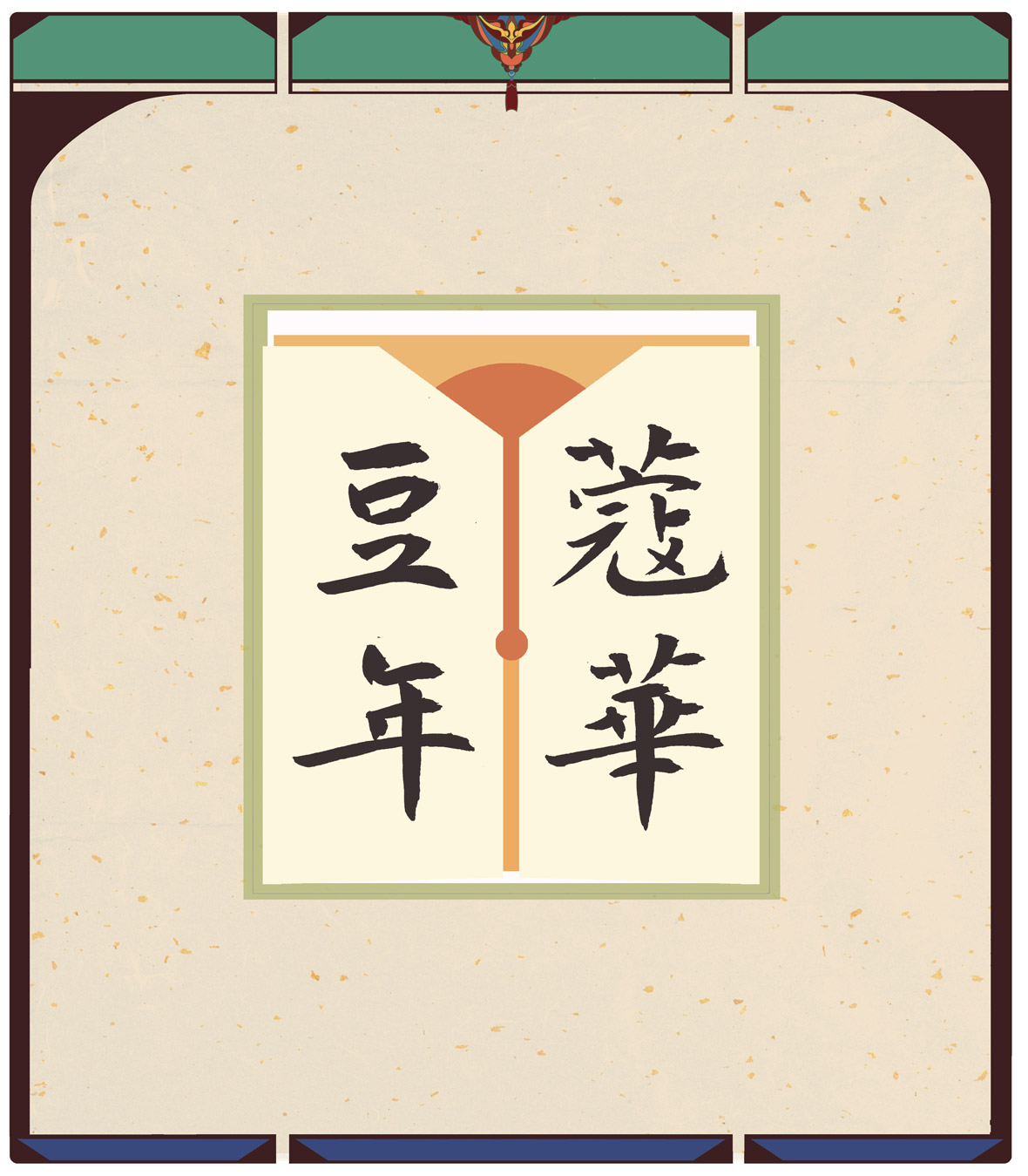
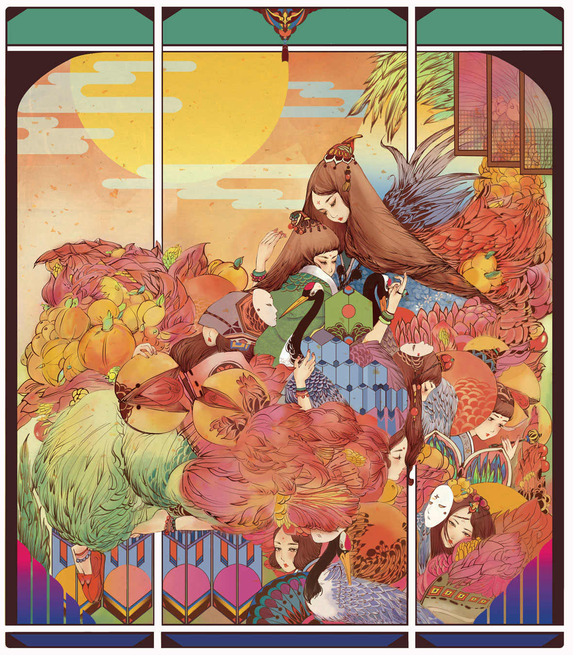
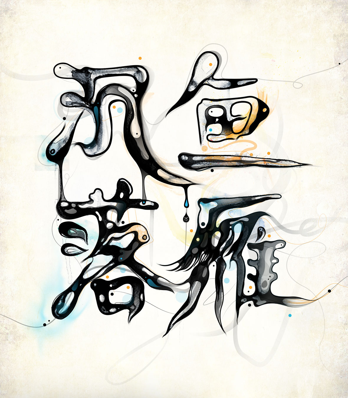
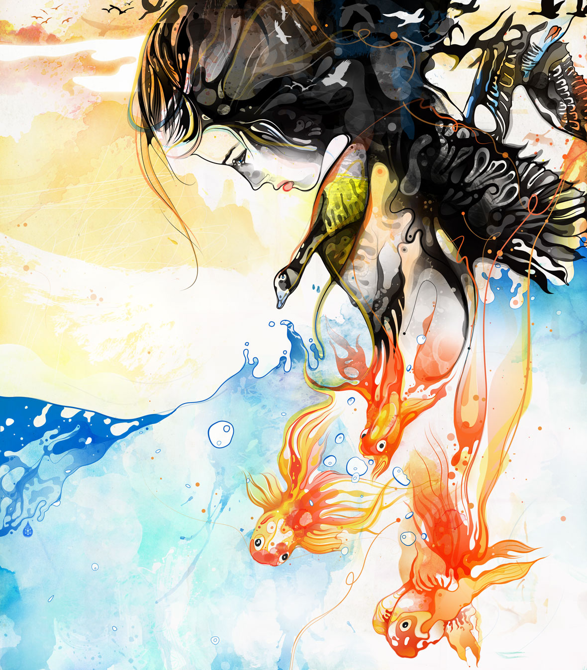
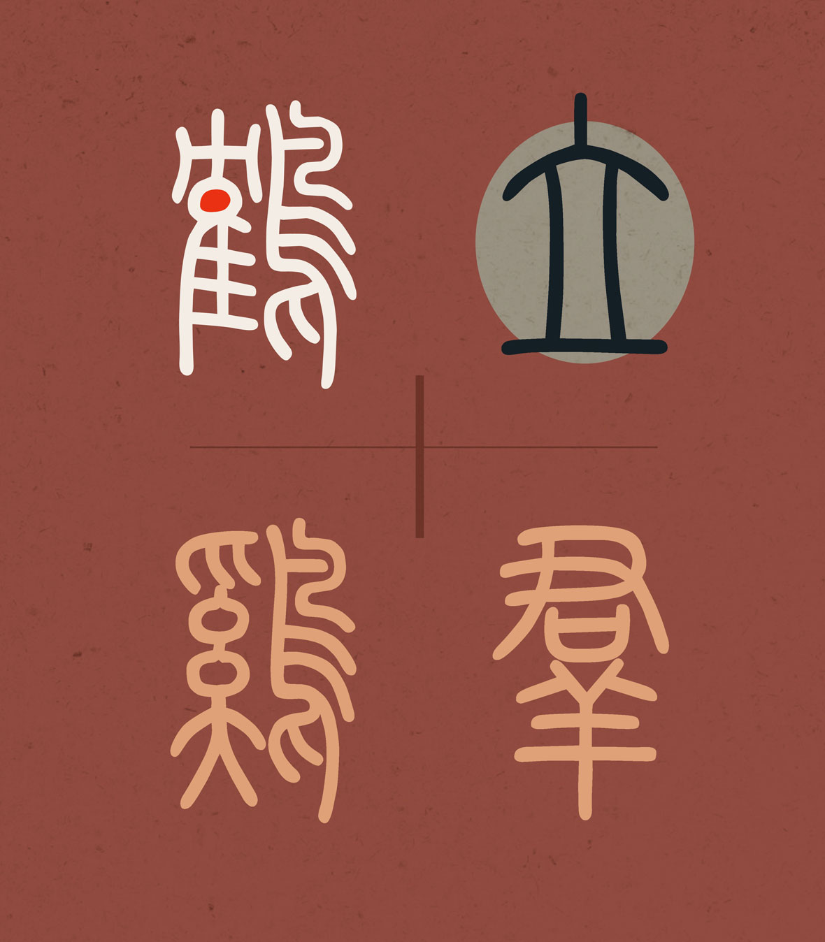
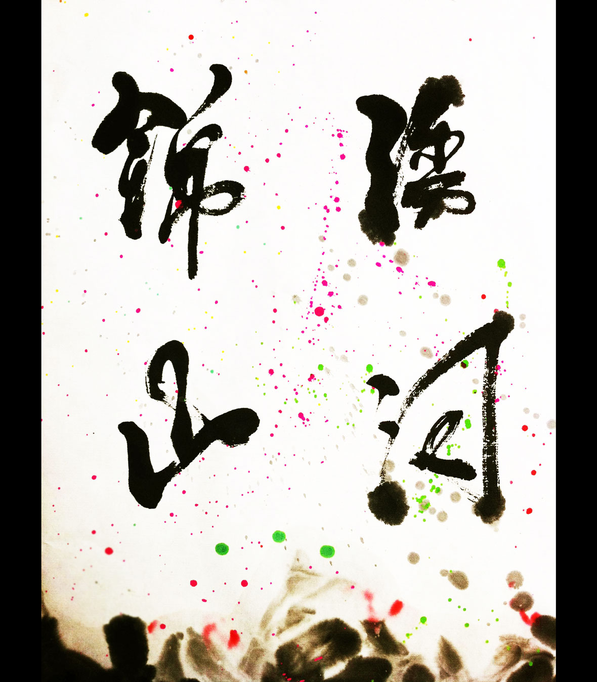
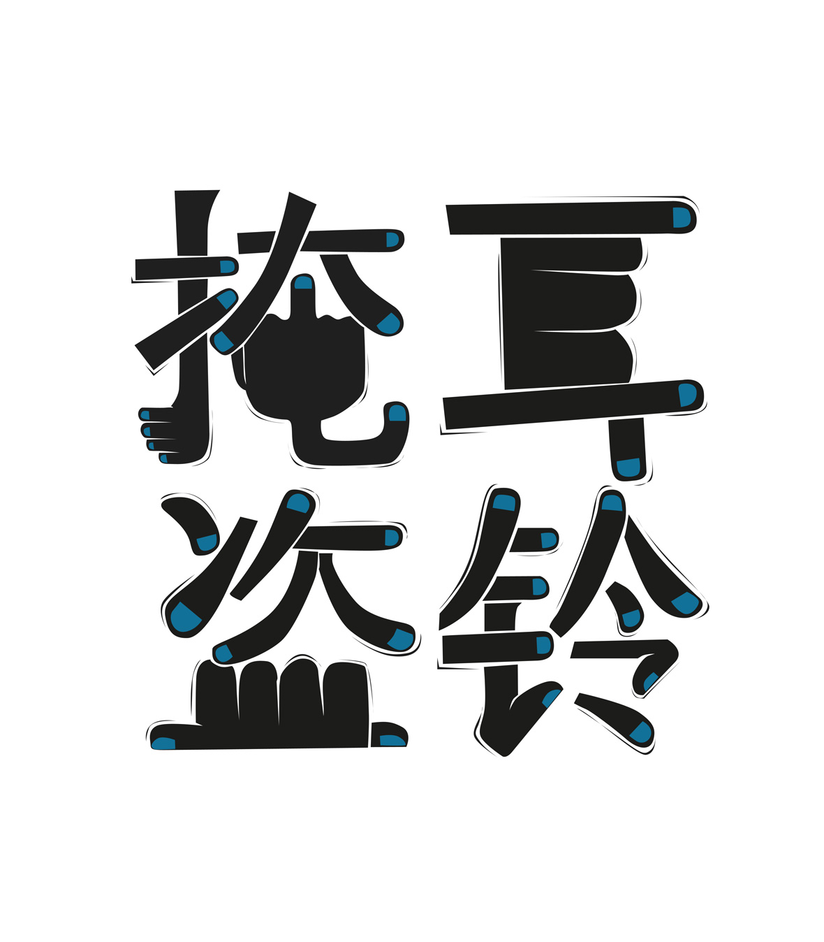
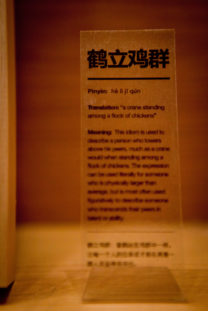
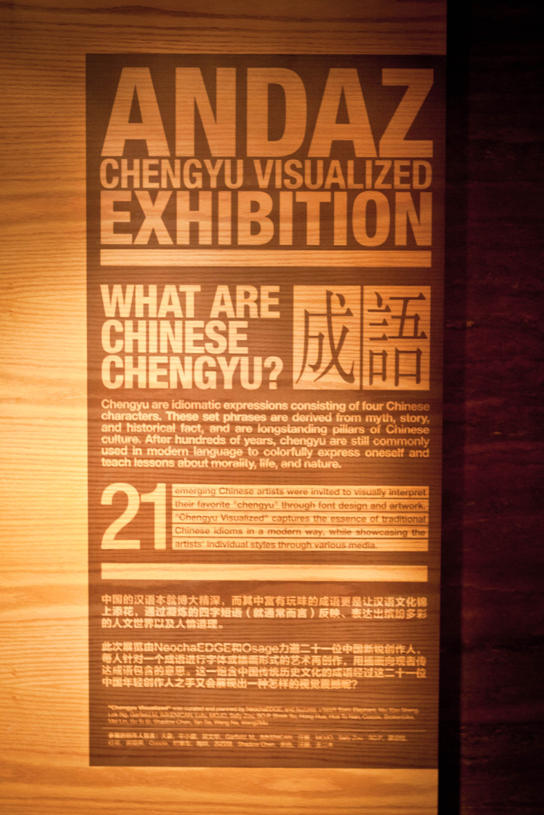
Storytelling takes many forms and idioms are one of the most elegant ways to encapsulate rich stories in just a few words or characters. Those passionate about Chinese culture know “Chengyu” –four character Chinese idioms–are a priceless and colorful source of Chinese myths, folktales, and historical facts that teach lessons about morality, life, and nature.

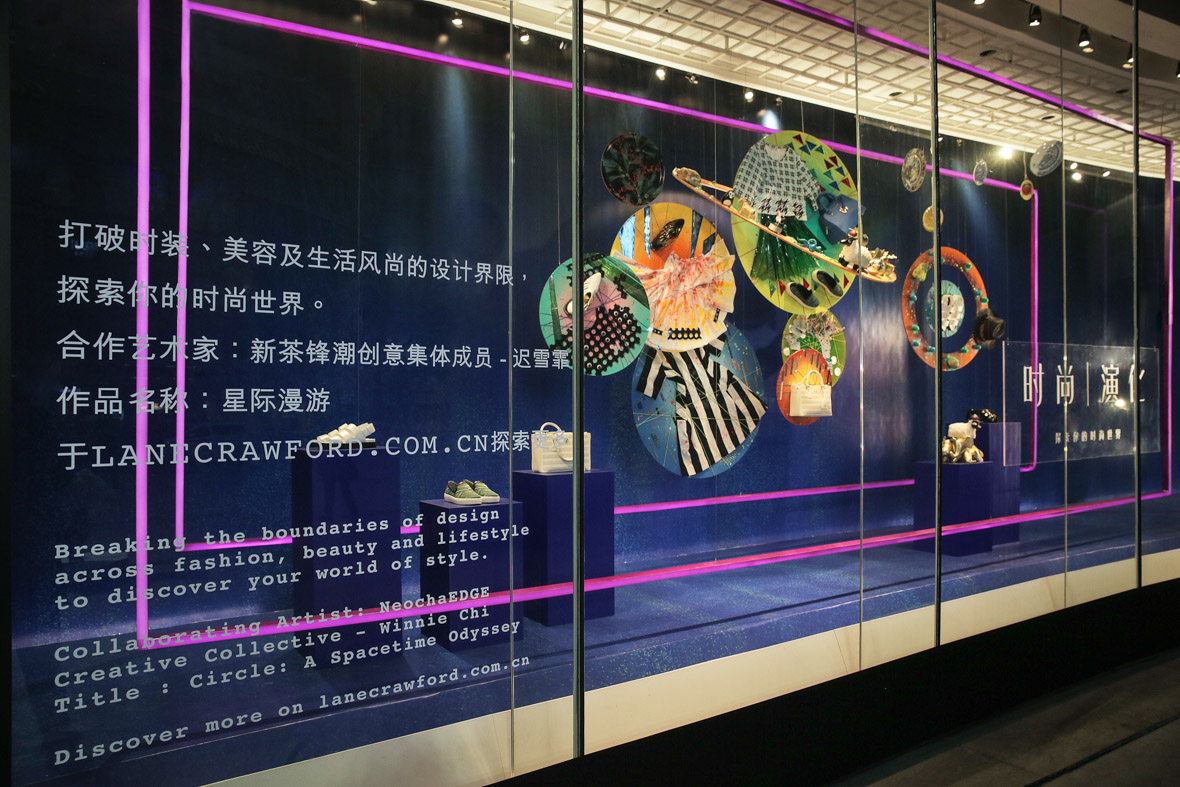
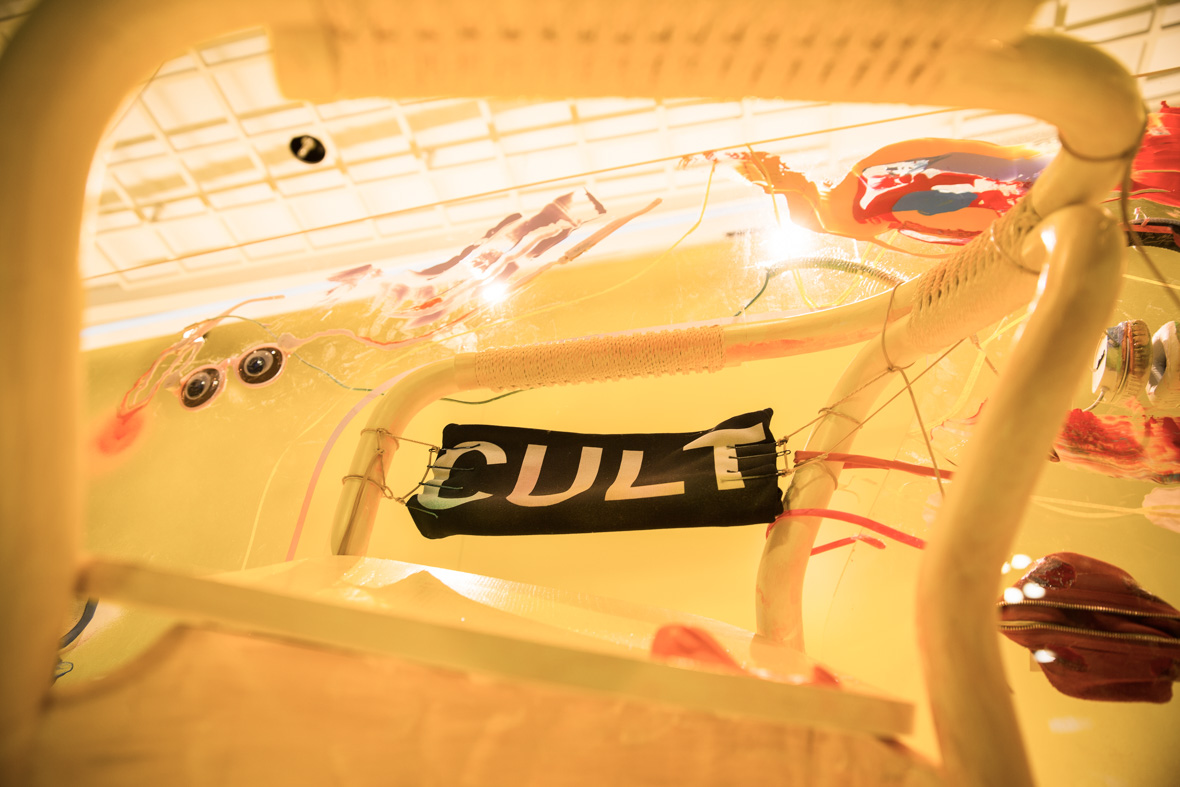
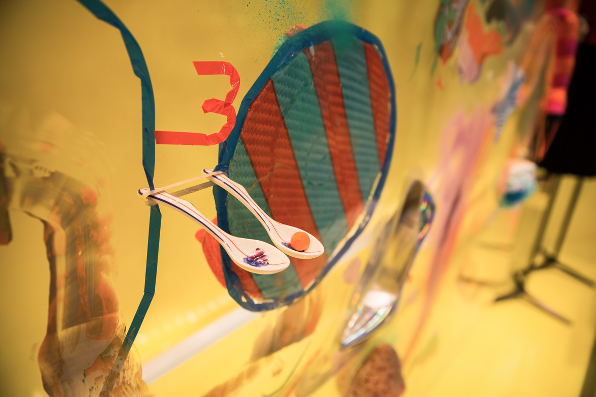
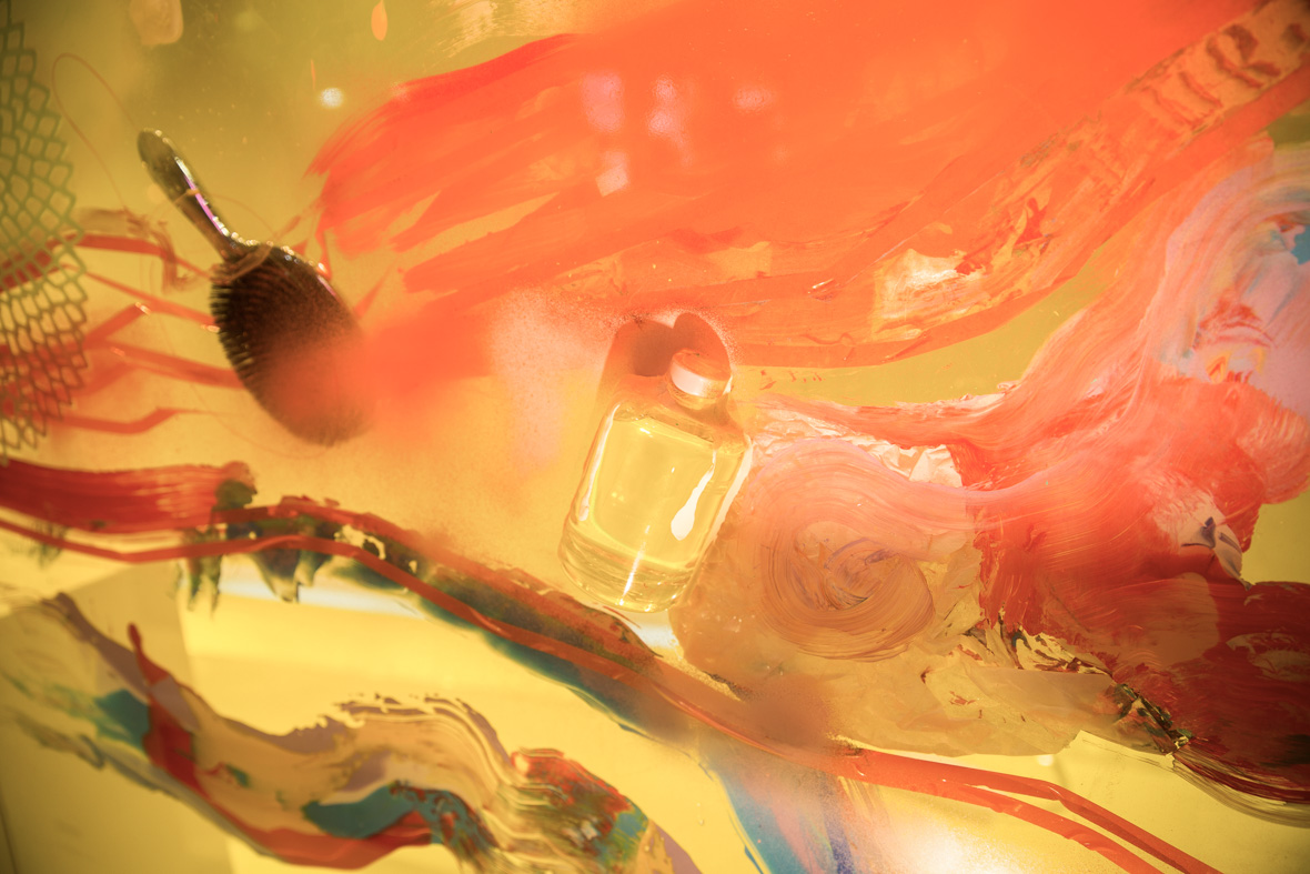
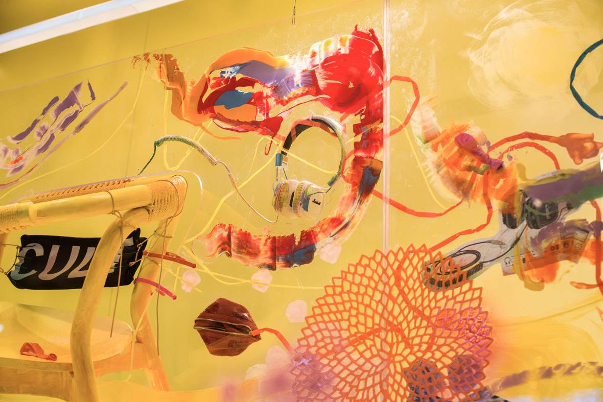
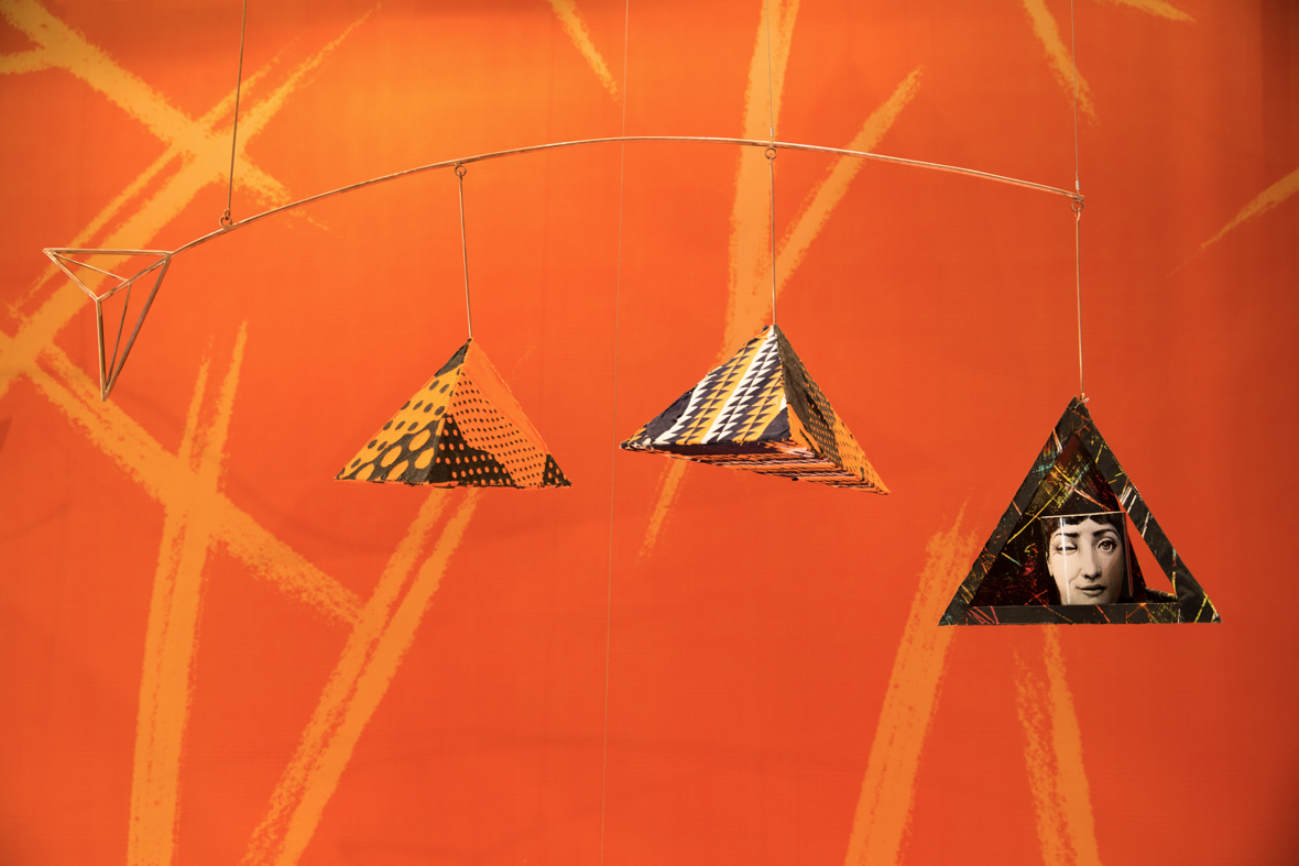
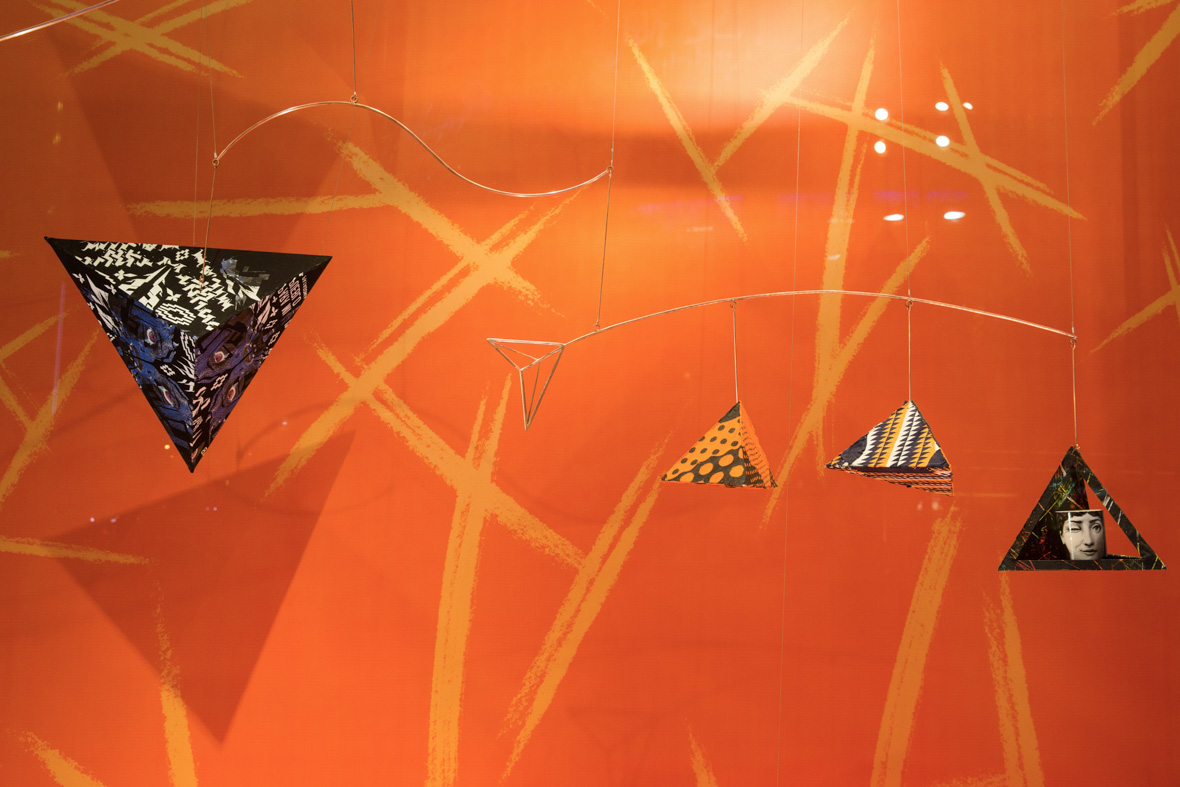
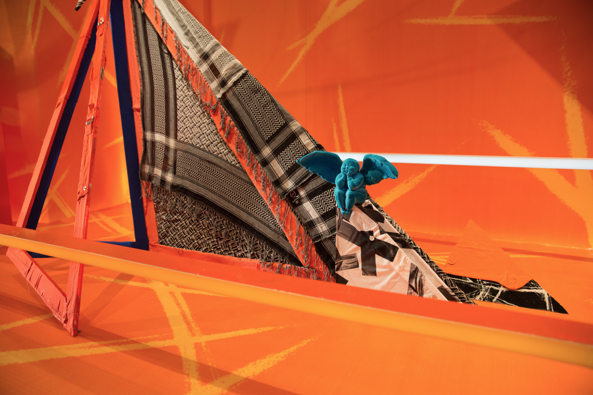
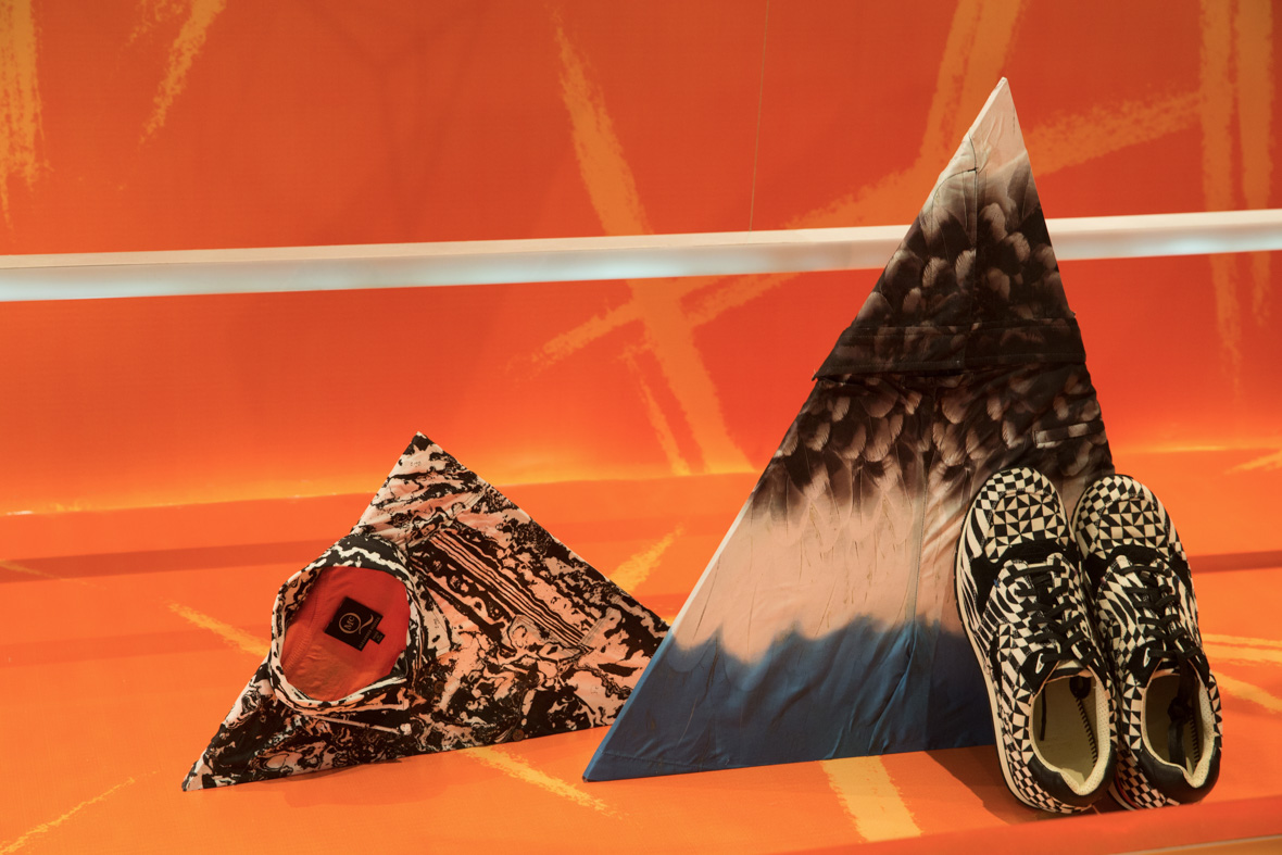
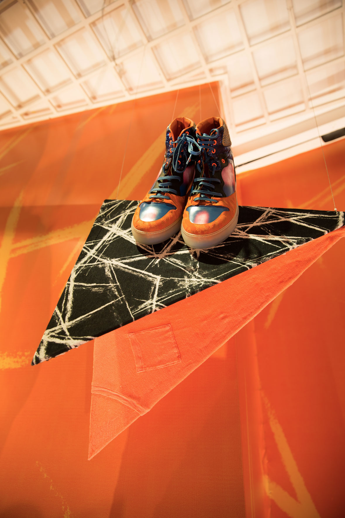
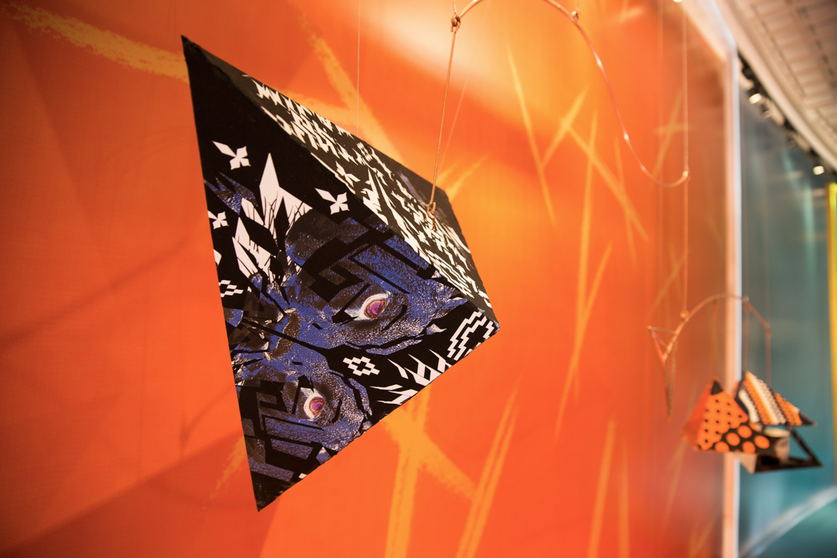
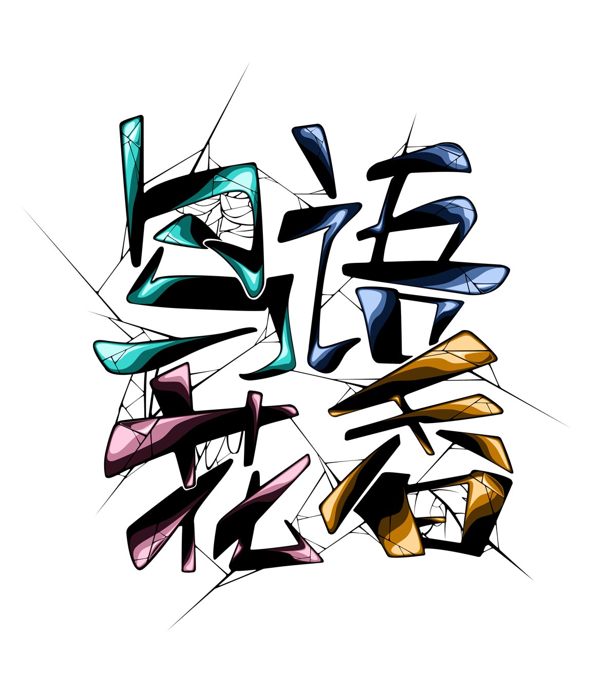
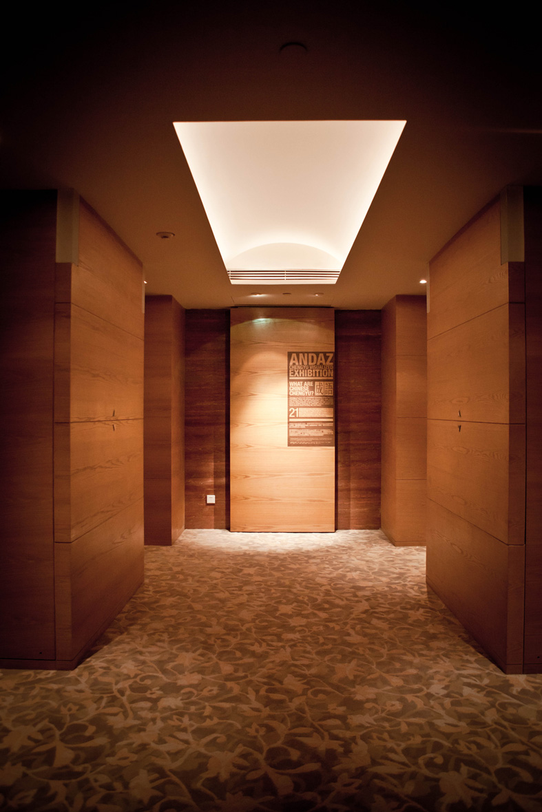
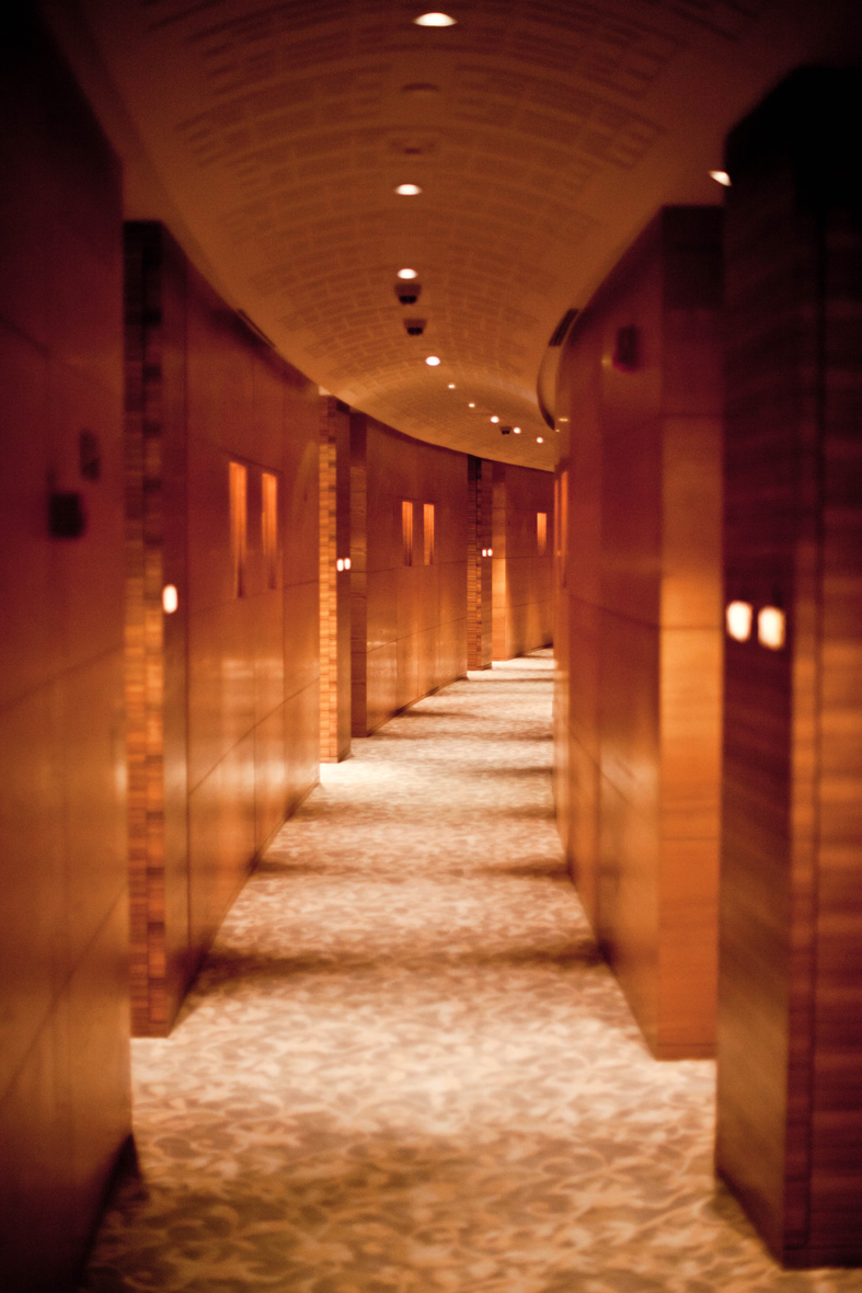
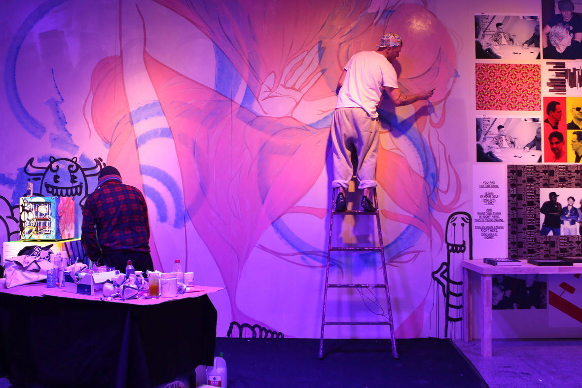
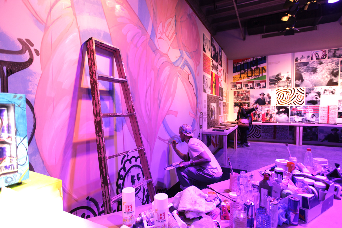
We’ve always believed that Chengyu should be celebrated more widely and in a variety of styles, including taking a modern approach to the visual reinterpretation of the four characters that make them up and the stories the phrases tell. That’s why we’re proud to announce our collaboration with Osage Art Consultancy to curate and produce an exhibition at Hyatt ANDAZ Shanghai titled “Chengyu Visualized.”

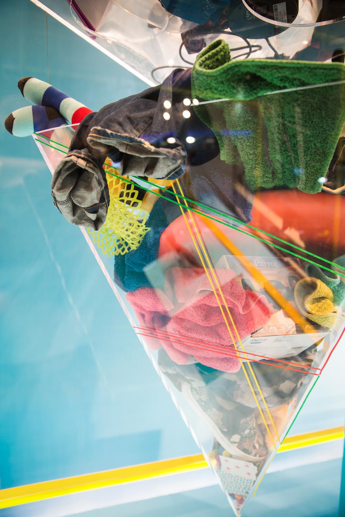
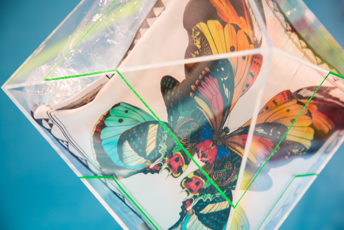
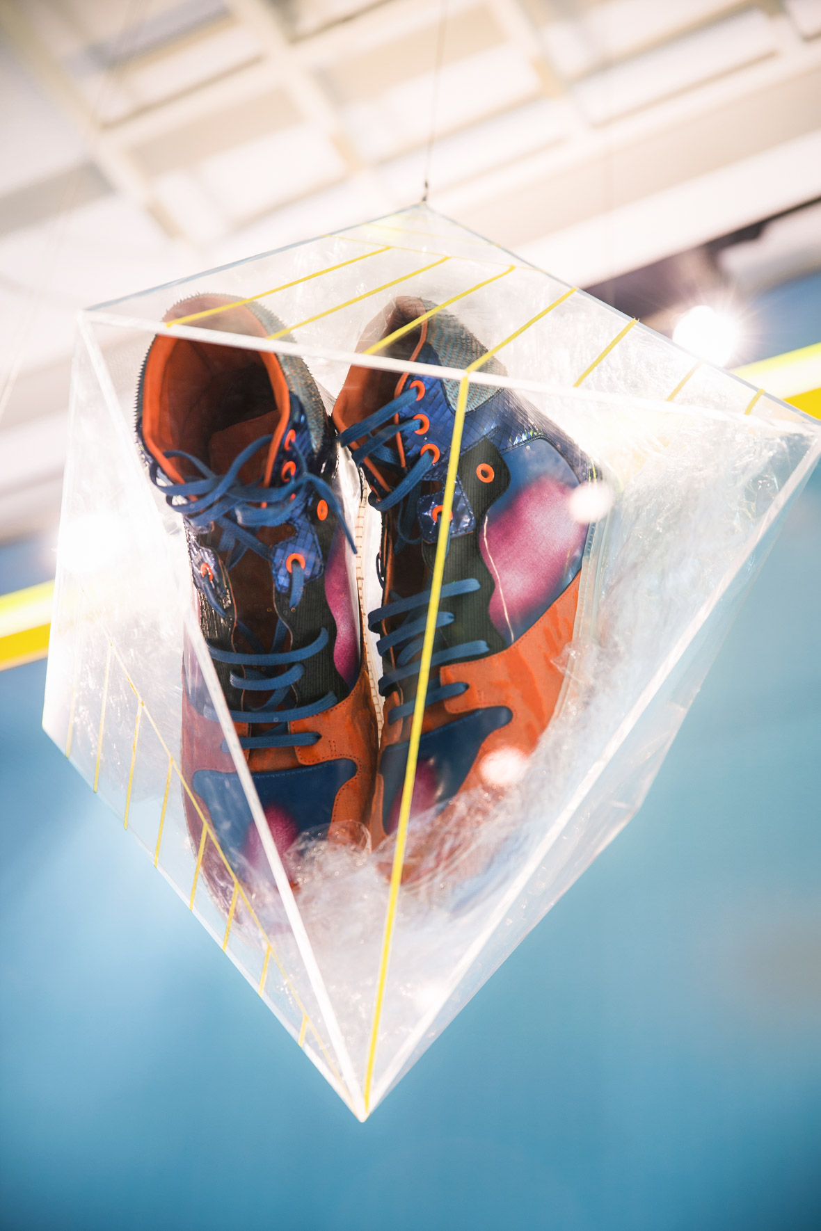
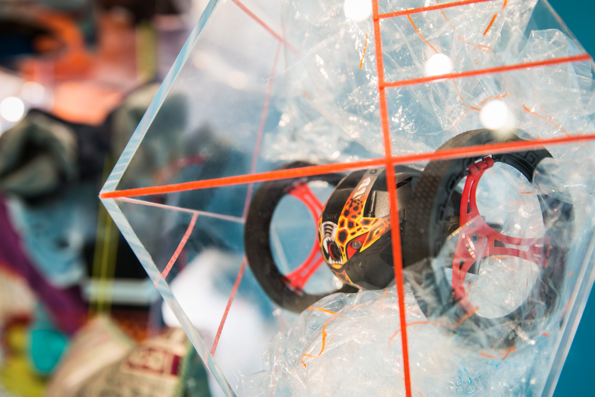
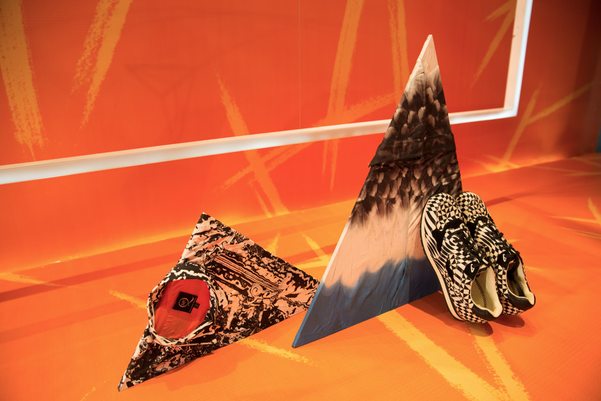
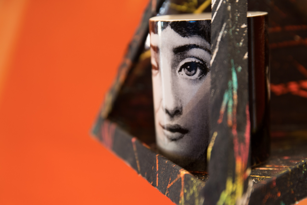
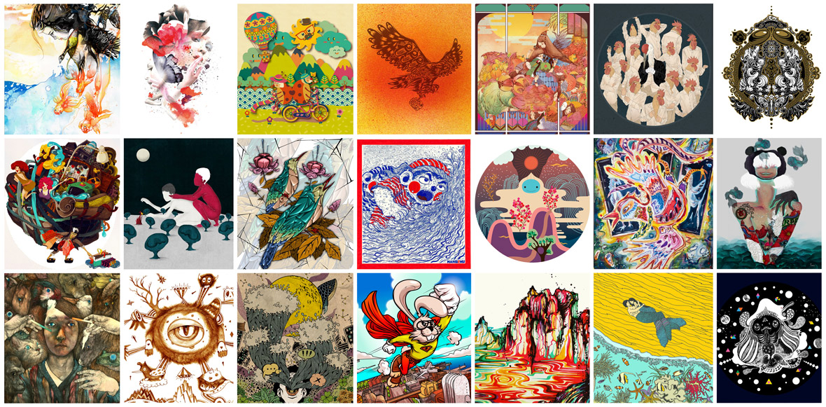
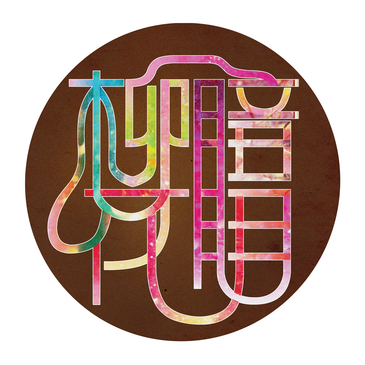
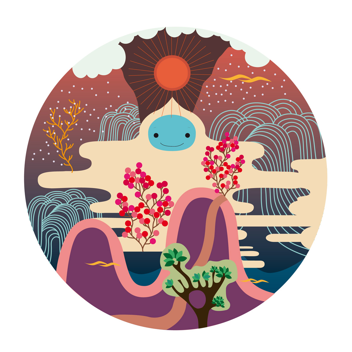
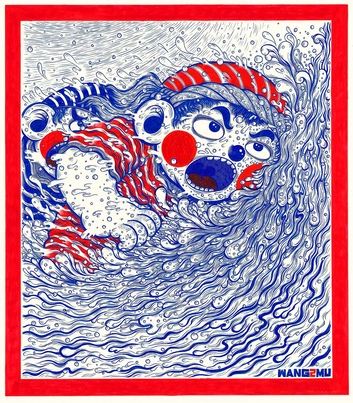
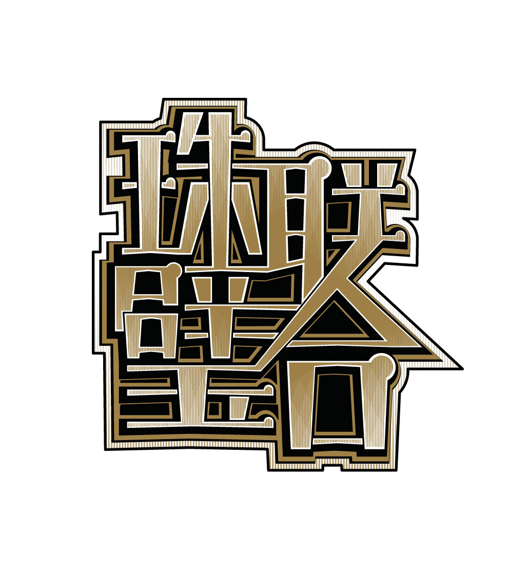
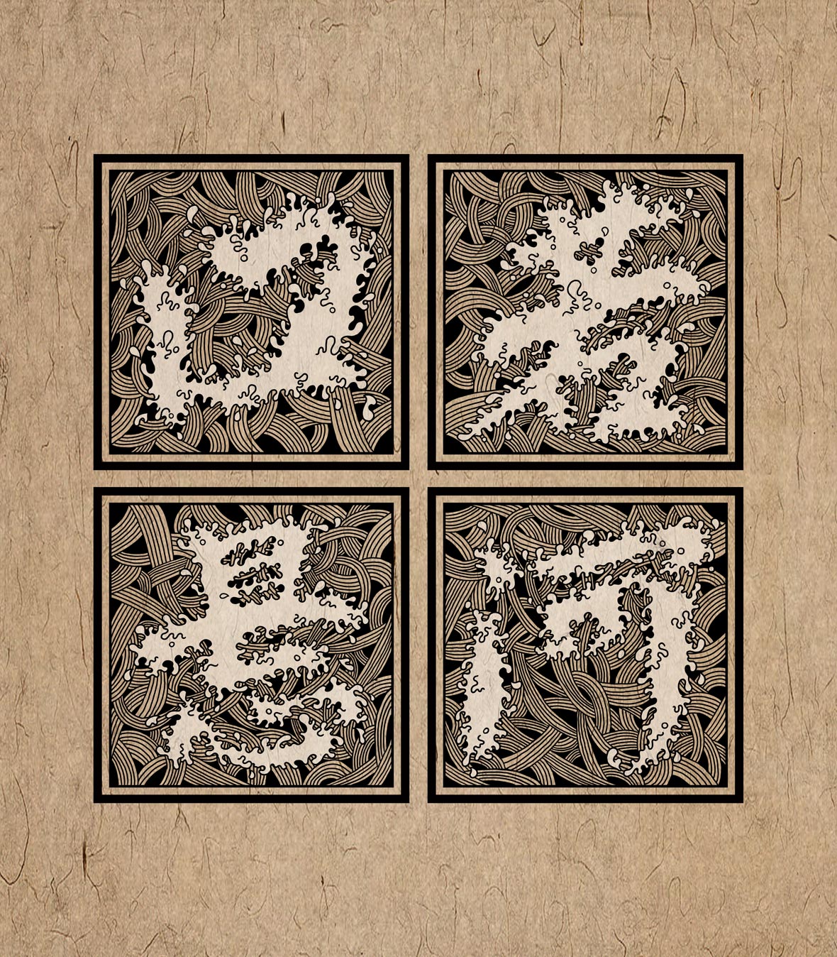
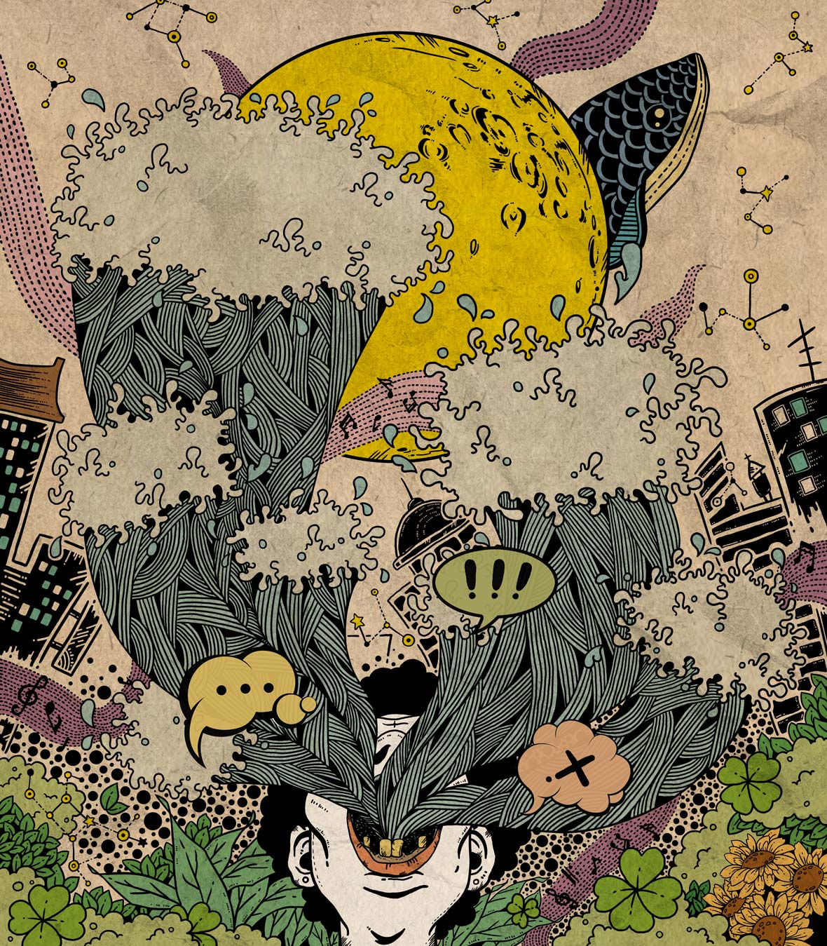
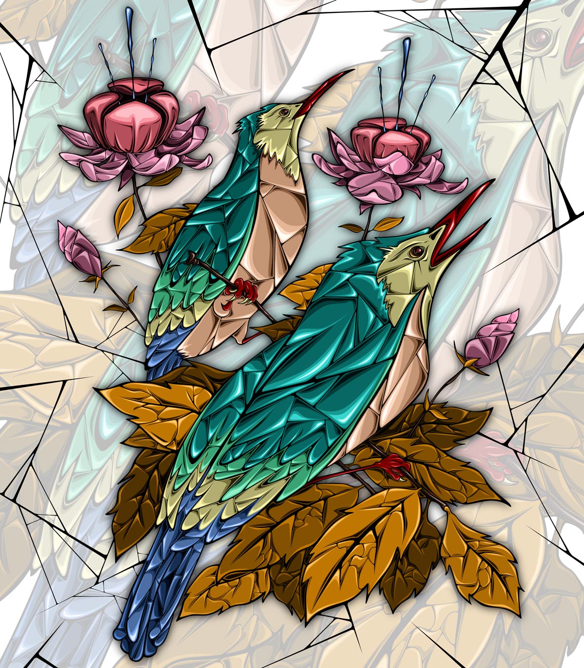
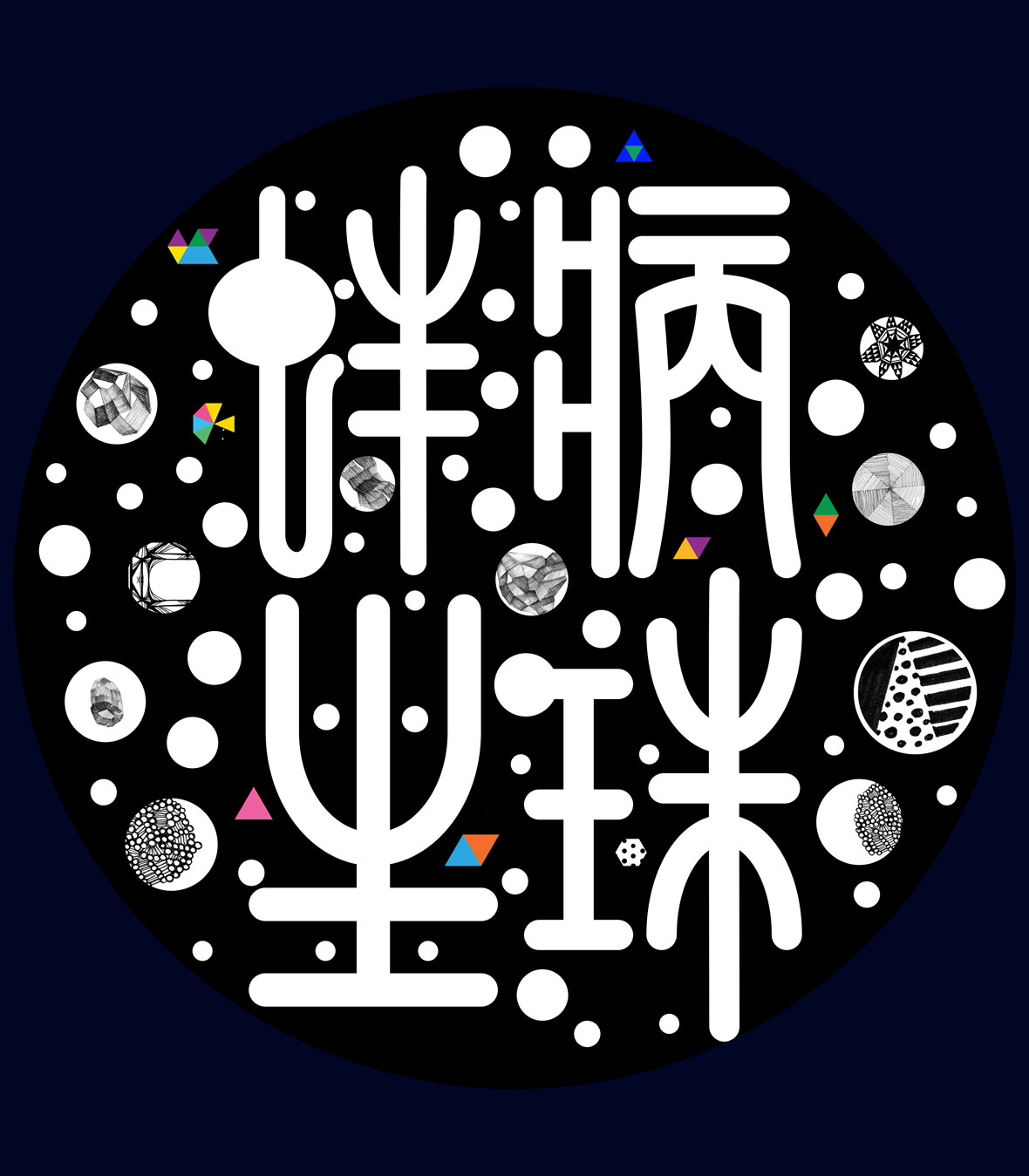
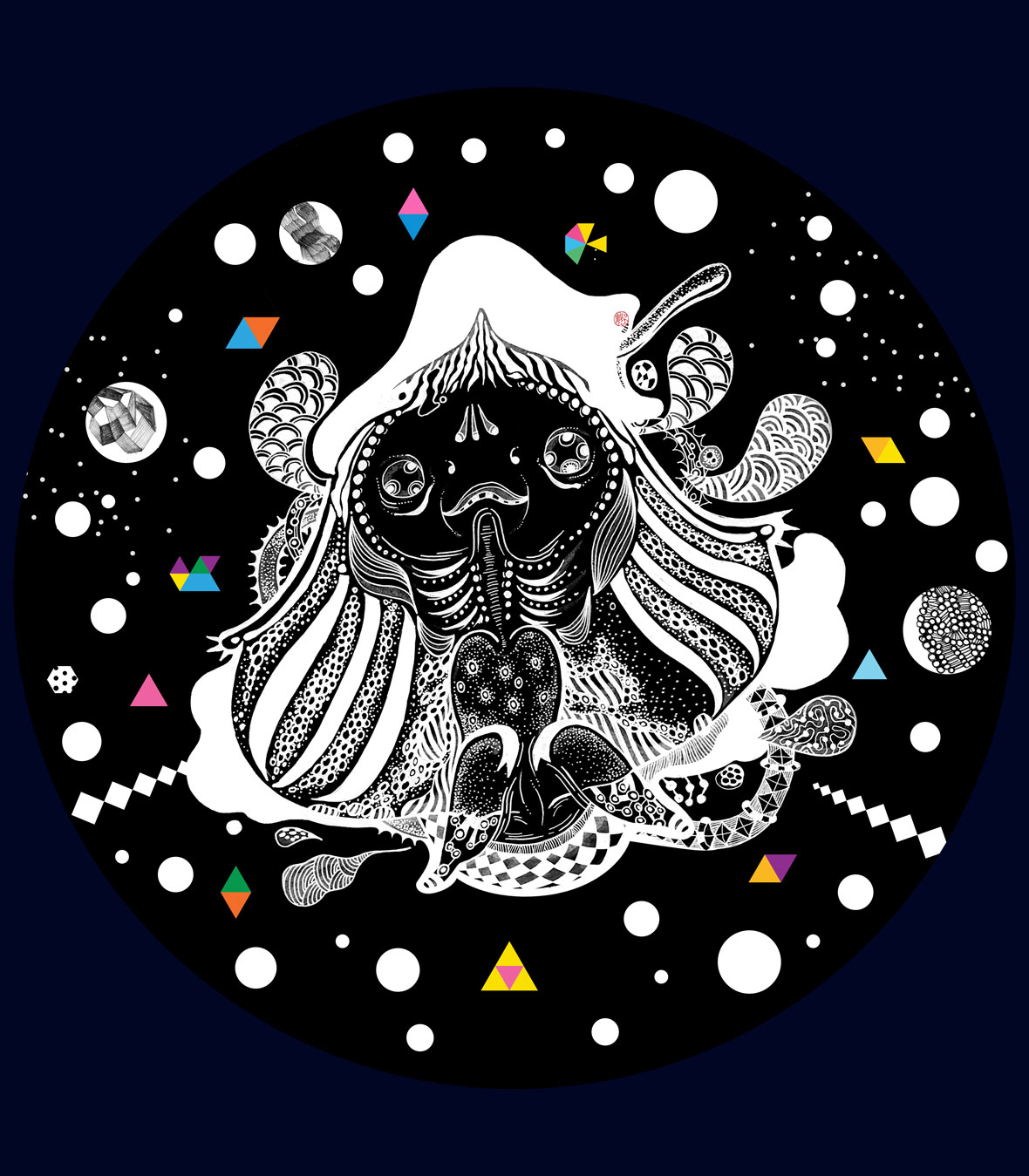
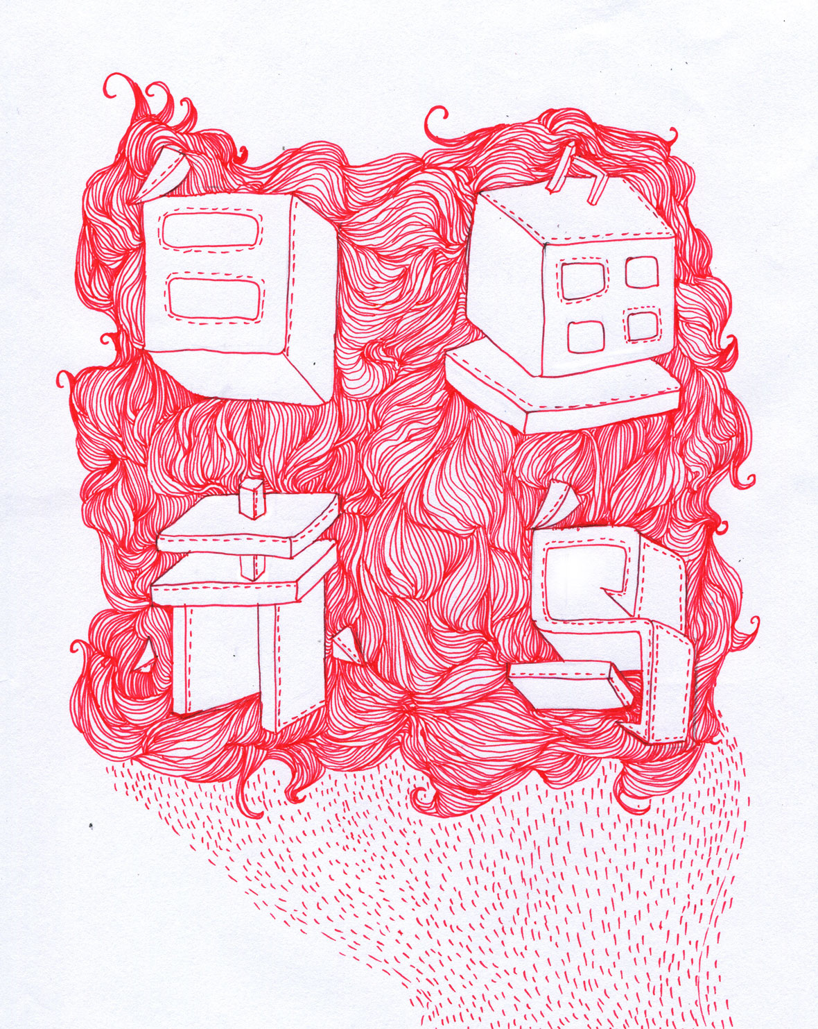
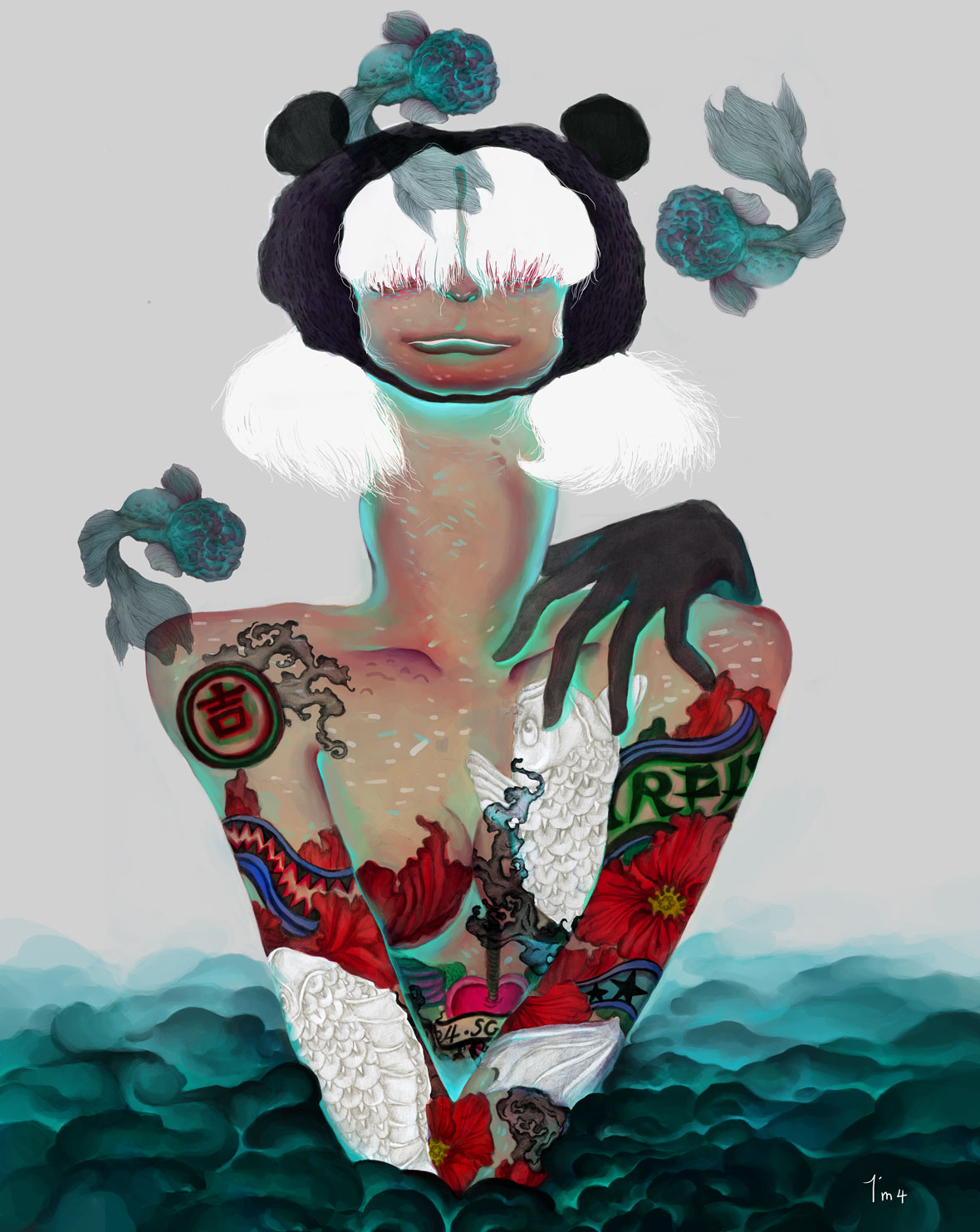
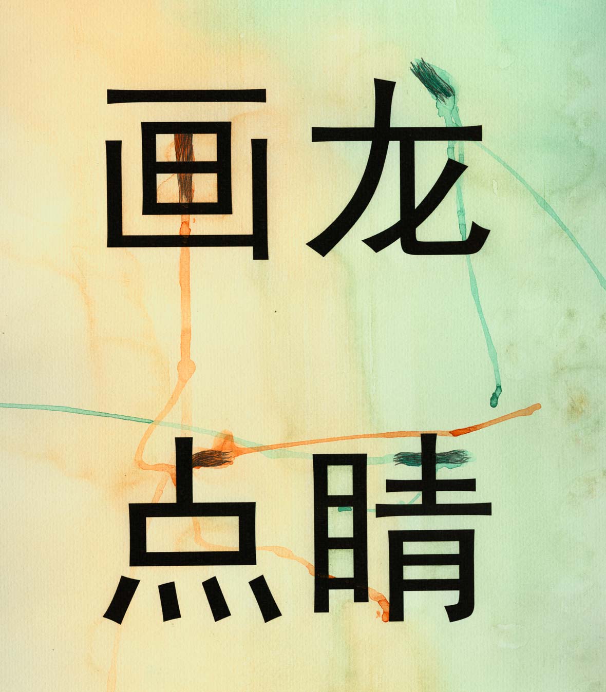
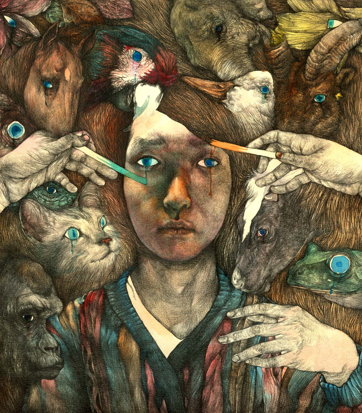
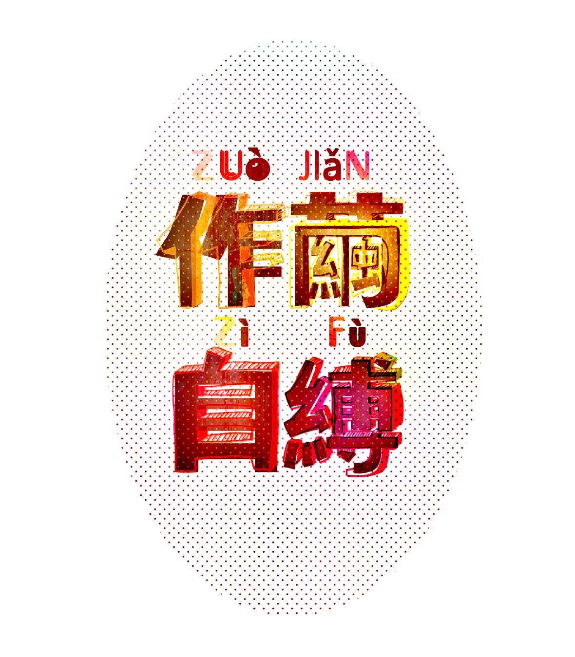
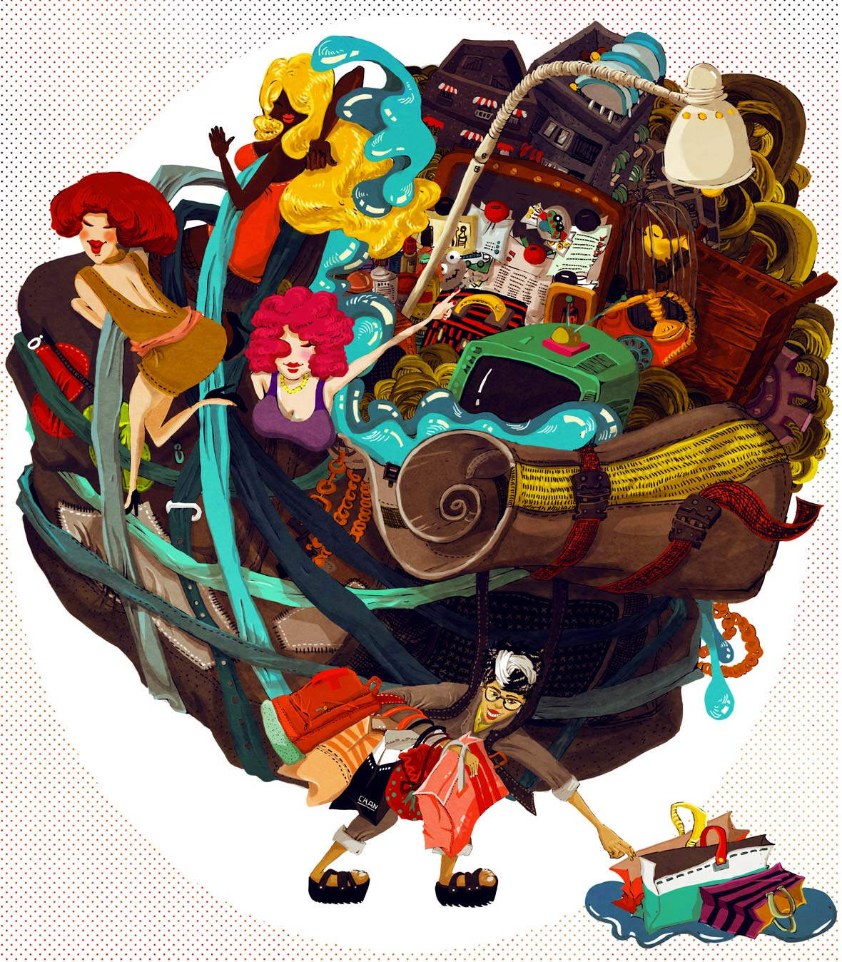
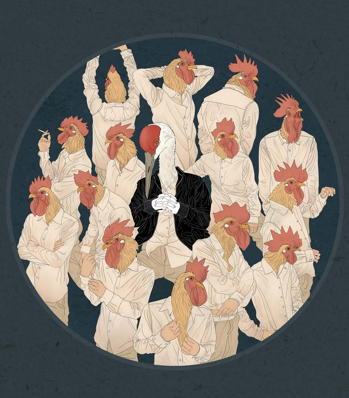
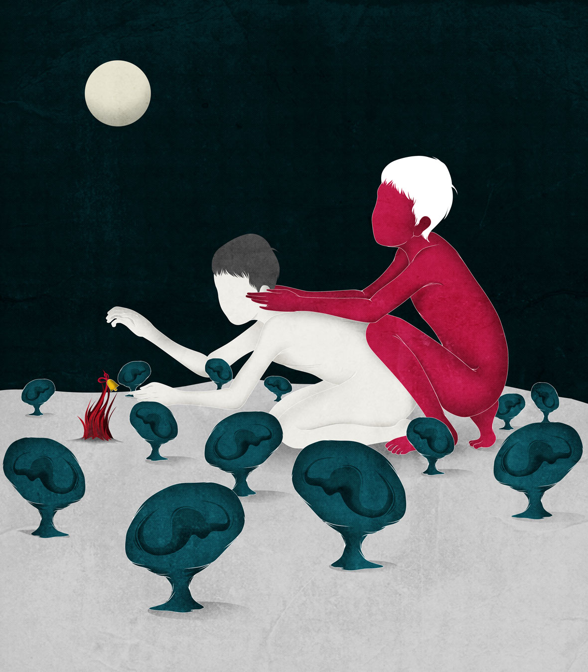
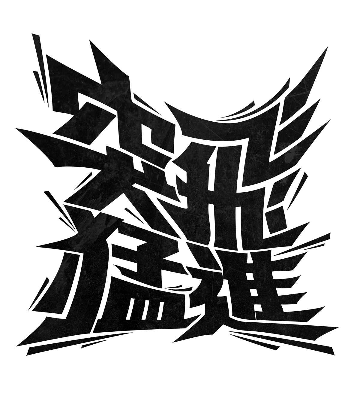
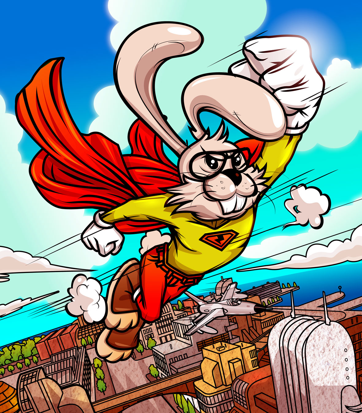
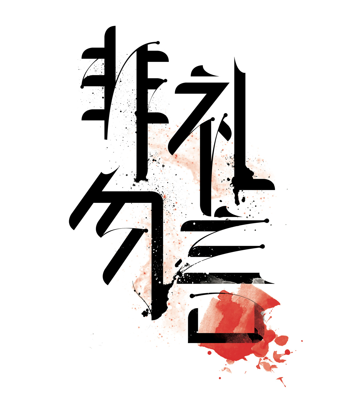
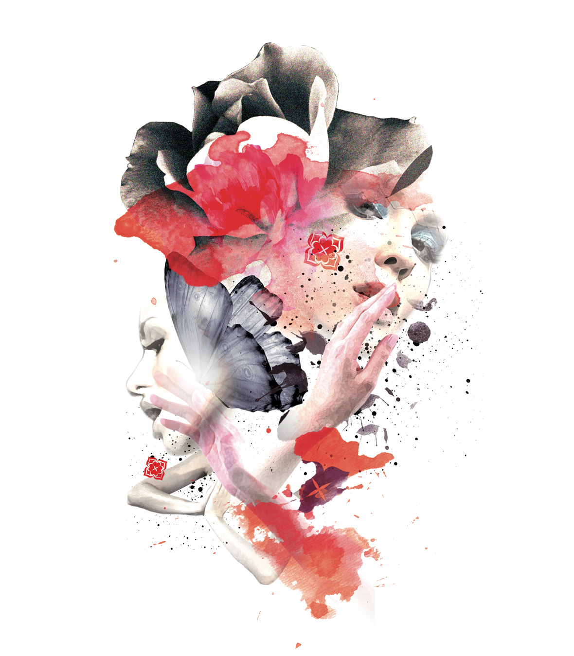
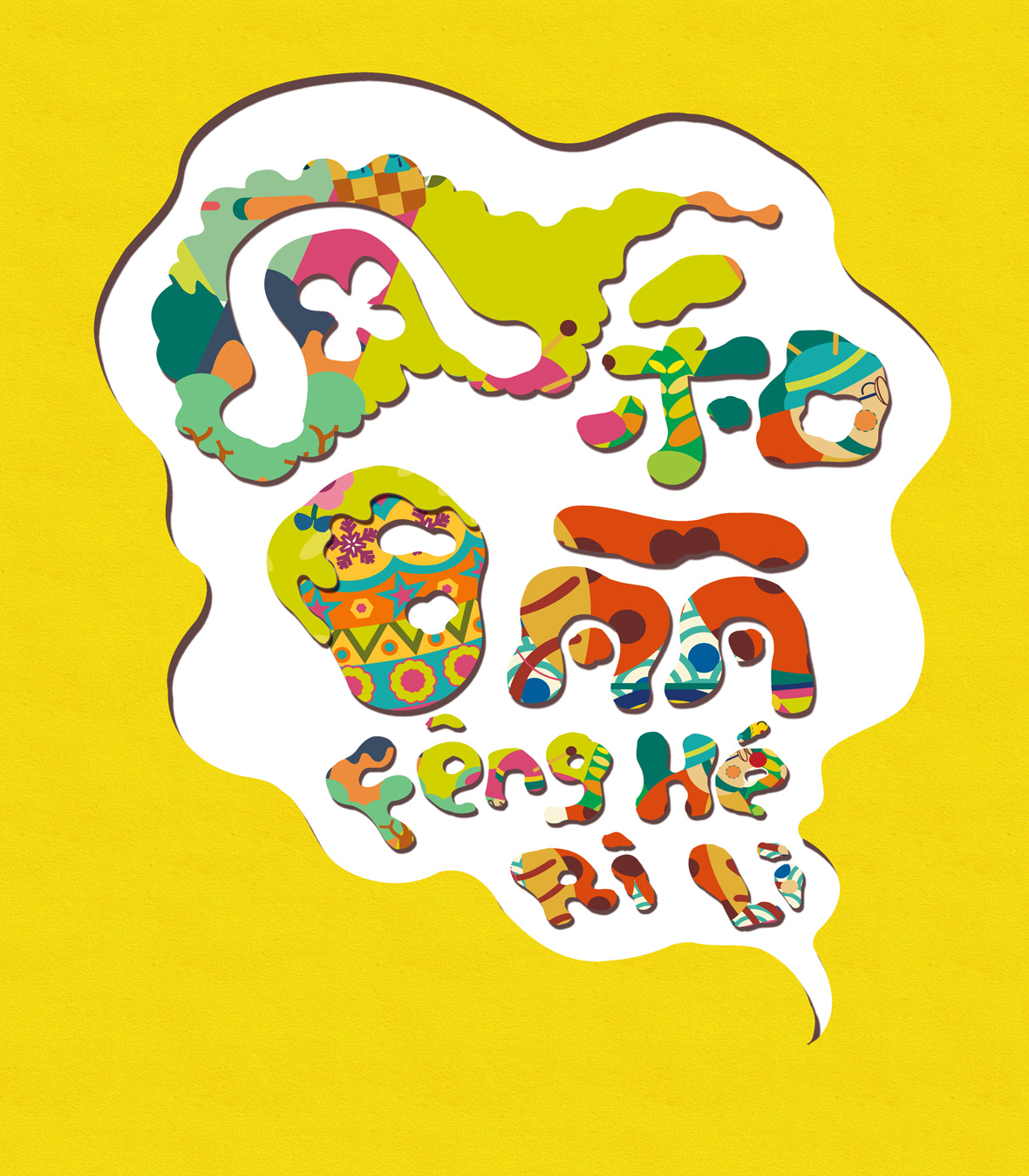
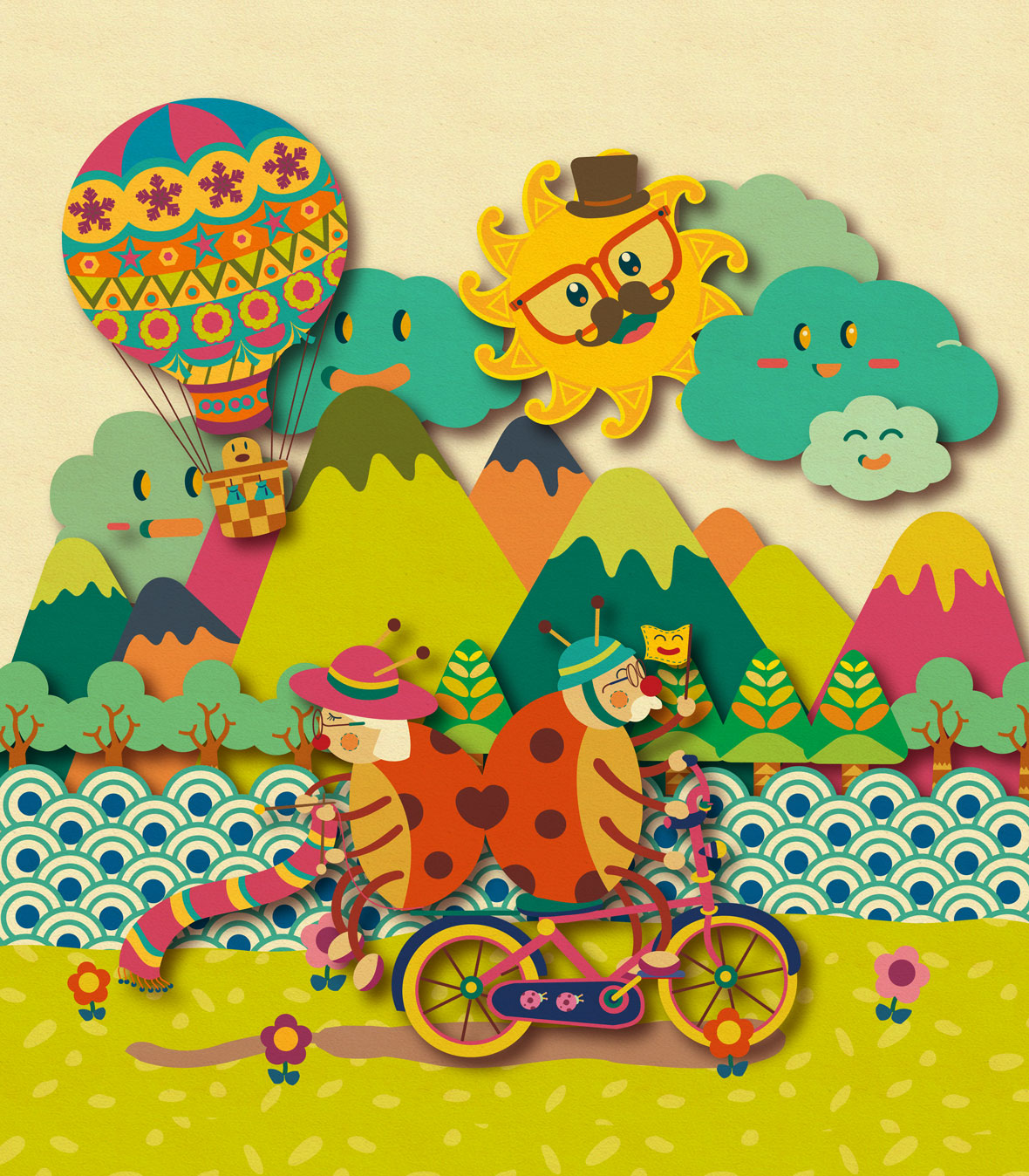
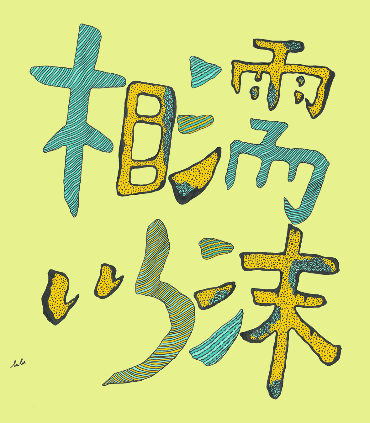
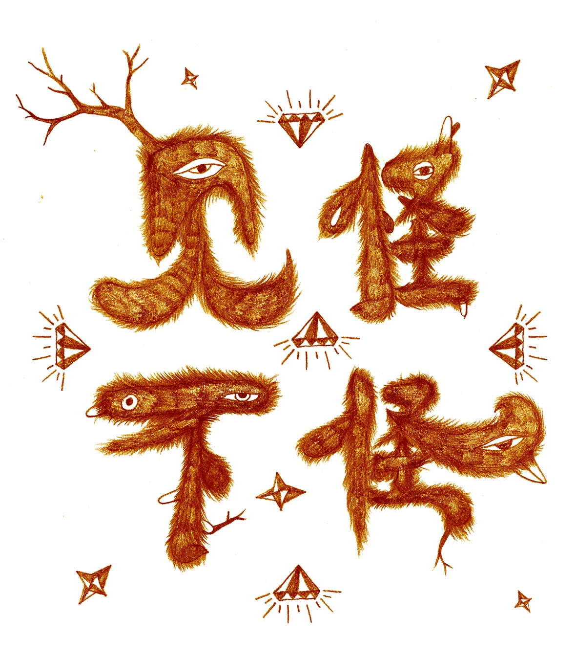
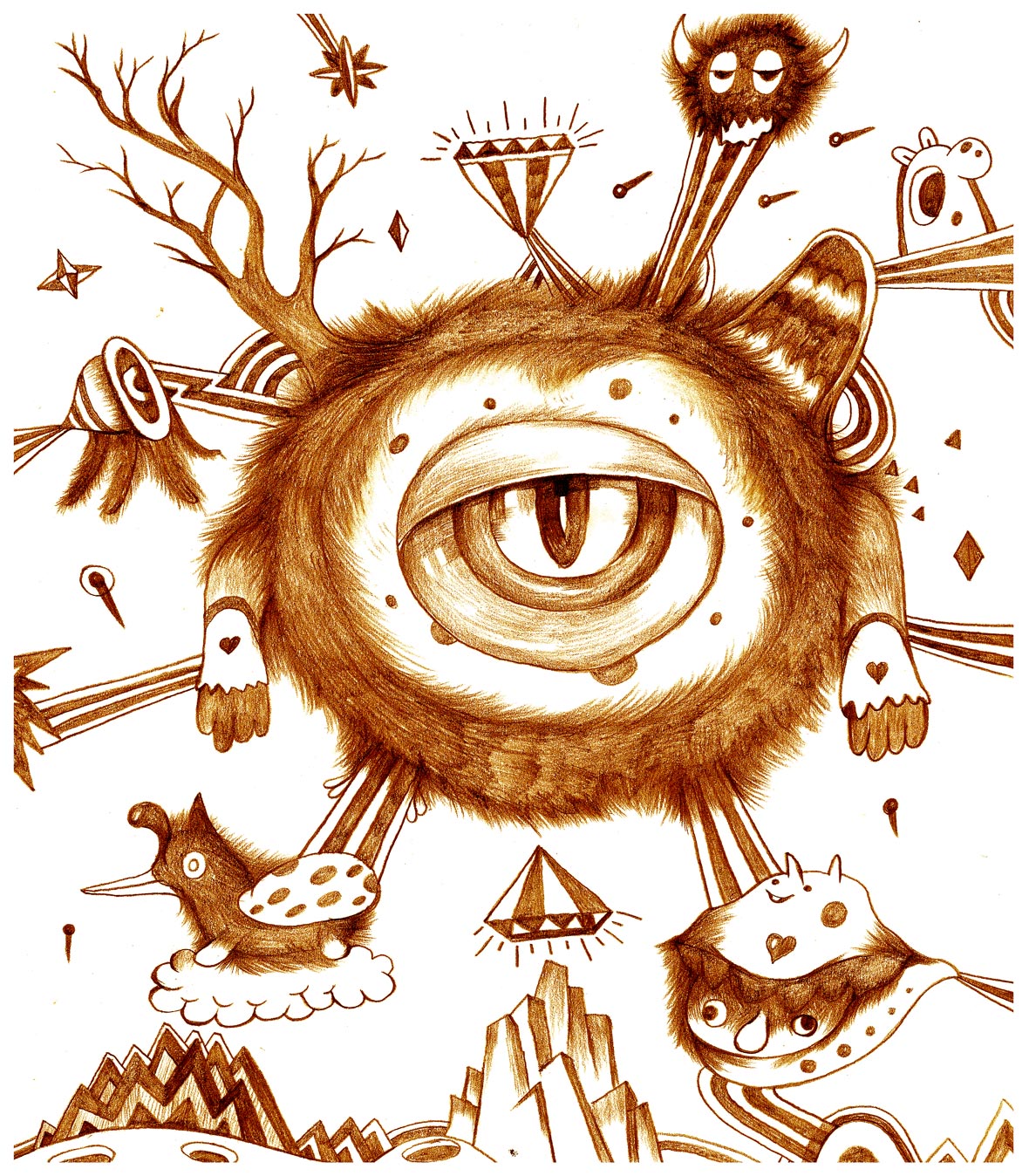
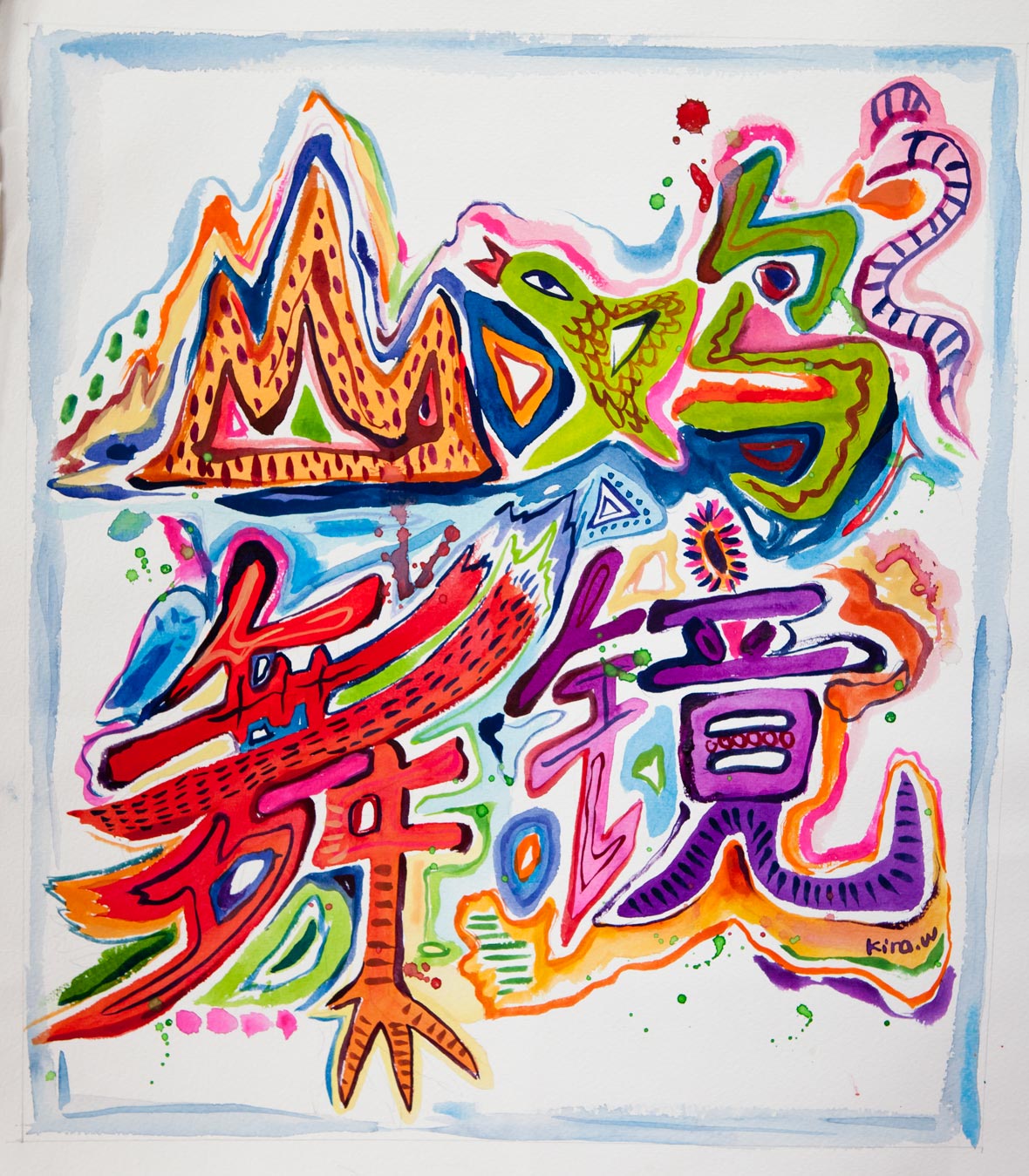
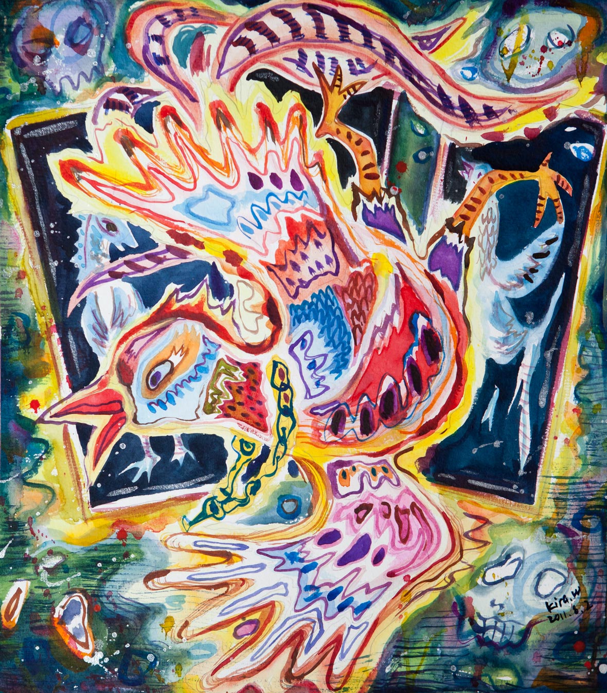
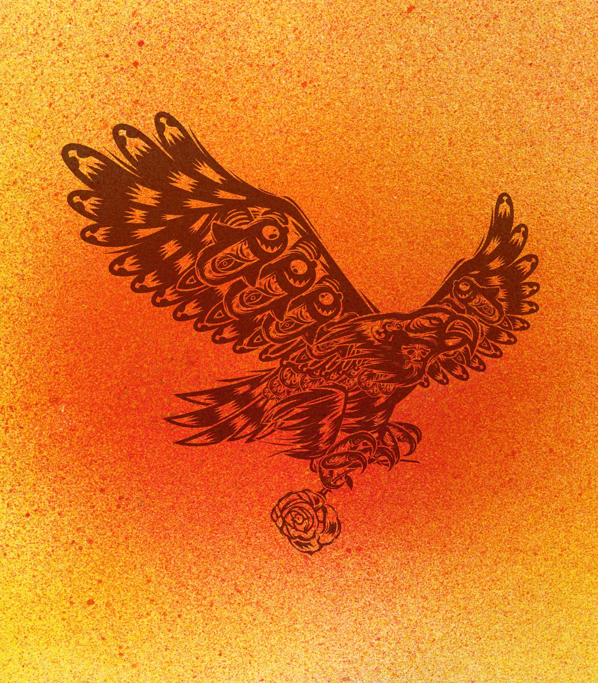
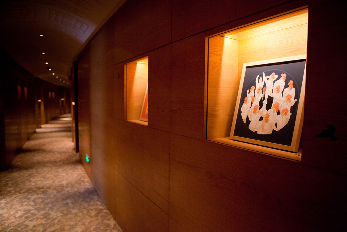
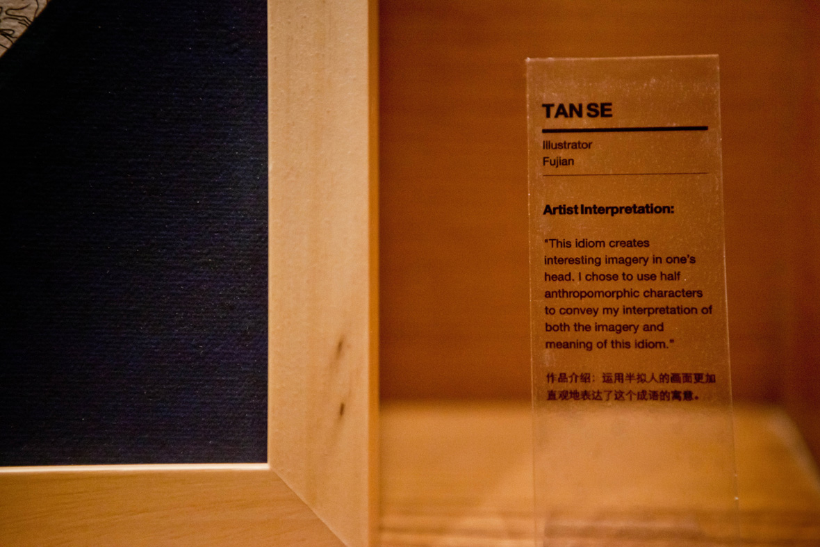
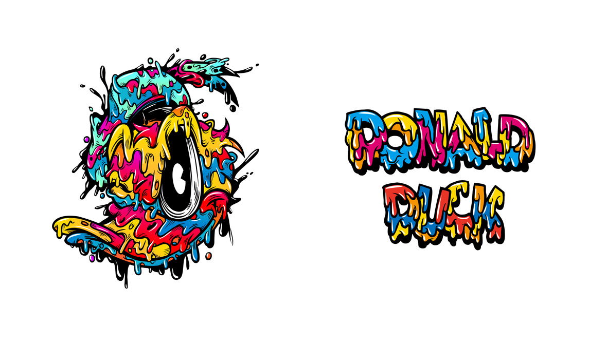
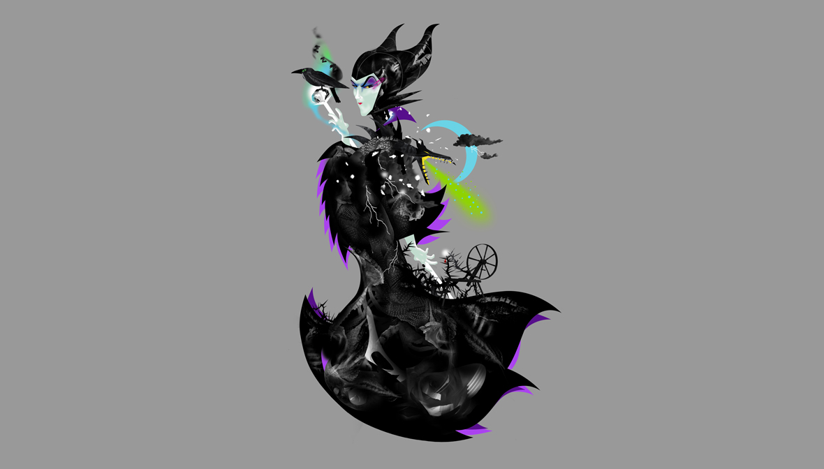
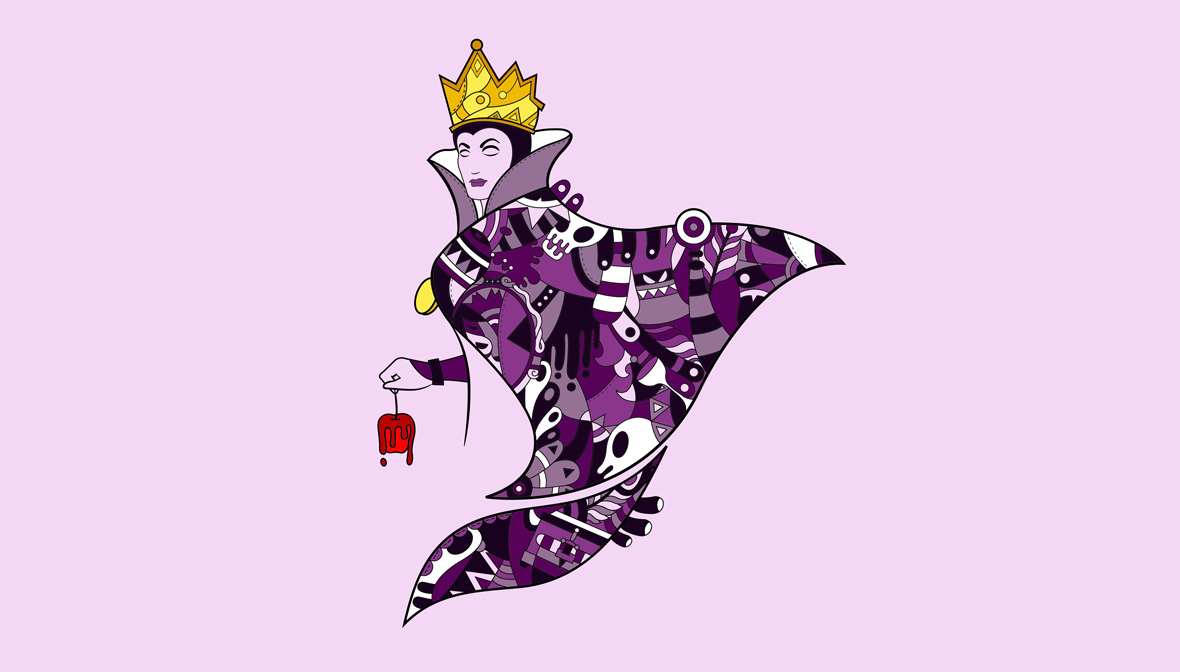
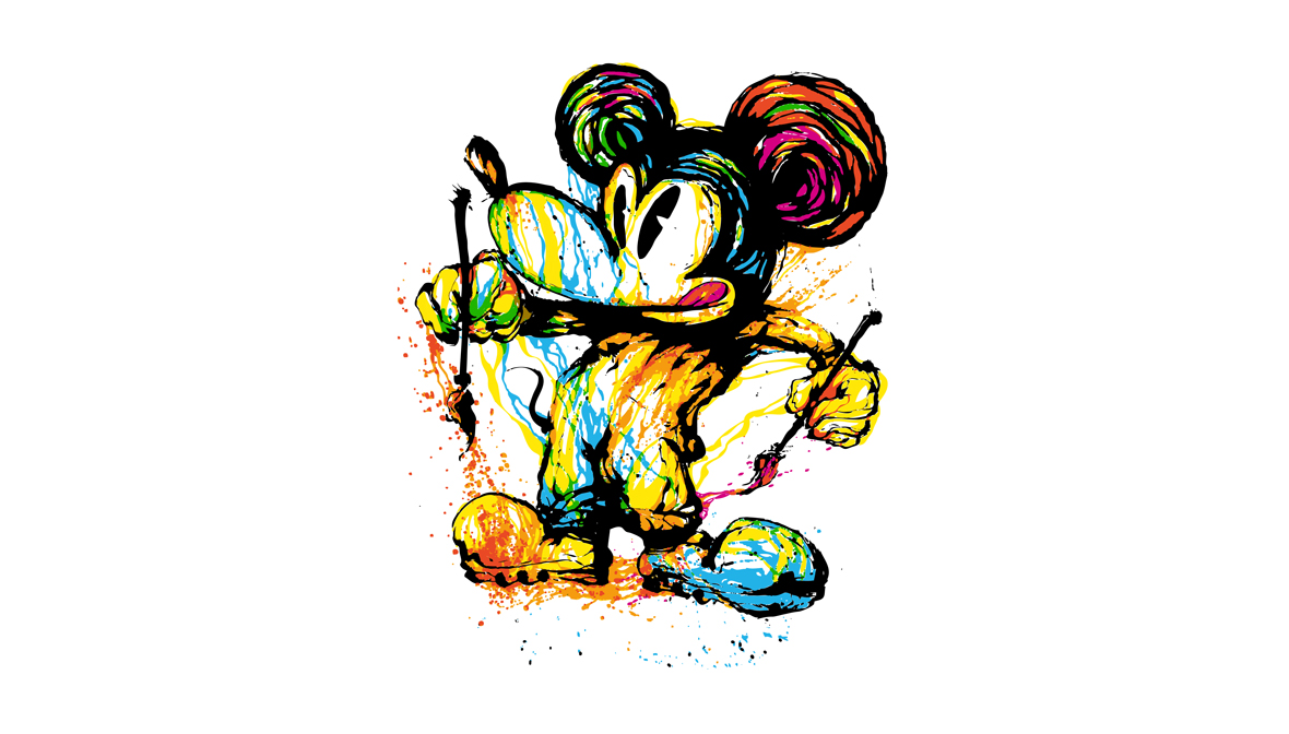
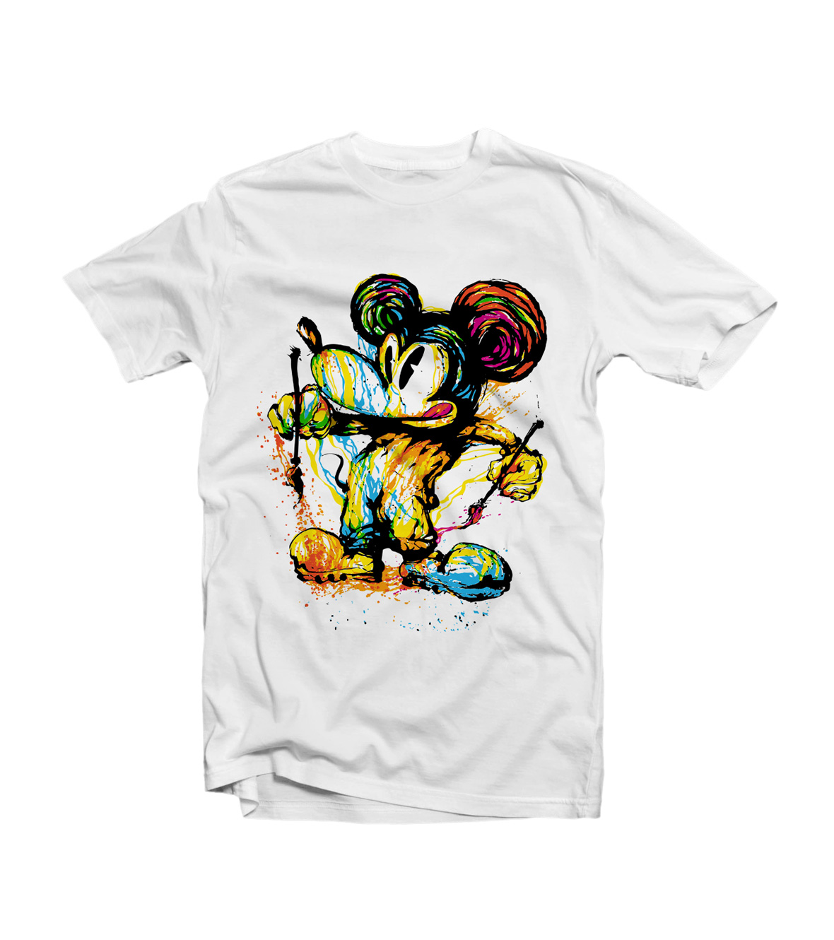
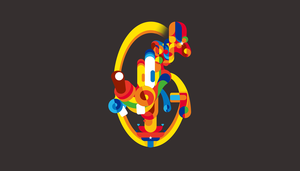
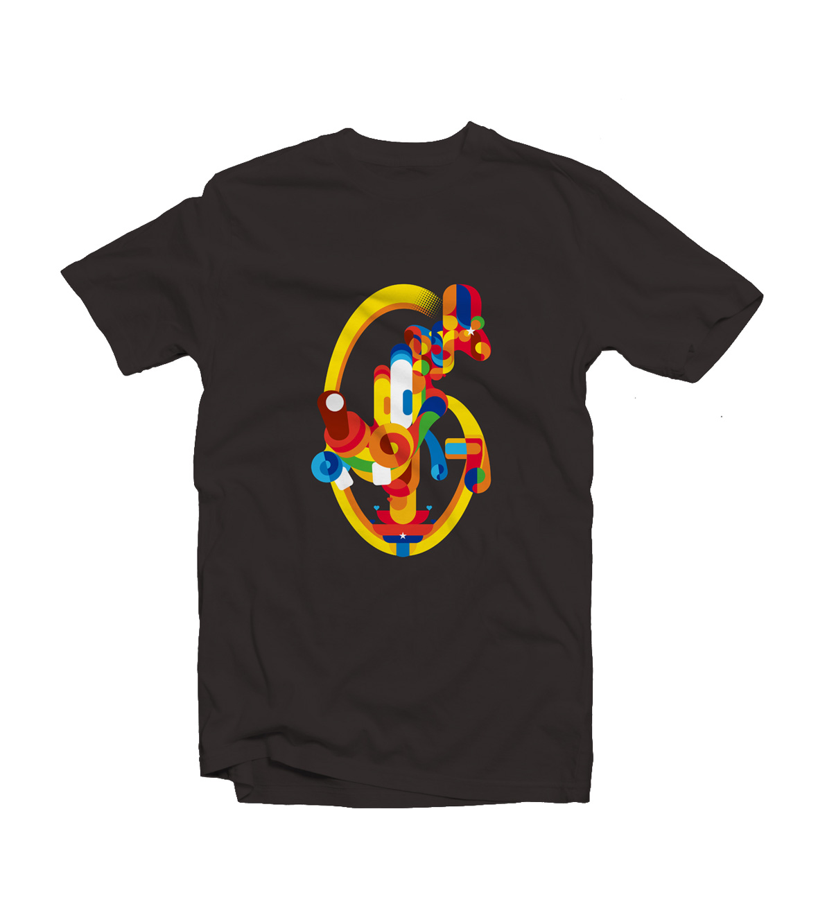
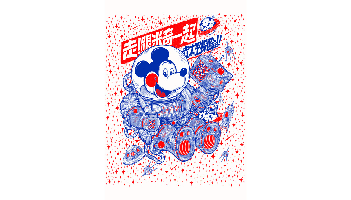
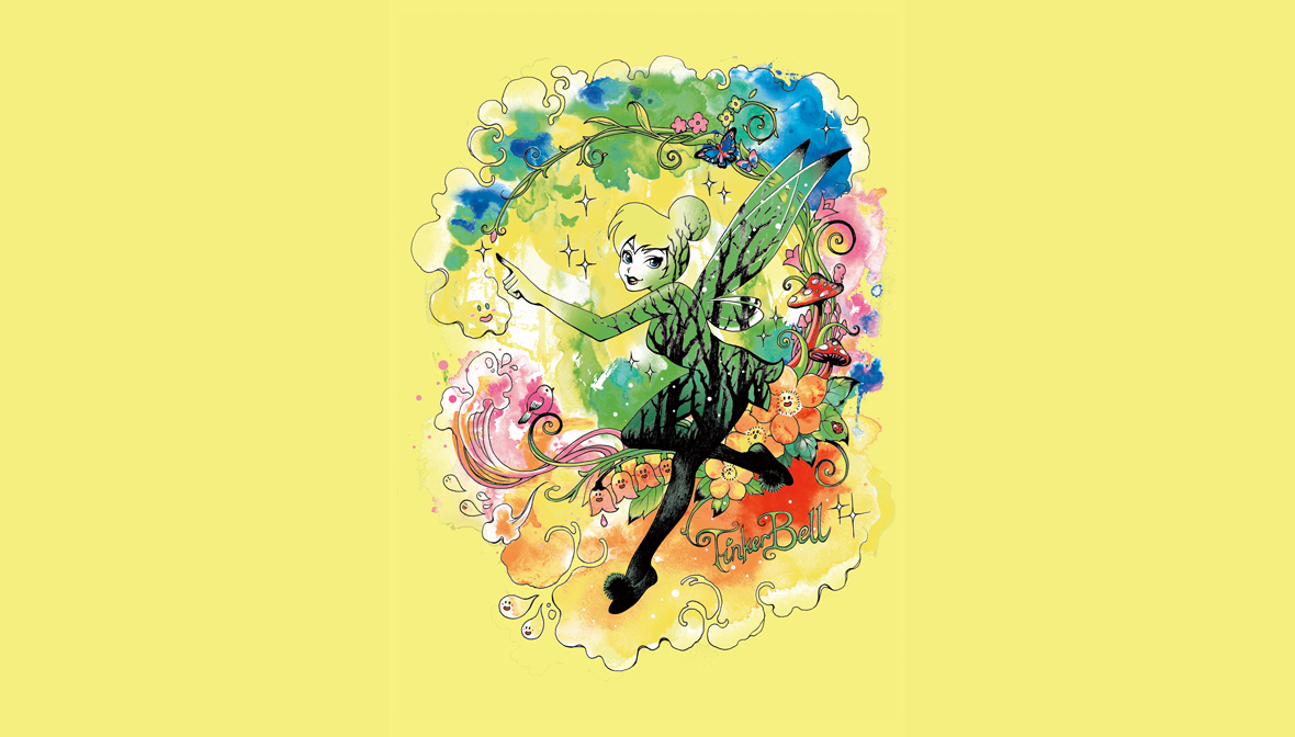
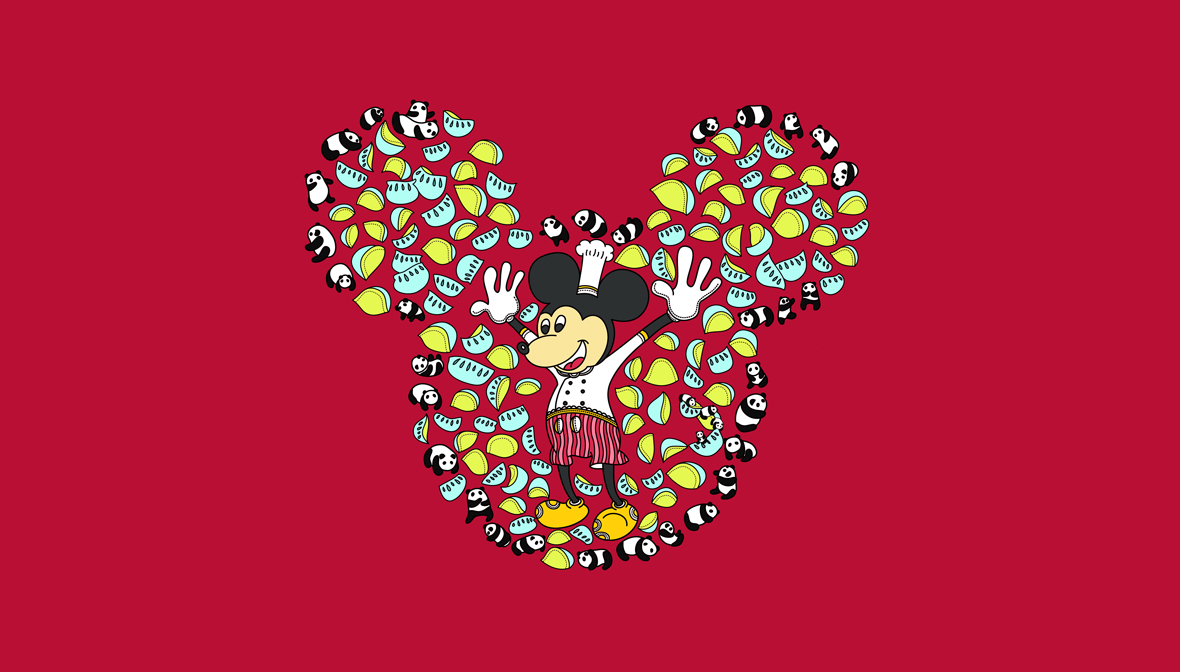
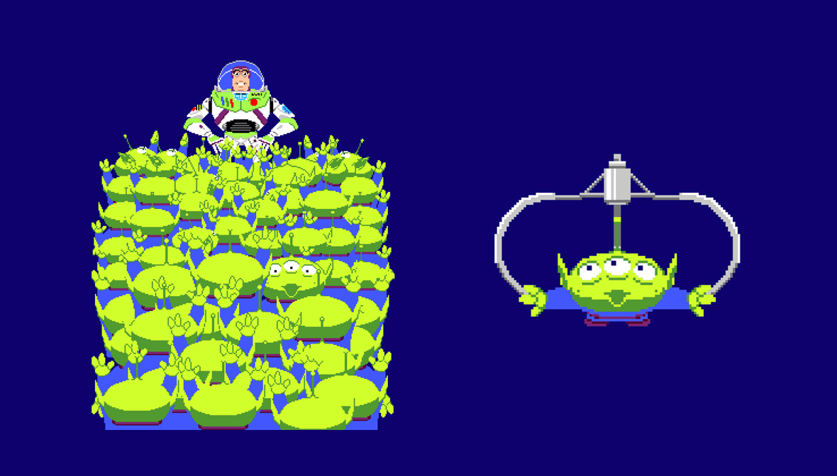
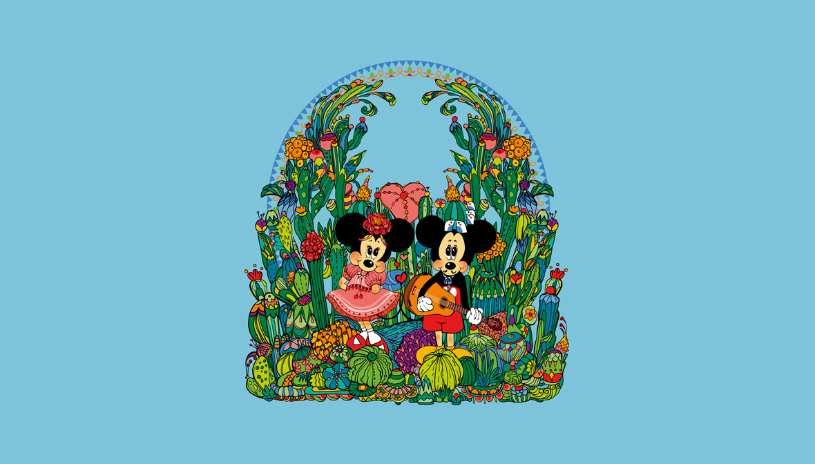
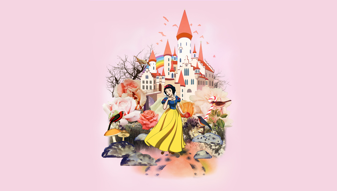
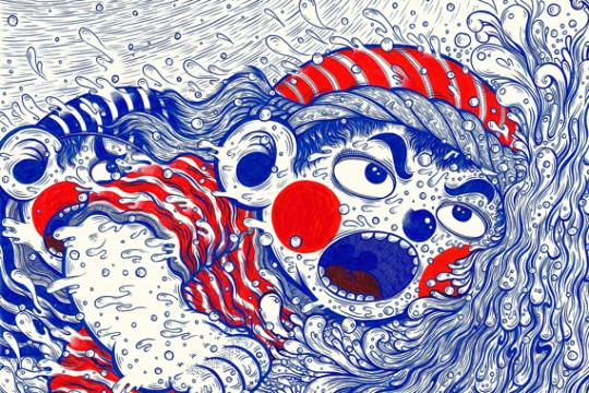
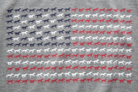
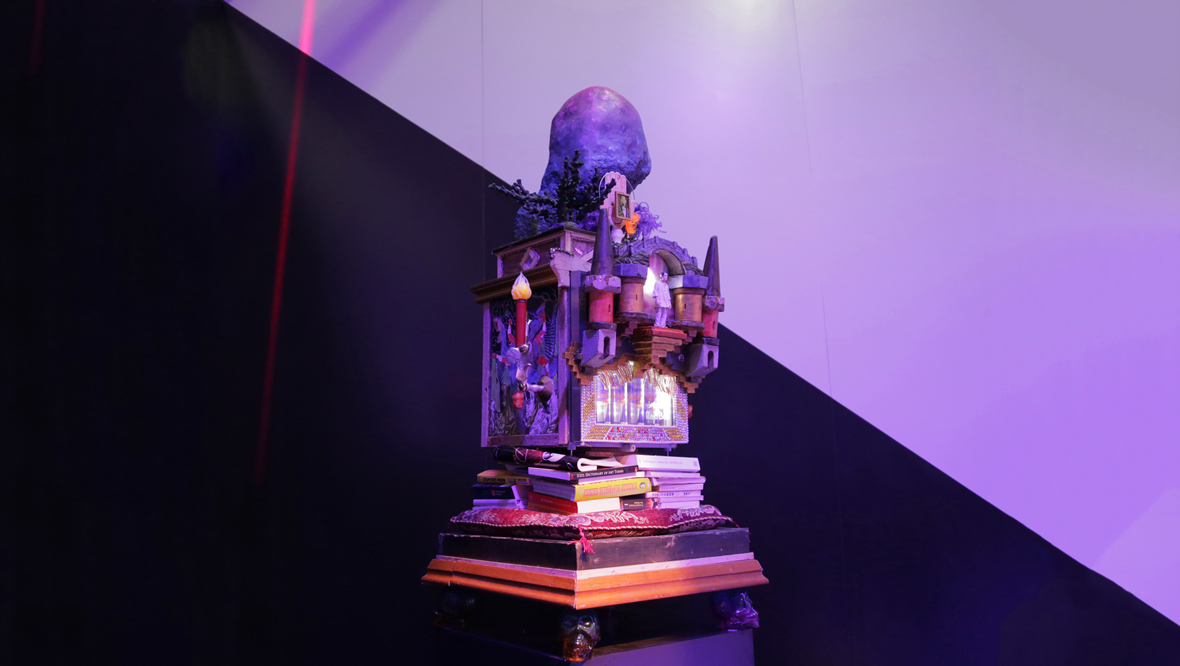
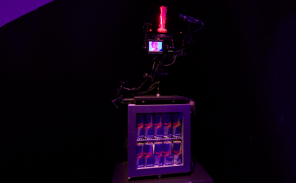
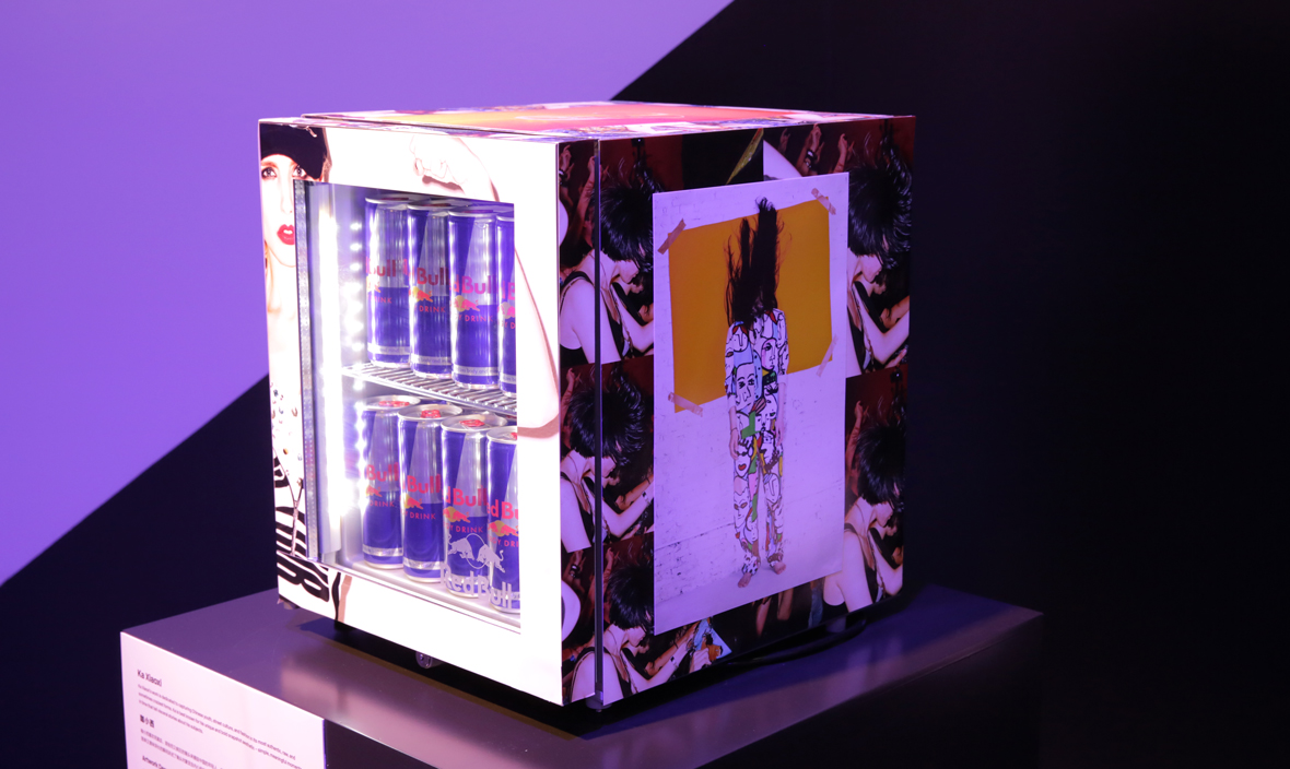
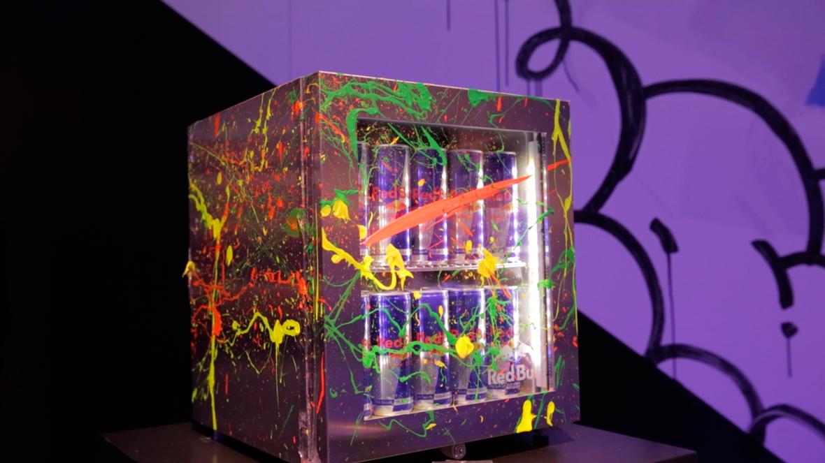
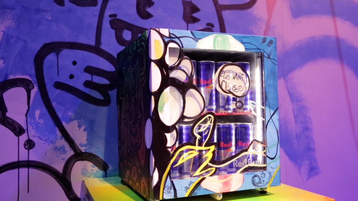
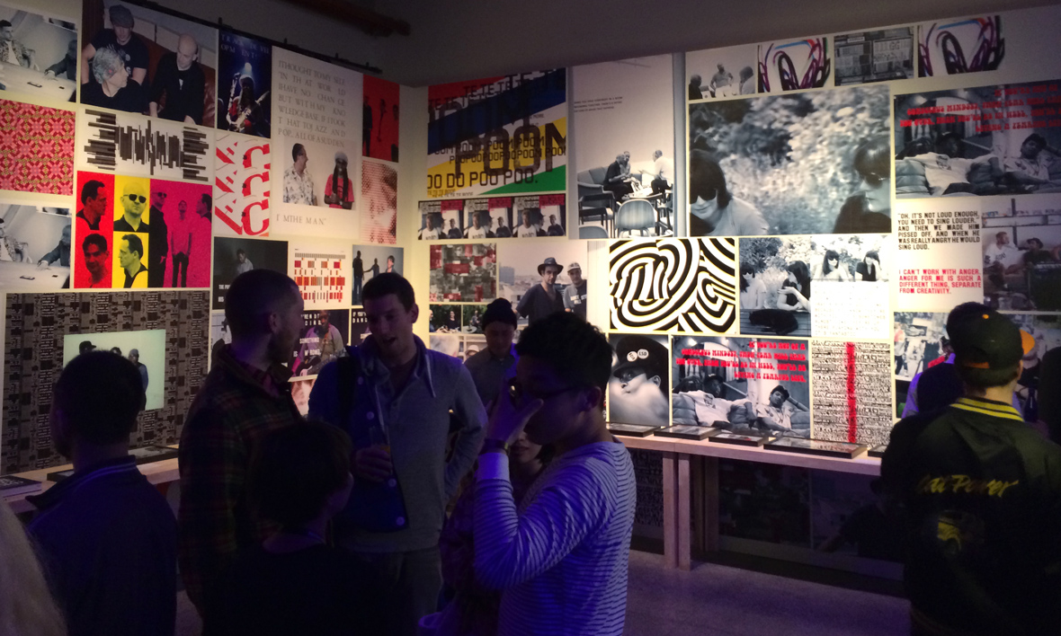
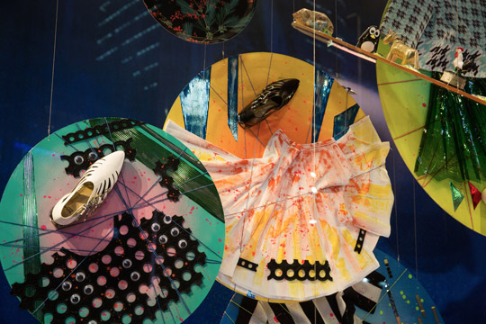
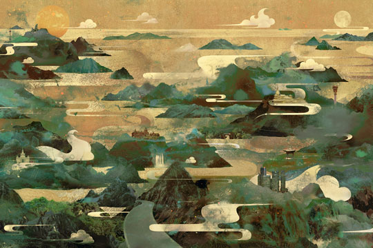
For the exhibition, 21 emerging Chinese artists from all over the country visually interpreted their favorite “chengyu” through typography design and artwork. “Chengyu Visualized” captures the essence of traditional Chinese idioms in a modern way, while showcasing a variety of individual artistic styles through various mediums.

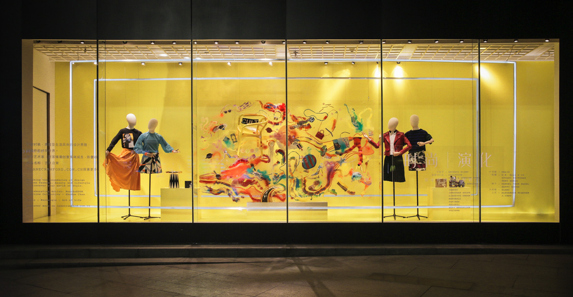
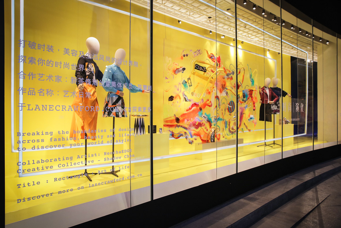
We collaborated with several leading edge Chinese artists: Elephant, Niu Xiaosheng, Lok Ng, Garfield.M, IMKENICAN, Lulu, Mojo, Sally Zou, SO.P, Shrek Su, Hong Hua, Hua Tunan, Coozie, Broken Bike, Mei Lin, Su Sisi, Shadow Chen, Tan Se, Wang Na, Wang2Mu, and Momo.


中国的汉语本就博大精深,而其中富有玩味的成语更是让汉语文化锦上添花,通过凝炼的四字短语(就通常而言)反映、表达出缤纷多彩的人文世界以及人情道理。

一直以来我们都认为成语应该用不同寻常的方式来表现,会别有情趣。很高兴受到上海新天地全新开业的精品酒店ANDAZ的委托,新茶和Osage Art Consultancy合作策划了这次“成语视觉化”的展览。

我们为此邀请了21位来自中国不同城市的创作人针对21个成语进行了一番字体和插画的艺术再创作,用插画向观者传达成语包含的意思,这一饱含中国传统历史文化的成语经过这21位中国年轻创作人之后又会展现怎样的风貌呢?

此次参加创作的艺术家有:大象、牛小盛、Lok Ng、Garfield. M、IMKENICAN、Lulu、MOJO、Sally Zou、SO.P、黑设绘、红花、画图男、Coozie、烂单车、梅林、苏四饲、Shadow Chen、炭色、汪娜、王二木和Momo。


Mei Lin / 柳暗花明

Chengyu – liǔ àn huā míng / 柳暗花明

Literal meaning – “Dense willow trees and bright flowers.” This idiom is often used in times of despair as a mental departure from a difficult situation. It alludes to the beauty of the world and acts as a reminder that there is a light at the end of the tunnel.

Artist interpretation – “This idiom evokes a strong sense of classic and elegant beauty. When it came to font design, I tried to preserve the fundamental style of the character while also smoothing out the lines by adding curves. The illustration uses simple, yet abstract elements to portray poetic scenes of beauty.”


成语 – “liǔ àn huā míng” / 柳暗花明

字面意思 – 比喻由逆境转为充满希望的顺境。

创作解读 – 柳暗花明一直是我很喜欢的成语,它有一种古典优雅的美。在字体设计上,我试图保持基本字形加之流畅的曲线连接,插画运用简单抽象的元素描绘了美好诗意的景致。


Wang2Mu / 逆流而上

Chengyu – nì liú ér shàng / 逆流而上

Literal meaning – “To go against the current.” This idiom is used to describe someone who is willing to break from conformity and is unafraid to try different things.

Artist interpretation – “The emotion captured in this image lies in the man’s facial expression. Through his grimace we see his endurance and perseverance in reaching his goal, while everything around him moves in opposition.”


成语 – “nì liú ér shàng” / 逆流而上

字面意思 – 逆:倒。逆水前进。比喻迎着困难而上。

创作解读 – 画面上的人物逆着流水的方向努力得往上游。


Sally Zou / 珠联璧合

Chengyu – zhū lián bì hé / 珠联璧合

Literal meaning – “Strings of pearls and bands of jade.” This idiom is used to describe things that are a perfect fit for one another; analogous to the round pearls of a necklace fitting flawlessly into the circular jade bands they are coupled with. This phrase is often used to describe a strong marriage between two people or things that work together seamlessly.

Artist interpretation – “I wanted this piece to be a symmetrical composition so as to emphasize the continuity and harmony of the elements. The centerpiece of this illustration is traditional Chinese jade. Surrounding the jade are a variety of precious stones, totems, and pearls that come together cohesively to create this beautiful image.”


成语 – “zhū lián bì hé” / 珠联璧合

字面意思 – 比喻杰出的人才或美好的事物结合在一起。

创作解读 – 璧:中间有孔的玉器。结合各种中国图腾元素和玉雕图案,珍珠联成串,美玉合成双。


Coozie / 口若悬河

Chengyu – kǒu ruò xuán hé / 口若悬河

Literal meaning – “A mouth like a waterfall.” This idiom describes a person who is overly loquacious and tends to babble on.

Artist interpretation – “The powerful currents of water represent an uncontrollable flow of words. The words coming out of the person’s mouth are powerful, but unrefined and aimless.”


成语 – “kǒu ruò xuán hé” / 口若悬河

字面意思 – 讲起话来滔滔不绝,象瀑布不停地奔流倾泻。形容能说会辨,说起来没个完。

创作解读 – 上聊天文 下说地理 他们的话语 如同奔涌的江河。


Imkenican / 鸟语花香

Chengyu – niǎo yǔ huā xiāng / 鸟语花香

Literal meaning – “Bird songs and fragrant flowers.” This idiom describes a beautiful Spring day.

Artist interpretation – “The fine details in the foliage and feathers of the birds are meant to evoke memories of the Spring season, compelling viewers to reminisce about the call of birds and the fragrance of blooming flowers.”


成语 – “niǎo yǔ huā xiāng” / 鸟语花香

字面意思 – 形容春天景色美好。

创作解读 – 画中强硬中带着柔软的线条,加以色块层次的表现法使整个环境中的鸟与花显得更优美,画边的线条加以强调画中的鸟叫得好听,花开得喷香。


Hong Hua / 豆蔻年华

Chengyu – dòu kòu nián huá / 豆蔻年华

Literal meaning – “The cardamom years.” This idiom is used in reference to girls in their early teens, which is widely regarded in Chinese culture as a beautiful and very meaningful age.

Artist interetation – “I wanted to focus on the facial expressions of adolescent girls to reflect the pompous yet innocent attitude they often have at this stage of life. The girls are lost in a bed of beautiful cardamom plants as they bud and continue to grow along side the plants.”


成语 – “dòu kòu nián huá” / 豆蔻年华

字面意思 – 指女子十三四岁时,美好的年纪。

创作解读 – 主要想体现一种繁盛的少女生长姿态,茂密、复杂,带有特定时期浮夸又不确定的情感,采用类似浮世绘装饰画的手法来描绘这样的状态。


Shadow Chen / 沉鱼落雁

Chengyu – chén yú luò yàn / 沉鱼落雁

Literal meaning – “Make fish sink and geese fall from the sky.” This idiom is used to convey the beauty of an extremely attractive woman, implying that her presence is enough to make fish sink and cause geese to fall from the sky in awe of her appearance.

Artist interpretation – “This work is inspired by the wonders of nature and the complexity of human emotion. The beautiful woman in this piece appears to be sad yet tranquil, which reflects her feelings toward her own beauty and the tragic effects it has on the world around her.”


成语 – “chén yú luò yàn” / 沉鱼落雁

字面意思 – 鱼见之沉入水底,雁见之降落沙洲。形容女子容貌美丽。

创作解读 – 画面里的女子为自己的美貌所带来的“鱼沉到水底大雁落下”悲剧结果感到悲伤。


Momo / 蚌病生珠

Chengyu – bàng bìng shēng zhū / 蚌病生珠

Literal meaning – “A sick clam births a pearl.” Clams must first endure the hardship of ingesting gritty sand before they are able to create beautiful pearls. This idiom draws a parallel to people that are forced to deal with adversity throughout their lives. It is through these hardships that they are able to gain a unique perspective on life and their surroundings, and in turn produce some of the world’s most beautiful works.

Artist interpretation – “I chose to use a line drawing method for this piece and incorporated some elements of plane geometry around the clam to represent pearls and other products of its experience. In its lifetime the clam has experienced both tribulation and enlightenment, and it faces it all with a smile.”


成语 – “bàng bìng shēng zhū” / 蚌病生珠

字面意思 – 比喻因不得志而写出好文章来。

创作解读 – 作品用了黑白线描的方法,加入了一些平面几何的元素,画面中间的蚌经历了一番磨难之后,终于开悟了,它脸带笑容。周围的哪些圆形的珍珠和元素,都是它经验后的产物。


Su Sisi / 白鱼赤乌

Chengyu – bái yú chì wū / 白鱼赤乌
Literal meaning – “White fish, red crow.” This idiom is used to describe signs of good fortune.
Artist interpretation – “In traditional Chinese culture, white fish are symbolic of good fortune. The woman featured in this illustration has several tattoos of traditional Chinese totems, including several white fish. Her white fish tattoos bring her good fortune, and with it, she is able to elevate herself above the clouds.”


成语 – “bái yú chì wū” / 白鱼赤乌
字面意思 – 形容祥瑞之兆。
创作解读 – 选择画中出现白色的鱼,因为白色的鱼象征祥瑞之兆。白鱼赤乌这句成语出自南朝,梁,刘勰《文心雕龙·正纬》:“白鱼赤乌之符,黄金紫玉之瑞,事丰奇伟,辞富膏腴。


SO.P / 画龙点睛

Chengyu – huà lóng diǎn jīng / 画龙点睛

Literal meaning – “Bring the painted dragon to life by adding a pupils of its eyes.” This idiom portrays bringing a piece of work to life y adding in intricate details. The expression is often used to describe finishing touches / last steps of a project.

Artist interpretation – “Eyes are the most important element in interpreting emotion and life. They play a pivotal role in helping us understand the world and beings around us. Each individual person’s interpretation of eyes is very different, and by changing unique details in a characters eyes, I’m able to alter the mood of the entire painting.”


成语 – “huà lóng diǎn jīng” / 画龙点睛

字面意思 – 说话或做事关键部位处理得好,使整体效果更加传神。

创作解读 – 成语的趣味在于它可以被随性地定义。“画龙点晴”相比近义的“点睛之笔”,除了“灵性”意味之外更具备主观色彩。“睛”是我们体会世界最主要的媒介,然而它往往会被自己或他人主观的“点”出来,因此我们所体会到的,都会如“画龙”般不同于现实。缺乏主观观察的世界,使字似字,却不完整,需要的便是“画龙点睛”般主观的一笔。


Garfield / 作茧自缚

Chengyu – zuò jiǎn zì fù / 作茧自缚

Literal meaning – “To spin a cocoon around oneself.” This idiom alludes to a person who makes matters more difficult “Eyes are the most important element in interpreting emotion and life. They play a pivotal role in helping us understand the world and beings around us. Each individual person’s interpretation of eyes is very different, and by changing unique details in a characters eyes, I’m able to alter the mood of the entire painting.”

Artist interpretation – “Delicate brushwork, asymmetrical elements, gorgeous colors; these are all things I incorporated into the piece to translate the beauty of life among the chaos of living it. The subject of the painting evokes humor while portraying an interesting view of the human condition.”


成语 – “zuò jiǎn zì fù” / 作茧自缚

字面意思 – 蚕吐丝作茧时,把自己包在里面。比喻人做事原来希望于自己有利,结果却反使自己吃亏受到连累。也比喻自己束缚自己。

创作解读 – 细腻的笔法,不对称的元素,单纯绚丽的颜色,具有动感的构成画面,力图在画面中诙谐而带有趣味性勾勒出的某种生活状态,某种人的状态。为了强调主题中的“自缚”的形象,烘托出这种“失衡”的感受,在画面内容的构架中,瘦弱的主角承载着他背上的巨大的背囊,同时还企图得到更多。运用生活中的各种物质作为一种代表的元素,简单明了的呈现某一种疯狂的生活现象。


Tan Se / 鹤立鸡群

Chengyu – hè lì jī qún / 鹤立鸡群

Literal meaning – “A crane standing among a flock of chickens.” This idiom is used to describe a person who towers above his peers, much as a crane would when standing among a flock of chickens. The expression can be used literally for someone who is physically larger than average, but is most often used figuratively to describe someone who transcends their peers in talent or ability.

Artist interpretation – “This idiom creates interesting imagery in one’s head. I chose to use half anthropomorphic characters to convey my interpretation of both the imagery and meaning of this idiom.”


成语 – “hè lì jī qún” / 鹤立鸡群

字面意思 – 像鹤站在鸡群中一样。比喻一个人的仪表或才能在周围一群人里显得很突出。

创作解读 – 运用半拟人的画面更加直观地表达了这个成语的寓意。


Hua Tunan / 锦绣山河

Chengyu – jǐn xiù shān hé / 锦绣山河

Literal meaning – “A beautiful brocade of mountains and rivers.” This idiom is used to describe the beauty of China’s majestic landscapes, suggesting that the vast mountains and rivers found in China’s countryside are just as beautiful as their depictions in traditional silk embroideries of the past.

Artist interpretation – “I utilized several different materials and techniques to create a traditional landscape painting with a modern twist. I chose to use vibrant colors to make a strong impact that would boldly contradict the monotonous aesthetics of traditional Chinese landscape paintings.”


成语 – “jǐn xiù shān hé” / 锦绣山河

字面意思 – 形容美好的国土。

创作解读 – 以全新的视觉营造传统山水的气势,用颜料做元素,给观者一种视觉上的冲击,颠覆审美上的习惯,从而激发观者的灵感。


Mojo / 掩耳盗铃

Chengyu – yǎn ěr daò líng / 掩耳盗铃

Literal meaning – “To plug one’s ears while stealing a bell.” This idiom is meant to characterize a person that is foolishly blinded by their own self-deception. Such a person would be acting with the same foolishness as a thief trying to steal a bell with his ears plugged; unaware of the attention he is drawing to himself because he has chosen to block out the ringing.

Artist interpretation – “People go to extremes to trick themselves into believing that their delusions could be easier to achieve if they just ignore the obstacles that stand in their way. They remain unaware of the risks and dangers, yet recklessly move forward to entertain their impulses.”


成语 – “yǎn ěr daò líng” / 掩耳盗铃

字面意思 – 偷铃铛怕别人听见而捂住自己的耳朵。比喻自己欺骗自己,明明掩盖不住的事情偏要想法子掩盖。

创作解读 – 有时候人就是会想尽一切办法自己骗自己,以为骗过了自己,假象便能成真,殊不知危机四伏,在他人眼里只是一个自娱自乐的笑话。


Broken Bike / 突飞猛进

Chengyu – tū fēi měng jìn / 突飞猛进

Literal meaning – “To leap and advance boldly.” This idiom is used to describe someone who is able to progress very quickly, advancing by leaps and bounds to a higher level.

Artist interpretation – “In traditional Chinese culture, rabbits are symbolic of speed, much like Superman in modern culture. I drew upon the elements of both the rabbit and Superman to highlight the speed and confidence of someone that is able to make bold advances in life.”


成语 – “tū fēi měng jìn” / 突飞猛进

字面意思 – 用来形容进步的速度很快。

创作解读 – 采用“突”的谐音“兔” 将兔子化身为行动迅速,雷厉风行的超人,通过兔子翱翔天空,速度媲美飞机的英姿,形象地突出“突飞猛进”的主题。


Lok Ng / 非礼勿言

Chengyu – fēi lǐ wù yán / 非礼勿言

Literal meaning – “The impolite must not be said.” This idiom was commonly used in ancient times when Chinese people lived in a very strict hierarchical society. There were many things that people weren’t permitted to say to someone of an older generation or higher social class. This expression is still used today to denote something that is too impolite to say.

Artist interpretation – “The flower and butterfly elements work to establish a sense elegance, while the woman’s facial expressions indicate that she is restraining herself from expressing her thoughts. Her hands work to repress her impolite thoughts, which are represented by the ink splatters that taint the image.”


成语 – “fēi lǐ wù yán” / 非礼勿言

字面意思 – 不合符礼教的话不能说。

创作解读 – 在整体的设计上运用了水彩及水墨的感觉,在纸上绽放出一种优雅的感觉,以花朵和蝴蝶去点缀表现“礼”的美。在画里的出现了两只手分别捂着嘴,预示出没有礼貌的话不能说,不道德的话不能说。背景的墨水预示凡事不礼言相对,必定祸从口。


Niu Xiaosheng / 风和日丽

Chengyu – fēng hé rì lì / 风和日丽

Literal meaning – “Gentle breeze and bright sunshine.” This idiom is used to describe the weather on a beautiful day.

Artist interpretation – “When people see my work, I want them to be able to feel a soft, gentle breeze and the warm summer sun on their face. I utilized a paper cut-out aesthetic, together with refreshing, cutesy colors to capture the warmth and joy of a beautiful sunny day.”


成语 – “fēng hé rì lì” / 风和日丽

字面意思 – 和风习习,阳光灿烂。形容晴朗暖和的天气。

创作解读 – 让看到作品的人的心情像“风和日丽”的天气一样晴朗暖和!作品用了假剪纸投影的效果,清新可爱的颜色诠释了和风习习,阳光灿烂的画面。瓢虫爷爷带着瓢虫奶奶在风和日丽的天气出游,是多么惬意的一件事情啊!


Lulu / 相濡以沫

Chengyu – xiāng rú yǐ mò / 相濡以沫

Literal meaning – “To moisten each other with spit.” This idiom alludes to a Chinese folktale about two beached fish struggling to keep each other alive by using all the fluids they have left in them / around them to moisten each other. The expression is used to implore people to be altruistic in helping one another in times of need, no matter how scarce resources may be and without regard to one’s own well-being.

Artist interpretation – “The use of the black gel pen on white paper outlines the movement of the two mermaids stranded on the beach struggling to make their way back to the ocean. The bottom portion of the piece is meant to provide a stark contrast, showing life in the water thriving as usual.”


成语 – “xiāng rú yǐ mò” / 相濡以沫

字面意思 – 比喻一同在困难的处境里,用微薄的力量互相帮助,只为了保住生命。多用来形容夫妻间的感情。

创作解读 – 运用黑色中性笔在白纸上自由勾勒出唯美动人的画面,相恋的人鱼在沙滩上彼此鼓励,相互扶持,抵抗骄阳,期待着生命延续的奇迹发生。画面下方渲染出欢乐的家园景象,更加反衬出人鱼此时此刻的困难处境。PS里将线条附着上鲜明的色块,于是那个古老动人的传说便如童话般呈现在我们眼前。


Shrek Su (aka: 黑设绘) / 见怪不怪

Chengyu – jiàn guài bù guài / 见怪不怪

Literal meaning – “To see the unfamiliar and not express dismay.” This idiom is used to describe a person’s poise and tranquility in an otherwise strange and unfamiliar situation.

Artist interpretation – “The small monsters that surround the cyclops are the creatures that haunt him. If we can understand that everyone and everything has something they are afraid of, it can help us keep an open mind about the strange and unknown, and teach us not to fear the unfamiliar.“


成语 – “jiàn guài bù guài” / 见怪不怪

字面意思 – 发现怪事怪物不要惊慌,它就不会危害了。

创作解读 – 你见到的怪物是真实的,你梦到的也是真是的,你走进去了才能发现原来怪物是那么多。运用黑白素描的表现方式,这样制作起来很有成就感。画面的构成上,我采用了一只大大的眼球怪物,犀利的眼神看着周围的一切,当然你也见到了他,所以都那么顺其自然吧,部要大惊小怪,要见怪不怪,回头就当做这一切都没发生吧。


Wang Na / 山鸡舞镜

Chengyu – shān jī wǔ jìng / 山鸡舞镜

Literal meaning – “A pheasant dancing in front of a mirror.” This idiom refers to a story in which a pheasant becomes obsessed with her own reflection while dancing in front of a mirror and ultimately dances herself to death. The expression is meant to be a reminder that narcissism is not healthy, and that one should not over-indulge in self-admiration.

Artist interpretation – “I used watercolor as a medium for this painting as it allows for more freedom in creating unrestrained lines. This flexibility enabled me to accurately illustrate the reserved appearance of the pheasant, while simultaneously creating a dynamic dance scene.”


成语 – “shān jī wǔ jìng” / 山鸡舞镜

字面意思 – 比喻顾影自怜,自鸣得意。

创作解读 – 运用水彩这种媒介,更自由洒脱得在纸上画下笔触色块,表现山鸡矜持自己的美貌并热舞的情景,松动的笔触烘托这种活力的气氛,背景画了一些虚幻的魔鬼头像,预示出了山鸡固执于自己的美貌最后却舞蹈到死亡的后果。


Elephant / 鸿鹄之志

Chengyu – hóng hú zhī zhì / 鸿鹄之志

Literal meaning – “A swan’s ambition.” This idiom is used to describe a person with great aspirations.

Artist interpretation – “I wanted to create a contrast in this piece by illustrating an eagle in an aggressive attack position carrying a rose. This contrast of fierce aggressiveness and romanticism implies that a person’s ambitions may not always be as savage as the actions and attitude one must assume to achieve those goals.”


成语 – “hóng hú zhī zhì” / 鸿鹄之志

字面意思 – 形容志向远大。

创作解读 – 浪漫的威慑性格分裂。慑人的爪子叼着的不是死体而是浪漫的玫瑰,在天空翱翔的雄鹰想要向人传达的是有时候用更温柔点的方式也可以完成远大的志向。


Limited Edition Bottle Campaign

Absolut Vodka


无法观看?前往优酷

For Absolut Vodka’s GLIMMER limited-edition bottle campaign, we created a series of key visuals and a short film featuring light-writing graffiti and long exposure photography techniques. We turned the GLIMMER bottles into illuminated “paint brushes” and took to the streets of Shanghai to tell the campaign’s “Make The Present Exceptional” story.


我们为绝对伏特加的绝对闪耀版限量系列创作了一系列的平面主视觉和延时光影涂鸦摄影的短片。我们将绝对闪耀版的瓶身变身为光影“画笔”走在上海街头传递着“绝对创意 就耀现在”的故事。


闪耀 – Shine


永恒 – Eternal


亮 – Bright


光 – Light


Make the Present Exceptional


Absolut Glimmer Limited Edition Bottle

REMIX Project

Gap

In 1969, a small store opened in San Francisco selling jeans and records to a new generation. Since then, Gap has grown to be a favorite around the world, establishing its place in pop culture with casual, cool clothing and iconic creative work.

Gap has always stood for self-expression and embracing one’s individual style. Today, Gap continues to support the shared spirit of creativity and encouraging the genuine exchange of ideas. By bringing artists from all corners of the world together in the REMIX Project, Gap celebrates them for their passions and continues its heritage in creativity.

The REMIX Project brings together 12 leading-edge American, British, French, Chinese, and Japanese artists to create an exclusive collection of limited edition graphic tees. Artwork in the collection remixes the classic Gap logo T-shirt into bold art treatments that showcase the distinctive style of each artist and celebrate the creative heritage of Gap.


1969年,旧金山开出一家专门卖牛仔服装的小店并开启了一个新纪元。从次,Gap在流行文化领域以其休闲、酷和标志性的创意内容迅速风靡全球。

Gap一直主张自我表达和接受主义的个人风格。如今,Gap继续坚持和鼓励着共享创意的交流精神。此次通过REMIX Project将世界各地的艺术家集合在一起,Gap要为他们的激情和源源不断的创造力喝彩。

REMIX Project让12位分别来自美国、英国、法国、中国和日本的先锋艺术家一起完成了这一限量版图案T恤系列。他们分别以经典的Gap logo为创意出发点并将风格鲜明的个人艺术特色融合在各自的设计中。


REMIX Project Collection


REMIX Project Book


无法观看?前往优酷


REMIX Project Tote


Fantasista Utamaro - Japan

Fantasista Utamaro is a leading manga and multi-medium artist. Known for ultra pop and technicolor sensibilities, his instantly recognizable work spans the fields of illustration, animation, graphic / textile / fashion design, and even outdoor landscaping.

His design for the REMIX Project hides the brand logotype within traditional Japanese “Karakusa” patterns, pop art coloring, and manga-styled characters. The piece represents hope for the development of cultures around the world.


Fantasista Utamaro是一个知名漫画家及多媒体艺术家。他以波普元素及明锐的色彩著称,他的插画、动画、图形、纹样、时尚设计甚至户外景观设计极易被辨别出来。

他为此次REMIX Project设计的作品中融合了日本传统的“Karakusa” 纹理、波普艺术色彩和漫画风格形象。这个作品代表着将文化发展蔓延至全球的寄望。


无法观看?前往优酷


Chocomoo – Japan

Chocomoo is a street fashion illustrator and artist. Influenced by rock music, hip-hop, and traditional Japanese calligraphy, her work is always done in a signature black and white line-art style.

Her design for the REMIX Project reimagines the brand logotype among iconic Americana imagery and the things that make me smile: music, fashion, partying, and the sharing of positive vibes with one another.


Chocomoo是一个深受受摇滚乐,说唱及日本传统书法影响的街头时尚插画师及艺术家,她的作品总是以一种黑白线条的风格呈现。

她为此次REMIX Project设计的作品将一些让我看后会心一笑的美国标志性的形象与事物融合在品牌标识中,比如:音乐、时尚、派对以及彼此分享的情境。


无法观看?前往优酷


Lin Zhipeng (aka: No. 223) – China

Lin Zhipeng (aka: No. 223) is a photographer known for his ability to show the volatile, primal energy of China’s younger generation. His work explores topics of love, sexuality, gender, free expression, and consumption within the context of modern China.

His design for the REMIX Project presents the brand’s logotype amidst some of my favorite recent images to form a snapshot collage of daily life in contemporary China.


林志鹏(又名:编号223)是一个以表达躁动的青春荷尔蒙而被众人所知的中国新生代摄影师。他的作品探寻的正是当代中国最受关注的主题:爱、性、性别、言论自由。

他为REMIX Project创作的作品,将其近期所拍摄的反应当代中国日常生活的照片作品以拼贴的形式重塑了经典的品牌标识。


无法观看?前往优酷


Candy Bird – Taiwan

Candy Bird is a renowned street artist and illustrator who creates unique and playful visuals addressing social injustices and environmental concerns around the world.

His design for the REMIX Project incorporates the brand’s logotype into a satirical composition that serves as a reminder for us to curb our obsessions with media and celebrity culture.


Candy Bird是一位知名的街头艺术家和插画师,他独具特色且趣味十足的作品旨在揭露社会不公现象以及全球环境问题。

他为REMIX Project创作的作品,将经典的品牌标识巧妙地融合到他的画作中,旨在提醒我们应该抑制自身从媒体和明星文化中所受的影响。


无法观看?前往优酷


Prodip Leung – Hong Kong

Prodip Leung is a painter, illustrator, graphic designer, and the bassist for the legendary Cantonese hip-hop group, LMF. Combining music with experimental art, his work draws from the legacies of street art, cartoons, and pop culture.

His design for the REMIX Project presents the brand logotype amidst a spin-off of my “Monster Pit” print series, with its retro-fashioned, “slamdancing” creatures of the night.


Prodip Leung(梁伟庭)是一位香港画家、插画师、平面设计师以及颇具传奇色彩的粤语嘻哈乐队LMF的贝斯手。他的作品提取了街头艺术、卡通及流行文化的精髓,常常结合了音乐和实验艺术。

他为REMIX Project创作的作品,是其带有复古时尚,且充满“slamdancing”夜生物的平面创作 —— 我的 “Monster Pit” 系列的一种延续。


无法观看?前往优酷


Maud Vantours – France

Maud Vantours is a designer and artist who works with layered, cut, and folded paper to create colorful 3D sculptures of hypnotizing patterns and textures.

Her design for the REMIX Project is inspired by nature and dreamscapes. She reimagined the brand logotype within a multicolored and multilayered paper sculpture design that mimics the patterns of waves, mountains, and wind-blown clouds.


Maud Vantours是一个设计师及艺术家,她的3D雕塑作品以层叠、裁剪和折纸方式呈现出一种色彩鲜亮且有着重复模式和肌理感。

她的REMIX Project作品灵感来源于自然与梦境,她将品牌标识隐匿于色彩缤纷和层叠的波纹、山脉及被清风拂云朵的纸塑中。


无法观看?前往优酷


Loïc Lavenu (aka: Xoil) – France

Loïc Lavenu is a world-renowned designer and tattoo artist acclaimed for pioneering an abstract graphic style of tattooing. His work pushes tattoo aesthetics into new realms inspired by digital illustration, photography, and collage.

His design for the REMIX Project positions the brand logotype within a collaged and transitional reflection of the things that inspire him: geometry, colors, lines, movement, and life’s circadian rhythms.


Loïc Lavenu作为世界知名设计师和纹身艺术家,一直以来的志向就是不断摸索创新一种抽象的纹身风格。他将纹身美学推进到一种新的高度,而他的灵感来源于各式各样的图形图像设计、摄影以及拼贴画。

他为REMIX project创作的作品是将品牌标志融入在了一个类似拼贴画的意境之中,这个设计中会看到他受几何、颜色、线条、动感以及生命巡回等种种理解的启发。


无法观看?前往优酷


Quentin Jones – UK

Quentin Jones is an artist, filmmaker and photographer. Her aesthetic is a modern take on the surrealist tradition, realized largely through photomontage and loose paintwork.

Her design for the REMIX Project is inspired by fashion iconography, and combines the brand’s logotype with simple but impactful collage and brush-work elements to create an ambiguous form composed of eyes, legs and letters.


Quentin Jones是一名艺术家、导演和摄影师。她的超现代主义独特审美跨越传统,并通过蒙太奇的方式和张弛有度的颜料绘画来展现。

她这次为REMIX project创作的作品,灵感来源于将时尚的肖像与品牌标识相结合,并运用简单却颇具效果的拼贴画及画笔将眼睛、腿和字母这些看似无关的元素联结在一起。


无法观看?前往优酷


Neville Brody – UK

Neville Brody is a pioneer in the fields of graphic design, art direction, and digital typography. With a career spanning four decades, he is widely acclaimed for his iconic typeface designs.

His design for the REMIX Project reinterprets the Gap letterforms using fluid lines and spaces that create an infinite gridded loop where cultural life pools take place and grow.


Neville Brody是一名先锋平面设计师、创意总监、数字字体设计师。四十年的职业生涯中,他传奇性的字体设计作品被大家广为赞誉。

他的REMIX Project设计采用流畅的线条和空间,将GAP字样创作为无限循环的圈体。这个作品展示出了永不终止的文化生活不断发生和发展的意义。


无法观看?前往优酷


POSE – USA

POSE uses bright colors and tight graphic stylings to create images that jump off walls. Inspired largely by the tradition of pop art, his work integrates illustration, lettering, screen print aesthetics, humor, and even violence.

His design for the REMIX Project reimagines the brand logotype within a contemporary portrait. The composition conveys modern expression and human experience as they are: constantly in flux, complex, and affected by environment and everyday experience.


POSE采用明亮的色彩和紧密的图形风格创造了独具一格大胆图像。受到传统波普艺术的启发,他的作品集插画、印字、丝网印刷、幽默,甚至暴力学为一体。

他为REMIX Project创作的作品巧妙地将品牌标识交融到当代肖像之中。该作品传达了现代人对不断变化的、复杂的、受环境影响和日常生活的情感和体会。


无法观看?前往优酷


Jessica Hische – USA

Jessica Hische is a letterer, illustrator, and crazy cat lady known for her silly side projects and occasional foul mouth.

Her design for the REMIX Project uses vintage-inspired typography made modern though context and color. Mixing historical letterforms with modern graphic geometric decoration, she reinterpret the Gap logotype in a sophisticated and unexpected blue, teal, and yellow color palette.


Jessica Hische是一名字体设计师、插画师以及疯狂的爱猫人,她以一些奇怪的小项目和偶尔的粗口著称。

我为REMIX Project创做的作品采用复古风格排版,重新传达了现代信息。组合复古字母形式与现代图形的几何装饰,我在一个丰富的和意想不到的蓝、蓝绿、黄的色板中重新诠释了GAP标识。


无法观看?前往优酷


Kyle Pierce – USA

Kyle Pierce is an illustrator and photographer who enjoys building layered narratives from photographs, illustrations, and bits of simple hand-drawn type.

His design for the REMIX Project is inspired by San Francisco, the city I live in and where Gap was founded in 1969. His design presents the Golden Gate Bridge within a contour of the city borders, while letterforms and the brand logotype recreate the fog that so frequently graces “The Gate.”


Kyle Pierce是一个喜欢将照片、平面设计和简单的手绘相互叠加的插画家和摄影师。

他的REMIX Project作品灵感来源于他所居住的城市,同是GAP品牌于1969年所成立的发源地旧金山。他的设计将金门大桥的影像结合在旧金山版图剪影形状之上,同时以该城市常见的迷雾以字母和品牌标识体现,笼罩在“金门”之上。


无法观看?前往优酷

Iconic T7 & Suede Collection

Puma


无法观看?前往优酷

We created a spot with Chinese pop-star Lu Han for Puma’s iconic T7 and suede Collection. The spot features retro Puma T7 tracksuit and suede sneakers in classic color ways: red, blue, black, and grey. Lu Han introduces the product and footwear while dancing through monotone color environments in an 80’s inspired breakdancing montage. The work was shot in Beijing and used in-stores, online, and in OOH executions.


我们与中国流行明星鹿晗合作为Puma经典的T7和suede系列创作了一条短片作品。该片展现了经典的红、蓝、黑、灰四色复古Puma T7运动服和suede球鞋。鹿晗在纯色背景前以80年代流行的霹雳舞蒙太奇展现品牌产品和鞋款。该片在北京拍摄并被广泛运用于品牌门店、网络以及户外执行。

House of Vans

Vans


无法观看?前往优酷

We created a video campaign to promote Vans’ annual House of Vans summer event series in Asia. House of Vans is a traveling hub of culture, creativity, and sport in which Vans celebrates its main brand pillars: music, art, skate. House of Vans made stops in Beijing, Guangzhou, Xi’an, Hong Kong, and Seoul, and presented a variety of creative workshops (painting, photography, screen printing, etc), exhibitions, live musical performances, skate opportunities, and raucous partying – a real good time for everyone involved.

For the campaign videos, we combined monster-inspired animations and live footage to introduce House of Vans in fun, interactive shorts. The content was used online, in-stores, and at the House of Vans events throughout Asia.


我们为Vans品牌的House of Vans年度亚洲区夏季活动做了一系列的宣传短片。House of Vans是一场以文化、创意和运动为主题的巡回活动,通过该活动来颂扬品牌的三大核心内容:音乐、艺术和滑板文化。House of Vans此次巡回历经北京、广州、西安、香港和首尔站,呈现了多元化的创意工作坊(绘画、摄影、丝网印刷等)、展览、现场音乐演出、滑板表演以及躁动派对,这绝对是一场众人参与的美妙盛宴。

活动短片中,我们从怪物中衍生出动画人物与实拍画面相结合,来呈现House of Vans的精彩和互动。该片用于网络、品牌门店以及House of Vans亚洲区的活动现场。


无法观看?前往优酷


House of Vans – Hong Kong Teaser


无法观看?前往优酷


House of Vans – Beijing Teaser


无法观看?前往优酷


House of Vans – Guangzhou Teaser


无法观看?前往优酷


House of Vans – Seoul Teaser


无法观看?前往优酷


House of Vans – Xi’an Teaser


无法观看?前往优酷

Seasonal Campaign

adidas Originals

We created the 2015 Fall / Winter seasonal campaign for adidas Originals. Working with celebrities and brand ambassadors Eason Chan, Fan Bingbing, JolinTsai, and Gianna Jun in raw, authentic, urban environments, the campaign key visuals communicated the true street fashion spirit of the brand.

The campaign was shot in Beijing, Taiwan, Hong Kong, and Seoul with assets used in nationwide print media, retail / point-of-sale, and digitally. We collaborated with Detroit-based photographer Jeremy Deputat, Beijing-based photographer Chen Man, Seoul-based photographer Hong JangHyun, with select imagery also shot by agency creative director Adam Schokora.


我们为adidas Originals 2015 秋冬系列创作了平面硬广。这次的主视觉结合了色彩丰富的城市场景真实展现了其品牌代言人陈奕迅、范冰冰、蔡依林和全智贤的形象,在真实的城市场景中还原了品牌的街头时尚精神。

平面硬广分别拍摄于北京、台湾、香港和首尔,并被广泛运用于其全国零售店铺,网络,户外和平面媒体的广告栏。我们与来自于底特律的摄影师Jeremy Deputat,北京摄影师陈漫,首尔摄影师Hong JangHyun及本机构的创意总监Adam Schokora共同合作完成了这一季的主视觉拍摄。


Eason Chan / 陈奕迅

Behind the Scenes w/ Eason Chan for adidas Originals 2015 Fall / Winter Campaign


无法观看?前往优酷


Eason Chan / Superstar Campaign


无法观看?前往优酷


Fan Bingbing / 范冰冰

Behind the Scenes w/ Fan Bingbing for adidas Originals 2015 Fall / Winter Campaign


无法观看?前往优酷


Fan Bingbing / Superstar Campaign


无法观看?前往优酷


Jolin Tsai / 蔡依林

Behind the Scenes w/Jolin Tsai for adidas Originals 2015 Fall / Winter Campaign


无法观看?前往优酷


Jolin Tsai / Superstar Campaign


无法观看?前往优酷


Gianna Jun / 全智贤

Behind the Scenes w/Gianna Jun for adidas Originals 2015 Fall / Winter Campaign


无法观看?前往优酷


Gianna Jun / Superstar Campaign


无法观看?前往优酷


Li Tianlun / Superstar Campaign


无法观看?前往优酷


VJ Mian / Superstar Campaign


无法观看?前往优酷


Hua Tunan / Superstar Campaign


无法观看?前往优酷


October Print Campaign

Artist Tee Collection

Disney

We ​created a ​collections of custom graphic tees for The Disney Store (China)​. We collaborated with 11 leading-edge Chinese artists and designers ​to ​re-imagining classic Disney characters​ for the collection. Artists featured in the collection include: Sally Zou, Calvin Ho, Jaye Kang, Hua Tunan, Nod Young, Wang2Mu, Left, Lulu, Spoony, Hong Hua and Mei Lin.


我们为中国迪士尼商店创作了定制图案T恤系列。为此我们与11位中国先锋艺术家及设计师合作以迪士尼人物为原型进行再创作。参与此次合作的艺术家包括:Sally Zou, Calvin Ho, Jaye Kang, 画图男, Nod Young, 王二木, Left, Lulu, Spoony, Hong Hua以及Mei Lin.


Donald Duck / Sally Zou


Maleficent / Calvin Ho


Evil Queen / Jaye Kang


Mickey Mouse / Hua Tunan


Goofy / Nod Young


Mickey Mouse / Wang2Mu


Tinkerbell / Left


Mickey Mouse / Lulu


Buzz Lightyear / Spoony


Minnie & Mickey Mouse / Hong Hua


Snow White / Mei Lin

China Brand Launch

Red Bull


无法观看?前往优酷

To help launch Red Bull in China, the brand tapped Neocha to execute its global Canvas Cooler Project.

The Canvas Cooler Project pairs up-and-coming artists with cool local venue owners to create custom and functional pieces of art: coolers (full of Red Bull product)

We curated 5 artists and tasked them with the challenge of transforming a blank canvas-wrapped Red Bull cooler into an inspired work of art. The finished pieces were unveiled to the public in a one-night only exhibition in Shanghai. Participating artists included: Idlebeats, Kim Laughton, Ka Xiaoxi, Arkham, Elephant, and Chase Wills.

To learn more about the project, the artists, and the exhibition, check out the above documentary we created to capture the campaign.

Additionally, for the exhibition event, we curated an invitee list of local creative culture influencers and designed a presentation of Red Bull Music Academy’s (RBMA) “For The Record” book. For The Record is a celebration of RBMA’s 15th anniversary, in which it links up with a compelling selection of top artists and industry insiders to share conversations and essays on some of the most relevant topics in music today.


品牌Red Bull(银色版)为其在中国的正式上市,委托Neocha执行其Canvas Cooler全球系列之上海站活动。

Canvas Cooler系列活动集结新生代艺术家和本土潮流场所持有人以创作兼备定制款设计和功能性于一身的艺术小冰柜(以Red Bull产品布满柜体)。

我们邀请了五位艺术家参与这次创意挑战,将外观空白的Red Bull冰柜幻化成为一件件艺术作品。最终成品在上海唯一的一场活动当天曝光,此次参与活动的艺术家包括:Idlebeats、Kim Laughton、咖小西、Arkham、大象和Chase Wills。

想要了解该项目、艺术家和展览的更多信息,请点击上方观看我们为此次活动拍摄的纪录片。

除此之外,在展览区域,我们策划邀请了当地创意文化引领者并设计展出了Red Bull音乐学院(RBMA)出版的For The Record一书。For The Record是RBMA十五周年纪念集,其中收录的对话及文章是来自世界顶尖的非凡艺术家和业内人士就当代音乐进行的深远挖掘和探讨。


Canvas Cooler Project

IdleBeats


Kim Laughton


Ka Xiaoxi


Arkham


Chase Wills & Elephant


For The Record