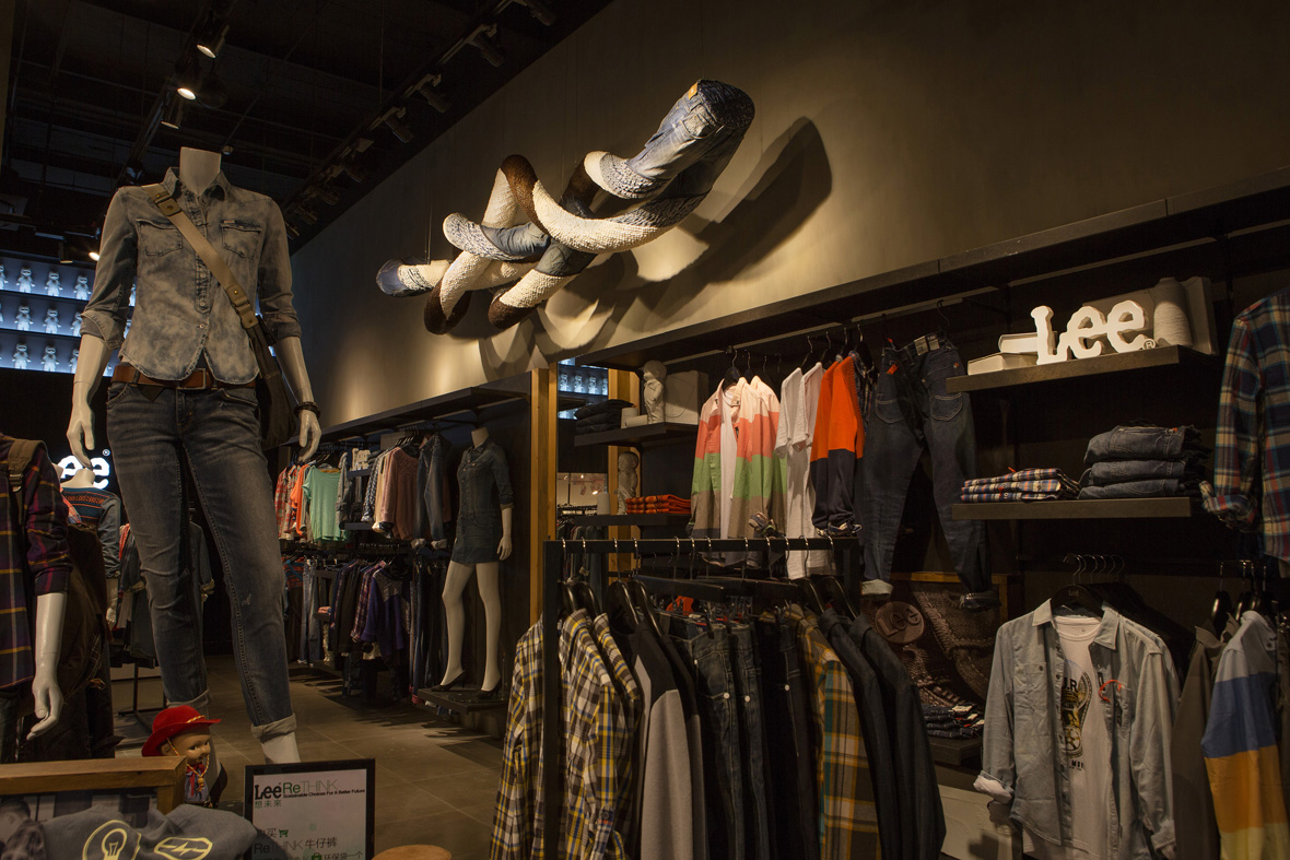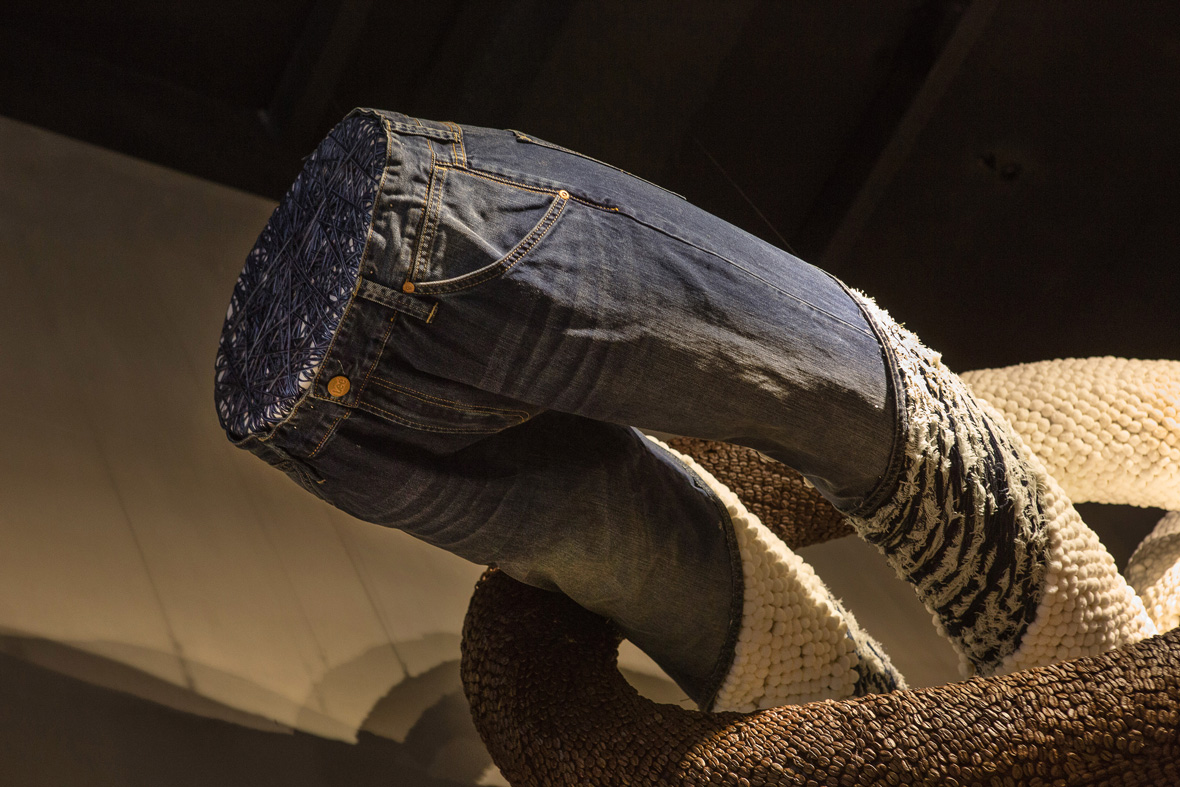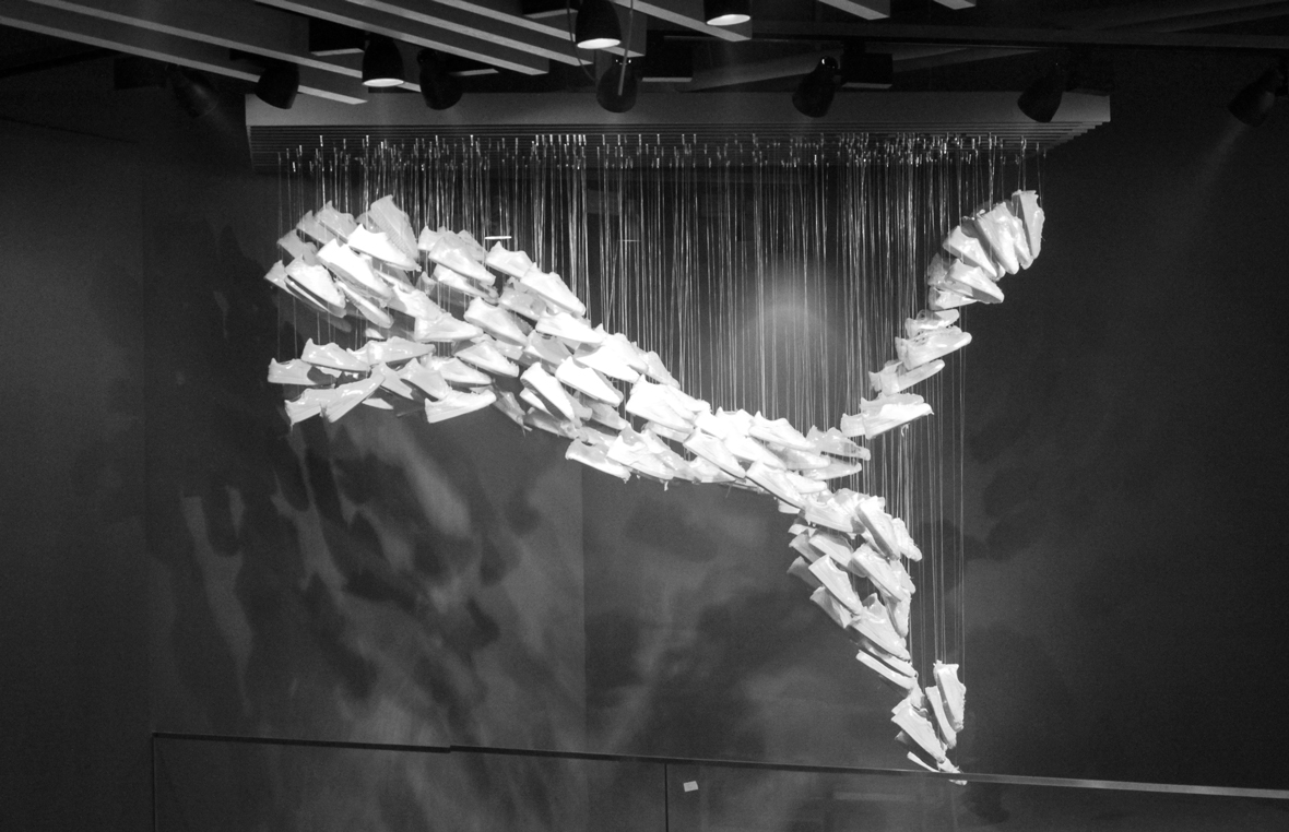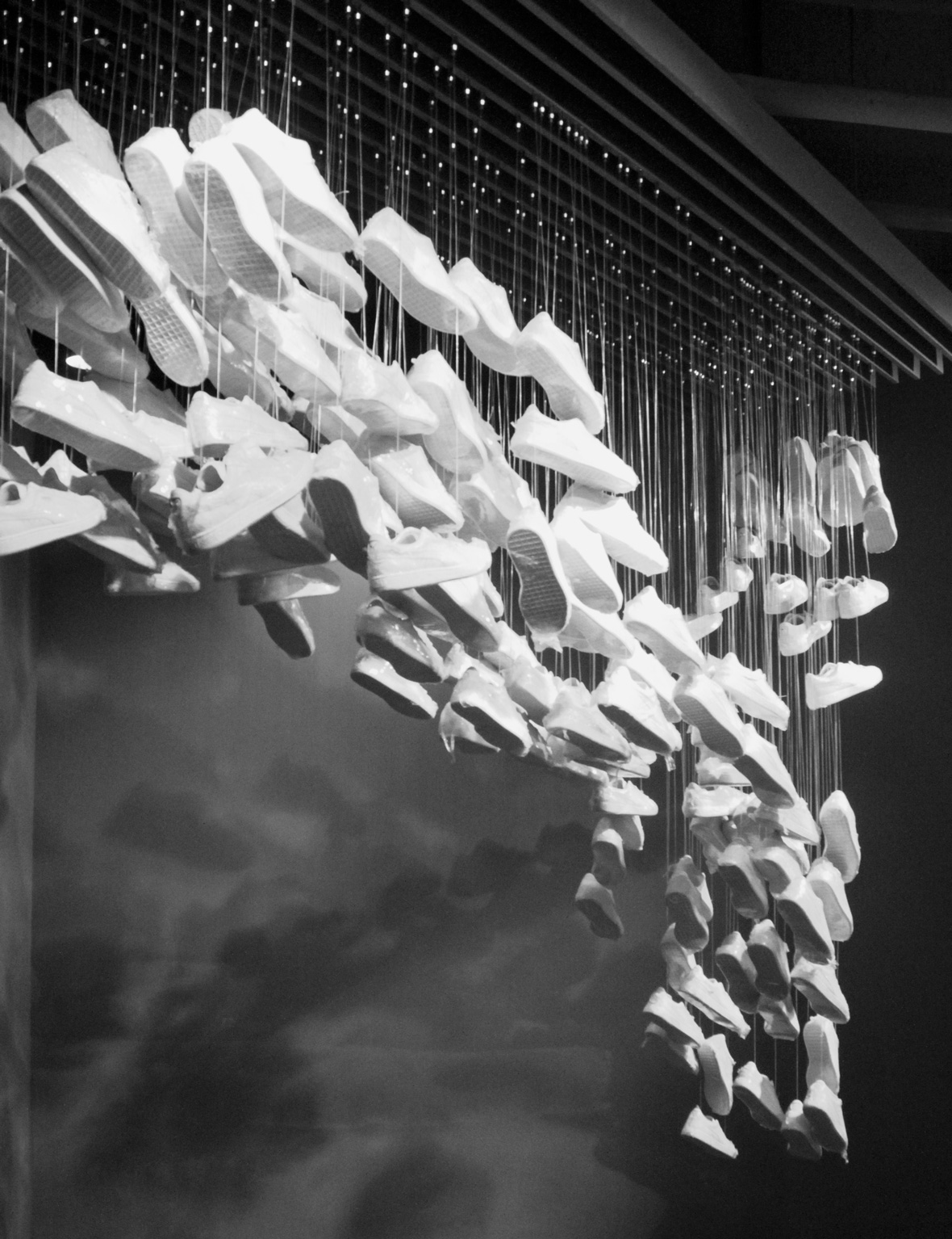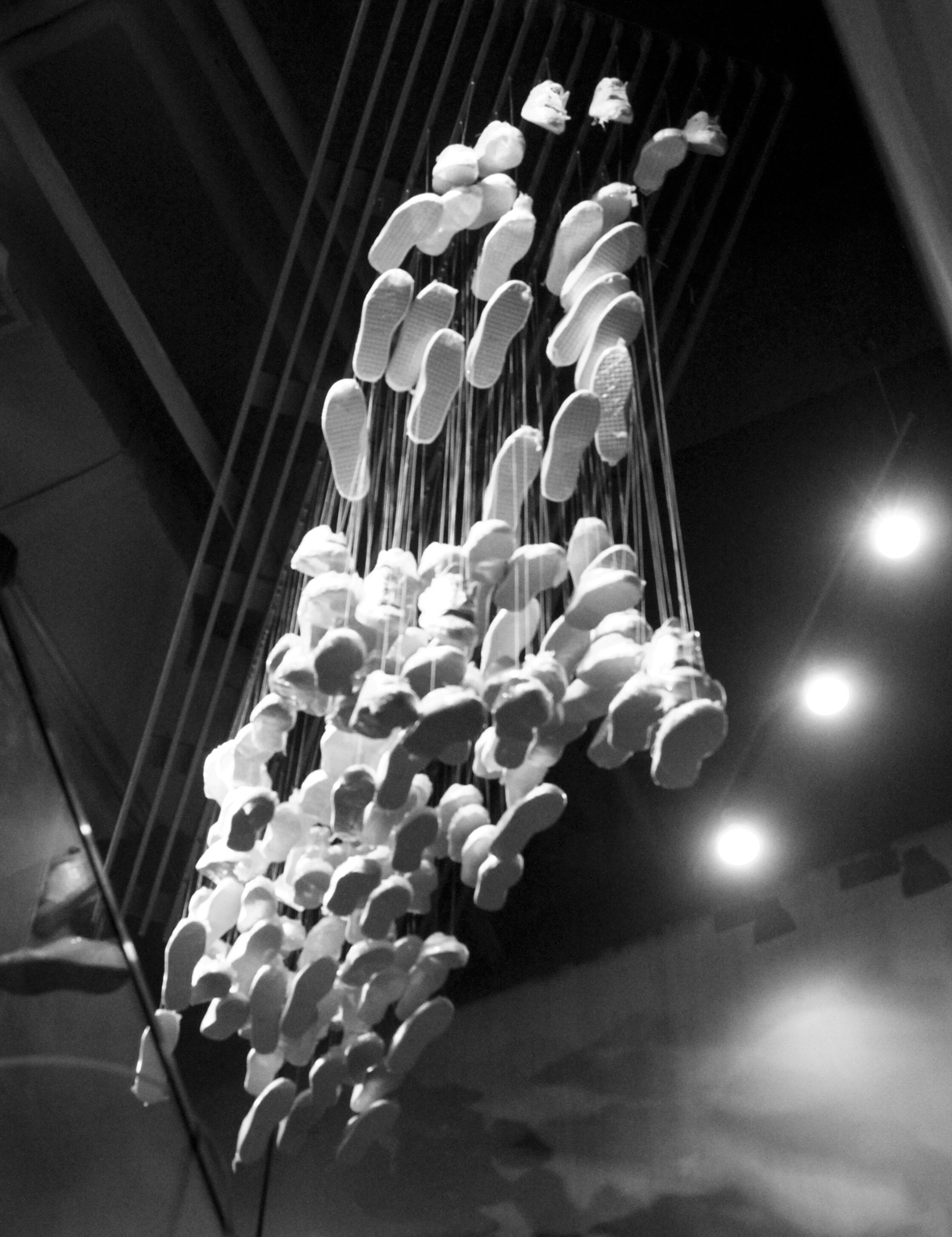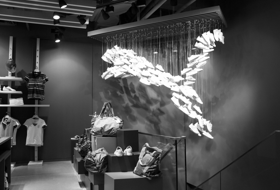
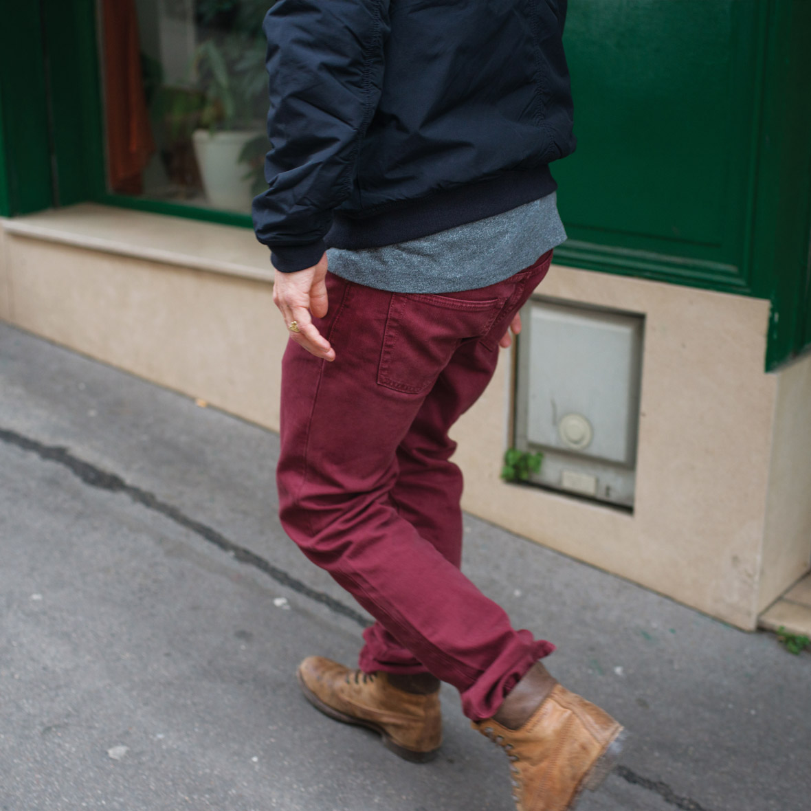
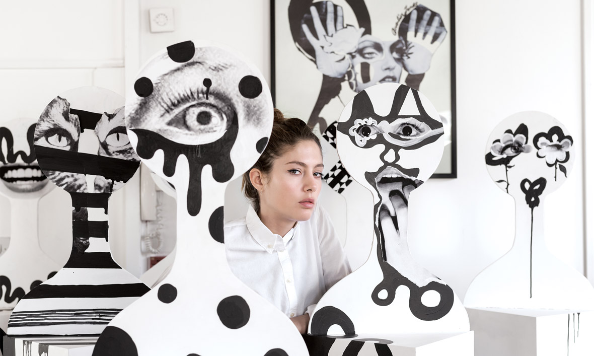
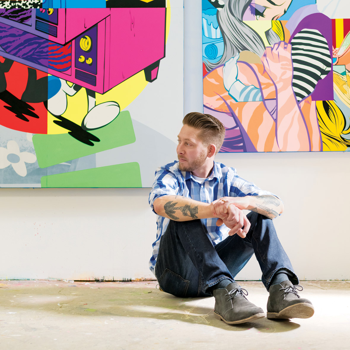
In 1969, a small store opened in San Francisco selling jeans and records to a new generation. Since then, Gap has grown to be a favorite around the world, establishing its place in pop culture with casual, cool clothing and iconic creative work.
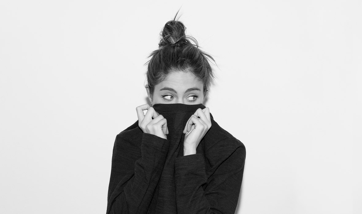
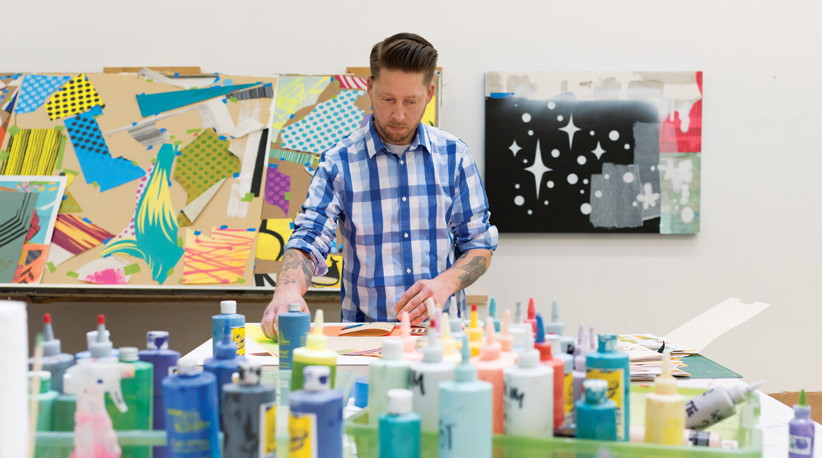
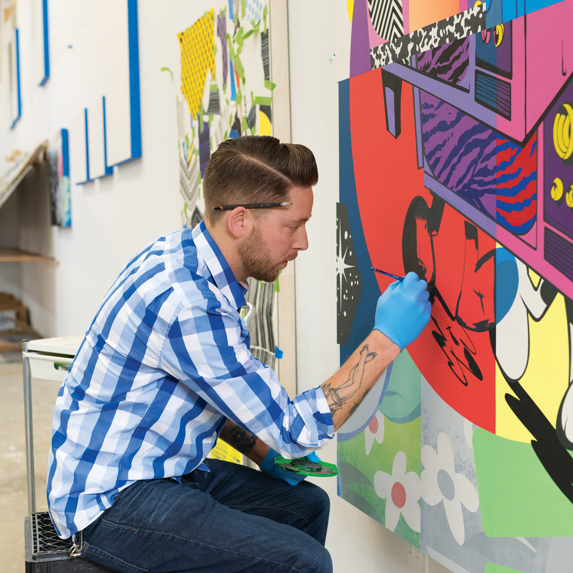
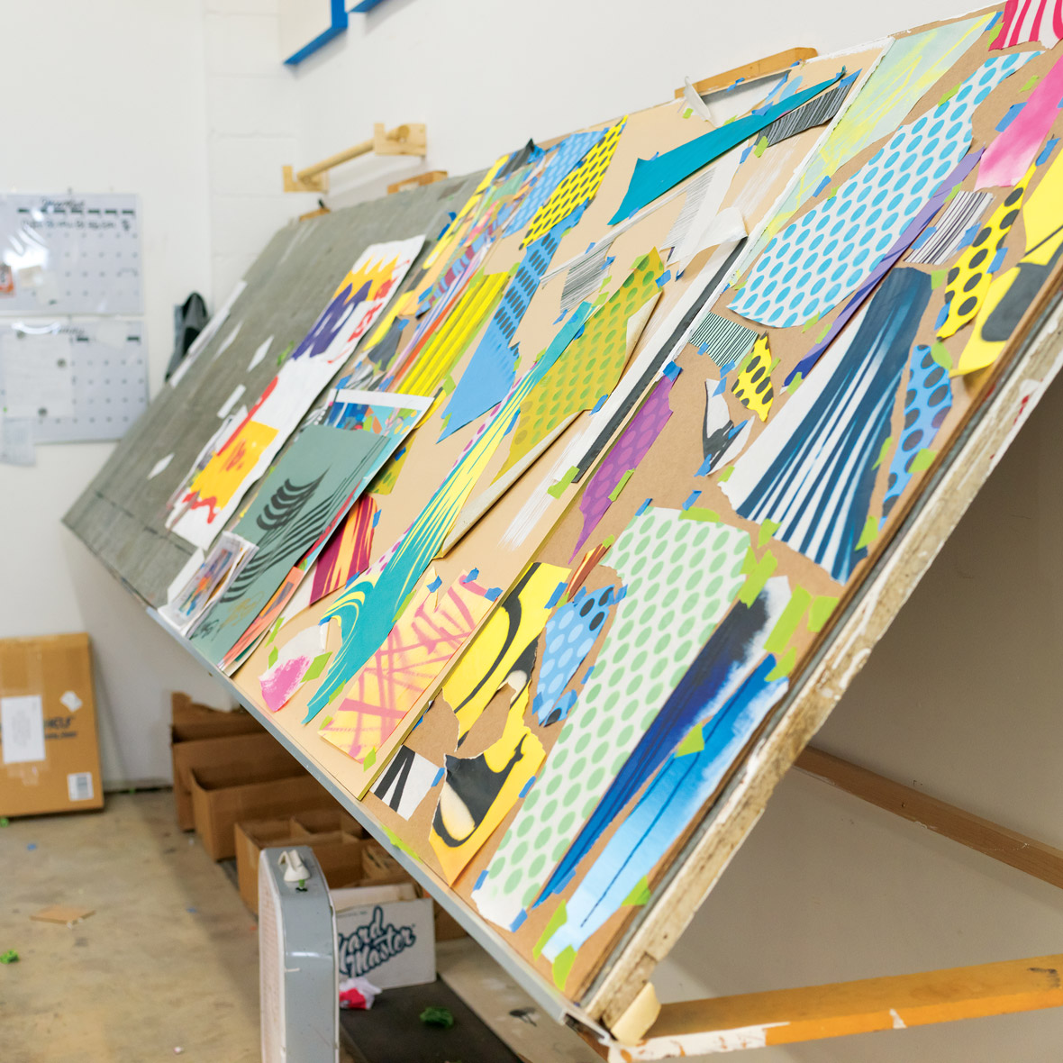
Gap has always stood for self-expression and embracing one’s individual style. Today, Gap continues to support the shared spirit of creativity and encouraging the genuine exchange of ideas. By bringing artists from all corners of the world together in the REMIX Project, Gap celebrates them for their passions and continues its heritage in creativity.
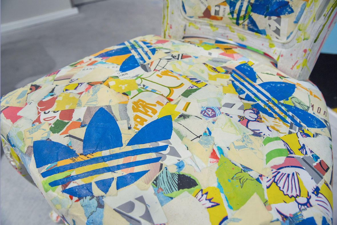
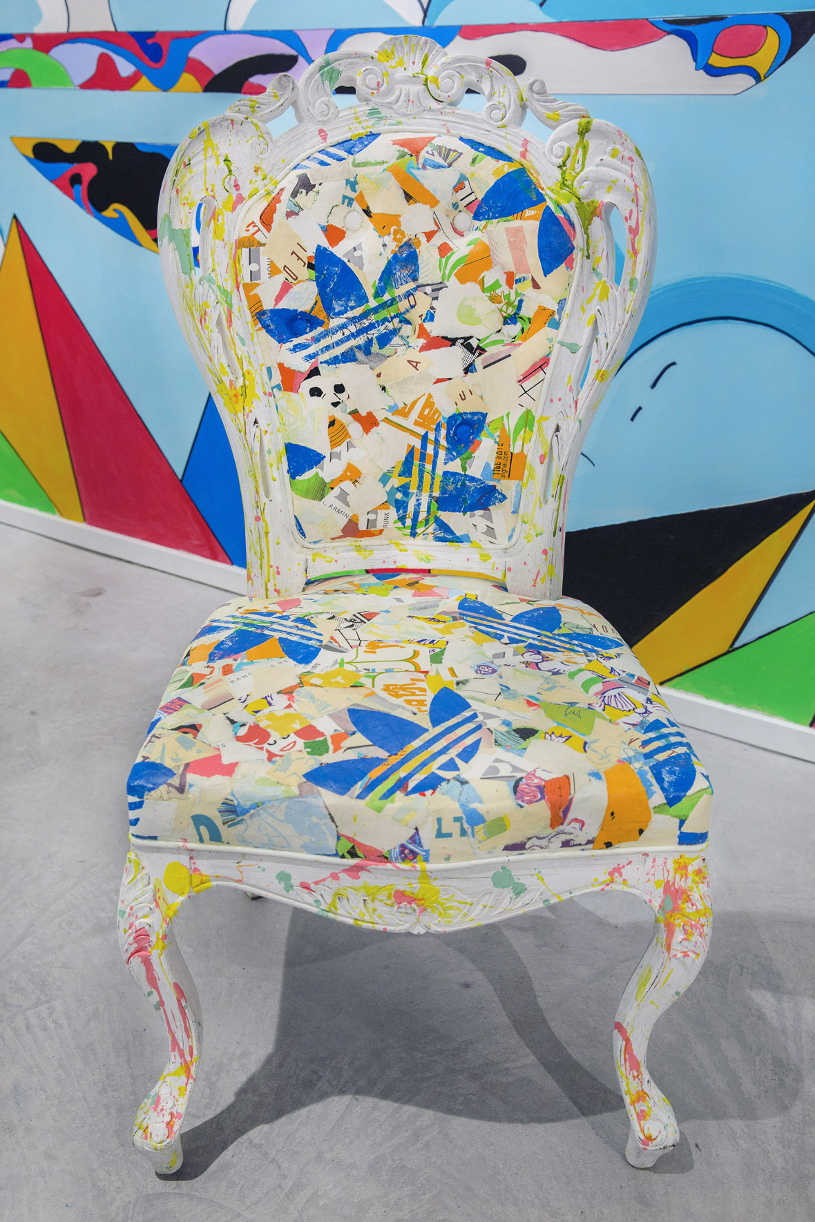
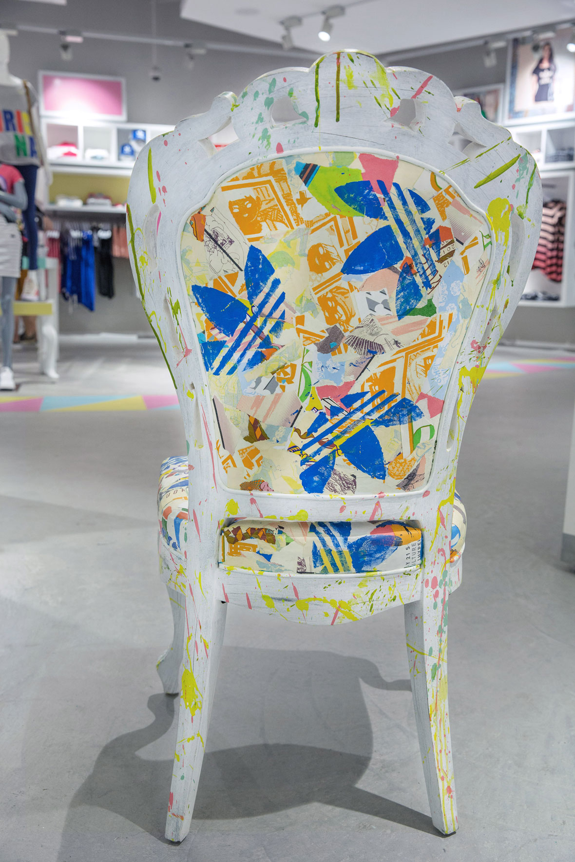
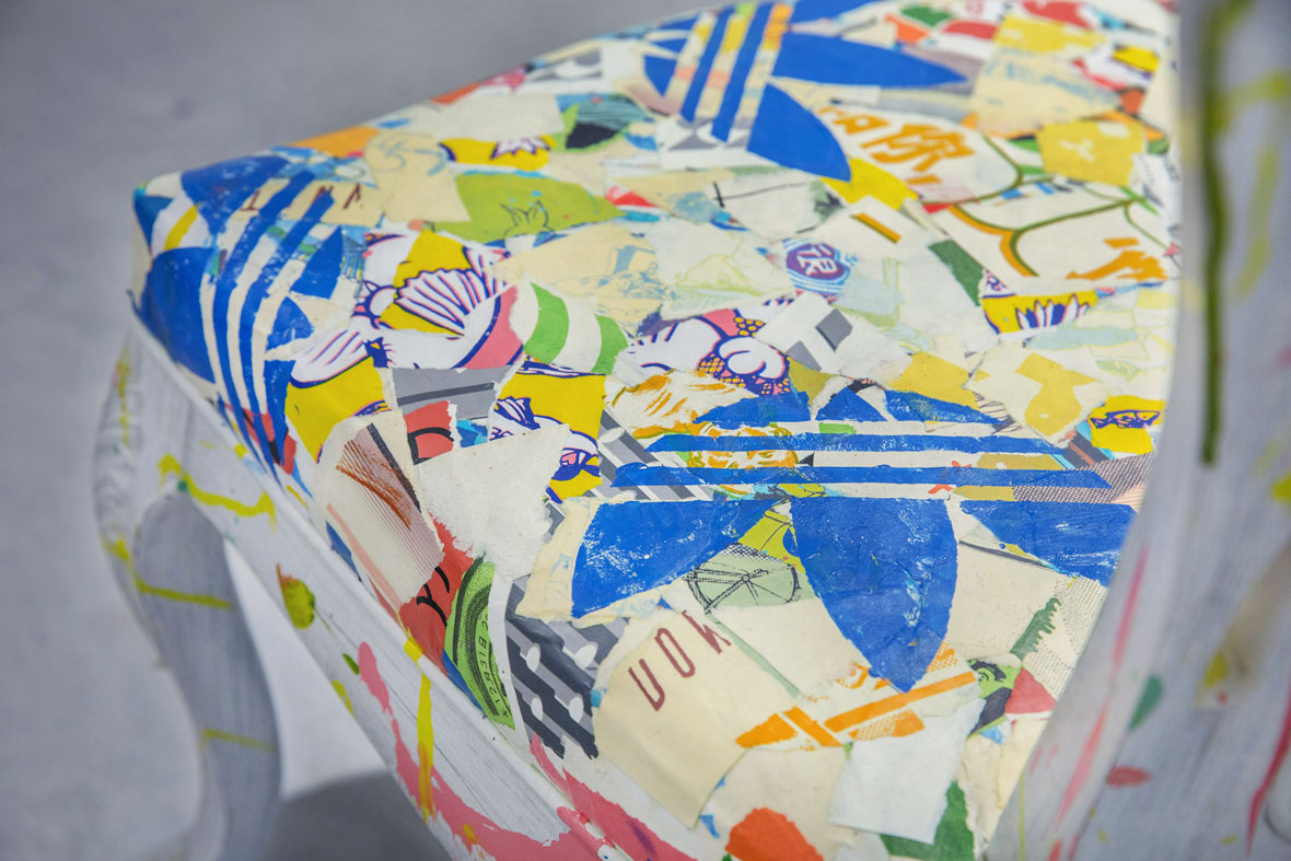
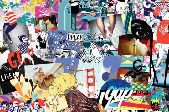
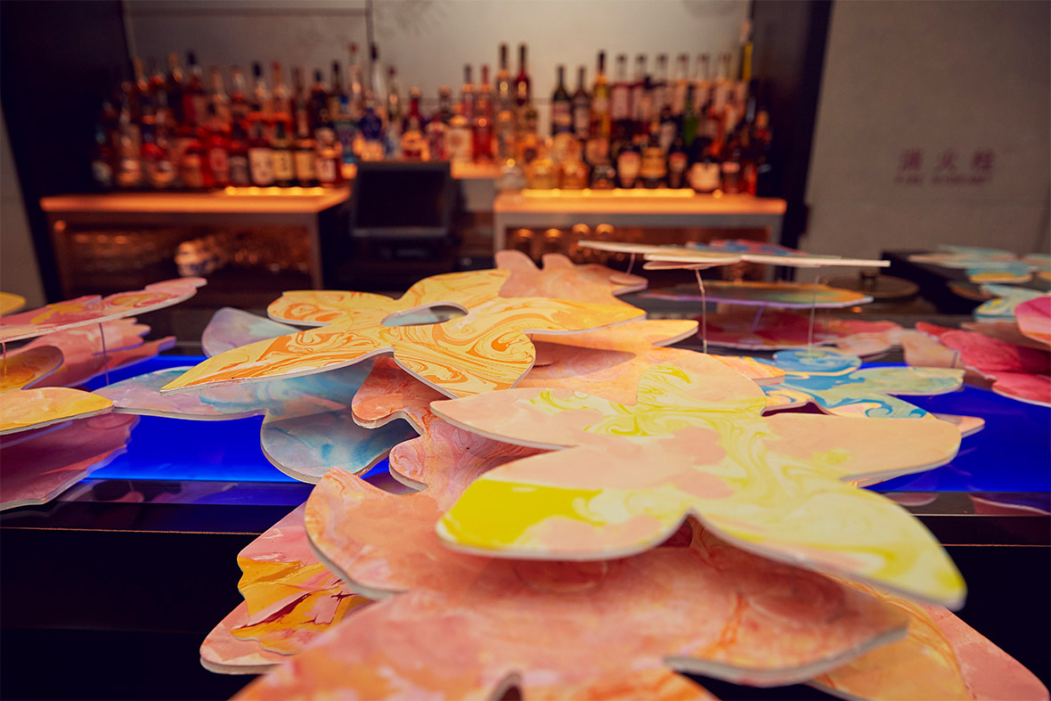
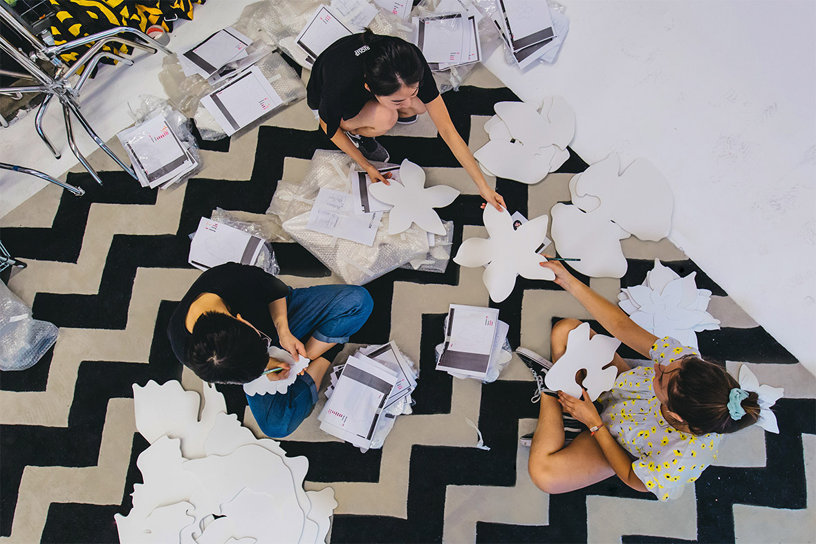
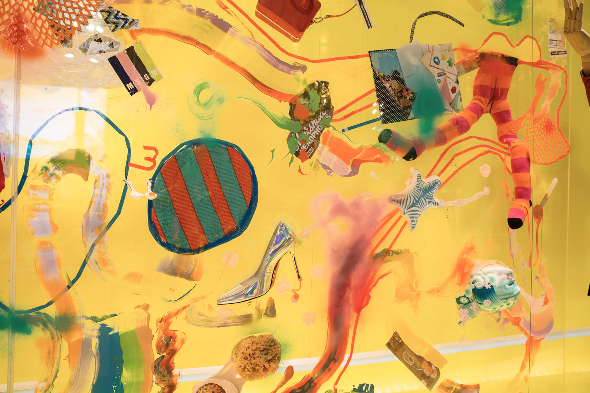
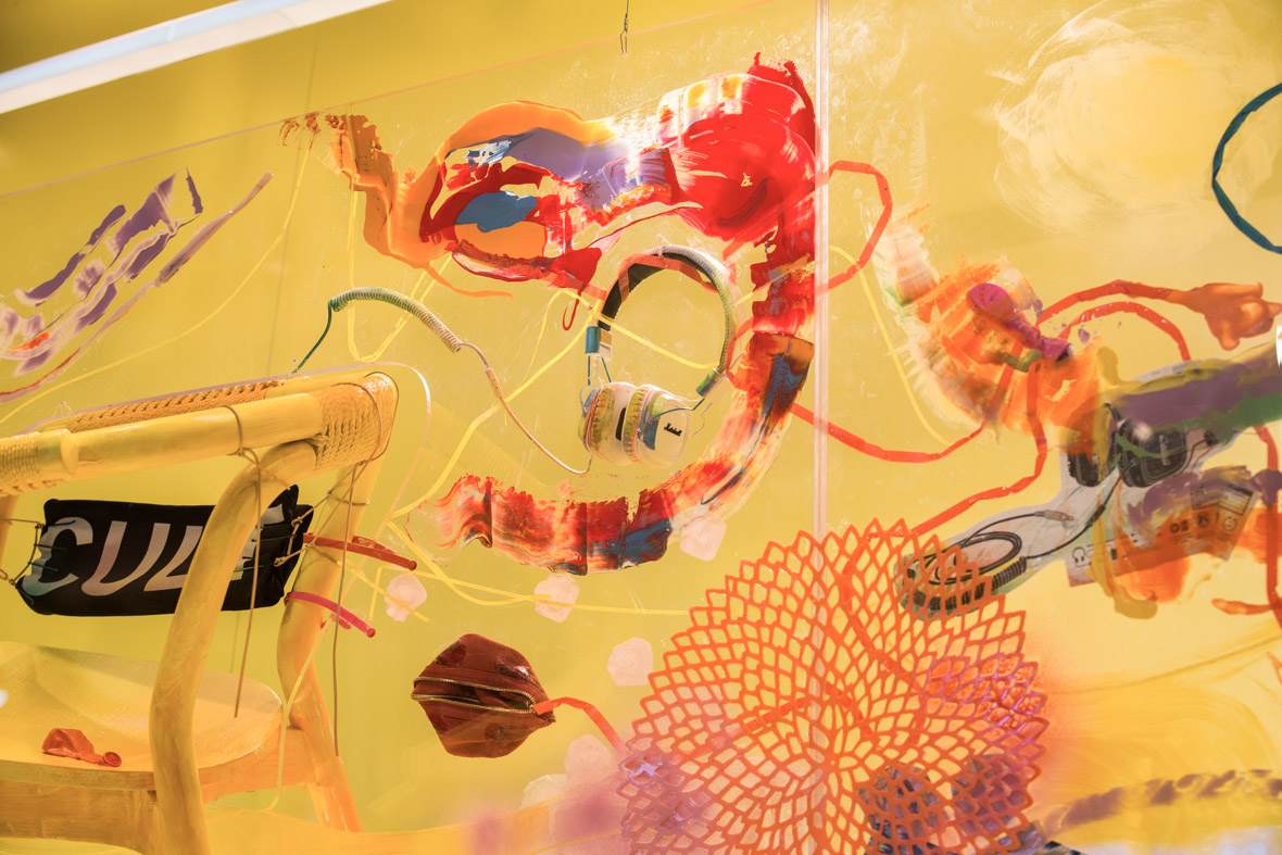
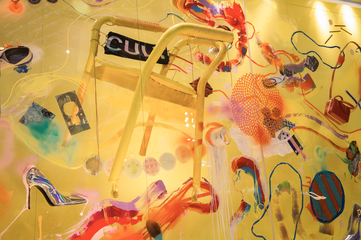
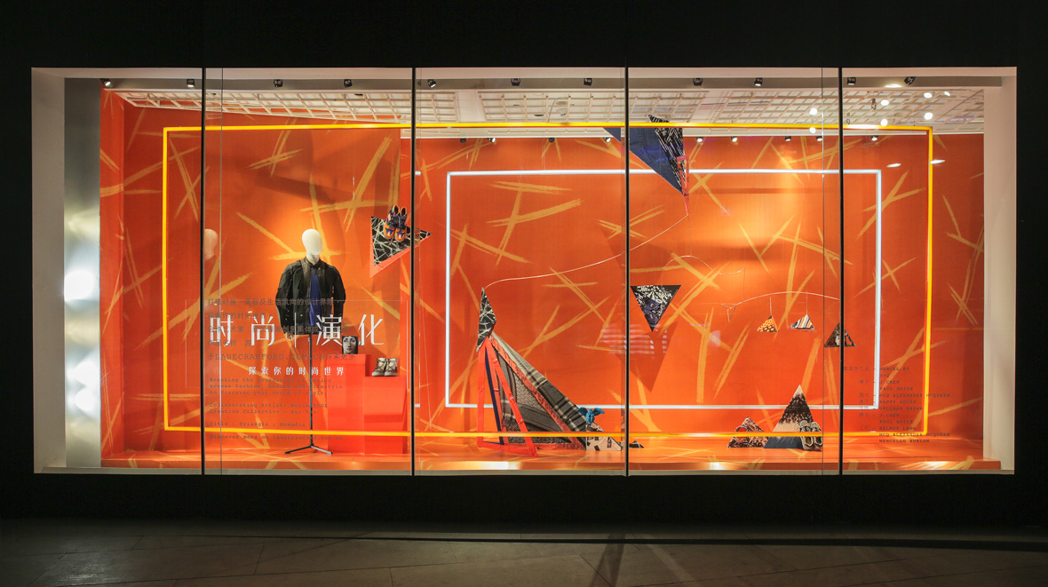
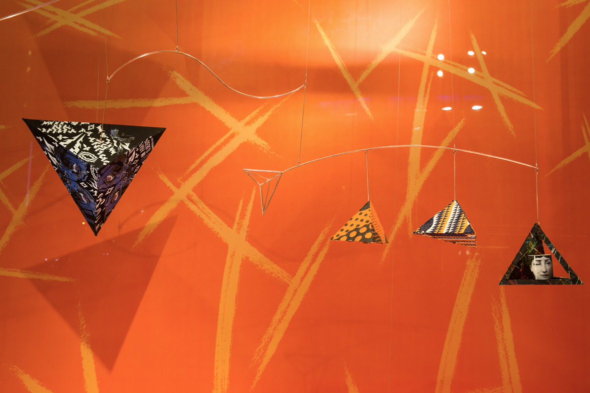
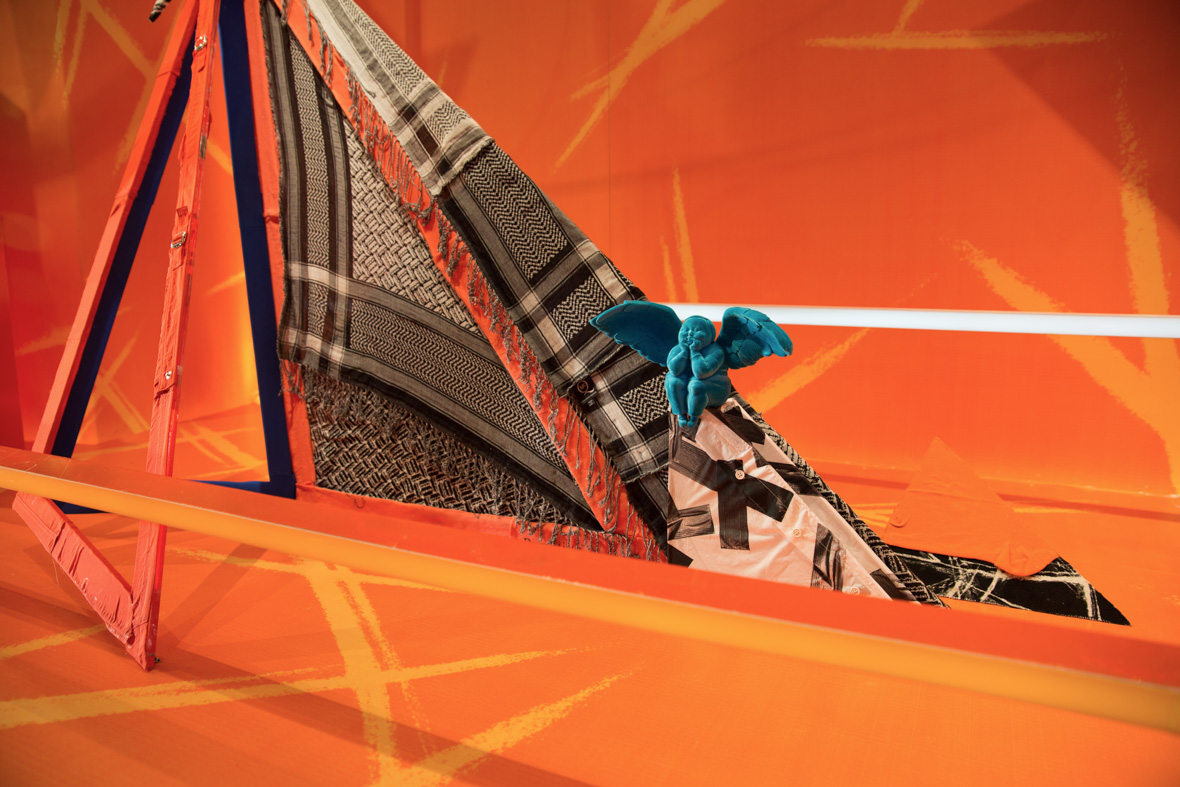
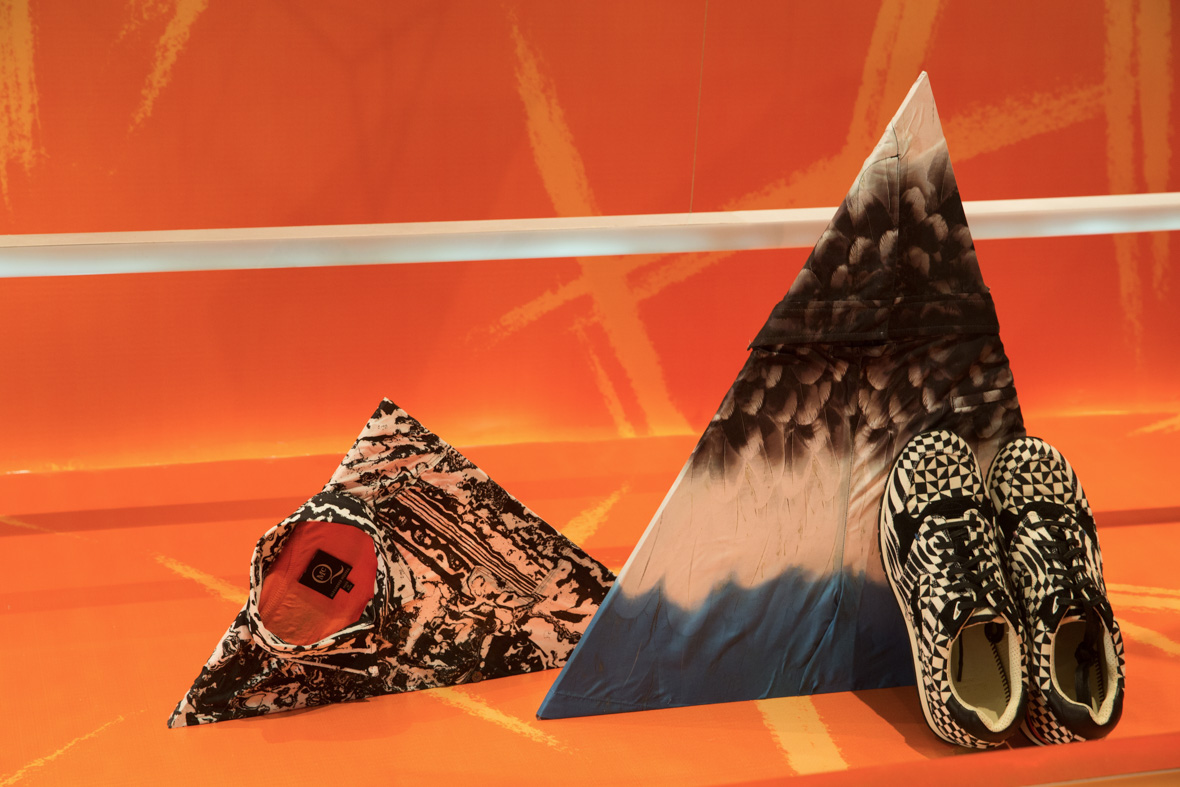
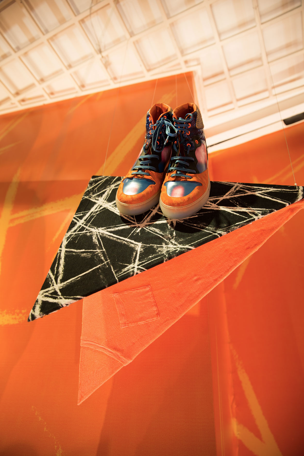
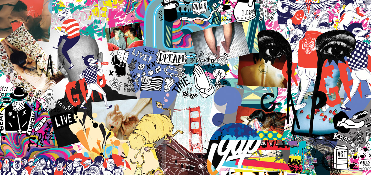
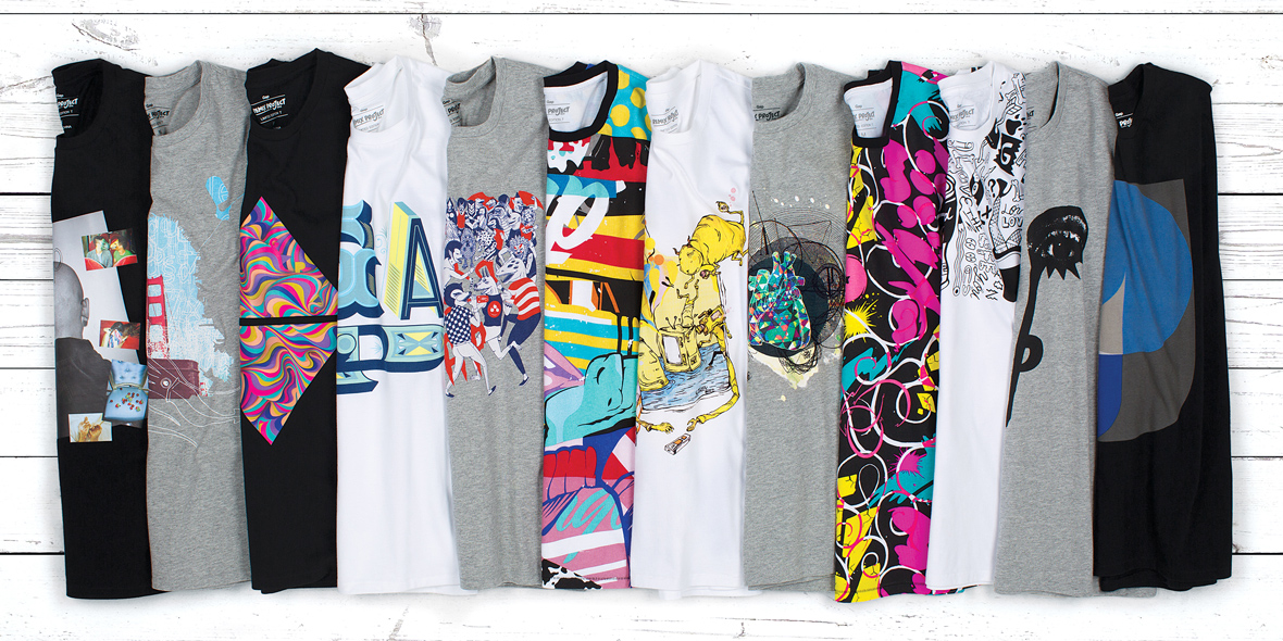
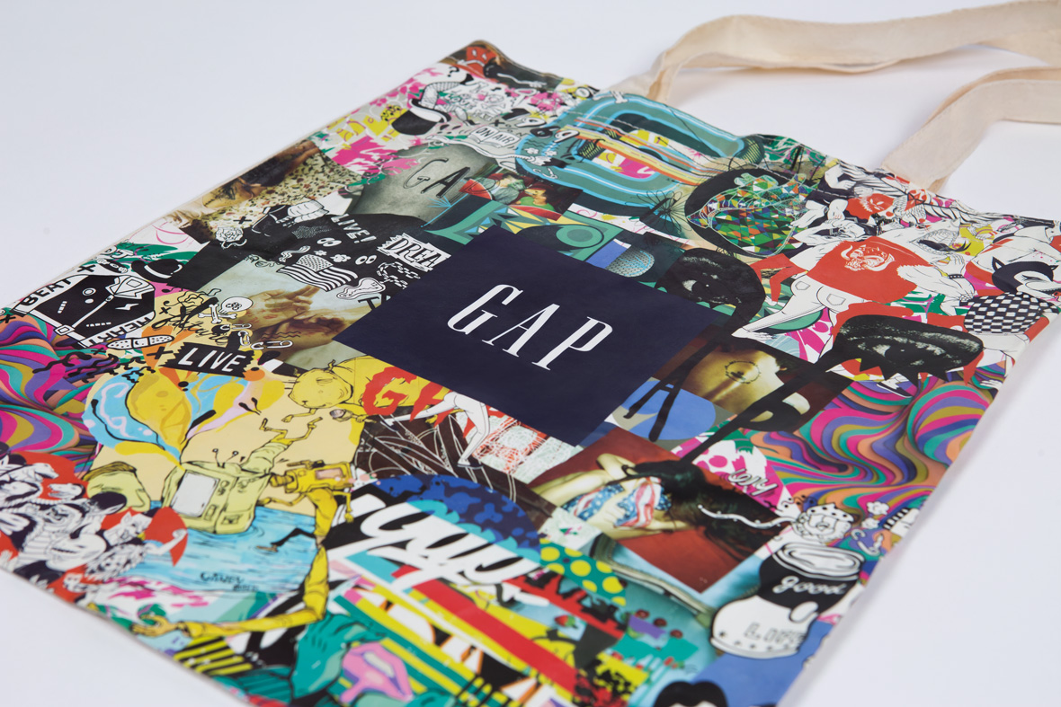
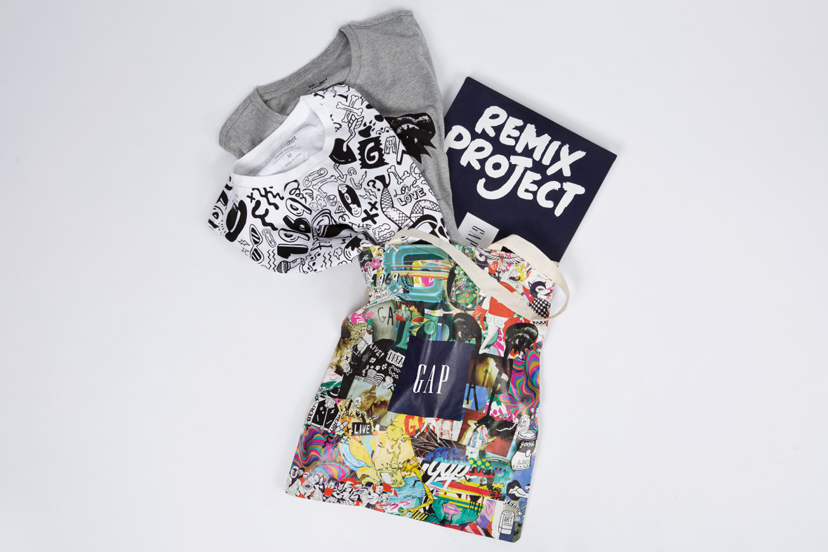
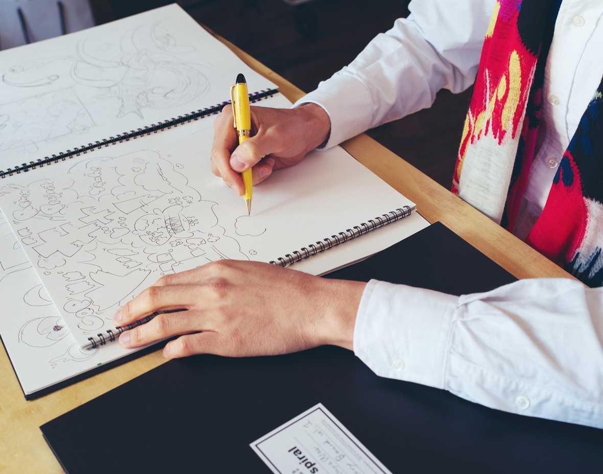
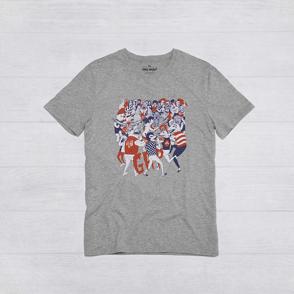
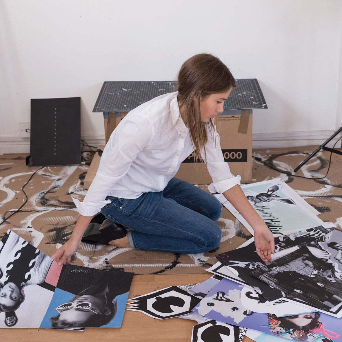
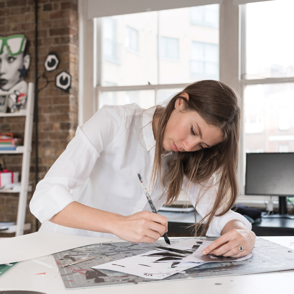
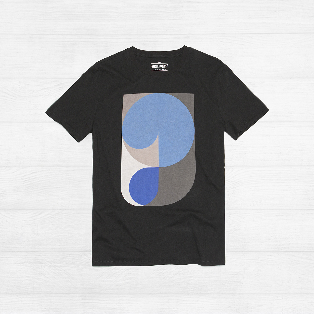
The REMIX Project brings together 12 leading-edge American, British, French, Chinese, and Japanese artists to create an exclusive collection of limited edition graphic tees. Artwork in the collection remixes the classic Gap logo T-shirt into bold art treatments that showcase the distinctive style of each artist and celebrate the creative heritage of Gap.
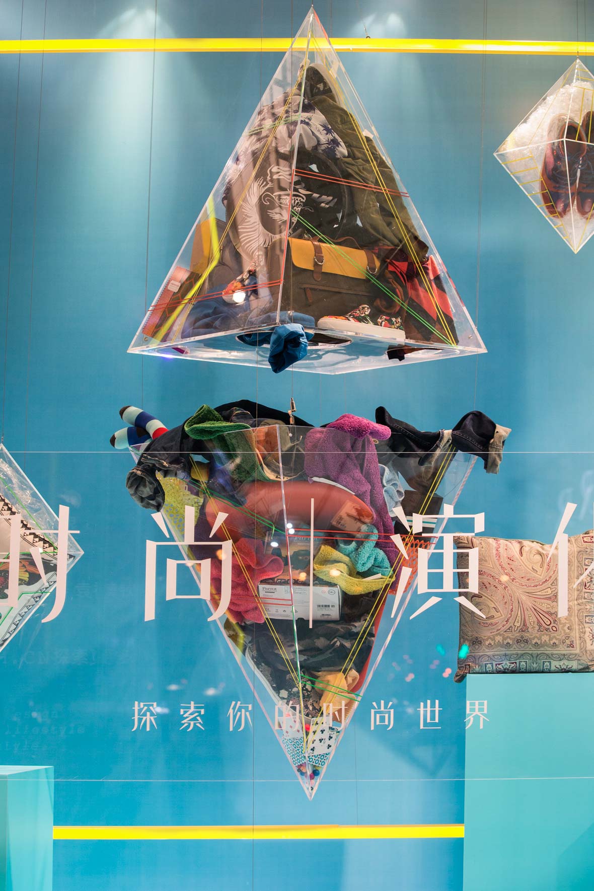
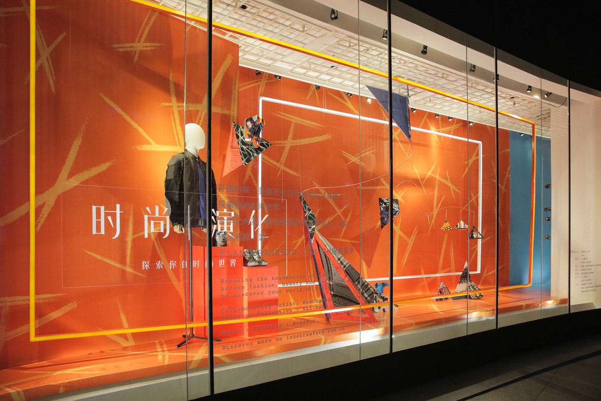
1969年,旧金山开出一家专门卖牛仔服装的小店并开启了一个新纪元。从次,Gap在流行文化领域以其休闲、酷和标志性的创意内容迅速风靡全球。
Gap一直主张自我表达和接受主义的个人风格。如今,Gap继续坚持和鼓励着共享创意的交流精神。此次通过REMIX Project将世界各地的艺术家集合在一起,Gap要为他们的激情和源源不断的创造力喝彩。
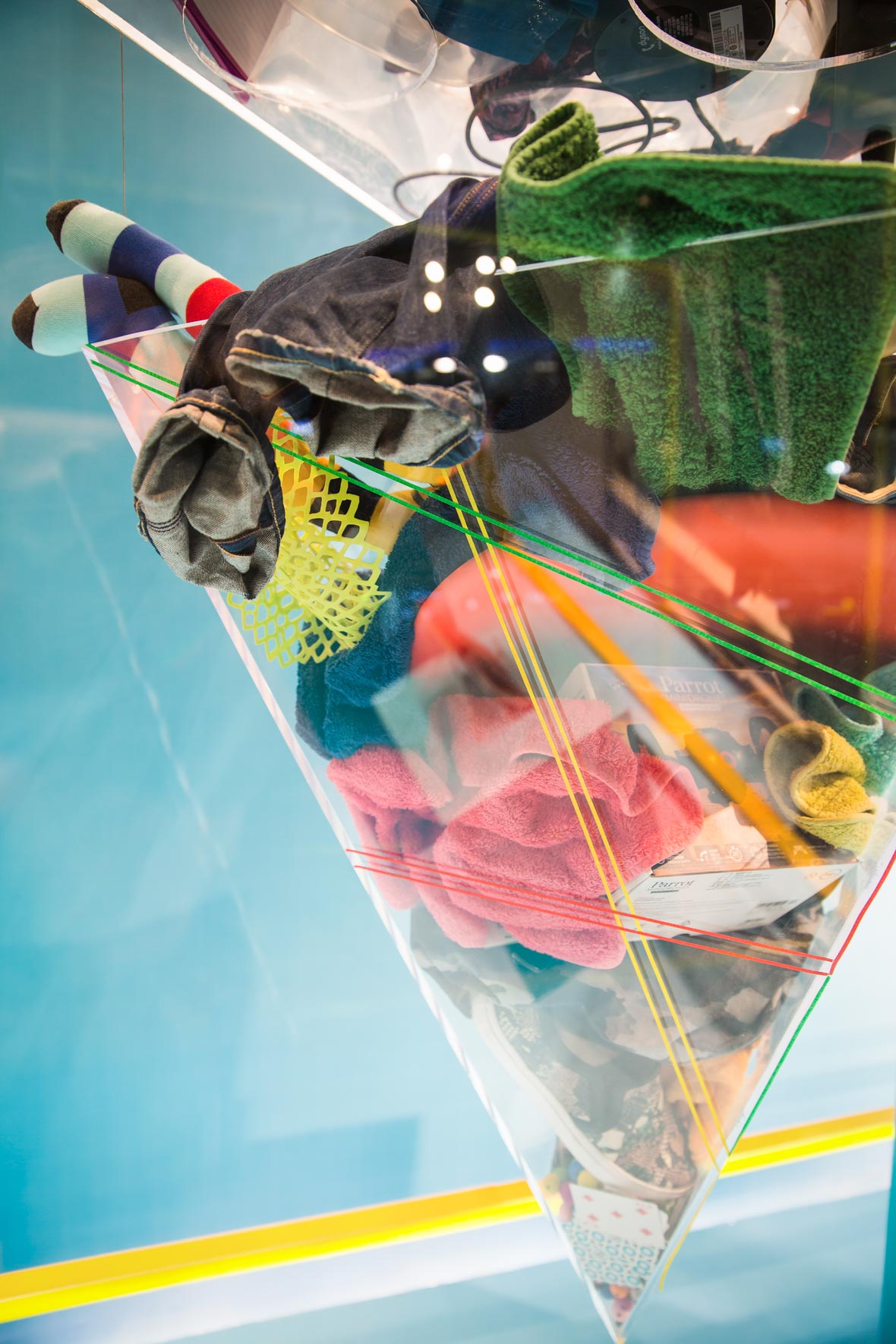
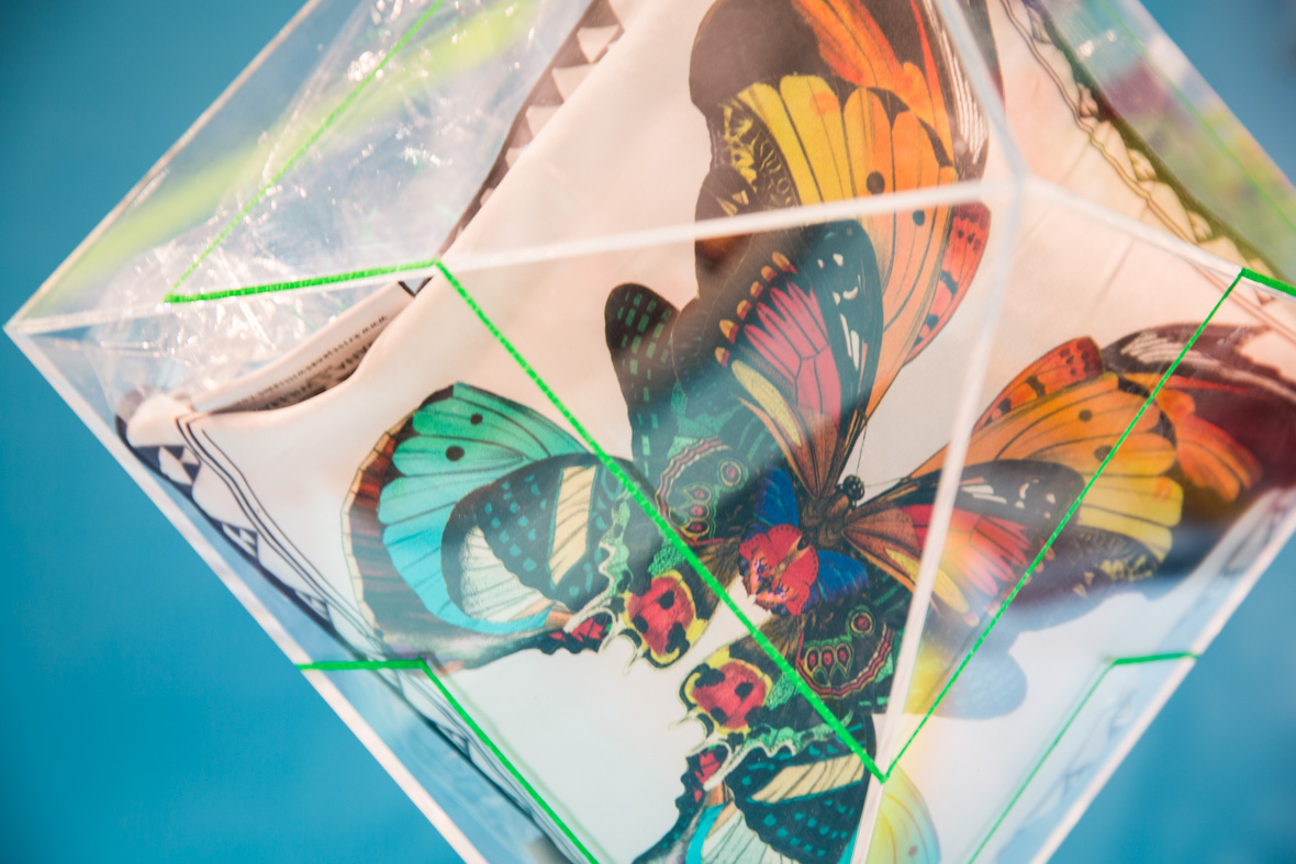
REMIX Project让12位分别来自美国、英国、法国、中国和日本的先锋艺术家一起完成了这一限量版图案T恤系列。他们分别以经典的Gap logo为创意出发点并将风格鲜明的个人艺术特色融合在各自的设计中。
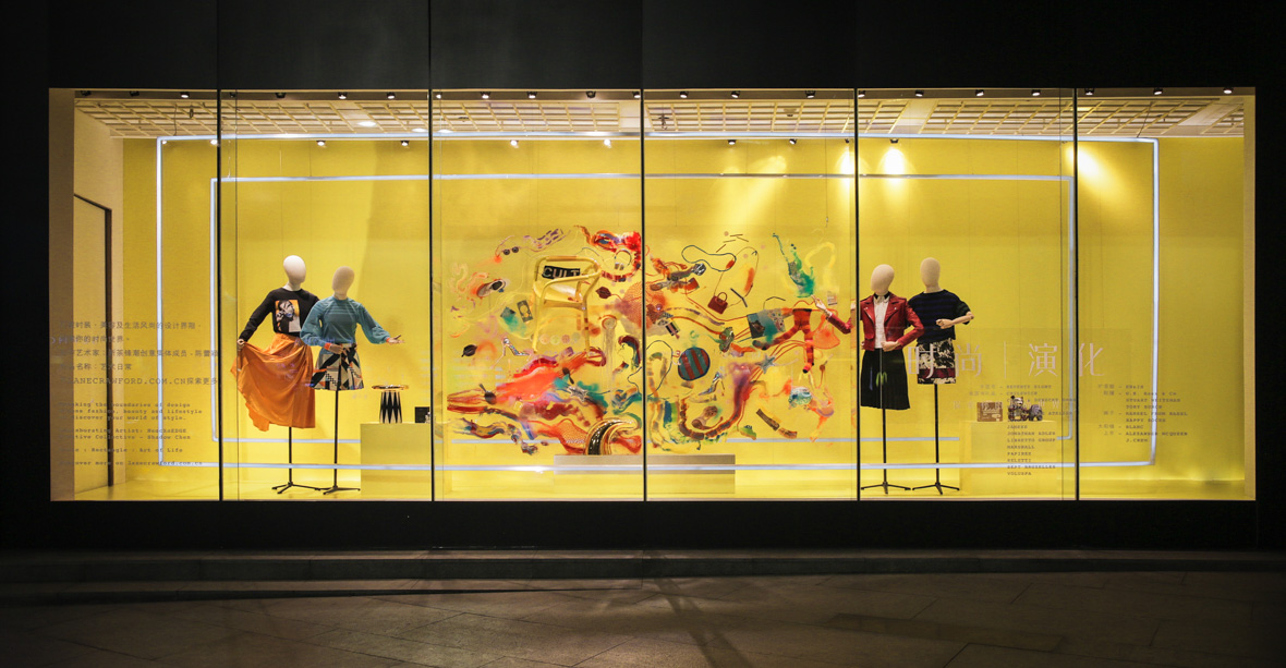
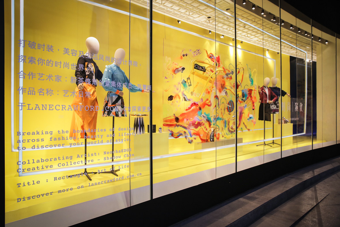
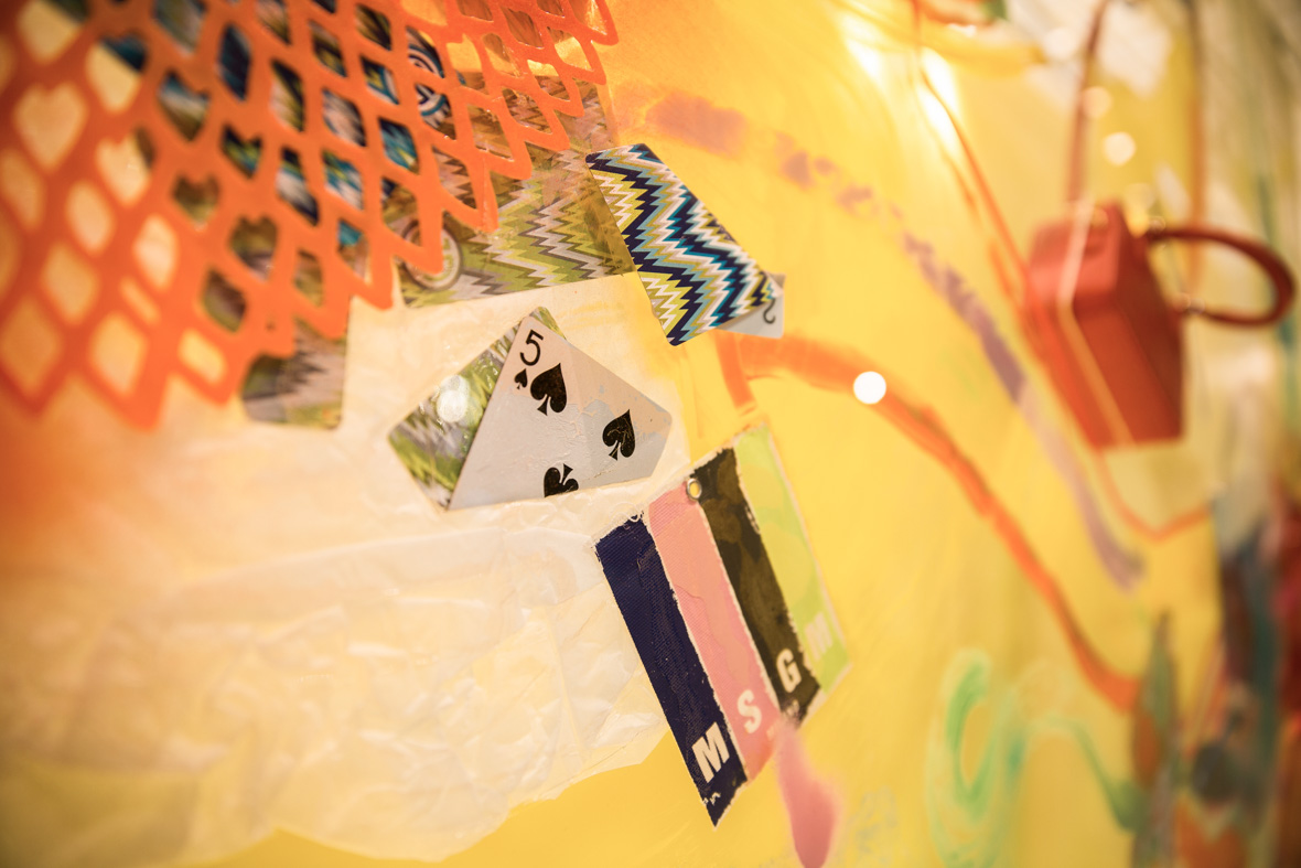
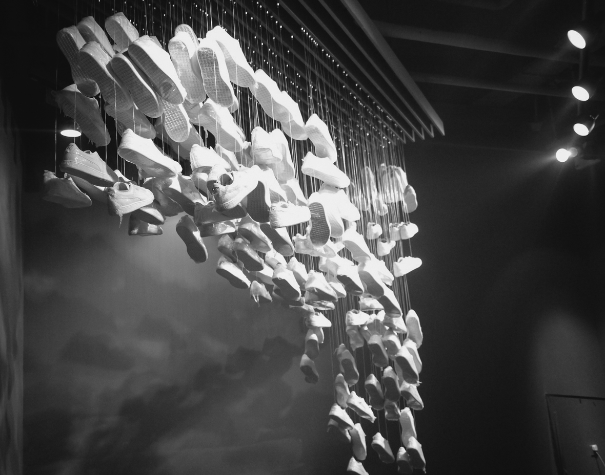
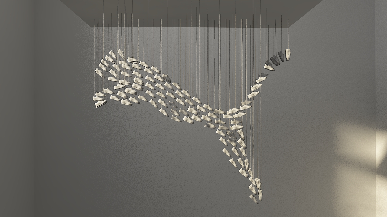
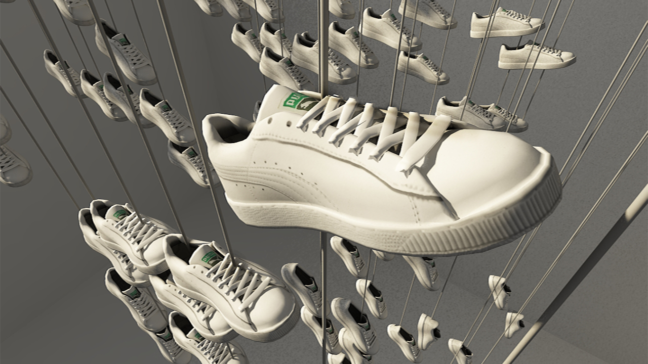
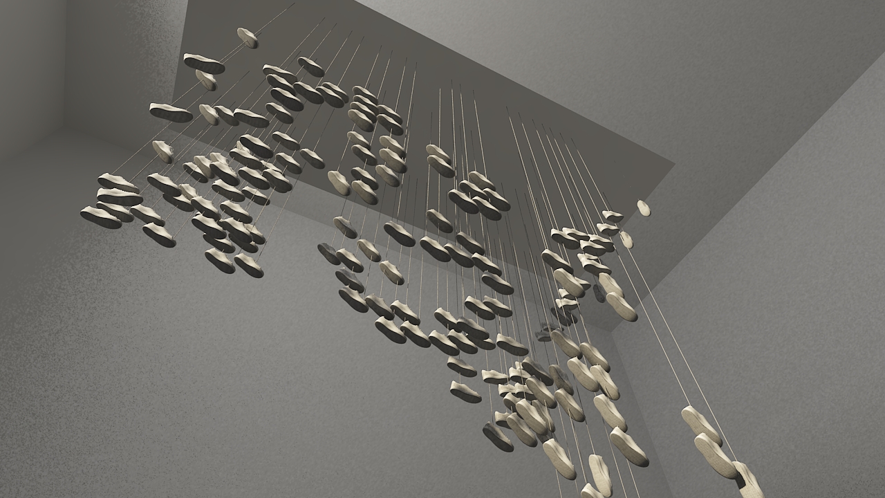
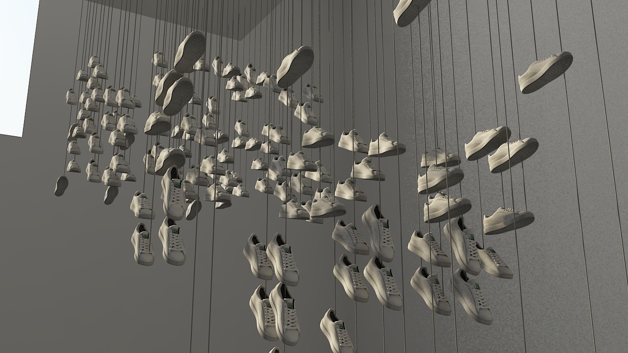
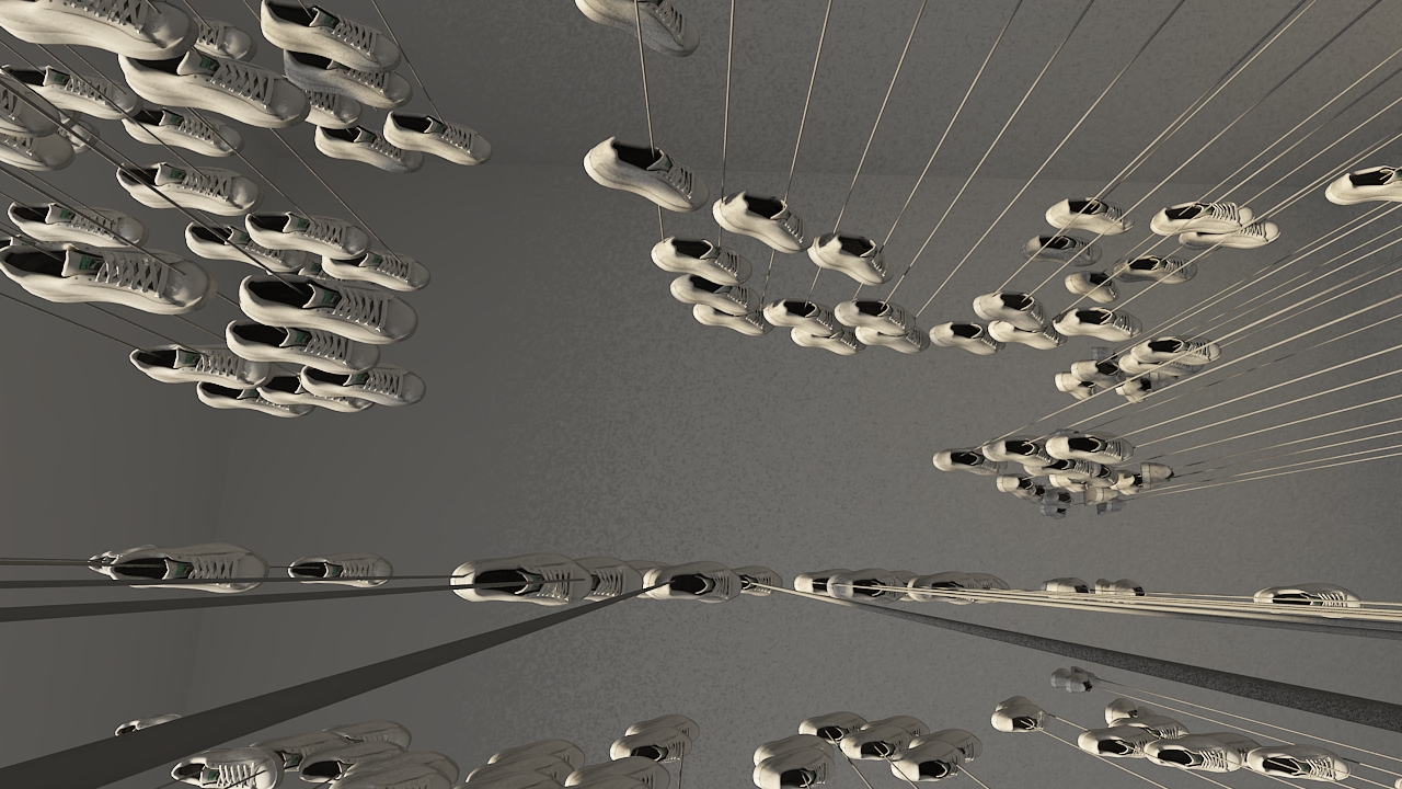
REMIX Project Collection
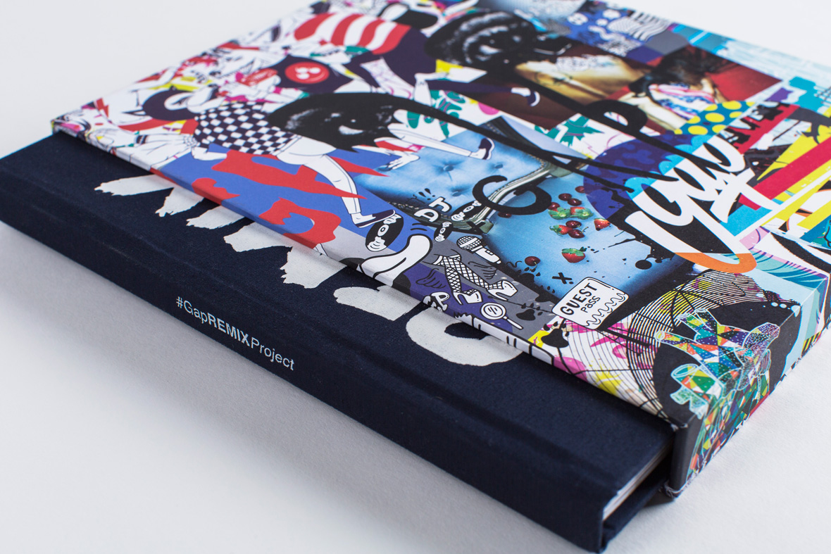
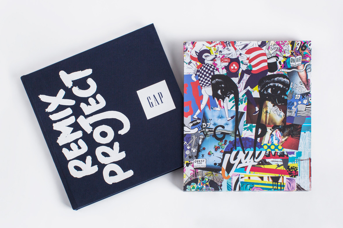
REMIX Project Book
无法观看?前往优酷
REMIX Project Tote
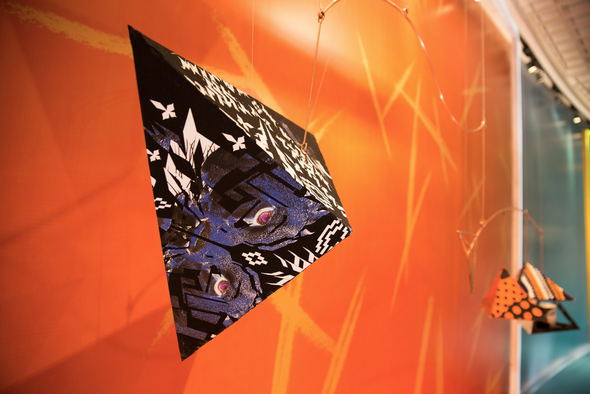
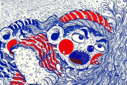
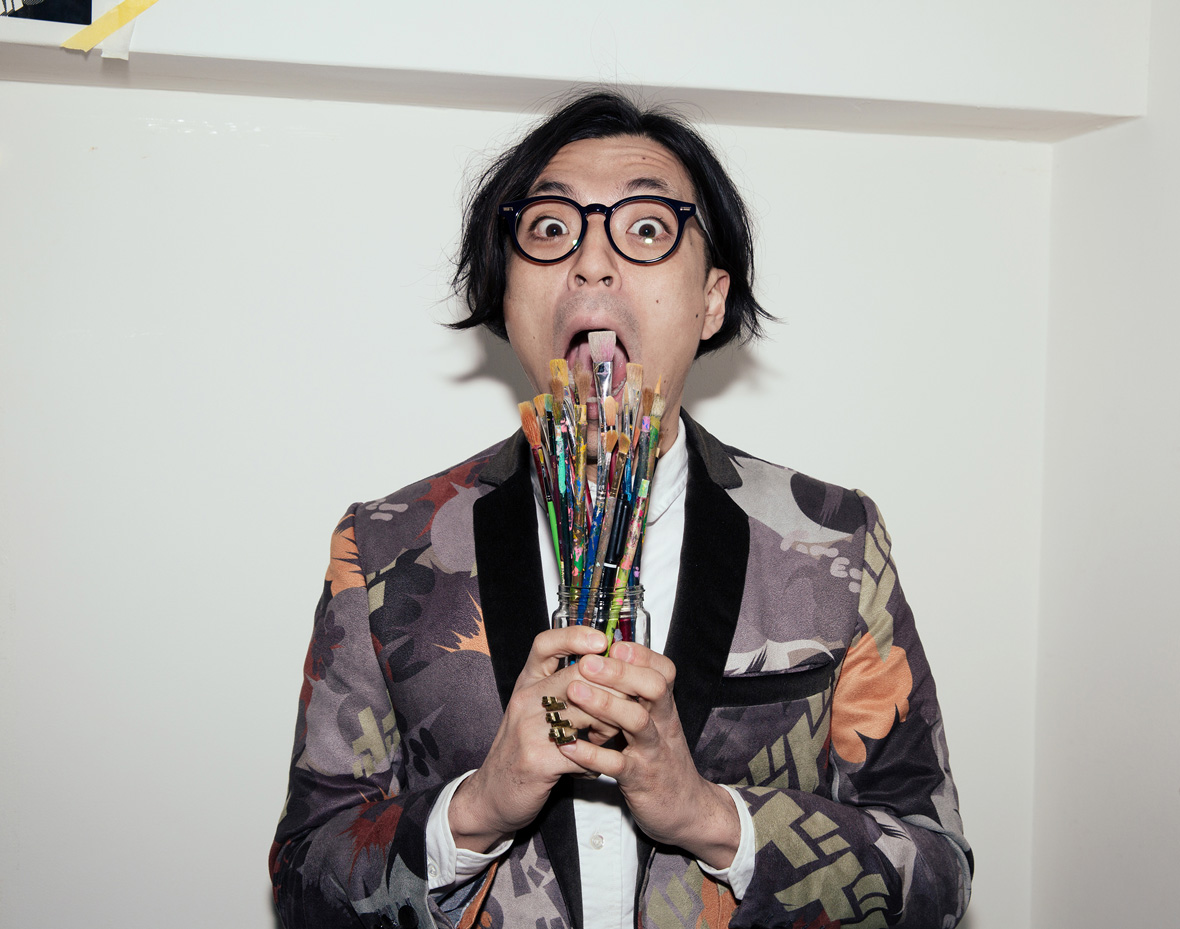
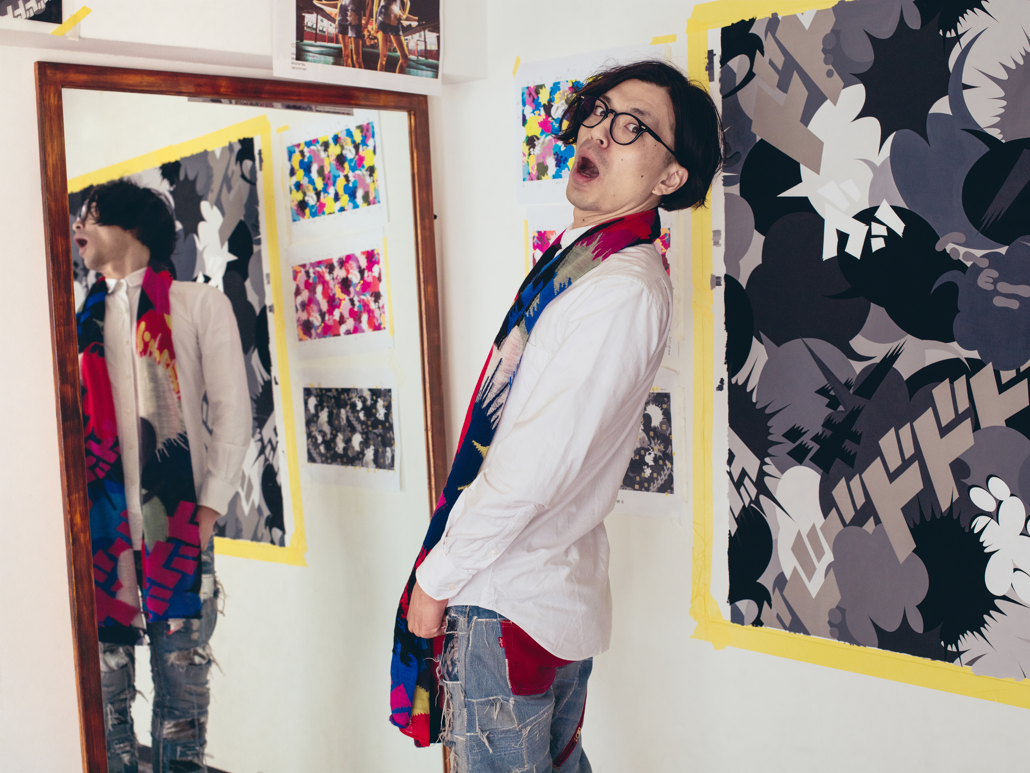
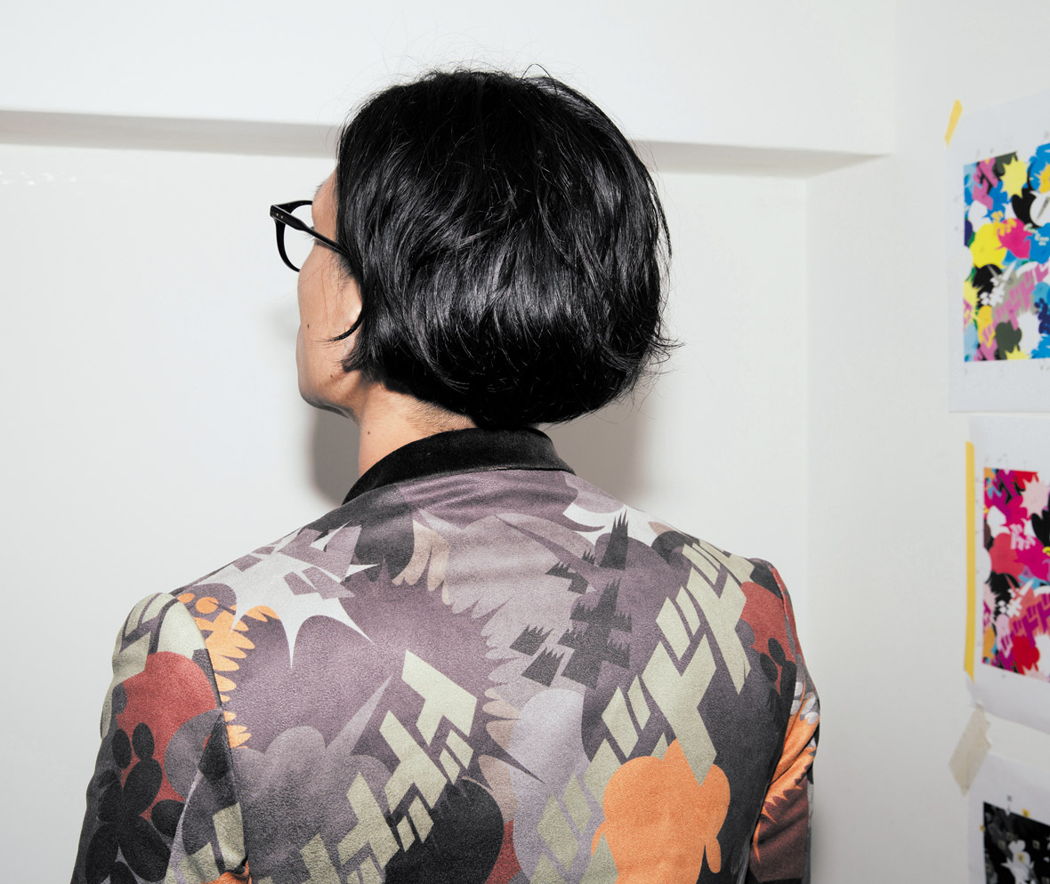
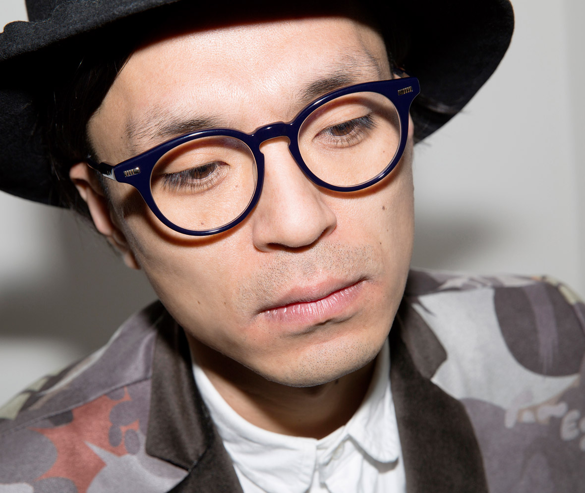
Fantasista Utamaro - Japan
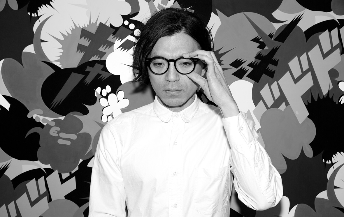
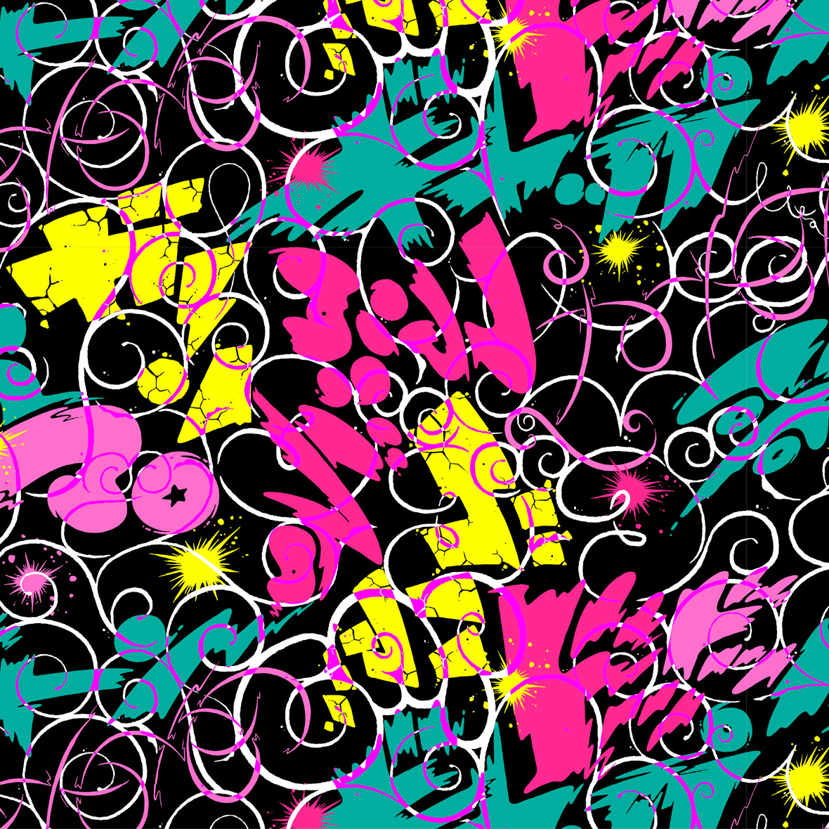
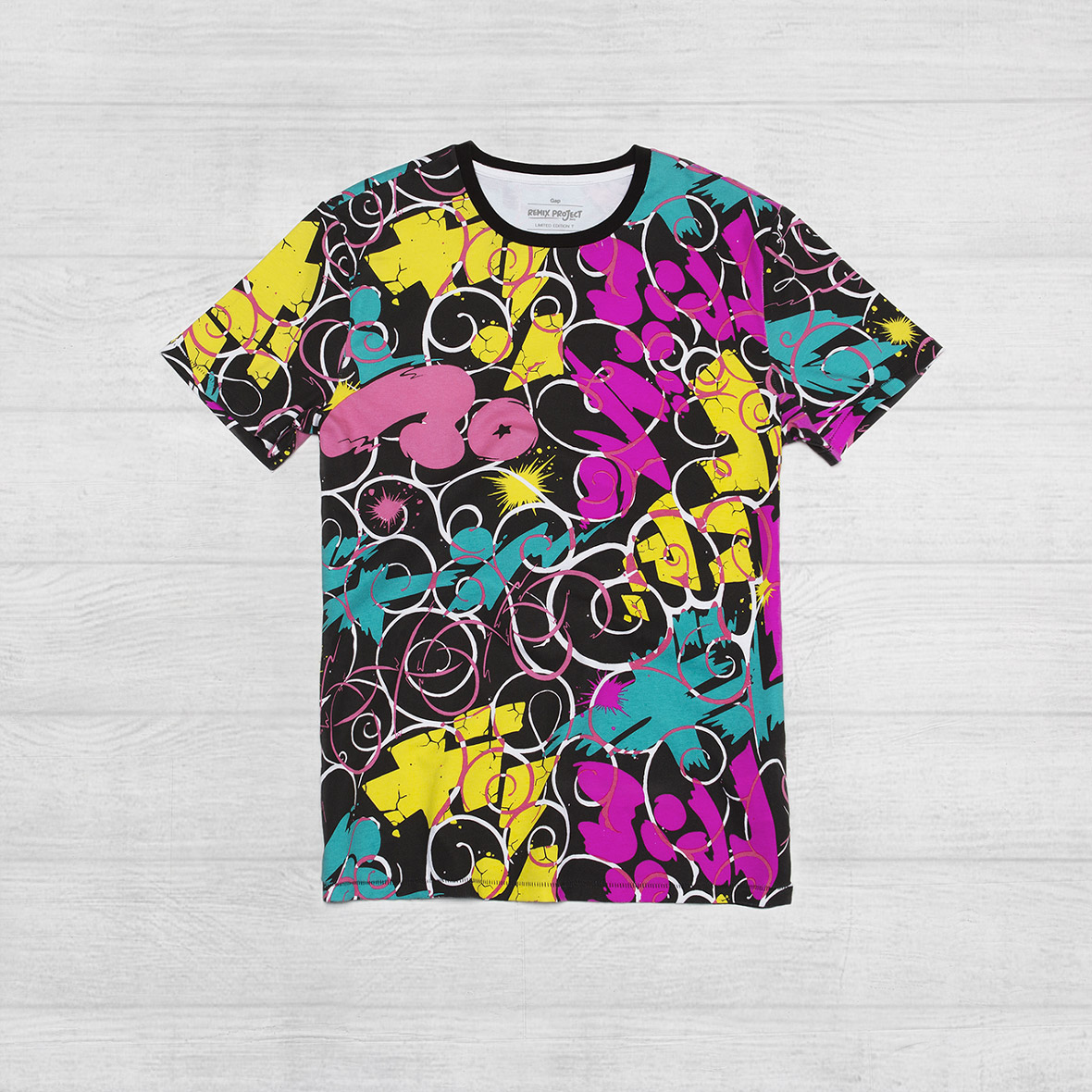
Fantasista Utamaro is a leading manga and multi-medium artist. Known for ultra pop and technicolor sensibilities, his instantly recognizable work spans the fields of illustration, animation, graphic / textile / fashion design, and even outdoor landscaping.
His design for the REMIX Project hides the brand logotype within traditional Japanese “Karakusa” patterns, pop art coloring, and manga-styled characters. The piece represents hope for the development of cultures around the world.
Fantasista Utamaro是一个知名漫画家及多媒体艺术家。他以波普元素及明锐的色彩著称,他的插画、动画、图形、纹样、时尚设计甚至户外景观设计极易被辨别出来。
他为此次REMIX Project设计的作品中融合了日本传统的“Karakusa” 纹理、波普艺术色彩和漫画风格形象。这个作品代表着将文化发展蔓延至全球的寄望。
无法观看?前往优酷
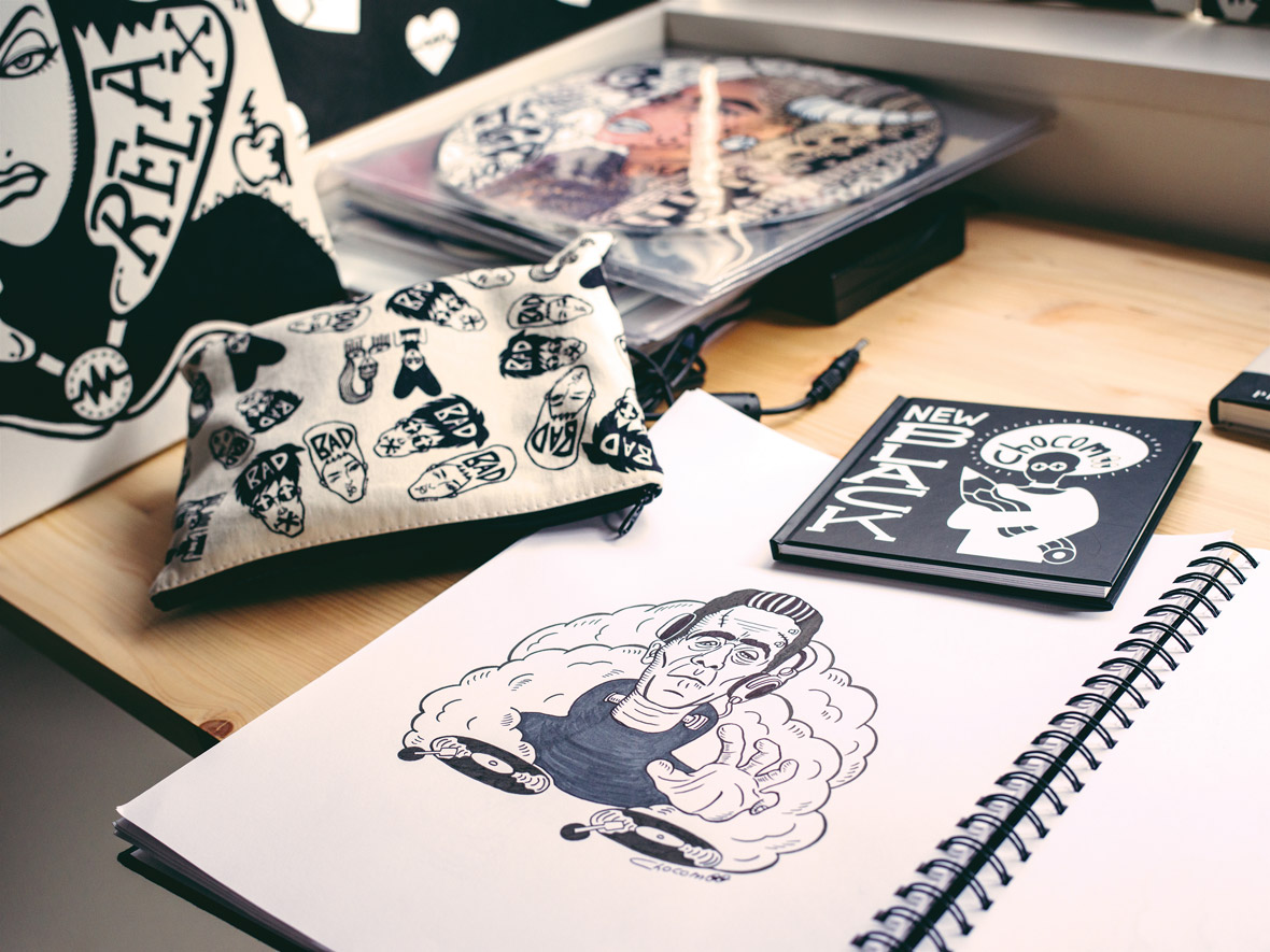
Chocomoo – Japan
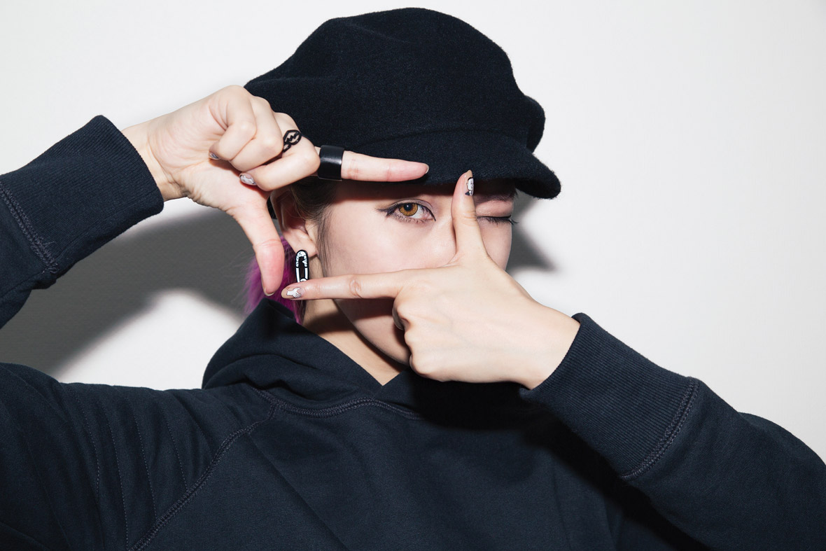
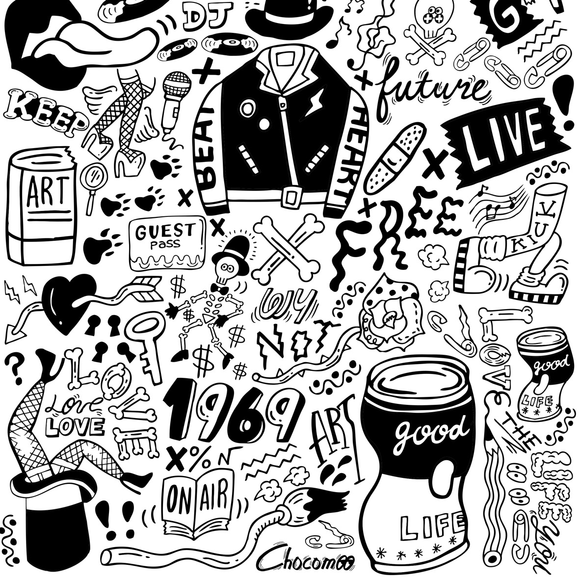
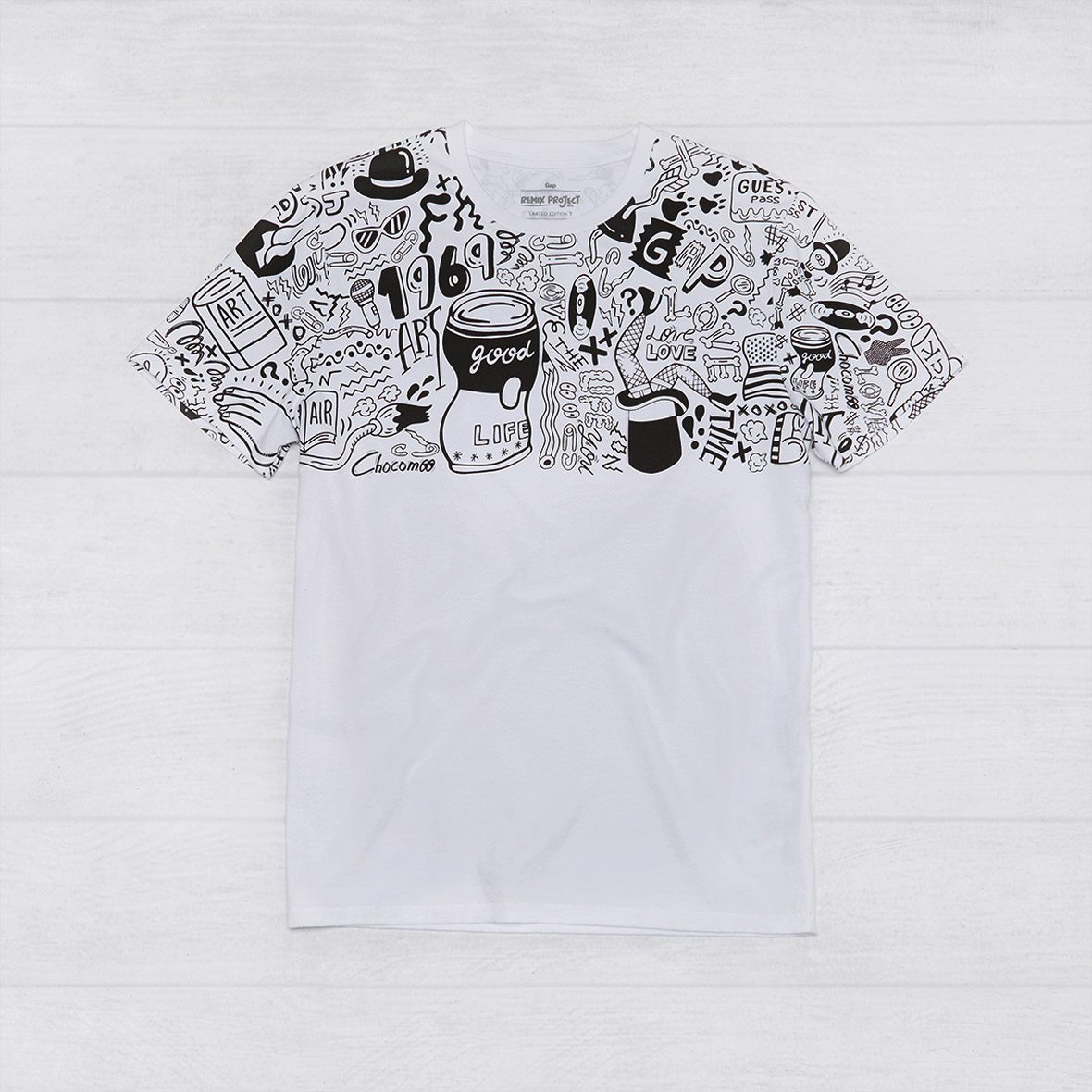
Chocomoo is a street fashion illustrator and artist. Influenced by rock music, hip-hop, and traditional Japanese calligraphy, her work is always done in a signature black and white line-art style.
Her design for the REMIX Project reimagines the brand logotype among iconic Americana imagery and the things that make me smile: music, fashion, partying, and the sharing of positive vibes with one another.
Chocomoo是一个深受受摇滚乐,说唱及日本传统书法影响的街头时尚插画师及艺术家,她的作品总是以一种黑白线条的风格呈现。
她为此次REMIX Project设计的作品将一些让我看后会心一笑的美国标志性的形象与事物融合在品牌标识中,比如:音乐、时尚、派对以及彼此分享的情境。
无法观看?前往优酷


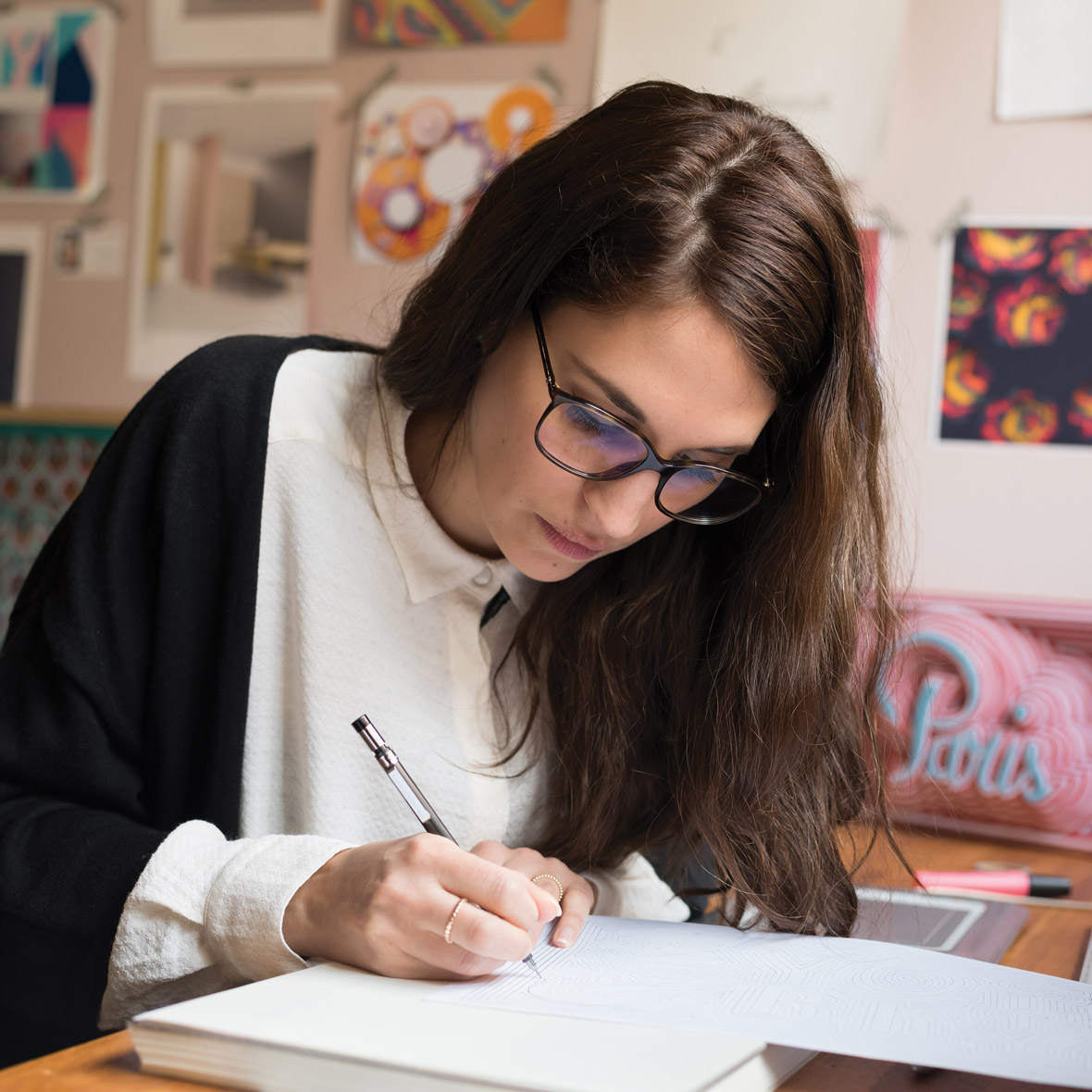
Lin Zhipeng (aka: No. 223) – China
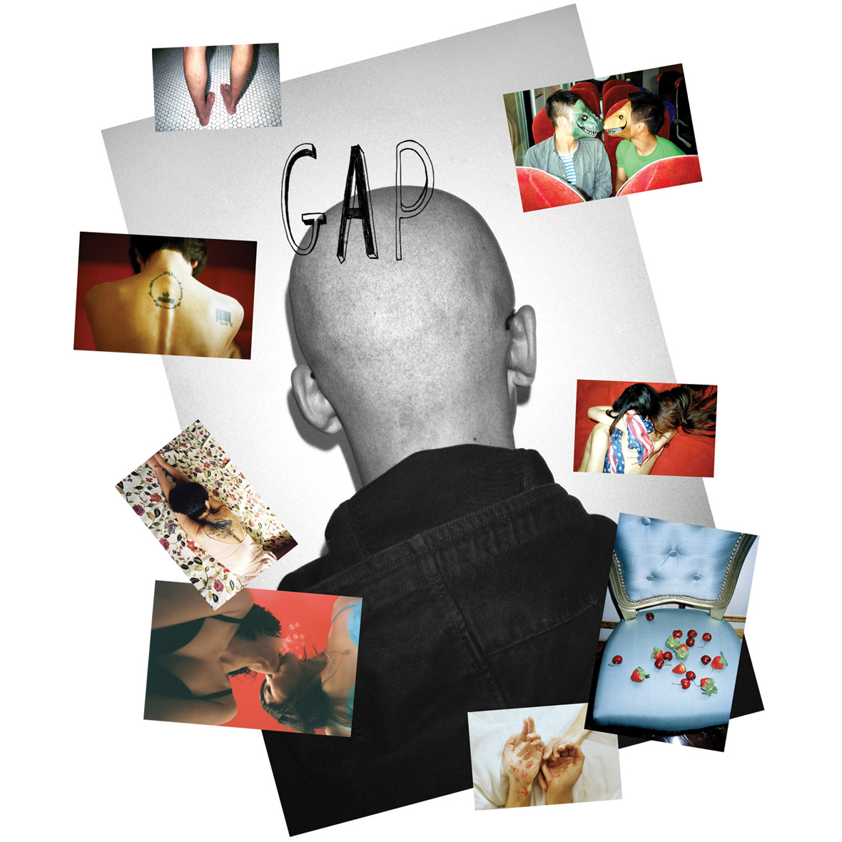
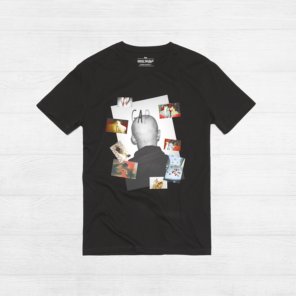
Lin Zhipeng (aka: No. 223) is a photographer known for his ability to show the volatile, primal energy of China’s younger generation. His work explores topics of love, sexuality, gender, free expression, and consumption within the context of modern China.
His design for the REMIX Project presents the brand’s logotype amidst some of my favorite recent images to form a snapshot collage of daily life in contemporary China.
林志鹏(又名:编号223)是一个以表达躁动的青春荷尔蒙而被众人所知的中国新生代摄影师。他的作品探寻的正是当代中国最受关注的主题:爱、性、性别、言论自由。
他为REMIX Project创作的作品,将其近期所拍摄的反应当代中国日常生活的照片作品以拼贴的形式重塑了经典的品牌标识。
无法观看?前往优酷

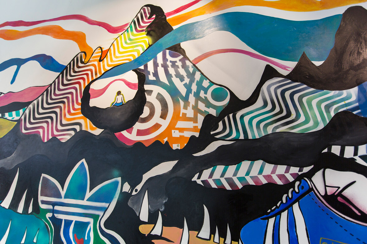
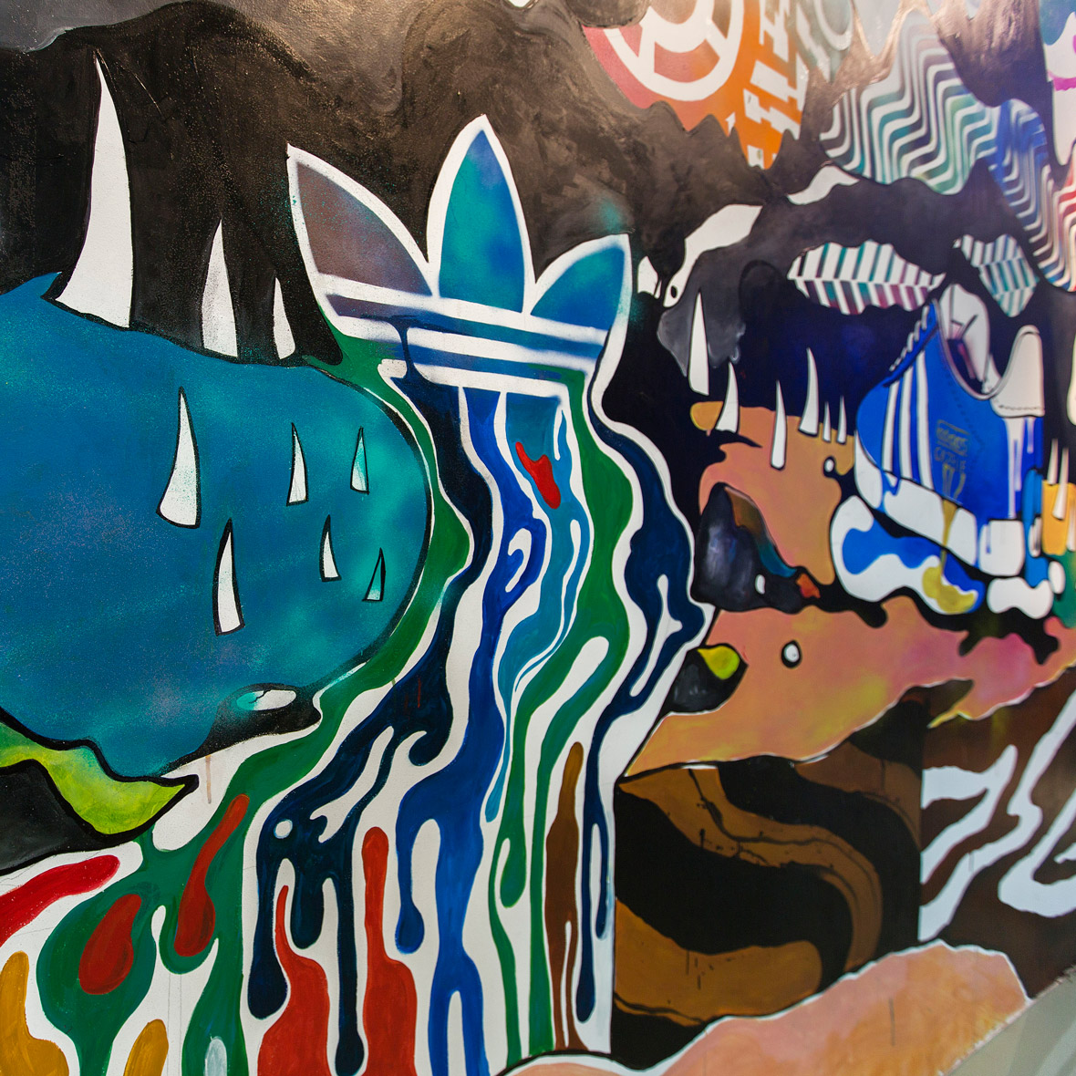
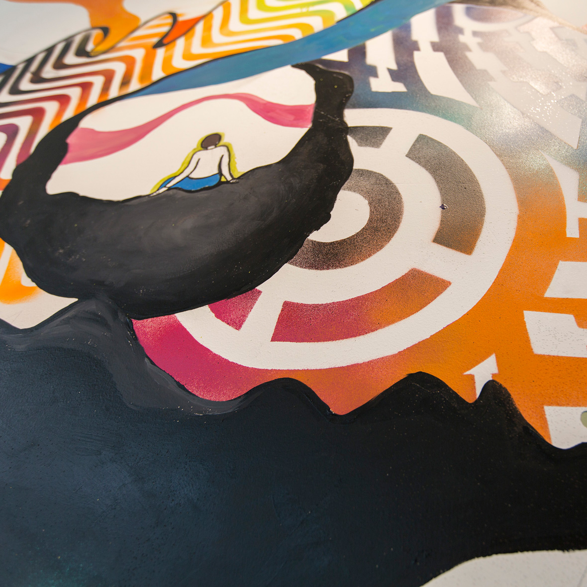
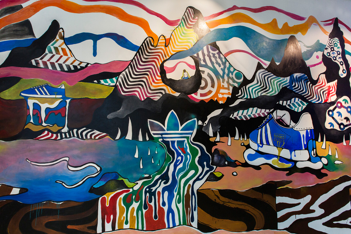
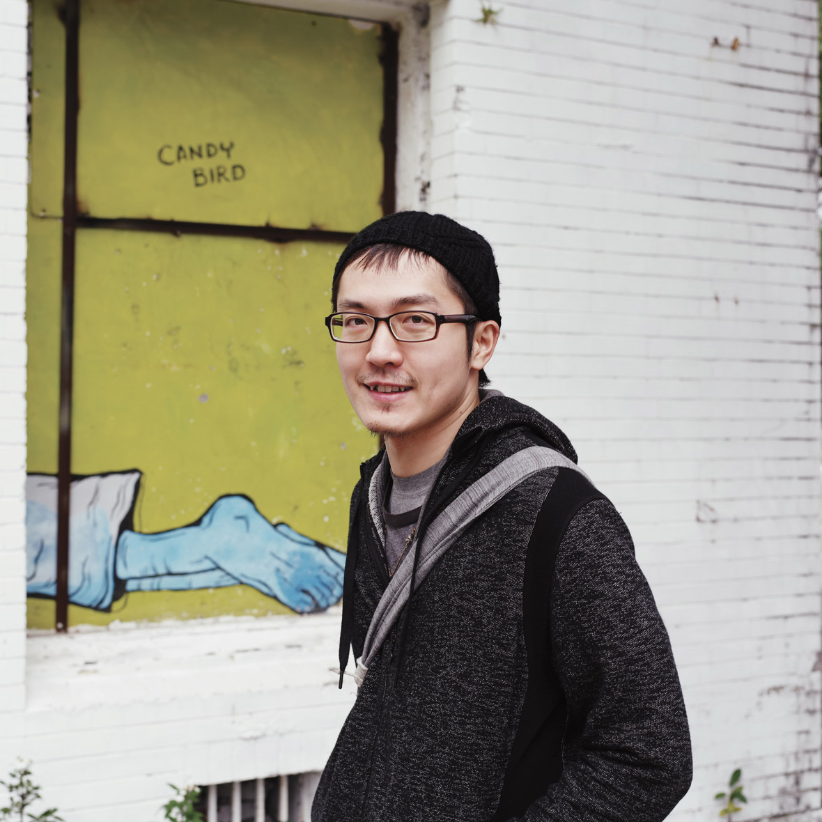
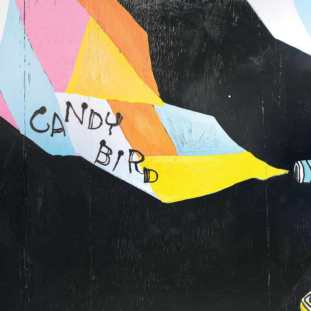
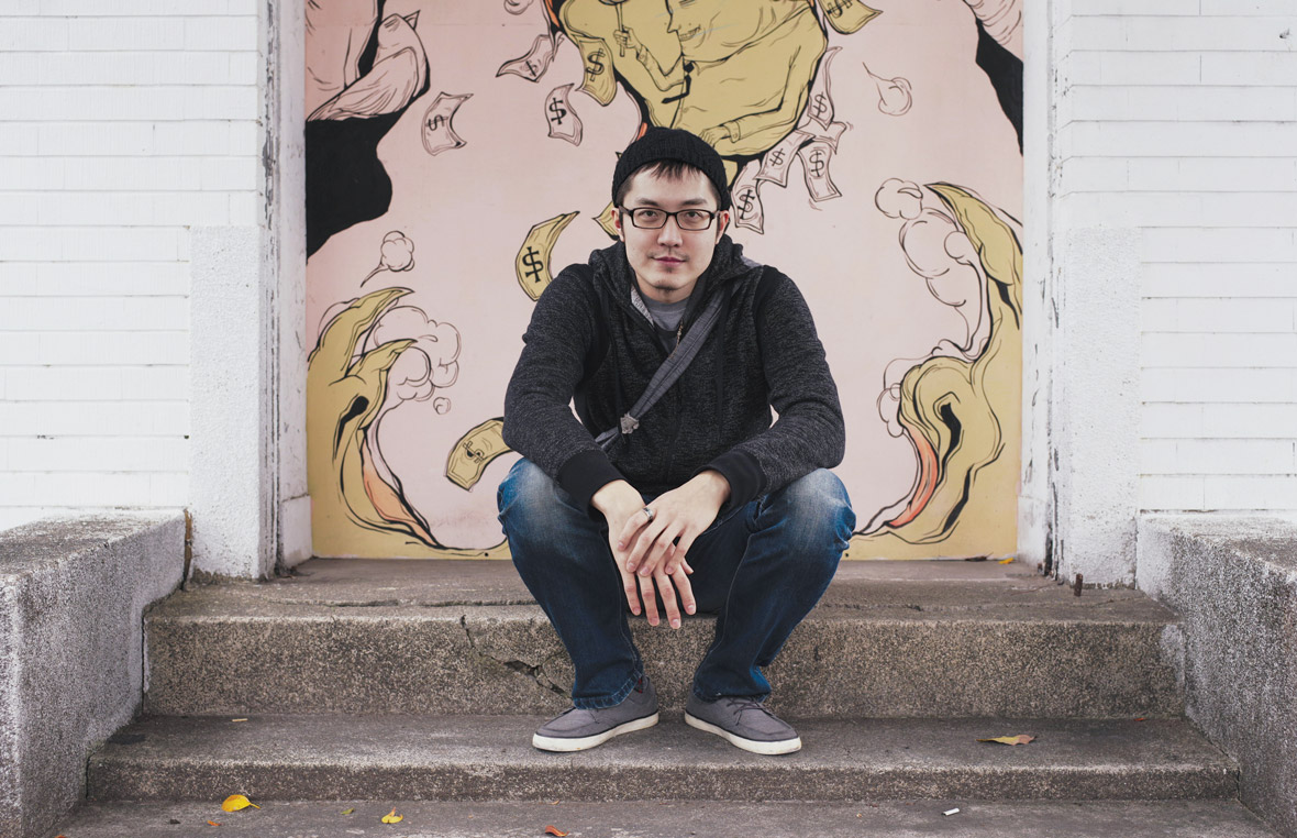
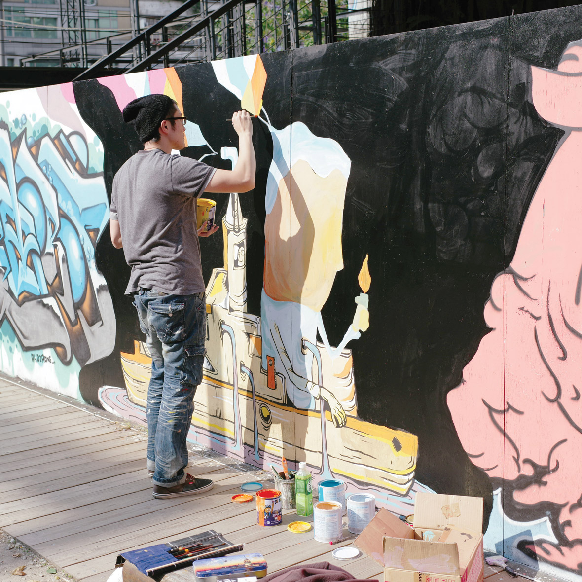
Candy Bird – Taiwan
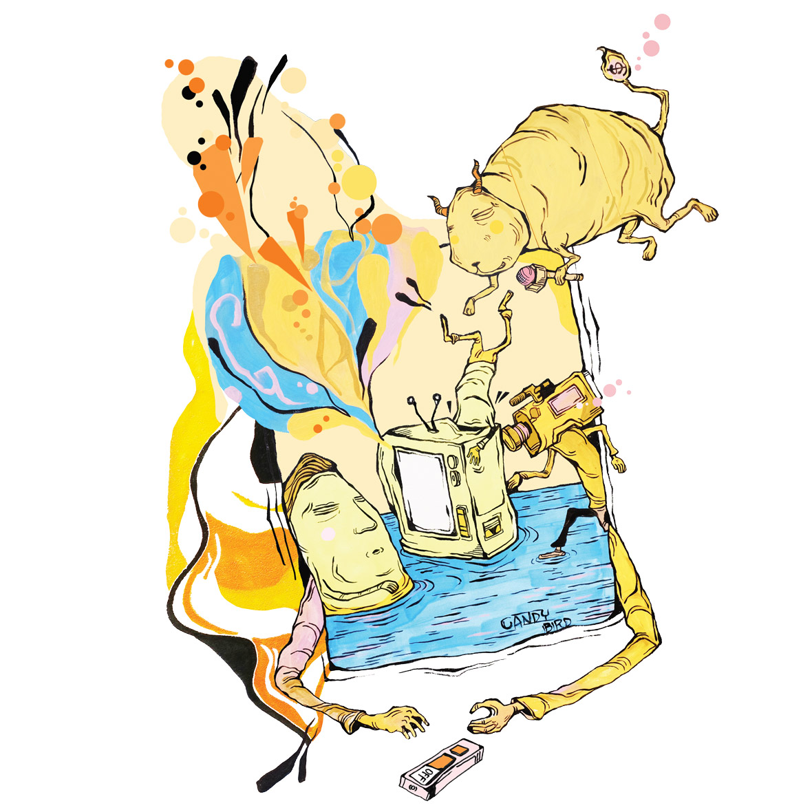
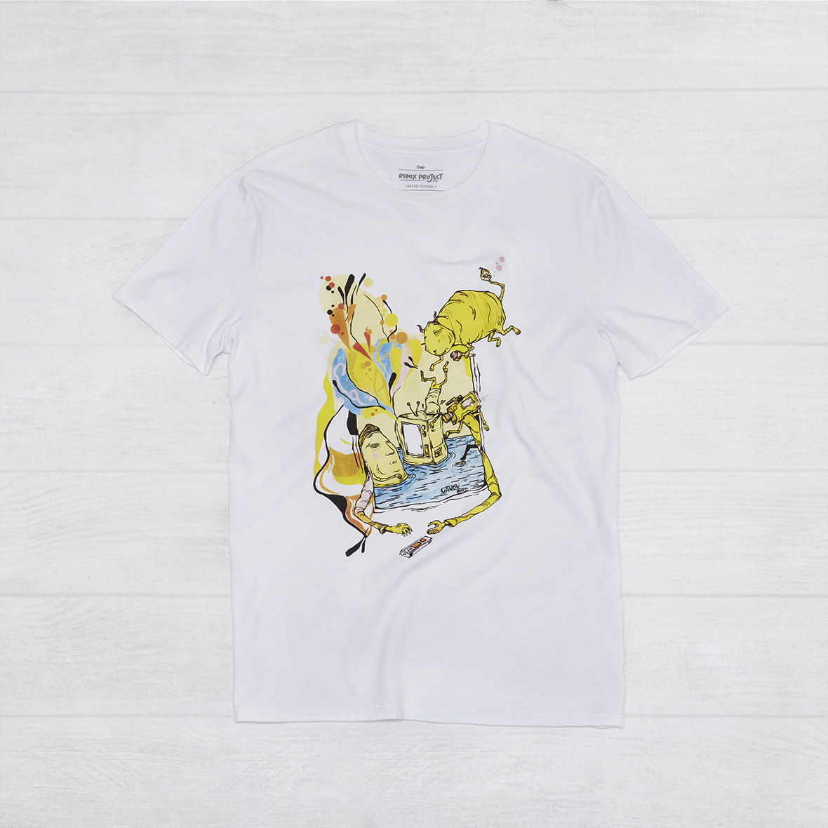
Candy Bird is a renowned street artist and illustrator who creates unique and playful visuals addressing social injustices and environmental concerns around the world.
His design for the REMIX Project incorporates the brand’s logotype into a satirical composition that serves as a reminder for us to curb our obsessions with media and celebrity culture.
Candy Bird是一位知名的街头艺术家和插画师,他独具特色且趣味十足的作品旨在揭露社会不公现象以及全球环境问题。
他为REMIX Project创作的作品,将经典的品牌标识巧妙地融合到他的画作中,旨在提醒我们应该抑制自身从媒体和明星文化中所受的影响。
无法观看?前往优酷

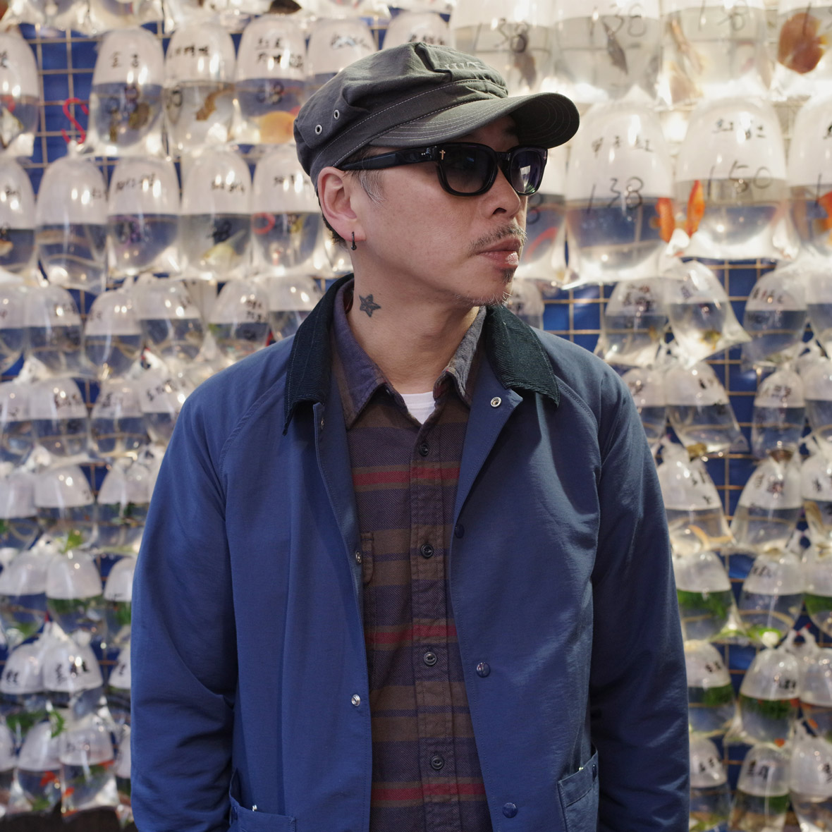
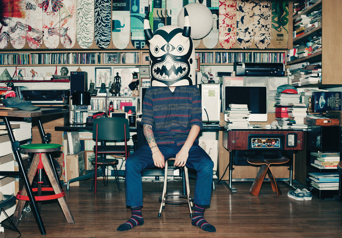
Prodip Leung – Hong Kong
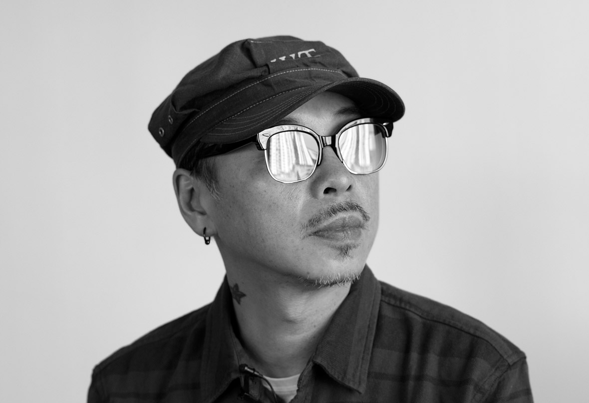

Prodip Leung is a painter, illustrator, graphic designer, and the bassist for the legendary Cantonese hip-hop group, LMF. Combining music with experimental art, his work draws from the legacies of street art, cartoons, and pop culture.
His design for the REMIX Project presents the brand logotype amidst a spin-off of my “Monster Pit” print series, with its retro-fashioned, “slamdancing” creatures of the night.
Prodip Leung(梁伟庭)是一位香港画家、插画师、平面设计师以及颇具传奇色彩的粤语嘻哈乐队LMF的贝斯手。他的作品提取了街头艺术、卡通及流行文化的精髓,常常结合了音乐和实验艺术。
他为REMIX Project创作的作品,是其带有复古时尚,且充满“slamdancing”夜生物的平面创作 —— 我的 “Monster Pit” 系列的一种延续。
无法观看?前往优酷

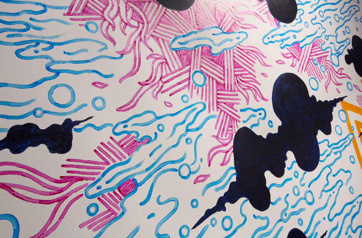
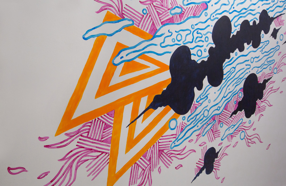
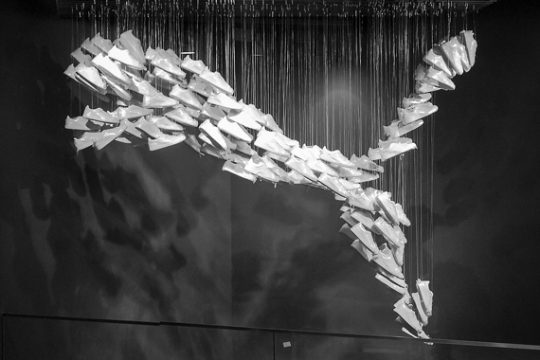
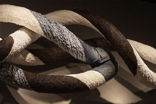
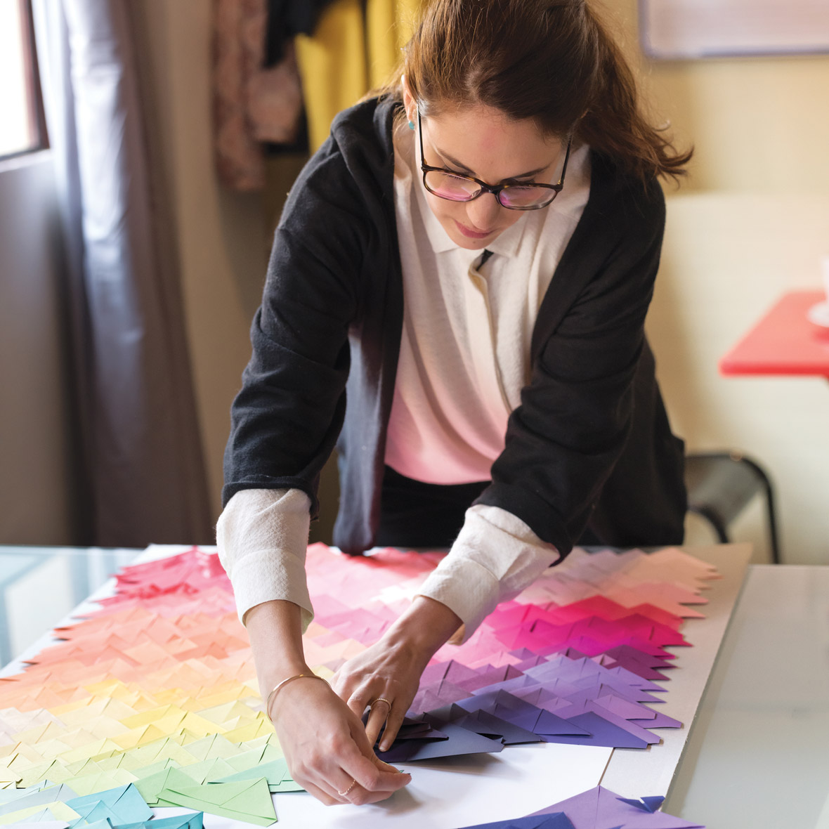
Maud Vantours – France
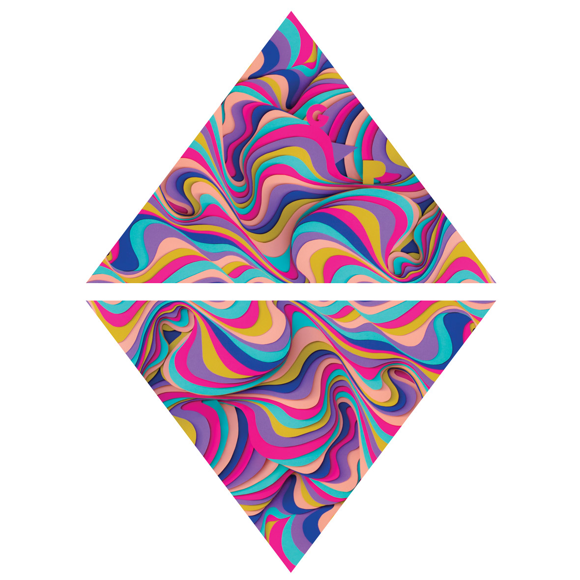

Maud Vantours is a designer and artist who works with layered, cut, and folded paper to create colorful 3D sculptures of hypnotizing patterns and textures.
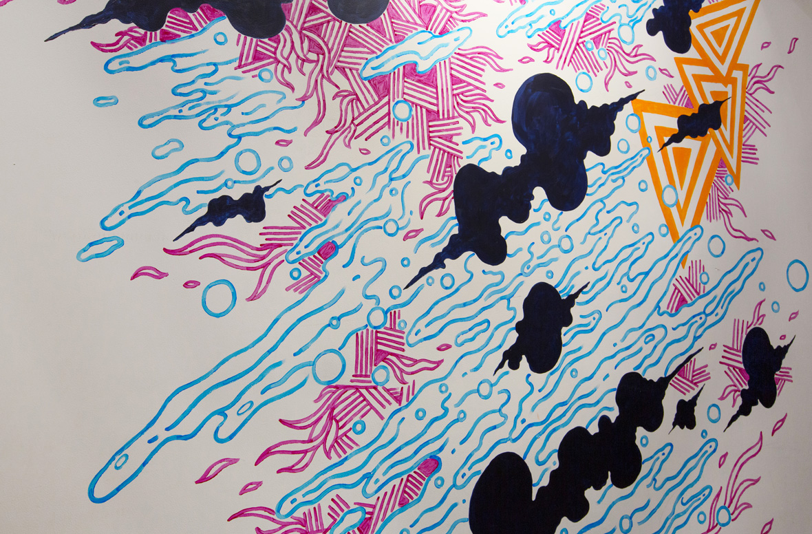
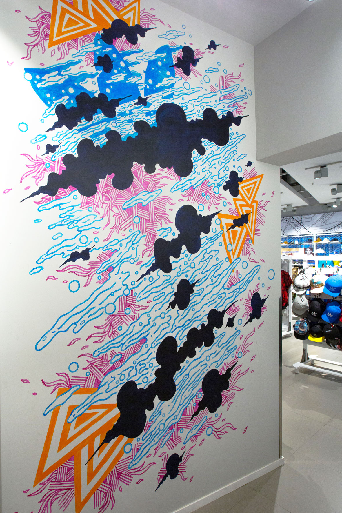
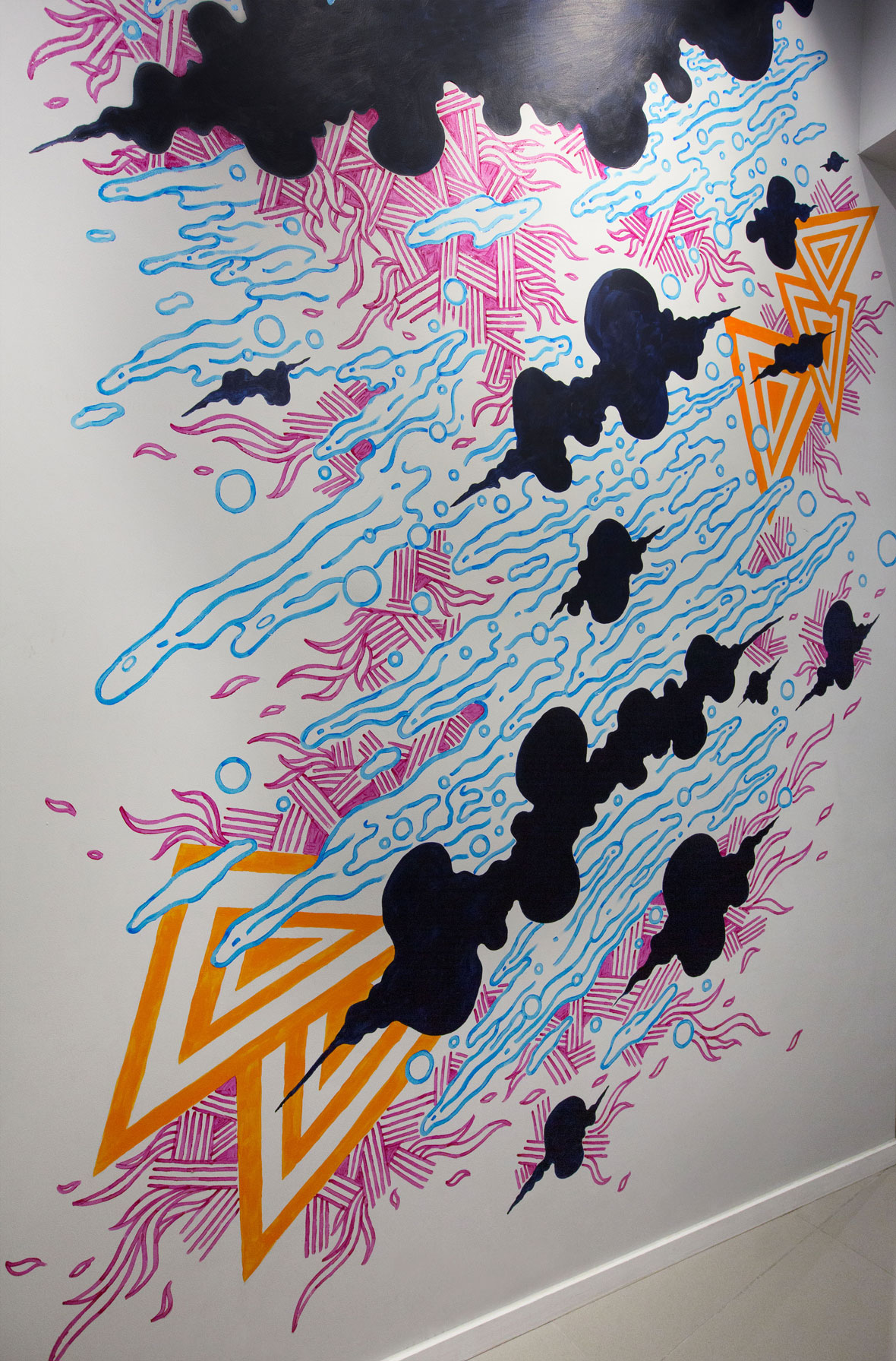
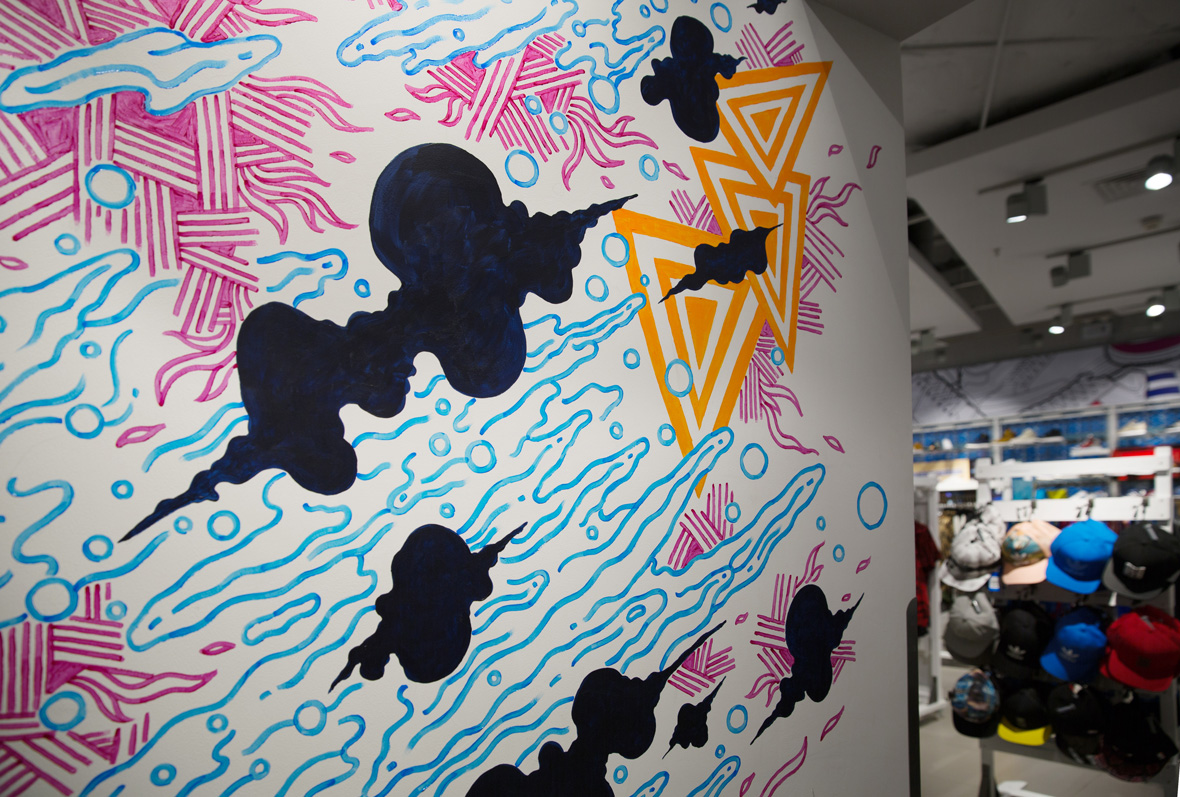
Her design for the REMIX Project is inspired by nature and dreamscapes. She reimagined the brand logotype within a multicolored and multilayered paper sculpture design that mimics the patterns of waves, mountains, and wind-blown clouds.
Maud Vantours是一个设计师及艺术家,她的3D雕塑作品以层叠、裁剪和折纸方式呈现出一种色彩鲜亮且有着重复模式和肌理感。
她的REMIX Project作品灵感来源于自然与梦境,她将品牌标识隐匿于色彩缤纷和层叠的波纹、山脉及被清风拂云朵的纸塑中。
无法观看?前往优酷
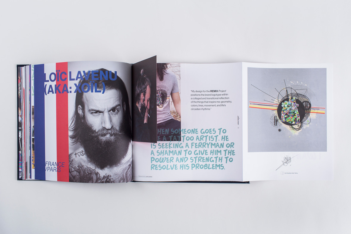
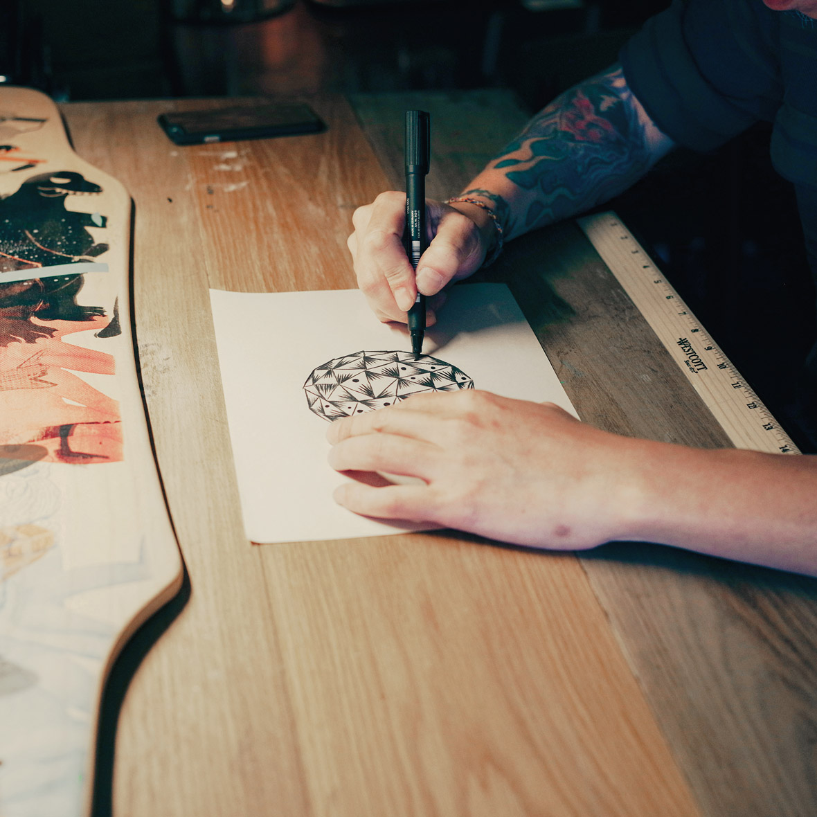
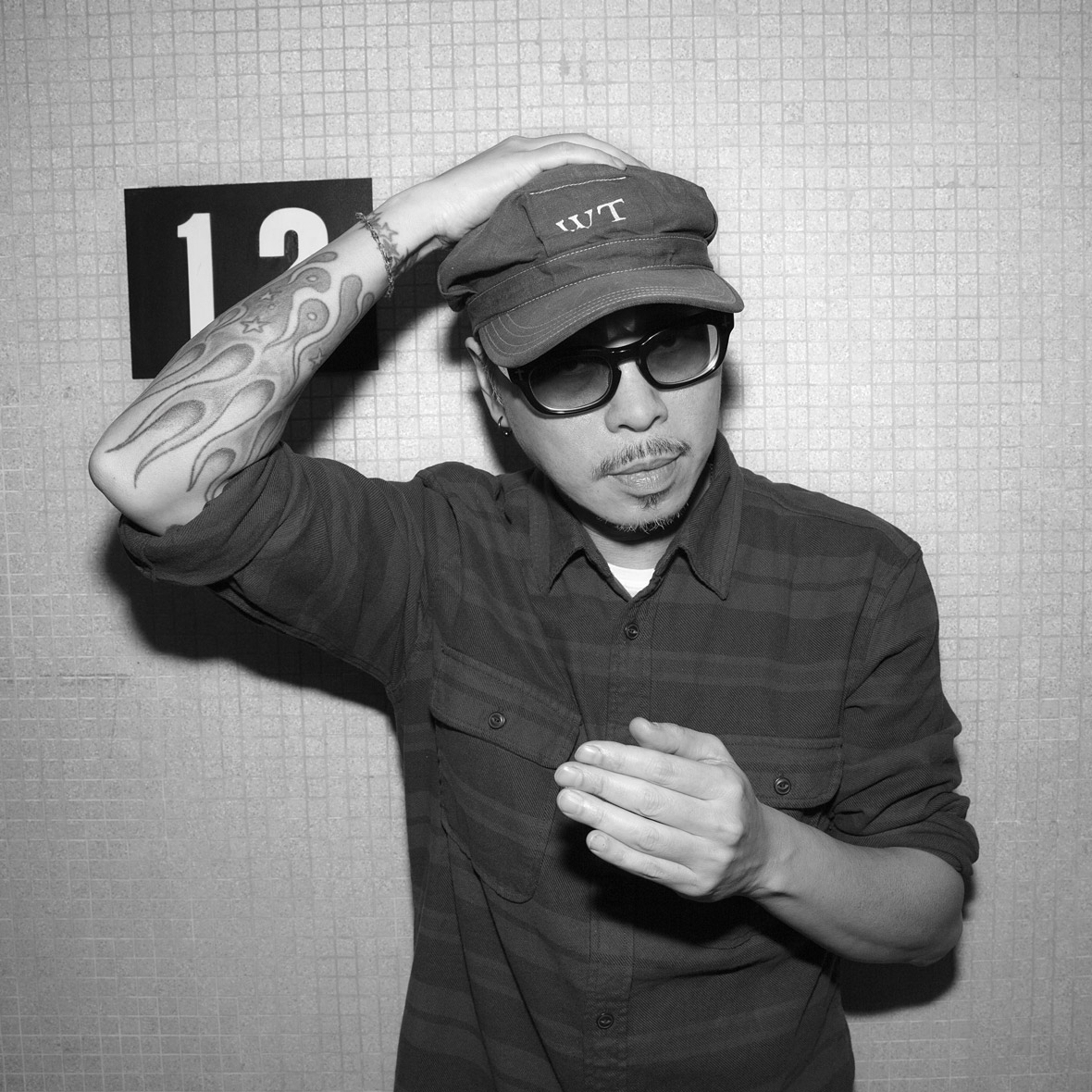
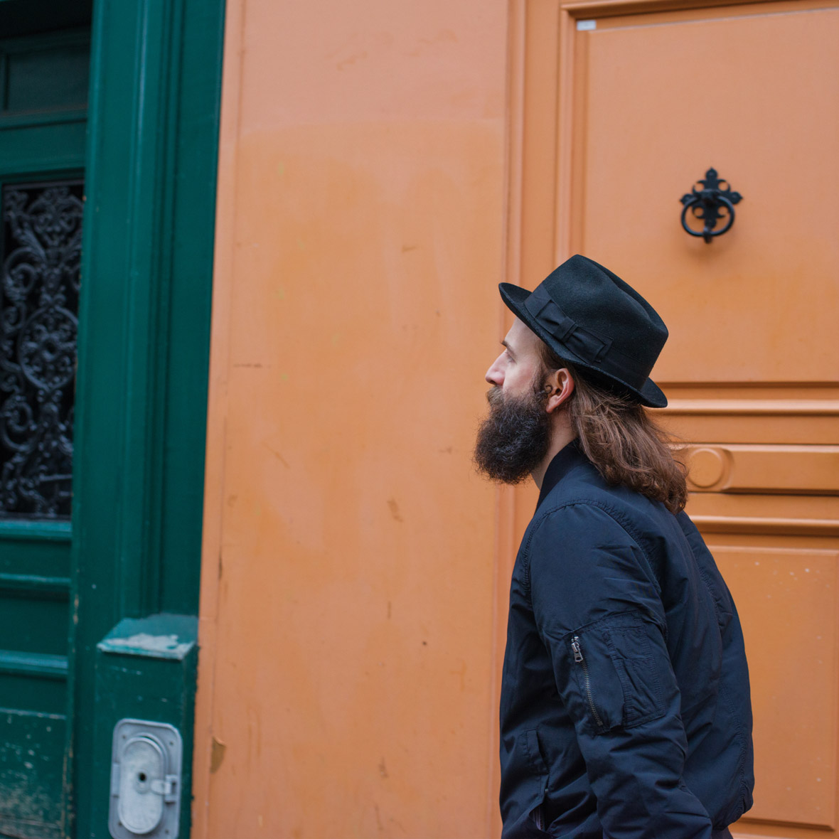
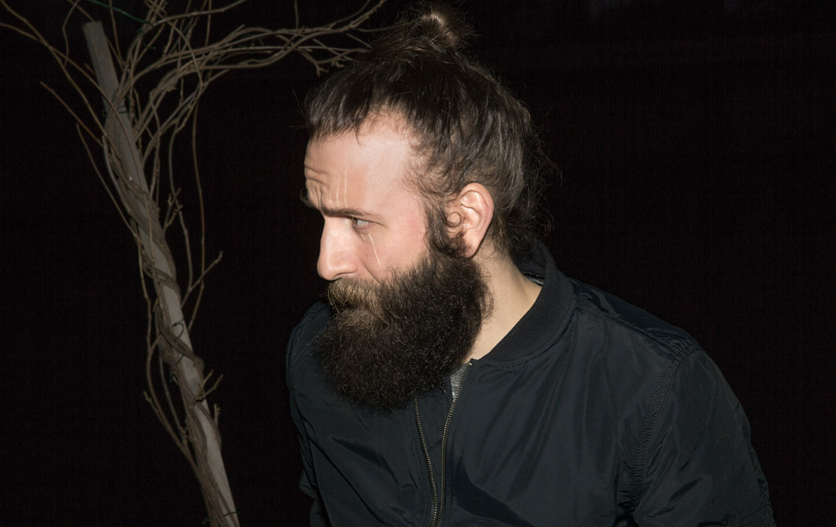
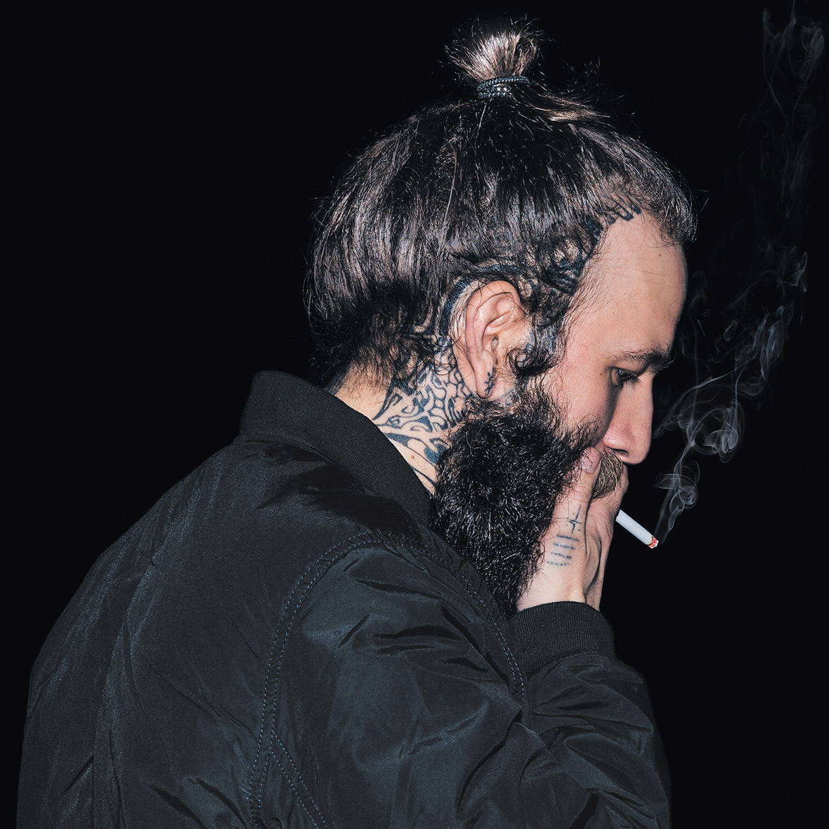
Loïc Lavenu (aka: Xoil) – France


Loïc Lavenu is a world-renowned designer and tattoo artist acclaimed for pioneering an abstract graphic style of tattooing. His work pushes tattoo aesthetics into new realms inspired by digital illustration, photography, and collage.
His design for the REMIX Project positions the brand logotype within a collaged and transitional reflection of the things that inspire him: geometry, colors, lines, movement, and life’s circadian rhythms.
Loïc Lavenu作为世界知名设计师和纹身艺术家,一直以来的志向就是不断摸索创新一种抽象的纹身风格。他将纹身美学推进到一种新的高度,而他的灵感来源于各式各样的图形图像设计、摄影以及拼贴画。
他为REMIX project创作的作品是将品牌标志融入在了一个类似拼贴画的意境之中,这个设计中会看到他受几何、颜色、线条、动感以及生命巡回等种种理解的启发。
无法观看?前往优酷

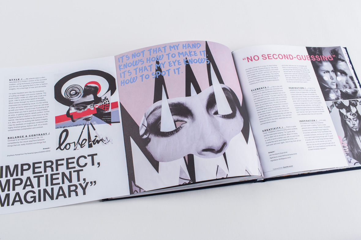
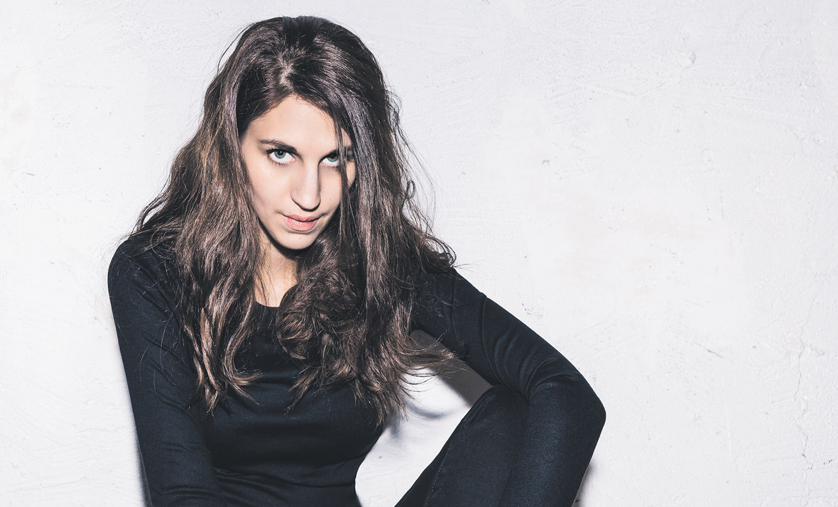
Quentin Jones – UK

Quentin Jones is an artist, filmmaker and photographer. Her aesthetic is a modern take on the surrealist tradition, realized largely through photomontage and loose paintwork.
Her design for the REMIX Project is inspired by fashion iconography, and combines the brand’s logotype with simple but impactful collage and brush-work elements to create an ambiguous form composed of eyes, legs and letters.
Quentin Jones是一名艺术家、导演和摄影师。她的超现代主义独特审美跨越传统,并通过蒙太奇的方式和张弛有度的颜料绘画来展现。
她这次为REMIX project创作的作品,灵感来源于将时尚的肖像与品牌标识相结合,并运用简单却颇具效果的拼贴画及画笔将眼睛、腿和字母这些看似无关的元素联结在一起。
无法观看?前往优酷

Neville Brody – UK

Neville Brody is a pioneer in the fields of graphic design, art direction, and digital typography. With a career spanning four decades, he is widely acclaimed for his iconic typeface designs.
His design for the REMIX Project reinterprets the Gap letterforms using fluid lines and spaces that create an infinite gridded loop where cultural life pools take place and grow.
Neville Brody是一名先锋平面设计师、创意总监、数字字体设计师。四十年的职业生涯中,他传奇性的字体设计作品被大家广为赞誉。
他的REMIX Project设计采用流畅的线条和空间,将GAP字样创作为无限循环的圈体。这个作品展示出了永不终止的文化生活不断发生和发展的意义。
无法观看?前往优酷

POSE – USA
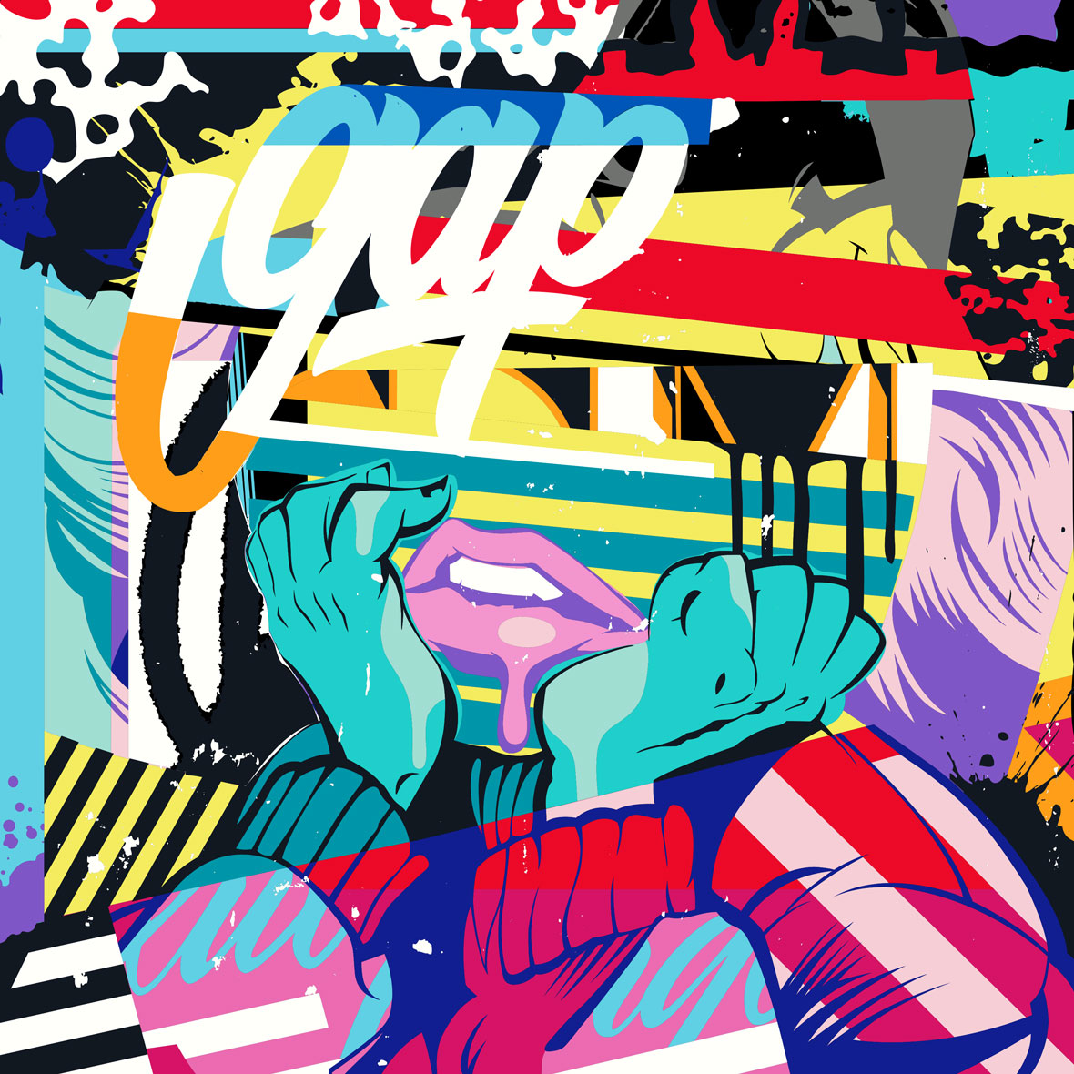
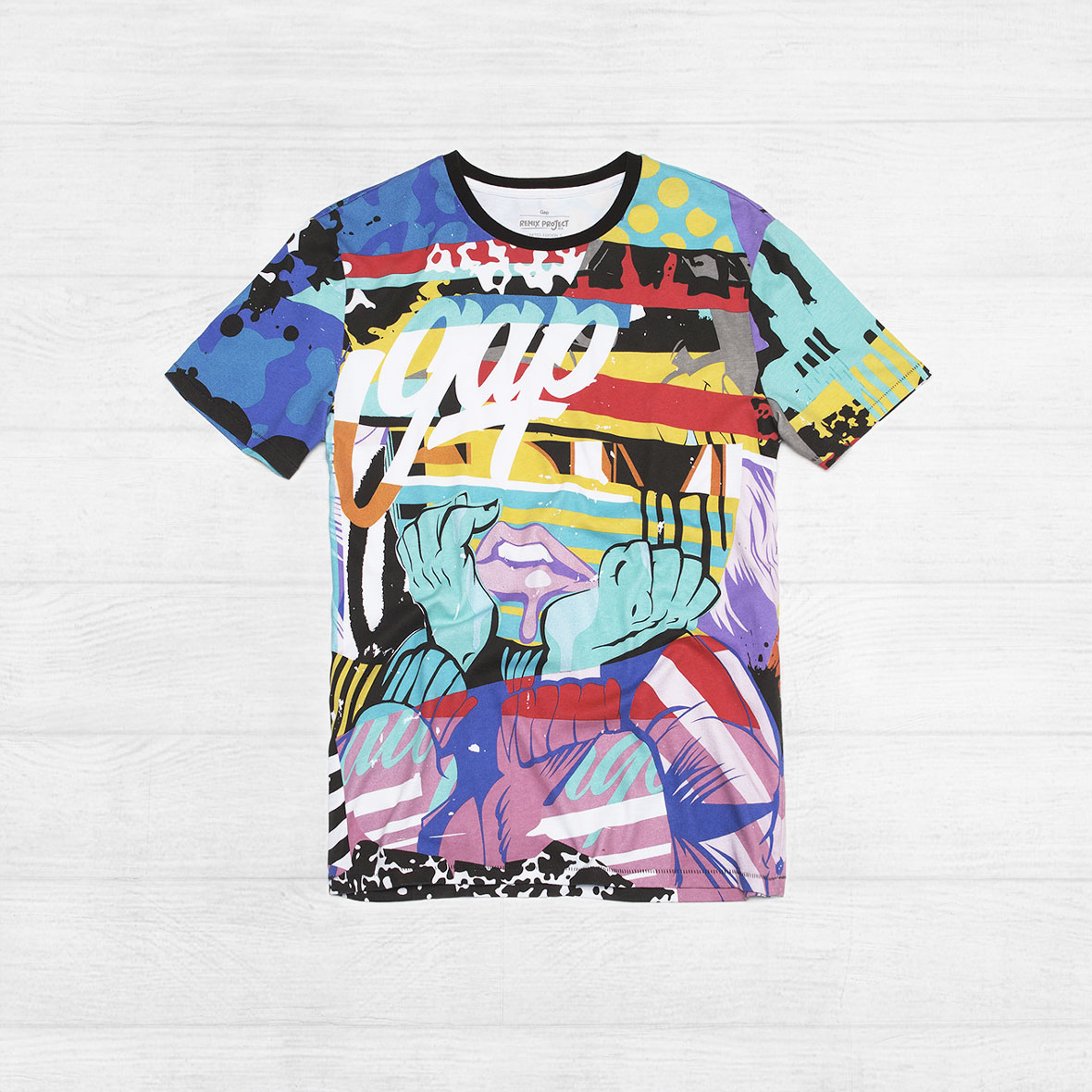
POSE uses bright colors and tight graphic stylings to create images that jump off walls. Inspired largely by the tradition of pop art, his work integrates illustration, lettering, screen print aesthetics, humor, and even violence.
His design for the REMIX Project reimagines the brand logotype within a contemporary portrait. The composition conveys modern expression and human experience as they are: constantly in flux, complex, and affected by environment and everyday experience.
POSE采用明亮的色彩和紧密的图形风格创造了独具一格大胆图像。受到传统波普艺术的启发,他的作品集插画、印字、丝网印刷、幽默,甚至暴力学为一体。
他为REMIX Project创作的作品巧妙地将品牌标识交融到当代肖像之中。该作品传达了现代人对不断变化的、复杂的、受环境影响和日常生活的情感和体会。
无法观看?前往优酷

Jessica Hische – USA


Jessica Hische is a letterer, illustrator, and crazy cat lady known for her silly side projects and occasional foul mouth.
Her design for the REMIX Project uses vintage-inspired typography made modern though context and color. Mixing historical letterforms with modern graphic geometric decoration, she reinterpret the Gap logotype in a sophisticated and unexpected blue, teal, and yellow color palette.
Jessica Hische是一名字体设计师、插画师以及疯狂的爱猫人,她以一些奇怪的小项目和偶尔的粗口著称。
我为REMIX Project创做的作品采用复古风格排版,重新传达了现代信息。组合复古字母形式与现代图形的几何装饰,我在一个丰富的和意想不到的蓝、蓝绿、黄的色板中重新诠释了GAP标识。
无法观看?前往优酷
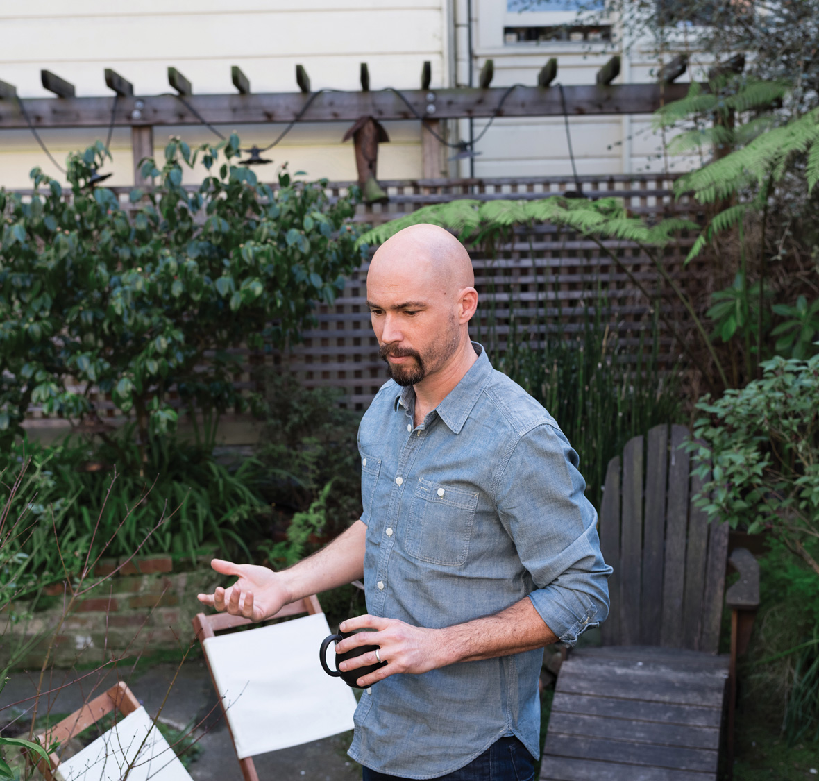
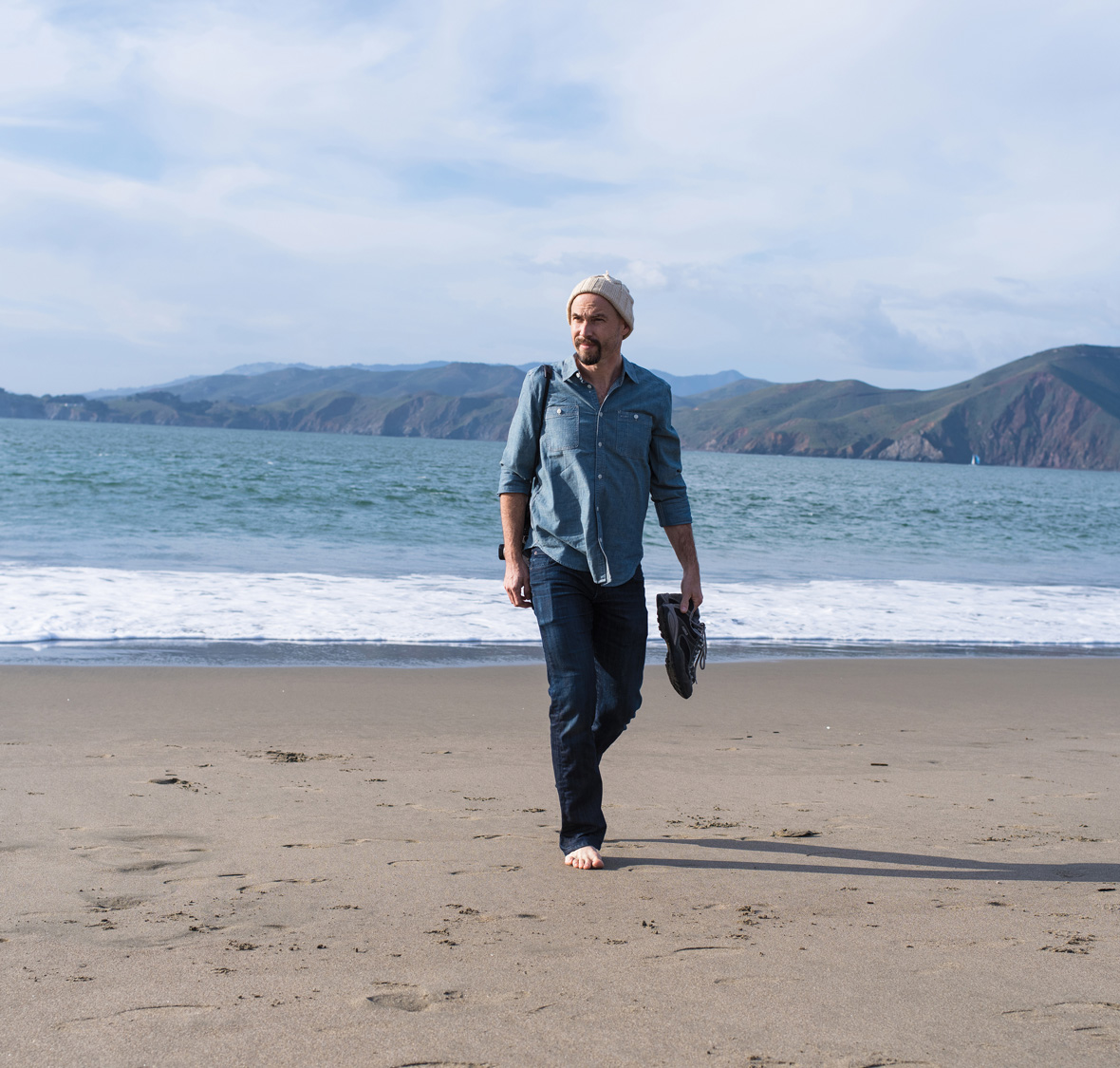
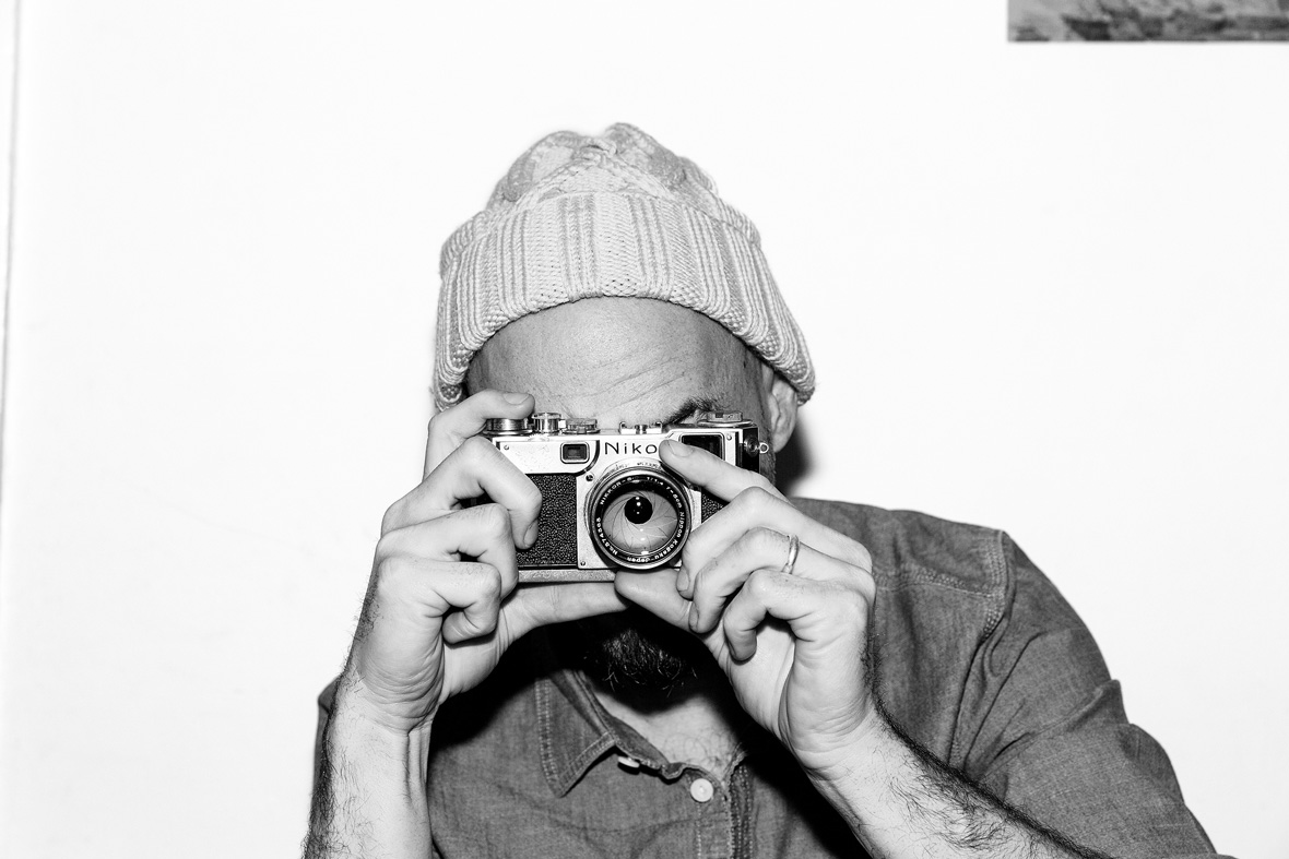
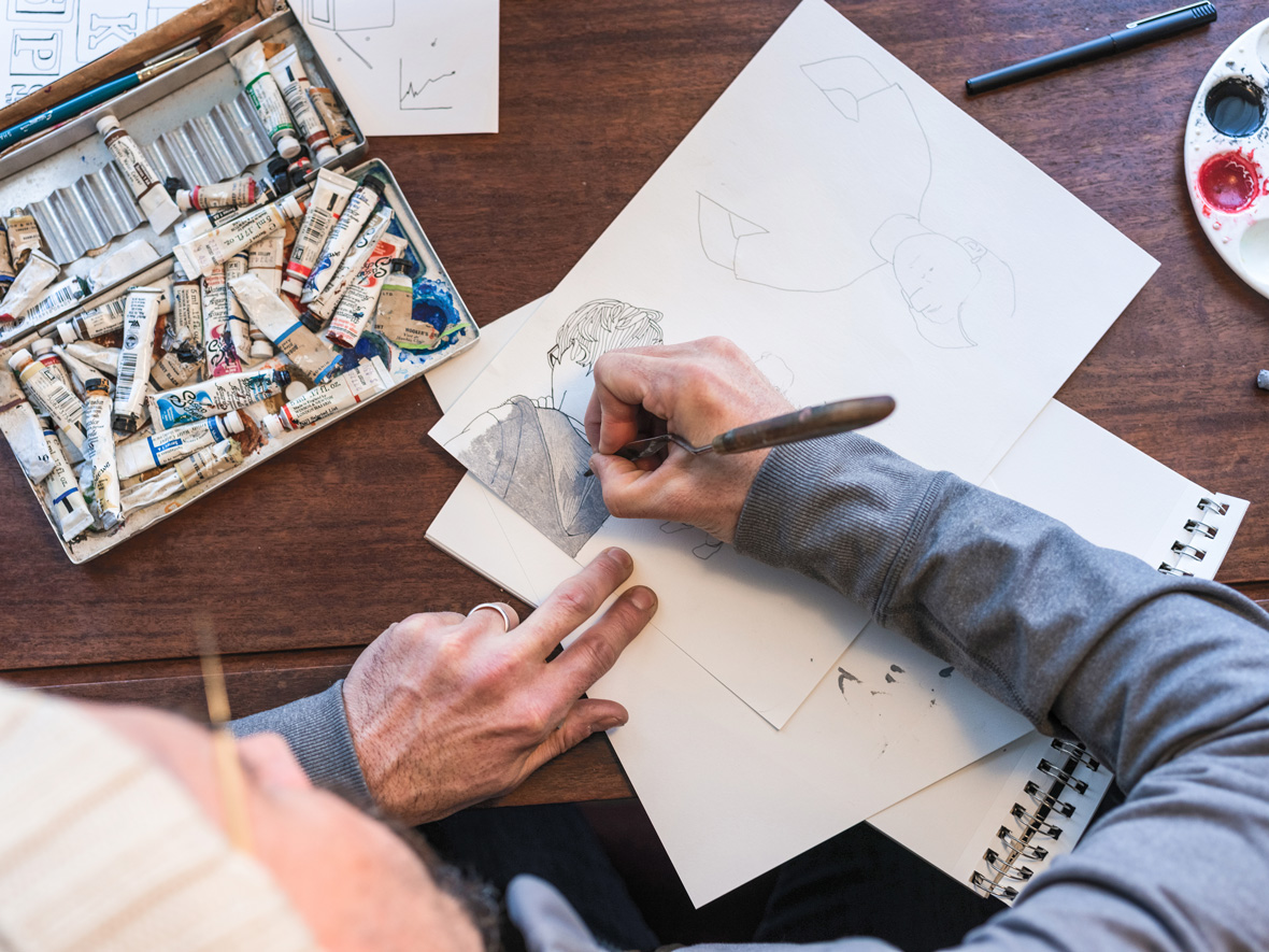
Kyle Pierce – USA
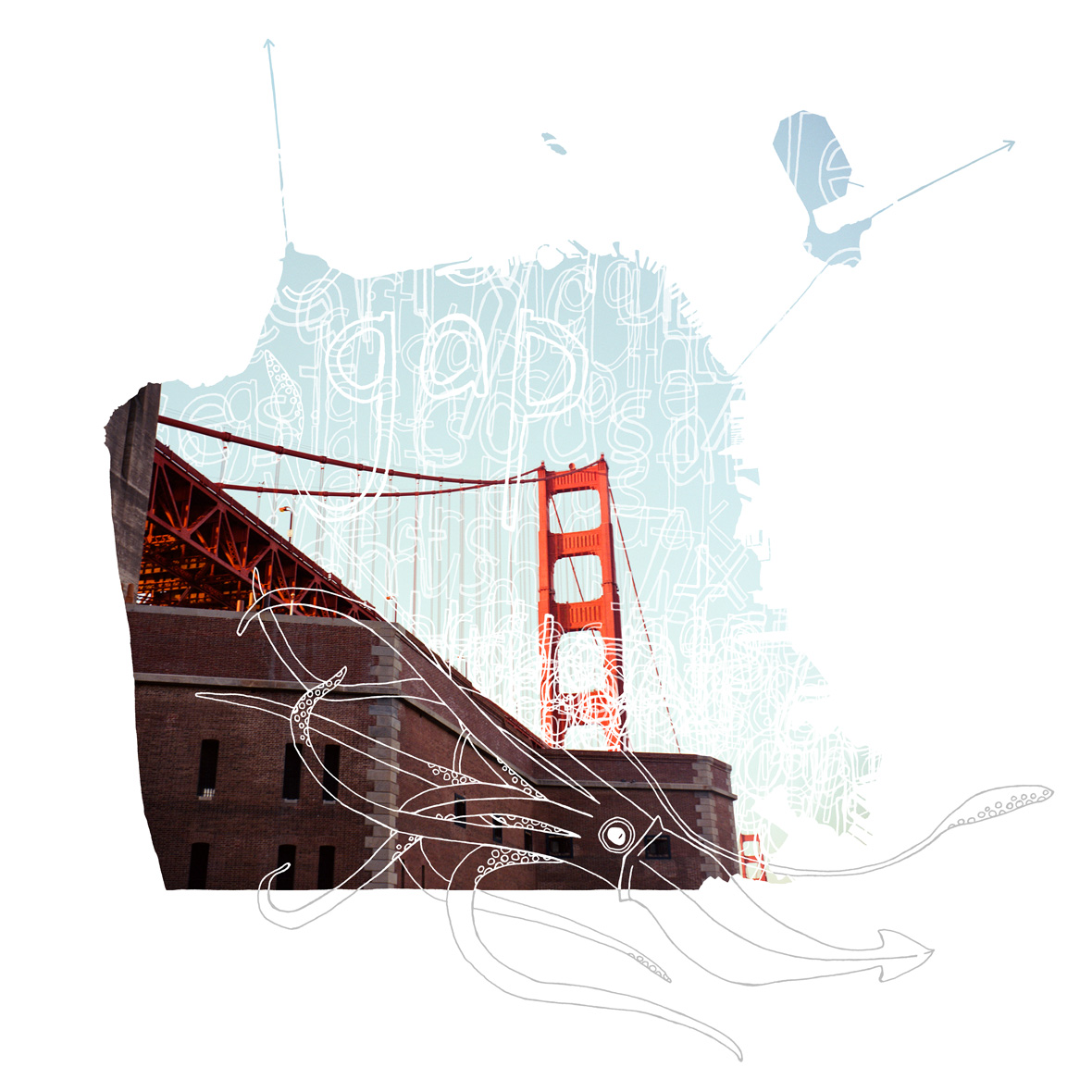
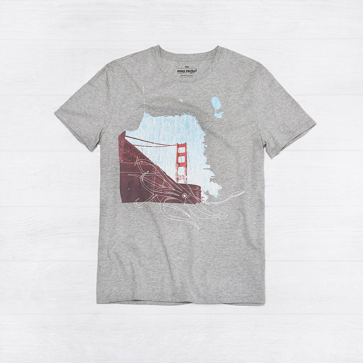
Kyle Pierce is an illustrator and photographer who enjoys building layered narratives from photographs, illustrations, and bits of simple hand-drawn type.
His design for the REMIX Project is inspired by San Francisco, the city I live in and where Gap was founded in 1969. His design presents the Golden Gate Bridge within a contour of the city borders, while letterforms and the brand logotype recreate the fog that so frequently graces “The Gate.”
Kyle Pierce是一个喜欢将照片、平面设计和简单的手绘相互叠加的插画家和摄影师。
他的REMIX Project作品灵感来源于他所居住的城市,同是GAP品牌于1969年所成立的发源地旧金山。他的设计将金门大桥的影像结合在旧金山版图剪影形状之上,同时以该城市常见的迷雾以字母和品牌标识体现,笼罩在“金门”之上。
无法观看?前往优酷