The Typography of Sabeena Karnik

November 17, 2015 2015年11月17日

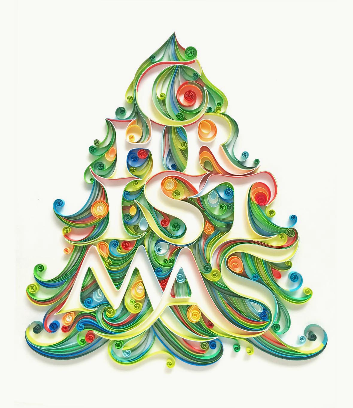
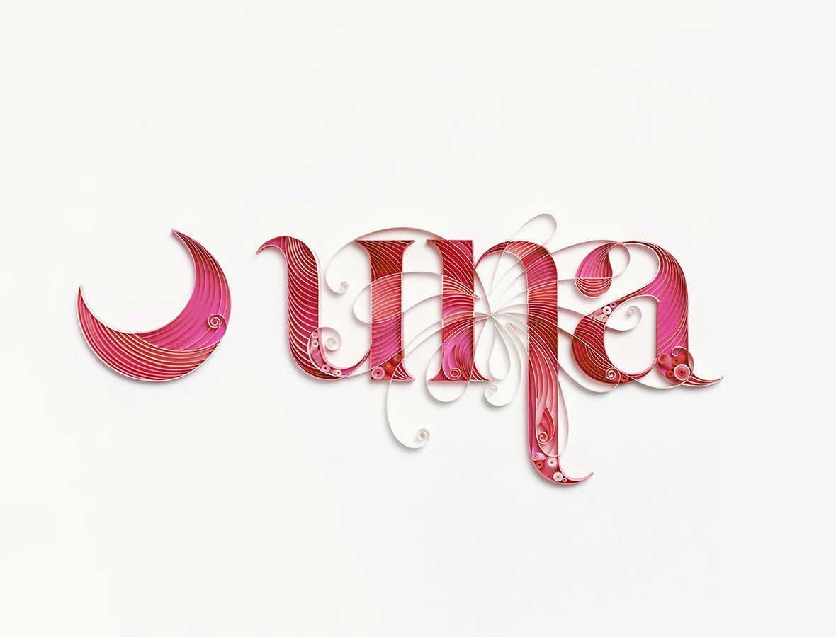
Sabeena Karnik is a graphic designer and illustrator from Mumbai, who specializes mainly in paper typography. That is to say, she creates type and letters by hand using only paper, which is the primary thing that sets her work apart from other typographers. She says that this “evokes many reactions from the viewer, especially because it is all handcrafted by me and nothing is done digitally”.

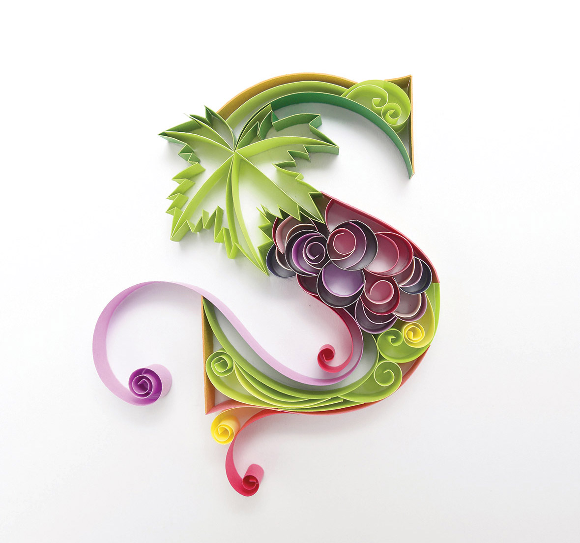
Basically Sabeena creates the visual elements by combining typography and illustration made with paper strips, which she then attaches onto a base. She uses the paper to produce different types of effects with lighting and shadows. It is quite a long process which first starts with a sketch and many days of careful work manipulating the paper by hand. The drawing serves as a guideline for sticking on 5mm or 10mm wide strips of paper. She explains, “The strips are curled, curved, folded, rounded, beautified and then glued on the edges for pasting on the base.”

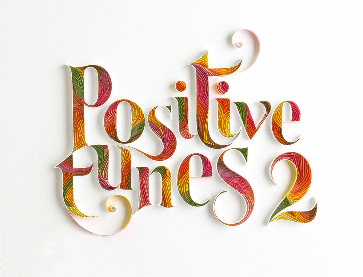
One illustration can take around 7-10 days to finish, with each day generally lasting 12 hours. The process requires a lot of patience, precision and careful handling of the paper, since it is very delicate and easy to crush. Once the art is ready, Sabeena then takes it to the studio to be photographed. She says, “The effect light produces when it falls on the paper art is quite magical and makes the art complete.” Finally in the end, it materializes as a three-dimensional piece of art.

Her interest in paper typography started three years ago when she started doing an entire series on the alphabet one afternoon. Initially there was no intention to make it a career. While in university, Sabeena studied graphic design with a special focus on typography. During this time, working with paper and hand lettering was always something that she was passionate about. A simple experiment one day led to her attempt to make the entire alphabet. According to her, this whole process gave her immense joy and the outcome was overwhelming. Soon after this, Sabeena started getting assignments and jobs from overseas which all involved paper typography.

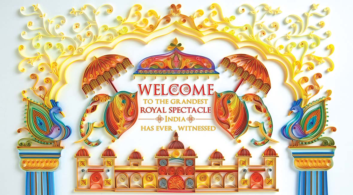
She says that her creative inspiration comes from everywhere: “A lot of it is from nature, handicrafts, and impressionist paintings when it comes to usage of colours, architecture, people.” It’s very hard for her to pick a favorite piece of work that she’s made, but one project that has given her immense pride and a great sense of fulfillment was a promotional campaign she did for the Mysore Palace in India for Karnataka tourism. “For that, I had to create a miniature version of the palace with a lot of detailing in my own way using paper,” she says, “It had some typography but the focus was on the illustration. The advertisement was published across billboards and magazines in India and overseas. It still makes me emotional when I reminisce about it.”

Sabeena admits that, to a large extent, her work really reflects who she is as a person. She likes things to be precise and neat when it comes to what she creates, and this applies to her life as well. “Experimentation and taking risks is essential in work and in life,” she says, “There shouldn’t be any restrictions. There are days when I consider myself to be as delicate and fragile as the papers I work with.” After her paper creations are photographed, they are kept, cared for like babies, and stored away in boxes that she also makes herself. Sabeena says, “Someday I hope to exhibit them all under one venue.”

Facebook~/SabeenaKarnik
Instagram: @sabeenu
Behance~/sabeenu


Contributor: Banny Wang

The Multi-Talented Prodip Leung

November 16, 2015 2015年11月16日

Prodip Leung is a Hong Kong-based painter, illustrator, graphic designer, and musician. His work often combines music with experimental art, drawing from the legacies of street art, cartoons, and pop culture. This year, Prodip was also one of the 12 artists brought together by Gap REMIX Project to reimagine the classic Gap logo in an exclusive collection of graphic tees.


Prodip Leung(梁偉庭)是一位香港畫家、插畫師、平面設計師及音樂人。他的作品提取了街頭藝術、卡通及流行文化的精髓,常常結合了音樂和實驗藝術。今年,Prodip也是參與2015年Gap REMIX項目的12位藝術家之一,該項目邀請每位藝術家以各自風格重塑經典的Gap logo,從而打造出一個限量版T恤系列。


无法观看?前往优酷

He first started his creative journey about 10 – 15 years ago. At that time, he was the bassist for LMF, a pretty well-known Cantonese hip-hop group in Hong Kong. In addition to playing the bass, he was responsible for all of the group’s graphic design and album art. While in LMF, he started getting into painting, illustration, toy design, and a bit of apparel design. Since the beginning, he has always been very independent about his creative endeavors, focusing only on the things that he enjoys, which he believes is “the way it should be”.


他的創作旅程可追溯到十至十五年前。彼時,他還是香港殿堂級說唱樂隊LMF樂隊的貝斯手。除了玩貝斯,他還負責整個樂隊宣傳的平面設計和專輯美術指導。在LMF,他開始著迷于畫畫、玩具設計以及一些服裝設計。從最開始,他就對自己的創作非常有自主傾嚮,他只專注于自己享受的事物,而他也一直堅信“這才是正確的方式”。

Ever since he was little, he always wanted to make toys. His shelves are full of toys and skateboard decks. Books are also a very big source of inspiration for him. He likes to read a lot of books about UFOs, aliens, monsters, new-age topics, ancient mysteries, and generally just strange things. As an artist and creative, Prodip likes to consider himself first and foremost as a storyteller. Storytelling is a major part of his creative process. In fact, the first thing he needs before he starts is a good story. All of his stories come straight from his imagination.


他從小就想自己做玩具。如今他的置物架上滿是玩具和滑板。書籍也是他靈感的最大來源之一。他喜歡大量閱讀有關UFO、外星人、怪物、新世紀主題、古代神秘學的書籍,總之就是些稀奇古怪的玩意兒。作爲一名藝術家和創意人,Prodip認爲自己首先是個故事講述者。講故事是他創作過程的一大重頭。事實上,創作開始前,他最需要的就是一個好故事。他的所有故事都來自于他的想象力。

When talking about his hometown, Prodip admits he has a love-hate relationship with Hong Kong. He was born there and he also grew up there, but because of his artwork, he runs into a lot of problems and restrictions. “There’s not much you can do here as an artist,” he says, “Hong Kong is a very traditional city and the media here doesn’t push the envelope when it comes to the arts and music, which holds the city back creatively compared to the Western world.” He adds, “Me and my peers all want to make Hong Kong a more diverse, exciting, and progressive place, but it’s pretty hard.”


說到故鄉,Prodip承認自己對香港愛恨交加。他生于此長于此,卻因爲創作遭遇諸多問題和限制。“作爲藝術家妳在這裏沒有太多發揮空間,”他說:“香港是一個非常保守的城市,這裏的媒體不會爲了藝術和音樂去沖破既有界限,相比西方,這點大大抑制了本土創意的發展。”他補充道:“我和同行們都想將香港變得更多元、更刺激、更進步,但這並不容易。”

Prodip is really into the writings of Jiddu Krishnamurti. More than anyone else, including other artists, Krishnamurti is a big source of inspiration. His teachings stress doing things not for money but rather for the soul, and how to nurture a happy, well-rounded self. This core principle has helped Prodip solve so many problems in his life. Krishnamurti’s writings have helped him prioritize what is important and focus only on the meaningful stuff.


Prodip非常喜歡Jiddu Krishnamurti的書。比起包括其他藝術家在內的任何人,Krishnamurti才是他最大的靈感來源。他的學說強調從心行事而非爲錢行事,以及如何完善自身,做一個快樂完滿的自己。這個核心理念幫助Prodip解決了人生中的許多問題。Krishnamurti的書讓他懂得把重要的事放在首位,懂得只專注有意義的事。

Beyond that, Prodip is basically against everything: religion, the social system, the education system, the financial system, everything. He says, “The modern world and modern society is broken and it’s our responsibility to fix it. This is something that I agree with wholeheartedly.”


除此以外,Prodip幾乎抵制所有東西:宗教、社會體系、教育體系、金融體系、所有事。他說: “現代世界和當代社會已經敗壞,改變它是我們的責任。這是我深信不疑的事。”

Facebook~/prodip.leung
Instagram: @prodipleung


Contributors: Leon Yan, Adam J. Schokora
Photographer: Adam J. Schokora


Facebook~/prodip.leung
Instagram: @prodipleung


供稿人: Leon Yan, Adam J. Schokora
攝影師: Adam J. Schokora


Designing Fangsuo Bookstore

November 14, 2015 2015年11月14日

Designing a beautiful bookstore has always been a dream for the Taiwanese designer Chu Chih-Kang. The inception of this dream came almost 14 years ago when Chu came across some interesting bookstore designs.


台湾设计师朱志康十四年前无意间受到了一些有趣的书店设计的启发,自此设计一间美好的书店便成为他的梦想。

Chu has always been attracted and inspired by interesting bookstore designs because they are not simply commercial shops designed to sell books. They are also spaces that collect and share knowledge as well as being public spaces for relaxation and contemplation. For Chu, to be able to create such a place is the ultimate achievement.


朱志康常被有趣的书店设计吸引和启迪,主要是因为这样的书店不只是单纯售卖书籍的商店,它们也是为公众提供知识共享与放松冥思的功能性空间。对他而言,能够打造这样的空间才是自己的终极目标。

When the opportunity arose to partner up with Fangsuo Bookstore on their latest project, Chu didn’t hesitate to leap at the chance. His initial proposal was centered around the concept of “The Secret Scripture Library”. Historically scripture libraries have existed in Buddhist temples for many centuries and also have an extended meaning of stored wisdom in Mandarin Chinese. This concept resonated deeply with the Fangsuo team and was immediately accepted.


方所书店最近恰好提供了这样一个契机,朱志康果断抓住了这个机会。他最初提出的方案是以“秘密藏经阁”的概念为核心。历史上,藏经阁在佛教寺庙中存在了多个世纪, 同时它在汉语中也有保存智慧及升华的精妙含义。这个概念得到了方所团队的强烈共鸣, 得以一致通过。


In the thousands of years of Chinese history, there have been many numerous and infamous quests for ancient scriptures and the wisdom that they hold. This spirit of exploration was something that Chu wanted to capture in the Fangsuo Bookstore. Moreover, Chu not only wanted people to experience this quest into the unknown, but he also wanted the bookstore to have the solemnity of a temple since books represent some of mankind’s most deep and profound wisdom.


在中国几千年的历史进程中,曾有无数次对藏经阁中古老经文和智慧的探索事件。这种探索精神正是朱志康想要在方所书店中呈现的。并且,他不仅想让人们去体会这种对未知的探索,也希望这家书店可以拥有寺庙般的肃穆感,因为书籍象征着人类最深沉和渊博的智慧。


Following on the theme of the cosmos, the entrance to the bookstore is through a sculpture shaped like a meteor. This mysterious tunnel is intentionally designed to feel narrow and confining for those passing through it. This near claustrophobic experience when you first enter is then followed by a sudden release into a large open space where you feel the pressure immediately ease. The initial journey through this meteor – this ark to knowledge, is designed to release tension and allow customers to enter the bookstore with a relaxed frame of mind, open to discovery and enchantment.


书店的设计是以宇宙为主题,其入口的隧道形如流星。这个神秘隧道故意设计得狭窄而幽深,从那经过的人首先会感到紧张和幽闭感。 初进书店会有近乎幽闭恐惧的体验,紧随其后的则是一个突然出现的豁大空间,这将让你的压力迅速得以释放。 这样一种星辰之旅的设计,让光顾者先高压后释放,得以用一种放松和开放的心态与意识去探索和发现。


The Fangsuo Bookstore Project was completed in 14 months. The bookstore was well received by everyone and continues to enchant people to this day. For Chu, the job of the designer is to help the dreamers of the world realize their dreams. While he is certainly grateful for the positive feedback for his designs, he feels that the ultimate success of the store should be credited to the ambitious vision of the owners. This project not only allows Fangsuo Bookstore to realise their dream, but it allowed Chu to fulfil a lifelong goal of designing a beautiful bookstore.


方所书店项目用了14个月完成。书店得到了如潮的好评,至今仍吸引人们蜂拥而至。对朱志康来说,设计师的工作就是帮助世界上的梦想家们实现他们的梦想。面对如此的肯定,他固然充满感激,但他始终认为书店的终极成功还是要归功于书店主人们的勃勃雄心。该项目不仅让方所书店实现了他们的梦想,也让朱志康完成了设计一间美好书店的毕生目标。

Websitekang.com.tw


Contributor: Leon Yan
Photos
 Courtesy of Chu Chih-Kang


网站kang.com.tw


供稿人: Leon Yan
图片由朱志康提供

A Profile of Nod Young

November 13, 2015 2015年11月13日

Nod Young is a Beijing-based designer and artist, who is also currently a partner at Tomeetyou Graphics. Young has a unique minimalist style whose geometric designs, while clean and abstract, also somehow manage to have an emotional resonance. His simple use of lines, shapes and patterns convey a calculated and balanced sense of wholeness, but contrast quite nicely with the looseness of his freeform elements.


Nod Young是居住在北京的设计师、艺术家,目前为吐毛球工作室的合伙人。他用克制的理性,创作具有情绪波动的感性作品。他的作品通常使用最简单最单纯的表达方式,几何为主,几乎不使用任何随意或是具有弹性的线条,以严谨甚至刻板做为限定。

When asked about his current state of mind, Nod replied at length, “I am annoyed by gentleness; I’m very attracted to strength and fierceness, but I’m actually quite gentle. It’s something I can’t change. For example, a lot of people want to have the strong build of a seasoned warrior, but they’re born into a body that is small and frail. That kind of dilemma you can’t resolve with exercise. So I feel that we need to accept our fates and quell some of our inner conflicts, while at the same time learn how to develop our natural skills and innate talents. I am not totally satisfied with the person that I am today, not only in my life but in my art as well. I feel that I’m too mild-mannered and self-restrained, but I hope that within my life’s plan, I’ve picked the right ways to express myself.”


我们在采访过程中问到 Nod 目前的状态,他说: “我其实讨厌温柔,我喜欢生猛,但自己偏偏是个温柔的人,这是没办法的事,是命。举个例子吧,有人希望自己是那种大块头的力士,但生下来他就是个矮小纤瘦的体型,这不是锻炼能解决的问题,这就是命。我们要接受自己的命运,用内心与之抗衡,与此同时还要学会如何去利用自己的先天优势去做得更棒。我的意思是,我对目前的我并不满意,生活中的我和创作中的我并不是我理想的状态,他太温和了,温和限制了我的释放。我没什么可保持的,我在命运规划中选择合适的机会爆发,我希望是这样。”

Neocha: How has abstract art influenced you and your work?

Nod: Most of my work is influenced by abstract art. I come from a background in design, so much of my approach is defined by my observations and experiences from graphic design. A decade ago, I fell madly in love with Swiss design and its clean, cold approach. I emulated this style for a period, but I wasn’t completely satisfied. I wanted to learn more about the essence of the Swiss style, so I began to retrace its history back to the 1930s, the Art Deco movement, and the Industrial Revolution. I’ve found that cleanliness, minimalism, and standardization were all principles that permeated the public consciousness at the time. By tracing history, I could better understand the sentiments of the artists that came later after the Impressionists. I was heavily influenced by Michel Duchamp, and was moved by the cold rationality of his work. I dabbled in various approaches, from researching different color combinations of the Renaissance period, to channeling the legacy of pop art. Although my work doesn’t exactly fit into the realm of abstract art, I’m still fond of and influenced by it.


Neocha: 你的作品中有很多抽象主义表现手法,是否受到这方面的影响?这其中是什么让你着迷?

Nod: 一部分是。我是设计出身,所以我的很多艺术主张来自于平面设计的观察和尝试。十年前,我疯狂的喜欢瑞士的设计,工整、常规、冷静但细节处的小改变让画面充满趣味。我模仿了一阵子,但觉得不过瘾,我想知道他们为什么这么做,这个源头到底在哪里,就这样一步一步向前倒,一直追到30年代,追到Art Deco,追到工业时代的早期,发现人类对工整的、简洁的、制式的需求其实是源于所谓的共同理想和时代标准。在追溯的过程中,我也搞清了印象派之后艺术家们在创作中自我诉求,其中杜尚对我的影响最大,“冷静的趣味”每次都能将我活捉。我参考了很多艺术形式,在配色技巧上我参考了文艺复兴时期的,在画面处理方式上也有波普的影子,我做不到抽象主义中的“顽皮”,但很喜欢。

Neocha: A designer’s role is very different from that of an artist. As someone who embodies both of these roles, do you ever feel conflicted?

Nod: A designer gives answers, while an artist poses questions. But the designer doesn’t have to answer the artist’s questions, and neither does the artist have to pose his questions to the designer. That’s why I think there’s no conflict between these two roles. To me, it’s all about creativity. As a designer, I’m responsible to my clients to provide them with intelligent solutions to their problems. But as an artist, I’m responsible to myself only – I have nobody to rush me with deadlines, and my conscience is the only judge. I can use whatever methods I like to create my work, without the need to resort to quick, clever, or flashy solutions.


Neocha: 设计师和艺术家这两者在创作上是很不同的,你在这两个身份之间有感受到冲突吗?

Nod: 设计师解决问题,艺术家提出问题。但,设计师不是去解决艺术家的问题,艺术家也不是向设计师这个特定人群发问,所以,在我身上,这两者并不冲突。对我来说,都是创作:做为设计师我要向雇主负责,全盘看问题,细致巧妙动脑子,拿出聪明的方案;做为艺术家,我只需要对自己负责,没人催我,我关注内心就足够了,不耍花样,慢慢磨,用最笨的办法来,动了小聪明的念头就立刻停下来。

Neocha: What challenges have you encountered during your commercial projects?

Nod: I want to bring new and visionary design to an even wider audience, but it’s difficult since most people will gravitate towards the familiar, making everything boring and homogenous. It’s not necessarily a problem with the market or clients, but it’s a larger, more universal problem of people not having an openness and willingness to accept the unknown. Those who are comfortable with the unfamiliar are truly rare and remarkable individuals.

The biggest difference between clients is in their attitude towards the designer. Some clients have the brazen attitude of a hospital patient who likes to tell his or her doctor how exactly to perform the operation. That is becoming less and less common as the design profession advances. The clients that we take on now tend to trust us more, and I always try my best to create something that works for the both of us.


Neocha: 你为很多客户创作过商业作品。对你个人而言,什么是最具有挑战性的?

Nod: 我想把更有前瞻性的设计投入到更大众的市场中,把“同质化”这个问题干掉,这是最难的,因为大家都总是选择熟悉的东西,从设计角度上看,熟悉就意味着无聊和相似。这个问题不完全是市场问题或是客户问题,我们也有问题,如果我们掌握好非常不一样的体验和莫名其妙的熟悉感,那这个问题就解决了,当然你知道这有多难,基本上谁做到谁就是盖世英雄。

客户间的根本区别在于他们如何看待设计师的专业性,举一个不是很恰当的例子: (有些客户就像) 骄傲的患者正在指点医生如何割开他自己的肚子取出那块结石。这种情况现在很少出现了,主要是因为我们的专业水平高了,找到我们的客户都比较信任我们,所以,我们不太像是乙方,而像是甲方的人。真的,我非常感谢我现在合作的这些客户,跟几年前太不一样了,我们是朋友,是一个战壕里兄弟。我会尽我所能为客户攻下一座座城池,然后大吃大喝,唱歌到天亮。

Neocha: What projects are you currently working on?

Nod: My personal work is still centered around my Where Are You project, which is coming into its second phase. For this phase, I collected 500 childhood photos and picked 30 of the most suitable to create into new works. I can’t really talk about it in detail, but it will be complete sometime next summer. This year, I still have two products that will be released. One is a rug that has already received over 700 pre-orders, and the other is a 2016 calendar collaboration with a snack label, derived from the first phase of my Where Are You project.


Neocha: 近期有什么创作计划?

Nod: 我的个人创作还是Where Are You这个大系列中的第二章,是从我收集的500张志愿者小时候的照片中摘选(不是优选,因为都很好,只是部分更适合)其中30张,然后创作成新的作品。细节不便透露,做好要明年夏天了。今年年底前我还有两个小产品会上:一个是地毯,现在网上预订的人超过700了;另一个是跟加餐面包合作的2016年的年历,是Where Are You第一章的艺术衍生品。

Websitenodyoung.com
Instagram: @nodyoung

Contributor: Banny Wang


网站nodyoung.com
Instagram: @nodyoung

供稿人: Banny Wang

Rabbit Holes in Shanghai

November 12, 2015 2015年11月12日


无法观看?前往优酷

Street artist, The Orangeblowfish recently talked to us about some of the rapidly disappearing neighborhoods in Shanghai’s Wangjiamatou area. He has produced countless pieces of street art all around the city, in areas that are in the process of being demolished to make way for commercial high-rises.


街头艺术家The Orangeblowfish向我们讲述了上海王家码头强拆迁的一段故事。他在上海的很多街头都留下过自己创作的印记,而这些作品也随着街道被拆除而渐渐消失,取而代之的是高楼林立的大厦。

For The Orangeblowfish, his artwork is about giving back to the community and he also encourages other artists to do the same. “How would a doctor use his skills to contribute to charity? He would do something like Doctors Without Borders. What should creative people do? They should give back to their communities creatively.”


The Orangeblowfish创作,是为了回馈社区。用他自己的话说,他鼓励艺术家们跳脱自己去思考:“医生要怎样才算用自己的所学服务于慈善业?他们可能会投身于无国界医疗事业。那创意人呢?他们应该投身于自己所在的社会群体。”

He discusses the concept behind his abstract rabbit hole patterns, which are intended as a visual metaphor for forced relocation. “My whole idea with the rabbit hole is that they transport people, so that they may go somewhere else, wherever that may be.”


他谈论了抽象兔子洞图形背后的概念,这个概念是为被迫背井离乡的一种视觉寓意。“关于兔子洞,我的想法是,它们可以将人们转移到别处。这样,他们就可能在某个时刻到达别的地方。”

Website: theorangeblowfish.com


Contributor: George Zhi Zhao


网站: theorangeblowfish.com


供稿人: George Zhi Zhao

Freezeforshort

November 11, 2015 2015年11月11日

Freezeforshort is a fashion influencer who has been making some waves with Malaysia’s new generation of trendsetters. Encouraging them to embrace self-expression through fashion, it seems Freeze is almost always at the center of something social and exciting. But when he’s not attending fashion or cultural events, he is also busy trying to complete his university studies.


Freezeforshort ialah peneraju pendapat media sosial yang telah mencipta gegaran dengan generasi baharu penentu arah aliran Malaysia kebelakangan ini.  Menggalakkan mereka untuk menyelami ekspresi diri melalui fesyen, nampaknya Freeze hampir sentiasa berada di tengah-tengah sesuatu yang sosial dan mengujakan. Tetapi apabila dia tidak menghadiri acara fesyen atau kebudayaan, dia juga sibuk cuba melengkapkan pengajian universitinya.

Freeze tells us that he has noticed a big change in the social behavior of some of the local youth. As they are becoming more influenced by things they see on social media, their tastes are also becoming more globalized. Read more about other fashion trends in Southeast Asia in our interview below with Freezeforshort.


Freeze memberitahu kami bahawa dia telah menyedari perubahan besar dalam tingkah laku sosial sesetengah anak muda tempatan. Sambil mereka menjadi semakin depengaruhi oleh perkara-perkara yang melreka lihat di media sosial, citarasa mereka juga semakin bersifat sejagat. Baca lebih lanjut tentang trend fesyen lain di Asia Tenggara dalam temu ramah kami di bawah dengan Freezeforshort.

Neocha: How have you contributed to fashion awareness in Southeast Asia?

Freeze: I have an Instagram account, which I just use to post pictures from events and anything else that I think is funny and relevant really. I will use my hashtag #FreezeOOTD to share my outfits. But pictures of yourself can get boring – people will think you have no friends! I also like to create new things. For example, I think socks are the most underrated accessory, but I have a lot of cute socks so I started a new hashtag for that called #FreezeStinkySocks. Lately that’s been really fun. In the bigger picture, I am working to launch a web series that I’ll co-host with a well-known Chinese female blogger here. We want to show “what’s happening” here in Malaysia because there’s so much to appreciate, from fashion to food to nature.


Neocha: Bagaimanakah anda telah menyumbangkan kepada kesedaran fesyen di Asia Tenggara?

Freeze: Saya ada akaun Instagram, yang saya hanya gunakan untuk mengepos gambar-gambar daripada acara-acara dan benda-benda lain yang saya rasa melucukan dan relevan sebenarnya. Saya akan menggunakan hashtag saya #FreezeOOTD untuk berkongsi rekaan pakaian saya. Tetapi gambar diri sendiri boleh mencetus kebosanan – orang ramai akan menganggap anda tidak mempunyai kawan! Saya juga suka mencipta benda baharu. Contohnya, saya rasa stokin merupakan aksesori yang paling tidak dipandang, tetapi saya ada banyak stokin yang comel-comel jadi saya mulakan hashtag baharu untuk itu yang dipanggil #FreezeStinkySocks. Sejak kebelakangan ini ia amat menyeronokkan. Dalam gambaran yang lebih besar, saya sedang berusaha untuk melancarkan siri web yang saya akan hos bersama pemblog wanita berbangsa Tionghua yang sudah terkenal di sini. Kami mahu tunjukkan “apa yang sedang berlaku” di sini di Malaysia kerana terlalu banyak yang boleh dihargai, dari fesyen ke makanan ke alam semula jadi.

Neocha: You often travel between Penang and Kuala Lumpur to attend events. What is popular right now?

Freeze: I went to KL Fashion Week and it seems the combination of black and white is really popular. By the end of the week, everyone was wearing it, even myself. So the last day I forced myself to wear something different! Trends tend to happen in groups here. People follow the influencers on social media who get inspired mostly by the West, although each influencer has his or her own style.


Neocha: Anda sering mengembara di antara Pulau Pinang dan Kuala Lumpur untuk menghadiri acara. Apakah yang popular sekarang?

Freeze: Saya pergi ke Minggu Fesyen KL dan nampaknya gabungan warna hitam dan putih benar-benar popular. Apabila tiba hujung minggu semua orang memakainya, malah saya juga. Jadi pada hari terakhir saya paksa diri untuk mengenakan sesuatu yang berlainan! Trend biasanya berlaku secara berkumpulan di sini. Orang ramai mengikuti pemengaruh dalam media sosial di mana mereka mendapat inspirasi kebanyakannya dari Barat, namun setiap pemengaruh mempunyai gaya tersendiri mereka.

Neocha: Are there any designers who are maintaining a sense of cultural tradition with their new designs?

Freeze: Yes, there’s a pattern called Batik. In the old days men wore it at home to be comfortable and women wore it after giving birth. It comes from Indonesia, but they wear it a lot in Malaysia. It’s becoming really commercialized. Celebrities and designers are creating many kinds of clothing with these traditional prints. I love how they make prints modern now, it’s really, really nice.


Neocha: Adakah mana-mana pereka yang mengekalkan penarapan budaya tradisi dalam rekaan naharu mereka?

Freeze: Ya, ada suatu corak yang dipanggil Batik. Pada zaman dahulu, orang lelaki memakainya di rumah untuk berasa selesa dan kaum wanita memakainya selepas melahirkan bayi. Ia datang dar Indonesia, tetapi mereka menggunakannya dengan kerap di Malaysia. Ia telah menjadi begitu dikomersialkan. Selebriti dan pereka mencipta pelbagai jenis pakaian dengan cetakan tradisional ini. Saya sukakan bagaimana mereka membuat cetakan secara moden sekarang, ia amat amat menarik.

Neocha: How do you find people are adapting to urban streetwear culture?

Freeze: People are making an effort to wear something that’s nice to show to others rather than what’s comfortable. They are more daring compared to the old days because they’ll try new colors and prints. Even the youngsters are posting #OOTD’s! It’s really exciting. I love when people feel good to express themselves. Of course people will look at you funny. I have a shirt that is a bit transparent and traditionally, men aren’t supposed to reveal the skin. But I want to be a role model for youth people by having more positive vibes, because some people can’t accept some things about urban culture.


Neocha: Bagaimanakah anda mendapati orang ramai menyesuaikan diri dengan budaya pakaian jalanan?

Freeze: Orang ramai melakukan usaha untuk mengenakan sesuatu yang menarik untuk ditunjukkan kepada orang lain daripada sesuatu yang selesa. Mereka lebih berani berbanding pada masa lalu kerana mereka mencuba warna dan corak baharu. Malah, anak-anak muda sekalipun mengepos #OOTD’s! Ia sungguh mengujakan. Saya suka apabila orang ramai merasa senang hati untuk mengekspresi diri mereka sendiri. Tentulah, orang ramai akan melihat anda dengan pandangan menghairankan. Saya ada baju yang agak sedikit jarang dan secara tradisional, orang lelaki tidak sepatutnya mendedahkan kulit mereka. Tetapi saya mahu menjadi perwatakan contoh untuk golongan muda-mudi dengan mencetuskan lebih suasana positif, kerana sesetengah orang tidak dapat menerima beberapa perkara tentang budaya bandar.

Instagram: @freezeforshort


Contributor: Alessandra Marconi


Instagram@freezeforshort


Penyumbang: Alessandra Marconi

The Many Seals of Wang Fanqiao

November 10, 2015 2015年11月10日

Wang Fanqiao, aka Wang xx, is a freelance illustrator who draws seals every day. According to Fanqiao, “When I’m in a bad mood, I draw seals. When I’m in a good mood, it’s the same. I just need to draw seals.” After graduating from the graphic design program at Nanjing University of the Arts, Fanqiao took up a position as an illustrator for COLORS magazine at Benetton’s Fabrica Communication Research Center in Italy from 2012 to 2014. She later lived in London for a time, but early this year returned to Nanjing.


王凡乔,也叫王xx,是一位每天都一定会画海豹的自由职业插画师。用她自己的话说,就是“心情不好的时候必须画海豹。心情好的时候也要画。总之就是要画海豹。”从南京艺术学院平面设计专业毕业后,她于2012年末至2014年末在意大利Fabrica(贝纳通研究传播中心)的COLORS杂志担任插画师,之后旅居伦敦并于今年初返回中国,现在一直居住在南京。

Fanqiao has loved drawing ever since she was a child. When she was in middle school, she became fascinated with Japanese manga, and vowed then to become a comic book illustrator herself. In university, she learned about other forms of illustration before starting her professional career. While working at COLORS in 2013, she started to draw seals in her free time, with her first series consisting of ten hand-drawn works. The seals were inspired by the stuffed toys she had from her childhood, which she would hug every night before falling asleep.


从小喜欢画画的她,自从中学时期喜欢上日本漫画,就立志成为漫画家。大学开始接触并爱上的独立漫画,让她从此走上插画师/漫画家的道路。2013年在杂志工作空余,她开始画起海豹。只因为从小到大,她都是抱着海豹公仔入眠。起初随手画了十余幅,从此便没有停下来过。

Fanqiao says, “There’s no real purpose to it, and I’m not sure where it’s headed. It’s just that when I stop drawing seals I feel lonely, so it’s something I need to do.” For the past two years, she has experimented with some different techniques for drawing seals. After her return to Nanjing, her seals have started to take on more human characteristics. She hopes that other people, in addition to being drawn to her cute aesthetic, will be able to find warmth and comfort in her illustrations.


凡乔说:“没有什么目的性的,也不知道我会走向哪里,只是觉得,不画海豹就会孤单,所以必须画。”从最开始画海豹至今两年,凡乔一直探索最合适的风格。直到她回到南京并开始画自己的生活环境,她的海豹不再只是一只好看的海豹,而是一只有了人格的海豹。她意识到相比表面的好看,她更希望别人可以从海豹身上得到温暖,得到安慰。

The main character in Wang Fanqiao’s illustrations is a white seal, who lives with a grey seal, a manatee, and an octopus. Other characters often appear, including a rabbit, an elephant, and a crocodile. They eat together, get drunk together, read books together, or sometimes they just fall asleep on the couch. It is an ideal life that’s never too busy and never too lonely. Wang Fanqiao tells us that the seal is a part of her own personality, while the other characters are inspired by stuffed animals or friends from her own life.


在她的海豹漫画里,主角海豹和另一只灰色小海豹、海牛以及章鱼住在一起。偶尔在画面中还会出现兔子、大象、鳄鱼等动物。吃东西也好,喝醉也好,看书也好,在沙发上睡着也好……海豹就这样和它的朋友们呆在一起,不喧闹,也并不寂寞。 她告诉我们,漫画中的海豹就是她自己,或者说是自己的一种寄托;灰色小海豹、海牛和章鱼都是现实生活中凡乔的玩具公仔;而其他动物则大多是她的朋友。

Although Fanqiao’s digital illustrations are simple, they also convey a genuine sense of warmth and gentleness. She doesn’t need to try too hard to make them cute, because she believes that the world is naturally cute. While her commercial projects are more serious and tend to have some restrictions, her own personal projects allow her to have fun and to express herself freely. According to Fanqiao, her time spent as a magazine illustrator has given her an aptitude for thinking and working quickly, which has also influenced her personal work. She is inspired by the minimalist style of American artist Ellsworth Kelly, as well as the artistic philosophy of Marcel Duchamp.


凡乔的作品,寥寥数笔的画面,却有一种温柔和温暖的力量。她喜爱将事物卡通化,无关刻意,她认为世界原本就这般可爱。商业作品上略为写实的约束让她的个人创作成为一种放松的行为。她说,杂志插画师的工作让她形成了迅速思考、迅速作画的习惯。这种习惯之后也很好地延续到个人创作中。此外,Ellsworth Kelly对她这种简约画风的形成也产生了很大影响。而杜尚那种活着就是艺术的态度让她极为倾心。

Living and working abroad has taught Fanqiao that life can sometimes be difficult. “We’re very fortunate when we have enough to eat, enough to wear, and a place to work and live. These are things that we should all learn to be grateful for,” she says. Fanqiao feels a sense of gratitude towards every person that she encounters, from her family and friends to her clients and colleagues. For her, seals are a great model for those who want to keep a positive attitude in life: “Seals are pure. They always maintain an innocent attitude towards the world.”


曾经的工作生活和长时间一个人居住的经历,让她明白生活的不易。“吃饱、穿暖、有工作、有住宅,都不容易,人要知足常乐”。因此,她对身边的亲朋好友、客户同事和海豹的每一位读者都充满感激。她觉得,“海豹就是永远天真、永远单纯 、永远温柔地对待这个世界”,而那正是她想成为,并努力成为的人。

Wang Fanqiao’s time is now mostly divided between submitting to commercial publications and drawing seals. In addition, she continues to draw comics and is currently working on a comic book about the heart. In the future, she hopes that she will be able to publish a collection of her seals, and perhaps make them into a toy collection.


现在的凡乔,除了商业约稿就是画海豹了。当然除了海豹,她也创作一些短篇漫画故事,近期她就正准备出一本关于心的漫画。同时,她希望未来可以出版她的海豹漫画,并制作相应的周边玩具。

Websitefanqiaowang.com
Tumblrsomanyseals.tumblr.com
Douban~wangxxno1


Contributor: Banny Wang


网站fanqiaowang.com
Tumblrsomanyseals.tumblr.com
豆瓣~wangxxno1


供稿人: Banny Wang

VULCAN

November 9, 2015 2015年11月9日

VULCAN is the world’s largest 3D-printed architectural pavilion and recently was showcased at this year’s fifth Beijing Design Week. It was developed by Beijing’s Laboratory for Creative Design (LCD) using innovative, biomimetic design and construction techniques for a large scale structure.


近期世界最大的3D打印构筑物VULCAN亮相于第五十五届北京国际设计周。它是一件由北京的LCD(创意设计实验室)以革新性的设计理念和建筑工艺完成的大规模建筑结构作品。

The project’s name VULCAN comes from Latin, and is also the name of the Roman god of fire. In English, the name means “volcano”. The pavilion itself resembles a mushroom cloud from an erupted volcano, while up close, it rather resembles a very intricate spider’s web.


项目名VULCAN来自拉丁语,它也是罗马神话中火神的名字。 在英文中,他则是“火山”的意思。该装置本身的形状也很像是一个火山爆发出的蘑菇云,更靠近时,它又像是一个十足复杂的蛛网。


Although man-made and 3D-printed, VULCAN’s overall structure feels strangely organic and in a way biomorphic, especially when viewed from afar. It is perhaps not too surprising to learn that the architectural forms of the pavilion developed from LCD’s long-term research into the biological structure of cocoons. The arched curvilinear shape of the pavilion, which may resemble an elastic membrane at a distance, is actually on closer inspection, made up of numerous smaller triangular panels and millions of web-like filaments.


虽然VULCAN是人造结合3D打印的,但它的整体构架让人感觉异常 富有生机且带有生态感, 尤其是从远处看时。然而当你得知它的整个构筑的形式是源自LCD对蚕茧结构的长期研究就不会那么讶异了。装置的曲面弧度的部分,远看像是弹性膜,当你靠近时,则会发现那是由数不清的小型三角板和数以万计的网状纤维组成。


Constructed by more than 1000 different 3D-printed elements that were printed by 20 different large-scale 3D printers, VULCAN was built over the course of 30 days. It was then assembled on site in 12 days by a team of 15 people at Beijing’s new Parkview Green complex. Measuring 9.08 meters long and standing 2.88 meters tall, VULCAN currently holds the Guinness World Record for the largest 3D-printed structure.


VULCAN由20台不同的大型3D打印机打印出的1000多块3D打印模块组成,整个打印过程耗时30天。再由一个15人的团队于北京侨福芳草地现场耗费12天拼接搭建而成。整个装置长9.08米、高2.88米,VULCAN最近获吉尼斯世界纪录,成为世界最大的建筑学意义上的3D打印构筑物。


无法观看?前往优酷

It is a landmark achievement that further helps us understand how 3D printing technology can be used for the construction of large-scale buildings through innovative fabrication methodologies. And perhaps more importantly, it is an exciting technological feat that brings the future of architecture and art even closer together.


这是一个里程碑式的成果,它帮我们进一步了解了3D打印技术是如何通过革新构建方式用于大规模建筑物的构建。或许更重要的是,它将拉近未来建筑与艺术之间的距离。


Websitebjdw.org


Contributor: Leon Yan
Photos Courtesy of Laboratory for Creative Design & Beijing Design Week
Video Courtesy of Laboratory for Creative Design


网站bjdw.org


供稿人: Leon Yan
图片由创意设计实验室与北京国际设计周提供
视频由创意设计实验室提供

The 8-bit Art of Toyoya

November 5, 2015 2015年11月5日

Toyoya Li, who was born and brought up in Beijing, first started to work as an interactive designer and a freelance animator after graduating from the Beijing Institute of Graphic Communication. He later joined Fox ADHD as a guest GIF artist, and now he’s also part of Feina Qi, an independent group of local GIF animators. In addition to making his own animations, he also likes to do some personal research into 8-bit pixel art. Toyoya typically likes to put some humor and things about everyday life into his delightfully strange artwork. His works include the short animation Eat Something (2012), the 8-bit illustration Rabbit God Go to East (2012), the animated GIF “Looop” (2014), among many others.


Toyoya Li,土生土长于北京,从北京印刷学院设计系毕业后,做过互动设计师,自由动画师。曾加入Fox ADHD任guest GIF artist,现为本土GIF独立动画创组小组“费纳奇”成员,专注像素动画的研究和创作。他喜欢结合生活中的小事物、小幽默,创作怪诞又可爱的作品。其主要作品有《Eat Something》(2012,动画短片)、《Rabbit God Go to East》(2012,像素&矢量插画) 以及《Looop》(2014,像素GIF) 等等。

Toyoya first became involved with digital pixel art while he was in college, when he discovered some 8-bit games on the Symbian OS. At around that time, he was influenced by emoticons and avatars from the 8-bit community, and from then on, he also started making some pixel art. It was then when Toyoya first came across the work of eBoy, the British illustrator Jack Teagle, the Belgian artist Jangojim, and the Australian animation artist Ivan Dixon, which opened up a new world for him and this further inspired his pixel creations.


Toyoya刚开始接触到数码像素艺术是在大学期间,后因受到Symbian手机系统下的像素游戏以及当时很多表情和社区avatar形象的影响,开始画像素画。当时,eBoy艺术团体、英国插画师Jack Teagle、比利时艺术家Jangojim以及澳大利亚动画艺术家Ivan Dixon的作品,让他看到一个美好的世界,并激发了他的创作。

In 2012, he quit his job and devoted himself fully to making pixel art. Prior to this, Toyoya had always worked in large ad agencies as an animator and interactive designer. In his opinion, doing commercial work required being fully dedicated to a client’s brief and “using his own inspiration to do things for other people”. On the other hand, working on his own personal projects allowed him to play and experiment as he pleased, and to “use his own inspiration to do his own thing”. His own work would have a lot more of his own personality in it.


在2012年辞职全心投入像素动画创作之前,Toyoya一直供职于大广告公司,从事动画、互动设计。在他看来,做商业作品需要充分考虑到客户的产品表现,是“用自己的灵感做别人的东西”;而做自己的作品,能够充分发挥主观能动性,是“用自己的灵感创作自己的东西”,作品也具有更强烈的个人特色。

When talking about how he manages to stay inspired to make his own work while also working on commercial projects, he says that, “Everyone has their own ways of staying creative and keeping their creative momentum. I try to be sensitive and aware of things around me every day, because for me, life is full of inspiration. It can be something as small as the motions I use when I brush my teeth, or even the direction that the water flows when I wash my face. All those small things from life can inspire me. If something is really interesting, I record it in my sketchbook. I’m an introverted person, and every day I like to contemplate and think. Most of my creative ideas and animations come to me from a moment of quiet introspection.”


谈及如何在长期商业创作之余仍然保持个人创作的灵感时,他是这么说的: “每个人都有自己的创作方法和惯性。我会时常保持敏感,因为生活就是一个大的灵感发动机。刷牙时,牙刷的节奏;洗脸时,水流的走向……都能激发出我创作的灵感,再把发现的有趣东西画在本子里记录下来。我是一个比较内向的人,但我会每天在内心做很多思考,与自己交流,我的很多创意和好玩的动画都是从自己安静的思考中得来的。”

Once he finds something that he wants to draw, Toyoya will start to make a sketch, then he adds color to make an illustration, sometimes this 8-bit drawing becomes a design for a t-shirt, a mobile phone case, a laptop computer bag, or other kinds of products. What he enjoys most is sitting in front of the computer very focused on creating something, fully immersed in the world of pixels.


一旦找到自己想画的东西,Toyoya便开始画成线稿,着色生成动画,有时也会将自己的像素画做成T恤、手机壳、电脑包等衍生产品。他最享受有了创意之后,坐在电脑前的潜心制作,游刃有余地沉浸在像素世界中。

Toyoya enjoys collaborating with and having a free exchange of ideas with the local Chinese animation community. In 2012, he and a friend worked together and made an animated short called Eat Something. Not only is this his favorite work, but the piece also gave him “special unforgettable memories.” He says that being “around like-minded friends and being able to create something special together is a very wonderful process. From this, you can meet many interesting people and learn a lot about the process of collaboration. For me, it is also a process of self-growth.” Toyoya hopes that more people will join the Chinese animation industry, and that both he and the Chinese film industry alike can get more investments and creative opportunities in the future.


Toyoya喜欢通过合作、集体创作等形式,和中国动画社区保持联系和交流。2012年时他和朋友合作的动画短片《Eat Something》,不仅是他最喜欢的作品,也给他带来“一次特别难忘的记忆”。他说: ”和身边志同道合的朋友一起创作,共同完成一件事情,这个过程很美妙。你可以从中认识很多有趣的人,学到很多东西。合作的过程,对我来说也是一个自我成长的过程。“ 关于中国动画,Toyoya希望有更多人投身这个行业,期望这个行业可以和中国电影一样,得到足够的投资,让动画人有更多创作机会。

Recently, because of the increasing interest in WeChat and QQ stickers, he’s also started making some fun stickers in his characteristic 8-bit style. At the same time, he also intends to put some of his previous work out there as stickers too. In the future, he wants to explore new directions and create more pixel animations. He is hoping to produce a three-dimensional pixel work, and wants to collaborate with more friends on new projects. Practically speaking, he also wants to put together an exhibition and get even more people to appreciate pixel art.


最近,源于对微信/QQ表情的兴趣,他开始创作一些有趣又有自己风格的像素表情,同时打算将自己以前的有趣作品应用进去。 对于未来,他将尝试用像素动画进行更多领域的探索和创作,希望能做出立体的像素作品,并希望可以跟更多的朋友做一些好玩的互动,再搬到现实中,做一些有趣的展,让更多的人喜欢上像素。

Websitetoyoyali.com
Tumblr: toyoyali.tumblr.com


Contributors: Banny Wang, Winnie Chi


You Might Also Like你可能会喜欢

The Work of Takehiro Tobinaga

November 4, 2015 2015年11月4日

Takehiro Tobinaga is an illustrator, who lives and works in Tokyo, Japan. His illustrative style clearly bears the strong influence of graffiti art and comics, but there is also a nostalgic element in his work that references traditional Japanese illustration, or perhaps even psychedelic poster art from the 1960s. Takehiro often gets his inspiration from music and films, but more importantly the fantastical forms in his artwork come from his own imagination and emotional world.


飛永雄大氏は、東京を拠点に活動するイラストレーターです。イラストのスタイルは、グラフィティ・アートと漫画からの影響、伝統的な日本のイラストを参考にしたノスタルジックな要素もあります。また、1960年代のサイケデリックポスターアートの影響も受けているかもしれません。音楽や映画からインスピレーションを得ることが多い飛永氏ですが、作品における空想的な形の由来が自身の想像と情感的世界であることのほうが重要なのです。

Although he primarily uses digital tools to create his art and admits to spending “an inordinate amount of time in front of his computer”, he also believes that it is important to do things in an analog style, to draw often by hand, and to be able to incorporate rougher and coarser textures in his illustrations. His process usually first involves making preliminary hand sketches, then creating the actual forms in Adobe Illustrator, and finally in the last stage, adding shades and textures with the Photoshop brush tool.


作品の制作には主としてデジタルツールが使われており、「コンピューターの前で多くの時間」を費やすことを飛永氏は認めていますが、アナログスタイルで制作する時は、多くの場合を手で描き、イラストにざらざらした粗い質感を取り入れることで作品に変化を与えることできることが重要であるとも考えています。飛永氏の制作プロセスでは、通常は最初に準備のためにスケッチをし、その後にAdobe Illustratorで実際の形態を作り、最後にPhotoshopのブラシツールで影と質感を加えます。


无法观看?前往优酷

Earlier this year, to celebrate the 2015 release of Adobe Creative Cloud, Takehiro was commissioned by Adobe to create a special piece of work. Inspired by the sacred Kumano Kodo Trail in Mie Prefecture in Japan, Takehiro created a stunning large-scale light box that was later also exhibited on the trail itself. He chose to go to this location in Northern Japan because it is so unlike his usual office setting in Tokyo. Surrounded by tall office buildings and a fast-paced urban life, Takehiro decided to spend a week away in a more rural setting, drawing inspiration instead from nature.


2015 年リリースのAdobe Creative Cloud Maki itというキャンペーンにて、Adobe からの依頼で飛永氏は特別な作品を制作しました。三重県の神聖な熊野古道からインスピレーションを受け、飛永氏はその場で作品を作り、そして大スケールの見事なライトボックスのフレームに設置し、その後実際に古道に展示しました。普段の東京のオフィス環境とは全く異なる熊野古道へ、飛永氏自身が実際のロケーションを訪れました。高いビルに囲まれ、ペースの速い都会の生活を送っている飛永氏は、神秘的な自然の中で一週間過ごし、自然からインスピレーションを引き出しました。

In his final artwork, one can see Takehiro’s visual interpretation of all the forests, mountains, trees, waterfalls, and other natural sights that he encountered on his journey. He used Illustrator CC, Photoshop CC and some Adobe CC mobile apps to create the forms, textures and shapes in this most impressive work.


完成作品からは、森、山、木々、滝、そして飛永氏が道中で出会ったその他の景色の視覚的解釈に触れることができます。この最も印象的な作品における形態、質感、そして 形状を作るために、Illustrator CC Photoshop CC 及び一部のAdobe Creative Cloud モバイルアプリが使用されています。

Takehiro likes to describe his unique visual style as being distorted, even perhaps a bit deformed, in some ways nostalgic and retro, and quite ornate. One of the surprising things about his body of illustrative work is that despite being achieved through mostly digital means, it still feels quite organic and personal. In thinking about what the future holds, Takehiro believes that the most important thing is for him to be able to continue creating the kind of art that he enjoys to make, and to have fun while doing it.


飛永氏は、自身の独特な視覚的スタイルを「歪んでいて、少し変形しているとも言え、ある意味ノスタルジックでレトロで、かなり装飾的である」と表現します。飛永氏の一連のイラスト作品で驚くべきことの一つには、ほとんどデジタル手段で保存されているにもかかわらず、かなりオーガニックでパーソナルな感じがするということです。将来のことについて飛永氏は、作ることが楽しい芸術作品の制作を継続することができることと、楽しみながら制作をすることが重要であると考えています。

Websiteagenthamyak.com/artists/takehiro-tobinaga
Behancebehance.net/Tobinaga


Contributor & Photographer: Leon Yan
Video & Images Courtesy of Adobe


ウェブサイトagenthamyak.com/artists/takehiro-tobinaga
Behancebehance.net/Tobinaga


寄稿者&カメラマン:Leon Yan
Video & Images Courtesy of Adobe