Retrofuturism with Page Tsou

October 14, 2016 2016年10月14日

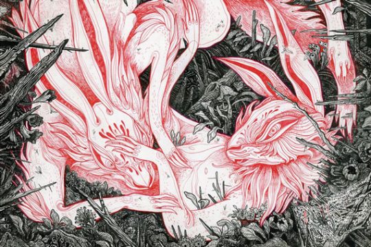
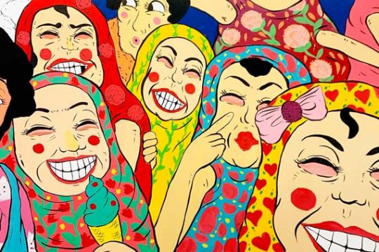
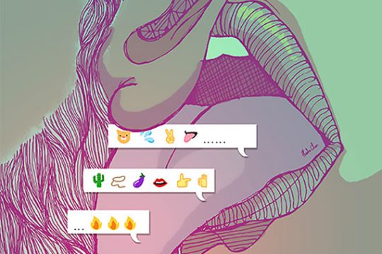
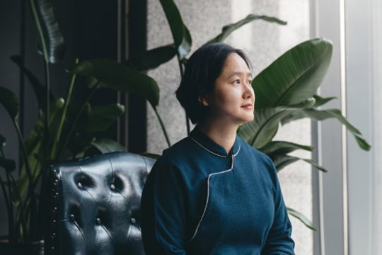
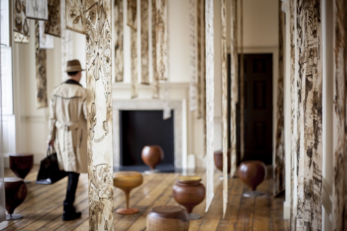
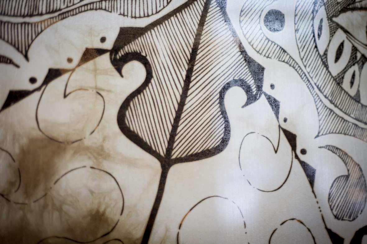
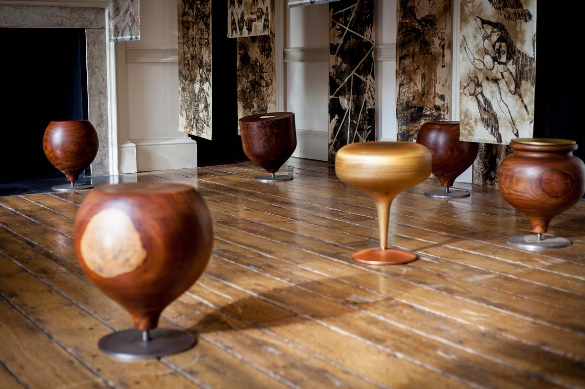
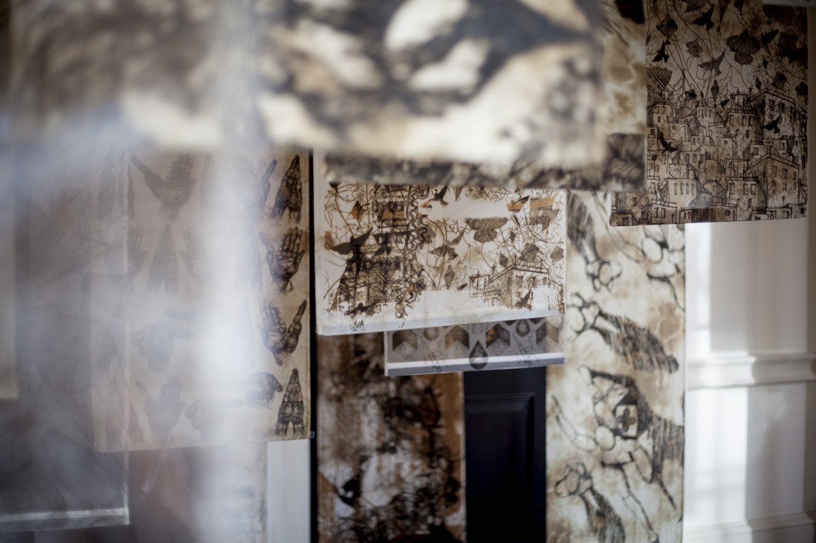
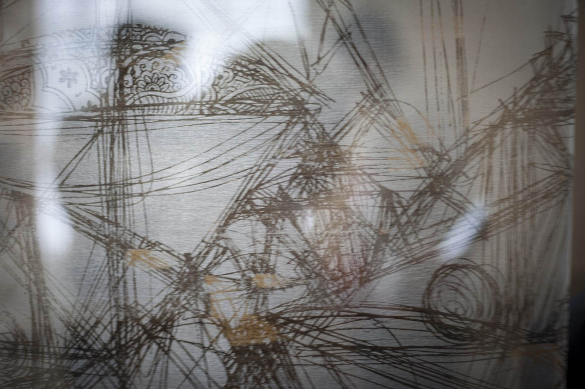
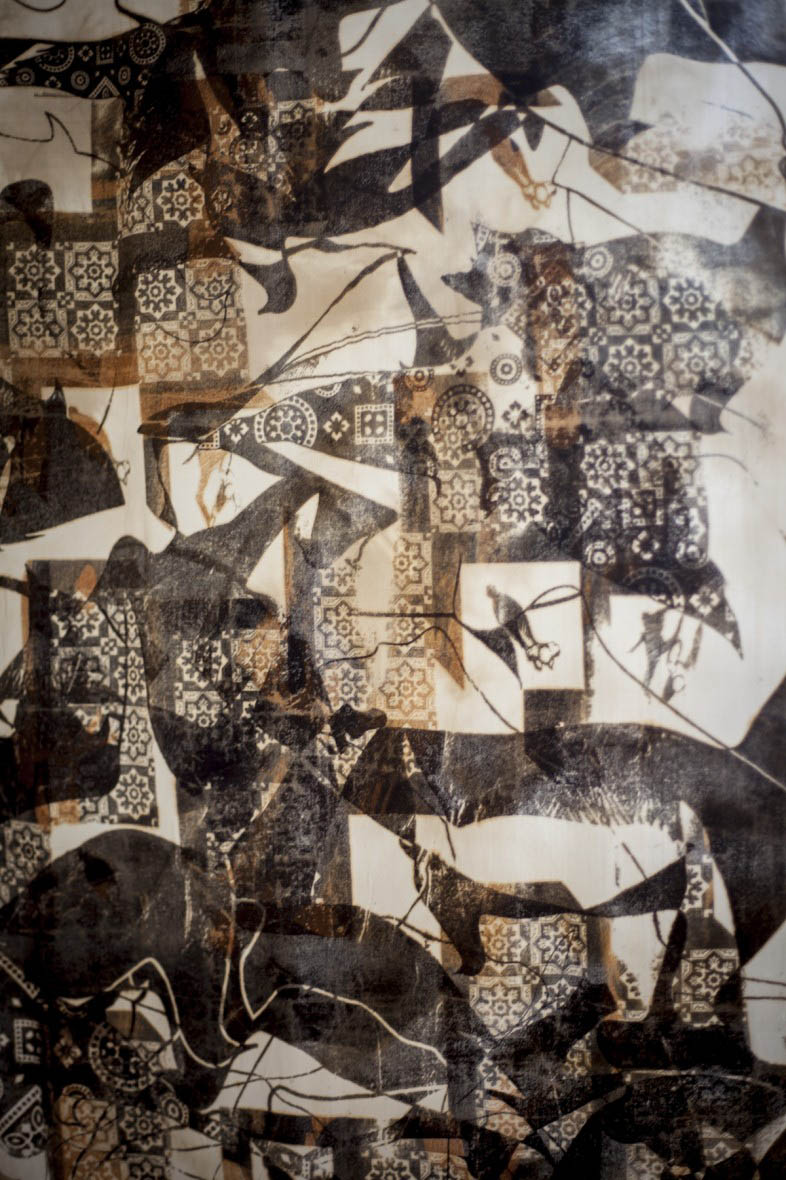
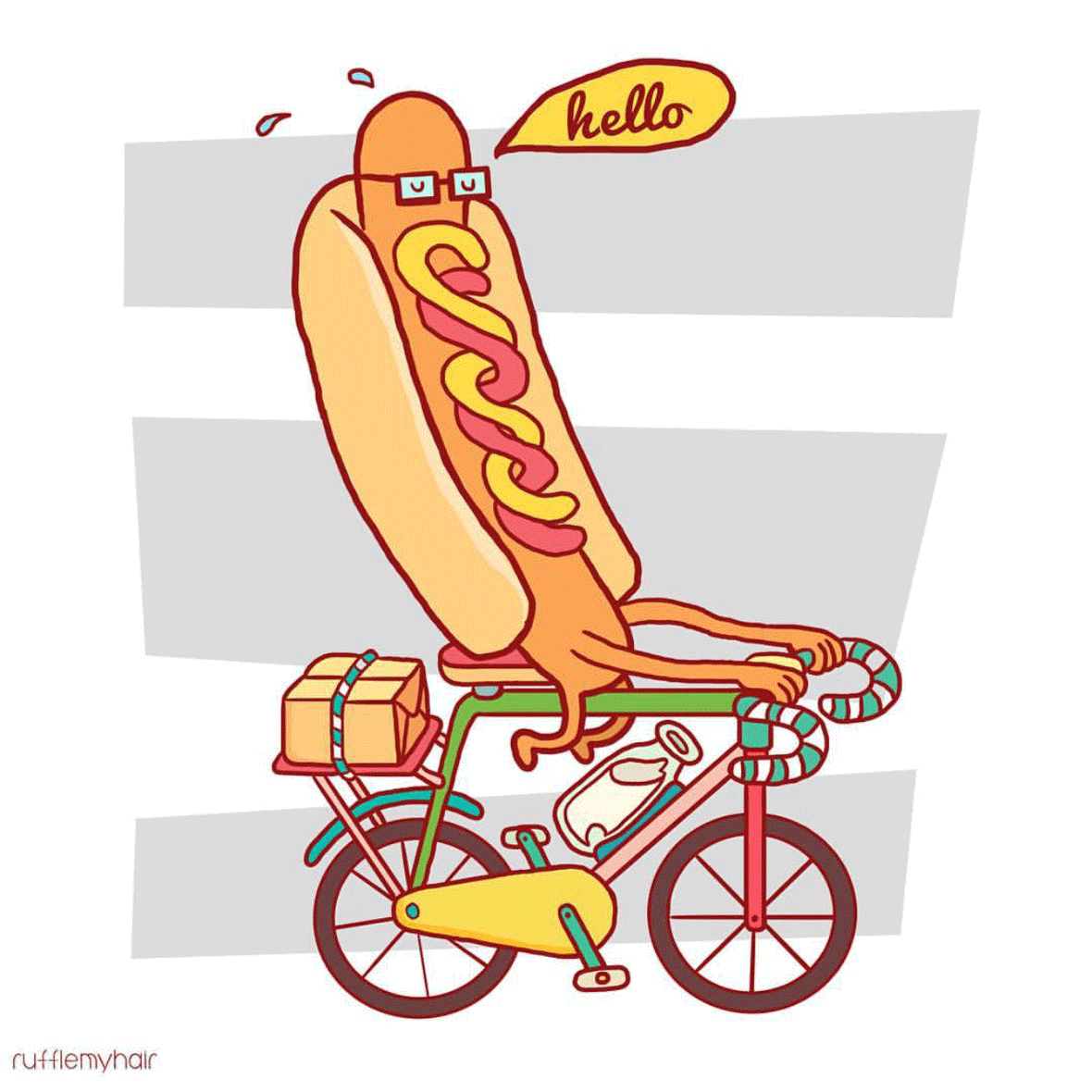
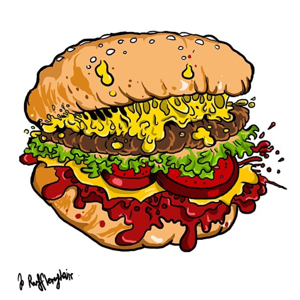
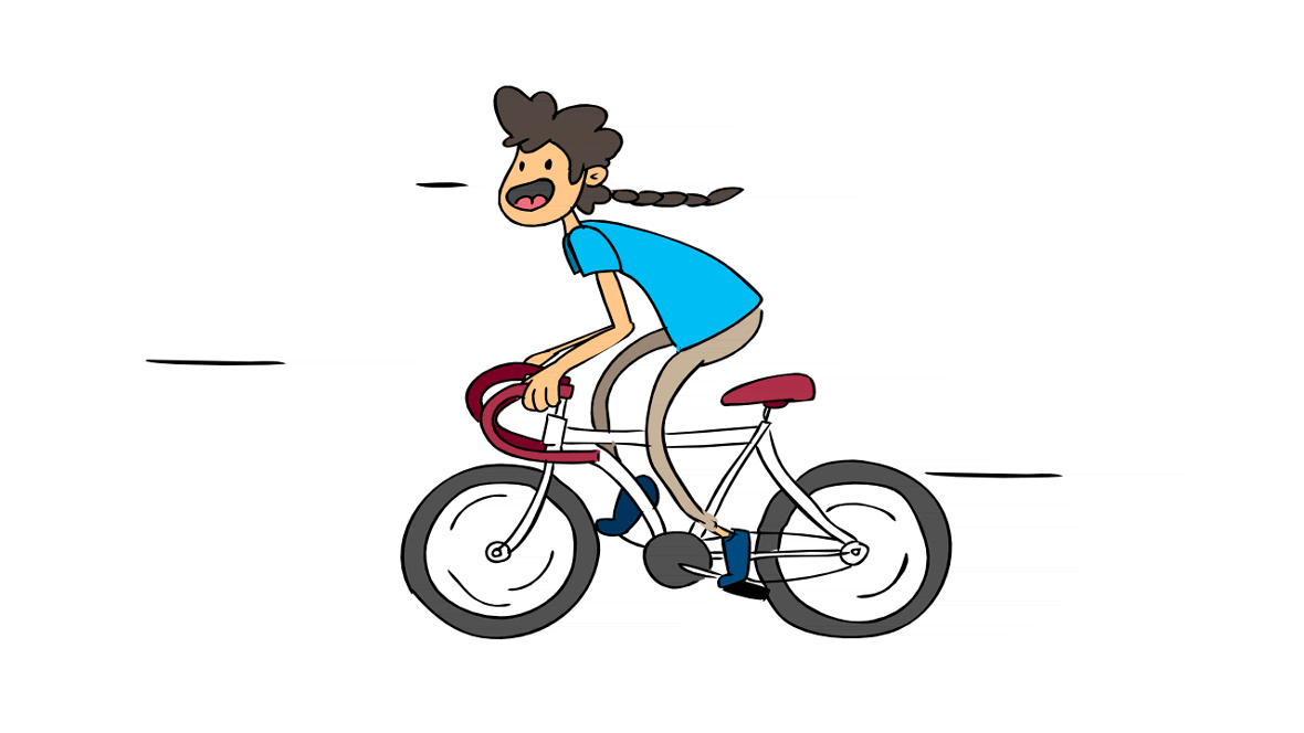
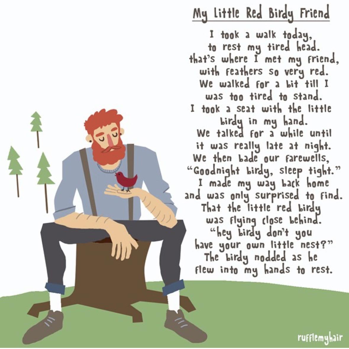
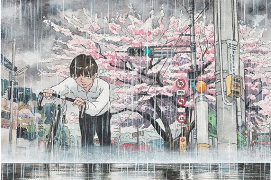
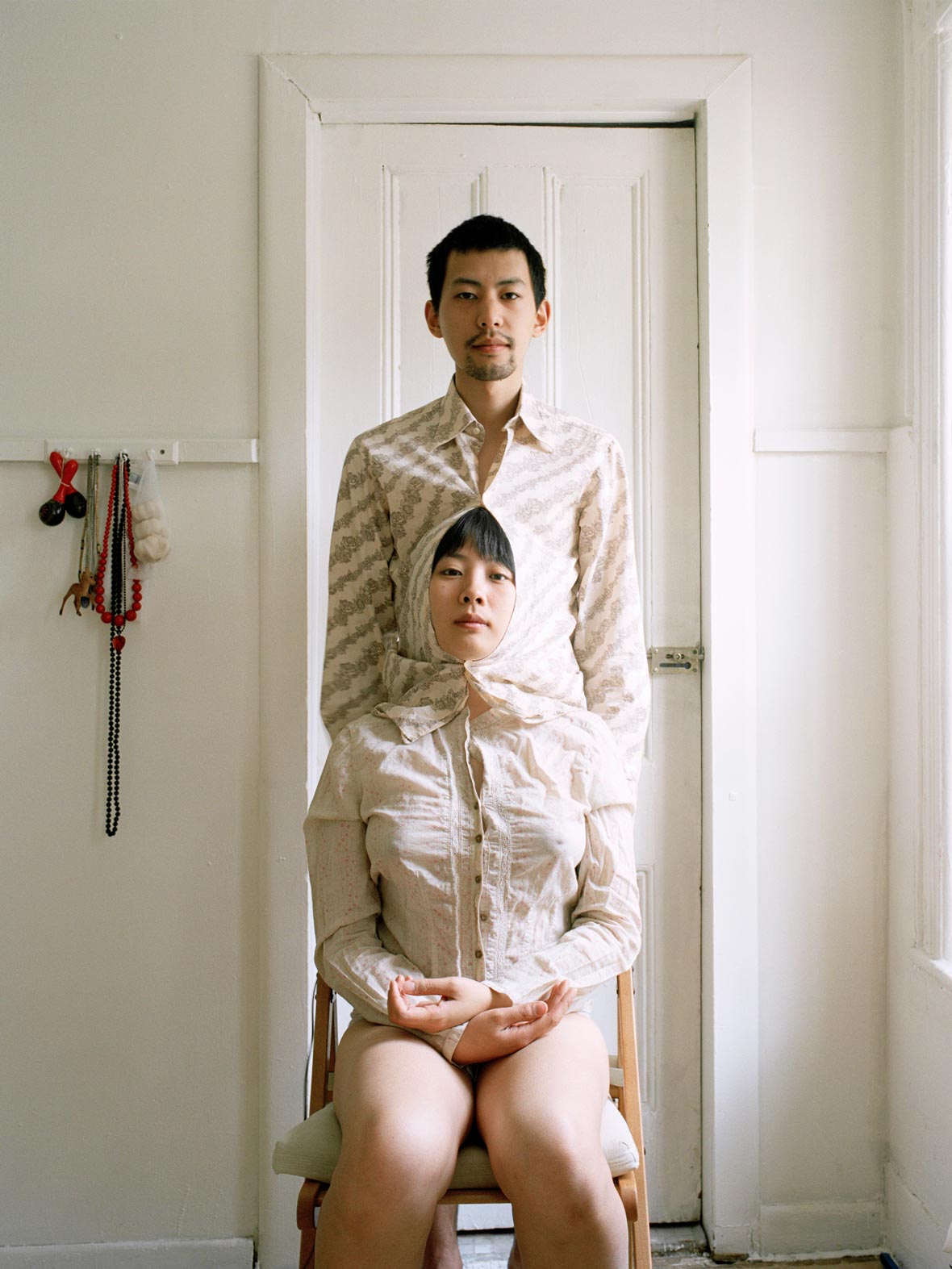
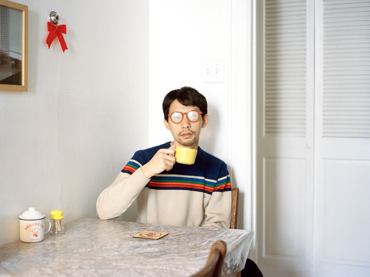
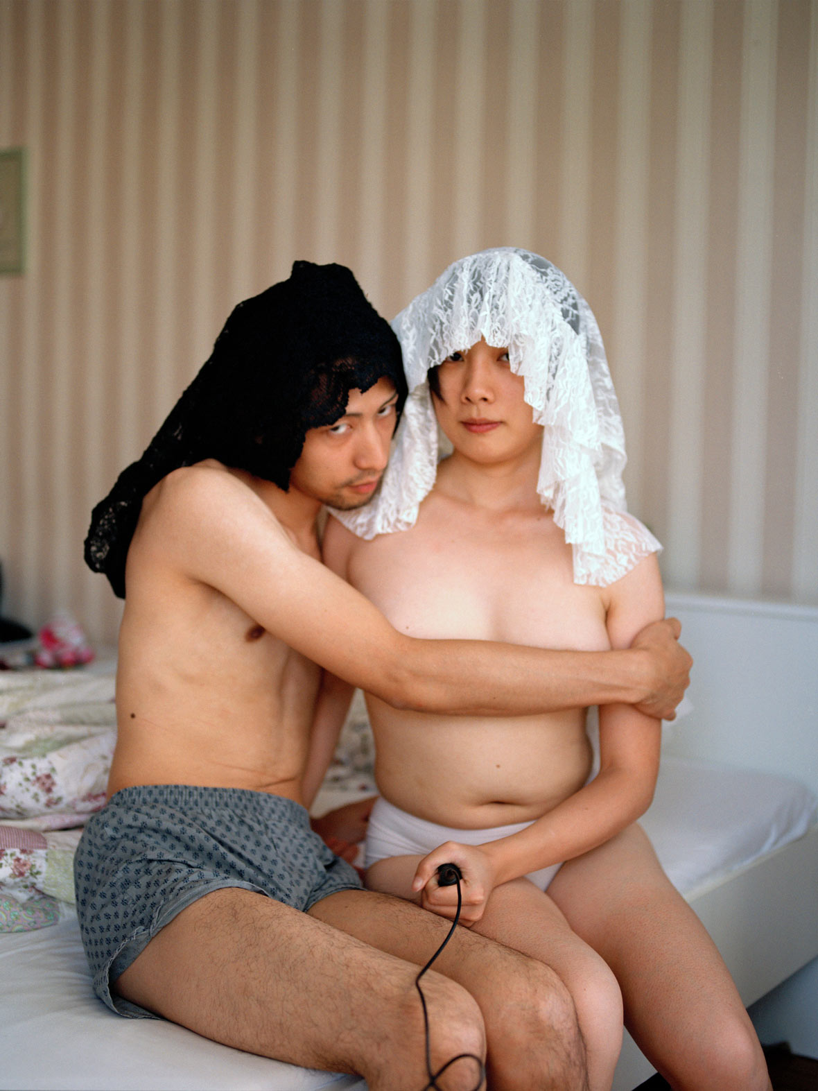
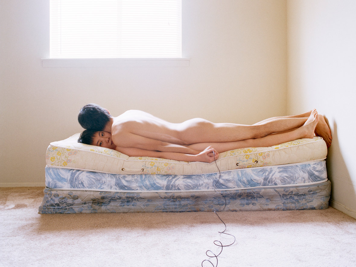
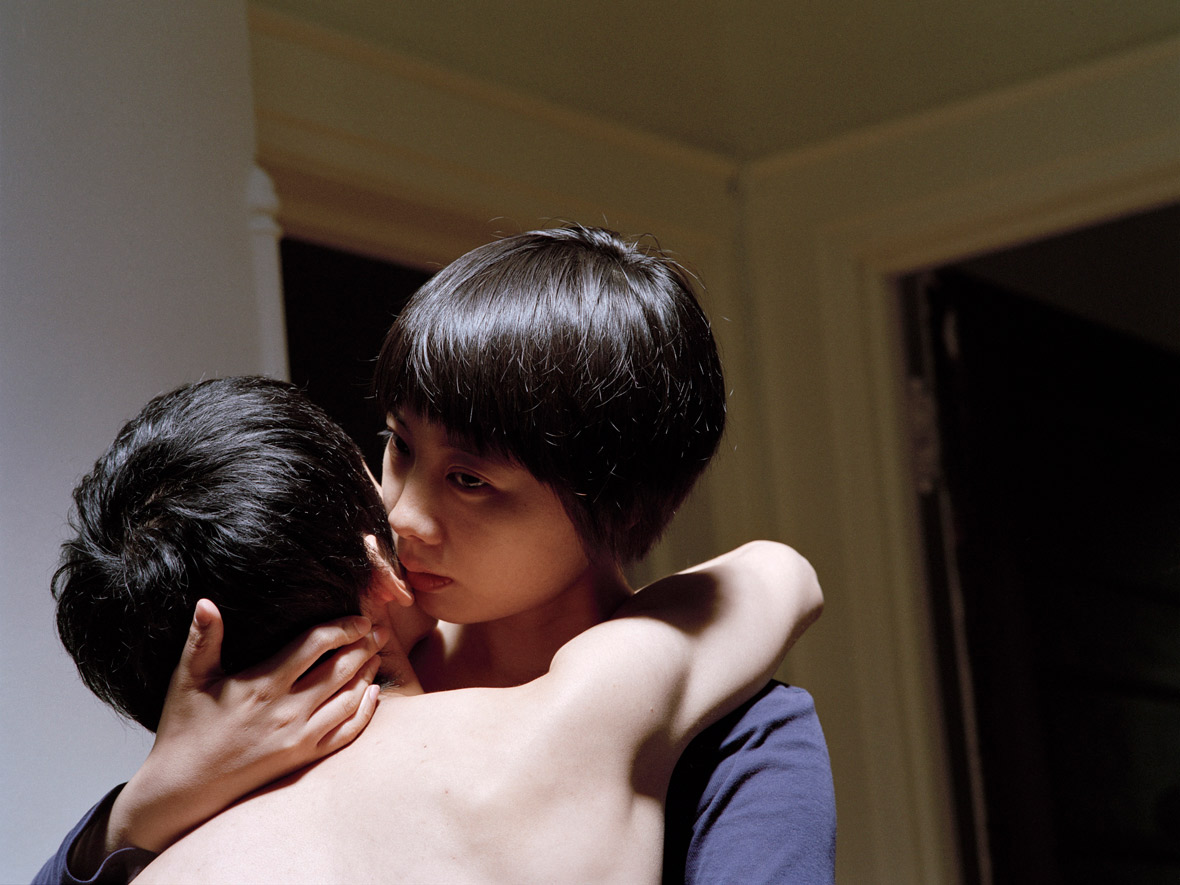
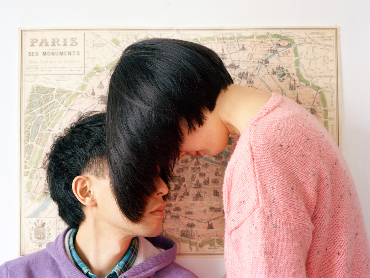
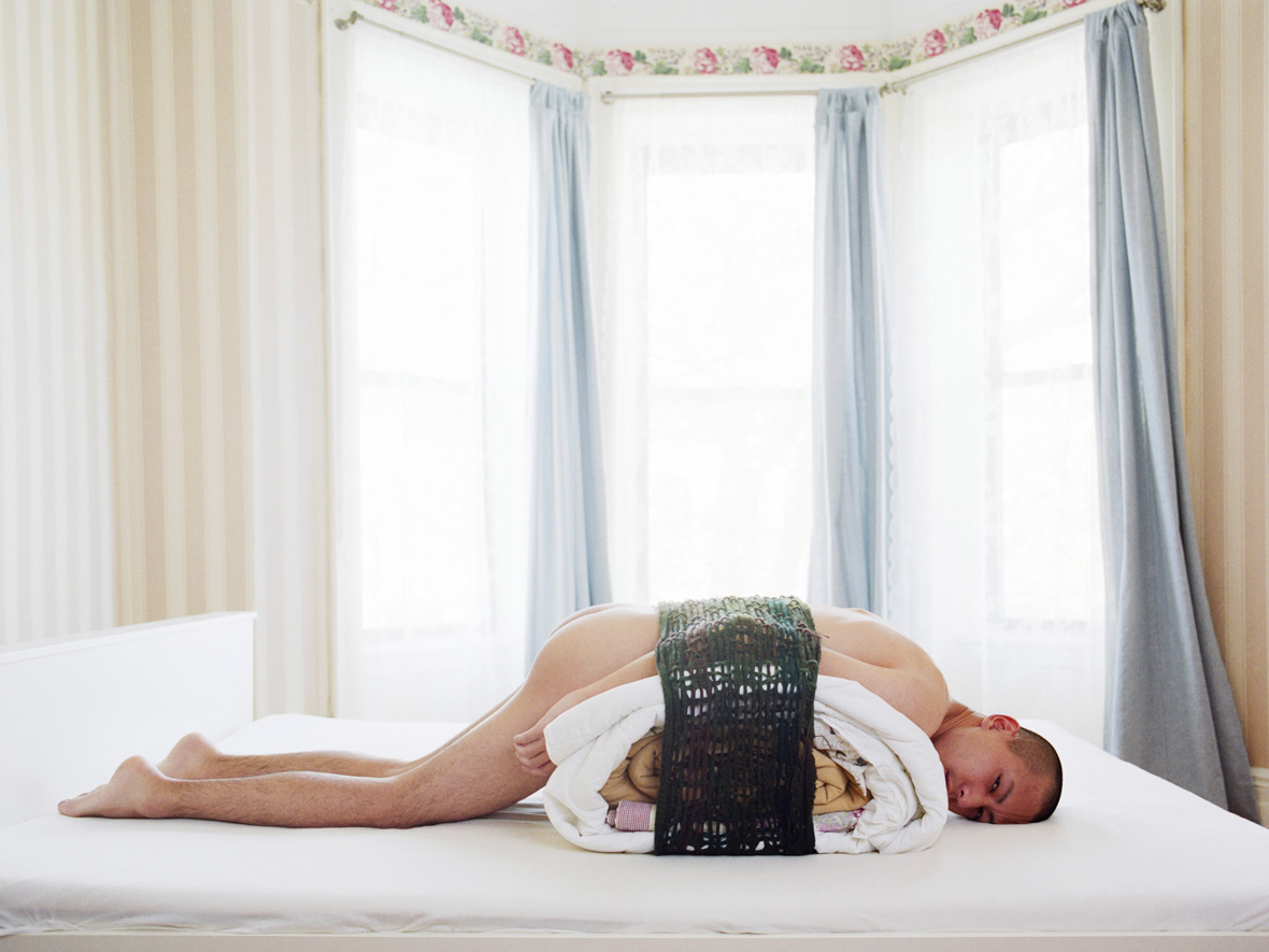
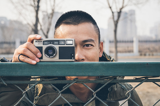
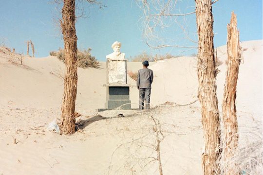
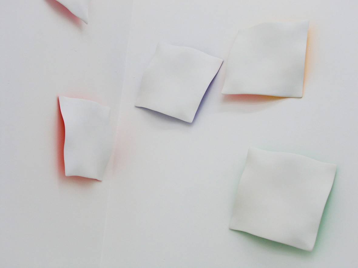
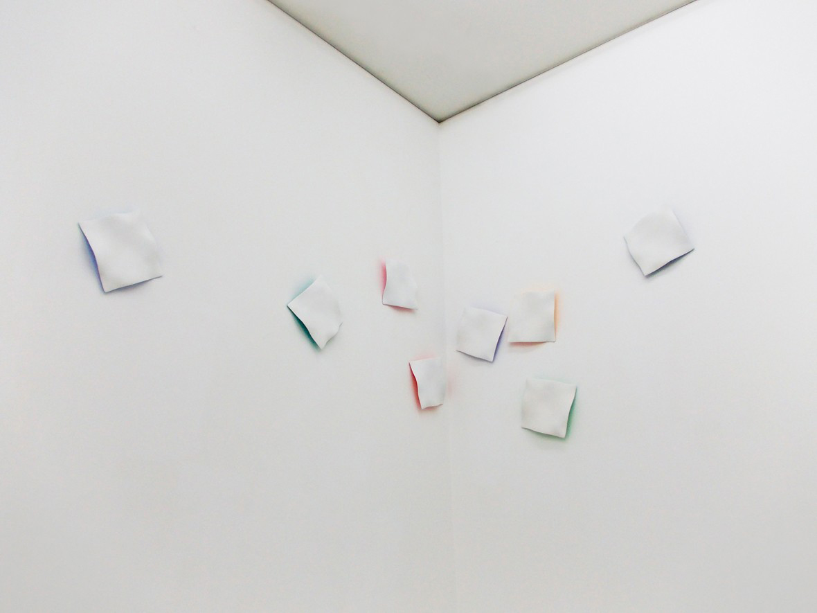
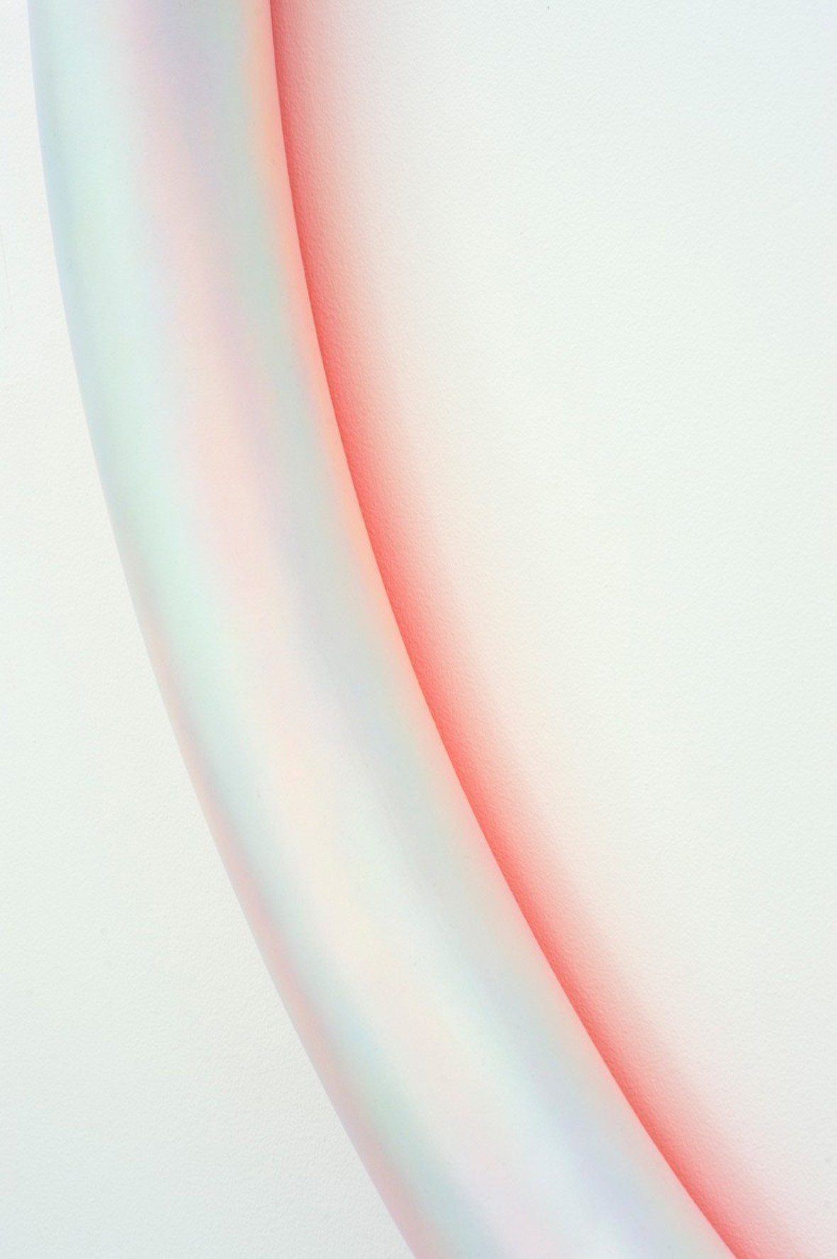
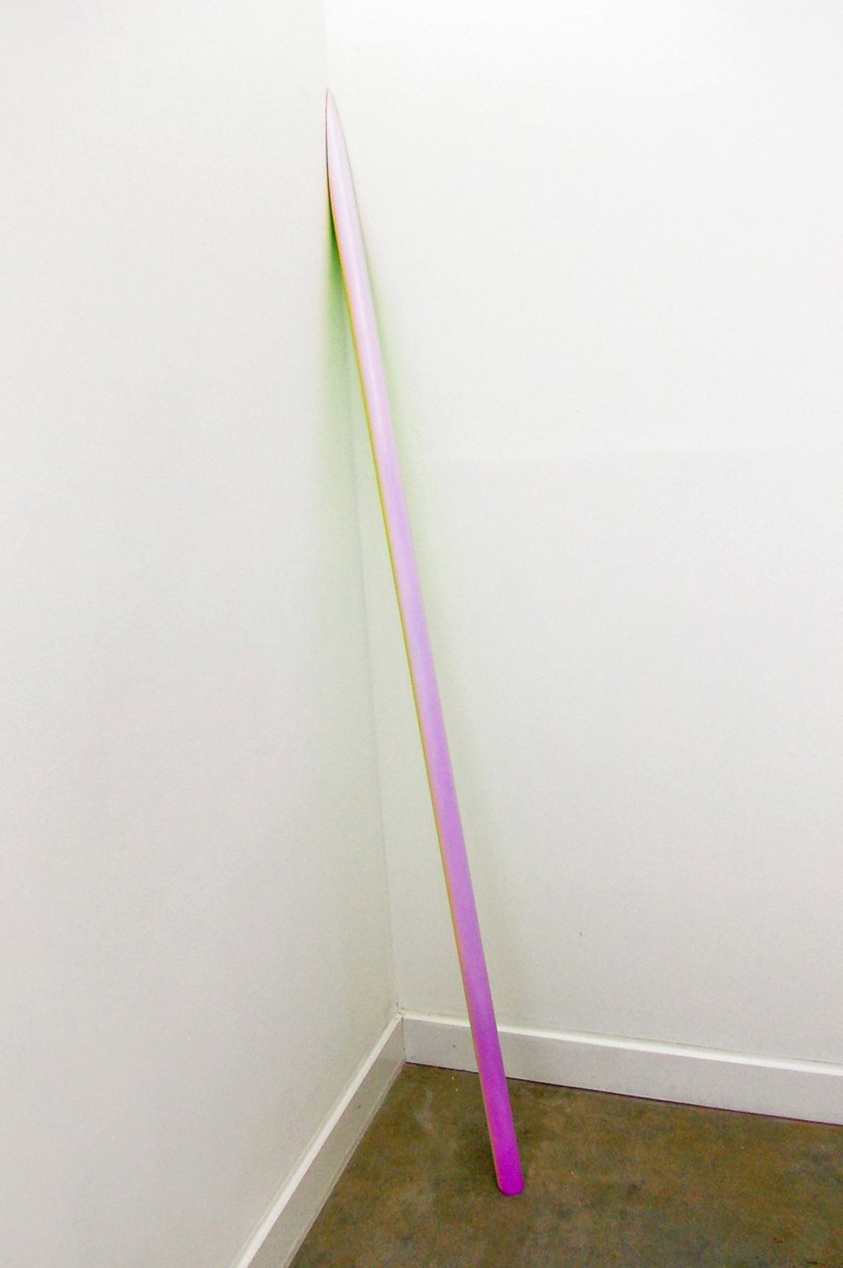
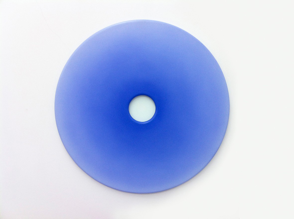
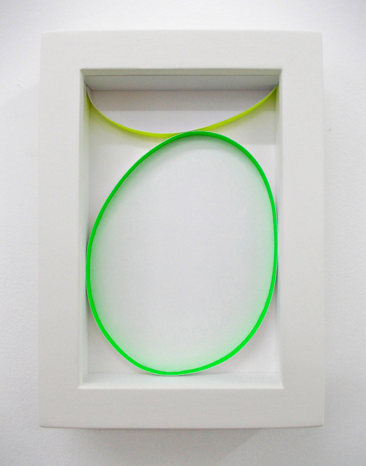
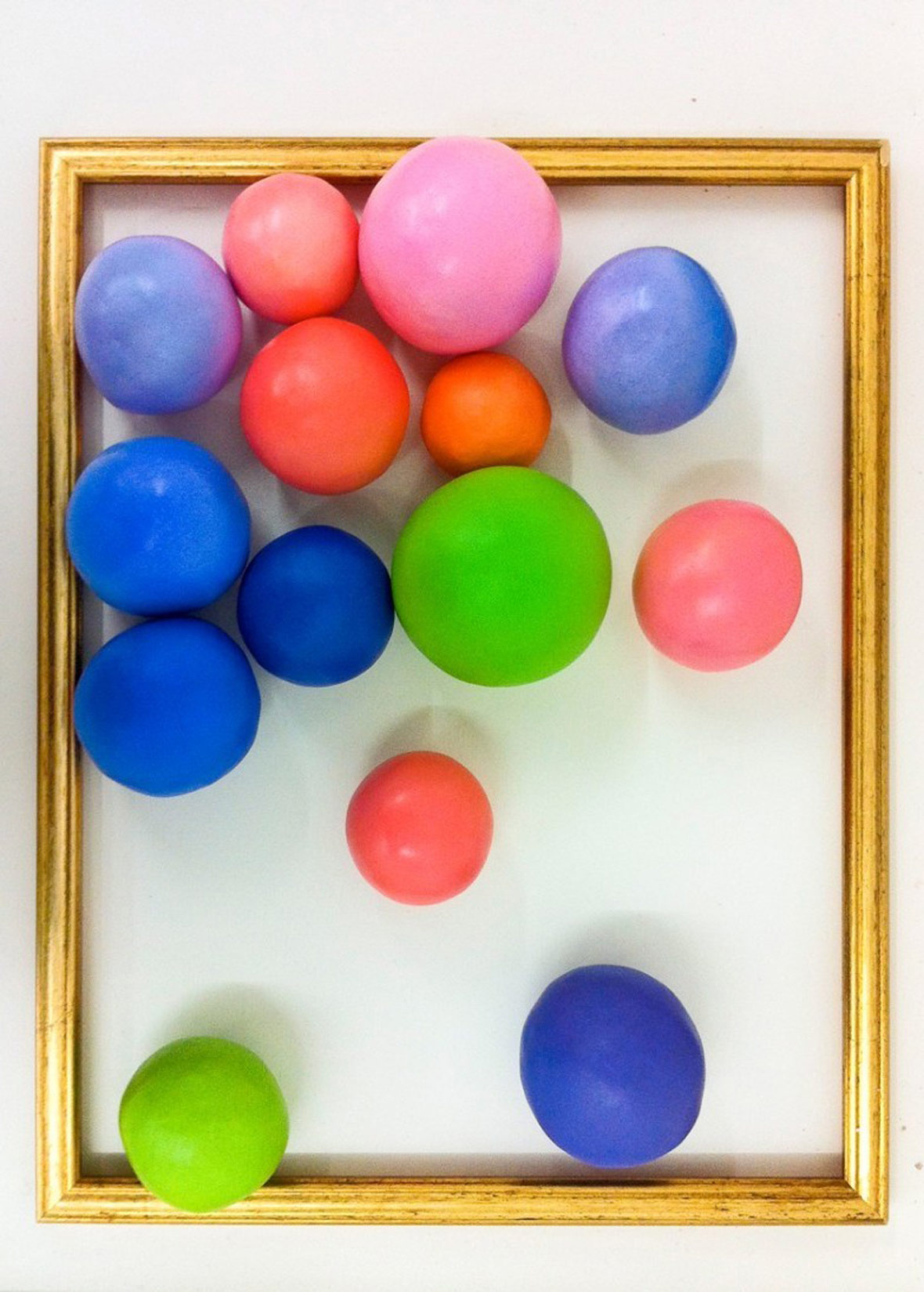
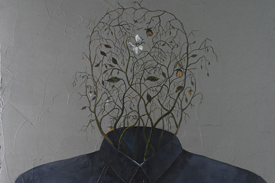
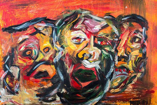
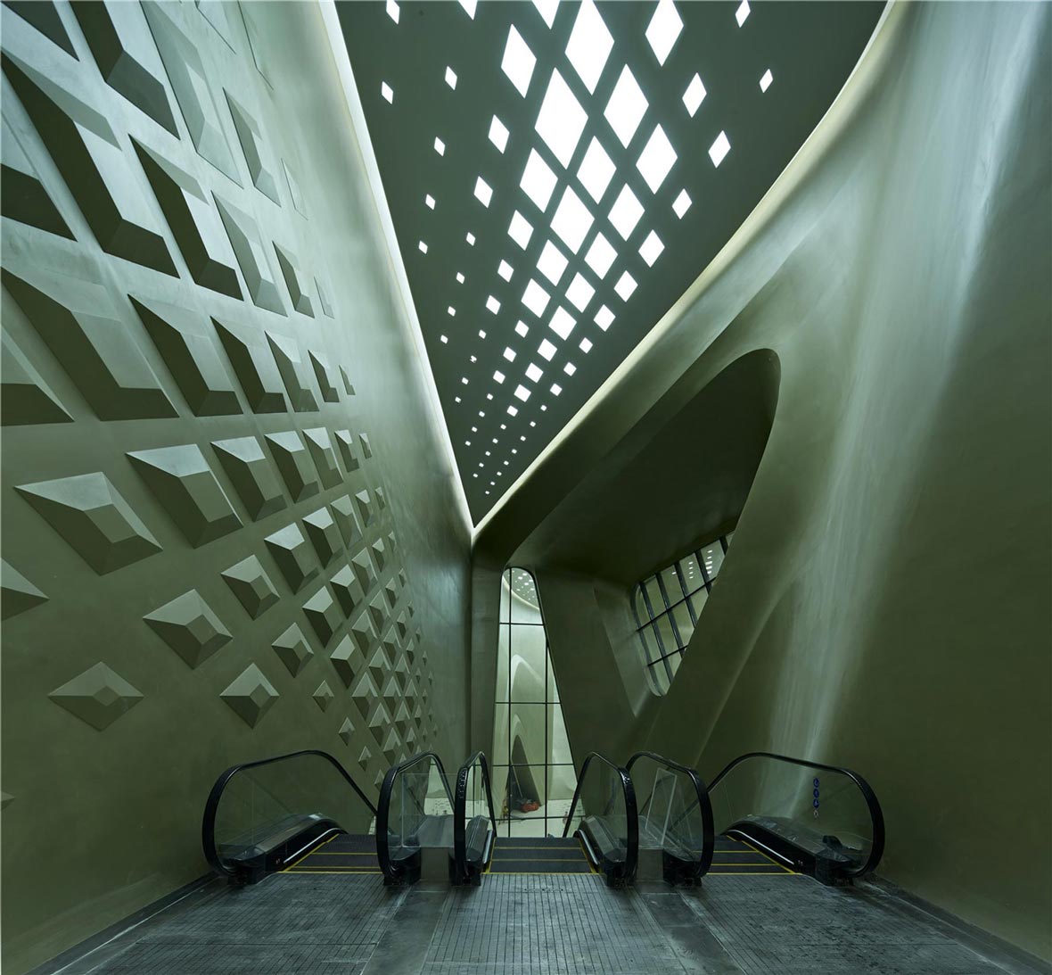
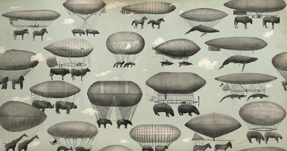
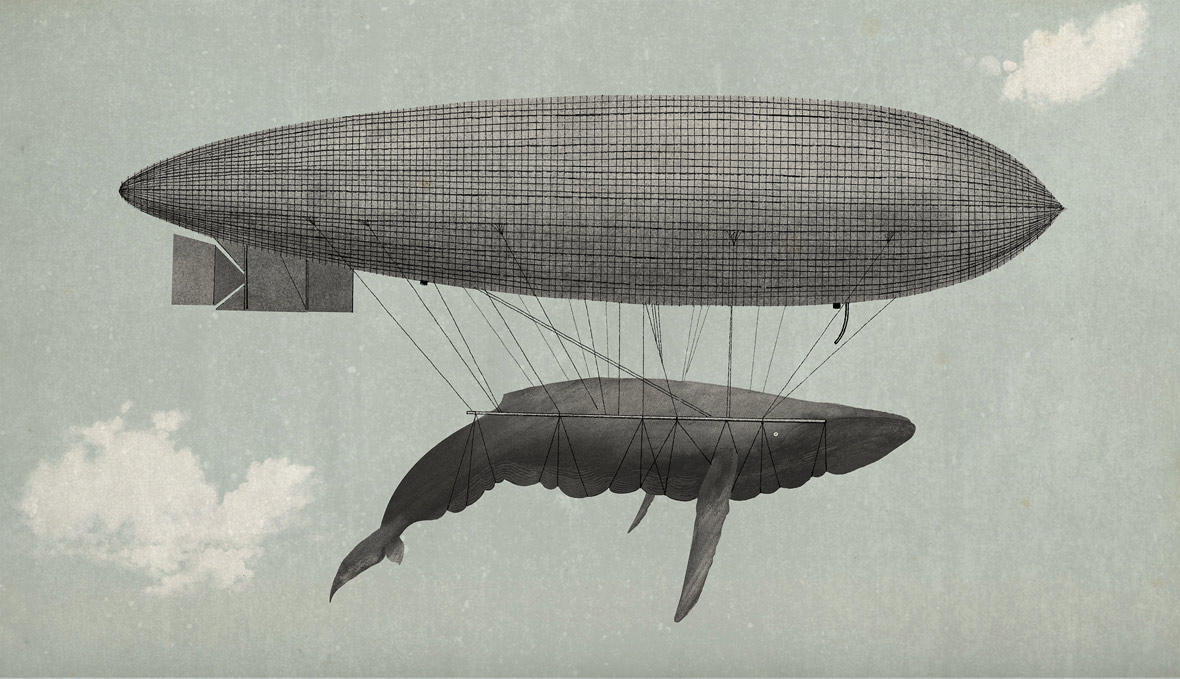
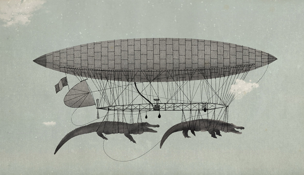
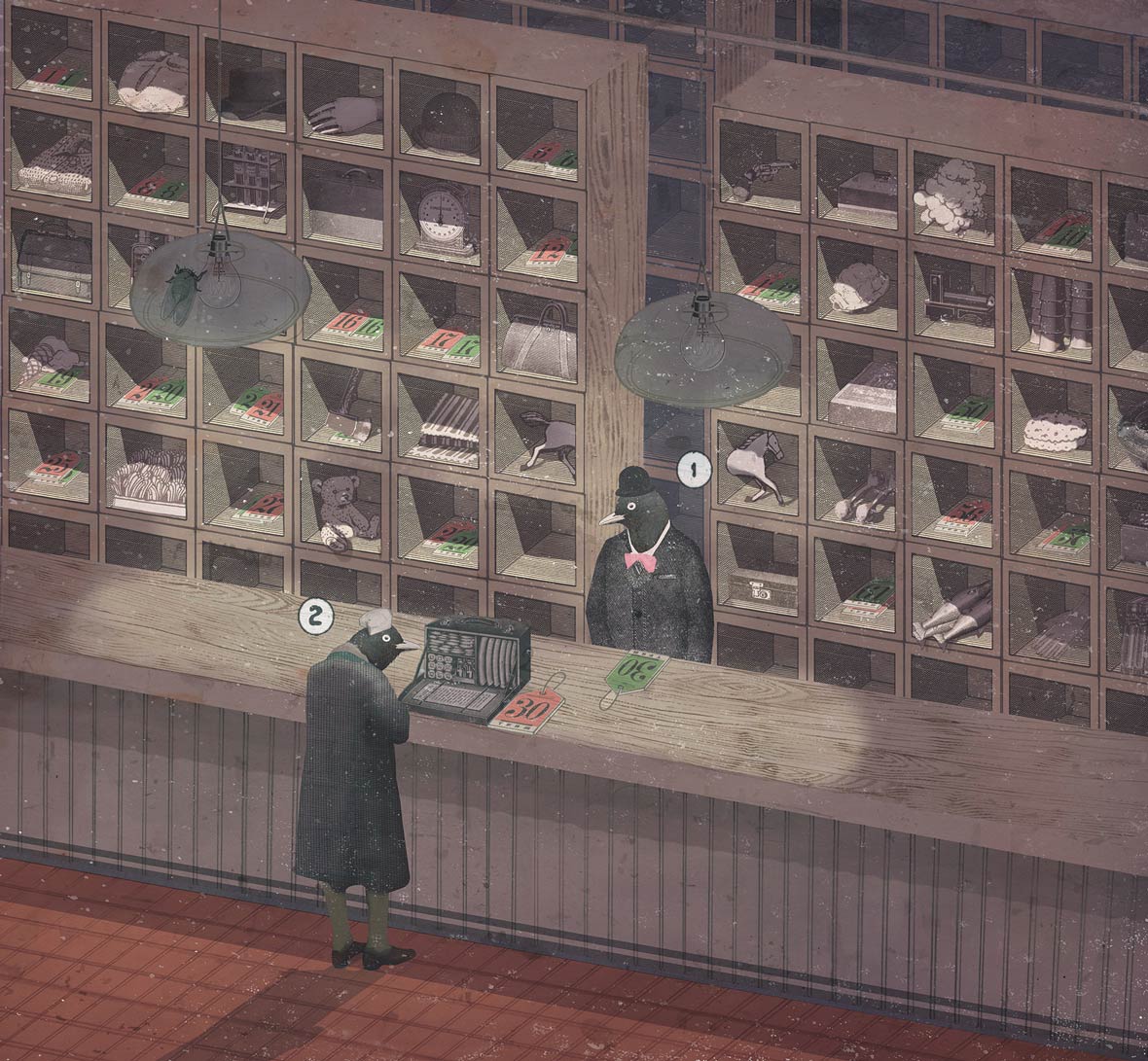
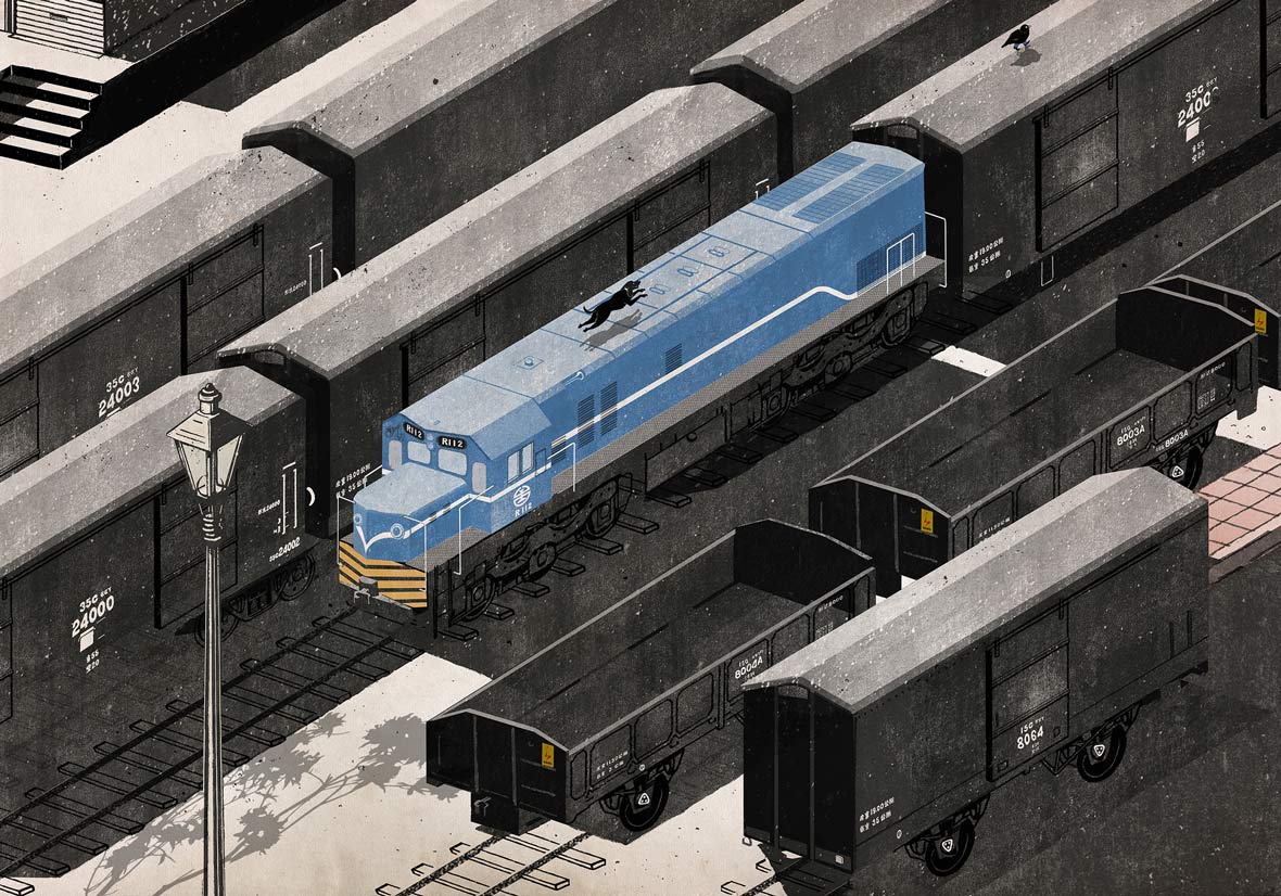
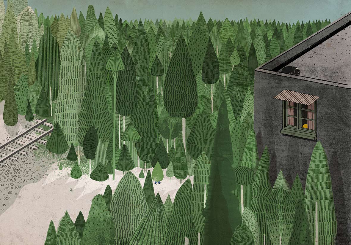
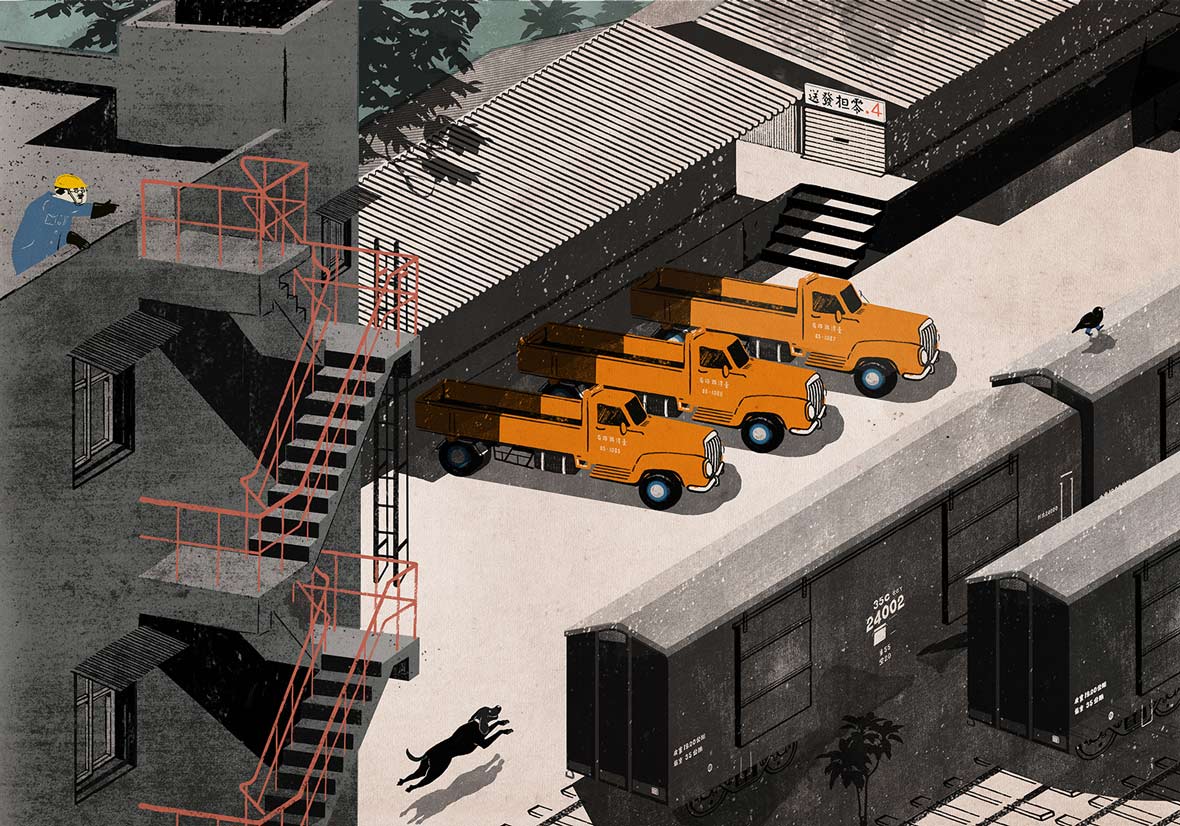
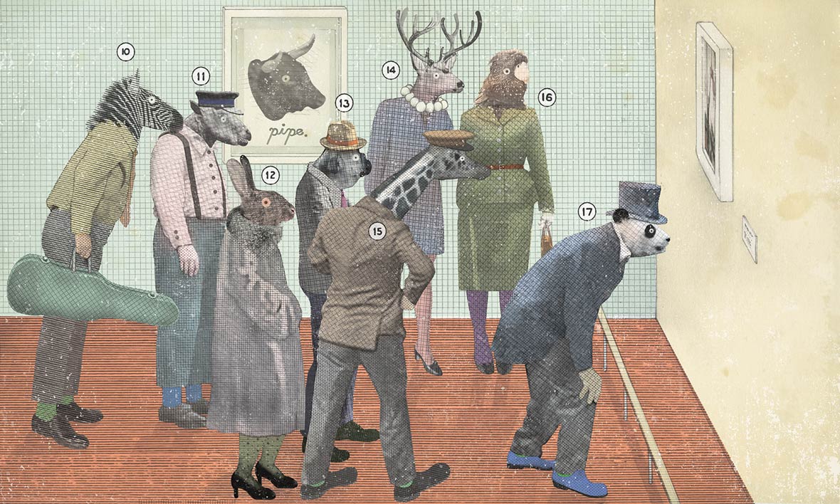
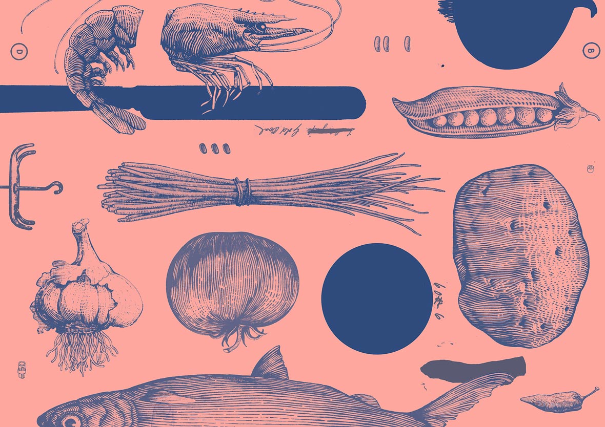
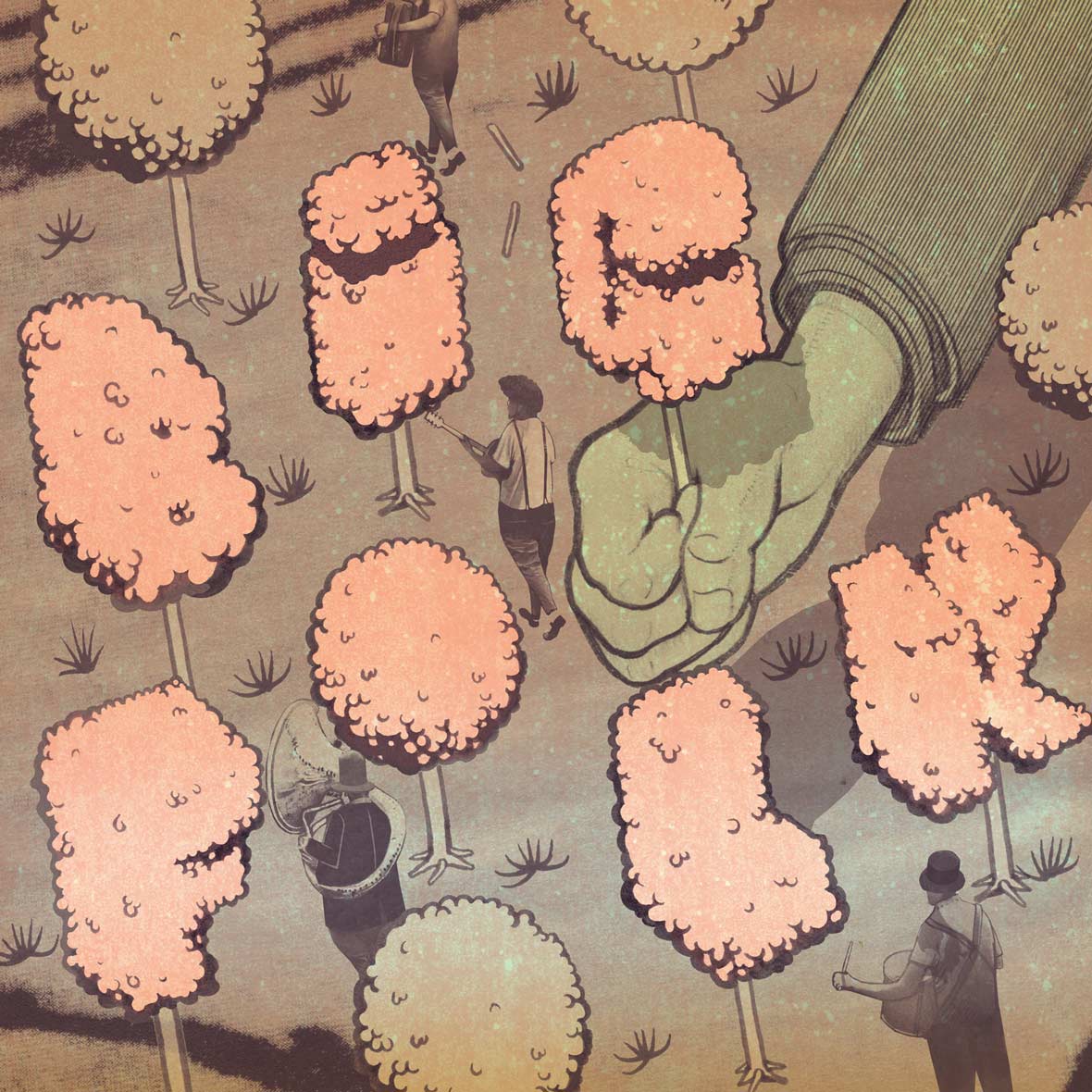
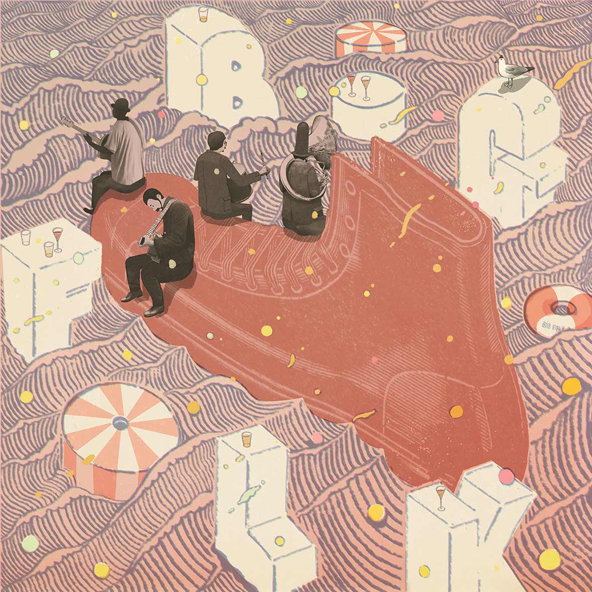
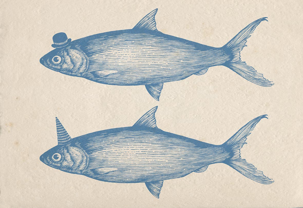
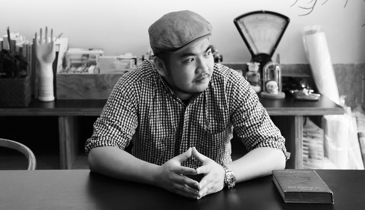
Page Tsou is a Taipei-based, award-winning visual artist, and is the founder of AUSPICIOUS design studio. His work is self-described as retrofuturistic art that still retains a contemporary aesthetic. With a background that consists of both Eastern and Western influences, the surreal worlds he creates are ever-changing and filled with a myriad of imaginative imagery, from fishes wearing top hats to a steampunk version of Noah’s Ark where animals are carried away via huge blimps. More than just aesthetically pleasing, his personal body of work is compelling and narrative-driven, putting various overlooked societal issues under the microscope. Through his storyteller’s approach, Page’s intention is to generate much-needed empathy through his art. We recently had the chance to talk to Page about his inspirations and his thoughts on Taiwan’s creative scene.


鄒駿昇是屢獲大獎的台灣視覺藝術家,也是AUSPICIOUS設計工作室的創始人。他描述自己的作品是具有當代美學的復古未來感藝術。他的創作背景来自于東、西方双重文化的影響,在他創作的不斷變化且神秘又富有想象力的超現實的世界里,從戴着著高禮帽的魚,到被充滿蒸汽朋克風格的諾亞方舟飛艇吊起的動物們。不僅是視覺上富有美感,他的作品也有著極強的故事性,用顯微鏡觀察著各種不同被人們忽視的社會問題。通過講故事的形式,鄒駿昇用他的作品有意識地去製造著現當今社會普遍所缺少的同理心。我們最近有機會和鄒駿昇聊了他的創作靈感和對台灣創新產業的看法。

Neocha: When would you say your interest in visual arts began?

Page: I was about seven years old when I started to fall in love with drawing. At the time, I didn’t really feel like I existed at school, because my grades weren’t very good, and the teachers didn’t pay any attention to me. But painting was my way to get acknowledgement, and it made me feel happy.


Neocha: 你對視覺藝術的興趣是從何時開始的?

Page: 大約七歲的時候開始喜歡畫畫,在那時期,除了畫圖,我在學校的存在感很薄弱,因為學科成績不太出色,老師從來沒注意過我,畫畫使我被肯定,也讓我感到快樂。

Neocha: How have the cities where you’ve lived influenced your work?

Page: I grew up in the suburbs of Fengyuan, near Taichung. The desolation of the semi-industrial landscape there is actually what fueled my desire to make beautiful things. I then spent my high school and college years in the countryside where I practiced traditional ink painting for seven years. Afterwards, I started becoming interested in graphic design. Then, in London, I came to realize that the overall atmosphere of an environment is the key to shaping a beautiful aesthetic. I particularly like the clashing contrasts between the new and the old, and I started paying more attention to details, gaining a more objective understanding of my own culture by observing it from a distance. I came to realize that delivering a message to the audience is much more important than just painting a beautiful painting, and as a result, I gained a more overarching insight into creativity.


Neocha: 你所居住過的城市為你的作品帶來什麼樣的影響?

Page: 我在台中豐原郊區成長,那個半工業地帶的蕭條環境讓我對美好事物更加渴望。後來高中和大學在鄉下度過,畫了七年傳統水墨之後開始對平面設計感到興趣。在倫敦我理解到大環境的整體氛圍才是形塑美感的關鍵,我喜歡新舊混合和衝突與對比,對細節更講究,從遠方觀看自己的文化特質也客觀許多。並且理解到傳達訊息比只是把圖畫漂亮重要,對創意有了更宏觀的包容性。

Neocha: Where do you draw your inspiration from? How do you feel like these inspirations have shaped your unique aesthetic?

Page: I am influenced by all aspects of life. I like to learn about different narrative techniques from movies, and I pay close attention to how the director controls the atmosphere and transitions between scenes. I appreciate Andy Warhol’s sense of modernity, the serenity of Edward Hopper’s work, the creativity of Damien Hirst, the non-conformity of Banksy, the aesthetic of Dieter Rams, the composition and colors of Wes Anderson’s work, Carlo Scarpa’s attentiveness to spatial details, and Le Corbusier’s scale of proportions. I could actually go on and on. In short, I take all of these artistic qualities that I like, and after internalizing them, it all eventually comes together to become my own personal aesthetic.


Neocha: 哪些事物會為你帶來影響?(書籍、電影、某位藝術家….等)而這些又如何塑造出你獨特的美學?

Page: 影響我的事物是很全面的,我喜歡從電影裡學習各種敘事的方式,我會特別注意氣氛的掌握和轉場之間的安排。我欣賞Andy Warhol的時代性,Edward Hopper的寧靜,Damien Herst的創意,Banksy的體制之外,Dieter Rams的美感,Wes Anderson的構圖與色彩,Carlo Scarpa的空間細節,Le Corbusier的比例感。其實也講不完,總之就是集結各種喜好與特質,內化之後,就變成屬於自己的美學。

NeochaWhat challenges do you feel Taiwanese creatives face in today’s market? Do you currently face or have you faced similar hardships in the past? If so, what advice would you give to these up-and-coming creatives?

Page: It’s hard for a normal Taiwanese person to appreciate the invisible and intangible value of creativity and art. Professional designers and artists often face disrespectful attitudes about their work, and business owners can find it quite hard to communicate with creatives. I consider it a problem of the whole environment. Taiwan just needs more time. As long as creatives remain persistent and continue to create great work, things will eventually change for the better.


Neocha: 你認為台灣創意人才在現今市場上面臨什麼樣的挑戰?你目前或曾經是否有面臨相同困境?如果有的話,你會給予這些創意人才什麼樣的意見?

 Page: 台灣普遍民眾對於看不到的價值比較難接受,常有對於專業不尊重事情發生,甚至許多業主並不清楚如何和創作人溝通。那是大環境的問題,需要給台灣多些時間,創意人只能繼續堅持做對的事情,把事情做到位,時間久了總會有轉機。

Neocha: What kind of effect do you think Taipei being chosen as the 2016 World Design Capital has on Taiwan? What do you think the future holds for Taiwan when it comes to the creative industry?

Page: With World Design Capital taking place in Taipei this year, there have been more design-focused events, which allow more people to participate and gain a deeper understanding of design. The government is gradually discovering the importance of the creative industry, which means that creatives will have more opportunities in the future. Nowadays, with the convenience of the internet, it’s easy for exceptional creatives to connect with the rest of the world.


Neocha: 你認為2016年臺北市被選為世界設計之都能夠帶給臺灣什麼樣的影響?你認為台灣創意人才具有什麼樣的未來?

Page: 都市裡多一點設計的活動發生,讓民眾多些機會參與設計並且認識設計。政府逐漸重視文創產業,創意人在未來將有更多機會。網路的便捷,創意人只要表現出色,很容易便能和外界合作。

Neocha: What would you say the most difficult part of doing a commercial project versus a personal project is? From your experience, do you feel like working for Taiwanese brands and international brands are different?

Page: There are more conditions and requirements when it comes to creative work in commercial projects. It’s more restricting because you have to meet the needs of the client while also thinking about the market. It takes time and perseverance to create personal projects. I think that as long as you can maintain a relationship of trust and respect with the client, you can have a degree of freedom, no matter whether it’s an international or a domestic project. The first prerequisite is to be demanding of yourself and make high-quality work. Only then can you start to talk about freedom.


Neocha: 對你來說,進行商業創作及個人創作之間最困難的部分是?依你的經驗,台灣品牌及國際商業活動給予藝術家的創作自由是否有任何差異?

Page: 商業案是個條件式的創作,要能夠達到業主需求,同時也要考慮市場性,限制比較多。個人創作需要時間跟執行的毅力。我覺得只要業主對你的專業保有信任度和尊重的時候,無論國內或國際都可以獲得某種程度的創作自由。先決條件是,你自己要先對自己有要求,作品水平夠了,才有條件談自由。

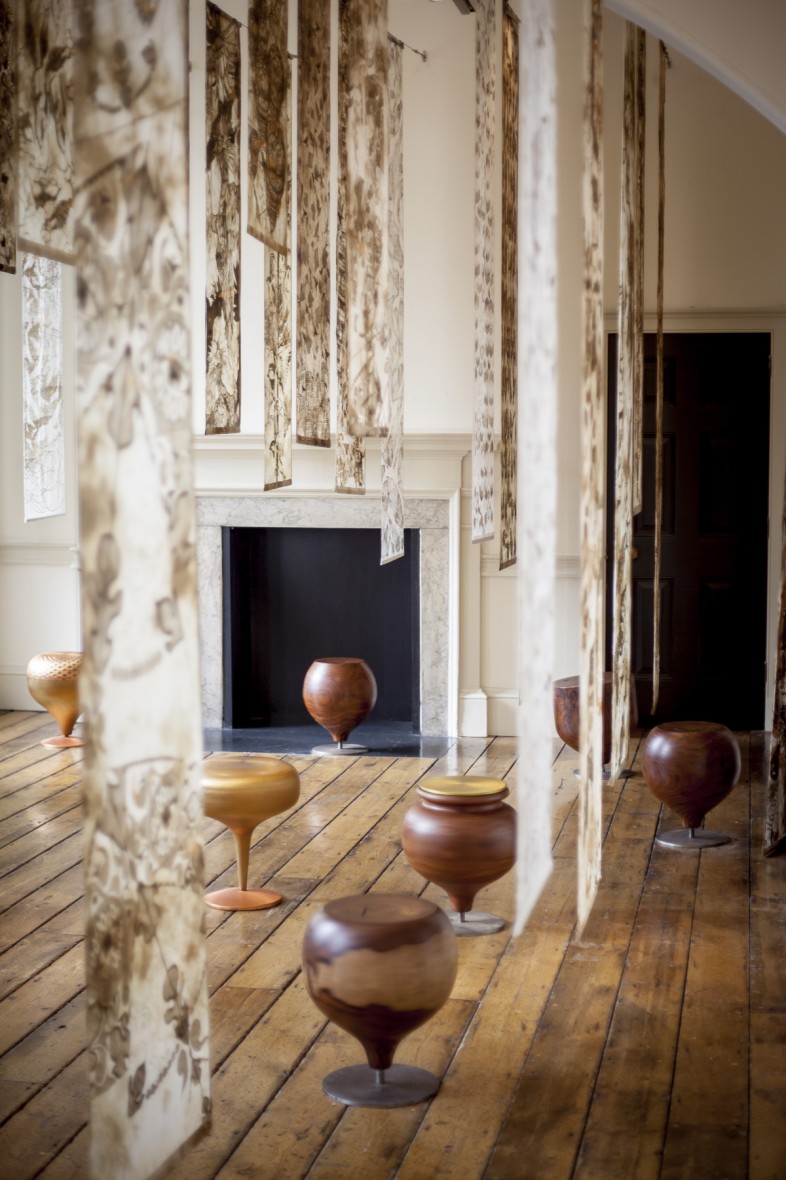
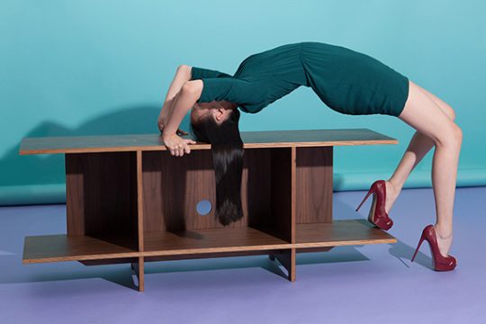
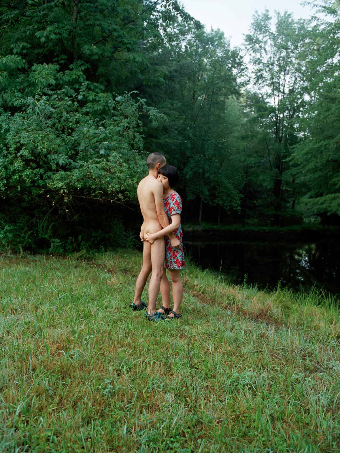
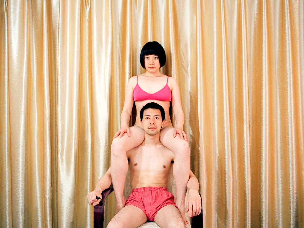
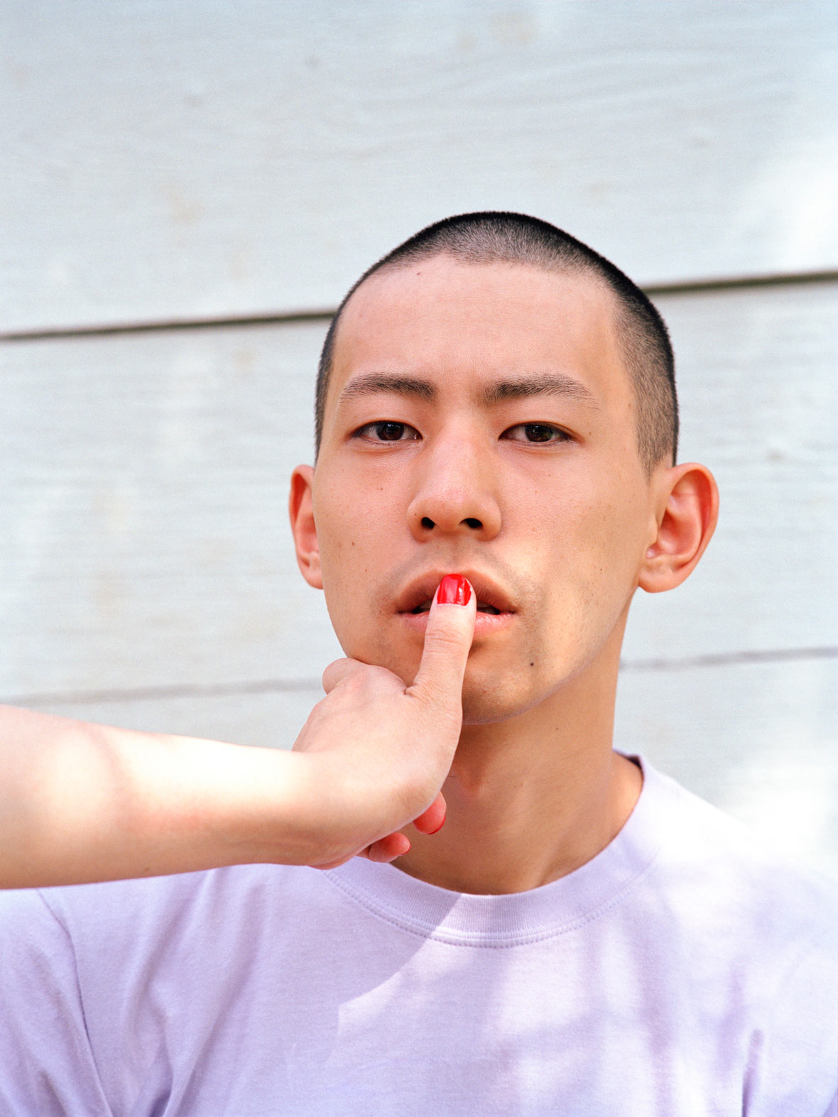
From October 13th to 30th, Visual Taipei, a collaborative exhibition curated by Page Tsou is happening at the Songshan Cultural and Creative Park. The exhibition features artists from around the world and aims to showcase Taipei in a new way through international perspectives.


从十月13号到30号,Visual Taipei,鄒駿昇策展的合作展会在松山文化创意园区展出。汇集艺术家来自世界各地。目标通过国际视角用新的方式展示台北。

This story is part of a content partnership and media exchange between Neocha and World Design Capital Taipei 2016.


本篇文章來自內容合作夥伴Neocha和2016臺北設計之都的媒體交換。

Website: pagetsou.com
Facebook: ~/pagetsou


Contributors: David Yen, Saskia Kerkvliet, Alex Wang


網站: pagetsou.com
臉書: ~/pagetsou


供稿人: David Yen, Saskia Kerkvliet, Alex Wang

You Might Also Like你可能会喜欢

The World’s Longest Glass Bridge

October 13, 2016 2016年10月13日

The Zhangjiajie Grand Canyon Glass Bridge is located near Zhangjiajie City, in Hunan Province, China, and is the tallest and longest glass pedestrian bridge in the world. Bridging the gap between two peaks, which are said to have inspired the American blockbuster Avatar, it is 380 meters long, six meters wide, and stands nearly 300 meters above the canyon floor. Its sleek, transparent design blends seamlessly into its surrounding landscape, offering unparalleled views of the national forest park’s dramatic scenery.


张家界大峡谷玻璃桥坐落于中国湖南省的张家界市附近,是全球最高以及最长的玻璃桥。大桥连接着两座高峰,这两座高峰据说也是美国大片《阿凡达》的创作灵感地。这座玻璃桥长380米,宽6米,矗立于距峡谷底部300米的高空,其流线型的透明设计与周围的景观融为一体。置身于桥上,便可将这个国家森林公园的如画景致尽收眼底。

Designed by internationally renowned architect Haim Dotan, who established Haim Dotan Ltd. Architects in 1990, the Grand Canyon Glass Bridge is a cutting-edge reflection of the firm’s focus on innovative and ecological architectural and design projects. Inspired by the ancient Chinese master Lao Tzu, who said, “Great sound is unheard; great form is invisible”, Haim Dotan has managed to create a structure that is both great in size and subtlety, a symbol of both the celebration and preservation of its natural environment.


大峡谷玻璃桥的设计师为蜚声国际的建筑大师Haim Dotan,其于1990年成立了Haim Dotan Ltd. Architects,一直以创新和生态的建筑和设计项目为重点,玻璃桥正是其中的顶尖代表。Haim Dotan表示,玻璃桥设计理念来自中国哲学大师老子的观点:大音希声,大象无形。他希望在建筑中融合薄如蝉翼却十足震撼的感官体验,并在保护自然环境的同时,也体现大自然的巧夺天工。

Haim Dotan’s projects offer new perspectives on our global architectural landscape by incorporating progressive technologies that continue to develop construction techniques. Previous to the Zhangjiajie Grand Canyon Glass Bridge, Professor Dotan earned international recognition for his design of the Israel Pavilion for the Shanghai World EXPO 2010. He describes the design as a physical representation of the Confucianist concept of Yin and Yang due its focus on balance, with two curvaceous structures gradually intertwining. Dotan is also a refined poet, philosopher and artist, as well as an educator at Beijing’s DeTao Masters Academy, the Institute of Visual Art, and Shanghai’s Fudan University.


通过引入持续促进施工技术发展的先进科技,Haim Dotan的项目成果为当今全球建筑景观提供了新的视野。在张家界大峡谷玻璃桥之前,Dotan教授就以2010上海世博会上的以色列馆国家馆设计广获国际赞誉。他表示,由于该建筑围绕双曲线结构的交织与平衡展开,可被视为儒家学派阴阳观念的实体代表。Dotan同时也是出色的诗人、哲学家和艺术家,并在北京德稻大师学会、上海视觉艺术学院和上海复旦大学任教。

“I believe in nature, harmony, balance and beauty,” says Dotan, “Nature is beautiful as it is. One wants to make the least impact upon it. Therefore, the Zhangjiajie Glass Bridge was designed to be as invisible as possible – a white bridge disappearing into the clouds.” It certainly gives the impression of being suspended in mid-air, a structural glass deck that floats above the canyon like a bird in flight. Slatted handrails flank the bridge’s glass walkway, which narrows in the middle to create an exaggerated perspective. Though its vertigo-inducing views are not recommended for the faint-hearted, the Zhangjiajie Grand Canyon Glass Bridge is the perfect destination for a breathtaking set of holiday snaps.


“我崇尚自然、和谐、平衡和美,” Dotan说,“大自然本身就是一种美。我想尽可能减少对它的影响。因此,张家界玻璃桥在设计时就希望看起来尽可能是无形的——白色轻巧的桥消失在云端的感觉。”毫无疑问,玻璃桥极具震撼魅力,其悬浮在半空中,透明的玻璃板架在峡谷之巅,就像一只展翅于天空的鸟。玻璃道上侧挂的斜拉索构成扶手,越往桥中心收得越窄,看似弱不禁风,其实承受能力非常强。尽管这孤高炫目的视角并不适合恐高胆小一族,但若想在假期中一睹大自然动人心魄的美,张家界大峡谷玻璃桥是你的不二之选。

Website: haimdotan.com


Contributor: Ruby Weatherall
Images Courtesy of Zhangjiajie Grand Canyon Tourism Management Co. Ltd


You Might Also Like你可能会喜欢

A Utopian Playground

October 12, 2016 2016年10月12日

Daalaan is an abstract playground in which visitors can interact by playing in and wandering through the space. Here, people are invited to revisit a utopian world, which they were once familiar with as children – a space without borders and judgement.

Daalaan in Urdu, one of the official languages spoken in Pakistan, means “courtyard”, essentially a space without doors. The installation Daalaan is a space created by Lattoo stools and silkscreens. The stools were made to attract people to spin them, wait for them to stop, and then spin them again. The silkscreens dance and sway with the gentle breeze – when people walk through the space it is as if they are playing hide-and-seek behind the screens.

The Daalaan design team consists of six young Pakistanis, who were motivated to bring the true image of Pakistan to the world. They were inspired by Pakistani craftsmanship and design, and came up with a version that is functional in the contemporary sense, as well as being aesthetically pleasing to the eye.

The stool tops are made of wood or metal, decorated in different patterns, crafted by Coalesce Design Studios, co-founded by Salman Jawed. The silkscreens are all handmade with natural dye by the Islamabad-based textile designer Hina Fancy.

“There is a plan to first create and compile a book on the cultural games of Pakistan,” says designer Faiza Adamjee, “and we would love to create a real playground for both mental and physical interaction that is much needed in our society today.”

Daalaan hopes not only to be a medium to evoke nostalgia, but also an open platform that encourages conversations, ideas and changes. It wants visitors to ask themselves – how have you changed and how can you go back to a more innocent time when all inhibitions were left behind?

Facebook: ~/daalaan


Contributor & Photographer: Shanshan Chen

Fly with Me

October 11, 2016 2016年10月11日


无法观看?前往优酷

Singapore-based artist Joelle Enver brings her loveable characters to life with a distinctive candy-like colour palette paired with whimsical rhymes. Each piece is effortlessly quirky; a true extension of Jo’s infectious personality. Under the online pseudonym, Rufflemyhair, she’s been delighting the masses with her illustrations since her days studying digital animation at Nanyang Technological University.


新加坡艺术家Joelle Enver以独树一帜的糖果色加上天马行空的调调,为其作品中可爱人物形象赋予了生命力。受到Jo本人鬼马般性格影响,她每一件作品都呈现出一种自然而然的古灵精怪。还在南洋理工大学修读数字动画专业时,她就以化名Rufflemyhair,通过轻松搞笑的插画虏获大批网民的喜爱。

“To me, my art is about storytelling and the evocation of emotion. If something could resonate with my deepest self, my core… then I would want to create it and hopefully convey that same feeling to other people,” Jo says.


“对我来说,我的艺术就是一种讲故事和情感召唤的表达。如果一旦有什么东西能泛起我内心深处、核心价值的共鸣,我就特别想去创建它,并希望将同样的感觉传达给他人。”

“Growing up, I spent almost all my time doodling and drawing. It hardly mattered what or where – it just came naturally to me.” Jo’s pursuit of a career in art almost did not happen. She was on the way to pursuing more stable professional fields, such as economics and geography. In Singapore’s academically driven society, the young artist never thought that her hobby could become a viable career until a friend approached her with a pamphlet from Nanyang Technology University. “In large, commanding letters, the pamphlet read: ART, DESIGN & MEDIA FACULTY. I just went, ‘this is it’.”


“在成长过程中,我几乎整天都在涂鸦或者绘画。画什么或者在哪里画都不重要,绘画对我来说就是一种非常自然的状态。”之前在职业规划上,Jo选择的是更为稳定的领域,如经济和地理之类,而非艺术。在学术氛围浓厚的新加坡社会,这个年轻的艺术家从不敢奢望她的爱好能够成为有稳定收入的职业,直到一个朋友带给她一个南洋理工大学的小册子。“册子上工整庄严的大字写着:艺术设计和媒体系。我就去读了,就这样。“

When Jo’s final year in NTU came around, she was tasked with creating an original short film. Her creative process was riddled with constructive critiques from her professors, who tore into nearly every aspect of the film. “When you invest your whole heart into your work, such scathing critiques definitely hurt. You’re brutally forced to wonder what you are doing in this field in the first place.” Her mentor, Professor Hannes Rall became a beacon of support throughout this entire process; his encouragement allowed her to condense the criticism into the tools that she needed to map her way through to a finished product. “Filter through the criticism, but stick to what I felt was right. Bit by bit, my magic world took its form. My characters came to life.”


Jo在南洋理工大学的最后一年里,老师布置了拍摄一个原创短片的任务。她的创意策划备受其教授挑剔,虽然这些批评都非常具有建设性,但几乎质疑她影片的每个层面。“当你全身心投入你的作品,这样严厉的批评无疑会让你感受伤心。你被无情地逼迫着去思考你到底是为什么来做这个事。”她的导师Hannes Rall教授,成了她这整个创作过程中的支撑灯塔——他的鼓励,促使她把批评变成鞭策自己完成最终作品的力量。“我一面汲取批评,但同时也坚持自己的感觉。我所构建出的魔法世界逐步成型,作品中的人物也开始立体丰满,富有生命力。”

In 2015, Jo’s short film Fly With Me won the top gong for Best Animation at Singapore’s 5th Short Film Awards. Her submission was motivated by the purest of intentions – to bring joy and laughter into the lives of her audience. After a rigorous production process, she was rewarded with a win that saw Fly With Me screened in over 15 countries. “It’s an exhilarating feeling, knowing that not only did my film bring a moment of light and happiness into the lives of viewers, but that experts in the field also thought that it was worthy to win Best Animation. It profoundly cemented my desire to be an artist, to give people something to take home with them, be it a small laugh or warmth in their hearts.”


2015年,Jo的短片飞《与我共飞》赢得了新加坡第五届短片奖的最佳动画奖。这个作品遵从心底最单纯的创作意图——给观众带来欢声笑语。经过了痛苦的制作后,她终于得到的喜人回报,带着自己的作品《与我共飞》在超过十五个国家的屏幕上亮相。“知道我的短片不仅能为观众带来一时的轻松和欢乐,而且还受到评委青睐,荣获最佳动画奖,这真的是太让人激动开心了。这也加深了我立志成为艺术家的愿望——人们散场归家后,仍能带点什么回去,或许是一个微笑,或者是一阵暖流。”

Singapore’s creative scene has made a progressive movement in recent years, as locals slowly begin to shake off the shackles imposed by a largely conservative society. Whilst Jo’s personal work is light-hearted and often doesn’t toe the line on controversy, she sees so much importance in the development of the local arts scene and encourages openness.


近年来,随着当地人们逐步摆脱充满保守风气的社会的枷锁,新加坡的创新氛围日益浓厚。尽管Jo的个人作品主题轻松,往往不参与争议性话题,但她看到了当地艺术氛围蓬勃发展的极大重要性,并倡导着开放性。

“Singapore has, for the longest time, been criticised for its rigidity and lack of creativity. The country is often fixated on minimising controversy, but I think we’re is trying very hard to step out of our boundaries. With major events like Singapore Night Festival (of Arts and Culture) gaining massive popularity, I would say that we’re definitely heading in the right direction.”


她表示:“新加坡在很长一段时期,都被诟病为古板僵化与创新疲软。目前,国家经常最大程度减小争议,但我想,我们还需要更加努力才能走出藩篱。随着大型文化艺术盛会正取得大众喜爱和关注,如新加坡仲夏夜空艺术节,我相信我们正朝着正确的方向前进。”

Currently, Jo is working on the sequel to her award winning short film, aptly titled Come Home With Me, which will feature a slightly different style and tone to the original Fly With Me. She remains focused on her journey as an artist, embodying the purest form of love and passion for creation.


目前,Jo正在筹划其获奖短片作品的续集,名为《Come Home With Me》。这个续集作品在风格和基调上与第一部《Fly With Me》都有所不同。她依旧专注于探索作为一个艺术家的漫漫长路,在创作中展示爱与热情的最纯粹表现方式。

“I feel incredibly lucky, and I can’t imagine doing anything else. I hope I will be remembered for just that: my passion and love for my craft, and how I wanted to use that to tell people stories.”


“我感到自己非常地幸运,我简直不能想象我从事其他工作将会是什么样子。对自己技艺的激情与热爱,以及借其与人们分享故事的愿望,我希望自己可以仅以此为人所记。”

Facebook: ~/rufflemyhair
Instagram: @rufflemyhair


Contributor: Whitney Ng


脸书~/rufflemyhair
Instagram: @rufflemyhair


供稿人: Whitney Ng

The Nike Studio

October 9, 2016 2016年10月9日

All designers strive to provide users a sense of joy and fulfillment through their designs. No matter if it’s a space, a game, or software, they hope for their design to be immersive and to become an escape from reality. In 2015, COORDINATION ASIA designed The Nike Studio for Nike Beijing around the concepts of infinity and empowerment. The sleek and futuristic design won them the prestigious ‘best-of-best’ award for the interior retail category from the German Design Council’s Iconic Awards.


在设计界里,不管是娱乐场所空间、游戏还是功能性软件的设计中,设计师们都力求在所营造的情境中,参与者们可以感到愉悦和满足,从而忘记真实世界。是为沉浸式体验。近期,协调亚洲在2015年为北京耐克工作室The Nike Studio所进行的设计,便以基于有趣和未来主题的沉浸式设计,斩获德国设计委员会标志性设计奖室内零售设计类别的最佳设计奖。

Looking to celebrate the World Athletics Championship in Beijing and to help promote China’s “National Fitness Program,” Nike temporarily converted a 1200 square meter art gallery into an impressive multipurpose space. There, they unveiled the Nike Holiday 2015 collection and their brand new running community N+RC (Nike+ Run Club). The renovated space consisted of brightly lit display rooms, dark workout labs, and multi-functional lounge areas.


2015年,Nike品牌为了迎接当年的北京世界田径锦标赛,推广全民健身,对一个1200平方米的艺术画廊进行了临时改造,并在此展出当季的Nike Holiday 2015系列和最新的奔跑社区系列N+RCNike+ Run Club)。整个空间涵盖了包括亮色系的产品陈列区、暗色系的高能运动工作室,甚至多功能休息区等一系列体验空间。

In the spacious product showroom, COORDINATION ASIA’s design team used frosted-over installations and brightly lit, high ceilings to create a sleek all-white interior. “Flash Pack” and “H015” from the Nike 2015 winter collection were on display atop elevated platforms within reflective booths, carefully arranged on linear panels. The design is meant to urge visitors to go outside, brave the cold of winter, and go for a run. Shoes from the Nike ZOOM collection were also on display, placed in rows on semi-transparent LED screens, giving them the illusion of being suspended in midair.


在产品陈列区,协调亚洲的设计团队在宽敞的敞开式空间内,用磨砂的装置设计和明亮、高挑的天花营造出冰冻和严寒的感觉。他们将2015年冬季的“Flash Pack”和“H015”系列置于镜面展台的包围中,精心陈列在悬挂的线条鲜明的层板上,从而更好地表达出产品鼓励人们走出户外,不惧严寒尽情奔跑的设计理念。“ZOOM”系列的所有鞋子则被固定在几排半透明的LED屏幕上,在光影的衬托下如同悬浮在空中,着重体现出动感的韵律。

The workout lab drastically differs from the product showroom. Instead of bright alabaster walls, it’s a nearly all-black space. LED lights pierce the space in the form of intersecting luminous lines. In the dark space, the LEDs aren’t only sources of light, but are used to turn the space into a futuristic scene that feels to have come straight out of a sci-fi film. Furthermore, the contrasting light and darkness brings forth a sense of intensity that aims to convey the allure of sports and athletics.


提供产品原型的运动实验室,有别于产品陈列区,在色彩上由明亮几乎全部转为纯黑,空间中的线条元素也以LED发光条实现。在黑暗中,明亮的LED发光条不仅是作为光源,更是塑造出如科幻电影中熟悉的未来科技感,让人极易沉浸其中专注于其中的运动氛围。此外,空间的张力也在这一明一暗的强烈对比中迸发而出,为运动和健身的魅力找到了全新的诠释方式。

Venturing from the workout space to the multi-functional rest area, the color scheme gradually becomes brighter. The locker room is flanked by black cabinets on both sides of the room, which are connected to white LED strips running along the walls and ceiling. Boldly emblazoned on the wall is a motivational phrase that reads: “Don’t dream of it. Train for it.”


运动实验室转向多功能休息区处,色彩逐渐转向明亮。“运动员休息室”空间内布有相应设计的座椅以供运动员休息;更衣室内,两侧黑色的衣物柜上方通过附在墙壁和天花板的白色LED发光条连接,承袭了整个空间的线条感,墙上更写有“Don’t dream of it. Train for it.”(将梦想付诸行动)装点空间,激励斗志。

Throughout the entire project, COORDINATION ASIA worked closely off of the concepts of Nike’s co-founder Bill Bowerman’s two quotes: “To bring inspiration and innovation to every athlete in the world” and “If you have a body, you’re an athlete.” The core of the design still revolved around the concepts of infinity and empowerment, and COORDINATION ASIA’s meticulous use of lines successfully turned the space into an impactful visual experience that conveyed a sense of infinity and athletic passion.


协调亚洲的设计团队在整个项目中,从耐克联合创始人Bill Bowerman所言的让全世界的运动员都能感受到创新与动力以及每个人都可以成为运动员作为源点出发,以“无限和力量”为主线,利用线条在透视中产生的延伸感,创造出一种对感官的冲击,成功让人感受到运动的激情。

Websitecoordination.asia


Contributor: Banny Wang
Images Courtesy of COORDINATION ASIA


网站coordination.asia


供稿人: Banny Wang
图片由协调亚洲提供


Gender Dynamics

October 8, 2016 2016年10月8日

Shanghai-born and now Brooklyn-based, Pixy Liao is a visual artist who’s on an ongoing exploration of gender dynamics in heterosexual relationships. Originally working as a self-taught graphic designer after graduating from college, the lack of creative control over the work forced her to rethink her career path. In 2005, she moved to the U.S. to study photography and there she ended up meeting Moro, her boyfriend and the main subject in the majority of her works. In Pixy Liao’s ongoing photo series Experimental Relationships, one of her most well-known projects, her boyfriend is depicted as being vulnerable and submissive, qualities that are stereotypically attributed to women. Besides Experimental Relationships, her other works also often challenge Asian societal expectations of relationship roles. For Soft Heeled Shoes, Pixy 3D printed a pair of silicon penises modeled after her boyfriend’s actual genitals and used them as heels on a pair of yellow suede shoes, which is meant to be a metaphor for their relationship. Recently, Neocha spoke to Pixy to find out more about her thoughts on gender and the collaboration process between her and her lover.


旅居纽约布鲁克林区的视觉艺术家廖逸君,她的作品一直在探索异性恋中的两性的化学反应。毕业后成为了一名自学成才的平面设计师, 缺乏创意的工作方式让她重新考虑自己的职业。2005,廖逸君前往美国学习摄影,在美国和男友Moro相识,也发现了她作品中的主要主题。 在她进行中的摄影系列作品,也是知名的作品《Experimental Relationship》中,她的男朋友Moro展现出娇弱和唯唯诺诺的姿态,被赋予了传统观念中女性的性格特质。除了《Experimental Relationship》,她的其它作品也常挑战着亚洲社会中的传统的人际关系。《Soft Heeled Shoes》也是她的代表作品之一,她用3D打印出她男友的实际比例的硅胶生殖器,把它作为黄色翻毛皮的高跟鞋的鞋跟,这个作品她把他们的关系比喻成这双高跟鞋。近期新茶和廖逸君展开了对话,去探讨关于性别和她和她男友的合作。

NeochaGenerally speaking, sexuality and feminism are subjects that aren’t openly discussed in China. How do you feel like this has influenced your work?

Pixy: When I just started making creating art, I was not influenced by sexuality and feminism. It was purely from my personal experience. I grew up in China and it’s true that sexuality and feminism were not talked about at all. I was so naive that I wasn’t even aware of homosexuality or feminism when I was a teenager. But I do think my work does make references to feminist issues and themes; other people often referred my work to feminism. When I first encountered feminist text and theory, I actually felt surprised to see what I had been thinking and doubting my entire life being discussed.


Neocha: 一般来说,在中国,性和女权主义这类话题都不会如此坦率地讨论。这对你的作品创作有何影响?

廖逸君: 当我最开始进行艺术创作的时候,并没有受性观念和女权主义的影响。那全是我的个人经历。我成长于中国,性与女性主义这类话题的确未曾谈及。我那时太天真,以至于在我的青少年阶段对同性恋或女性主义完全没有观念。但我想我的作品的确参考了女权主义的论点和主题,很多人也常常把我的作品归类于探讨女权主义的艺术作品种类。当我最初接触到女权主义的文章和理论时,我是非常惊喜地看到有人在探讨我所一直在思考和怀疑的。

Neocha: What does your family or Chinese friends think of your work? How receptive are they and what type of feedback did you receive in the beginning? How has this changed as your work evolved?

PixyAs mentioned in my artist statement, this work was partly inspired by my Chinese friend’s comments about our relationship. One of my male friends even questioned how I could choose a boyfriend the way a man would choose a girlfriend. I thought, “Damn right. That’s exactly what I’m doing and why not!” After having continued on with this project for ten years, most of my friends shifted their attitudes. They no longer question my decisions and started to really accept me as who I am. I think a lot of my friends really got to know me through my work.


Neocha: 你的家人和中国朋友是如何看待你的作品的?他们是否认同和接受?在开始时候,你得到是什么样的反馈呢?随着你作品的发展,这些观点有没什么改变?

廖逸君: 就如我在我的创作理念里提到的,我作品一部分是受到中国朋友两性关系观念的启发。曾经我的一个男性朋友甚至质疑我 “你怎么可以像我们挑选女友一样挑选男友呢?” 我想,“这他妈就对了,这就是我干的事,有何不可?” 在这个作品持续创作了十年之后,我的大多数朋友转变了他们的态度。他们不再质疑我的决定,并开始接受真实的我。我想很多我的朋友都是通过我的作品来真正地认识我。

Neocha: Much of your work is about the power shift in gender. Rather than a gender being more submissive or dominant than the other, what are your thoughts on gender equality?

PixyI don’t believe in gender equality. I think people need to fight for their own rights and opportunities. It’s not just as simple as saying that men and women deserve equality in everything.


Neocha: 很多你的作品都是关于性别上权力的转移。而非一方一味顺从或一方完全主导,你在性别平等上持何观点?

廖逸君: 我不相信性别平等。我觉得人需要去争取自己的权利和机会。这并不仅仅只是简单地说,男人和女人在一切事情上都应该平等。

Neocha: Besides only exploring the dynamics of male and female relationships, Experimental Relationship is also meant to be a dissection of cultural differences between Japan and China (or as you noted, “a love and hate relationship”). Can you expand on this?

Pixy: Japan and China has a long and complicated history. It’s usually tense and sometimes it can even be hostile. But the two countries influence each other so much; their history is intertwined. I see it as somewhat similar to a love and hate relationship, and in a way, it’s similar to our own relationships. I think everyone who is or was in a relationship experiences the love and hate dynamic at some point. As much as you love him or her, there will always be times when you cannot put up with the other person. The hatred comes out of love because love is only ideal in our own imagination. In many of my photos, the poses can be explained by both love and hate. For example, when I’m kissing him, I’m choking him at the same time, or a hug looks both tender and aggressive. A relationship is built by two lovers and also two rivals. But even when problems arise, I still believe we need to stay together and mend it, just like our two countries.


Neocha: 除了探索性别关系中的的化学反应,《Experimental Relationship》也是一个对中日文化差异的解剖(或者就如你提到的,“爱恨交织关系”)。你能再深入谈谈这个层面吗?

廖逸君: 中日两国关系历史悠久而又错综复杂。两国关系通常较为紧张,有时候甚至是剑拔弩张的敌对。但两国也深受彼此的影响,在各自的历史进程中都密不可分。我觉得这有点类似于爱恨之间的关系,从某种程度上说,与我们亲身经历的两性关系很相似。我想每个人在某段关系中都会有爱恨交织的时刻。不管你多么的爱她/她,必定会有某个时刻你无法忍受这个人。恨源自于爱,因为理想的的爱只存在于我们的想象之中。在我的很多照片中,那些姿势都充满了爱恨交缠的喻义。比如当我亲吻他,我同时也在令他窒息,或是一个拥抱也能看起来既温柔又咄咄逼人。一段关系,是由两个爱人,同时也是两个宿敌建立起来的。当关系中出现了问题,我还是相信需要双方在一起进行修复,就如中日这两个国家一样。

NeochaMany of your works are collaborative projects between you and your boyfriend. You’re the driving force behind most of the photography and visual projects. Your band PIMO, however, stems from Moro being a musician. Do you feel like dabbling in each other’s art has shifted your relationship dynamic? What is it like for you as a visual artist to be working with music and collaborating with your boyfriend on his personal projects?

PixyI think it as a good way to balance our relationship. Being in the band is my way of paying him back. It also fulfills my dream of becoming a musician, which was impossible if I was just doing it by myself. I like to think of a couple as a unit, almost like a pair of siamese twins. You become more powerful and multi-functional. We usually introduce ourselves as PIMO (the combination of our names, Pixy and Moro). Working with music is quite different than working with visual arts. It emphasizes on the feeling of time, mood, breath, etc. For me, visual art is more straightforward, whereas music is more abstract. I used to play bass but I was horrible at it. I don’t have much music talent. When we play music together, Moro seems to become someone else. He would be very strict on me and become almost like my mentor.


Neocha: 你的很多作品都是你与男友的合作项目。你在在大多数的摄影和视觉作品中占主导。但是你的乐队PIMO却以作为音乐人的男友Moro作为主力。目前你们两人相互合作、涉足彼此艺术领域,这是否会转变你在这段两性关系中的化学反应?涉猎音乐领域并和男朋友在他主导上的项目进行合作,是一种什么样的体验?

廖逸君: 我认为这是一种不错的方式去平衡我们的关系。加入这个乐队是我对他的一种回报,当然,这也实现了我想成为一个音乐人的梦想,要是靠我一个人的力量是不可能实现的。我喜欢把一对情侣看做一个整体,就像是一对连体双胞胎。这样你也会变得更加强大和多才多艺。我通常以PIMO(我的名字Pixy与Moro的组合)的身份做我们的自我介绍。音乐与视觉艺术是完全不同的两种体验。音乐强调的事时间、情绪、气息等的感觉。对于我来说,视觉艺术更为直观,而音乐偏于抽象。我之前弹过贝斯,但是弹得很糟糕,我没有什么音乐天赋。当我们在一起玩音乐的时候,Moro似乎换了一个人,他对我会很严格,就像我的导师一样。

NeochaDo you feel like the music that PIMO creates ties into your visual work? If so, what are the overlaps and are they intentional?

Pixy: I believe there are overlaps. The music is more from Moro’s point of view. In the music, I become the protagonist more often, whereas he is the protagonist in most of my photos. Sometimes our lyrics are influenced by the photos. Like there’s a song called “Wanna be a Tuna”, and I feel like it fits so well with my photo of Home-made Sushi. We’re also working on our third album now!


Neocha: 你认为PIMO创作的音乐与你的视觉艺术作品有联系吗?如果有,哪些部分是重叠的?是故意为之的吗?

廖逸君: 我相信两者是有重叠的。音乐作品更多的是从Moro的角度出发。在音乐中,我常常成为那个主角,而在我的大多数摄影作品里,他才是主角。有些时候,我们的歌词也受这些摄影作品的影响。比如《Wanna be a Tuna》这首歌,我觉得它和我的摄影作品《Home-made Sushi》相辅相成。目前,我们正着手创作我们的第三张专辑。

Pixy Liao: Venus As A Boy will be shown at Leo Xu Projects in Shanghai until October 25th.


《廖逸君:男孩维纳斯》将在上海 Leo Xu Projects 展览至10月25日。

Websitepixyliao.com
Facebook~/yijunliaoart


Contributor: David Yen


网站pixyliao.com
脸书~/yijunliaoart


供稿人: David Yen

You Might Also Like你可能会喜欢

Kurasu Kyoto

October 6, 2016 2016年10月6日

In 2013, Yozo Otsuki made a career switch from investment banking to curating Japanese homewares after relocating to Sydney, Australia. In a matter of months, Yozo launched Kurasu, an online retail space that carefully curated the very best of Japanese ceramics, textiles and coffee equipment. Within the last three years, Kurasu began to specialize in coffee, with products ranging from accessories, filters and even a coffee subscription. This year, Yozo returned to Kyoto, Japan to bring his passion and vision to the forefront of the Japanese coffee industry. In August 2016, the aptly named café and gallery space, Kurasu Kyoto, opened its doors. Neocha spoke with Yozo recently to uncover his thoughts on Japanese coffee and the last three years of sharing Kurasu with the world.


大槻洋三氏は、2013年にオーストラリアのシドニーに移住し、投資銀行業務から日本の家庭用品のキュレーターへと転身しました。その後わずか数カ月で日本の家庭用品や繊維製品、コーヒー器具のみを取り扱うネットストア「Kurasu」を立ち上げました。当サイトは、ここ3年でコーヒー用品を取り扱うようになり、フィルター、付属品、そしてコーヒーの定期購入サービスへと広がりました。今年に入り大槻氏は京都に帰郷し、日本のコーヒー業界の最前線に彼自身の情熱とビジョンをもたらしました。そして今年の8月、その名にふさわしいカフェ&ギャラリースペース「Kurasu Kyoto」がオープンしたのです。この度Neochaは、日本のコーヒーについてや、過去3年で世界に広げることができた「Kurasu」への思いについて大槻氏に取材しました。

Neocha: Why the name Kurasu?

Yozo: Kurasu means “to live” in Japanese. We started as more of a lifestyle store selling homeware goods such as Japanese cups, ceramics, textiles and a small selection of coffee equipment. The name Kurasu stuck as we transitioned to specialising in coffee over the last three years. The meaning behind Kurasu has evolved with our business and it now represents a “lifestyle with coffee”.


Neocha: Kurasuを立ち上げたきっかけをお聞かせください。

Yozo: 「Kurasu」とは日本語で「暮らす」を意味します。日本のカップ、陶磁器、繊維製品、コーヒー器具の希少なコレクションなど、当時はむしろ家庭用品を販売し、ライフスタイルに合うお店として始めました。ここ3年でコーヒー専門店に変わったとしても、「Kurasu」という名はそのまま残しました。「Kurasu」という言葉の裏にある意味は事業と共に進化し、今では「コーヒーのあるライフスタイル」を表しています。

Neocha: How did you get started in the coffee industry?

Yozo: I was living in Tokyo and in between jobs after four years in finance. I felt that I could see a future in the coffee industry, and personally, I couldn’t see myself staying in the same job in finance down the road. Around this time, my wife had the opportunity to move to Sydney with her company. We saw this as a new adventure and made the move not long after.

While in Sydney I was lucky to be able to personally connect with a lot of creative minds, especially many in the design field. I came to the realisation that Japanese design and products were highly regarded by a lot of people. The downside is that they’re hard to come by in Australia and can be very expensive. It was a light-bulb moment for me, so I decided to start an online store selling Japanese homewares. Things have naturally expanded from there. I would’ve never imagined it would get this far after just three years.


Neocha: コーヒー業界ではどのように事業を始めたのでしょう?

Yozo: 当時は東京に住んでいて、金融業界で4年間働いたのちに新しい仕事を探しました。この業界では将来的に何かよいものをしっかりつかめると感じていたものの、その道を続けていく自分の姿を想像できませんでした。その頃、妻が働く会社に付き添いシドニーに移住するという転機が訪れたのです。新たな経験だと捉えた私達は、それからまもなく移住しました。

シドニーにいた頃は、創造力豊かな人達と触れ合う機会に恵まれ、特にデザインの分野で多くの出会いがありました。そのような機会から、日本のデザインや製品が非常に高く評価されていることに気づいたのですが、商品をオーストラリアで入手するのがとても難しい、あるいは非常に高価なものでした。そこから、日本の家庭用品を販売するオンラインストアを始めるように思いついたのです。それ以降は何事も自然に広がり始め、3年でにこれほどまで広がるとは夢にも思いませんでした。

Neocha: How do you see the coffee scene in Japan? How does the quality and culture compare with the rest of the world?

Yozo: Japan has a deeply rooted coffee culture that is quite unique. Dark roasts and drip coffee is the popular choice out here. Like many artisan crafts, the process and the techniques can be quite meticulous, which I believe is influenced by Japanese traditional tea ceremony. Tea-drinking shops, or kissatens, like the now-closed Daibo Coffee or Satei Hotou, really show off the beauty of Japanese coffee culture. Every step is calculated, flawless, and graceful. At the same time, these places have unfortunately been on a steady decline due to franchises like Starbucks, coffee offerings from convenience stores, and canned coffee.

That’s where specialty coffee spaces like ours come in. It’s starting to be recognised as the next wave in Japanese coffee culture. I believe the future of Japanese coffee will be the coexistence of newer generation specialty coffee and traditional kissaten, where quality is of course sought after but it’s coming from different perspectives.


Neocha: 日本のコーヒー環境をどのように捉えていますか?他の国々と比較して、品質や文化はどうでしょう?

 Yozo日本には、とても深いルーツで独特のコーヒー文化があり、中でもダークローストのドリップコーヒーが人気です。多くの職人技と同じく、作り方の手順と技術は細かい部分にまでこだわり、これは伝統的な茶道に根付いたものだと思います。すでに閉店してしまいましたが、大坊珈琲店のほか、茶亭羽當といった喫茶店は、日本のコーヒー文化の美を象徴するお店です。すべての手順が計算され、完璧かつ上品です。

と同時に、スターバックスのようなフランチャイズ店をはじめ、コンビニのコーヒーや缶コーヒーに流れる若者層にとっては、残念ながらそういった喫茶店は着実に衰退の途にあります。

そのような中で、私達のようなスペシャルティコーヒーを取り扱う専門店が勢いづき、日本のコーヒー文化の次世代の波として認識されるようになったのです。日本のコーヒーの未来は、視点が違っていたとしても品質にこだわるという共通点を持つ、次世代のスペシャルティコーヒーと伝統の喫茶店が共存していくものだと考えています。

Neocha: Tell us about your journey leading up to the opening of Kurasu Kyoto.

Yozo: Kurasu Kyoto was a natural progression as we sold coffee equipment and a coffee subscription service that allowed us to gain a solid network with roasters all around Japan. It made sense to have a space that showcased our high quality beans and equipment. I always had something like this in mind and it finally solidified in April. Things moved fairly quickly, allowing us to open in August 2016.


Neocha: Kurasu Kyoto開店までの経緯についてお聞かせください。

Yozo: Kurasu Kyotoは、コーヒー器具やコーヒーの定期購入サービスの販売を経て、日本全国でコーヒーを焙煎する人達との強いネットワークが確立するという、とても自然的な流れでした。良質な豆や器具を披露するだけの意義があったのです。そのような思いはいつも頭の中にありました、その考えがようやく今年の4月に固まり、後はとんとん拍子に物事が運び、8月に開店できたのです。

Neocha: What are the favourite parts of your café? What do you hope for customers who experience Kurasu?

Yozo: For the café, we love the integration of both Japanese and contemporary design. Pebble floors used for traditional Japanese outdoor flooring are mixed with our clean wooden countertops. The gallery wall houses handmade brass pendants by Futagami, a brand founded in 1897. We really wanted to showcase Japanese craftsmanship in the shop.

We use Japanese coffee equipment for pour-over coffee, while for espresso, we operate a La Marzocco Linea PB custom black paint with an EK 43 grinder. We’re very proud of our gallery space – there are tons of amazing Japanese coffee equipment on show. We want people to come and feel the beauty of these products and test their performance as well. We want Kurasu to be the hub that connects Japanese coffee culture to the rest of the world, as well as introduce coffee from the rest of the world to Japan.


Neocha: 当カフェの一番お気に入りの点は何でしょう?Kurasuのお客様に望むことは何でしょう?

Yozo: カフェでは、日本的なデザインとコンテンポラリーなデザインとの組み合わせがとても気に入っています。日本伝統の屋外フローリングに使われる小石を敷き詰めた床は、当店の清潔な木のカウンターと調和しています。ギャラリーの壁には、1897年創業の真鍮鋳物メーカーの「二上」による手作業の真鍮製ペンダントランプが飾られています。日本の工芸品を店内で展示することが強い希望でした。

当店では、エスプレッソにラ・マルゾッコ・リネアPBカスタムブラックとEK43グラインダーを使用する中、プアオーバーには日本のコーヒー器具というように使い分けています。自慢のギャラリースペースには、素晴らしい日本のコーヒー器具が多数展示されています。お客様には、これらの製品の美しさを肌で感じていただき、その性能をお試しいただきたいと思っています。Kurasuが、日本のコーヒー文化と世界をつなぐ拠点となり、世界中のコーヒーを日本に紹介する場となることが私達の願いです。

Address:
552 HIgashiaburano-koji cho,
Shimogyo Japan

Hours:
8:00am ~ 6:00pm

Website: kurasu.kyoto


Contributor: Whitney Ng
Images Courtesy of Yozo Otsuki


住所:
下京区油小路通塩小路下る東油小路町552
京都 日本

営業時間:
08:00~18:00

ウェブサイト: kurasu.kyoto


寄稿者: Whitney Ng
Images Courtesy of Yozo Otsuki

You Might Also Like你可能会喜欢

Fluorescent Tranquility

October 4, 2016 2016年10月4日

Having grown up in the northern Japanese city of Hokkaido, where it’s covered by snow for half of the year, artist Yukako Shibata’s inspiration is deeply rooted in her childhood memories of the snow-covered landscape. This influence can be seen in her work, in which she creates sculptures with organic shapes that are juxtaposed against white backgrounds.


一年の半分が雪に覆われる北海道で育ったアーティスト柴田祐加子のインスピレーションは、幼少時代に見た雪景色の記憶に深く根付いています。この影響が、白い背景を背に並んだ有機的な形を生み出す彼女の彫刻作品に見られます。

“Snow definitely gave me lots of inspiration to make my sculptures, and I feel like there’s a sense of harmony when white covers everything,” she says. Influenced by her nostalgic memories of snow, Shibata often uses the white walls and other part of the exhibition space as her canvas.


「確かに、雪は私の彫刻制作に大きなインスピレーションを与えてくれたもので、白がすべてを覆う時、そこには調和という感覚が生まれる気がします。」と柴田さんは語ります。懐かしい雪の思い出に影響された彼女は、白い壁やその他の展示スペースをキャンバスに見立てて使うことが多いものです。

Shibata is more intrigued by shadows, reflections, colours, and the negative space of the surrounding environment as opposed to the actual object itself. She’s also fascinated by small, seemingly trivial things. Shibata’s sensitivity to the mundane is evident in Breeze, where she used eight pieces of plaster, similar to wrinkled paper or plastic bags, and painted them white before placing them onto an all-white wall. Colors painted on the back of the plaster are reflected onto the all-white wall by natural light, adding a magical, ethereal quality to the creation.


柴田さんは、実際のオブジェそのものに対立するものとして、周辺環境の影、反射、色彩、余白により興味をそそられます。彼女はさらに、小さく一見些細なものにも惹かれます。日常的なものへの柴田さんの感受性は、くしゃくしゃの紙切れかビニール袋に似た8個の石膏のかけらが白く塗られて真っ白な壁に配置された作品Breezeを見れば明らかです。石膏の裏側に施された色彩は、自然光によって真っ白な壁に反射し、この世のものとは思えない不思議な質感を醸し出しています。

Colour is an important subject in Shibata’s art. “My colours tend to be understated in terms of its hue and vibrancy. Having said that, I actually use the strongest possible colours, such as fluorescent ones, but I hide them by turning the colourful side to face the wall, so that all you see is the reflection of the colour,” Shibata explained. “When it comes to my painted surfaces, no matter how subtle and pale the colours may be, there is a long process of layering and glazing the different colours over time to achieve the soft shimmering effect. My colour is slow in revealing itself and requires a bit of time to tune into. At first glance, you may see not very much, and as you observe longer you will gradually begin to notice more and more details.”


色彩は柴田さんの作品の主役となるものです。「私の色彩は、色調や鮮やかさに関しては地味なものです。とは言え、実際には蛍光色など可能な限り強い色を使うのですが、そういった色鮮やかな面を壁に向けて隠し、その色の反射だけが見えるようにしています。」と、柴田さんは解説します。「色が塗られた表面については、どんなに微妙で淡い色であっても、優しく光る効果が現れるまで、時間をかけて何層にも様々な色を塗り重ねてゆく長いプロセスがあります。私の色彩は、すぐに目を引くものでなく、それと認識するには少し時間がかかるものです。一見したところほとんど何も見えないものの、長く眺めるうちに、次第に細部が見えてくるのです。」

Shibata’s work also often revisits similar forms and shapes, commonly working with circles, spherical, round, or egg-like forms. She explains that this personal preference is beyond intellectual understanding and she’s simply led by her instincts. “A circle is the most complete and self-containing abstract form that symbolizes the beginning of everything. It symbolizes life, our world, and even eternity in different cultures, hence I feel like it suggests something greater,” Shibata explains. “Modeling or carving round forms is satisfying and feels really natural to me. It’s pleasing to my eyes, and the process also feels quite nurturing for the soul.”


柴田さんの作品は、一般に円形、球体、輪、卵型といった形を用いることが多く、類似する形を再考するものでもあります。自身のこういった優先傾向は頭で理解できることではなく、ひたすら本能的なものであると彼女は説明します。「円形は、すべての始まりを象徴する最も完全な自蔵の抽象形です。生命や我々の世界、さらには様々な文化における永遠をも象徴するものであることから、円形が何か偉大なものを暗示する気がするのです。」と解説します。「円形を形作ったり彫ったりすることはやりがいのある作業で、自分にとってごく自然なことなのです。目に心地よく、そのプロセスにも精神が養われる気がします。」

Shibata says that White Circle is one of her most understated works, which she describes as an experimental and conceptual idea. Minimalistic and colorless, the shadow is the dominant aspect of this creation. During exhibitions, it’s also purposefully placed in a slightly higher position in the gallery.


柴田さんは、自ら実験的かつ概念的アイデアと表現するWhite Circleが自身の作品のうちで最も地味な作品の一つであると言います。ミニマルで無色のこの作品を支配するものは影です。展覧会開催中、この作品は意図的にギャラリー内の若干高い位置に展示されます。

In Circles & Gold Frame, Shibata used egg-shaped objects and took a more formal approach. She placed several colourful round objects in a traditional gold picture frame, which questions the notion and tradition of painting and frames. She said, “I wondered what if I give a frame to my sculptures that obviously doesnʼt require one. My sculptures are bigger and can’t be contained by the frame. They aren’t being protected. Would it change anything?”


Circles & Gold Frameで、柴田さんは卵型のオブジェを使い、より形式的なアプローチを採用しました。絵画と額の概念と伝統に異議を唱えるように、色鮮やかな複数の丸いオブジェを古風な金色の額の中に配置したものです。彼女は、「額など当然必要ない自分の彫刻に額を付けたらどうだろうと考えたんです。額より大きな私の彫刻は額に入りません。彫刻は額に保護されていないわけです。それで何かが変わるでしょうか?」

Website: yukakoshibata.com


Contributor: Shanshan Chen
Images Courtesy of Yukako Shibata


ウェブサイト: yukakoshibata.com


寄稿者: Shanshan Chen
Images Courtesy of Yukako Shibata

You Might Also Like你可能会喜欢

Life After the Youth Olympics

October 2, 2016 2016年10月2日

At the close of another Olympic year, the monumental venues that once housed the cheers of tens of thousands of spectators become hollow spaces as the host city shifts back to a pace of normality. Some host cities have managed to breathe new life into these spaces – once the epicentre of the Summer Olympics of 2012, London Stadium has been converted into a multi-use facility and the new home of English Premiership team, West Ham United. Likewise, the Fisht Olympic Stadium for the Sochi Winter Olympics is still in use today and is now undergoing renovations in preparation for the 2018 FIFA World Cup in Russia. However, the same can’t be said for the 2004 Summer Olympics host, Athens, with the Faliro Olympic Complex, the Helinikon Complex and the Aquatic Centre all left derelict and in ghostly ruins.


随着今年奥运会的结束,主办城市回归正常人流状态,些可容纳成千上万激情澎湃观众的巨型场馆就变成了泛人问津的空旷之地。一些主办城市正通过加瓦添新,将这些空间好好利用起来:2012年伦敦夏季奥运会的主会场“伦敦碗”就改造成为一个多功能公共设施,也是英国英超球队、西汉姆联队的比赛新场地。同样,索契冬奥会的菲施特奥林匹克体育场现在依然在使用,目前正在翻新施工中,为2018年在俄罗斯举行的世界杯做准备。但是,同样的方法在2004年的奥运会主办城市雅典却行不通,Faliro Olympic Complex, Helinikon Complex还有Aquatic Centre等场馆都摒弃在一旁,任其荒废。

Nanjing, China was the official host city for the 2014 Youth Olympic Games with the Nanjing Youth Olympic Games International Convention Centre acting as the main reception venue. The complex was intrinsically designed by the late Zaha Hadid and her team at Zaha Hadid Architects – it remains as a shining example of functional architecture that can continue to serve great purpose even after its Olympic debut.


2014年青年奥林匹克运动会在中国南京举办,主会场青年奥林匹克运动会国际会议中心由扎哈·哈迪及其建筑与室内设计工作室负责设计。这个主会场堪称此类建筑的典范,不仅能够承担专门的大型盛事主会场用地,还能在奥林匹克首秀之后,有效地发挥其他功效。

The design for the Nanjing Youth Olympic Games International Convention Centre was centred around the merging of a series of contradictions into one cohesive structure. Polar opposites such as black and white, brightness and dim, truth and falsity, as well as yin and yang were symbolically incorporated into the venue. Due to the lack of natural lighting present within the building, creating artificial lighting that streamed through the entire convention centre was paramount. The team hoped to showcase “Flow and Energy”. “Flow” being the extension of light and its movement between surfaces and “Energy” being the source for flow. Light is the interdependence and interlacement of “Flow” and “Energy”. The result of this vision is a six-story tall building that spans 194000m2, complete with a 2,181 seater Conference Hall, 505 seat Concert Hall and four multi-purpose rooms.


青年奥林匹克运动会国际会议中心的设计理念在于将一系列对立的元素融入在统一的建筑中:黑与白、明与暗、虚与实、阴与阳……这些充满意象性的元素汇集于此。由于室内无法获取足够的自然光,贯穿整栋建筑内的人工照明显得尤为重要。设计团队希望展示“流动”与“能量”的照明效果,“流动”是光线的延伸,是层面的乐章,“能量”是“流动”的源泉。光就是“能量”与“流动”的相互依存和相互交织。想象一下这种照明的效果,在这个面积覆盖达19万平方米的六层高的建筑体,并拥有可容纳2181个席位的会议厅,505个席位的音乐厅以及四个多功能厅。

The main Conference Hall plays host to various conferences, musicals, plays and presentations throughout the year – however, unlike most performance spaces, there are no spot lights fixed onto the ceiling. This was an intentional move to preserve Hadid’s original design, allowing “Flow” to be represented by the luminous white fixtures. Instead, the space is affixed with densely covered LED luminescence film, allowing for the theatre lights to change gradually.


主会议厅可常年举行大型会议,音乐剧,剧院演出及发布会,但是与大多数常规剧院不同的是,天花板上没有设置任何功能灯,这是为了保持Hadid的原创设计理念的特意之举,目的是在白色发光体中展示“流动”的美感。在照明上,主要采用嵌入空间的LED发光薄膜,能让剧院灯光产生渐变效果。

The Concert Hall additionally has luminous ribbon-like surfaces, which serve as both decorative and functional lighting. The fixtures not only provide environmental lighting for performers on stage, but they can also be altered to suit the performance atmosphere. Lighting operators are given ample flexibility across both spaces to alter luminance and visual focus in order to enhance each performance and presentation.


音乐厅增加了表层飘带状的发光体,用于装饰和功能性照明。在舞台正上方的功能灯在演出时也会为场上提供必要的环境光,以增加气氛,同时飘带通过自身变化也能营造氛围。在空间和视觉调控上,这些照明灯都有很大灵活性,能够为每一场演出和展示调节气氛。

Hadid’s intention was to guide visitors through the space with well-placed lighting that would essentially “follow” each person and guide them like a map. Dimming controls were put into place in all public areas; the diamond shaped lights can also be altered from the primary lighting circuit. Each open space epitomises the design and lighting team’s intention to create a venue showcasing how light and space can co-exist and compliment each other.


Hadid希望在空间通过巧妙的照明设置,让光线自然而然的流动赋予所有人可及之处,并进行道路引导。在所有公共区域中都放置了调光控制;钻石菱形状的定制灯也能通过主调光回路进行改变。每一个开放空间都是包括灯光、设计等整个团队的心血之作,旨在打造光与空间相互依存,相互衬托的经典场馆。

Much like the Bird’s Nest from Beijing’s 2008 Summer Olympics, which has been repurposed for football matches and the upcoming 2022 Winter Olympics, Nanjing’s Youth Olympic Games International Convention Centre continues to host exhibitions, conferences, performances and attract architect enthusiasts and visitors from around the world.


就像北京2008奥运会的鸟巢还能作为足球比赛场地以及用于2022届冬季奥运会,南京青年奥林匹克运动会国际会议中心也仍能继续举办展览、会议、演出,并吸引全球建筑爱好者和游客的观光。

Contributor: Whitney Ng
Images Courtesy of He Shu


供稿人: Whitney Ng
图片由舒赫提供

You Might Also Like你可能会喜欢