Grafis Nusantara 从贴纸到历史

April 28, 2022 2022年4月28日

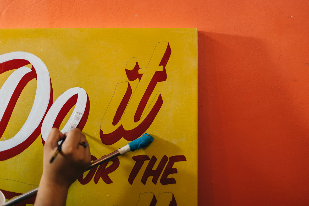
Design can offer a window into a culture’s past. It’s this conviction that sparked the idea for Grafis Nusantara, a comprehensive collection of Indonesian labels and stickers made between the ‘70s and ‘90s. The ambitious project is led by Rakhmat Jaka, Hendri Siman, and Claudia Novreica, three graphic designers with a shared passion for their country’s history and design roots. “We are particularly fascinated by the references for many different cultures and styles that can be found within our collection,” says Siman. “Indonesia is a big melting pot of many cultures, thus making Indonesian vintage design different from others.”


设计是通往传统和文化的一扇窗——这正是 Grafis Nusantara 项目坚定不移的信念。项目收藏了创作于 70 年代和 90 年代之间的印度尼西亚标签和贴纸设计,由三位主创 Rakhmat Jaka、Hendri Siman 和 Claudia Novreica 共同建立。他们都是平面设计师,且对这个国家的历史和设计传统有着共同的热忱。“不同文化背景下的创作吸引着我们,在整个系列的作品中也可以看到很多文化参考元素,”Hendri 说,“印度尼西亚是一个文化大熔炉,造就了这里不拘一格的复古设计。”

The project began as a personal collection of vintage labels and stickers that Jaka was collecting in his university years. The collection grew over the years, until 2019, when all of the material was digitally archived and shared for the first time on social media. A wave of positive feedback from netizens and a serendipitous meeting with Siman and Novreica led to the idea of establishing a proper website, where the visuals could be easily accessed. Siman built the website from scratch, while the history and background information for certain entries are currently being compiled by Novreica.


Rakhmat 在大学期间就喜欢搜集的复古标签和贴纸,这是整个项目的雏形。多年来,他的个人收藏不断丰富,直到 2019 年,他开始把这些作品以数字格式首次呈现在社交媒体。系列最开始便在社交媒体上揽获一波好评,他也因此与 Hendri 和 Novreica 相识,三人最终有了搭建网站的想法,更方便为人们呈现这些视觉设计作品。Hendri 负责搭建网站,而 Claudia 则负责调研每幅作品的来龙去脉。

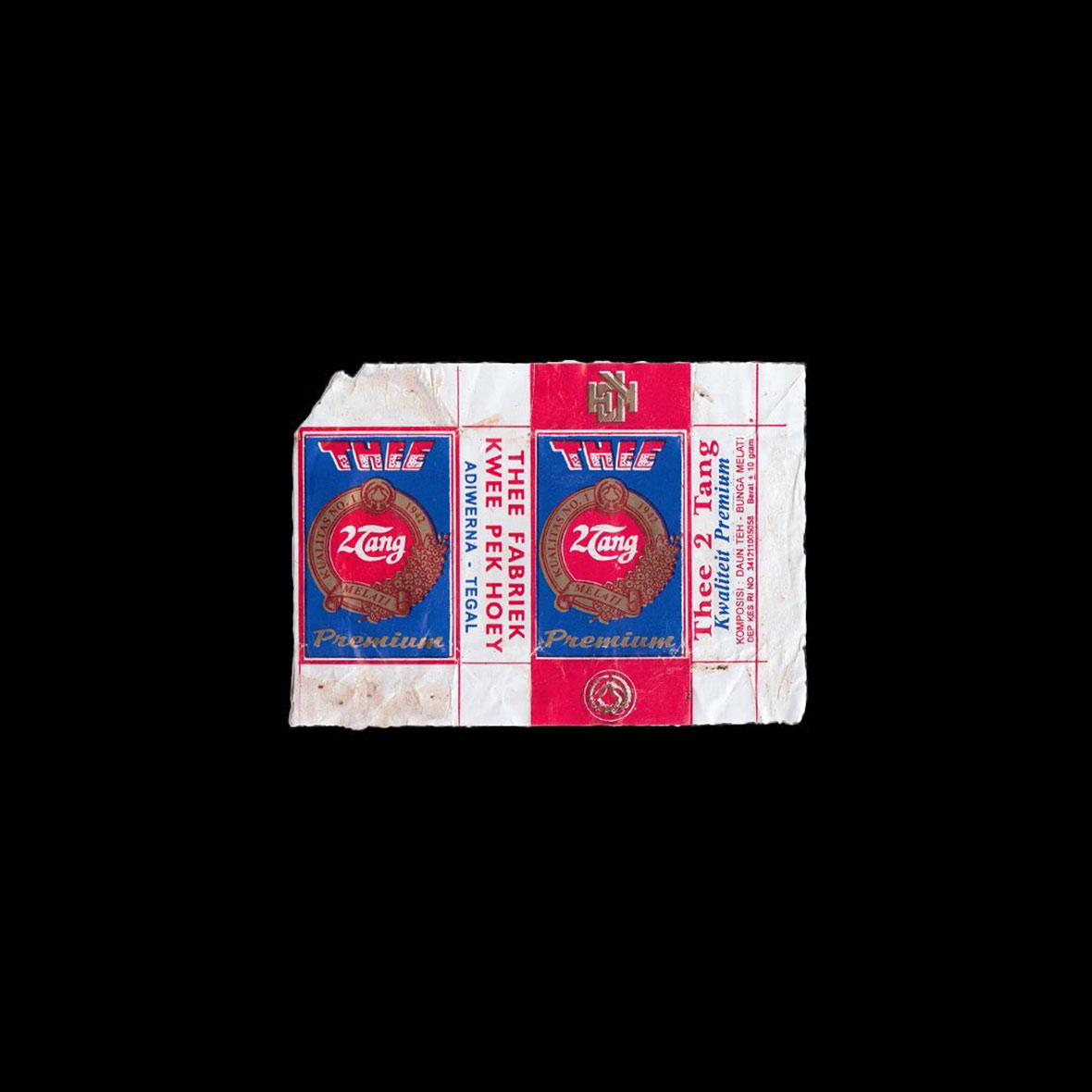
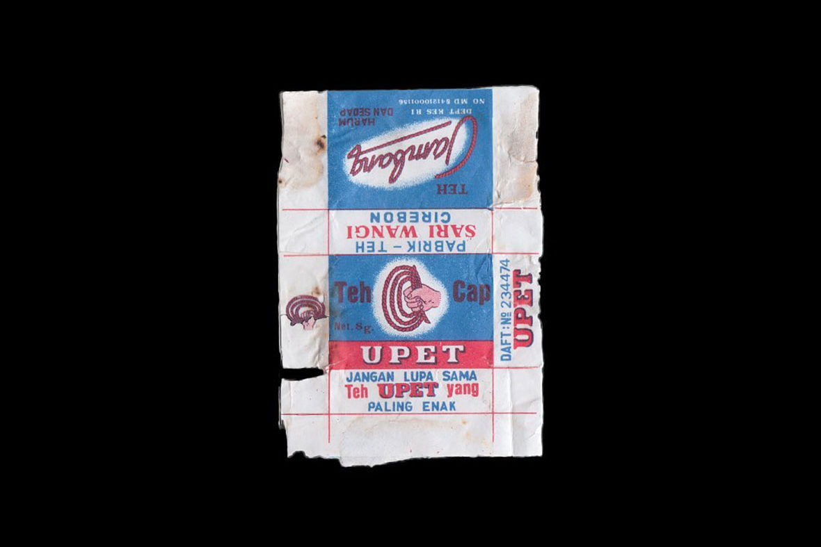
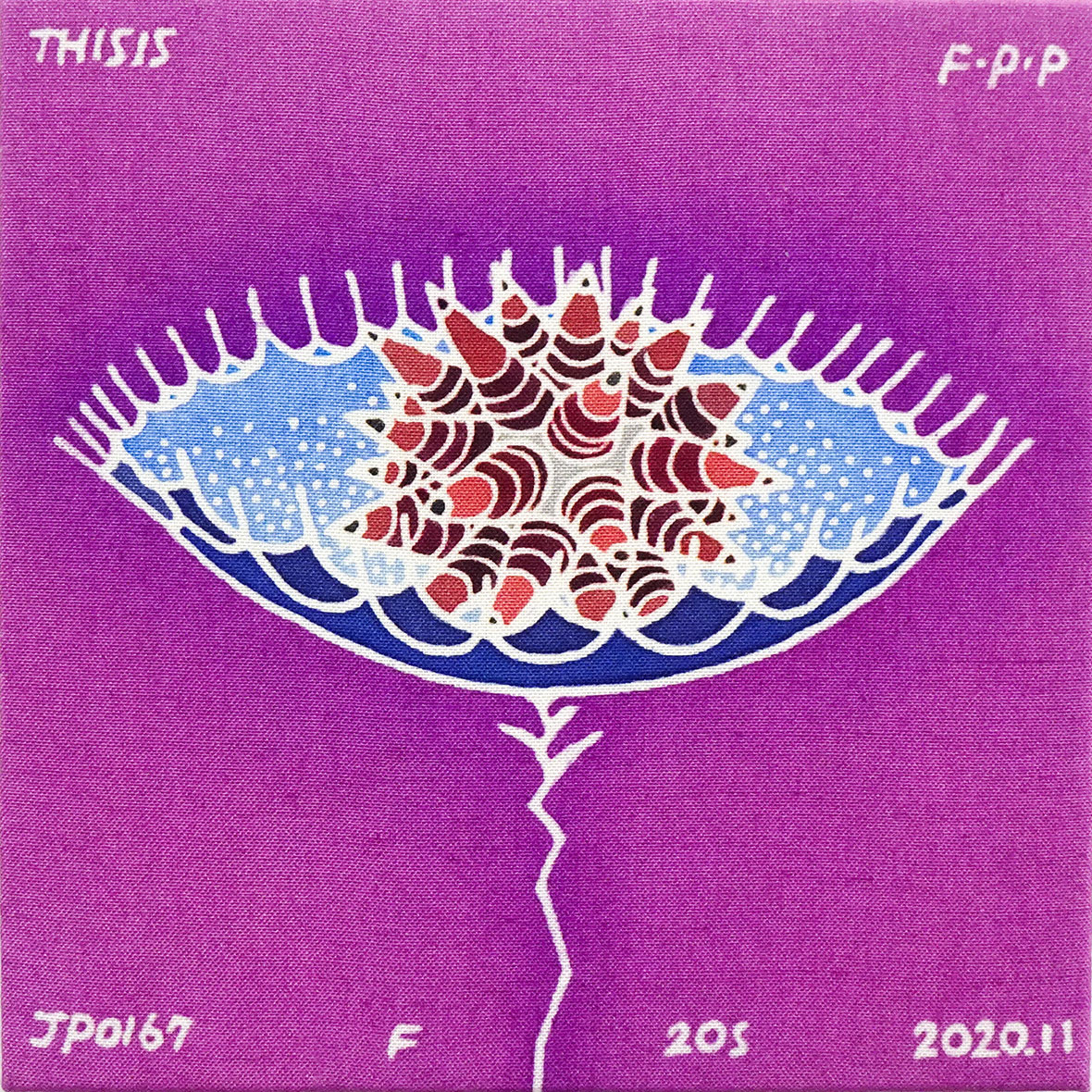
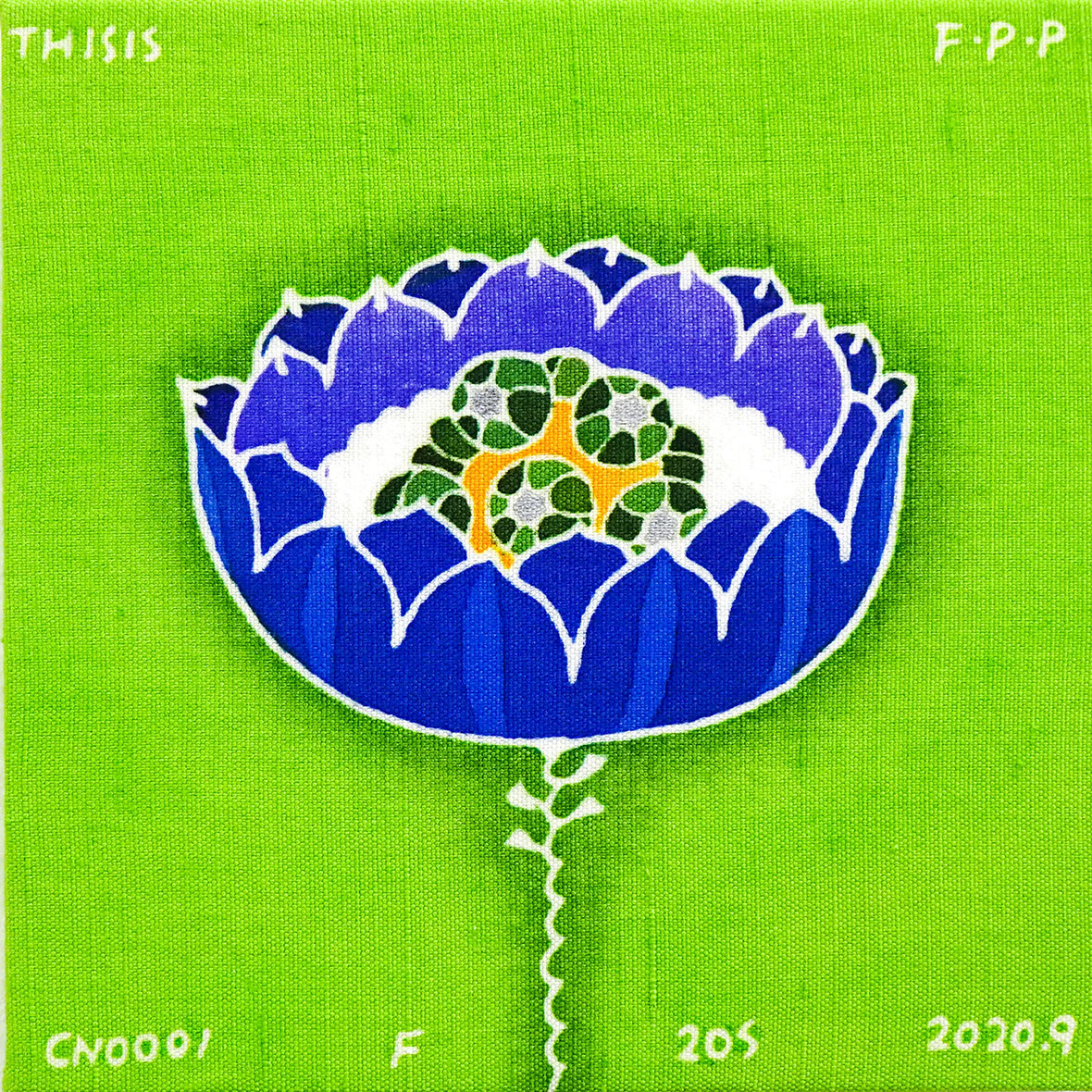
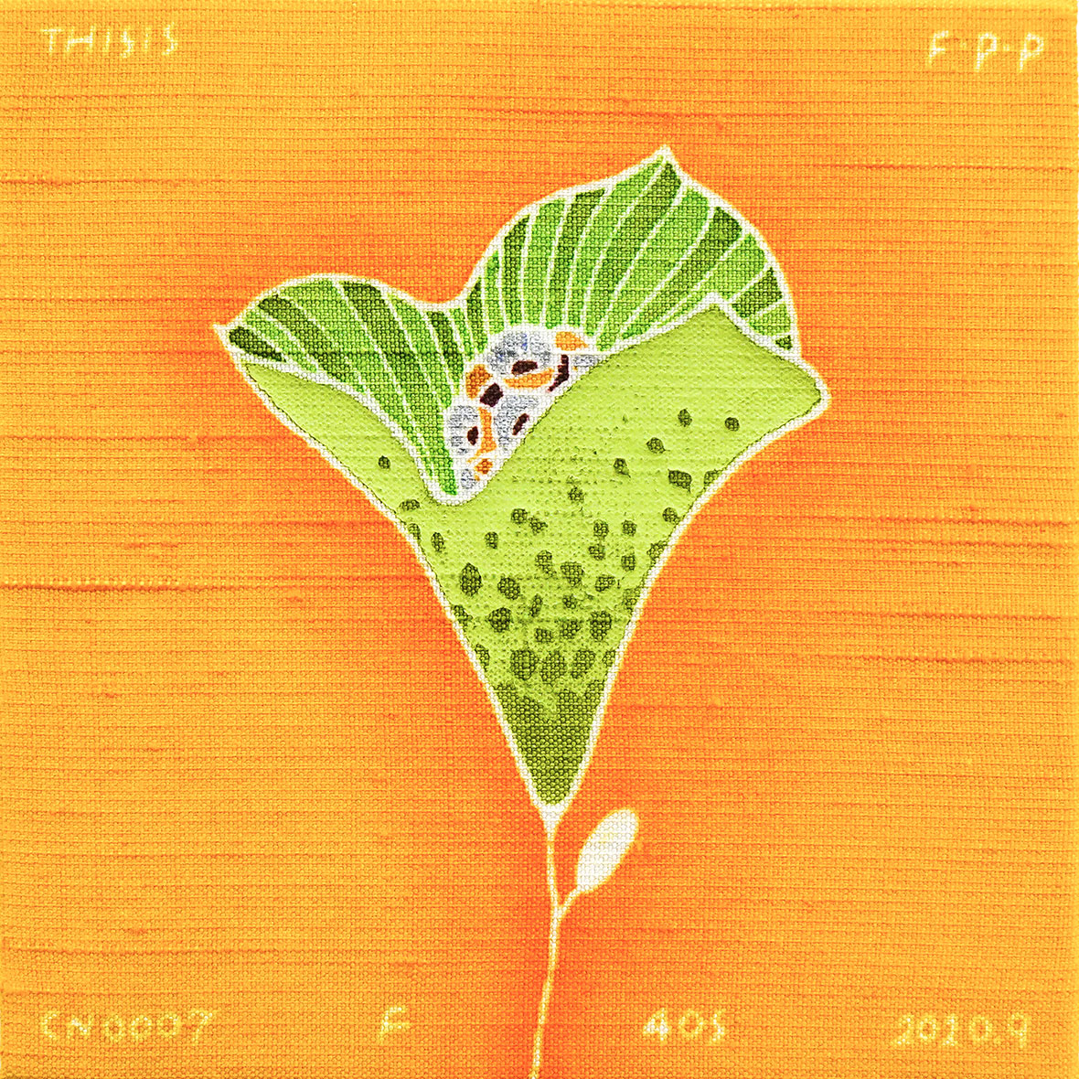
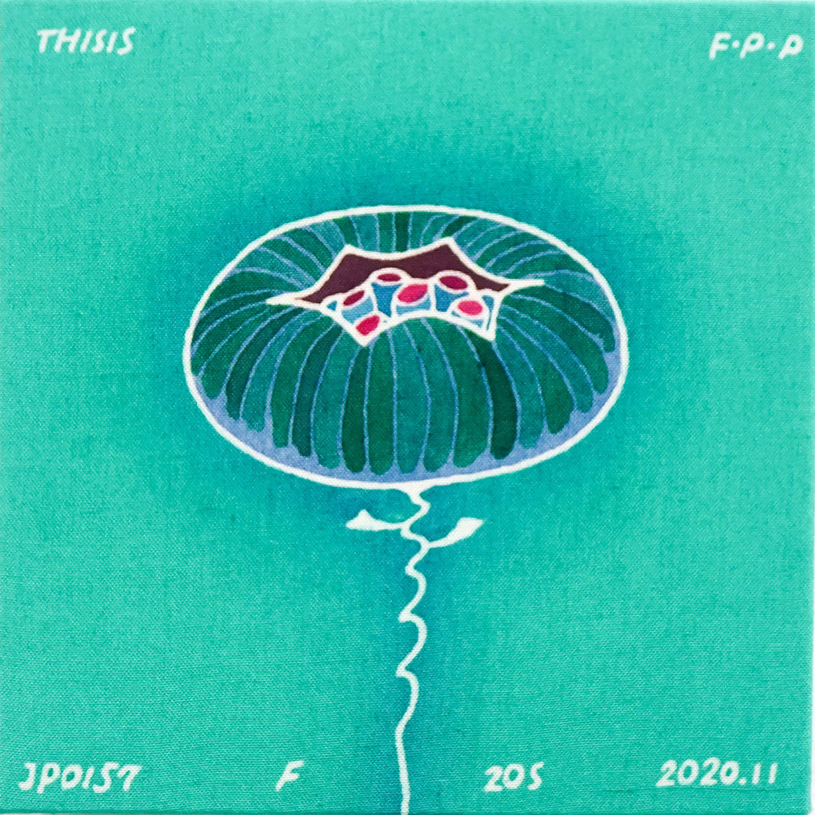
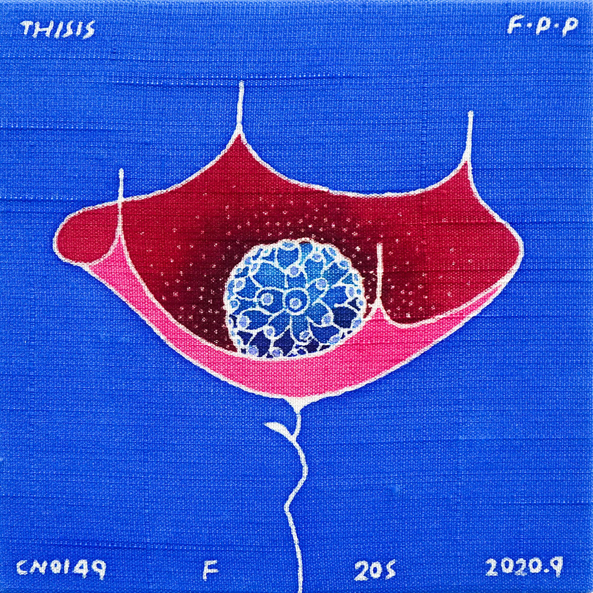
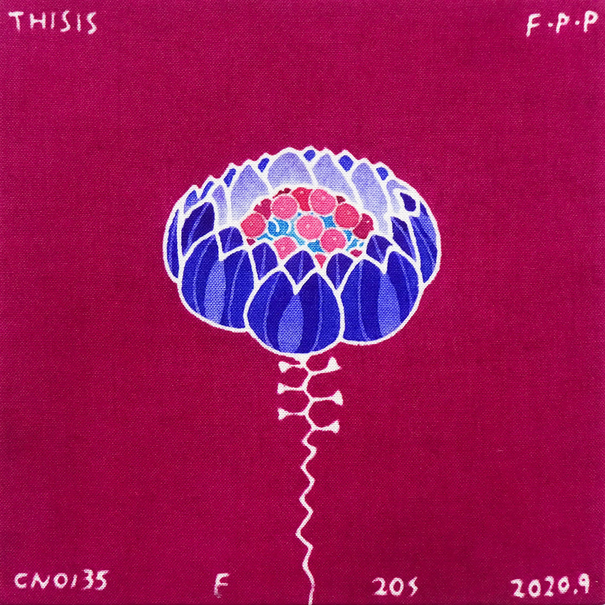
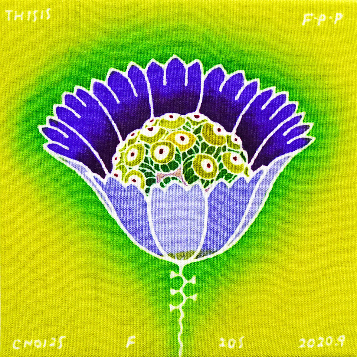
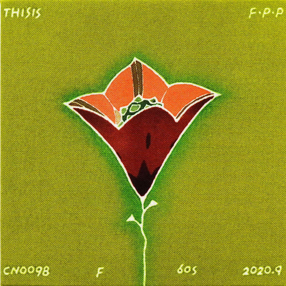
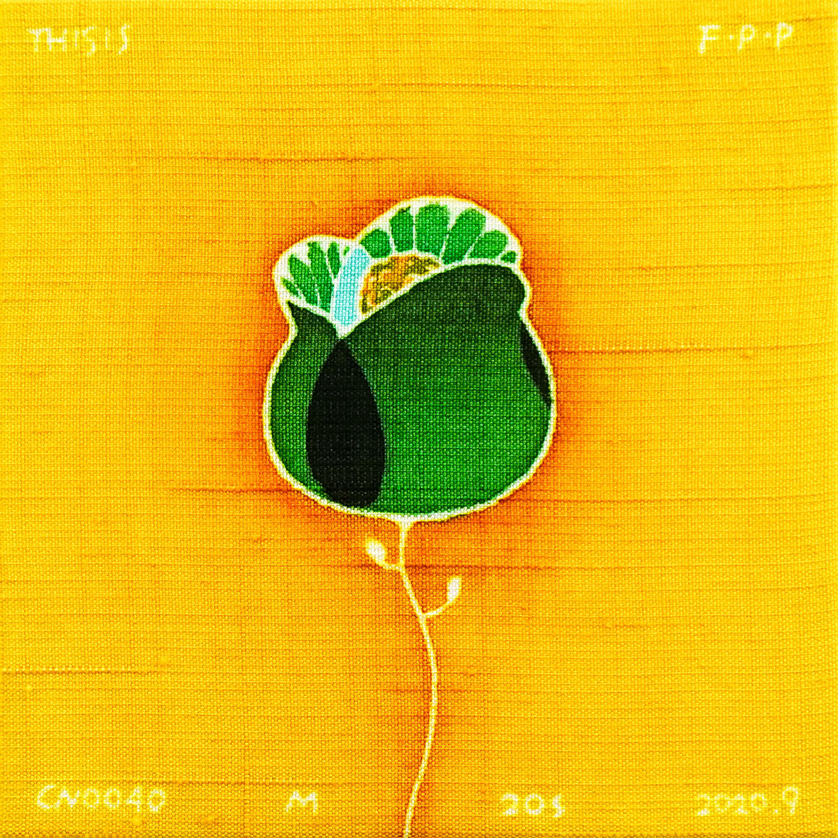
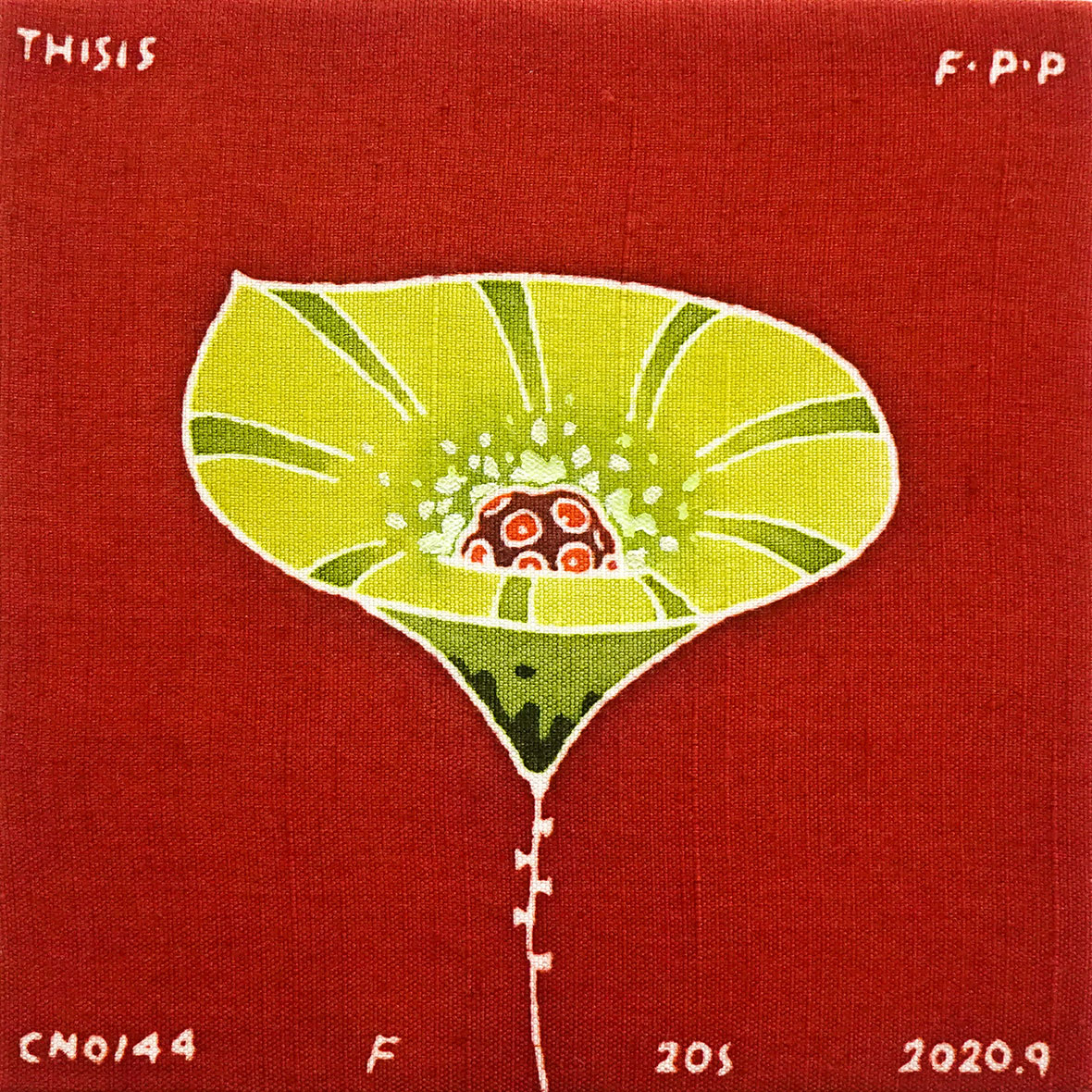
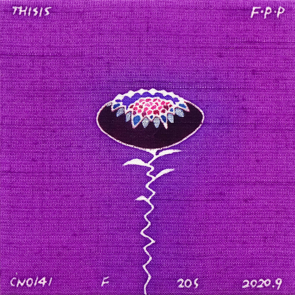
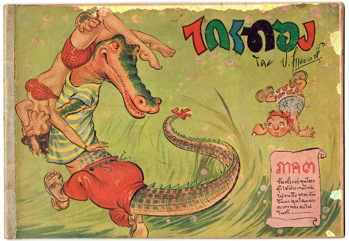
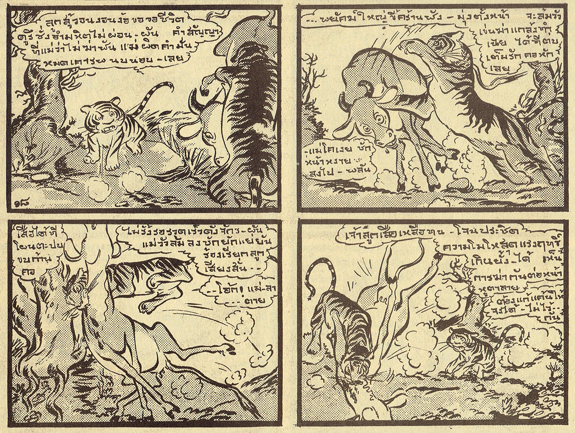
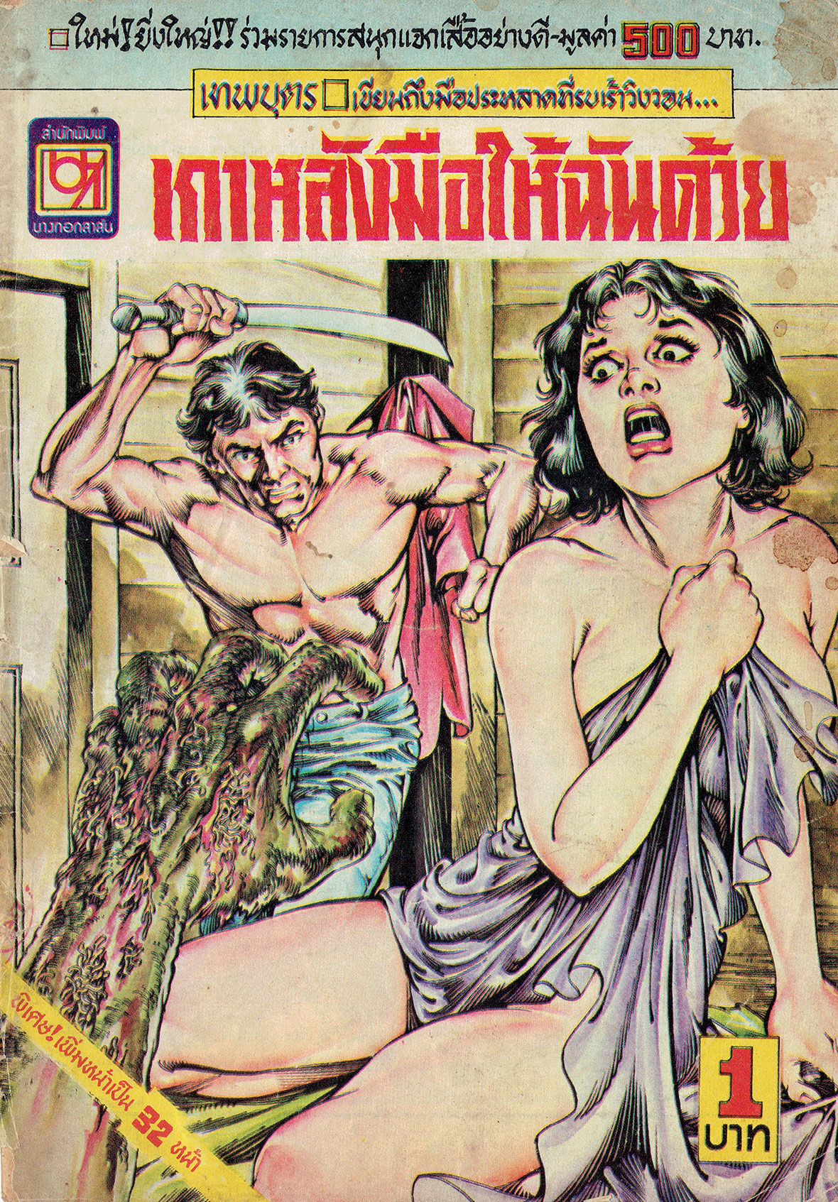
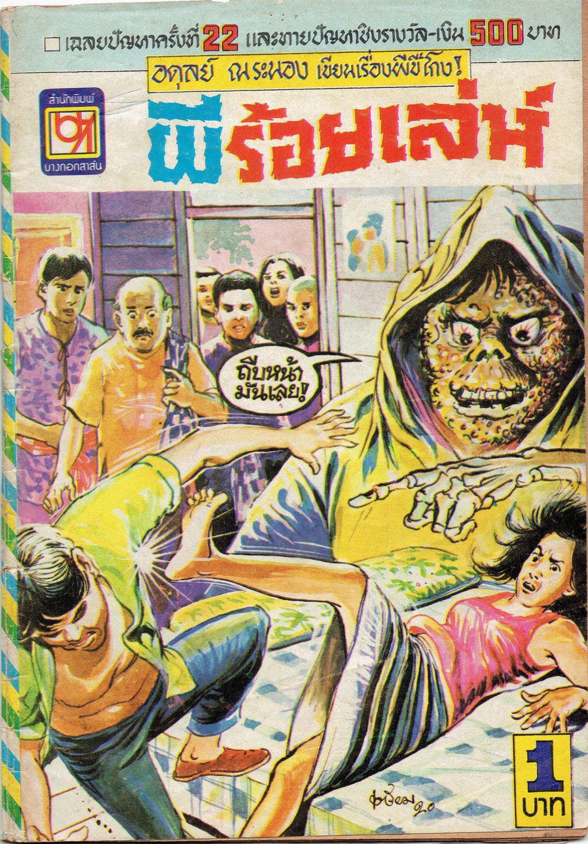
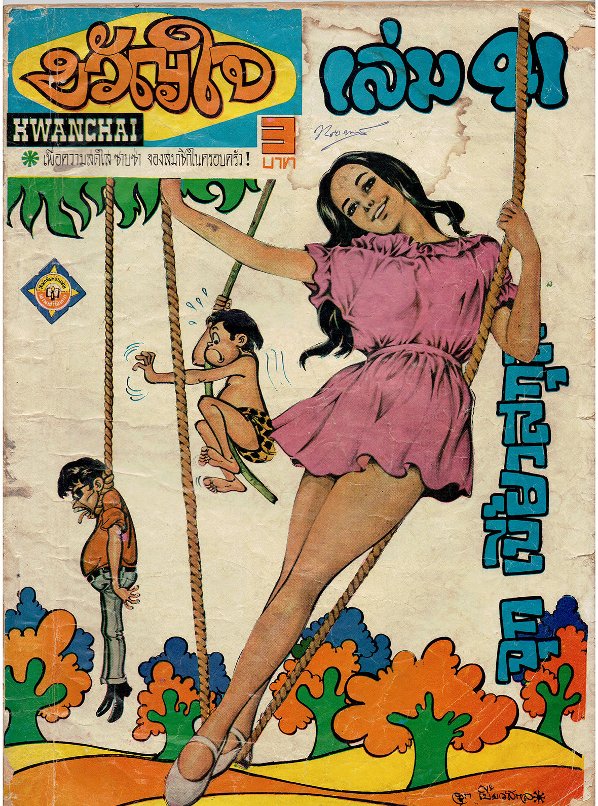
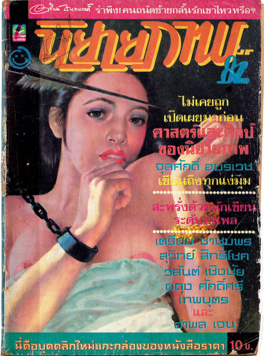
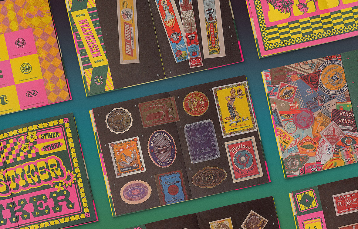
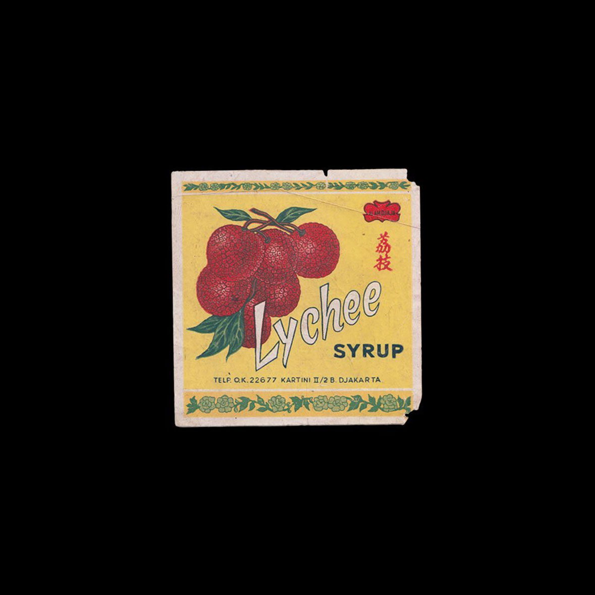
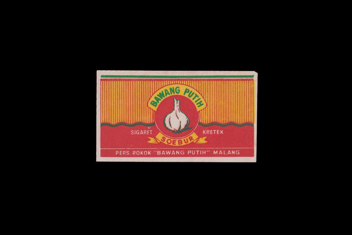
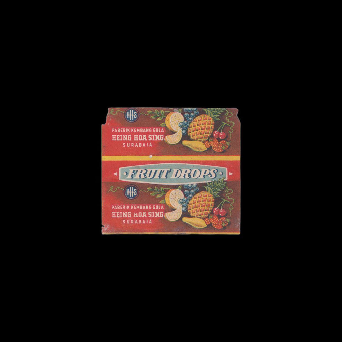
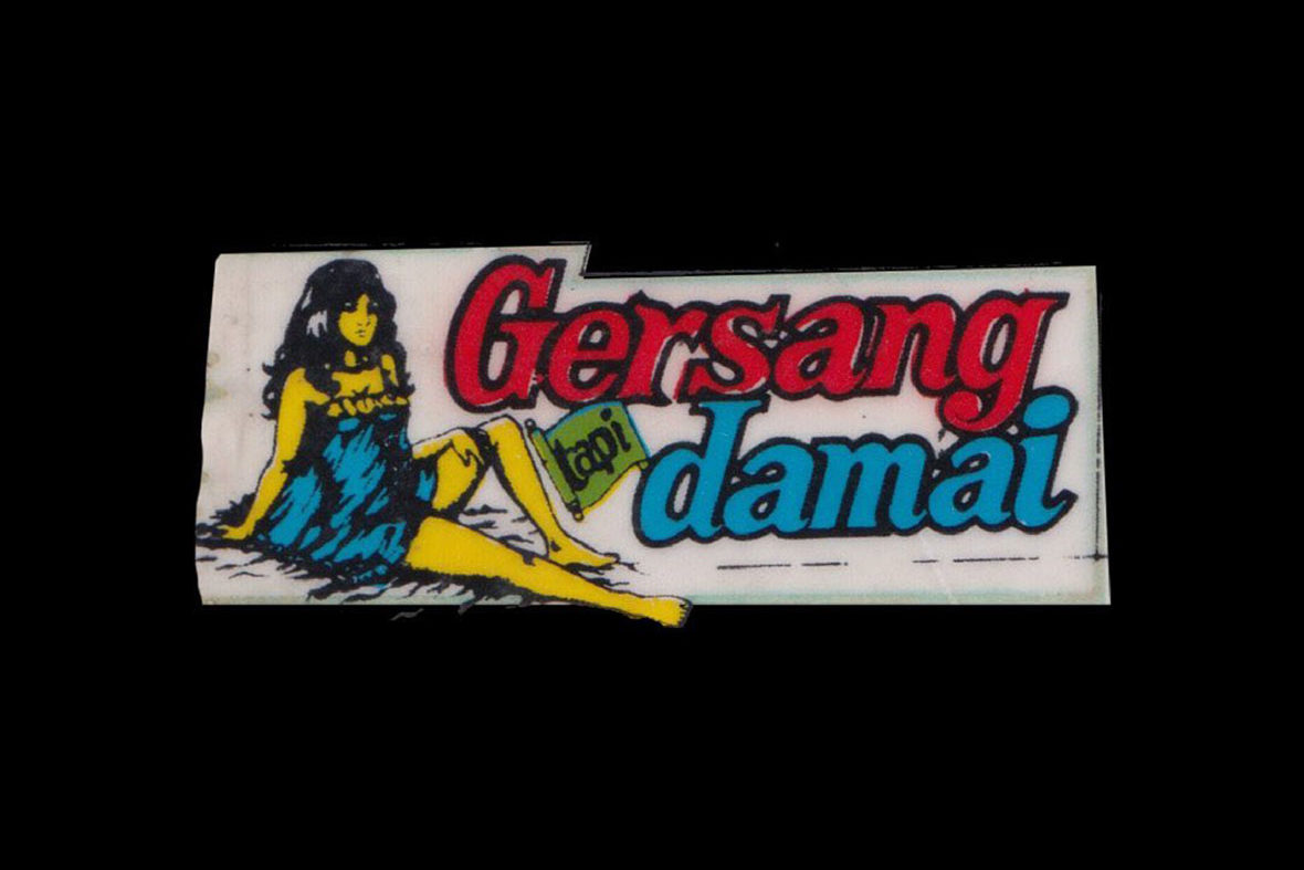
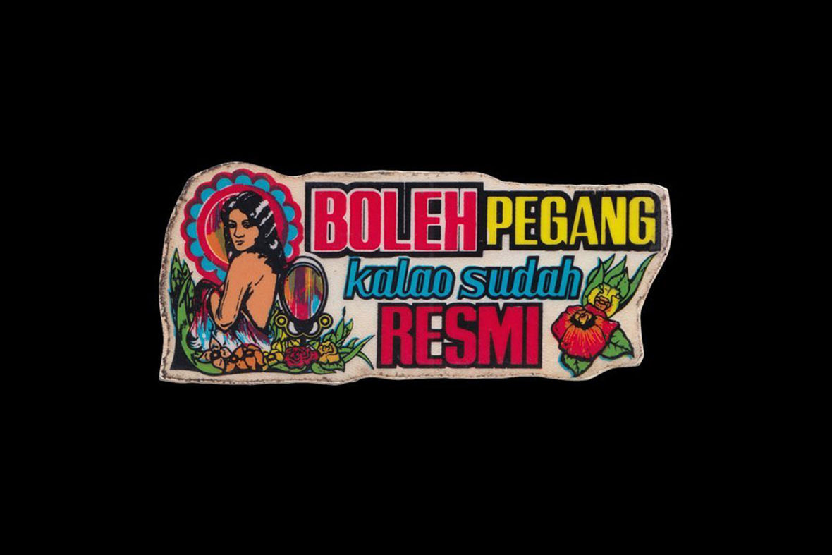
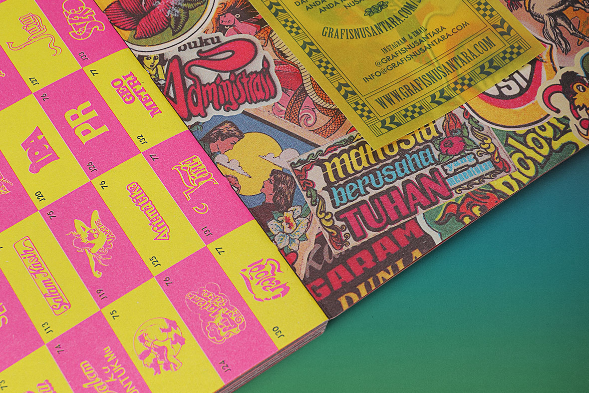
Grafis Nusantara’s focus on stickers and labels is due to the fact that they’re somewhat easier to come by compared with other forms of vintage designs. Stickers, in particular, were in abundance because of stiker kota, or urban stickers, which are cheap, mass-produced stickers that began circulating throughout Indonesian cities in the ’70s. Religious stickers were arguably what first kicked off the country’s sticker craze, but the trend moved towards stickers printed with popular idioms. A preference for more visually driven stickers—specifically ones featuring beautiful girls—then followed. Stickers from these different fad cycles have all been categorized accordingly in the Grafis Nusantara archives, being grouped as cartoon, eroticism, religion, picture text, or classic text. Labels were given a similar treatment, grouped into five different categories: food and beverage, medicine, textile, cigarette, and tea.

Over 300 vintage designs from across the archipelago have since been uploaded on the Grafis Nusantara website, and the collection continues to grow. The Grafis Nusantara web site now also includes a “Submit” section where users can send scans and photos of undocumented designs. “Labels and stickers collection is by far the most dominating part of the archive due to the fact that they are easier to find and were mass-produced consumer products,” Siman explains. “Of course, we don’t want to restrict ourselves to only those two mediums and we plan on expanding our collection in the future.”


Grafis Nusantara 之所以选择对贴纸和标签进行收藏,是因为和其他形式的复古设计相比,前两者更容易收集,尤其是曾大批量生产的廉价贴纸“stiker kota”(城市贴纸),这种贴纸从 70 年代便开始在印尼各地流行。据说,最早印尼的贴纸热主要围绕宗教,后来才渐渐在民间兴起,又融入大量视觉元素,其中曾印有靓丽少女的卡通贴纸最为流行,散落在城市各个角落。在 Grafis Nusantara 项目中,贴纸被按照卡通、情色、宗教、图片文本和文本的分类;此外,标签的分类则更具有功能性,被大致分为食品、饮料、药品、纺织品、香烟和茶叶几大类。

目前,团队从印度尼西亚各地搜罗的 300 多幅复古作品均已上传到 Grafis Nusantara 网站,且数量现在还在不断增加。Grafis Nusantara 网站现在还增设了“提交”功能,用户可以发送未收录在内的其他作品,以扫描件或照片的形式提交。“标签和贴纸是目前收藏得最多的作品,毕竟它们保存完好、更易找到,且大都来自批量生产的消费品,”Hendri 解释道,“当然,我们不想局限于这两种媒介,我们计划在不久的将来扩大收藏的品类。”

In the beginning, the vintage stickers and labels were mainly scavenged from local thrift shops, but later entries into the Grafis Nusantara archives include rarer designs that were harder to come by. They had to find private collectors or make the trek to smaller shops in rural parts of the country. Despite the increasing difficulty in securing these designs, the journey has been tremendously rewarding. “Some required a lot of negotiation and persuaisn,” Siman says. “But we realized it was a chance to chat with people and gain new knowledge from them.”


起初,收集的范围主要在旧货市场,而为了搜集更多稀有设计,他们联系过私人收藏家,或者长途跋涉到印尼偏远地带。虽然整个过程难度不小,但这让他们从中获益。“我们意识到这是一个与人交谈的机会,我们可以从他们身上挖掘出更多新的认识和经历,” Hendri 谈道。

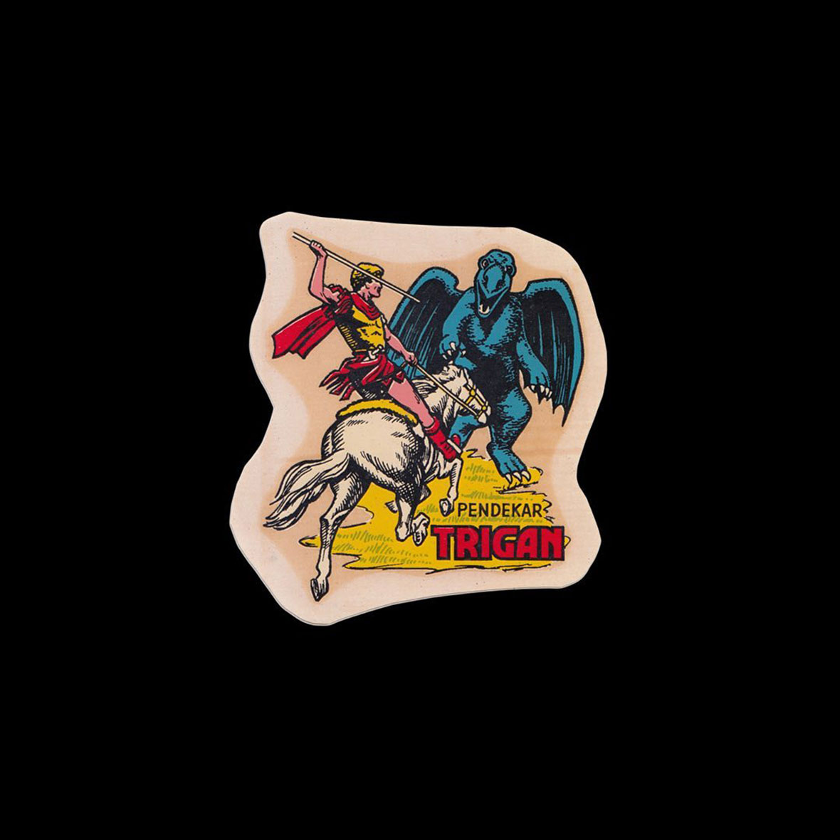
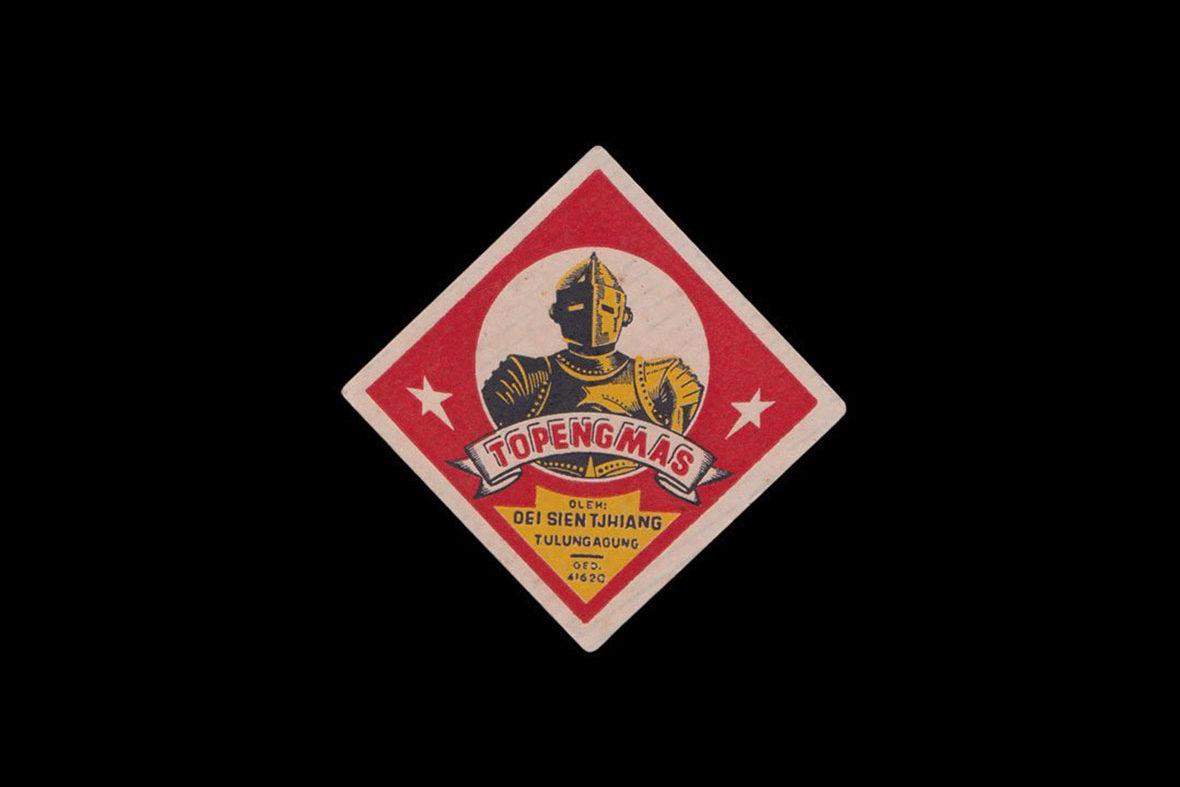
Of all the designs that the team has collected so far, the rarest are perhaps what they call the angkot stickers, which are stickers that used to be placed on the country’s shared taxis. Most of these stickers were made by AMP, one of the most well-known stickers producers in Indonesia. The company is credited with producing over 70% of the stickers printed in the country’s most populous cities. “We got our angkot stickers from a collector in Yogyakarta,” Siman says. “They didn’t want to let us purchase them at first because they are rare collectibles, but eventually agreed after we let them know that we want them to be digitally archived.”


截至目前,在他们所有收藏作品中最为稀有的可能是一组“angkot”贴纸,这是以前人们贴在公共小巴士上的贴纸。公共小巴和普通公交车不同,它们没有指定的站点,行人可以在路线上随时叫停。贴纸的制造商来自 AMP Malang,是印尼最有名气的贴纸生产商之一。Hendri 说:“这些贴纸是我们从日惹的一批商人和收藏家手中买到的。他们一开始并不想卖给我们,因为存货实在太稀有。后来我们说希望将它们以数字化形式保存下来,他们才肯答应。”

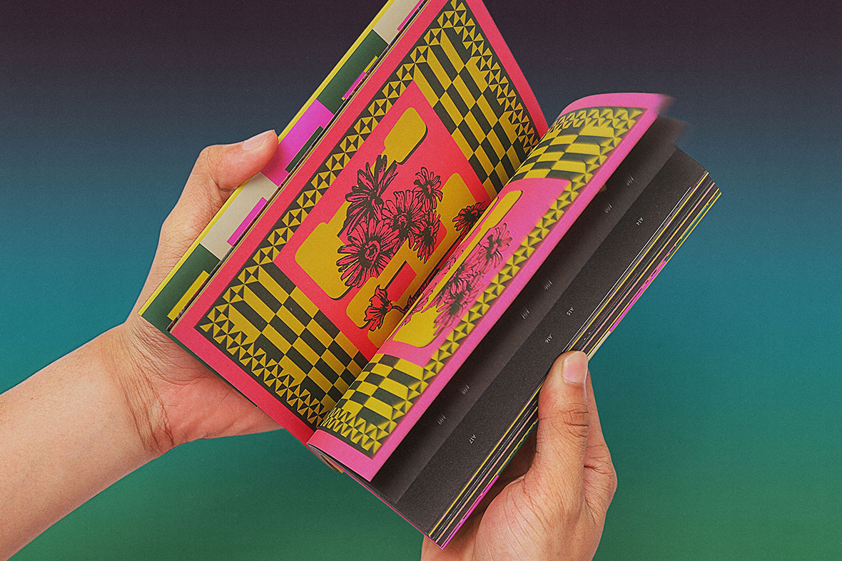
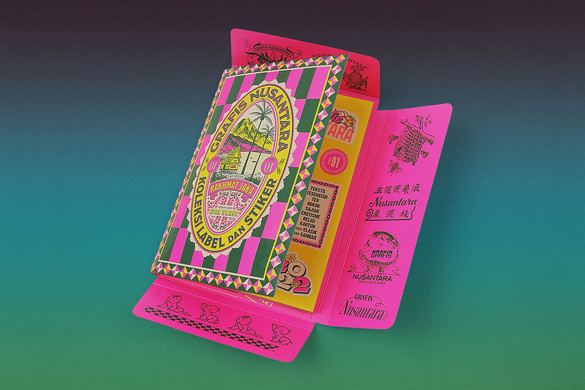
Recently, the Grafis Nusantara digital archives have been remade into a tangible format with the debut of a zine, the team’s latest endeavor in promoting Indonesian vintage designs. The zine features some of their favorite designs from their collection, including a bonus section that showcased vintage poster and postcard design. It was published in collaboration with Kamengski Foundation, a non-profit operated by a multidisciplinary brand and design studio of the same name. Kamengski is known incorporating vintage designs into their work, and this mutual love for old Indonesian design made them an obvious partner for the project. “ We feel like we have the same vision, which led us to collaborate on the zine and merch based on our collection,” Siman explains.

Aside from Kamengski, Jakarta-based designer Evan Wijaya was also an integral part of the project. He was in charge with designing the layout and overall aesthetics of the zine, which was designed in the likeness of a file folder and colored in with a distinctive neon pink.


最近,团队推出一个新的项目:在首期《Grafis Nusantara》出版物上,他们将这些数字化档案再次以实物形式呈现。其中展示了他们最爱的一系列收藏作品,除此之外,还附赠了复古海报和明信片设计。该出版物由团队与 Kamengski 基金会联合出版。Kamengski 是由同名跨界品牌和设计工作室运营的非营利组织,以复古设计闻名圈内。双方都对印尼复古设计怀有共同的热情,让此次合作一拍即合。“我们都有着共同的愿景,这也是我们合作的契机,”Hendri 说道。

除了 Kamengski,雅加达设计师 Evan Wijaya 也参与了杂志的制作。他负责排版和美学指导,别出心裁地采用文件夹式的外包装设计,搭配明亮的霓虹粉色,看起来格外抢眼。

Contemporary design in Indonesia often look to the West, and many locals considers older forms of Indonesian designs as unworthy of modern times—they’re viewed as kitschy at best. Though more Indonesian designers have started looking to the country’s past for design inspiration in recent times, there’s more to be gleaned from them than simply the nostalgic aesthetics. More than the preservation of past design, there’s important historical and social context to be uncovered in understanding these works, and these are areas the Grafis Nusantara plans on delving deeper into. “We want to study these artifacts, and start writing down our learnings as journal articles on the website and social media,” Siman says. “We believe these materials are results from the social dynamics, technology, behavior, and values that exist in our society over a certain period of time.”


尽管在许多人眼中,这些贴纸和标签不过是些“不入眼”的物件。但作为 Grafis Nusantara 背后的主创们,三人认为这个项目的意义不仅在于保存,更是为了让人们透过这些复古设计去了解其背后的文化语境。

当代印尼设计往往向西方文化看齐,甚至有当地人也认为这些旧时的印尼设计与现代格格不入。不过近年来,越来越多印尼设计师开始善于从本地传统里寻求灵感。回溯传统不只是有怀旧,当中还有很多历史和社会内涵亟待人们发掘,而这些也是该团队计划深入的领域。“我们想好好研究这些作品,并将发现记录下来,撰写文章发表到网站和社交媒体,”Hendri说,“我们相信这些作品其实是我们社会在一段时间内的社会动态、技术、行为和价值观所共同作用的结果。”

Like our stories? Follow us on Facebook and Instagram.


Website: www.grafisnusantara.com
Instagram: @grafisnusantara


Contributor:  David Yen
Chinese Translation: Olivia Li


喜欢我们的故事?欢迎关注我们 Neocha 的微博微信


Website: www.grafisnusantara.com
Instagram: @grafisnusantara


供稿人: David Yen
英译中: Olivia Li

Tagging Along 汉字涂鸦简史

April 26, 2022 2022年4月26日

Chinese culture has considered the written letter fundamental to the arts since ancient times. There are billions of people across the world able to read Chinese characters. Manga and anime have brought kanji lettering to a global audience for 40 years. Graffiti has had a foothold in Asia for over 20 years. So where is all the Chinese-language graffiti? It’s still a frustratingly rare occurrence despite all these facts. But there is a new crop of artists taking advantage of missed opportunities and exploring the wealth of creative options from these overlaps. From mainland China, Hong Kong, and Taiwan, to Thailand, Europe, and Chile, these artists have a diverse range of backgrounds, outlooks, and styles.


自古以来,文字书写就被认为是中国文化的基础。全世界能读懂汉字的人有数十亿。在与中国隔海相望的日本,四十年来动漫和漫画持续将日本汉字文化推广在世人面前(日本汉字是由中国汉字衍生出的日语书写语言)。截至目前,涂鸦艺术已进入亚洲二十余载,而中文涂鸦形式仍属罕见。不过现在,有一批新锐艺术家,他们正在尝试从汉字和涂鸦的碰撞中探索丰富的创作灵感。这些艺术家来自中国大陆、香港、台湾、泰国、欧洲甚至秘鲁,他们有着不同的文化背景,以及不同的视角和风格。

By Exas, a member of Yellow Peril 来自灵丹作品,“黄祸”团队的一名涂鸦师
By Dao Ke of Sinoghetto 来自刀客作品,“汉部落”团队的一名涂鸦师

Two of the major crews with writers using Chinese graffiti are Yellow Peril and SinoGhetto. Yellow Peril was started in China with the goal of pushing graffiti written in different Asian languages and includes members from across the world. SinoGhetto was founded by a European writer, and welcomes members from all over the spectrum, as long as they have love for Chinese and hip hop culture. In Hong Kong, writers like Boms and Sicko are dedicated to bombing in Chinese, and in Taiwan artists such as Chwis and Candy Lien focus more on blending street art with Chinese type design. Writers like Guangzhou’s Chan13 paint huge graffiti murals and push internationally recognized crews like BAMC and ZNC. In Japan, Serik and Veryone work in kanji, which are Chinese characters that have made it into the Japanese written language. Even European graffiti artists with no connection to Asia, such as Debz and Marx, also create interesting work with kanji lettering. Nobody knows exactly how many writers there are, but it’s likely less than 100 all together worldwide.


全球范围内,汉字涂鸦团队主要由两大分支构成,一支叫“黄祸”(Yellow Peril),另一支叫“汉部落”(SinoGhetto)。“黄祸”起源于中国,初衷是推广那些不同亚洲语言创作的涂鸦作品,在世界各地招贤纳士。汉部落则由一位欧洲艺术家创立,阵容也可谓五湖四海,只要是热爱中文和嘻哈文化的艺术家都能加入。在香港,Boms 和 Sicko 致力于游击式汉字涂鸦;台湾的 Chwis连翊庭(Candy Lien)则把创作重心放在街头艺术与汉字字体设计的融合;在中国南部,广州的陈拾叁(Chan13)擅长涂鸦壁画,同时也致力于推广 BAMC 和 ZNC 这样国际知名的团队;日本艺术家 SerikVeryone 擅长用日本汉字创作;在欧洲,也不乏有像 DebzMarx 这样的汉字涂鸦艺术家,虽置身亚洲之外,但仍坚持用汉字创作。尽管没人曾统计过确切数字,不过大致来看,全球汉字涂鸦艺术家一共加起来也不到 100 人。

Graffiti by the Plumber King / Image via Wikipedia Commons “渠王”的涂鸦 / 来自 Wikipedia Commons
A mural by the King of Kowloon / Image via Longzizun 九龙皇帝的涂鸦作品 / 来自 Longzizun
Some of MC Yan's graffiti from the 90s / Image via MC Yan MC Yan 90年代涂鸦作品 / 图片来自 MC Yan

Some of the earliest graffiti written in Chinese comes from Hong Kong, and MC Yan might be one of the first writers to be inspired by hip-hop graffiti culture. After a trip to France in 1997 exposed him to graffiti, he brought it home with him and helped spark a movement. “I have been doing tags over the last 20 years and using Chinese characters has always been my style,” he noted in a past interview. “My three references are from traditional Chinese calligraphy, which is a beautiful art form on its own, adding on modernized typography – and my own creation which is about using Chinese characters inversely.” But there were local writers from entirely different traditions who he says paved the way for him—namely the late “King Of Kowloon” Tsang Tsou-choi, who wrote poetry in the street, and the “Plumber King” Yim Chiu-tong, who advertised his plumbing services on every square inch of the city. 

In mainland China, earlier forms of Chinese-language “graffiti” were similarly cheap, guerrilla advertising, which promoted shady services with phone numbers stenciled on walls. “It’s all over here,” says Exas, a cofounder of Yellow Peril and graffiti artist who was born and raised in Beijing. “That type of graffiti is the most famous type of graffiti advertisement. It’s so profitable that there’s a lot of people in every city doing the same thing.” He adds that a lot of graffiti writers and designers now look to this work for inspiration, although none of the advertisers themselves have received recognition, except maybe in the form of patronage of their services.


汉字涂鸦作品最早来自一批香港艺术家,其中 MC Yan 是当地第一批受嘻哈涂鸦文化影响的艺术家之一。1997 年的一次法国旅行,让 MC Yan 第一次接触到涂鸦,他随后把这种艺术形式带回了家,并发起了一场涂鸦运动。他曾在一次采访中谈到:“20 年来,我一直在创作签名式涂鸦,但与西方涂鸦不同的是,我坚持使用汉字,这就是我自己的风格。我有三个灵感来源,一是传统中国书法——它本身就是一种美丽的艺术形式;二是当代字体设计;第三是我自己的原创,但同样基于传统汉字。”还有一些来自完全不同背景的本地街头涂鸦者也同样给予了 MC Yan 极大启发——比如在街头写诗的已故“九龙皇帝”曾灶财(Tsang Tsou-choi),还有在城市每个角落留下管道维修广告的“渠王”严兆棠(Yim Chiu-tong),MC Yan 说:“他们为我铺好了创作之路。”

中国大陆早期的中文“涂鸦”作品和“渠王”的广告很相似——是一种廉价的游击式涂鸦,诸如办证之类的“路边野鸡式”宣传广告。“这里到处都是这些涂鸦,”来自北京的“黄祸”联合创始人灵丹(Exas)说道。“说白了就是广告,利润极为丰厚,每个城市都有很多人在做。”灵丹还提到,这类涂鸦影响过很多艺术家,可惜,原作者们早已不知了去向,那些人甚至从未了解过涂鸦,以及他们的作品如何对涂鸦艺术家带去的影响。

An image of the advertisement graffiti found in China / Image via Free WeChat 图片来自 自由微信

Another popular form of Chinese graffiti outside the New York realm of influence are the candid confessions of everyday people leaving anonymous messages across the mainland, as documented by the Chinese Graffiti Hub blog. “In this era of instant gratification, people may be in need of more forthright ways of communicating,” reasons Lil Quacky, who runs the blog, of the style’s popularity. “This infotech age makes the simple prose of these graffiti shorthands that much more valuable.”


另一种中文涂鸦形式则更像是某种匿名留言,内容多是些赤裸裸的告白、或是内心的独白,以潦草的形式出现在墙壁或废墟。这些涂鸦被“中文塗鴉中心”记录下来。账号的运营者 Lil Quacky 表示,“在这个充满即时满足的时代,人们可能需要更直截了当的沟通方式,留言涂鸦这种形式因此而流行起来。” Lil Quacky 还说,“当下这个信息时代,发自内心的文字涂鸦变得格外珍贵。”

A photo of a graffiti artwork that reads, "I'm innocent for loving country, but I am guilty of loving you." / Image via Chinese Graffiti Hub 图片来自 中文塗鴉中心
A photo of a graffiti artwork that reads, "I'm sick, I'm sick, I'm sick, I'm sick, I'm sick, I'm sick, I'm sick, I'm sick, I'm sick, I'm sick, I'm sick, I'm sick, I'm sick, I'm sick, I'm sick, I love you." / Image via Chinese Graffiti Hub 图片来自 中文塗鴉中心

Reset is one of the most active writers in Chengdu writing in Chinese. He started getting up in 2015 but didn’t start using Chinese until 2017. He says one of his big inspirations is Gas, an influential Chengdu writer who started using Chinese characters in the mid-2000s. There are many new writers in the city these days, and Reset has noticed a lot of them are using Chinese. “Chengdu is a city that’s inclusive of different cultures, I suppose that’s a perk,” he says. “The more people getting involved, the more possibilities there are. It’s fun to see and come up with new ideas.” Reset switches his style up between a few different forms. When he takes his time, his pieces are often jumbles of blocky shapes with sharply divided colors. For his more simple pieces, he switches between wormy, curved characters, and straightforward, advertorial ones.


奇人(Reset)是成都最活跃的汉字涂鸦艺术家之一。他从 2015 年开始签名式涂鸦,但直到 2017  年才开始用汉字创作。他称自己的创作深受一位名叫“”(Gas)的艺术家影响。“气”同样来自成都,在当地涂鸦圈子很有影响力,他最早在 2000 年代中期便开始使用汉字进行创作。奇人注意到,成都这些年涌现出许多新兴的涂鸦艺术家,其中很多人都尝试使用汉字。“成都是一座包容性很强的城市,不同文化能在这里共存”,奇人说,“我想这对汉字涂鸦创作来讲是一个优势,因为参与的人越多,创意的可能性就越大。”奇人能在几种不同风格之间来回切换,他善于堆砌色彩迥异的色块、又能够驾驭朋克式野蛮粗旷的字体。

Graffiti by Reset series 涂鸦师奇人的作品
Graffiti by Reset series 涂鸦师奇人作品

Many of the writers using Chinese characters are fond of “antistyle,” although most wouldn’t categorize themselves as such. Antistyle is a loose, catch-all term for a recent form of graffiti that purposely dispenses with traditional values of can control, color schemes, and details. “The reason why we don’t paint clean colorful walls is simple, we like to paint actively, sometimes more than ten pieces a week and try to create something new every day,” an anonymous member of SinoGhetto explains. “Painting fast pieces with roller paint for example is much more efficient and affordable. But we paint whatever we feel like, we don’t limit ourselves.” The crew is a mix of different ethnicities. Sangge is Chinese, Psiborg is American, Prisoner is Russian, Meimeng is Thai, and Poetry6+ is Czech. Yellow Peril also has a couple non-Asian members, some of whom overlap with SinoGhetto. There’s a lot of overlap between them in general.

“I get bored with legal stuff, graffiti has always been illegal. I just want to go bombing,” adds Paradise, a Chilean member of Yellow Peril who’s now living in France. Her interest in kanji characters came from manga comics. “I had a completely otaku childhood; mangas were my reason to live! They’re the reason I started drawing and loving Asiatic culture so much, so I’ve always loved kanjis. I don’t have the pleasure of knowing how kanjis work and I feel almost guilty because I’m not Asian, but I love the culture so much and I really look forward to learning more.”


尽管大多数汉字涂鸦艺术家都不想把自己归类为“反叛式风格”(Antistyle),但他们当中很多人都青睐这种创作方式。“反叛式风格” 是相对宽泛、笼统的术语,它指向一种区别于现有风格的涂鸦形式——其有意抛弃传统涂鸦中对颜料、配色和细节的控制,转而表现出一种原始、野生的呈现方式。“我们不喜欢那种精致的、色彩丰富的墙画,反而喜欢那种更加随性、自由的创作状态,我们有时一周要画10多面墙,每天都有新的想法诞生”,“汉部落”的一位匿名成员这样解释,“比如用滚刷来快速创作,那样的确更高效,也更经济。但我们倾向于画任何我们想画的东西,而不希望被创作原材料限制。”“汉部落”的成员来自不同民族,Sangge 是中国人,Psiborg 是美国人,Prisoner 是俄罗斯人,Meimeng 来自泰国,poey6+ 是捷克人。“黄祸”团队成员也来自不同国家,其中一些成员也同时是“汉部落”的一份子。团队之间有很多来往。

“我厌倦了合法涂鸦。涂鸦从来都是一项非法活动,我更倾向于‘打游击’。” 艺术家天国(Heaven )说道。天国是“黄祸”团队的一员,来自秘鲁,现居住于法国。她最早对日本汉字的兴趣源于日本漫画:“小时候完全是个御宅族,漫画是我对生活的动力!它促使我开始画画,也让我深深爱上亚洲文化。我一直都很喜欢日本汉字,然而,我没有特别多兴趣去探究日本汉字的语义。我虽然不是亚洲人,但亚洲文化让我着迷、让我想要深入探索,一直没有机会好好去学习,实在有点可惜。”

By Paradise of Yellow Peril 来自“黄祸”团队涂鸦师天国的作品

Chan13, a writer from Guangzhou, is quite the opposite. Although he’s fond of catching tags and throwies, he only promotes his large production work, which is impressive in detail and scale. As an architecture student, he views his graffiti in terms of design and mapping, resulting in letters plotted like buildings on a street grid. “Chinese characters are quarter-bounded and each character has its own discipline within these boundaries; its own outlook, shape, and structure,” he explains. “I try to reflect the city I’m painting from a bird’s view. The demands of the modern city are the same in the West and East but there are also differences, so I try to illustrate this through small adaptations in the font I’m creating or color schemes.” 


来自广州的艺术家陈拾叁(Chan13)则与天国不同。他有自己的大型涂鸦作品,同时也专注于签名涂鸦和泡泡字。作为一名建筑专业学生,陈拾叁常以设计和绘图的角度来构想自己的涂鸦。在他眼中,汉字笔画的排布,就像是地图上被街道划分的建筑物。陈拾叁解释说:“汉字的笔画分布在方格内,每个汉字在方格里都有自己的规则,有自己的外观、形状和结构。”他进一步阐释自己的城市主题作品:“东西方建筑具有差异性,鸟瞰之下不尽相同,我希望从这个角度入手,来探索汉字在不同语境下的多样性。”

Work by Chan13 来自陈拾叁的作品

Growing up, Chan13 was first exposed to graffiti on his walks to and from school: “We had some of the earliest practitioners of graffiti in China, starting in the ’90s. I don’t know who they were but we can still see their works.” They wrote words like “soul” and “hip hop,” using brushes for tags, throw ups, and type-oriented murals. “In 2008 I got really into vandalism,” he laughs. “I got caught carrying spray paint to school with me. After a while I realized certain places make it easy to get caught, so I focused on spots that won’t make anybody unhappy.” He says plenty of writers still bomb there today.

“In 2013 I started to wonder why I was writing in English when I’m Chinese,” he recalls. “It would be constructive to use something from my own culture. Graffiti is supposed to be non-elitist and decentralized. If there was a fixed form for what it was supposed to be it wouldn’t be true to its roots. I also enjoy it more and I’m familiar with it. It’s generous to share it with others and I wanted to gain an audience. I wanted people to understand what I was doing, to consider it art.” He says he was inspired to switch by his crewmate Touch as well as Gas from Chengdu.

But switching to such a different form of written language was like starting from scratch. “By deconstructing the existing view of graffiti, I needed to reconstruct a new discipline for myself,” Chan13 says. “I had to destroy all my previous efforts in English language graffiti. It’s a little bit risky to start over, and it took me about three years to find my new style.”


少时的陈拾叁在他上学的路上第一次接触到了涂鸦:“中国最早的涂鸦是在 90 年代。我不清楚当时是谁在做,但现在仍然可以看到他们的作品。”早期实践者写下“灵魂”和“嘻哈”这样的词,他们用笔刷创作签名、泡泡字,这些作品往往由字体主导。陈拾叁笑着说:“2008 年那会儿,我便开始在公共区域涂鸦,甚至有被抓到过。后来,我发掘城市中一些醒目但不会惹麻烦的地方,如今依然有许多艺术家在那里涂鸦。”

涂鸦之后的几年,陈十叁开始思考:为什么我是中国人,却要用英文涂鸦?他说:“我想从自己的文化中去借鉴一些东西。涂鸦本来就应该是非精英主义、去中心化的。如果一定要用一种固定形式来阐释涂鸦是什么,那就背叛了涂鸦的本真。我更熟悉汉字,我也更喜欢用汉字涂鸦。我分享作品,是想要找到受众和认同,我想让他们理解我在做什么,促使大家以一种艺术的眼光来看待涂鸦。”在成都同侪 Touch 和气的影响下,陈拾叁正式转向汉字涂鸦创作。

然而,转变一种语言来进行涂鸦,相当于从零开始。陈拾叁说:“我需要解构原来的创作理念,然后重建一种新的创作语言。这意味着我要放弃之前所有的英文涂鸦手法。重新开始是有点冒险,我大概花了三年时间才找到适合自己的路子。”

Work by Blackzao 来自雷布克的作品
Work by CreepyMouse 来自異鼠的作品
Work by Tacos 来自 Tacos 的作品

Chinese characters can be complicated too and if the wrong line is changed, it can alter its meaning entirely. Artists like Tacos, a French writer who partially grew up in Shanghai, say he paints in a very simple style because of this fact. And Blackzao, a writer in Taiwan who bombs in English, says this is why he only writes in Chinese when doing calligraphy. CreepyMouse is another Taiwanese graffiti writer using Chinese text, but he focuses on calligraffiti, which alters characters in distinctly different ways.  

Exas, a writer from Beijing, also found the transition of languages challenging: “Chinese characters take more time to write and it’s hard to develop a cool style because you can’t bite no one.” He started writing graffiti while in high school around 2005 but says he was a “toy” (graffiti slang for a novice) then, only imitating the work of European writers. MC Yan was finding some attention in magazines at the time and was the only writer that Exas had seen using Chinese, but it wasn’t until 2012 that he decided to focus on working in Chinese himself. He was inspired by his crewmate, Funk, and began looking into Chinese characters that resembled his English name, which is how he came up with his Chinese nickname, líng dān (灵丹), which translates into “panacea.” “The first character of Panacea means ‘soul,’ so we appeared on the streets as funk and soul together,” he explains. Exas’s original crew is BJPZ, a group of OG Beijing writers, and he says they all write in Chinese, but that it’s mostly commercial work, more like design than true graffiti.

His lettering in Chinese resembles a traditional simple style, with straight lines and rounded edges. It closely resembles the Chinese Cai Yun font, although that’s unintentional. “I didn’t even realize that! I guess it happened because it’s simple enough to paint and has that fat throw-up look.” It fits his preference for bombing over legal work. “Graffiti has to appear in people’s daily life, in the urban environment, not just in an art district or on shopping mall walls,” he says. “It’s almost over now because of work being buffed overnight. Beijing had a time where people came from all over the world to paint, even the subways got painted. In 2008, the government was promoting graffiti, they saw it as urban decoration. But not anymore.”


Tacos 来自法国,在他的成长过程中,有一部分时光是在上海度过。他说,“汉字的结构复杂,如果笔画出现偏差,整个意思也会随之变化。”出于这个原因,Tacos 在创作时特意规避繁琐的风格,以清晰呈现汉字的完整结构。出于同样的考虑,台湾艺术家雷克布(Blackzao)创作游击式涂鸦时只用英文,而汉字则是以书法的形式出现在创作中。台湾的汉字涂鸦艺术家異鼠(CreepyMouse)则专注于书法涂鸦,以大手笔来改编汉字。

同样,来自北京的艺术家灵丹(Exas)也发现转换创作语言具有很大挑战:“写汉字会花更多时间,而且很难形成一种很酷的风格,前提是你不能去偷任何人的创意和想法。”2005 年左右,正读高中的灵丹开始涂鸦。他说自己初出茅庐的时候,只会模仿一些欧洲艺术家的作品。当时灵丹关注到的唯一一位使用汉字的艺术家是 MC Yan。直到 2012 年,灵丹才下决心专注于汉字涂鸦。受到团队成员 Funk 的启发,灵丹开始寻找和他英文相匹配的汉字,最后他找到“灵丹”二字,意为万灵药。灵丹说,“‘灵’的意思是‘灵魂’,包含‘放克’和‘灵魂’的结合,代表我们在街头的姿态。”灵丹最初的团队叫“BJPZ”,由一群北京土生土长的艺术家组成,他们都用汉字创作,但主要做商业用途,这样的作品更像是设计而不是涂鸦。

灵丹认为,“涂鸦必须出现在街头,它必须出现在人们日常生活中可以看到的地方。它不应该只是画在艺术区或者是购物中心的墙上”。然而现实是,“游击式涂鸦现在濒临消失,很多作品被城管连夜清除。之前有段时间,全世界的涂鸦艺术家都在北京扎堆,甚至连地下铁道都能看到他们的身影。2008 年,政府甚至把涂鸦当作城市装饰去推广,可是现在,一切都变了。”

By Exas and Zato, two members of Yellow Peril 来自灵丹与杂投的作品,均是“黄祸”团队成员

In Hong Kong, it’s more common for writers to paint sewer tunnels and abandoned buildings or to paint trucks and street gates under the cover of night than it is to paint permission spots. “I’d never reject a legal wall, who’d say ‘no’ to a beautiful, sexy virgin wall right?” Hong Kong-based writer Boms laughs. “But it’s hard to find legal spots here. Also, exploring the city is fascinating, every time it’s a new adventure.” 

Boms started writing in 2014 as an extension of his interest in breakdancing. But he was working an exhausting job as a designer in an online marketing agency, often slugging away at 12 hour to 15 hour shifts. In 2017, he finally quit and became an artist full time and this is also when he started to find his footing in graffiti. His tag is in English but his pieces are in Chinese, and his style is loose and cartoony, with letters that seem to bounce around with energy. Sometimes, as a way of blowing off steam, he’ll write curse words and lewd slang instead of his alias.


在夜色的庇护下,下水道、废弃建筑、卡车和大门是香港涂鸦师的领地。“我从不会拒绝任何一堵墙壁,没涂过的地方总是那么性感、且美丽。”香港艺术家爆(Boms)笑着说道,“在一座城市里去寻找适合涂鸦的地方,这个过程本身就很迷人,每次都像是一场新的冒险。”

2014 年,爆延续他对霹雳舞的兴趣,开始了涂鸦创作。当时的他在一家线上营销机构担任设计师,工作很累人,经常一天工作 12 到 15 个小时。三年后,他终于辞职,成为一名全职艺术家。也就是在这个时候,他开始渐渐形成自己涂鸦风格,以汉字作为创作根基。他的风格变化自由,带有鲜艳的卡通色,动感笔触在墙壁上下跳动。而有时为了宣泄心中的情绪,他也会留下些脏话和俚语。

Work by Hong Kong-based graffiti artist Boms <span class="label-cn"来自香港涂鸦师爆的作品
Work by Hong Kong-based graffiti artist Boms 来自香港涂鸦师爆的作品

Many writers have found that writing in Chinese characters make their pieces stand out, regardless of where they paint. “When I lived in New York, I wrote in both English and Chinese, but nobody noticed my English pieces,” Exas says. “It was like they just disappeared. But the graffiti photographers spotted my Panacea pieces. When you represent your culture it makes you unique.” 

This is true within Chinese speaking countries, too: “Chinese characters speak more to Chinese audiences, since they can read them and concentrate on their meaning,” SinoGhetto explain. “It’s much more fun to communicate with your audience, because people in the city really care about what you are writing. You can make them laugh, feel sad or angry or whatever. We switch between various languages based on where we live. For example if someone from our team moves to Germany or Mexico they will surely come up with something new based on their surroundings and life experience.”


许多涂鸦艺术家发现,无论在哪里创作,用汉字涂鸦往往最能吸睛。“住在纽约的时候,没人会留意我的英文作品,反倒是我的汉字涂鸦比较受关注。”灵丹说道,“当你的作品代表自己的文化时,就会让旁人眼前一亮。”

不光在西方国家,在讲汉语的国家亦是如此。“汉部落”团队认为:“汉字对中国观众来说更有吸引力,因为他们看得懂,就会去了解涂鸦背后的故事。与观众获得交流让涂鸦创作变得更有趣。观众和你的作品一起哭、一起笑、一起伤心、一起愤怒。此外,我们还会根据团队成员的居住地来切换不同的创作语言,会根据身处的环境和生活经历构想出一些新的东西。”

Work by Taiwan-based graffiti artist Candy Lien 来自连翊庭的作品

“There’s such a small amount of Chinese graffiti in Taiwan that when you see it, it makes it special,” adds Candy Lien, a street artist from Taipei City. As a designer before she was using spray paint, she also applies her graffiti letters to other forms of art, like nail art and package design. And when she paints walls, she prefers to write phrases rather than her name. “Chinese is my mother language; I speak Chinese every day,” she explains of her decision to incorporate Chinese.

Chan13 also prefers to write phrases like “Better taste than regret” or “To be either intellectual or individual.” He only writes his name in his productions once a year. A recent piece that reads “Serendipity” provided an interesting example of the challenges of translation. “It was painted in Boston, so a lot of people asked me to explain it,” he says. “Sometimes I can’t find equal English phrases to express Chinese idioms. “Serendipity” in Chinese is an idiom referring to one feather of a unicorn. In China they don’t have a horn, but have feathers instead. It represents a certain type of luck, a curious opportunity of finding small, beautiful treasures in life.”

In addition to the practical fact that this is the language he grew up with and studied since he was a child, Chan13 sees a philosophical reason for writing in Chinese as well: “Life is hard, right? When you do graffiti and have to follow rules, it makes life harder. Graffiti is supposed to be non-elitist and decentralized. If there was a fixed form for what it was supposed to be, it wouldn’t be true to its roots.” 


现居台北的街头艺术家连翊庭(Candy Lien)表示,“台湾本土的汉字涂鸦依然非常少见,这使得它成为了一种特殊的存在。”连翊庭原先是一名设计师,后来才开始涂鸦。她也把涂鸦同样运用在更多领域,例如美甲艺术和包装设计。与众不同的是,她偏爱短语式涂鸦:“中文是我的母语,我们每天都有在讲。”她的短语往往具有互动性,比如“2020年你在幹嘛?”,“在幹嘛”一语双关,“幹”字也表示“操”。“这就是 2020 年该有的心情哇!”连翊庭笑着说道。

陈拾叁也喜欢写类似的句子,譬如 “试过,总好过后悔” 或者 “要么才智出众,要么不从众” 等类似的句子。他每年只在自己的作品中署名一次。他最近一幅题为“意外机缘(凤毛麟角)(Serendipity)” 的作品,带给翻译巨大的挑战。他说,“这幅作品在波士顿完成,很多人要我解释它是什么意思。可有时候我找不到能准确对应的英文单词。‘意外机缘(凤毛麟角)’在汉语中意指独角兽的一根羽毛。在中国文化里,独角兽没有角,而是有羽毛。它代表着某种特别的运气,一种发现生活中美丽且微小宝藏的奇妙缘机。”

"To be either intellectual or individual" by Chan13 来自陈拾叁的作品

During the Black Lives Matter protests in 2020 after the death of George Floyd, Exas decided to start Yellow Peril. Alongside crew member Elvis, they had wanted to start a crew dedicated to supporting graffiti in Asian languages, and this seemed like a good moment. “Since I listen to rap music and consume other forms of Black culture, I wanted to do something to support them.” Yellow Peril was a xenophobic term used to refer to Asian immigrants that was coopted by activists during the 1960s civil rights movement and they were aligned with Black power movements like the Black Panthers.


2020 年,非裔美国公民乔治·弗洛伊德(George Floyd)离世,让抗议一触即发。也是在那个时候,灵丹与埃尔维斯(Elvis)决定创立“黄祸”。灵丹说,“我平时听很多说唱,我自己就是黑人文化的受众,所以想做一些能支持他们的事”。而“黄祸”这个名称,本身带有一种仇恨和敌意。但在近代,这个词指代 20 世纪 60 年代的民权运动中与黑豹党(Black panther)等黑人权力运动结盟的亚洲移民。

By Exas, a member of Yellow Peril 涂鸦师灵丹的作品

Given the different layers of cultural context, it proved difficult to communicate their meaning. “In China, if you write ‘yellow peril’ in Chinese and they search it, they get angry because they think you’re insulting them,” Exas admits. “It’s a derogatory term originally. I’ve gotten a lot of hate mail over it.” He also made T-shirts, but his European crewmates were uncomfortable wearing them because a white guy wearing a “yellow peril” shirt might seem racist. “So now I write YP, unless it’s in a more private place.”

After the wave of hate crimes against Asians in Western countries across the world, it took on an extra urgency. “I’m trying to say that if you’re Chinese or Asian, you don’t have to be afraid or ashamed, you can be proud,” he says, before ending with an apathetic note: “But graffiti can’t change shit.”


可往往这类术语容易引起他人的误会。灵丹承认:“在中国,如果你用中文写‘黄祸’这个词,人们会认为你在侮辱他们,我也因此遇到很多恶意。”灵丹还制作了印有团队名称的T恤,但他的欧洲团员们并不敢穿:“因为一个白人穿着写有‘黄祸’二字的T恤,可能会被当作是种族主义者。所以现在,我们都用 YP 简写代替了。”

当西方国家卷起亚裔仇恨的风波,汉字涂鸦对于他们来说成了当务之急。灵丹说:“我想告诉所有人,无论你来自亚洲任何地方,你都应该感到骄傲,而不是害怕或羞耻。但可悲的是,涂鸦往往无济于事,什么都改变不了。”

Like our stories? Follow us on Facebook and Instagram.


Instagrams:
@yellow_peril_crew
@ghettosino
@gudiii
@reset_swg
@dohak625
@pasleparadis
@chanthirteen
@candylien1203
@boms_boming_here


Contributor: Mike Steyels
Chinese Translation: Young Yang


喜欢我们的故事?欢迎关注我们 Neocha 的微博微信


Instagrams:
@yellow_peril_crew
@ghettosino
@gudiii
@reset_swg
@dohak625
@pasleparadis
@chanthirteen
@candylien1203
@boms_boming_here


供稿人: Mike Steyels
英译中: Young Yang

Reflecting on Impermanence 一碗拉面、一组相片

April 21, 2022 2022年4月21日

This story is part of a content partnership and media exchange between Neocha and MAEKAN. To see more of MAEKAN’s content on Neocha, click here.

I turned away for a second to find that Yuma Yamashita had already inhaled his first bowl of rice. It was noon-time and the restaurant was packed—we ordered a set lunch that came with crispy karaage, miso soup, and pickles. As a waitress disappeared into the kitchen to get a second serving, I watched him pick up individual grains from the bowl with his chopsticks. He clearly didn’t intend to miss a single piece.

Sitting in the middle of having a practice in photography and food, Yamashita is the type of person who zooms in on the details.


本篇文章来自新茶媒体合作伙伴 MAEKAN 的内容交换。在 Neocha 上阅读更多 MAEKAN 的文章,请 点击此处

一转身的功夫,Yuma Yamashita 已经吃完第一碗饭。正午时分,餐馆里座无虚席。我们点了一份午市套餐,里面有香脆炸鸡、味噌汤和一些腌菜。当餐馆厨房给他添饭时,我看着他用筷子夹起碗里剩下的米饭——他显然一粒饭也不想浪费。

游走于摄影与美食之间的 Yuma 是一个对细节一丝不苟的人。

A friend from Tokyo once told me that residents of the city remodel their houses every few years to strengthen their structures to prepare for earthquakes. One would imagine that the cycle of construction in a landscape that is constantly on the verge of change makes people confront the transience of their spaces on the daily. We grapple with stories of the unknown on a regular basis: in the age of the disaster movie, the concept of the urban dystopia is constantly reimagined and doesn’t always feel far off.

Photography: a practice that acknowledges this impermanence. The probability of one’s coordinates, light sources, and curiosity in a moment create a frame that cannot be replicated in its entirety.

The choice to create an image becomes a collective archive: we can feel the rapid heartbeat of a city scrolling through angles of the same moment channeled through multiple screens; changing by the millisecond it takes to create a personal depiction: I am here, and also I am amongst. We document history as we live through it.


一位东京朋友曾经告诉我,当地的居民每隔几年就会翻修房屋,以加固楼房结构应对地震。周期性的改建与不断变化的城市景观使得人们自然而然对日常空间产生一种短瞬即逝的眷恋。未知成为人们的日常:在灾难片盛行的时代,城市反乌托邦的概念不断被重新构想,感觉离我们并不太遥远。

摄影能对这种短暂做出回应。一个人在某个瞬间所处的地点、当时的光源与好奇心组成一个无法完全复制的画面。

所拍摄的照片最终会成为一份集体档案:浏览着从不同镜头和角度拍摄下的同一时刻,我们可以感受到城市快速跳动的脉搏;每个人用镜头记录的影像描述着瞬息万变:摄影师就在那里,他们既是时代的亲历者,也是记录者。

Yuma Yamashita focuses on this unknown with his camera lens: his work juxtaposes people, for scale, alongside the Japanese metropolis. The co-founder of Inspiration Cult Magazine and Gallery has a continuous stream of photographs that feed an ever-growing collection of moments, but has his roots firmly planted in tradition.

“I think photographers need a certain amount of luck,” Yamashita muses. “May it be weather, the timing of passersby—I think I have it as part of my style. It’s not contrived. I know when luck is not with me when timing doesn’t work out, and I know that’s when I pull back and walk away. I just want to naturally capture the moment that is there.”


在摄影师 Yuma Yamashita 的作品中,人与日本大都市的影像被精致雕刻在时光的倒影里。作为 Inspiration Cult 杂志和画廊的联合创始人,他不断进行时间的雕刻,也始终牢牢扎根于传统。

我觉得摄影师也需要一点运气,”Yuma 沉思着说道,比如天气或过路的景象,这种运气也是形成我作品风格的一部分。我不喜欢刻意的摆拍。时机不合适,或者运气不好的时候,我会选择停下和离开。我只想自然地捕捉当下的那一刻。

Image via Yuma Yamashita 图片来自 Yuma Yamashita

The Shizuoka-born artist describes his self-taught approach to artwork as flat and diverse, choosing to bypass genres.

“When I first started taking photographs, I would see and emulate the works of New York photographers like 13th Witness and Trashhand, and to render something that’s foreign to Japan in my photos,” says Yamashita. “I now think that focusing on something more traditional, more uniquely Japanese will lead to something more original. And I think that’s because I grew up being exposed to such traditions [here] that make me think I can get over a certain hurdle, and to go to the next focus.”


这位自学成才的艺术家出生于静冈县,他形容自己的作品平淡而多样化,拒绝将自己的作品定义为特定的流派。

Yuma 说:我刚开始摄影时,喜欢浏览和模仿 13th Witness Trashhand 等纽约摄影师的作品,还喜欢在照片中渲染一些不属于日本的元素。但现在我觉得,专注于日本的传统和特色能呈现出更新颖独特的作品。因为自小浸淫于本土的传统文化,我想要突破壁垒,更好地专注、并融合其他方面的元素。

Before landing projects with brands like Apple and Suntory Hibiki, the creative’s earliest practice started through an interest in food, creating carefully constructed bowls of noodles in a ramen shop. “There are actually similarities between the two: [when it comes to food], you make something from scratch using material at hand,” he says. “Photography too—you take something that is already there, think about it, photograph, and edit.”

Elements in each bowl had intentionality in color and composition, with consideration to the human eye. With the philosophy to take down preexisting ramen rules, the space served ‘shio’ (salt) and ‘shoyu’ (soy sauce) variants topped with bamboo shoots, pork, scallions, and egg with an added twist: tomatoes.

The added profile of flavour came through from a thoughtful process—the sourcing would change depending on the season, the chef mindful of which farm provided the best ones. The ingredient sat in an oven with olive oil before making its way into the bowl. “By adding this single essential element, he created an artwork. I think this is quite linked to photography,” said Yamashita. “May it be the composition or the coloring, it is always important to consider the essence, what is essential here.”

The amount of preparation placed into a bowl that would be consumed in under an hour: a fleeting work of art, measured by the satisfaction of the handful of visitors in front of him.


Yuma Apple、三得利”(Hibiki) 等品牌合作之前,其创作灵感最初源于对食物的兴趣——在拉面店精心制作的一碗碗拉面。他说:实际上两者之间有相似之处:食物制作过程中,你要运用手头上的食材,从零开始烹饪。摄影也是如此——根据已经存在的事物,再去思考、拍摄和编辑。

Yuma 随后向我介绍了拉面的制作要领。他告诉我,拉面碗中的各种食材在颜色和摆盘上都带有目的性,有时候也会考虑观赏性。本着打破传统拉面规则的理念,这里供应的拉面有“shio”(盐)和“shoyu”(酱油)两种调味,上面除了放上竹笋、猪肉、葱和鸡蛋,还出人意料地加入了西红柿。所有食材的选择都经过深思熟虑。“这些食材放在一起就像艺术品。我觉得这一点和摄影很像。无论是构图或是色彩,都要思考其本质,思考最重要的是什么,”Yuma 解释道。

付诸于一碗拉面中的心思和功夫将在不到一个小时内被享用掉:这些拉面如同转瞬即逝的艺术品,而他面前寥寥几位顾客的满意度将是衡量这些艺术品水平的标尺。

Image via Yuma Yamashita 图片来自 Yuma Yamashita

When the shop was closed on Mondays, the then-chef would explore the city and capture it through his iPhone. “This is something I learned from using a mobile device to take photographs: It’s easy to compose a good [picture], just as long as you get the golden ratio found in the Instagram square format. It’s easy to make something nice to look at, and accessible,” Yamashita says. “But if you’re creative,” he adds, “you should take that extra step or jump out of the comfort zone. When you take a photo of a puddle, you can just take a straight photo of it. Instead, take that push: stick your phone in the puddle and see what you get. All creatives, not just photographers, should take that extra step and get out of that comfort zone.”

What started out as a platform for ramen photos soon expanded as he explored more photography subjects. The budding chef once serving ramen to 6 people at a time grew into a photographer with a social media audience of more than 100,000. “May it be for them or for the [individual customers], to whom I serve carefully prepared ramen, there is no way that everyone will like what we serve,” he muses, “and it’s just not feasible to create a photo that 100% of my followers would like.”


每逢餐馆周一关店,这位厨师就会拿起他的 iPhone 探索并拍摄这座城市。Yuma 说:我用手机拍摄时明白一点:只要你按照 Instagram 方形图片的黄金比例来拍照,就可以轻松获得好看的构图。拍出好看的照片其实很简单。但如果你有更多的创意,不妨跳出舒适区,多做尝试。例如在拍摄水洼的照片时,你可以直接把镜头对着水洼拍,但你也可以选择换个角度,把手机放在水洼里向外拍,看看可以拍到什么样的照片。不仅仅是摄影师,所有创意人都应该走出创作的舒适区,多去尝试不一样的创意。

随着他在摄影上探索的主题越来越丰富,原本只用来展示拉面成品的账号迅速扩大。这位拉面厨师摇身一变,成了在社交媒体上拥有超过 100,000 名观众的摄影师。

Image via Yuma Yamashita 图片来自 Yuma Yamashita

This curiosity towards experimentation has moved Yamashita to create some of his most memorable work: themed Inspiration Cult magazine editions, with varying key words contributors would explore per issue: from “things that have been around, things that will not change”, to the idea of “risk”.

One particular issue was entitled “war and fruit”: a juxtaposition of seemingly unrelated ideas. Commissioning work from war photographer friends who regularly went to areas of conflicts alongside photographs of fruit, Yamashita hoped that people would create a link behind the visceral images of conflict alongside everyday objects by alternating them in a pattern. “For some people, I’m sure it was confusing, but we hoped they would feel a link for themselves,” he said: his assigned fruit was the cherry. “I took photos that suggested that the cherries symbolized the earth, and with blood [cherry juice] being shed in the name of money.”


好奇心的驱使下,Yuma 创作了许多令人过目难忘的作品。他此前为《Inspiration Cult》杂志创作过一系列作品。该杂志每期有不同主题,邀请艺术家围绕不同的关键词进行创作,比如一些关于“过去”、“时过境迁或者 冒险的主题。

其中一期杂志的主题为 战争与果实,让艺术家将两个看似毫无关联的名词被并列在一起。Yuma 与一位战地摄影师朋友一起完成了该主题,朋友负责提供战地照片、他则拍摄了一些水果。Yuma 希望通过两组照片的鲜明对比,让观众在残酷和日常生活之间产生深刻的理解。他说:一部分观众可能会觉得很困惑,但仔细思考,其实能从中找到一定联系。他选择拍摄的水果是樱桃,在我所拍的照片中,樱桃象征地球,而滴落的樱桃汁指代以金钱为名义流下的鲜血。

Image via Yuma Yamashita 图片来自 Yuma Yamashita

What’s really troublesome, he explains, are man-caused calamities: people making tunnels, destroying the structure and causing landslides. “People bring about a lot of secondary disasters onto nature.” After the 2011 Tohoku earthquake, he started to look for a way to define “nature” through the lens of animism.

“Since civilization, Japanese people have believed in the concept [that everything is alive], has their own spirit and feelings. I think if I could capture and render that, it could perhaps be the expansion of [my] personal expression.” Yamashita explains. “Things that were previously there are washed away, even feelings, by the tsunami—but it shouldn’t be seen as tragic—the earth is alive, it’s breathing, and things like that are bound to happen.”

“There isn’t that much nature in Tokyo so even when I take photographs of buildings, I think they are alive too,” he says. “It feels like they are breathing, even if they’re not even of nature, but man-made.”


在他看来,世界真正的问题都是人为造成:人类修建隧道、破坏地质结构,最终导致山体滑坡。人类给自然带来了很多次生灾害。” 2011 年的东日本大地震后,他开始从泛灵论(又名万物有灵论,是发源并盛行于 17 世纪的哲学思想,泛灵论认为天下万物皆有灵魂或自然精神,并在控制间影响其他自然现象)的视角来定义自然

Yuma 解释道:日本人信奉‘万物皆生命’的观念,认为万物都拥有灵魂和感情。我觉得如果我可以捕捉并呈现这一点,或许可以成为我个人作品风格的延伸。以前存在的事物,包括感情,都被海啸一一冲走。但这不应该被视为悲剧。地球还活着,还在呼吸,这些都是注定要发生的事情。

东京没有太多自然风光,所以即使在拍摄建筑物时,我也会将它们视为有生命的物体。虽然它们并非来自大自然,但我仍然觉得它们无时无刻都在呼吸,他说。

Image via Yuma Yamashita 图片来自 Yuma Yamashita

After lunch we walked to a shrine in the middle of the city. The space is a testament to our conversation: that amid the chaos of existence and the impermanence of things, we can choose to make our surroundings, and the present moment, sacred. At the entrance, there was a moment of silence. We scooped up water from a fountain with wooden tools to wash our hands before crossing the threshold.


吃完午饭,我们步行到市中心的一座神社。这座神社印证了我们的对话:在事物的混乱和无常中,我们可以选择赋予周围环境和当下时刻神圣的意义。来到神社入口处,我们沉默了片刻,用木勺从喷泉里舀水洗了洗手,然后才踏入神社。

Image via Yuma Yamashita 图片来自 Yuma Yamashita

Website: www.yumayamashita.com
Instagram: @yuma1983


Media Partner: MAEKAN

Contributor & Photographer: Kara Chung
Chinese Translation: Pete Zhang
Additional Images Courtesy of Yuma Yamashita


网站: www.yumayamashita.com
Instagram: @yuma1983


媒体合作伙伴: MAEKAN

供稿人与摄影师: Kara Chung
中译英: Pete Zhang
附加图片来自 Yuma Yamashita

In Blossom 人间花像

April 19, 2022 2022年4月19日

People are multilayered, and no two individuals are the same. This also stands true when it comes to flowers, and it became the line of thinking that sparked the idea for Chinese artist Zeng Siqin’s Flower: Portraits of Personality. The project features different forms of floral life, and they were all created based on computer-generated palettes matched up with different personalities. It all began with a question: “Is there way to give shape and form to human nature?”

With this question as the starting point, she found inspiration from the likes of Xiang Fan and Laurie Frick, data artists whose works offered a eureka moment: data can presented in beautiful, visually engaging ways.


人类性格各异,冷暖不一,如果将千万种人间性格抽象成花卉,会是什么样子?曾斯琴的《人间花像》系列作品,用基于数据生成的颜色鲜艳的花像,在带给欣赏者视觉享受的同时,向人们给出了答案。这些花像在东京艺术大学展出,按彩虹色谱排列,在雪白的墙体上相互映衬下格外上镜。

《人间花像》来自于她的灵光一闪。某天她突然开始思考:是否能找到一种可量化的方法,用不失艺术美感的形式,把形形色色的“人间性”具现化?后来这个想法被用在她的毕设创作上,在受到向帆、Laurie Frick 等当代视觉艺术家的启发之后,她很快明确了自己的创作思路 —— 数据可视化。

Using WeChat, China’s most popular form of social media, Si invited strangers to take part in a personality survey, creating a database of personalities that she then organized, analyzed, and assigned with ratings. Feeding this information into a program that she designed specifically for this project, the algorithm churned out different colors based on each participant’s personalities.

As for the visual motif that would serve as the vessel for this data, that took a lot of deliberation. She eventually settled on flowers. “When we talk about someone’s personality, it’s easy to generalize,” she explains. “It’s either you have a bad personality or you have a good personality, but it’s not this black and white. Everyone is unique and I believe there’s no set standards to judge someone by. It’s like flowers, they come in all shapes and forms, but it’s hard to objectively say whether one is more beautiful than another.”

Flowers are also often viewed in a positive light, and Si believes that these positive connotations are very much in line with the message she wanted to convey about human personality. “The main theme of my art is about the kindness of men,” she says. “Everyone is a flower in their own right. No matter the personality, humans bloom into their own and add color to the world. Because of every person’s existence, the world is brighter. Everyone should feel confident about themselves.”


她在微信上招募志愿者,让他们填写人格测试问卷,然后再将获得的数据整理、分析,按某个标准去量化评级,再设计一套算法,将数据输入程序,就能获得每个人独一无二的性格特写。

但究竟应该选择什么载体呢?曾斯琴苦思冥想许久,最终敲定了“花”这个答案。“人们谈论性格的时候,总是容易二元化。比如你性格很好,他性格很坏,那个人性格又怎么怎么样……但其实不是这样的,每个人的性格都别具一格,没办法用这套标准评判。就像花,千百种模样,但你很难说出它们是好看还是不好看。”

此外,她还认为花带有积极的、正面的意象,与作品主题十分契合:“我的主旨就是,我觉得每个人都很棒,大家其实就是一朵朵花,无论你性格是所谓的好还是所谓的坏,你都是为这个世界增色的。因为有你的存在,才会让世界更多姿多彩,每个人都应该自信起来。”

This optimistic outlook can perhaps be traced back to her teenager years, where the encouragement of her parents and teachers set her off on the path of art. Si was taught traditional Chinese painting at a young age, but she only pursued it as a hobby. Making art was hardly anything of lasting interest. In her sophomore year of high school, Si’s mom decided to send her off to Changsha with her brother to finish her studies, but the school didn’t have an art course. She decided to attend art classes outside of school once a week. As time went on, her artistic abilities caught the attention of her teacher. “He said that I had a talent and that he was sure I had the potential to go to Tsinghua University’s art program one day,” Si recalls. “But I still wasn’t really interested in it at the time.”

Surprisingly, another teacher further encouraged her to follow her artistic talents. This support was what gave Si a change of heart, and consider art as a viable path. For her, switching her main area of study to art with only one year left to the Chinese national exams was a road paved with difficulties. Her parents stood with her every step of the way.

She eventually landed a spot at Tsinghua University, which hosts China’s most sought-after art program. There, she completed a graduate degree before heading overseas to further her studies at the Tokyo University of Arts. This trajectory might make it seem like her success came without hindrance, but this isn’t the case. Even with her academic success, self-doubt kept creeping in.

She often questioned herself: “Am I truly an artist?”


如此豁达的心态要追溯到她青少年时期,那会儿在老师的鼓励下,她才走上了艺术创作的道路。曾斯琴自小开始学国画,但她只当作兴趣发展的,对“艺术”这个词并无实感。高中时,因为弟弟在长沙读书的缘故,妈妈决定让她也去那儿完成她的高中学业。她转入的学校开设有艺考班,高二那年开始,她每周都会去一次画室。随着时间推进,她的艺术才能再次崭露出来,画师的老师也对她青睐有加。“老师那时候说,觉得我挺有天赋的,成绩也挺好,如果文化再抓一把,上清华美院应该是没什么问题的,她说得很肯定,应该是对我很有信心,但我那时候完全没有艺考的想法。”

有意思的是,之后她的文化科老师也加入到支持她参加艺考的队伍中,这才让事情出现了转机——斯琴第一次开始认真考虑走艺考这条路。对于只剩下一年时间备考的她,从文化生转艺术生,并不简单。但是,父母给了她很大的支持,“上清华美院这件事情看上去像几乎预定了一样,我动摇了。”她说,如果不是因为这个契机,她只会是一名普通的理科生。

于是她不负众望地考上了清华美院,进修学习,考研,出国,前赴东京艺术大学深造工艺学,探寻工艺与艺术的深层关系……这在许多人看来,或许已经是接近“爽文女主”的人生赢家式经历,可望不可求。但在曾斯琴本人看来,却截然相反。这段顺风顺遂的艺考路,反而让她一度陷入深深地自我怀疑:

“我,真的是个艺术家吗?”

This doubt is actually nothing new. It’s a question that’s popped up in her head time and time again throughout her six years of art studies. Although she excelled academically, she didn’t feel like she was a particularly gifted artist. “Exams at art school are just practice for technical skills,” Si says. “It’s about building a foundation, but we’re not really creating art. I hadn’t drawn anything of my own in a long time, and exams are just about drilling repetitive knowledge.”

Si says that these methods may sometimes feel detrimental to true artistic development. There is a certain energy and spirit to artistic creation, which she believes can’t be taught. “To a certain extent, art school and exams may even stifle creativity,” she says.


实际上,她不是第一天产生这个疑问了,在长达六年的艺术学习中,她一直在质问自己这个问题。虽然在艺考道路上一路出彩,但她觉得自己并不具备被称作艺术家的条件。“艺考更像是技能练习,为你打基础,但和艺术创作真的没有联系。我已经很久没有拿起铅笔素描了,艺考为你带来的是机械性的重复练习,比起艺术创作的勃勃生机,我觉得这反而与‘培养艺术家’的思想背道而驰了,虽然不太好听,我觉得艺考一定程度上会扼杀人的创作性。”在她心里,她充其量只算个 “搞了点不值一提的小创作” 的人。

To her, there are major differences between a “creator” and an artist. To be classified as the former, they must have a strong concept or emotion, and that must be passed on to viewers. “To be an artist, the work must facilitate an open dialogue between artist and audience, one that’s spiritually resonant,” Zeng says. “It must also come with a sense of originality, and the work must be creatively fulfilling.”

To her, Flower: Portraits of Personality meets a number of these criteria. There were a lot of hurdles to overcome in achieving her vision though. “It was hard to make everything cohesive because there was so much I wanted to include,” she recalls. “I had to think about how to solicit the personality data, how to quantify it, how to turn that data into a floral motif, and how these images would be presented. These were just some of the issues I had to keep in work out.”

A pragmatic approach was her earliest method. Collecting and analyzing the data were the first steps, and, surprisingly, was one of the most enjoyable parts of the project for her. She surveyed people using the Big Five personality traits, a theory that identified five factors of an individual’s personality to form a picture of their personality. This system scores a person based on their openness to experience, extraversion, agreeableness, and neuroticism. This method-driven approach seemed to make the most sense at the time, but little attention was given to how the data could be shown in more interesting ways.

“It was all about expression!” Zeng says. “I thought it was enough to have a strong theme in a piece of artwork, so I didn’t think about how to make it even more visually expressive. ”

This methodology was criticized by her teacher at the time. “He said I was too logical, and that artworks should not be so rigid. He said this isn’t scientific research; this is art, and that art should focus a lot on visual expression,” she recalls. “It was more important to work from the heart.”


她还谈到了创作者与艺术家的区别:“我觉得创作者和艺术家的区别大概有三个吧,一个是你要通过你的作品倾诉一个想法、一种理念或情绪;第二个是你要通过视觉和鉴赏者对话,达到心灵交互。再者就是你需要从你的艺术创作里面获得成就感和新鲜感,无法收获观者反馈以后的欢欣鼓舞的话,多半是走不远的。”斯琴说,她一直没有放弃追寻艺术创作的意义,她的最终目标,就是成为一名实打实的艺术家。

“而这之中我觉得视觉真的很重要。”她继续说。“艺术创作其实非常依赖视觉,这是我的导师告诉我的,在我完成《人间花像》后往回看更是如此。”

她回忆到,项目刚开始的时候,自己踩了不少坑。“把这个作品呈现好很难,因为每一个环节都有太多值得说道的地方了。性格的数据从哪儿来?用什么标准去量化?怎么把这些数据有机组合成花朵的图像?图像要如何呈现呢?有什么章法?剩下的问题还有很多很多。”

比如,她最初追求“实用主义”,在创作《人间花像》时,她更偏爱数据的收集与分析处理,以及如何实现具象化的表现方式这些理论层面的部分,认为作品的美感形式不重要。对于“花”的表达,也仅仅是停留在用色块和色彩堆叠而来。  收集数据的过程中,她使用 “大五人格理论” 支撑,该理论认为人格可以用五个主要特征来进行描述:开放性、责任心、外倾性、宜人性、神经质性。性格中这些特质所展现的不同程度,造就了我们每个人的不同。不过对于斯琴来说,如何将这个所谓的“程度”进行有趣的可视化,是需要攻克的难题。

“重在表达嘛!”斯琴说,“我本身觉得,一件作品,有好的内核就已经很足够了,不需要去太注重美感的表达。”但很快,这个想法就遭到了导师的批评,直言斯琴有点过于理论武装。“他说我太喜欢讲道理了,艺术作品不应该那么死板,这不是科学研究也不是什么田野调查,这是艺术,艺术就应该很多注重视觉表达,要‘从心而作’。”

This also made her acutely aware of the differences between her creative process and that of many of her peers. Other artists, as she observed, often worked with artistic intuition, which she felt like she lacked. This doubt led to a lot of second guessing and confusion about how she would rework the project from the ground up. In the end, she decided to break each flower into five sections, which was in line with the Big Five personality traits.


这也让她深深地觉察到自己与很多艺术生存在思维差别,她觉得很多艺术创作者都是用文科的感性思维去创作的,而她不太擅长,这就给她的创作过程带来小摩擦,经常感觉被束缚了手脚。

确定了要重新规划视觉设计,新的难题又摆在她面前:要如何设计花的结构呢?需要分几个部分?花朵的高度、花瓣的数量又该设定怎样的标准?最终她将花朵拆解为五个部分——以此与 “大五人格理论” 呼应。

Yūzen, a resist dyeing method that originated from Japan’s edo era, was chosen as the medium Zeng would work with for this project. Unlike traditional dyeing, this method not require cloth to be dipped in a solution before dyeing. Instead, yūzen artisans would work on silk directly with a brush, creating delicate and airy textures. “It has very distinctive line work and share some parallels with traditional Chinese painting,” she explains of the method. “Because of the similarities, that was what I decided on.”

After designing the initial patterns for the flowers, she dyed and washed the silk all by hand. This DIY process felt tremendously rewarding, as it allowed her to be fully in the moment and immersed within each piece. Yūzen can be incredibly time consuming, but there are still many artists in Japan who work with it. She feels that this perseverance in traditional craft is something that every country can learn from.

After the artworks were completed, she was equally eager in being involved with how they’d be displayed. In her exhibition at the Tokyo University of the Arts, these works were arranged in a chromatic gradient that made for a stunning rainbow-like arrangement. “When the show was on display, I was there the whole time,” she recalls. “It was amazing being able to watch the visitors, seeing them come, stopping in front of a certain flower, and telling a friend how much it resembles them.”


在完成视觉布局后,曾斯琴则需要考虑更具体的表达方式。作品风格的呈现上,她选用了日本的 “友禅染技法” —— 这是日本江户时代一种传统的印染工艺。与传统技法不同,友禅染不需要将布浸于染液染色,而是可以直接用笔在绢布上作画,纹理细腻雅致。“友禅染这个东西线条很分明,和国画其实有共同之处,我觉得它们相性契合,去了日本毫不犹豫就决定学习它。”

在将花朵的图案打样好后,其余所有步骤,包括染色、水洗,都由斯琴亲手在绢布上制作。每一幅作品都饱含她的用心,她也乐在其中:“做工艺花时间之外,其实自由度很高,和画画一样,真的很棒。

这项染织技术古老费时,但在日本,仍有众多染织艺术家用这种传统方式进行创作。工艺是慢过程的,来不得半点儿急躁 —— 一件工艺作品往往要花很多实践。在完成《人间花像》后,曾斯琴如释重负。毕业展策展时,她也参与了布置。只有沉浸在忘我的工作中,才能让她从紧绷焦虑的状态得到缓解,像闹钟一般把她的身心唤醒。

“展出的时候,我全程守在摊位,看到一个个访客过来,停下来,观看,直到看到某一朵像自己的花,激动地和朋友说:‘你看你看,这个真的和我很像!’或是:‘看,这个和你很像。’的时候,我心里面有种说不出来的喜悦。”

At the show, some visitors would approach Zeng and ask for explicit explanations on the personality types shown in specific pieces. Even though each work does have a corresponding personality, she hoped for there to be some ambiguity. Giving a concrete explanation for each work seemed to defeat the purpose, as she had also envisioned for this project to promote the message of admiring the beauty of every person’s individuality, looking past prejudices and generalizations.

The exhibition ended up being a hit, with her receiving a nomination in the Emerging Young Artists category from the Kuma Foundation, a Japanese non-profit organization dedicated to empowering the next generation of creatives . The Tokyo University of Arts even ended up paying 30,000 yen to purchase a portion of the project for its personal collection. Though Zeng was initially hesitant, since it means that these works would no longer be available to the public for a period of time, she eventually agreed.

“I was a bit sad because I poured a lot of blood and sweat into finishing this series, and it was only on display for five days,” she says. “I’m proud of how it was received, but I’m also a bit conflicted because I want these works to be shown to more people. My friends convinced me, since not a lot of artists have had the honor of entering its collection, so I said yes.”

As for whether Zeng has found the answer as to whether or not she can be truly considered as an “artist,” it’s hardly important. Regardless of how she’s classified, there’s never time for complacency. She’s more ambitious than ever. She says that she has little interest in commercializing her art in the future, and she ever returns to China, she hopes to work in a university as a teacher, so that she could help nurture the next generation of Chinese artists. “With my experiences, I now realize that everyone has a lot of potential for art,” she says. “They just need their potentials to be stimulated.”


不过,让她最记忆犹新的,还是访客的普遍反应。“更多访客会站在摊位前,驻足,凝视,许久后指向一朵花像,询问我这朵花代表的性格,‍以及其好坏,我会有些愕然——因为我不知道是否真的有必要为他/她解释清楚。‍我当然可以阐明背后要义,但《人间花像》的初衷,就是为了去避免性格的评定。‍我想避免比如‍开放、沉稳、跳脱这样的评价,我希望每一个观展者能自己在心中产生一套感觉体系。正如我们和每一个人相处,都需要用心感受,那无法窥见的共鸣。而这样的诘问只会让我感到无奈。‍”不过,这更让斯琴觉得做这个作品是有实际积极意义的,“我们需要开个好头,来破除这种性格偏见。”

这次展览,也让曾斯琴的导师对她刮目相看,他没有想到《花像》能取得这么好的效果。斯琴还一度拿到了日本 KUMA 财团的新锐艺术家提名。更重要的是,校方决定用 30 万日元收录她的部分作品,代价是可能未来很长一段时间内,作品都没办法再展出了。曾斯琴思忖了很久,还是答应了。

“我其实还挺心疼的,辛辛苦苦做了大半年的作品,只展出了五天。虽然这件事让我感到很荣幸,但我也很纠结,我是很希望我的作品能够随便展出的。不过很多朋友劝我机会难得,我答应了,因为历史上没几个毕业生能有此殊荣。”她再次感受到艺术理念被他人认同的喜悦。

对于是否可被称为“艺术家”这件事,她心里已经有了自己的答案。

从那以后,她并没有沾沾自喜,反而选择继续出发,去追逐更远大的目标。她说,她对工艺商业化兴趣不大,如果有一天回国,她希望回到高校当老师,回到自己最喜爱的学术氛围中去,继续发光发热。

对于这次创作,曾斯琴说:“人人都能被塑造,经过这次创作之后我也意识到每个人的潜能可以被放大。” 她还希望能尽自己绵薄之力,让更多人了解并参与数据可视化这块领域,与大家共同营造一个积极的氛围。

她的想法或许有些乌托邦,但在她身上,早已看不见“不可能”三个字。

Like our stories? Follow us on Facebook and Instagram.


Instagram: @siqin_zeng


Contributor: Senki Yu


喜欢我们的故事?欢迎关注我们 Neocha 的微博微信


Instagram: @siqin_zeng


供稿人: Senki Yu

You Might Also Like你可能会喜欢

The History of Thai Comics 你可能不知道的泰国漫画小史

April 14, 2022 2022年4月14日
© Family of Juk Biewsakul (Chulasak Amornvej)

With the mention of Asian comics, most would instantly think of the Japanese tradition of manga—but not of much else. Thailand certainly doesn’t come to mind as a hotbed of creativity in the medium, but, like other Asian countries, it has developed a rich and unique comics tradition over the twentieth century, one that, despite the adversities, is still alive, and currently taking new, exciting directions. 

However, the Thai comics tradition is just as little known at home as it is abroad. That’s something Bangkok-based Belgian scholar Nicolas Verstappen has been trying to change. Since moving to Thailand in 2014, he studied, cataloged, and even recovered lost parts of Thai comics history.

In 2021, Verstappen published The Art of Thai Comics, the most comprehensive book to date on the topic, in which he organizes his findings in chronological order, discussing the life and examining the works of fifty prominent Thai comics artists. The book also gives you a clear exposition of the political and social background that affected their production and includes a wonderful assortment of visual references, mostly taken from Verstappen’s personal archives.


提起亚洲漫画,绝大多数人首先会想到日本,但你可能不知道,其实泰国也是亚洲漫画重镇。早在 20 世纪,泰国便已形成丰富而独特的漫画特色。泰国漫画的发展之路堪称曲折,但一直存在,并在当下朝着新的方向发展。它在世界范围内缺乏影响力,就连在国内都少有人关注,而这正是定居曼谷的比利时学者 Nicolas Verstappen 一直试图改变的事。自 2014 年移居泰国以来,他一直努力研究、整理,励志将泰国漫画历史的面纱重新在世人面前掀起。

2021 年,Nicolas 撰写的《泰国漫画艺术》(The Art of Thai Comics)发行。这是迄今为止,关于泰国漫画最为详尽的书籍。书中,Nicolas 按时间顺序整理了他的所有发现,介绍了 50 位泰国著名漫画艺术家的生平和作品。此外,本书还清晰阐述了影响当地漫画创作的政治和社会背景,包括各种精彩的图片参考,其中大部分都来自 Nicolas 的个人收藏。

Page: ©2021 River Books / Illustration: © Niwat ‘Raj Lersroung’ Tarapan
Page: ©2021 River Books / Illustrations: © Banlue Publications - Wattana Petsuwan

Verstappen’s native Belgium has a longstanding comics tradition, ranked among the world’s most respected, largely thanks to young globetrotting reporter Tintin. “Comics in Belgium are considered the ninth art, and reading them is a tradition passed through generations, from grandfather to father to son,” he says. He himself grew up “obsessed with comics,” as he puts it, and, by his teen years, he was very familiar with most American and Japanese titles, including Buddha by Tezuka Osamu.

To take his enthusiasm further, since there was no comics department in Belgian universities, Verstappen studied art history, focusing on medieval and contemporary art, followed by a master’s in cinema studies, including film history and scriptwriting. It was his way of finding an academic path related to comics, even if loosely. Everything was complemented by an extensive side curriculum of personal studies.

Coincidentally, the same day he presented his master’s thesis, he was offered a job at his favorite comic bookshop in Brussels, Multi BD. “I worked there for fifteen years with access to comics from all around the world, from underground to mainstream, and in almost all existing formats,” he recalls. Simultaneously, Verstappen began to interview his favorite artists from Belgium and abroad and make zines out of his conversations. He also started to research deeply how psychic trauma is shown through comics.

Even with all that, his first contact with Thai comics was when he visited Bangkok for the first time, still as a tourist, and caught sight of a cheap one Baht comic in a 7-Eleven. Years later, already living in the city and working as a lecturer at the Faculty of Communication Arts at Chulalongkorn University, Verstappen was entrusted with the seemingly straightforward task of writing a report on a subject hardly covered until then: the origins of Thai comics. “It was like opening pandora’s box,” he says. “Suddenly, I started to dig and discover that approximately seventy to eighty years of Thai comics had just been forgotten, almost completely lost.”


Nicolas 的故乡比利时拥有悠久的漫画传统,这在很大程度上要归功于享誉世界的著作《丁丁历险记》。Nicolas 说:“在比利时,漫画被视为‘第九艺术’,这里世世代代的人们,看漫画已经成为一种世代流传的传统。”他从小就是“漫画迷”,十几岁的时候,他就已经能对大多数美国和日本漫画作品如数家珍,包括手冢治虫的作品《佛陀》。

由于比利时的大学没有漫画专业,为了追求对艺术的热爱,Nicolas 攻读艺术史,主要侧重于中世纪和当代艺术,随后又获得了电影研究硕士学位,进修了电影史和剧本写作课程。在此之外,他还会通过大量的课余学习来了解漫画艺术。

巧合的是,在他提交硕士论文的同一天,他在布鲁塞尔漫画书店 Multi BD 找到了工作机会,这是他在当地最喜欢的漫画书店。“我在那里工作了十五年,接触到了来自世界各地的漫画,从地下到主流,看过了几乎所有类型的漫画,”他回忆道。与此同时,Nicolas 开始采访自己喜欢的比利时和国外漫画家,并将采访的谈话整理成电子杂志发表。另外,他还开始深入研究艺术家如何通过漫画表达内心世界、疗愈创伤。

直到第一次去曼谷旅行,他才初次接触到泰国漫画,那是他偶然在 7-11 便利店买到的一本价格仅为 1 泰铢的便宜漫画书。多年后,Nicolas 定居曼谷并成为了朱拉隆功大学传播艺术学院的一名讲师。有一次,他受任一项工作委托 —— 撰写一份关于泰国漫画起源的研究报告,这是一个很少人讨论的冷门主题。他说:“就像打开了潘多拉魔盒。通过深入的挖掘,我发现有近70 到 80 年历史的泰国漫画被人们完全遗忘,无人问津。”

© Thai Watana Panich / Mongkol Wong-Udom

Verstappen’s report evolved into a broader research project. He was invited by publishing house River Books to write a book on Thai comics altogether. “It took about six years to complete. There was always more to dig. I would work for a few months on one artist and then discover another artist, and then, two months later, another artist. It took me five years to reach a point of feeling confident that I had a good overview of the history of Thai comics,” Verstappen says. 

The Art of Thai Comics is more than a book about comics. It’s a book on the history of Thai society reflected in comics art. Throughout its 287 pages and in the works they feature, readers are given insight into the relations, struggles, changes, and setbacks that marked Thai society across all sectors over the past 120 years. “The history of Thai comics is the history of ups and downs,” Verstappen says. Arguably, the same could be said about the history of Thailand.


Nicolas 的这份报告后来演变为更广泛的研究项目,他受到 River Books 出版社的邀约,开始编纂一部关于泰国漫画史的书。Nicolas 表示:“这本书用了大约六年的时间完成。过程中,我有了更多新的发现。我可能花了几个月的时间去研究一位艺术家,然后沿途又发掘更多艺术家出来,就这样循序渐进地展开。整整五年过去,我才开始觉得自己对泰国漫画历史有了比较深入的了解。”

《泰国漫画艺术》(The Art of Thai Comics) 不仅是一本关于漫画的书,更是一本透过漫画艺术反映泰国社会历史的书。翻阅 287 页内容及其中展示的作品,读者可以深入了解过去 120 年来泰国社会各行各业的牵连、挣扎、变化与挫折。“泰国漫画的历史跌宕起伏,”Nicolas 说道,而泰国的历史也是如此。


© River Books / Design: Peeraphat Kittisuwat and P. Library Design Studio

Royal Beginnings

Based on his findings, Verstappen relates the origins of Thai comics to members of Siamese nobility who traveled to Europe and were exposed to satirical art in the early 20th century. He mentions, in particular, King Vajiravudh, or Rama VI, who was educated in England and took an interest in political cartooning there. 

Interestingly, back in Siam, Vajiravudh drew caricatures for the pages of royal gazettes and promoted drawing competitions among artists. “This is something I’ve seen nowhere else; the king was an artist himself and created cartoons,” Verstappen says, adding that this led to the first generation of political and editorial cartoonists in Siam in the 1920s.

It backfired though: the same cartoonists used their work to criticize the absolute monarchy of the time in the local press. Their ideas and objections were, for the first time, accessible to those who could not read and had a significant impact on general discontent, leading to the 1932 revolution, which inaugurated the now-established constitutional monarchy.


起源于贵族


Nicolas 发现,泰国漫画最早起源于 20 世纪初前往欧洲并在当地接触讽刺艺术的暹罗贵族。他特别提到了拉玛六世 Vajiravudh 国王,这位泰国国王曾赴英国留学,并对当地的政治漫画产生了兴趣。

有趣的是,回到暹罗后,Vajiravudh 在皇家公报上发行过一系列带有讽刺意味的漫画,并举办各种漫画艺术家比赛。Nicolas 表示:“这是我在其他地方前所未闻的,国王本人就是一位漫画家。正是这一切催生了 1920 年代的第一代泰国政治漫画家和社论漫画家。”

然而这一切最后适得其反:这一批漫画家利用他们的作品在当地媒体上抨击当时的君主专制。不识字的民众第一次了解到他们的想法和反对意见,社会大众的不满情绪一触即发,最终导致了 1932 年的政变,并建立了如今的君主立宪政体。

© Prayoon Chanyawongse Foundation, All Rights Reserved

Historical Findings & a Uniquely Thai Genre

Ironically, press censorship was only intensified in the following decade. In the 1930s, a shorter satirical format gave way to longer-form, sometimes serialized comics. More visually sophisticated and realistic, these were primarily adaptations of epic Thai poems and folktales, but also stories that reflected the diverse spectrum of ethnicities and cultures that existed in the Kingdom. They also sowed a modern European lifestyle that began to penetrate Bangkok.

The misogynistic and racist tendencies of the time are evident in such comics, especially when viewed a century later. For instance, in some of them, we can clearly recognize the unbecoming place of women in society and the bigotry that took place against Chinese immigrants.


自成一派的开始


到了 30 年代,短篇讽刺漫画逐渐让位于长篇讽刺漫画,有时还会以连载漫画的形式出现。这些漫画在视觉上更加复杂和写实,主要是对泰国长篇诗歌和民间故事的改编,但也包括一些反映了泰国不同种族和文化的故事。除此之外,这些漫画还展示了开始渗透到曼谷的现代欧洲生活方式。

这些漫画里还充斥着赤裸裸的厌女和种族主义倾向,这些问题在一个世纪后的今天看来更为明显。例如,在其中一些漫画里,我们可以清楚看到女性在社会中较低的地位以及对中国移民的偏见。但与之同时发生的,是当地日趋严格的新闻审查制度。

Page: ©2021 River Books Illustrations: © Heirs of Jamnong Rodari

Since Verstappen began working on the book, one name represented a mystery: Jamnong Rodari. He was held as an influential comics artist by everyone Verstappen spoke to about his project, but an artist whose work had virtually disappeared. “I had been researching for five years, and everybody was talking about his comics from 1932, but I had never seen any images. There was nothing available by Rodari in any collection, not one single surviving page,” Verstappen says.

“Then, a miracle happened,” he says. He received a call that someone had found a national treasure while cleaning an old attic: a box containing 1700 pages of 1930s comics including the lost works of Rodari. “It was an invaluable discovery. It changed history because everyone believed that Hem Vejakorn was the first to draw realistic cartoons, but Rodari did that before.” However, the discovery meant a lot more work for him. Since it all happened rather late, as he was about to finish the book, he had to revise the entire structure and connect the pieces once again.

Considering how easy it is for thin newspaper pages to deteriorate in the Thai climate, especially the humid monsoon months, it was remarkable to find Rodari’s work still kept in good condition. Adding to the mystery and allure of the find, the newspaper pages with the comics had been, at some point, amended with other pieces of paper glued to their backs. These pieces contained notes in English about other literary works. Who took them and who kept those Rodari specimens in the first place is still a mystery.


从 Nicolas 开始写这本书以来,有一位名叫 Jamnong Rodari 的漫画家一直是个谜。Nicolas 所采访的每个人都会提到 Jamnong Rodari,称他是颇具影响力的漫画家,然而这位漫画家的作品却已经无迹可寻。“我整整研究了五年,每个人都在谈论他 1932 年创作的漫画,但我从未亲眼见过  Rodari 的漫画,完全找不到他的任何痕迹,一页也没有,”Nicolas 说道。

“直到有一天,事情突然有了进展,”他说。有人给 Nicolas 打了一个电话,说在清理旧阁楼时发现了一件国宝:一个装有 1700 页 1930 年代漫画的盒子,其中包括 Rodari 曾经遗失的作品。“这是相当重要的发现,可能彻底扭转当地人对泰国漫画史的看法。以前所有人都认为 Hem Vejakorn 是第一个创作现实主义漫画的人,但其实 Rodari 比他更早。”然而,这一发现对他来说也意味着要投入更多的工作。由于这一切发生时已经接近项目的后期,本书也已将近完成,他不得不重新修改整本书的结构。

考虑到泰国的气候,尤其是在潮湿的季风天气,薄薄的报纸页面很容易损坏,而 Rodari 的作品至今仍然保持良好的状态,实在是非常难得。更令人觉得神秘和好奇的是,这些刊载漫画的报纸页还专门粘贴了英文注释。而究竟是谁完好地保存了这些刊登有 Rodari 作品的报纸,至今仍然是个谜。

© Prayoon Chanyawongse Foundation, All Rights Reserved

By the late 1930s, something truly unique to Thailand appeared in the medium. Prayoon Chanyawongse, considered the “king of Thai comics,” established the cartoon likay, a genre that places the reader inside the comics as if they were watching a performance of improvised theater. Likay is a uniquely Thai theater practice in which the audience takes part in the play’s direction, guiding the actors to improvise skits. “You can interrupt the play whenever you want,” Verstappen explains. “What’s amazing is that there is the space and freedom to make political commentaries during the play. Most of the stories were folktales, but you could add some references to modern times. It’s really a free form, and Prayoon was the one to use that and transfer it into comics.” 

Cartoon likay is a dynamic, layered genre. Through the comics panels, the reader is taken into a play that switches from the setting of the theater to another embedded folk narrative, a device that emulates the actual likay experience. In a classical likay theater performance, the actors play with tones and the availability of homophones in the Thai language to make political commentaries. Likewise, Chanyawongse used this aspect to play with words and critique the abuse of power of the government of his time. These scathing critiques made him famous nationwide.

“Everyone saw these comics in the newspapers. They were sold in the villages; someone would buy a copy and pass it around. The higher classes would also read them, including a group of really defiant journalists and artists in Bangkok. Prayoon was the top star of his time,” Verstappen says. Chanyawongse’s work continued to be widely appreciated across society in the 1940s and 1950s, and the Thai tradition of comics at large also gained traction in those decades. “By the early 1960s, comics were everywhere, and everybody read them; children and adults. They become a part of daily life in Thailand,” Verstappen says.


30 年代后期,泰国漫画开始逐渐形成自己真正的特色。被誉为“泰国漫画之父”的 Prayoon Chanyawongse 创立了“Cartoon Likay”漫画流派,这类漫画让读者身临其境,仿佛是一出出舞台剧。“梨伽(Likay)”是一种泰国戏剧,观众可以参与到戏剧中,指导演员即兴创作和表演。Nicolas 解释道:“你可以随时打断表演。人们可以在戏剧中发表政治评论。大多数故事都是民间故事,但也可以加入一些现代元素。这是一种很自由的形式。Prayoon 巧妙利用了这一点,并将其转化到漫画中来。”

在传统 “梨伽” 戏剧表演中,演员通过使用音调和泰语同音字的玩法,来发表政治看法。同样,Prayoon 也利用了文字游戏的方式,以批判他那个时代的政府滥用权力的问题。漫画中直言不讳的批判使得他在泰国国内声名大噪。

Nicolas 说:“每个人都可以在报纸上看到这些漫画,偏远的乡下也可以买到,大家相互传阅。就连上层人士也会看,包括曼谷当地一众敢于挑战权威的记者和艺术家。Prayoon 是那个时代最耀眼的明星。”在 1940 年代和 1950 年代,Prayoon 的作品一直深受社会大众喜爱,而泰国漫画也在这几十年间获得广泛关注。“到了 1960 年代初,漫画无处不在,大人小孩都在看。漫画已经成为泰国日常生活的一部分,”Nicolas 说道。

© Prayoon Chanyawongse Foundation, All Rights Reserved

Rise of Middle Class, War, and Horror

In the late 1960s and 1970s, there was an economic boom that boosted the growth of the middle classes. Those who had just climbed the social ladder were in search of a new identity that, above all, would differentiate them from the lower classes. It was a very aspirational mentality, which led them to move away from reading comics. “There was a misconception that comics were easy to read, which is not true. Parents and teachers would say it was not like seeing a classic painting or reading classic literature, poetry, and so on. They would prefer highbrow culture, the type of art and culture seen in the court as if it would help them elevate in society,” Verstappen says.

The distancing of the middle classes from comics art was also defined by the rise of a new genre that swarmed the Thai market like nothing before: horror and gore. These short stories came in cheaply produced and in a small format for the meager price of one Baht—and they were sold by the millions.


中产的崛起、战争、恐怖与血腥


1960 年代末和 70 年代,经济繁荣促进了中产阶级的壮大。那些刚刚攀升社会阶梯的人想要寻找一种新的身份,藉此与下层阶级划清界限。在这种渴望成功的心态下,他们不再阅读漫画。“人们有一种误解,认为漫画是通俗、大众的,其实不然。家长和老师觉得看漫画不如看古典画作,不如读读经典文学、诗歌等,他们更喜欢高雅,那种‘上得了台面儿’的艺术和文化,仿佛这样能帮助他们提升社会地位,”Nicolas 说。

在中产阶级与漫画艺术撇清关系的同时,一种新的漫画流派随之兴起,并以前所未有之势横扫整个泰国市场,那就是恐怖和血腥漫画。这类短篇漫画制作成本低,篇幅小,价格仅为 1 泰铢,曾经销量达到数百万。

© Family of Juk Biewsakul (Chulasak Amornvej)
© Chachumphon Heirs
© Family of Juk Biewsakul (Chulasak Amornvej)
© Thaweeporn ‘Thong’ Janekoonthongkambai

The 1970s were feverish times. First, there was an intense rural migration to the cities, especially Bangkok. Not graced by the economic boom, migrant workers faced the most undignified conditions in the capital, living and working precariously and with pitiful wages. At the same time, as the Vietnam war happened next door with all its horrors, Thailand was a place of “rest and recreation” for deployed American soldiers, which meant a rise in prostitution and drug use. The decade was also marked by anti-communist persecution, traumatic and bloody uprisings, and a military coup.

“The explosion in horror comics was a way to deal with all the violence that was happening. These topics were also taboo. You could not talk about the massacres. The killers were not arrested; they were amnestied,” Verstappen says. He adds that these horror stories were first read by most Thais, but then, with the middle classes distancing themselves from comics, and specifically from this type of violent, superstitious stories, they’ve become prevalent among the lower classes, including alienated low-wage workers and prostitutes.

“What’s interesting is that all these stories finish with some form of karmic justice, meaning that if someone does something wrong, they’ll get punished by the ghosts. Justice is always supernatural, but it’s still justice. For the readers, I think it felt like they would never get it in the real world, but they could feel better in thinking that there will be karmic justice in the future,” Verstappen says.


1970 年代是狂热的。农村人口大量涌入城市,尤其是曼谷。农民工并未受惠于繁荣的经济,在这座首都城市里,他们身处最不体面的环境,生活和工作动荡不定,拿着微薄的工资。与此同时,越南战争的爆发,使得作为邻国的泰国成为美国士兵的“后花园”,卖淫和吸毒的现象与日俱增。除此之外,反共迫害、血腥革命事件以及军事政变在这十年期间接踵而来。

Nicolas 说:“恐怖漫画的兴起成为了人们应对当前各种暴力事件的一种方式。这些话题本身就是禁忌。人们不能谈论大屠杀。杀人的凶手也没有被逮捕,而是获特赦了。”他补充说,刚开始大多数泰国人都会看这些恐怖漫画,但随着中产阶级远离漫画,特别是这类暴力、迷信的漫画故事,这类漫画就只要流传于下层阶级,譬如处于社会边缘的廉价工人和妓女。

“有趣的是,这些漫画故事最后都会以某种形式的因果报应作为结局,也就是说,做错事的人会受到鬼神的惩罚。正义总是以超自然的形式存在,但仍然是正义的。对于读者来说,我感觉是他们无法在现实世界里实现正义,但可以安慰自己,未来会通过因果报应来伸张正义,”Nicolas 说道。

© Vibulkij Publishing / Chian
© Vibulkij Publishing / Butri Traikhun

Japanese Manga and the Collapse of Thai Comics

In the late 1960s, the first manga was translated to Thai, starting a wave that would seriously disrupt the local comics market. Everything started with collaborations between Thai and Japanese publishers. Mangas were not only translated but they were also flipped: from right to left, as it’s common in Japan, to left to right, as people read in Thailand. Osamu Tezuka, the creator of Astro Boy, even wrote a personal letter to Thai readers introducing his comics Jungle Emperor Leo and thanking his collaborators in the country. By the 1970s, a proper manga craze was established in Thailand—a fierce competition that didn’t please local comic artists. 

To make things worse, what started as licit collaborations quickly descended into widespread piracy. Japanese mangas were translated and copied in cheap bootleg issues without regard to copyrights, and their selling price was even lower than any Thai production. “In ten years, from the mid-1980s to the mid-1990s, the Thai market was destroyed, and all major cartoonists just retired because they could not compete with the piracy of Japanese mangas,” Verstappen says.

The year 1995 brought relief. There was a new copyright agreement between Thailand and Japan that fought back against piracy. That raised manga prices and established a fairer scenario for competition. Still, by that time, the new generation of Thai artists was heavily influenced by what they saw in mangas and reproduced the style in their comics. By the early 2000s, Thai manga-style stories had taken over the mainstream scene.


日漫的冲击与泰漫的衰落


1960 年代末,第一部日本漫画被翻译成泰语,由此开始对当地的漫画市场的严重冲击。泰国和日本出版商展开密切合作,不断有日本漫画不仅被翻译成泰语,甚至连排版也按照泰国阅读习惯进行了优化:从原来的“从右到左”(日本大众普遍阅读顺序)变成“从左到右”(泰国大众普遍阅读顺序)。《阿童木》的作者手冢治虫甚至给泰国读者写了一封私人信,介绍他的漫画《小白狮王》,并向他在泰国的合作者表达了谢意。70 年代末期,泰国掀起了一股真正的日本漫画热潮,这对于当地漫画家来说是非常残酷的现实。

更糟糕的是,合法正当的合作产品很快演变为猖獗的盗版行为。人们不顾版权问题,将日本漫画翻译和复制成廉价盗版漫画,其售价甚至低于泰国本地作品。“十年间,从 1980 年代中期到 1990 年代中期,泰国本土漫画市场土崩瓦解,就连一些知名的泰国漫画家也因为无法与盗版日漫竞争而退出了市场,”Nicolas 说道。

情况到 1995 年才有所缓解。泰国和日本之间达成了一项新的版权协议,以打击盗版现象。这一措施提高了漫画价格并营造了更为公平的竞争环境。但在这个时候,新一代的泰国漫画家已经深受日本漫画的影响,他们在漫画创作中也往往遵循类似的风格。到 2000 年代初,日漫风格已在泰国占据了主流地位。

© Suttichart Sarapaiwanich

The Indie Generation

Even if the local production of manga-styled comics incorporated traces of Thai culture and folklore, many Thai artists didn’t see themselves in what was created in the mainstream. Hence, an independent scene appeared in the late 1990s with works that varied in both style and narrative but that exuded a sense of cultural hybridism. They mixed global cultures and identities while reflecting modern metropolitan life in Thailand.

It was around the same time, following the 1997 Asian Financial crisis, that a culture of DIY fanzines flourished. They were sold by their creators in markets and alternative festivals, from music to art, catering to a much smaller, although trendier, audience. 

The indie scene defined Thai comics throughout the 2000s. But then another blow. The Covid-19 pandemic hit with an extended halt in festivals, book fairs, and gatherings of any sort. Even Thai schools and universities, the breeding ground of many indie artists, turned online. Money people were willing to spend on entertainment was sharply lower because of the economic crisis that descended upon Thailand with the pandemic. As a result, Verstappen notes that quite a few Thai cartoonists turned to NFTs as an easier way to keep afloat and earn a living.

Still, the scene is resilient, and what does not kill you makes you stronger. That’s certainly true regarding the current socio-political turmoil Thailand is going through and the effects on local art. “More and more young Thai artists are making small publications like zines, and even documentary comics related to the issues they face. They talk about many topics, from women and LGBTQ+ rights to challenging rape culture,” Verstappen says. He also remarks that the surging wave of comics is notably more politically motivated than when he started his research six years ago.

Verstappen believes that self-publishing and the small press scene will make a strong comeback. “After two years of lockdown, when everything was online and dematerialized, the young generation feels the need to go back to print and sell their own books. They want to use any print techniques to create objects, books, something they can hold,” he says.


独立世代


虽然偏日式风格的泰国本地漫画也会融入一些泰国文化和民间传说元素,但对于许多泰国艺术家而言,这些主流漫画并不能体现他们独有的特色。1990 年代后期,泰国独立的漫画圈子逐渐形成,他们的作品在风格和叙事上各不相同,但充满了文化混合感。他们既有全球化的文化与身份,同时又能反映泰国的现代都市生活。

大约在同一时期,继 1997 年亚洲金融危机之后,DIY 式的同人志文化蓬勃发展。同人志创作者在市场和各种节日活动出售自己的音乐和艺术作品,以迎合更小众,但更新潮的观众。

整个 2000 年代,独立漫画成为了泰国漫画的基调。但很快,又一个冲击接踵而至。新冠疫情的爆发导致各种节日活动、书展和聚会被迫取消。就连原来作为独立艺术家培养中心的泰国学校和大学也转为线上授课。由于疫情对泰国造成的经济危机,人们在娱乐方面花费的意愿也急剧下降。Nicolas 指出,为了更好地维持生计和谋生,相当多的泰国漫画家因此转向了 NFT。

尽管如此,泰国漫画仍然展现出蓬勃的生命力,正所谓:无法击溃你的一切只会造就更强大的你,“越来越多的年轻泰国艺术家开始创作电子杂志之类的小型出版物,甚至还有根据自己的故事创作的纪录片式漫画。他们在漫画中探讨各类社会话题,包括女权、LGBTQ+ 平权运动以及对强奸文化的抵制等等,”Nicolas 说道。他还表示,与六年前自己刚开始这个项目时相比,现在明显涌现了越来越多更具政治动机的漫画。

Nicolas 相信,自助出版和小型媒体将强势回归。“在过去两年的封锁期间,一切转移到线上和非物质化,但现在年轻一代渴望回归实体的印刷物,出售自己的书。他们想运用各种印刷工艺来创造事物、书籍或任何可以拿在手上的东西,”他说。


A need to go back to physical, tactile forms of entertainment would hopefully spike a renewed interest in the art of comics outside the more underground scenes, not just in Thailand, but globally. In the age of online streaming, Verstappen believes comics hold inherent qualities that are good for the brain. “Recent studies have shown that reading comics is actually more challenging than reading text only. We have to figure out how text and image work together and how all the other images work together. This is a demanding process to our brains,” he says. He’s also an enthusiast of the capacity comics have to challenge the status quo through exciting and visually engaging narratives. 


Ultimately, the combination of drawing and text opens up endless possibilities for self-expression and social critiques, from autobiographical stories to documentaries. Broadening the horizons even further, Verstappen refutes the idea that artists need to stick to a format, like always drawing inside panels, for instance. The notion of what defines comics is broader, more abstract, and virtually impossible to pinpoint. To him, it’s not about panels or even a narrative sequence. It’s more about a “visual solidarity,” as he puts it, that happens within the work and between the depictions, one that conveys a message on its own and unites all pages non-linearly.


渴望回归实体形式的需求,有望重新激发人们对于漫画艺术的兴趣,不仅仅是在泰国,在全球各地同样如此。在这个线上流媒体时代,Nicolas 认为看漫画是一件兴奋大脑的事。他说:“近期的研究表明,看漫画实际上比只阅读文字更具挑战性,因为你要弄清楚文字与图画如何结合,以及其他图画之间如何组合。这对我们的大脑来说是一个有难度的过程。”此外,他还热衷于探讨漫画如何通过精彩和引人入胜的视觉叙事来挑战现状。

归根到底,从自传故事到纪录片漫画,图画与文字的结合能为自我表达和社会批判开辟无限的可能性。Nicolas 从更开拓的视角出发,驳斥了艺术家需要恪守一种漫画形式的想法。漫画的概念其实更广泛、更抽象,没有条条框框。用他的话来说,更重要的是作品和图画中的“视觉一致性”,能够独立传达信息,并将所有画面以非线性的形式串联起来。

Page: ©2021 River Books / Illustration: © Heirs of Sanae Thanarat Sarit

The pages of The Art of Thai Comics are connected linearly, though. The book is organized in chronological order in chapters divided by time periods, featuring the fifty artists whose works he analyzes. Furthering his homage, he included their sketched portraits and, when available, also their trademark signatures. To make the evolution of Thai comics more apparent to the reader, Verstappen included two graphical timelines; one illustration loop on the inside cover, and another with the portraits of the artists as content pages. All illustrations are by designer Peeraphat Kittisuwat, whose work already revolved around looping narratives.

The extensive historical background the book provides made the writing process all the more complex and lengthy. “I wanted to give context to everything. Every time there was a page with references, like politics, royalty, or the likay theater, I needed to explain everything to the readers,” Verstappen says. Initially, he wrote the book in English with an international audience in mind. But it quickly became clear that a translation to Thai was needed—another complex task that took six months to accomplish.

The translation became absolutely necessary to Verstappen as his work progressed. Realizing that the path for new Thai comics artists was challenging, with little support, resources, and visibility, he felt the need to connect them to the rich tradition of comics that had been almost completely forgotten. “In the past, there were masters with incredibly high-level work. They created unique things no one was doing in the United States, Europe, or Japan. They impacted society and their governments. I wanted to give young Thai artists a sense of legacy and show them that, even if they might feel alone now, they are part of something bigger,” Verstappen says.

The Art of Thai Comics is now available for purchase on Amazon.


不过作为一部历史读物,《泰国漫画艺术》则以线性形式编写。全书按时间顺序,以不同时期划分章节,一共介绍了 50 位艺术家,包括 Nicolas 对每位艺术家的作品分析。为了进一步表达敬意,他还在书中附上了艺术家的素描肖像以及他们的签名。为了帮助读者更好地了解泰国漫画的演变,Nicolas 制作了两条生动形象的时间线。所有插图均出自设计师 Peeraphat Kittisuwat 之手。

本书涉及漫长的历史背景,整个写作过程也因此复杂而艰辛。Nicolas 说:“我想为所有内容提供背景信息。每次提及参考资料,例如关于政治、皇室或“梨伽”戏剧的内容,我都需要向读者解释背景的来龙去脉。”目前,图书仅有英文版本,不过马上计划翻译成泰语,需要六个月才能完成。

在这本书的创作过程中,Nicolas 也逐渐意识到翻译的必要性。新生代泰国漫画家面临诸多挑战,缺乏支持、资源和关注,他希望藉此帮助他们与一度失落的丰富泰国漫画传统相联系。“过去,这里曾有多位漫画大师,他们有着过人的作品水平,创作出在美国、欧洲或日本都没有的独特作品,影响着整个社会和政府。我想让年轻的泰国艺术家感受传承的力量,让他们知道,虽然现在可能感到孤立无助,但他们的努力有着更宏大的意义,”Nicolas 说道。

《泰国漫画艺术》目前可在亚马逊(Amazon)平台购买。

Like our stories? Follow us on Facebook and Instagram.


Instagram: @nicolasverstappen


Contributors: Tomas Pinheiro
Chinese Translation: Olivia Li
Images Courtesy of Nicolas Verstappen, Family of Juk Biewsakul, River Books Illustration, Thai Watana Panich, Mongkol Wong-Udom, Prayoon Chanyawongse Foundation, Thaweeporn ‘Thong’ Janekoonthongkambai, Vibulkij Publishing, and Suttichart Sarapaiwanich


喜欢我们的故事?欢迎关注我们 Neocha 的微博微信


Instagram: @nicolasverstappen


供稿人: Tomas Pinheiro
英译中: Olivia Li
图片由 Nicolas Verstappen、Family of Juk Biewsakul、River Books Illustration、Thai Watana Panich、Mongkol Wong-Udom、Prayoon Chanyawongse Foundation、Thaweeporn ‘Thong’ Janekoonthongkambai、Vibulkij Publishing 与 Suttichart Sarapaiwanich 提供

Chinese Girls in New York 中国女孩在纽约

April 12, 2022 2022年4月12日

There’s no place like home, so they say. But does the old proverb still hold true to today’s youth?

New York, a city with one of the largest Chinese populations outside of Asia, has long been home to many Chinese immigrants. The earliest Chinese immigrants to settle in the Big Apple can be traced back to the 1840s and 1850s. Today, the Chinese population accounts for six percent of New York City’s total population, and it’s increasing each year.

The Chinese-American community there has been documented through the lens of photographers such as Bud Glick and Thomas Holton, who have shown the tenacity and grit of New York’s Chinese diaspora. However, these typically only focused on older generations. Photographer Ni Ouyang hopes to present a new perspective on the Chinese-American experience, choosing instead to point her lens at young Chinese girls living in the city. Through her portraits, she offers forth a story of feminine power, individuality, and contemporary Chinese-ness.


俗话说,出门在外,身不由己,这句话依然能与当下年轻人产生共鸣吗?让我们把视线望向纽约,这里是世界除亚洲地区华裔人口最多的城市之一,也是华人移民的主要目的地。最早一批纽约华人移民可追溯至十九世纪四五十年代,如今在经历了近现代三次移民潮之后,当地华人人口已占纽约总人口的百分之六,并呈逐年递增趋势。这不禁让人们思考,华人在纽约的生活是怎样的?那里和故乡究竟有着怎样的不同?

你也许曾在巴德·格里克(Bud Glick)、托马斯·霍尔顿(Thomas Holton)等摄影师的作品中看到旧时纽约华人社区的生活光影,拥挤、辛劳的生活境遇尝试托起下一代人的光明。而中国年轻摄影师欧阳妮(Ni Ouyang)则将镜头对准了在纽约的当代华人女性,她们看上去自信、自我,以动人的神情姿态、生活中的鲜艳色,讲述自己的故事,各有各的风采。

Like many international students who decided to study in New York, Ni hoped to stay after graduating. After completing a degree in photography at the SUNY Fashion Institute of Technology, she took the leap of faith and began working freelance gigs in the city. Over time, she began seeing many parallels between her hometown of Shanghai and New York City, especially in the ways that older architecture are wedged between the newer gleaming skyscrapers. New York, however, is much more culturally diverse, which was the biggest factor in her decision to stay. The longer she stayed though, the fresh eyes through which she saw the city began grew tired, and a feeling of mundanity began to set in, which she felt a need to shake. “This was when I started to really reflect about who I am,” Ni says. “I thought long and hard about where I wanted my career to go, and how I can create work that can find resonance within Western culture.”


与一些留学生想法类似,欧阳妮也想毕业后在国外试试。2017 年从纽约州立大学时装学院摄影专业毕业后,她并没有打算立刻回到家乡上海,而是计划在纽约做一名独立摄影师。在她看来,纽约和上海饶有几分相似,虽然摩天高楼鳞次节比,但也保留了时代的痕迹,比如坐落在曼哈顿西区和布鲁克林的很多褐砂石老式住宅、还有铸铁建筑群等等。而不同的是,纽约是座老牌移民城市,这里的文化和生活要更包容、更多元,这是吸引她想要在纽约发展的主要动力之一。

但随着时间的推移,憧憬和好奇心的日渐消散,当习惯了眼前的一切,生活还是回归到了本质。欧阳妮开始不断反问自己:“我开始去思考,我究竟是谁?我能为我的事业做点什么?应该怎样做才会让作品与当地的文化环境契合?”

Her photo series, Chinese Girls in New York, was conceptualized out of these meditations. Contemporary femininity, age constructs, and Western perceptions of China are just among a few of the issues that she’s long been fascinated by, and she saw the project as a way of examining all of these matters through a broader scope. “As a Chinese woman in New York, I’m also a central subject to my project,” Ni says. “The work taps into my background, personal experiences, and feelings to lend insight into Chinese girls living abroad—visualizing both a struggle to come to terms with their disparate identities and their epiphanies. By showing these girls with their guards down, the project is a response to the cultural stereotypes often perpetuated by Western mainstream media. At the same time, it’s also a reflection on femininity and how multifaceted it can be.”


《中国女孩在纽约(Chinese Girls in New York)》摄影项目并非欧阳妮的一时性起,除了摄影,她平时还将目光聚焦在当代女性、年龄危机、中国发展、大众职业等社会议题上,而该项目也正与这些话题息息相关。她说道:“作为在纽约的中国女孩,我也是我作品中的个体,我希望我的创作能基于时代背景,以我个人的视角和同理心出发,理解拍摄对象们在双重文化背景下的身份认同的困惑和自我意识的觉醒,通过描绘这些身居海外的女孩们真实的、生动的肖像,来回应西方主流媒体对中国和中国女孩的文化刻板印象,也引发观众对于女性意识,和女性多元化问题的关注和思考。”

All of the girls featured in the photo series were born in China and later moved to New York. Their professions range from artists and designers to office workers and students. “They all have their own stories,” Ni says. “I chose to photograph them in locations that have relevance to them, or places that they have an emotional connection to. It could be their homes, studios, or anywhere that they have special memories of. I also considered how the environment could be used to better capture their appearance and personalities. Being that the photos were shot with an empathetic eye and through a female gaze, the project was also a process of self-discovery for myself.”


项目中的女孩们都与欧阳妮有着相似的背景:中国出生,后来移居纽约。而她们的身份则大不相同,有艺术家、设计师、上班族和留学生,大多来自欧阳妮线上和线下的朋友。为了在摄影中呈现故事感,欧阳妮在作品中以丰富的颜色和真实场景来还原人物更为立体的个性,让观众对每一位人物的背后充满好奇。她接着说道:“我通常更倾向于选择对她们来说有亲密属性和特殊情感连结的地点进行拍摄,无论是在家里、工作室,或是唤起回忆的地方。”除此之外,欧阳妮还根据每个女孩的外表、性格,个性和自我认知,从共情和女性凝视的视角进行创作,她认为这些权衡的要素也是她自我探索的过程。

Even though she’s acclimated to life in the States, Ni is prouder than ever of her Chinese roots. This series is largely focused on Chinese femininity, but she also hopes for these images to give Western audiences a renewed perspective on what it means to be Chinese in modern times—regardless of gender. Photography, as she sees it, can serve as an important voice for Asian minorities. “Chinese immigrants in New York are usually thought of as meek, law-abiding people who are just interested in going about their own business,” Ni says. “They’re seen as people who are unconcerned with politics, equality, and so on. But with the uptick in Asian hate crimes and anti-Asian sentiment in the U.S., Chinese communities have rallied together. It’s more important than ever for people to realize that the Asian minorities deserves a voice in Western society. It goes beyond the individual. Having a voice is a powerful tool in the fight for Asian rights.”


身在异国他乡,欧阳妮对于自己的身份没有刻意隐藏,相反,她以身份认同的角度展现新生代华人女性的多元面向、用摄影为自己发声,这在当下显得十分可贵。近年来,华人在西方国家的生活遇到了一些插曲,在刚刚过去的一年,亚裔仇恨事件引发广泛关注。欧阳妮认为亚裔移民在不同时代都会面临不同的问题,当如何去适应和生存不再是话题,积极发声,也格外重要。

欧阳妮说道:“华人群体在纽约,包括移民,留学生,持签证华人,外籍华人,大多数华人群体给人的印象普遍遵纪守法,过好各自的小生活,不乐意参与主流社会投票,平权,发声等等。从疫情期间针对亚裔的种族歧视和仇恨犯罪问题,到 2021 年美国各城市举行的一系列反亚裔暴力集会的游行,我认为这是华人团结意识和民族意识提高的行为,越来越多的华人意识到在西方社会发声,不止是为自己,争取亚裔权利对于整个华人群体都很重要。”

Like our stories? Follow us on Facebook and Instagram.


Website: www.niouyang.com
Instagram: @rotten_avocadoo


Contributor: Pete Zhang


喜欢我们的故事?欢迎关注我们 Neocha 的微博微信


网站: www.niouyang.com
Instagram: @rotten_avocadoo


供稿人: Pete Zhang

You Might Also Like你可能会喜欢

Anatomically Incorrect 是谁在肠道内滑梯

April 7, 2022 2022年4月7日

A man naps inside of a hair follicle, vehicles cruise through major arteries, and human heads divide and multiply like cells—these surreal scenes are par for the course in the work of Chinese illustrator Jam Dong. In her latest series of illustrations, titled Fake Medical Graphics, she reimagines human biology in humorous, quirky ways. “If we look at our bodies under a microscope, certain areas can seem abstract, even graphical,” she says. “They may seem strange, but they are inside of us.”


男人在头皮发囊下小憩、轿车在动脉血管里巡航、人类头颅变成细胞模样,野蛮繁衍生长。这些不太真实的景象,出自中国插画师 Jam Dong 的笔下。在她最近的插画系列《内科假想(Fake Medical Graphics》中,Jam 以幽默、奇特的方式重新构想人体构造。她说道:“如果在显微镜下观察我们的身体,很多部分会变得抽象、图像化。这些细微的变化、或是神奇的构造就发生在我们体内,而我们却对此感到陌生。”

Under her pen, narrow blood vessels transform into a network of intersecting roadways, intestines become playground slides, and a singular cell has grown into an entire planet blooming with never-before-seen foliage. With the right perspective and a bit of imagination, the microscopic can seem expansive, and the mundane can take on grandiose qualities. Dong believes that if you look closely enough, the human anatomy can begin to resemble vast landscapes or even the universe at large. “Even though they may be tiny enough to exist inside of our bodies,” she says.


在她笔下,人们能在肠道上滑梯、毛细血管成为纵横交错的高架桥,就连细胞也有自己的行星轨道,以不可思议的方式绽放。她独特的视角、搭配想象力的佐料,让细微的事物变得豁然开朗、将普普通通点缀地不同寻常。Jam 说,如果你近距离仔细观察,人体构造就像是风景地貌、甚至是一整套宇宙系统,而如此庞杂的景象竟存在于渺小的人体内。

Even before creating the series, biology had long been a subject of fascination for her. In school, she scored top grades in biology. “It interests me because it’s a field so intertwined with life,” she says. “And life means everything.”

Outside of school, this interest in living organisms persisted. She frequently spent time chatting with her grandpa, a physician, learning about various diseases and how the human body operates. The beautiful complexity of the human body and the natural world remain constant sources of wonder to this day. “It could be something as little as the structure of a seed or as big as an entire ecosystem,” she says. “These small ideas can trigger my imagination, and inspire me to start drawing one of my stories.”


其实在创作该系列之前,Jam 就对生物学情有独钟。读书期间,她的生物分数总是班上的名列前茅。她说:“这门学科和生命有着千丝万缕的联系,而生命则意味着一切。”

Jam 对生物学的兴趣还延伸至课外。她经常与身为医生的外公讨论起各种人类疾病、人体运作机制等话题。直至今日,人体构造、自然世界依旧是她的兴趣所在。她说:“生命小到一粒种子,大到整个生态系统。在探索的过程中,我的想象力一触即发,促使着我勾勒出属于我自己的故事。”

Despite the anatomical incorrectness of Fake Medical Graphics, Dong says that a lot of inspiration came from actual medical texts and science books, though these inspirations weren’t always visual in nature. Sometimes, a new piece of scientific knowledge will be enough to set her creativity into motion. “I’ll follow that inspiration and apply the story I want to tell to it,” she explains. “The final piece is often very far away from where I started.”


除了《内科假想》中那些天花乱坠的想象,Jam 指出还有很多创作灵感则来自真实的医学文章和科学刊物,这些灵感的呈现并非为视觉上的、更多是由理论支撑。有时,科学界的最新发现足以为她提供充足的创作动力。她补充说:“这些灵感为我的故事提供开端,去引导我的作品朝着更远的方向发展。”

As humorous as they may be, Dong’s illustrations are ultimately meditations on the miracle of life and human physiology. In an indirect way, these works call attention to the complex, unseen mechanisms at work in keeping the natural world in balance and our bodies healthy. In the throes of a seemingly endless pandemic, these reminders—presented with a signature touch of playfulness and imagination–may perhaps be more relevant than ever. “The contradiction between being familiar and strange, large and micro, is something I love discussing,” she says. “They can reflect the relationships between humans, nature, and our inner selves.”


无论 Jam 的呈现方式再怎么幽默、再怎么风趣,作品的主题最终还是会放在生命和人类上面。她的插画正以一种间接的方式唤起人们对生物复杂机制、微观构造的关注,而这些在维持自然世界平衡、以及身体健康方面都发挥着重要作用。在眼下这个看似不休止的大疫情时代,这种充满想象力的玩笑式提醒,要比以往来得更是时候。她说:“我的作品看上去既熟悉又陌生、即微观又宏观,这恰恰是我希望与观众探讨的,反映出人类、自然还有我们内心之间的联系。”

Like our stories? Follow us on Facebook and Instagram.


Website: www.jamdongart.com
Instagram: @fisheaddd


Contributor:  David Yen
Chinese Translation: Pete Zhang


喜欢我们的故事?欢迎关注我们 Neocha 的微博微信


网站: www.jamdongart.com
Instagram: @fisheaddd


供稿人: David Yen
英译中: Pete Zhang

You Might Also Like你可能会喜欢

Sign of the Times 人情招牌

April 5, 2022 2022年4月5日

In an era of effortless reproduction, sign painting has become a lost art. In the Philippines, tarpaulins on small sari-sari stores with telecom brands printed in plain black letters are ubiquitous. It’s rare to find a shop with hand-painted letterwork. But there are still some holdouts that believe in a do-it-yourself approach, such as Jeepney signage or hand-drawn tubero posters advertising plumbing services plastered all over Manila. When Filipina artist Krizel Hidalgo decided she wanted to pursue sign painting, she didn’t realize she’d be one the few left doing it.


工厂流水作业,让时下的产品外观正在日渐趋同,商家二话不说,就给你来个原样照搬,这也使得纯手工制作正在渐渐消失在大众视野。在菲律宾,小卖部门头的柏油布招牌随处可见,这些浅底黑字的数字印刷品毫无特点可言,而纯手绘招牌却在街头寥寥无几。事实上,菲律宾当地仍有一帮人希望能把 DIY 精神践行到底,譬如吉普尼巴士、还有贴遍了整个马尼拉水泥电线杆的手绘维修告示等等。当菲律宾艺术家 Krizel Hidalgo 决定投身手工招牌绘写时,她并没有意识到这个行业已经没剩下几个人在做了。

Tita Keks is Hidalgo’s sign-painting and tattoo studio. Located in Laguna, a province just outside of Manila, it’s where she produces hand-drawn signs and posters, all of which are imbued with a playful sense of sarcasm. Her letters are vibrant and colorful, drawn with confident strokes and often involve several typefaces. These signs range from the cynical (“Rats get fat while brave men die”) to the motivational (“Be Who You Want To Be”) to the promotion of female pride and self-love (“Morena bombshell”). 


手工招牌工作室 Tita Keks 由 Krizel 一手创立,其坐标拉古纳(Laguna),位于菲律宾首都马尼拉城外。在这里,Krizel 创作了大量手工招牌,其中大部分充满了讽的意味。她的作品大都鲜艳活泼,一笔一画显得自信满满,拥有各式各样的字体风格。其中不乏一些愤慨:“勇敢的人把老鼠们喂大(Rats get fat while brave men die)”、还有一些鼓舞人心的标语:“你可以成为任何人(Be Who You Want To Be)”、以及宣扬女性和爱的观点:“女中豪杰(Morena bombshell)”。

In addition to these personal pieces, she frequently works with local businesses, including other tattoo parlors, a record store, a barber shop, and more. Even when she’s doing client work, Hidalgo finds deep meaning in the needs of her customers. “When I’m painting, all I can think about the whole time is the person who’ll use it,” she says. “I really think that’s something important.”


除了个人作品,Krizel 还频繁参与商业机构合作,客户囊括了当地大大小小的纹身店、唱片店、理发店等等。而即便是商业项目,Krizel 也能出色拿捏客户内心的深层理念。她说道:“每当我创作的时候,我都会尽可能去揣摩观看者以及使用者的感受,这一点非常重要。”

Hidalgo paints on a range of surfaces and materials, including metal and wood. Of all of them, glass has become her favorite, because of the challenges it poses. Relishing hurdles has been a constant theme in her creative trajectory. “Those frustrations made me fall in love with sign painting. It was so damn hard!”

When she first started drawing hand-painted letters, Hidalgo admits that she could barely paint in a straight line, let alone control the brush or mix the paint correctly. It was all even more difficult on glass. ​​“It took me seven hours to paint my first glass sign!” she recalls. “The consistency of the paint has to be just right. You won’t find instructions or exact measurements on the internet; you just need to feel it. And you can only know that feeling if you’ve done it a thousand times. But once I got the hang of painting glass, it’s the easiest and the most fun surface to paint on.”


创作原材料的使用相当广泛,有时要用到金属、甚至木材。在所有这些材料中,Krizel 偏爱玻璃,但它对作品呈现来说是极大的挑战。而攻克一个个困难,却是她的一大乐趣。她说:“我喜欢创作中焦头烂额的感觉,太他妈刺激了!”

Krizel 回想起第一次创作手工招牌时,甚至不能完整地画出一道直线,她独自一人慢慢纠正、练习自己的笔法。而在玻璃上创作,让一切变得更难。她回忆道:“第一次在玻璃上画就用掉我七个小时!网上没有任何教学,就得自己慢慢来,去感受、体会,直到一千次之后才能掌握。一旦学会之后,创作就变得极其简单、并乐在其中。”

The overall learning curve was made that much harder by the fact that very few sign painters remain to learn from these days. “When I was starting, I tried searching online how to paint signs, but none of the videos made sense,” she says. “So I started messaging sign painters on Instagram from different countries to ask questions.” Hidalgo says a local named Kuya Vinz, who now builds bikes but used to be a sign painter, also offered help and advice.


招牌的学习比看起来要难得多,以至于很少有人能坚持下来。Krizel 说道:“我刚开始学的时候也会在网上查找一些视频教学,但没有一个靠谱的。于是我开始在 Instagram 私信大神,”她提到当地一位名叫 Kuya Vinz 的艺术家,此人目前正从事自行车组装,但曾也是一名招牌手画师,经常为她提供很多有用的建议和帮助。

It’s difficult to buy sign-painting materials in the Philippines as well. Only one type of brush fit for sign painting is available in art stores, but even that isn’t fully ideal since it’s made of nylon. Lettering enamel is not available at all. Instead, Hildalgo asks friends in the Kustom Kulture community to make her brushes. (Kustom Kulture originally revolved around cars and motorcycles in California but has spread to every part of the world.) “I was into that scene way before I started sign painting,” Hidalgo says. “It’s a mashup of everything custom or hand made; there’s traditional tattooing, sign painting, pinstriping, choppers, hot rods, clothes, music… I love everything about it.” She also dabbles in traditional tattoos, which influence back to her sign-painting endeavors. 


招牌的创作原材料在菲律宾很难买到。市面上仅有一种笔刷适合招牌创作,而当地业内人士却认为这种笔刷还不够理想,因为该笔刷的尼龙材质对瓷漆的吸附力不够。为此,Krizel 专门找到 Kustom Kulture 社区的人定做专用笔刷(加利福尼亚 Kustom Kulture 社群最初以汽车、摩托涂装闻名,并享誉全球)。她说道:“在从事招牌手绘之前我就很喜欢 Kustom Kulture,他们的纹身、装饰绘、手绘招牌、机车、热复古车、服装、音乐等等,简直棒呆了好吧。” 值得一提的事,Krizel 在平时除了进行手写招牌的工作,还是一名 old-school 纹身师。

Being able to keep a dying tradition afloat is one of the most rewarding aspects of sign painting for Hidalgo. In addition to persevering and mastering the technical skills, she also incorporates a wealth of local influences, including old-school movie posters, Filipino komiks, and even design inspiration from Pinoy ice cream carts. But she credits jeepney artists with building the foundation for Filipino sign-painting and doing the most to keep it alive. (Unfortunately though, jeepneys have started being replaced by impersonal, government-backed mini-buses.)

Embracing all of these local cultures, combined with international influences such as circus-inspired types and storybook fonts, results in a distinctly personal aesthetic with an explicitly Filipino flair. During a time when cheap, digital printing processes threaten to stamp out a lot of individuality and community heritage, this insistence on the human touch is all the more important. She says, “I think hand-painted signs have souls in them: They were made just for you.”


坚持一项逐渐消逝手艺,是难能可贵的事。而除了秉承工艺,Krizel 显然下了更大功夫。她从当地许多艺术形式汲取灵感,譬如复古的手绘电影海报、菲律宾漫画、甚至菲利宾的冰激淋推车外包装……在这些风格中来去自如。她称赞吉普尼艺术家们为手招牌的发展奠定了基础,并尽他们所能让吉普尼艺术发扬光大,但可惜的是,吉普尼巴士在前不久被当地政府取缔。

Krizel 在拥抱本土文化的同时,也与西方文化进行融合,比如复古马戏团宣传字体、图书封面等,这些元素呈现出她独具特色的一面。当廉价的数字打印正在侵蚀个性与文化遗产,人情味站出来作以抗衡。她说道:“手写的招牌因为是人来创作,所以更懂你;而且每一幅作品都没有重复,更像是为你量身打造的事物。”

Like our stories? Follow us on Facebook and Instagram.


Instagram: @titakeks


Contributor: Mike Steyels
Photographer: Jilson Tiu

Chinese Translation: Pete Zhang


喜欢我们的故事?欢迎关注我们 Neocha 的微博微信


Instagram: @titakeks


供稿人: Mike Steyels
摄影师: Jilson Tiu

英译中: Pete Zhang

You Might Also Like你可能会喜欢