The Language of Glass 一半是海水,一半是火焰

May 17, 2018 2018年5月17日


无法观看?前往优酷

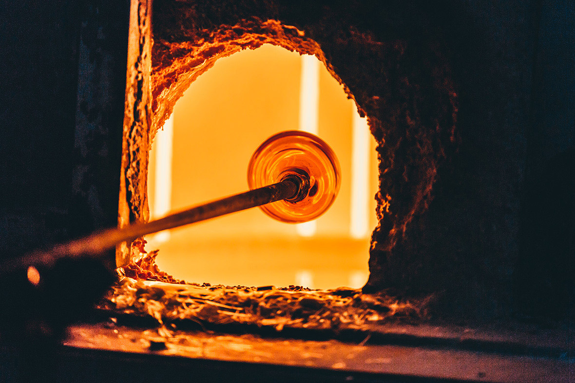
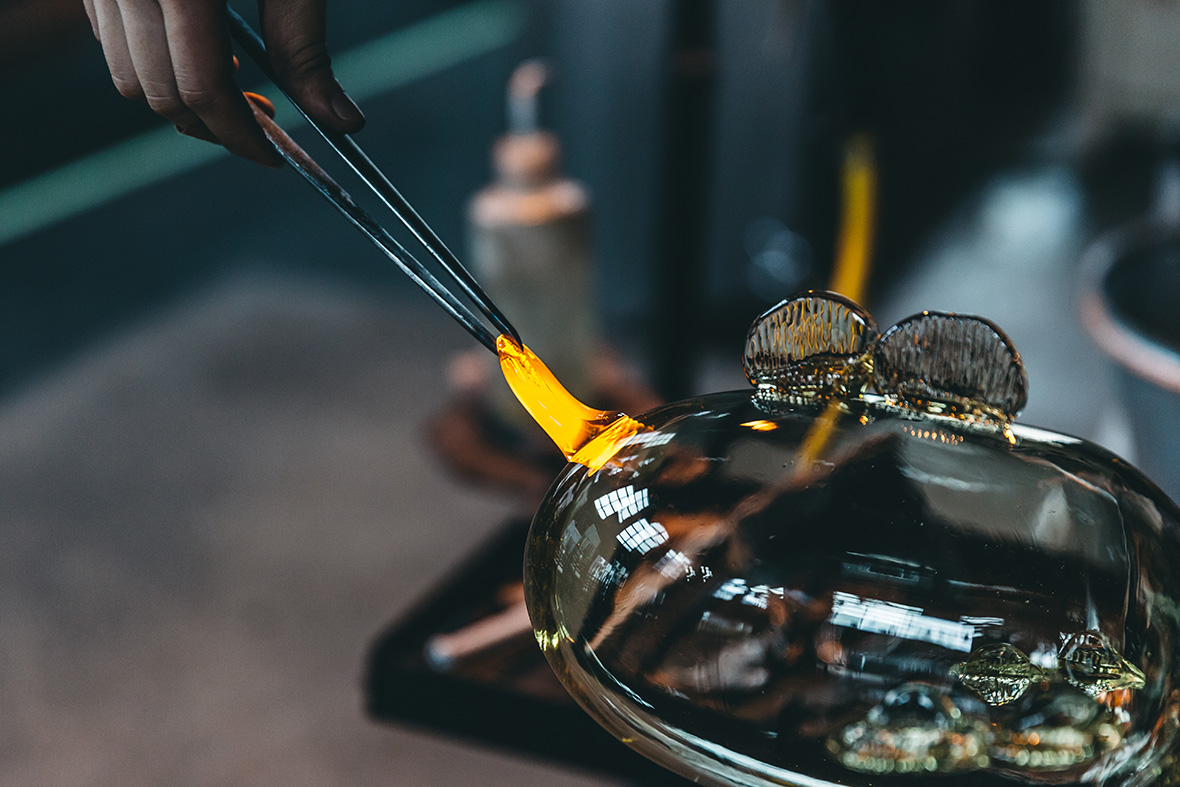
At 600 – 1000˚ C it slowly melts, forming a flame-red liquid – watery yet ablaze. Cooling down, it solidifies into a transparent substance. This wondrous material is none other than glass.

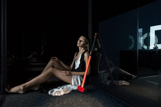
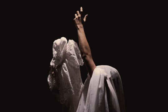
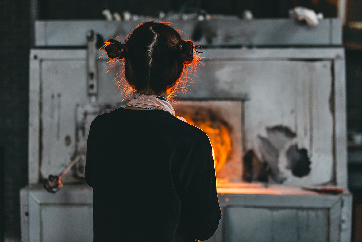
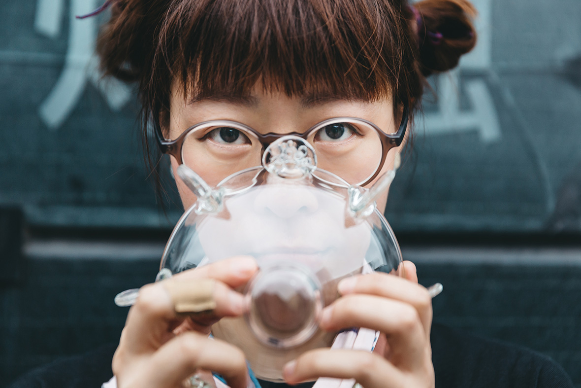
Pulling the iron rod from the furnace, Beijing-based glass artist Du Meng blows into one end to begin shaping the wad of molten glass on the other. The luminous orange of the liquid glass is captivating, hypnotic even, tempting you to draw closer to its deadly heat.


它一半是海水,一半是火焰;它只能在 600 – 1000 ℃ 的高温下慢慢融化,化作一滩火色的水,再一点点降温,凝结成冰的形状。它就是玻璃。

来自北京的玻璃艺术家杜蒙,在我们的镜头前支起一根吹管,把一团流动的火焰吹了起来。热烈的橙色引诱着你目不转睛地看着它,也引诱着你一步步向危险靠近。

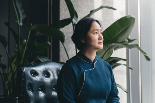
At the Central Academy of Fine Arts in Beijing, Du Meng studied graphic design, a field she felt had “limitless potential.” But as time went on, doubts began to fester. To an artist who yearned to work with her hands, graphic design seemed a little too fast, a little too hectic.

After graduation, she watched a live glassblowing performance on her first visit to the US. This became a eureka moment for her. “It was all because of that exhibition. It changed the way I looked at glass,” she recalls. “It opened my eyes to how this material could be used for artistic expression.”


在中央美院念本科的时候,杜蒙学的是平面设计。这个看似“前途无量”的专业,却让杜蒙一次次感到疑惑──的确,对一个热衷亲手塑造艺术品的艺术家来说,这有些太快了,也有些太多了。

毕业那年,在去美国首次接触到了玻璃的艺术表演形式之后,杜蒙心动了:“就是因为那次展览改变了我对玻璃的看法,让我觉得原来它也是可以有艺术表现的这么个方向的。”

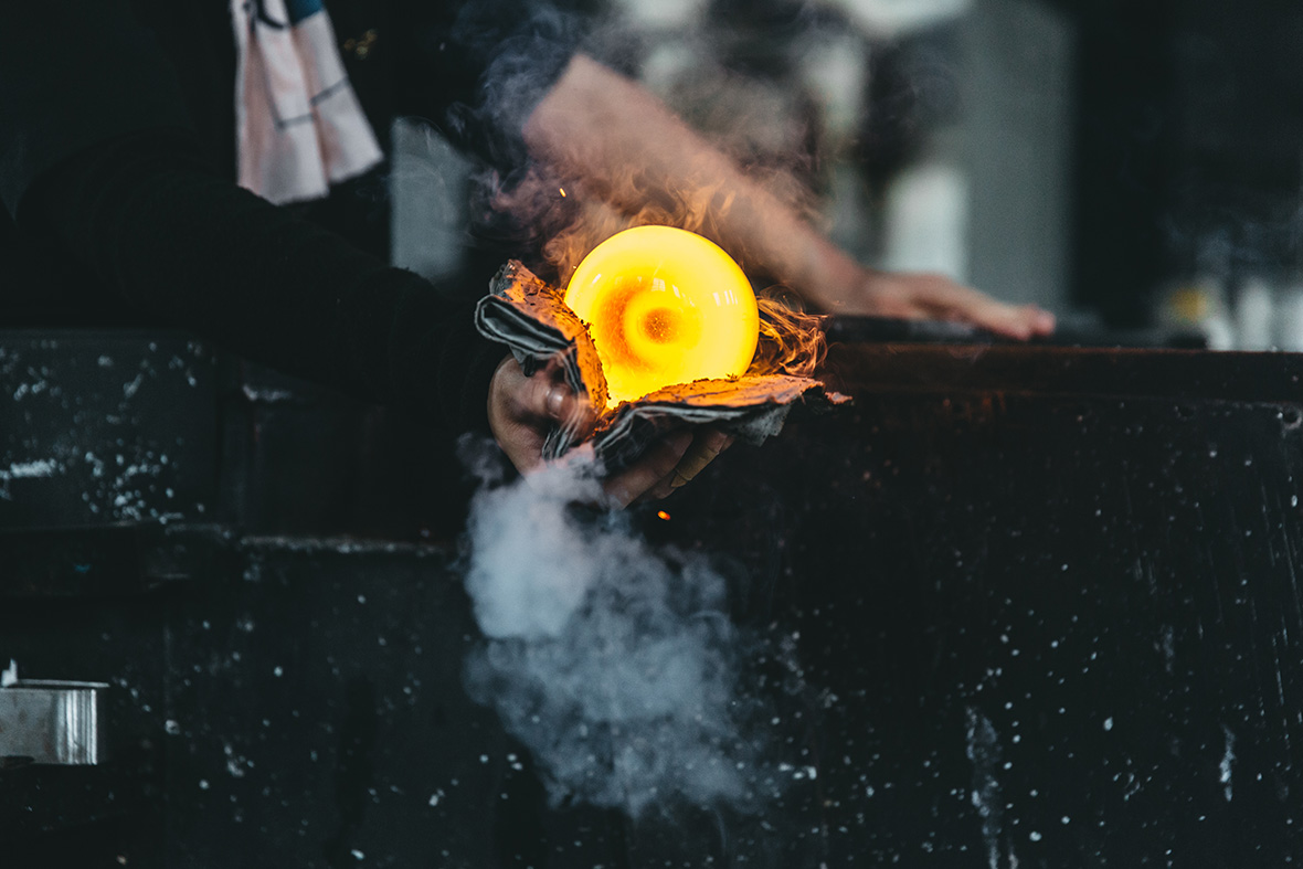
But picking up glassblowing is no easy feat for a complete novice. “It’s scorching hot, and it’s easy to get hurt,” she says. “When I first started, I got blisters up and down my arms.” Back then Du Meng felt torn. Working with hot glass at temperatures well over 1000˚ C is like dancing on the edge of a knife: it’s fraught with danger and utterly exhilarating.

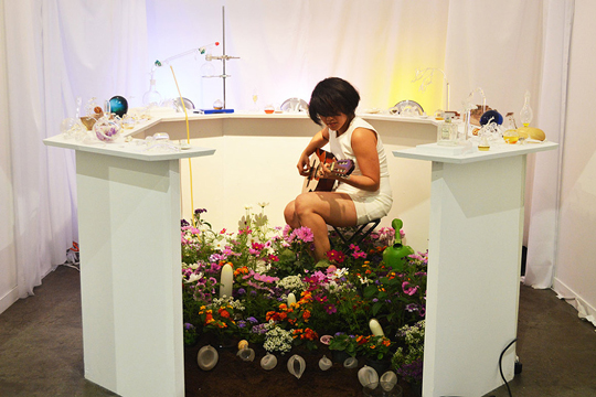
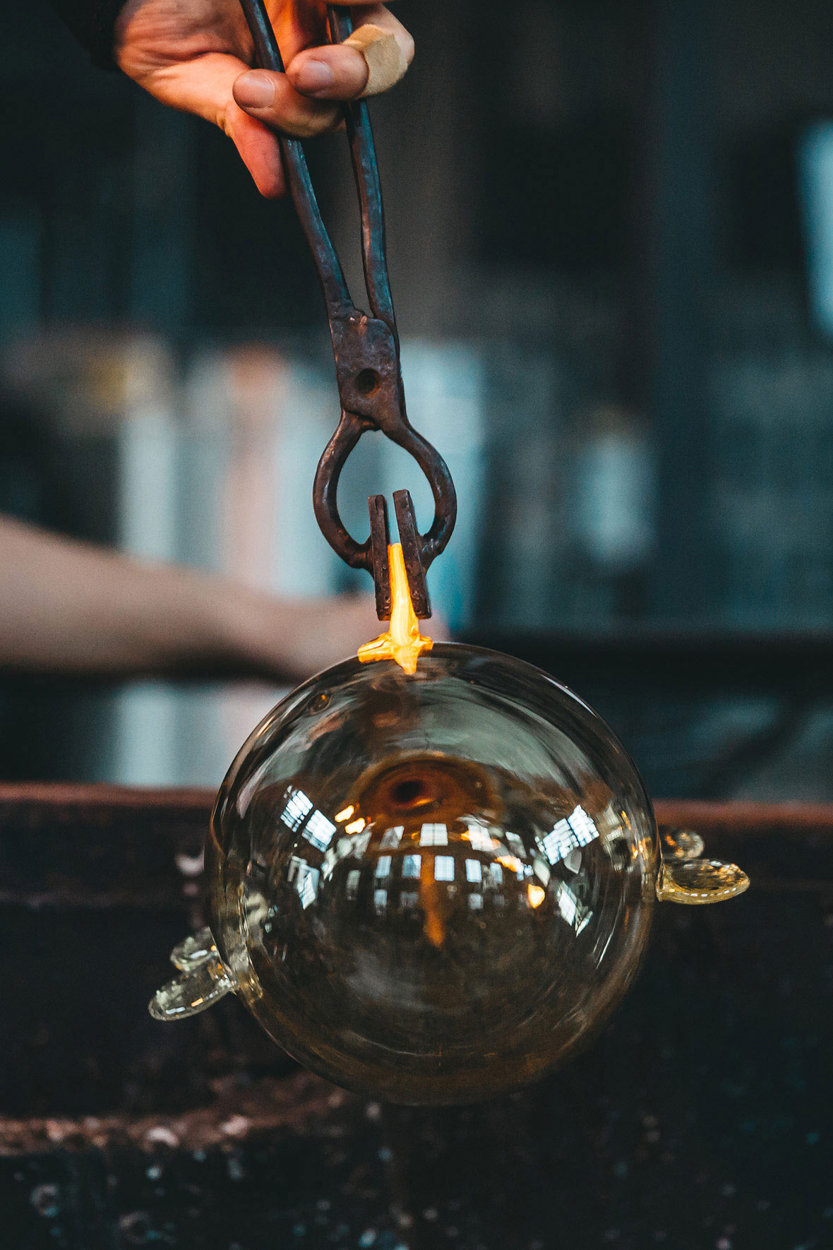
Glass is a unique material – it requires an artist’s undivided attention and coordination. “The way that light refracts and shines through glass to fill a room is a special feeling. It makes you feel like this material is alive, that it breathes and has memories of its own. I think this is what moves me the most.”


而初初接触玻璃所带给杜蒙的感受,着实说不上容易──“又热又烫又容易受伤 ”,“开始用炉子吹制的时候,满手臂都是烫出的泡”。那时候的杜蒙,不是没有过抵触。与动辄上千度的热玻璃共事,那就像在刀刃上跳舞一般,充满危险,又精彩万分。

由于材质的特殊性,玻璃要求创作者无时不刻的全神贯注,也要求动作与心意的紧密联结。“它折射的光线,和光线透过玻璃洒落在整个空间当中的那种感受,你会觉得这种材料是活着的,它会呼吸,而且它有记忆我觉得这一点是非常非常打动我的。”杜蒙说。

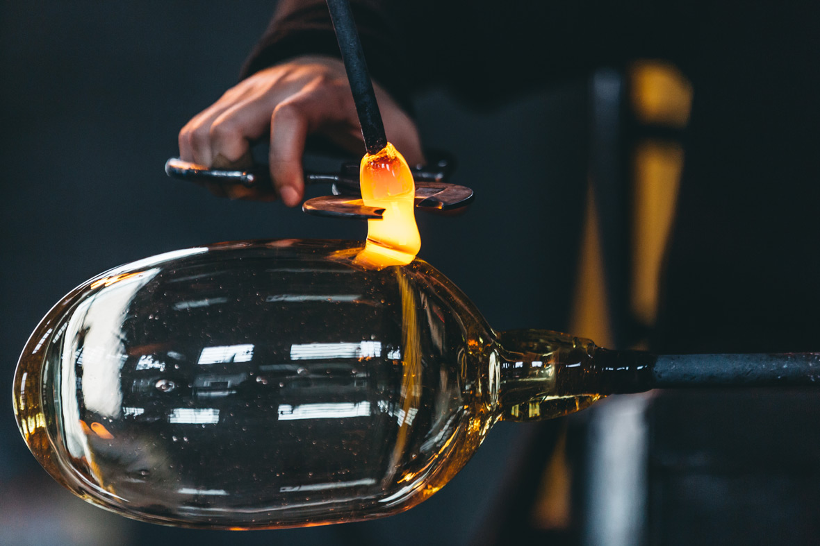
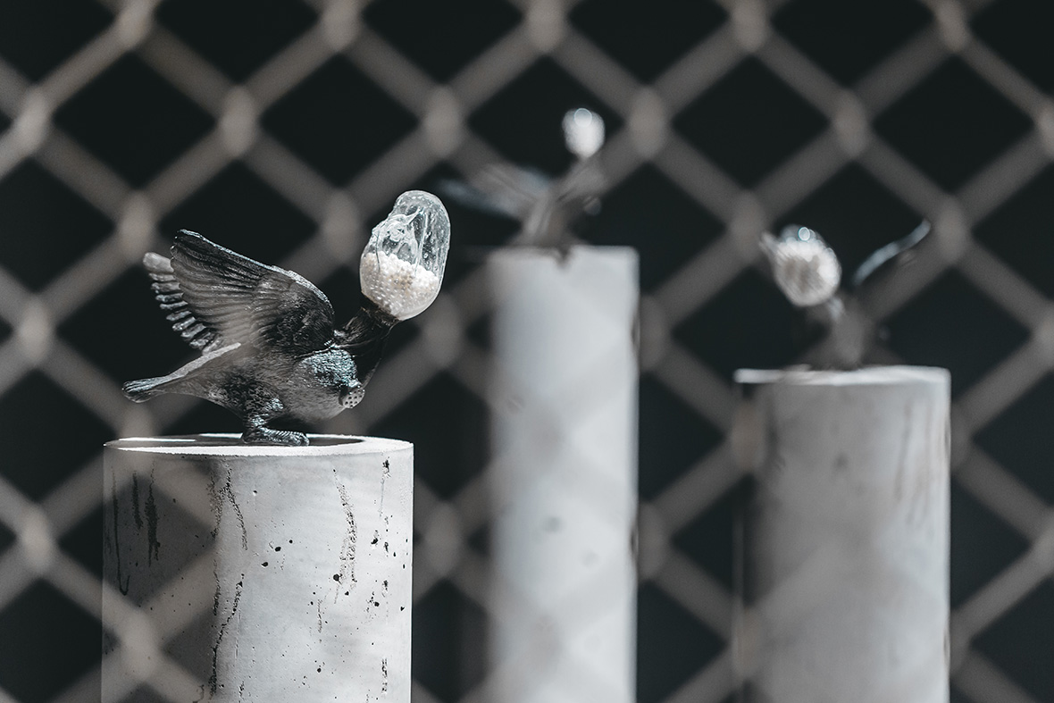
Du Meng describes herself as someone who “uses glass to tell stories.” She sees glass as a medium that’s helped her share anecdotes about the people in her life and her own personal experiences. And she thinks glassblowing isn’t so different from actual storytelling—they’re both always works in progress that can develop in limitless directions. And they can both slip out of your hands if you’re not careful.


杜蒙喜欢称自己为“一个用玻璃讲故事的人”,一来是因为玻璃的确是讲述她与身边人的故事的媒介,二来,是因为用玻璃创作的确与写故事无异──它永远在“现在进行时”,既拥有无穷发展的可能,也随时面临着功亏一篑的挑战。

图片由上海玻璃博物馆提供 / Image Courtesy of Shanghai Museum of Glass

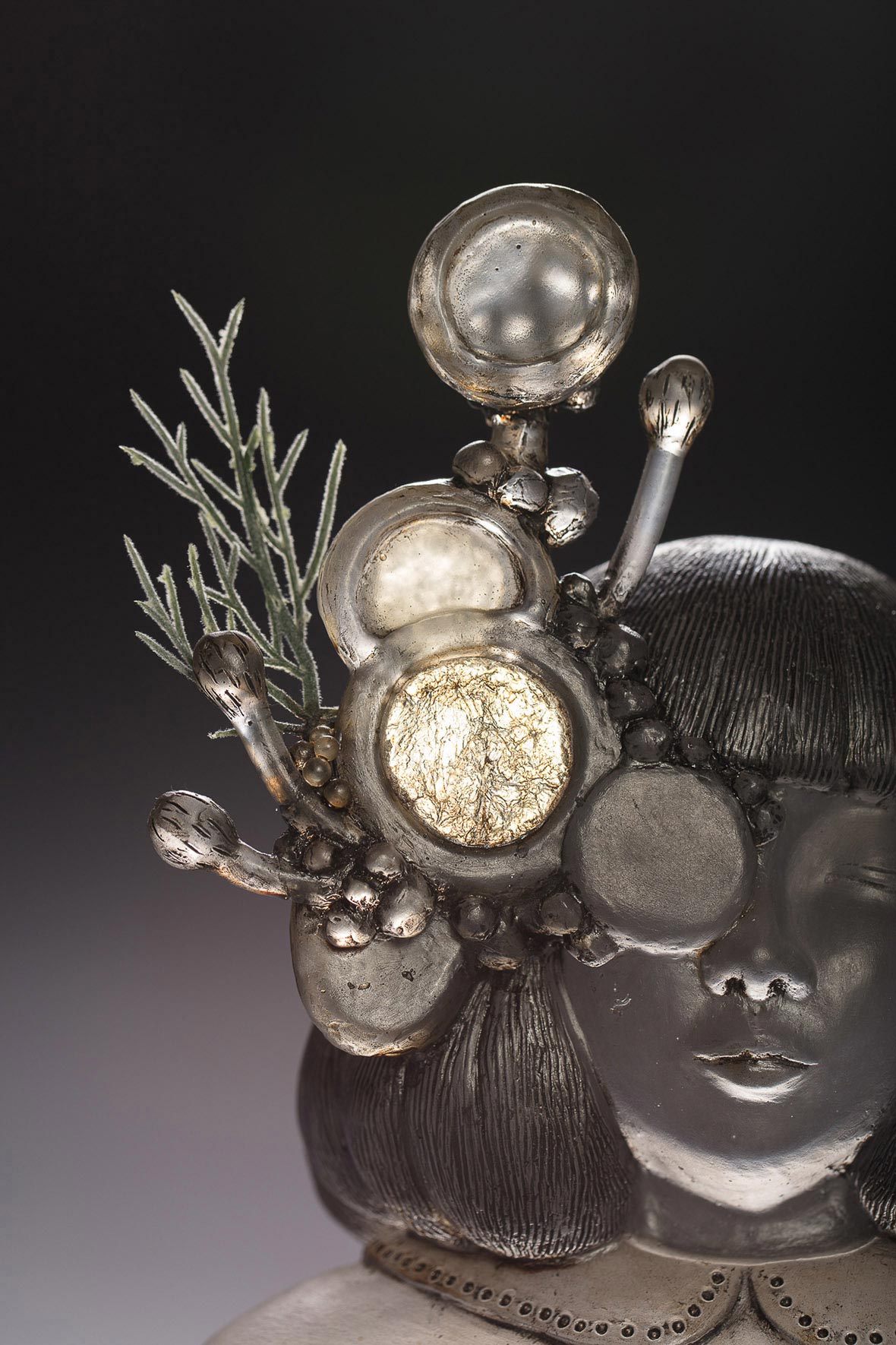
“When working with other materials, you’ll think about what you want to make first even though it might not be a definitive idea. When I’m creating with glass, all of this is happening at the same time. I’m making adjustments as the work is being created,” she explains. “Every piece of work I make is like an individual character with their own stories, and when they’re all together, a new story begins to emerge.”


“在你用其他材质做作品之前,你就会先想到要做什么,并不是会有一个大体的方向,但是我在创作的时候,所有的都是同时发生的,就是一边做一边去调整。”杜蒙说,“所有的作品,都仿佛是一个一个故事中的角色,但把它们互相组在一起,又会产生一个新的故事。”

But over time, Du Meng’s relationship with the medium began to change.

In the beginning, her works had a very personal style, and were a means for her to “better understand herself and her relationship with her art.” Fast forward to today, Du Meng now believes a successful piece of glass art should be the result of fully understanding the story you wish to tell. As a result, her work now attempts to explore the complex relationship between humans, physical spaces, nature, other living organisms, and our changing world.

These are the new world perspectives she’s acquired from glass. “Working with glass, I gained a newfound attitude for life, and it changed my way of thinking. This is especially with the case with glassblowing – this type of art something that can instantly reveal an artist’s temperament. And the road to learn glassblowing is filled with uncertainties and challenges. If your artwork breaks, how do you react, how do you face your failure? Having worked for a while, I feel like I’m a much stronger person. It’s helped me become calmer and more composed,” she smiles.


慢慢地,杜蒙与玻璃之间的关系变了。

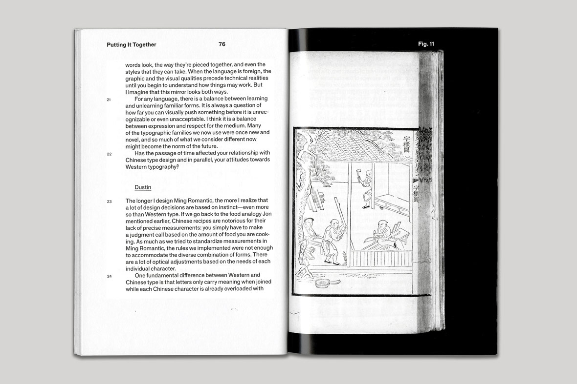
一开始,杜蒙的作品充满个人化风格,在“梳理清楚自己和自己在创作之间的这种关系”;而如今的杜蒙觉得,真正成功的玻璃艺术品,诞生于“把它整个的故事情节梳理清楚的时候”,随之也会更多地“去探讨人、空间,然后以及自然,以及生物、我们周围的各种各样的变化、隔阂,这之间的错综的关系”。

这是玻璃给她带来的全新的角度。从前亦步亦趋的那种危险关系,变成了某种财富:“我觉得其实在跟玻璃工作的过程当中,学到了很多思考的方式和对生活的态度。特别是做吹制,一秒就能看出人的性格的……然后,就是你在学这个吹玻璃的这个过程当中,你会经历很多很多状况,未知的元素特别多。那你如果东西破了,你要怎么样去反应,要怎么样去面对你的失败?我觉得工作时间久了好像心里也变得坚强了一些,特别从容吧。”杜蒙笑着说。

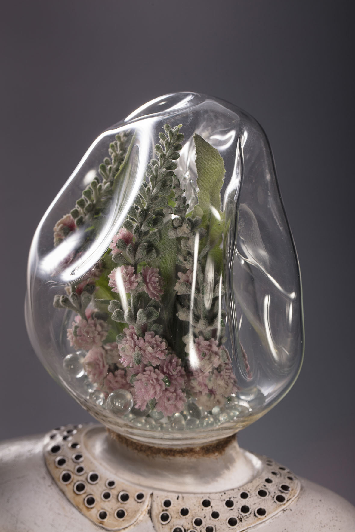
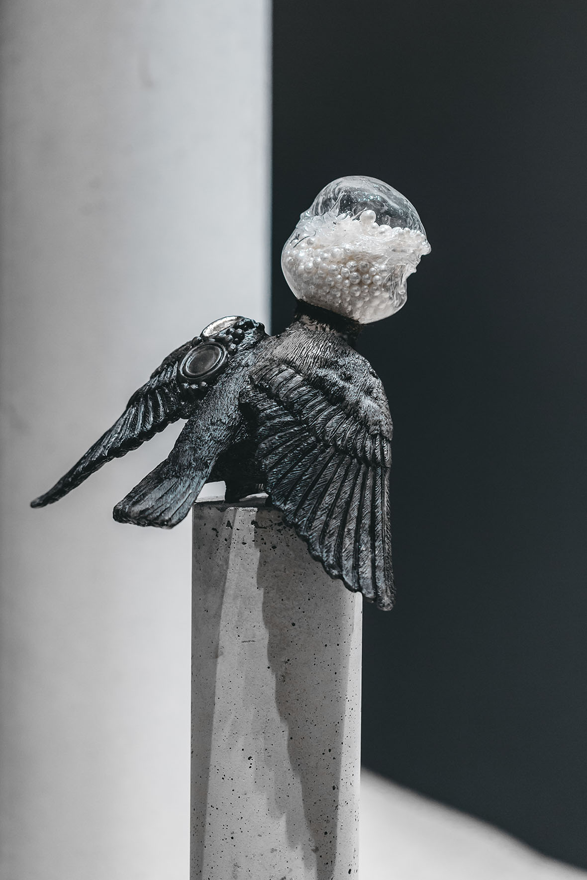
Du Meng’s limited-edition sculptures Shimmer No. 1 and Shimmer No. 2 are now available in the Neocha Shop.


目前杜蒙的玻璃塑像《微光》系列(一号和二号)已经在 Neocha Shop 上线。

Shimmer No. 1 / Photographer: Gao Yu《微光》之一 / 摄影师: 高宇
Shimmer No. 2 / Photographer: Gao Yu《微光》之二 / 摄影师: 高宇
Photographer: Gao Yu摄影师: 高宇

Website: www.mengduwork.com
Instagram:  @moe_mengdu


Contributor: Chen Yuan
Videographers: Yang Bingying, Damien Louise
Photographer: David Yen


网站: www.mengduwork.com
Instagram: @moe_mengdu


供稿人: Chen Yuan
视频摄影师: Yang Bingying, Damien Louise
图片摄影师: David Yen

You Might Also Like你可能会喜欢

Salt 在生活中撒点盐 加点味

May 16, 2018 2018年5月16日

“The idea behind Salt is to add flavor to people’s lives. It can’t be too little or too much. Sometimes my friends ask, why do you persist, when it’s so tough to put out this magazine? I can’t really explain why. People say if you really want to do something, you have to just make it happen. I guess that just about sums it up.”

– Songbing, designer / Co-founder and editor-in-chief of Salt


盐巴,是给生活加点味道的意思,但须有,无须多。有些朋友问我,这本杂志做得那么别扭,为什么还要做。其实我也说不清楚。“心里想要做的事,就去做出来”,我想,大概就是这样吧。

—— 松饼,设计师 /《盐巴》创刊人之一、主编

It all began with a simple idea: Songbing and Juzi, whose nicknames mean “muffin” and “tangerine,” wanted to publish their own magazine. The two women didn’t worry much about the business side of it and went ahead and launched Salt. It’s about finding joy in the simple things. With a friendly, intimate tone, it offers readers reflections on lifestyles and thoughts for how to live.

Busy city dwellers can open Salt and find a moment of respite, with practical tips and artisanal techniques – the little things in life that are the most important. It showcases products, but its real focus is on the creators who make them.

Following the positive reception of their 2011 inaugural issue, “An Ambiguous Life,” they released a series of issues centered around a narrow theme. So far, they’ve covered natural dyes, botany, needlework, printmaking, and with their latest release, hand-woven textiles. The writing is like the scent of grass after a fresh rain: it’s earthy and simple and lingers in your mind.


两个女生松饼和桔子,因为一个简单的念头, 就想去做一本独立杂志。她们没有考虑太多的市场运营,就这样开始了《盐巴》的生命,不断尝试去探索生活中的小确幸,用亲切自然的方式娓娓道来,和产品使用者共同分享对生活方式的解读以及对生活的思考。

对于忙碌的都市人而言,打开杂志的那一刻,内心会进入一个独特的宁静国度,生活常识、手工艺技巧,这些都你生活中最重要的小事。不仅如此,相比那些生活的产物,《盐巴》更关注的是产物的创造者。

自 2011 年创刊号“生活分不清”之后,“草木染”、“种植”、“针线活”和“版画”的主题也接踵而来,一期一个主题,在这些生活甚至市井的主题下,每个文字都透露着雨后青草香气的清新,扑鼻而来,质朴却留痕。

Honestly, cultivating your own individual habits isn’t easy. Salt seeps through the cracks in your life, and becomes that little bit of flavor you can’t give up.

Independent magazines are often considered niche publications that cover obscure, non-mainstream topics. Through the medium of paper, they’re a vehicle of self-expression. But how does Songbing define indie magazines?

“Independent magazines are just a different method of expression,” she says, drawing on her years of experience as an independent publisher. “Just because someone creates a magazine or decides on its content by themselves doesn’t make it independent. If they have something to say, and if their understanding of what’s true, what’s right, and what’s beautiful is untainted by commercialism, they’ll be discovered by more people.”


坦白说,培养一个人的习惯其实并不易,然而《盐巴》却洒进你生活的缝隙,成为那个戒不掉的“小味道”。

有人说,独立杂志,远离日常视野的小众读物,关注主流之外,以纸张为载体,书写自我主张。那么,独立杂志到底在松饼眼里是什么?

“其实独立杂志只是一种途径,一种方式,”松饼用她几年的运作经验告诉我们,“独立杂志不是说你自己独自参与其中,内容你自己说了算,就是独立的。而是你要有所表达,没有被商业控制的价值观伴随着你对真善美的理解,被更多人发现。”

Unlike many other independent magazines, which are a collective endeavor, Salt is often written entirely by Songbing. “A lot of my friends would ask if the magazine was still active. I’d joke and say, ‘Yeah, but it’s an annual publication now.’ I’m an optimist and can laugh at myself. It helps me endure the stress and loneliness.”


不同于很多独立杂志的团队操作,《盐巴》更多时候是松饼独立执笔完成。“不少朋友问我杂志还在进行中吗,我也开玩笑地回答是呀,变成了一本年刊了。我总是习惯乐观地开自己玩笑,这样一来才不会被所背负的压力和孤单击倒。”

What’s kept Songbing going are her devoted readers. But an abrupt two-year hiatus had many of them asking, “Did she give up? Did she get sick of it?” To these questions Songbing replies:

“As your worldview changes, so do the topics that interest you. You can’t stay in the same place you started from. I don’t want to be repetitive. I want to start again and introduce a new Salt to the world. So after the two-year break, Salt’s relaunch marks the beginning of a new chapter for the magazine. The new narrative-driven approach makes every story that much more immersive . . . The willingness to experiment and overcome new challenges is the essence of life. I believe that good things come to those who persevere, and this belief has led to many surprises and delights along the way.”


对于松饼和她的《盐巴》来说,有读者有聆听,就是她坚持下去最大的理由。可是突然间,熟悉的“小味道”消失了,而且一去就是两年。是放弃了么?是疲惫了么?面对各种各样的疑问,松饼是这样说的:

“当你对世界的看法在改变,所感兴趣的领域也发生了改变,你就不会还只是停留在原地。我不想重复自己,我想再次出发,带来了一个完全不一样的盐巴。于是两年后的再次出发,全新的故事性架构让我们看到一种更生动的方式……还能尝试和挑战新的东西,这就是生活该有的姿态,继续坚持下去,最好的总会出现,要这样相信,就能得到生活给予的惊喜。”

Fitting to the name, Salt adds a certain piquancy to the blandness of everyday life. It’s a jolt of savoriness that helps bring out the complex flavors of life. There’s not too little and not too much. It feels just right.

The sixth issue of Salt is now available on the Neocha Shop in limited supply.


正如杂志名《盐巴》,翻开第一页到合上最后一页的过程里,它留给你的,好似淡白开水里加了一点盐,就是那么一点两点,舌尖突然有了滋味。生活看似平淡,细细品味,总有着简单的深刻。正是那所谓的“但须有,无须多”。

《Salt》第六期现已于 Neocha商店限量发售。

To pay via PayPal or international credit card, please check out through our Shopify. To pay with AliPay or WeChat, please visit our Weidian.


如需使用PayPal或国际信用卡支付,请转至我们的 Shopify 页面;如需使用支付宝或微信支付,请至我们的微店

/**/


《盐巴》第六期 “手工织物”

¥150

立刻购买

Product Details:

  • Year of Publication: 2017
  • Number of Pages: 196
  • Dimensions: 18.5 cm x 25 cm
  • Price: 24 USD

详情

  • 出版年份:2017
  • 页数:196
  • 尺寸: 18.5 x 25 厘米
  • 价格:150 RMB

Additional Recommendations from Salt’s Editor-in-Chief

“I’m actually not that in tune with indie magazine in other parts of Asia. But within China, I’d recommend LOSTBe Water Journal, and Chengdu’s Keyi. Especially Keyi – the design of every issue is so creative. And if Seeds hadn’t folded, it’d be one to follow.”


 《盐巴》主编推荐

“关于其他亚洲独立杂志,坦白说我关注的并不多。国内我比较推荐的,《LOST》、《水象》,以及成都的《可以》,特别是《可以》每一期都在工艺上有很多创新。無早的《Seeds》如果能一直做下去,也很值得持续拥有。”

Contributor: Handowin Ho


供稿人: Handowin Ho

You Might Also Like你可能会喜欢

Painting Silence 寂静无声的画布

May 15, 2018 2018年5月15日

A tiny figure in a dark coat and red hat stands in the center of a vast white space, as if lost in the middle a snow-covered plain. At the top of the frame, a flat, powder-blue band indicates the sky, while a gray tint in the foreground and pair of trees in the distance add minimal texture to the landscape. Not far from the figure stands a horse. The two regard each other with ambivalence, perhaps in an attitude of mutual defiance or mutual need. Tiny islands of color against the canvas, the human and the animal seem at once utterly alone and bound together by a shared isolation.


一个穿着深色大衣、头顶红色帽子的渺小身影,站在一片茫茫白色世界的中心,好像在积雪覆盖的荒原中迷路了。画面最上方的一片浅蓝色代表天空,前景的一抹灰色阴影与远处的两棵树木,增添了景观的层次感。在离这个小人儿不远处,站着一匹马。人与马之间流露着一股模糊不清的游移气氛,像是在挑衅,也像是在确认彼此存在的需要。小人儿与马占去了画布上两个细小的色块,他们是独立的,却又因为这种共同的孤独而联系在一起。

Thai artist Yozanun Suntur Wutigonsombutkul, better known simply as Suntur, was born and raised in Bangkok. After a few years working writing copy at an advertising agency, in 2015 he decided to take the leap and devote himself full-time to his art. His work has earned him a large fan base, as well as exhibitions in his hometown and in Hong Kong. Two years ago he took an even bigger leap and moved to New York by himself. Since then, Suntur has embraced a pared-down style that seems to radiate a deep quiet, almost as though he had set out to paint silence. This style was on display at his recent solo exhibition, fittingly titled Zero Decibel, at the Yelo Gallery in Bangkok.


泰国艺术家 Yozanun Suntur Wutigonsombutkul 更为人熟知的名字是 Suntur ,他在曼谷出生和长大。在广告公司工作了几年后,2015 年他做了一个大胆的决定——全心投入他的艺术创作。他的作品为他吸引到了大批粉丝,曾在泰国和香港举办过展览。两年前他又做了一个更大胆的决定——毅然决然搬到纽约生活。从那之后,Suntur 的创作开始转向一种极简风格,简洁的画面散发一股深沉的静谧,仿佛他一心要画的就是寂静本身。最近,他在曼谷知名的 Yelo 画廊 举办了个人作品展,取了个贴切的名字为《Zero Decibel》(《零分贝》)。

Nearly all of the paintings in the Zero Decibel series feature small figures, often alone, that are dwarfed by an enormous backdrop of solid colors and geometric shapes. One image depicts a lone figure on a charcoal-color landscape under a jet-black sky. A few strips of gray define the horizon, and the piercing yellow ray of a flashlight provides the sole concession to color in the painting. Almost abstract in its simplicity, this image, like many in the series, conveys a sharp sense of isolation. Its near-emptiness carries a powerful emotional charge.


《Zero Decibel》中几乎每幅作品都有一个单独的人,与之形成对比的是一大片的单一色块与几何形状。其中一幅作品,一个孤独的身影站在一片灰炭色风景中,天空也是一片乌黑。一抹灰色笔触定义了地平线,电筒发出的黄色光线成为画面中唯一的亮色彩。这幅画简单得近乎抽象,正如系列中许多作品一样,传达出强烈的孤独感。近乎空虚的画面引发观者强烈的情绪反应。

This emotional impact is perhaps a new feature of Suntur’s art. Much of his earlier work consists of cute, carefree images on a blank backdrop — balloons, palm trees, cottages, faces, composed in the sort of whimsical illustrations you’d see on a letterpress greeting card. In Zero Decibel, his style feels more refined. “I think I’m changing, growing up,” he says. “Many things have changed, like the medium, from watercolor to acrylic, and the size, from small sheets of paper to large canvases.”


这种情感冲击也许是 Suntur 艺术创作的一个新特点。他早期的许多作品都是在空白背景下一些可爱的图像,譬如气球、棕榈树、小屋和脸,充满异想天开的插图,就像贺卡上的画一样无忧无虑。然而在《Zero Decibel》里,他创作的风格更加精致了。他说:“我想我正在改变、成长。许多事情都改变了,譬如我创作的媒介,从水彩到丙烯酸。画的大小也变了,从小幅画纸变成大幅画布。”

Suntur’s Instagram features an enhanced, animated version of some of these images in the form of a simple GIF. Invariably cute, these animations produce a very different effect: by adding elements of a story, they remove some of the static ambiguity from which the images draw their force.


Suntur 将一部分画制作成简单的 GIF 动画并放在 Instagram 上,两种作品的表现形式都很讨人喜欢,但 GIF 能表现更加丰富的故事性,并减少静态画作中一些意义不明的模糊性。

Suntur credits his move to New York for the change in his style. “I can experience different cultures, and can see art from around the world,” he says. Perhaps more importantly, the distance from his family and friends has also had an impact. “I’m far from my family, so I live by myself,” he adds. “I think the loneliness has changed my art.” If so, he’s taken his isolation and made it a source of strength. The quiet paintings in Zero Decibel turn a deceptive simplicity to devastating effect.


Suntur 说搬到纽约生活是触发他创作风格转变的主因。“我可以体验不同的文化,看到来自世界各地的艺术。” 他说。但是也许更重要的影响来自他与家人朋友之间遥远的距离。他补充道:“我离家很远,一个人住,可能是我自身的孤独改变了我的艺术。” 如果是这样的话,孤独如今已经成为了他的力量源泉。《Zero Decibel》中那些看似 “寂静无声” 的画,将一种假象式的单调转换成了震撼力十足的情感冲击。


无法观看?前往优酷

Website: illusuntur.com
Instagram: @suntur


Contributor: Allen Young


网站: illusuntur.com
Instagram: @suntur


投稿人: Allen Young

You Might Also Like你可能会喜欢

Whooli Chen’s Vivid Imagination 不一定有美好结局的童话

May 14, 2018 2018年5月14日

Taiwanese illustrator Whooli Chen creates worlds teeming with flowers and plants and fills them with characters from her wildly active imagination. In these fantastical worlds, you might see flowers sprouting from a girl’s eyes, flames leaping from a boy’s heart, or a pair of hands manipulating reality from the side of the frame. Her illustrations are like fables or fairy tales, but a happy ending isn’t guaranteed.


来自台湾的插画家 陈狐狸 (Whooli Chen),喜欢营造一个充满花花草草的世界,让一些胡思乱想的人和动物穿梭其中。在她的幻想里,女孩的眼睛可以长出无名花,男孩可以拥有一颗野火燎原的心脏,或是一双手从旁生出来操弄现实。她的画是无数则不一定会有美好结局的寓言童话。

After graduating with a bachelor’s degree in fine arts, Chen moved to the UK to pursue a master’s degree in illustration. It was there that she chose her artistic name. “A few months before I left London, looking out from my window to the house across the way, I noticed a red fox that would often bask in the backyard sun,” she says. “It’s one of my last memories of my time there, so I chose the name ‘Chen Whooli’ on a whim as a tribute to that fox and that city.” (Whooli is pronounced huli, which means “fox” in Chinese.)


大学时期念的是纯美术,之后到英国继续学插画,陈狐狸这个插画家的身份就是在此时诞生的。“大概在离开伦敦前几个月,发现从家里窗户看向对街房子的后院,常常有一只红色的狐狸在晒太阳。牠是我在伦敦最后一段时光的一个记忆。“陈狐狸” 就是为了纪念那只红狐狸和伦敦而乱取的名字。”


Chen likes the tactile simplicity of pencil and paper, so when working on a new illustration, she often starts with a hand-drawn sketch. Afterward she’ll scan and color it digitally. Attentive to details, her illustrations often include subtleties that are designed to be appreciated by the keenest of observers. Her illustrations feel like pop-up books – they’re immersive and beckon viewers into each frame.

While her style is soft and delicate, a sense of melancholy seems to linger. But rather than asking the artist to define the messages and themes behind her works, it’s much more fun to wander into Chen’s make-believe worlds and conjure up stories of your own.


创作时,陈狐狸说自己很喜欢铅笔和纸张那种质朴的手感,所以画画时通常会先在纸上打草稿, 最后再扫描进电脑上色。她特别注重细节的处理,每一个角落的画面都细细勾勒,充满很多得好好花时间欣赏的小物件。她的画好像是立体的故事书,从什么角度看,都可以找到不一样的切入点。画风看似温柔,寓意却不全然是美好的。关于她想透过画,对我们传递的讯息到底是什么,这部分我们不想请陈狐狸为我们定义。凭着你的想像,进入她的创作世界解读出属于自己的故事,才是最好玩的地方。

Chen’s rich, vibrant style is revealing of the artists who’ve influenced her. “I think artistic creation is a process of gradual change. You’re constantly taking in new stimuli, integrating them into your own style. I really like early Western naturalist prints, along with Persian miniatures and early Japanese woodcuts. Every so often I’ll come across a new artist I like, such as early 20th-century French illustrator George Barbier, who I recently discovered and think is really great.”


繁复多彩的创作风格,也许是受到平常喜欢艺术家的影响。“我觉得创作是一个缓慢变动的过程,不停地吸收新的刺激,再融入原本的风格。我很喜欢西方早期动植物学的版画,也喜欢波斯细密画,和日本早期的木刻版画。通常每隔一段时间会接触到新的喜欢的图像作品,我最近的新发现是百年前的法国插画家 George Barbier,觉得很喜欢。”

Now that she’s a full-time illustrator, Chen often finds that her professional and personal interests are hard to separate. Still, even with her busy life, she likes to take things slow in her free time. “I mostly like to read, watch films, go on easy hikes, stroll around the nearby alleyways of the old city, and spend time relaxing,” she says.

But aside from her passion for illustration, Chen is also an avid writer. Sometime-Else Practice is a side project she runs with graphic designer Chen Jibao. “It’s a way for us to freely practice creative forms we enjoy outside of our jobs,” she tells us. “We write about art, illustration, and photography in an expressive style – almost going overboard in talking about works we like.”

If you like Chen’s drawings, you can see a different side of her work by clicking here.


现在作为一位全职插画家,工作和兴趣时常分不开,但她总能在忙碌的生活中,享受平缓的前进步调。“平常我还喜欢看小说、看电影、爬一些难度低的山、步行在附近老街区的巷子里,度过一些轻松的时光。”

除了画画,陈狐狸也写字 —— 以后, 练习室 “sometime-else practice.” 是她和伙伴陈吉宝一起经营的计划。“这是一个在工作之外,让我们自由练习喜欢创作方式的地方。我们用比较抒情的文体去书写艺术、插画和摄影,有点自溺的去讨论我们喜欢的作品。” 如果你喜欢陈狐狸的画,也可点击此处,看看她另外一种创作形式。

Behance: ~/whoolichen
Instagram: @whooli.chen


Contributor: Yang Yixuan


Behance~/whoolichen
Instagram: @whooli.chen


供稿人: Yang Yixuan

Dear Sky 亲爱的天空

May 11, 2018 2018年5月11日

Arthur Mebius is a Dutch photographer and aviation enthusiast from Amsterdam. His photo series, Dear Sky, is a look inside Air Koryo, the state-owned national airline of North Korea. The airline boasts a fleet of 19 vintage aircraft, including Cold War models by Soviet manufacturers Antonov, Ilyushin, and Tupolev, many of which date back to the 1960s. Because of sanctions and environmental restrictions, Air Koryo’s only remaining international flights are its China and Vladivostok routes.


Arthur Mebius 是来自荷兰阿姆斯特丹的摄影师和航空爱好者。他的摄影作品系列《Dear Sky》(《亲爱的天空》)用镜头记录了朝鲜国有航空公司高丽航空(Air Koryo)。这家航空公司拥有 19 架老式飞机,其中包括苏联制造商安东诺夫(Antonov)、伊留申(Ilyushin)和图波列夫(Tupolev)冷战时期的机型,还有许多 20 世纪 60 年代的飞机。由于航空制裁和环境限制,高丽航空现在唯一的国际航班是往返中国和符拉迪沃斯托克的航线。

After learning of Air Koryo in 2015, Mebius journeyed from Amsterdam to Beijing to board a flight to Pyongyang and experience the airline for himself. Since then he’s taken a total of 24 flights on different types of aircraft. With his Fuji X100T he documented the planes, passengers, and crew he encountered in his travels.

Below you can view more of Mebius’s images and read a short excerpt from his book.


在 2015 年知道高丽航空后,Mebius 特意从阿姆斯特丹飞到北京,坐上了一趟飞往平壤的航班,亲身体验了这家航空公司。从那以后,他一共乘坐过 24 架不同型号的飞机。透过他的富士 X100T 相机,他用镜头记录了在旅行中遇到的飞机、乘客和机组人员。

下面即是由 Mebius 所拍摄的照片及他书中的片段节选。

“Sunan Airport City, September 14, 2016 ––

In one of the apartment buildings in Sunan, next to Pyongyang airport, the haze of 7.27 cigarette smoke is lit by flashing colored lights pinned to the wall and a Moranbong Band CD pumps from a stereo in the corner. Two flight attendants sit demurely on a sofa, an animated card game is in progress at the table. The flight engineer from the Tu-154 is already asleep in a chair. Animated conversation forms a steady roar as tales of the week are cut with memories of a Belgrade nightstop and a zero-zero landing in the depth of a Moscow winter.

The team effort of these comrades, patriots all, is the visible peak of a mountain of institutional knowledge as big as Mount Paektu made of Juche-orientated aviating, and whatever the obstacle, decade or politics, the mission is accomplished.”


“平壤顺安国际机场,2016 年 9 月 14 日——

在位于平壤顺安国际机场旁边的一栋公寓大楼中, 7.27 牌香烟的烟雾中,透着墙上彩色灯的灯光,角落的音响播放着朝鲜女子乐队牡丹峰乐团(Moranbong Band)的CD。两位空姐端坐在沙发上,兴高采烈地玩着扑克牌。Tu-154 客机的飞行工程师已经在椅子上睡着了。他们热烈地谈论着本周的八卦,以及在贝尔格莱德停飞过夜,在莫斯科的寒冬能见度为零时,客机盲降的回忆。

这些同志、爱国者们的团队努力,体现着体制教育的顶峰,犹如白头山(位于中朝边境的一座“圣山”)一样雄伟;而以“主体思想”(Juche,意为自立,是朝鲜劳动党的思想体系和理论基础,由金日成创立,因而也称为“金日成主义”)为导向的飞行,无论遇到什么障碍,历经多少个十年,或说政治形势如何,这个任务都已经完成了。”

Dear Sky is now available on the Neocha Shop in limited supply.


《Dear Sky》现已于 Neocha商店限量发售。

To pay via PayPal or international credit card, please check out through our Shopify. To pay with AliPay or WeChat, please visit our Weidian.


如需使用PayPal或国际信用卡支付,请转至我们的 Shopify 页面;如需使用支付宝或微信支付,请至我们的微店

/**/


《Dear Sky》The People and Planes of North Korea’s Airline

¥350

立刻购买

Product Details:

  • Year of Publication: 2017
  • Hardcover
  • Number of Pages: 128
  • Size: 20 cm x 27.5 cm
  • Price: 55 USD

详情

  • 出版年份: 2017
  • 精装版
  • 页数: 128
  • 尺寸: 20 x 27.5 厘米
  • 价格: 350 RMB

Website: arthurmebius.com
Instagram: @arthurmebius.com_


Contributor: George Zhi Zhao


网站: arthurmebius.com
Instagram: @arthurmebius.com_


供稿人: George Zhi Zhao

You Might Also Like你可能会喜欢

Between Dog and Wolf 介于狗与狼之间的时间

May 10, 2018 2018年5月10日
The Only Question Is How to Endure — Seizing the Moment (from Towards Evenings: Six Chapters)

Towards Evening: Six Chapters is Beijing-based artist Chen Zhe’s exploration of a personal obsession: the sense of dread she experiences with the arrival of evening. Begun in 2012 and now perhaps only half-complete, the project has been continuously refined and expanded over the course of several exhibitions, most recently this spring at OCAT in Xi’an, and last fall at Bank Gallery in Shanghai. Chen’s patience is evident in each of the items that make up the show—photographs, texts, sculptures, and archival images—all clearly the product of long and careful meditation.


来自北京的艺术家陈哲自小就对黄昏怀有一种复杂的不安感受,而她的长期项目《向晚六章》正是她对这种不安感的深入探索。《向晚六章》始于 2012 年,项目的完成度迄今尚未过半,其内容仍在艺术家每次展览里持续完善和生长。陈哲最近的一次个展是春天在西安 OCAT,去年秋天还曾在上海 Bank Gallery 画廊展出。展出的媒介从照片、文字、雕塑到档案图像,每一件作品都体现出陈哲非凡的耐心,每一件作品也都显然经过持久与细致的思考。

The Only Question Is How to Endure

Chen’s first two projects, Bees and The Bearable, published together as a photobook in 2016 to critical acclaim, documented self-harm and psychological distress in unsparing detail. Towards Evenings is both more ambitious and more idiosyncratic, and it’s cementing Chen’s reputation as one of China’s major young artists.


2016 年,陈哲此前的两个主题相续的摄影系列《蜜蜂》和《可承受的》集结成书,并于出版后大获好评。此书呈现了陈哲对于不安的心灵、受伤的身体以及二者之间难以捉摸的关联的长期思考。相比之下,《向晚六章》的规模要更为宏大,主题也更具作者性。它的出现亦巩固了陈哲作为中国重要年轻艺术家之一的地位。

From Bees
From Bees
Entre Chien et Loup — Dog / Wolf

“I have always had symptoms of ‘evening uneasiness,’ and it’s not uncommon if you search for it online,” Chen explains. Finding no diagnosis or explanation for the condition, she eventually began to look for ways to make sense of it through her art. The ambiguity of twilight—the time the French call entre chien et loup, “between dog and wolf”—itself provided a clue. “How to ask an ambiguous question? Perhaps the way it’s asked must itself be ambiguous,” she says. “It can be neither too scientific nor too lyrical—it needs to be something in the middle.” Her answer is a series of images, texts, installations, and objects that evoke or reflect evening and its accompanying disquiet.


“我一直都有点儿‘向晚意不适’,事实上,如果你上网搜索,有类似感受的人并不少见。”陈哲如此说道。然而,一直以来,她始终未曾找到这种“意不适”的缘由,而这种求知的心最终引领她通过艺术创作来回应它。法语中的黄昏可以被写为 “entre chien et loup”,意为“介于狗与狼之间的时间”,表达在日暮时分人们难以辨别来客是狗是狼——原本清晰的界限变得模棱两可。“如何提出一个被认为是真假难辨的问题?或许需要这个提问的方式本身难辨真假。”陈哲说道,“它不能太科学,也不能太抒情。它需要界乎于这两者之间。”而陈哲也正是在她创作的影像、文本、装置和物件中,召唤并回应了黄昏带来的不安。

The Only Question Is How to Endure — Understanding Eternity
The Only Question Is How to Endure — Resisting

It’s tempting to view “evening uneasiness” as a metaphor for a fear of mortality, or the anxiety that can accompany any sort of ending. But Chen’s work avoids easy symbols, and instead relies on a series of indeterminate juxtapositions. This is the case of the “sun clock” that hangs at the opening of the show and charts the project’s progress: as each chapter is completed, another section of the clock lights up. A shining sun is a curious reversal for a show about nightfall. Does it suggest that the completed project will banish evening’s anxieties, or that darkness itself is a form of illumination?


人们很容易将“向晚意不适”解释为对于死亡的恐惧,或是伴随任何形式的结束而来的一种焦虑。但陈哲的作品避免了这些显而易见的象征,转而依赖于一系列模棱两可的对比。譬如在个展入口墙上悬挂着的《向晚时计》。这一时钟样貌的圆盘标记了整个项目的进度:每完成一个小节,相对应的光柱就会亮起;项目结束之时,它则会化身为一个完整的太阳。燃烧的太阳与这场关于日暮的展览形成了奇妙的对比。它是否在说,项目的完结将会消除艺术家对于黄昏的焦虑?还是说,黑暗本质上是另一种形式的光明?

Clock
Entre Chien et Loup — Light / Twilight
The Only Question Is How to Endure — Immersing (detail)

One of the most unsettling pieces in the show is a photograph of a spiderweb silhouetted against the afternoon sun, covered in several dozen spiders. The spiders arouse feelings of revulsion or danger, in stark contrast to the carefree summer day that the rest of the photograph conveys. Yet they are also, in their eerie way, beautiful.  The photo thus creates a sort of double juxtaposition: on one hand, the beauty of the sunlight against the dread evoked by the spiders; on the other, the dread evoked by the spiders against the beauty they also possess.


展览中最令人不安的作品之一,是一张为暮光所映衬的蜘蛛网的照片,上百只蜘蛛密密麻麻地挂满了整张蛛网。蜘蛛往往令人反感或惧怕,但诡秘的是,同照片里的其他部分传达的无忧无虑的夏日景象形成鲜明对比,这里的蜘蛛同时具有着一种离奇的美感。这张照片因此创造了双重的对比:一方面是夏日阳光之美感对比了蜘蛛予人之恐惧感;另一方面则是蜘蛛予人之恐惧感与它们自身无法被忽视的美感。

The Only Question Is How to Endure — Immersing (detail)
Study of a Poem by Rainer Maria Rilke

A different kind of juxtaposition appears in a triptych titled “A Study of a Poem by Rainer Maria Rilke.” The piece combines text—a blending of different English translations of Rilke’s poem “Evening” (“Abend”)—with drawing and photography. It invites the viewer to see parallels across media, to view the text as an image or read the image as a literary text.


作品《理解一首里尔克的诗》则呈现了不同类型的对比。这组作品以三联的形式依次对里尔克的诗作《黄昏》(《Abend》)进行了剖析:对不同英译版的拼贴组合、诗中关键词与插图的叠加、奇遇的照片。在看和读中激发观众去思考不同媒介的相似之处;尝试将文本视作图像,同时将图像当作文本来解读。

Study of a Poem by Rainer Maria Rilke
An Expansion of Kobo Abe’s “The Red Cocoon,” Experiment II 2
An Expansion of Kobo Abe’s “The Red Cocoon,” Experiment II 5

Even beyond the poem by Rilke, Towards Evenings is a distinctly literary project. It includes long passages from E. M. Cioran and Claude Lévi-Strauss, as well as a series of photographs based on Kobo Abe’s “The Red Cocoon.” The project’s title is itself a reference to two separate poems: Austrian expressionist Georg Trakl’s “Toward Evening My Heart” (“Zu Abend mein Herz”) and Tang dynasty poet Li Shangyin’s “Leyou Plateau” (乐游原), which begins “Towards Evening My Mind Is Not at Ease.” “Visual expression and literary expression are both a sort of translation of reality and experience. But in every translation there’s a loss,” says Chen. “When making art, what I think about most, when faced with a sort of twilight reality or twilight perception, is what mode of expression can minimize this loss, while preserving, to the extent possible, the elusive quality of the subject itself.”


《向晚六章》毫无疑问是一个极富文学性的项目。除了德语诗人里尔克(Rilke)的诗歌之外,陈哲还引用了包括罗马尼亚哲学家萧沆(E. M. Cioran)、法国人类学家列维-斯特劳斯(Claude Lévi-Strauss)等人著作中段落,并创作了一组以日本小说家安部公房的短篇小说《赤之茧》为原型的摄影作品。事实上,《向晚六章》这一标题本身就来源于两首诗,分别是奥地利表现主义诗人特拉克尔(Georg Trakl)的《Zu Abend mein Herz》(《向晚,我的心》)和唐朝诗人李商隐《乐游原》中的诗句“向晚意不适”。陈哲解释道:“视觉表达和文学表达都是现实和经验的一种翻译。但凡是翻译,就会有耗损。我在创作时最常考虑的是,在面对一种黄昏的现实,或者说一种对于黄昏的感知时,如何表达才能最大程度地降低这种耗损,同时又尽可能地保留言说对象自身的暧昧特质。”

891 Dusks: An Encyclopedia of Psychological Experiences

One of the strangest and most intriguing pieces is a large leather-bound book titled 891 Dusks: An Encyclopedia of Psychological Experiences. It contains, in index-like fashion, a mysterious list of symptoms. An entry for “delirium” is typical. Under the heading, we read:

Delirium

night
bed and escapes, springs up suddenly from
business, talks of
busy
loquacious
mild
murmuring
muttering
himself, to
persecution in d., delusions of
quiet
sepsis, from
sleep, falling asleep, on
sleeplessness, and
trembling, with

The awkward entries, with the pseudo-exactness of their organization, read like an avant-garde poem. Chen took the text from the New Comprehensive Homeopathic Materia Medica of Mind, a compendium of symptoms that various homeopathic remedies are intended to treat. “I scanned every page of the book, erased the parts that were not quite relevant, and changed the names of the 891 types of herbs to the experience of encountering dusk in 891 times,” she explains. She also redesigned the book to give it an almost biblical look. “If you look carefully, you can see the original title embossed on the cover, while the new title is printed in gold ink.” In an accompanying video, voices read selected entries aloud in English and Chinese.


展览中最为独特且令人着迷的作品之一,是一本名为《关于891次黄昏心灵活动的百科全书》的精装皮面书。它以类似索引的方式,列出一个症状清单。譬如在“狂乱(Delirium)”这个词条下,我们可以读到:

狂乱

夜晚
床上跳起并逃跑,突然从
讨论工作
忙碌
喋喋不休
温和的
诉怨
自言自语
迫害,妄想被
安静
败血,来自
睡眠,入睡,当
失眠,和
颤抖,伴随

看似古怪的文字,加之貌似严谨的格式排版,让这段话读起来就像是一首先锋派诗歌。这件以书为载体的作品来自于陈哲对于出版物《全新心灵顺势疗剂药典》(《New Comprehensive Homeopathic Materia Medica of Mind》)的篡改。她谈道:“我逐页扫描了整本书,删除掉那些与‘黄昏不适’不太相关的部分,并将其中891种草药的名字替换为891次,以对应日日回访的黄昏体验。” 此外,陈哲还重新设计了书的封面,让它看上去像是《圣经》般的经典著作。 “如果你贴近看,你仍然可以在封面上找到原始的标题——那些只被印凹的黑色部分,而新被赋予的标题则额外多了一层金色墨水。”部分节选的词条在同这本书配套展出的视频中还会由艺术家以中英双语朗诵出来。

891 Dusks: An Encyclopedia of Psychological Experiences

Towards Evenings began an as attempt to shed light, if only obliquely, on a peculiar dread of the coming of night. Neither clinical nor cathartic, the project does not explain or dispel that dread. But it does perhaps offer a brief sort of clarity, a fleeting revelation of the hidden ties between sensations, images, objects, and words. “For me, making art means solving one riddle while posing another, answering one question while asking another,” concludes Chen. “The riddles and questions vary with the circumstances of each artist, but the experience of grappling with them remains, and becomes a source of insight.”


《向晚六章》的创作初衷是陈哲对于“向晚意不适”的求解,而落实在每一件作品上,它们既没有冷冰冰地分析这种不适,也没有以宣泄的方式来试图消除它。然而,它确实为观者提供了一刻短暂的清醒,一场对知觉、图像、物体和文字之间的隐蔽关系的短暂揭示。“对我来说,创作就是在解开谜的时候制造新的谜,在理解问题的时候提出新的问题。谜和问题会根据创作者的境遇更迭,而与它们相处的经验,最终都会变成锦囊,留在创作者身上。”

The Only Question Is How to Endure — Resisting (detail)

Website: www.zheis.com


Contributor: Allen Young


网站:www.zheis.com


投稿人: Allen Young

You Might Also Like你可能会喜欢

Type-of-Graphics 设计一套中文字体有多难?

May 9, 2018 2018年5月9日

This story is part of a content partnership and media exchange between Neocha and MAEKAN. To see more of MAEKAN’s content on Neocha, click here.


Typefaces are to text what accent and cadence are to speech: they create an immediately recognizable “voice.” Thanks to digital typography, designers have access to tens of thousands of different typefaces, each of which can steer a project in a different direction and give it a different visual identity. Don’t like the fonts on offer? You can always create your own — you just need to design some 250 characters, including upper- and lower-case letters and punctuation. If you’re working in a language like English, that is.

But what if you’re a designer working in Chinese, creating a typeface that needs tens of thousands of characters to be considered “complete”? How do you tackle a project that’s bound to outlive you, and why even start in the first place?

I sat down with Caspar Lam, of the New York-based studio Synoptic Office, to talk about his team’s new typeface, Ming Romantic, and the challenges of Chinese font innovation.


本篇文章来自新茶媒体合作伙伴 MAEKAN 的内容交换。在 Neocha 上阅读更多 MAEKAN 的文章,请 点击此处


字体设计之于文字,就像声调和抑扬顿挫之于一篇演讲来说一样重要,同样都提供后者一个能轻易被辨识出来的 “风格”。归功于数位排版,设计师现在可以在网上接触到上千万种不同的字体,让作品的视觉风格更加多元化。但如果你还是找不到想要的字体呢?你还有另一种选择:设计出 250 个大小写字母和标点符号,创建属于你自己的字体。当然了,前提是你用的语言是英语。

但是,如果你是一名中文设计师,创建一套数位的中文字体则需要设计出上千万个不同的字元,才能称得上“完整”。要如何完成这项说不定一辈子都做不完的工作,更重要的是,为何一开始还选择去做这件事?

我带着这样的疑问来到了纽约设计工作室 Synoptic Office,和字体设计师 Caspar Lam 一起讨论 明日体 的构思,以及在设计中文字体时所面临的挑战。

It all began with a simple enough request.

Before founding Synoptic Office, while working at a design studio, Lam was tasked with finding a romantic Chinese font for his client, Vogue China, which was looking something akin to Didone — an unadorned, modern typeface characterized by a striking contrast between thin horizontal and thick vertical lines.

The problem? No such type existed.


这一切都始于一个简单的提问。

在创立 Synoptic Office 之前,Caspar 曾在纽约一间工作室工作。当时他在为客户《Vogue China》寻找一种风格浪漫的中文字体,类似 Didone 字体这样的设计——简洁、现代、横竖笔画的对比强烈,竖线要细,而横线要粗。

问题是,并没有这样的中文字体。

After completing the project with Vogue China, Lam discussed the idea of creating a font with Synoptic’s co-founder and creative director, YuJune Park, and their design team, which included Abby Chen, Dustin Tong and Gabriela Carnabuci. “We were sitting together in a room and we said, ‘Oh, why don’t we make a Chinese typeface?’” Lam recalls. “How hard could that be? Literally, it was that naive.”

Thus began Synoptic’s five-year journey to explore and reinvent the way modern Chinese typefaces are created.


结束这个项目后,Caspar 与工作室共同创办人暨创意总监 YuJune Park 以及其团队成员,包括设计师 Abby Chen、Dustin Tong 和 Gabriela Carnabuci,一起讨论了设计字体的想法。Caspar 回忆说:“我们坐在一个房间里,讨论着 ‘我们为什么不自己去制作中文字体?这能有多难呢?’ 我们当时的想法就是这么天真。”

就这样,Synoptic Office 开启了一项长达五年的项目,重新探索和塑造了中文字体的设计方式。

Ming Romantic came about from a combination of circumstance, curiosity and, as Lam concedes, “youthful optimism.”

The team originally wanted to include an accompanying Korean typeface in a similar style, a plan they abandoned within the first month, once the enormity of the project became apparent.

Why? Several factors make creating a new Chinese typeface exceedingly difficult, many of which have existed since antiquity.

For starters, written Chinese is vast and intricate.

This complexity gives the script its richness, but it has also hindered its ability to make full use of technological innovations that elsewhere proved transformative.


明日体是對周遭环境的審視、好奇心、以及 Caspar 所说 “年轻的乐观主义” 结合之下的产物。

团队最初原本還计划创建一款类似风格的韩文字体。但是在项目开始的一个月后,他们就放弃了这个想法,因为很快他们就意识到这个项目的艰巨性。

为什么?创建新的中文字体之所以如此困难有很多原因,其中一些原因甚至可以说是自古以来一直存在的。

首先,汉字的数量非常庞大,结构复杂。

这种复杂性既丰富了语言,同时也阻碍了它像其它语言一样充分应用于新兴科技。

For the Western world, the impact of the printing press was huge. It’s probably a simplification, but when every book had to be copied by hand by a team of monks, a machine that could churn out Bibles at the pull of a lever was revolutionary.

It led to the greater dissemination and democratization of knowledge in the West. And as printing technology progressed, so did the typefaces conceived to meet different design challenges, such as cost-saving italics, which allowed a printer to fit more letters onto a block.


对于西方国家来说,印刷技术的影响是巨大的,毕竟在一个只能手抄《圣经》的时代,突然出现一个拉一下开关,就能大批生产出畅销书的机器,在当时绝对称得上是一项革命性的发明。

打印机的出现让知识得以在西方国家更大范围地传播出去。随着印刷技术的不断发展,字体设计也在不断向前推进,以迎合更多不同的设计挑战。例如,人们发明斜体字,让打印机可以将更多字母装入同一个方格,以节省成本。

“If they created a block for every character, that’s also a huge undertaking. You needed an emperor or somebody with a lot of money hire a lot of people to do this type of work and sustain it.”

“如果你为每个字都创造一个方格,那将是一个巨大的工程。你首先需要一个像皇帝一样富有的人的资助,才能去雇用一大堆人来做这件事。”

These developments would eventually lead to the first modern” Roman typefaces, Bodoni and Didot, with their sharp serifs and high contrast between vertical and horizontal line weights. The set of typefaces that descend from these two, collectively known as Didone, would also become the conceptual basis for Ming Romantic.

In case you’re wondering why it’s called Ming Romantic, it’s named for the dynasty during which ceramic, wood, and bronze movable type gained popularity, in a marked a shift away from calligraphic script styles based on brush strokes. And the Mingti typeface, also named for this period, marked the starting point for their exploration.

Although movable type was invented in China as early as 1040 AD, printing was long limited by the costs of producing large character sets.

Individual characters or even whole texts were carved onto woodblocks, which were then inked and stamped onto paper, in a process known as xylography. But this process required the support of a wealthy patron such as the emperor. If there was no block for a given character, a new one had to be carved.


发展到后来,诞生了第一批现代罗马字体 Bodoni 和 Didot,这些字体有着明显的衬线、和强烈的横竖线粗细对比。以这两种字体为基础发展的字体都被统称为 Didone,同时也是明日体的灵感之源。

也许你会想知道为什么取名为 “明日体”,它的命名取自明朝。在这个朝代,陶瓷、木材和铜板活字印刷术得到了广大的普及,意味着中文字体开始有了不同于手写书法字体的风格转变。同样的 “明日体” 也标志了一个世代,是对中文字体重新探索的开端。

虽然活字印刷术早在公元 1040 年就在中国被发明和使用,但关于中文印刷业及字体的后续发展,最大的限制因素是生产如此大量字符模具,随之而来的巨大成本。

在古代,人们喜欢在木版刻上文字或整篇文章,然后再将印有墨水的木版压印到纸上,这一过程被称为 “木版印刷术”。但这背后需要相当雄厚的资金支持,通常只有皇帝才做得到。因为这项工作必须有人随时待命,一旦木板被用完了,就必须马上再雕刻一个新的出来。

And a similar issue persists today. A non-designer can do a quick browse of DaFont and find tens of thousands of different typefaces for English, but a committed search of similar sites for Chinese will yield only a fraction of that number — even as the demand for new Chinese typefaces has grown.

While an alphabetic typeface can be created by a single designer with sufficient passion or compensation, making a usable Chinese typeface requires a team of designers working together over several months — or in Synoptic Office’s case, several years.

This is because a typical Western typeface needs only about 250 characters, a number that includes the alphabet in upper and lower case, punctuation marks, and special characters like currency signs and the ampersand.

The problem is that a modern Chinese typeface needs those Roman characters along with 2,500 to 3,000 common-use Chinese characters to be useable for simple texts such as titles.

As it happens, the 250 or so Western characters used in most Chinese typefaces are included for completeness and are usually copied from other typefaces. The results are Roman characters that are jarringly out of place next to the Chinese typeface, something of a bastardized Times New Roman. Lam and I joked that these characters look like an afterthought, a job left to a hapless intern.

But for a typeface intended for professional use – for body text, for example – where the variety of characters is bound to be greater, thousands more are needed. Some estimate that as many as 80,000 are needed for a typeface to truly be considered “complete.”


同样的问题至今仍然存在。即使你不是设计师,也能在 DaFont 这样的字体网站上轻松找到成千上万种英文字体。但是當搜索中文字体时,结果却廖廖无几。然而人们现在对于新的中文字体的需求正在与日具增,也有越来越多人愿意资助这项工作。

要创建新的罗马字母字体,只要有资金资助和足够的热情,一位设计师单枪匹马就能完成这项工作。然而,要创建一款可用的中文字体仍然需要一个团队的设计师工作好几个月,或是像 Synoptic Office 这样,努力了数年才行。

一般来说,西方字体只需要大约 250 个字符,其中包括大写和小写字母、标点符号以及其他特殊符号如$或 &。

问题是在现代中文里,除了需要那些罗马字符外,光要写出一个简单的标题,就需要 2500到 3000个常用中文字符了。

大多数中文字体中附带的 250 个西方字符只是为了确保其完整性,通常都是直接借用其它字体的。结果是两者摆在一起看起来极不协调,像是一种变异的 Times New Roman 字体。Caspar 和我开玩笑,这些被借用的字符感觉就像是一个倒霉的实习生,被派去收拾別人的烂摊子。

但是对于一款用于专业用途的设计字体,譬如用在正文部分,字符的种类一定要更丰富才行。起码需要超过八万个字符以上,才能算的上 “完整”。

“Theoretically, you could work on this forever, because the character set is so huge. If we want people to use it quickly, maybe we should set expectations and say ‘well, maybe we won’t complete it on the first go.”

“理论上,你可以花上一辈子的时间去设计,因为中文字实在太多了。如果想要人们可以更快的使用到,也许我们应该换个方式,不用一次就全部完成所有的字。”

It bears mentioning that Synoptic Office isn’t a type foundry – that is to say, they don’t create typefaces full-time. I asked Lam how they executed a project of such magnitude in the background, while working on other jobs, over five years.

He began by comparing approaches used by type foundries. One of these involves writing a character by hand, scanning it into a graphics program and live-tracing it. But as Lam notes, this was not a suitable approach for Ming Romantic, as their design aim was to distance it from handwriting and instead explore typography.

Taking a page out of the software development playbook, Synoptic is releasing Ming Romantic in successive versions. This means the team’s work can be published even before it’s complete – and with so many characters left to go, it can be hard to pinpoint when that will be.


值得一提的是,Synoptic Office 并不是一间专门的字体设计公司,他们没办法投入所有时间来做这件事。于是我问 Caspar,他们是如何在五年多的时间里,利用工作之余持续进行一个如此大规模的项目?

他首先跟我比较了字体设计公司和 Synoptic Office 使用方法的不同。其中一种方法是先手写,扫描进绘图软件里再描图。但是正如 Caspar 所说的,这种方式不太适合明日体,因为它的设计精神本来就是要摆脱手写字型,以去探索更多印刷字体的风格。

Synoptic Office 则是采取分阶段,以不同版本推出的发布形式。这意味着字体可以在完成前就先曝光,毕竟这个项目要完成的字符如此之多,很难精确的预定出具体的完成日期。

Yet even with the advantages of graphic design software and scripting languages that can produce characters with similar elements based on successful iterations, individual characters still need to be finessed or adjusted to be visually pleasing, Lam explains.

That means carving out time every day for drawing a character on a blank grid on a screen. In the beginning, the time commitment meant the net output was maybe only one to three characters a day.

These characters sit on a large master list that the team goes through over and over again until items are completed, with milestones set in increments of 500 characters.

Intrigued, I ask him how the team celebrates.

“With a cup of coffee,” he laughs. “Or maybe just walking around, because it takes a toll on your eyes. I already have very bad eyesight, so you can feel your eyes degenerating after a while, and you know that this is actually not good for you in the long run!”

Besides the consistency of the entire character set, Lam points out another crucial criterion – Does it look Chinese?

“After the initial explorations were done, it became a little more robust and efficient. Because then you could copy a lot of the forms you drew previously and then modify them for forms that are similar,” he says.


因为绘图软件和脚本语言的帮助,他们可以依据重复的笔画元素去创作更多字符。但是 Caspar 解释说,即便如此,他们仍然需要一个一个字去加工处理或调整,视觉上才能达到一致平衡,让人看得舒服。

这意味着他们每天要抽出时间在电脑上绘制字符。一开始,他们每天只能做一至三个字符。

“最初试验工作的阶段完成后,工作流程就变得更加顺畅和高效率。因为你可以复制之前绘制过的偏旁,然后在做类似字符时直接在它的基础上修改就行了。”

团队把这些所有字符列成一份工作清单,过了一遍又一遍直到项目完成。每完成 500 个字符,对他们来说都算得上是一个里程碑。

有趣的是,当我问团队会如何庆祝时,他笑着说:“就喝杯咖啡。或者是起来走走,因为这项工作挺伤眼睛的。我的视力本来就不好,过了一段时间又感觉到视力在退化。长远来看,这其实对健康不是很好。”

但是,除了要针对所有字符的一致性进行测量和调整之外,Caspar 还指出另一个关键的标准——新的字体看起来够像中文吗?

Contrary to a popular myth, Chinese characters are not pictograms. Over 80% of characters are logosyllabic (or pictophonetic, if you prefer). What that means, simply, is that a typical character contains an element that hints at its meaning (the character’s “radical”), and an element that hints at its pronunciation.

In their countless combinations, these elements take on slightly different shapes and proportions that the design has to account for. What’s more, not only do characters have to follow universal visual design principles, they also have to look authentic.

As someone whose Chinese handwriting, acquired at university, looks like the legible but clumsy penmanship of a child, I don’t have the lifetime of practice necessary to judge authenticity.

But authenticity is important, and to show why, Lam mentioned the contrasting case of writing by Chinese learners of English. Sure enough, a glimpse at some writing samples shows a few extra features that are decidedly not native to English handwriting styles. These anomalies are pretty easy to spot, especially if you’re just working with the standard 26-letter Roman alphabet.

For example, you’d likely think something was off if the capital ‘D’ in Delaware appeared as small as the adjacent lower case ‘e.’

With so many “moving parts” in a character, in both typography and writing, there are a lot of extra things that could look off to the Chinese eye. This made creating Ming Romantic more daunting, but also more interesting.


人们向来有个误解,以为每个汉字都是 “图画” 一样的象形字。但其实超过 80%的中文字都是意音文字,或者说是形声字。大部分中文字由不同的 ‘偏旁’ 组成,有些偏旁表示发音,有些则表示意义。一部份的字仅由一个偏旁组成,一部份则由不同偏旁共组、或者是延伸的变体。

在这些由无数种偏旁组合出的中文字中,偏旁的形状、大小比例、位置会稍有不同,都会影响到字体的设计。除了要符合客观的美学要求,更重要的是,它们必须拥有 ‘正宗性’,也就是看起来要够像中文字。

由于我自己一直到大学才开始学写中文,写字看起来就像小学生那种一笔一划、很生疏。我可能还没有资格去判断明日体是否真的像正宗的汉字。

但这件事却很重要,例如在一些英文的书写样本中,你可以察觉到一些不符合传统英文手写的装饰细节。这些不对劲的小地方很容易就能被发现,特别是当我们用标准的 26个罗马字母时。

例如, Delaware 这个单词的大写字母 D 与相邻的小写字母 e 一样大时,即使这是字体的设计意图,你也能看出有点不对。

中文字里面有这么多组合的部分,不论是印刷体还是手写体,更为容易出现让你觉得去看來奇怪的小地方。这也让设计明日体的过程充满更多难关和乐趣。

“We wanted to pursue it because it was such an interesting topic for us. In our studio, we tend to pursue projects that we find to be of cultural relevance and of cultural interest.”

It would be unfair to suggest that the point of Ming Romantic was simply to see how a Chinese typeface could be created from scratch. Aside from the practical challenge of producing a typeface through more intuitive and efficient methods, Ming Romantic also poses a stylistic, and even cultural challenge to the existing visual norms of printed Chinese.

Despite the small but growing body of innovative Chinese typefaces, Chinese culture remains heavily attached to its history in the calligraphic arts for its expressiveness.

Lam describes a sort of “mental barrier” in the Chinese context, offering the example of his family and friends’ questions about Ming Romantic.

When they’d ask what kind of calligraphic face he was working on, he’d have to explain the difference between typography and calligraphy: the former has “an aspect of mechanical reproduction and product,” while the latter is a means of personal expression.

It’s this ingrained attachment to an esteemed tradition that makes giving the two arts “their space” a great, if unacknowledged, challenge for Chinese typography.


“我们之所以投入这件事,是因为它对我们来说非常有趣。我们喜欢做与文化相关或具文化意义的工作。”

如果说明日体,仅仅是为了试验看看中文字如何从头开始创作,这是不恰当的。除了一一克服创建中文字体的困难,明日体的创作尝试用更直观、更有效的方法去制作中文字体。这在视觉设计、甚至文化领域上都是一大挑战,也是对现存中文视觉规范的突破。

尽管中文设计字体目前为数不多,但有在逐步成长。其中很多设计都包含书法的元素,这项传统艺术凭借其丰富的表现力,始终是中华文化的代表。

Caspar 指出人们对于汉字有一种 “认知上的障碍”。他举例道,当他与家人朋友谈论自己在创建明日体时,他们都会问他是在研究哪种书法。这时他必须解释印刷体和书法之间的区别,前者是 “机械复制的产品”,后者是 “个人表达的手段”。

正是对这种根深蒂固的想法进行质问,使得区分这两种字体艺术,成为一个尚未被人们意识到的挑战。

“Even Chairman Mao was a calligrapher. It’s a very reactionary activity for a revolutionary, but it highlights the sort of myth we have as part of our cultural identity, or who we are as Chinese.”

“就连毛主席也是一位书法家。对于他这位革命家来说这是一种相对保守的行为。但书法确实强调了一种文化上的身份认同,充分说明了 ‘我是一个中国人’ 的概念。”

As the first combination of traditional Chinese characters and a high-contrast modern Western typeface, Ming Romantic is an exciting development, but Lam points out that history isn’t entirely devoid of similar attempts.

When he and Park discussed their font at the Typographics 2016 design festival, they showed many remarkable examples of typefaces from the 1950s and after – a relatively unrecognized heritage of Chinese experimentation in typography.

“Experimentation in Chinese type has a somewhat rocky history, because Chinese has tended to allow the forms which are considered canonical, while the rest of the experimentations tend to get buried,” he explains. Outside the art and design worlds, the visible lack of provocative Chinese fonts in everyday life seems to confirm this.

“So you always hear about the great calligraphers or the things that worked. And the things that haven’t worked, you have to search really hard to find them.”


作为中文传统字体和西方现代字体的首次结合,明日体是中文印刷字体中一次令人兴奋的发展。但 Caspar 说其实之前早就有过类似的尝试。

当和 YuJune 在 Typographics 2016 设计节上讨论明日体时,他们展示了1950年代以来许多重要的字体设计案例。这些字体可以说是中文印刷体被埋没的文化遗产。

“中文印刷字体的发展并非一帆风顺,因为中国自古以来只鼓励符合常规的东西,而其余实验性的设计往往会被埋没掉。”他解释道。在艺术和设计界之外,日常生活中很难看到有趣的中文字体。这正好印证了 Caspar 所说的。

“所以你总是能听到人们在谈论哪位伟大书法家,或是哪些已经成功的事迹。而那些还没成功的,你往往要很努力、花上更多力气才能找得到。”

To fully grasp the impact of an achievement like Ming Romantic, you could think of it this way: how many projects fail to reach their full potential, or are never even started, because they lack a typeface to express their visual identity? It’s as if you only had, say, Times New Roman, Arial and (perish the thought) Comic Sans at your disposal.

While Lam stops short of suggesting Chinese design would “mushroom” if it had more typefaces for its creative energies, he does believe more typefaces would allow for more directions and greater freedom. For now, he can proudly count Ming Romantic as the first Didone-style Chinese font and celebrate the end of the first leg of a much longer journey.

At the time of this writing, Ming Romantic’s initial release, unveiled in New York on February 1st, included 2,300 traditional characters in three weights.


要真正明白明日体的成就,你可以这样来思考:有多少失败的设计项目尝试做到跟他们一样的事情、或根本还没开始,因为缺乏合适的字体基础来符合设计上的需求。这就好像跟你说:你当然可以自己设计,但只能用 Times New Roman、Arial、Comic Sans 这三种字体来做一样。

虽然 Caspar 并未明说,但如果中国能有更多创新字体来引导其创作能量,中文设计字体的发展会更快速。更多的字体选择可以为设计作品提供更多方向和创作空间。现在,他们可以自豪地把明日体称为第一款 Didone 风格的中文字体,团队也终于可以庆祝,在这一段漫长旅程中取得了阶段性的胜利。

在写这篇文章的同时,明日体于2月1日在纽约推出第一版,一共收录 2300个繁体字,三种不同的粗细版本。

After our chat, I asked Lam by email what was next for Ming Romantic. Aside from taking some much-needed rest to distance and reflect on the project, he mused about a potential simplified Chinese version, subject to demand.

True to Ming Romantic’s original spirit, there may even be bolder explorations down the road.

“One idea which I find fascinating is exploring ‘ligatures’ in the typeface,” he writes, referring to combinations of two or more characters into one, such as in Æ. But in light of the very history that inspired Ming Romantic, that could be a slippery slope.

“In some way, this is a dangerous idea because ligatures have their origins in handwriting, and going too deeply into this area would turn a typeface into a script.”


上次见面后,我又发了邮件问 Caspar 明日体的下一步计划是什么。Caspar 表示,除了打算休息一下,也要继续思考明日体更多可能性,例如创建简体字的版本。

忠于创建明日体的初心,他们之后可能会有更大胆的作为。

“我还有一个想法一直很感兴趣,那就是字体中的 “连字”。指的是将几个字元组合成一个字元,类似英语的Æ。但有鉴于当初启发他们创建明日体的那些经验,这种想法可能会带来 ‘滑坡效应’。

“某种意义上说,这是一个危险的想法,因为连字起源于手写体。如果在这个领域继续深入,这一款印刷字体可能会再次变为手写体。”

Media Partner: MAEKAN

Contributor: Nate Kan
Images Courtesy of Synoptic Office


媒体合作伙伴: MAEKAN

供稿人: Nate Kan
图片由 Synoptic Office 提供

You Might Also Like你可能会喜欢

Summer Love Aria 恋恋夏日咏叹

May 8, 2018 2018年5月8日


无法观看?前往秒拍

“Summer Love Aria” is a long-overdue collaboration between Shanghai-based musicians ChaCha and Akin. The instrumental, produced by the ever-versatile HARIKIRI, works in tandem with ChaCha and Akin’s crooning vocals to form a soundscape that’s equal parts dreamy and funky. Pairing Akin’s buttery smooth delivery with ChaCha’s sultry and seductive voice, the single captures the feel-good vibes of a summer romance from two different perspectives.


《恋恋夏日咏叹》由常驻上海的音乐人ChaCha 及 Akin 合作而成。多才多艺的音乐制作人 HARIKIRI 担任编曲与后期制作,为二人的低吟浅唱构建了一个梦幻却时髦的音景。Akin 绵滑的唱腔与 ChaCha 诱人的歌声两相融合,从两个角度演绎出夏日恋曲的浪漫情调。


“My life revolves around love,” ChaCha tells us. “But it’s not limited to romantic love. It includes the love between family and friends, the love for our world and for Mother Nature, the love you feel when pursuing your passions, and the love you feel for yourself. These are the things that make life worth living.”


“爱,是我赖以生活的空气。” ChaCha说,“但它不仅仅是恋人之爱,亲情之爱、友情之爱、对世界和自然的爱、对所做之事的爱,以及对自己的爱,都是保持生活运转的最核心的动力。”

Weibo:
~/xhaxha
~/lilakin


Contributor: David Yen
Images Courtesy of PaulbtRose


微博:
~/xhaxha
~/lilakin


供稿人: David Yen
图片由PaulbtRose提供

You Might Also Like你可能会喜欢

Losing Face 走,到街上去丢个脸

May 7, 2018 2018年5月7日

Korean-American photographer Argus Paul Estabrook believes that art should contribute to a greater understanding of our surrounding world, and he, as a photographer, has the responsibility to help present new perspectives and provoke critical thinking. While he’s best known for his street photography, Estabrook considers his work to be more a form of personal documentary rather than photojournalism. “Everyone who shoots on the street has a relationship with it,” he tells us. “They know what it means to be on a journey, searching for something yet not knowing what that might be.”


美籍韩裔摄影师 Argus Paul Estabrook 认为,艺术应该有助于我们去更加了解这个世界。而他作为一名摄影师,肩负着提出新观点和批判思维的责任。 虽然他以街头摄影闻名,但 Estabrook 认为自己的作品更像是个人观点的纪录,而非单纯纪录外在事件的新闻摄影。 “每个在街上拍照的人都与‘街头’有着特殊的连结关系。”他告诉我们, “他们知道当带着相机上街头,这段旅程代表的真正意义为何。是在路上寻找一些东西,即使还不知道那些东西是什么。”

His photo series, Losing Face, offers a candid look inside the Seoul protests that arose from the revelation of former South Korean President Park Geun-hye’s scandal. Processed entirely in black and white, the powerful series uses slow shutter speeds and a bright flash to dramatic effect. Last year, the powerful series went on to win the prestigious Magnum Photography Award as well as the LensCulture Street Photography Awards.


他的作品《Losing Face》(《丢脸》) ,纪录了发生在韩国首尔街上,因前总统朴槿惠的丑闻而起的抗议活动,他的摄影为此事件提供一个坦率的视角。照片完全采用黑白处理,使用低快门速度和明亮的闪光灯拍摄,以达成极具戏剧张力的视觉效果。 2017年,此系列作品为 Estabrook 赢得了著名的玛格南摄影奖和 LensCulture 街头摄影奖。

“When the street leads me to an experience like the Seoul protests, I feel like my job is to zero in on the energy and then conceptualize it in a way that enables it to be reintroduced back into the world,” Estabrook explains of his process. “It’s like a creative circuit. I just try to keep my mind open, so whenever a moment moves me, I’m able to ‘describe’ it with my photography.”


“当我被街头带着去体验像这次首尔的抗议活动时,我觉得我的工作是将注意力全部集中在当场释放出的能量上,然后捕捉并概念化这样的能量,再以一个能重新被导入世界的方式呈现出来。”Estabrook 这样解释他的创作过程。“这是一个创作循环的回圈。我尽量让自己的心思保持开放,所以每当有一个瞬间感动到我,我就能用我的照片去把那一瞬间 ‘描述’ 出来。”

Website: arguspaul.com
Instagram: @arguspaul


Contributor: Shanshan Chen


网站: arguspaul.com
Instagram: @arguspaul


供稿人: Shanshan Chen

The Art of Censorship 《被审查》的女郎

May 4, 2018 2018年5月4日

During the 1960s and 1970s, Thailand was a thoroughly conservative place. In the West, sexual liberation had prompted a reexamination of values and views on sexual orientation, premarital sex, birth control, abortion, and expressions of desire, gradually freeing people from the fetters of antiquated thinking. But that wave of open-mindedness didn’t make its way east until later, and in Thailand any hint of sexuality was still viewed as dirty, obscene, and immoral.

At the time, a censorship law banned nudity—which after all tends to make people think of sex—in all public media, whether in print, on television, in film, or in art. Parts of this law remain in place today, and nude images in Thailand are still subject to strict controls.


六、七零年代的泰国,是一个极端保守的地方。尽管当时风靡西方的性解放运动(上世纪 60 年代从美国发起的社会运动,针对性欲的表达、性向、婚前性行为、避孕行为、堕胎……种种性价值观进行重新检讨)正把人民一步一步从守旧的思想地狱解救出来,在这波开明的理念东传之前,泰国依然处在一个任何有关性爱的联想,都被看作肮脏、淫秽、伤风败俗的年代。

比如裸露的身体容易让人想到性,所以当时泰国有这么一条法律,规定裸体必须接受审查,禁止在任何公开的传播管道上出现,印刷品、电视电影、艺术品都不行。这条法律一部分甚至沿用至今,所以在现今的泰国,裸体的影像依然受到严格控管。

That’s not to say there was no private demand for such images in the 1960s and 1970s. The popular erotic magazine Siam’s Guy is emblematic of the times. Like any erotic magazine worthy of the name, it contained all kinds of titillating photos, but given the government censorship, it couldn’t publish images with full nudity. Far from giving in, the editors took censorship as an opportunity to test their creativity: they let their imaginations run wild, playfully covering nipples and private parts in flowers, butterflies, blooming geometric forms, and other indistinct shapes. The images, which almost never appear twice, practically upstage the women themselves, becoming the magazine’s most conspicuous feature.


但是人们私底下寻欢作乐的时候不是没有这个需求——比如红极一时的情色杂志《Siam’s Guy》,它可是当年标志性的刊物。作为一本堂堂正正的情色杂志,里面可见各种性感的裸体照。但由于受到政府审查的限制,裸体照又不能大方的直接刊登。

可杂志编辑并没有因此打退堂鼓,反而心想“这是一个发挥创意的好机会”。于是他们异想天开,玩了起来,画出各种几乎不会重复的简笔画,比如绽放的几何形状、花和蝴蝶,或是你认不出来的有趣图形,覆盖在乳头和生殖器官上。这些图案抢尽了裸体女郎的风采,甚至成为杂志中最抢眼的部分 。

Tiane Doan Na Champassak, a French photographer who collects old photographs and magazines, stumbled across early issues of Siam’s Guy at a Bangkok flea market. The find set him on a journey to collect Thailand’s pornographic magazines, some five hundred of which now sit piled on his bookshelves. Eventually, he realized he had an encyclopedic collection of erotic censorship, so he scanned all the images and published them as a book titled Censored. “I was first drawn to the very sophisticated design,” he says. “In the 1970s many different erotic magazines were released, but none came close to the originality and quality of Siam’s Guy.”


有一位喜欢收藏各种老照片和旧杂志的摄影师的法国摄影师 Tiane Doan Na Champassak,一次偶然在曼谷的跳蚤市场上发现了早期的《Siam’s Guy》,从此开启了一段搜集早期泰国色情杂志的漫长旅程。在他的书柜里,堆叠了超过五百本这样的色情杂志。直到后来他意识到自己对于“情色审查”这个主题,已经拥有如百科全书一般的影像资料库。

于是,他把这些幽默的图像全都扫描整理成册,成为了共有六册的图集《Censored》(《被审查》)。Tiane Doan 说:“我想我最受这些杂志吸引的地方是它精致的设计。即使后来有更多色情杂志出现在市面上,但无论是质量上、原创性或创意上,都比不上早期像《Siam’s Guy》这样的杂志。”

Censored contains over four thousand of these photographs. “I find it amazing that all models posed completely naked in front of the camera later to be ‘covered’ so creatively,” says Champassak. “In some photos, it’s clear it would have been easier for them to pose in bikinis.” That way they could have complied with the censorship rules, and the results would have been more or less the same. But that’s exactly what they didn’t want to do—they wanted to be playful.


在《Censored》里,总共收录了四千张以上这样子的照片。有趣的是,这些裸身女子在镜头前摆出撩人的姿势,之后又必须想尽办法“遮盖”起来。 “杂志编辑不是有更轻松的方法吗?比如让模特儿穿上比基尼,或是避开特写的镜头——可以符合审查的规范,效果其实也差不多。但他们偏偏不要,他们就是要这样玩。”

Today, nearly half a century after the height of erotic censorship, nudity still hasn’t shed its negative associations: it’s often labeled pornographic, brazen, or even depraved, a view Champassak rejects as unnatural, unnecessary overinterpretation. “As for comparing the past and the present, not much has changed. Hypocrisy is still high,” he says. “Our societies are becoming more and more prude, and at the same time tolerating violence as if it were natural. What is natural is the body we were born with.”

Censored is now available for purchase on RVB Books.


时至今日,即使距离情色审查的年代已经过了近半世纪之久,裸露这个概念的负面形象尚未褪去,它依然容易被贴上腥膻色情、大胆、甚至荒淫的标签。这些看在 Tiane 的眼里,全部都是不自然、而且不必要的过度解释。 “我认为即使过了这么久,事情依然没有改善。社会上伪善的人还是很多,他们嚷嚷着裸体多么破坏风气,却对传播着更多暴力的东西视而不见。裸体不应该被当作禁忌,它不就是人的身体而已吗?”

《Censored》现已于RVB Books发售

Websitewww.champassak.com


Contributor: Yang Yixuan


网站www.champassak.com


供稿人: Yang Yixuan

You Might Also Like你可能会喜欢