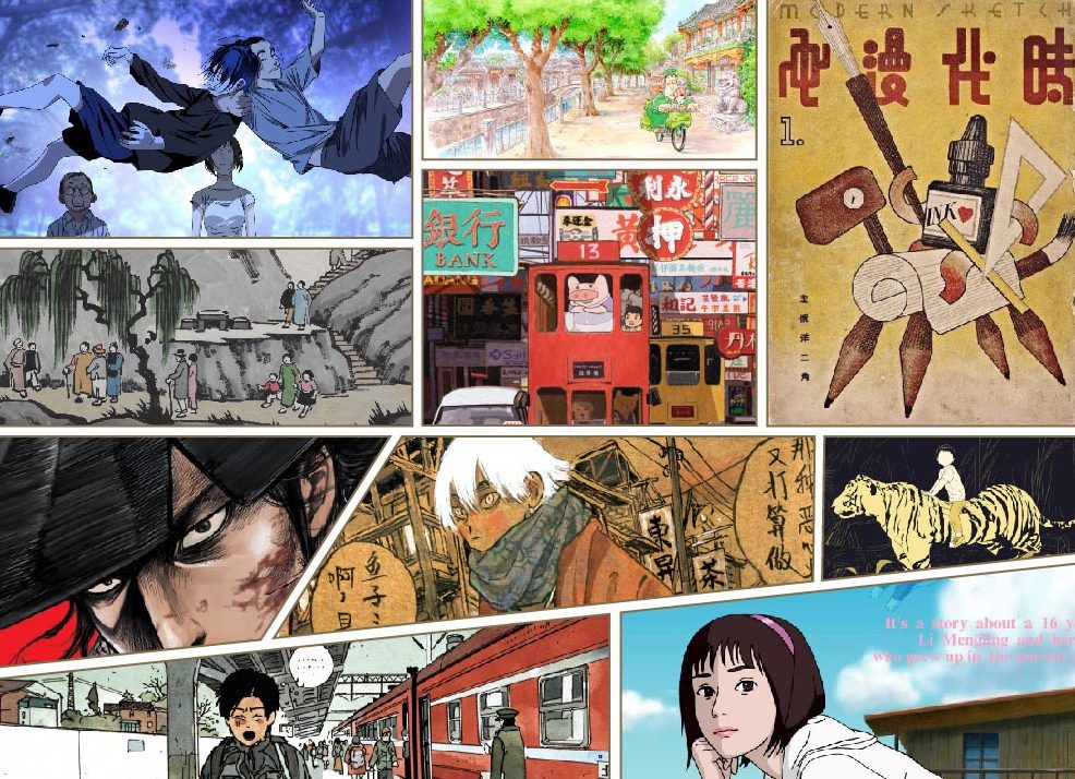
In China, manhua, the word for comics or manga, means different things to different people. For some it calls to mind a recent spate of movies based on illustrated characters; for others it means the online comics that have flooded the internet; for still others, it conjures childhood memories of stories like Journey to the West or Black Cat Detective.
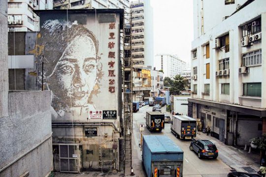
But there’s no denying that over the last century, from its origins, to its golden age, to its latest innovations, Chinese manhua has developed a distinctive style—even if the Japanese and US influences are evident. A new exhibit organized by Design Society titled “Y-COMIC-X? One Hundred Years of Chinese Manhua,” held at Shenzhen’s Sea World Culture and Arts Center, traces the art form’s evolution in China. Neocha visited the show recently and selected our favorite highlights—and each one is a reason for comics fans to make a trip to Shenzhen.
说起“国漫”,你会想到什么呢?是近年大热的漫画改编电影?充斥网络的各种连载漫画?还是小时候伴随成长的孙悟空和黑猫警长?
但无论是哪一种,无可否认的是,中国漫画经由近一个世纪的诞生、成长、巅峰时期和现代演变,也经历了日漫、美漫的冲击和影响,逐渐形成了国漫独特的风格。最近,由设计互联团队策划的“百年国漫大展Y-COMIC-X?”正在深圳展出,我们精选了几个最值得想让你观展的理由,也希望能以此献给漫画迷们一份国漫观展集锦。
The Cinematic
最电影范
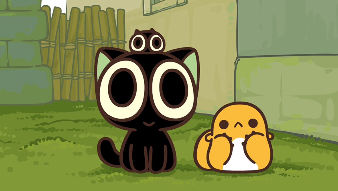
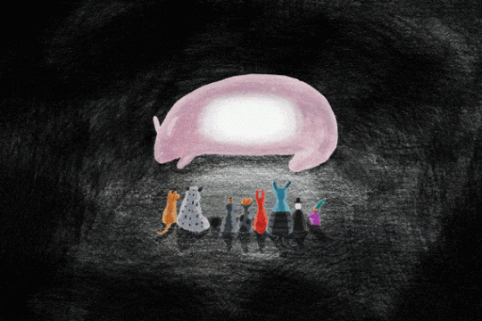
The Legend of Luo Xiaohei
This black kitten, ubiquitous not long ago on WeChat and QQ stickers, is the creation of independent Chinese cartoonist MTJJ. The simple, bubbly style and adorable expressions later appeared in a comic book, which proved a hit with readers.
In 2011, the kitten got its own show, The Legend of Luo Xiaohei, an animated web series created by MTJJ and his studio. It had heavy, colorful lines and an entertaining storyline about a demon cat stealing a magic pearl. With its slow updates, though, people on the internet began to joke that new episodes were a once-in-a-year occurrence. The opening of the exhibition coincided with a trailer and a release date for the long-awaited feature-length film. Fans eager for the adventure to continue can finally take heart.
《罗小黑战记》
这只曾广泛出现在微信和 QQ 中表情包里的小黑猫,由中国大陆独立动画制作人 MTJJ 创造,起初的动漫画风很简单,圆润可爱的造型配上软萌的表情,收获了大批用户的喜欢。
2011 年,罗小黑也成为《罗小黑战记》里的主角——这部由 MTJJ 及其工作室制作的一部动漫片,仍是以彩色粗线条的简笔画为主,加上了“猫妖盗取天明珠”的剧情,故事情节搞笑,但由于更新速度非常缓慢,被一众网友称为元老级“年番”国漫。就在“百年国漫大展Y-COMIC-X?”开幕前后,《罗小黑战记》终于发布了大电影的先导预告和定档时间,或许终于可以告慰一下等待数年的观众了。
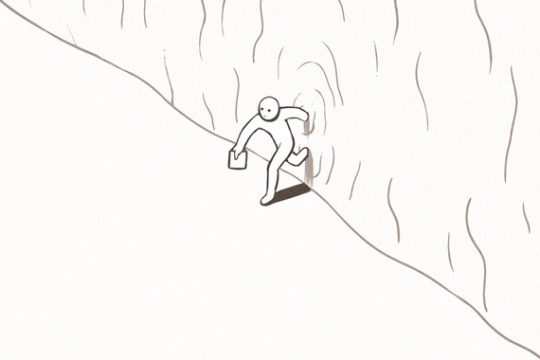
The Minimal
最极简范
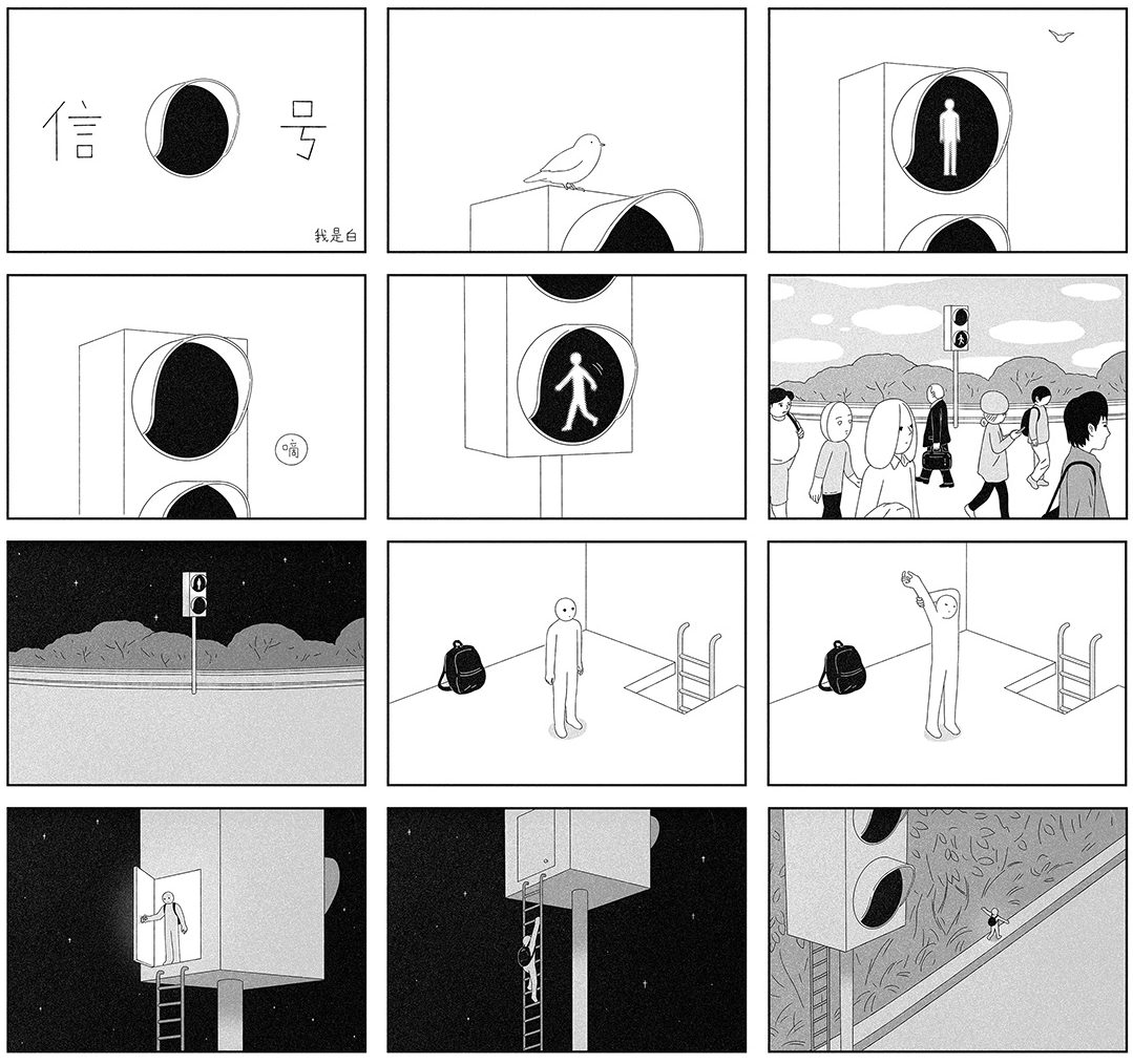
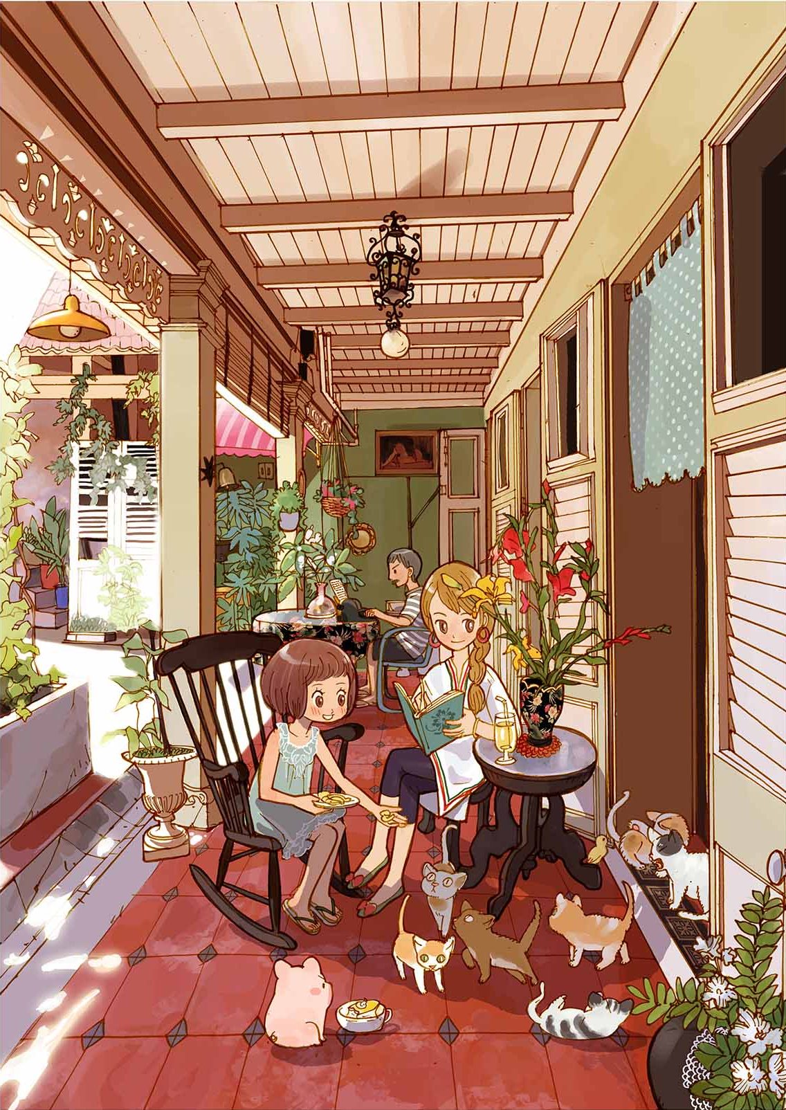
Wo Shi Bai
Born in 1988, Wo Shi Bai (whom Neocha has previously written about) was a video game designer until 2017, when he began working full-time as an illustrator. His comics feature a little character with a blank face and a generic outline. Simple as the art is, the stories have a dramatic depth that will give you pause.
我是白
1988 年生于上海的插画漫画作者“我是白”(点击可查看往期报道《我是白》)曾是一名游戏设计师,于 2017 年开始全职漫画创作。他的画里只有简单轮廓的小白人,简单的线条世界中,故事却很有戏剧性,让人回味无穷。
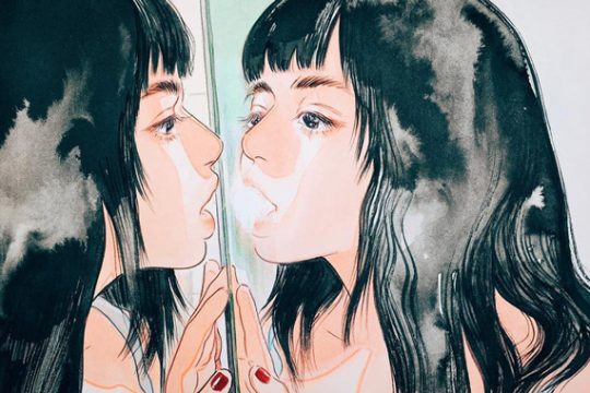
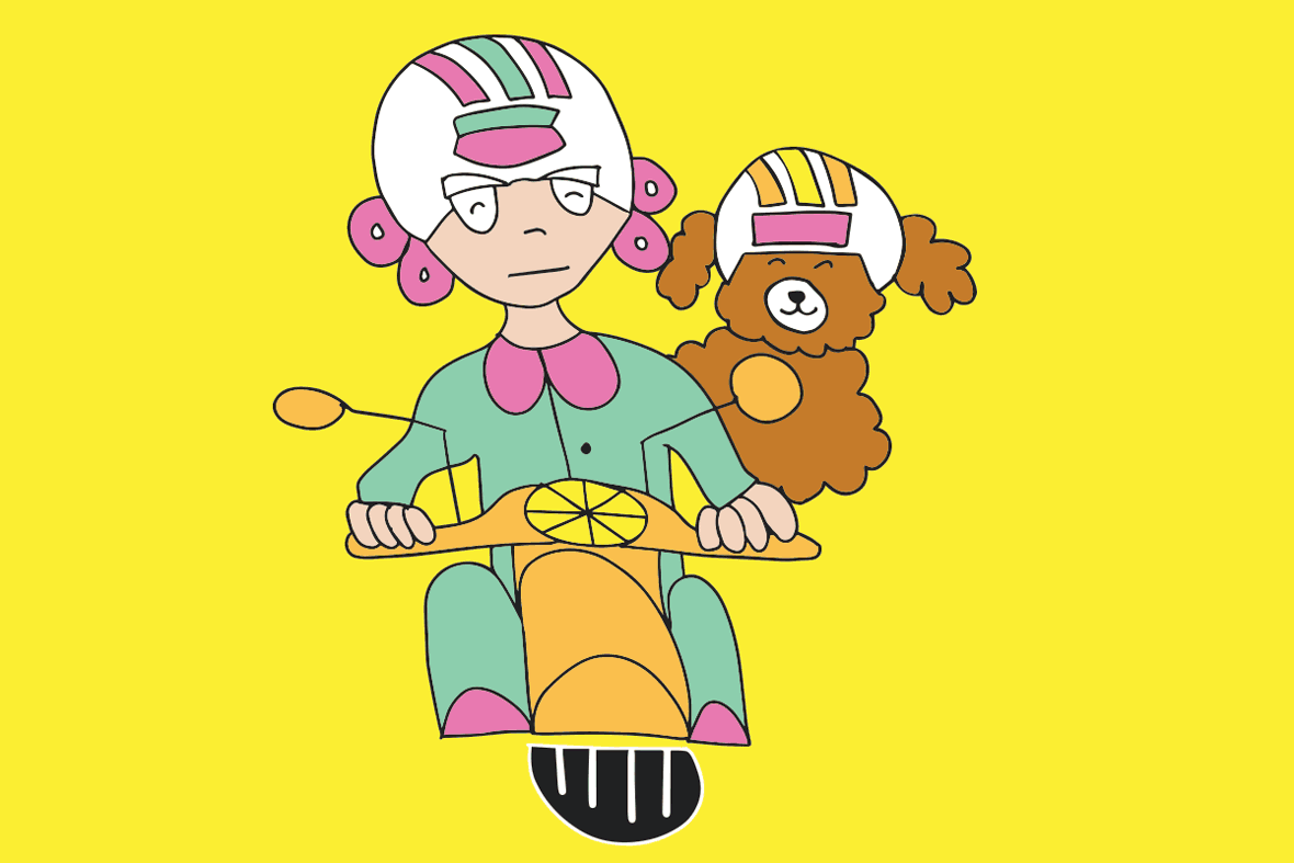
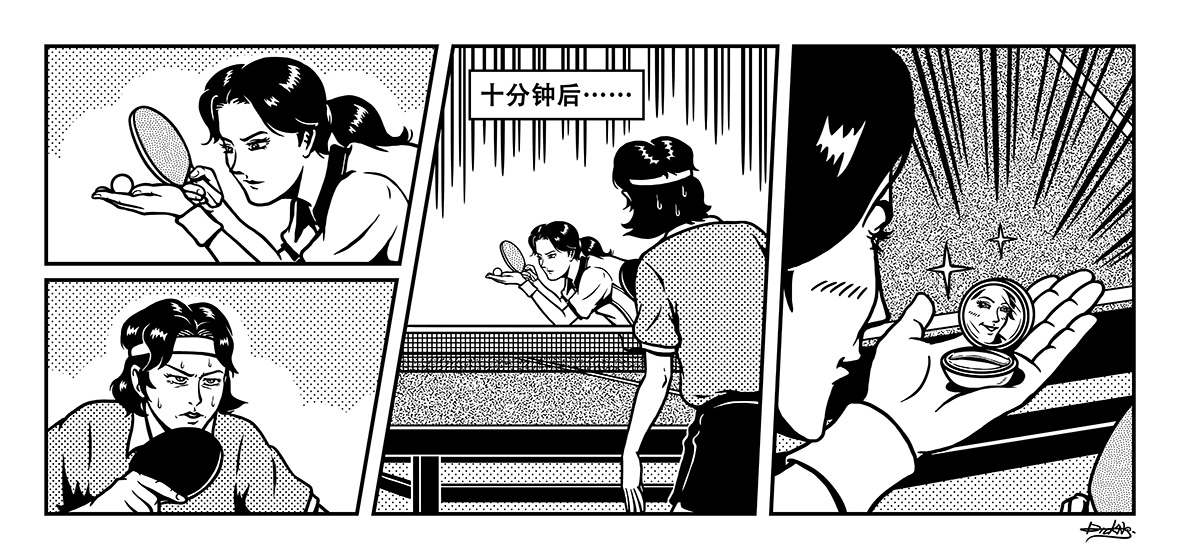
The Witty
最佳脑洞
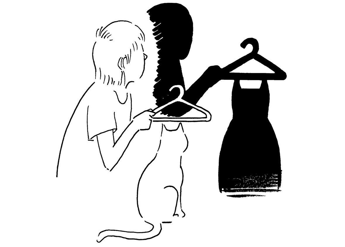
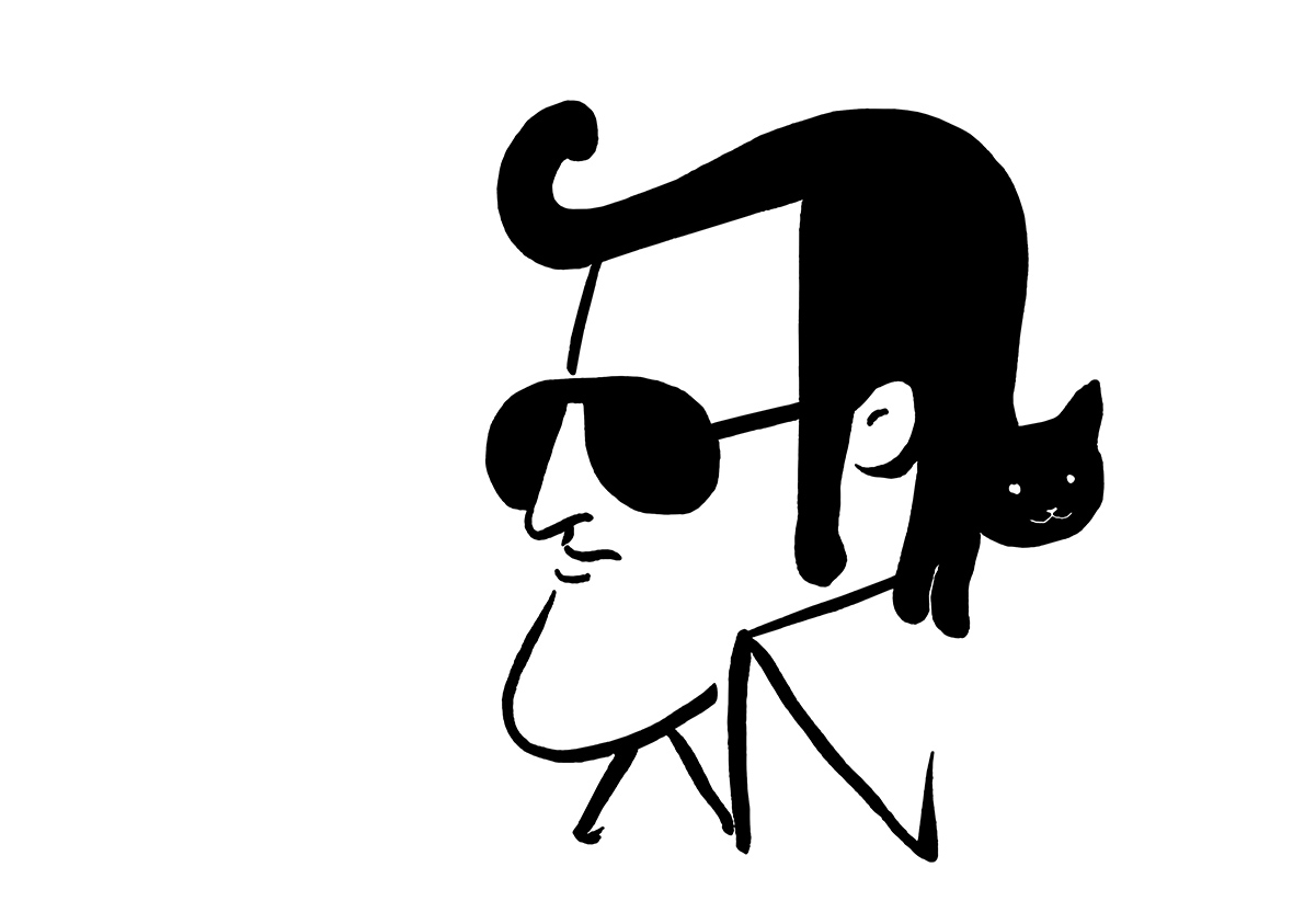
Tango
Tango’s various identities are hard to reconcile: he has a day job in advertising, a master’s degree in industrial design from Tsinghua Academy of Art, and over a million followers on Weibo. His comics almost always involve just a few black lines: a person, a cat, or a painting are enough to fill a sketch, and more often than not they’re all it takes to make you laugh.
Tango
清华美院工业设计硕士、职业广告人、微博百万粉插画大 V,这三个很难关联的标签,都代表了 Tango 的某种身份。他的作品基本都由寥寥几笔黑色线条勾勒出来,很多时候一个人、一只猫、一幅画便是一个段子,常常让看画的人忍俊不禁。
The In-Demand
最具人气
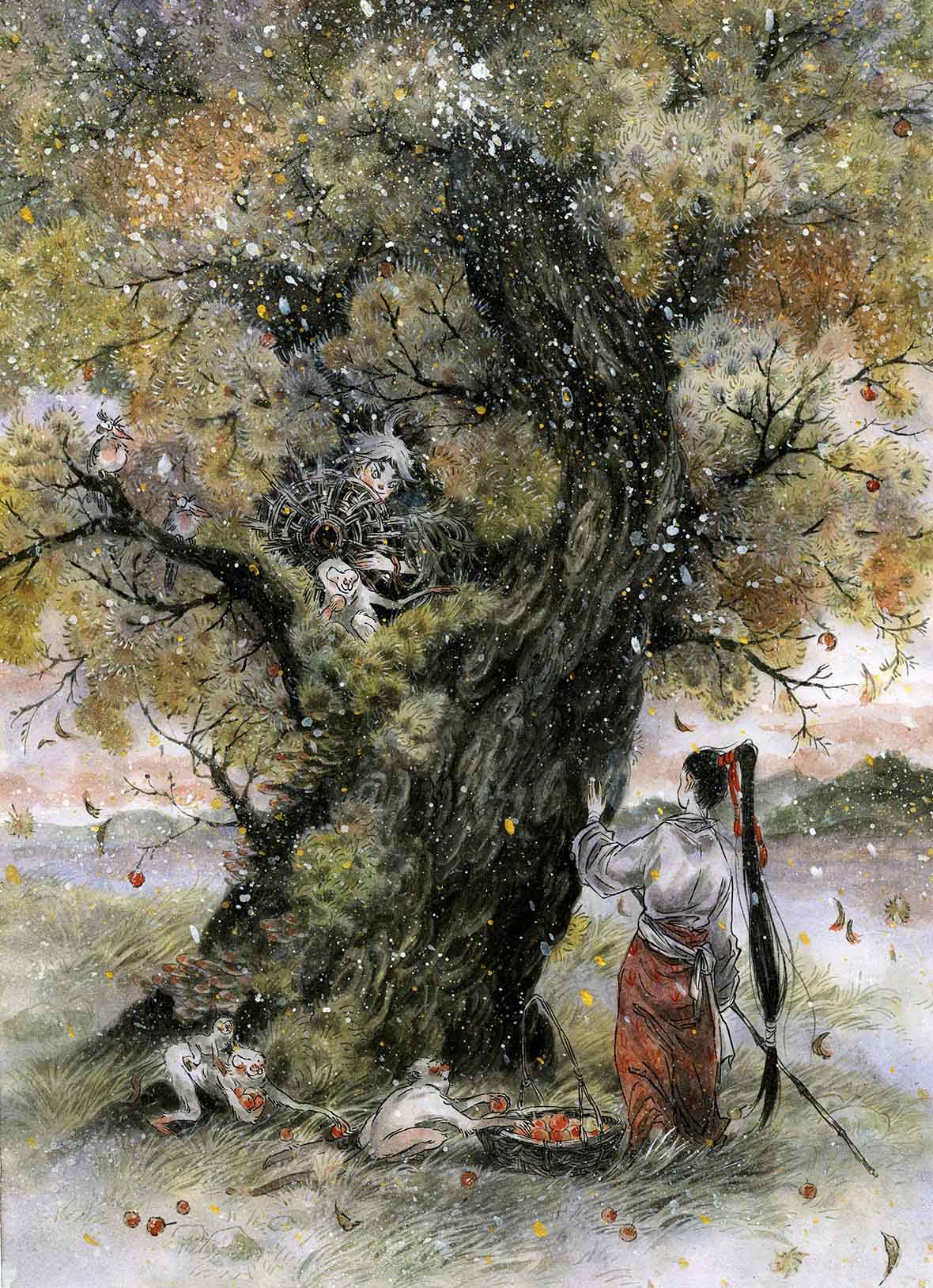
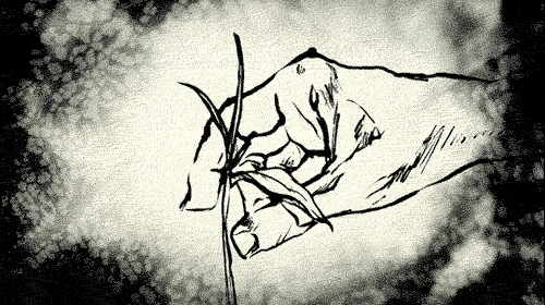
Zao Dao
Zao Dao, an artist in her 20s, grew up amid mountains and hills, and her comics are propelled by a wild spirit. Her trademark brushwork and her unruly, unconstrained style have a distinctly Chinese touch. Zao Dao already has two manhua books to her name, and she’s designed posters for such movies as The Mermaid and Monkey King: Hero is Back.
早稻
90 后漫画家早稻,从小在山野间长大,因而作品里也处处充斥着野性的灵气。她自成一派的水墨手法和洒脱不羁的态度,将中国元素表现得淋漓尽致。如今,早稻已经出版了两本画集,还一手包揽了《美人鱼》《大圣归来》等许多影视作品的海报。
The Feel-Good
最治愈风
Zhu Letiao
China’s “little goddess” of illustration, Zhu Letiao is the author of Diary of High School Class no. 5, the first comic in China to have its film rights bought by a production company. Zhu has also won more prizes than just about any other comic artist in the country.
猪乐桃
身为国内“绘本小天后”的猪乐桃,曾发表过的作品《高中 5 班日记》,是中国内地第一个被电影公司购买电影改编权的漫画,也是内地获奖最多的漫画家之一。
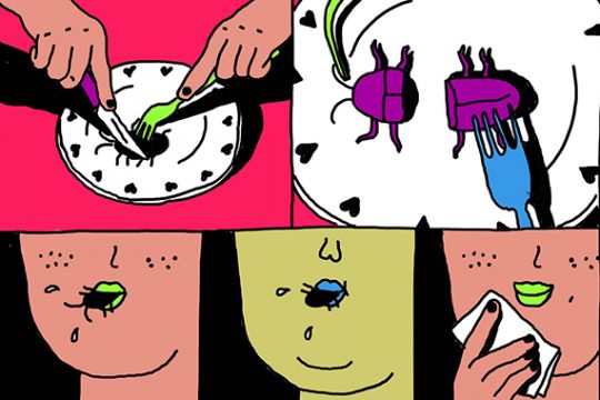
The Zany
最无厘头
Dick Ng
Born in Shenzhen and based in Hangzhou, Dick Ng draws a funny, absurd, thoroughly wacky style of manhua. His comics blend scenes from everyday life with a dry sense of humor.
Dick Ng
来自深圳的漫画家、插画师 Dick Ng,现居于杭州。他惯于将日常生活的元素融入到漫画中,并以冷笑话形式表现出来,风格荒诞、搞笑,非常无厘头。
The Classic
最经典范
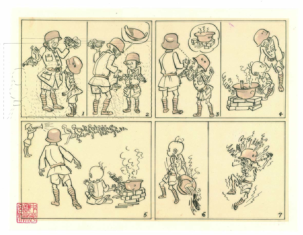
The Adventures of Sanmao
Not the first Chinese manhua character, but certainly the most famous, Sanmao was created by Zhang Leping in 1935. A street urchin who works as a paperboy, a shoeshine, and an apprentice, Sanmao had a vivid personality and a fresh style, and his adventures have a special place in readers’ hearts.
《三毛流浪记》
这不是中国最早的漫画,却是最为知名的漫画人物。张乐平笔下的三毛,诞生于 1935 年。这个无依无靠的流浪孤儿,小小年纪就体验过卖小报、擦皮鞋、当学徒……漫画中的三毛形象和性格鲜明,他的一切经历也都牢牢牵挂着每一个读者的心。
The Editors’ Pick
编辑最爱
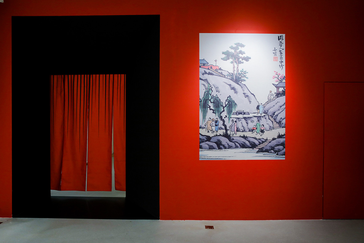
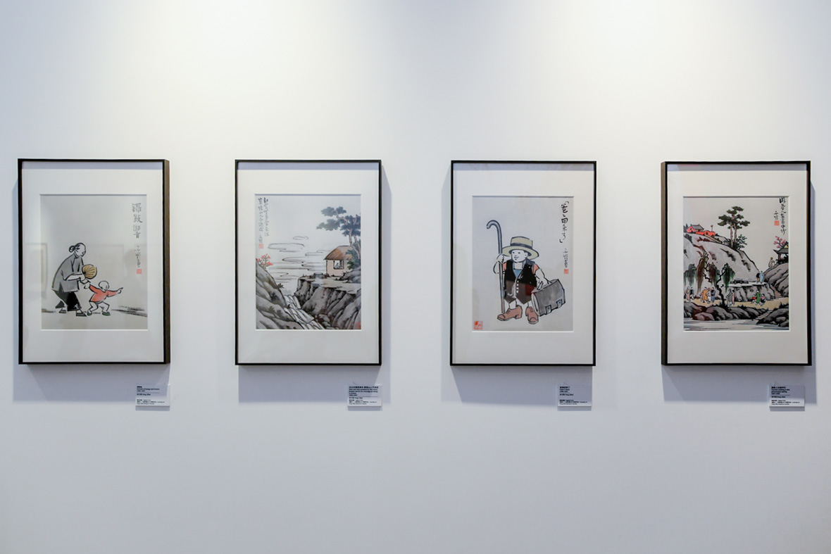
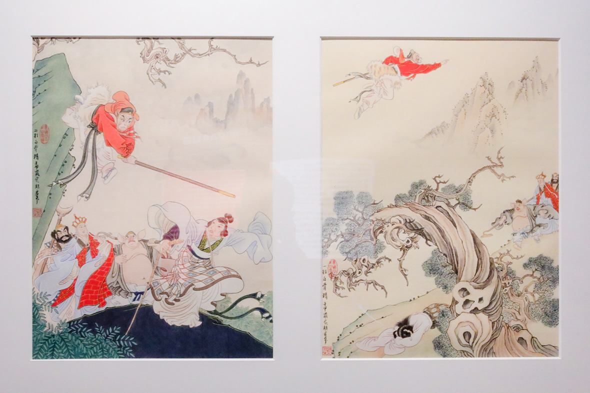
Manhua’s golden age has its own section at the exhibit, featuring ink sketches by Feng Zikai, the father of Chinese comics; early comics of the Monkey King; illustrated versions of The Romance of the Three Kingdoms; and the revolutionary-era picture-books known as lianhuanhua. Visitors can revisit their childhood memories of curling up with comics as kids.
从“中国漫画之父”丰子恺的简笔水墨画开始,到《三毛流浪记》、孙悟空漫画形象的诞生,再到《三国演义》、《智取威虎山》……连环画迎来了它的“黄金时代”。这一部分也让所有观众仿佛脱离展览现场,一下回到看“小人书”连环画的童年时代。
The Experience
最佳体验

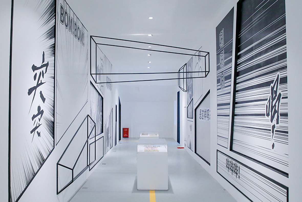
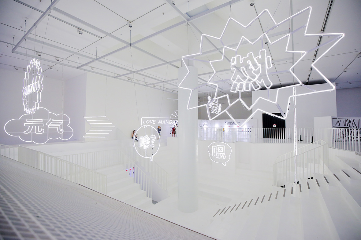
At X-COMIC-Y?, the gallery space is not what it seems. The design team has brought comics’ 2-D visuals into a 3-D space, and as you step into the gallery, you feel as though you’ve walked into an oversized comic book. As you move about the space, the dimensions of your perspective seem to shift, and you find yourself inside a comic frame, interacting with—almost becoming part of—the art.
本次“百年国漫大展Y-COMIC-X?”的展览空间设计别有用心,展厅设计团队将漫画的平面视觉创作形式,搬到了三维空间中,步入展馆,就仿佛走进了一本巨大的立体漫画书中,视角会随着位移而实现不同维度的转换。来展厅的人在看漫画,殊不知自己也成为了漫画的一景,人与画也就形成了极强的互动。
Looking back to the classics while encapsulating the spirit of today, this exhibition of a century of Chinese comics gives a boost of inspiration to the manhua artists of tomorrow.
Y-COMIC-X? is now at the Sea World Culture and Arts Center in Shenzhen. Check it out! To purchase tickets, click here.
Event: Y-COMIC-X?
Address:
Sea World Culture and Arts Center, Main Ballroom
Wanghai Rd. no. 1187
Nanshan District
Shenzhen, China
Dates:
July 20 to September 30, 2019
Monday to Friday 10:00 to 19:00
Saturday and Sunday 10:00 to 21:00
Like our stories? Follow us on Facebook and Instagram.
Contributor: Chen Yuan
English Translation: Allen Young
Images Courtesy of Design Society