All posts by leon

Sting Chen & His Art

December 29, 2015 2015年12月29日

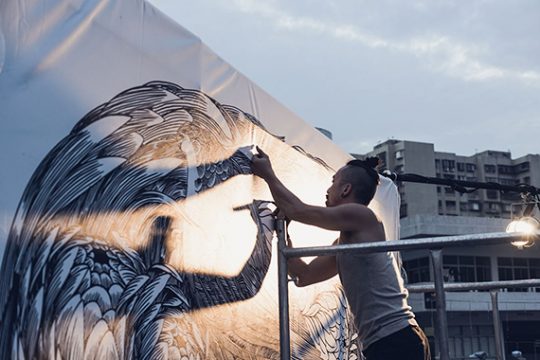
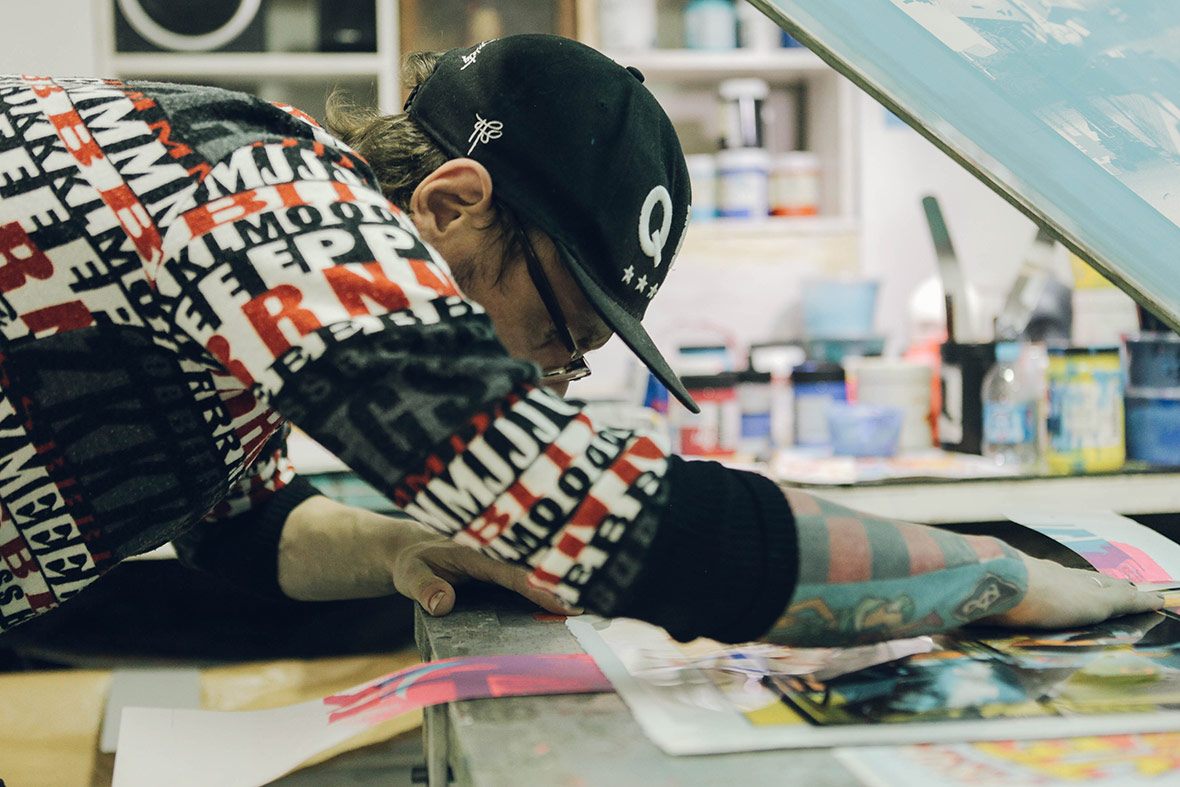
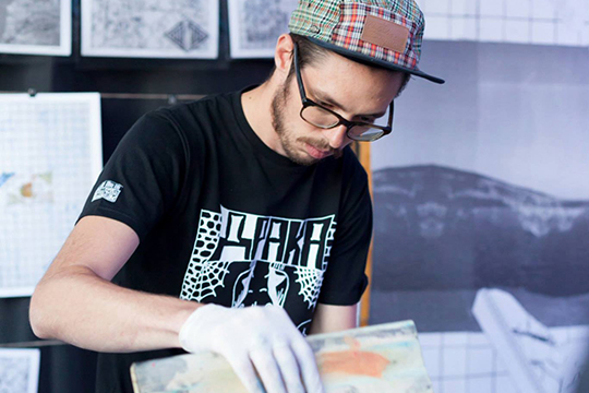
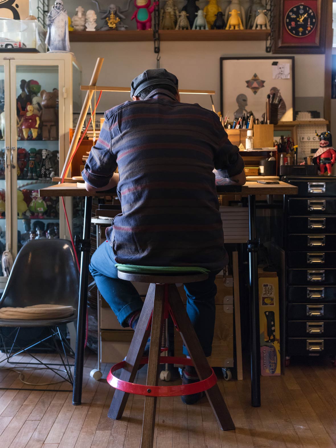
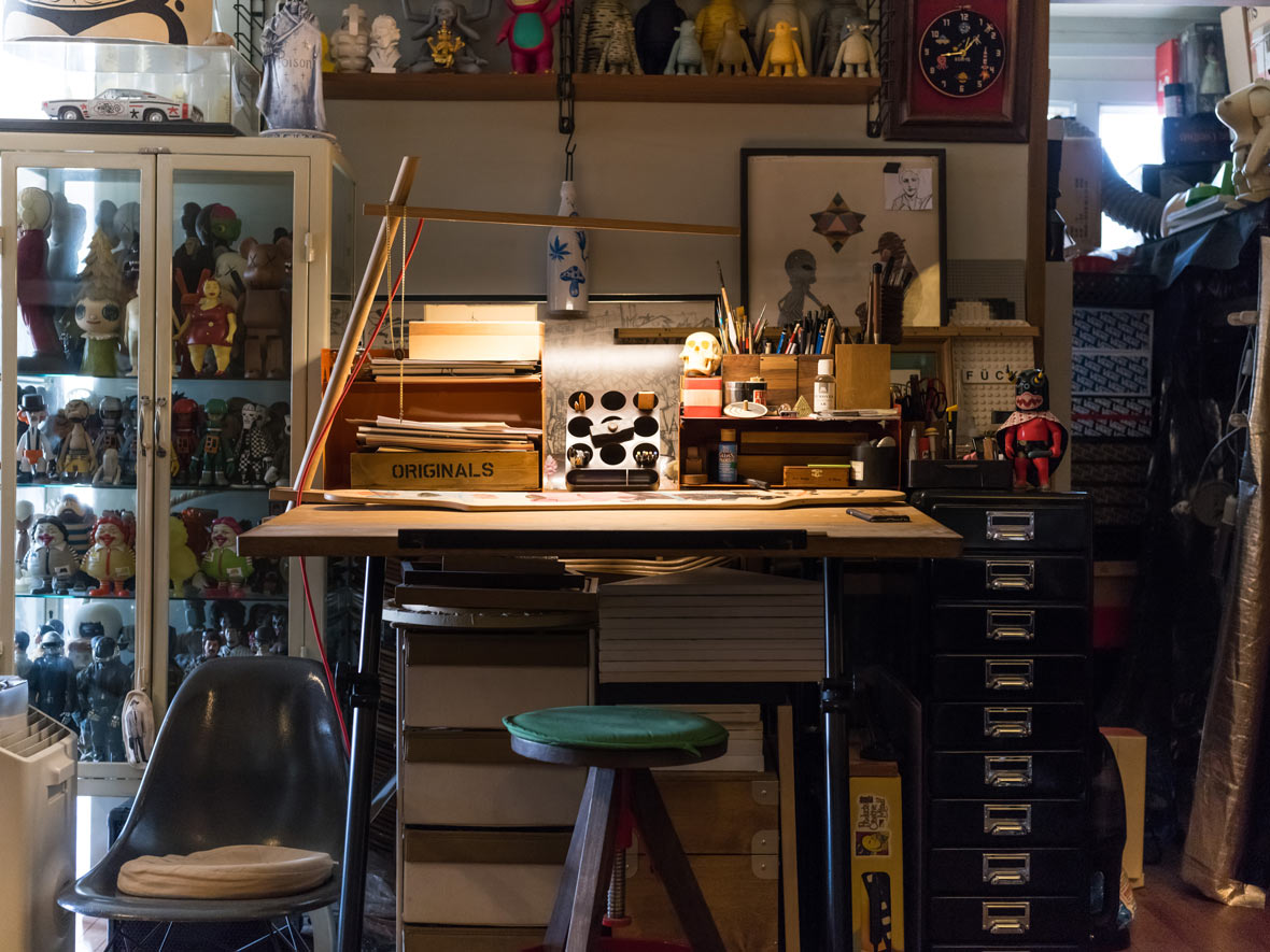
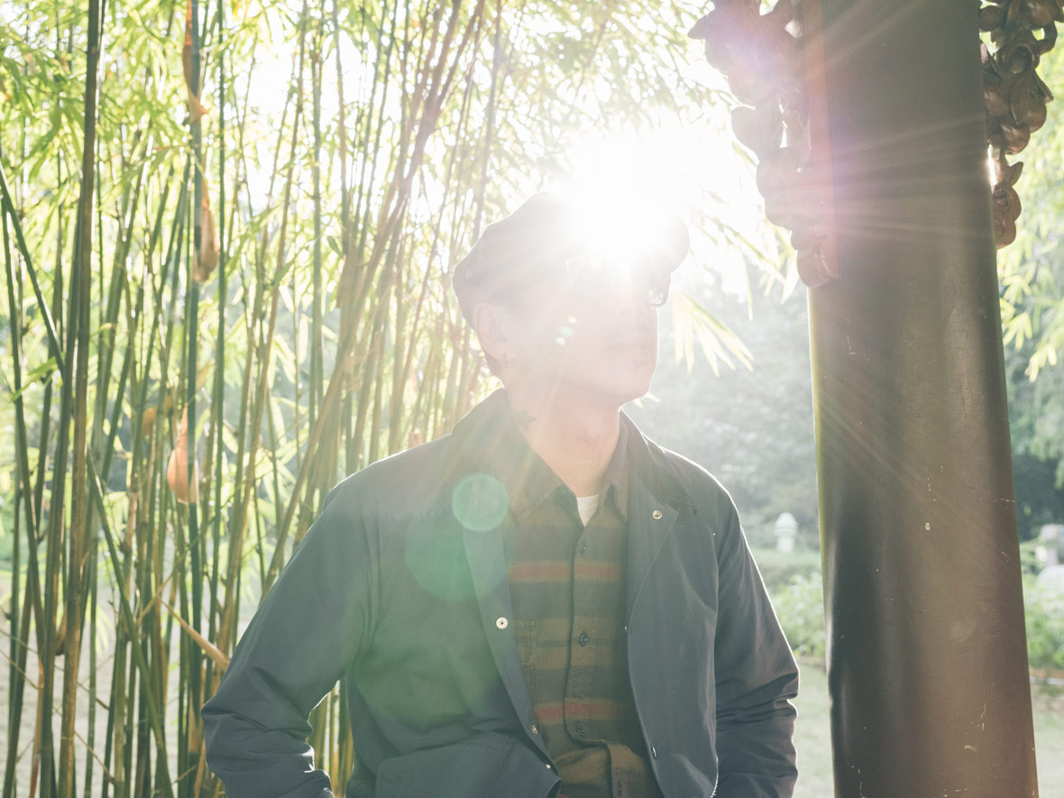
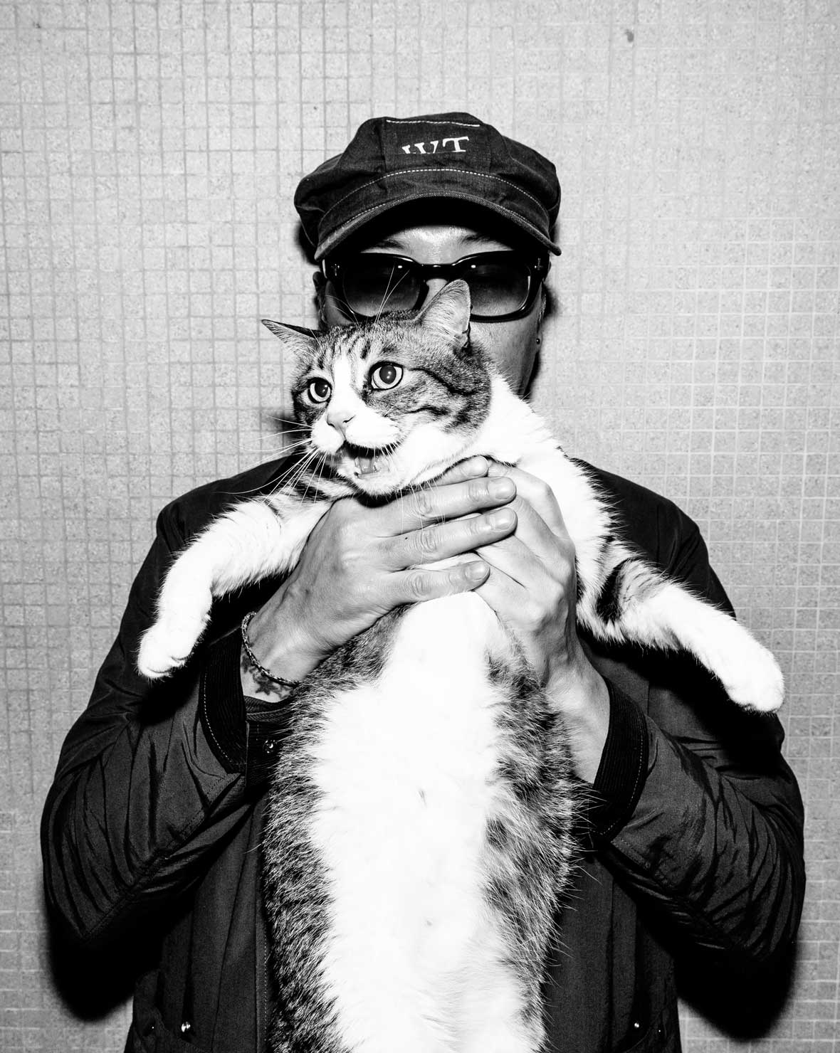
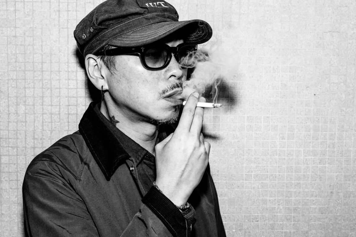
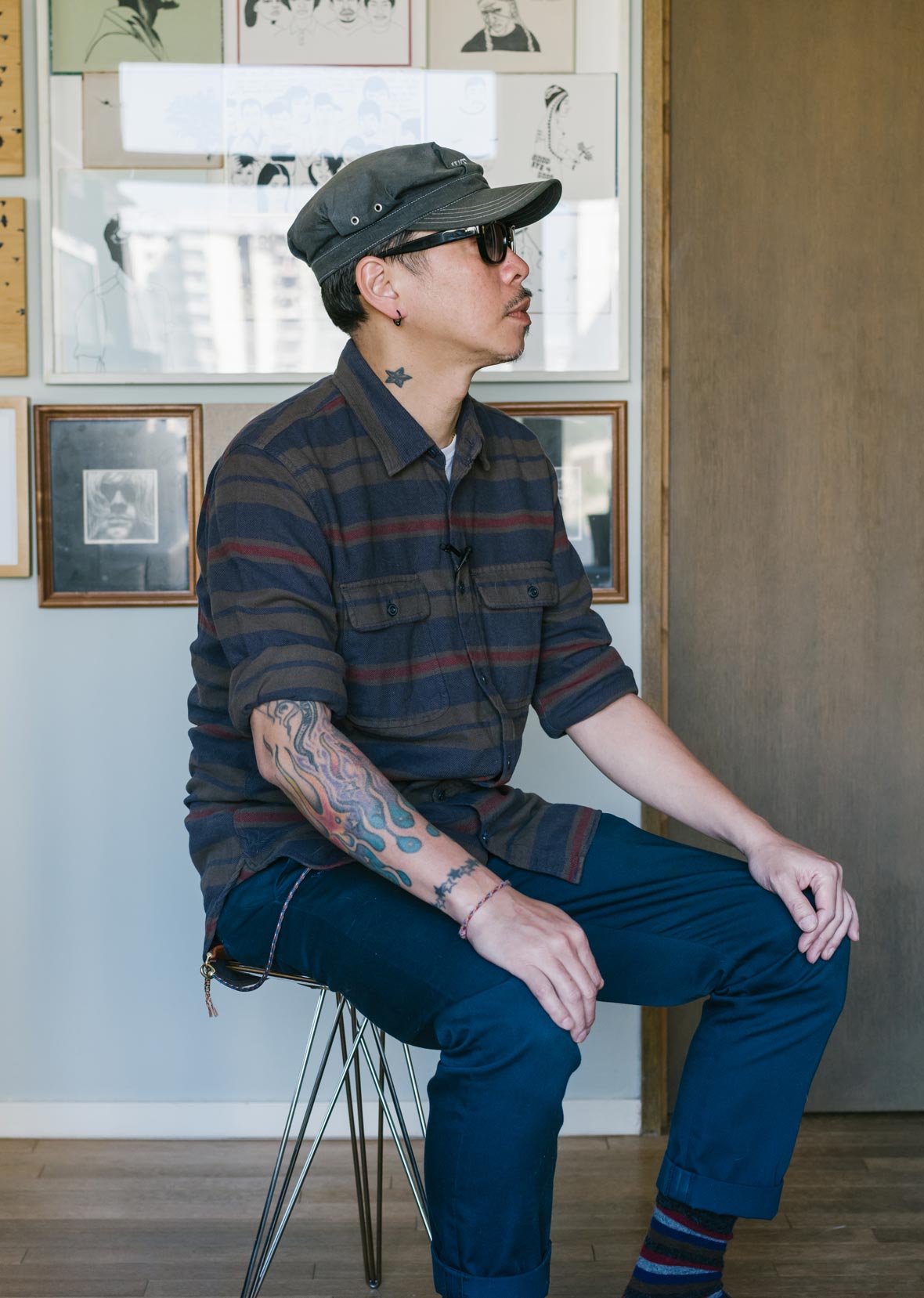
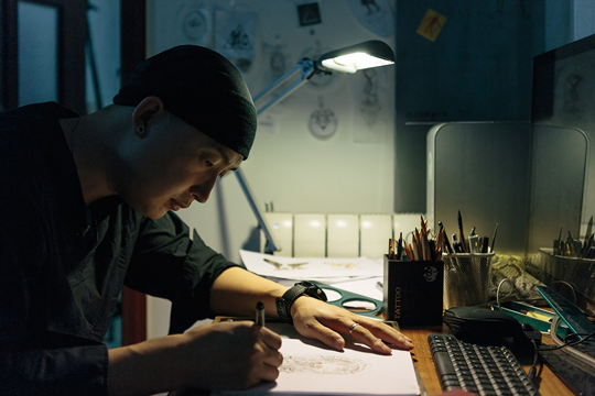
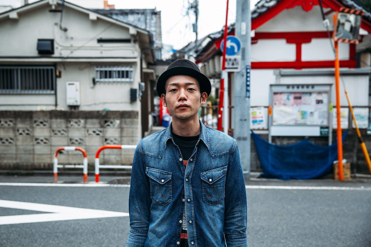
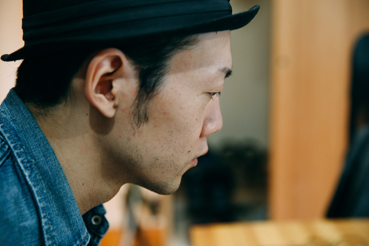
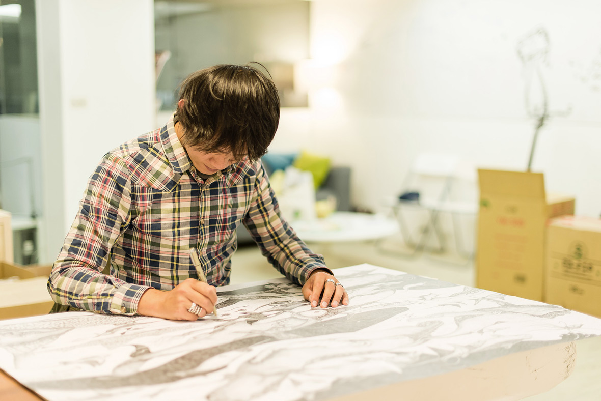
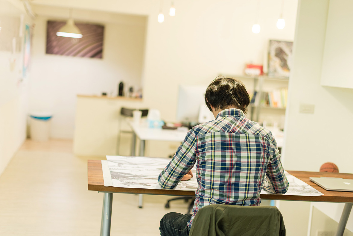
His name is Chen Ruihe in Chinese, but everyone calls him Sting. Growing up in Taipei, Sting had a very ordinary family background. In college he studied Fine Art and Visual Communication, and today he works as an advertising art director and a freelance illustrator.


他的中文名字叫陳瑞和,但是大家都叫他Sting。Sting成長於臺北壹個普通傳統的家庭。大學在校時期學習純藝術和視覺傳達的他,現在是壹名廣告藝術指導和自由插畫師。

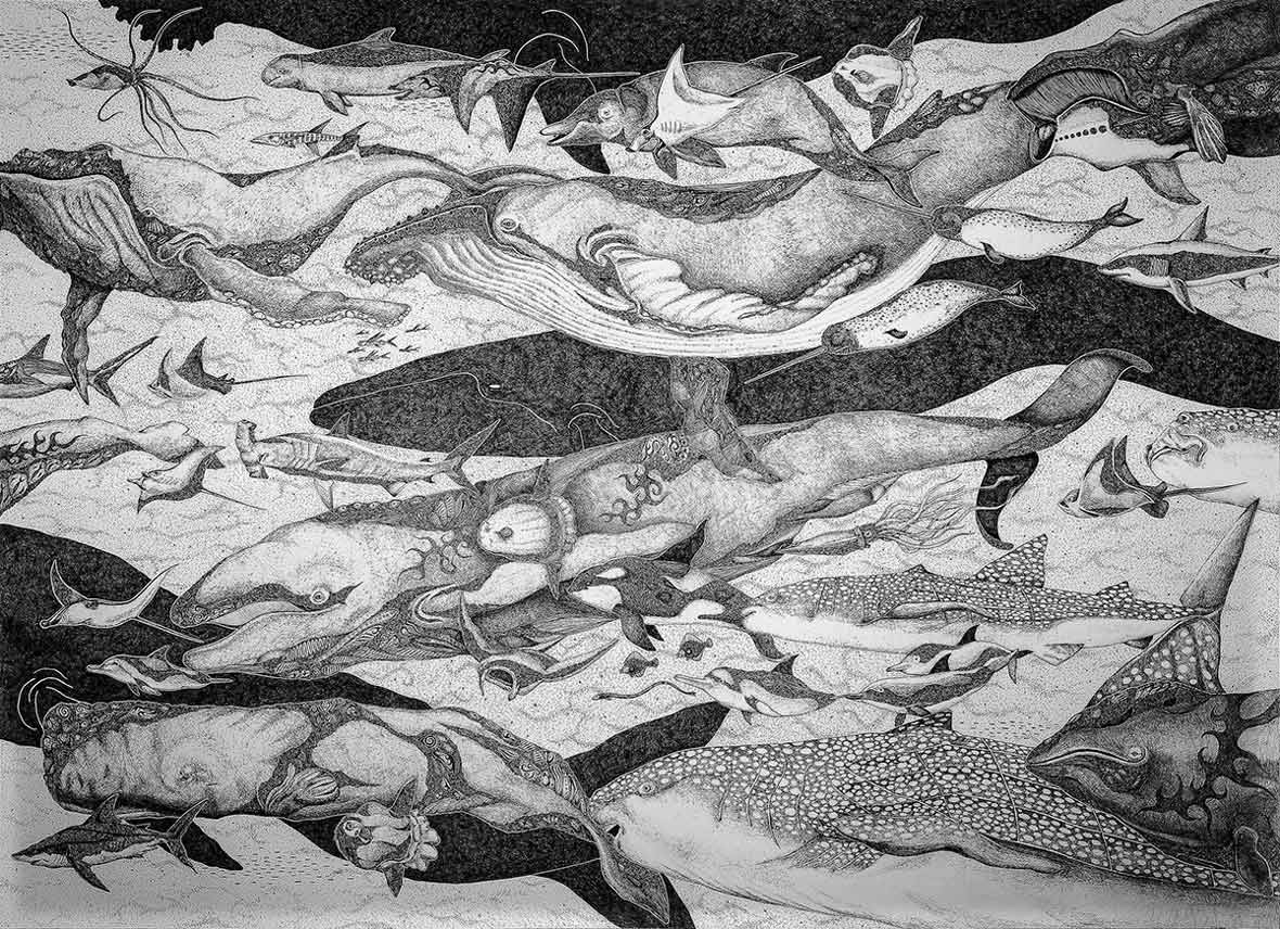
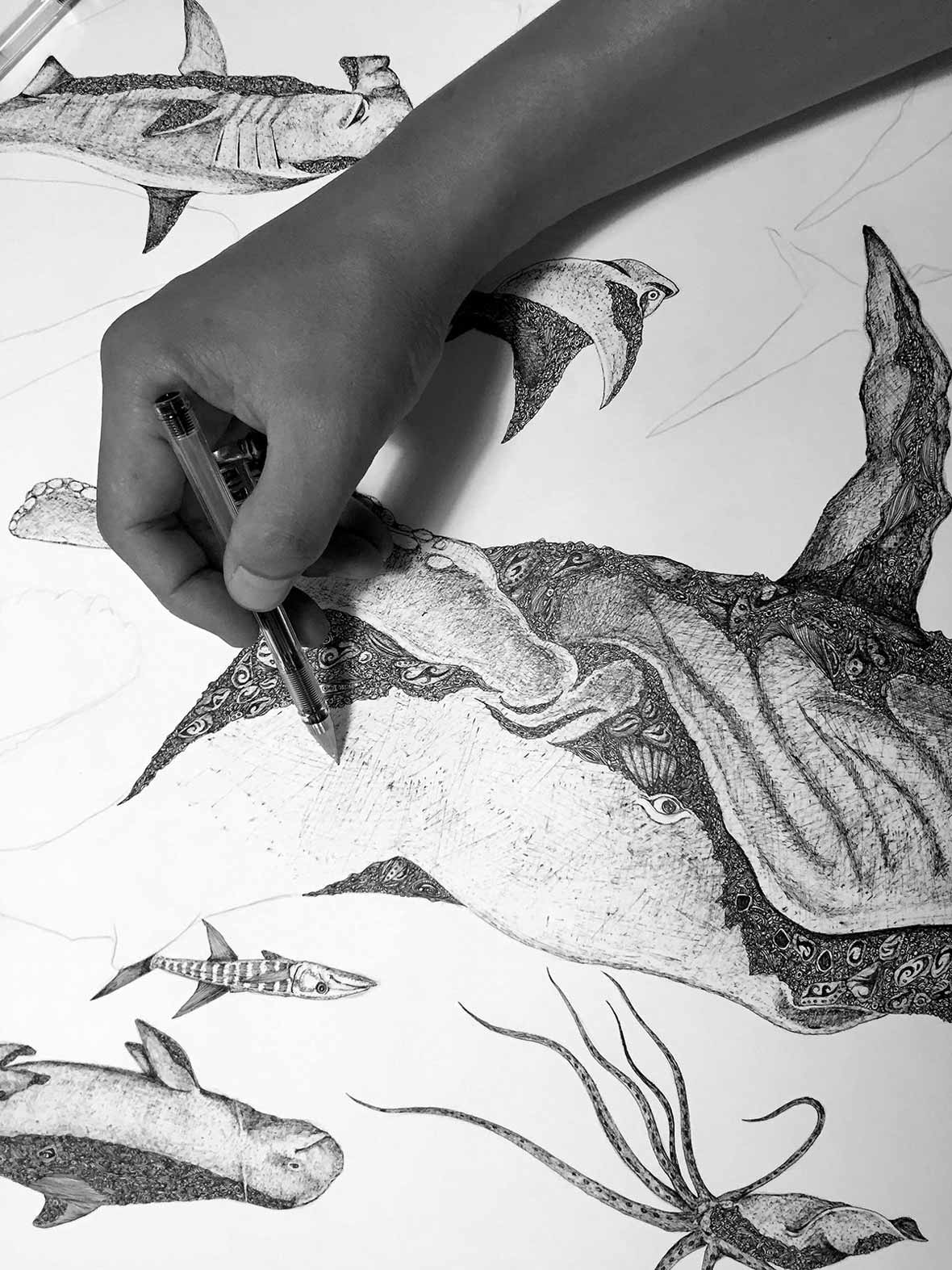
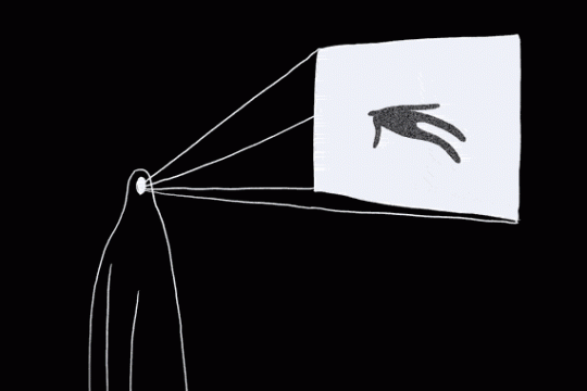
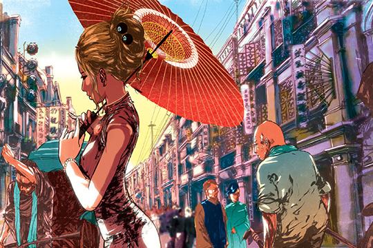
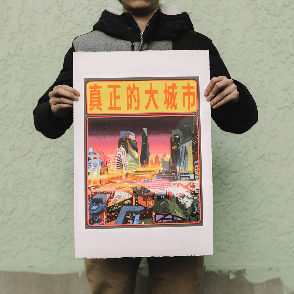
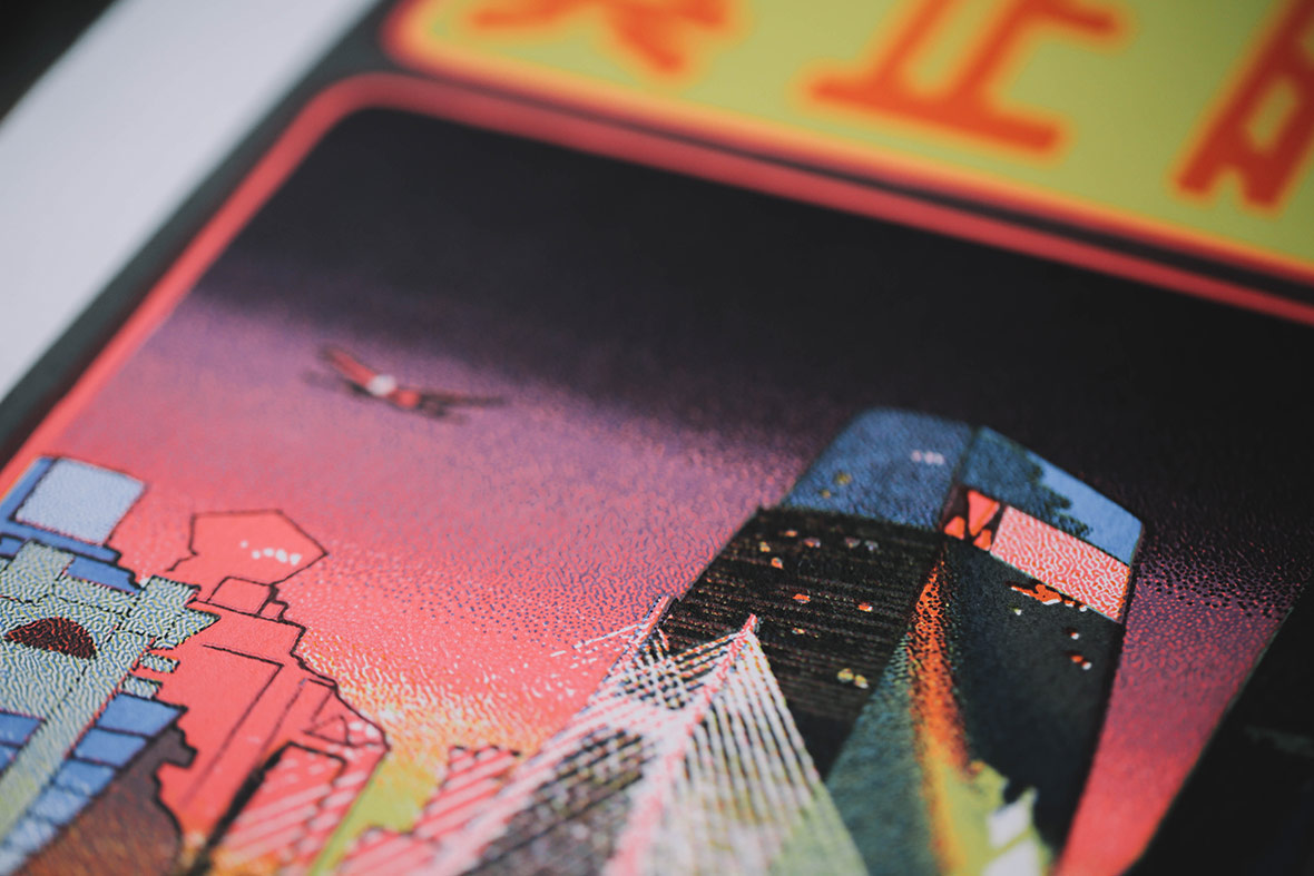
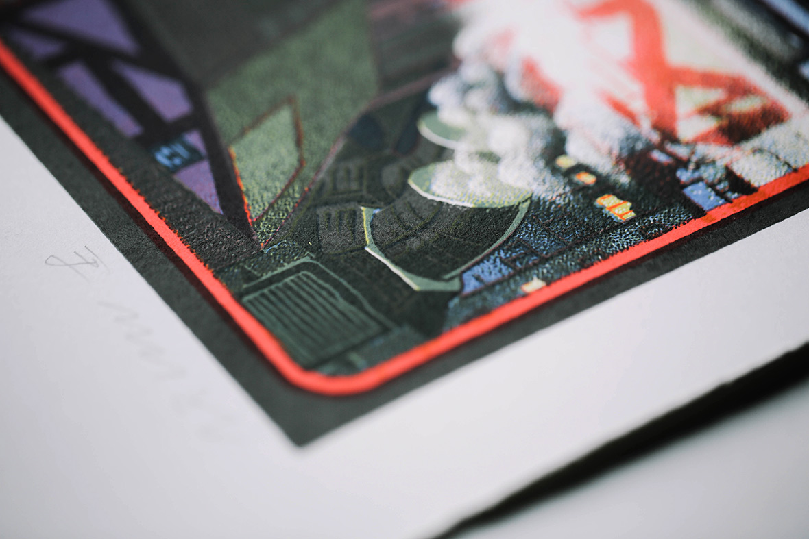
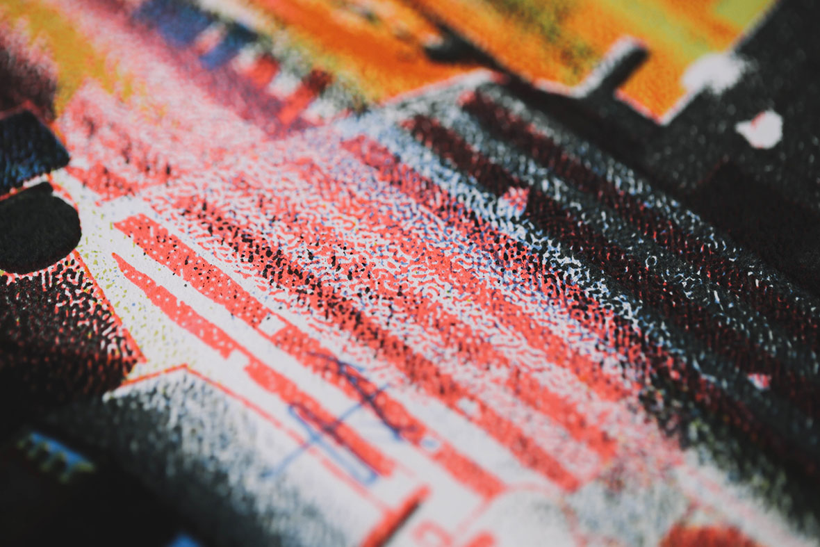
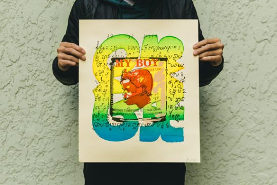
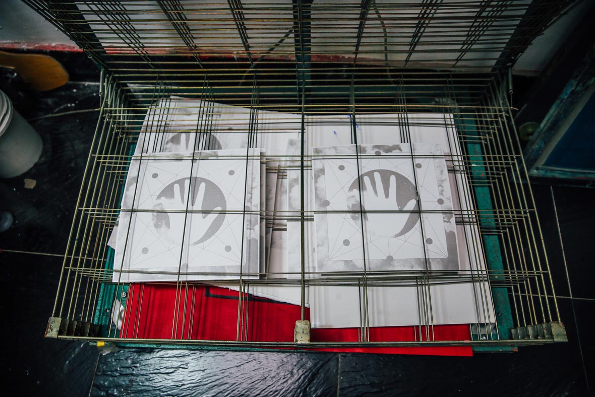
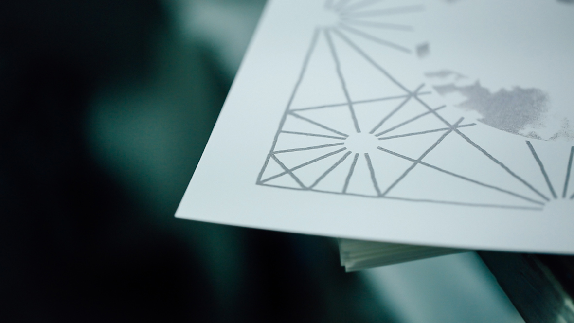
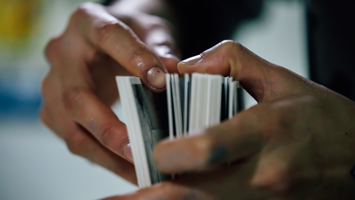
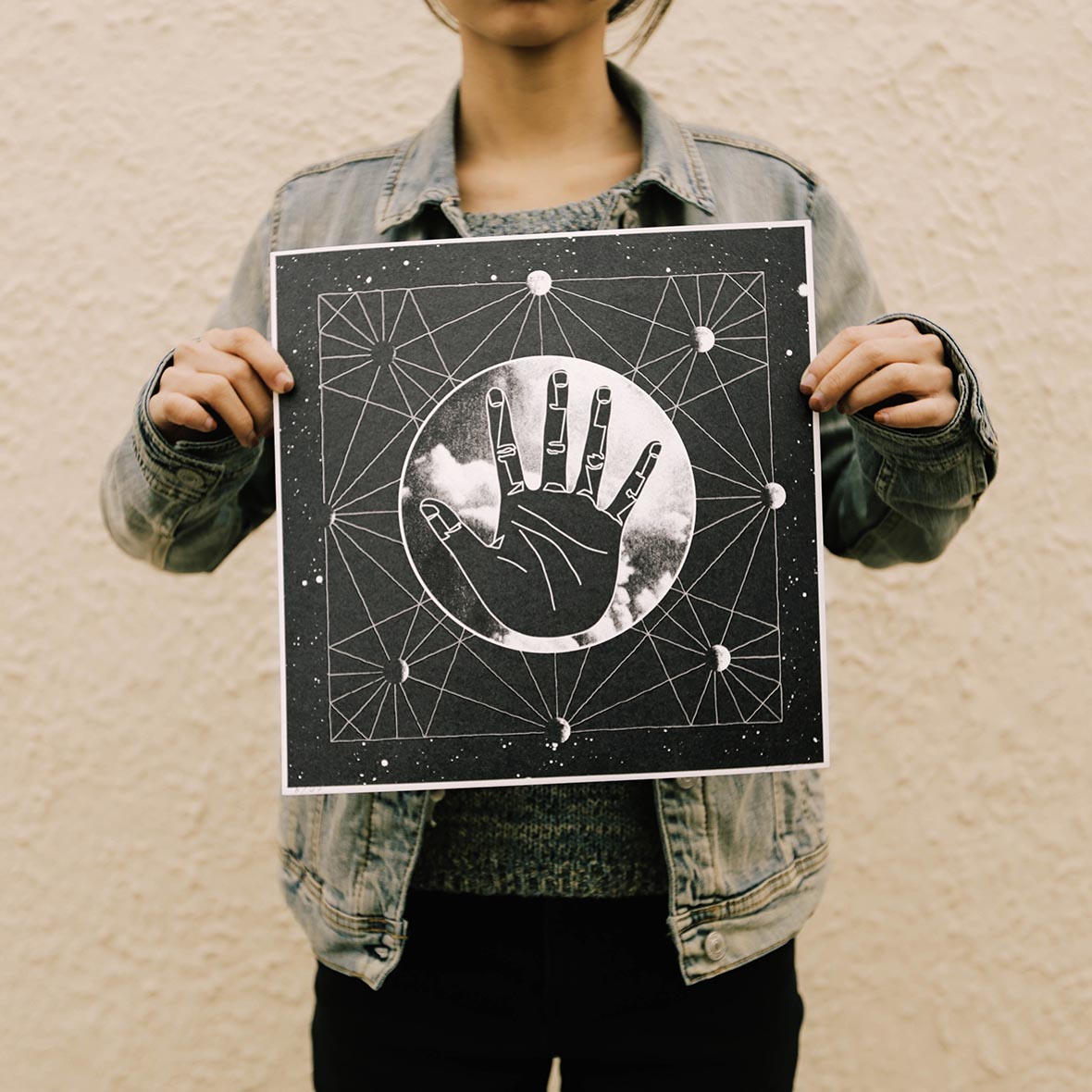
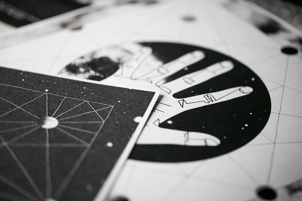
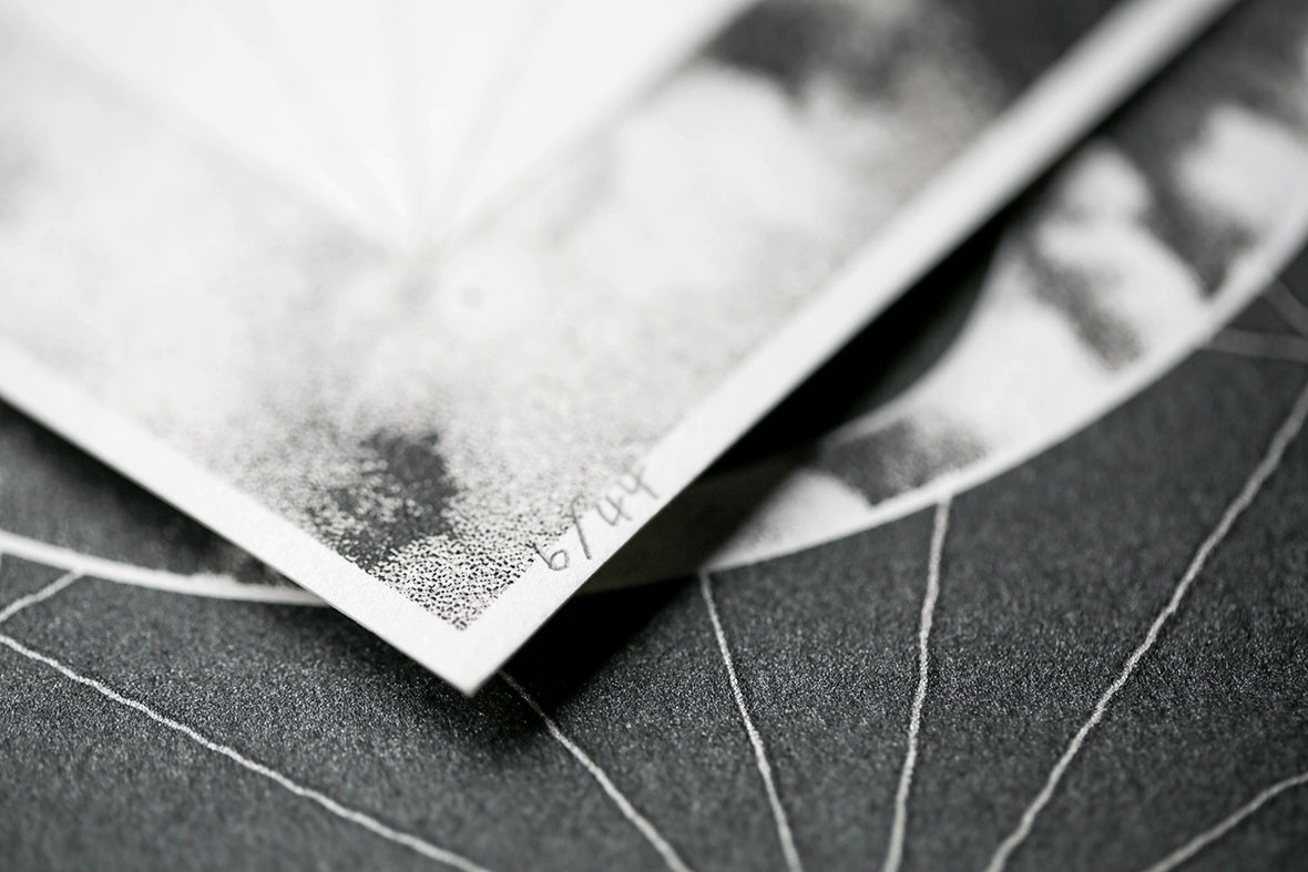
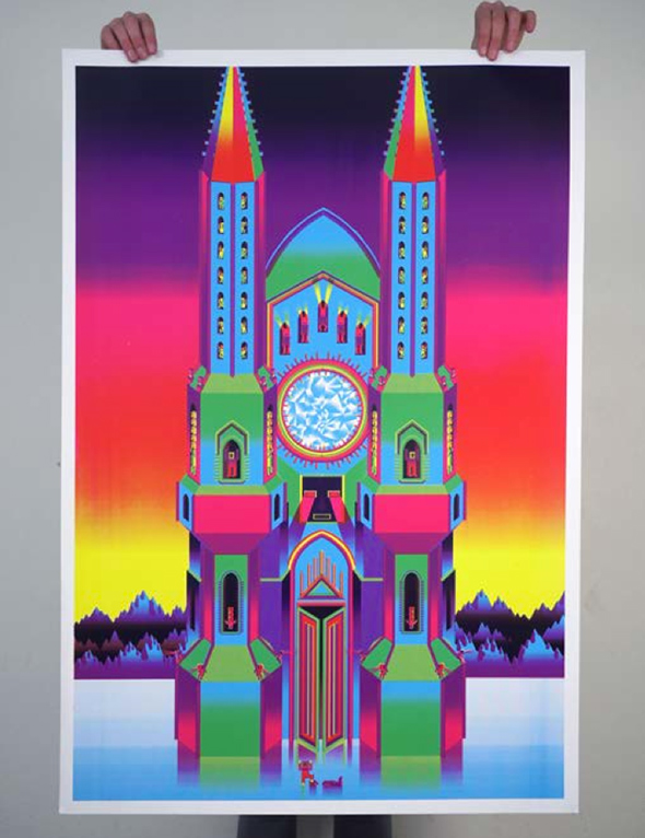
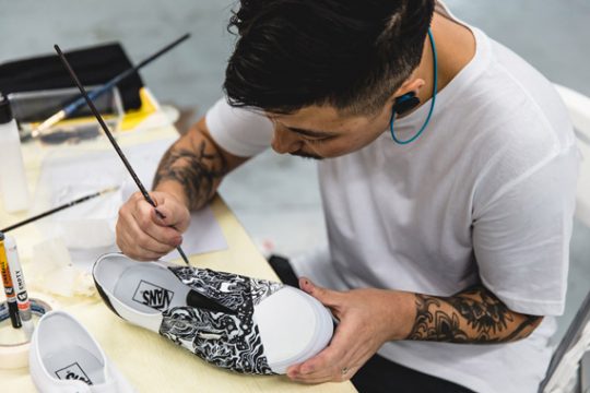
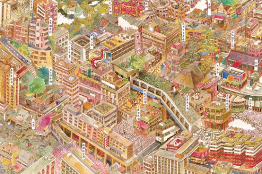
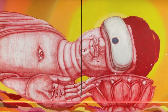
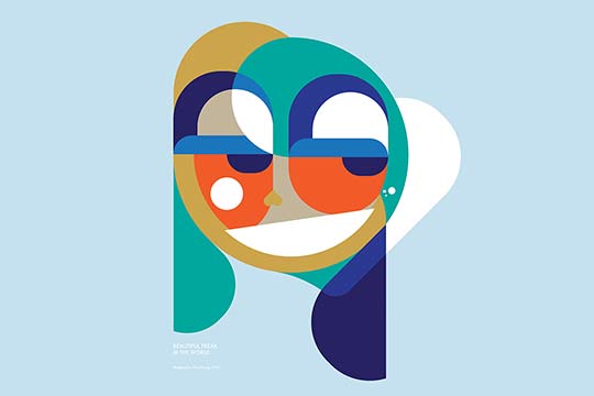
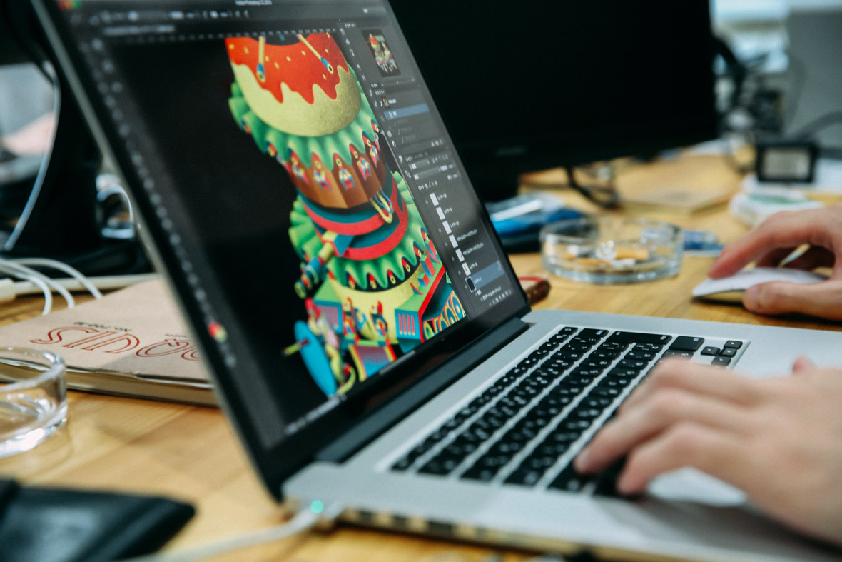
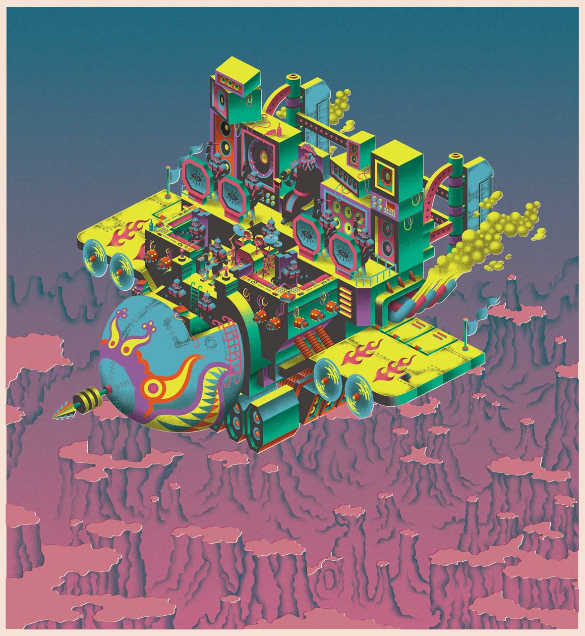
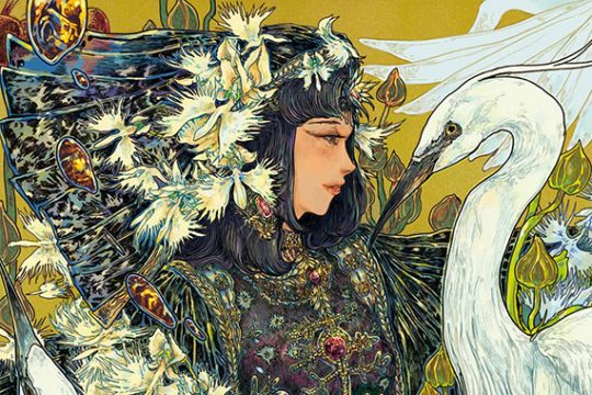
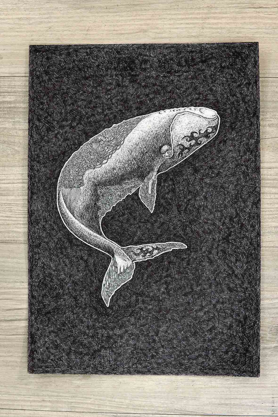
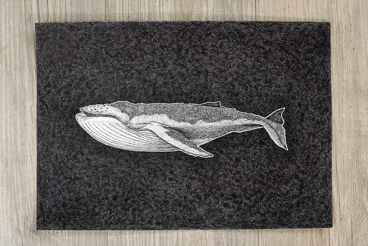
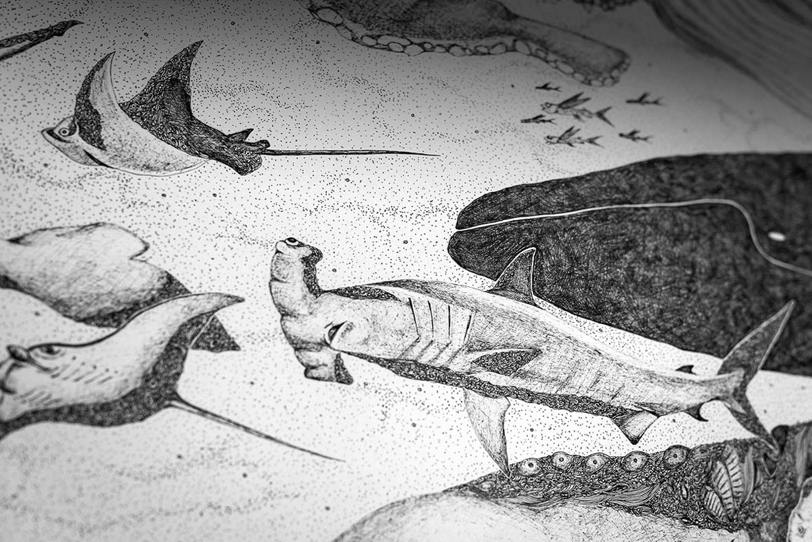
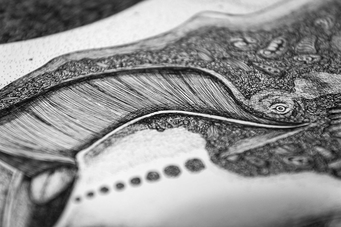
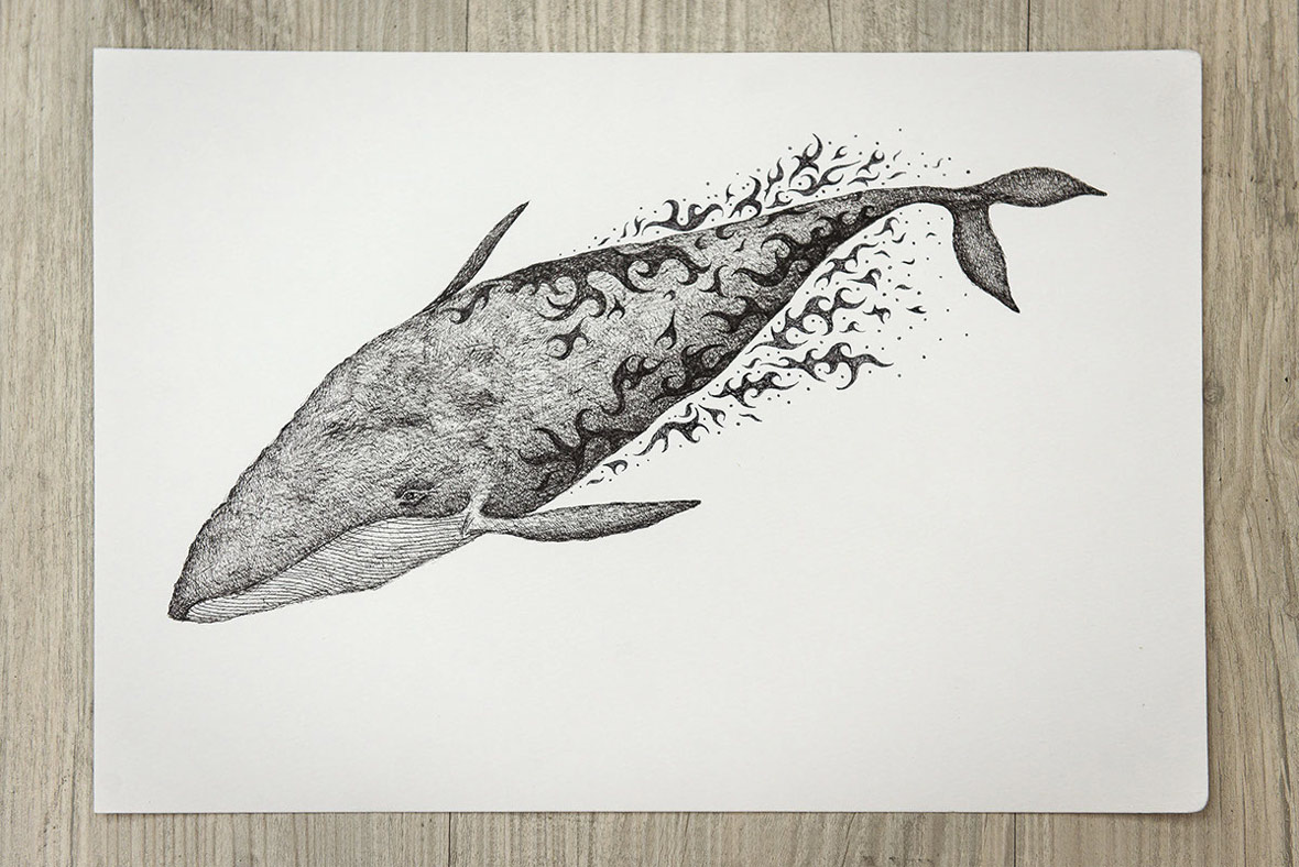
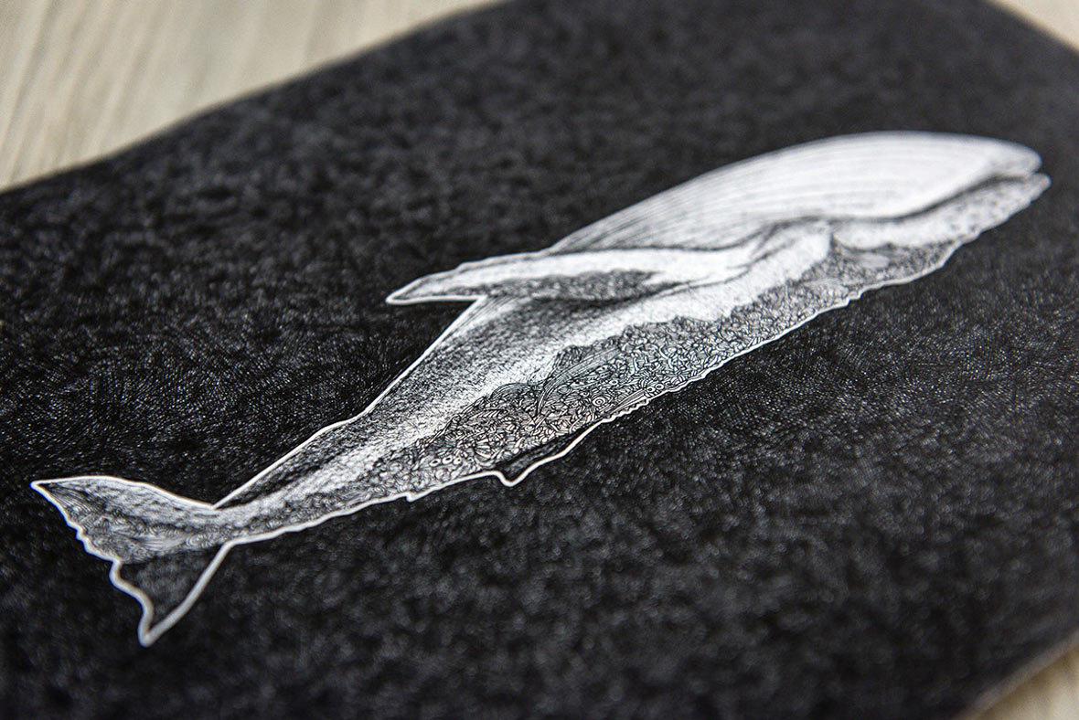
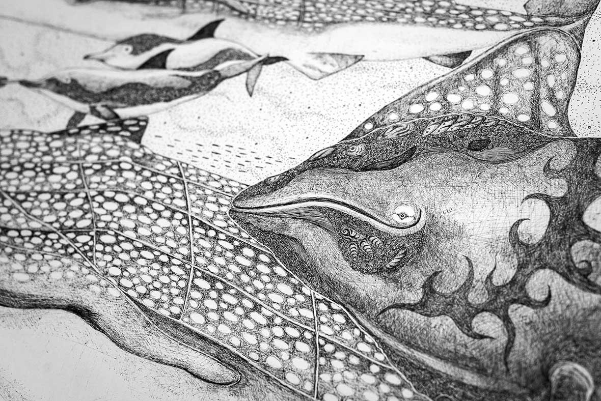
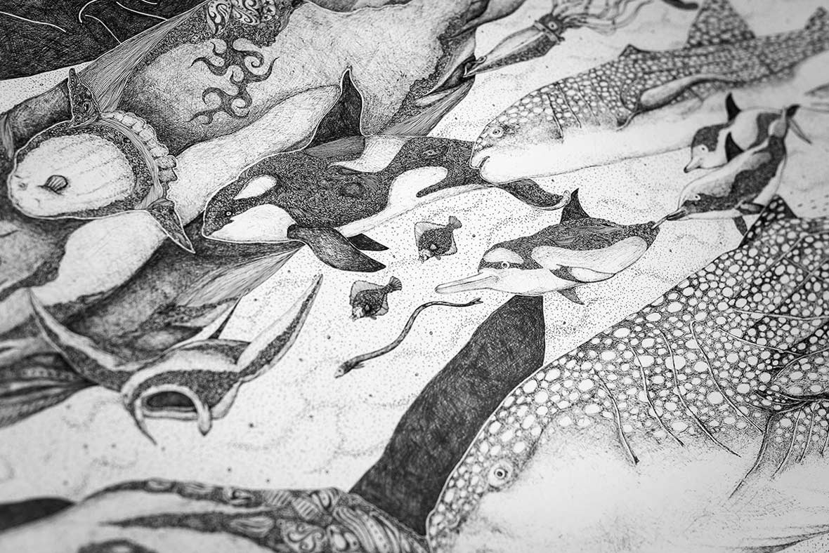
When Sting draws, he likes to think that his hand is actually holding a surgical scalpel, and that he is like a doctor performing surgery, suturing creative ideas together. He says that in his work there are many secrets and layers of hidden meanings. Sting laughingly describes his illustration work as being “neurotic, claustrophobic, and schizophrenic”. At times, there is even an underlying sense of catabythismomania, or the impulsive desire to drown oneself. This feeling is perhaps most evident in his eye-catching new series of drawings Our common pre-existence exists in the ocean, which illustrates a dense world of underwater marine organisms.


Sting在作畫時,樂於想象自己是位醫生,雙手握著手術刀,將藝術創意縫合在壹起。他說,他的作品中藏匿著諸多秘密和隱秘含意。他笑言自己的作品是具有“神經質、幽閉空間恐懼癥、精神分裂癥”的。間或,也有自溺狂癥,抑或是壹種將自己溺斃的沖動欲望深藏作品之中。這種意味在他的新作品系列《Our common pre-existence exists in the ocean》中或許最為強烈,這個引人註目的繪畫系列描繪了壹個海洋生物群體的密集世界。

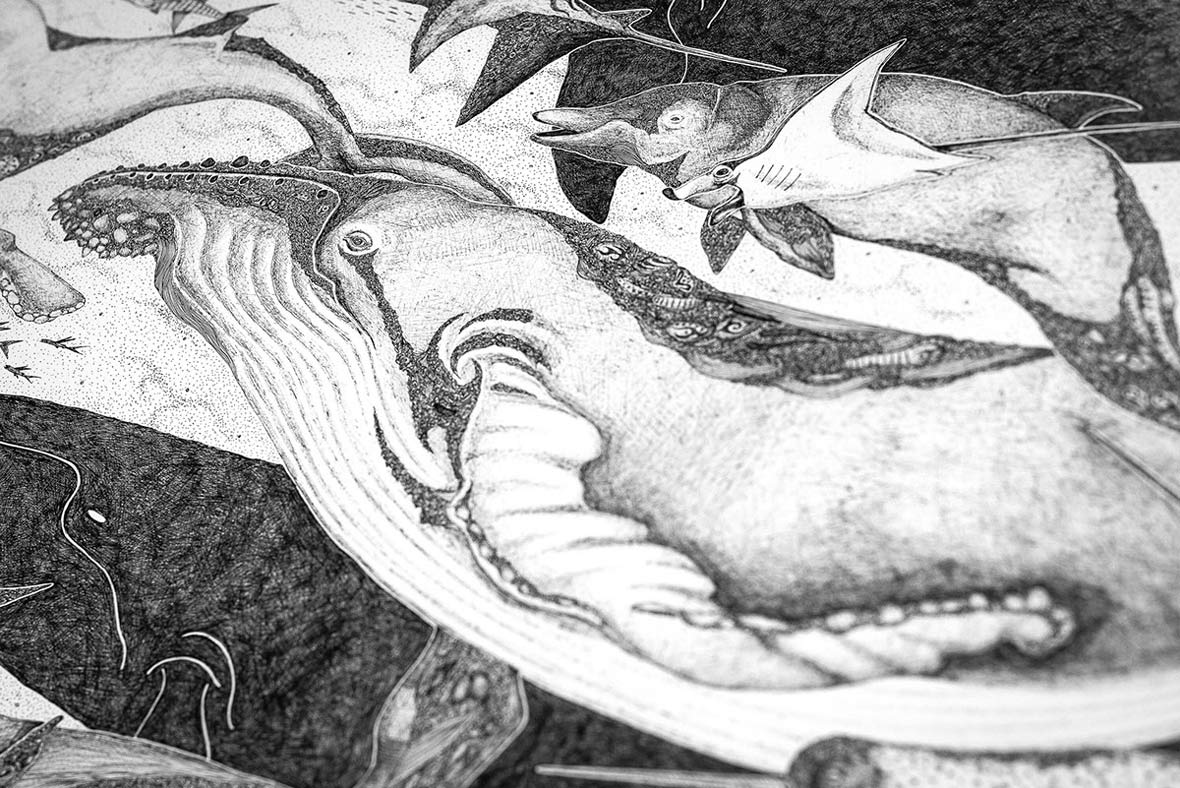
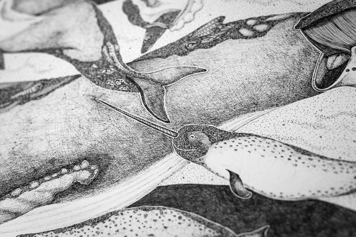
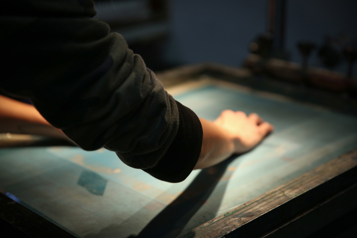
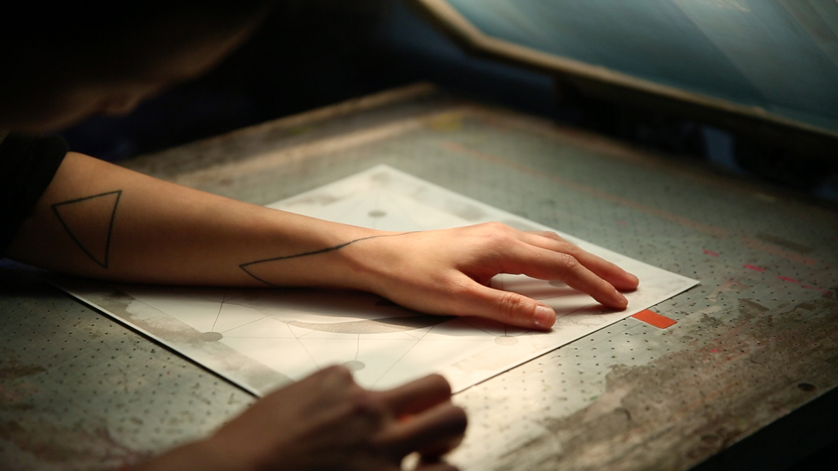
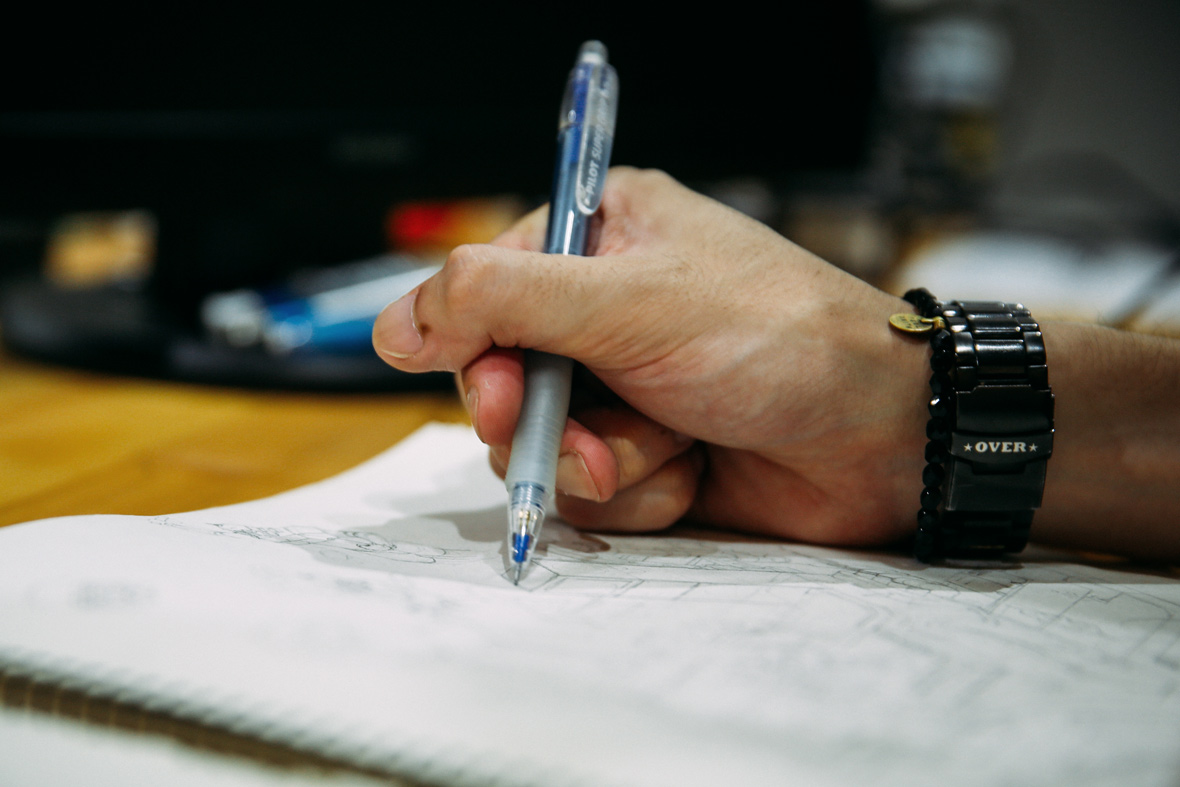
The idea for this series of drawings came after he took a body sketch class. Sting quickly became fascinated with the beauty and textures of anatomical forms. He started work on the drawings, by first collecting hundreds of pictures of whales as reference materials. He then achieved the texture of the skin with many repeated hand-drawn strokes. During the process of making this work, he soon came to the realization that marine creatures also had very real and mysterious souls. After all, as he says, we share a common pre-existence in the ocean. In our interview below with Sting, he tells us more about his own personal journey as an artist.


這個繪畫系列的創意形成於他所修的人體素描課。Sting迅速著迷於解剖體的肌理和美妙。為了新繪畫系列的創作,他收集上百張鯨魚的照片作為參考材料,繼而通過周而復始的手繪將這些皮膚肌理於紙上實現。在這些作品的創作過程中,他很快意識到海洋生物同樣也是非常真實和神秘的個體。他說,歸根結底,我們都有著共同的海洋先祖。以下采訪中,Sting將告訴我們更多關於他身為藝術家的個人旅程。

Neocha: What do you enjoy most about illustration?

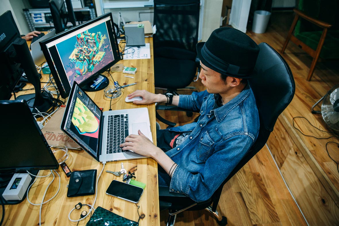
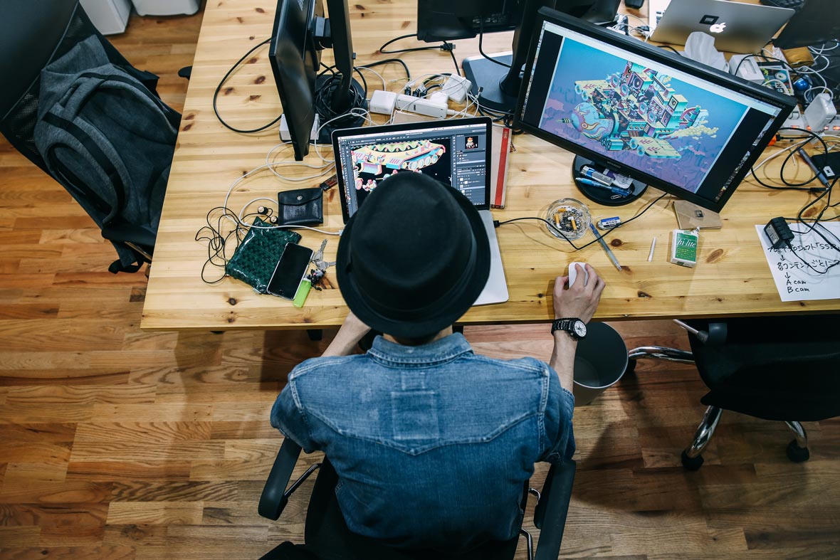
Sting: Just the act of creating something and then trying to comprehend what I’d made. I really enjoy the process of creating things purely from scratch, starting out with an intangible idea and then making it into an actual physical piece of work. During this whole process, because I am constantly thinking about and analyzing the work – both by itself and in the greater context of things, my understanding of what I’m making is always evolving. For me, it’s not about having a right or wrong answer. It’s about forcing myself to think more critically.


Neocha: 妳覺得插畫令妳最享受的是什麽?

Sting: 創造與瞭解。創作是個從無到有的過程,把無形的念頭與思緒轉換成作品,我非常享受在這樣的狀態之中。同時,在這過程中,因為不斷的思考,對於自身與周邊的事物,都會有新的體悟與瞭解,無關乎對錯與答案,對我而言,只是一個強迫思考的療程。

Neocha: Tell us about your creative process. How do you normally come up with a new piece of work?

Sting: My creative ideas very rarely ever come to me all of a sudden. Most of them brew inside me for a very long time, until I feel the moment is right for me to start drawing. I tend to work on a few illustrations at a time. If one drawing doesn’t feel right to me, I’ll take a break from it and work on a different one. Maybe some time will pass and then I’ll come back to it later and look at it from a fresh perspective. Maybe I will have some new ideas, and then continue working on it. This happens over and over again until the work is finished.


Neocha: 聊聊妳的創作過程吧!壹個新作品都是怎麽來的?

Sting: 我的創作來源很少是靈光乍現般的突然出現。大部份都是藏在內心,醞釀很久的記憶,直到某個對的時間我才開始動筆。創作過程我都是同時進行多張作品。感覺不對便停下來換下一張,或許過段時間重新看看,又有些新想法,便再繼續。如此週而復始,直到全部作品完成。

Neocha: What do you do, or where do you go, to get inspiration?

Sting: I actually get a lot of my inspiration from going to music festivals. Recently over the years, I’ve been to a lot of local and international ones; for example, up in the mountains for Japan’s Fuji Rock, or next to sea at Hong Kong’s Clockenflap or at Spain’s Primavera Sound, or outdoors in the city at Japan’s Summer Sonic Japan and Taipei’s Formoz Festival. That is, when I’m watching a band play live on stage, drinking a beer, smoking a cigarette, I feel completely free to do as I like. After dancing, cheering, losing myself in the crowd, if I’m really tired, I can just lie on the grass, bask in the sun, and chat with my friends. Inspiration comes to me quite naturally in those kinds of moments.


Neocha: 都會去哪裏獲取靈感?做什麽能獲得靈感?

Sting: 音樂祭是我靈感最大的來源。這幾年參加了許多國內外的活動,例如在山林裡的日本Fuji Rock,在海邊的香港Clockenflap與西班牙的Primavera Sound,在都會裡的日本Summer Sonic與台北的野台開唱Formoz Festival…… 就是邊聽喜歡樂團的音樂,一邊喝點酒,抽些煙,無拘無束,還不時大叫與堆擠衝撞,累了就躺在草地曬太陽聊天。靈感在那時候就會不斷地湧現催促著我。

Neocha: Was there a decisive moment in your life when you said to yourself “this is what I am going to do”? How did you discover your own talent?

Sting: When I was three and was in kindergarten – when I still hadn’t learned how to ride a bicycle yet, I realized that I was actually really good at drawing. No one had ever told me this, but I just knew this about myself. And not only that, I also believed from early on that this would be something that would be a part of me for the rest of my life.


Neocha: 生命中有沒有壹個時刻是妳對自己說:“這就是我要追求的事?”妳怎麽發現自己這種創造性的自我表達和才能?

Sting: 在我3歲唸幼稚園時、當我還未學會騎腳踏車時,就明瞭自己擅長繪畫。沒有人跟我說過,但就是自己知道,而也相信這會陪著我一生。

Websitestingchen-art.com
Behance~/stingchen-art
Instagram: @stingchen_fittingroom


Contributor: Leon Yan


網站stingchen-art.com
Behance~/stingchen-art
Instagram: @stingchen_fittingroom


供稿人: Leon Yan

Bicycles in Beijing, Now

December 23, 2015 2015年12月23日

Zhao Xiaomeng is a photographer and artist who is based in both Beijing, China and Toronto, Canada. At the moment, he is working on a number of projects that examines the massive societal changes in today’s rapidly developing China. One of these projects is called Bicycles in Beijing, Now, which he hopes will be his first book to be published next year.


赵小萌是常居于北京和多伦多两地的一位摄影师。他的诸多作品项目都审视着今日中国快速发展下的巨大社会变革。《Bicycles in Beijing, Now》便是其中一个项目,他希望可以将这个项目在明年出版成他的第一本书。

Bicycles in Beijing, Now is an extensive photo series that documents the dramatic decline of the once ubiquitous bicycle in Beijing. Once known as the “Kingdom of Bicycles”, China has in recent years seen the sudden and formidable rise and rise of car culture. Ever since the turn of the millennium, a growing number of Chinese people who live in big metropolitan cities, like Beijing and Shanghai, have become more accustomed to the convenience and comfort of owning and driving their own cars.


《Bicycles in Beijing, Now》 是一个大量摄影图片组成的系列,纪录在北京曾经普遍存在的自行车的戏剧性衰减。中国曾被誉为自行车王国,却在近年见证了汽车文化那令人瞠目的平地而起。自千禧年以来,居住在北京和上海等中国本土大都会的剧增人口,已经更习惯于拥有和驾驶私家车的方便和舒适。

According to Xiaomeng, the humble and dependable bicycle has all but since been lost in the frenzy of today’s auto boom. “The once iconic mode of transit has been severely marginalized in the modern city,” he says, “Mainstream Chinese society has now lost interest in the bicycle as a way of getting around in favor of the more glamorous automobile.” Rather than being a cultural symbol that represents the city, the bicycle has since been reduced to a sign of a socially vulnerable group in contemporary China.


据小萌说,可靠又平民化、曾一度坐拥天下的自行车在机动车的发展狂潮中面临消亡。“曾经标志性的交通方式,在如今的现代化都市中已经严重边缘化了。” 他说,“中国社会主流对自行车这种交通工具已经丧失了兴趣,转而投向更具魅力的汽车。” 自行车已经沦落为当代中国社会弱势群体的一种象征, 而不再是作为代表城市的一种文化符号。

For this project, Zhao Xiaomeng embarked on a search to discover where some bicycles have ended up. He tells us, “Not surprisingly, many are dilapidated and rusty, having entirely lost their use. But some have managed to live on: locked up, tucked away, refurbished, reconstructed, or randomly parked by their owners.”


为了这个项目,赵小萌开始探寻一些自行车最终去向何处。他告诉我们: “果不其然,很多都已经锈迹斑驳,毫无用处了。但是有一些还是成功地幸存下来: 上了锁,存放起来,修复修整过,抑或只是被它们的主人随处停放着。”

Sometimes while out shooting, Xiaomeng would also ask some owners of the disused bicycles how they felt about them. Why did they hang onto these pitiful things? To which they often replied: “Maybe one day I will make use of it.” This answer sadly reminded the artist of an old Beijing saying: “a dog’s life is better than no life.” Perhaps only time will tell what the ultimate fate of the bicycle will be, but at the current rate of China’s urban development and the rapid growth of consumer culture in its big cities, it may very well just become an artifact of the country’s past.


有时在外拍摄,小萌会向那些废弃自行车的主人们询问他们的感受。为什么他们对那些破烂还不放手?他们常会回答,搞不好哪天能用的上。这个回答让小萌想起一句北京老话,“好死不如赖活着”。也许,只有时间知晓那些自行车的最终命运,但是照目前中国的都市发展和其消费文化的快速发展来看,它极可能就作为一种工艺品代表这个国家的过去罢了。

Website: zhaoxiaomeng.com
Instagram: @xiaomengzhao_image


Contributor: Leon Yan


网站: zhaoxiaomeng.com
Instagram: @xiaomengzhao_image


供稿人: Leon Yan

Real Big City

December 18, 2015 2015年12月18日


无法观看?前往优酷

Real Big City is a new limited-edition screen print from Shanghai-based German artist and IdleBeats co-founder Gregor Koerting. He recently premiered the poster in a joint exhibition called Tale of Two Cities in Shanghai with the Paris-based print studio Frenchfourch.


《真正的大城市》是居住在上海的德国艺术家兼IdleBeats联合创始人Gregor Koerting的限量丝网版画新作。在近日的“双城记”——与巴黎版画工作室Frenchfourch的联展上,他首次展示了这个海报作品。

Real Big City is a remake of a woodblock print that Gregor had made eight years ago when he first arrived in Shanghai. The first version of this print illustrated his initial impressions of the city, which according to him, was unlike anything he had ever seen before. He envisioned the iconic skyline of Shanghai as a cyberpunk and impressively futuristic cityscape.


《真正的大城市》是Gregor八年前初到上海时创作的一幅木版画的复刻。这幅版画的初刻描绘的是他对这个城市的最初印象,据他所说,当时的他从未见过这番景象。他将上海标志性的城市天际线想象成赛博朋克和未来得令人咋舌的城市景观。


Now after having lived in Shanghai for eight years, Gregor has remade this poster as a new four-color silk-screen print. Incorporating his greater understanding and experience of having lived in this “real big city”, he has now changed the concept of the print to represent every major megalopolis in the world. He believes that in a place like Shanghai one can see the trajectory of future civilizations, which is not necessarily dystopian, but actually full of exciting new possibilities.


在上海生活八年之久后,Gregor用四色丝网印重新制作这幅海报。有了在这座“真正的大城市”生活的更多经历以及对其的更深了解,他改变了这幅版画的概念,它现在代表世界各个大都会。他相信,在像上海这样的地方,你可以看到未来文明的走向,它未必是反乌托邦,但是确是充满了激动人心的机会。


Real Big City can be purchased now exclusively on the Neocha Shop. Each print measures 38 x 57cm , and was screen printed on high-quality Somerset 300gsm watercolor paper in four layers: yellow, red, blue and black. It is available in a limited edition of only 17.


《真正的大城市》现由Neocha网店独家贩售。其每幅作品尺寸为38 x 57cm,由黄、红、蓝、黑四色网印于300毫克高质Somerset水彩纸上。此作限量印制17版,现可供购买。

// <![CDATA[
document.getElementById('ShopifyEmbedScript') || document.write('’);
// ]]>
Buy "Real Big City" by Gregor Koerting

Details:

  • Edition size: 17
  • Screenprint size: 38 x 57cm
  • Number of colors: 4
  • Paper: Somerset 300gsm Watercolor Paper
  • Price: $150 for single print without frame

详情:

  • 印刷数量: 17
  • 作品尺寸: 38 x 57cm
  • 颜色: 4
  • 纸张: 300克Somerset水彩纸
  • 价格: $150单幅无装裱作品

Websiteidlebeats.com


Contributor & Videographer: Leon Yan
Photographers: Leon Yan, Banny Wang


网站idlebeats.com


供稿与视频摄影: Leon Yan
图片摄影: Leon Yan, Banny Wang

You Might Also Like你可能会喜欢

Hand of Paradox

December 8, 2015 2015年12月8日


无法观看?前往优酷

Hand of Paradox is a new pair of prints from Chinese artist Nini Sum’s Yin Yang silkscreen series. Nini is one half of the Shanghai-based screen printing studio IdleBeats, who recently collaborated with the Parisian studio Frenchfourch in the first edition of an exhibition series called Tale of Two Cities at UNDEF/NE.

《悖论之手》是中国艺术家Nini Sum的《阴阳》丝网印刷系列中的新作品。Nini是上海丝网印刷工作室IdleBeats的创始人之一,他们最近在UNDEF/NE举办了“双城记”系列展览,该展览的第一期是与巴黎Frenchfourch工作室合作完成的。
Yin Yang is a new series of paired black and white images, that were inspired by ancient Taoist philosophy. In line with the other prints from this series, Hand Of Paradox examines the connection between natural forces and human power. The hands that are illustrated in the print can be seen as both palms and the backs of hands. The image is open to interpretation and is intended to inspire the viewer to find different meanings when viewing the artwork.

《阴阳》是以古代道家哲学为灵感的全新黑白系列作品。为了与该系列其它作品风格一致,《悖论之手》探寻了自然力量和人力之间的关联。作品中描绘的手既可以被看作是手心也可以是手背,整个作品为观者带来开放性思维,启发他们探寻不同层面的含义。


The artist asks us: do absolute extremes and polar opposites really exist? Can things in this world be described so simply as black and white, right and wrong, good and bad? The universe is endless with seemingly infinite possibilities – how much can we really control? And in which manner do we interact with the world? Do we go with its natural flow, or do we follow the rules set by man?

该艺术家 抛出一个问题:终极绝对和两极差异真实存在吗?这世上的东西真的能被如此简单地以黑白、对错或好坏区分吗?整个宇宙伴随着无穷持续的可能性,又有多少是我们所能控制的?我们又以怎样的方式与世界对话?我们只是顺其自然,还是受绊于规则?


Hand of Paradox can be purchased separately or as a pair of prints exclusively on the Neocha Shop. Each print was screen printed in two layers of silver and black – with special silver ink mixed in both layers, on 330gsm heavy acid free art paper, in a limited edition of 44.

你可以从Neocha网店独家购置限量44幅的《悖论之手》,可单幅或成对购买。每幅作品皆为银色和黑色双层丝网印刷而成, 且全部使用了特质银色墨水,纸张为330gsm无酸艺术纸

To pay via PayPal or international credit card, please check out through our Shopify. To pay with AliPay or WeChat, please visit our Weidian.


如需使用PayPal或国际信用卡支付,请转至我们的Shopify页面;如需使用支付宝或微信支付,请至我们的微店

// <![CDATA[
document.getElementById('ShopifyEmbedScript') || document.write('’);
// ]]>
<a href=”https://neochaedge.myshopify.com/cart/9166333765:1″ target=”_blank”>Buy Hand of Paradox No. 1 (悖论之手 一) by IdleBeats, limited edition of 44</a>


Nini Sum的《悖论之手》之一

立刻购买 ¥650

// <![CDATA[
document.getElementById('ShopifyEmbedScript') || document.write('’);
// ]]>
Buy Hand of Paradox No. 2 (悖论之手 二) by IdleBeats, limited edition of 44


Nini Sum的《悖论之手》之二

立刻购买 ¥650

// <![CDATA[
document.getElementById('ShopifyEmbedScript') || document.write('’);
// ]]>
Buy Special 2 Offer: Hand of Paradox No. 1 + No. 2 by Nini Sum


特别优惠 Nini Sum的《悖论之手》之一和之二

立刻购买 ¥1050


Details:

  • Edition size: 44
  • Screenprint size: 30 x 30cm
  • Number of colors: 2
  • Paper: Materica 330gsm Acid Free Paper
  • Price: $105 for single print without frame
  • Special offer: $185 for both prints without frames

详情:

  • 印刷数量: 44
  • 作品尺寸: 30 x 30cm
  • 颜色: 2
  • 纸张: 蒙特利卡330克无酸艺术纸
  • 价格: ¥650单幅无装裱作品
  • 特别优惠: ¥1050双幅整组无装裱作品

Websiteidlebeats.com


Contributor & Videographer: Leon Yan
Photographers: Leon Yan, Banny Wang


网站idlebeats.com


供稿视频摄影: Leon Yan
图片摄影: Leon Yan, Banny Wang

You Might Also Like你可能会喜欢

Tale of Two Cities #1

November 27, 2015 2015年11月27日

Tale of Two Cities is a new collaborative screen print exhibition series initialized by IdleBeats. Every episode in this exciting series will feature the latest prints of two studios: IdleBeats (Shanghai) and an international one from the worldwide print art family. Persistence, consistency, innovation, and the free expression of ones’ own local culture are the common qualities shared by all of the artists participating in the series.


“双城记” 是一个由爱豆笔此 (IdleBeats上海) 发起的系列丝网版画主题展览系列。每期展览将展出两个独立工作室的最新版画作品——IdleBeats以及来自世界各地的另一个版画工作室。不懈探索、连贯性、革新性,以及各自对本土文化的自由表达,这是所有参展艺术家的共性。


In the first episode of Tale of Two Cities, IdleBeats will be partnering up with the well-known and beloved serigraph pioneers FrenchFourch from Paris, who will be presenting a line of their classic street art posters. The visual style of this series ranges from psychedelic illustrations to mysterious cult imagery.


在“双城记”的第一期,IdleBeats将和来自巴黎的知名丝网版画先锋团队FrenchFourch联手创作。他们将带来一组视觉风格囊括迷幻插画到神秘宗教意象的经典法兰西街头海报。


Established in 2007, Frenchfourch is a renowned community of artists in Paris. They are also a printing laboratory specializing in the production of books, art zines, textiles, and posters. Their group additionally function as an editorial team, dedicated to showing the work of new emerging artists. Frenchfourch will from time to time organize group exhibitions too, partnering with artists and galleries around the world.


FrenchFourch成立于2007,是巴黎艺术界的重要艺术家群体。他们同时也是专注于书籍、电子艺术杂志、纺织品和海报制作的印制实验室。这个团队亦是一个编辑团队,专注展现新生代的艺术家。FrenchFourch也不时联合世界各地艺术家和画廊机构组织艺术群展。

IdleBeats in Shanghai are an artist duo who function primarily as a print art studio. They create original screenprinted art, installation art, music posters, and brand crossover projects. The pair have become well-known within the Shanghai creative circles and beyond, for their psychedelic and distinctive visual style. In addition to their print work, they have also been doing innovative live screen printing show and workshops since 2009.


位于上海的IdleBeats前身主要是个双人艺术家的印刷艺术工作室。他们制作原创的丝网印刷艺术、装置艺术、音乐海报,以及品牌合作项目。这两人已因为他们迷幻、独特的视觉风格在上海创意圈内外为众人所知。自2009年,他们除了版画创作外,也一直在做创意丝网印刷的现场展示和研讨班。

At the special two-day opening of the Tale of Two Cities exhibition this upcoming weekend (Nov. 28-29) at UNDEF/NE, IdleBeats will be creating an experimental installation with live screen printing. The whole process will span two whole days, so visitors should be able to witness a unique phase of the project at any given moment over the weekend. IdleBeats will also be showing 20 fresh new art prints, one series each by Gregor and Nini. There will be a special 30% discount for those attending the two-day opening event at Shanghai’s UNDEF/NE!


在“双城记”本周末 (11月28-29日) 于UNDEF/NE举行的双日特别开幕活动上,IdleBeats将现场制作结合丝网印的实验光影装置。整个作品会在两天内于开幕现场完成,所以无论何时到来,你总能看到“装置进行时”的某个阶段和它独一无二的样貌。IdleBeats也将展出分别来自Gregor和Nini的两组20幅全新的丝网版画。本周末至上海UNDEF/NE参加“双城记”,即可享受开幕7折特售价。


Stay tuned over the next few weeks to find out more about these new prints. If you are unable to attend the Tale of Two Cities show at UNDEF/NE in Shanghai, there will be exclusive offers to buy the prints directly from the Neocha Shop!


敬请期待在接下来几周的版画新作。如果你无法亲临上海UNDEF/NE参加“双城记”,也将仍有机会从Neocha的在线商店直接购买独家销售的版画作品。

Address:
UNDEF/NE, Room 105, Bldg 6
50 Moganshan Road (near West Suzhou Road)
Putuo District, Shanghai
People’s Republic of China


地址:
中国 上海市普陀区
莫干山路50号6号楼105室(近西苏州路)
UNDEF/NE

Websiteidlebeats.com


Contributor: Leon Yan


网站idlebeats.com


供稿人: Leon Yan

You Might Also Like你可能会喜欢

Noodle Rack

November 18, 2015 2015年11月18日

Noodle soup is a common street food that is all over China. While most noodle joints spend a tremendous amount of effort to win over customers with the taste of their noodle soup, some have also started to incorporate attractive and modern store designs in their marketing strategy. One good example is Longxiaobao, a newcomer who recently set foot in Changsha with the ambition to spread their local Shaoyang-style rice noodles to the rest of China. Commissioned to come up with a contemporary identity and design for Noodle Rack, incidentally also their first restaurant client, Lukstudio integrates the tradition of noodle-making in the spatial design of the store’s interiors by reinterpreting the noodle rack.


面条是中国随处可见的街头小吃。大部分面馆都仅在口味上费尽工夫以赢得客户,然而另一些品牌却已将优质的店铺设计视为不可或缺的成功秘方,隆小宝就是其中之一。这个新团队在长沙小试牛刀,力图把钻研多时的地道邵阳米粉推广到中国各地。芝作室受邀为其打造品牌创始店,为了将传统制面工艺引入到空间设计中,用现代语汇重新诠释了“晾面架”这一元素。

Nestled along an outdoor shopping promenade near the Xiangjiang River, the compact noodle joint exudes a calm yet mysterious presence with a bamboo-cast concrete storefront. Two rustic steel boxes penetrate through the solemn exterior: the taller one is cladded with rusted steel panels, while its shorter neighbour is constructed like a metal scaffold. These three elements together are visually orchestrated to suggest a journey of discovery.


湘江畔的购物大道上,这间小巧的面馆有一个宁静而引人入胜的店面。竹子倒模浇筑的混凝土外立面上,两个相映成趣的钢盒子穿墙而出:左边略高的一个看起来比较冷静封闭,右边的有脚手架一样繁复的面孔。三个元素并置在一起,为食客揭开入店探索的旅程。

Walking through the entrance, a customer is greeted by a well-composed counter design lined with a bamboo mold used for casting the exteriors. As one proceeds towards the halo surrounding the grid structure, the interior layers start revealing themselves. Firstly, the original wall is stripped down to its structural blocks to resonate with the rustic metal grid. Secondly, wooden boxes are carefully placed within the rack to showcase selected porcelains. Finally, a series of metal wires are draped across the dining room to create a dramatic lighting feature with hanging bulbs. Balanced with the rustic interiors, these reflective strands create a poetic notion of dining under a noodle rack.


从左侧盒子进入店内,首先来到一个简约内敛的空间:前台嵌缀着曾用于浇筑混凝土的竹模,与外立面相呼应,水泥素墙衬托着由橡木盒子和点单屏幕组成的背景墙。转身步入用餐区,围绕着铁架子的光晕将空间的丰富层次展开:墙体原本的砖块与水泥结构得以露出,与铁架子共同营造粗矿的背景;层层叠叠的铁架子中,精心布置的木盒子展示着光洁的瓷器;一束束细密的钢丝‘面条’优雅地垂挂着,微微映着灯泡的暖光,成为整个空间的亮点。每一处的细微用心都是为了引起客人在晾面架下进餐的诗意联想。

Playing with the duality between rustic and refined, eastern tradition and western representation, Lukstudio introduces a crossover between a fast food chain and an upscale diner. Noodle Rack differentiates itself from the stigma of a kitsch fast food “hole in the wall” on every street of China. It demonstrates just how Chinese eateries can also have the potential to be reborn into hip gathering spots not unlike the ubiquitous café.


粗糙质朴和细腻精致,东方传统和现代诠释,芝作室通过这样的融合让店铺成为连锁快餐和高档餐厅的混合体。这个项目改变大众对平常面馆环境简陋低劣的偏见,展示传统中式美食店也有潜质成为像咖啡厅一样令人流连忘返的场所。

Website: lukstudiodesign.com


Contributor: Leon Yan
Photos Courtesy of LOTAN Architectural Photography


网站: lukstudiodesign.com


供稿人: Leon Yan
图片由洛唐建筑摄影提供

You Might Also Like你可能会喜欢

The Multi-Talented Prodip Leung

November 16, 2015 2015年11月16日

Prodip Leung is a Hong Kong-based painter, illustrator, graphic designer, and musician. His work often combines music with experimental art, drawing from the legacies of street art, cartoons, and pop culture. This year, Prodip was also one of the 12 artists brought together by Gap REMIX Project to reimagine the classic Gap logo in an exclusive collection of graphic tees.


Prodip Leung(梁偉庭)是一位香港畫家、插畫師、平面設計師及音樂人。他的作品提取了街頭藝術、卡通及流行文化的精髓,常常結合了音樂和實驗藝術。今年,Prodip也是參與2015年Gap REMIX項目的12位藝術家之一,該項目邀請每位藝術家以各自風格重塑經典的Gap logo,從而打造出一個限量版T恤系列。


无法观看?前往优酷

He first started his creative journey about 10 – 15 years ago. At that time, he was the bassist for LMF, a pretty well-known Cantonese hip-hop group in Hong Kong. In addition to playing the bass, he was responsible for all of the group’s graphic design and album art. While in LMF, he started getting into painting, illustration, toy design, and a bit of apparel design. Since the beginning, he has always been very independent about his creative endeavors, focusing only on the things that he enjoys, which he believes is “the way it should be”.


他的創作旅程可追溯到十至十五年前。彼時,他還是香港殿堂級說唱樂隊LMF樂隊的貝斯手。除了玩貝斯,他還負責整個樂隊宣傳的平面設計和專輯美術指導。在LMF,他開始著迷于畫畫、玩具設計以及一些服裝設計。從最開始,他就對自己的創作非常有自主傾嚮,他只專注于自己享受的事物,而他也一直堅信“這才是正確的方式”。

Ever since he was little, he always wanted to make toys. His shelves are full of toys and skateboard decks. Books are also a very big source of inspiration for him. He likes to read a lot of books about UFOs, aliens, monsters, new-age topics, ancient mysteries, and generally just strange things. As an artist and creative, Prodip likes to consider himself first and foremost as a storyteller. Storytelling is a major part of his creative process. In fact, the first thing he needs before he starts is a good story. All of his stories come straight from his imagination.


他從小就想自己做玩具。如今他的置物架上滿是玩具和滑板。書籍也是他靈感的最大來源之一。他喜歡大量閱讀有關UFO、外星人、怪物、新世紀主題、古代神秘學的書籍,總之就是些稀奇古怪的玩意兒。作爲一名藝術家和創意人,Prodip認爲自己首先是個故事講述者。講故事是他創作過程的一大重頭。事實上,創作開始前,他最需要的就是一個好故事。他的所有故事都來自于他的想象力。

When talking about his hometown, Prodip admits he has a love-hate relationship with Hong Kong. He was born there and he also grew up there, but because of his artwork, he runs into a lot of problems and restrictions. “There’s not much you can do here as an artist,” he says, “Hong Kong is a very traditional city and the media here doesn’t push the envelope when it comes to the arts and music, which holds the city back creatively compared to the Western world.” He adds, “Me and my peers all want to make Hong Kong a more diverse, exciting, and progressive place, but it’s pretty hard.”


說到故鄉,Prodip承認自己對香港愛恨交加。他生于此長于此,卻因爲創作遭遇諸多問題和限制。“作爲藝術家妳在這裏沒有太多發揮空間,”他說:“香港是一個非常保守的城市,這裏的媒體不會爲了藝術和音樂去沖破既有界限,相比西方,這點大大抑制了本土創意的發展。”他補充道:“我和同行們都想將香港變得更多元、更刺激、更進步,但這並不容易。”

Prodip is really into the writings of Jiddu Krishnamurti. More than anyone else, including other artists, Krishnamurti is a big source of inspiration. His teachings stress doing things not for money but rather for the soul, and how to nurture a happy, well-rounded self. This core principle has helped Prodip solve so many problems in his life. Krishnamurti’s writings have helped him prioritize what is important and focus only on the meaningful stuff.


Prodip非常喜歡Jiddu Krishnamurti的書。比起包括其他藝術家在內的任何人,Krishnamurti才是他最大的靈感來源。他的學說強調從心行事而非爲錢行事,以及如何完善自身,做一個快樂完滿的自己。這個核心理念幫助Prodip解決了人生中的許多問題。Krishnamurti的書讓他懂得把重要的事放在首位,懂得只專注有意義的事。

Beyond that, Prodip is basically against everything: religion, the social system, the education system, the financial system, everything. He says, “The modern world and modern society is broken and it’s our responsibility to fix it. This is something that I agree with wholeheartedly.”


除此以外,Prodip幾乎抵制所有東西:宗教、社會體系、教育體系、金融體系、所有事。他說: “現代世界和當代社會已經敗壞,改變它是我們的責任。這是我深信不疑的事。”

Facebook~/prodip.leung
Instagram: @prodipleung


Contributors: Leon Yan, Adam J. Schokora
Photographer: Adam J. Schokora


Facebook~/prodip.leung
Instagram: @prodipleung


供稿人: Leon Yan, Adam J. Schokora
攝影師: Adam J. Schokora


Designing Fangsuo Bookstore

November 14, 2015 2015年11月14日

Designing a beautiful bookstore has always been a dream for the Taiwanese designer Chu Chih-Kang. The inception of this dream came almost 14 years ago when Chu came across some interesting bookstore designs.


台湾设计师朱志康十四年前无意间受到了一些有趣的书店设计的启发,自此设计一间美好的书店便成为他的梦想。

Chu has always been attracted and inspired by interesting bookstore designs because they are not simply commercial shops designed to sell books. They are also spaces that collect and share knowledge as well as being public spaces for relaxation and contemplation. For Chu, to be able to create such a place is the ultimate achievement.


朱志康常被有趣的书店设计吸引和启迪,主要是因为这样的书店不只是单纯售卖书籍的商店,它们也是为公众提供知识共享与放松冥思的功能性空间。对他而言,能够打造这样的空间才是自己的终极目标。

When the opportunity arose to partner up with Fangsuo Bookstore on their latest project, Chu didn’t hesitate to leap at the chance. His initial proposal was centered around the concept of “The Secret Scripture Library”. Historically scripture libraries have existed in Buddhist temples for many centuries and also have an extended meaning of stored wisdom in Mandarin Chinese. This concept resonated deeply with the Fangsuo team and was immediately accepted.


方所书店最近恰好提供了这样一个契机,朱志康果断抓住了这个机会。他最初提出的方案是以“秘密藏经阁”的概念为核心。历史上,藏经阁在佛教寺庙中存在了多个世纪, 同时它在汉语中也有保存智慧及升华的精妙含义。这个概念得到了方所团队的强烈共鸣, 得以一致通过。


In the thousands of years of Chinese history, there have been many numerous and infamous quests for ancient scriptures and the wisdom that they hold. This spirit of exploration was something that Chu wanted to capture in the Fangsuo Bookstore. Moreover, Chu not only wanted people to experience this quest into the unknown, but he also wanted the bookstore to have the solemnity of a temple since books represent some of mankind’s most deep and profound wisdom.


在中国几千年的历史进程中,曾有无数次对藏经阁中古老经文和智慧的探索事件。这种探索精神正是朱志康想要在方所书店中呈现的。并且,他不仅想让人们去体会这种对未知的探索,也希望这家书店可以拥有寺庙般的肃穆感,因为书籍象征着人类最深沉和渊博的智慧。


Following on the theme of the cosmos, the entrance to the bookstore is through a sculpture shaped like a meteor. This mysterious tunnel is intentionally designed to feel narrow and confining for those passing through it. This near claustrophobic experience when you first enter is then followed by a sudden release into a large open space where you feel the pressure immediately ease. The initial journey through this meteor – this ark to knowledge, is designed to release tension and allow customers to enter the bookstore with a relaxed frame of mind, open to discovery and enchantment.


书店的设计是以宇宙为主题,其入口的隧道形如流星。这个神秘隧道故意设计得狭窄而幽深,从那经过的人首先会感到紧张和幽闭感。 初进书店会有近乎幽闭恐惧的体验,紧随其后的则是一个突然出现的豁大空间,这将让你的压力迅速得以释放。 这样一种星辰之旅的设计,让光顾者先高压后释放,得以用一种放松和开放的心态与意识去探索和发现。


The Fangsuo Bookstore Project was completed in 14 months. The bookstore was well received by everyone and continues to enchant people to this day. For Chu, the job of the designer is to help the dreamers of the world realize their dreams. While he is certainly grateful for the positive feedback for his designs, he feels that the ultimate success of the store should be credited to the ambitious vision of the owners. This project not only allows Fangsuo Bookstore to realise their dream, but it allowed Chu to fulfil a lifelong goal of designing a beautiful bookstore.


方所书店项目用了14个月完成。书店得到了如潮的好评,至今仍吸引人们蜂拥而至。对朱志康来说,设计师的工作就是帮助世界上的梦想家们实现他们的梦想。面对如此的肯定,他固然充满感激,但他始终认为书店的终极成功还是要归功于书店主人们的勃勃雄心。该项目不仅让方所书店实现了他们的梦想,也让朱志康完成了设计一间美好书店的毕生目标。

Websitekang.com.tw


Contributor: Leon Yan
Photos
 Courtesy of Chu Chih-Kang


网站kang.com.tw


供稿人: Leon Yan
图片由朱志康提供

VULCAN

November 9, 2015 2015年11月9日

VULCAN is the world’s largest 3D-printed architectural pavilion and recently was showcased at this year’s fifth Beijing Design Week. It was developed by Beijing’s Laboratory for Creative Design (LCD) using innovative, biomimetic design and construction techniques for a large scale structure.


近期世界最大的3D打印构筑物VULCAN亮相于第五十五届北京国际设计周。它是一件由北京的LCD(创意设计实验室)以革新性的设计理念和建筑工艺完成的大规模建筑结构作品。

The project’s name VULCAN comes from Latin, and is also the name of the Roman god of fire. In English, the name means “volcano”. The pavilion itself resembles a mushroom cloud from an erupted volcano, while up close, it rather resembles a very intricate spider’s web.


项目名VULCAN来自拉丁语,它也是罗马神话中火神的名字。 在英文中,他则是“火山”的意思。该装置本身的形状也很像是一个火山爆发出的蘑菇云,更靠近时,它又像是一个十足复杂的蛛网。


Although man-made and 3D-printed, VULCAN’s overall structure feels strangely organic and in a way biomorphic, especially when viewed from afar. It is perhaps not too surprising to learn that the architectural forms of the pavilion developed from LCD’s long-term research into the biological structure of cocoons. The arched curvilinear shape of the pavilion, which may resemble an elastic membrane at a distance, is actually on closer inspection, made up of numerous smaller triangular panels and millions of web-like filaments.


虽然VULCAN是人造结合3D打印的,但它的整体构架让人感觉异常 富有生机且带有生态感, 尤其是从远处看时。然而当你得知它的整个构筑的形式是源自LCD对蚕茧结构的长期研究就不会那么讶异了。装置的曲面弧度的部分,远看像是弹性膜,当你靠近时,则会发现那是由数不清的小型三角板和数以万计的网状纤维组成。


Constructed by more than 1000 different 3D-printed elements that were printed by 20 different large-scale 3D printers, VULCAN was built over the course of 30 days. It was then assembled on site in 12 days by a team of 15 people at Beijing’s new Parkview Green complex. Measuring 9.08 meters long and standing 2.88 meters tall, VULCAN currently holds the Guinness World Record for the largest 3D-printed structure.


VULCAN由20台不同的大型3D打印机打印出的1000多块3D打印模块组成,整个打印过程耗时30天。再由一个15人的团队于北京侨福芳草地现场耗费12天拼接搭建而成。整个装置长9.08米、高2.88米,VULCAN最近获吉尼斯世界纪录,成为世界最大的建筑学意义上的3D打印构筑物。


无法观看?前往优酷

It is a landmark achievement that further helps us understand how 3D printing technology can be used for the construction of large-scale buildings through innovative fabrication methodologies. And perhaps more importantly, it is an exciting technological feat that brings the future of architecture and art even closer together.


这是一个里程碑式的成果,它帮我们进一步了解了3D打印技术是如何通过革新构建方式用于大规模建筑物的构建。或许更重要的是,它将拉近未来建筑与艺术之间的距离。


Websitebjdw.org


Contributor: Leon Yan
Photos Courtesy of Laboratory for Creative Design & Beijing Design Week
Video Courtesy of Laboratory for Creative Design


网站bjdw.org


供稿人: Leon Yan
图片由创意设计实验室与北京国际设计周提供
视频由创意设计实验室提供

The Work of Takehiro Tobinaga

November 4, 2015 2015年11月4日

Takehiro Tobinaga is an illustrator, who lives and works in Tokyo, Japan. His illustrative style clearly bears the strong influence of graffiti art and comics, but there is also a nostalgic element in his work that references traditional Japanese illustration, or perhaps even psychedelic poster art from the 1960s. Takehiro often gets his inspiration from music and films, but more importantly the fantastical forms in his artwork come from his own imagination and emotional world.


飛永雄大氏は、東京を拠点に活動するイラストレーターです。イラストのスタイルは、グラフィティ・アートと漫画からの影響、伝統的な日本のイラストを参考にしたノスタルジックな要素もあります。また、1960年代のサイケデリックポスターアートの影響も受けているかもしれません。音楽や映画からインスピレーションを得ることが多い飛永氏ですが、作品における空想的な形の由来が自身の想像と情感的世界であることのほうが重要なのです。

Although he primarily uses digital tools to create his art and admits to spending “an inordinate amount of time in front of his computer”, he also believes that it is important to do things in an analog style, to draw often by hand, and to be able to incorporate rougher and coarser textures in his illustrations. His process usually first involves making preliminary hand sketches, then creating the actual forms in Adobe Illustrator, and finally in the last stage, adding shades and textures with the Photoshop brush tool.


作品の制作には主としてデジタルツールが使われており、「コンピューターの前で多くの時間」を費やすことを飛永氏は認めていますが、アナログスタイルで制作する時は、多くの場合を手で描き、イラストにざらざらした粗い質感を取り入れることで作品に変化を与えることできることが重要であるとも考えています。飛永氏の制作プロセスでは、通常は最初に準備のためにスケッチをし、その後にAdobe Illustratorで実際の形態を作り、最後にPhotoshopのブラシツールで影と質感を加えます。


无法观看?前往优酷

Earlier this year, to celebrate the 2015 release of Adobe Creative Cloud, Takehiro was commissioned by Adobe to create a special piece of work. Inspired by the sacred Kumano Kodo Trail in Mie Prefecture in Japan, Takehiro created a stunning large-scale light box that was later also exhibited on the trail itself. He chose to go to this location in Northern Japan because it is so unlike his usual office setting in Tokyo. Surrounded by tall office buildings and a fast-paced urban life, Takehiro decided to spend a week away in a more rural setting, drawing inspiration instead from nature.


2015 年リリースのAdobe Creative Cloud Maki itというキャンペーンにて、Adobe からの依頼で飛永氏は特別な作品を制作しました。三重県の神聖な熊野古道からインスピレーションを受け、飛永氏はその場で作品を作り、そして大スケールの見事なライトボックスのフレームに設置し、その後実際に古道に展示しました。普段の東京のオフィス環境とは全く異なる熊野古道へ、飛永氏自身が実際のロケーションを訪れました。高いビルに囲まれ、ペースの速い都会の生活を送っている飛永氏は、神秘的な自然の中で一週間過ごし、自然からインスピレーションを引き出しました。

In his final artwork, one can see Takehiro’s visual interpretation of all the forests, mountains, trees, waterfalls, and other natural sights that he encountered on his journey. He used Illustrator CC, Photoshop CC and some Adobe CC mobile apps to create the forms, textures and shapes in this most impressive work.


完成作品からは、森、山、木々、滝、そして飛永氏が道中で出会ったその他の景色の視覚的解釈に触れることができます。この最も印象的な作品における形態、質感、そして 形状を作るために、Illustrator CC Photoshop CC 及び一部のAdobe Creative Cloud モバイルアプリが使用されています。

Takehiro likes to describe his unique visual style as being distorted, even perhaps a bit deformed, in some ways nostalgic and retro, and quite ornate. One of the surprising things about his body of illustrative work is that despite being achieved through mostly digital means, it still feels quite organic and personal. In thinking about what the future holds, Takehiro believes that the most important thing is for him to be able to continue creating the kind of art that he enjoys to make, and to have fun while doing it.


飛永氏は、自身の独特な視覚的スタイルを「歪んでいて、少し変形しているとも言え、ある意味ノスタルジックでレトロで、かなり装飾的である」と表現します。飛永氏の一連のイラスト作品で驚くべきことの一つには、ほとんどデジタル手段で保存されているにもかかわらず、かなりオーガニックでパーソナルな感じがするということです。将来のことについて飛永氏は、作ることが楽しい芸術作品の制作を継続することができることと、楽しみながら制作をすることが重要であると考えています。

Websiteagenthamyak.com/artists/takehiro-tobinaga
Behancebehance.net/Tobinaga


Contributor & Photographer: Leon Yan
Video & Images Courtesy of Adobe


ウェブサイトagenthamyak.com/artists/takehiro-tobinaga
Behancebehance.net/Tobinaga


寄稿者&カメラマン:Leon Yan
Video & Images Courtesy of Adobe