The Art of the Mural

September 30, 2016 2016年9月30日

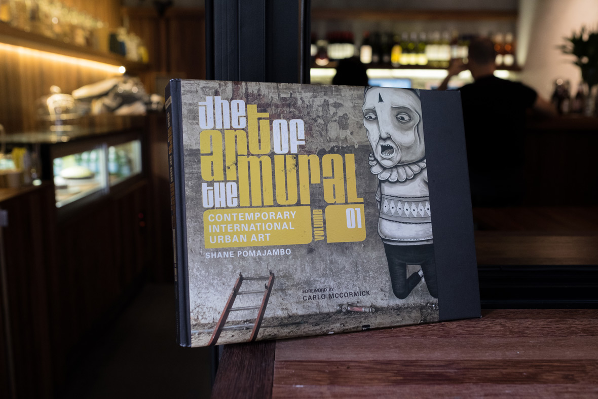
The Art of the Mural is a celebration of muralism as a contemporary global movement. It features some of the most impressive mural art worldwide, offering insight into the gravity of muralism as an influential art form and encouraging the appreciation of street art culture as a valuable part of our visual landscape. As the first installment of a four-part series, the book introduces fifty outstanding artists from Africa to Asia, whose level of commitment to their work continues to bridge the gap between the worlds of fine art and street art.


The Art of the Mural一书堪称当代全球性壁画运动的代表作,以世界各地最让人惊艳的壁画艺术为特色,解析这个深具影响力的艺术形式的厚重意义,希望把街头艺术的欣赏纳入人们享受视觉风景的重要一环。本书作为四部曲的首推款,介绍了五十位来自非洲和亚洲的优秀艺术家,他们全心投入自己的工作,旨在为学院派美术和街头艺术构建交流平台。

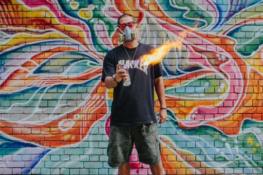
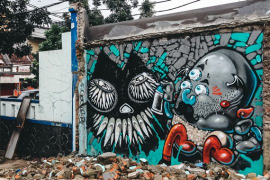
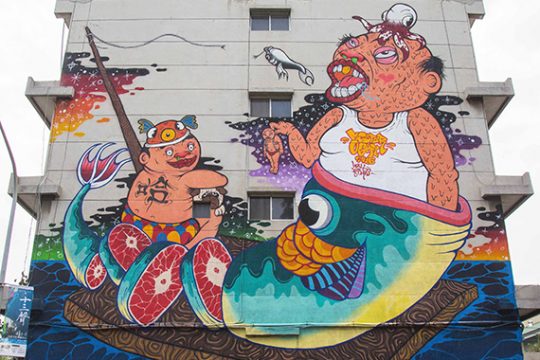
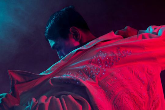
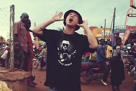
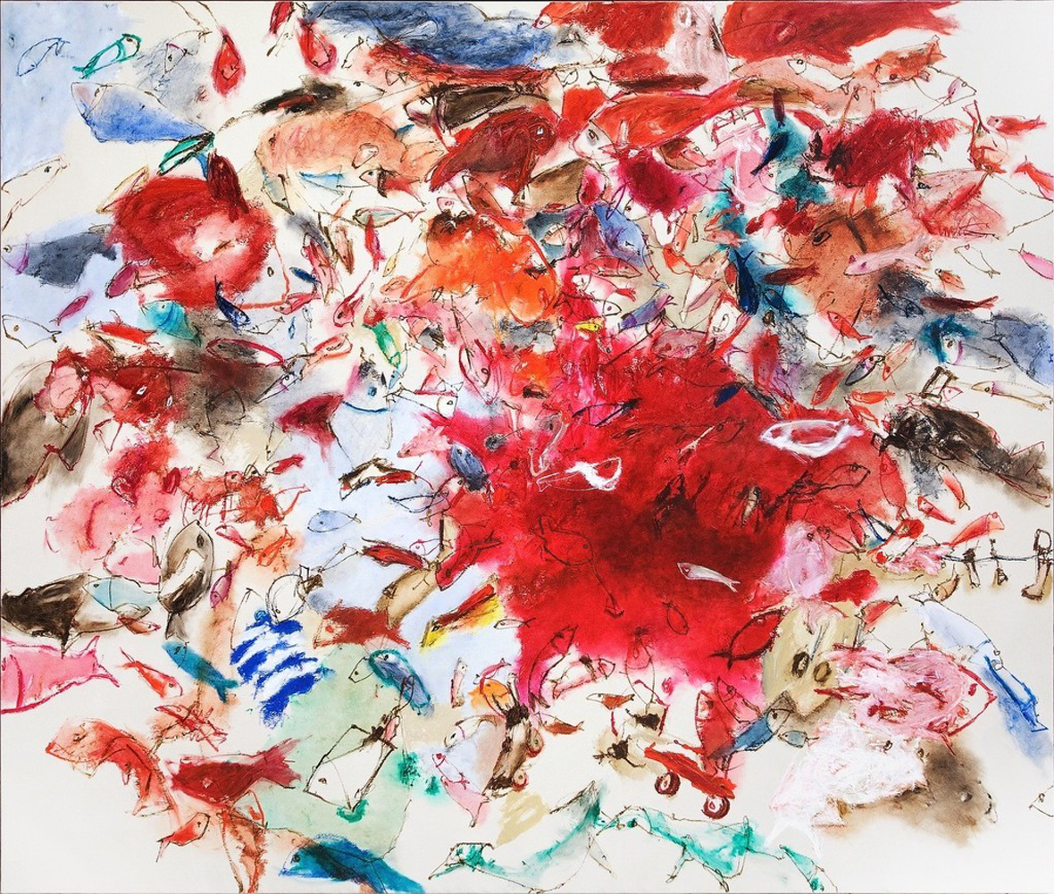
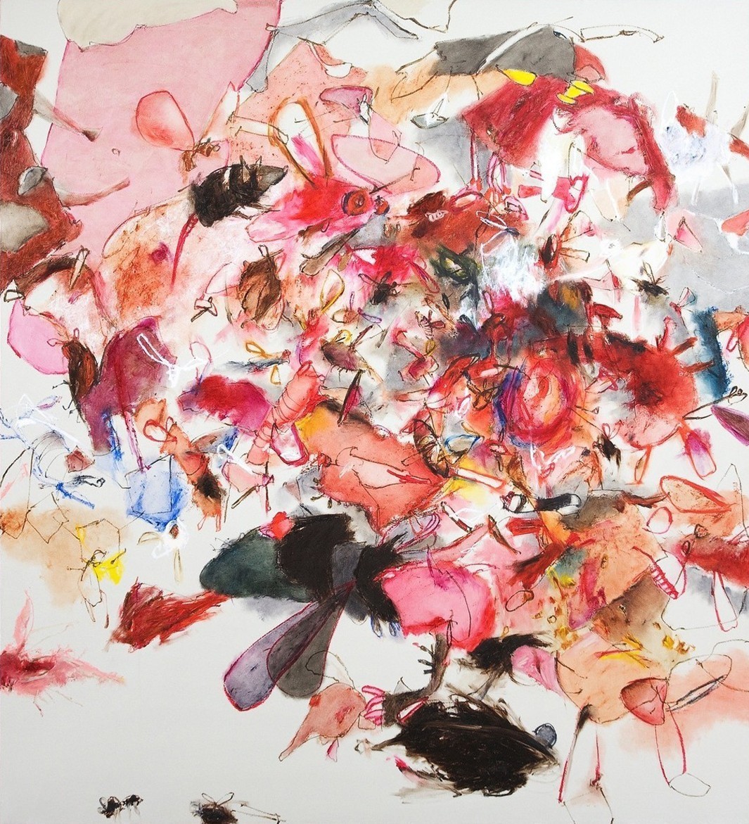
The Art of the Mural draws attention to the universal nature of muralism and its ability to transcend cultural barriers. The book showcases a multi-cultural variety of work and styles, including an outstanding selection of Asian artists such as Clogtwo, TWOONE, and DALeast, from Singapore, Japan and China respectively. Although the latter two no longer live in Asia, their cultural heritage continues to permeate the work they create abroad. This is an integral part of contemporary international urban art: the fact that anyone, from anywhere, can engage with the medium as a vital social concept.


The Art of the Mural向人们凸显壁画中的共通性以及跨越文化障碍的魅力。书中也展示了大量风格各异的多元化作品,其中包括很多亚洲艺术家的杰出代表作,如来自新加坡的Clogtwo,日本的TWOONE和中国的DALeast都榜上有名。尽管后面两位艺术家目前都不居住在亚洲,但地域文化依旧传承于他们在海外的作品创作中。这就是当前国际性城市艺术的不可分割性:来自任何地方的任何人,都能以突出表现某种社会概念为主旨,加入到这个传播媒介中。

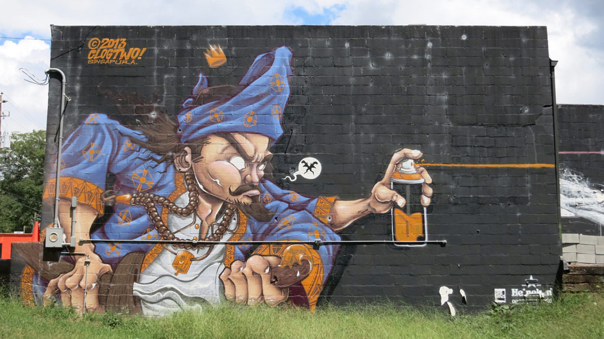
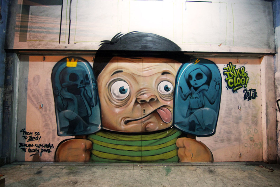
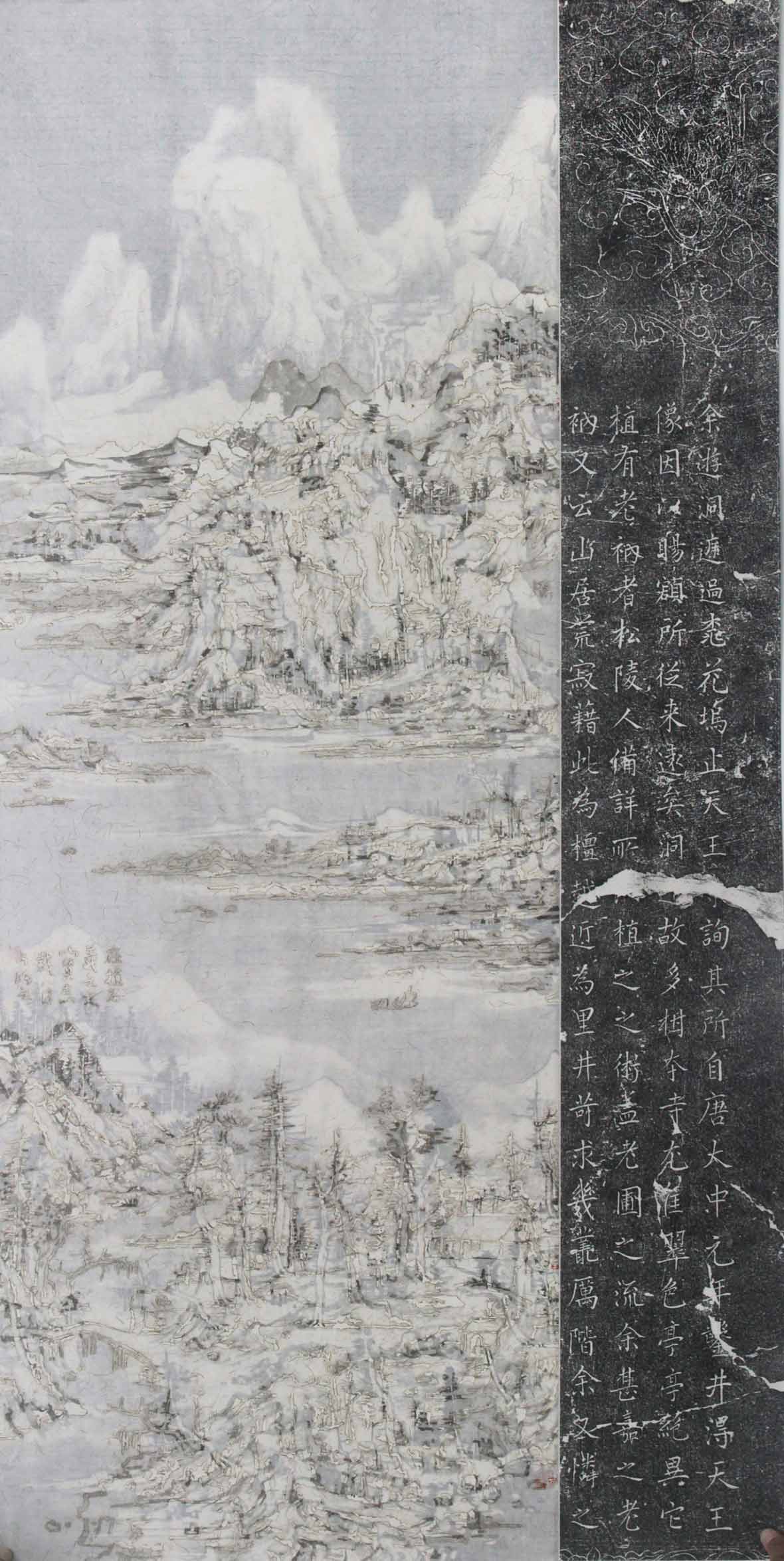
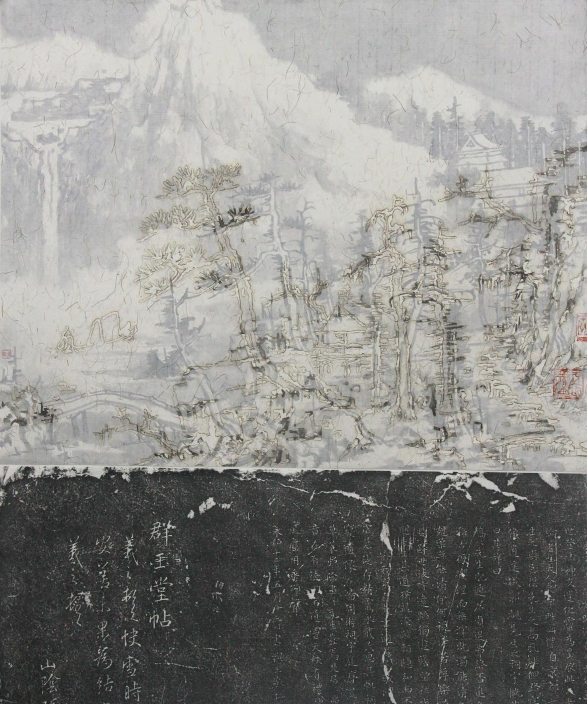
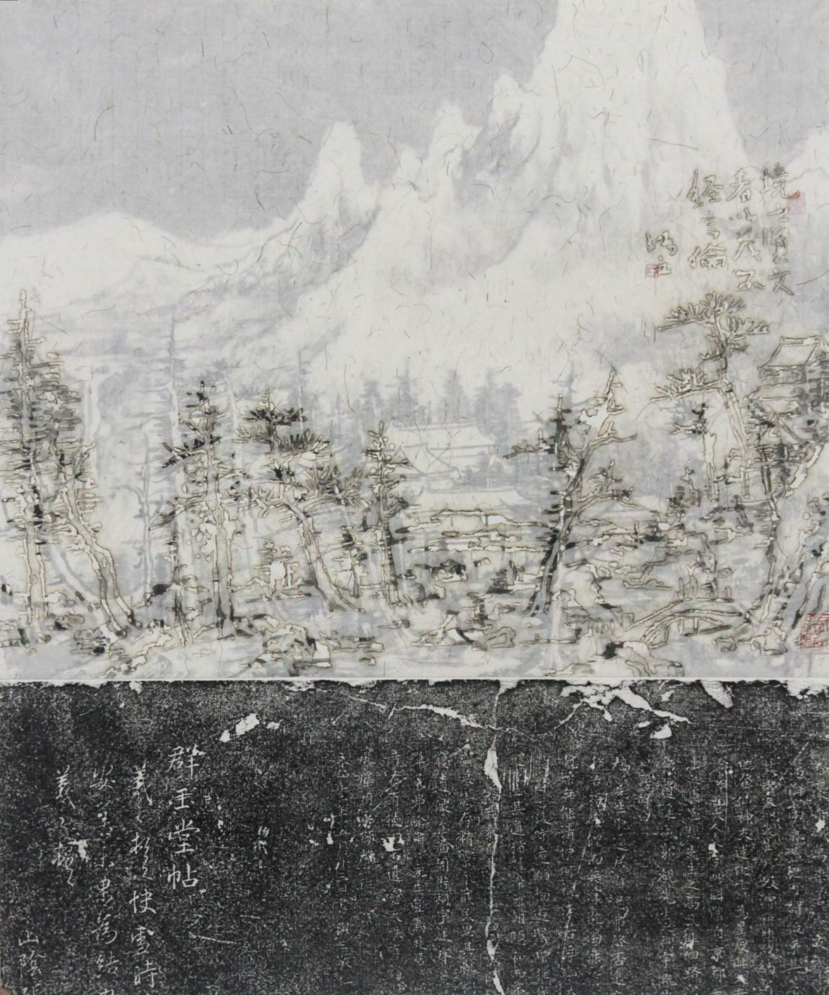
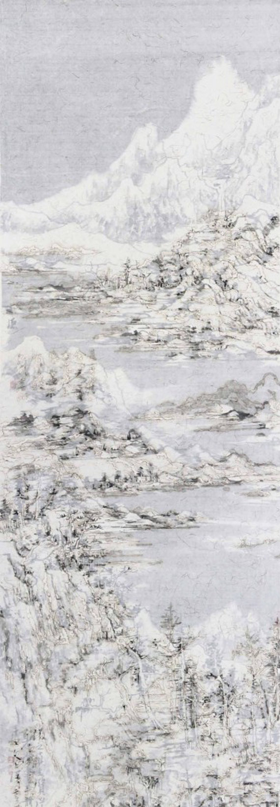
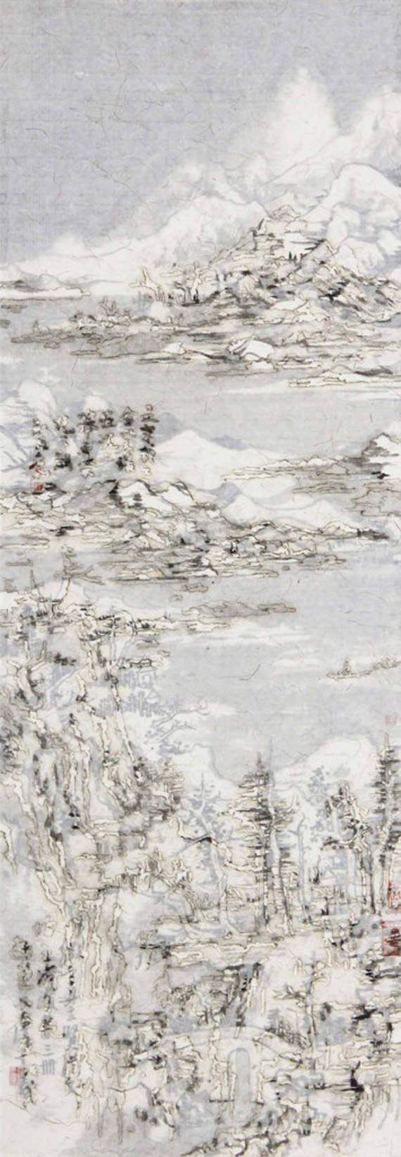
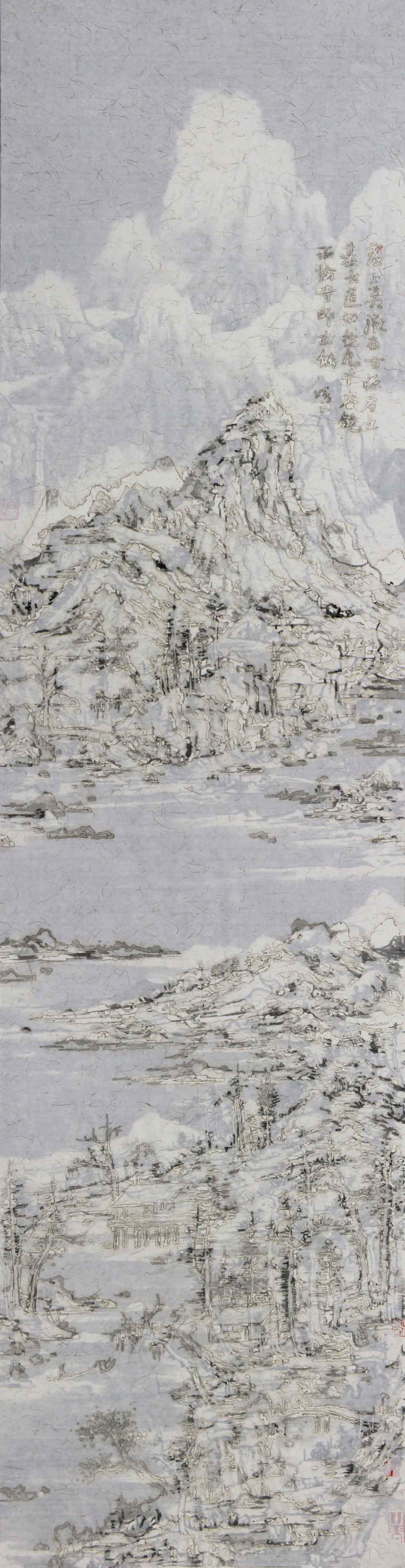
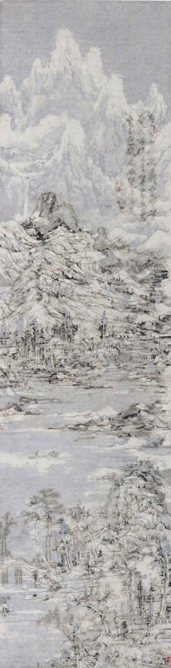
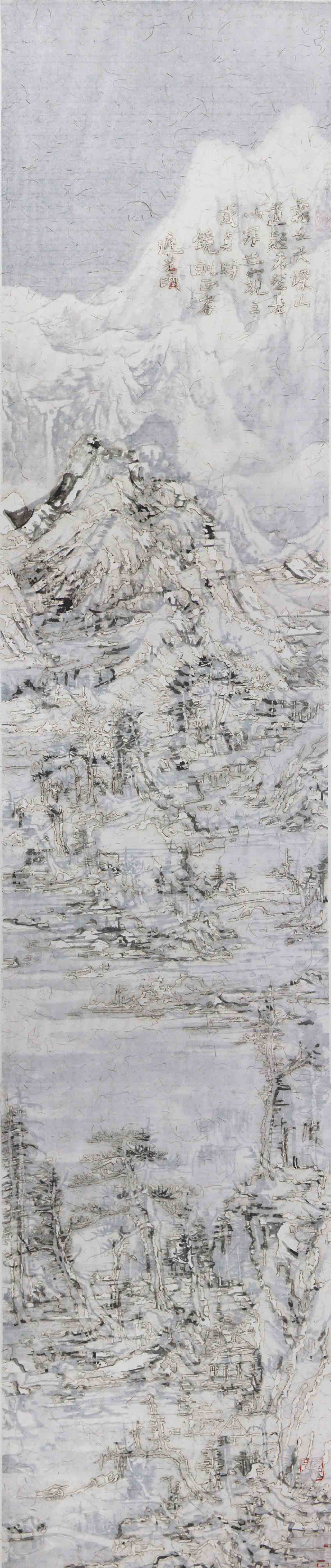
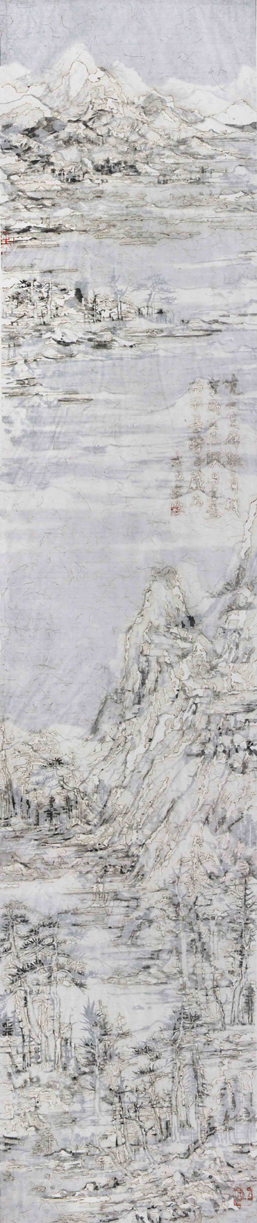
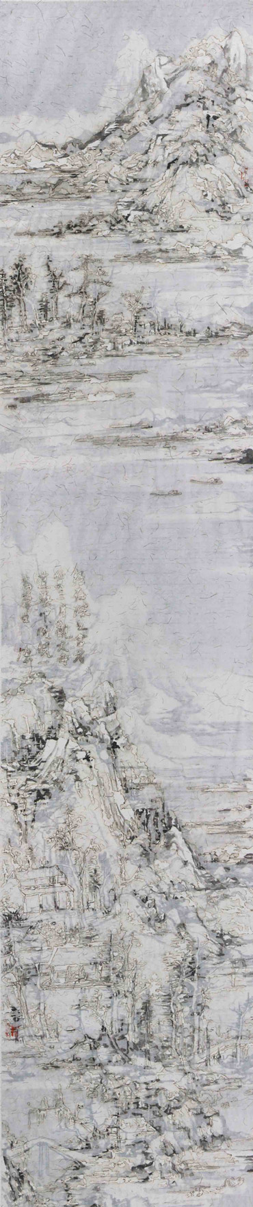
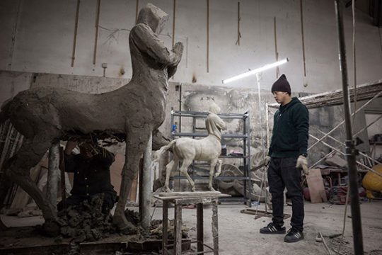
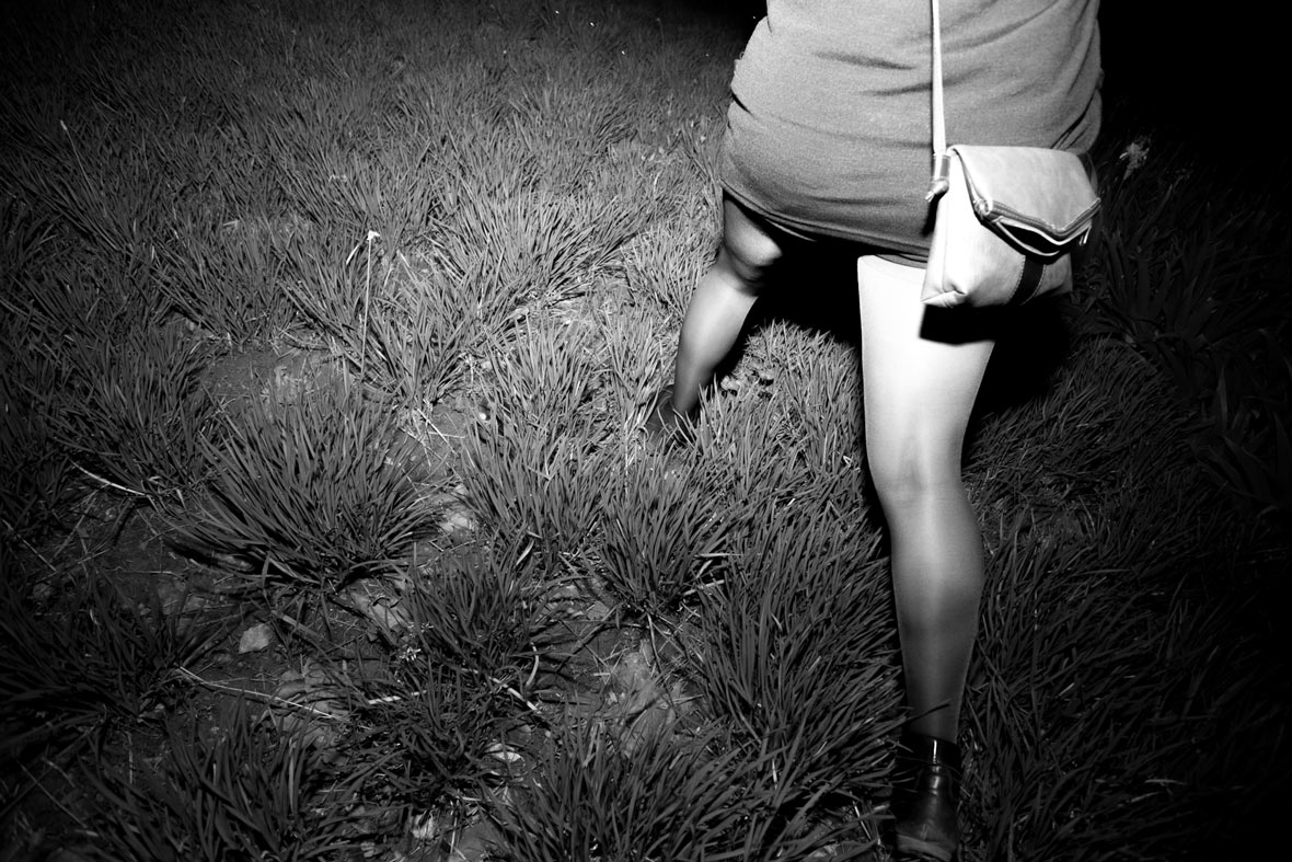
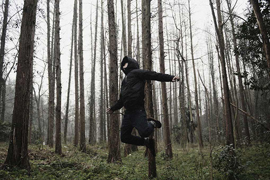
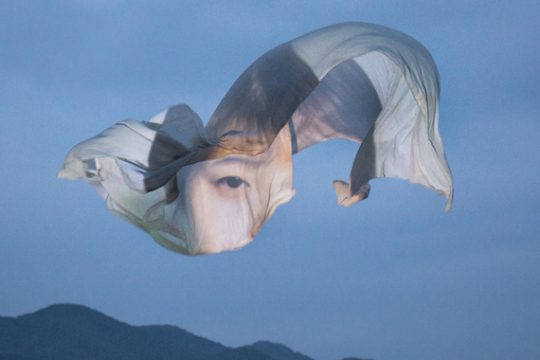
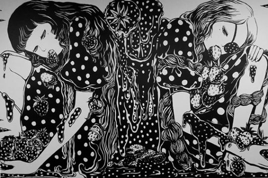
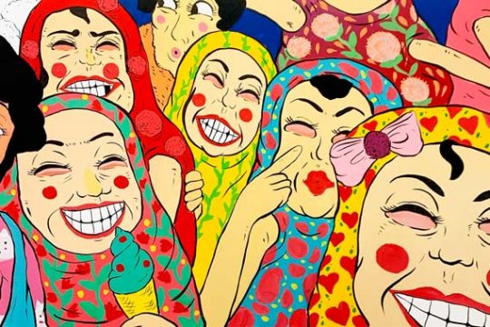
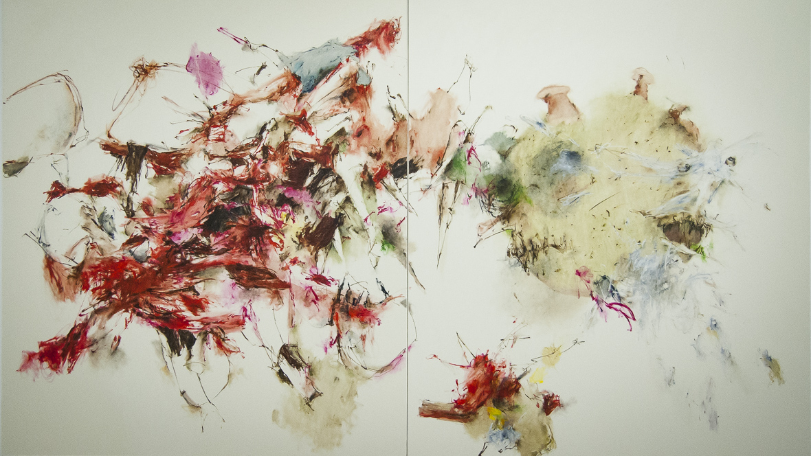
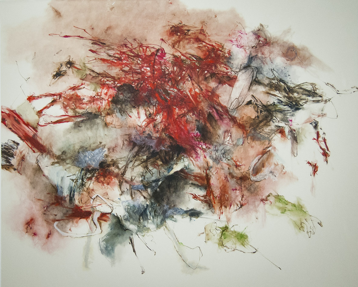
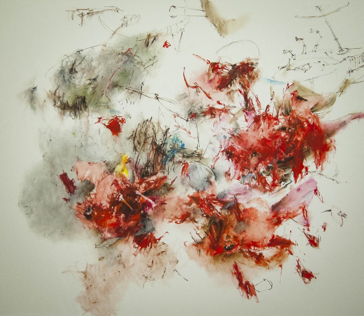
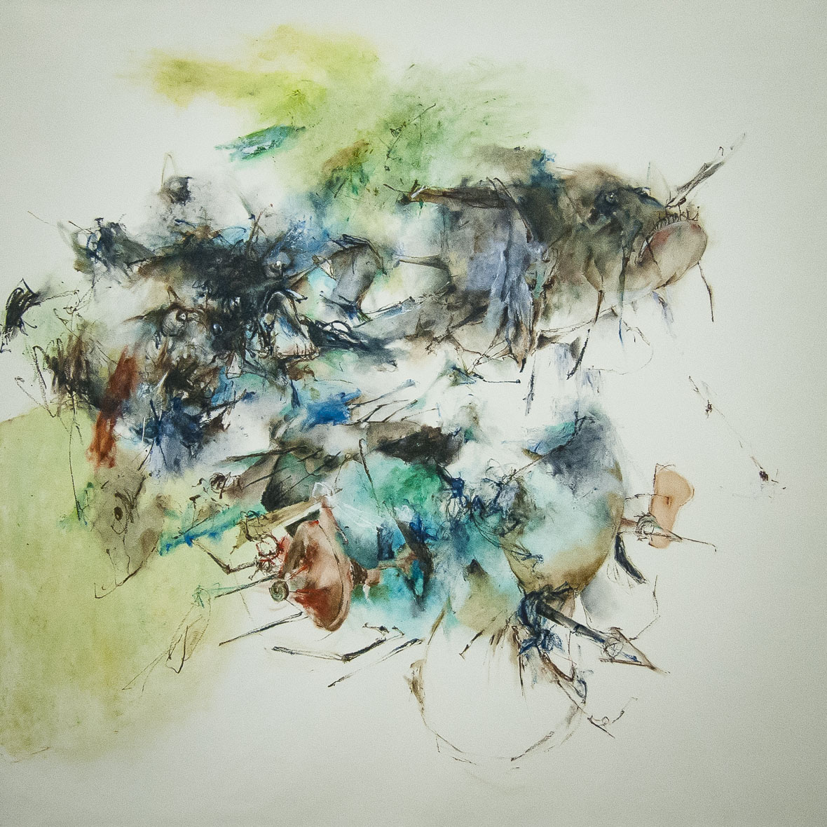
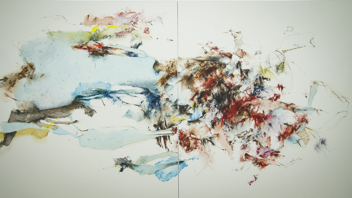
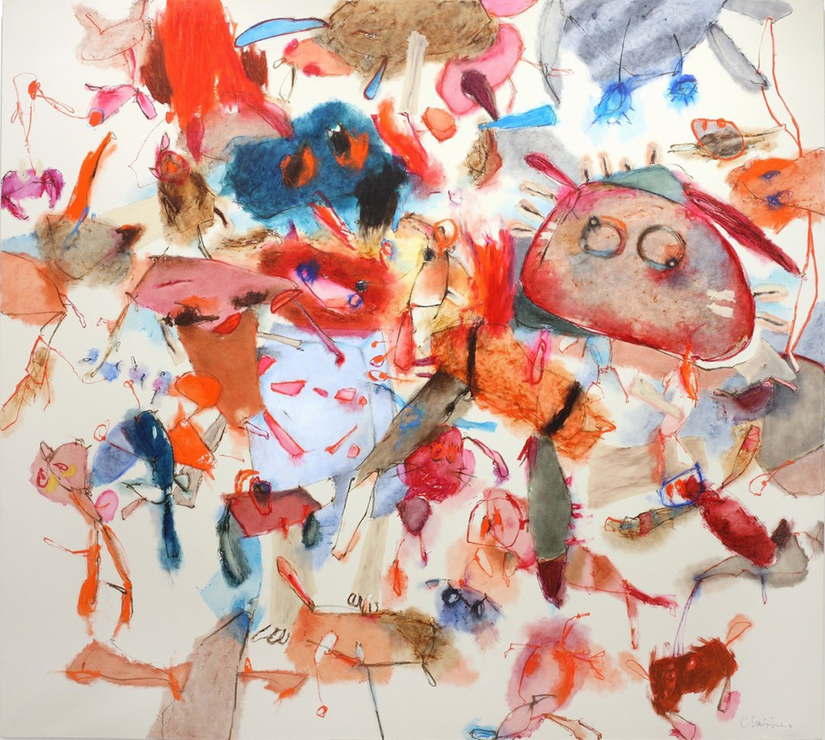
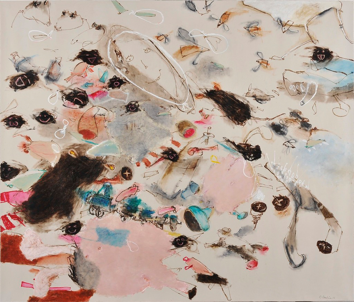
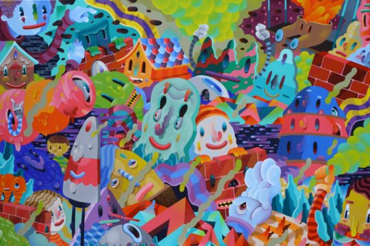
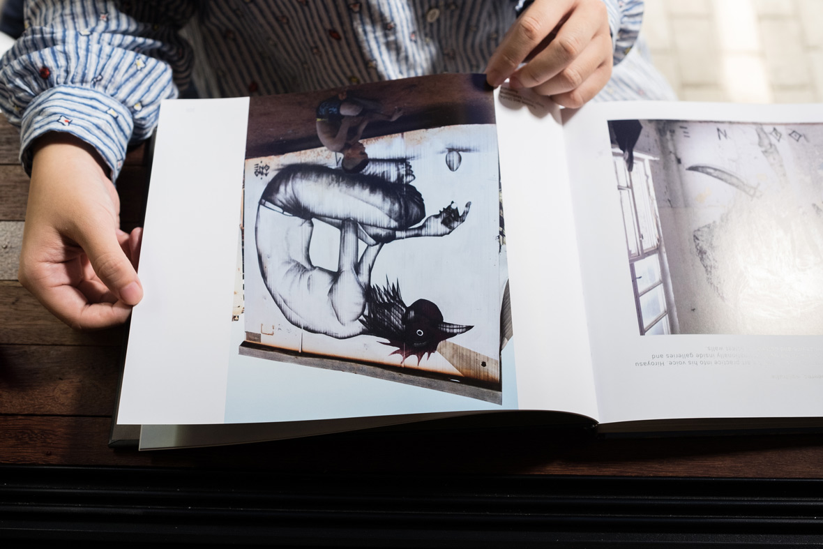
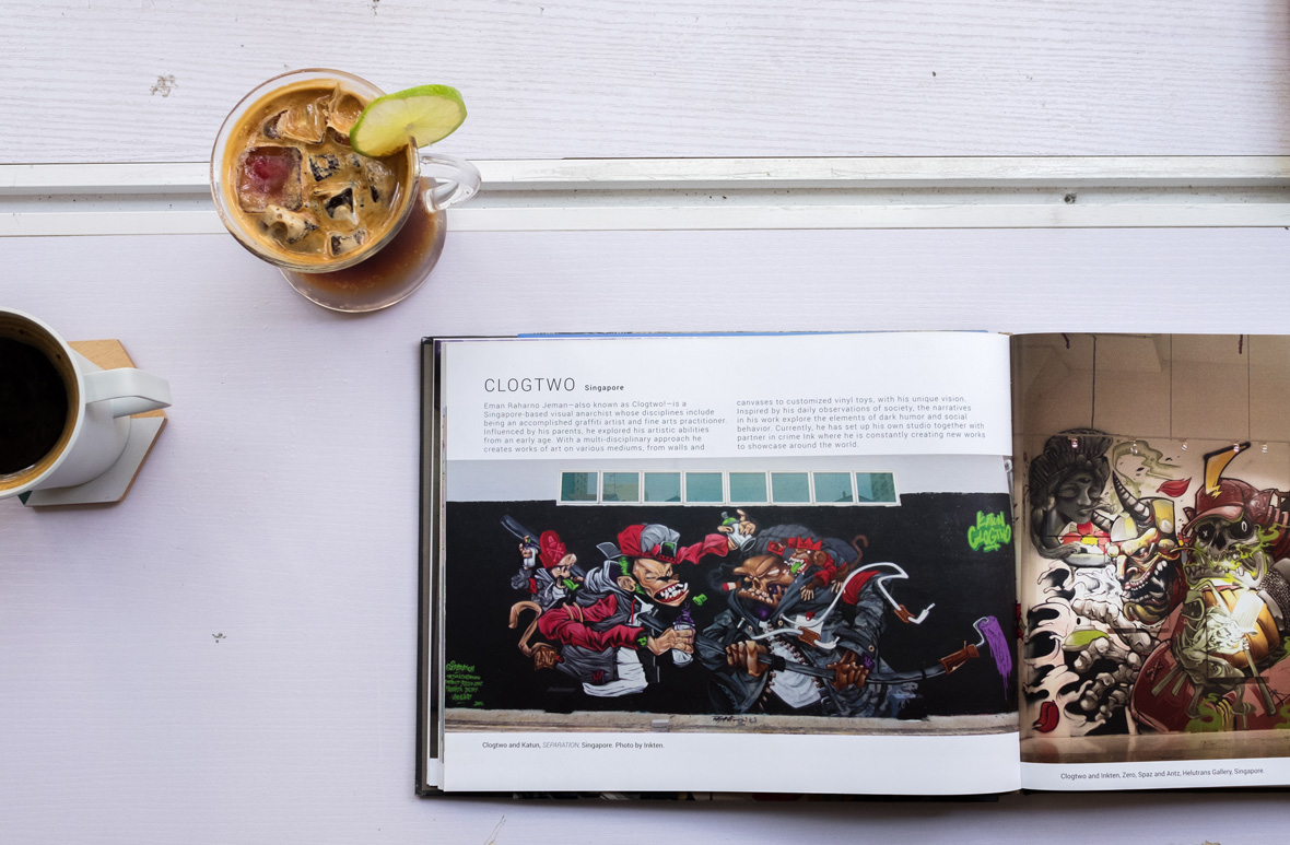
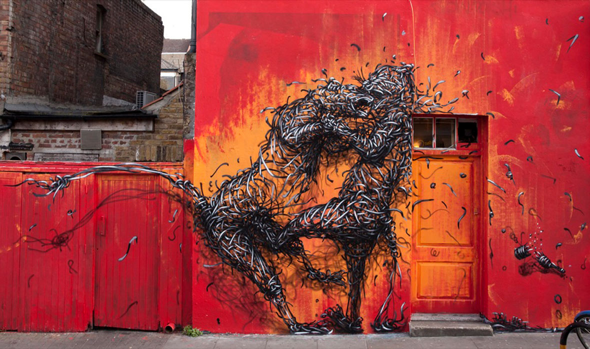
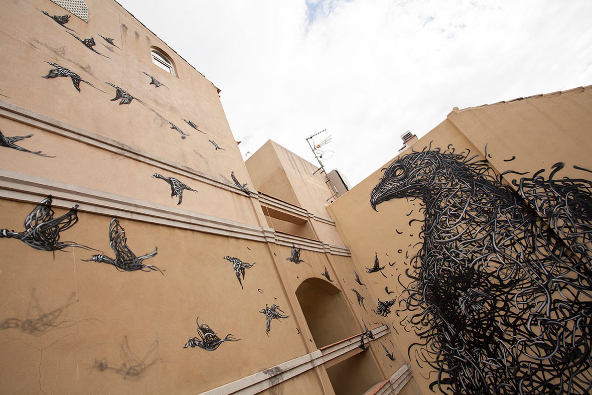
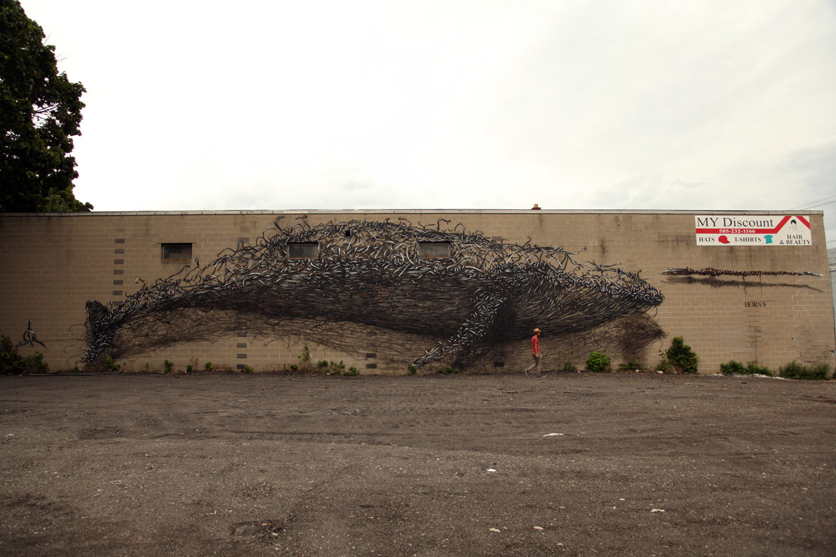
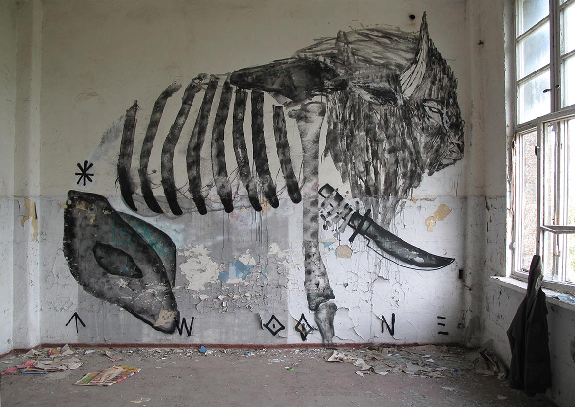
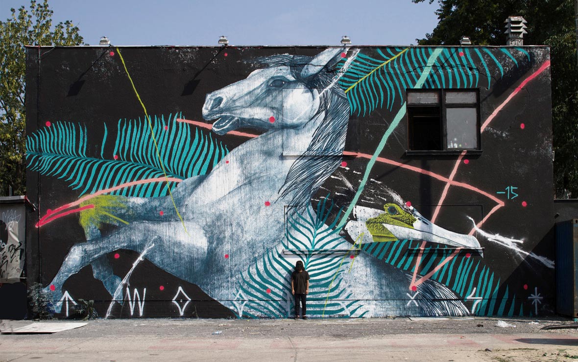
Based in Singapore, Clogtwo is a ‘visual anarchist’ whose style incorporates both graffiti art and fine art. His work is often aggressive, exploring the darker aspects of society but using black humor to create interesting and colorful narratives. DALeast’s fractured imagery is similarly dark, woven with intricate detail to look as though thousands of metal shards are converging together. This brings his figures energetically to life, alleviating them from their somber subject matter. As a Chinese artist, he is inspired by the way the material world revolves, how the spiritual world unfolds, life’s emotions and the infinite space between us, the questions his ancestors have been concerned with for centuries.


来自新加坡的Clogtwo是一位视觉艺术家,同时也是一位先锋的无政府主义者。他的作品融入了涂鸦和油画的绘图风格,同时思想激进,勇于探索社会黑暗之面,但也加入黑色幽默让创造变得趣味无穷。DALeast的作品里充满破碎的意向同样带着黑暗面的隐喻,他作品以繁复的细节营造出似是上千小金属碎片制成的立体效果,因而涂鸦中形象更加栩栩如生,同时也给严肃沉重的主题带来缓冲。作为华裔艺术家,DALeast一直在思考这个物质社会的运转方式,精神世界是如何呈现,生活中的喜怒哀乐,人与人之间的无限空间,以及那些从人类祖先就开始思考、困扰了我们几个世纪的难题。

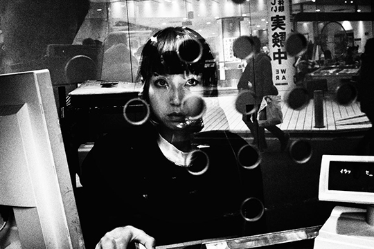
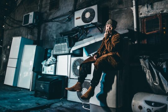
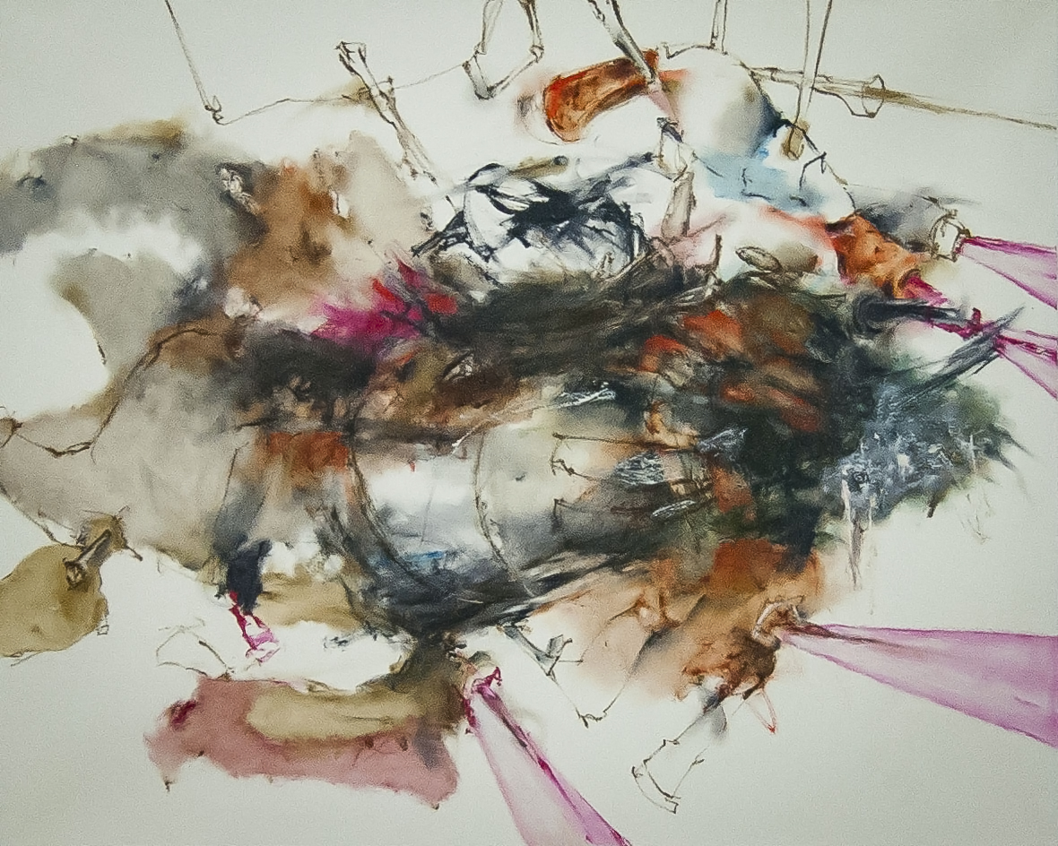
TWOONE’s work is equally dynamic, heavily influenced by his exposure to skateboarding and urban art subculture in both Japan and Australia. The artist moved from Tokyo to Melbourne at the age of eighteen, immediately becoming a prominent part of the local street art scene. He has continued to expand on the formal training he received in his youth, showing his work internationally inside galleries and, of course, outside on the streets.


受滑板的运动经历和在日本和澳大利亚的城市亚文化艺术影响,TWOONE的作品都充满了一种动态。这位来自东京的艺术家在十八岁时来到了墨尔本,不久便摇身成为当地街头艺术的领军人物。他正延续之前接收的正式艺术培训之路,继续深造,所以其作品不仅限于市井街区,也能在各地的艺术画廊里得以展出。

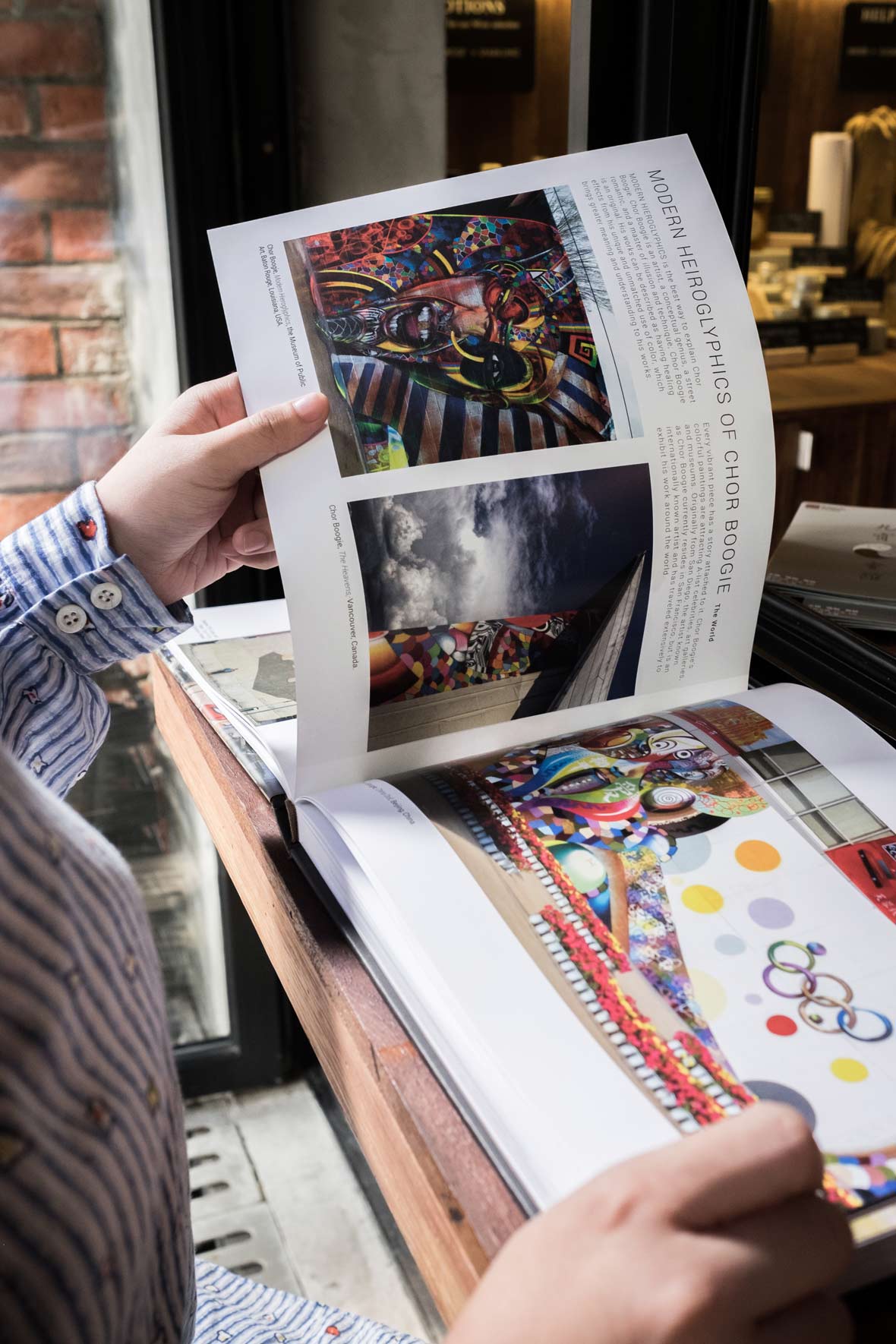
Art Whino gallery owner and creative director of the book, Shane Pomajambo, describes The Art of the Mural as capturing a particular moment in time, a personal observation and unification of a worldwide scene where artists have taken to the streets to creatively express themselves. He’s particularly amazed by street art culture’s ubiquitous history and equal development, that even if you exhibited thirty culturally different artists, the array of work could easily have come from one city. The Art of the Mural is now available for purchase from Schiffer Publishing and on Amazon.


该书的创意总监,同时也是Art Whino画廊的老板Shane Pomajambo称The Art of the Mural一书是某个时刻的捕获,以一种个性化的观察视角,串联起全球各地艺术家们在街头的创意之作。他尤其感叹于街头艺术文化那种俯拾即是的氛围和无差别发展历史,就算你展示了三十个不同文化风格的艺术家作品,其作品都有可能来自同一个城市。现在可以从Schiffer PublishingAmazon上购买The Art of the Mural

Contributor: Ruby Weatherall
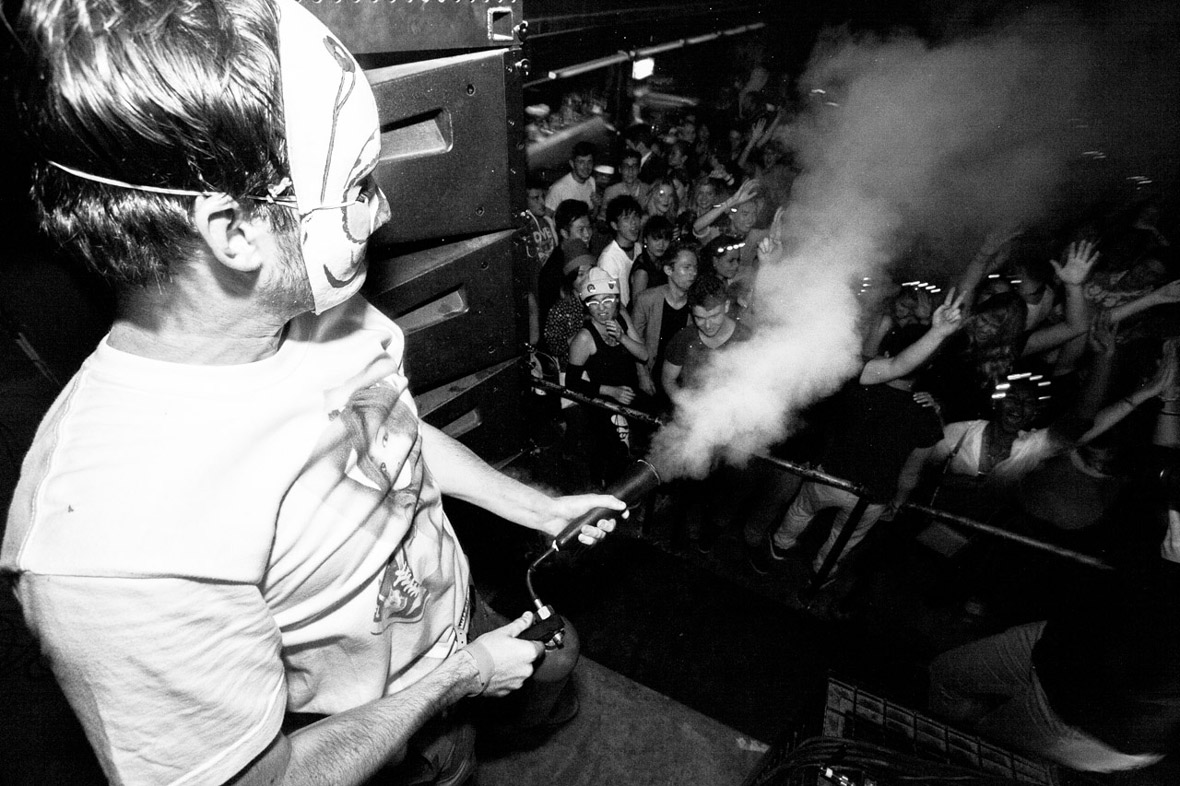
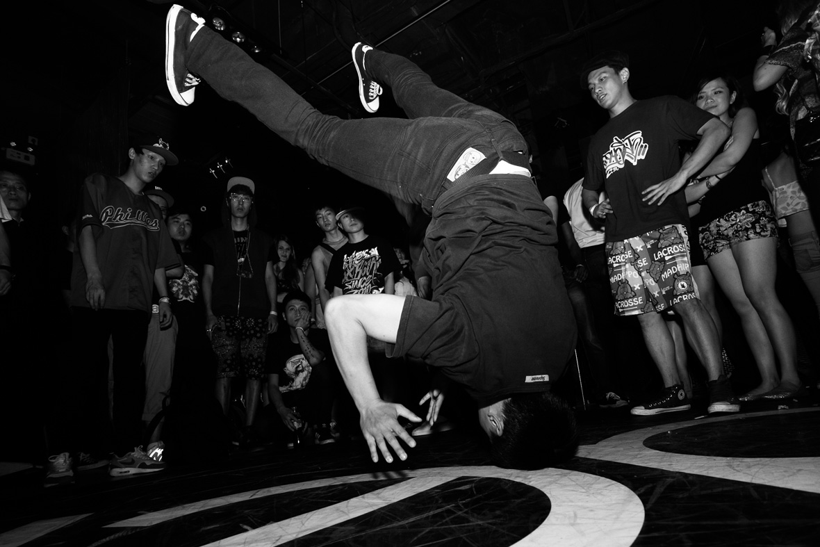
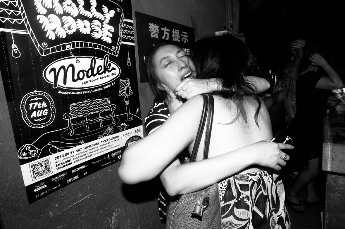
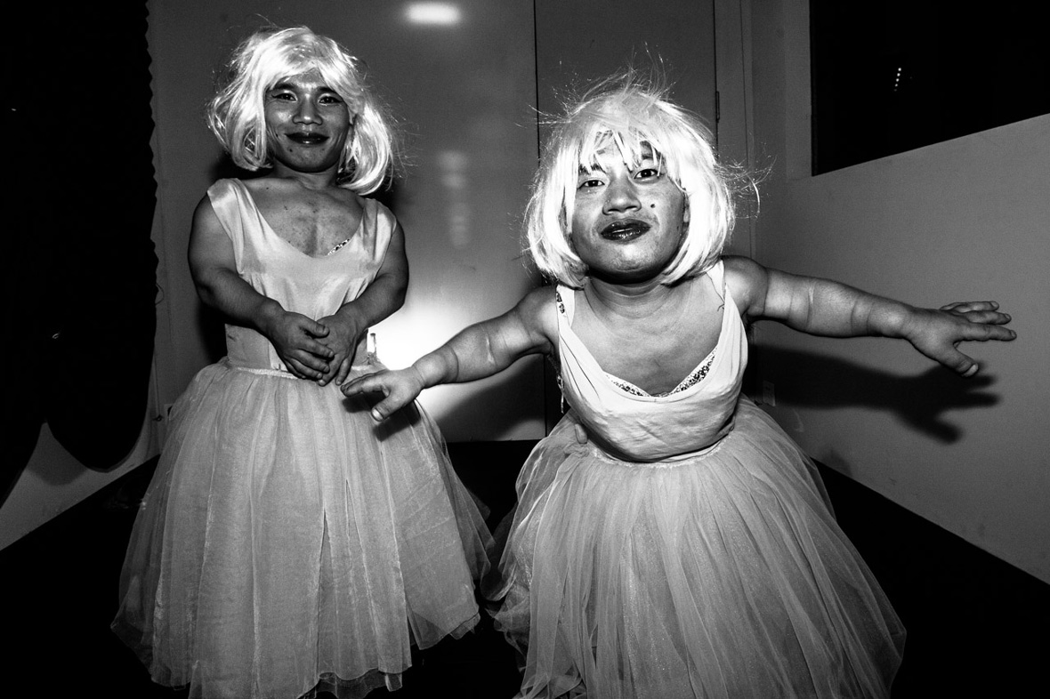
Photographer: Whitney Ng


Additional Images Courtesy of DALEast, Clogtwo & TWOONE


供稿人: Ruby Weatherall
摄影师: Whitney Ng


附加图片由DALEast, Clogtwo与TWOONE提供

Working with Negative Space

September 29, 2016 2016年9月29日

Contemporary Chinese artist Wang Tiande’s paintings engage with the cultural history of ink and its influence on the development of Chinese painting and personal expression. His work is deep and brooding, often rooted in classical landscapes and calligraphy but executed in a way that breathes new life and meaning into the traditional art form. His upcoming exhibition Literati Gathering will be showcased at San Francisco Bay’s Asia Art Week. It presents the artist’s “Houshan” series of layered, deconstructed compositional elements, created in his unique style as a response to the paintings and calligraphy of classical Chinese masters. Wang hopes to inspire discussion about the past, the present, and the ability to respect the timelessness of traditional art forms.


中国当代艺术家王天德的作品结合中国传统水墨画的文化历史,以及其对中国艺术发展和艺术家的表现形式所产生的影响力。其作品主旨深刻,充满哲思,常常以古代山水和书法为创作根基,同时也为传统艺术注入新的生机和寓意。他的展览Literati Gathering即将在旧金山湾区亚洲艺术周亮相。此次展示的是这位艺术家名为“后山”的系列画作,这组作品在对中国传统水墨和书法大家致敬的同时,以层次分明、解构组合元素的方式开创出独树一帜的艺术风格。王天德希望引发人们对传统和当代的探讨与思考,重拾对传统艺术里永恒魅力的尊重。

Born and raised in Shanghai, Wang Tiande graduated from the Chinese Paintings Department of Zhejiang Academy of Fine Arts before obtaining his doctorate degree from their Calligraphy department. Taking inspiration from the paintings and calligraphy of traditional Chinese masters such as Wu Hufan (1894 – 1968), Literati Gathering is a poignant choice of title for the series; the word Literati alludes to the class of Chinese scholar-painters who developed their style in the Song, Yuan, and Ming dynasties, and were generally more interested in personal erudition and expression over literal representation in their artistic style. Wang Tiande takes particular inspiration from Wu Hufan’s artistic attitude, for he stayed true to traditional Chinese art forms while embracing modernity.


土生土长于上海的王天德毕业于浙江美学学院中国画系,之后在书法系取得了博士学位。为展览取名为Literati Gatherin是受到如吴湖帆(1894 – 1968)等中国传统绘画和书法大师们的启发,此名也寓意深刻。 “文士”暗指的就是中国宋、元、明朝的人文画家一族,他们学识渊博,艺术造诣上极具个人风格。由于吴湖帆在融入现代元素的同时保持了中国传统艺术之精髓,王天德尤其受他艺术观的影响。

The work in Wang’s “Houshan” series is comprised of two layers, one negative and one positive. Each piece is supported by an under layer of rice paper, on which landscapes and inscriptions are rendered in traditional Yuan and Ming dynasty compositions and brushwork. Wang’s use of plain ink strokes and minimal color represents a common Literati lack of concern for ostentation, and an emphasis on personal, ethical expression. The upper surface of the paper is burned through with incense sticks instead of traditional brushwork in order to create another landscape through negative space. This separates the series from its traditional connotations and places it into a unique contemporary context.


王天德的“后山”系列画作构建于一正一负的两个层面,每一张作品都以宣纸为底,山水和题字都呈现出元明两朝的传统绘画和书写风格。淡墨和简色的运用,凸显“文士”不喜粉饰的共通点,同时也强调了个性化和精神伦理层面的表现形式。画纸上方用香烛以火灼取代传统毛笔,构建出灼空后的另一个空间的山水层面。这套从传统内涵中衍生而来的系列作品置入了与众不同的当代语境中。

By double layering each piece, Wang successfully adds texture, depth and complexity to the “Houshan” series of seemingly simplistic tones and landscapes. Although the layers overlap, they are intentionally mismatched in order to spark discussion about reconciling one’s past with the present. The lower layers are only partially visible through the upper layer of the painting. “For some things, full display is unnecessary. The value system of traditional landscape painting is obvious. We need not deny it. It exists,” Wang explains. “But our lifestyle and artistic discourse must be contemporary. These two layers, put together, will produce a new aesthetic experience.”


通过这种双层面作品,王天德在看似色调简单的山水画“后山”系列中,融合了质感、深度和复杂性。虽然不同的层面有所重叠,但却特意错位搭配,就是为了能唤起人们对传统和现代的思考和讨论。每张作品下面的一层在上层的覆盖下,只有部分可显现,王天德解释到,“对于某些东西,全部显示出来没有必要。传统山水画的价值体系无需赘言,我们也无需否认,它就真实地存在于此。但是我们的生活方式和艺术表现必须与时俱进。两个层面交织在一起,将会产生一种全新的审美体验。”

Wang also creates an illusion of spatial depth by layering his pieces. He describes the creation of the virtual “third space” between the layers as an opportunity for debate, where contemporary people can appreciate and engage with ancient art as well as modern art. By working with negative space, he succeeds in generating apparent depth and space in his pieces and presents how complexity can come from simplicity. The simple layering of sheets of rice paper masterfully fuses two diametrically and chronologically opposed techniques, in a result that is both seamless and refreshing.


王天德以层次分明的作品创造出一种空间深度有致的幻境。他把这个夹层间虚拟“第三空间”的创作称为一种探讨机会,借此让当代人在欣赏或进行现代艺术创作的时候,多回望一下传统文化。繁自简出。以一种与“正”相对的“负”层创作,他在其画作中成功构建了一种可视的深度和空间。层层的宣纸通过精巧的排列,融合了两种截然不同,甚至是跨时代的艺术技巧,最终呈现无缝连接的艺术效果,让人眼前为之一亮。

Websiteartsy.net/wang-tian-de


Contributor: Ruby Weatherall


网站artsy.net/wang-tian-de


供稿人: Ruby Weatherall

Shan Café

September 28, 2016 2016年9月28日

Located in East Beijing, Shan Café was first conceived when its owner wanted to convert the first and second floors of an office building into a café with a large open area, which would encourage customers to stay and communicate freely. Since the client also enjoyed the mountains, the space was specially but subtly designed to hint at mountain landscapes and the great outdoors.


山咖啡位于北京东侧,最初业主想利用办公楼一、二层构建一个空间开阔的咖啡馆,让顾客随意逗留,自由沟通。由于业主喜欢山野的环境,因此希望在空间设计时能够巧妙嵌入山林和户外元素,享受自然的美好。

The budget to design and construct the café was a bit limited, so only commonly attainable materials were used. One anomaly of the space was that its first level was 3.8 meters high, which is too high for one floor, but not really high enough for two. So the design of the space turned out to be full of challenges for the Beijing studio Robot 3, who were tasked with the project of bringing Shan Café to life.


由于咖啡馆的预算和施工经费有限,所以只能用常见的材料进行建构。整个空间有一处有意思的地方,其层高非常特别,有3.8米,做单层太高,两层又比较紧张。对于接手了这个项目的北京Robot 3工作室来说,怎么构思这样的空间使之焕然一新并融入活力,确实充满挑战。

The word shan, meaning mountain in Chinese, reminded the designers at Robot 3 of a poem written by Su Shi: “From the side, a whole range; from the end, a single peak; Far, near, high, low, no two parts alike. Why can’t I tell the true shape of Lu Shan? Because I myself am in the mountain.” The poem would give the designers a crazy idea to dig down one meter at the center of the entire space, and then build a large mezzanine over it.


Shan Café的“Shan”在中文中就是“山”的喻义,这让设计师想到苏轼的一首诗:“横看成岭侧成峰,远近高低各不同。不识庐山真面目,只缘身在此山中。”于是突发奇想地在空间的中央部位向下又挖了一米,然后在上边建立一个夹层。

When customers walked into the lower level through the mezzanine, it would very subtly simulate the experience of “walking into the mountain”. The floor height of the mezzanine is quite low, so once inside it, customers could only sit or lie down, which makes it a good area for chatting amongst a couple of friends. Under the stairs which lead to the second floor, there is a log cabin.


当顾客通过夹层向下步入挖出的“负一层”时,营造出来一个仿若“走进山林”的特别空间体验。另一处夹层空间较矮,顾客进去后只能在里边坐着或躺着,但非常适合三两朋友在此闲逸聊天。在通往二层的楼梯下面做了一个小木屋。

The second floor is divided into several small areas, but instead of building solid partitions, Robot 3 made shelves stacked with rows of green plants. As the plants inevitably would grow, the space would also change with the passage of time. Design features such as this and the choice of construction materials were all carefully considered to maximise the flexibility of the space and to enhance the feeling of comfort for visitors. Here is a space that, despite being in downtown East Beijing, effectively evokes the airiness and openness of the great outdoors.


二层划分了几个小空间,Robot 3没有用实体的隔墙,取而代之的是绿色的植物搁架。随着时间流逝,绿植恣意生长,形态变迁。无论是诸如此类的设计特色还是在建筑的选材方面,都是设计师的精心安排,最大程度发挥空间的灵活性,让来访者如沐春风。尽管此地位于北京东侧的繁华市区,却仍能打造大自然的空间流动之感和开放自由之美。

Websiterobot3.com


Contributor: Leon Yan
Photographer: Xi-Xun Deng

Photos Courtesy of Robot 3 Studio


网站robot3.com


供稿人: Leon Yan
摄影师: Xi-Xun Deng

图片由Robot 3 Studio提供

You Might Also Like你可能会喜欢

When the Sun Goes Down in the East

September 26, 2016 2016年9月26日

When Dutch photographer and filmmaker Marc Ressang first arrived in Shanghai five years ago, he was fresh out of university and nearly broke all of the time. To make ends meet during those first few years in Shanghai, he did a lot of nightlife photography. Ressang originally came to Shanghai from the Netherlands for an internship in marketing, but later decided to turn his hobby into a full-time gig.


五年前,荷兰摄影师兼电影人Marc Ressang初到上海,那时的他刚刚走出校园,经济拮据。为了生计,在上海的最初几年里,他接了很多拍摄夜生活的摄影工作。最初从荷兰来到上海的时候,Ressang的身份还是市场营销实习生,但之后,他决定将自己的爱好转变成正职。

“In Shanghai, I still like shooting late at night,” he says, “There is always something unexpected. I bring a small camera with me every time I step out of the house, just in case I run into something weird.” There is always “plenty of weird stuff going on late at night”, according to Marc, especially in a city like Shanghai. One of the most extravagant things he ever witnessed while he was out shooting was “when one of China’s richest men walked into a nightclub, ordered 140 bottles of Dom Perignon, sprayed 10 of them, had a few sips and then walked out again.”


“现在在上海,我仍然是喜欢深夜出去拍照,”他说,“这里总有意想不到的事发生。每次出门,我都会随身带个小相机,有备无患。”据Marc表示,“深夜里总会发生大把奇怪的事”,尤其是在上海这样的城市。外拍时,他目睹过最奢靡的一个场景就是:一个中国顶级富豪走进一家夜店,点了140瓶名贵香槟Dom Perignon,打开,喷洒了其中10瓶,嘬了几口,随后就走了。”

“Fast forward three years, and I just couldn’t keep up physically with going out five nights a week until the early morning,” Marc admits. Needless to say, staying up every night also prevented him from being productive and having a life during the day. “Having so many interesting nightlife shots that never got published – the promoters usually weren’t very interested in photos of their patrons making fools out of themselves,” he explains, “I decided to put together a one-night-only photo exhibition at Basement 6 to show the 100+ pics that never made the cut.” And so, his photo series When the Sun Goes Down in the East was born.


Marc承认: “三年之后,一周通宵达旦个五次,我的身体就实在吃不消了。自不必说,这样的方式让他在日间无法拥有好的工作效率和正常的生活。我有太多有意思的夜生活摄影作品没有发布出来——推广人员通常都不愿意在照片里看到他们顾客出丑的样子。”他解释道,“我决定把这些照片放到Basement 6,做一个只展一个晚上的图片展览,展出上百张没有被采用的摄影作品。于是,他的《When the Sun Goes Down in the East》图片系列就此诞生。

Ressang describes his photographic style as being “observational, real, and (even) cynical at times”. He tries not to fall into clichés or repeat himself, admitting that he can get bored pretty quickly. Regardless, he always tries to have a camera on hand when he is out and about. His main goal is to document culture in its every form, which could be anything from quirky dog outfits that he sees on the streets of China, to ancient religious rituals on a tropical island in Southeast Asia. He makes an effort not to romanticize other cultures, and tries to show that a lot of elements are actually universal or similar to our own culture.


Ressang是这样定位自己的摄影风格:“观察而来,真实可感,时不时(还)带点讽刺”。虽说他容易陷入倦怠情绪,但他尽量不让作品落入俗套或者或重复自己。而无论何时出门在外,他一定会随身携带一个相机,从各个层面记录文化,可以是中国大街上狗狗们的奇装异服,也可以是东南亚热带岛屿上古老的宗教仪式。他力图不去粉饰其他文化,同时也希望展示出有普世价值的文化元素,或者是那些与自身熟悉的文化相似的影子。

As a filmmaker, Marc Ressang has also adopted a more documentary approach with his subjects. His sense of composition and timing from his photographic work has had a huge influence on his approach to filmmaking. As a result, he says that he tends to work quite fast and doesn’t usually worry about details, for better or for worse.


作为一个制片人,Ressang还采用了更多偏纪实记录的方式表现其主题。而他摄影作品的空间感和时间感对他影视制作过程中也产生了很大的影响。因此,他更喜欢快速的工作节奏,不会太在乎细节,不管那是点睛之笔或者毁堤蚁穴。

For Marc, filmmaking is now his main bread and butter – but he enjoys taking photos more than anything. As a result, he has decided to keep photography as his passion project instead of forcing himself to make a living out of it. Currently Marc is trying to get a foothold in documentary projects for both photo and video. At the moment, he is chasing a number of cultural stories in the far corners of China and around Southeast Asia, but they are all self-funded and unsponsored trips.


Marc现在主要收入来自于他的制片人身份——但他最爱的还是摄影。他决定依旧保持这样的状态,把摄影作为自己的爱好项目,而非维持生计的工作。现阶段的Marc正立志在纪录片领域的摄影和视频制作上树立风格,找到自己的位置。目前,他正在挖掘中国边缘之地以及东南亚各区的文化故事,这个项目的旅程没有赞助,全部依靠自筹资金。

Websites:
marcressang.com
highhorsestudios.com

Instagram: @unioz


Contributor: Leon Yan


网站:
marcressang.com
highhorsestudios.com

Instagram: @unioz


供稿人: Leon Yan

Little Toy Big Seoul

September 26, 2016 2016年9月26日


无法观看?前往优酷

Toyanna Rae (aka Toy) is a rapper, singer, and songwriter based in Seoul, South Korea. Originally from the United States, she moved to Korea in 2010, where she became involved with Seoul’s hip-hop community. After making herself known in the underground rap community, she appeared as the only non-Korean contestant on seasons one and three of the Korean TV rap competition Show Me The Money, rapping bilingually in English and Korean. We spoke to Toy about her views on the local hip-hop scene and her experience in Korea’s music industry.


Toyanna Rae (일명 Toy) 한국에 기반을 랩퍼이며 싱어송라이터이다. 미국에서 태어난 그녀는 2010년에 한국으로 건너와 서울의 힙합 커뮤니티에서 활동하기 시작했다. 그녀 자신을 언더그라운드 힙합 그룹들 사이에 알린 , 한국의 TV 콘테스트인 쇼미더 머니 시즌 1 3 유일한 외국인으로 참가하여 영어와 한국어의 이중언어 랩을 구사하였다. 우리는 Toy 만나 로컬 힙합씬과 한국 음악 산업에 대한 그녀의 경험을 들어 보았다.

Neocha: How did you first become interested in Korea and Korean culture? What made you want to move to Korea in the first place?

Toy: I knew that after I graduated from university I wanted to travel. At the time, I had several Asian American friends and was looking through one of my friend’s blogs and came across a Korean music video. I thought the song was nicely done, so I started looking into Korean music as well as jobs available for Westerners in South Korea. I always wanted to do music, so why not try it in Korea?


Neocha: 어떻게 처음 한국과 한국 음악에 대해 관심을 갖게 되었습니까? 무엇이 한국을 당신이 가고 싶은 번째 장소가 되게 했습니까?

Toy: 저는 제가 대학을 졸업한 여행을 하고 싶다는 것을 알게 됬어요. 당시 저는 명의 아시아계 미국인 친구들을 알고 있었는데, 친구들 명의 블로그를 읽어 보다가 한국 음악 비디오를 접하게 되었어요. 저는 노래들이 정말 만들어 졌다는 생각이 들었어요. 그래서 한국에서 서양인에게 가능한 일자리를 찾으면서 동시에 한국 음악을 깊이 살펴보기 시작 했어요. 저는 음악을 하고 싶었는데 한국에서 이것을 해보지 못할 이유가 있겠어요?

Take a listen below to a few select tracks from Toy:

Toy – Leaders (feat. Pinnacle TheHustler & Jake Pains)

Toy – Donnie Darko (feat. Samuel Seo)

Toy – 불 붙여봐라 (Toy Remix)


Toy 노래 몇 곡을 아래에서 들어볼 수 있습니다:

Toy – Leaders (feat. Pinnacle TheHustler & Jake Pains)

Toy – Donnie Darko (feat. Samuel Seo)

Toy – 불 붙여봐라 (Toy Remix)

Neocha: How did you get started rapping bilingually? How does your creative process differ for your Korean versus English raps?

Toy: I wouldn’t really consider myself a bilingual rapper. When I did season three of Show Me The Money, I wasn’t really allowed to rap in English, I was told that I needed to rap mostly Korean. So that’s where the Korean-English raps came in. Writing Korean raps is actually really difficult for me, because I’m not completely fluent in Korean. Another thing is that the Korean language isn’t as phonetically flexible as English. When writing a Korean rap, I would first have to write my ideas in English, then translate them into Korean. Then I would have a Korean friend check it over and help me with punchlines or phrases that I didn’t know how to say. It’s actually a really long process, and by the time that I finish, sometimes I feel like it’s no longer really even my own rap.


Neocha: 어떻게 이중언어 랩을 시작하게 되셨나요? 창작 과정에서 영어 한국어 랩은 어떻게 달랐나요?

Toy: 저는 자신을 이중언어 랩퍼라고 생각해 보지 못했어요. 쇼미더 머니 시즌 1 나갔을 , 저는 영어로 랩을 수가 없었어요. 랩의 대부분을 한국어로 해야 한다고 들었거든요. 그래서 한국어영어 랩이 탄생하게 되었어요. 한국어 랩을 쓰는 것은 저에게 정말 어려운 일이었어요. 한국어는 완전히 유창하지 않았거든요. 리고 한국어는 영어와 달리 소리면에서 그리 유연하지가 않아요. 한국어 랩을 때는, 생각을 먼저 영어로 써야 했어요. 그런 다음 한국말로 번역을 했죠. 그리고 한국 친구에게 이것을 확인해 달라고 부탁했고, 제가 어떻게 말해야 할지 모르는 핵심 구절이나 문구에 대해 도움을 받았어요. 이것은 실제로 정말 과정 이어서, 마침내 끝냈을 때는 가끔 이게 이상 자신의 랩이 아니라는 느낌이 들기도 했어요.

Neocha: As a foreigner, what are your perceptions of the Korean culture industry?

Toy: It is very difficult for a foreigner (non-Asian) to make it in the music industry here. In all honesty, I don’t think Korea is at the point yet where they’re willing to accept any non-Asian artists in their entertainment companies. I guess you can compare it to how difficult it is for Asians to try to make it in the music industry in America. Korea is also a very homogenous country, making it more difficult for foreigners to break into the industry. Don’t get me wrong though, it’s pretty easy to stand out as a foreigner here, but it’s not easy to get considered seriously for the industry.


Neocha: 외국인 으로서, 한국 문화 산업에 대해 어떻게 생각하시나요?

Toy: (아시아계) 외국인이 이곳 음악 시장에서 성공한다는 것은 매우 어려운 일입니다. 정말 정직하게 말하자면, 한국의 엔터테인먼트 비즈니스는 아직 아시아계 예술인들을 받아 들일 준비가 되어있지 않은 같아요. 미국 음악 시장에서 아시아인이 성공하는 것이 얼마나 어려운지 비교해 보시면 쉬울 같아요. 한국은 또한 매우 단일한 민족 국가 라서, 외국인들이 분야를 뚫고 들어가는 것이 더욱 어려운 같습니다. 오해 없이 들어 주세요. 이곳에서 외국인으로서 튀는 것은 정말 쉬워요. 하지만 산업 분야에 진지하게 받아 들여지는 것은 쉽지 않습니다.

Neocha: Hip-hop has become mainstream in Korea over the course of the past decade. Where do you think the culture is headed in the future?

Toy: I honestly feel that hip-hop in Korea is just a trend. While it’s become more popular over the past couple of years, it is still K-pop that really dominates the mainstream media and the charts. Also, because most Korean artists have little experience abroad, hip-hop isn’t rooted in Korea the same way it is in America. Artists in Korea generally imitate the artists they see in America, and because of that, I feel like hip-hop in Korea isn’t as innovative as it could be. Nevertheless, I’m thankful to have been a part of this community and to have had this experience.


Neocha: 지난 십여년 한국에서 힙합은 음악계의 주류가 되었습니다. 미래에는 문화가 어느 쪽으로 흐를 것이라고 보고 있나요?

Toy: 저는 솔직히 한국에서의 힙합은 단지 유행이라고 느껴요. 지난 몇년 동안 힙합이 점점 대중적이 되었지만, 여전히 K-팝이 미디어 흐름과 차트을 점령하고 있어요. 또한, 한국 음악가들이 해외에 대한 경험이 적기 때문에, 한국에서 힙합이 미국에서 처럼 뿌리 내리진 않았어요. 한국의 음악가들은 일반적으로 그들이 미국에서 음악가들을 모방하죠. 그것 때문에 한국 힙합은 훨씬 창의적이어야 함에도 불구하고 그렇지 못한것 같습니다. 하지만 저는 제가 공동체의 일원이 것과 이런 경험을 하게 것을 감사하게 생각해요.

Soundcloud: ~/toy-anna-brown
Facebook
: ~/toyannarae
Instagram: @toyannarae


Contributor & Videographer: George Zhi Zhao
Additional Images Courtesy of Toyanna Rae


Soundcloud: ~/toy-anna-brown
Facebook
: ~/toyannarae
Instagram: @toyannarae


기고자 & 비디오그래퍼George Zhi Zhao
Additional Images Courtesy of Toyanna Rae

Every City Has a Bloodline

September 23, 2016 2016年9月23日

Think of your daily commute – that twice a day round trip bringing you from point A to point B on the road (nearly) always travelled. For the vast majority of big city dwellers, public transport is not only a thrifty choice, but also one of convenience and efficiency; in a city populated by the millions, traffic can be time crippling. This journey has become one of our most consistent daily rituals – it’s almost like our bodies become systematically aware of when to alight and the number of minutes it takes to walk through an interchange. Seoul-based Art Director Kim Ji-Hwan of ZERO PER ZERO design studio, describes subway systems as the “bloodline” of each city – the crux that seamlessly links people and places together.


매일 반복되는 출퇴근을 생각해보자. A 지점에서 B 지점까지 길을 따라 (거의) 항상 여행하듯 매일 왕복한다. 대부분의 대도시 거주자들에게 대중 교통이란 단순히 저렴할 뿐만 아니라 편리하고 효율적이기도 한 교통수단이다. 따라서 대중 교통을 이용한 여정은 이제 우리 삶의 일상적인 의식 중의 하나가 되어버렸다 – 우리의 몸은 거의 조직적으로 어디에서 하차해야 할 지 그리고 인터체인지를 걸어 나가는데 몇분이나 걸릴 지 이미 아는 듯하다. 서울에 소재한 제로퍼제로 디자인 스튜디오의 김지완 아트 디렉터는 도시의 지하철 시스템을 도시의 “혈관” – 사람들과 장소를 매끄럽게 연결하는 중심점 – 이라고 부른다.

In 2006, Kim spent a year in Japan as an exchange student at Tama Art University; his stay in Tokyo fuelled his interest in subway lines, fascinated by how each transit system could feel so familiar and foreign – a feeling that hinged completely on one’s own understanding of the city. Whilst at Tama, Kim was inspired to create an infographic map of the famed Tokyo Metro system, which was to become the first of many maps in his City Railway System series. Ten years later, his studio, ZERO PER ZERO have produced infographic maps that span major cities around the world, including Tokyo, New York City, Seoul, Paris, Beijing, Osaka, Barcelona, Berlin, Amsterdam, London and Hokkaido.


2006년 김지완은 Tama Art University의 교환 학생 자격으로 일본에서 1년을 보냈다. 도쿄에서 보낸 시간 동안 그는 지하철에 관심을 갖게 되었다. 그는 각각의 교통 시스템이 얼마나 서로 비슷하면서도 상이한 지에 대하여 매력을 느꼈다. Tama에서 공부하는 동안 그는 저명한 도쿄 메트로 시스템의 인포그래픽 맵을 만들어야겠다는 영감이 들었다. 었덨다. 그것이 그의 “도시 철도 시스템 (City Railway System)” 시리즈의 여러 맵 중 첫번째 맵이었다. 10년 후, 그의 스튜디오인 제로퍼제로는 도쿄, 뉴욕, 서울, 파리, 북경, 오사카, 바르셀로나, 베를린, 암스테르담, 런던과 홋카이도를 포함하는 전 세계의 주요 도시들을 아우르는 인포그래픽 맵을 제작 해 냈다.

Kim has an ingrained affinity with Tokyo, stating that the original map is still his favourite – the Tokyo map was given a fresh update this year, entitled New Tokyo. Amongst the twists and turns of each city’s railway system, Kim has thoughtfully included tourist attractions and iconic sites to give map owners a true sense of each city’s space. Each ZERO PER ZERO map is characterised by a motif that symbolises each individual city. Osaka’s motif is especially interesting, as the map also features neighbouring cities, Kyoto, Kobe, Nara and Wakayama. Inspired by the octopus in Osaka’s famous local snack, Takoyaki – “In this map, the Osaka metropolitan area is visualised as an octopus with the head being Osaka and the legs sprawling out to the other four cities.”


도쿄에 대한 깊은 애정을 가진 김지완은 아직도 도쿄 오리지널 맵에 가장 애착이 간다고 한다. 도쿄 맵은 올해 새롭게 개정되어 “뉴 도쿄”라는 이름으로 선보였다. 각 도시의 철도 시스템을 적절히 변형하는 가운데도 김지완은 도시의 관광 명소와 상징적 장소들을 지도에 사려깊게 배치하여 지도를 보는 사람들로 하여금 도시 각 공간의 진정한 의미를 깨닫게 한다. 제로퍼제포에서 제작되는 모든 맵은 각 도시를 상징하는 모티브를 형상화하였다. 이중 오사카의 모티브는 특히 흥미로운데, 지도적 측면에서 오사카 맵은 인근의 교토, 코베 나라 및 와카야마까지 소개하고 있다. 오사카의 유명한 지역 음식인 문어, 타코야키에 영감을 받아 제작된 이 맵에서 문어의 머리에는 오사카 메트로폴리탄 지역을 표현하고 4개의 다리는 다른 4개 도시로 퍼져 나가는 모습을 하고 있다.

New Tokyo and Tokyo - Inspired by the “Rising Sun” on the Japanese flag.
신 도쿄와 도쿄 – 일본 국기의 “떠오르는 태양”을 모티브로 제작
New New York City and New York City - Inspired by Milton Glaser’s "I♥NY" logo.
신 뉴욕과 뉴욕 – 밀톤 글레이저의 "I♥NY"을 모티브로 제작
Seoul - Inspired by the bends of Han River. 서울 – 굽이져 흐르는 한강을 모티브로 제작
Paris - Inspired by the iconic Eiffel Tower. 파리 – 파리의 상진인 에펠탑을 모티브로 제작
Beijing - Inspired by the Chinese character, 中. 베이징 – 중국 한자中자를 모티브로 제작
Osaka – Inspired by the Octopus and Takoyaki. 오사카 – 문어와 타코야키를 모티브로 제작
Barcelona - Inspired by famous Spanish architect, Antoni Gaudi. 바르셀로나 – 저명한 스페인 건축가 안토니 가우디를 모티브로 제작
Berlin - Inspired by the city’s symbol, the Bear. 베를린 – 시의 상징인 곰을 모티브로 제작
Amsterdam - Inspired by the Dutch symbol, the Tulip. 암스테르담 – 더치의 심볼인 튤립을 모티브로 제작
London - Inspired by the Union Jack. 런던 – 유니언 잭을 모티브로 제작
Hokkaido - Inspired by the city’s world famous powder like snow. 홋카이도 – 세계적으로 유명한 파우더 눈을 모티브로 제작

Kim hopes that his maps can serve as both a helpful guide for new visitors and a long lasting reminder of the beauty in each city for those who call it home. The commute may be just a slither of time in the day, but it is also the best time to zone out and reflect on the beautiful city that surrounds you.


김지완은 그의 맵이 도시를 방문하는 사람들에게는 가이드로서의 도움이 되고 그 도시에 사는 사람들에게는 도시의 아름다움을 오랫동안 기억에 남는데 도움이 되기를 바란다. 하루에 있어서 출퇴근은 그저 의미없이 흘려 보내는 시간이라고 생각할 수도 있다. 하지만 그 시간은 자신이 머물던 지역에서 벗어나 자신을 둘러싼 아름다운 도시의 모습을 감상할 수 있는 최고의 시간인 것이다.

Websitezeroperzero.com


Contributor: Whitney Ng


웹사이트zeroperzero.com


기부자: Whitney Ng

You Might Also Like你可能会喜欢

ONWARD

September 21, 2016 2016年9月21日


无法观看?前往优酷

Filmed by Cale Glendening, “ONWARD” is a short film that offers a glimpse of the life of an eagle hunter in western Mongolia. The grandiose documentary takes viewers into the sweeping expanses of Mongolia where Glendening masterfully weaves a compelling narrative about traditions and family.


Cale Glendening ийн зураг авсан “ONWARD” богино хэмжээний кино нь баруун Монголын нэгэн бүргэдийн анчин залуугийн амьдралыг харуулдаг. Глэндэнин энэхүү баримтат кинондоо Монголын уудам тал, ёс заншил, болон гэр бүлийн амьдралыг өргөнөөр харуулсан байна.

The film follows Konki, an animal herder who lives in a small village in the Altai Mountains. After his father passed, he felt an obligation to learn eagle hunting and preserve the dying art. Learning from his cousin, Konki aims to eventually pass on this ancient tradition to his four-year-old son. The film bounces between intimate moments of Konki’s life, awe-inspiring images of the falconers traversing the rugged Mongolian wilderness, and gorgeous visuals of eagles in motion. Glendening’s short film majestically presents Mongolia, its people, and their traditions in all its glory.


Кинонд Алтайн нурууны нэгэн жижиг суманд амьдардаг Конки хэмээх малчин залуу гардаг. Тэрээр аавыгаа нас барсаны дараагаар устаж буй бүргэд агнах урлагийг сурах зорилго өөртөө тавьсан байна. Конки үеэлээсээ бүргэд агнахыг сурсанаар өөрийн 4 настай хүүдээ мөн өвлүүлэн үлдээхийг хүссэн байна. Киноны турш Конкигын амьдралд тохиолдох олон үйл явдалууд гарах ба анчидын хатуу ширүүн зэрлэг байгалийг туулж гарч буй сэтгэл хөдөлгөм зураг, мөн бүргэдийн дүүлэн нисэж буй үзэсгэлэнт дүр зураг гарах аж. Глэндэнингийн богино хэмжээний кино Монгол орон, ард иргэд, тэдний ёс заншлыг бахархмаар харуулсан байна.

Neocha Selects is a curated selection of some of the most inspiring and innovative video content from Asia. To see more stories like this, click here. To see original Neocha videos, click here.


Neocha Selects нь Ази тивийн хамгийн шинэлэг, хамгийн урам зориг төрүүлсэн бичлэгүүдийн шилмэл цуглуулга юм. Өөр энэ шиг түүх харахыг хүсвэл энд дарна уу. Neocha-гийн бичлэгүүдийг үзэхийг хүсвэл энд дарна уу.

Websitecaleglendening.com
Vimeo:  ~/cale


Contributor: David Yen


Вэбсайтcaleglendening.com
Vimeo:  ~/cale


Зохиогч: David Yen

Modern Revival of Calligraphy

September 20, 2016 2016年9月20日

In a world where email, instant messaging and social media rule modern day communication, writing by hand has taken a back seat, often reserved for rushed shopping lists and meeting minutes. Long before we learnt to touch type with our thumbs, written word took shape through calligraphy, differing across cultures but still serving the same important purposes; communication between parties and the preservation of the world’s most important manuscripts.


在这个电子邮件、即时信息和社交媒体铺天盖地的世界里,手写这件事早已退居其后,通常只用于匆匆写下购物清单或者进行会议记录。早在我们学会拇指触打文字之前,手写文字就已经形成书法,在不同的文化体系中尽管有所不同,但都同样有着重要的意义:政党机关里的信函沟通,全球最重要的手稿存留。

Lettering by hand has almost become a lost art, kept alive by dedicated practitioners who are now few and far between. At the forefront of this modern revival is Kuala Lumpur-based calligrapher and hand letterer Sharon Tan, widely known by her online moniker @ronnycakes.


手工字体设计已经几乎成为一种失传的艺术,在零星的虔诚爱好者中存留一线生机。这场当代复兴浪潮首当其冲者之一,便是居住在吉隆坡的书法家和手写字体设计师Sharon Tan,以网名@ronnycakes为更多人所熟识。

“I began dabbling in calligraphy some time in April 2015. At the beginning, there was this manic and obsessive energy to practice and achieve perfect script – I spent two to three hours every night after work practicing my drills, strokes and writing quotes.” Sharon’s calligraphy journey could be likened to a pursuit for perfection – fuelled both by a hunger to truly hone the craft and the therapeutic reward that came with every stroke.


“我从2015年四月开始涉足书法。最开始的时候,浑身都是疯狂练习、执着于达成完美手稿的能量——我每天下班后都会花两三个小时进行练习,注重每笔每划,练字成句。” Sharon的书法之路堪称追求完美——如饥似渴地打磨练习,最终的一笔一划都能投以让人身心愉悦的回报。

The first few weeks were difficult, as she learned her way around new tools and coaxed herself into an entirely new form of writing. After six months of rigorous practice, she ran her first every calligraphy workshop, realising a personal dream to share her knowledge and passion for lettering.


最初的几周颇为难熬,因为她在用新的工具探索其道路,并不断引导自己尝试全新的书写形式。在经过半年的艰苦训练后,她创办了她的首个书法研讨班,实现自己的梦想——分享她对字体书写的知识和热爱。

Sharon cites her body of work as a series of spontaneous creations and an extension of her practice sessions. She encourages all of her students to approach calligraphy as an art form by beginning with the basics and building up to a solid foundation in order to branch off into other forms of contemporary lettering; she herself began by studying the Engrosser’s Script method.


Sharon表示她作品的主体就是一系列随性的创造和其长期练习的一种结果。她鼓励她所有的学生将书法视为一种艺术形式来学习,从最基础的练习开始,夯实基础,才能在此之上衍生出当代手写字体的其他表现形式。她自己就是从学习Engrosser’s Script的方法开始的。

In addition to lettering, Sharon also loves to combine calligraphy with watercolour illustrations to create whimsical mixed media pieces that are inspired by travel, literature and childhood nostalgia.


除了手写字体,Sharon还喜欢把水彩插画融入其书法中,创造出一种特立独行的混搭型作品,而那些灵感有的来自旅行,有的来自文学,还有的来自童年的怀旧情怀。

She also describes Kuala Lumpur’s art scene as a thriving environment, with calligraphy slowly making its way to centre stage. Calligraphy has a very niche local following in Malaysia, which has been steadily gaining traction in recent years. “I think that certain people appreciate the art of good penmanship, but not necessarily everyone. Some find it as a luxury that is hardly worth spending on. Others wonder why we spend so much time and money on something that can be reproduced by a computer!”


她还认为吉隆坡的艺术市场发展欣欣向荣,书法正在慢慢走向中心舞台。在马来西亚,书法在当地人中自有一个市场,并在近年来稳步发展,得到越来越多的关注。“我想特定的人群会欣赏这种精致的书法艺术,但未必会达到人人都接受的地步。有的人觉得那是一种与付出不成正比的奢侈之物,还有人会质疑:为何要如此费时费力去做一些用电脑就能批量复制的东西。”

In between holding down a full time job and co-owning a wedding photography business, Sharon sees calligraphy as an opportunity to push her creativity and collaborate without constraints. Previously, she’s worked with Stabilo, a German stationery manufacturer; Swatch, a swiss watch brand; and MUJI – such projects have allowed her to explore new techniques and create freely. As one of Kuala Lumpur’s most dynamic young artists, Sharon continues to blaze the trail for budding calligraphers in Malaysia and around the world.


在全职工作和合营的婚礼摄影生意之间,她将书法视为一个推动自己的创意和自由合作的一种机会。此前,她曾与德国文具制造商Stabilo、手表品牌Swatch以及MUJI等开展合作,在这样的项目里,她得以大胆地去探索新的技术和发挥天马行空的创造力。作为吉隆坡最具活力的年轻艺术家之一,Sharon将继续在书法之路上,为马来西亚以及世界上其他地方成长中的书法者们,开辟道路。

Instagram@ronnycakes


Contributor: Whitney Ng


Instagram@ronnycakes


供稿人: Whitney Ng

You Might Also Like你可能会喜欢

The Spirit of Abstraction

September 19, 2016 2016年9月19日

Christine Ay Tjoe is one of the most prominent female contemporary artists from Indonesia. Ay Tjoe’s practice encompasses painting on canvas, works on paper, sculptures and large, room-sized installations.


Christine Ay Tjoe adalah salah satu seniman wanita yang paling menonjol dari Indonesia. Praktik Ay Tjoe meliputi melukis di atas kanvas, berkarya di atas kertas, mematung, dan instalasi ruangan skala besar.

Ay Tjoe started her career as a graphic artist exploring the intaglio dry point printing technique, a process where artists create an impression of a drawing that, when inked, can be printed from. Lines remain paramount in Ay Tjoe’s printings, which clearly reflects her past experience in printmaking.


Ay Tjoe mengawali karirnya sebagai seniman grafis yang mengeksplorasi teknik percetakan titik kering intaglio, yaitu sebuah proses di mana seniman menciptakan kesan pada gambar yang, ketika diberi tinta, dapat dicetak. Garis-garis tetap penting dalam lukisan Ay Tjoe, yang secara jelas mencerminkan pengalamannya di masa lalu dalam seni grafis.

In the series of 12 paintings in 2016 including Demonic Possession, Greed and Greed 1, Greed and Greed 2, and Concealer Player, which Ay Tjoe completed using oil bar, the colourful and powerful lines express a sense of physical urgency. Beyond the immediate beauty of those paintings, Ay Tjoe explores philosophical and psychological questions about our modern age and the human condition.


Dalam serangkaian 12 lukisan di tahun 2016 termasuk Kerasukan Setan, Keserakahan dan Ketamakan 1, Keserakahan dan Ketamakan 2, dan Pemain yang Menyembunyikan Sesuatu, di mana Ay Tjoe menyelesaikannya dengan menggunakan papan minyak, garis-garis penuh warna dan kuat mengekspresikan rasa urgensi fisik. Di atas semua keindahan lukisan itu, Ay Tjoe mengeksplorasi pertanyaan-pertanyaan filosofis dan psikologis tentang zaman modern dan kondisi manusia.

Partial figures emerge from within the paintings’ dramatic passages of abstraction: a planet, a huge face, a tiny human figure, a weapon, and so on. Ay Tjoe has been quoted as saying these forms are “metaphors for figures of authority, figureheads or ‘gods’, and forces that influence and shape our behaviour.”


Figur-fitur parsial muncul dari dalam bagian-bagian abstrak yang dramatis dari lukisan itu: planet, wajah besar, sosok manusia kecil, senjata, dan sebagainya. Ay Tjoe mengatakan bahwa bentuk-bentuk ini merupakan “metafora untuk figur otoritas, boneka atau ‘dewa’, dan kekuatan yang mempengaruhi dan membentuk perilaku kita.”

She explains: “My interest point is human beings. In my work, I talk more about what will happen in terms of human trends, whether it be local or global. I’ll see these possibilities in my mind and turn them into artistic concepts.”


La menjelaskan: “Fokus minat saya adalah manusia. Dalam karya saya, saya berbicara tentang apa yang akan terjadi kaitannya dengan tren manusia, apakah itu secara lokal atau global. Saya akan melihat kemungkinan-kemungkinan ini dalam pikiran saya dan mengubahnya menjadi karya seni.”

The earthly brown or red colours reveal an internal world full of emotions and thoughts, and a careful contemplation on the notion of abjection and of the human condition filtered through the artist’s subjective experiences.


Warna coklat atau merah tanah yang sering digunakan dalam lukisannya mengungkapkan dunia internal penuh dengan emosi dan pikiran, serta kontemplasi mendalam mengenai gagasan tentang kehinaan dan kondisi manusia yang disaring melalui pengalaman subjektif Ay Tjoe.

You Might Also Like你可能会喜欢

The Work of Kishor Sharma

September 19, 2016 2016年9月19日

Born and raised in Nepal, Kishor Sharma is a photographer focused on exploring social and political issues in his home country. Having studied journalism and mass communication for his masters, Kishor noticed the social and political shift that Nepal was undergoing, and thus began his interest in exploring sociopolitical issues. Despite not having any official experience as a photojournalist, he fully understands the importance of storytelling through photography. Now working as a freelance photographer, Kishor is on a mission to tell the untold stories that he feels like the world needs to hear. His work has been published in numerous publications and showcased in exhibitions in both Nepal and abroad.

In his photo series No Land For Us, Kishor travels into the Bagiya village in the southern lowlands of Nepal and documents the struggles of landless squatters who live in rundown huts they’ve built for themselves and their family. Most of the inhabitants of the village are from marginalized ethnic groups who have been deemed as “untouchables” in an archaic caste system that still remains in parts of the country. The impactful photo essay tells the story of these overlooked minorities who often end up working for landlords in the area for their entire lives, with no opportunities or land of their own.

Kishor’s insatiable infatuation with telling the unheard stories of his country has also brought him into the western mid-hills of Nepal, where he documented the life of the Raute tribe, a nomadic group of hunter-gatherers. The tribe is rather unique, as they are the only indigenous community that hunts monkeys. The Raute tribe also don’t drink flowing water, despite the fact finding standing water can be rather difficult. His powerful photo essay captures the uncertainties and challenges that the tribe faces as their traditions clash against modernity. “It was difficult at the beginning for sure but I was not the first one to approach them with camera so they were pretty aware of it. I stayed for few weeks and started to visit them before starting to take photographs,” Kishor recalls. “They are very friendly but usually don’t like to deal with outsiders that much. This is slowly changing though.”

Documenting the complexities and tribulations of life in powerful black-and-white images, many of Kishor’s images have the ability to leave a lasting impression on viewers. His narratives vividly captures the lives of many people forgotten and living on the fringes of society. “When I started photography, I was influenced by photographers who mostly worked in black-and-white,” he explains. “Lately, I’ve been working in color too. I think it’s good to explore different options in photography. But to me, more than aesthetics, it’s the story that matters.” One of Kishor’s upcoming photo series is shot in color and documents the struggles of a village facing water scarcity in the eastern part of Nepal.

After the 2015 Nepal earthquake, Kishor and a few other photographers formed the Nepal Photo Project, an Instagram account where they documented and shared images of the devastation and recovery of the earthquake. “I don’t think I have any specific agenda that I want to accomplish. I’m just curious and want to understand and tell the stories of people and communities that I find important and interesting,” he says. “Photojournalism has some social responsibility attached to it for sure, as it possesses the power to highlight certain issues and helps to shape public opinion. It just needs to be done with good faith.”

Websitekishorksharma.wordpress.com
Instagram: @kishorksg


Contributor: David Yen