All posts by admin

Traditional Contexts 胳臂上的文物

October 4, 2022 2022年10月4日

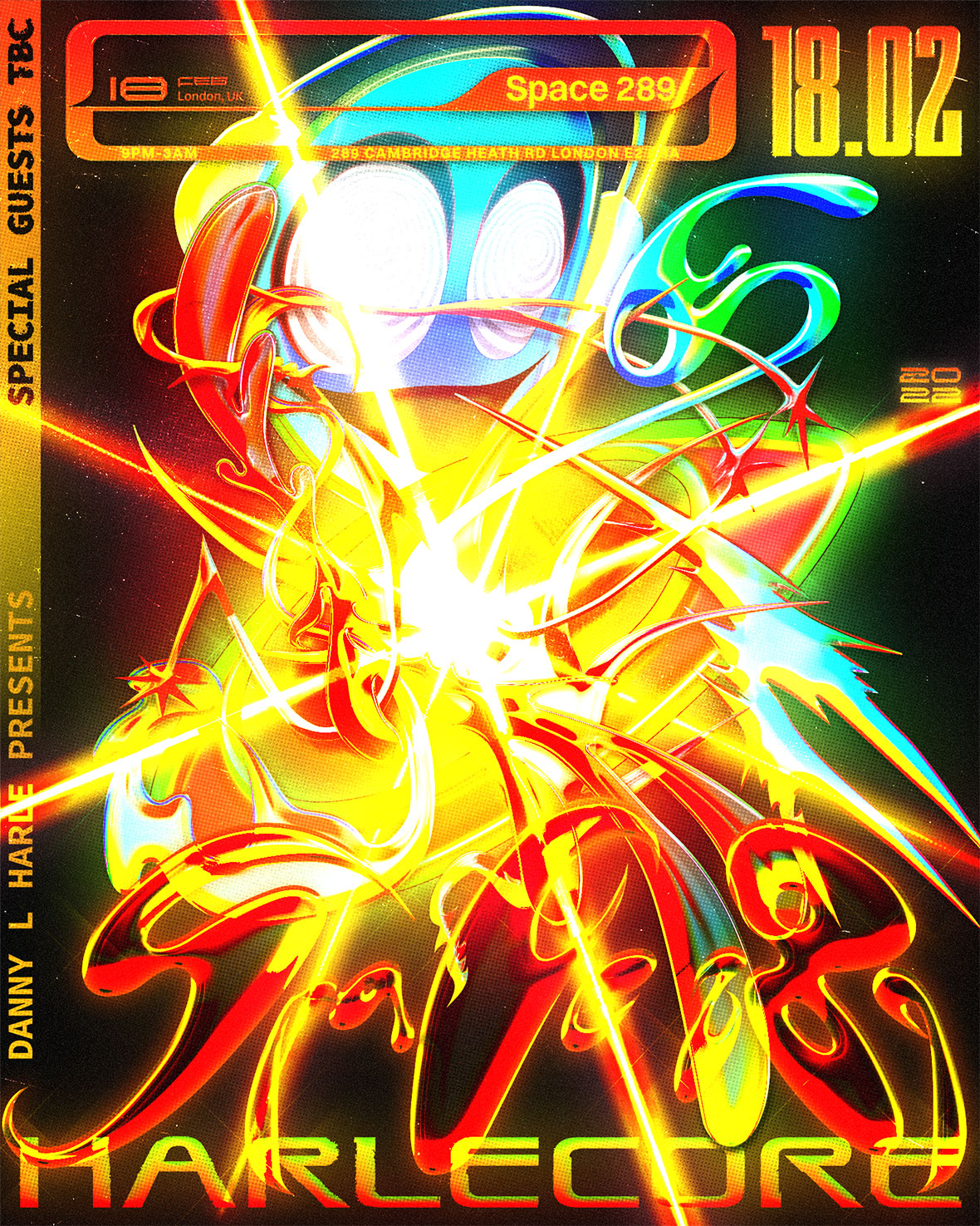
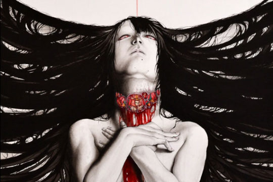
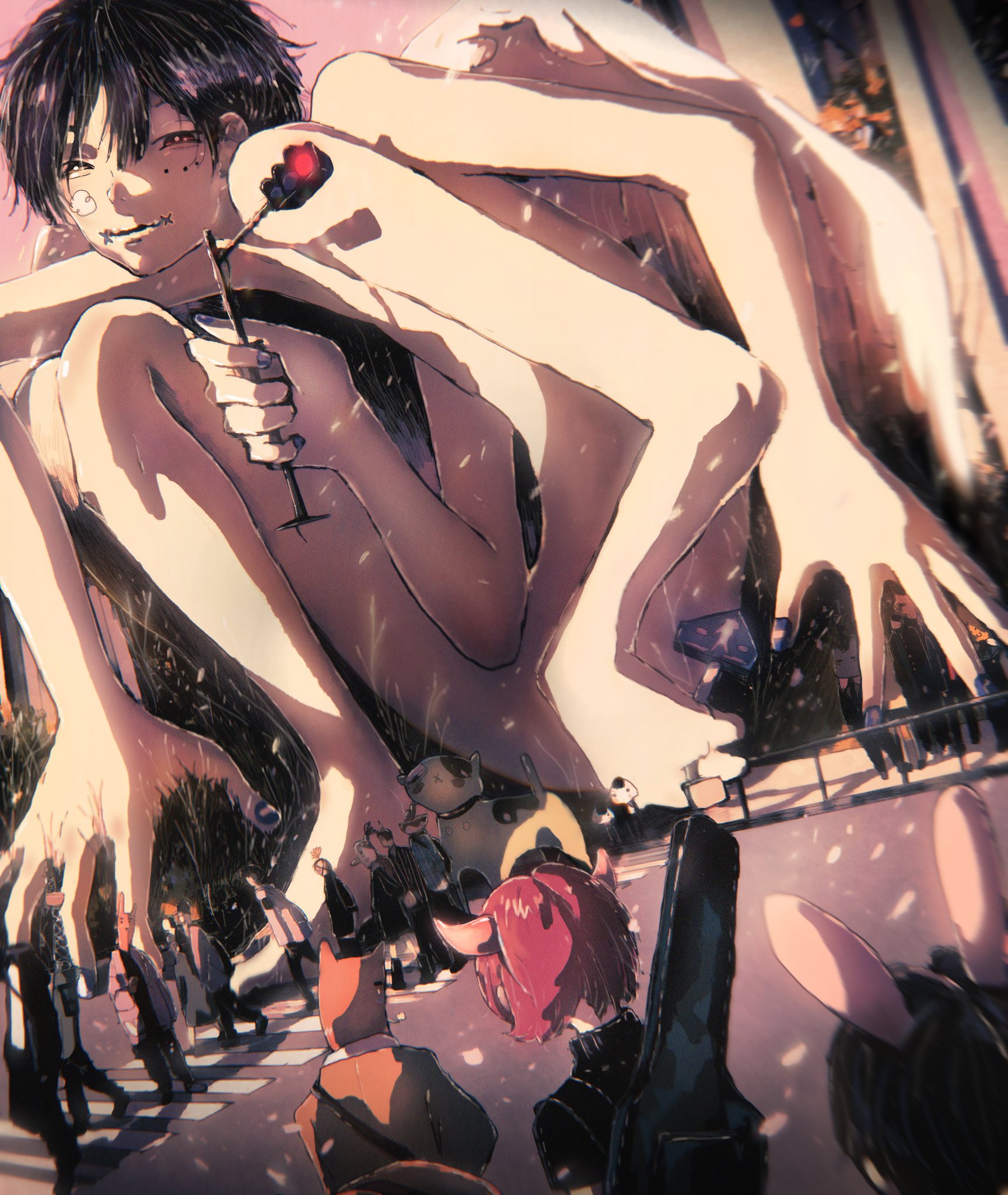
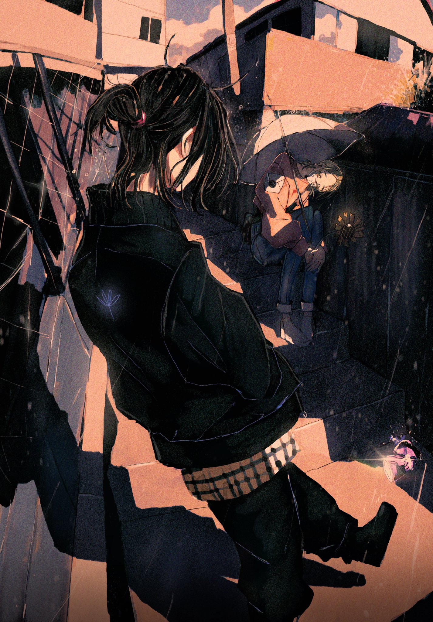
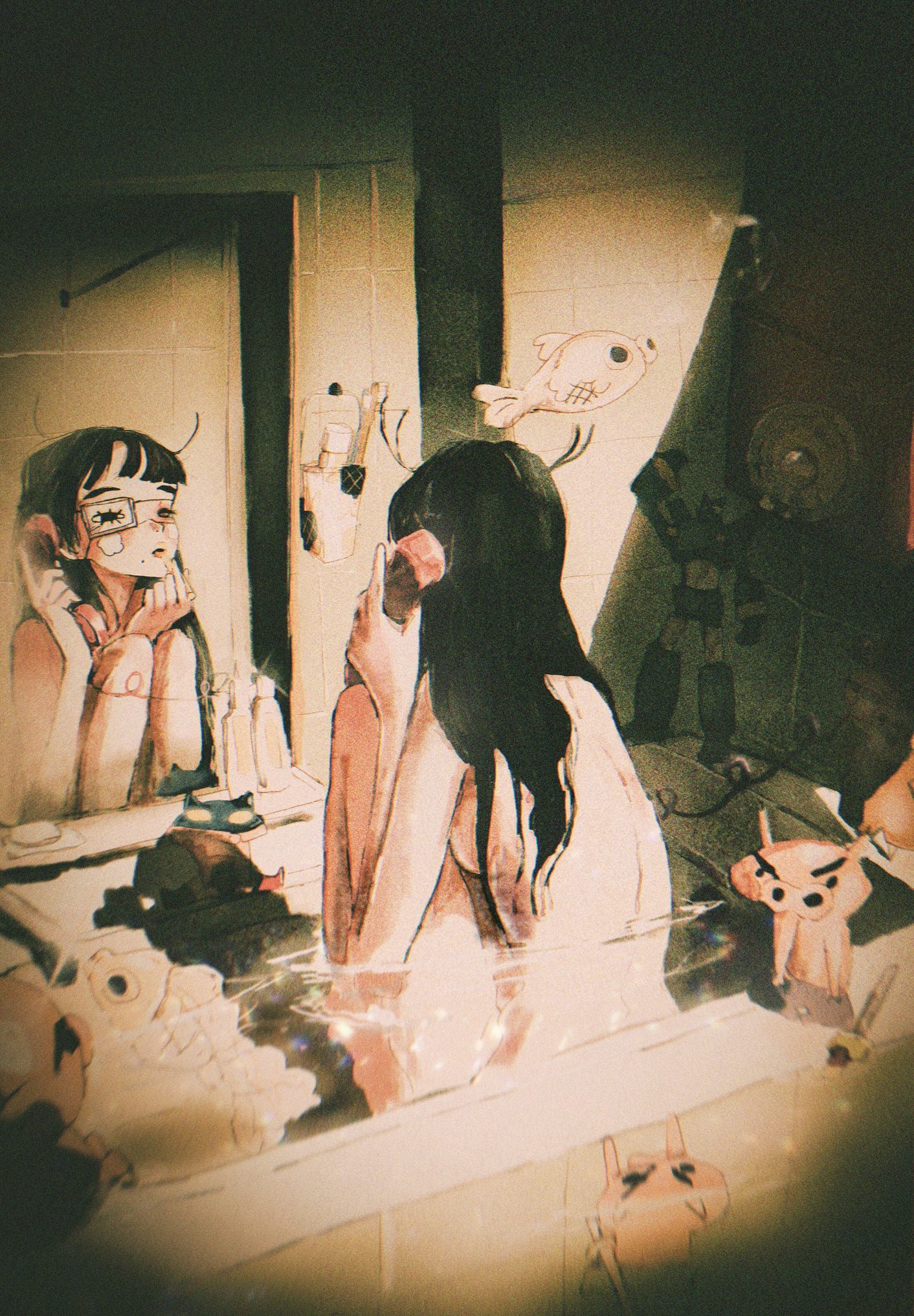
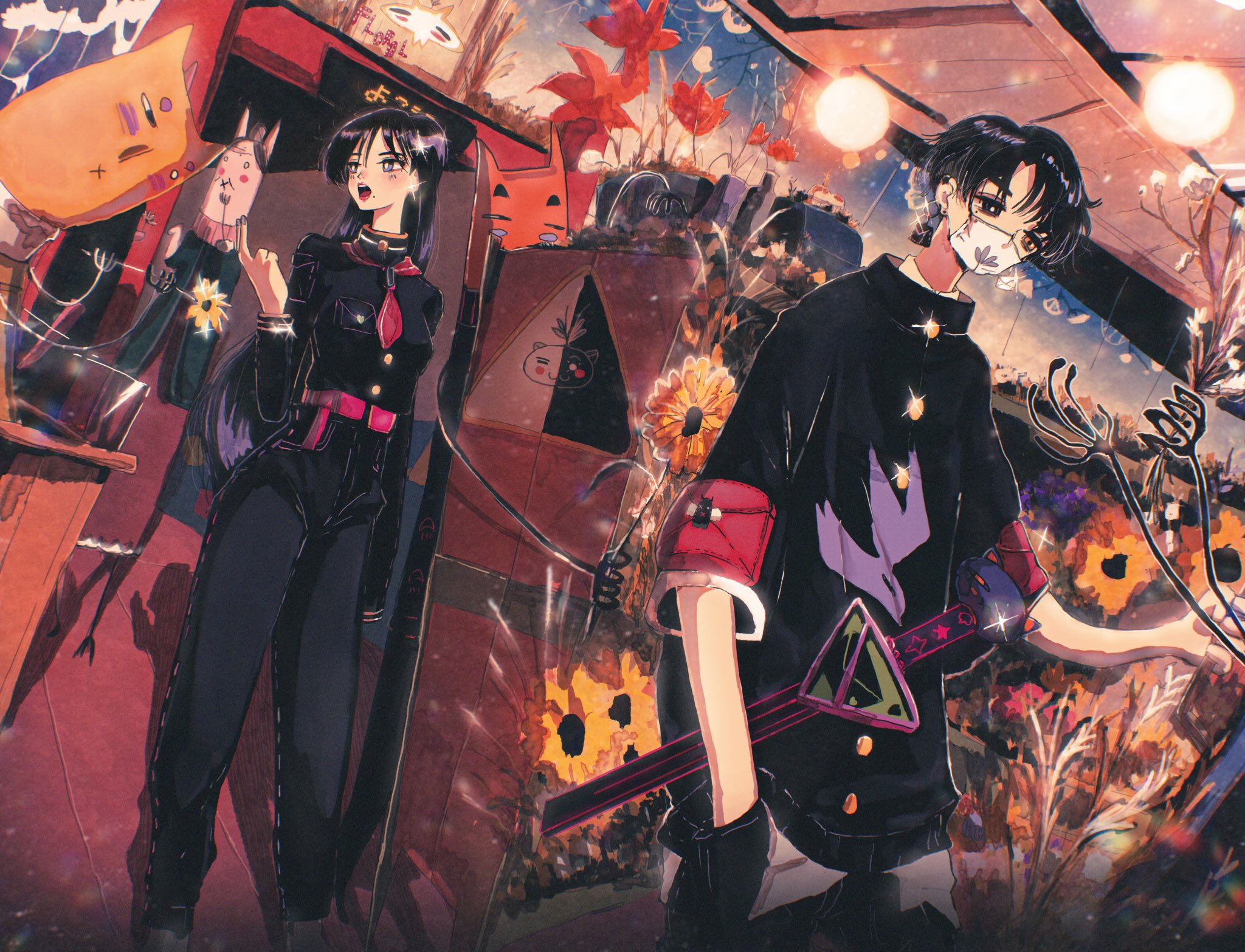
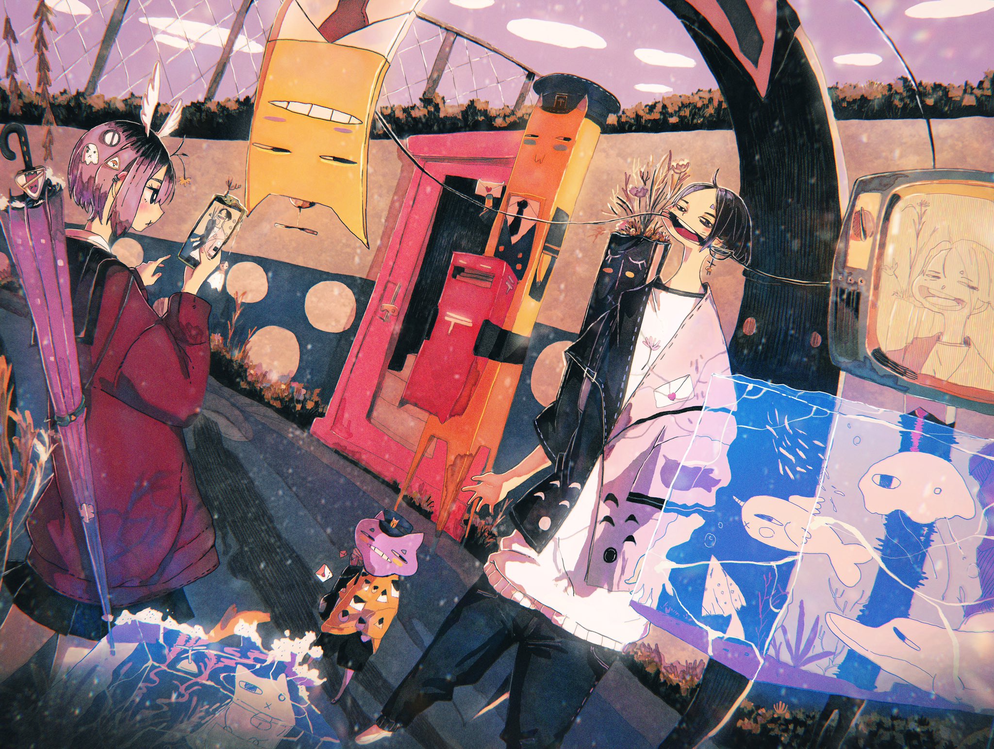
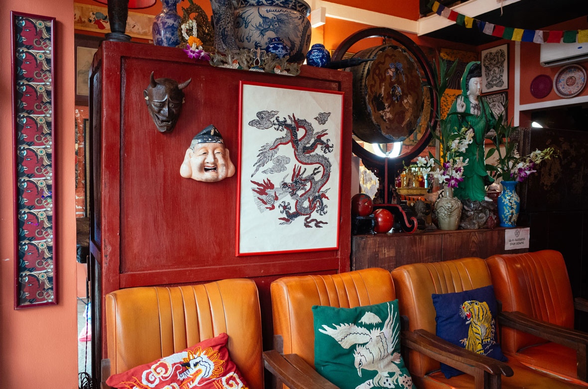
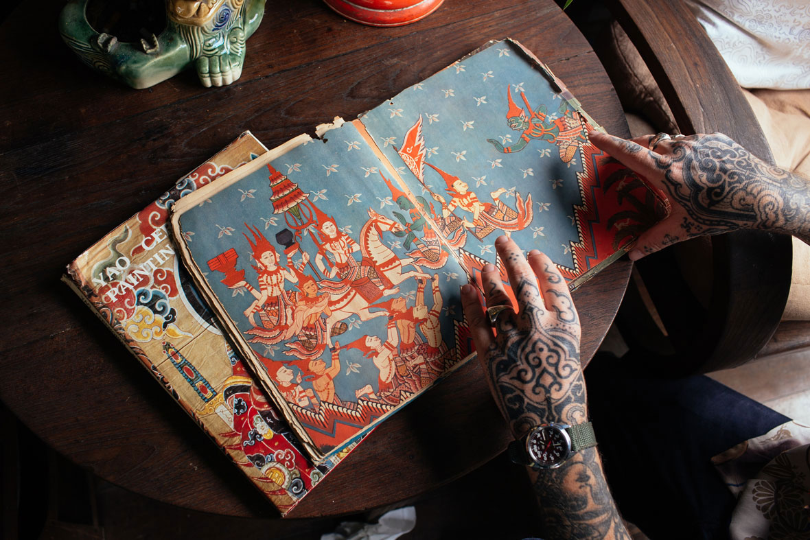
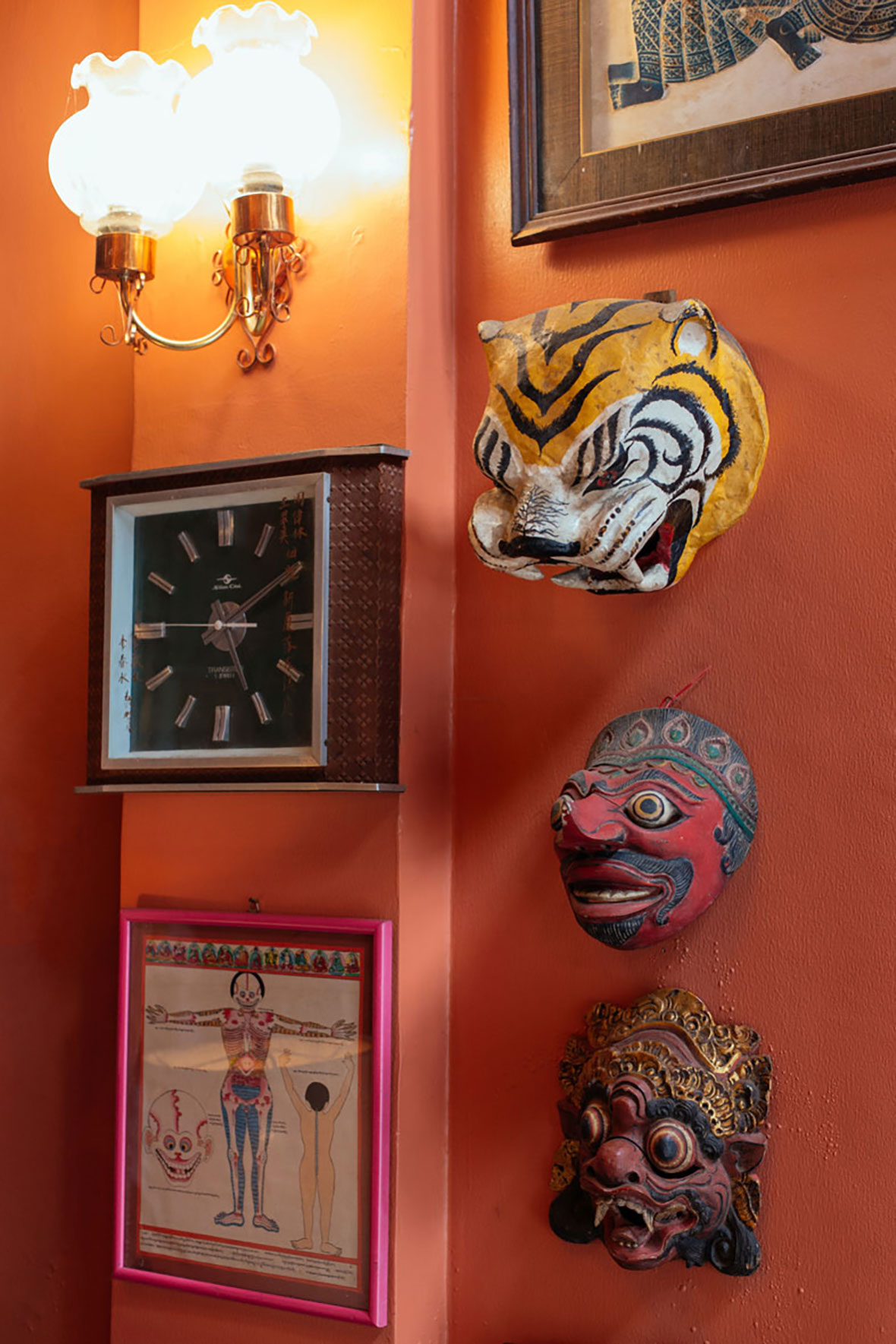
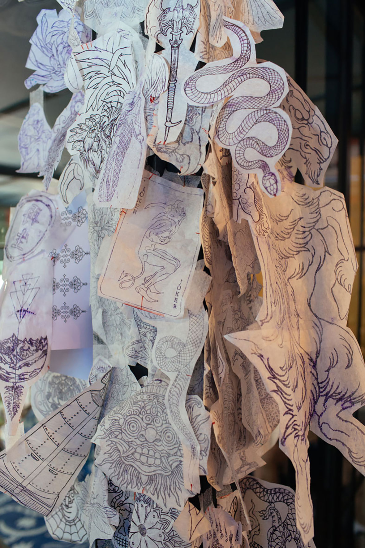
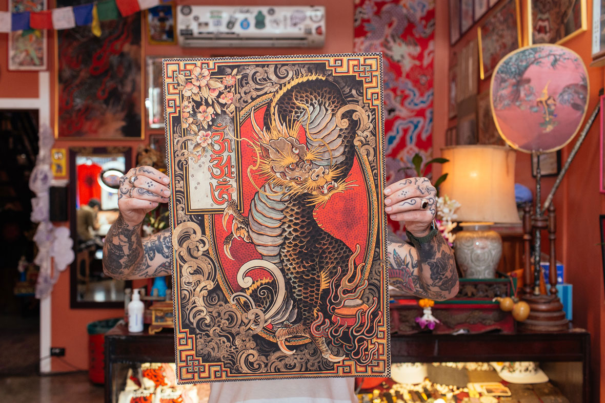
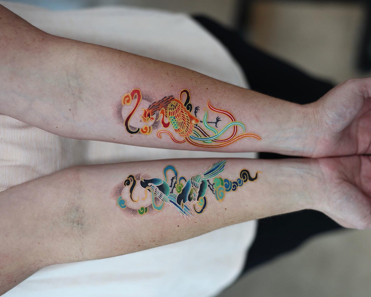
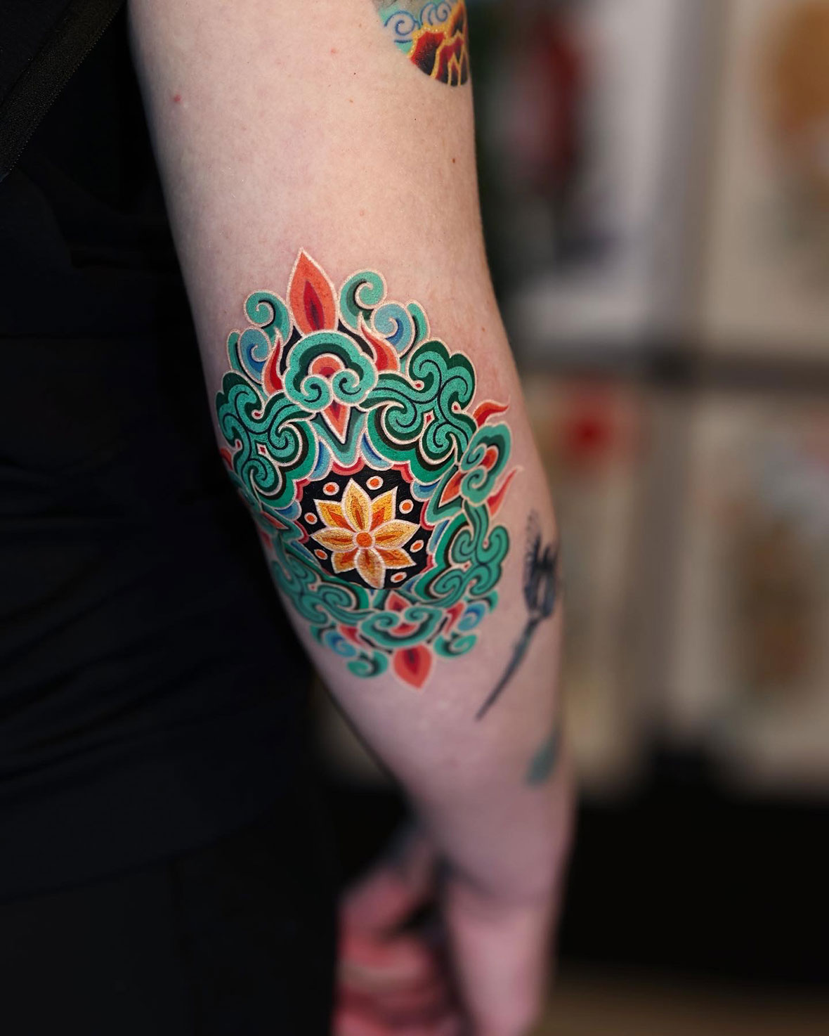
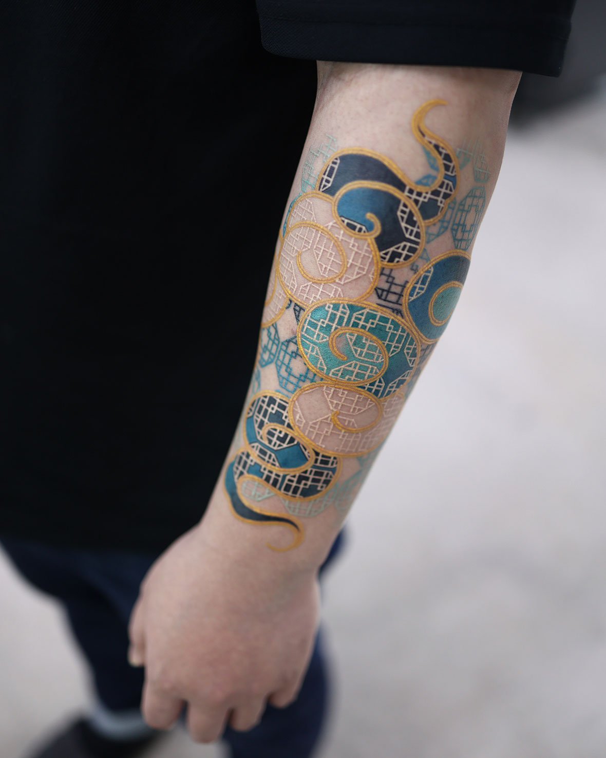
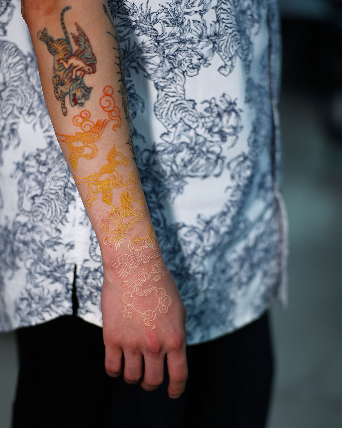
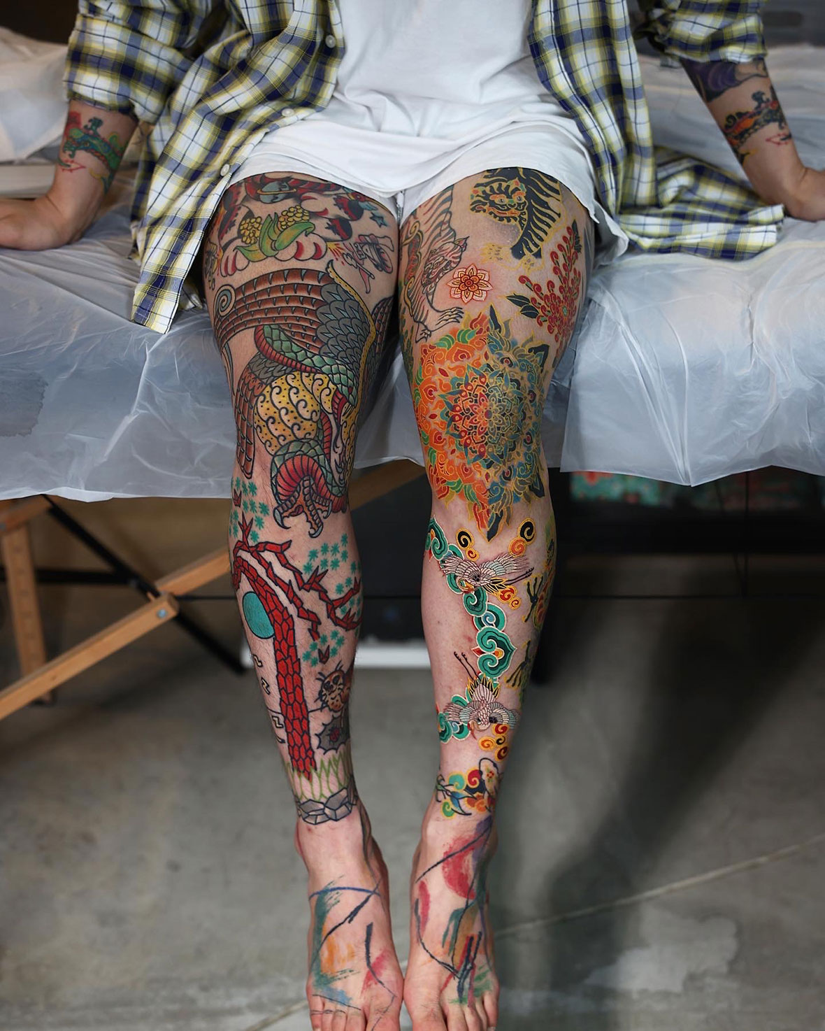
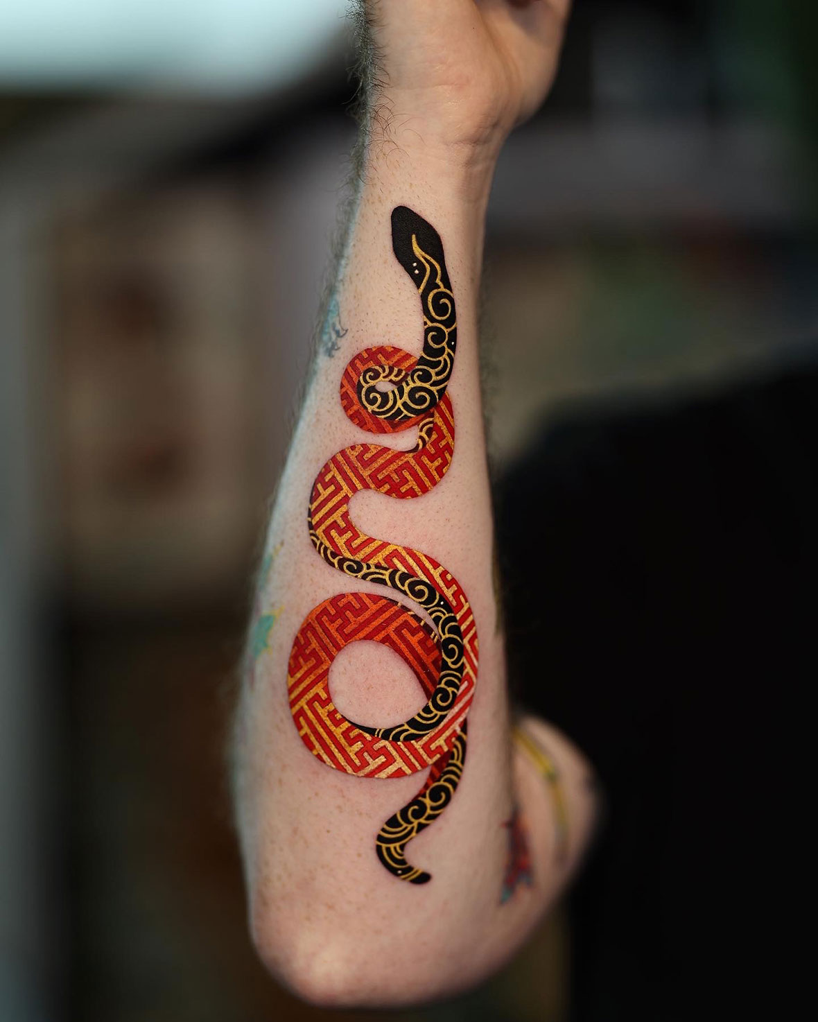
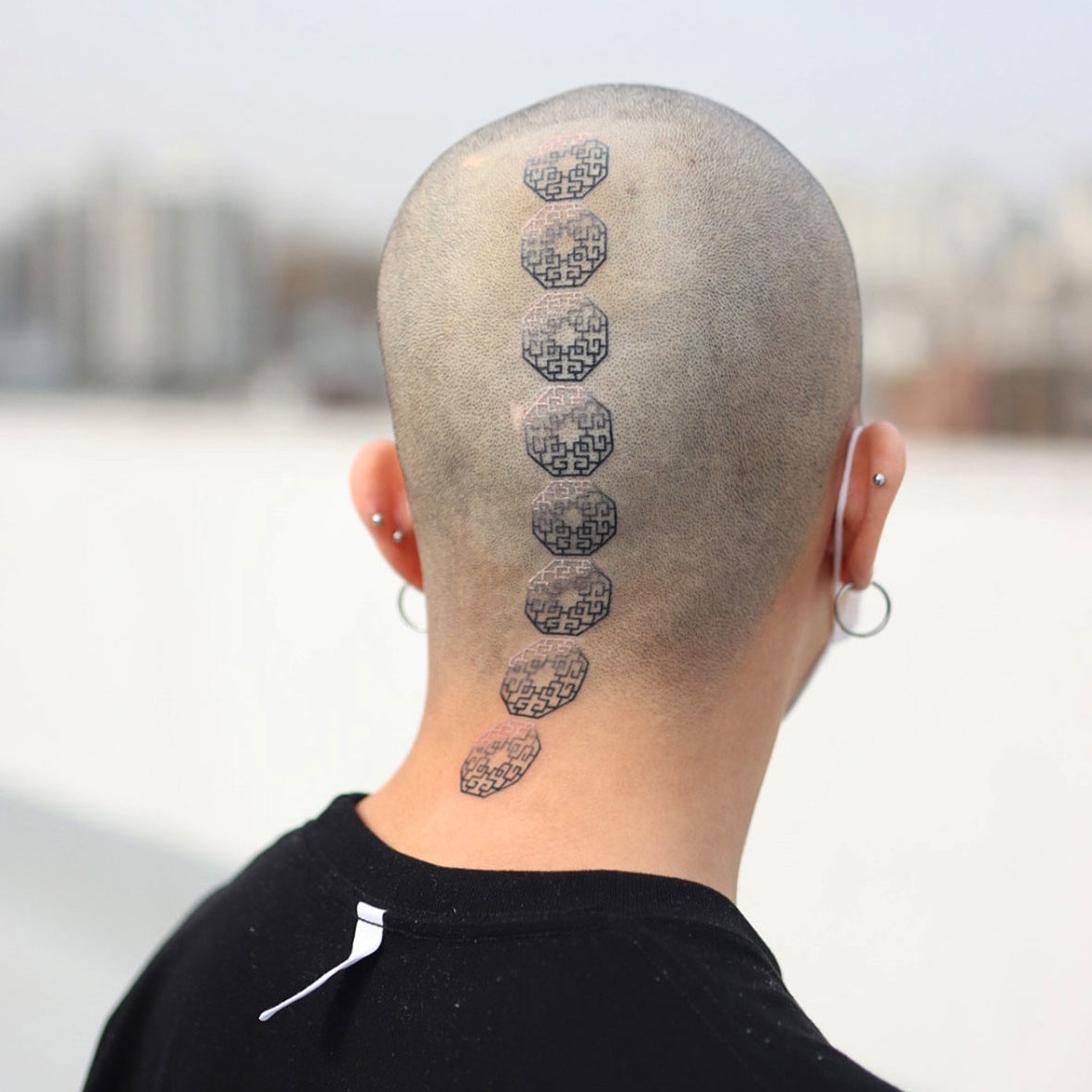
Blooming lotus mandalas, angular lattice patterns, and whirling smoke clouds; snakes, dragons, and demons colored in brilliant tones—this is the work of Seoul-based tattoo artist Jung-hyun Kim, better known at PittaKKM. His art is a contemporary reinterpretation of traditional Korean art styles and Buddhist art, mainly those inspired by temples around his country.


绽放的莲花曼荼罗,棱角分明的篱笆图腾,还有那些穿梭在云雾之间的蛇、龙以及恶魔——这些不同元素共同构成了首尔纹身艺术家 Jung Hyun Kim 的艺术风格。他以当代媒介重新诠释韩国传统和佛教艺术,呈现出别具一格的纹身样式,其灵感大多来自韩国当地的寺庙。

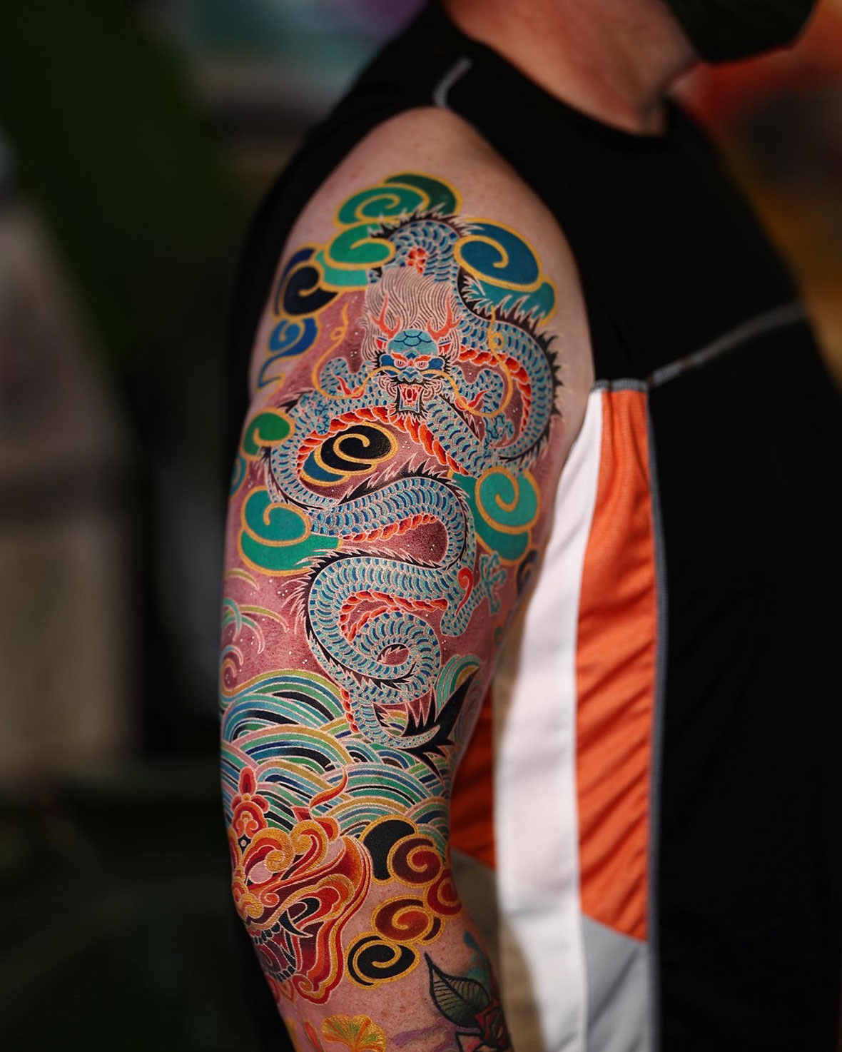
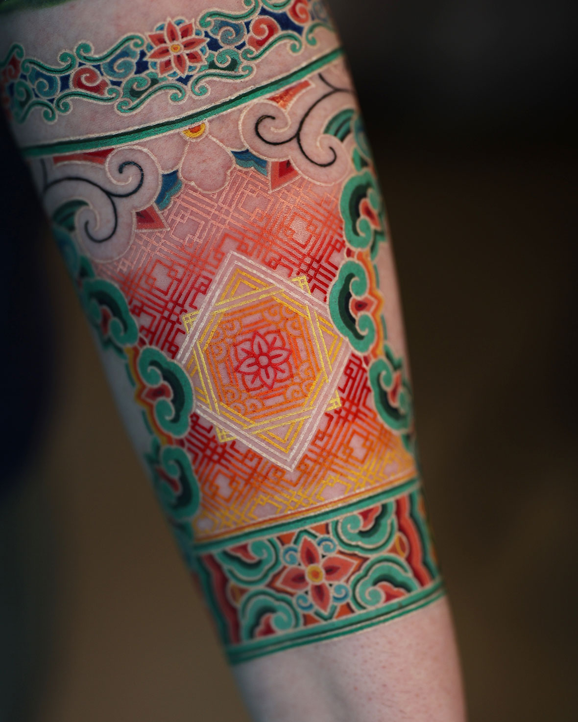
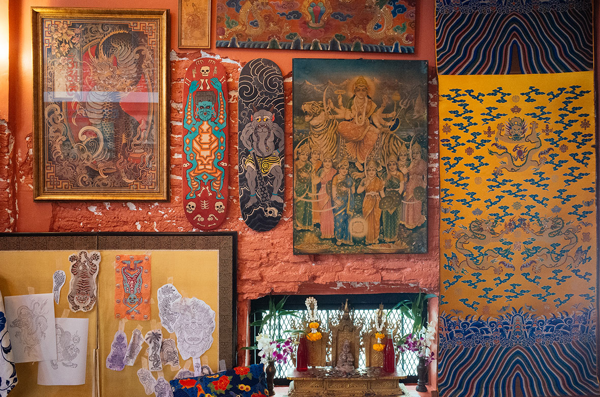
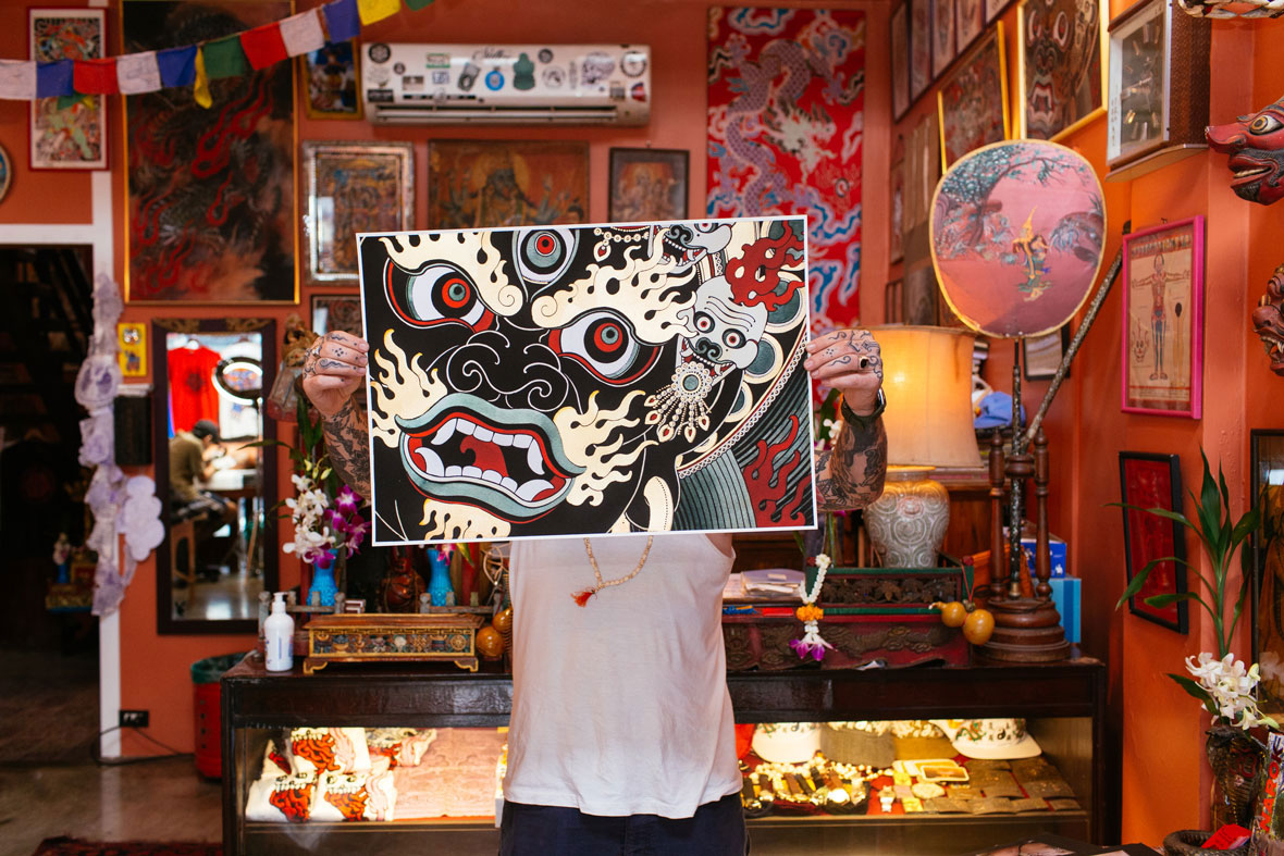
His main influence is dancheong art, which translates to “balance and contrast between vermillion and turquoise.” It’s a decorative painting style used on buildings and artifacts, defined by vibrant colors; maze-like patterns; and bold linework. Its roots stretch as far back as the Goguryeo Kingdom tombs from the start of the common era, but it reached the distinctive identity it’s now known for during the Joseon Dynasty in the late 1600s. The style utilizes the five obangsaek or elemental colors: blue, red, yellow, white, and black, which respectively represent wood, fire, earth, metal, and water.


Jung Hyun 的作品明显受到了丹青Dancheong艺术的影响。丹青在韩文里,意为朱砂和蓝绿两种颜色彼此映衬的效果,是曾经用来装饰建筑或文物的一种艺术色。在创作时,除了赏心悦目的对称性,其成品往往由鲜艳色彩、迷宫般的图案和干净俐落的线条构成。其最早可追溯至公元初高句丽王国时代的墓葬,并在 17 世纪末的朝鲜王朝迎来了鼎盛。丹青主要运用五种基本颜色:蓝、红、黄、白和黑,这些颜色分别代表木、火、土、金属和水,也就是俗称的五方色(obangsae)。

Traditionally, ​​dancheong is functional and a form of beautification, but it was also symbolic of hierarchy and spirituality. Kim eschews that past and makes a point of avoiding meaning in his work: “I just focus on how it looks, how to make it as beautiful as possible,” he says. “Meanings and viewpoints change, but there are always absolute standards of beauty.”


历史上, ​​丹青其实也是一种装饰形式,是阶级和精神的象征。不过,Jung Hyun 在创作时刻意避开了这些含义。他解释道:我只关注视觉上的效果,美观至上。意义和观点会变,但对于美的标准不会。” 

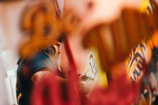
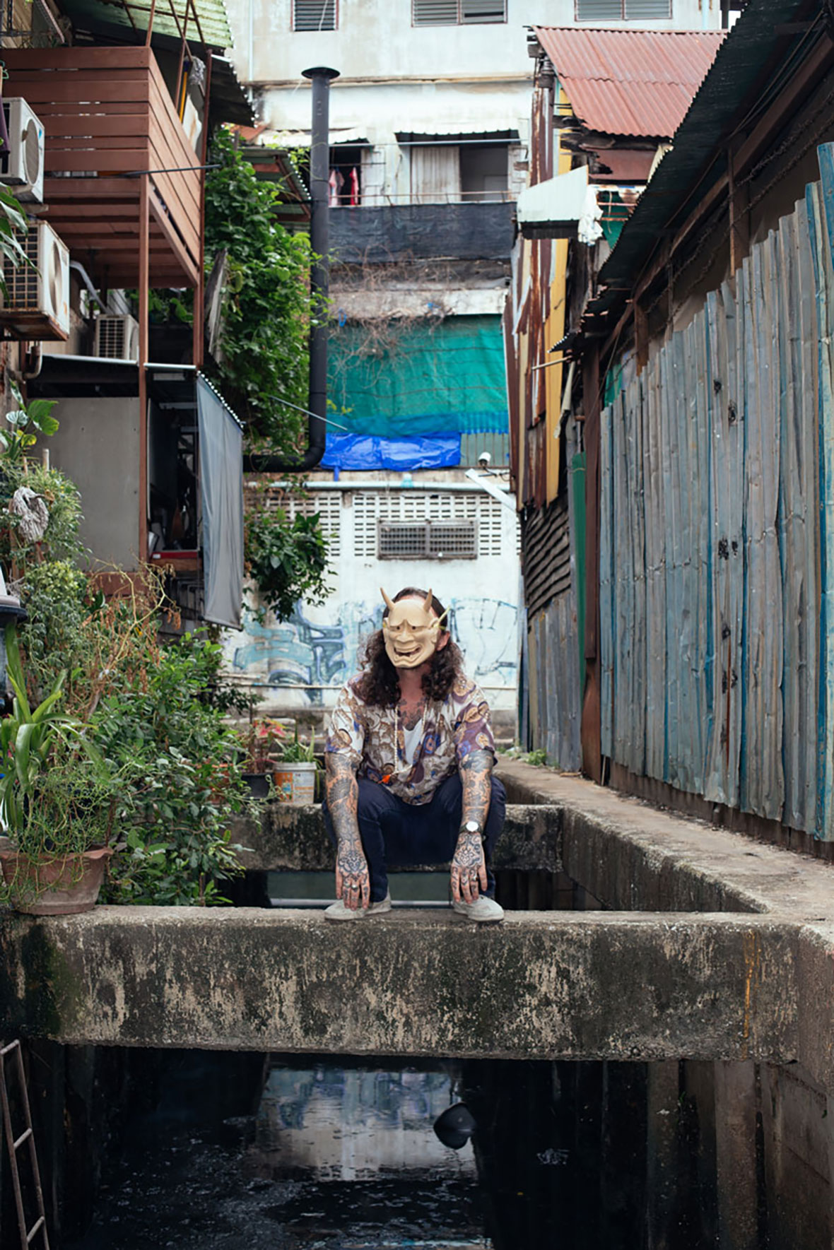
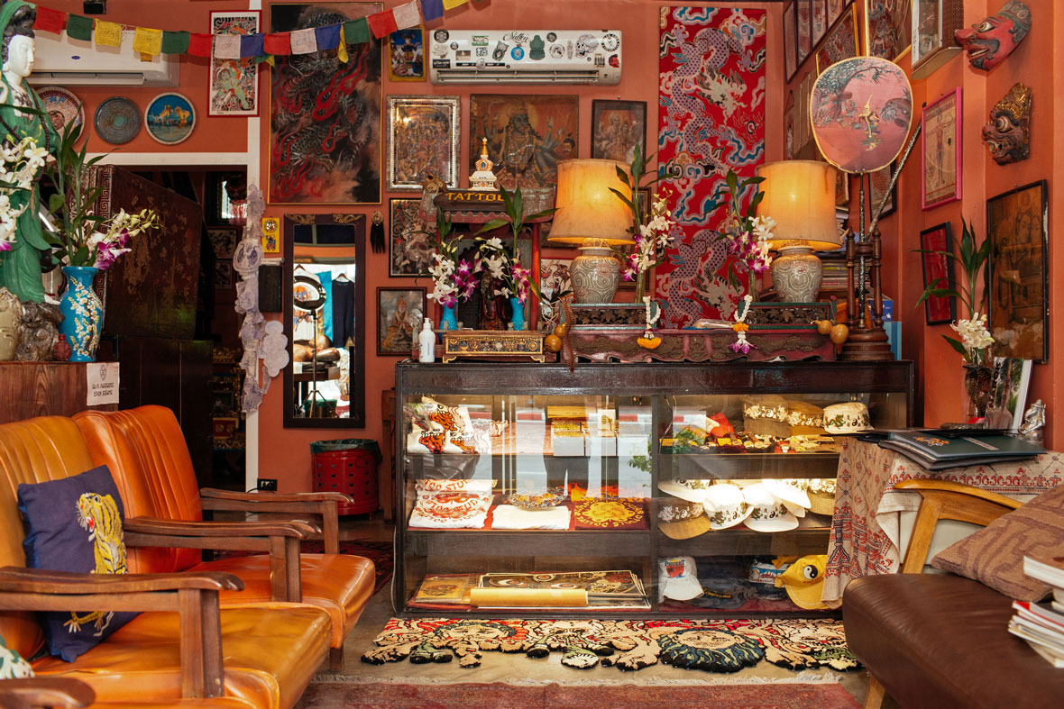
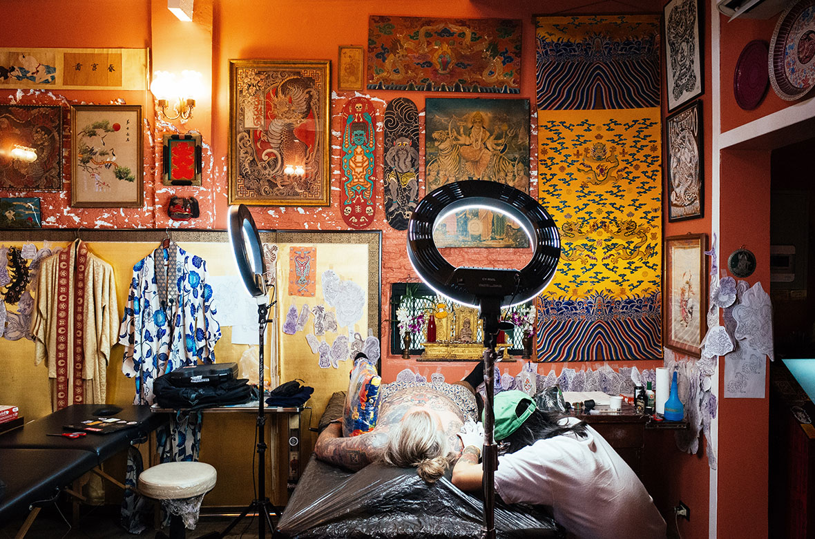
About ten years ago, as a senior at an arts high school in Incheon, Kim became fascinated with body modification. After graduating, he began pursuing his love for body mods in the form of tattoos. “I got lots of tattoos by popular artists before making my own,” he recalls. “I loved getting them but also wanted to learn how they do what they do.” Although he enrolled in university for sculpture, he never gave up on tattoos, and now he runs a shop in Seoul with 13 artists called Mizangwon.


大概在十年前,那时的 Jung Hyun 还就读于仁川一所艺术高中,也是从那时开始,他着迷于人体改造,如穿孔和扩耳等等。美术专业毕业后,他想以纹身作为职业,并展开进一步学习。在开始纹身之前,我找了很多圈内的大咖来帮我纹身,他回忆道,“出于热爱,我想成为一名出色的纹身师,但首先要懂得学习才行。现在,他在首尔经营一家纹身店,店的名字叫作 Mizangwon,共聘有 13 位驻店纹身艺术家。

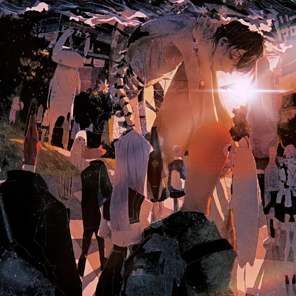
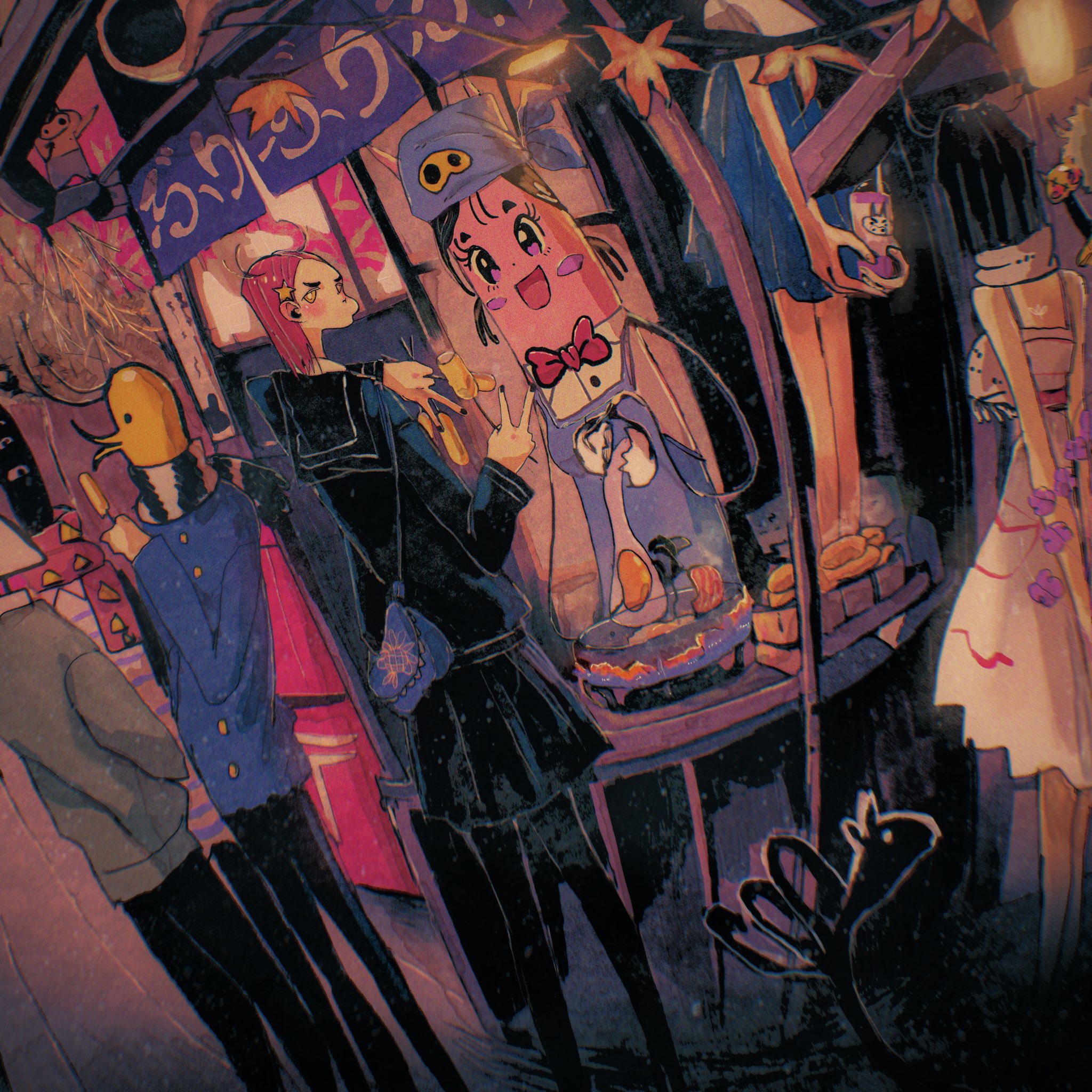
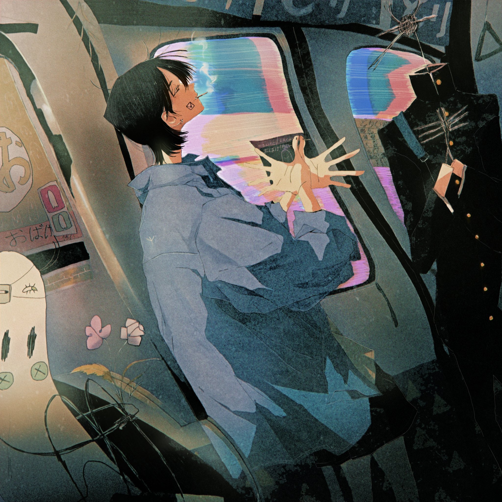
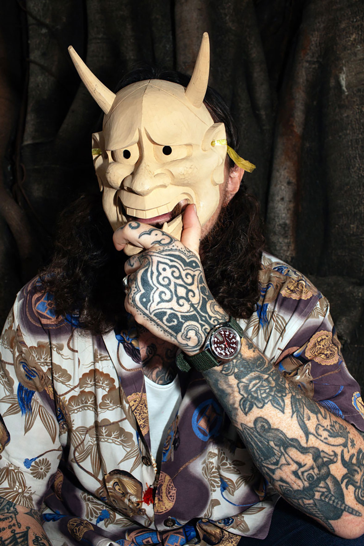
Kim’s style has been relatively the same since he started in 2015, although he’s continuously refining and evolving. Aside from his bold use of colors, the most consistent feature of his style is super clean line work, which did not come naturally to him at first. “My lines were really bad at first, and I struggled a lot to make it happen,” he laughs.

As rewarding as it is to see so much history repurposed through the modern art form of tattoos, Kim infuses his own ingenuity into the style. Through unexpected color schemes, experimentations with contrast, and unique line work, he’s created a style that carries on his culture’s traditions and furthers them for a new generation.


2015 年成为一名职业纹身师以来,Jung Hyun 在保持一贯风格的同时,一直不断尝试改进和提升。除了色彩的运用,其作品最一致的特点便是干脆俐落的线条,这是他苦苦练就的成果。他笑着说道:“刚开始那会儿的确很糟糕,但后来我倾尽全力去实现我的目标。”

借鉴传统并将其融入纹身,固然意义非凡。Jung Hyun 也相信自己能凭借努力和一双巧手,来实现充满创造力的融合。无论对于传统文化、还是在纹身圈来讲,他的作品通过出人意料的色彩搭配与实验性的色彩对比,为韩国本土增添了一抹全新的活力。

Like our stories? Follow us on Facebook and Instagram.


Instagram
: @pittakkm


Contributor: Mike Steyels
Chinese Translation: Olivia Li


喜欢我们的故事?欢迎关注我们 Neocha 的微博微信


Instagram: @pittakkm


供稿人: Mike Steyels
英译中: Olivia Li

Digital Dissemination 俱乐部海报像是这个时代的缩影

September 29, 2022 2022年9月29日

When music went digital and shed most of its physical limitations, a lot of visual culture was lost with it. But the need to break through the noise on social media now pushes musicians to cultivate a visual presence. Taiwanese artist EG Huang’s work is native to this new ephemeral world. His graphic design, typography, and 3D art is mainly created for musicians, and his early interest in digital art was directly inspired by the growth of social media. The result of this influence is a style brimming with chaotic energy, a visual overload with a metallic sheen and neon colors, all bathed in jagged textures and unusual type design.


当音乐在数字化的道路上越走越远,实体早已不再是限制。随之到来的,则是大量视觉要素的消失。不过当下,不少音乐人正尝试利用醒目的视觉在社交媒体斩获大批眼球。台湾艺术家 EG Huang 的作品便诞生在这样的大环境下。他的大部分平面设计、字体设计和 3D 艺术作品都是为音乐量身打造,而他最初对数字艺术的兴趣也是来自社交媒体的启发。他的作品仿佛往往自带混乱的磁场,藉由金属质感与霓虹色彩的交织,带给观众一种“视觉过载”的感受,以锯齿般的纹理和怪异的字体设计联合呈现。

During high school, Huang created zines populated by his own illustrations related to skateboarding, movies, and music. “It was like a diary for my life,” he says. To improve his zines, he began experimenting with font design and typography, a trajectory that eventually led him to study graphic design at university. With the rise of social media in the past decade, he found a deluge of visual material to draw inspiration from. Suddenly the whole world was visible and he saw the digital ether as a space to collect the things that he loved, reinterpreting them through his own style. It was like a new version of the zine to him, only now it was available instantly worldwide.


高中期间,EG 曾自己尝试电子杂志制作,内容都是他画的与滑板、电影和音乐相关的插画,他说:“那部(电子杂志)就像是我生活的日记。”为了将杂志做得更好,他开始尝试字体设计和排版,并最终在大学时选择了平面设计专业。过去十年里,社交媒体兴起,大量的视觉素材给予他源源不断的灵感。突然之间,整个世界变得触手可见,他从数字世界里搜罗有趣事物,然后按照自己的设计风格进行重新诠释。

But of course, for all the possibilities created by social media, the challenges are undeniable. “It can definitely affect your mental health and it’s changed me personally, so I try to include this in my work,” Huang says. “It’s like a feedback loop, creating art for and about the internet.” This paradox and sense of agitation is often visualized in his work, resulting in an aesthetic that feels jagged and cluttered, with images often unclear and difficult to discern. There’s an undeniable angst too, visualized through scrapes and scratches, the serrated edges covered in splashes of ink.


社交媒体这个熔炉拥有无的可能性,但同样为 EG 的创作带来挑战。他解释道:“毋庸置疑,社交媒体影响并改变了你我的心理,我想将这些改变统统融入进我的作品。我的创作就像一个反馈环,一切取材于互联网,又在网上流传。”这种悖论和混乱感经常在他的作品中被可视化,呈现出一种参差不齐和杂乱无章的美学风格,整个画面看上去模糊不清,难以辨别。除此之外,作品中的划痕以及溅上墨水的锯齿状边缘令画面透露出一股难以忽视的焦虑。

Like the zines of his youth, Huang’s designs still have a collage feel, with images stripped from one context and layered over another. “I love mixing things with no connection to create something new,” he explains. They’re often literal collages that he scans into his pieces but sometimes the collage effect is created in Photoshop.


和他年轻时所创作的电子杂志一样,EG 的作品依然延续着拼贴画风格,各种设计元素通过叠加与组合,揉捏在一起。“我喜欢把毫无关联的元素糅合在一起,创造出全新的视觉,”他解释道。大部分时候,他都会先裁剪图片,然后扫描并组成拼贴作品,或是用 Photoshop 来创建拼贴画效果。

While flyers and album art are meant to advertise the music, Huang’s typography is often less about legibility than aesthetic effect. It’s partially influenced by death metal logo design and chromatic textures that are in vogue at the moment, but Huang also utilizes East Asian calligraphy and other less easily recognizable forms. Take for example, a flyer for Taipei nightclub Final, a vicious, deconstructed face of the alien warrior from Predator is surrounded by blood red cursive script Chinese calligraphy.


EG 的大多数作品主要围绕活动宣传单和专辑封面艺术,因此字体设计成为作品中不得不考虑的要素。除了深受死亡金属音乐乐队 Logo 和时下流行的立体渐变色纹理,他还参考了东亚书法艺术等字体形式。譬如,在他为台北臭名昭著的地下电子音乐圣地 Final 设计的活动海报中,他将电影《铁血战士》中的外星战士狰狞的面部进行解构,并融入了血红色的草书汉字。

As a digital artist inspired by the internet and electronic music, Huang’s work is unsurprisingly futuristic. The glint of metallic material, the holographic and ultraviolet colors, distant nebula clouds, and infinite tangles of computer wiring are everywhere. His designs are a window into a new dimension, a liminal space neither here nor there, with no tangible form but undeniably real. 


作为深受互联网和电子音乐启发的数字艺术家,毫不意外,EG Huang 的作品充满了未来主义感,这一点从无处不在的锃亮的金属材料、全息影像效果、紫外光色调、遥远的星云以及无限纠缠的电脑线路可见一斑。他的作品为观众开启了一扇通往新世界的窗口,一个独立的临界空间,像是一种来源于现实,又触摸不到的虚拟。

Like our stories? Follow us on Facebook and Instagram.


Instagram
: @eg____ge


Contributor: Mike Steyels
Chinese Translation: Olivia Li


喜欢我们的故事?欢迎关注我们 Neocha 的微博微信


Instagram: @eg____ge


供稿人: Mike Steyels
英译中: Olivia Li

KRAF Studio 当孩子作业成为你的第二职业

September 27, 2022 2022年9月27日

A young girl poses in a cardboard samurai helmet, her black hijab contrasting with a colorful face mask and red Bahasa writing from what was once a pizza box. The girl’s father, Dian Arismawan, created the helmet as part of his KRAF Studio project, where he designs cardboard sculptures that he sells as affordable DIY kits for fans to build on their own. He makes everything from robot masks and eagle-shaped helmets to pen holders and lamps.


镜头前,女孩头顶硬纸板制成的武士头盔,她身着黑色头巾,与面前印有印尼文字的卡通口罩形成反差萌效果。“武士头盔”由女孩父亲 Dian Arismawan 用披萨盒亲手打造。他亲手 DIY 了一系列纸板模型,以亲民价格出售。整个系列被定名为 KRAF Studio,从机器人面具、鹰形头盔到笔筒、灯具等等,只有你想不到,没有他做不了。

The project is heavily inspired by Arismawan’s kids. His first cardboard sculpture was a school project that he helped them with, but he found the medium interesting enough to continue creating on his own. As the pieces got more advanced, he started uploading the process to Youtube. His work became very intricate and sculptural, to the point where he created a four-foot-tall cardboard mosque in his home. But the work wasn’t interactive—once it was built, that was kind of it.


项目最初的灵感来自 Dian 的孩子。在一次协助孩子完成学校作业的过程中,他完成了人生第一个纸板模型,从此对这种创作方式产生了深厚性质。往后的日子里,他像个孩子一样制作各式各样的纸板模型,并将制作的整个过程上传至 Youtube 平台。作品风格也逐渐变得复杂且多样化,他甚至曾在家中制作了一座 1.2 米高的纸板清真寺,而这些纸板模型并没有交互性,一旦制成便成定局,不得拆分。

Arismawan’s wife suggested that if he wanted to create something more engaging that he should make them easy to duplicate—that way people watching the videos could make their own. So he started creating works that came with directions for people to follow. He moved away from curvy surfaces and intricately carved details, focusing instead on more replicable designs with lots of angular, flat edges. This also happened to give his work a bold, distinctive style.


后来在妻子的建议下,Dian 意识到,要想让这些纸板模型像儿童玩具一样有趣,则需要让作品做到易上手、可拆解性,要让观众在观看视频后萌发动手尝试的冲动。他开始为作品附上制作说明,并在作品中摒弃弯曲和复杂的细节,改为棱角和平边设计。这样的做法极大的增加了作品的可上手性、易复刻性,同时也赋予作品一种醒目、鲜明的独特风采。

KRAF Studio is a brand geared towards families, so naturally, his kids are often invited to take part in his creative process. Arismawan usually runs new models by them first, asking if they can identify what it’s supposed to be. If they can’t describe it quickly, he feels that it isn’t clear enough and goes back to the drawing board. His clients often send him pictures of the finished kits with their kids proudly wearing them.


KRAF Studio 的品牌定位为家庭玩具,没有年龄限制,各个年龄段均可自然地参与到他的制作过程中。每当一副新模型制作完成,Dian 都会先让孩子们过目,看看他们能不能一眼看出模型是什么,询问他们关于模型的意见。如果孩子不能很快确定,就代表作品的设计还不够清晰,然后又会回到绘图板上进行修改。有很多顾客也会把制作好的模型让孩子戴上,拍成照片发送给他。

As a web designer by trade, Arismawan uses digital tools to design the pieces. He sketches the basic ideas out on paper, then models the details of the shapes and makes a template for building them with cardboard. It takes him about a day to design a model, another day to build the prototype, and another to put together social media content with the new piece.


作为一名网页设计师,Dian 对数字软件的运用还算熟练。他通常在稿纸上描绘设计的轮廓,然后对细节进行建模,并制成模版,最后用纸板组装成模型。每个模型,大概需要一天的时间进行设计,一天的时间用来制作原型,再需要一天时间整理视频素材,剪辑并上传至社交媒体。

The mundanity of the cardboard belies its importance: It’s appealing to Arismawan because it’s environmentally sustainable, easy to find and free, so it’s accessible to everyone. It also has an aesthetic appeal, with the jumble of bright graphic designs and smatterings of Bahasa text, which give his pieces a touch of Indonesian identity. When stopping by the local grocery to find supplies, Arismawan looks for stuff that’s colorful and in good shape. Instant noodle boxes are often what he turns to and he prefers the outer later with graphics because they’re fun, smoother, and cleaner.

Family values, an enviromental message, consideration for the economic conditions of its customers, the promotion of Indonesian culture and the normalization of Muslim faces—it’s rare that a such a charming and fun side hustle like this also encapsulates so much meaning.


平平无奇的纸板之下,却蕴藏深意:Dian 之所以热衷于用纸板,是因为这些纸板均来源于日常生活,易于找到且免费,每个人都可以轻松获取,这何不是一种可持续的环保创意尝试。除此之外,纸板也自带独特的美学风格,它们通常来自当地食品、商品包装,鲜艳的平面设计与其表面的印尼文字相得益彰,令作品本身自带印尼特色。平时,Dian 会到当地的货店搜罗一些色彩独特且外形无损的纸板,他尤其喜欢方便面包装盒,以及带有图形设计的外包装纸壳,看上去更有趣、更光滑、更干净,也更平易近人。

从家庭价值观、环保概念、消费水平、以及推广印尼本土和穆斯林文化的角度出发来看这些作品。谁能想到,这样一份有趣的副业竟然也能带来如此多层的深层含义。

Like our stories? Follow us on Facebook and Instagram.


Instagram
: @krafstudio
YouTube: ~/KrafStudio


Contributor: Mike Steyels
Chinese Translation: Olivia Li


喜欢我们的故事?欢迎关注我们 Neocha 的微博微信


Instagram: @krafstudio
YouTube: ~/KrafStudio


供稿人: Mike Steyels
英译中: Olivia Li

A Split Second in Tokyo 人群中,他正等待一个时机

September 20, 2022 2022年9月20日

A bus screams past a pedestrian in a blur of white and black lines. As it turns into an intersection, its hovering lines cut across the blocky lines of a crosswalk, seemingly creating a new dimension. Meanwhile, the man simply yawns, wholly unimpressed, his shadowy profile jumping out starkly from the white lines swirling around him. This is the work of Shinya Kawaoto, a portrait-focused street photographer from Japan who shoots exclusively in black and white.


公车从男子身旁呼啸而过,留下糊了的黑白色线条,仿佛来自超现实的维度。与之对应的,是路口等待的男子,一副漫不经心的样子。他身上的深色衣服,与周遭线条,将整幅画面的色彩层次进一步加强。这张照片是来自日本街头摄影师川音真矢(Ash Shinya Kawaoto)的拍摄,他专注于人像摄影,且只拍摄黑白照片。

The sense of contrast—present in both his interplay of shadow and highlights as well as the characters that seem out of place in the settings—is a prominent feature of Kawaoto’s photography. It’s buttressed by a steadfast attention to energy, the creation of surreal settings, and puzzle-like compositions. His subjects display poignant and deeply personal feelings at emphatic moments, and the silvery glint of blacks, whites, and grays shine like precious metals.


从高光和阴影的强烈对比,到与周围环境格格不入的人物神情,强烈的反差感是川音真矢摄影作品的突出特点。虽是黑白照片,但他的作品始终充满活力、超现实感的环境塑造以及出其不意的构图想象力。在照片定格的瞬间,镜头下的人物往往流露出极其个人的情绪,让人印象深刻;而周遭的黑色、白色和灰色则如同视觉的利刃,使整幅画面熠熠生辉。

Kawaoto is invested in people, especially their faces. Whether they’re elderly or adolescents, tourists or businessmen, he likes to get right up close, his camera right under their nose, their profile jutting sharply out from their settings. He forgoes the use of color to tame the noise of the busy Tokyo streets, famous for their kinetic lights and flashing signs. This funnels the viewer’s eyes straight towards his subjects. But the city is always present, patiently waiting in the background to be discovered, confident it won’t be forgotten. It’s a supporting cast member; secondary but important.

Taking photographs of strangers can be a tricky thing. But he says people in Tokyo are generally very shy and don’t complain, while tourists are usually fine with being photographed if asked. “I’ve been warned by people to delete my pictures, but it’s never escalated to the point of an argument,” he laughs. “When I tell them the purpose of my pictures, they usually agree to the shot.”


川音真矢专注于人物拍摄,尤其是人物面孔。无论男女老少,游客或上班族,他喜欢把镜头“怼”到他们脸上,让人物的光影从周围环境中脱颖而出。为了隐去眼花缭乱的东京街道,他放弃颜色,将观众的注意力引向人物。但城市的身影也从不缺席,静静地等待被镜头捕捉的时刻。在他的照片里,城市是配角,人物情绪被放在首要位置。

拍摄陌生人照片并非易事,川音真矢也表示,东京人通常比较害羞,而游客在这方面则更加随意一些。“也会有人要求我删除照片,但从来都不会升级到争吵的地步,”他笑着说,“在得知拍摄的意图后,很多人并不会拒绝。”

Kawaoto, who’s lived in Tokyo for the last 20 years, started shooting portraits as a hobby for a change of pace from his routine days working in the IT field. One day he took his camera out to Shibuya on a whim and fell in love with the charm of the city when viewed through the lens. “Street photography is a record of the city,” he says. “Tokyo is constantly changing I think it’s important to document this in my photographs.” He paired that with his interest in portraits, positioning people in candid postures as his focal point. “These people are part of the city, they make it what it is.”


川音真矢在东京生活了 20 年,刚开始拍摄人物肖像时,他只是想把摄影当作自己 IT 工作之余的一门爱好。直到一天,他带着相机横穿涩谷,猛然陷入都市的风采之中。街头摄影是一座城市的记录,他说道,东京在不断变化,我觉得用照片来记录它还蛮有意义的。加上自己对人像摄影的兴趣,他决定用镜头定格人们在生活中的真实瞬间,人是城市的一部分,是他们在塑造着这座城市的面貌。

Everything in the frame is kept in focus by setting the aperture for a wide depth of field. This way, a background of sun-soaked tarmac and bright smiles can contrast better with the sickly, elderly man in the foreground. Or it captures the isolation of a little girl waiting alone at a broad intersection, totally separated from the distant crowd on the opposite side of the road.


在拍摄时,他特别选择了大景深光圈,来保持镜头里所有细节都能清晰对焦。通过这种方式,阳光下的柏油路面、人物的微妙深情,均以一种激进的方式进入观众视线。亦或者马路两边的人物轮廓,都清晰可见。让画面上的对比,变得显而易见。

This also allows him to play with shutter speed, blurring objects moving at different speeds from his focus, creating a trail behind them that highlights their movement and speed, such as his image depicting the undefined silhouettes of commuters struggling beneath sharp white streaks of swirling snow.


白天时候,大景深光圈还会在较慢的快门速度下呈现有趣的效果。以这种拍摄方式捕捉动态事物时,事物会在画面上留下的一道道线条状的痕迹,这大大丰富了画面的动感与速度感。例如在下面这幅作品中,飘落的雪花在人群之间留下漂浮的痕迹。

The people filling Kawaoto’s photos are vulnerable, guarded, mysterious, and forgotten. Whatever they are, they’re overstated in their expressions, captured at the peak of their feelings. Personal expression in a public space amplifies everything. It happens regardless of people’s surroundings or because of them. It happens unconsciously or because someone is spilling over and can’t hold it back. When it happens, it’s magic. And Kawaoto is there to capture it.


川音真矢照片中的人物脆弱、谨慎、神秘、不起眼。形形色色的行人,他们的表情都被镜头放大,往往抓拍在情绪最强烈的一刻。在公共空间中的个人表达令一切显得更加醒目。这些情绪的产生或与周围环境无关,又或因环境而起;有的是无意识下的流露,有的是则是因为情难自禁。这样的瞬间有着奇妙的魅力,也是川音真矢一直等待捕捉的瞬间。

Like our stories? Follow us on Facebook and Instagram.


Instagram
: @ashley_designing


Contributor: Mike Steyels
Chinese Translation: Olivia Li


喜欢我们的故事?欢迎关注我们 Neocha 的微博微信


Instagram: @ashley_designing


供稿人: Mike Steyels
英译中: Olivia Li

Buu Hoa 来自过去的信

September 15, 2022 2022年9月15日

The art of communication is no longer what it once was.

Letter writing in particular can seem like an irrelevant medium, superseded by memes, emojis, and even Instagram stories. But in such an era, the sincerity of a handwritten letter can be that much more meaningful. There’s an unparalleled human warmth that comes with putting ink to paper, and there’s no way that it can be replaced by text scrolling by on a screen. Penned missives are particularly meaningful for Duc Luong, a Saigon-based illustrator who runs Buu Hoa, a project archiving old stamps and letters from Vietnam. “I believe that writing and sending letters is a sacred thing,” he says. “You breathe your stories, your emotions, and all that you want to say, into a blank piece of paper. You look at your own handwriting, which is your personal mark. You fold the letter, seal the envelope, paste the stamp, and finally send it to the post office. Every step is intimate and intricate.”


人与人之间的沟通方式已经今非昔比。写信似乎成为了一种不合时宜的方式,取而代之的是各种表情包、表情符号甚至是 Instagram 故事。然而也正是在这样的时代,手写信所蕴含的真挚情意却显得别具意义。当笔墨流淌于纸上,所流露出的人性温暖是在屏幕上滚动的文本所无法取代的。对于西贡插画家、越南旧邮票和信件档案馆 Buu Hoa(在越南语中意为邮票)创始人 Duc Luong 来说,用笔墨书写的信件有着特别的意义。他说:“我觉得写信和寄信是件神圣的事情。你可以将你的故事、你的情感,以及你想说的一切,都倾注在一张白纸之上。笔迹是属于你的个人标记,从折叠信件,密封信封,再粘贴邮票,到最后拿到邮局寄信,每一步都充满微妙复杂的亲密。”

Between 1955 and 1975, Vietnam was a war-torn country where families and close friends found themselves separated by the ongoing conflict; the only method of communication was often by writing letter. As a child, his parents and grandparents recounted the hardships in staying in contact with loved ones during that era. “Sadly, as I’ve grown up up, I’ve forgotten the details of these stories from the letters or my grandma,” he admits. “I’ve lost the magical innocence of being a child. Still, I know that their emotions are inside me, fueling every project I do, whether it’s Buu Hoa or my art.”


1955 至 1975 年间,越南饱受战争蹂躏,亲人和朋友因此隔绝、失散,而通常他们唯一的沟通方式就是写信。小时候,Duc 的父母和祖父母曾跟他讲述过那个时代亲人之间不堪的联络经历。他说:“长大后,我已经忘却这些故事。我失去了小时候对于写信那种纯真的向往。不过,故事的情绪一直牵动着我的内心,也在后来成为我的创作动力,促成了 Buu Hoa 和其他系列作品的创作。”

In fact, stamps ended up becoming Duc’s launchpad into the creative world. In 2015, when he visited his hometown of Hue with his parents, he became close with his uncle, a quirky hobbyist with an affinity for collecting labels, album covers, and stamps. “I told my uncle about my passion for drawing,” Duc recalls. “He smiled and nodded, and came back with a very special gift: an old box containing everything that he had collected over the last 30 years. Along with the box, my uncle said to me: ‘Maybe you can study from these stamps. Look at them, look at their harmonized colors and forms and emotions, all that an artist can put into a tiny little thing.’”


邮票后来成为 Duc 踏足创意领域的契机。2015 年,他随父母回到家乡顺化,与住在当地的叔叔来往亲密。叔叔是个性格古怪的收藏家,喜欢收集标签、专辑封面和邮票。Duc 回忆道:“我告诉叔叔我喜欢绘画,他微笑着对我表达赞许,随后递给我一份特别的礼品:那是一个旧盒子,里面装着他在过去 30 年里的收藏。他还对我说:‘邮票虽小,但内容不少。你快看,它们的色彩、形状和情感融洽地组合在一起。’”

The vintage graphics of stamps captivated his imagination so much that he began collecting them himself. The idea that so much work and thought might’ve gone into one of these designs, only for them to eventually be forgotten and unseen by the world. The ephemerality of his collection is what makes each item incredibly meaningful for him.

When he first began the idea of putting together a stamp archive, he scoured antique markets in Saigon in search of interesting collectibles. The first stamp that he entered into his collection was from a stamp dealer. The stamp, titled “One Pillar Pagoda,” depicted a historic Buddhist temple in Hanoi and was released on December 22, 1957.

But even before buying this stamp, he often visited a stamp fair that was hosted weekly at the Fine Arts Museum in his city. He recalls the initial surprise of the vendors and visitors. “The participants were mostly seniors remembering past times and buying and selling stamp,” Duc says. “I remember their surprised reaction when they looked at me, a thin little young man, visiting every weekend and asking to photograph the beautiful stamps, as I didn’t have much money back then.”


复古邮票的图案令他深陷,很快也开始了自己的收集。每一张邮票的设计都埋藏着大量的深思熟虑,让人对于它们被世界的遗忘感到惋惜。对 Duc 来说,邮票的短暂性更令它们显得珍贵。

当有了建立邮票档案馆的想法后,Duc 前往西贡古董市场开始撒网式搜集。他所收藏的第一枚邮票来自一位邮票商人。这枚邮票名为“独柱寺”(One Pillar Pagoda),发行于 1957 年 12 月 22 日,描绘了河内一座历史久远的佛教寺庙。

在那之前,他还经常光顾当地的美术博物馆每周举办的邮票集会。他回忆起那里的摊主和访客看到他时流露出的惊讶神情:“参与者大多数都是老年人,他们回忆过去,手里的邮票仿佛是攥着过去的记忆,我这个毛头小子在现场实属罕见,不过我每个周末都会去。当时我没什么钱,所以只能在征求同意后拍下漂亮的邮票照片。”

On the other hand, the letters that Duc has begun collecting have been usually discovered by complete chance. He’s stumbled across scrap dealers or antique shops while out on an errand or looking for a place to eat, and there, these old letters lay in undisturbed piles, unread for years. “There, the letters lay in a corner, forgotten by the world, but I’m sure they must be waiting for me,” he says. “Time may pass, and the ink may fade, but a letter exists perpetually in the present.”


对于信件的收集,则带有一定的随机性。其中大多数收藏信件都是偶然发现,比如外出办事或找地方吃饭时偶然在废品店或旧货店里。旧信往往堆积在无人在意的角落,多年来一直未被开启。他说:“这些信就躺在角落里,被世界抛弃,但我觉得它们一定是在等待着某人的开启。时间会流逝,墨水会褪色,但信封却被永恒地保存下来。”

Of all the letters that Duc has featured in the project, his favorite is one sent from a boyfriend to a girlfriend detailing an upcoming scheduled date. “To sum it up, the man was to meet his girlfriend, Thao, at 22:00 in the evening, but he wanted her to come sooner,” he grins. “But if she couldn’t, then they would hang out at the expected time. He teased her in a loving way. I estimate that the letter was written after June 1978, based on the military stamp published at this time. The thing I love about this letter is that it reminds me of how different people communicated in the past. In our modern time, sending and receiving a text message via your phone is so simple. One second and it’s done. But back then, to even rearrange a date, a hand-written letter was needed. In a way, it is more personal, and even a small note is something to be remembered. And I wonder whether the couple did meet that distant evening.”


该项目中,Duc 最喜欢的一封信是一位男生寄给女友的信,信里详细描述了即将到来的一次约会。“写信的男生打算在晚上 10 点和女友见面,并希望她可以早点过来,”他笑着说道,“如不能提前到达,他们就按原定时间见面。在信里,男生以一种充满爱意的方式和女生逗趣。这封信大概是在 1978 年 6 月之后编写,封皮上的军用邮票大概也是在那个年代发行。现代社会,人们通过手机发送和接收短信非常简单,在一秒钟内就能完成。但在当时,如果要重新约定时间,还需要再写一封。这在某种程度上更个人化,即使是一张小小的便条也值得留念,也潜移默化地影响着人们对约定的执着。我很想知道,当年这对情侣在那个夜晚是否如愿会面。”

The project title Buu Hoa is a Sino-Vietnamese word that was widely used to reference postage stamps prior to 1975. “The previous generations lovingly used the word, and now remember it with nostalgia,” Duc explains. “Poetically speaking, ‘Buu Hoa’ is ‘The Flower on The Letter.'”

And like flowers, Duc acknowledges that the project must be tended to with care. Even though he’s occupied with a full-time job, he believes the past is worth preserving. “I know the beautiful flowers will grow, and it motivates me to continue forward,” he says. “Every moment of the present will become the past. And the past is irrecoverable, that’s what makes it so important. Each person’s part is different, and their memories and stories are totally unique, whether they choose to remember it or not.”


“Buu Hoa”是汉越混合词,在 1975 年之前被广泛用来指代邮票。Duc 解释说:“老一辈人很喜欢用这个词,现在说起来也充满怀念,很老派。‘Buu Hoa’的字面意思充满诗意,意思是‘信上之花’。”

而该项目也的确像鲜花一样,必须小心翼翼。虽然平时要忙于自己的全职工作,只有晚上才有时间,但他认为这些历史值得被保存。他认真地说道:“我知道这些美丽‘花朵’也许会在无人照料的情况下凋零,而这却激励着我坚持推进这个项目。现在的每一刻都会成为过去。过去不可挽回,这也正是它如此珍贵的原因。每个人的过去都有不同,无论他们是否选择记住,但都是独一无二的经历。”

Like our stories? Follow us on Facebook and Instagram.


Instagram: @buuhoavietnam


Contributor: David Yen
Chinese Translation: Olivia Li


喜欢我们的故事?欢迎关注我们 Neocha 的微博微信


Instagram: @buuhoavietnam


供稿人: David Yen
英译中: Olivia Li

You Might Also Like你可能会喜欢

Bodies that Consume 衣物侦查

September 13, 2022 2022年9月13日

When you’re at the mall shopping for clothes, shirts and pants hang neatly from the racks, pristine and fresh. The smell of new clothes fills the air and raises the spirit. But how did those intoxicating garments get to you? Who made them; what are the conditions at the various factories across the world where they were produced; and what happens to the leftovers and waste along this sprawling supply chain? To get into your hands, those clothes touched the lives of so many people and places. But there, in front of you, all you see is the final result, presented at its best, that long trail behind it very well concealed.

Indonesian designers and artists Widi Asari and Riyadhus Shalihin would like you to think about all this. Their latest installation, Bodies That Consume, displays racks of clothing in rows, all neatly separated under the tall, bright rafters of a repurposed church. But the clothes themselves are far from fresh, the history behind them starkly clear. The path these clothes took is stained deeply into the fabric and design, written plainly in simple prose on its tags.


商场中崭新整齐的衣物,往往为顾客带来一股独特的气味,令你感到清爽、新颖,不自觉地掏向钱包。然而,这些迷人的衣服是如何来到你面前的?它们的制作过程如何展开?在世界各地,生产这些衣服的工厂环境是怎样的?整个庞大的服装供应链中,那些剩余和废弃的物料会被如何处理?这些衣服在到达你面前之前,曾与多少人的生活和地方有过交错?但服装呈现在你面前,你所能看到的只有光鲜亮丽的成果,它们背后的坎坷却已经无迹可寻。

为了引起人们对这些问题的思考,印度尼西亚设计师和艺术家 Widi AsariRiyadhus Shalihin 推出了全新艺术装置作品《肌体消费》(Bodies That Consume),在由教堂改建的高亮的空间内,整齐陈列成数排几乎相同的衣物。与商场不同的是,这些衣服看上去一点也不新,取而代之的是污渍和褶皱,讲述每一件衣服自己的故事。服装所经历的一切被制作进面料和设计中,标签也不再是商标、用料和价格,而是一段段服装背后的故事。

Curated by State Of Fashion and presented alongside artists from Columbia and South Africa, Asari and Shalihin borrow silhouettes from the classic Indonesian workers’ uniforms. They’re stained with rust, mold, and sewage common in local factories. And the tags feature excerpts from interviews with a worker describing the precariousness of life within these factories. Megaphones used in the factory to shout orders at workers are fused to clothing hangers around the racks, playing the worker’s words on a loop along with factory noises, sewing machines, and a river flowing.


此次展览由 State Of Fashion 一手策划,同时展出的还有来自哥伦比亚和南非艺术家的作品。Widi 和 Riyadhus 以传统印尼工服为设计原型,在制服上刻意保留了当地工厂常见的铁锈、霉菌和污水留下的痕迹。标签上的故事,来自工人在采访时的摘录,讲述飘摇不定的工厂生活。工厂里用来向工人施号命令的扩音器,则被固定在一旁的衣架上,循环播放着来自工厂的声音,其中包括了:机械噪音、缝纫机、河流、工人的声音等等。

To create authentic representations of workers’ lives, everything is based on real aspects of life in the factories. The basic form is modeled on actual workers’ garments that were used for 25 years. Using a microscope, Asari and Shalihin found traces of black mold in the clothing and rusty sweat stains in its folds and creases. “The microscope reveals what cannot be seen on the ‘capitalism surface.’ Instead, all people see is the profit from buying and selling,” they say. “This a record of the suffering experienced by textile workers that clings to the clothing archives.” It also recalls one of the duties of the workers, who had to closely inspect clothes every day.


为了还原真实的工人生活,装置陈列的服装均以真实工厂生活为原型进行设计。Widi 和 Riyadhus 找来一件在工厂内穿着 25 年之久的制服进行研究,透过显微镜,他们发现了衣服上的黑色霉菌、折痕中的汗渍与泥污。他们说道:“我们仿佛看到了‘资本主义表面’之下不为人知的一面。人们往往只看到买卖之间的利润,而这些痕迹却在讲述纺织工人所经历的痛苦,他们是服装行业历史不可缺少的一部分。”这一件件一模一样的衣服,仿佛映射着工人们日复一日的工作。

For the installation pieces, they reproduced the stains with rust from factory sewage pipes and plants growing in front of polluted streams nearby in their hometown of Bandung City in West Java. The Citarum River, which flows through the city, is one of the world’s most polluted, largely due to textile plant runoff. Although the original pieces were blue, they use beige in the installation to fit the industrialist mood of their theme. The cotton they use to produce them was damaged from mold when they purchased it from Cigondewah, which is the central waste post-production market for industrial textile in Bandung.


服装上的污渍,来源于工厂污水管道的铁锈和一旁的植物。这条流经他们家乡西爪哇万隆市的奇塔伦河 (Citarum) 是世界上污染最严重的河流之一,造成污染的主要原因是附近纺织厂排放的废水。用来制作衣服的棉料从 Cigondewah 购买的发霉棉花,那里是万隆工业纺织的主要废物加工市场。

Although in the artists’ mock-ups, the tags featured proper English, they ultimately use imperfect translations via an app, resulting in weird turns of phrases and improper grammar. “This is an organic representation of the speaker’s colloquial language,” Asari and Shalihin say. “We want to emphasize resistance from a post-colonial country. We’re forced to communicate with the global north in a language that is not our mother tongue. It’s complex and difficult.”

“We look for opportunities to work within a critical view of fashion practices,” Asari says. “As a designer, I’m looking for alternative ways to look at the fashion and textile industries. I want to reveal the complex situation and conditions of the invisible production flow, such as the condition of workers and the environmental conditions of the community around the industrial area.” Shalihin, for his part, focuses on how colonization is rooted in the exploitation of laborers, which he exposes by examining bodies and places on a microscopic scale.


标签上的文字由英文撰写,两位艺术家刻意在文字中加入蹩脚的语法、拼写错误。Widi 和 Riyadhus 表示:“这是为了还原说话者的口语表达。我们想藉此突出来自后殖民国家的抵抗。我们被迫使用非母语的语言与发达国家去交流。这对许多人来说是很复杂和困难的。”

“我们不断寻找机会,以批判性观点探讨时尚实践课题,”Widi 说,“作为一名设计师,我希望能以常人以外的方式来看待时尚和纺织行业。我想揭示生产过程中那些不为人知的复杂条件和环境,例如工人的待遇,以及工业区周围社区的环境状况。”而对 Riyadhus 而言,他更着眼于殖民化对于劳动者剥削问题的深层影响,并通过微观视角,从身体与地点的角度来剖析和揭示该主题。

They’ve worked together before, including on a site-specific performance called Lusi Pakan Sumbi; Failure De Couture, which dealt with similar themes but featured stylish clothing and dancers situated in old factories and on display in retail windows. Alongside groups like State Of Fashion, their aim is to inspire radical change the fashion industry around the world.

Indonesia plays a key role in the fashion industry, as a popular manufacturing location for global fast fashion brands like Uniqlo, Zara, H&M. “We provide cheap land, cheap workers, and cheap power to produce garments for wealthy countries,” Asari and Shalihin explain. “Instead of rice fields that could feed us and green open land to keep the air clean, they become textile factories that degrade our social order and environmental health.”


在此之前,两位艺术家已有过合作,其中包括一场名为“败装”(Lusi Pakan Sumbi: Failure De Couture)的艺术活动。其与上述作品探讨相似主题,展出场地被安置在旧工厂和零售橱窗中,集合了服装和舞者表演。他们希望能携手 State Of Fashion 等团体,在全球时尚行业催生变革。

印度尼西亚在时尚行业扮演重要角色,是优衣库、Zara、H&M 等全球快时尚品牌的主要制造基地。Widi 和 Riyadhus 表示:“我们提供廉价的土地、劳动力和电力能源,为发达国家生产服装。曾经用来养活我们的稻田,以及保持清新空气的绿色开阔田地,如今变成了一间间纺织厂。然而,我们的社会秩序和环境健康还在进一步恶化。”

Like our stories? Follow us on Facebook and Instagram.


Instagram
:
@asariwidi
@riyadhusshalihin


Contributor: Mike Steyels
Chinese Translation: Olivia Li
Images Courtesy of Taufik Darwis


喜欢我们的故事?欢迎关注我们 Neocha 的微博微信


Instagram:
@asariwidi
@riyadhusshalihin


供稿人: Mike Steyels
英译中: Olivia Li

图片来自 Taufik Darwis

You Might Also Like你可能会喜欢

Shameless Showa 昭和年间,那些曾被物化的女性

September 8, 2022 2022年9月8日

The Showa Era is a fascinating time in Japanese history. Spanning from 1926 to 1989, the length of the reign of Emperor Hirohito, the period comprises the so-called post-war miracle, when Japanese society modernized and westernized. Japanese people gained access to new technologies and household appliances and fully embraced pop culture.

Going to the movies became popular, as did listening to music and sports on the radio. People began gathering in new restaurants and bars. Japan saw the proliferation of fast-food chains and konbinis, iconic convenience stores like Family Mart and Lawsons, with their shelves packed with consumer goods. Cooking became more efficient at home, too; easy meal options included instant noodles and frozen food.

Born in 1977, artist Rina Yoshioka only lived through the tail end of the Showa Era, but her fascination with the period is such that she made it the overlying theme of her work. Painting on canvas, wooden panels, and paper with acrylic gouache, Yoshioka recreates the Showa zeitgeist in garish illustrations of urban and domestic scenes, all featuring women as central figures. 


昭和时代在日本历史中是独特的存在。1926 年至 1989 年裕仁天皇在位期间,日本社会实现了现代化、西化,及战后重建。日本民众开始接触新技术和现代家电,并完全接纳了流行文化的洗礼。

电影院、餐馆和酒吧聚会成为人们新的生活方式;音乐和运动类的广播节目开始流行;而随着快餐连锁店和便利店概念的普及,全家(Family Mart)和罗森(LAWSON)等驰名商标纷纷亮相;方便面和冷冻食品的兴起也让做饭这件事变得简单起来。

出生于 1977 年的艺术家吉冈里奈(Rina Yoshioka)正好赶上昭和时代末期。她对这一时期极为迷恋,并将其作为主题进行创作。她的作品中,女性被视作主体。她以帆布、木板和丙烯酸水粉纸上,描绘着一幅幅奢淫的都市场景,展示着昭和时代下社会的思潮。

When looking at her work, viewers might feel like her sense of perspective and scale is slightly off. That’s not something intentional but an accidental consequence of her manual process. Whatever the result is, she embraces it. Yoshioka’s work has a low-brow, kitschy style, similar to the iconography of cheap graphic novels and vintage Bollywood posters. “I’ve always liked the coolness of the analog era and the rough atmosphere Japan had during the Showa period,” she says, adding that anything “vivid and fluffy” attracts her.


也许不难发现,吉冈里奈的作品偶尔会出现视角比例上的失调,这并非有意而为,而是她保留了手绘过程中的偏差,保留作品最原始的状态。她的作品,往往带给观众一种浅薄、媚俗的感受,类似于廉价漫画和早期宝莱坞海报。“我一直着迷于上世纪末‘大哥大时代’的那种酷酷的感觉,以及昭和年间日本文化领域的那种粗糙、原始感”,她解释道。此外,生活中任何“色泽鲜艳、质感毛茸”的事物也都令她着迷。

Something else stands out in the scenes she depicts: her female characters appear objectified, in BDSM roles, as sex workers, strippers, hostesses, or housewives, for instance. They pose to satisfy or entice the male gaze or else they’re involved in sexual adventures, sometimes quite sordid.


在吉冈里奈所描绘的场景中,有一个视觉主题格外引人注目,即被物化的女性。她们或成为 BDSM 对象、性工作者,或是脱衣舞女、歌伎或家庭主妇,纷纷搔首弄姿来满足或吸引男性的目光;有时她们会尝试大胆的性探索,其中一些场面相当露骨。

The Showa years also had their kinky side. It was the boom of brothels, love hotels, adult magazines, and the pinku eiga, a low-budget genre of soft-core porn films also known as pink films. The latter two exhibited high levels of toxic masculinity and the obvious sexploitation of women with romantic, comedic, or sadistic overtones.

Adult magazines were sold openly, often in konbinis, and pink films were commonly screened across erotic cinemas in central locations, despite being an embarrassment to serious Japanese directors. To Yoshioka, there’s an obvious difference in how people perceived sexual themes then and now. “I think the Showa Era was more vulgar and obscene, and there was a much more defined separation between the roles of men and women,” she says.


昭和岁月也有其情色的一面,在当时,妓院、爱情旅馆、成人杂志和桃色电影(Pinku Eiga,一种低成本的软色情电影,也被称为粉色电影)势头正旺,充斥着过激的以男性为主的审美,对女性的剥削十分明显。这些内容被包装成浪漫故事、喜剧或虐待情节。

当时,成人杂志在便利店公开出售;桃色电影也常常在中心地段的影院内放映,引发争议。在里奈看来,当时的民众和现在相比,对性主题的看法是明显不同的:“我认为昭和时代更粗俗、更猥琐,男性和女性的角色有着明确的隔绝。”

One of Yoshioka’s favorite personalities of the Showa Era is Naomi Tani, an erotic actor with the matronly appearance of a housewife. Tani was best known for her BDSM roles in pink films. In fact, she had a preference for such parts, and after some progression in her career, she made a condition that she would only work in movies that involved bondage. Tani was also known for being highly dedicated to acting and willing to experiment with even the most extreme sexual kinks.

In many of her illustrations, Yoshioka pays homage to Tani. She even had a solo exhibition called The World of Naomi, for which she named several female characters after the actor. Her Naomis appear in various situations: working in the kitchen or at the tavern, tied with ropes in a kimono, smoking a cigarette in the dead of night, or as a showgirl, to name a few. Many of these illustrations closely resemble the cover art of Tani’s movies and some of her sexual encounters on screen.


谷直美(Naomi Tani,色情演员)是吉冈里奈在昭和时代最喜爱的公众人物之一。最让谷直美闻名遐迩的,是她在桃色电影中的扮演的 BDSM 角色。而这类角色,也成为谷直美演艺生涯中的挚爱之选。她甚至在成名后提出一个条件,只会出演涉及 BDSM 的电影。之后,谷直美因极高的专注度、敢于尝试最极端的性癖而爆红。

里奈的许多作品都在向谷直美致敬,她甚至举办了一场名为“谷直美世界”的个展,画中的几位女性角色分别饰演“谷直美”在不同影片中的形象,她们或在厨房或酒馆,或身着和服被绳索捆绑,或在深夜的背街里吐着烟圈,或从事歌舞女郎的差事等等。相当一部分场景都照搬了谷直美电影封面或是片中描绘性的场面。

Sex workers and showgirls are also recurrent themes in Yoshioka’s work. “I think such professions can express the strength and beauty of women,” she explains. For the Pleasure Rakuten series, she drew inspiration from the tart cards, flyers, and postcards advertising the services of sex workers that could easily be found in some public places, especially in phone booths, until recently. 

“I find these leaflets interesting because of their small size and rough design,” Yoshioka says. “They were everywhere in Japan from the Showa Era to the Heisei Era. The times were not yet so strict,” she adds. Once more, her characters take on various roles, from dressing up as nuns and nurses to exotic Hawaiian dancers.


此外,性工作者和歌舞伎也是吉冈里奈作品中反复出现的人物。她说:“这些职业可以表达女性力量和美丽的另一面。”她所创作的系列《快乐天国》(Pleasure Rakuten ),其灵感就来自于印有性服务广告的卡片、传单和明信片,这些广告曾在公共场所,尤其是电话亭里随处可见。

里奈说:“我觉得这些广告很有趣,恰是因为它们小巧,设计粗糙。从昭和时代到平成时代,这些卡片在日本无处不在。”《快乐天国》系列中,她的角色再次上演了各种各样的戏份,她们扮成修女、护士、或是颇具异国风情的夏威夷舞者。 

Frequently, Yoshioka establishes an interesting parallel between a man’s desire for women and his appetite. Her women appear associated with food and drinks, like sake sets, sushi, and, perhaps implying a housewife role, vegetables, and packaged food—several times these women are involved in food play. 

Occasionally, they are the food, or so it seems from Yoshioka’s depictions. In a few instances, they stick their heads out of sake cups or literally bathe in curry bowls as if ready to (gladly) be devoured. Regarding this association, Yoshioka simply says she “enjoys drawing food as much as she enjoys drawing a woman’s naked body” and that “the sexiness of a woman’s body and food go well together.”

Yoshioka admits her depictions of life and culture during the Showa period are not necessarily accurate. She doesn’t engage in in-depth research and is not interested in the period from a historical perspective. Instead, her inspiration comes from movies and posters, sex advertisements, and other elements that evoke the Showa mood. The rest she paints with her imagination. Sometimes she even inadvertently includes anachronic elements in her illustrations and only finds out when someone points them out.


吉冈里奈频繁地将男人对女人和食物的欲望进行有趣的类比。画中的女性人物常与食物及饮料联系在一起,很多场景都与食物游戏有关。例如,作品中出现的清酒器具或寿司拼盘,又或是蔬菜和包装食品,暗示家庭主妇的身份。

有时,这些女性形象本身就是食物。她们会把头从清酒杯里伸出来,或者在咖喱碗里泡澡,好像随时准备好(心甘情愿地)被吃掉。对于这种关联,里奈说:“我喜欢画食物,就像我喜欢画女性裸体一样——总觉得女性身体和食物画在一起毫无违和感。”

里奈承认她对昭和时期的生活和文化的描述并不一定准确。她对历史并不感冒,有时只是浅尝辄止。她的灵感来自电影、海报、性广告以及其他能唤起昭和印象的元素,剩余的创作统统交给想象力。有时她甚至在作品中无意加入了其他年代的元素,透过旁人的指出,她才猛然意识到。

Yoshioka’s chosen aesthetic is undeniably linked to the sense of escapism from contemporary life. Still, perhaps, her work also bares a sense of reverie that takes her away from her own world and personality. “When I was a student, I was quiet and restrained. I felt inferior. Since painting gives you the freedom to do as you wish, I like to draw pretty girls that are different from me. I think there’s also a longing for and a crush on these pretty girls,” she says about her work.

Yoshioka grew up and is still based in Kawasaki, one of the main cities of the Greater Tokyo Area. She always enjoyed drawing and began attending painting classes when she was three. Creative fields were always her thing, and she later graduated from Tama Art University, majoring in film and photography. 

During her studies, she developed a parallel interest in Indian culture, especially religious paintings of deities. After she graduated, she worked part time in an Indian restaurant and eventually embarked on a trip to the country. Amidst local frenzy, one thing caught her eye: “I was overwhelmed by the power of hand-painted movie signboards,” she says. That’s what prompted her to go back to drawing and towards her specific style. 


她所塑造的美学流露出一种“逃避现实主义”的色彩。“逃避主义”主张人们逃离现代生活和本我。她这样描述自己的创作动机:“学生时代的我,很安静,很克制,也很自卑。但是画画可以让我随心所欲。我喜欢画那些和我不一样的漂亮女孩。我想,是一种对漂亮女孩的渴望和迷恋在促使我创作。”

吉冈里奈成长于大东京地区的主要城市之一——川崎,她目前仍住在这里。从小喜欢画画的她在三岁时就开始上绘画课,并笃定要从事创意行业。后来,她去了多摩美术大学攻读电影与摄影专业。

学习期间,里奈对印度文化产生兴趣,尤其是印度宗教绘画中对神的描绘。毕业后,她去了一家印度餐馆做兼职,并前往当地旅行。在印度,最让里奈触动的是电影广告牌,这也促使她重新开始画画,完成属于自己的独特风格。

Yoshioka also mentions the work of Tadanori Yokoo as an influence on her work. Yokoo is a prominent graphic designer and a representative artist of the Japanese counterculture. He began his career creating posters and flyers for theater productions. With time, though, he became interested in mystical and psychedelic themes, doing his own travels through India in search of inspiration. His work is pop and colorful, composed mainly of nonsensical collages that make a satirical commentary on Japanese society.

Similarly, Yoshioka’s art can also be seen as a comical critique of Japanese society, notably the place of women in Japan’s patriarchal society and the shufu culture that dictates they have to become housewives and submit to their fathers, husbands, and sons. In her illustrations, Yoshioka playfully twists the power balance in sexual role-playing. Her male characters appear pathetically gawked, lost in perversion and lust, and with the appearance of overworked middle-aged men.

On the other hand, her female characters are exuberant and in control, using their seductiveness to manipulate their male counterparts and get what they want. “It seems humorous that men try to stand on top of women socially, even though they are not as attractive as women. That’s why I always draw attractive women,” she says. Yoshioka sees women’s attractiveness as something powerful and hypnotic—something men lack in nature.


采访中,里奈还提到横尾忠则(Tadanori Yokoo)对她的影响。横尾忠则是一位杰出的平面设计师,也是日本反主流艺术的代表。他的职业生涯始于为戏剧作品创作海报和宣传页。后来,他又对神秘和迷幻主题产生兴趣。为了寻找灵感,他同样也曾前往印度旅行。鲜艳且丰富的色彩是他作品的主要特点,以讽刺日本社会的无厘头拼贴作品为主。

里奈的作品也同样不乏对日本社会的戏谑批判,尤其是针对女性在日本男权社会和主妇文化中的地位的批判——主妇文化要求女性成为家庭主妇,服从于她们的父亲、丈夫和儿子。她俏皮地扭曲着传统的两性权力平衡,画面中的男性角色多为中年男人,因过度劳累而呆滞得可怜,迷失在肉欲横流的变态之中。

而她笔下的女性角色则充满活力和控制欲,她们利用自身的魅惑来操纵男性对手,获得想要的东西。里奈说:“即便男人没有女人那么有吸引力,他们还是会试图在社会层面上凌驾于女人之上,这一点很搞笑。” 她认为女性的吸引力是一种强大的、如催眠般令人失神的东西,这恰是男性本质上所缺乏的特质。

Eroticism in Japanese art precedes the Showa Era by centuries, and it was a part of daily life. During the Edo period, from 1603 to 1867, shunga, a sexually explicit art form printed in hand scrolls, was widely available and appreciated across society. Like the pink films, these erotic depictions represented the sexual relations of ordinary people and were replete with lust, drama, and comedy. 

Jump a few centuries, and much has changed. As Japan modernized, sexual repression grew at the same speed. Discussing sex and private matters can now represent huge cultural taboos. In some ways, by illustrating a completely different Japan, Yoshioka also criticizes the fact that Japanese society seems to have gone passionless and repressed.

Yoshioka doesn’t like to define her work. Still, she says it relates to how “people’s feelings and desires were more disclosed in the past than they are today” and that her illustrations are a way to cast light “on feelings of melancholy and desire,” as well as the “strangeness of human beings.” 

It’s almost as if Yoshioka is musing on anemoia, or the nostalgia we can feel for a time we barely experienced, to draw a shameless Showa, partly accurate, partly imagined, based on her own interpretation of a bygone era when things were more loose and exciting and when human emotions were more exposed.


日本艺术中情色元素的出现要早于昭和时代几个世纪,情色艺术一度甚至是日本人日常生活的一部分。在江户时代(1603 年至 1867 年),春画(shunga),一种印刷在手卷上的、赤裸裸表现性爱的艺术形式,在社会上被广为传播和欣赏。像桃色电影一样,这些情色作品描绘普通人的性关系,其中充满了欲望、戏剧性和喜剧元素。

王朝兴替,岁月变迁。几百年后,随日本的现代化进程而来的,还有日益加剧的性压抑。时至今日,讨论性和私密话题已然成为文化大忌。从某种意义上来说,吉冈里奈是在通过描绘一个与当今完全不同的日本,批判着日本社会里似乎已经凋零的性激情以及无处不在的压抑。

她不喜欢定义自己的作品,对于创作,她只做了这样的阐述:“相比今日,过去的人们更善于表露感受和欲望。而我的作品正与这一点差异有关,其张扬‘欲望的快感’,又揭示着当代社会人与人之间的‘疏离感’。”

里奈深陷于过去,她怀念着一段几乎没有经历过的时光,然后根据自己的解读,参照历史,通过想象,重构了一个开放的昭和时代——一个氛围更轻松、更令人着迷、人们可以更自由地表露情感的时代。

Like our stories? Follow us on Facebook and Instagram.


Website: www.rina-yoshioka.com


Contributors: Tomas Pinheiro, Lucas Tinoco
Chinese Translation: Yang Young


喜欢我们的故事?欢迎关注我们 Neocha 的微博微信


网站: www.rina-yoshioka.com


供稿人: Tomas Pinheiro, Lucas Tinoco
英译中: Yang Young

Future Accessories 佩戴它,便可穿越未来

September 6, 2022 2022年9月6日

“I see my work as a sculpture you can put yourself inside,” says Thai jewelry maker Jittrakarn Bunterngpiboon. As an artist with a background in design, she feels the need for her work to have some sort of functionality or it doesn’t satisfy her. To appease that deep urge, she makes wearable art. Sleek, gleaming angles rest weightlessly on the wearer, transporting them to an imaginary future. Looping circles orbit a head or shoulder, infinity mirrors expose and warp the eyes, and circular blades seemingly slice through the soul.


“我的作品是可以穿上身的雕塑,”泰国珠宝设计艺术家 Jittrakarn Bunterngpiboon 说。对于设计专业出身的她来说,具备一定功能用途的作品才算是合格的创作。带着这一理念,她打造出自己独具一格的可穿戴艺术。她手下的珠宝首饰设计简约俐落,拥有轻盈的科技感。从环绕于头部和肩膀的圆环、折射双眸的镜像以及质问灵魂的圆形刀片,仿佛佩戴这些首饰,便可穿越未来。

Bunterngpiboon views her jewelry as a form of storytelling, a recollection of her younger years spent buried in manga comics and anime like Ghost In The Shell or Altered Carbon. “When I read, I put myself into the character’s place. I feel like I can be anything, there are no limits.” The pieces even resemble otaku fashion mixed with a touch of Asian science fiction vibes.


Jittrakarn 把珠宝当作一种叙述方式,透过作品,《攻壳机动队》和《副本》等她酷爱的漫画和动画世界浮于眼前。“看漫画时,我总会把自己代入漫画角色”,她以漫画为灵感进行创作,让一部分作品散发出御宅族天花乱坠般的奇想,同时又渗透了亚洲科幻故事的元素。

Design schematics by Jittrakarn Bunterngpiboon 设计图纸

She wanted to be a manga artist as a kid, but to compromise with her parents she studied industrial design instead. Jewelry making was an elective at her university, and the freedom to design without limits at these classes captured her imagination. That ability to start with no direction and figure out where she’s going along the way is at the core of her creative process: “I start with an idea about the shape and form, then explore materials to achieve what I’m looking for. The story comes later.”


小时候,她梦想成为一名漫画家,但出于对父母的妥协,她转而修读了工业设计专业。大学的时候,她选修了珠宝设计课程,并深陷其中。在创作初期,Jittrakarn 并没有明确方向,而是慢慢摸索自己创作的核心,“通常是先有想法和草图轮廓,再在这个基础上去探索材料,最终打造出我想要的作品,让作品的故事性自陈其说。”

Prior to attending jewelry classes, she had no interest in fashion. This was an unexpected pivot for Bunterngpiboon. “I don’t dress up or even wear jewelry; I never understood people who wore it,” she laughs. “I want people to see my jewelry as culture or art.” But she’s also started making the effort to appeal to the masses, with a brand that carries more everyday-appropriate accessories. “Those pieces are much more simple, smaller things with brass, crystal, and synthetic stones compared to the stuff I’m known for.” Her art-driven jewelry is most popular with stylists, who use them for television shows or for celebrities and singers, which in turn promotes her brand.


在参加珠宝设计课程之前,Jittrakarn 其实对时尚并不感冒,这对她来说是一个意想不到的转折点。“我不喜欢打扮,甚至从不佩戴首饰,并不能理解时尚的意义,”她笑着说,“我希望人们能把我的珠宝作品当作一种文化或艺术来看待。”

但不得不承认,如今的她已经跻身于当地时尚圈内,为了让作品的受众面更广,她在品牌中推出了更多适合日常佩戴的配饰。“与我之前的作品相比,这些作品更简易,更小巧,采用黄铜、水晶和人造宝石来制作。”

她的艺术风格珠宝最受造型师们的青睐,一些作品被用来给电视节目上的名人和歌手造型。而这也能反向为品牌带来推广效益。

Originally, Bunterngpiboon’s style was more traditionally feminine, with fairy tale and vintage references. But when she started using 3D programs like Rhino, sharp edges and a futuristic aesthetic began to take hold. The bigger, sculptural headpieces are made with 3D printers. New features she’s discovered within Rhino have inspired her to consider the possibility of creating horror-themed, organic designs.


其实 Jittrakarn 的早期风格更倾向于具有当地特色的传统女性气质作品,揉合各类童话故事和复古元素。但当她开始接触 Rhino 等 3D 造型软件之后,她的作品也逐渐发生转变,锐利的线条设计与未来主义的美学风格开始显现。她用 3D 打印机制作大体积类雕塑头饰。而 3D 打印软件也为她带来恐怖、有机感设计的可能性。

Now that she’s an established designer, Bunterngpiboon gives lectures at the university she attended. One of the lessons she tries to impress on the students is one she never took to heart when she was still a student: you can start with your passion. “Design students want to save the world, but you can be selfish,” she argues. “Your designs can be useless when you start, as long as you truly have passion. It can just be fun or silly. It will lead somewhere eventually.”

She breaks down the three values to consider when beginning a design: that it be good for the environment, support your local people, or promote your local culture. Environmental, social, and cultural. “But I think you can be freer than that, it’s restricting. When you create something new and unique that the whole world notices, that adds to the culture anyway.” 


现在,成为资深设计师的 Jittrakarn 回到大学母校里授课。她希望让学生明白一个自己曾在学生时代忽视的道理:从个人的激情出发设计。她说:“设计专业的学生总想着要拯救世界,但其实我们可以自我一点。刚起步时,即使你的设计毫无用处也没关系,重要的是你对设计充满热情。你的作品可以是有趣的,也可以毫无用处,但你可以在这个基础上逐渐琢磨出理想的作品。”

她指出,在开始设计前,要从三个价值观开始考虑:对环境有益、扶持当地人、推广当地文化。围绕环境、社会和文化开展。“不过,也可以更自由的方式进行设计。新颖的理念和设计可以吸引到足够眼球,这当然对文化的推广带来积极的作用。”   

Like our stories? Follow us on Facebook and Instagram.


Instagram
: @jittrakarnjewellery


Contributor: Mike Steyels
Chinese Translation: Olivia Li


喜欢我们的故事?欢迎关注我们 Neocha 的微博微信


Instagram: @jittrakarnjewellery


供稿人: Mike Steyels
英译中: Olivia Li

You Might Also Like你可能会喜欢

Unusual Perspectives 当代人现状:面对面玩手机

August 30, 2022 2022年8月30日

You can’t really ask for more than a nice, sunny day out people watching or a lazy day at home with a loved one. There are plenty of artists painting scenes of domestic bliss like these, but it often doesn’t translate well into art that sticks. Jojodoboro could definitely be placed in this genre, but he transforms these scenes into something memorable by playing with a sense of mystery, abstraction, and perspective.

In one work, a simple bus ride is infused with the momentum of travel, distorted as if viewed from underwater and dripping with textures. The couple at the center communicate through an unnecessary amount of technological mediation, with paper notes floating about, sometimes in the form of other passengers. This is a pretty typical scene of Jojo’s, one that treasures these everyday moments but is unafraid to embellish them with surreal effects, characters, and style.


有什么比得上在阳光明媚的日子里与路人相逢;或是和爱人宅在家里,度过慵懒惬意的一天。很多艺术家都曾描绘过这些小确幸,只不过大多时候,平淡无奇的画面只是一闪而过,悄悄填充着我们的日常生活。插画家 Jojodoboro 喜欢创作这类题材,但他的作品中多了一层神秘、梦幻、抽象和透视效果,将原本平凡的场景变得与众不同。

画面上,一趟洋溢着旅行气息的公车,仿佛漫游在水底。这是他作品中一贯的奇幻纹理。一对男女正悠闲地查看手中的电子设备,对话内容化作水中气泡,四散开来。这是 Jojo 笔下一个非常典型的场景,取材于日常生活,又大胆地加入各种超现实的效果、角色和风格。

He’s been drawing digitally for three years now but used to use acrylics and watercolors. He uses Procreate for things like line art, coloring, shading, and adding a bit of lighting. Then he uses Ibis Paint for textures and effects. He also uses Lightroom to adjust his colors and some of the textures like grain. “I kinda gave up on art and stopped completely for a year, then I started drawing digitally on my phone using my finger on Ibis Paint,” he laughs. Eventually, he upgraded to an iPad and an Apple Pencil. “I have less fear of experimentation with digital tools and they’ve really allowed me to find a style I’m comfortable with.”


Jojo 从三年前开始数字绘画创作,在那之前,他一直使用丙烯颜料和水彩创作。他在 Procreate 来草稿、上色、描绘阴影和添加照明效果;然后用 Ibis Paint 来处理纹理和特效。此外,他还用 Lightroom 来进行颜色和颗粒纹理等操作。“我曾暂停过一年绘画创作,之后突然发现在 Ibis Paint 上画画也蛮不错的,”他笑着说。后来,他又升级自己的创作工具,改用 iPad 和 Apple Pencil,“使用数字工具,我可以无所顾忌地进行各种尝试和实验,也让我找到了自己喜欢的风格。”

Jojo is an artist from India studying Japanese, and his artwork usually takes place in the picturesque side streets and trains that the country is well known for. Japanese flora, traditional garb, Kanji lettering, and even the occasional Ukiyo-e character populate his work. There’s a heavy dose of Japanese pop art influence as well in the form of manga, old-school movies, and local fashion styles. “I love using scenes from old movies as reference material,” he says. “And I’m a big fan of Japanese fashion from the ’80s and the ’90s.” He cites Japanese movies like ​​Blue Spring, Linda Linda Linda!, and A Moment Of Romance but also Hong Kong’s Wong Kar Wai (of course).

Magical characters like giant people are a recurring theme. One tries to hide in plain sight while a couple of girls stand below her waiting to give her flowers. Another mischievous-looking creature looms over an intersection directing traffic, with road signs pained on his fingernails.


Jojo 来自印度,曾在日本留学,日本植物、街景、传统服装、汉字字体常常出现在他的作品中,有时还会借鉴浮世绘画法。漫画、老式电影和日本流行文化也是他重要的创作灵感来源。他说:“我喜欢借鉴老电影里的场景,也特别喜欢 80 和 90 年代的日本流行风格。”他还提到了《蓝色青春》、《琳达!琳达!琳达!》以及《天若有情》这些 90 和千禧年代上映的电影,以及香港导演王家卫的作品。

此外,他的作品还经常会出现巨人等奇幻的角色。在一幅作品中,裸体巨人顽皮地蹲坐在十字路口,他正挥舞手中的信号灯指挥交通,指甲上还印有各种路牌的标识。

Jojo is closeted about the meanings behind his work, saying he hopes to convey his intentions through his art, rather than telling us outright. But the giants give the sense of being unwillingly exposed. As if it’s impossible to fade into the background like every other person in the scene. Often, characters are further reavealed with parts of their bodies rendered as skeletons. It looks painful and uncomfortable, as if they represent signs of trauma. One of the partial skeletons is at home cooking, with a sink full of dirty dishes, weapons, and armor, suggesting he’s frequently at battle with the outside world.


Jojo 对于自己作品背后的意义讳莫如深,他希望通过创作间接传达意图,而不是直言不讳。这些身形庞大的巨人总带给观众一种迫不得已而为之的感受,仿佛他们无法像画面中其他人一样隐埋于背景中。有时,角色的一部分身体还会被画成骷髅造型,看起来充满痛苦与不自在,似乎以此来暗示心中的伤痛。在其中一幅作品里,身体另一半骷髅形象正在家中下厨,水槽里狼藉满目,脏盘子、武器和盔甲,暗指角色与外界的战殇。

Another regular feature is technology getting in the way of communication. The boy on the bus speaks into a microphone on his hand, and wires protrude from his wrist, which stretch over to an old school phone receiver that the girl next to him is holding. All of this and they’re right next to each other, but they don’t seem to notice it since they look in opposite directions. The theme unfolds again outside a train station, where a girl looks at a picture of a boy on her phone, despite the fact that he’s right in front of her. A wire strings the boy up, runs through his mouth, and leads to a television displaying the picture she sees on her phone. It’s all clearly unneeded and gets in the way of real interaction.


另一个在他作品中常见的主题,是科技对沟通的阻碍。公车上的男孩使用麦克风侃侃而谈,电线从他的手腕中伸出,延伸到身旁女孩拿着的旧式座机电话听筒。他们明明彼此相邻,却似乎未察觉这一点,各自扭头朝着不同的方向望去。在另一幅以地铁站为背景的作品中,同样延续着相似的主题:女孩手机里显现男生的照片,而男孩明明就在她面前。这一切都显得多此一举,扼杀人与人之间的真正沟通。

Other times, the scenes are more casual, with the characters simply wandering around the neighborhood, showing off their fits or picking up some tasty street food. Even in these more simple scenes, they’re still packed with the feeling of possibility and magic. Those days of youth when school is over and anything could happen. Drawing the feelings of his childhood is a big part of Jojo’s art: “The animation I watched growing up makes me feel very nostalgic and warm, so there are are a lot of scribbling of those characters over most of my illustrations.”

Many artists nowadays might feel the need to add violence or sex to their art to make it memorable, and it admittedly works. Sometimes those elements are a good way to illustrate a feeling or are honest depictions of self. But work like Jojo’s proves this isn’t always necessary. We can find meaning in the mundane. Quiet walks and daily meals can be transcendent too. He’s clearly found an engaging way to communicate those moments. And he tackles bigger topics as well, like finding connection with others and feelings of otherness. Then he ties all of this together with a unique style that’s all his own.


很多时候,他所描绘的场景更为随意,人群招摇过市,小吃摊玲琅满目。即便是如此平凡的场景,也依然充满了奇妙和魔幻的氛围。令人想起那些青春日子,放学后的美妙时光。描绘童年感受是 Jojo 创作的重要部分:“每次回想起小时候看过的动画,都怀旧感爆棚,这也带给我很多温暖,现在的一部分创作也许是对过去的追思。”

如今,许多艺术家喜欢在作品里添加暴力或性元素,让作品看上去更抢眼球,这种做法确实奏效,有时可以帮助艺术家很好地传达情绪,或表达真实自我。但 Jojo 的作品证明这些元素并非必要。我们也可以在平凡中找寻意义。安静的散步和日常三餐也可以很特别,Jojo 成功通过一种引人入胜的方式来诠释这些时刻。同时,他也会探讨更宏大的话题,并将这些话题与自成一派的艺术风格出色地糅合在一起。

Like our stories? Follow us on Facebook and Instagram.


Instagram
: @jojodoboro


Contributor: Mike Steyels
Chinese Translation: Olivia Li


喜欢我们的故事?欢迎关注我们 Neocha 的微博微信


Instagram: @jojodoboro


供稿人: Mike Steyels
英译中: Olivia Li

You Might Also Like你可能会喜欢

Finding Common Ground 博物纹身

August 23, 2022 2022年8月23日

A quiet residential neighborhood in Bangkok is home to the flagship Common Ground tattoo shop. Once you enter the unassuming storefront, which is nestled close to a small estuary, it feels kind of like a museum. Its walls are covered with vintage artwork from all over Asia, mixed with artwork by guest tattoo artists. A worn Edo-period Japanese drum sits right in the front of the greeting counter, which is full of vintage Seiko watches with Thai writing and old-school souvenir hats from Thai tourist islands. A stack of books about various Asian arts is packed tightly, featuring tribal Sarawak tattoo designs, modern Thai font books, and lama thangka cave paintings. It’s a mix of a tattoo shop and showroom for the Yellow Fever brand, which sells certified antiques, vintage, and special pieces from across the continent.


纹身店 Common Ground 藏匿于曼谷一处安静的河畔住宅区。踏入不起眼的门店,却仿佛置身于亚洲文化的迷你博物馆。墙壁上挂满来自亚洲各地的古早艺术品和特邀纹身艺术家作品;一个江户时代的日式太鼓摆放在前台,那里还放置着各种印有泰文的 SEIKO 古董表和泰国海岛上兜售的老式帽子;各类亚洲艺术书籍堆放在一旁,包括关于砂拉越(Negeri Sarawak)原始部落的纹身设计、现代泰语字体和唐卡洞穴壁画主题书籍等等。这里既是一家纹身店,同时被用来展示 Yellow Fever 品牌的各类产品。该品牌专注于出售从亚洲各地搜罗而来的古董和古早物件。

Fever was started by Dillon Fever, a foreigner who followed graffiti and tattoo artist friends to the country 16 years ago. The freedom and counter-culture leanings of their lifestyle left an impression on him. Asian design was another big draw and he had been collecting even before arriving, although at a significantly smaller scale. He was a graf writer, which left him with some legal troubles and a craving for anonymity, but never a tattoo artist. He still wanted to give back to the culture, and after a few years, he realized a lot of his friends were having trouble finding guests spots when visiting Thailand. So he launched his first shop, Six Fathoms Deep, with the express purpose of hosting guest tattoo artists.  


Yellow Fever 品牌由外籍人士 Dillon Fever 创立。早在 16 年前,他便开始关注泰国本地涂鸦领域,这些艺术家身上无所顾忌、反主流文化的态度和精神对 Dillon 影响颇深。除了涂鸦,五花八门的亚洲设计也深深地吸引着他。在移居泰国之前,他就喜欢收集各种关于亚洲的周边设计,但数量并不算多。他曾也是一名涂鸦创作者,也为此招来了一些法律上的麻烦,因而不得不隐姓埋名低调行事,但为这个圈子作出贡献,一直是他希望去做的事。在泰国生活的几年后,他发现身边没有一个固定的场地来进行纹身设计。于是,他打算为其他纹身艺术家提供创作机遇,Dillon 的第一家店 Six Fathoms Deep 就这样落成了。

The first Common Ground opened 10 years ago, and they’ve brought on five Thai tattoo artists as residents since. “There weren’t as many Thai people working in American traditional style when we started, but it’s exploded globally and we’ve helped spread the message here in Bangkok,” Dillion says. “Everyone was already going in this direction themselves and we just tried to be there to help push it, host it, and improve it with reference books and guests. It started to catch on as a scene about six years ago.” Their original Thai artist was the late Miss Ink, who would adopt Thai subject matter to the classic style. He’s opened several shops with partners over the subsequent years.


十年前,Common Ground 创立之初,他一共邀请了五位泰国纹身艺术家常驻于店内。“那时候泰国并没有很多传统美式风格的纹身,但现在美式已经成为潮流,我们也为这种纹身风格在曼谷的推广出了一份力,”Dillion 接着说,“其实很多艺术家本身也已经朝着这个方向迈进,我们只不过是推波助澜,提供一个平台,并借助一些书籍和邀请,不断推动它的发展。大约六年前,美式风格在本地渐渐流行。”团队最初邀请的泰国艺术家是已故的 Miss Ink,她的作品曾将泰国元素与经典风格纹身相结合。在接下来的几年里,当地的纹身艺术家数量日益增多,Dillon 和合伙人一起又开了几家分店。

All of the vintage ware that Dillon sells and collects connects back to tattooing, whether literally or in a way that could be adapted to tattoos. Plenty of his books feature ancient and tribal tattoo styles and he’s always on the hunt for vintage tattoo merchandise. One of his favorite grails is a shirt from the 90s for the China Sea Tattoo, a famous shop in Honolulu. “I never expected to find it in Thailand, let alone some random, obscure market. It’s so rare, it blew my mind and everyone else’s mind,” he laughs. Eventually, he ended up trading it for a tattoo from a friend and a bit of cash on the side. 


店内所出售和收集的各种复古单品,都是 Dillon 在纹身创作中所遇到具有启发性的物品。他有许多介绍古代和部落纹身的书籍,收集算是他一大爱好。在他最喜欢的藏品中,有一件来自九十年代火奴鲁鲁 China Sea Tattoo 纹身店的 T 恤衫。“我完全没想过会在泰国淘到这件衣服,更何况是在一个不知名的小市场里,实在太珍贵了,身边所有人都觉得很不可思议,”他笑着说。

Dillon sells stuff that has certified value with a certificate of authenticity, but a lot of what he picks up is valuable only to his eyes and other like-minded souls. “If you push a certain style and enough people agree with you, you can make something valuable,” he explains. It’s old and vintage but valuable only because of the style and obscurity. 

Vintage clothes are huge in Thailand because Western companies unload stuff here or on the borders, often under the name of aid. People will trawl through vast piles to find valuable pieces like cool band shirts which will end up making their way back to the West at very high prices. A lot of it gets resold here in Bangkok as well. But Dillon specifically seeks out Asian items, which are even harder to find. He seeks out souvenir tees, temple tees, and company tees instead of name brands and band tees. 90s Japanese reproductions of Hawaiian shirts are also always a good bet. 


这些陈设的物品通常都是价值得到认可或经认证过的真品,属于圈内的尖货,其价值往往来源于设计与它们背后的含义。

复古、古着单品在泰国很受欢迎,一些欧美企业经常以援助的名义把各种二手服装运往泰国或其边境地区。当地人们会在这些堆积如山的二手服装里挑选有意思的东西,比如很酷的乐队 T 恤、版型独特的上衣、九十年代日本制造的夏威夷 T 恤等等;有趣的是,这些挑选出来的二手衣服又会回流到欧美国家,并以高昂的价格重新出售。其中也有很多在当地兜售。但 Dillon 喜欢搜罗更为少见的亚洲古着,比如游客纪念 T 恤、寺庙 T 恤和品牌 T 恤,而不是其他名牌和乐队等流行于市面的 T 恤。

The shop also features custom pieces, like a vintage Japanese indigo kimono covered in Sak Yant hand-drawn with a Uni marker by a guest tattoo artist. Dillon has also started creating some of his own pieces as well. Sizing can make selling a lot of his finds difficult, so he’s started taking inspiration from vintage aesthetics and creating a brand out of it. So far he’s mostly making homeware, like recycled plastic rugs with Tibetan influence and pillows with embroidered East Asian-style skulls.

But Dillon will never give up on the hunt: “I look every day. I’m online, going away on weekends. It’s one of the few things that keep life enjoyable. It’s always something new.” It’s not just a business, it’s a passion. “Many people have suggested that I sell a lot of what’s on the walls here but some of it is very difficult because they have their place there now. Maybe if I find another piece that could replace one I’d sell that. I’m constantly building towards the next piece.”


此外,店里还会为客人提供定制,例如由特邀纹身艺术家用马克笔手绘的泰国萨印刺符和蓝染日式和服。Dillon 也开始有了自己创作,他以复古美学为灵感,推出自己的品牌设计,主要以日用品为主,比如西藏风情地毯,以及东亚风格骷髅头刺绣枕头。

现在,Dillon 每天的收集工作还会继续,他说:“每天都会去留意,在网上逛逛看,周末的时候还会出门去找。对我来说,这是生活中为数不多的乐趣,因为你总能有新的发现。”对他而言,这不仅仅是一门生意,更是自己的热情所在。“许多人劝我卖掉店里放在墙壁上的一些物品,但我不舍得,因为它们已经在这里拥有了属于自己的位置。也许当我找到另一件可以取而代之的物品,我会考虑卖掉它。总之,我会一直找下去。”

Like our stories? Follow us on Facebook and Instagram.


Instagram
:
@_yellow.fever_
@common.ground.tattoo


Contributor: Mike Steyels
Photographer: Krerkburin Kerngburi
Chinese Translation: Olivia Li


喜欢我们的故事?欢迎关注我们 Neocha 的微博微信


Instagram:
@_yellow.fever_
@common.ground.tattoo


供稿人: Mike Steyels
摄影师: Krerkburin Kerngburi
英译中: Olivia Li

You Might Also Like你可能会喜欢