无法观看?前往腾讯视频
In youth, we rarely think about matters of life and death. But being conscious of our mortality can instill in us a deeper appreciation for life. It can motivate us to make the most of every moment, to live our best lives, and to not waste time worrying about the future. For Chinese dancer Li Kehua, this awareness of life’s transience has become a powerful creative catalyst in recent years.
年轻的时候,我们很少会去思索人间生死的苦楚。当意识到生命的有限之后,生活或许有了更深的领悟。我们会因此触动,好好地活在当下,真诚地感受生活中的每一刻,不再因为未来而焦虑。对于中国舞者李可华来说,近些年来生活的瞬息万变已成为她创作的积淀。
Li hadn’t given much thought to death in the past, but with the passing of her grandfather at the end of 2018, the subject began to weigh on her mind. “I realized I wanted something to remember our time together, the moments we shared,” she recalls. “Dance was the only way I knew how.”
过去的李可华对于死亡并没有太多概念,直到 2018 年末祖父去世,这个主题在她心中开始变得沉重。“我意识到需要用一些事情来纪念我和祖父共度的时光。”李可华回忆道,“对我来说,唯一能实现的方式就是舞蹈。”
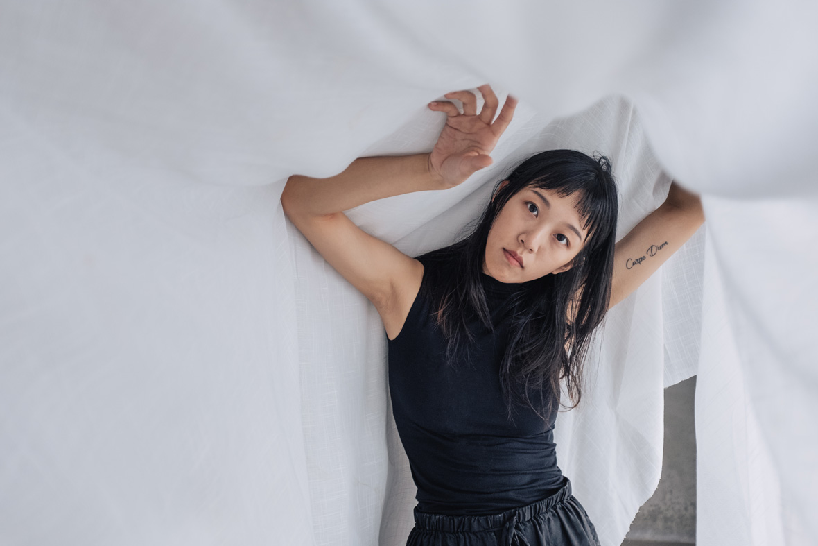
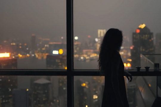
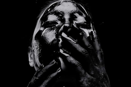
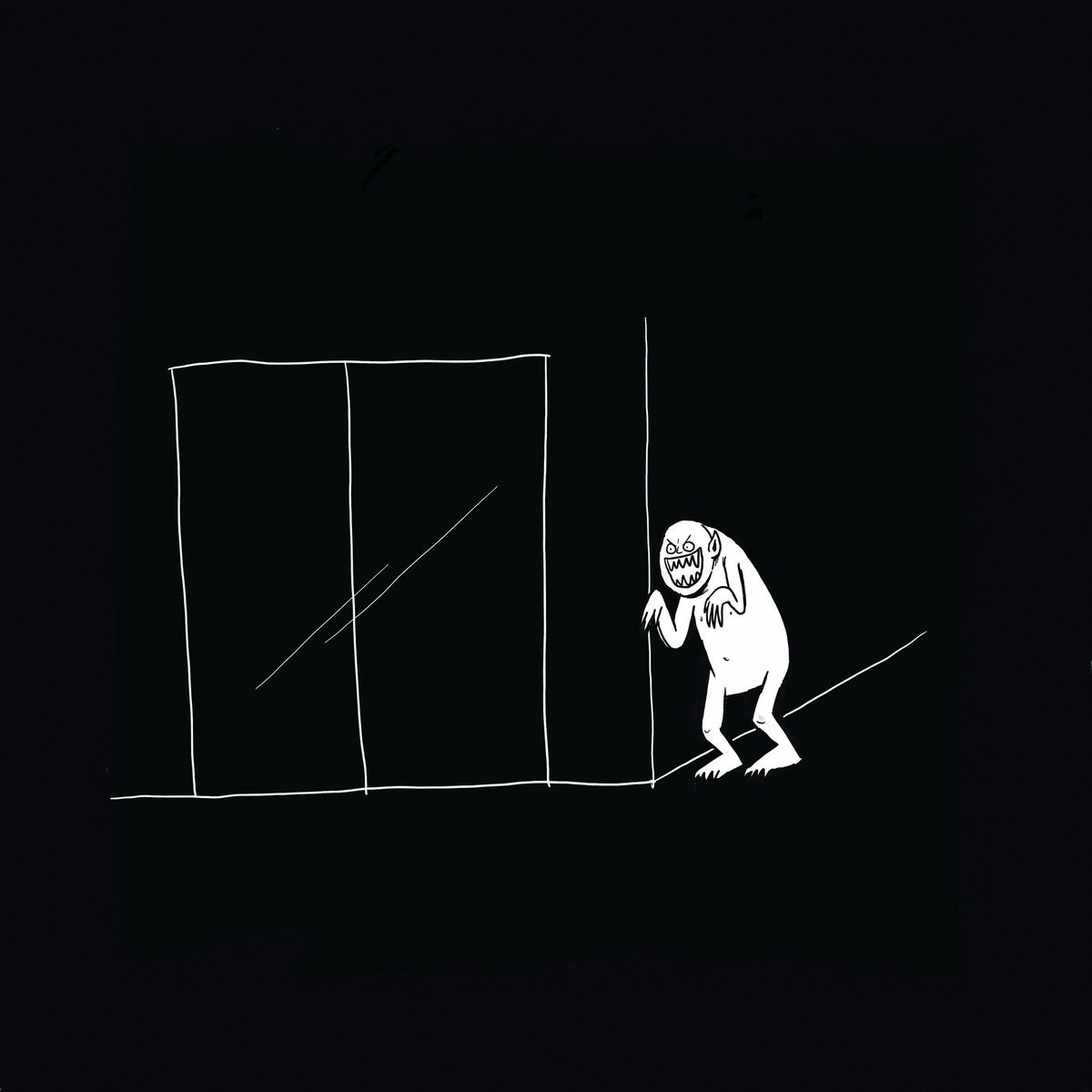
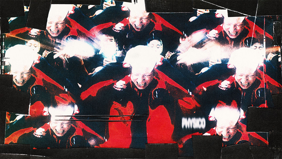
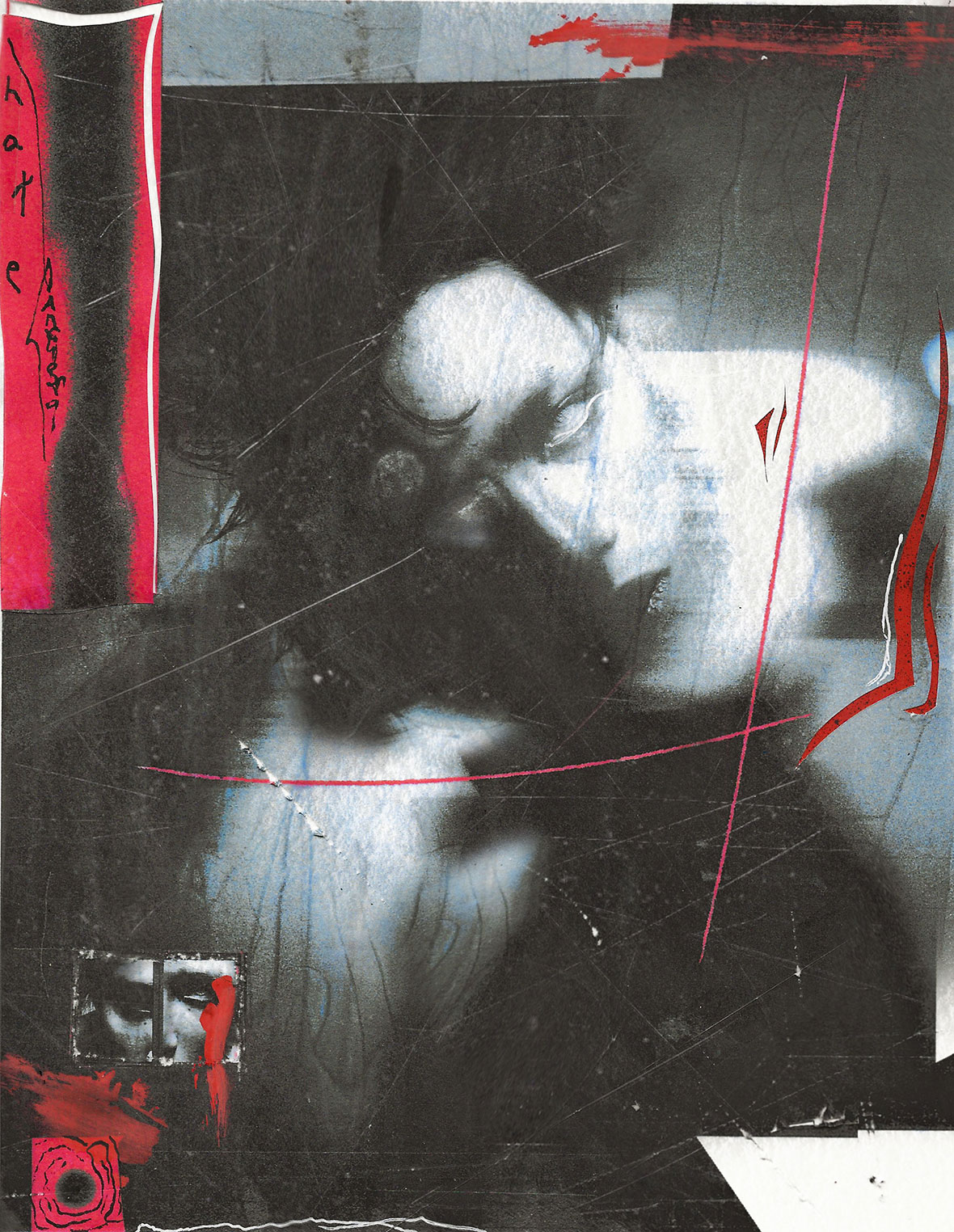
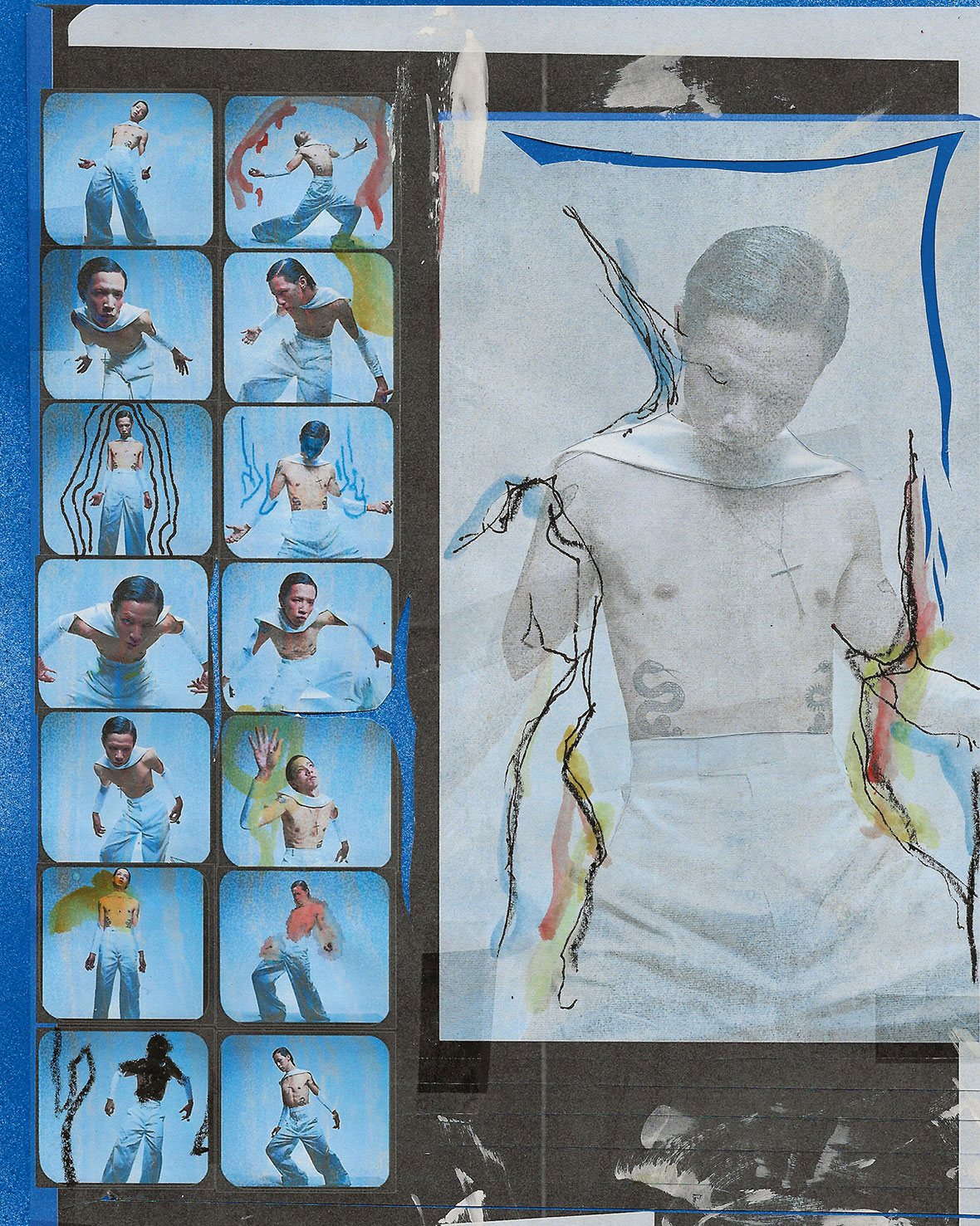
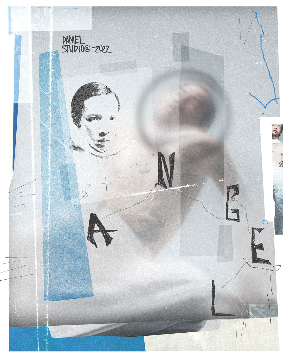
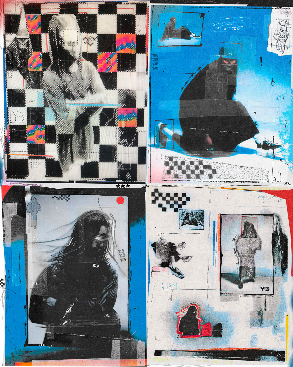
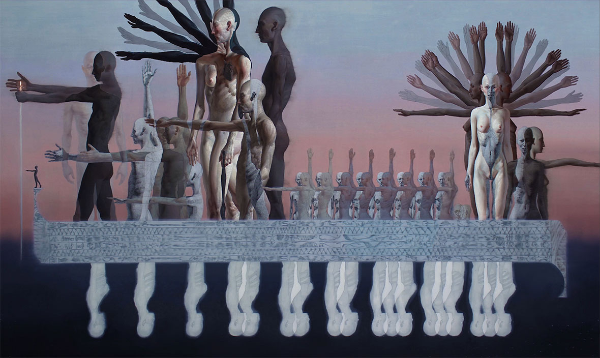
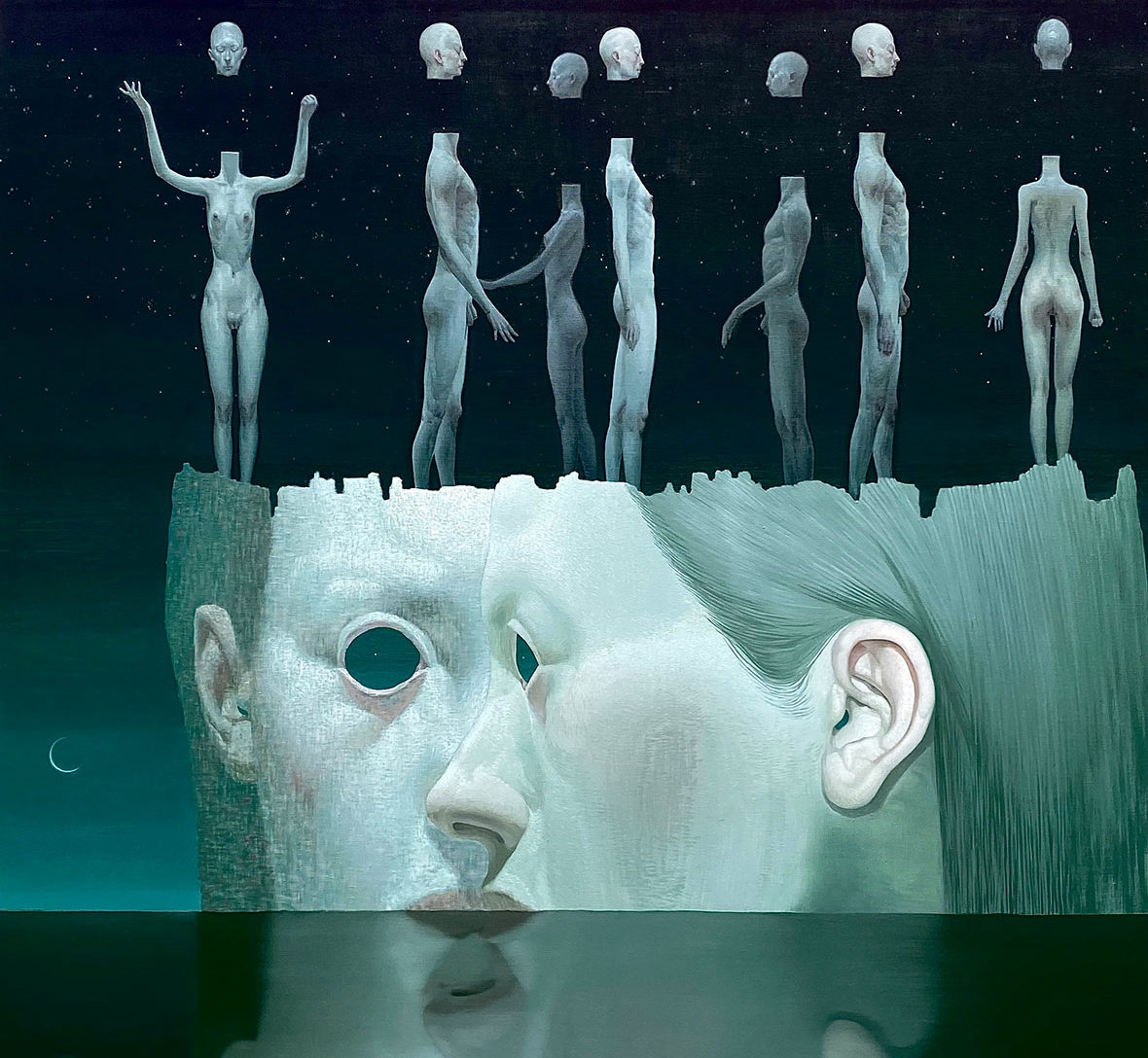
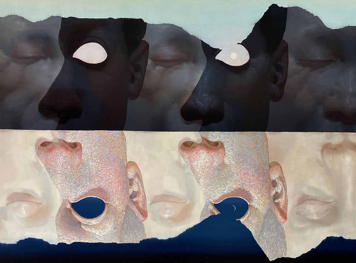
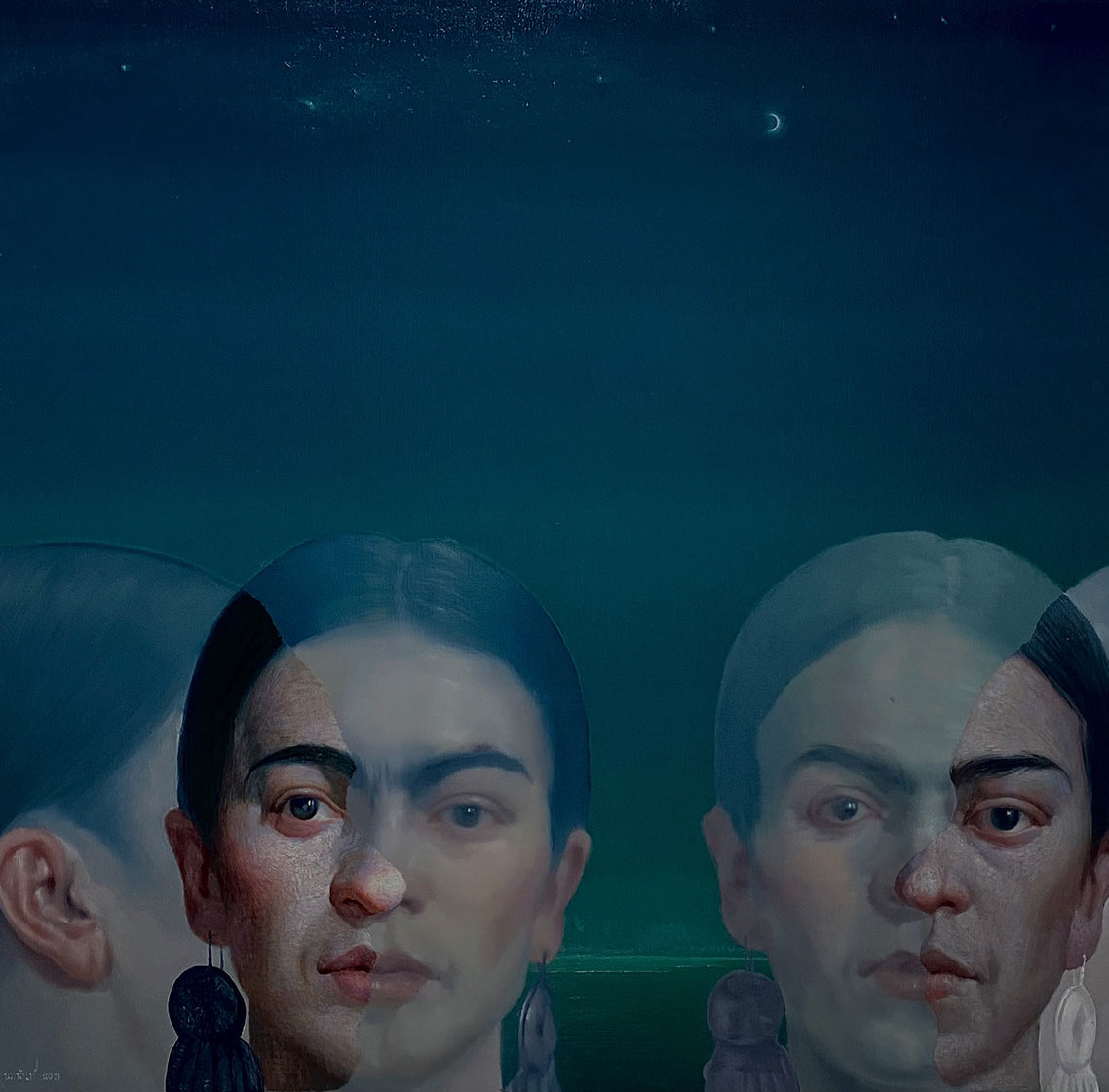
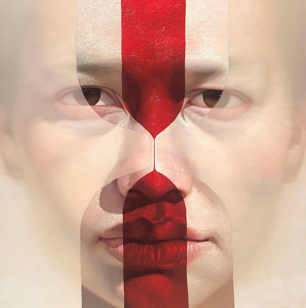
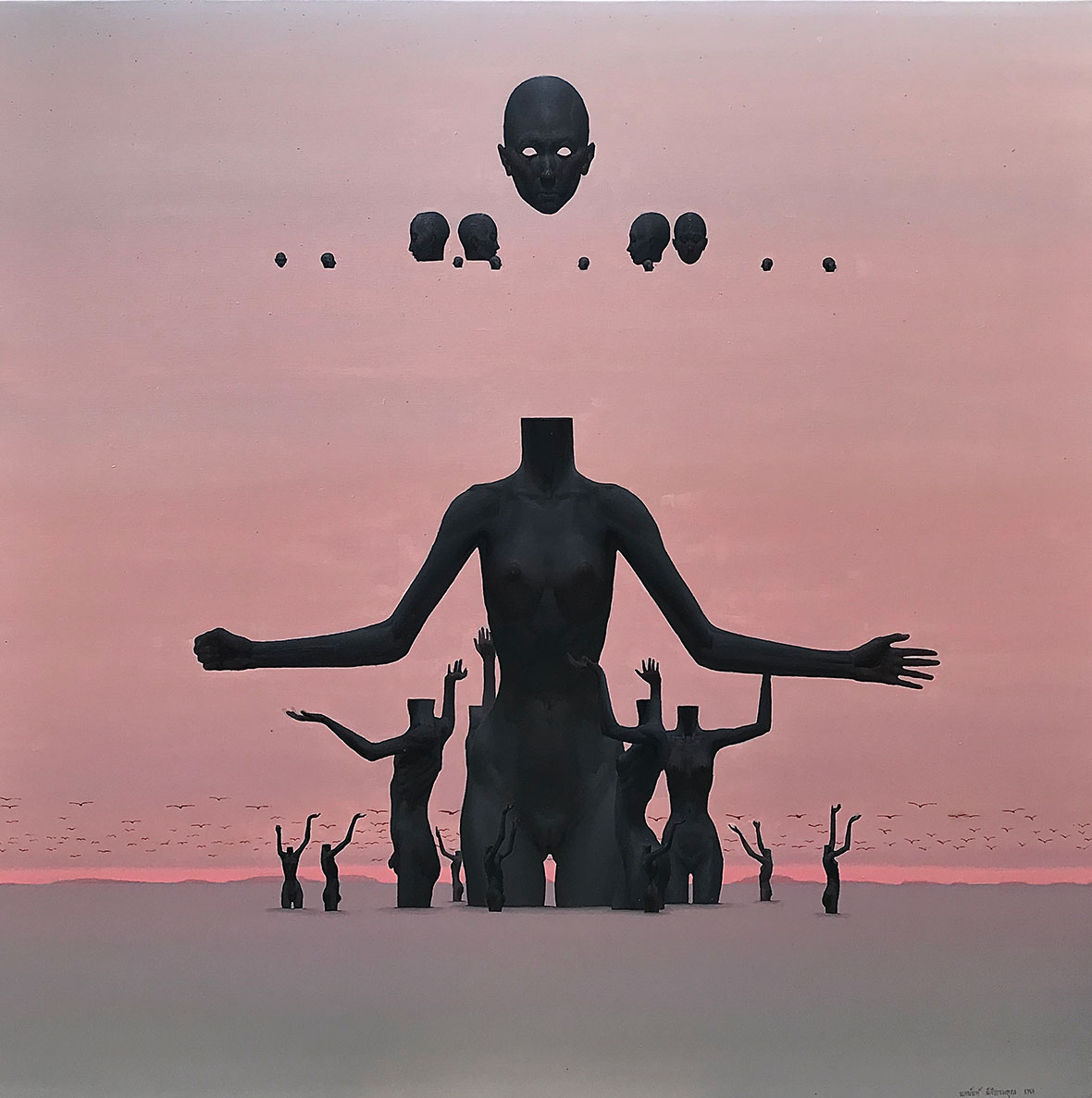
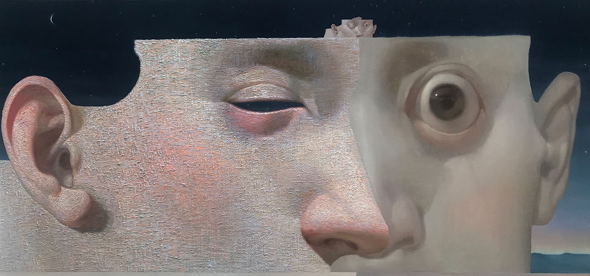
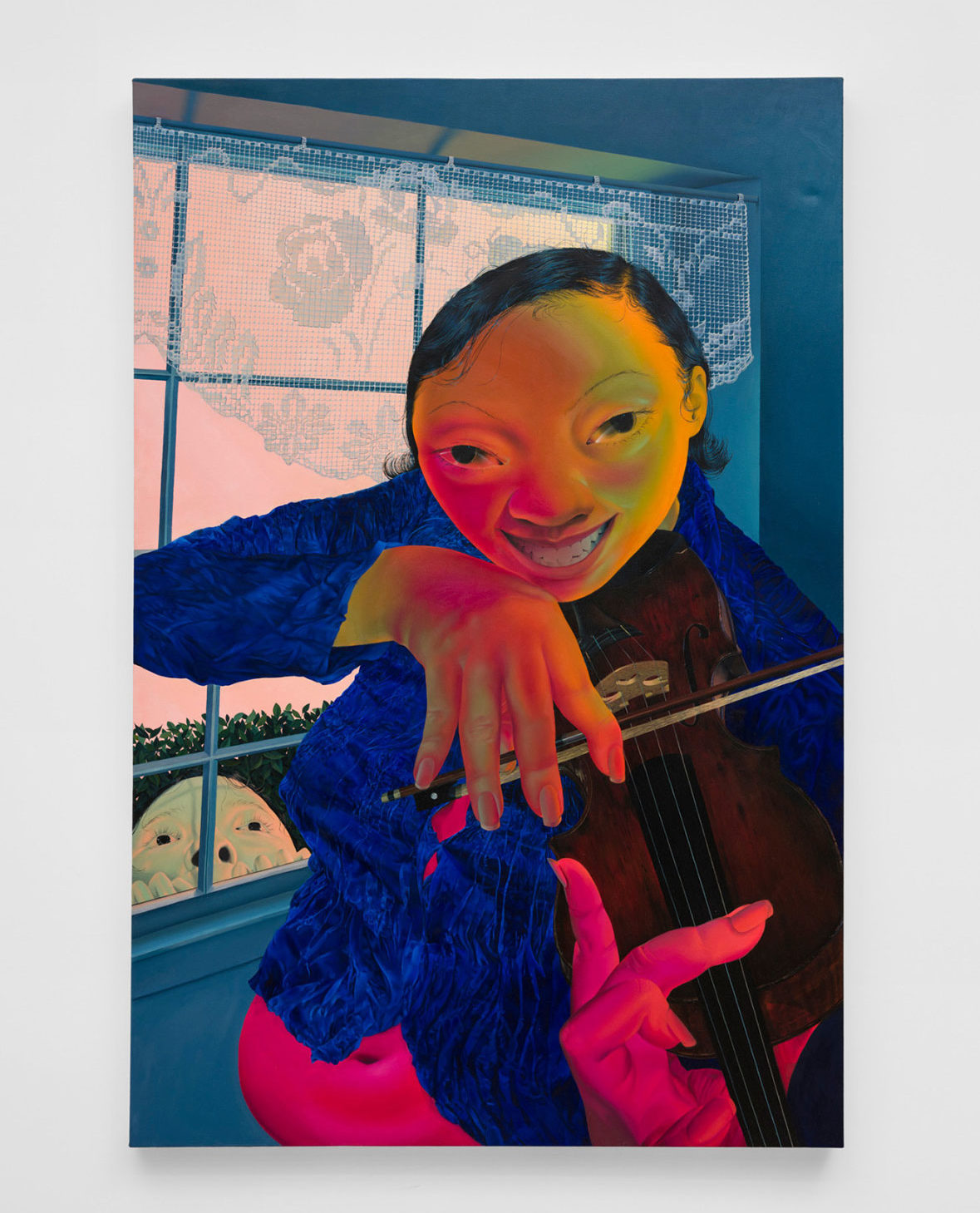
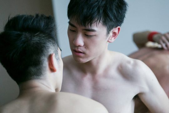
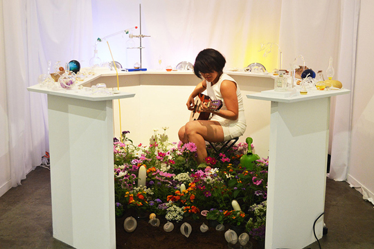
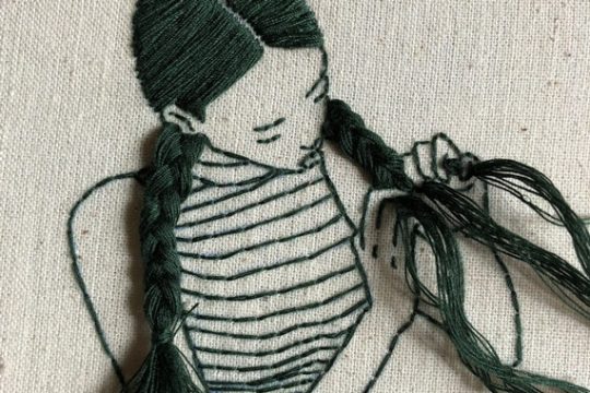
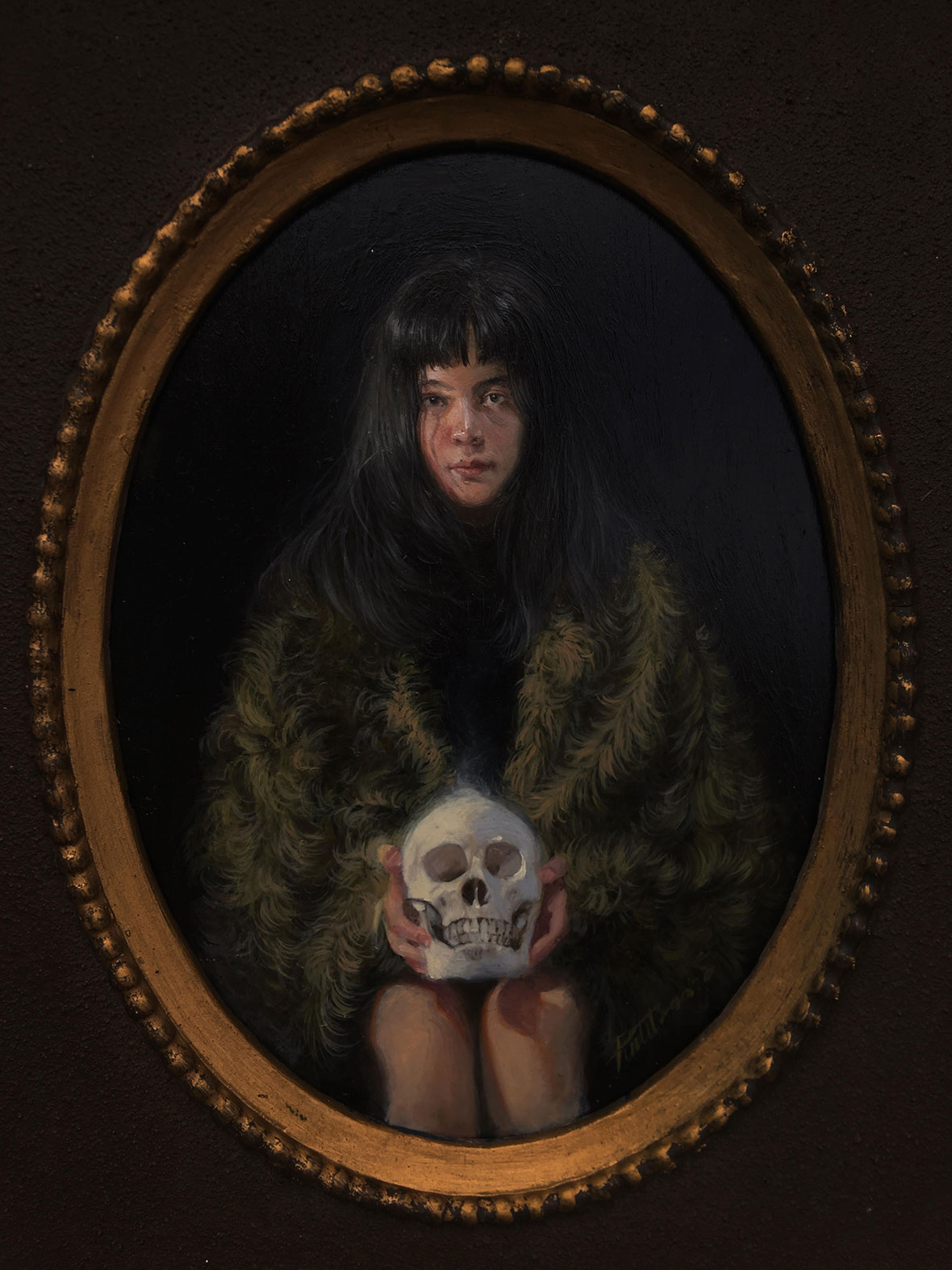
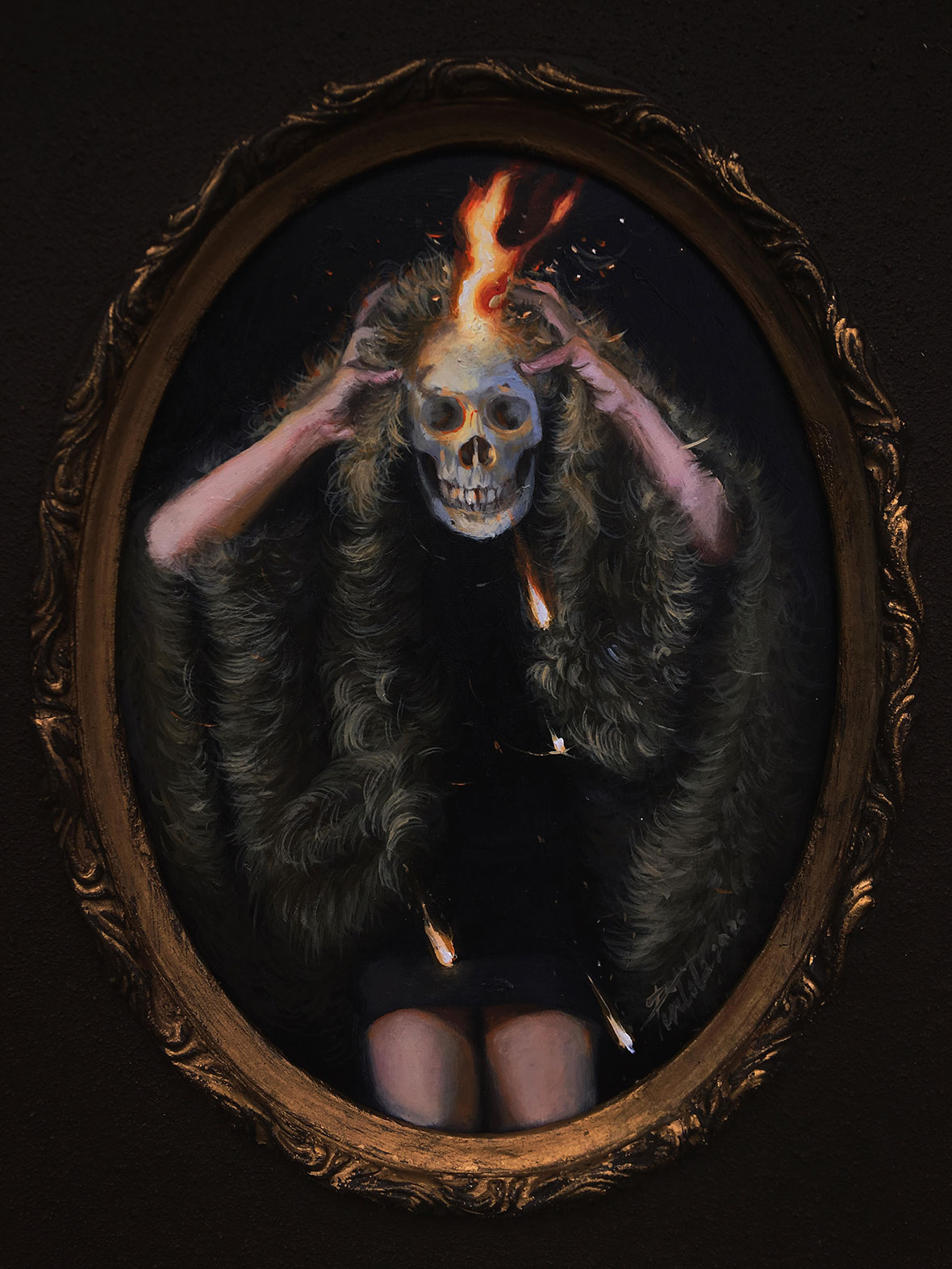
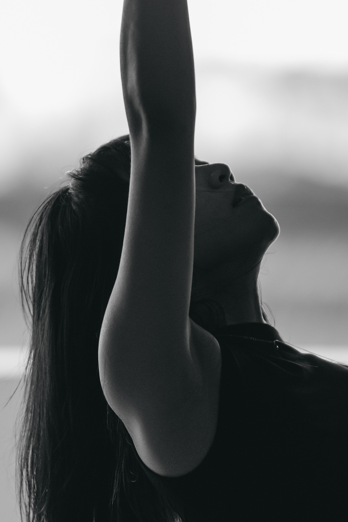
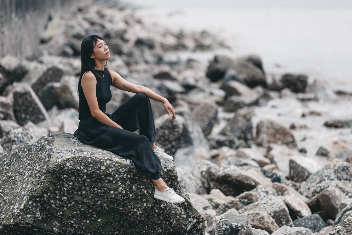
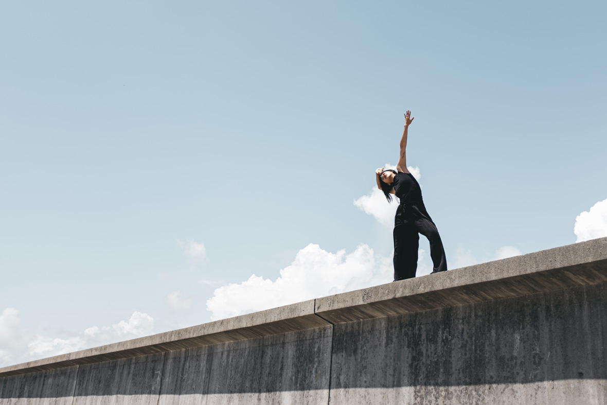
The desire to preserve her grandfather’s memory led Li to create Tomb, a performance meditating on time, memory, and the brevity of life. It’s a deeply personal work that marries Li’s technical skills with a visceral display of emotion. Li approaches the performance with complete honesty, putting her vulnerabilities on display for the audience. Each gesture, from subtle flicks of her wrist to sweeping full-body movements, carries the potency of a thousand words and emotions. Tomb recognizes the inevitability of death, but it’s also a declaration that death isn’t the end: even after we’re gone, we’ll continue to live on in the memories of our loved ones.
带着对祖父的追忆,李可华创作了《墓》—— 一场关于冥想时间、记忆与生命之短暂的表演。这是一部完全个人的作品,将李可华内心深处的情绪与舞蹈专业技艺嫁接在一起。她将最真实的一面搬上舞台,把脆弱的自己放在观众面前。每一个动作,从腕间的轻弹到全身的起伏,都呈现出万语千言和情感的蓄力。《墓》揭示了死亡的必然性,同时也向我们阐述 —— 死亡并不意味着终点,即使我们离去,但我们仍将继续生活在被牵挂的记忆当中。
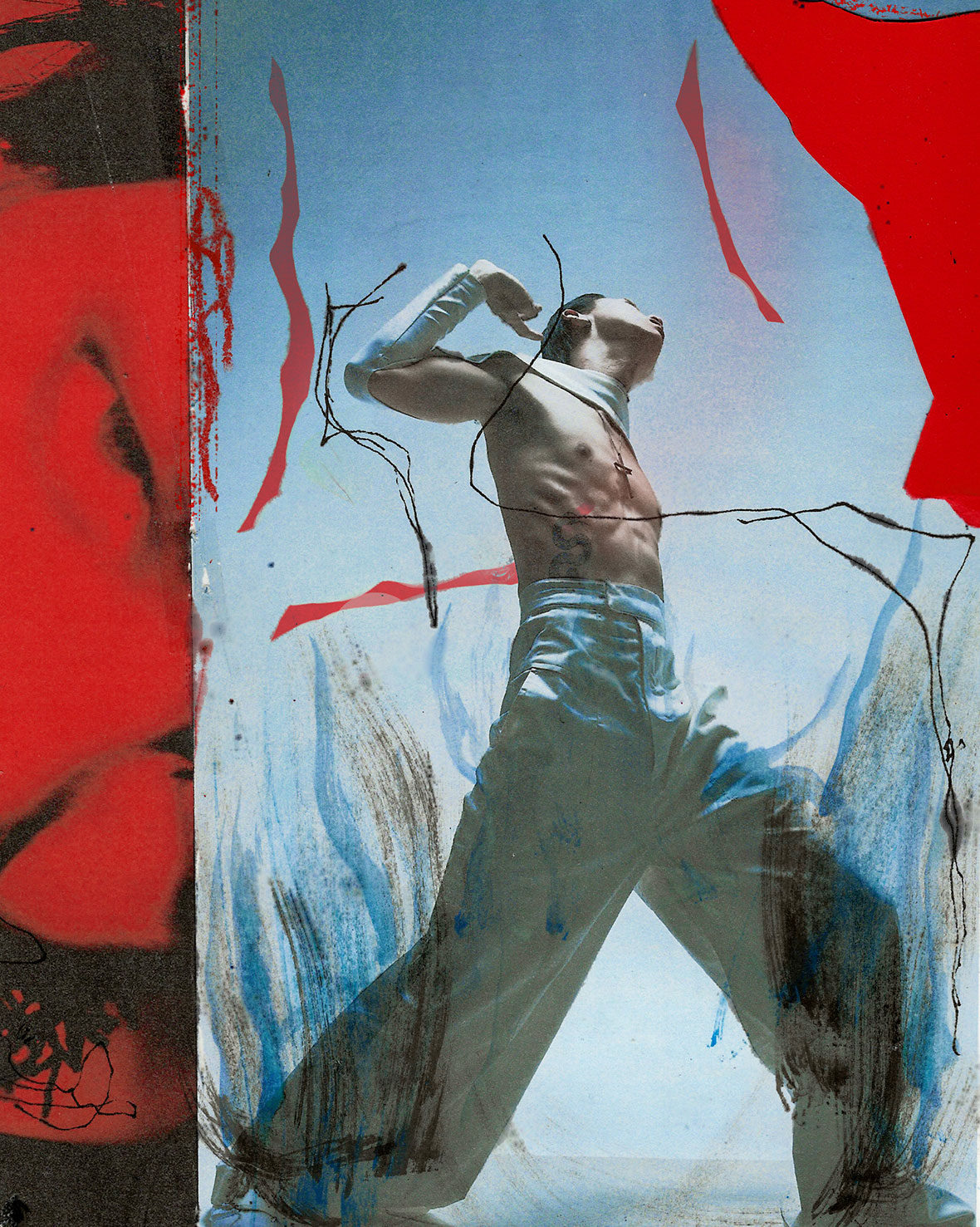
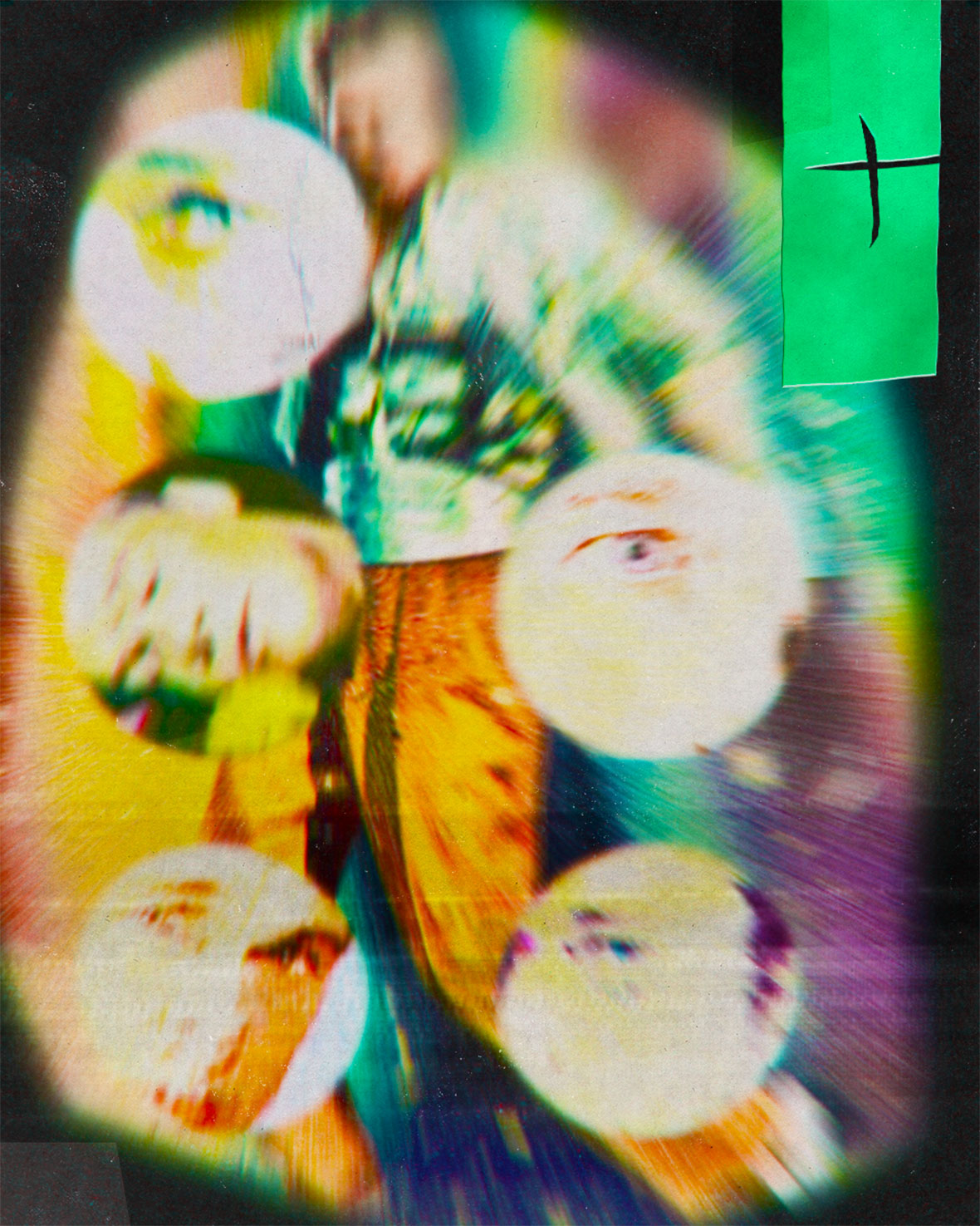
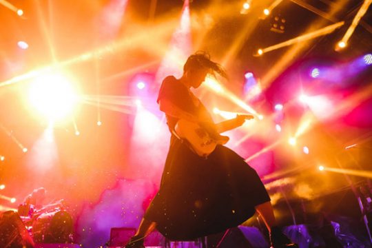
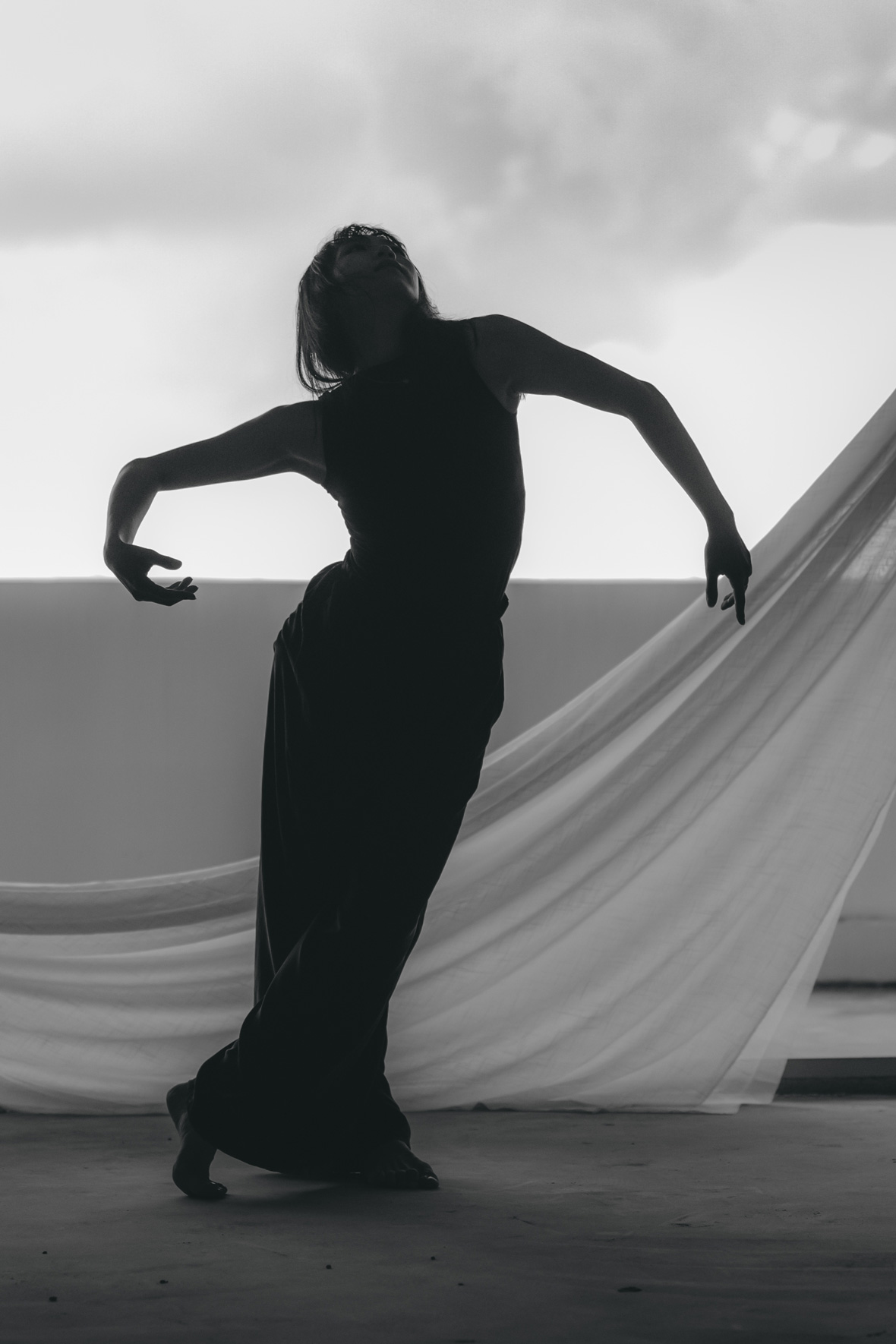
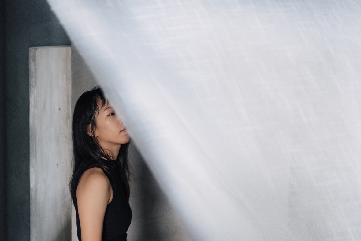
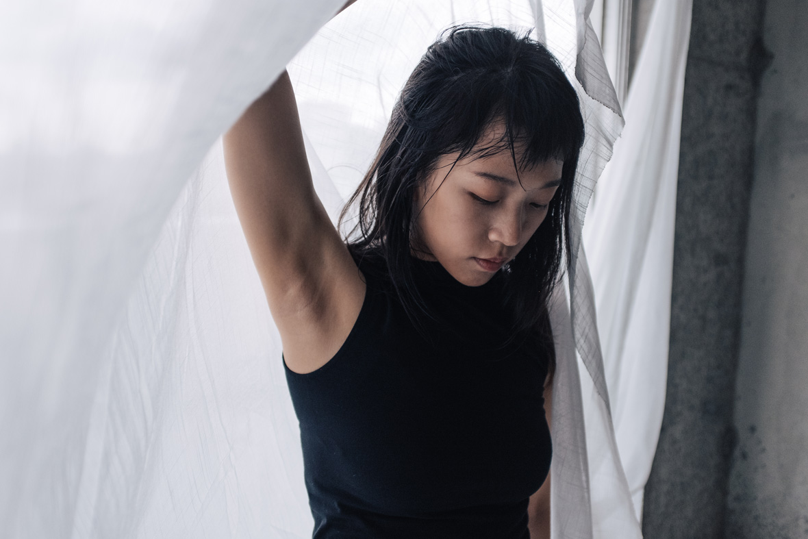
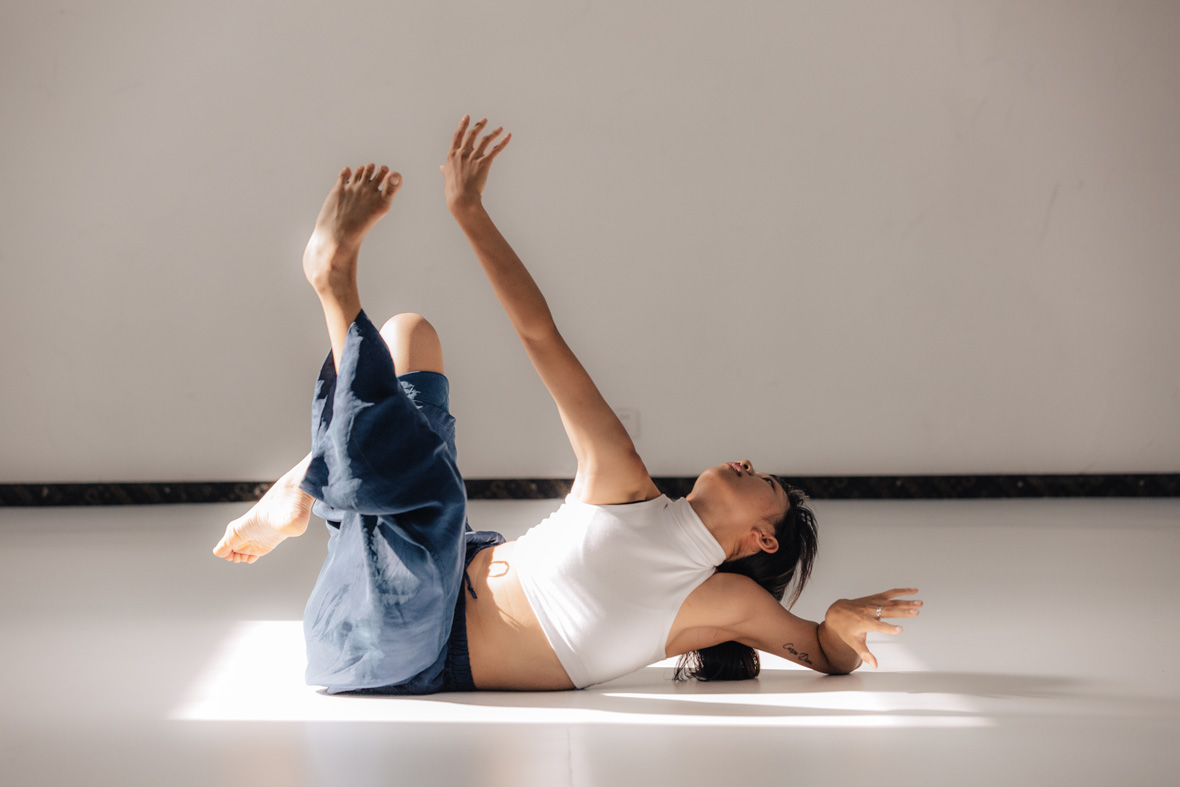
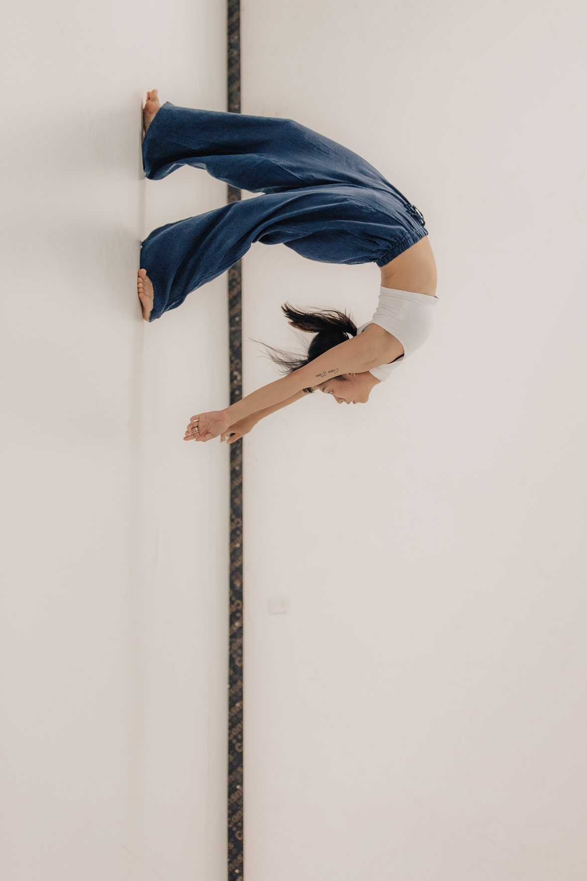
Dance is an ephemeral form of art that exists for a moment and then is gone. The dancer has to be fully devoted to that moment, and Li brings this ethos of mindfulness to her everyday life as well: through the medium of her body, she shows what it means to be present in the now. Every performance is a live rendering of her immediate spiritual, emotional, and mental worlds, a way for her to turn these intangibles into something physical. This immersion in the moment is what makes Li’s work so mesmerizing.
接受痛苦,因为它存在,它必然会流逝,它必然会消失。同时,舞蹈作为一种艺术的短暂形式,它存在于片刻,也终将离去。舞者需要在片刻中倾尽全力,这样的理念被李可华带入了每一天的生活中,她用身体做媒介,展现了活在当下的意义。每一场演出,都像是对思绪、情感和精神世界的即刻描述,是一种将无形转化为有形的方式。沉浸在当下,让李可华的作品令人着迷。
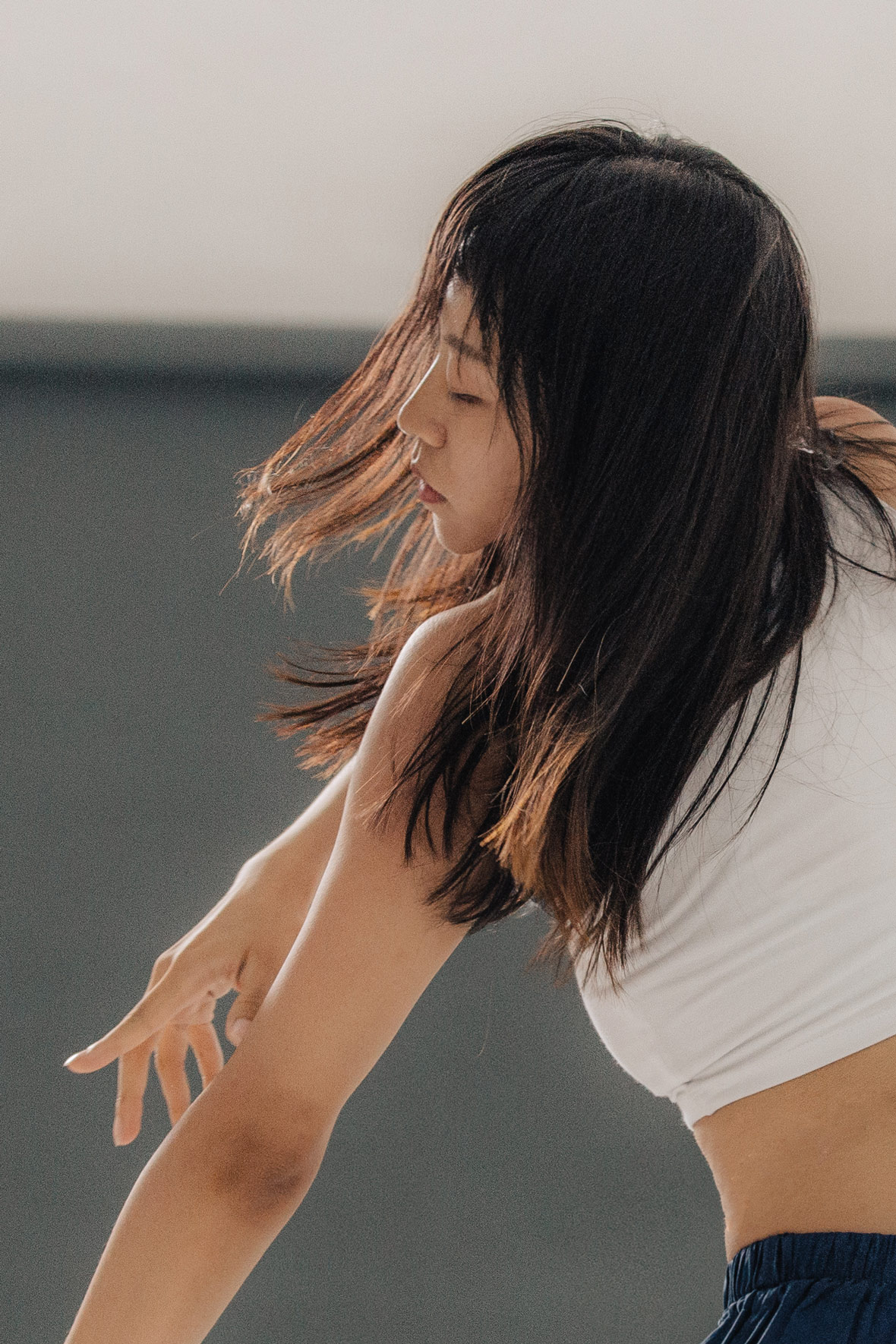
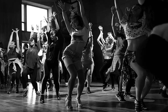
While she puts a great deal of thought into her own choreography, Li doesn’t believe that artistic intent is a prerequisite for good dance. “Even movement not intended to be performative can be riveting,” she says. “I’m often fascinated by how a person moves or gesticulates, and I’ll try to understand the purpose or reasoning behind these movements. It’s all a form of dance to me. I believe that movement in itself—any kind of movement—is the purest expression of life. It’s all meaningful.”
尽管李可华在自己的编排中花了很多心思,但她并不认为艺术意图是好舞蹈的先决条件。“即使那些不带有表演性的动作也令我非常着迷,”她说。“我经常被人体的动作和手势吸引,然后尝试理解这些行为背后的动机和原因。对于我来说,这些都是舞蹈。我相信事物本身的任何运动,都是表达生命的纯粹方式,并且具有非凡的意义。”
Like our stories? Follow us on Facebook and Instagram.
Weibo: ~/LicoLi
Contributor & Photographer: David Yen
Videographer: Damien Louise
Chinese Translation: Pete Zhang