All posts by admin

Poolside Daydreams 泳池畅想

May 24, 2022 2022年5月24日

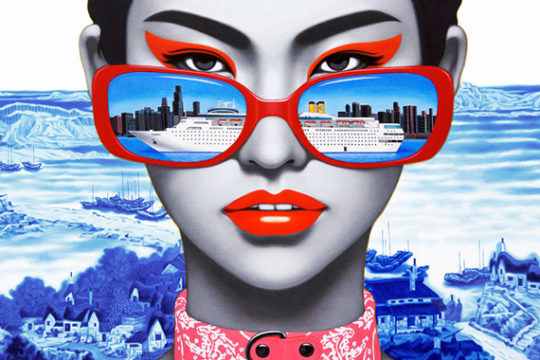
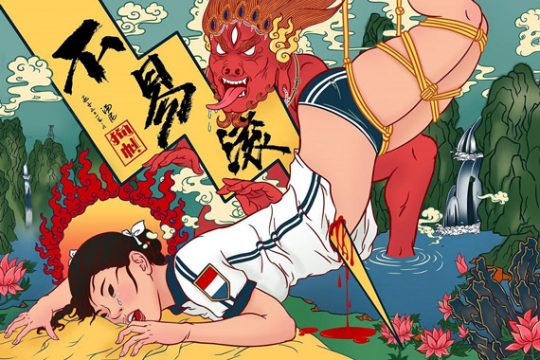
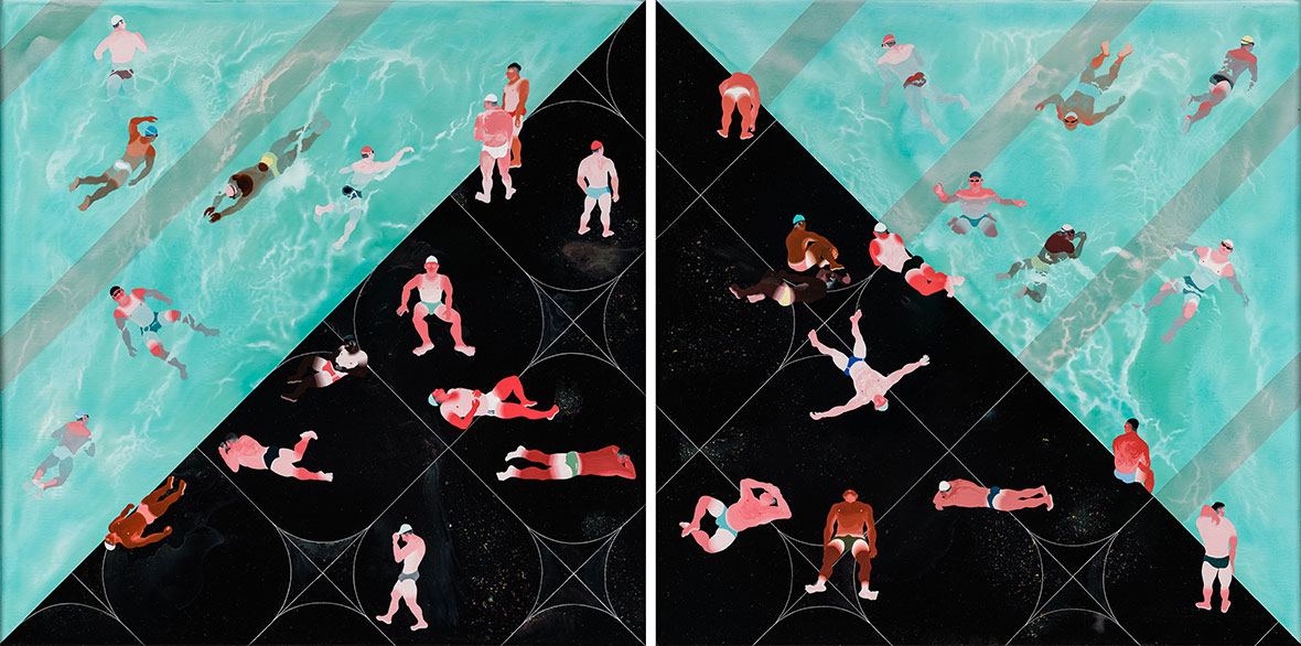
The paintings of Fan Yang-Tsung are technicolor visions of poolside life created with crisp lines and geometric edges. Vacationers lounge along abstract decks, tanning in the sun; others swim weightlessly in hypnotically crystal-blue water or peer out from hidden vantage points behind lush green foliage. The Taiwanese artist’s work seems to balance many alternating views at once: natural and artificial, pleasure and discomfort, cleanliness and filth. And he doesn’t seem too concerned with resolving any of this, which gives his work an uncertainty that’s compelling.


范扬宗的画作以俐落线条、几何轮廓突出泳池的灿烂时光。画中的主角,有的躺在抽象化的池畔沐浴阳光;有人在葱郁的绿叶背后探头张望;还有人则仿如失重状态,飘浮于梦幻般的蔚蓝之上。这位台湾艺术家的笔触似乎在不同角度之间切换:自然与人工、愉悦与不适、纯洁与情色。而这一切却像是他无意而为之,这也让他的作品透露出引人入胜的不确定性

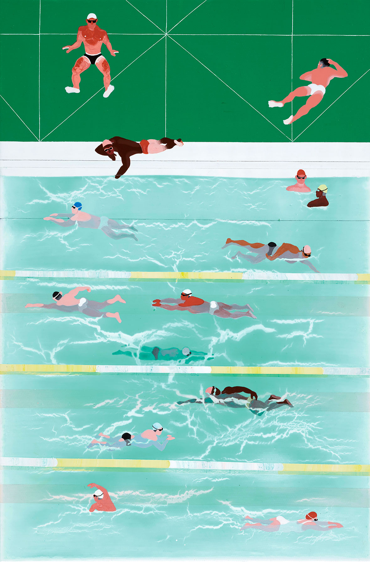
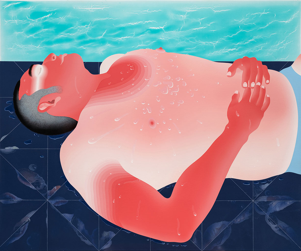
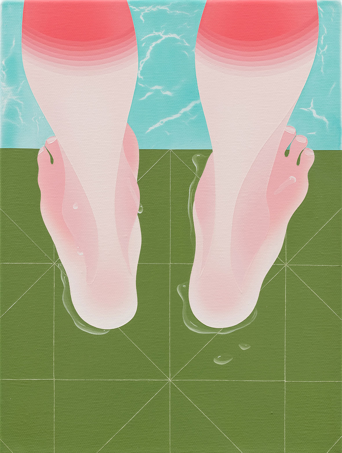
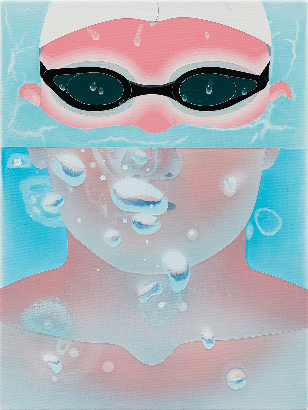
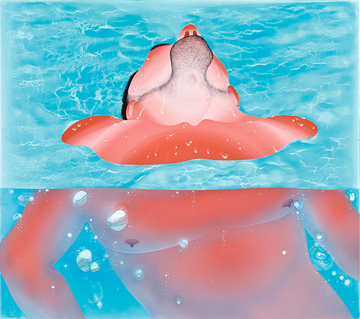
Some of Fan’s work is painted from a bird’s-eye view, with pool-goers splayed about at random below. Sometimes he gets up close and personal, with a focus on someone’s sunburnt back or calves. Others are painted from an voyeuristic perspective from behind the bushes. There are paintings set inside the pool and below the water as well. All together the variety of angles and viewpoints of the same scene gives his work a , the feel of a photo album of an overzealous cameraman. It’s pretty much all men in his works, and he’s straightforward about the meaning behind this: “It’s because I’m attracted to men.”


在一部分作品中,范扬宗以空中俯瞰的角度来进行绘制,让泳池中玩乐的人物随性地分布于画面之上;时而,他又会拉近距离,从亲密的角度来放大阳光照射下的肌肤;有时,他又好像躲到灌木丛后,偷窥画中之人。除此之外,他还会潜入游泳池内部,从水下的角度来进行创作。同一场景的各种角度和视角,令其作品看上去就像是一个狂热摄影师的相册。他作品中的人物几乎无一例外全是男性,而他也直截了当地揭晓了背后的原因:“因为我会被男人迷住。”

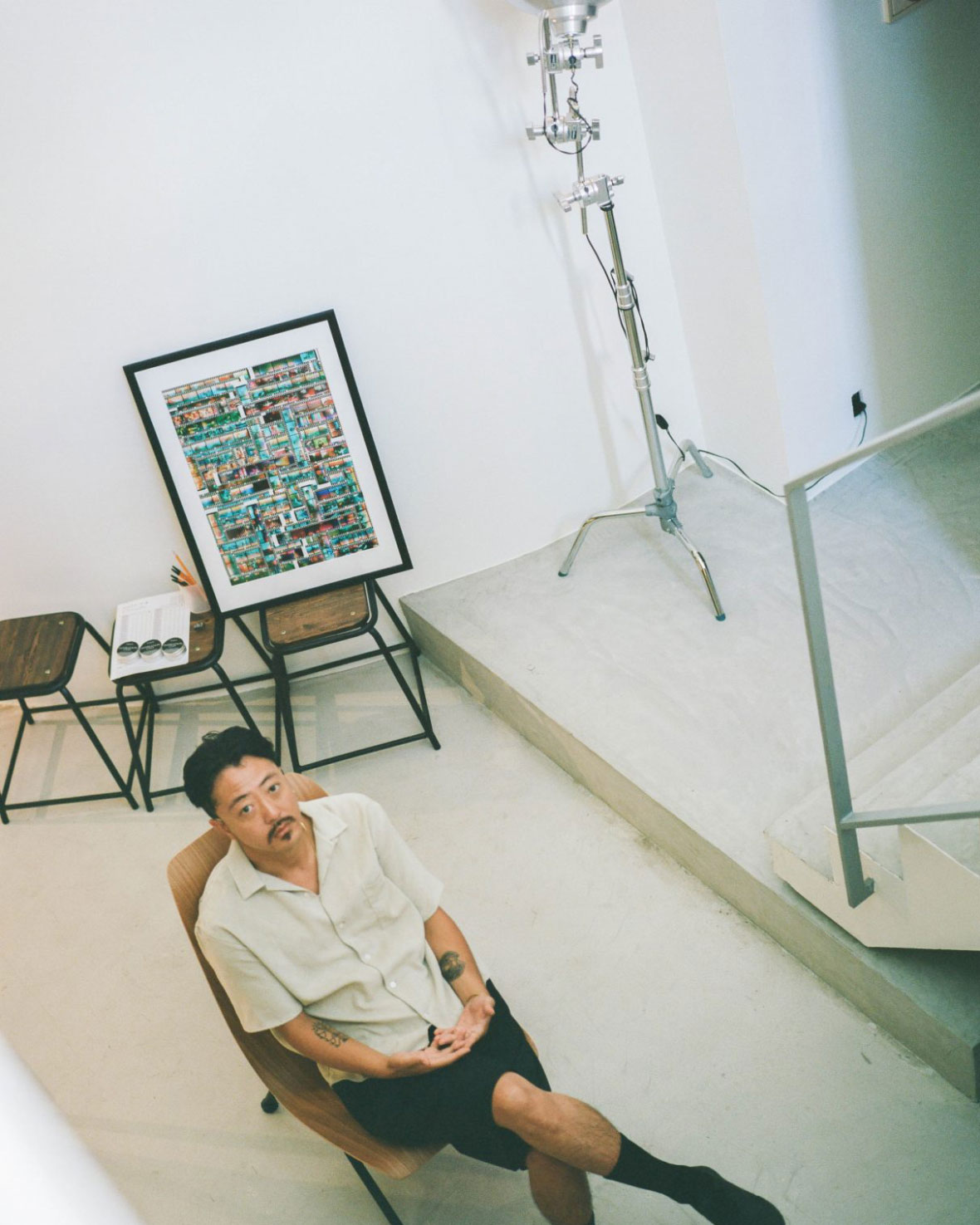
Fan was born and raised in Hsinchu, a province about an hour southwest of Taipei where he still lives and works. Outdoor pools aren’t very common there, but in the capital, they’re regular and affordable. Fascinated by public pools, he realized they would make for great subject material about ten years ago. “Swimming pools are a public space where everyone can show off their bodies and express themselves,” the 40-year-old artist says. “People really enjoy being seen and seeing others. The desire of watching others’ bodies is at the same time fulfilled.”


范扬宗在新竹出生和长大,这里距离他现在生活和工作的台北西南部约一小时车程。在新竹,室外游泳池并不常见,但在台北却很普遍,而且费用低廉。他对公共游泳池很感兴趣,早在大约十年前就发现这是一个非常不错的创作主题。“作为一个公共场所,每个人都可以在游泳池展示自己的身体,表达自己,”这位时年 40 岁的艺术家说,“泳池的人们喜欢被注视,也喜欢观察他人,他们可以在这里满足观察他人身体的愿望。”

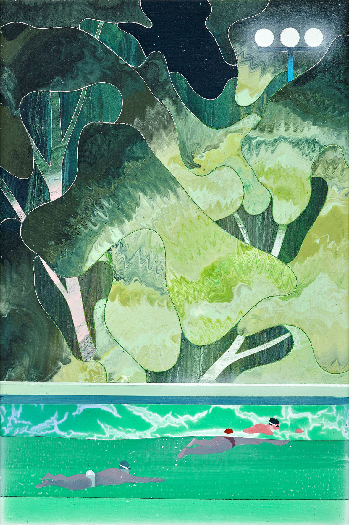
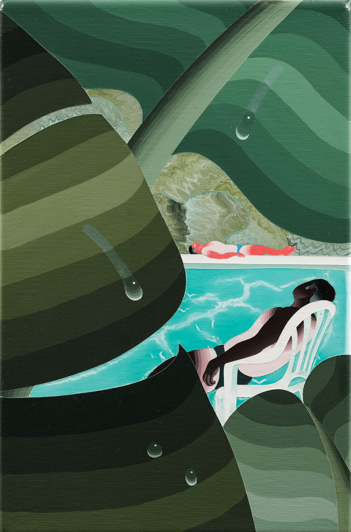
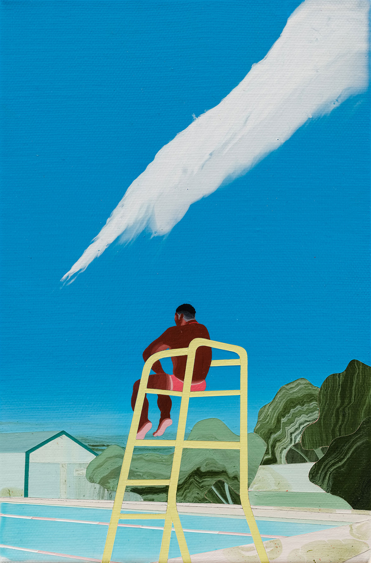
Sometimes nature is prominent in Fan’s paintings, with vibrant green trees scaling high or large verdant leaves taking up most of the foreground. But it’s always contrasted with the built environment. Sterile blue water, unnaturally green-painted surfaces, bright towering spotlights. Even his style of linear gradient shading seems to refer to the artificial, the digital. This is contrasted with a swirling paint effect used for foliage and waves. Geometric patterns are paired with curvy bubbles and wavy leaves. The pool is, after all, a human recreation of something we’re drawn to in the natural world: “People are trying to recreate this environment where they relax and interact with each other,” he says. The results are not always great though, and oftentimes he depicts the pools and surfaces as being dirty and unkempt.


有时,大自然是范扬宗的画作的主要元素,绿植高高延伸,大片青翠绿叶占据着画面大部分前景,但总是与周围的建筑环境形成鲜明对比,譬如蔚蓝色的消毒泳池、非天然的绿色油漆地面、明晃刺眼的聚光灯。就连他的线性渐变色似乎也在暗指人工与数字化,与树叶和波浪的漩涡纹理形成鲜明对比。几何图案与弧形气泡和波浪形叶子相得益彰。毕竟,游泳池是人类对所向往自然界事物的重现:“人们正试图重构这种供他们放松和交流的环境,”他说,但结果往往并不理想,很多时候,他笔下的泳池和地面显得脏乱。

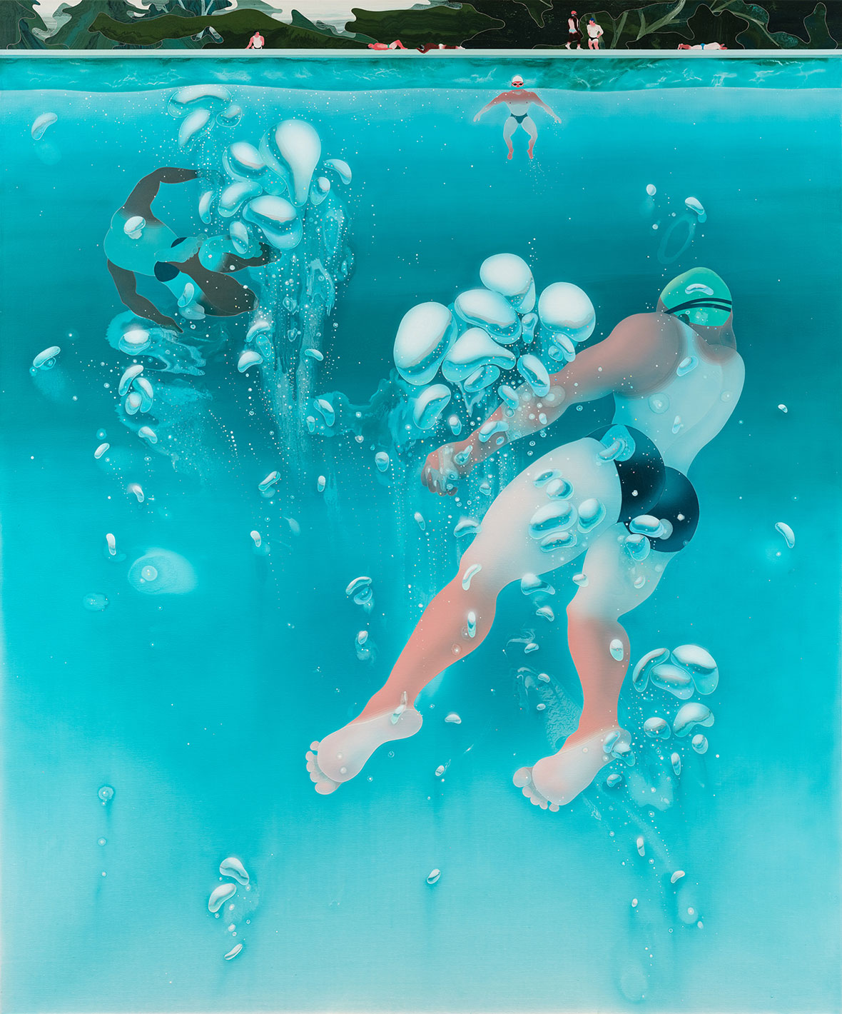
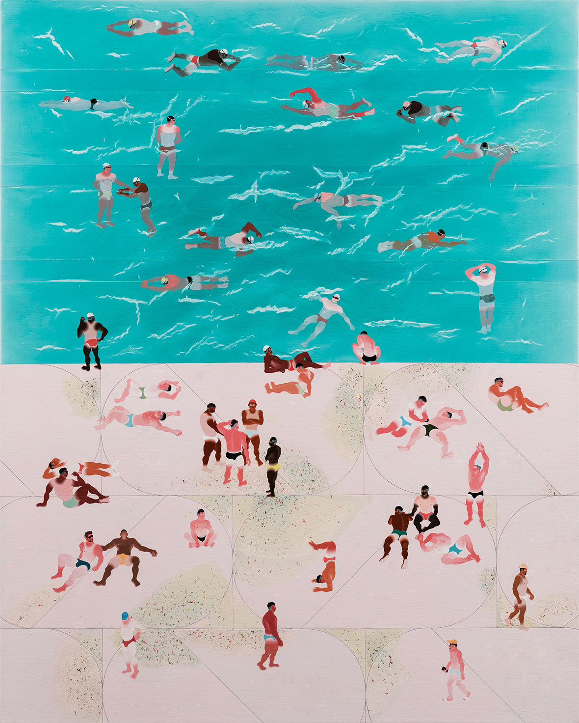
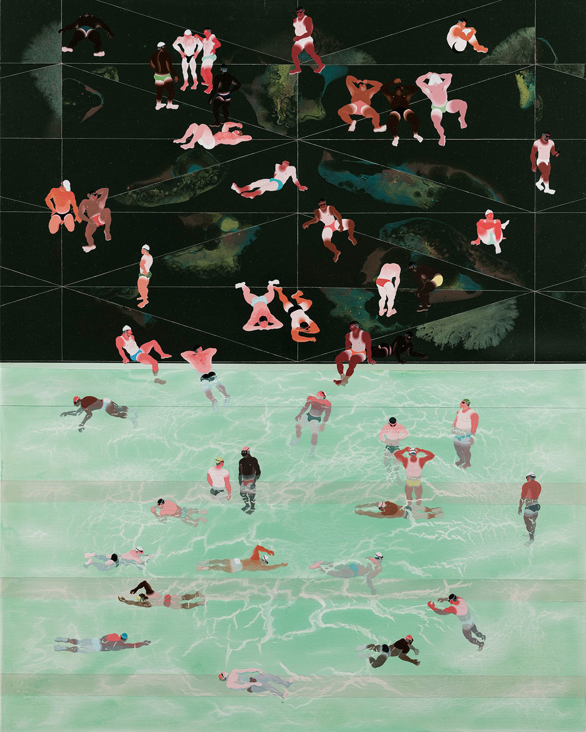
Contrast is central to most of Fan’s work. A sharply delineated horizon line; a pool’s edge in a diptych that switches up colors on each side but shares a common through line; the tanlines. From pale white, to lobster red, to dark umber, he relishes differences in skin tones that he paints. He says that while tanning is often frowned on in East Asia, especially among women, it’s considered healthy and attractive for gay men. He portrays his characters lying prone in every corner of the pool, exhausted by the heady sun or happily relaxed. Awkward tan lines with pasty white flesh starkly juxtaposed alongside freshly burnt skin is a regular feature as well. “This is just a normal feature at the pool, but I try to exaggerate that aspect,” he grins. “Tan lines show off what areas are usually concealed, which suggests a sensual desire of peeking at what’s not usually available.”


在范扬宗大部分作品中,对比是核心。清晰明了的地平线,以游泳池边缘将画面分成两侧,不同的颜色并互并列,但又共享着同一条分界线;从白皙、红润再到黝黑的肤色,他热衷于绘画不同的肤色。他表示,虽然在东亚国家,人们不喜欢晒黑,特别是女性,但对男同性恋者来说,这种肤色代表着健康和吸引力。他笔下的人物俯卧在游泳池的各个角落,沐浴在热烈的阳光,或心情愉快地放松休息。除此之外,黝黑与白皙之间明显的分界线也是其作品中常见的细节。“这在游泳池边很常见,但我喜欢夸大这种效果,”他笑着说道,“这些分界线代表了人们喜欢遮盖的部位,也代表着人们渴望窥看又看不到的地方。”

While Fan paints mainly in cool colors, pastels, and pared-down tones, a sense of warmth still radiates from his canvases. Clear blue skies, dripping sweaty, and well-cooked skin imbues an unmistakable summertime vibe. He also manages to avoid easy categorization, constantly readjusting the way his work could interpreted, all the while remaining laser focused on his subject material. It makes his work instantly accessible while still encouraging deep viewing—a difficult balance that he pulls off with ease.


虽然范扬宗主要以冷色调、粉彩和低饱和度色彩绘画,但其画面上仍然洋溢着温暖感。晴朗的蓝天、汗水和皮肤,提升了画面的温度。他刻意避免作品被简单分类,不断调整作品的解读方式,同时专注于同一个主题,这使得他的作品与观众产生共鸣,又引观众对画面深入解读。他不费吹灰之力,就实现了这种巧妙的平衡。

Like our stories? Follow us on Facebook and Instagram.


Instagram: @xyzfanxyz


Contributor: Mike Steyels
Chinese Translation: Olivia Li


喜欢我们的故事?欢迎关注我们 Neocha 的微博微信


Instagram: @xyzfanxyz


Contributor: Mike Steyels
Chinese Translation: Olivia Li

From Lore to Art 菲律宾怪谈

May 19, 2022 2022年5月19日
From the Trese comic / Image via Alamat Comics 《Trese》漫画版,图片来自 Alamat Comics

An elevated streetcar screeches to a halt, its darkened silhouette sitting beneath the glare of a giant LED billboard. The passengers disembark onto the tracks, only to be swarmed by fanged creatures. This is the opening scene of “Trese,” an animated series responsible for the most famous appearance of Filipino folklore on a global platform. The show is set in the dark megalopolis of a fictional Manila, and brings to life a cast of creatures from Filipino myths in a contemporary, neo-noir storyline. “Trese” follows its namesake hero, a detective supported by magical bodyguards. The trio is called on by the police when supernatural crimes are committed, which begins happening with increasing frequency. While the show is currently the most well known, there are a number of artists today who continue these traditions through contemporary art forms, as many generations have done before them. You can find folklore in nearly every form of art in the Philippines today—in fashion editorials, illustrations, fine art, and even graffiti. These artists see it as a way to explore Filipino identity, to decolonize their art, or to revisit fond childhood memories.


随着一声巨响,一辆高架有轨电车紧急刹停,漆黑的车身停靠在一块巨型 LED 广告牌的眩光之下。乘客纷纷下车走上铁轨,殊不知身边长满獠牙的怪物正朝着他们蜂拥而至。这是动画片《灵探特莱丝》(Trese)的开场。该动画将于 Netflix 平台放送,内容是诸多菲律宾家喻户晓的民间传说。片中以虚构马尼拉为背景,运用“新黑色”(Neo-noir)风格,生动呈现了菲律宾神话故事中的鬼怪形象。《灵探特莱丝》的主角特莱丝是一位神探,拥有两位魔法保镖助手。因为超自然案件近来频频繁发生,警方找到这三人寻求帮助。

如今,这部动画在网上已有较高的知名度,但其实,一直以来还有很多艺术家通过艺术的方式来讲述当地民间传说。在今天的菲律宾,从时尚杂志、插图、美术作品乃至涂鸦,几乎每一种艺术形式都能找到民间传说的元素。对于艺术家而言,这是他们探索菲律宾身份、非殖民化艺术以及重温美好童年记忆的一种方式。

A screencap of Trese / Image via Netflix 《灵探特莱丝》剧照,图片来自 Netflix

Filipino folklore is a mix of Animism (the belief that places and creatures have their own spiritual essence) and local superstition whose roots in the archipelago stretch back to a time before Spanish colonization in the late 1500s. The mythological characters that populate these stories are often mischievous and sometimes outright demonic, but a few are also known to provide blessings. Although the specifics change from region and group, there is a lot of overlap across the country with the same concepts, even if they at times appear with different names and minor details. Many of these stories have pre-colonial roots, but they’re frequently altered from their origins by the widespread adoption of Catholicism and other contemporary influences.


菲律宾民间传说信奉泛灵论(即相信所有地方和生物都有灵魂或精神的存在),其最早可追溯到 16 世纪后期,即西班牙殖民之前的时代,后来混杂了当地的迷信文化造就了现在的样子。故事中的角色通常耍宝顽皮,有时则是彻头彻尾的恶魔,还有一些是能带来祝福的善良角色。虽然角色在每个地区的叫法不同,但往往大同小异,有着大致相同的背景。这些故事大都源自前殖民时期,后来受到天主教和不同时代的影响,而不断被后人改编。


无法观看?前往腾讯视频

Belief in and discussion of folklore is more common in the provinces, but it certainly makes its way into the city as well. Trese, which was originally a Filipino komik before its animated adaptation by Netflix, makes a point of reimagining these mythological characters by removing them from their rural origin stories and placing them in urban settings. So for example, instead of challenging people to wrestle in the forest, the Tikbalang competes in drag racing. And the Nuno sa Punso becomes something more like a Nuno sa Sewer, since it lives under the street instead of a mound of dirt.


相较于城市,民间传说的迷信和讨论在偏远地区更为普遍。动画片《灵探特莱丝》改编自一部菲律宾漫画,漫画的故事设定在乡下,而影片则将故事背景设定在城市中,重新构想了传说中的角色。例如,Tikbalang(马怪)原本与人在森林里摔跤,在动画里则变成飙车一族;Nuno sa Punso(土丘之祖)变成了 Nuno sa Sewer(下水道之祖)。

Carved statues representing Anito, or spirits and deities. An illustration by Ralph Reyes. “ Anito(恶灵)”雕塑。来自插画师 Ralph Reyes 的作品。

The Dictionary of Philippine Mythology” is another recent piece of work celebrating the country’s folklore traditions. It’s an English-translated edition of a book dating back to 1895 cataloging the various mythologies across the country. It includes the original ethnographic maps and a compendium of Filipino tribes and languages, but now features an additional 59 historical photographs and 19 illustrations. ” I don’t think we should forget our roots,” says Ralph Reyes, who drew the illustrations. “Our culture is ever-evolving and Filipino folklore could always adapt to contemporary storytelling. We haven’t had enough representation, even locally.” He for one believes the stories, although he’s not sure he’s experienced any himself. “There are a lot of witnesses, especially in Mt. Makiling, where my family is from.”

Among Reyes’s new illustrations is the Aswang, one of FIlipino folklore’s most well-known creatures. In animal form, these monsters are often depicted as a very large pig or dog. They can also have long tongues, believed to be capable of sucking fetuses out of pregnant women. There’s also an Aswang of vampiric origins, those who delve more in witchcraft, and ghouls. But Reyes thinks the Hukloban is the most powerful mythical creature, as she can burn down a house with just the point of her finger. You can find her in the dictionary as well.

While the dictionary is more explicitly educational, there are a lot of artists taking creative license with the stories.


英译版《菲律宾神话词典》(The Dictionary of Philippine Mythology)是近期以当地民间传说为主题的另一部作品,其初版可追溯至 1895 年。当中记载了菲律宾全国各地大量神话故事,包括原始的民族志地图、菲律宾部落和语言的描述。现如今,又新增了 59 张历史图片和 19 幅插图。负责绘制插图的 Ralph Reyes 表示:“我们不应该忘记文化根源。我们的文化在不断发展,菲律宾民间传说也可以适应当代来进行叙述。一直以来,民间传说没能获得足够重视,即使在本地也是如此。”他甚至相信其中一些故事曾真实发生过,“尤其在我的家乡马基林山,很多人都曾亲身经历过,在民间口口相传。”

由 Ralph 新增的插图,包括 “毒裁梦魇” 阿斯旺(Aswang)——是菲律宾民间传说中最闻名遐迩的鬼怪之一,它们往往长着猪狗之类动物的躯干、长长的舌头,据说会从孕妇身上吸食胎儿。还有吸血鬼版本的阿斯旺,它们精通巫术。除此之外,Ralph 还认为胡鲁班(Hukloban)是字典中最强大的恶魔,手指随便一点就能烧毁一幢房子。后来很多艺术家,也是根据了这本字典,对传说进行艺术演绎。

An Aswang is a shape-shifting creature thought to take the form of vampirie, large dogs or pigs, ghouls, and more. An illustration by Ralph Reyes. “阿斯旺(Aswang)”是嗜血的物种,外形是大狗、猪或是食尸鬼。来自 Ralph Reyes 的插画作品。
The Hukloban is a goddess of death who can kill simply by raising her hand. An illustration by Ralph Reyes. “胡鲁班(Hukloban)”是死亡女神,抬手之间便能置人于死地。来自 Ralph Reyes 的插画作品。

Bastinuod, an illustrator from the central province of Cebu, is probably the most purposeful about the incorporation of folklore into his art. He’s well known for using art to speak out on charged topics, such as politics, disaster relief, and international issues like the war in Ukraine. His use of mythology is just as meaningful, and he recently created a month-long series depicting these creatures in modern times. “I try my best to incorporate Filipino elements in my artworks as my little way of contributing to the promotion and preservation of our culture,” he says. “Folktales are one of the oldest heirlooms we’ve inherited from our pre-colonial ancestors, and they’re a testament to how rich our culture is and was. I want to help define and preserve that heritage.”

Growing up, he was told to avoid doing certain things to avoid conjuring or disturbing spirits because of superstitions rooted in these folk tales. Although he doesn’t believe in them personally, he thinks studying them is valuable as a way to learn about Filipino culture.

In one recent piece from his folkloric series, Bastinuod depicts witches‘ embracing and laughing, with ants crawling along their touching hands and a bird in the upper right. “Langgam” in Bisaya means “bird” but in Tagalog means “ant” and the loose translation for “witch” is “Mangbabarang” and “Mangkukulam” in each language respectively. It’s a pan-Filipino image, using the words from different local languages that sound the same but mean separate things, to reimagine traditions in a more inclusive context. Another image from a few years back captures the custom of pouring the first drink of a bottle onto the ground. He was always told this was done because people believed that the top portion of the drink tastes different, but another interpretation is that it is an appeasement to Yawa, or rather a devil.


在当代一批围绕传说进行创作的艺术家中,来自中部宿务省的插画家 Bastinuod 是当之无愧的佼佼者。他擅长于在艺术作品中探讨极具争议的话题,譬如政治、灾难救助以及乌克兰战争等国际问题,使得他笔下的神话元素别具深意。最近,他用一个月的时间,将神话角色融入进现代场景中。“我会尽量在艺术创作中融入菲律宾的元素,也算是我为推广和保护本地文化付出的微薄之力,”他说道,“民间传说是我们从前殖民时代的祖先那里获得的最古老的传承之一,能充分展示了我们文化的丰富性。”

受到民间传说中的迷信思想的影响,小时候的 Bastinuod 常被大人告诫一些禁忌,一些行为可能会招引或打扰到鬼怪和神灵。即便他不是迷信之人,但他依然认为,研究这些民间传说有助于菲律宾文化的深入。

在最新的系列作品中,Bastinuod 描绘出女巫们谈笑风生的场景,蚂蚁沿着她们相互触碰的手爬行,乌鸦在手臂上驻足。“Langgam”一词在比萨亚语中意为小鸟,但在他加禄语中却代表蚂蚁,而“女巫”在这两种语言中大致可分别翻译为“Mangbabarang”和“Mangkukulam”。作者使用不同方言中发音相同、意思不同的单词,将这些词语的意象以一种更加包容的态度进行融合。几年前的另一幅作品中,他描绘了当地另一种习俗——饮料开瓶后的第一口要倒在地上,人们相信,饮料最上面部分的味道与饮料本身的味道不同,但还有另一种解释,认为是为了安抚魔鬼 “Yawa” 的情绪。

Mangkukulam means witch in Tagalog but in Bisaya it's Mangbabarang. Here, two Mangkukulams play with langgam, which means ant and bird in each language. An illustration by Bastinuod. “Langgam”一词在比萨亚语中意为小鸟,在他加禄语中代表蚂蚁,而“女巫”在这两种语言中大致可分别翻译为“Mangbabarang”和“Mangkukulam”。来自插画师 Bastinuod 的作品。
A Sarimanok is a bird whose presence entails good fortune. An illustration by Bastinuod. “Sarimanok”是一种能够带来好运的鸟。来自 Bastinuod 的插画作品。
Yawa, or devil, accepts the offering of a drink poured on the ground as ritual. An illustration by Bastinuod. 恶魔“Yawa”,将倒在地上的酒视作仪式。来自 Bastinuod 的插画作品。
The Tiyanak is a fanged creature that takes the form of a baby or toddler to lure in its victims. An illustration by Bastinuod. “Tiyanak(鬼仔)”是一种长着尖牙的生物,以婴儿或蹒跚学步的样子来引诱受害者。来自 Bastinuod 的插画作品。

Patrick Gañas is another Filipino illustrator fond of drawing upon local folklore, and he revels in their dramatic and powerful nature. He grew up in and around Metro Manila and has been drawing mythology-inspired characters since childhood. “My elders and neighbors would tell me tales that haunted me in my sleep,” he laughs. He drew them in sketchbooks throughout his school ages and later even enrolled in a university class involving Philippine mythology. “The class rekindled the same enthusiasm I had for them as a kid.” 

He says the inclusion of local folklore is actually a common theme for graduates with a fine arts degree searching for their artistic voice. “Although I grew up imagining ghosts around me, I knew, somewhere inside me, they would never show up in real life,” he notes. “But I’ve always respected our ancestors’ storytelling, the way they incorporate good values in a creative context. To spread that knowledge is a way to recognize that we belong to a beautiful tradition. If we abandon the memory of our past, we’ll lose the basis to move forward, halting our progress as a country in the process.”

In many of Gañas’s pieces, endless swirls of hair and smoke weave and dip into a wide tapestry that takes up most of the page. Manlalayog directly concerns a myth surrounding sentient, vengeful hair. In the original tale, a blind shaman with beautiful hair was abducted by colonizers who demonized powerful women and they proceeded to eat her. Her hair fell to the blood-soaked ground and absorbed her rage, turning into a monstrous incarnation of anger. Since the shaman wasn’t able to see her attackers, the creature directed its rage at any passerby. And then there’s Harionago, who uses her flowing white hair to camouflage herself in the snow, only appearing on the first day of snowfall. Its origin story is similar to that of the Manlalayog. “She was bound and mutilated by a group of men during the first day of snow while being forced to smile during her death,” Gañas explains. “Because of this, she inflicts the same horror on men who smile back at her.”


Patrick Gañas 尤其迷恋民间传说的戏剧性与惊心动魄的情节。他在马尼拉大都会及周边地区长大,从小喜欢画神话角色。“长辈和邻居经常跟我讲一些让我做恶梦的故事,”他笑着说。学生时期,他喜欢用素描本来画画,后来在大学时修读了关于菲律宾神话的课程。“这门课重新点燃了我儿时对神话故事的热情。”

他表示,对于美术专业毕业生来说,融入当地民间传说元素是一个共同的课题。他谈到:“故事的真实性虽有待考量,但对于祖先们口口相传的故事,我依然满怀敬意,这些天马行空的故事里蕴含着美好的价值观。推广民间传说也是对传统文化的肯定。如果我们抛弃过去的记忆,就失去了前进的基础,我们国家也会因此停下前进的步伐。”

在 Patrick 的许多作品中,毛骨悚然的发丝与烟雾交织在一起,几乎占据整幅画面。作品《Manlalayog》(曼德勒戈)的灵感来自一段关于头发复仇的传说。原著中,殖民者将拥有强大力量的女性视为妖魔,他们绑架了有着一头秀发的盲人萨满巫师,并打算吃掉她。萨满巫师的头发掉落在布满鲜血的地上,吸收了愤怒,成为可怕的化身。此外,他还曾以 “Harionago”(针女)创作过作品,针女以一头飘逸的白发在雪中伪装自己,只在落雪的第一天现身。针女的故事和 Manlalayog 有着相似之处,“在下雪的第一天,一群男人捆绑并肢解了她,强迫她在死去时仍然保持微笑,” Patrick 解释说,“正因如此,她对那些对朝她微笑的男人施加了同样的暴行。”

The Manlalayog is vengeful hair spirit created by murderous colonizers. An illustration by Patrick Gañas. 在殖民者的逼迫下,女性的头发化作“Manlalayog”(曼德勒戈)开始复仇计划。来自 Patrick Gañas 的插画作品。
The Harionago appears on the first day of snow to attack men who smile at her. An illustration by Patrick Gañas. “Harionago”(针女)以一头飘逸的白发在雪中伪装自己,只在落雪的第一天现身。来自 Patrick Gañas 的插画作品。
The Critana is a seamstress turned witch covered in voodoo dolls. An illustration by Patrick Gañas. “Critana”是由女裁缝化身的女巫,全身包裹在巫毒娃娃之下。来自 Patrick Gañas 的插画作品。
The Karpe is a muscular tree giant that's known for its love of smoking. An illustration by Patrick Gañas. “Karpe"是一个肌肉发达的树巨人,以爱抽烟而闻名。来自 Patrick Gañas 的插画作品。

With such dark trails to follow in folklore, a lot of  artists fully embrace the gory side of the stories. Doktor Karayom, whose trademark color is a bloody red, frequently incorporates mythologies into his dense murals, paintings, and sculptures. His work is rooted in supernatural mystery stories from movies, TV, and folk tales that he absorbed as a kid, and he often emphasizes the horror elements in his reinterpretations. “Aside from bringing back the memories and feelings from my childhood, I had learned to tell stories using my own world as inspiration.” 

For one sculpture, he molded it into likeness of Filipino protective amulets called agimats. In another art piece, he draws his interpretation of a vampiric Aswang. Like many artists, he says that these tales are great for nurturing the imagination and allow for a lot of creative exploration. But he truly believes in them, and recounts several stories, including one that’s quite horrific: “Once when we were kids alone at my grandparents’, we heard our three dogs fighting in the yard at night. In the morning we found one poor dog with its body torn open and its internal organs missing. Its body was clean cut open. They said it was probably an Aswang or a Sigbin that attacked it. I still remember it clearly.”


对于这些带有暗黑色彩的民间传说,许多艺术家选择在创作中延续故事的恐怖一面。Doktor Karayom 的作品以血染的红色著称,涵盖了壁画、绘画和雕塑作品。创作灵感源于童年时看过的电影、电视剧和民间传说里的超自然神秘故事,以及他个人偏爱的恐怖元素。

他仿照菲律宾民间护身符(agimat,又称安亭)进行雕塑;还以自己的想象,重绘吸血鬼阿斯旺的造型。和许多艺术家一样,他认为这些民间传说夸大着自己的想象力,激发丰富的创意构想。他深信一些传说是真实存在,还分享了自己儿时一次非常可怕的经历:“有一次,我们几个小孩儿单独留在爷爷奶奶家,晚上我们听到三只狗在院子里打架。第二天早上,我们发现其中一只可怜的小狗身体被撕开,内脏都不见了。它的身体被干净利落地切开。人们都猜测元凶是阿斯旺或怪物 Sigbin(晚上出现,往往将鲜血从人或动物的影子中吸走),这件事我至今仍然历历在目。”

A different take on the Aswang. Photography by Andrea Beldua. 以“阿斯旺(Aswang)”为灵感的时尚造型。来自摄影师 Andrea Beldua。

Other artists prefer to approach folklore with a more playful attitude, such as photographer Andrea Beldua, who recently shot a fashion editorial based on mythological characters. “At first, we just wanted to do something cute with fairy wings or elf ears,” she says. “But we thought it had already been done too much, so we wanted to go darker. More ‘ugly pretty.'” And so they landed on the idea of a high fashion interpretation of folklore. The editorial features a Mambabarang with butterfly adornments and long, steel nails; There’s also a Sirena mermaid with clear bubble nails and a chain link sheath dress. The Aswang stands out most though, reimagined as a high-fashion goth with ripped stockings, big black boots, and a lacey mask.

Although Beldua doesn’t believe in these stories, they’re fused with her childhood and were a big part of popular culture growing up. “A lot of my friends really believed, and would say ‘tabi tabi, po‘ whenever they’d pass by a grassy area or a big tree,” she recalls, which is a way of saying “excuse me” to spirits when passing the kind of areas they’re believed to inhabit.

Beldua and her team aren’t the only ones to explore folklore and fashion in recent times. Designer Axel Que created a dress in the form of a Bakunawa serpent-like dragon. The dress was worn by Beatrice Luigi Gomez as she competed for the Philippines in the Miss Universe 2021 pageant.


另有一批艺术家,则希望以相对轻松的角度借用民间传说,例如摄影师 Andrea Beldua。最近,她拍摄了一组以神话人物为原型的时尚大片。“最初,我们是想用仙女翅膀或精灵耳朵,拍一些偏可爱的造型,”她介绍着说,“但又觉得类似的照片已经拍过很多,所以想尝试点别的,吊吊胃口”。最终,他们将视角放在了民间传说。其中一位模特儿打扮成女巫 “Mambabarang” 的模样,佩戴蝴蝶装饰和钢钉;另一位主角化身海妖 “Sirena”,身着铁链编制的紧身裙,亦有水滴状美甲加持;其中最引人注目的还是阿斯旺造型——破洞丝袜、夸张的黑色靴子和蕾丝口罩,以高定时装的哥特风格重新演绎。

Andrea 不迷信,但这些民间传说已经成为她的童年的一部分,也是她从小所接触的流行文化中的重要组成部分。她回忆道:“我有很多朋友真的相信这些传说,他们每次经过草地或大树时,都会说‘tabi tabi,po’。”这是人们在经过神灵所在的地时,担心冒犯而表达 “不好意思” 的方式。

在时尚领域,借鉴民间传说元素的并非只有 Andrea 和她的团队。设计师 Axel Que 以菲律宾神话中的巨龙巴库那瓦(Bakunawa)为原型,设计了一条连衣裙。在2021年环球小姐选美比赛上,Beatrice Luigi Gomez 曾穿着这条裙子代表菲律宾参赛。

A different take on the Mambabarang, which is a witch in Filipino myth. Photography by Andrea Beldua. 以女巫 “Mambabarang”为灵感的时尚造型。来自摄影师 Andrea Beldua。
The Sirena is a mermaid from Filipino legends. Photography by Andrea Beldua. 以海妖 “Sirena”为灵感的时尚造型,即菲律宾神话故事中的美人鱼。来自摄影师 Andrea Beldua。

“Trese” may have helped Filipino folklore reach new, contemporary heights, but it started as a humble ashcan komik, photocopied by its creators and sold hand to hand locally, taking many years to garner the level of attention it has now. It’s not alone either. Ella Arcangel is another komik-turned-cartoon with plenty of nods to local folk tales. The story follows a band of kids in a squatters’ village battling evil creatures. Although the character art is drawn in a cartoony style, its subject matter leans decisively into the adult horror genre. And there are at least a dozen podcasts cataloging Pinoys’ encounters with the mythic realm. Book series like True Philippine Ghost Stories have also dutifully done the same.


如今,动画《灵探特莱丝》让菲律宾民间传说获得了前所未有的关注。而它的雏形,最初只是一本很不起眼的迷你漫画书,之后随着多年的积累和努力,才有了现在的成就。另一部动画《Ella Arcangel》同样改编自菲律宾民间传说,讲述了一群孩子在村庄里与邪恶斗争的故事。即便片中的角色都是卡通风格,但故事和内容却是不折不扣的成人恐怖类型。除此之外,还有至少十几个电台播客,持续讲述菲律宾神秘世界的故事;当地还曾发行过《真实菲律宾鬼故事》(True Philippine Ghost Stories)系列丛书等等。

Some of the artworks available from the Aswang NFT projects “Aswang NFT”项目中的一些艺术作品。

Folklore might not be as central to Filipino life as it was centuries ago, but it’s still quite common. All these pop culture influences; old tales from lola (grandma) or shared stories from pinsan (cousin); veteran artists like sculptor Roberto Feleo or the 60-artist strong exhibit “Filipino Myths and Legends” from 2014 help cement folklore in Filipino lives. There’s even an Aswang NFT of various creatures already. Mythology is embedded in the culture and piles up in the subconscious. Oftentimes, it’s just a natural influence, with artists instinctively pulling these subjects from their everyday lives. It’s extremely Filipino, which also gives it value beyond some trend or novelty. As many of the artists have said above, the tales are a way to communicate their history and identity amongst themselves and to the rest of the world. It’s a means of finding pride in a culture so frequently trampled by colonialism. And the lessons embedded within the tales themselves, whether one believes them true or not, hold important values. This generation of artists is only the most recent to draw inspiration from folklore, and hopefully the next will continue the tradition.


虽然民间传说已经不像几个世纪前那样占据菲律宾人生活的中心,但其影响仍可见一斑。无论是亲朋邻里在茶余饭后的分享、还是 Roberto Feleo 等资深艺术家的创作、抑或是 2014 年 60 位艺术家共同举办的展览“菲律宾神话和传说”(Filipino Myths and Legends)、以及由各种神话角色组成的 Aswang NFT 项目等等,这些人、这些事,都巩固着民间传说在菲律宾人生活中的比重。

神话故事根植于文化之中,潜移默化地影响着我们的行为和思想,一切自然发生。艺术家们本能地从日常生活中借鉴这些元素。正因为是菲律宾本土特色的属性,也因此超越了流行和猎奇意味的价值。正如许多上述艺术家所说,这些故事是传达菲律宾历史和身份的一种方式,让他们从殖民主义的践踏中找到共鸣、并引以为傲的途径。无论人是否迷信,这些故事本身所蕴含的意义和智慧都具有不凡价值。这一代艺术家是最新一批从民间传说中汲取创作灵感的艺术家,他们对于传统的执着与敬畏心,但愿可以代代相传。

Like our stories? Follow us on Facebook and Instagram.


Instagram:
@__r.angelo
@bastinuod
@patrick.ganas
@andreabeldua


Contributor: Mike Steyels
Chinese Translation: Olivia Li


喜欢我们的故事?欢迎关注我们 Neocha 的微博微信


Instagram:
@__r.angelo
@bastinuod
@patrick.ganas
@andreabeldua


供稿人: Mike Steyels
英译中: Olivia Li

Stay Negative 考验心态的时刻,我选择舞蹈

May 16, 2022 2022年5月16日

China’s Zero Covid policy and Shanghai’s subsequent lockdown due an Omicron flare-up in the city have been disruptive to say the least. Its impact has rippled far beyond the country’s borders, but Shanghai’s residents have bore the brunt of the consequences. In the face of these tribulations, one unexpectedly positive development has been the strengthening of communal bonds in the city. Neighbors who were once strangers have come together to help secure food for one another and countless volunteers have stepped up to help their respective communities. This sense of solidarity was the similar impetus for Stay Negative, a newly launched project looking to leverage the power of creativity for the greater good during Shanghai’s citywide lockdown.


不得不说,中国在疫情清零政策和上海奥密克戎爆发下实施的封锁,带来了颠覆性的影响,波及全国和境外。这段日子,上海居民首当其冲。在这个艰难动荡的时刻,一些出乎意料的积极变化加强了这座城市里人和人之间的纽带。原本素不相识的邻居团结起来,帮助彼此获取食物,志愿者挺身而出,为各自的社区尽力而为。在这股精神的影响下,Stay Negative 艺术项目诞生——旨在借助创意力量,为封控下的上海加油打气。

The project is founded by five China-based creatives—Alessandro Pavanello, who oversees social media operations; Vittorio Sileo, who specializes in NFTs and marketing; joining them are two designers and a public relations expert who’ve chosen to remain anonymous. To them, this project is a way to give back to the place they proudly call home.

In April, when Shanghai’s lockdown measures began ramping up, the severity of the situation began to set in. However, the team realized they were the fortunate ones when compared with the plights many other locals faced. Pavanello himself spent time in a quarantine center after testing positive in late March, and the conditions there gave him further perspective on how important it was to keep a positive mindset—this became one of the driving philosophies for the entire project. “As a team, we all share the same values and firmly believe that positivity can drive a change and achieve more than negativity,” says Pavanello. “Humor and a smile are magic ingredients that foster inclusivity and can bring people together.”


该项目由五位现居中国的创意人成立,他们分别是负责社交媒体运营的 Alessandro Pavanello、负责 NFT 和营销工作的 Vittorio Sileo,以及两位匿名设计师和一位公关专家。团队希望将该项目献给这个引以为傲的家园。

3 月底,上海收紧封控措施时,人们这才开始逐渐意识到情况的严重性。和许多当地人面临的困境相比,团队的经历还算幸运。Alessandro 本人在三月下旬检测阳性后被送往方舱,期间他更加意识到,保持积极心态的重要性,而这也是推动整个项目的理念之一。Alessandro 说:“作为团队,我们有着相同的价值观。我们相信,比起消极的想法,积极的心态更能带来改变,也更有意义。幽默和微笑有时具有的神奇的力量,可以凝聚人心。”

Despite knowing there was only so much they can do within the confines of their homes, the team knew they needed to contribute to the fight. The project initially sought to raise funds for charity through selling T-shirts, but the logistic complexities that arose from the stringent lockdown hamstrung the idea. This led them to look towards Web3, where NFTs seemed like an ideal medium to distribute their art and raise funds. “We believe that apathy never really made an impact on anyone’s life,” says Sileo. “Having a positive and proactive approach, even during tough times, can indeed make a difference, and that’s what we are trying to achieve as a team.”


隔离在家,很多事情心有余而力不足,但团队确信地想要为这场抗疫出一份力。最初,项目试图通过销售T恤衫的方式筹集善款,但严格的封锁措施导致物流受阻,后来不了了之。于是他们转向了 Web3 领域,这当中,NFT 似乎是传播艺术作品和筹集资金的理想媒介。Vittorio 表示:“我们相信,冷漠对人们的生活无济于事,而保持积极心态让人在困难时期也会有所作为,这正是我们团队想要努力传递的信息。”

Without context, some of the artworks from the project can seem completely absurd, but they’re all based on real happenings within the city—more specifically, riffing off of some of the most viral videos that have been posted since the lockdowns began. In one, a fish is seen dangling from a drone, a reference to a video of someone fishing from the confines of their high-rise apartment with a consumer-grade UAV. In another, a robot dog references a widely circulated video of a four-legged machine patrolling an apartment complex as a megaphone on its back broadcasts a pre-recorded message urging residents to stay indoors.

Mundane moments are equally given a spotlight in the project though. Some illustrations feature sights that’ve become all too familiar for Shanghai locals in the past month, such as the rapid antigen test kits that are self-administered every few days, the men in white hazmat suits disinfecting the streets, or the groups of volunteers in blue surgical gowns collecting the group-buy deliveries for their apartment complexes.


作品的创作都来自上海真实事件;具体来讲,这些创作都是他们参考封锁以来一些流传于网络的视频。例如无人机钓鱼,参考的是前一阵特别火的视频,视频中,高层公寓住户利用无人机钓得池塘里的鱼;机械狗则参考了另一段广为流传的视频,视频中,一台四轮机器在公寓大楼巡逻,狗背上的喇叭正在播放一则预录语音,敦促各位居民足不出户。

除此之外,项目也着眼于生活中的平凡时刻,描绘过去一个月里熟悉的场景,例如隔几天一次的抗原测试、大白消毒、或是穿着蓝色防疫服的志愿者团体正在统筹社区救援物资等等。

Compared with some of the most popular NFT projects out there, the team decided on a more pared-down aesthetic. A busier composition can be too distracting for their purposes. Simple details such as the blue markings on the otherwise all-white hazmat suits of city workers, a splash of red on the vest of a community-level officials, or the distinctive yellow of cordon tape are the only pops of color within each frame. Against the plain gray backgrounds, each illustration is given plenty of room to breath within the frame. The project shows that when it comes to NFT art, simplicity can still be a virtue.


不同于许多热门 NFT 项目,团队决定采用极简风来进行创作,他们认为复杂的构图会过于分散观众的注意力。项目的作品中,画面中只保留一些单色来突出细节,如大白身上的蓝条、抗原试剂上的红色标记、警戒带上醒目的黄色等等。同时保留了底片上灰色的留白。这也表明,极简风格在 NFT 领域同样能引起人们的注意。

Shanghai’s residents have demonstrated a laudable resilience and patience since early April until now, and these artworks capture the fortitude and levity that have been essential for getting through the lockdown. Despite the obvious drawbacks and plethora of issues that’ve arose from the current Covid strategy, there are perhaps lasting benefits that can be reaped once the city opens back up. “We believe that this lockdown will make us stronger as human and as a collective, and the sharing of such an incredibly intense experience will inevitably change the dynamic within the community and people,” says one of the anonymous artists behind the project. “We’re not saying that we will have weekly dinner with the neighbors, but we’re pretty sure that we will smile more and be more willing to help each other in moments of need.”

Proceeds from the Stay Negative NFT series will go to an organization helping homeless people impacted by the lockdown. You can learn more about the series and its mission by visiting the official website.


从 3 月底到现在,上海居民表现出令人称赞的韧性和耐心,而这些画作也捕捉苦难时期下的坚强与幽默。尽管当前疫情政策仍存诸多问题,但当这座城市重新开放,这次的经历或许会留下许多供后人借鉴的经验和思考。“我们相信,这次封城将使我们更加强大,共同度过如此不平凡的时刻一定会在某种程度上改变社区和人群之间的关系,”参与项目的一位匿名艺术家说道,“并不是说我们以后就会每周与邻居共进晚餐,但可以肯定,我们以后会对彼此有更多笑容,在有需要的时候会更乐于帮助对方。”

Stay Negative NFT 系列的盈利将捐赠给那些为疫情时期无家可归者提供帮助的机构。您可以通过访问项目的官方网站了解更多信息。

Like our stories? Follow us on Facebook and Instagram.


Website: www.staynegative.io
Instagram: @staynegative.io
Twitter: ~/staynegativeio
OpenSea: ~/staynegative


Chinese Translation: Olivia Li


喜欢我们的故事?欢迎关注我们 Neocha 的微博微信


网站: www.staynegative.io
Instagram: @staynegative.io
Twitter: ~/staynegativeio
OpenSea: ~/staynegative


英译中: Olivia Li

You Might Also Like你可能会喜欢

Energy Exchange 她的作品并非来自这个世界

May 14, 2022 2022年5月14日
Unconscious 《毫无意识》

The artwork of Fawalai Fai is otherworldly. It’s a universe conjured from the digital ether. Her main characters—suspended faces with big eyes and disembodied hands—seem to live in the cloud, digital natives created for the coming dawn of a virtual reality more real than our own. They’re surrounded by a stream of consciousness, each little thought and feeling scripted by a dynamic algorithmic, but translated into swirling visuals designed for human consumption.


Fawalai Fai 别名 Mamablues,其作品科幻离奇,呈现出一个由数字以太构成的宇宙。她笔下的角色往往以上半身特写为主,大眼睛、悬浮在半空的双手,仿佛是一个个生活于数字云层之间的原住民,她们绝非来自现实。此外,各种意象不明的元素环绕于人物左右,每一个细小的思绪和情感都按照动态的算法编写成脚本,又转化成引人入胜的漩涡般视觉效果。

From the Medium of Nowhere series 来自《难以被界定的媒介》系列

Fai was born and raised on the outskirts of Bangkok in Min Buri. It’s a district known for its fish market and Islamic and Chinese communities. Fai is half Chinese herself. “There’s no art there,” she says, adding that her parents weren’t too happy about her artsy leanings. But whenever they would go to the mall, she was allowed to pick out one thing for herself, and she would make a beeline straight to the comics.

Those early manga influences are definitely still present in her artwork, as evidenced by her character designs. But there’s another significant inspiration that’s a lot less obvious: mimes. “I would see them at festivals and amusement parks and it always stuck with me,” she recalls. “I recreate that with faces that make eye contact with my audience and use hands movements to create movement. It’s the idea of life as a performance. We all play our little roles.”


Fawalai 在位于曼谷郊区的民武里长大,这里以鱼市场、伊斯兰教和华人社区而闻名(她自己也有一半华人血统)。“那里没有艺术,”她说,并表示她的父母起初并不支持她对艺术的兴趣。而每次逛商场,父母让她自己挑一样喜欢的东西时,她都会毫不犹豫地跑去买漫画书。

从她的作品中,能明显看到早期的漫画影响,譬如她的角色设计。但她承认自己的创作灵感却是来自哑剧。她回忆道:“我通常都是在节日活动和游乐园里看哑剧,每场都印象深刻。作品中,角色直视观众,以手部和肢体动作传达故事内容。其背后的理念告诉观众:生活就是一场表演,每个人都扮演着自己的小角色。”

Futureproof 《时空典藏》
Youth Soul! 《青春之魂!》
Playground 《乐场》

When Fai moved away to university, she became captivated with local street artists like Alex Face, who was her senior at school. Her roommate was studying fine art and doing street art, so she would go with them when they painted. She focused strictly on street art for about five years, only painting canvases when they were commissioned work. At first, her murals were painted with aerosol, but she eventually decided to switch it up for brushes, which she still uses to this day. “I learned a lot from the local street art community,” she says. “Not necessarily in a style sense, but in terms of techniques and marketing myself. They freely offered advice whenever I would ask.”


当 Fawalai 离家去大学念书,她开始关注当地的街头艺术家,这其中就有她的同校学长 Alex Face。她当时的室友所读的专业是纯艺并自己创作街头艺术,他们经常一起去很多地方,Fawalai 用心地关注他们的创作。长达五年的时间,她一直专注于街头艺术创作,只有接到客户委托工作时才在画布上绘画。刚开始,她用气溶胶来创作壁画,后来又决定换成画笔,并一直延续至今。她说:“我从本地的街头艺术社区学到了很多东西。不只是风格,还包括创作技巧和营销方式。身边同学为我提供了不少帮助,每次我有疑问的时,他们都非常乐意提供有用的意见。”

Theatre 《剧院》
Amusement Paradox 《娱乐悖论》

Without any context, it would be very difficult to place Fai’s artwork. Full of disparate motifs and styles, it looks easily like it could be from the US or Japan, and she’s firm about her work’s placelessness. “One of my favorite words is ‘nowhere’,” she smiles. The crisp lines, bold colors, and acrobatic characters resemble video games, anime, and Saturday morning cartoons more than anything Southeast Asian. “My art is not Thai at all. It comes from nowhere. It’s not from this world.”

Fai had tried out many styles over the years, only to return to an older aesthetic, one defined by crowded compositions drawing influence from memes, popular culture, and her street art roots. “The pandemic gave me the time to be alone and think things through thoroughly.” Before she starts painting she draws three or four digital sketches. Once the canvas is done, she photographs it and completes it digitally for conversion into an NFT. Sometimes she takes her final digital pieces and has them printed on metallic sheets. “The way the light changes on the metal gives it even more energy; it comes to life.”


Fawalai 的作品很难被简单定义。各种样式的图案,看起来明显受到许多日本或美国风格的影响,而她也很强调自己作品中这种“无地域性”,她笑着说:“我最喜欢的一个词是‘nowhere’。”清晰俐落的线条、大胆的色彩和杂技演员般的角色更像是视频游戏、动漫和周六早上的卡通人物,毫无东南亚艺术痕迹,“我的作品一点也不泰国。它没有特定的地域性,也并非来自这个世界。”

这些年来,Fawalai 尝试过多种不同的风格,在新冠疫情期间,她回归了一种传统的绘画风格,将网络热梗、流行文化和街头艺术糅合成纷繁复杂的构图,“疫情给了我时间独处,去认真思考问题。”在开始绘画之前,她会在电脑画三到四幅素草稿图;在画布上完成后,再拍摄下来,转换成 NFT 的数字格式。有时,她会将数字化的完稿作品印于金属板上,“金属表面的光线变化能赋予作品更多能量,看上去更生动,”她解释道。

Close-up details of The Creator 《缔造者》局部

Energy is Fai’s primary focus. No matter how dense her work gets, and it gets extremely dense, there’s always a strong sense of movement, almost like its many parts are moving with the same choreography. It’s that performance element again: “Humans live life like a theater,” she says. “I want to be a medium to tell those stories and events.”

One relevant work in this new phase is called The Creator. It’s painted mainly in greyscales, with small, colorful splotches bubbling in the foreground visualizing an old-school artist coming into the new era. It’s personal, as she only started making digital art about a year ago with the rise of NFTs. “I didn’t care about digital before. I thought real art had to be painted. I believed in classic technique,” she explains. “But once I started experimenting, I realized there are no limits with digital. I can fully express what’s inside me this way.”


能量感是 Fawalai 在创作中的关注重点。无论是多么复杂的画面,当中总会透露出一股强劲的动能,仿佛各个部分正按照编排好的舞步在移动,而这又是她在作品中体现哑剧的方式,她说:“人的生活就像剧院一样,我想成为讲述这些故事的媒介。”

她近期的一幅相关作品名为《The Creator》(缔造者),这幅作品的色彩以深浅灰色为主,前景中点缀零星的几抹彩色,寓意一位跨入新时代的 Old-School 艺术家。这幅画与她本人有关,她大约一年前 NFT 兴起才开始创作数字艺术,“我此前对数字领域并不感冒,总觉得真正的艺术作品应该是手绘完成。我比较推崇传统的创作技巧,”她解释道,“但开始接触数字艺术后,我才发现这种方式可以让人摆脱各种限制,畅快淋漓地表达出内心的想法。”

Like our stories? Follow us on Facebook and Instagram.


Instagram: @mamablues


Contributor: Mike Steyels
Chinese Translation: Olivia Li


喜欢我们的故事?欢迎关注我们 Neocha 的微博微信


Instagram: @mamablues


供稿人: Mike Steyels
英译中: Olivia Li

Inking Absurdities 一切从魔改教科书开始

May 12, 2022 2022年5月12日

This story is part of a content partnership and media exchange between Neocha and FLAT43. To see more of FLAT43’s content on Neocha, click here.

For tattoo enthusiasts, body art is their way of communicating with the world at large. It’s a way for them to express their own interpretations of reality, however zany they may be. This is the belief of Taipei-based illustrator and tattooist Sic Lee, whose work effortlessly weaves together humorous absurdities with insightful context.

Almost every kid has scribbled in the pages of their textbooks, and Lee is no exception. These mischievous doodles became his earliest memories of creating art. He drew on and off for a number of years throughout his teenage years, and ended up pursuing a degree in visual communication at Taiwan’s Shih Chien University where he found himself in awe at the illustration skills of other classmates. This was where he realized that perhaps becoming an illustrator could be a viable career path, and he began attending fine-art classes. However, the fun for him typically began once classes ended—in his personal time, he drew demons, trolls, and fictional species. Irreverent towards the pretentiousness of the fine-art scene, he even parodied the works of world-renowned painters.


本篇文章来自 Neocha 杂志合作伙伴 FLAT43 的交换内容。在 Neocha 上阅读更多来自 FLAT43 的文章,请点击这里

纹身,像是人与世界的内在交流,通过对现实景象的重新诠释,回归都市化的纹路。就像纹身兼插画师 Sic Lee(李金霖)笔下那些充满戏谑和深意的作品,让人重新感受生活中那些有点荒谬但又滑稽的片段。

也许我们每个人,八成都经历过在课本上乱涂画的快乐时光,而那也是 Sic Lee 记忆中开始创作的起点:“我一直喜欢画好玩的,大学攻读实践媒体传达设计学时期,一切开始发生转变。”当时 Sic 看到班上几位同学私下的画作心生敬佩,于是便开始有了 “不如也来认真画画” 的念头。从那时候起,他开始上绘画课外班,自创各种生物和怪兽、并发布在网络,算是把人体写生课程“学以致用”。

In late 2020, Lee joined Taipei’s Moon Face Dragon Temple tattoo studio as an apprentice artist. Along the way, he’s stuck with his unconventional style of illustration that comes with an unfakable sense of spontaneity. Since joining, he’s developed a distinct aesthetic defined by bold line work and unconventional silhouettes. Sometimes, the illustrations he uploads are accompanied by concise English copy with a dose of levity. “I love encyclopedias, so my work sometimes imitates encyclopedic entries,” he explains of this approach. “It’s more fun when my drawings come with a caption. My English may seem a bit goofy to native speakers though because it’s not always grammar proper usage.”

This affinity for humor is a stark contrast to the deadpan calm Lee speaks with. Similar juxtaposition can be found in his work, whether it be his muscle-bound cupids or lovelorn zombies. These dualities are precisely what makes his art so unexpected, and that much more hilarious. 


2020 年下旬,在加入太陽龍宮拜师学习纹身之前,Sic 一直沿袭自己的 “乱想乱画” 道路。他一边接插画私活儿,一边忙于一些无关绘画的工作。Sic 擅用对比鲜明、令人印象深刻的配色画出五官独特的角色,衬以版画线条构成的背景;搭配简短的配文,这些旁白时而带有调侃讽刺,有时温馨得格外诡异。“我蛮喜欢百科全书的感觉,所以常常以系列进行创作,搭配文字则是单纯觉得这样更有笑点。其实有些英文在外国人看来可能笨笨的,搞不好弄巧成拙。”Sic 说出 “好笑” 的语气格外冷静,就像他笔下壮汉模样的小天使、面目狰狞却在讲述爱情观的怪物,这种反差涌现奇特的幽默感,不知不觉地触发观众的笑点。

Whether it be inside jokes or his unconventional approaches to art, Lee’s work is undeniably memorable. “One of my favorite mangas as a kid was Old Master Q,” he says. “No two frames are alike in each graphic novel, and even when there wasn’t any dialogue, it still managed to be hilarious.”

Lee’s passion for creativity followed him well into his college years, where he consumed as much music and films as he could get his hands on. In the case of films, he’d purposely find the most avant-garde works that he could, such as The Holy Mountain (1973) and Naked Lunch (1991). Understanding the plot was hardly of any importance. The visual direction and compositional genius were more than enough to spark Lee’s creativity.

These influences have been deeply engrained into his mind and manifest in his art today, whether it be the absurd plot devices of his favorite films or the visual storytelling of his childhood comics. One of his favorite past times is drawing short-form comics, which in a few short panels is able to induce leave viewers feeling poignant or dying with laughter.


即便是内行人才懂的梗,或绕了个无厘头的弯,结果反而比刻意的编排更容易戳中观众的记忆点。“我小时候很爱看老夫子,一大本里每篇漫画都不重复,就算没对白也很好笑。大学时期,每天狂找各种电影和音乐,电影还尽量找看不懂的片,像是邪典电影《圣山》、《裸体午餐》之类的。” 看不懂要怎么办?“那些电影中的画面很好看,我把它们潜移默化成自己的东西。” 正因如此,你偶尔会发现 Sic 的四格漫画,总像一出诙谐短片的分镜,情节跳跃在难以捉摸的思维上,最后抵达令人哑然失笑或心头一暖的结局。

In college, Lee discovered that with a bit of imagination, anything could become his canvas. He’s since drawn on red envelopes, court summons, and even bento boxes. His enjoyment of working on varied surfaces eventually led him to the world of tattooing, where the human skin offered new possibilities. “It felt like working on a living, breathing canvas,” Lee laughs.

The irreversible nature of tattoos added a new layer of challenge. Each pen stroke had to be decisive. “I used to start with drawing the eyes before I develop the rest of my drawing,” he says. “With tattooing, I had to learn how to create the outline first.”

Skin, with its elasticity and unique textures, was also quite different from the styluses and iPads he had grown accustomed to. Doing away with technology and working with a more hands-on approach felt like a blessing though. “Returning to the basics might be the best way to go about things,” Lee says.


小时候拿课本当画板的 Sic,上大学后喜欢出门乱晃,信手拈来的不只有灵感,还有千奇百怪的物品:红包袋、传票、路边捡来的纸条、便当盒、招租的广告单……直到他了解纹身后,人体肌肤成了他全新的创作媒介,“有点像是活招牌的感觉”,Sic 笑道。

同样以绘画作为基础,但纹身一下笔便成定局,因此 Sic 感到不小挑战:“我以前习惯先画眼睛再发展其他部分,让人物轮廓慢慢形成;开始纹身后,则要试着直接抓好画面的整个轮廓。”由于肌肤有幅度与触感,让已习惯用 iPad 绘制草稿的 Sic 不得不卸甲归田、返璞归真,他感悟道:“有时候第一次创作出来的东西,往往是最好的。”

Adaptiveness is key to growth, but there are advantages and disadvantages to being so creatively malleable. “I’ve found my recent work to be a bit too commercial,” Lee says. “They’re clean but rigid, while my older works were more humorous and impulsive. Some people have even commented that my newer drawings are missing a certain warmth, which to me, is a more scathing critique than saying my works are ugly. I’ve started looking to my past self for guidance.”


生而为人,每一种改变都需要适应,过程中自然有失有得:“我发觉现在的作品好像太商品化,整体相对干净但是很生硬,以前的东西真的生猛又好笑。有人说我现在的画会比较没温度,我觉得还不如被说丑……所以,我现在反而向以前的自己学习。”

说到这,Sic 提到自己最近尝试用多种创作媒介来呈现的画作:“羊毛毡也蛮好玩的,未来可能会找这种创作者合作。”全新的尝试仿佛一门刺绣工艺,从人体肌肤到羊毛,由平面化为立体,Sic 的画作在各物种之间穿梭,将无边想像力附上特殊材质,搭建属于自己的一座新颖的生态圈。

Lee feels that getting older has made him duller, as there are a new myriad of pressures that he has to deal with. He says he has less chances to take creative risks, and even when he feels bottlenecked, he often still forces himself to draw. Despite this, he still sees art a way of relieving stress. Sharing his work with people is a way for him to find respite. “Some artists might only be interested in working for themselves and aren’t interested in sharing their work with others,” Lee says. “Not me though, I want as many people to see my art as possible.”

Aside from tattoos and personal illustrations, Lee enjoys working with varying mediums and collaborating across different fields. His illustrations have since been released as stickers, stamped on accessories, and even printed atop T-shirts. As long as it gets his work in front of more eyes, he’s open to any means. Of his favorite collaborations though, his favorite so far is the animation work he created for “Friend Friend,” a music video for Taiwanese rapper Leo Wang.

“I listened to the song on repeat over several days, and after meeting with the label to discuss the characters I wanted to make, I got to work,” Lee recalls. “Animation is very different from my illustrations, so it took a lot of time and effort to complete. But after finishing, it felt amazing. It was really rewarding.”


将画画从消遣变为职业,自嘲 “年纪越大越无聊” 的 Sic 觉得,如今难得闲晃,没什么机会乱捡东西;有时即使画不出来也得硬画,难免颇有压力,但他仍旧视画画为纾压之道:“不像有些人画了图后不给别人看,只想自己留着,我最大目的还是希望越多人看到越好。”

除了纹身和绘画,Sic 还与多方领域合作,以贴纸、吊饰、联名T恤等方式,来呈现自己的画作。谈及他心中最爱的一次合作,则是 2020 年与颜社(台湾饶舌嘻哈音乐厂牌)旗下音乐人 Leo 王合作的动画 MV《朋友朋友》。他说:“我当时先连续听歌听了好几天,开完会讨论出几只主角后,就开始埋头画图。虽然逐格动画和平时插画很不一样,工作时完全出不了门,画完后累归累,但真的很爽,非常有成就感。”

Going forward, Lee remains committed on experimenting outside the bounds of his comfort zone. He’s even looked into tufting recently, but tattoos will still remain his core area of focus—the steady stream of customers looking to get work done by Lee is a testament to his success. “I have a lot more clients lately, so in the short term, I plan on just staying posted up in the shop, arranging appointments, and inking customers.”

When asked how long he thinks he’ll continue on his path of art, Lee responds without hesitation. “I’ve never thought about stopping, so I supposed it’s something I’ll do forever,” he says. “Illustration has so many diverse forms. I never thought I’d dabble in tattoos before, but now here I am, so I believe I’ll discover even more new approaches going forward. Even years from now, when my hand trembles from old age, perhaps I can even turn that into a new art style of sorts!”


对于未来,Sic 想尝试更多。最近,他还想要以绒毛的方式制作地毯。而现在的他正专心投身于纹身,店里的客人络绎不绝,他短期内只想按部就班,安排好每位客人的时段。当被问到是否想过如果不画画会做什么时,他并未犹豫太久:“我没有这种念头,就画一辈子吧!因为画画也有不同形式,就像以前没想过会开始纹身一样,也许之后总会出现新的形式。如果我老了以后手抖,也会变成一种风格啦!”

Instagram: @sic_lee


Media Partner: FLAT43

Contributor: Rachel S.
Photographer: Lin Yu Huan
Additional Images Courtesy of Sic Lee


Instagram: @sic_lee


媒体合作伙伴: FLAT43

供稿人: Rachel S.
摄影师: 林俞欢
附加图片来自 Sic Lee

Playtime Paradiso 如果把路边摊摆在展览中央

May 3, 2022 2022年5月3日

What would the world look like if you could see it again through the wide eyes of childhood? To wander expectantly through everyday life as if it were brand new, all vibrant and glittering; to feel the innocent joy sparked by sugary treats or cheap toys? Filipina artist Tyang Karyel offers her bubbly take on what that felt like with her new installation, Playtime Paradiso, which recreates slices of everyday life in the Philippines. Local staples such as a sari-sari convenience store, a palengke food market, and a banketa household goods shop all make appearances in her immersive installation. Instead of their usual utilitarian appearance, they’ve been reimagined with a candy-colored palette and wavey edges, populated with products that seem to come from a cartoon universe.


如果能回到小时候,你看到的世界会是怎样的?你是否会满怀期待地过好每一天?或者因为几颗糖果或廉价玩具就能收获快乐?菲律宾艺术家 Tyang Karyel 在她的全新艺术装置“Playtime Paradiso”中给出了生动且形象的答案。该沉浸式艺术装置,重现了菲律宾的日常,譬如当地常见的“sari-sari”便利店、“palengke”食品市场和“banketa”日用品小店,那里摆满了仿佛来自卡通世界的商品。

Across Manila, street sellers hawk items on overpasses and sidewalks—their cheap wares laid out on the ground atop a piece of cloth. Karyel pays homage to the practice at the exhibition by offering some of her own artistic takes on these products in a similar manner—items such as dust pans, heart-shaped mirrors, and packs of clothes pins are scattered across a fruit-patterned cloth.

At the convenience store, she offers exaggerated ceramic sculptures of San Miguel beer done in collaboration with Mansy Abesamis. Across the way, an ukay thrift shop displays other-worldly outfits designed by Salad Day, and a butcher stall offers cartoon-like drumsticks with smiling faces alongside checker-patterned cuts of meat. You can even play the “lottery” or sign up for her email list at the tanod stand, which are stalls where civilian peace officers hired by the neighborhood-level government usually keep watch.  


在马尼拉,街头小贩喜欢扎堆在立交桥和人行道,小摊贩会在地面铺一块布,将商品摊开出售。Tyang 以类似的形式展出自己的作品:畚箕、心形镜子和晒衣夹等等,这些物品被统统放在在水果图案的桌布上;便利店摆放着她和 Mansy Abesamis 合作完成的大号生力啤酒陶瓷雕塑;“ukay”旧货店里陈列着由 Salad Day 设计的卡通色服装;展览内甚至还有肉摊,售卖面带微笑的卡通鸡腿以及方格图案的肉块。你还可以来这里玩乐透彩票,但首先要到“tanod”摊位登记电子邮件表格(现实中,“tanod”代表当地社区政府保安人员驻守的警卫岗)。

Since Karyel’s childhood years, she has found inspiration in Filipino design. “Street snack packaging has squiggly lines with very erratic prints. They’re very unique, it’s an art in itself,” she says. “My family never understood what I saw in them until now; to them it was just the same old thing they always see, something purely functional. But they let me do what I wanted as an artist and child so I was free to explore my interests.” To this day, she still collects old packages and toys from the ’90s, citing nostalgia as a core element in shaping her identity as an artist.


Tyang 从小便对菲律宾传统设计充满兴趣,创作时自然会从中汲取许多灵感。“其实街头小吃的包装本身就是一门艺术,”她说道,“对观众来说,这些都是稀松平常的事物,因此能产生极大的共鸣。成为一名艺术家让我保持童心,父母也都支持我想做的事情,让我可以自由地探索自己的兴趣。”现在的她仍然会收集各种 90 年代市面上的旧包装和玩具。怀旧,是她艺术创作的核心。

For all the love Karyel finds in these designs, there’s an element of commercialization that she prefers to avoid. Unless the items in her show are actual snacks or products used as props, she doesn’t include their brand names on her art. “I want it to be timeless, not an advertisement. I want to show my culture with my own style,” she explains. But of course, most of the designs are instantly recognizable and viewers can find that connection regardless. Pest control products, canned meats, prophylactics, cigarettes; all these items purchased on a regular basis without much thought that are in fact central to many of our lives.


创作过程中,她会尽量避免商业化元素,减少品牌名称的出现,她解释说:“我的创作不是广告。我想让观众把注意力放在文化上面,而非品牌或消费观。”当然,大多数商品的设计非常显眼,观众仍然可以一下子猜到商品对应的品牌。这不仅引我们思考 —— 大众经常购买的口罩、杀虫剂、肉类罐头、避孕用品、香烟等等日常用品,却很少想到它们在生活中的重要地位。

Most of the items on display in the shop are made from styrofoam coated in epoxy resin, which is then painted over with acrylic paint. All of the items created for the show are attached to the specific shops they’re displayed in and are not meant to be separated, including the outfits in the ukay. But certain ceramic pieces, such as the beer bottles, the Karyel-branded household items, or her artworks can all be purchased individually. 


店铺所展出的大多数物品,都用涂有环氧树脂的泡沫塑料制成,然后用丙烯酸涂料上色,再将所有商品固定到对应的店铺中,不能单独取出,甚至连“ukay”旧货店中陈列的服装也是如此。而其中的一些陶瓷摆件,如啤酒瓶、Tyang 自创品牌的家居用品以及她个人的画作,则可供单独出售。

The full installation, which was shown at this year’s annual Art Fair Philippines, took four months from proposal to finish. She asked local tricycle rickshaw drivers for carpenter recommendations, but unexpectedly they insisted on helping her themselves: “They made a wonderful installation, you never know what an individual’s potential is,” she says. “They’re real DIY guys.”


该系列在今年菲律宾艺会 (Art Fair Philippines) 上展出,从提案到最终完成花了四个月的时间。她找到当地三轮人力车夫,希望他们能帮忙介绍合适的木匠,但出乎意料的是,这些车夫坚持要亲自上阵,“他们是我的技术指导!你永远不知道一个人能藏得多深,”她说,“真是高手在民间!”

Karyel views the installation as something of a possible road map for local sellers with entrepenuerial goals. Much of the cheap plastic items are manufactured in China and shipped to the Philippines, but there’s nothing stopping locals from turning them into white-label products to give themselves a competitive edge. “It used to be that only big companies could do this, but we can do it DIY now. Mom and pop shops can build their own empires,” she says. “These hole-in-the-wall, family-owned and -operated stores can expand their businesses.” To create her own logos she uses a simple inkjet printer and acknowledges that her background in graphic design gives her an advantage over everyday shopkeepers.

Mainly though, she sees the installation as a way to pay homage to her roots. “It’s not just about where I started as a Filipino, but as an individual,” Karyel explains. “I grew up with these types of businesses and was raised in that culture. As an artist, it’s humbling to represent where I came from. And I came from humble beginnings. We have to love our country. Be in love with it despite everything that’s happening. Teach our children to love it. Because this is all we’ve got.”


与此同时,Tyang 的装置也为本地具有商业头脑的卖家提供了一个有力的参考。在菲律宾当地,许多廉价塑料商品均来自中国制造,而本地人完全可以利用这些资源、或是手头材料来制作一些白标商品,参与到市场的竞争中来。“之前只有大企业会这样做,但我们也可以自己行动起来。这样,阿妈、阿爸也能成就自己的商业帝国,甚至有机会让小店形成家族产业并不断扩大影响,” 她说道。对于她自己的商标,一台简易的喷墨打印机便可完成。她承认,平面设计方面的背景,让她比普通店主更具有优势,而这也正是市场中缺乏的环节——包装。

不过,这个项目最重要的意义还是追溯并致敬自己的文化根源。Tyang 说:“菲律宾很多小商贩特别有趣,它们就是我的童年。身为一名艺术家,一切从自身实际出发,哪怕再不起眼,但这就是我的生活。我们必须热爱自身所处的环境,不管发生什么,都要满怀热爱和希望。我以后也会教导我的孩子们,去热爱这片土地,因为这就是我们所拥有的一切。”

Like our stories? Follow us on Facebook and Instagram.


Instagram: @tyangkaryel


Contributor: Mike Steyels
Photographer: Jilson Tiu
Chinese Translation: Olivia Li


喜欢我们的故事?欢迎关注我们 Neocha 的微博微信


Instagram: @tyangkaryel


供稿人: Mike Steyels
摄影师: Jilson Tiu
英译中: Olivia Li

You Might Also Like你可能会喜欢

Grafis Nusantara 从贴纸到历史

April 28, 2022 2022年4月28日

Design can offer a window into a culture’s past. It’s this conviction that sparked the idea for Grafis Nusantara, a comprehensive collection of Indonesian labels and stickers made between the ‘70s and ‘90s. The ambitious project is led by Rakhmat Jaka, Hendri Siman, and Claudia Novreica, three graphic designers with a shared passion for their country’s history and design roots. “We are particularly fascinated by the references for many different cultures and styles that can be found within our collection,” says Siman. “Indonesia is a big melting pot of many cultures, thus making Indonesian vintage design different from others.”


设计是通往传统和文化的一扇窗——这正是 Grafis Nusantara 项目坚定不移的信念。项目收藏了创作于 70 年代和 90 年代之间的印度尼西亚标签和贴纸设计,由三位主创 Rakhmat Jaka、Hendri Siman 和 Claudia Novreica 共同建立。他们都是平面设计师,且对这个国家的历史和设计传统有着共同的热忱。“不同文化背景下的创作吸引着我们,在整个系列的作品中也可以看到很多文化参考元素,”Hendri 说,“印度尼西亚是一个文化大熔炉,造就了这里不拘一格的复古设计。”

The project began as a personal collection of vintage labels and stickers that Jaka was collecting in his university years. The collection grew over the years, until 2019, when all of the material was digitally archived and shared for the first time on social media. A wave of positive feedback from netizens and a serendipitous meeting with Siman and Novreica led to the idea of establishing a proper website, where the visuals could be easily accessed. Siman built the website from scratch, while the history and background information for certain entries are currently being compiled by Novreica.


Rakhmat 在大学期间就喜欢搜集的复古标签和贴纸,这是整个项目的雏形。多年来,他的个人收藏不断丰富,直到 2019 年,他开始把这些作品以数字格式首次呈现在社交媒体。系列最开始便在社交媒体上揽获一波好评,他也因此与 Hendri 和 Novreica 相识,三人最终有了搭建网站的想法,更方便为人们呈现这些视觉设计作品。Hendri 负责搭建网站,而 Claudia 则负责调研每幅作品的来龙去脉。

Grafis Nusantara’s focus on stickers and labels is due to the fact that they’re somewhat easier to come by compared with other forms of vintage designs. Stickers, in particular, were in abundance because of stiker kota, or urban stickers, which are cheap, mass-produced stickers that began circulating throughout Indonesian cities in the ’70s. Religious stickers were arguably what first kicked off the country’s sticker craze, but the trend moved towards stickers printed with popular idioms. A preference for more visually driven stickers—specifically ones featuring beautiful girls—then followed. Stickers from these different fad cycles have all been categorized accordingly in the Grafis Nusantara archives, being grouped as cartoon, eroticism, religion, picture text, or classic text. Labels were given a similar treatment, grouped into five different categories: food and beverage, medicine, textile, cigarette, and tea.

Over 300 vintage designs from across the archipelago have since been uploaded on the Grafis Nusantara website, and the collection continues to grow. The Grafis Nusantara web site now also includes a “Submit” section where users can send scans and photos of undocumented designs. “Labels and stickers collection is by far the most dominating part of the archive due to the fact that they are easier to find and were mass-produced consumer products,” Siman explains. “Of course, we don’t want to restrict ourselves to only those two mediums and we plan on expanding our collection in the future.”


Grafis Nusantara 之所以选择对贴纸和标签进行收藏,是因为和其他形式的复古设计相比,前两者更容易收集,尤其是曾大批量生产的廉价贴纸“stiker kota”(城市贴纸),这种贴纸从 70 年代便开始在印尼各地流行。据说,最早印尼的贴纸热主要围绕宗教,后来才渐渐在民间兴起,又融入大量视觉元素,其中曾印有靓丽少女的卡通贴纸最为流行,散落在城市各个角落。在 Grafis Nusantara 项目中,贴纸被按照卡通、情色、宗教、图片文本和文本的分类;此外,标签的分类则更具有功能性,被大致分为食品、饮料、药品、纺织品、香烟和茶叶几大类。

目前,团队从印度尼西亚各地搜罗的 300 多幅复古作品均已上传到 Grafis Nusantara 网站,且数量现在还在不断增加。Grafis Nusantara 网站现在还增设了“提交”功能,用户可以发送未收录在内的其他作品,以扫描件或照片的形式提交。“标签和贴纸是目前收藏得最多的作品,毕竟它们保存完好、更易找到,且大都来自批量生产的消费品,”Hendri 解释道,“当然,我们不想局限于这两种媒介,我们计划在不久的将来扩大收藏的品类。”

In the beginning, the vintage stickers and labels were mainly scavenged from local thrift shops, but later entries into the Grafis Nusantara archives include rarer designs that were harder to come by. They had to find private collectors or make the trek to smaller shops in rural parts of the country. Despite the increasing difficulty in securing these designs, the journey has been tremendously rewarding. “Some required a lot of negotiation and persuaisn,” Siman says. “But we realized it was a chance to chat with people and gain new knowledge from them.”


起初,收集的范围主要在旧货市场,而为了搜集更多稀有设计,他们联系过私人收藏家,或者长途跋涉到印尼偏远地带。虽然整个过程难度不小,但这让他们从中获益。“我们意识到这是一个与人交谈的机会,我们可以从他们身上挖掘出更多新的认识和经历,” Hendri 谈道。

Of all the designs that the team has collected so far, the rarest are perhaps what they call the angkot stickers, which are stickers that used to be placed on the country’s shared taxis. Most of these stickers were made by AMP, one of the most well-known stickers producers in Indonesia. The company is credited with producing over 70% of the stickers printed in the country’s most populous cities. “We got our angkot stickers from a collector in Yogyakarta,” Siman says. “They didn’t want to let us purchase them at first because they are rare collectibles, but eventually agreed after we let them know that we want them to be digitally archived.”


截至目前,在他们所有收藏作品中最为稀有的可能是一组“angkot”贴纸,这是以前人们贴在公共小巴士上的贴纸。公共小巴和普通公交车不同,它们没有指定的站点,行人可以在路线上随时叫停。贴纸的制造商来自 AMP Malang,是印尼最有名气的贴纸生产商之一。Hendri 说:“这些贴纸是我们从日惹的一批商人和收藏家手中买到的。他们一开始并不想卖给我们,因为存货实在太稀有。后来我们说希望将它们以数字化形式保存下来,他们才肯答应。”

Recently, the Grafis Nusantara digital archives have been remade into a tangible format with the debut of a zine, the team’s latest endeavor in promoting Indonesian vintage designs. The zine features some of their favorite designs from their collection, including a bonus section that showcased vintage poster and postcard design. It was published in collaboration with Kamengski Foundation, a non-profit operated by a multidisciplinary brand and design studio of the same name. Kamengski is known incorporating vintage designs into their work, and this mutual love for old Indonesian design made them an obvious partner for the project. “ We feel like we have the same vision, which led us to collaborate on the zine and merch based on our collection,” Siman explains.

Aside from Kamengski, Jakarta-based designer Evan Wijaya was also an integral part of the project. He was in charge with designing the layout and overall aesthetics of the zine, which was designed in the likeness of a file folder and colored in with a distinctive neon pink.


最近,团队推出一个新的项目:在首期《Grafis Nusantara》出版物上,他们将这些数字化档案再次以实物形式呈现。其中展示了他们最爱的一系列收藏作品,除此之外,还附赠了复古海报和明信片设计。该出版物由团队与 Kamengski 基金会联合出版。Kamengski 是由同名跨界品牌和设计工作室运营的非营利组织,以复古设计闻名圈内。双方都对印尼复古设计怀有共同的热情,让此次合作一拍即合。“我们都有着共同的愿景,这也是我们合作的契机,”Hendri 说道。

除了 Kamengski,雅加达设计师 Evan Wijaya 也参与了杂志的制作。他负责排版和美学指导,别出心裁地采用文件夹式的外包装设计,搭配明亮的霓虹粉色,看起来格外抢眼。

Contemporary design in Indonesia often look to the West, and many locals considers older forms of Indonesian designs as unworthy of modern times—they’re viewed as kitschy at best. Though more Indonesian designers have started looking to the country’s past for design inspiration in recent times, there’s more to be gleaned from them than simply the nostalgic aesthetics. More than the preservation of past design, there’s important historical and social context to be uncovered in understanding these works, and these are areas the Grafis Nusantara plans on delving deeper into. “We want to study these artifacts, and start writing down our learnings as journal articles on the website and social media,” Siman says. “We believe these materials are results from the social dynamics, technology, behavior, and values that exist in our society over a certain period of time.”


尽管在许多人眼中,这些贴纸和标签不过是些“不入眼”的物件。但作为 Grafis Nusantara 背后的主创们,三人认为这个项目的意义不仅在于保存,更是为了让人们透过这些复古设计去了解其背后的文化语境。

当代印尼设计往往向西方文化看齐,甚至有当地人也认为这些旧时的印尼设计与现代格格不入。不过近年来,越来越多印尼设计师开始善于从本地传统里寻求灵感。回溯传统不只是有怀旧,当中还有很多历史和社会内涵亟待人们发掘,而这些也是该团队计划深入的领域。“我们想好好研究这些作品,并将发现记录下来,撰写文章发表到网站和社交媒体,”Hendri说,“我们相信这些作品其实是我们社会在一段时间内的社会动态、技术、行为和价值观所共同作用的结果。”

Like our stories? Follow us on Facebook and Instagram.


Website: www.grafisnusantara.com
Instagram: @grafisnusantara


Contributor:  David Yen
Chinese Translation: Olivia Li


喜欢我们的故事?欢迎关注我们 Neocha 的微博微信


Website: www.grafisnusantara.com
Instagram: @grafisnusantara


供稿人: David Yen
英译中: Olivia Li

You Might Also Like你可能会喜欢

Tagging Along 汉字涂鸦简史

April 26, 2022 2022年4月26日

Chinese culture has considered the written letter fundamental to the arts since ancient times. There are billions of people across the world able to read Chinese characters. Manga and anime have brought kanji lettering to a global audience for 40 years. Graffiti has had a foothold in Asia for over 20 years. So where is all the Chinese-language graffiti? It’s still a frustratingly rare occurrence despite all these facts. But there is a new crop of artists taking advantage of missed opportunities and exploring the wealth of creative options from these overlaps. From mainland China, Hong Kong, and Taiwan, to Thailand, Europe, and Chile, these artists have a diverse range of backgrounds, outlooks, and styles.


自古以来,文字书写就被认为是中国文化的基础。全世界能读懂汉字的人有数十亿。在与中国隔海相望的日本,四十年来动漫和漫画持续将日本汉字文化推广在世人面前(日本汉字是由中国汉字衍生出的日语书写语言)。截至目前,涂鸦艺术已进入亚洲二十余载,而中文涂鸦形式仍属罕见。不过现在,有一批新锐艺术家,他们正在尝试从汉字和涂鸦的碰撞中探索丰富的创作灵感。这些艺术家来自中国大陆、香港、台湾、泰国、欧洲甚至秘鲁,他们有着不同的文化背景,以及不同的视角和风格。

By Exas, a member of Yellow Peril 来自灵丹作品,“黄祸”团队的一名涂鸦师
By Dao Ke of Sinoghetto 来自刀客作品,“汉部落”团队的一名涂鸦师

Two of the major crews with writers using Chinese graffiti are Yellow Peril and SinoGhetto. Yellow Peril was started in China with the goal of pushing graffiti written in different Asian languages and includes members from across the world. SinoGhetto was founded by a European writer, and welcomes members from all over the spectrum, as long as they have love for Chinese and hip hop culture. In Hong Kong, writers like Boms and Sicko are dedicated to bombing in Chinese, and in Taiwan artists such as Chwis and Candy Lien focus more on blending street art with Chinese type design. Writers like Guangzhou’s Chan13 paint huge graffiti murals and push internationally recognized crews like BAMC and ZNC. In Japan, Serik and Veryone work in kanji, which are Chinese characters that have made it into the Japanese written language. Even European graffiti artists with no connection to Asia, such as Debz and Marx, also create interesting work with kanji lettering. Nobody knows exactly how many writers there are, but it’s likely less than 100 all together worldwide.


全球范围内,汉字涂鸦团队主要由两大分支构成,一支叫“黄祸”(Yellow Peril),另一支叫“汉部落”(SinoGhetto)。“黄祸”起源于中国,初衷是推广那些不同亚洲语言创作的涂鸦作品,在世界各地招贤纳士。汉部落则由一位欧洲艺术家创立,阵容也可谓五湖四海,只要是热爱中文和嘻哈文化的艺术家都能加入。在香港,Boms 和 Sicko 致力于游击式汉字涂鸦;台湾的 Chwis连翊庭(Candy Lien)则把创作重心放在街头艺术与汉字字体设计的融合;在中国南部,广州的陈拾叁(Chan13)擅长涂鸦壁画,同时也致力于推广 BAMC 和 ZNC 这样国际知名的团队;日本艺术家 SerikVeryone 擅长用日本汉字创作;在欧洲,也不乏有像 DebzMarx 这样的汉字涂鸦艺术家,虽置身亚洲之外,但仍坚持用汉字创作。尽管没人曾统计过确切数字,不过大致来看,全球汉字涂鸦艺术家一共加起来也不到 100 人。

Graffiti by the Plumber King / Image via Wikipedia Commons “渠王”的涂鸦 / 来自 Wikipedia Commons
A mural by the King of Kowloon / Image via Longzizun 九龙皇帝的涂鸦作品 / 来自 Longzizun
Some of MC Yan's graffiti from the 90s / Image via MC Yan MC Yan 90年代涂鸦作品 / 图片来自 MC Yan

Some of the earliest graffiti written in Chinese comes from Hong Kong, and MC Yan might be one of the first writers to be inspired by hip-hop graffiti culture. After a trip to France in 1997 exposed him to graffiti, he brought it home with him and helped spark a movement. “I have been doing tags over the last 20 years and using Chinese characters has always been my style,” he noted in a past interview. “My three references are from traditional Chinese calligraphy, which is a beautiful art form on its own, adding on modernized typography – and my own creation which is about using Chinese characters inversely.” But there were local writers from entirely different traditions who he says paved the way for him—namely the late “King Of Kowloon” Tsang Tsou-choi, who wrote poetry in the street, and the “Plumber King” Yim Chiu-tong, who advertised his plumbing services on every square inch of the city. 

In mainland China, earlier forms of Chinese-language “graffiti” were similarly cheap, guerrilla advertising, which promoted shady services with phone numbers stenciled on walls. “It’s all over here,” says Exas, a cofounder of Yellow Peril and graffiti artist who was born and raised in Beijing. “That type of graffiti is the most famous type of graffiti advertisement. It’s so profitable that there’s a lot of people in every city doing the same thing.” He adds that a lot of graffiti writers and designers now look to this work for inspiration, although none of the advertisers themselves have received recognition, except maybe in the form of patronage of their services.


汉字涂鸦作品最早来自一批香港艺术家,其中 MC Yan 是当地第一批受嘻哈涂鸦文化影响的艺术家之一。1997 年的一次法国旅行,让 MC Yan 第一次接触到涂鸦,他随后把这种艺术形式带回了家,并发起了一场涂鸦运动。他曾在一次采访中谈到:“20 年来,我一直在创作签名式涂鸦,但与西方涂鸦不同的是,我坚持使用汉字,这就是我自己的风格。我有三个灵感来源,一是传统中国书法——它本身就是一种美丽的艺术形式;二是当代字体设计;第三是我自己的原创,但同样基于传统汉字。”还有一些来自完全不同背景的本地街头涂鸦者也同样给予了 MC Yan 极大启发——比如在街头写诗的已故“九龙皇帝”曾灶财(Tsang Tsou-choi),还有在城市每个角落留下管道维修广告的“渠王”严兆棠(Yim Chiu-tong),MC Yan 说:“他们为我铺好了创作之路。”

中国大陆早期的中文“涂鸦”作品和“渠王”的广告很相似——是一种廉价的游击式涂鸦,诸如办证之类的“路边野鸡式”宣传广告。“这里到处都是这些涂鸦,”来自北京的“黄祸”联合创始人灵丹(Exas)说道。“说白了就是广告,利润极为丰厚,每个城市都有很多人在做。”灵丹还提到,这类涂鸦影响过很多艺术家,可惜,原作者们早已不知了去向,那些人甚至从未了解过涂鸦,以及他们的作品如何对涂鸦艺术家带去的影响。

An image of the advertisement graffiti found in China / Image via Free WeChat 图片来自 自由微信

Another popular form of Chinese graffiti outside the New York realm of influence are the candid confessions of everyday people leaving anonymous messages across the mainland, as documented by the Chinese Graffiti Hub blog. “In this era of instant gratification, people may be in need of more forthright ways of communicating,” reasons Lil Quacky, who runs the blog, of the style’s popularity. “This infotech age makes the simple prose of these graffiti shorthands that much more valuable.”


另一种中文涂鸦形式则更像是某种匿名留言,内容多是些赤裸裸的告白、或是内心的独白,以潦草的形式出现在墙壁或废墟。这些涂鸦被“中文塗鴉中心”记录下来。账号的运营者 Lil Quacky 表示,“在这个充满即时满足的时代,人们可能需要更直截了当的沟通方式,留言涂鸦这种形式因此而流行起来。” Lil Quacky 还说,“当下这个信息时代,发自内心的文字涂鸦变得格外珍贵。”

A photo of a graffiti artwork that reads, "I'm innocent for loving country, but I am guilty of loving you." / Image via Chinese Graffiti Hub 图片来自 中文塗鴉中心
A photo of a graffiti artwork that reads, "I'm sick, I'm sick, I'm sick, I'm sick, I'm sick, I'm sick, I'm sick, I'm sick, I'm sick, I'm sick, I'm sick, I'm sick, I'm sick, I'm sick, I'm sick, I love you." / Image via Chinese Graffiti Hub 图片来自 中文塗鴉中心

Reset is one of the most active writers in Chengdu writing in Chinese. He started getting up in 2015 but didn’t start using Chinese until 2017. He says one of his big inspirations is Gas, an influential Chengdu writer who started using Chinese characters in the mid-2000s. There are many new writers in the city these days, and Reset has noticed a lot of them are using Chinese. “Chengdu is a city that’s inclusive of different cultures, I suppose that’s a perk,” he says. “The more people getting involved, the more possibilities there are. It’s fun to see and come up with new ideas.” Reset switches his style up between a few different forms. When he takes his time, his pieces are often jumbles of blocky shapes with sharply divided colors. For his more simple pieces, he switches between wormy, curved characters, and straightforward, advertorial ones.


奇人(Reset)是成都最活跃的汉字涂鸦艺术家之一。他从 2015 年开始签名式涂鸦,但直到 2017  年才开始用汉字创作。他称自己的创作深受一位名叫“”(Gas)的艺术家影响。“气”同样来自成都,在当地涂鸦圈子很有影响力,他最早在 2000 年代中期便开始使用汉字进行创作。奇人注意到,成都这些年涌现出许多新兴的涂鸦艺术家,其中很多人都尝试使用汉字。“成都是一座包容性很强的城市,不同文化能在这里共存”,奇人说,“我想这对汉字涂鸦创作来讲是一个优势,因为参与的人越多,创意的可能性就越大。”奇人能在几种不同风格之间来回切换,他善于堆砌色彩迥异的色块、又能够驾驭朋克式野蛮粗旷的字体。

Graffiti by Reset series 涂鸦师奇人的作品
Graffiti by Reset series 涂鸦师奇人作品

Many of the writers using Chinese characters are fond of “antistyle,” although most wouldn’t categorize themselves as such. Antistyle is a loose, catch-all term for a recent form of graffiti that purposely dispenses with traditional values of can control, color schemes, and details. “The reason why we don’t paint clean colorful walls is simple, we like to paint actively, sometimes more than ten pieces a week and try to create something new every day,” an anonymous member of SinoGhetto explains. “Painting fast pieces with roller paint for example is much more efficient and affordable. But we paint whatever we feel like, we don’t limit ourselves.” The crew is a mix of different ethnicities. Sangge is Chinese, Psiborg is American, Prisoner is Russian, Meimeng is Thai, and Poetry6+ is Czech. Yellow Peril also has a couple non-Asian members, some of whom overlap with SinoGhetto. There’s a lot of overlap between them in general.

“I get bored with legal stuff, graffiti has always been illegal. I just want to go bombing,” adds Paradise, a Chilean member of Yellow Peril who’s now living in France. Her interest in kanji characters came from manga comics. “I had a completely otaku childhood; mangas were my reason to live! They’re the reason I started drawing and loving Asiatic culture so much, so I’ve always loved kanjis. I don’t have the pleasure of knowing how kanjis work and I feel almost guilty because I’m not Asian, but I love the culture so much and I really look forward to learning more.”


尽管大多数汉字涂鸦艺术家都不想把自己归类为“反叛式风格”(Antistyle),但他们当中很多人都青睐这种创作方式。“反叛式风格” 是相对宽泛、笼统的术语,它指向一种区别于现有风格的涂鸦形式——其有意抛弃传统涂鸦中对颜料、配色和细节的控制,转而表现出一种原始、野生的呈现方式。“我们不喜欢那种精致的、色彩丰富的墙画,反而喜欢那种更加随性、自由的创作状态,我们有时一周要画10多面墙,每天都有新的想法诞生”,“汉部落”的一位匿名成员这样解释,“比如用滚刷来快速创作,那样的确更高效,也更经济。但我们倾向于画任何我们想画的东西,而不希望被创作原材料限制。”“汉部落”的成员来自不同民族,Sangge 是中国人,Psiborg 是美国人,Prisoner 是俄罗斯人,Meimeng 来自泰国,poey6+ 是捷克人。“黄祸”团队成员也来自不同国家,其中一些成员也同时是“汉部落”的一份子。团队之间有很多来往。

“我厌倦了合法涂鸦。涂鸦从来都是一项非法活动,我更倾向于‘打游击’。” 艺术家天国(Heaven )说道。天国是“黄祸”团队的一员,来自秘鲁,现居住于法国。她最早对日本汉字的兴趣源于日本漫画:“小时候完全是个御宅族,漫画是我对生活的动力!它促使我开始画画,也让我深深爱上亚洲文化。我一直都很喜欢日本汉字,然而,我没有特别多兴趣去探究日本汉字的语义。我虽然不是亚洲人,但亚洲文化让我着迷、让我想要深入探索,一直没有机会好好去学习,实在有点可惜。”

By Paradise of Yellow Peril 来自“黄祸”团队涂鸦师天国的作品

Chan13, a writer from Guangzhou, is quite the opposite. Although he’s fond of catching tags and throwies, he only promotes his large production work, which is impressive in detail and scale. As an architecture student, he views his graffiti in terms of design and mapping, resulting in letters plotted like buildings on a street grid. “Chinese characters are quarter-bounded and each character has its own discipline within these boundaries; its own outlook, shape, and structure,” he explains. “I try to reflect the city I’m painting from a bird’s view. The demands of the modern city are the same in the West and East but there are also differences, so I try to illustrate this through small adaptations in the font I’m creating or color schemes.” 


来自广州的艺术家陈拾叁(Chan13)则与天国不同。他有自己的大型涂鸦作品,同时也专注于签名涂鸦和泡泡字。作为一名建筑专业学生,陈拾叁常以设计和绘图的角度来构想自己的涂鸦。在他眼中,汉字笔画的排布,就像是地图上被街道划分的建筑物。陈拾叁解释说:“汉字的笔画分布在方格内,每个汉字在方格里都有自己的规则,有自己的外观、形状和结构。”他进一步阐释自己的城市主题作品:“东西方建筑具有差异性,鸟瞰之下不尽相同,我希望从这个角度入手,来探索汉字在不同语境下的多样性。”

Work by Chan13 来自陈拾叁的作品

Growing up, Chan13 was first exposed to graffiti on his walks to and from school: “We had some of the earliest practitioners of graffiti in China, starting in the ’90s. I don’t know who they were but we can still see their works.” They wrote words like “soul” and “hip hop,” using brushes for tags, throw ups, and type-oriented murals. “In 2008 I got really into vandalism,” he laughs. “I got caught carrying spray paint to school with me. After a while I realized certain places make it easy to get caught, so I focused on spots that won’t make anybody unhappy.” He says plenty of writers still bomb there today.

“In 2013 I started to wonder why I was writing in English when I’m Chinese,” he recalls. “It would be constructive to use something from my own culture. Graffiti is supposed to be non-elitist and decentralized. If there was a fixed form for what it was supposed to be it wouldn’t be true to its roots. I also enjoy it more and I’m familiar with it. It’s generous to share it with others and I wanted to gain an audience. I wanted people to understand what I was doing, to consider it art.” He says he was inspired to switch by his crewmate Touch as well as Gas from Chengdu.

But switching to such a different form of written language was like starting from scratch. “By deconstructing the existing view of graffiti, I needed to reconstruct a new discipline for myself,” Chan13 says. “I had to destroy all my previous efforts in English language graffiti. It’s a little bit risky to start over, and it took me about three years to find my new style.”


少时的陈拾叁在他上学的路上第一次接触到了涂鸦:“中国最早的涂鸦是在 90 年代。我不清楚当时是谁在做,但现在仍然可以看到他们的作品。”早期实践者写下“灵魂”和“嘻哈”这样的词,他们用笔刷创作签名、泡泡字,这些作品往往由字体主导。陈拾叁笑着说:“2008 年那会儿,我便开始在公共区域涂鸦,甚至有被抓到过。后来,我发掘城市中一些醒目但不会惹麻烦的地方,如今依然有许多艺术家在那里涂鸦。”

涂鸦之后的几年,陈十叁开始思考:为什么我是中国人,却要用英文涂鸦?他说:“我想从自己的文化中去借鉴一些东西。涂鸦本来就应该是非精英主义、去中心化的。如果一定要用一种固定形式来阐释涂鸦是什么,那就背叛了涂鸦的本真。我更熟悉汉字,我也更喜欢用汉字涂鸦。我分享作品,是想要找到受众和认同,我想让他们理解我在做什么,促使大家以一种艺术的眼光来看待涂鸦。”在成都同侪 Touch 和气的影响下,陈拾叁正式转向汉字涂鸦创作。

然而,转变一种语言来进行涂鸦,相当于从零开始。陈拾叁说:“我需要解构原来的创作理念,然后重建一种新的创作语言。这意味着我要放弃之前所有的英文涂鸦手法。重新开始是有点冒险,我大概花了三年时间才找到适合自己的路子。”

Work by Blackzao 来自雷布克的作品
Work by CreepyMouse 来自異鼠的作品
Work by Tacos 来自 Tacos 的作品

Chinese characters can be complicated too and if the wrong line is changed, it can alter its meaning entirely. Artists like Tacos, a French writer who partially grew up in Shanghai, say he paints in a very simple style because of this fact. And Blackzao, a writer in Taiwan who bombs in English, says this is why he only writes in Chinese when doing calligraphy. CreepyMouse is another Taiwanese graffiti writer using Chinese text, but he focuses on calligraffiti, which alters characters in distinctly different ways.  

Exas, a writer from Beijing, also found the transition of languages challenging: “Chinese characters take more time to write and it’s hard to develop a cool style because you can’t bite no one.” He started writing graffiti while in high school around 2005 but says he was a “toy” (graffiti slang for a novice) then, only imitating the work of European writers. MC Yan was finding some attention in magazines at the time and was the only writer that Exas had seen using Chinese, but it wasn’t until 2012 that he decided to focus on working in Chinese himself. He was inspired by his crewmate, Funk, and began looking into Chinese characters that resembled his English name, which is how he came up with his Chinese nickname, líng dān (灵丹), which translates into “panacea.” “The first character of Panacea means ‘soul,’ so we appeared on the streets as funk and soul together,” he explains. Exas’s original crew is BJPZ, a group of OG Beijing writers, and he says they all write in Chinese, but that it’s mostly commercial work, more like design than true graffiti.

His lettering in Chinese resembles a traditional simple style, with straight lines and rounded edges. It closely resembles the Chinese Cai Yun font, although that’s unintentional. “I didn’t even realize that! I guess it happened because it’s simple enough to paint and has that fat throw-up look.” It fits his preference for bombing over legal work. “Graffiti has to appear in people’s daily life, in the urban environment, not just in an art district or on shopping mall walls,” he says. “It’s almost over now because of work being buffed overnight. Beijing had a time where people came from all over the world to paint, even the subways got painted. In 2008, the government was promoting graffiti, they saw it as urban decoration. But not anymore.”


Tacos 来自法国,在他的成长过程中,有一部分时光是在上海度过。他说,“汉字的结构复杂,如果笔画出现偏差,整个意思也会随之变化。”出于这个原因,Tacos 在创作时特意规避繁琐的风格,以清晰呈现汉字的完整结构。出于同样的考虑,台湾艺术家雷克布(Blackzao)创作游击式涂鸦时只用英文,而汉字则是以书法的形式出现在创作中。台湾的汉字涂鸦艺术家異鼠(CreepyMouse)则专注于书法涂鸦,以大手笔来改编汉字。

同样,来自北京的艺术家灵丹(Exas)也发现转换创作语言具有很大挑战:“写汉字会花更多时间,而且很难形成一种很酷的风格,前提是你不能去偷任何人的创意和想法。”2005 年左右,正读高中的灵丹开始涂鸦。他说自己初出茅庐的时候,只会模仿一些欧洲艺术家的作品。当时灵丹关注到的唯一一位使用汉字的艺术家是 MC Yan。直到 2012 年,灵丹才下决心专注于汉字涂鸦。受到团队成员 Funk 的启发,灵丹开始寻找和他英文相匹配的汉字,最后他找到“灵丹”二字,意为万灵药。灵丹说,“‘灵’的意思是‘灵魂’,包含‘放克’和‘灵魂’的结合,代表我们在街头的姿态。”灵丹最初的团队叫“BJPZ”,由一群北京土生土长的艺术家组成,他们都用汉字创作,但主要做商业用途,这样的作品更像是设计而不是涂鸦。

灵丹认为,“涂鸦必须出现在街头,它必须出现在人们日常生活中可以看到的地方。它不应该只是画在艺术区或者是购物中心的墙上”。然而现实是,“游击式涂鸦现在濒临消失,很多作品被城管连夜清除。之前有段时间,全世界的涂鸦艺术家都在北京扎堆,甚至连地下铁道都能看到他们的身影。2008 年,政府甚至把涂鸦当作城市装饰去推广,可是现在,一切都变了。”

By Exas and Zato, two members of Yellow Peril 来自灵丹与杂投的作品,均是“黄祸”团队成员

In Hong Kong, it’s more common for writers to paint sewer tunnels and abandoned buildings or to paint trucks and street gates under the cover of night than it is to paint permission spots. “I’d never reject a legal wall, who’d say ‘no’ to a beautiful, sexy virgin wall right?” Hong Kong-based writer Boms laughs. “But it’s hard to find legal spots here. Also, exploring the city is fascinating, every time it’s a new adventure.” 

Boms started writing in 2014 as an extension of his interest in breakdancing. But he was working an exhausting job as a designer in an online marketing agency, often slugging away at 12 hour to 15 hour shifts. In 2017, he finally quit and became an artist full time and this is also when he started to find his footing in graffiti. His tag is in English but his pieces are in Chinese, and his style is loose and cartoony, with letters that seem to bounce around with energy. Sometimes, as a way of blowing off steam, he’ll write curse words and lewd slang instead of his alias.


在夜色的庇护下,下水道、废弃建筑、卡车和大门是香港涂鸦师的领地。“我从不会拒绝任何一堵墙壁,没涂过的地方总是那么性感、且美丽。”香港艺术家爆(Boms)笑着说道,“在一座城市里去寻找适合涂鸦的地方,这个过程本身就很迷人,每次都像是一场新的冒险。”

2014 年,爆延续他对霹雳舞的兴趣,开始了涂鸦创作。当时的他在一家线上营销机构担任设计师,工作很累人,经常一天工作 12 到 15 个小时。三年后,他终于辞职,成为一名全职艺术家。也就是在这个时候,他开始渐渐形成自己涂鸦风格,以汉字作为创作根基。他的风格变化自由,带有鲜艳的卡通色,动感笔触在墙壁上下跳动。而有时为了宣泄心中的情绪,他也会留下些脏话和俚语。

Work by Hong Kong-based graffiti artist Boms <span class="label-cn"来自香港涂鸦师爆的作品
Work by Hong Kong-based graffiti artist Boms 来自香港涂鸦师爆的作品

Many writers have found that writing in Chinese characters make their pieces stand out, regardless of where they paint. “When I lived in New York, I wrote in both English and Chinese, but nobody noticed my English pieces,” Exas says. “It was like they just disappeared. But the graffiti photographers spotted my Panacea pieces. When you represent your culture it makes you unique.” 

This is true within Chinese speaking countries, too: “Chinese characters speak more to Chinese audiences, since they can read them and concentrate on their meaning,” SinoGhetto explain. “It’s much more fun to communicate with your audience, because people in the city really care about what you are writing. You can make them laugh, feel sad or angry or whatever. We switch between various languages based on where we live. For example if someone from our team moves to Germany or Mexico they will surely come up with something new based on their surroundings and life experience.”


许多涂鸦艺术家发现,无论在哪里创作,用汉字涂鸦往往最能吸睛。“住在纽约的时候,没人会留意我的英文作品,反倒是我的汉字涂鸦比较受关注。”灵丹说道,“当你的作品代表自己的文化时,就会让旁人眼前一亮。”

不光在西方国家,在讲汉语的国家亦是如此。“汉部落”团队认为:“汉字对中国观众来说更有吸引力,因为他们看得懂,就会去了解涂鸦背后的故事。与观众获得交流让涂鸦创作变得更有趣。观众和你的作品一起哭、一起笑、一起伤心、一起愤怒。此外,我们还会根据团队成员的居住地来切换不同的创作语言,会根据身处的环境和生活经历构想出一些新的东西。”

Work by Taiwan-based graffiti artist Candy Lien 来自连翊庭的作品

“There’s such a small amount of Chinese graffiti in Taiwan that when you see it, it makes it special,” adds Candy Lien, a street artist from Taipei City. As a designer before she was using spray paint, she also applies her graffiti letters to other forms of art, like nail art and package design. And when she paints walls, she prefers to write phrases rather than her name. “Chinese is my mother language; I speak Chinese every day,” she explains of her decision to incorporate Chinese.

Chan13 also prefers to write phrases like “Better taste than regret” or “To be either intellectual or individual.” He only writes his name in his productions once a year. A recent piece that reads “Serendipity” provided an interesting example of the challenges of translation. “It was painted in Boston, so a lot of people asked me to explain it,” he says. “Sometimes I can’t find equal English phrases to express Chinese idioms. “Serendipity” in Chinese is an idiom referring to one feather of a unicorn. In China they don’t have a horn, but have feathers instead. It represents a certain type of luck, a curious opportunity of finding small, beautiful treasures in life.”

In addition to the practical fact that this is the language he grew up with and studied since he was a child, Chan13 sees a philosophical reason for writing in Chinese as well: “Life is hard, right? When you do graffiti and have to follow rules, it makes life harder. Graffiti is supposed to be non-elitist and decentralized. If there was a fixed form for what it was supposed to be, it wouldn’t be true to its roots.” 


现居台北的街头艺术家连翊庭(Candy Lien)表示,“台湾本土的汉字涂鸦依然非常少见,这使得它成为了一种特殊的存在。”连翊庭原先是一名设计师,后来才开始涂鸦。她也把涂鸦同样运用在更多领域,例如美甲艺术和包装设计。与众不同的是,她偏爱短语式涂鸦:“中文是我的母语,我们每天都有在讲。”她的短语往往具有互动性,比如“2020年你在幹嘛?”,“在幹嘛”一语双关,“幹”字也表示“操”。“这就是 2020 年该有的心情哇!”连翊庭笑着说道。

陈拾叁也喜欢写类似的句子,譬如 “试过,总好过后悔” 或者 “要么才智出众,要么不从众” 等类似的句子。他每年只在自己的作品中署名一次。他最近一幅题为“意外机缘(凤毛麟角)(Serendipity)” 的作品,带给翻译巨大的挑战。他说,“这幅作品在波士顿完成,很多人要我解释它是什么意思。可有时候我找不到能准确对应的英文单词。‘意外机缘(凤毛麟角)’在汉语中意指独角兽的一根羽毛。在中国文化里,独角兽没有角,而是有羽毛。它代表着某种特别的运气,一种发现生活中美丽且微小宝藏的奇妙缘机。”

"To be either intellectual or individual" by Chan13 来自陈拾叁的作品

During the Black Lives Matter protests in 2020 after the death of George Floyd, Exas decided to start Yellow Peril. Alongside crew member Elvis, they had wanted to start a crew dedicated to supporting graffiti in Asian languages, and this seemed like a good moment. “Since I listen to rap music and consume other forms of Black culture, I wanted to do something to support them.” Yellow Peril was a xenophobic term used to refer to Asian immigrants that was coopted by activists during the 1960s civil rights movement and they were aligned with Black power movements like the Black Panthers.


2020 年,非裔美国公民乔治·弗洛伊德(George Floyd)离世,让抗议一触即发。也是在那个时候,灵丹与埃尔维斯(Elvis)决定创立“黄祸”。灵丹说,“我平时听很多说唱,我自己就是黑人文化的受众,所以想做一些能支持他们的事”。而“黄祸”这个名称,本身带有一种仇恨和敌意。但在近代,这个词指代 20 世纪 60 年代的民权运动中与黑豹党(Black panther)等黑人权力运动结盟的亚洲移民。

By Exas, a member of Yellow Peril 涂鸦师灵丹的作品

Given the different layers of cultural context, it proved difficult to communicate their meaning. “In China, if you write ‘yellow peril’ in Chinese and they search it, they get angry because they think you’re insulting them,” Exas admits. “It’s a derogatory term originally. I’ve gotten a lot of hate mail over it.” He also made T-shirts, but his European crewmates were uncomfortable wearing them because a white guy wearing a “yellow peril” shirt might seem racist. “So now I write YP, unless it’s in a more private place.”

After the wave of hate crimes against Asians in Western countries across the world, it took on an extra urgency. “I’m trying to say that if you’re Chinese or Asian, you don’t have to be afraid or ashamed, you can be proud,” he says, before ending with an apathetic note: “But graffiti can’t change shit.”


可往往这类术语容易引起他人的误会。灵丹承认:“在中国,如果你用中文写‘黄祸’这个词,人们会认为你在侮辱他们,我也因此遇到很多恶意。”灵丹还制作了印有团队名称的T恤,但他的欧洲团员们并不敢穿:“因为一个白人穿着写有‘黄祸’二字的T恤,可能会被当作是种族主义者。所以现在,我们都用 YP 简写代替了。”

当西方国家卷起亚裔仇恨的风波,汉字涂鸦对于他们来说成了当务之急。灵丹说:“我想告诉所有人,无论你来自亚洲任何地方,你都应该感到骄傲,而不是害怕或羞耻。但可悲的是,涂鸦往往无济于事,什么都改变不了。”

Like our stories? Follow us on Facebook and Instagram.


Instagrams:
@yellow_peril_crew
@ghettosino
@gudiii
@reset_swg
@dohak625
@pasleparadis
@chanthirteen
@candylien1203
@boms_boming_here


Contributor: Mike Steyels
Chinese Translation: Young Yang


喜欢我们的故事?欢迎关注我们 Neocha 的微博微信


Instagrams:
@yellow_peril_crew
@ghettosino
@gudiii
@reset_swg
@dohak625
@pasleparadis
@chanthirteen
@candylien1203
@boms_boming_here


供稿人: Mike Steyels
英译中: Young Yang

You Might Also Like你可能会喜欢

Reflecting on Impermanence 一碗拉面、一组相片

April 21, 2022 2022年4月21日

This story is part of a content partnership and media exchange between Neocha and MAEKAN. To see more of MAEKAN’s content on Neocha, click here.

I turned away for a second to find that Yuma Yamashita had already inhaled his first bowl of rice. It was noon-time and the restaurant was packed—we ordered a set lunch that came with crispy karaage, miso soup, and pickles. As a waitress disappeared into the kitchen to get a second serving, I watched him pick up individual grains from the bowl with his chopsticks. He clearly didn’t intend to miss a single piece.

Sitting in the middle of having a practice in photography and food, Yamashita is the type of person who zooms in on the details.


本篇文章来自新茶媒体合作伙伴 MAEKAN 的内容交换。在 Neocha 上阅读更多 MAEKAN 的文章,请 点击此处

一转身的功夫,Yuma Yamashita 已经吃完第一碗饭。正午时分,餐馆里座无虚席。我们点了一份午市套餐,里面有香脆炸鸡、味噌汤和一些腌菜。当餐馆厨房给他添饭时,我看着他用筷子夹起碗里剩下的米饭——他显然一粒饭也不想浪费。

游走于摄影与美食之间的 Yuma 是一个对细节一丝不苟的人。

A friend from Tokyo once told me that residents of the city remodel their houses every few years to strengthen their structures to prepare for earthquakes. One would imagine that the cycle of construction in a landscape that is constantly on the verge of change makes people confront the transience of their spaces on the daily. We grapple with stories of the unknown on a regular basis: in the age of the disaster movie, the concept of the urban dystopia is constantly reimagined and doesn’t always feel far off.

Photography: a practice that acknowledges this impermanence. The probability of one’s coordinates, light sources, and curiosity in a moment create a frame that cannot be replicated in its entirety.

The choice to create an image becomes a collective archive: we can feel the rapid heartbeat of a city scrolling through angles of the same moment channeled through multiple screens; changing by the millisecond it takes to create a personal depiction: I am here, and also I am amongst. We document history as we live through it.


一位东京朋友曾经告诉我,当地的居民每隔几年就会翻修房屋,以加固楼房结构应对地震。周期性的改建与不断变化的城市景观使得人们自然而然对日常空间产生一种短瞬即逝的眷恋。未知成为人们的日常:在灾难片盛行的时代,城市反乌托邦的概念不断被重新构想,感觉离我们并不太遥远。

摄影能对这种短暂做出回应。一个人在某个瞬间所处的地点、当时的光源与好奇心组成一个无法完全复制的画面。

所拍摄的照片最终会成为一份集体档案:浏览着从不同镜头和角度拍摄下的同一时刻,我们可以感受到城市快速跳动的脉搏;每个人用镜头记录的影像描述着瞬息万变:摄影师就在那里,他们既是时代的亲历者,也是记录者。

Yuma Yamashita focuses on this unknown with his camera lens: his work juxtaposes people, for scale, alongside the Japanese metropolis. The co-founder of Inspiration Cult Magazine and Gallery has a continuous stream of photographs that feed an ever-growing collection of moments, but has his roots firmly planted in tradition.

“I think photographers need a certain amount of luck,” Yamashita muses. “May it be weather, the timing of passersby—I think I have it as part of my style. It’s not contrived. I know when luck is not with me when timing doesn’t work out, and I know that’s when I pull back and walk away. I just want to naturally capture the moment that is there.”


在摄影师 Yuma Yamashita 的作品中,人与日本大都市的影像被精致雕刻在时光的倒影里。作为 Inspiration Cult 杂志和画廊的联合创始人,他不断进行时间的雕刻,也始终牢牢扎根于传统。

我觉得摄影师也需要一点运气,”Yuma 沉思着说道,比如天气或过路的景象,这种运气也是形成我作品风格的一部分。我不喜欢刻意的摆拍。时机不合适,或者运气不好的时候,我会选择停下和离开。我只想自然地捕捉当下的那一刻。

Image via Yuma Yamashita 图片来自 Yuma Yamashita

The Shizuoka-born artist describes his self-taught approach to artwork as flat and diverse, choosing to bypass genres.

“When I first started taking photographs, I would see and emulate the works of New York photographers like 13th Witness and Trashhand, and to render something that’s foreign to Japan in my photos,” says Yamashita. “I now think that focusing on something more traditional, more uniquely Japanese will lead to something more original. And I think that’s because I grew up being exposed to such traditions [here] that make me think I can get over a certain hurdle, and to go to the next focus.”


这位自学成才的艺术家出生于静冈县,他形容自己的作品平淡而多样化,拒绝将自己的作品定义为特定的流派。

Yuma 说:我刚开始摄影时,喜欢浏览和模仿 13th Witness Trashhand 等纽约摄影师的作品,还喜欢在照片中渲染一些不属于日本的元素。但现在我觉得,专注于日本的传统和特色能呈现出更新颖独特的作品。因为自小浸淫于本土的传统文化,我想要突破壁垒,更好地专注、并融合其他方面的元素。

Before landing projects with brands like Apple and Suntory Hibiki, the creative’s earliest practice started through an interest in food, creating carefully constructed bowls of noodles in a ramen shop. “There are actually similarities between the two: [when it comes to food], you make something from scratch using material at hand,” he says. “Photography too—you take something that is already there, think about it, photograph, and edit.”

Elements in each bowl had intentionality in color and composition, with consideration to the human eye. With the philosophy to take down preexisting ramen rules, the space served ‘shio’ (salt) and ‘shoyu’ (soy sauce) variants topped with bamboo shoots, pork, scallions, and egg with an added twist: tomatoes.

The added profile of flavour came through from a thoughtful process—the sourcing would change depending on the season, the chef mindful of which farm provided the best ones. The ingredient sat in an oven with olive oil before making its way into the bowl. “By adding this single essential element, he created an artwork. I think this is quite linked to photography,” said Yamashita. “May it be the composition or the coloring, it is always important to consider the essence, what is essential here.”

The amount of preparation placed into a bowl that would be consumed in under an hour: a fleeting work of art, measured by the satisfaction of the handful of visitors in front of him.


Yuma Apple、三得利”(Hibiki) 等品牌合作之前,其创作灵感最初源于对食物的兴趣——在拉面店精心制作的一碗碗拉面。他说:实际上两者之间有相似之处:食物制作过程中,你要运用手头上的食材,从零开始烹饪。摄影也是如此——根据已经存在的事物,再去思考、拍摄和编辑。

Yuma 随后向我介绍了拉面的制作要领。他告诉我,拉面碗中的各种食材在颜色和摆盘上都带有目的性,有时候也会考虑观赏性。本着打破传统拉面规则的理念,这里供应的拉面有“shio”(盐)和“shoyu”(酱油)两种调味,上面除了放上竹笋、猪肉、葱和鸡蛋,还出人意料地加入了西红柿。所有食材的选择都经过深思熟虑。“这些食材放在一起就像艺术品。我觉得这一点和摄影很像。无论是构图或是色彩,都要思考其本质,思考最重要的是什么,”Yuma 解释道。

付诸于一碗拉面中的心思和功夫将在不到一个小时内被享用掉:这些拉面如同转瞬即逝的艺术品,而他面前寥寥几位顾客的满意度将是衡量这些艺术品水平的标尺。

Image via Yuma Yamashita 图片来自 Yuma Yamashita

When the shop was closed on Mondays, the then-chef would explore the city and capture it through his iPhone. “This is something I learned from using a mobile device to take photographs: It’s easy to compose a good [picture], just as long as you get the golden ratio found in the Instagram square format. It’s easy to make something nice to look at, and accessible,” Yamashita says. “But if you’re creative,” he adds, “you should take that extra step or jump out of the comfort zone. When you take a photo of a puddle, you can just take a straight photo of it. Instead, take that push: stick your phone in the puddle and see what you get. All creatives, not just photographers, should take that extra step and get out of that comfort zone.”

What started out as a platform for ramen photos soon expanded as he explored more photography subjects. The budding chef once serving ramen to 6 people at a time grew into a photographer with a social media audience of more than 100,000. “May it be for them or for the [individual customers], to whom I serve carefully prepared ramen, there is no way that everyone will like what we serve,” he muses, “and it’s just not feasible to create a photo that 100% of my followers would like.”


每逢餐馆周一关店,这位厨师就会拿起他的 iPhone 探索并拍摄这座城市。Yuma 说:我用手机拍摄时明白一点:只要你按照 Instagram 方形图片的黄金比例来拍照,就可以轻松获得好看的构图。拍出好看的照片其实很简单。但如果你有更多的创意,不妨跳出舒适区,多做尝试。例如在拍摄水洼的照片时,你可以直接把镜头对着水洼拍,但你也可以选择换个角度,把手机放在水洼里向外拍,看看可以拍到什么样的照片。不仅仅是摄影师,所有创意人都应该走出创作的舒适区,多去尝试不一样的创意。

随着他在摄影上探索的主题越来越丰富,原本只用来展示拉面成品的账号迅速扩大。这位拉面厨师摇身一变,成了在社交媒体上拥有超过 100,000 名观众的摄影师。

Image via Yuma Yamashita 图片来自 Yuma Yamashita

This curiosity towards experimentation has moved Yamashita to create some of his most memorable work: themed Inspiration Cult magazine editions, with varying key words contributors would explore per issue: from “things that have been around, things that will not change”, to the idea of “risk”.

One particular issue was entitled “war and fruit”: a juxtaposition of seemingly unrelated ideas. Commissioning work from war photographer friends who regularly went to areas of conflicts alongside photographs of fruit, Yamashita hoped that people would create a link behind the visceral images of conflict alongside everyday objects by alternating them in a pattern. “For some people, I’m sure it was confusing, but we hoped they would feel a link for themselves,” he said: his assigned fruit was the cherry. “I took photos that suggested that the cherries symbolized the earth, and with blood [cherry juice] being shed in the name of money.”


好奇心的驱使下,Yuma 创作了许多令人过目难忘的作品。他此前为《Inspiration Cult》杂志创作过一系列作品。该杂志每期有不同主题,邀请艺术家围绕不同的关键词进行创作,比如一些关于“过去”、“时过境迁或者 冒险的主题。

其中一期杂志的主题为 战争与果实,让艺术家将两个看似毫无关联的名词被并列在一起。Yuma 与一位战地摄影师朋友一起完成了该主题,朋友负责提供战地照片、他则拍摄了一些水果。Yuma 希望通过两组照片的鲜明对比,让观众在残酷和日常生活之间产生深刻的理解。他说:一部分观众可能会觉得很困惑,但仔细思考,其实能从中找到一定联系。他选择拍摄的水果是樱桃,在我所拍的照片中,樱桃象征地球,而滴落的樱桃汁指代以金钱为名义流下的鲜血。

Image via Yuma Yamashita 图片来自 Yuma Yamashita

What’s really troublesome, he explains, are man-caused calamities: people making tunnels, destroying the structure and causing landslides. “People bring about a lot of secondary disasters onto nature.” After the 2011 Tohoku earthquake, he started to look for a way to define “nature” through the lens of animism.

“Since civilization, Japanese people have believed in the concept [that everything is alive], has their own spirit and feelings. I think if I could capture and render that, it could perhaps be the expansion of [my] personal expression.” Yamashita explains. “Things that were previously there are washed away, even feelings, by the tsunami—but it shouldn’t be seen as tragic—the earth is alive, it’s breathing, and things like that are bound to happen.”

“There isn’t that much nature in Tokyo so even when I take photographs of buildings, I think they are alive too,” he says. “It feels like they are breathing, even if they’re not even of nature, but man-made.”


在他看来,世界真正的问题都是人为造成:人类修建隧道、破坏地质结构,最终导致山体滑坡。人类给自然带来了很多次生灾害。” 2011 年的东日本大地震后,他开始从泛灵论(又名万物有灵论,是发源并盛行于 17 世纪的哲学思想,泛灵论认为天下万物皆有灵魂或自然精神,并在控制间影响其他自然现象)的视角来定义自然

Yuma 解释道:日本人信奉‘万物皆生命’的观念,认为万物都拥有灵魂和感情。我觉得如果我可以捕捉并呈现这一点,或许可以成为我个人作品风格的延伸。以前存在的事物,包括感情,都被海啸一一冲走。但这不应该被视为悲剧。地球还活着,还在呼吸,这些都是注定要发生的事情。

东京没有太多自然风光,所以即使在拍摄建筑物时,我也会将它们视为有生命的物体。虽然它们并非来自大自然,但我仍然觉得它们无时无刻都在呼吸,他说。

Image via Yuma Yamashita 图片来自 Yuma Yamashita

After lunch we walked to a shrine in the middle of the city. The space is a testament to our conversation: that amid the chaos of existence and the impermanence of things, we can choose to make our surroundings, and the present moment, sacred. At the entrance, there was a moment of silence. We scooped up water from a fountain with wooden tools to wash our hands before crossing the threshold.


吃完午饭,我们步行到市中心的一座神社。这座神社印证了我们的对话:在事物的混乱和无常中,我们可以选择赋予周围环境和当下时刻神圣的意义。来到神社入口处,我们沉默了片刻,用木勺从喷泉里舀水洗了洗手,然后才踏入神社。

Image via Yuma Yamashita 图片来自 Yuma Yamashita

Website: www.yumayamashita.com
Instagram: @yuma1983


Media Partner: MAEKAN

Contributor & Photographer: Kara Chung
Chinese Translation: Pete Zhang
Additional Images Courtesy of Yuma Yamashita


网站: www.yumayamashita.com
Instagram: @yuma1983


媒体合作伙伴: MAEKAN

供稿人与摄影师: Kara Chung
中译英: Pete Zhang
附加图片来自 Yuma Yamashita

In Blossom 人间花像

April 19, 2022 2022年4月19日

People are multilayered, and no two individuals are the same. This also stands true when it comes to flowers, and it became the line of thinking that sparked the idea for Chinese artist Zeng Siqin’s Flower: Portraits of Personality. The project features different forms of floral life, and they were all created based on computer-generated palettes matched up with different personalities. It all began with a question: “Is there way to give shape and form to human nature?”

With this question as the starting point, she found inspiration from the likes of Xiang Fan and Laurie Frick, data artists whose works offered a eureka moment: data can presented in beautiful, visually engaging ways.


人类性格各异,冷暖不一,如果将千万种人间性格抽象成花卉,会是什么样子?曾斯琴的《人间花像》系列作品,用基于数据生成的颜色鲜艳的花像,在带给欣赏者视觉享受的同时,向人们给出了答案。这些花像在东京艺术大学展出,按彩虹色谱排列,在雪白的墙体上相互映衬下格外上镜。

《人间花像》来自于她的灵光一闪。某天她突然开始思考:是否能找到一种可量化的方法,用不失艺术美感的形式,把形形色色的“人间性”具现化?后来这个想法被用在她的毕设创作上,在受到向帆、Laurie Frick 等当代视觉艺术家的启发之后,她很快明确了自己的创作思路 —— 数据可视化。

Using WeChat, China’s most popular form of social media, Si invited strangers to take part in a personality survey, creating a database of personalities that she then organized, analyzed, and assigned with ratings. Feeding this information into a program that she designed specifically for this project, the algorithm churned out different colors based on each participant’s personalities.

As for the visual motif that would serve as the vessel for this data, that took a lot of deliberation. She eventually settled on flowers. “When we talk about someone’s personality, it’s easy to generalize,” she explains. “It’s either you have a bad personality or you have a good personality, but it’s not this black and white. Everyone is unique and I believe there’s no set standards to judge someone by. It’s like flowers, they come in all shapes and forms, but it’s hard to objectively say whether one is more beautiful than another.”

Flowers are also often viewed in a positive light, and Si believes that these positive connotations are very much in line with the message she wanted to convey about human personality. “The main theme of my art is about the kindness of men,” she says. “Everyone is a flower in their own right. No matter the personality, humans bloom into their own and add color to the world. Because of every person’s existence, the world is brighter. Everyone should feel confident about themselves.”


她在微信上招募志愿者,让他们填写人格测试问卷,然后再将获得的数据整理、分析,按某个标准去量化评级,再设计一套算法,将数据输入程序,就能获得每个人独一无二的性格特写。

但究竟应该选择什么载体呢?曾斯琴苦思冥想许久,最终敲定了“花”这个答案。“人们谈论性格的时候,总是容易二元化。比如你性格很好,他性格很坏,那个人性格又怎么怎么样……但其实不是这样的,每个人的性格都别具一格,没办法用这套标准评判。就像花,千百种模样,但你很难说出它们是好看还是不好看。”

此外,她还认为花带有积极的、正面的意象,与作品主题十分契合:“我的主旨就是,我觉得每个人都很棒,大家其实就是一朵朵花,无论你性格是所谓的好还是所谓的坏,你都是为这个世界增色的。因为有你的存在,才会让世界更多姿多彩,每个人都应该自信起来。”

This optimistic outlook can perhaps be traced back to her teenager years, where the encouragement of her parents and teachers set her off on the path of art. Si was taught traditional Chinese painting at a young age, but she only pursued it as a hobby. Making art was hardly anything of lasting interest. In her sophomore year of high school, Si’s mom decided to send her off to Changsha with her brother to finish her studies, but the school didn’t have an art course. She decided to attend art classes outside of school once a week. As time went on, her artistic abilities caught the attention of her teacher. “He said that I had a talent and that he was sure I had the potential to go to Tsinghua University’s art program one day,” Si recalls. “But I still wasn’t really interested in it at the time.”

Surprisingly, another teacher further encouraged her to follow her artistic talents. This support was what gave Si a change of heart, and consider art as a viable path. For her, switching her main area of study to art with only one year left to the Chinese national exams was a road paved with difficulties. Her parents stood with her every step of the way.

She eventually landed a spot at Tsinghua University, which hosts China’s most sought-after art program. There, she completed a graduate degree before heading overseas to further her studies at the Tokyo University of Arts. This trajectory might make it seem like her success came without hindrance, but this isn’t the case. Even with her academic success, self-doubt kept creeping in.

She often questioned herself: “Am I truly an artist?”


如此豁达的心态要追溯到她青少年时期,那会儿在老师的鼓励下,她才走上了艺术创作的道路。曾斯琴自小开始学国画,但她只当作兴趣发展的,对“艺术”这个词并无实感。高中时,因为弟弟在长沙读书的缘故,妈妈决定让她也去那儿完成她的高中学业。她转入的学校开设有艺考班,高二那年开始,她每周都会去一次画室。随着时间推进,她的艺术才能再次崭露出来,画师的老师也对她青睐有加。“老师那时候说,觉得我挺有天赋的,成绩也挺好,如果文化再抓一把,上清华美院应该是没什么问题的,她说得很肯定,应该是对我很有信心,但我那时候完全没有艺考的想法。”

有意思的是,之后她的文化科老师也加入到支持她参加艺考的队伍中,这才让事情出现了转机——斯琴第一次开始认真考虑走艺考这条路。对于只剩下一年时间备考的她,从文化生转艺术生,并不简单。但是,父母给了她很大的支持,“上清华美院这件事情看上去像几乎预定了一样,我动摇了。”她说,如果不是因为这个契机,她只会是一名普通的理科生。

于是她不负众望地考上了清华美院,进修学习,考研,出国,前赴东京艺术大学深造工艺学,探寻工艺与艺术的深层关系……这在许多人看来,或许已经是接近“爽文女主”的人生赢家式经历,可望不可求。但在曾斯琴本人看来,却截然相反。这段顺风顺遂的艺考路,反而让她一度陷入深深地自我怀疑:

“我,真的是个艺术家吗?”

This doubt is actually nothing new. It’s a question that’s popped up in her head time and time again throughout her six years of art studies. Although she excelled academically, she didn’t feel like she was a particularly gifted artist. “Exams at art school are just practice for technical skills,” Si says. “It’s about building a foundation, but we’re not really creating art. I hadn’t drawn anything of my own in a long time, and exams are just about drilling repetitive knowledge.”

Si says that these methods may sometimes feel detrimental to true artistic development. There is a certain energy and spirit to artistic creation, which she believes can’t be taught. “To a certain extent, art school and exams may even stifle creativity,” she says.


实际上,她不是第一天产生这个疑问了,在长达六年的艺术学习中,她一直在质问自己这个问题。虽然在艺考道路上一路出彩,但她觉得自己并不具备被称作艺术家的条件。“艺考更像是技能练习,为你打基础,但和艺术创作真的没有联系。我已经很久没有拿起铅笔素描了,艺考为你带来的是机械性的重复练习,比起艺术创作的勃勃生机,我觉得这反而与‘培养艺术家’的思想背道而驰了,虽然不太好听,我觉得艺考一定程度上会扼杀人的创作性。”在她心里,她充其量只算个 “搞了点不值一提的小创作” 的人。

To her, there are major differences between a “creator” and an artist. To be classified as the former, they must have a strong concept or emotion, and that must be passed on to viewers. “To be an artist, the work must facilitate an open dialogue between artist and audience, one that’s spiritually resonant,” Zeng says. “It must also come with a sense of originality, and the work must be creatively fulfilling.”

To her, Flower: Portraits of Personality meets a number of these criteria. There were a lot of hurdles to overcome in achieving her vision though. “It was hard to make everything cohesive because there was so much I wanted to include,” she recalls. “I had to think about how to solicit the personality data, how to quantify it, how to turn that data into a floral motif, and how these images would be presented. These were just some of the issues I had to keep in work out.”

A pragmatic approach was her earliest method. Collecting and analyzing the data were the first steps, and, surprisingly, was one of the most enjoyable parts of the project for her. She surveyed people using the Big Five personality traits, a theory that identified five factors of an individual’s personality to form a picture of their personality. This system scores a person based on their openness to experience, extraversion, agreeableness, and neuroticism. This method-driven approach seemed to make the most sense at the time, but little attention was given to how the data could be shown in more interesting ways.

“It was all about expression!” Zeng says. “I thought it was enough to have a strong theme in a piece of artwork, so I didn’t think about how to make it even more visually expressive. ”

This methodology was criticized by her teacher at the time. “He said I was too logical, and that artworks should not be so rigid. He said this isn’t scientific research; this is art, and that art should focus a lot on visual expression,” she recalls. “It was more important to work from the heart.”


她还谈到了创作者与艺术家的区别:“我觉得创作者和艺术家的区别大概有三个吧,一个是你要通过你的作品倾诉一个想法、一种理念或情绪;第二个是你要通过视觉和鉴赏者对话,达到心灵交互。再者就是你需要从你的艺术创作里面获得成就感和新鲜感,无法收获观者反馈以后的欢欣鼓舞的话,多半是走不远的。”斯琴说,她一直没有放弃追寻艺术创作的意义,她的最终目标,就是成为一名实打实的艺术家。

“而这之中我觉得视觉真的很重要。”她继续说。“艺术创作其实非常依赖视觉,这是我的导师告诉我的,在我完成《人间花像》后往回看更是如此。”

她回忆到,项目刚开始的时候,自己踩了不少坑。“把这个作品呈现好很难,因为每一个环节都有太多值得说道的地方了。性格的数据从哪儿来?用什么标准去量化?怎么把这些数据有机组合成花朵的图像?图像要如何呈现呢?有什么章法?剩下的问题还有很多很多。”

比如,她最初追求“实用主义”,在创作《人间花像》时,她更偏爱数据的收集与分析处理,以及如何实现具象化的表现方式这些理论层面的部分,认为作品的美感形式不重要。对于“花”的表达,也仅仅是停留在用色块和色彩堆叠而来。  收集数据的过程中,她使用 “大五人格理论” 支撑,该理论认为人格可以用五个主要特征来进行描述:开放性、责任心、外倾性、宜人性、神经质性。性格中这些特质所展现的不同程度,造就了我们每个人的不同。不过对于斯琴来说,如何将这个所谓的“程度”进行有趣的可视化,是需要攻克的难题。

“重在表达嘛!”斯琴说,“我本身觉得,一件作品,有好的内核就已经很足够了,不需要去太注重美感的表达。”但很快,这个想法就遭到了导师的批评,直言斯琴有点过于理论武装。“他说我太喜欢讲道理了,艺术作品不应该那么死板,这不是科学研究也不是什么田野调查,这是艺术,艺术就应该很多注重视觉表达,要‘从心而作’。”

This also made her acutely aware of the differences between her creative process and that of many of her peers. Other artists, as she observed, often worked with artistic intuition, which she felt like she lacked. This doubt led to a lot of second guessing and confusion about how she would rework the project from the ground up. In the end, she decided to break each flower into five sections, which was in line with the Big Five personality traits.


这也让她深深地觉察到自己与很多艺术生存在思维差别,她觉得很多艺术创作者都是用文科的感性思维去创作的,而她不太擅长,这就给她的创作过程带来小摩擦,经常感觉被束缚了手脚。

确定了要重新规划视觉设计,新的难题又摆在她面前:要如何设计花的结构呢?需要分几个部分?花朵的高度、花瓣的数量又该设定怎样的标准?最终她将花朵拆解为五个部分——以此与 “大五人格理论” 呼应。

Yūzen, a resist dyeing method that originated from Japan’s edo era, was chosen as the medium Zeng would work with for this project. Unlike traditional dyeing, this method not require cloth to be dipped in a solution before dyeing. Instead, yūzen artisans would work on silk directly with a brush, creating delicate and airy textures. “It has very distinctive line work and share some parallels with traditional Chinese painting,” she explains of the method. “Because of the similarities, that was what I decided on.”

After designing the initial patterns for the flowers, she dyed and washed the silk all by hand. This DIY process felt tremendously rewarding, as it allowed her to be fully in the moment and immersed within each piece. Yūzen can be incredibly time consuming, but there are still many artists in Japan who work with it. She feels that this perseverance in traditional craft is something that every country can learn from.

After the artworks were completed, she was equally eager in being involved with how they’d be displayed. In her exhibition at the Tokyo University of the Arts, these works were arranged in a chromatic gradient that made for a stunning rainbow-like arrangement. “When the show was on display, I was there the whole time,” she recalls. “It was amazing being able to watch the visitors, seeing them come, stopping in front of a certain flower, and telling a friend how much it resembles them.”


在完成视觉布局后,曾斯琴则需要考虑更具体的表达方式。作品风格的呈现上,她选用了日本的 “友禅染技法” —— 这是日本江户时代一种传统的印染工艺。与传统技法不同,友禅染不需要将布浸于染液染色,而是可以直接用笔在绢布上作画,纹理细腻雅致。“友禅染这个东西线条很分明,和国画其实有共同之处,我觉得它们相性契合,去了日本毫不犹豫就决定学习它。”

在将花朵的图案打样好后,其余所有步骤,包括染色、水洗,都由斯琴亲手在绢布上制作。每一幅作品都饱含她的用心,她也乐在其中:“做工艺花时间之外,其实自由度很高,和画画一样,真的很棒。

这项染织技术古老费时,但在日本,仍有众多染织艺术家用这种传统方式进行创作。工艺是慢过程的,来不得半点儿急躁 —— 一件工艺作品往往要花很多实践。在完成《人间花像》后,曾斯琴如释重负。毕业展策展时,她也参与了布置。只有沉浸在忘我的工作中,才能让她从紧绷焦虑的状态得到缓解,像闹钟一般把她的身心唤醒。

“展出的时候,我全程守在摊位,看到一个个访客过来,停下来,观看,直到看到某一朵像自己的花,激动地和朋友说:‘你看你看,这个真的和我很像!’或是:‘看,这个和你很像。’的时候,我心里面有种说不出来的喜悦。”

At the show, some visitors would approach Zeng and ask for explicit explanations on the personality types shown in specific pieces. Even though each work does have a corresponding personality, she hoped for there to be some ambiguity. Giving a concrete explanation for each work seemed to defeat the purpose, as she had also envisioned for this project to promote the message of admiring the beauty of every person’s individuality, looking past prejudices and generalizations.

The exhibition ended up being a hit, with her receiving a nomination in the Emerging Young Artists category from the Kuma Foundation, a Japanese non-profit organization dedicated to empowering the next generation of creatives . The Tokyo University of Arts even ended up paying 30,000 yen to purchase a portion of the project for its personal collection. Though Zeng was initially hesitant, since it means that these works would no longer be available to the public for a period of time, she eventually agreed.

“I was a bit sad because I poured a lot of blood and sweat into finishing this series, and it was only on display for five days,” she says. “I’m proud of how it was received, but I’m also a bit conflicted because I want these works to be shown to more people. My friends convinced me, since not a lot of artists have had the honor of entering its collection, so I said yes.”

As for whether Zeng has found the answer as to whether or not she can be truly considered as an “artist,” it’s hardly important. Regardless of how she’s classified, there’s never time for complacency. She’s more ambitious than ever. She says that she has little interest in commercializing her art in the future, and she ever returns to China, she hopes to work in a university as a teacher, so that she could help nurture the next generation of Chinese artists. “With my experiences, I now realize that everyone has a lot of potential for art,” she says. “They just need their potentials to be stimulated.”


不过,让她最记忆犹新的,还是访客的普遍反应。“更多访客会站在摊位前,驻足,凝视,许久后指向一朵花像,询问我这朵花代表的性格,‍以及其好坏,我会有些愕然——因为我不知道是否真的有必要为他/她解释清楚。‍我当然可以阐明背后要义,但《人间花像》的初衷,就是为了去避免性格的评定。‍我想避免比如‍开放、沉稳、跳脱这样的评价,我希望每一个观展者能自己在心中产生一套感觉体系。正如我们和每一个人相处,都需要用心感受,那无法窥见的共鸣。而这样的诘问只会让我感到无奈。‍”不过,这更让斯琴觉得做这个作品是有实际积极意义的,“我们需要开个好头,来破除这种性格偏见。”

这次展览,也让曾斯琴的导师对她刮目相看,他没有想到《花像》能取得这么好的效果。斯琴还一度拿到了日本 KUMA 财团的新锐艺术家提名。更重要的是,校方决定用 30 万日元收录她的部分作品,代价是可能未来很长一段时间内,作品都没办法再展出了。曾斯琴思忖了很久,还是答应了。

“我其实还挺心疼的,辛辛苦苦做了大半年的作品,只展出了五天。虽然这件事让我感到很荣幸,但我也很纠结,我是很希望我的作品能够随便展出的。不过很多朋友劝我机会难得,我答应了,因为历史上没几个毕业生能有此殊荣。”她再次感受到艺术理念被他人认同的喜悦。

对于是否可被称为“艺术家”这件事,她心里已经有了自己的答案。

从那以后,她并没有沾沾自喜,反而选择继续出发,去追逐更远大的目标。她说,她对工艺商业化兴趣不大,如果有一天回国,她希望回到高校当老师,回到自己最喜爱的学术氛围中去,继续发光发热。

对于这次创作,曾斯琴说:“人人都能被塑造,经过这次创作之后我也意识到每个人的潜能可以被放大。” 她还希望能尽自己绵薄之力,让更多人了解并参与数据可视化这块领域,与大家共同营造一个积极的氛围。

她的想法或许有些乌托邦,但在她身上,早已看不见“不可能”三个字。

Like our stories? Follow us on Facebook and Instagram.


Instagram: @siqin_zeng


Contributor: Senki Yu


喜欢我们的故事?欢迎关注我们 Neocha 的微博微信


Instagram: @siqin_zeng


供稿人: Senki Yu