All posts by admin

The History of Thai Comics 你可能不知道的泰国漫画小史

April 14, 2022 2022年4月14日
© Family of Juk Biewsakul (Chulasak Amornvej)

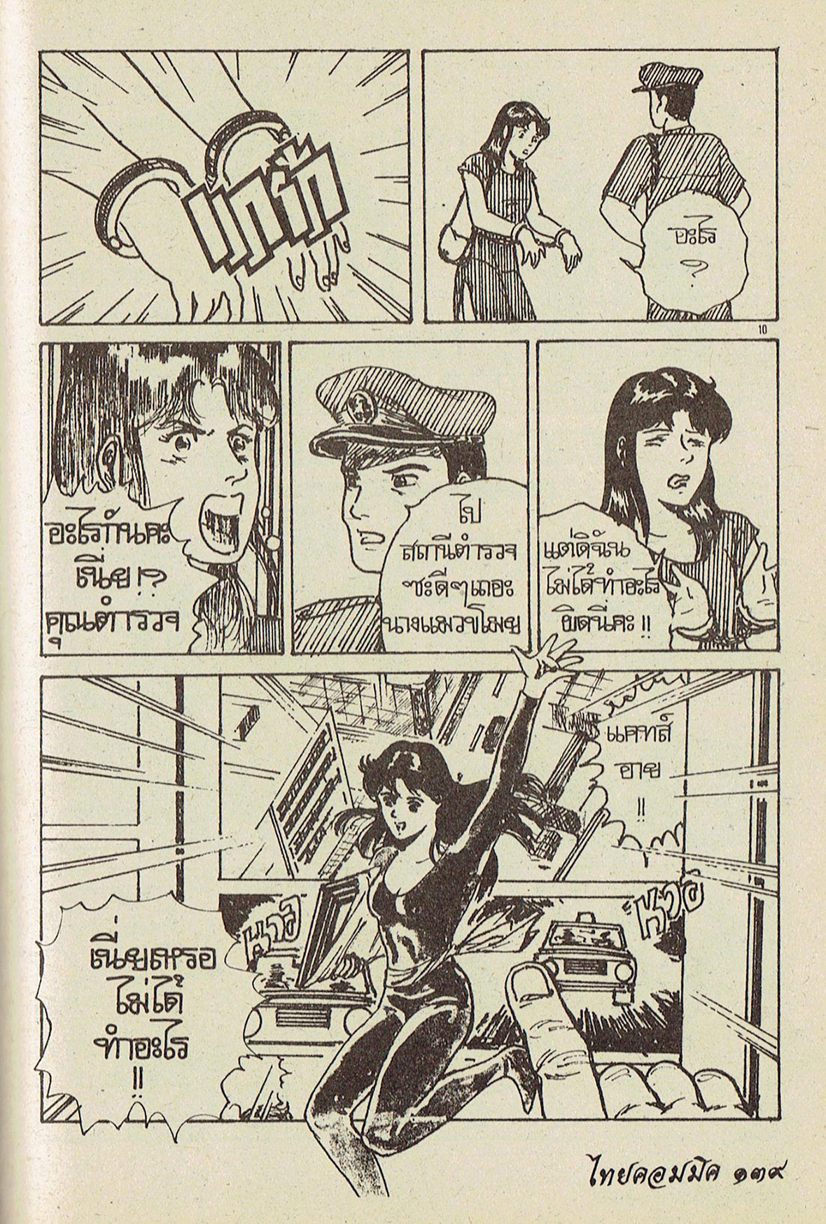
With the mention of Asian comics, most would instantly think of the Japanese tradition of manga—but not of much else. Thailand certainly doesn’t come to mind as a hotbed of creativity in the medium, but, like other Asian countries, it has developed a rich and unique comics tradition over the twentieth century, one that, despite the adversities, is still alive, and currently taking new, exciting directions. 

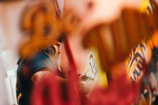
However, the Thai comics tradition is just as little known at home as it is abroad. That’s something Bangkok-based Belgian scholar Nicolas Verstappen has been trying to change. Since moving to Thailand in 2014, he studied, cataloged, and even recovered lost parts of Thai comics history.

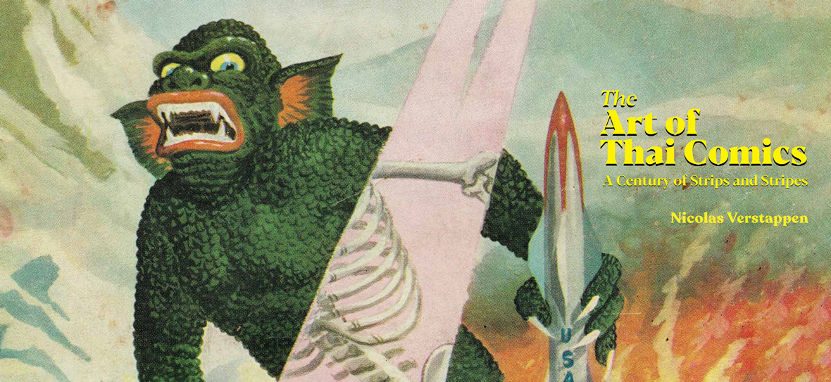
In 2021, Verstappen published The Art of Thai Comics, the most comprehensive book to date on the topic, in which he organizes his findings in chronological order, discussing the life and examining the works of fifty prominent Thai comics artists. The book also gives you a clear exposition of the political and social background that affected their production and includes a wonderful assortment of visual references, mostly taken from Verstappen’s personal archives.


提起亚洲漫画,绝大多数人首先会想到日本,但你可能不知道,其实泰国也是亚洲漫画重镇。早在 20 世纪,泰国便已形成丰富而独特的漫画特色。泰国漫画的发展之路堪称曲折,但一直存在,并在当下朝着新的方向发展。它在世界范围内缺乏影响力,就连在国内都少有人关注,而这正是定居曼谷的比利时学者 Nicolas Verstappen 一直试图改变的事。自 2014 年移居泰国以来,他一直努力研究、整理,励志将泰国漫画历史的面纱重新在世人面前掀起。

2021 年,Nicolas 撰写的《泰国漫画艺术》(The Art of Thai Comics)发行。这是迄今为止,关于泰国漫画最为详尽的书籍。书中,Nicolas 按时间顺序整理了他的所有发现,介绍了 50 位泰国著名漫画艺术家的生平和作品。此外,本书还清晰阐述了影响当地漫画创作的政治和社会背景,包括各种精彩的图片参考,其中大部分都来自 Nicolas 的个人收藏。

Page: ©2021 River Books / Illustration: © Niwat ‘Raj Lersroung’ Tarapan
Page: ©2021 River Books / Illustrations: © Banlue Publications - Wattana Petsuwan

Verstappen’s native Belgium has a longstanding comics tradition, ranked among the world’s most respected, largely thanks to young globetrotting reporter Tintin. “Comics in Belgium are considered the ninth art, and reading them is a tradition passed through generations, from grandfather to father to son,” he says. He himself grew up “obsessed with comics,” as he puts it, and, by his teen years, he was very familiar with most American and Japanese titles, including Buddha by Tezuka Osamu.

To take his enthusiasm further, since there was no comics department in Belgian universities, Verstappen studied art history, focusing on medieval and contemporary art, followed by a master’s in cinema studies, including film history and scriptwriting. It was his way of finding an academic path related to comics, even if loosely. Everything was complemented by an extensive side curriculum of personal studies.

Coincidentally, the same day he presented his master’s thesis, he was offered a job at his favorite comic bookshop in Brussels, Multi BD. “I worked there for fifteen years with access to comics from all around the world, from underground to mainstream, and in almost all existing formats,” he recalls. Simultaneously, Verstappen began to interview his favorite artists from Belgium and abroad and make zines out of his conversations. He also started to research deeply how psychic trauma is shown through comics.

Even with all that, his first contact with Thai comics was when he visited Bangkok for the first time, still as a tourist, and caught sight of a cheap one Baht comic in a 7-Eleven. Years later, already living in the city and working as a lecturer at the Faculty of Communication Arts at Chulalongkorn University, Verstappen was entrusted with the seemingly straightforward task of writing a report on a subject hardly covered until then: the origins of Thai comics. “It was like opening pandora’s box,” he says. “Suddenly, I started to dig and discover that approximately seventy to eighty years of Thai comics had just been forgotten, almost completely lost.”


Nicolas 的故乡比利时拥有悠久的漫画传统,这在很大程度上要归功于享誉世界的著作《丁丁历险记》。Nicolas 说:“在比利时,漫画被视为‘第九艺术’,这里世世代代的人们,看漫画已经成为一种世代流传的传统。”他从小就是“漫画迷”,十几岁的时候,他就已经能对大多数美国和日本漫画作品如数家珍,包括手冢治虫的作品《佛陀》。

由于比利时的大学没有漫画专业,为了追求对艺术的热爱,Nicolas 攻读艺术史,主要侧重于中世纪和当代艺术,随后又获得了电影研究硕士学位,进修了电影史和剧本写作课程。在此之外,他还会通过大量的课余学习来了解漫画艺术。

巧合的是,在他提交硕士论文的同一天,他在布鲁塞尔漫画书店 Multi BD 找到了工作机会,这是他在当地最喜欢的漫画书店。“我在那里工作了十五年,接触到了来自世界各地的漫画,从地下到主流,看过了几乎所有类型的漫画,”他回忆道。与此同时,Nicolas 开始采访自己喜欢的比利时和国外漫画家,并将采访的谈话整理成电子杂志发表。另外,他还开始深入研究艺术家如何通过漫画表达内心世界、疗愈创伤。

直到第一次去曼谷旅行,他才初次接触到泰国漫画,那是他偶然在 7-11 便利店买到的一本价格仅为 1 泰铢的便宜漫画书。多年后,Nicolas 定居曼谷并成为了朱拉隆功大学传播艺术学院的一名讲师。有一次,他受任一项工作委托 —— 撰写一份关于泰国漫画起源的研究报告,这是一个很少人讨论的冷门主题。他说:“就像打开了潘多拉魔盒。通过深入的挖掘,我发现有近70 到 80 年历史的泰国漫画被人们完全遗忘,无人问津。”

© Thai Watana Panich / Mongkol Wong-Udom

Verstappen’s report evolved into a broader research project. He was invited by publishing house River Books to write a book on Thai comics altogether. “It took about six years to complete. There was always more to dig. I would work for a few months on one artist and then discover another artist, and then, two months later, another artist. It took me five years to reach a point of feeling confident that I had a good overview of the history of Thai comics,” Verstappen says. 

The Art of Thai Comics is more than a book about comics. It’s a book on the history of Thai society reflected in comics art. Throughout its 287 pages and in the works they feature, readers are given insight into the relations, struggles, changes, and setbacks that marked Thai society across all sectors over the past 120 years. “The history of Thai comics is the history of ups and downs,” Verstappen says. Arguably, the same could be said about the history of Thailand.


Nicolas 的这份报告后来演变为更广泛的研究项目,他受到 River Books 出版社的邀约,开始编纂一部关于泰国漫画史的书。Nicolas 表示:“这本书用了大约六年的时间完成。过程中,我有了更多新的发现。我可能花了几个月的时间去研究一位艺术家,然后沿途又发掘更多艺术家出来,就这样循序渐进地展开。整整五年过去,我才开始觉得自己对泰国漫画历史有了比较深入的了解。”

《泰国漫画艺术》(The Art of Thai Comics) 不仅是一本关于漫画的书,更是一本透过漫画艺术反映泰国社会历史的书。翻阅 287 页内容及其中展示的作品,读者可以深入了解过去 120 年来泰国社会各行各业的牵连、挣扎、变化与挫折。“泰国漫画的历史跌宕起伏,”Nicolas 说道,而泰国的历史也是如此。


© River Books / Design: Peeraphat Kittisuwat and P. Library Design Studio

Royal Beginnings

Based on his findings, Verstappen relates the origins of Thai comics to members of Siamese nobility who traveled to Europe and were exposed to satirical art in the early 20th century. He mentions, in particular, King Vajiravudh, or Rama VI, who was educated in England and took an interest in political cartooning there. 

Interestingly, back in Siam, Vajiravudh drew caricatures for the pages of royal gazettes and promoted drawing competitions among artists. “This is something I’ve seen nowhere else; the king was an artist himself and created cartoons,” Verstappen says, adding that this led to the first generation of political and editorial cartoonists in Siam in the 1920s.

It backfired though: the same cartoonists used their work to criticize the absolute monarchy of the time in the local press. Their ideas and objections were, for the first time, accessible to those who could not read and had a significant impact on general discontent, leading to the 1932 revolution, which inaugurated the now-established constitutional monarchy.


起源于贵族


Nicolas 发现,泰国漫画最早起源于 20 世纪初前往欧洲并在当地接触讽刺艺术的暹罗贵族。他特别提到了拉玛六世 Vajiravudh 国王,这位泰国国王曾赴英国留学,并对当地的政治漫画产生了兴趣。

有趣的是,回到暹罗后,Vajiravudh 在皇家公报上发行过一系列带有讽刺意味的漫画,并举办各种漫画艺术家比赛。Nicolas 表示:“这是我在其他地方前所未闻的,国王本人就是一位漫画家。正是这一切催生了 1920 年代的第一代泰国政治漫画家和社论漫画家。”

然而这一切最后适得其反:这一批漫画家利用他们的作品在当地媒体上抨击当时的君主专制。不识字的民众第一次了解到他们的想法和反对意见,社会大众的不满情绪一触即发,最终导致了 1932 年的政变,并建立了如今的君主立宪政体。

© Prayoon Chanyawongse Foundation, All Rights Reserved

Historical Findings & a Uniquely Thai Genre

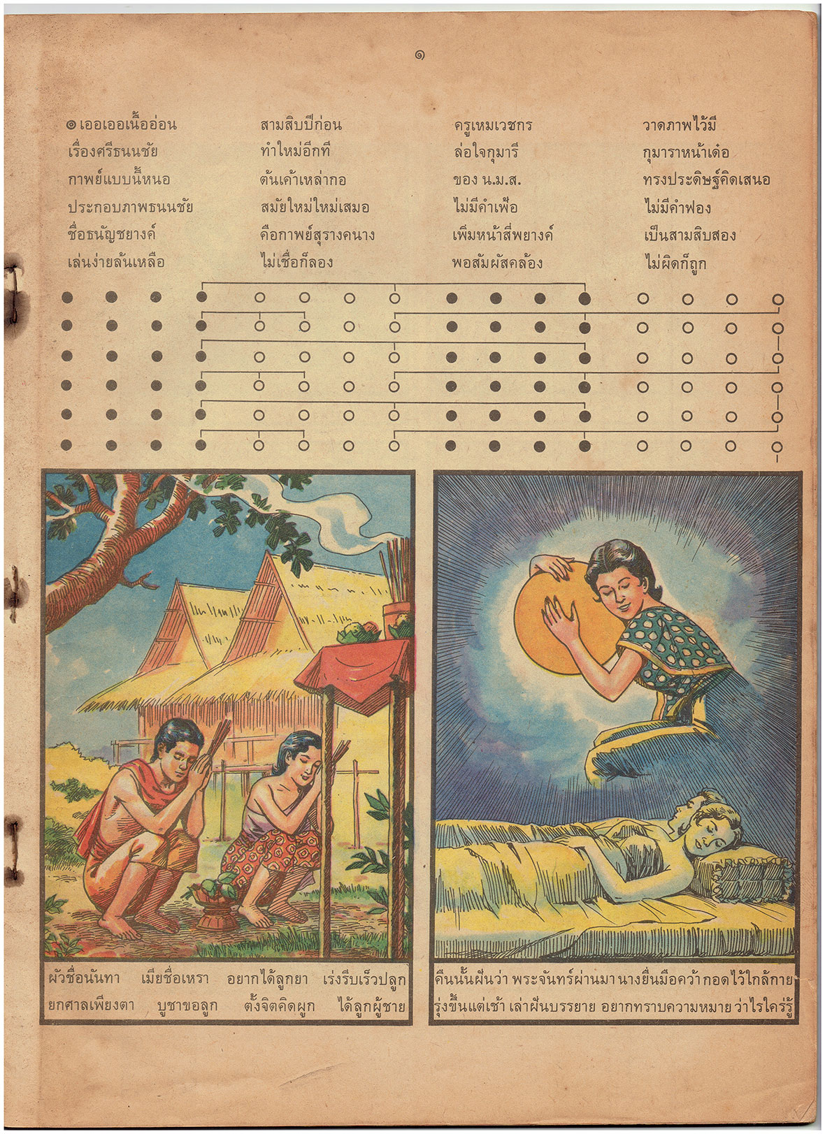
Ironically, press censorship was only intensified in the following decade. In the 1930s, a shorter satirical format gave way to longer-form, sometimes serialized comics. More visually sophisticated and realistic, these were primarily adaptations of epic Thai poems and folktales, but also stories that reflected the diverse spectrum of ethnicities and cultures that existed in the Kingdom. They also sowed a modern European lifestyle that began to penetrate Bangkok.

The misogynistic and racist tendencies of the time are evident in such comics, especially when viewed a century later. For instance, in some of them, we can clearly recognize the unbecoming place of women in society and the bigotry that took place against Chinese immigrants.


自成一派的开始


到了 30 年代,短篇讽刺漫画逐渐让位于长篇讽刺漫画,有时还会以连载漫画的形式出现。这些漫画在视觉上更加复杂和写实,主要是对泰国长篇诗歌和民间故事的改编,但也包括一些反映了泰国不同种族和文化的故事。除此之外,这些漫画还展示了开始渗透到曼谷的现代欧洲生活方式。

这些漫画里还充斥着赤裸裸的厌女和种族主义倾向,这些问题在一个世纪后的今天看来更为明显。例如,在其中一些漫画里,我们可以清楚看到女性在社会中较低的地位以及对中国移民的偏见。但与之同时发生的,是当地日趋严格的新闻审查制度。

Page: ©2021 River Books Illustrations: © Heirs of Jamnong Rodari

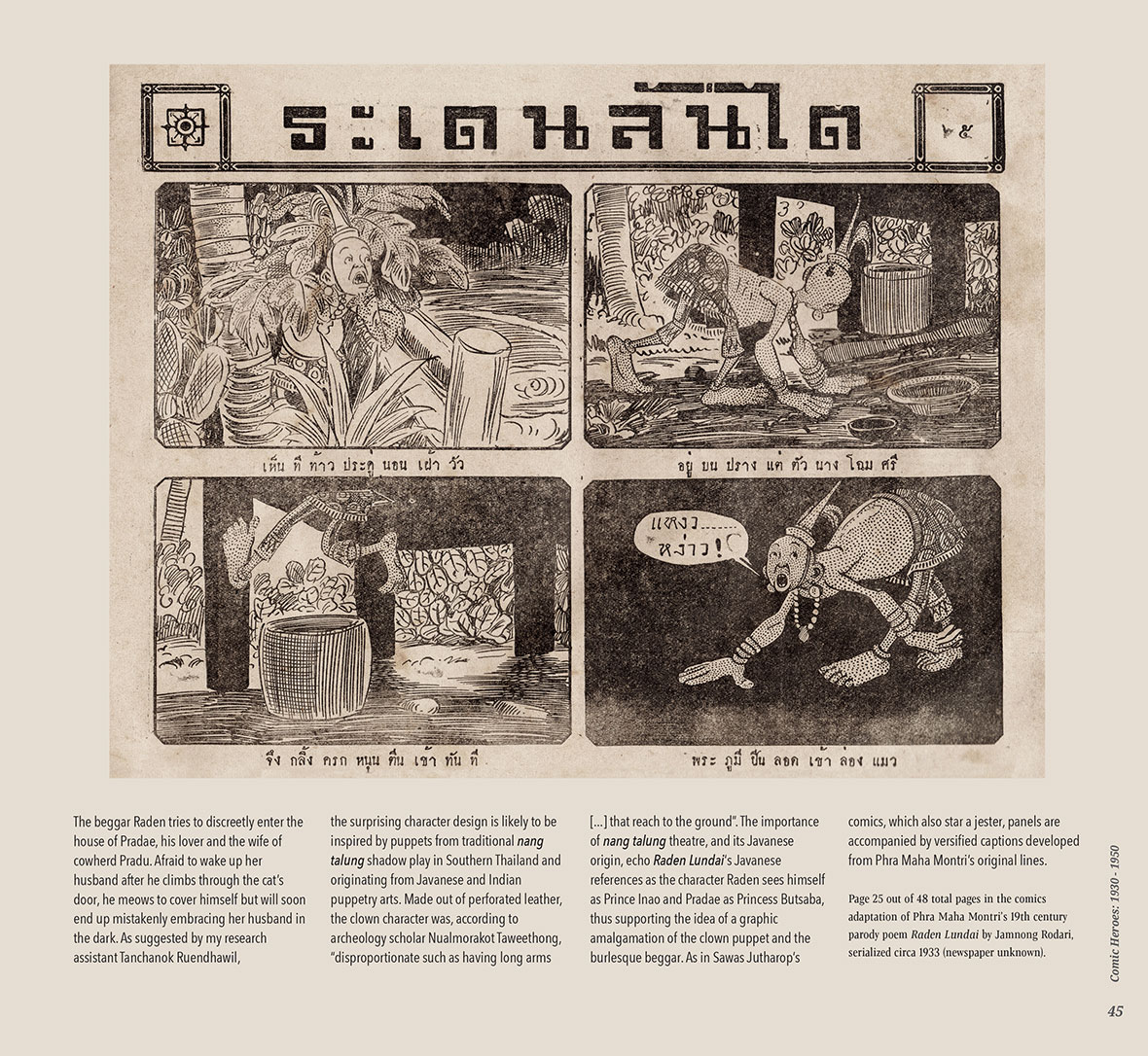
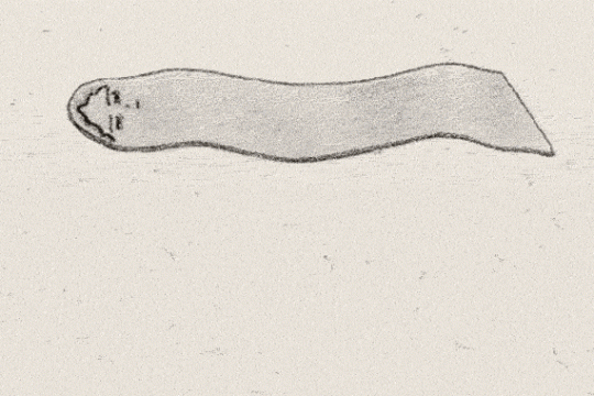
Since Verstappen began working on the book, one name represented a mystery: Jamnong Rodari. He was held as an influential comics artist by everyone Verstappen spoke to about his project, but an artist whose work had virtually disappeared. “I had been researching for five years, and everybody was talking about his comics from 1932, but I had never seen any images. There was nothing available by Rodari in any collection, not one single surviving page,” Verstappen says.

“Then, a miracle happened,” he says. He received a call that someone had found a national treasure while cleaning an old attic: a box containing 1700 pages of 1930s comics including the lost works of Rodari. “It was an invaluable discovery. It changed history because everyone believed that Hem Vejakorn was the first to draw realistic cartoons, but Rodari did that before.” However, the discovery meant a lot more work for him. Since it all happened rather late, as he was about to finish the book, he had to revise the entire structure and connect the pieces once again.

Considering how easy it is for thin newspaper pages to deteriorate in the Thai climate, especially the humid monsoon months, it was remarkable to find Rodari’s work still kept in good condition. Adding to the mystery and allure of the find, the newspaper pages with the comics had been, at some point, amended with other pieces of paper glued to their backs. These pieces contained notes in English about other literary works. Who took them and who kept those Rodari specimens in the first place is still a mystery.


从 Nicolas 开始写这本书以来,有一位名叫 Jamnong Rodari 的漫画家一直是个谜。Nicolas 所采访的每个人都会提到 Jamnong Rodari,称他是颇具影响力的漫画家,然而这位漫画家的作品却已经无迹可寻。“我整整研究了五年,每个人都在谈论他 1932 年创作的漫画,但我从未亲眼见过  Rodari 的漫画,完全找不到他的任何痕迹,一页也没有,”Nicolas 说道。

“直到有一天,事情突然有了进展,”他说。有人给 Nicolas 打了一个电话,说在清理旧阁楼时发现了一件国宝:一个装有 1700 页 1930 年代漫画的盒子,其中包括 Rodari 曾经遗失的作品。“这是相当重要的发现,可能彻底扭转当地人对泰国漫画史的看法。以前所有人都认为 Hem Vejakorn 是第一个创作现实主义漫画的人,但其实 Rodari 比他更早。”然而,这一发现对他来说也意味着要投入更多的工作。由于这一切发生时已经接近项目的后期,本书也已将近完成,他不得不重新修改整本书的结构。

考虑到泰国的气候,尤其是在潮湿的季风天气,薄薄的报纸页面很容易损坏,而 Rodari 的作品至今仍然保持良好的状态,实在是非常难得。更令人觉得神秘和好奇的是,这些刊载漫画的报纸页还专门粘贴了英文注释。而究竟是谁完好地保存了这些刊登有 Rodari 作品的报纸,至今仍然是个谜。

© Prayoon Chanyawongse Foundation, All Rights Reserved

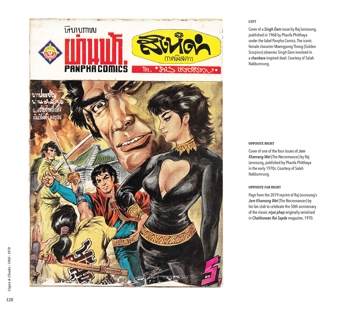
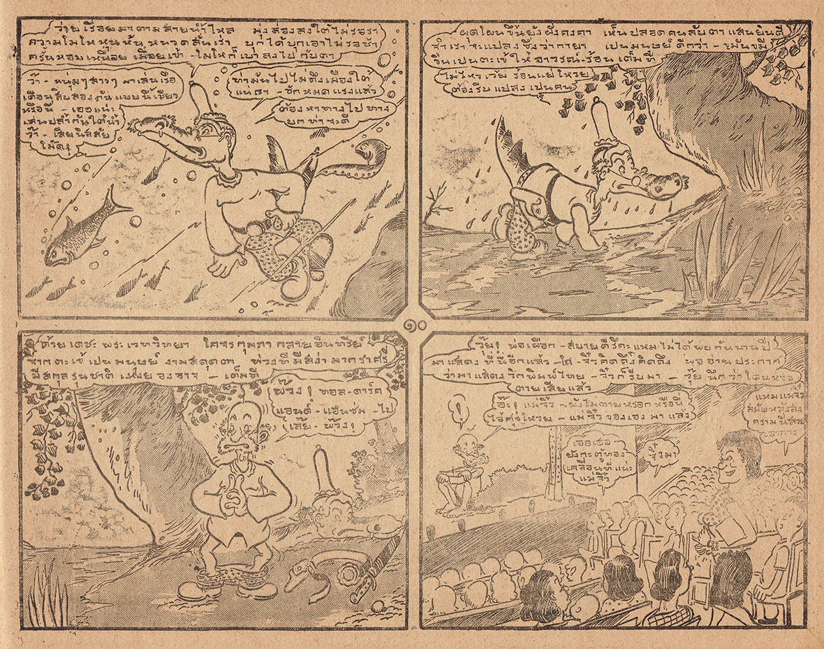
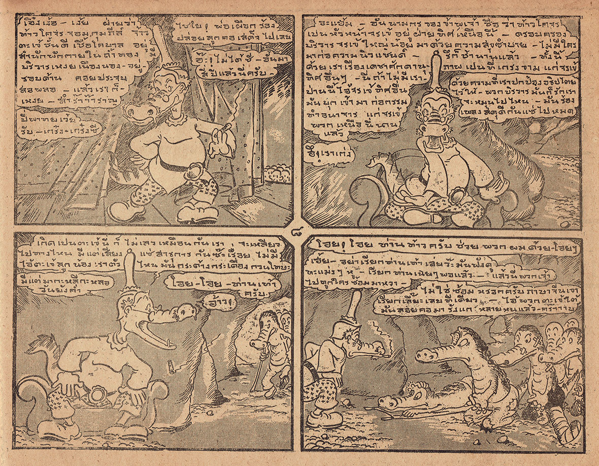
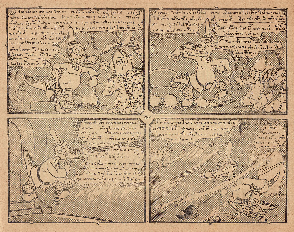
By the late 1930s, something truly unique to Thailand appeared in the medium. Prayoon Chanyawongse, considered the “king of Thai comics,” established the cartoon likay, a genre that places the reader inside the comics as if they were watching a performance of improvised theater. Likay is a uniquely Thai theater practice in which the audience takes part in the play’s direction, guiding the actors to improvise skits. “You can interrupt the play whenever you want,” Verstappen explains. “What’s amazing is that there is the space and freedom to make political commentaries during the play. Most of the stories were folktales, but you could add some references to modern times. It’s really a free form, and Prayoon was the one to use that and transfer it into comics.” 

Cartoon likay is a dynamic, layered genre. Through the comics panels, the reader is taken into a play that switches from the setting of the theater to another embedded folk narrative, a device that emulates the actual likay experience. In a classical likay theater performance, the actors play with tones and the availability of homophones in the Thai language to make political commentaries. Likewise, Chanyawongse used this aspect to play with words and critique the abuse of power of the government of his time. These scathing critiques made him famous nationwide.

“Everyone saw these comics in the newspapers. They were sold in the villages; someone would buy a copy and pass it around. The higher classes would also read them, including a group of really defiant journalists and artists in Bangkok. Prayoon was the top star of his time,” Verstappen says. Chanyawongse’s work continued to be widely appreciated across society in the 1940s and 1950s, and the Thai tradition of comics at large also gained traction in those decades. “By the early 1960s, comics were everywhere, and everybody read them; children and adults. They become a part of daily life in Thailand,” Verstappen says.


30 年代后期,泰国漫画开始逐渐形成自己真正的特色。被誉为“泰国漫画之父”的 Prayoon Chanyawongse 创立了“Cartoon Likay”漫画流派,这类漫画让读者身临其境,仿佛是一出出舞台剧。“梨伽(Likay)”是一种泰国戏剧,观众可以参与到戏剧中,指导演员即兴创作和表演。Nicolas 解释道:“你可以随时打断表演。人们可以在戏剧中发表政治评论。大多数故事都是民间故事,但也可以加入一些现代元素。这是一种很自由的形式。Prayoon 巧妙利用了这一点,并将其转化到漫画中来。”

在传统 “梨伽” 戏剧表演中,演员通过使用音调和泰语同音字的玩法,来发表政治看法。同样,Prayoon 也利用了文字游戏的方式,以批判他那个时代的政府滥用权力的问题。漫画中直言不讳的批判使得他在泰国国内声名大噪。

Nicolas 说:“每个人都可以在报纸上看到这些漫画,偏远的乡下也可以买到,大家相互传阅。就连上层人士也会看,包括曼谷当地一众敢于挑战权威的记者和艺术家。Prayoon 是那个时代最耀眼的明星。”在 1940 年代和 1950 年代,Prayoon 的作品一直深受社会大众喜爱,而泰国漫画也在这几十年间获得广泛关注。“到了 1960 年代初,漫画无处不在,大人小孩都在看。漫画已经成为泰国日常生活的一部分,”Nicolas 说道。

© Prayoon Chanyawongse Foundation, All Rights Reserved

Rise of Middle Class, War, and Horror

In the late 1960s and 1970s, there was an economic boom that boosted the growth of the middle classes. Those who had just climbed the social ladder were in search of a new identity that, above all, would differentiate them from the lower classes. It was a very aspirational mentality, which led them to move away from reading comics. “There was a misconception that comics were easy to read, which is not true. Parents and teachers would say it was not like seeing a classic painting or reading classic literature, poetry, and so on. They would prefer highbrow culture, the type of art and culture seen in the court as if it would help them elevate in society,” Verstappen says.

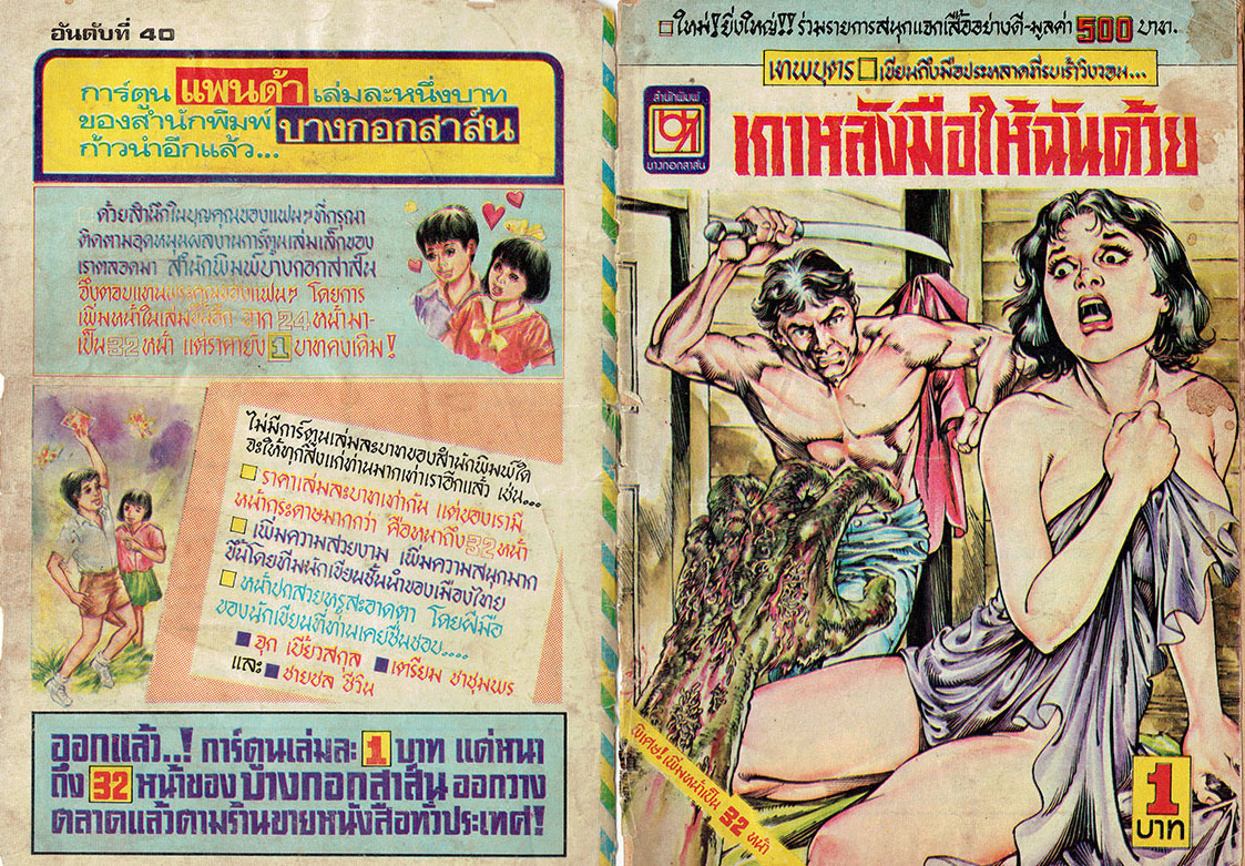
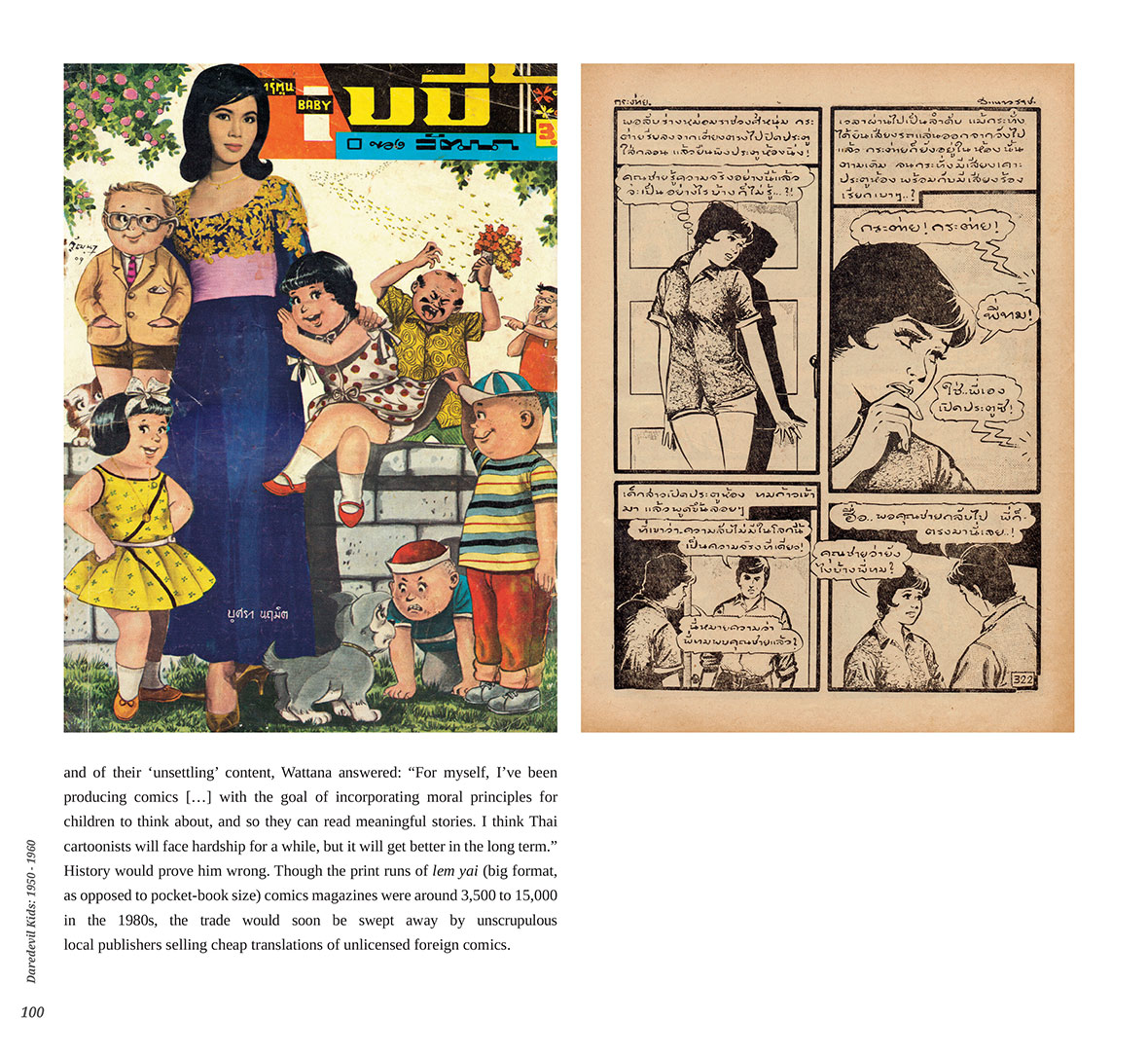
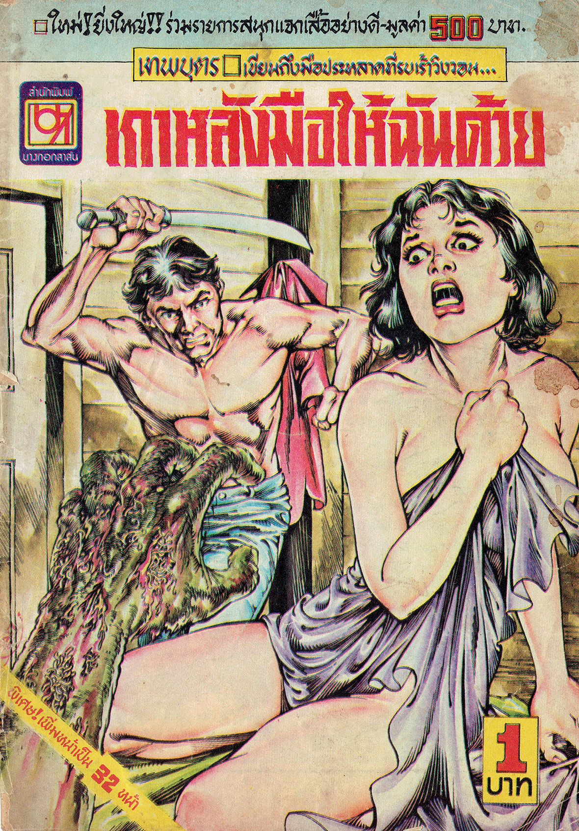
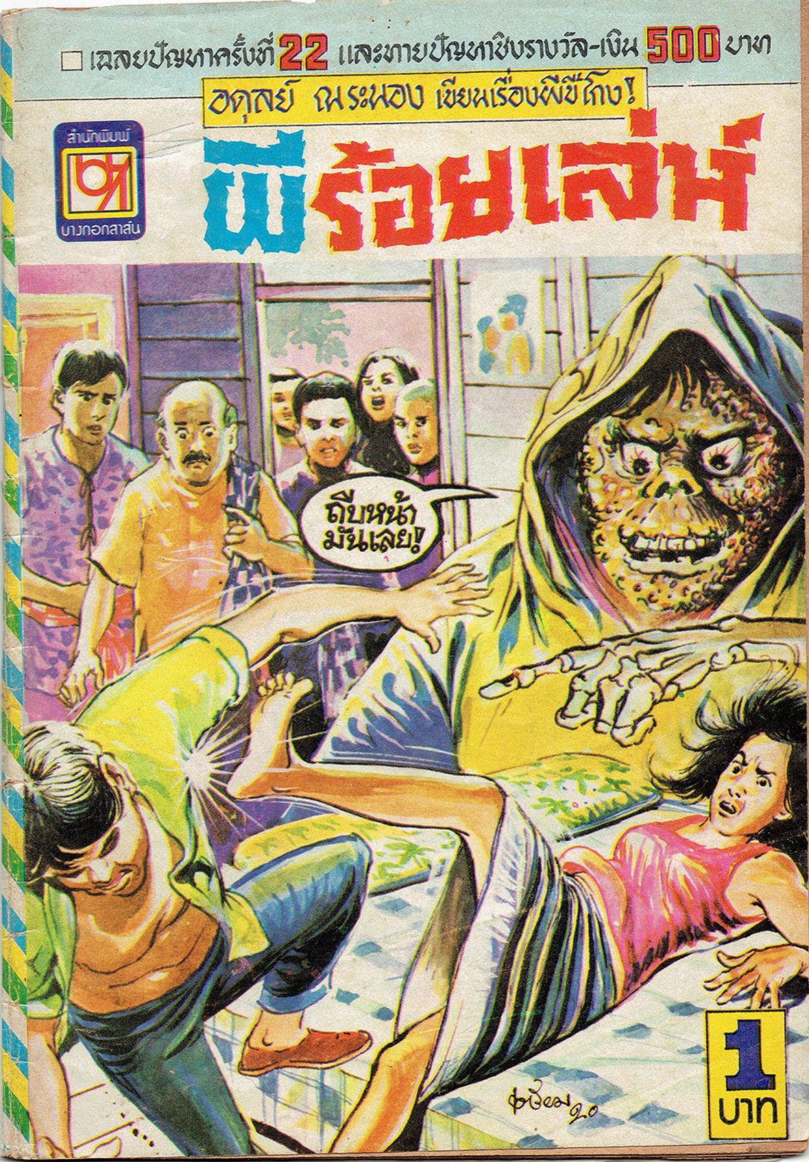
The distancing of the middle classes from comics art was also defined by the rise of a new genre that swarmed the Thai market like nothing before: horror and gore. These short stories came in cheaply produced and in a small format for the meager price of one Baht—and they were sold by the millions.


中产的崛起、战争、恐怖与血腥


1960 年代末和 70 年代,经济繁荣促进了中产阶级的壮大。那些刚刚攀升社会阶梯的人想要寻找一种新的身份,藉此与下层阶级划清界限。在这种渴望成功的心态下,他们不再阅读漫画。“人们有一种误解,认为漫画是通俗、大众的,其实不然。家长和老师觉得看漫画不如看古典画作,不如读读经典文学、诗歌等,他们更喜欢高雅,那种‘上得了台面儿’的艺术和文化,仿佛这样能帮助他们提升社会地位,”Nicolas 说。

在中产阶级与漫画艺术撇清关系的同时,一种新的漫画流派随之兴起,并以前所未有之势横扫整个泰国市场,那就是恐怖和血腥漫画。这类短篇漫画制作成本低,篇幅小,价格仅为 1 泰铢,曾经销量达到数百万。

© Family of Juk Biewsakul (Chulasak Amornvej)
© Chachumphon Heirs
© Family of Juk Biewsakul (Chulasak Amornvej)
© Thaweeporn ‘Thong’ Janekoonthongkambai

The 1970s were feverish times. First, there was an intense rural migration to the cities, especially Bangkok. Not graced by the economic boom, migrant workers faced the most undignified conditions in the capital, living and working precariously and with pitiful wages. At the same time, as the Vietnam war happened next door with all its horrors, Thailand was a place of “rest and recreation” for deployed American soldiers, which meant a rise in prostitution and drug use. The decade was also marked by anti-communist persecution, traumatic and bloody uprisings, and a military coup.

“The explosion in horror comics was a way to deal with all the violence that was happening. These topics were also taboo. You could not talk about the massacres. The killers were not arrested; they were amnestied,” Verstappen says. He adds that these horror stories were first read by most Thais, but then, with the middle classes distancing themselves from comics, and specifically from this type of violent, superstitious stories, they’ve become prevalent among the lower classes, including alienated low-wage workers and prostitutes.

“What’s interesting is that all these stories finish with some form of karmic justice, meaning that if someone does something wrong, they’ll get punished by the ghosts. Justice is always supernatural, but it’s still justice. For the readers, I think it felt like they would never get it in the real world, but they could feel better in thinking that there will be karmic justice in the future,” Verstappen says.


1970 年代是狂热的。农村人口大量涌入城市,尤其是曼谷。农民工并未受惠于繁荣的经济,在这座首都城市里,他们身处最不体面的环境,生活和工作动荡不定,拿着微薄的工资。与此同时,越南战争的爆发,使得作为邻国的泰国成为美国士兵的“后花园”,卖淫和吸毒的现象与日俱增。除此之外,反共迫害、血腥革命事件以及军事政变在这十年期间接踵而来。

Nicolas 说:“恐怖漫画的兴起成为了人们应对当前各种暴力事件的一种方式。这些话题本身就是禁忌。人们不能谈论大屠杀。杀人的凶手也没有被逮捕,而是获特赦了。”他补充说,刚开始大多数泰国人都会看这些恐怖漫画,但随着中产阶级远离漫画,特别是这类暴力、迷信的漫画故事,这类漫画就只要流传于下层阶级,譬如处于社会边缘的廉价工人和妓女。

“有趣的是,这些漫画故事最后都会以某种形式的因果报应作为结局,也就是说,做错事的人会受到鬼神的惩罚。正义总是以超自然的形式存在,但仍然是正义的。对于读者来说,我感觉是他们无法在现实世界里实现正义,但可以安慰自己,未来会通过因果报应来伸张正义,”Nicolas 说道。

© Vibulkij Publishing / Chian
© Vibulkij Publishing / Butri Traikhun

Japanese Manga and the Collapse of Thai Comics

In the late 1960s, the first manga was translated to Thai, starting a wave that would seriously disrupt the local comics market. Everything started with collaborations between Thai and Japanese publishers. Mangas were not only translated but they were also flipped: from right to left, as it’s common in Japan, to left to right, as people read in Thailand. Osamu Tezuka, the creator of Astro Boy, even wrote a personal letter to Thai readers introducing his comics Jungle Emperor Leo and thanking his collaborators in the country. By the 1970s, a proper manga craze was established in Thailand—a fierce competition that didn’t please local comic artists. 

To make things worse, what started as licit collaborations quickly descended into widespread piracy. Japanese mangas were translated and copied in cheap bootleg issues without regard to copyrights, and their selling price was even lower than any Thai production. “In ten years, from the mid-1980s to the mid-1990s, the Thai market was destroyed, and all major cartoonists just retired because they could not compete with the piracy of Japanese mangas,” Verstappen says.

The year 1995 brought relief. There was a new copyright agreement between Thailand and Japan that fought back against piracy. That raised manga prices and established a fairer scenario for competition. Still, by that time, the new generation of Thai artists was heavily influenced by what they saw in mangas and reproduced the style in their comics. By the early 2000s, Thai manga-style stories had taken over the mainstream scene.


日漫的冲击与泰漫的衰落


1960 年代末,第一部日本漫画被翻译成泰语,由此开始对当地的漫画市场的严重冲击。泰国和日本出版商展开密切合作,不断有日本漫画不仅被翻译成泰语,甚至连排版也按照泰国阅读习惯进行了优化:从原来的“从右到左”(日本大众普遍阅读顺序)变成“从左到右”(泰国大众普遍阅读顺序)。《阿童木》的作者手冢治虫甚至给泰国读者写了一封私人信,介绍他的漫画《小白狮王》,并向他在泰国的合作者表达了谢意。70 年代末期,泰国掀起了一股真正的日本漫画热潮,这对于当地漫画家来说是非常残酷的现实。

更糟糕的是,合法正当的合作产品很快演变为猖獗的盗版行为。人们不顾版权问题,将日本漫画翻译和复制成廉价盗版漫画,其售价甚至低于泰国本地作品。“十年间,从 1980 年代中期到 1990 年代中期,泰国本土漫画市场土崩瓦解,就连一些知名的泰国漫画家也因为无法与盗版日漫竞争而退出了市场,”Nicolas 说道。

情况到 1995 年才有所缓解。泰国和日本之间达成了一项新的版权协议,以打击盗版现象。这一措施提高了漫画价格并营造了更为公平的竞争环境。但在这个时候,新一代的泰国漫画家已经深受日本漫画的影响,他们在漫画创作中也往往遵循类似的风格。到 2000 年代初,日漫风格已在泰国占据了主流地位。

© Suttichart Sarapaiwanich

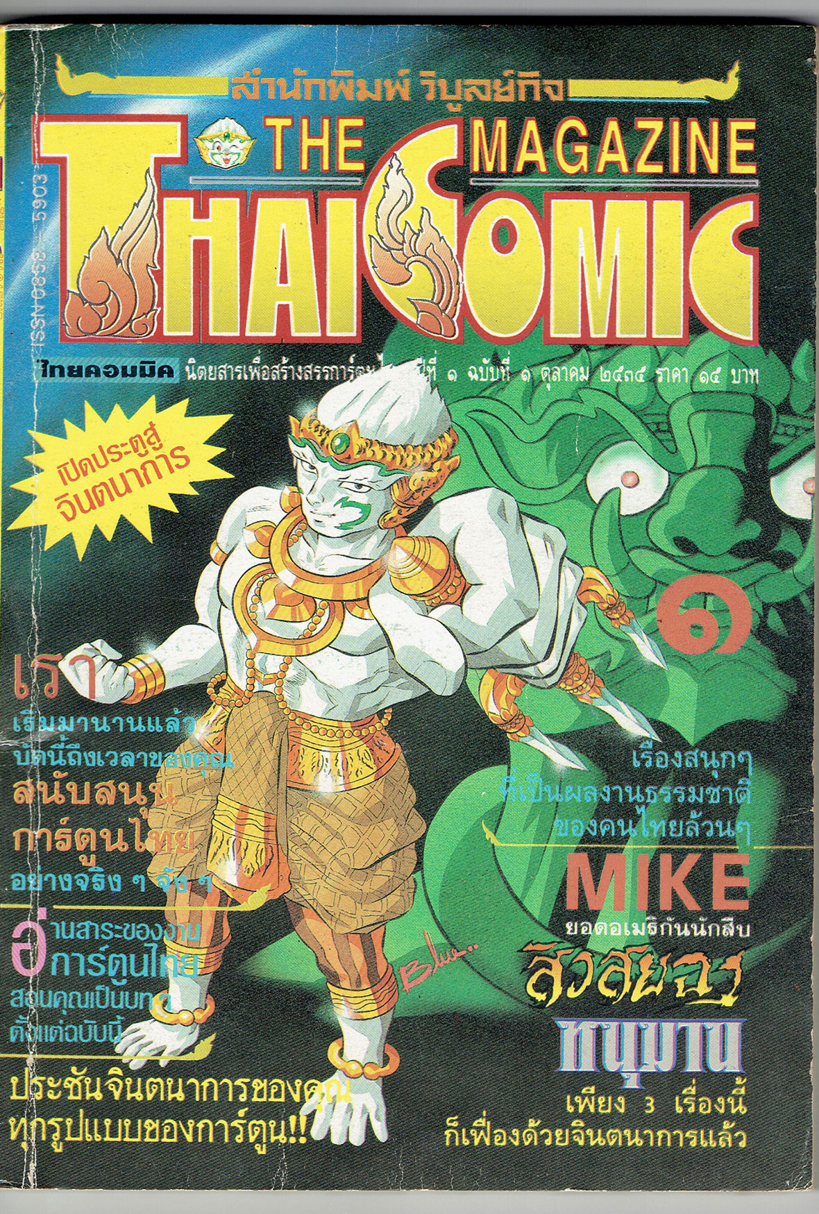
The Indie Generation

Even if the local production of manga-styled comics incorporated traces of Thai culture and folklore, many Thai artists didn’t see themselves in what was created in the mainstream. Hence, an independent scene appeared in the late 1990s with works that varied in both style and narrative but that exuded a sense of cultural hybridism. They mixed global cultures and identities while reflecting modern metropolitan life in Thailand.

It was around the same time, following the 1997 Asian Financial crisis, that a culture of DIY fanzines flourished. They were sold by their creators in markets and alternative festivals, from music to art, catering to a much smaller, although trendier, audience. 

The indie scene defined Thai comics throughout the 2000s. But then another blow. The Covid-19 pandemic hit with an extended halt in festivals, book fairs, and gatherings of any sort. Even Thai schools and universities, the breeding ground of many indie artists, turned online. Money people were willing to spend on entertainment was sharply lower because of the economic crisis that descended upon Thailand with the pandemic. As a result, Verstappen notes that quite a few Thai cartoonists turned to NFTs as an easier way to keep afloat and earn a living.

Still, the scene is resilient, and what does not kill you makes you stronger. That’s certainly true regarding the current socio-political turmoil Thailand is going through and the effects on local art. “More and more young Thai artists are making small publications like zines, and even documentary comics related to the issues they face. They talk about many topics, from women and LGBTQ+ rights to challenging rape culture,” Verstappen says. He also remarks that the surging wave of comics is notably more politically motivated than when he started his research six years ago.

Verstappen believes that self-publishing and the small press scene will make a strong comeback. “After two years of lockdown, when everything was online and dematerialized, the young generation feels the need to go back to print and sell their own books. They want to use any print techniques to create objects, books, something they can hold,” he says.


独立世代


虽然偏日式风格的泰国本地漫画也会融入一些泰国文化和民间传说元素,但对于许多泰国艺术家而言,这些主流漫画并不能体现他们独有的特色。1990 年代后期,泰国独立的漫画圈子逐渐形成,他们的作品在风格和叙事上各不相同,但充满了文化混合感。他们既有全球化的文化与身份,同时又能反映泰国的现代都市生活。

大约在同一时期,继 1997 年亚洲金融危机之后,DIY 式的同人志文化蓬勃发展。同人志创作者在市场和各种节日活动出售自己的音乐和艺术作品,以迎合更小众,但更新潮的观众。

整个 2000 年代,独立漫画成为了泰国漫画的基调。但很快,又一个冲击接踵而至。新冠疫情的爆发导致各种节日活动、书展和聚会被迫取消。就连原来作为独立艺术家培养中心的泰国学校和大学也转为线上授课。由于疫情对泰国造成的经济危机,人们在娱乐方面花费的意愿也急剧下降。Nicolas 指出,为了更好地维持生计和谋生,相当多的泰国漫画家因此转向了 NFT。

尽管如此,泰国漫画仍然展现出蓬勃的生命力,正所谓:无法击溃你的一切只会造就更强大的你,“越来越多的年轻泰国艺术家开始创作电子杂志之类的小型出版物,甚至还有根据自己的故事创作的纪录片式漫画。他们在漫画中探讨各类社会话题,包括女权、LGBTQ+ 平权运动以及对强奸文化的抵制等等,”Nicolas 说道。他还表示,与六年前自己刚开始这个项目时相比,现在明显涌现了越来越多更具政治动机的漫画。

Nicolas 相信,自助出版和小型媒体将强势回归。“在过去两年的封锁期间,一切转移到线上和非物质化,但现在年轻一代渴望回归实体的印刷物,出售自己的书。他们想运用各种印刷工艺来创造事物、书籍或任何可以拿在手上的东西,”他说。


A need to go back to physical, tactile forms of entertainment would hopefully spike a renewed interest in the art of comics outside the more underground scenes, not just in Thailand, but globally. In the age of online streaming, Verstappen believes comics hold inherent qualities that are good for the brain. “Recent studies have shown that reading comics is actually more challenging than reading text only. We have to figure out how text and image work together and how all the other images work together. This is a demanding process to our brains,” he says. He’s also an enthusiast of the capacity comics have to challenge the status quo through exciting and visually engaging narratives. 


Ultimately, the combination of drawing and text opens up endless possibilities for self-expression and social critiques, from autobiographical stories to documentaries. Broadening the horizons even further, Verstappen refutes the idea that artists need to stick to a format, like always drawing inside panels, for instance. The notion of what defines comics is broader, more abstract, and virtually impossible to pinpoint. To him, it’s not about panels or even a narrative sequence. It’s more about a “visual solidarity,” as he puts it, that happens within the work and between the depictions, one that conveys a message on its own and unites all pages non-linearly.


渴望回归实体形式的需求,有望重新激发人们对于漫画艺术的兴趣,不仅仅是在泰国,在全球各地同样如此。在这个线上流媒体时代,Nicolas 认为看漫画是一件兴奋大脑的事。他说:“近期的研究表明,看漫画实际上比只阅读文字更具挑战性,因为你要弄清楚文字与图画如何结合,以及其他图画之间如何组合。这对我们的大脑来说是一个有难度的过程。”此外,他还热衷于探讨漫画如何通过精彩和引人入胜的视觉叙事来挑战现状。

归根到底,从自传故事到纪录片漫画,图画与文字的结合能为自我表达和社会批判开辟无限的可能性。Nicolas 从更开拓的视角出发,驳斥了艺术家需要恪守一种漫画形式的想法。漫画的概念其实更广泛、更抽象,没有条条框框。用他的话来说,更重要的是作品和图画中的“视觉一致性”,能够独立传达信息,并将所有画面以非线性的形式串联起来。

Page: ©2021 River Books / Illustration: © Heirs of Sanae Thanarat Sarit

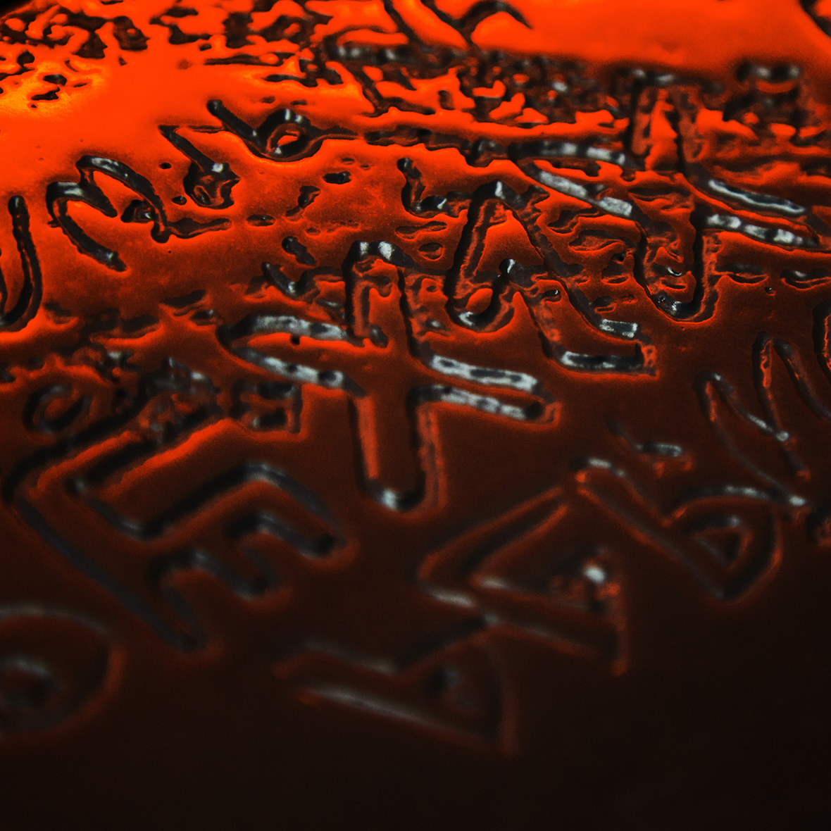
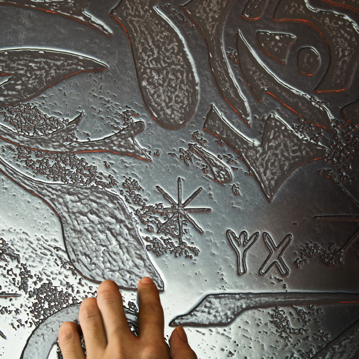
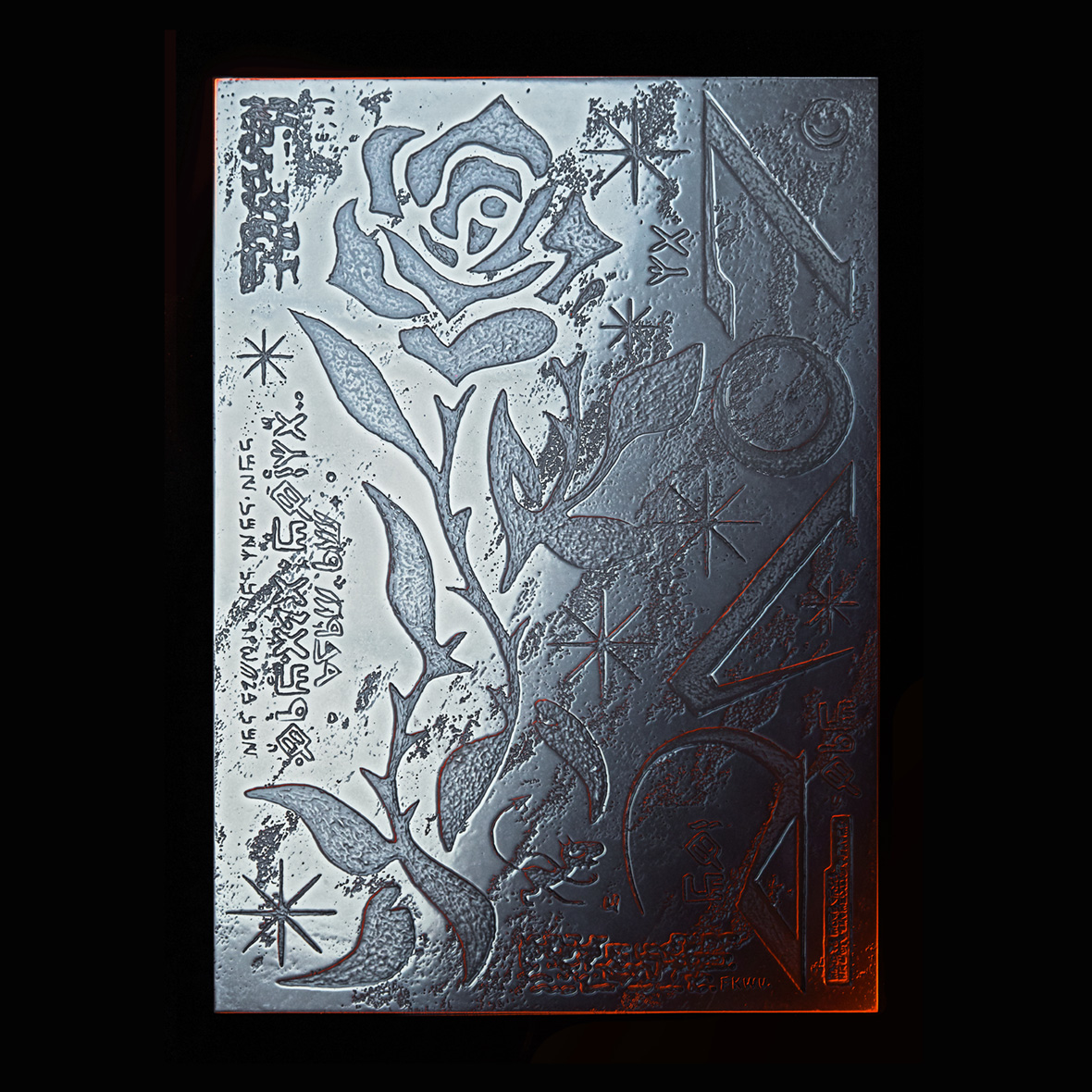
The pages of The Art of Thai Comics are connected linearly, though. The book is organized in chronological order in chapters divided by time periods, featuring the fifty artists whose works he analyzes. Furthering his homage, he included their sketched portraits and, when available, also their trademark signatures. To make the evolution of Thai comics more apparent to the reader, Verstappen included two graphical timelines; one illustration loop on the inside cover, and another with the portraits of the artists as content pages. All illustrations are by designer Peeraphat Kittisuwat, whose work already revolved around looping narratives.

The extensive historical background the book provides made the writing process all the more complex and lengthy. “I wanted to give context to everything. Every time there was a page with references, like politics, royalty, or the likay theater, I needed to explain everything to the readers,” Verstappen says. Initially, he wrote the book in English with an international audience in mind. But it quickly became clear that a translation to Thai was needed—another complex task that took six months to accomplish.

The translation became absolutely necessary to Verstappen as his work progressed. Realizing that the path for new Thai comics artists was challenging, with little support, resources, and visibility, he felt the need to connect them to the rich tradition of comics that had been almost completely forgotten. “In the past, there were masters with incredibly high-level work. They created unique things no one was doing in the United States, Europe, or Japan. They impacted society and their governments. I wanted to give young Thai artists a sense of legacy and show them that, even if they might feel alone now, they are part of something bigger,” Verstappen says.

The Art of Thai Comics is now available for purchase on Amazon.


不过作为一部历史读物,《泰国漫画艺术》则以线性形式编写。全书按时间顺序,以不同时期划分章节,一共介绍了 50 位艺术家,包括 Nicolas 对每位艺术家的作品分析。为了进一步表达敬意,他还在书中附上了艺术家的素描肖像以及他们的签名。为了帮助读者更好地了解泰国漫画的演变,Nicolas 制作了两条生动形象的时间线。所有插图均出自设计师 Peeraphat Kittisuwat 之手。

本书涉及漫长的历史背景,整个写作过程也因此复杂而艰辛。Nicolas 说:“我想为所有内容提供背景信息。每次提及参考资料,例如关于政治、皇室或“梨伽”戏剧的内容,我都需要向读者解释背景的来龙去脉。”目前,图书仅有英文版本,不过马上计划翻译成泰语,需要六个月才能完成。

在这本书的创作过程中,Nicolas 也逐渐意识到翻译的必要性。新生代泰国漫画家面临诸多挑战,缺乏支持、资源和关注,他希望藉此帮助他们与一度失落的丰富泰国漫画传统相联系。“过去,这里曾有多位漫画大师,他们有着过人的作品水平,创作出在美国、欧洲或日本都没有的独特作品,影响着整个社会和政府。我想让年轻的泰国艺术家感受传承的力量,让他们知道,虽然现在可能感到孤立无助,但他们的努力有着更宏大的意义,”Nicolas 说道。

《泰国漫画艺术》目前可在亚马逊(Amazon)平台购买。

Like our stories? Follow us on Facebook and Instagram.


Instagram: @nicolasverstappen


Contributors: Tomas Pinheiro
Chinese Translation: Olivia Li
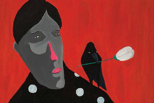
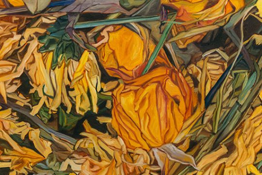
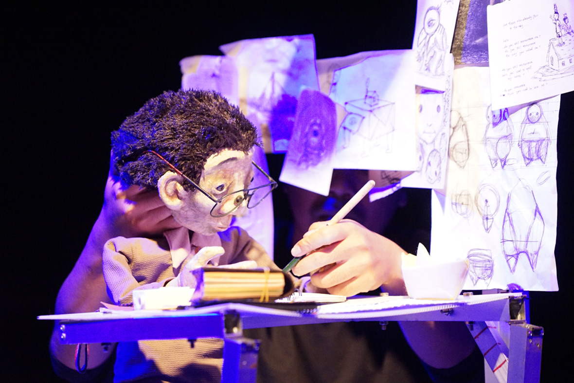
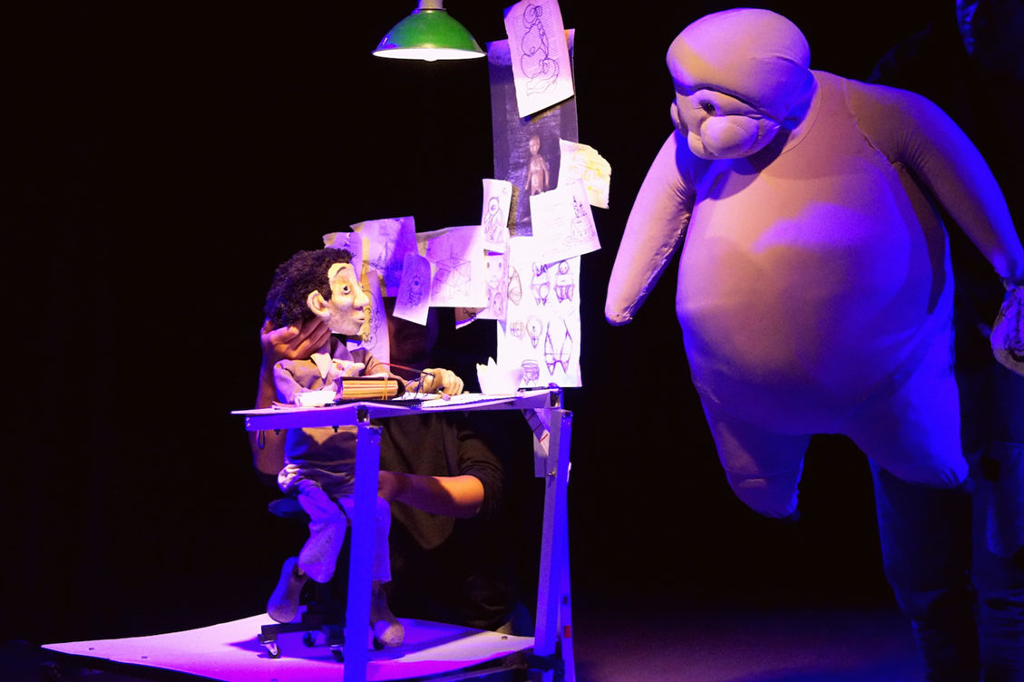
Images Courtesy of Nicolas Verstappen, Family of Juk Biewsakul, River Books Illustration, Thai Watana Panich, Mongkol Wong-Udom, Prayoon Chanyawongse Foundation, Thaweeporn ‘Thong’ Janekoonthongkambai, Vibulkij Publishing, and Suttichart Sarapaiwanich


喜欢我们的故事?欢迎关注我们 Neocha 的微博微信


Instagram: @nicolasverstappen


供稿人: Tomas Pinheiro
英译中: Olivia Li
图片由 Nicolas Verstappen、Family of Juk Biewsakul、River Books Illustration、Thai Watana Panich、Mongkol Wong-Udom、Prayoon Chanyawongse Foundation、Thaweeporn ‘Thong’ Janekoonthongkambai、Vibulkij Publishing 与 Suttichart Sarapaiwanich 提供

You Might Also Like你可能会喜欢

Anatomically Incorrect 是谁在肠道内滑梯

April 7, 2022 2022年4月7日

A man naps inside of a hair follicle, vehicles cruise through major arteries, and human heads divide and multiply like cells—these surreal scenes are par for the course in the work of Chinese illustrator Jam Dong. In her latest series of illustrations, titled Fake Medical Graphics, she reimagines human biology in humorous, quirky ways. “If we look at our bodies under a microscope, certain areas can seem abstract, even graphical,” she says. “They may seem strange, but they are inside of us.”


男人在头皮发囊下小憩、轿车在动脉血管里巡航、人类头颅变成细胞模样,野蛮繁衍生长。这些不太真实的景象,出自中国插画师 Jam Dong 的笔下。在她最近的插画系列《内科假想(Fake Medical Graphics》中,Jam 以幽默、奇特的方式重新构想人体构造。她说道:“如果在显微镜下观察我们的身体,很多部分会变得抽象、图像化。这些细微的变化、或是神奇的构造就发生在我们体内,而我们却对此感到陌生。”

Under her pen, narrow blood vessels transform into a network of intersecting roadways, intestines become playground slides, and a singular cell has grown into an entire planet blooming with never-before-seen foliage. With the right perspective and a bit of imagination, the microscopic can seem expansive, and the mundane can take on grandiose qualities. Dong believes that if you look closely enough, the human anatomy can begin to resemble vast landscapes or even the universe at large. “Even though they may be tiny enough to exist inside of our bodies,” she says.


在她笔下,人们能在肠道上滑梯、毛细血管成为纵横交错的高架桥,就连细胞也有自己的行星轨道,以不可思议的方式绽放。她独特的视角、搭配想象力的佐料,让细微的事物变得豁然开朗、将普普通通点缀地不同寻常。Jam 说,如果你近距离仔细观察,人体构造就像是风景地貌、甚至是一整套宇宙系统,而如此庞杂的景象竟存在于渺小的人体内。

Even before creating the series, biology had long been a subject of fascination for her. In school, she scored top grades in biology. “It interests me because it’s a field so intertwined with life,” she says. “And life means everything.”

Outside of school, this interest in living organisms persisted. She frequently spent time chatting with her grandpa, a physician, learning about various diseases and how the human body operates. The beautiful complexity of the human body and the natural world remain constant sources of wonder to this day. “It could be something as little as the structure of a seed or as big as an entire ecosystem,” she says. “These small ideas can trigger my imagination, and inspire me to start drawing one of my stories.”


其实在创作该系列之前,Jam 就对生物学情有独钟。读书期间,她的生物分数总是班上的名列前茅。她说:“这门学科和生命有着千丝万缕的联系,而生命则意味着一切。”

Jam 对生物学的兴趣还延伸至课外。她经常与身为医生的外公讨论起各种人类疾病、人体运作机制等话题。直至今日,人体构造、自然世界依旧是她的兴趣所在。她说:“生命小到一粒种子,大到整个生态系统。在探索的过程中,我的想象力一触即发,促使着我勾勒出属于我自己的故事。”

Despite the anatomical incorrectness of Fake Medical Graphics, Dong says that a lot of inspiration came from actual medical texts and science books, though these inspirations weren’t always visual in nature. Sometimes, a new piece of scientific knowledge will be enough to set her creativity into motion. “I’ll follow that inspiration and apply the story I want to tell to it,” she explains. “The final piece is often very far away from where I started.”


除了《内科假想》中那些天花乱坠的想象,Jam 指出还有很多创作灵感则来自真实的医学文章和科学刊物,这些灵感的呈现并非为视觉上的、更多是由理论支撑。有时,科学界的最新发现足以为她提供充足的创作动力。她补充说:“这些灵感为我的故事提供开端,去引导我的作品朝着更远的方向发展。”

As humorous as they may be, Dong’s illustrations are ultimately meditations on the miracle of life and human physiology. In an indirect way, these works call attention to the complex, unseen mechanisms at work in keeping the natural world in balance and our bodies healthy. In the throes of a seemingly endless pandemic, these reminders—presented with a signature touch of playfulness and imagination–may perhaps be more relevant than ever. “The contradiction between being familiar and strange, large and micro, is something I love discussing,” she says. “They can reflect the relationships between humans, nature, and our inner selves.”


无论 Jam 的呈现方式再怎么幽默、再怎么风趣,作品的主题最终还是会放在生命和人类上面。她的插画正以一种间接的方式唤起人们对生物复杂机制、微观构造的关注,而这些在维持自然世界平衡、以及身体健康方面都发挥着重要作用。在眼下这个看似不休止的大疫情时代,这种充满想象力的玩笑式提醒,要比以往来得更是时候。她说:“我的作品看上去既熟悉又陌生、即微观又宏观,这恰恰是我希望与观众探讨的,反映出人类、自然还有我们内心之间的联系。”

Like our stories? Follow us on Facebook and Instagram.


Website: www.jamdongart.com
Instagram: @fisheaddd


Contributor:  David Yen
Chinese Translation: Pete Zhang


喜欢我们的故事?欢迎关注我们 Neocha 的微博微信


网站: www.jamdongart.com
Instagram: @fisheaddd


供稿人: David Yen
英译中: Pete Zhang

Sign of the Times 人情招牌

April 5, 2022 2022年4月5日

In an era of effortless reproduction, sign painting has become a lost art. In the Philippines, tarpaulins on small sari-sari stores with telecom brands printed in plain black letters are ubiquitous. It’s rare to find a shop with hand-painted letterwork. But there are still some holdouts that believe in a do-it-yourself approach, such as Jeepney signage or hand-drawn tubero posters advertising plumbing services plastered all over Manila. When Filipina artist Krizel Hidalgo decided she wanted to pursue sign painting, she didn’t realize she’d be one the few left doing it.


工厂流水作业,让时下的产品外观正在日渐趋同,商家二话不说,就给你来个原样照搬,这也使得纯手工制作正在渐渐消失在大众视野。在菲律宾,小卖部门头的柏油布招牌随处可见,这些浅底黑字的数字印刷品毫无特点可言,而纯手绘招牌却在街头寥寥无几。事实上,菲律宾当地仍有一帮人希望能把 DIY 精神践行到底,譬如吉普尼巴士、还有贴遍了整个马尼拉水泥电线杆的手绘维修告示等等。当菲律宾艺术家 Krizel Hidalgo 决定投身手工招牌绘写时,她并没有意识到这个行业已经没剩下几个人在做了。

Tita Keks is Hidalgo’s sign-painting and tattoo studio. Located in Laguna, a province just outside of Manila, it’s where she produces hand-drawn signs and posters, all of which are imbued with a playful sense of sarcasm. Her letters are vibrant and colorful, drawn with confident strokes and often involve several typefaces. These signs range from the cynical (“Rats get fat while brave men die”) to the motivational (“Be Who You Want To Be”) to the promotion of female pride and self-love (“Morena bombshell”). 


手工招牌工作室 Tita Keks 由 Krizel 一手创立,其坐标拉古纳(Laguna),位于菲律宾首都马尼拉城外。在这里,Krizel 创作了大量手工招牌,其中大部分充满了讽的意味。她的作品大都鲜艳活泼,一笔一画显得自信满满,拥有各式各样的字体风格。其中不乏一些愤慨:“勇敢的人把老鼠们喂大(Rats get fat while brave men die)”、还有一些鼓舞人心的标语:“你可以成为任何人(Be Who You Want To Be)”、以及宣扬女性和爱的观点:“女中豪杰(Morena bombshell)”。

In addition to these personal pieces, she frequently works with local businesses, including other tattoo parlors, a record store, a barber shop, and more. Even when she’s doing client work, Hidalgo finds deep meaning in the needs of her customers. “When I’m painting, all I can think about the whole time is the person who’ll use it,” she says. “I really think that’s something important.”


除了个人作品,Krizel 还频繁参与商业机构合作,客户囊括了当地大大小小的纹身店、唱片店、理发店等等。而即便是商业项目,Krizel 也能出色拿捏客户内心的深层理念。她说道:“每当我创作的时候,我都会尽可能去揣摩观看者以及使用者的感受,这一点非常重要。”

Hidalgo paints on a range of surfaces and materials, including metal and wood. Of all of them, glass has become her favorite, because of the challenges it poses. Relishing hurdles has been a constant theme in her creative trajectory. “Those frustrations made me fall in love with sign painting. It was so damn hard!”

When she first started drawing hand-painted letters, Hidalgo admits that she could barely paint in a straight line, let alone control the brush or mix the paint correctly. It was all even more difficult on glass. ​​“It took me seven hours to paint my first glass sign!” she recalls. “The consistency of the paint has to be just right. You won’t find instructions or exact measurements on the internet; you just need to feel it. And you can only know that feeling if you’ve done it a thousand times. But once I got the hang of painting glass, it’s the easiest and the most fun surface to paint on.”


创作原材料的使用相当广泛,有时要用到金属、甚至木材。在所有这些材料中,Krizel 偏爱玻璃,但它对作品呈现来说是极大的挑战。而攻克一个个困难,却是她的一大乐趣。她说:“我喜欢创作中焦头烂额的感觉,太他妈刺激了!”

Krizel 回想起第一次创作手工招牌时,甚至不能完整地画出一道直线,她独自一人慢慢纠正、练习自己的笔法。而在玻璃上创作,让一切变得更难。她回忆道:“第一次在玻璃上画就用掉我七个小时!网上没有任何教学,就得自己慢慢来,去感受、体会,直到一千次之后才能掌握。一旦学会之后,创作就变得极其简单、并乐在其中。”

The overall learning curve was made that much harder by the fact that very few sign painters remain to learn from these days. “When I was starting, I tried searching online how to paint signs, but none of the videos made sense,” she says. “So I started messaging sign painters on Instagram from different countries to ask questions.” Hidalgo says a local named Kuya Vinz, who now builds bikes but used to be a sign painter, also offered help and advice.


招牌的学习比看起来要难得多,以至于很少有人能坚持下来。Krizel 说道:“我刚开始学的时候也会在网上查找一些视频教学,但没有一个靠谱的。于是我开始在 Instagram 私信大神,”她提到当地一位名叫 Kuya Vinz 的艺术家,此人目前正从事自行车组装,但曾也是一名招牌手画师,经常为她提供很多有用的建议和帮助。

It’s difficult to buy sign-painting materials in the Philippines as well. Only one type of brush fit for sign painting is available in art stores, but even that isn’t fully ideal since it’s made of nylon. Lettering enamel is not available at all. Instead, Hildalgo asks friends in the Kustom Kulture community to make her brushes. (Kustom Kulture originally revolved around cars and motorcycles in California but has spread to every part of the world.) “I was into that scene way before I started sign painting,” Hidalgo says. “It’s a mashup of everything custom or hand made; there’s traditional tattooing, sign painting, pinstriping, choppers, hot rods, clothes, music… I love everything about it.” She also dabbles in traditional tattoos, which influence back to her sign-painting endeavors. 


招牌的创作原材料在菲律宾很难买到。市面上仅有一种笔刷适合招牌创作,而当地业内人士却认为这种笔刷还不够理想,因为该笔刷的尼龙材质对瓷漆的吸附力不够。为此,Krizel 专门找到 Kustom Kulture 社区的人定做专用笔刷(加利福尼亚 Kustom Kulture 社群最初以汽车、摩托涂装闻名,并享誉全球)。她说道:“在从事招牌手绘之前我就很喜欢 Kustom Kulture,他们的纹身、装饰绘、手绘招牌、机车、热复古车、服装、音乐等等,简直棒呆了好吧。” 值得一提的事,Krizel 在平时除了进行手写招牌的工作,还是一名 old-school 纹身师。

Being able to keep a dying tradition afloat is one of the most rewarding aspects of sign painting for Hidalgo. In addition to persevering and mastering the technical skills, she also incorporates a wealth of local influences, including old-school movie posters, Filipino komiks, and even design inspiration from Pinoy ice cream carts. But she credits jeepney artists with building the foundation for Filipino sign-painting and doing the most to keep it alive. (Unfortunately though, jeepneys have started being replaced by impersonal, government-backed mini-buses.)

Embracing all of these local cultures, combined with international influences such as circus-inspired types and storybook fonts, results in a distinctly personal aesthetic with an explicitly Filipino flair. During a time when cheap, digital printing processes threaten to stamp out a lot of individuality and community heritage, this insistence on the human touch is all the more important. She says, “I think hand-painted signs have souls in them: They were made just for you.”


坚持一项逐渐消逝手艺,是难能可贵的事。而除了秉承工艺,Krizel 显然下了更大功夫。她从当地许多艺术形式汲取灵感,譬如复古的手绘电影海报、菲律宾漫画、甚至菲利宾的冰激淋推车外包装……在这些风格中来去自如。她称赞吉普尼艺术家们为手招牌的发展奠定了基础,并尽他们所能让吉普尼艺术发扬光大,但可惜的是,吉普尼巴士在前不久被当地政府取缔。

Krizel 在拥抱本土文化的同时,也与西方文化进行融合,比如复古马戏团宣传字体、图书封面等,这些元素呈现出她独具特色的一面。当廉价的数字打印正在侵蚀个性与文化遗产,人情味站出来作以抗衡。她说道:“手写的招牌因为是人来创作,所以更懂你;而且每一幅作品都没有重复,更像是为你量身打造的事物。”

Like our stories? Follow us on Facebook and Instagram.


Instagram: @titakeks


Contributor: Mike Steyels
Photographer: Jilson Tiu

Chinese Translation: Pete Zhang


喜欢我们的故事?欢迎关注我们 Neocha 的微博微信


Instagram: @titakeks


供稿人: Mike Steyels
摄影师: Jilson Tiu

英译中: Pete Zhang

You Might Also Like你可能会喜欢

Art in the Age of Doomscrolling 环球局势卷轴

March 31, 2022 2022年3月31日

In the age of doomscrolling, we’ve become addicted to endless feeds of incendiary headlines and thumbnails that illustrate the depressing state of the world. The overstimulation of the online realm leaves us utterly dazed, no longer knowing what’s trivial or troubling, real or fake—and no one’s immune.

Born in 1995, as part of  Gen Z—the first truly digitally native generation—South Korean artist Jang Seungkeun renders the nonsensical amalgam of the internet into paintings that dish out stinging commentary on how we consume and spread information online. To him, we’re living in a post-truth era of questionable and frenzied content designed to lure undiscriminating audiences. “In the present era, narratives collapse, and the truth is lost, dominated by thumbnail images,” he says. “My work contemplates the uncontrollable anxiety in this idling world.”

Jang’s art revolves around montages of clashing images reclaimed from the internet. It features global personalities from pop culture, history, and present-day politics, as well as other figures that take center stage in various episodes of media frenzy. His portraits, however, are never flattering; they always come with an edgy, playful twist.


这是一个被负面刷屏的时代,我们沉溺于揭示世间煽动性标题和简报。网络空间的过度刺激令我们茫然无措,大事小情、真真假假变得难以分辨 —— 没人能够幸免。

韩国画家 Jang Seungkeun 生于 1995 年。作为 Z 世代,他属于第一批互联网时代的亲历者。他把网络上光怪陆离的元素挥洒在画布上,对消费和网络信息传播进行了针砭时弊的批判。在他看来,我们所生活的后真相时代普遍存在真相质疑的现象,导致那些缺乏辨别能力的人因此沦陷,从而达到背后操纵者的目的。“当下,文字崩坏,真相缺失,取而代之的是残缺信息碎片。我的作品对乱世引发的焦虑情绪进行了深刻反思。”

Jang 的作品由互联网新闻图片构成,涉及一众名人:流行文化大咖、传奇历史人物、政客以及曾红极一时的风云人物等等。然而,他笔下的人像并没有谄媚之颜,反而在旁人眼里充满了戏谑、直击要害的暗讽意味。

From the Kitsch Man series 来自《俗咖》(Kitsch Man)系列

In the series Source, Jang paints some famous—and some infamous—politicians from around the world, but with an added layer of silliness. Joe Biden, Kim Jong-un, Donald Trump, John Kennedy, and Joseph Goebbels appear with exaggerated features we’re all too familiar with: the big eyes and wide mouths typical of popular Instagram and Snapchat filters. “The faces of influential people whose actions affect everyone’s lives appear just like the faces of netizens when they use these filters, and the result is both hilarious and scary,” Jang says.

For this series, Jang googled the subjects he was interested in and captured the image results with the filter app on his phone. Then, he transposed the results onto canvases using oil painting. “I wanted them to look like sports cards or monster images from Yu-Gi-Oh!, he laughs, referring to Kazuki Takahashi’s manga series about a trading card game. Not coincidentally, like a trading game on a global scale, the people he portrays are the ones consistently involved in global conflicts and power disputes.

Interestingly, Jang reveals the source of his references in the title of each work, and he includes other elements like page titles and headings in the paintings, offering further clues to finding these images online. The viewer can easily trace his steps, apply the filter to a web search result, and get the same effect on the same faces.


 在《追踪》(Source)中,他描绘了一系列政治人物,当中不乏一些闻名遐迩的角色,另一些人则臭名在外,视觉呈现令人忍俊不禁。乔·拜登、金正恩、唐纳德·特朗普、约翰·肯尼迪和约瑟夫·戈培尔的形象跃然纸上,拥有大众喜闻乐见的漫画式幽默:人物眼镜和嘴巴被放大,与 Instagram 和 Snapchat 的流行滤镜效果如出一辙。“加上滤镜后,人物显得更加亲近,狰狞且好笑”,Jang 说道。

创作过程中,Jang 经常在谷歌上搜索新闻热点,并对其进行截图,随后用手机滤镜加以修饰,以此激发创作灵感。在谈及引用高桥和希的集换式卡牌游戏漫画风格时,他笑道:“我希望我笔下的人物看起来和《游戏王》卡牌上的怪兽一样,不同人物有各自的技能。”而现实与游戏类似,我们正身处由少数人掌握的游戏之中,Jang 笔下的人物在全球冲突和力量博弈之中颠簸沉浮。

每幅作品的网页信息来源巧妙地出现在作品下方,予人们线索,观众可轻而易举地追踪到新闻来源,从而更好地理解作品。

From the Source series 来自《追踪》(Source)系列

In a separate series, Jang paints his larger-than-life personalities with pixelated, blurred, or glitchy faces, as if seen on low-resolution. Then, he replaces their eyes with the eyes of TV cartoons and anime characters which, in turn, appear clear, in high-resolution style. 

People in the likes of Hitchcock, Marilyn Monroe, Beethoven, Shinzo Abe, Moon Jae-in, Stalin, Queen Elizabeth II, Obama, and even Bin Laden, to name a few, are matched with the eyes of other equally renowned characters, like Garfield, SpongeBob SquarePants, Squidward Tentacles, The Powerpuff Girls, and Pink Panther. Aside from Western cartoons, Jang also incorporates eyes from Japanese anime characters, such as Yusuke Urameshi from YuYu Hakusho, Ken Washio from Science Ninja Team Gatchaman, and Shinji Ikari from Neon Genesis Evangelion.


在另一组系列中,人物轮廓在马赛克效果的加持下变得模糊不清。而在这朦胧之中,人物却拥有像电视卡通或动漫人物一样被夸张放大的双眼。

希区柯克、玛丽莲·梦露、贝多芬、安倍晋三、文在寅、斯大林、伊丽莎白二世、奥巴马和本·拉登等人的双眼,纷纷被加菲猫、海绵宝宝、章鱼沃德、飞天小女警和粉红豹等一众卡通人物的双眸取代。除了西方动画,《幽游白书》(YuYu Hakusho)中的浦饭幽助、《科学小飞侠》(Science Ninja Team Gatchaman)中的肯·鹫尾以及《新世纪福音战士》(Neon Genesis Evangelion)中的碇真嗣等日本动漫人物的眼睛都出现在作品当中。

From the Source series 来自《追踪》(Source)系列

In planning his odd compositions, he downloads images from the internet and experiments in Photoshop. He ultimately chooses the most eccentric results to paint it on canvas. “There are no criteria for choosing them,” he shrugs. “Sometimes there’s a relationship between the character’s personality and the real person, but that’s only a secondary element, for fun.” Jang cherishes the ambiguous nature of his paintings, which invites viewers to create unique narratives and imagine connections. This implicit subjectivity is the essence of his work.

Anything viral is grist to his mill. Jang likes to turn the hype of social media challenges into art. In the Assemble series, he draws inspiration from the Ice Bucket Challenge. Once more, his original references are a simple Google search away, including the first image that appears on Wikipedia when we look up the challenge (the online encyclopedia is a major source of inspiration to him), and a picture from when George W. Bush took the challenge.

Another trend that didn’t escape his brushes was the Sailor Moon Challenge, which encouraged artists to redraw the world-famous anime character in their own distinctive style. Jang’s version, Demo, features the show protagonist’s blue glaring eyes superimposed on Joe Biden’s face. This piece was also inspired by how the outcomes of American elections affect social feelings of optimism and anxiety across the world in South Korea.


在对这样令人意想不到的组合进行构思时,Jang 先会采用 Photoshop 对不同图片进行组合试验,最终选出最为怪诞不经的组合进行创作。“我的选择没什么标准”,Jang 耸耸肩说道,“有时,动画人物和真实人物的性格会有一定联系,但这只是次要因素。我主要还是为了好玩。” 除此之外,作品中的朦胧感被 Jang 视作重点。若虚若实的效果在某种程度上唤起观众的联想,而这种含蓄性、隐晦性正是作品的精髓所在。

任何风靡一时的元素都能为 Jang 带来创作上的灵感。他热衷于将社交媒体中的噱头用艺术的手段表现出来。在冰桶挑战的启发下,Jang 创作了《拼装》(Assemble)系列 。该系列的灵感来源于谷歌搜索结果,其中包括维基百科冰桶挑战词条下的第一张图片(维基百科是他灵感的主要来源)以及小布什接受挑战时留下的一张照片。

此外,Jang 还用美少女战士挑战赛暗示总统局选举。在这张名为《小试牛刀》(Demo)的作品中。水冰月的蓝色大眼被挂在乔·拜登脸上,反映出美国总统选举结果对韩国民众心理产生的种种影响,有些人心生希望,另一些人则对此心神不宁。

Demo (2021) 作品《小试牛刀》(Demo)

Donald Trump—who has long been a source of memes, clickbait headlines, and internet virality like no one else—is a recurring character in Jang’s work. In the paintings that feature him, his mannerisms and expressions are obvious even if his face appears pixelated. The whole phenomenon concerning Trump’s magnetism on the internet and his association with internet memes fascinates Jang. “Memes help you to unite with others and express your points of view in a comic way. By saying it’s just a joke you sort of neutralize the critical view. I don’t think the relationship between the meme Pepe the frog and Donald Trump’s presidential success is a mere coincidence,” he says, alluding to the theory that the controversial frog meme might have had a favorable impact on Trump’s election.


唐纳德·特朗普(Donald Trump)是网络热梗的重要素材,他为互联网创作者提供了极佳的机会,往往火爆全网。Jang 也常常邀请他到作品中做客。他笑着说道:“网络热梗增近名人和大众的距离,这种幽默搞笑的表达方式能使批判变得不再那么尖锐。”

From the Who is He series 来自《他是谁》(Who is He)系列
From the New Face series 来自《他是谁》(Who is He)系列
From the Kitsch Man series 来自《他是谁》(Who is He)系列

Jang’s creative process differs slightly in Moe Soldier, a set of two paintings based on images of North Korean soldiers. To shine a light on the question of what’s real and what’s not, he experimented with a new technique: mixing digital print and oil painting. Once more, he juxtaposes anime eyes with pixelated faces. However, this time he printed the anime cuts, already pixelated, glued them to the canvases, and painted over them, leaving small sections exposed. The lines between the parts are positively blurred; only an attentive eye can distinguish between his brushstrokes and the print, even from up close.

As Jang explains, South Koreans are used to seeing caricatures of the North Korean military appearing on local media channels. “Those who threaten us flow around the web as memes and comical figures,” he says, adding that these portrayals often blur the difference between the trivial and the consequential, making it difficult to see the truth about a particular issue. Similarly, the title of the series explores the disparity between the hostile figure of a soldier and the vulnerable, candy-coated notions of moe, a subgenre of anime that explores the idea of inocent and fragile femininity.


Jang 还根据朝鲜士兵形象创作的双联画《萌战士》(Moe Soldier)系列。相比以往,该系列的创作过程稍有不同。为了突出虚实与真假的对比,Jang 尝试了不同以往的创作方式:将数字打印与油画相结合。这次,他将打印好的像素化动漫剪贴画贴到画布上,再用画笔创作,实现了一次油画和数码打印的融合。两部分之间的线条被有意识地模糊,需细致观察才能辨出手绘与打印的差别。

Jang 解释,对于韩国人来说,社交媒体上出现的朝鲜军人形象早已习以为常。他表示,每次看到这些军人的照片,都令人感到迫在眉梢。现实网络中,他们的形象通常以表情包或搞笑图片等形式流传。他还认为,作品中刻意营造的模糊感,隐喻了扑朔迷离的国际形势。此外,这一系列作品通过软妹的双眸与士兵肖像进行对比,探索了二者间的巨大差别,引人深思。

Moe Soldier (2021) 来自《萌战士》(Moe Soldier)系列

Above all, Jang is drawn to cynical and catchy humor, which he defines as kitschy. “I think kitschy jokes symbolize a sense of defeat. They are twisted expressions of disgust for a society where it’s difficult to have healthy dreams and hopes,” he says. In Kitsch Man, he combines the faces of the supreme leaders of North Korea with female anime characters. For instance, in one piece, he juxtaposes Kim Jong-un with Bulma from Dragon Ball Z, who’s pretty, spoiled, and vain, often using her looks as an excuse for her selfish attitude. These pieces bear a sense of heightened visual confusion through evenly distributed overlaid dots, a result Jang achieved from experimenting with clipping masks in Photoshop. 

The idea stems from Roy Lichtenstein’s Ben-day dots and his use of comics to convey his message. “I like the message behind his sarcastic work and his choice of using subcultures as something with aesthetic value,” Jang says. Pop art has influenced him since his early days as an artist. He began painting the faces of pop icons still in university as an homage to Andy Warhol.


总的来说,Jang 的绘画主要围绕政治幽默展开,以此来表达普罗大众对现实的不满情绪,他个人将这种创作方式称之为 “低俗创作“。他说道:“我的作品像是一个个庸俗的笑话,体现出一种挫败感,反映了人们对现实的厌恶。这是一种扭曲的表达方式”,Jang 如是说。在系列作品《俗咖》(Kitsch Man)中,他将金日成肖像和日漫女性角色进行叠加;还将金正日和《七龙珠》中面容姣好的自负女孩布尔玛(Bulma)进行联动,漫画中,布尔玛时常凭借靓丽外表做着自私的事。画面上均匀分布的波点迷乱了观众的视线,Jang 采用了 Photoshop 中的剪贴蒙版功能来实现这一效果。

画中引用的波点,其灵感来源于波普艺术大师罗伊·利希滕斯坦(Roy Lichtenstein)标志性的大圆点(Benday dots)。Jang 表示,“罗伊对时代的批判使我着迷,他对非主流文化也情有独钟,并将其拔到了一个新的高度。”在绘画生涯初期,Jang 受波普艺术的影响很大,为了致敬安迪·沃霍尔(Andy Warho),他曾在大学期间就开始试着描绘名人肖像画,这为他之后的创作埋下了一颗种子。

From the Who is He series 来自《他是谁》(Who is He)系列

Even if Jang uses the cultural scope above as a reference, his inspiration comes primarily from his own experiences—particularly those he considers unpleasant. For instance, he forced himself to get familiarized with certain anime and Netflix shows only to have something in common to talk about with other people in his social circle. “I needed to know about these shows not to look like an out-of-date artist, but I didn’t have the time or will to watch them,” he admits. 

His solution was to get the gist of what he needed from reading Wikipedia articles and watching YouTube summary videos. He even began acting as a fake otaku, something he thought was comical, to say the least, but that also illustrated more significant issues in modern society, such as the widespread inversion of values and the lack of depth.


现如今,Jang 的创作灵感主要源自他于网络的所见所闻,尤其是那些令人百感交集和迷惑的瞬间。为了在作品中寻求与他人的共鸣,他强迫自己去看某些日漫和网飞节目。他承认:“为了跟上时代的步伐,我必须熟悉现在媒体的流行趋势,但我依然觉得兴趣寡淡,也没有很多时间。”

对此,他想到了一个解决方法:阅读维基百科首页内容、观看 YouTube 上国际新闻汇总。为了熟悉漫画角色,他甚至一度成为御宅。在这个过程中,他渐渐发现现代社会的特征 —— 价值观的颠覆以及深度的匮乏。

CCH (2021) 作品《公共传输信道》(CCH)(2021)

Likewise, Jang believes that growing up between very emotional parents influenced his development as an artist. “My parents would always start fights for silly and trivial reasons. I saw many situations where the fight began from seemingly unimportant factors—like trying to figure out what to eat in a restaurant—and then escalated to discussions about getting divorced,” he remembers.

It’s almost as if the dynamics in his family were a microcosm of the larger scenario he expresses with his work and his helplessness as a child represented our everyday confusion and torpor while facing the status quo. His blurred, pixelated characters convey an unhinged world where “the power that can change the lives of regular people no longer takes a logical form, but rather penetrates their lives in a denser and consumable format,” as he puts it.

Amazingly enough, Jang doesn’t consider his work to be political—at least not intentionally. “I tend to believe that my work is irrelevant. But, since I am often asked this question, it’s likely that I subconsciously pay attention to political tensions. Still, that’s not what I’m talking about directly,” he says, and he adds his paintings are not necessarily critical of the individuals they show. To him, their faces represent something bigger. Just like Warhol’s portraits, Jang’s characters reflect the world we live in—online and offline—and, especially when fused with the lunacy of the internet, they ooze the zeitgeist of our time.


Jang 成长在一个情绪化严重的家庭,他认为成长经历潜移默化地影响了自己的创作。“父母曾总会因为一些愚蠢和微不足道的小事吵得不可开交。”Jang 说道,“我曾多次目睹他们在餐馆等公共场合因小事发生口角,甚至以离婚相逼。”

家庭矛盾几乎可以看作是他作品中更具个人内涵的缩影,童年的无助则反映了人们面对现状时的冷漠与麻木。而他笔下面目模糊的像素化人物展现了一个混乱的世界:在那里,能改变人们生活的权力挣脱了理性的约束。因而,这些权力更进一步渗入并人们的生活,消耗他们的人生。

出人意料的是,Jang 并不认为自己的作品具有政治性,至少他的初衷并非如此。他认为,“我倾向于认为我的作品与政治无关。但人们总是提及这一问题,因此政治矛盾可能存在于我的潜意识里,而这并非重点。”此外,他还认为作品无关指责和批判。对他而言,他们的面孔具有更深刻的内涵。同沃霍尔的作品一样,Jang 笔下的的人物也反映了我们生活的这个世界,无论是网络空间抑或现实生活都得到了体现。毕竟,现实生活掺杂了网络上的痴笑疯癫——这才是这个时代的真实写照。

Like our stories? Follow us on Facebook and Instagram.


Instagram: @jangkamzza


Contributors: Tomas PinheiroLucas Tinoco
Chinese Translation: Alice Zhang
Images Courtesy of UARTSPACE and Jang Seungkeun


喜欢我们的故事?欢迎关注我们 Neocha 的微博微信


Instagram: @jangkamzza


供稿人: Tomas PinheiroLucas Tinoco
英译中: Alice Zhang
图片由 UARTSPACE 与 Jang Seungkeun 提供

Papermoon Puppet Theater 月亮剧场

March 29, 2022 2022年3月29日

With moonlike faces and beady eyes, papery skin, and dangling limbs, the characters in Indonesia’s Papermoon Puppet Theatre float, stomp, and clack, communicating with the audience without words. Movement, sound effects, and lighting speak for them instead. 

Papermoon is a troupe based in Yogyakarta with six core members from across Indonesia. Founded by Maria Tri Sulistyani, it was originally established as an art studio for kids but evolved into a puppet theater company in 2010. Although each member is involved in various creative duties, there are two main puppet designers, three main puppeteers, and Sulistyani is the primary scriptwriter. None of them have received formal training in puppetry and learned everything hands-on. The initial storyboards, puppet sketches, and set designs are drawn by visual artist Iwan Effendi and graphic designer Anton Fajri, the latter of whom also builds the sets. At shows, Effendi and Anton also perform as puppeteers.


空洞深邃的圆眼睛、纸糊状的材质、粗粝的面庞,悬在空中微微摆动的躯体,这些都是印度尼西亚纸月亮(Papermoon)木偶剧院里的角色,神似一个个行走的月亮。或飘然移动,或重步前行,木质结构产生碰撞声噼啪作响,它们正与与观众进行无声的对白。动作、声音和光效替它们诉说衷肠。

驻扎在日惹市的木偶剧团 Papermoon 由印尼各地的六名成员组成。这家由艺术家 Maria Tri Sulistyani 创立的剧团最初是一间儿童艺术工作室,后来逐步转型,于 2010 年成为一家木偶剧公司。公司内木偶设计师两人、操纵师三人,主创 Maria 则担任总编剧。六人从未接受过正规培训,均从实践中习得技艺。从最初的剧情梗概图、木偶设计草稿和场景设计,这些都由视觉艺术家 Iwan Effendi 和平面设计师  Anton Fajri 绘就,后者还负责亲自布景。与此同时,二人还是木偶操纵师。

The team mainly uses paper, wood, and rattan to construct their puppets and sets. But recently, they began exploring ceramics and other sustainable materials sourced locally. “We’re trying our best to use recyclable, organic materials that are not imported,” Sulistyani says. “Each time a puppet meets its end, we break it down and reuse the parts.”

Each performance lasts from 45 minutes to an hour. They’ve taken shows to multiple countries, and they create at least two new plays each year. Since it’s easier to find foreign grants and the performing arts infrastructure is limited in Indonesia, the majority of Papermoon’s traveling performances have taken place abroad. When performing at home, they largely stay within Yogyakarta. “But our biggest dream is to bring our performances to different islands in Indonesia,” says Sulistyani.


纸、木头和藤条是木偶制作和布景的主要原材料。近日,团队还开始尝试陶瓷和可持续材料。Maria表示:“每当一个木偶完成了使命,它就会被拆除,身体各部分的材料会被循环利用,因此可回收材料对我们来说非常必要。我们仍使用一些聚氯乙烯管,不过总会多次使用。”

每场演出的时长为四十五分钟至一个小时。如今,Papermoon 木偶剧团已在多个国家开展演出,甚至已将多部作品带至海外。此外,剧团每年还会开发至少两部新剧。由于印尼当地的演出基本设施还尚待完善,而海外演出项目往往更易接受当地的经济扶持,Papermoon 的大多数巡演都在海外进行。而在印尼国内演出时,行程范围基本不出日惹。Maria 表示,“若不考虑现实因素,我们还是希望能在印尼本土进行表演。”

Papermoon’s puppets range in size from as small as 20cm tall to as large as 3.5m tall. “We use giant puppets to ‘shout,’ human-size puppets to ‘talk,’ and small puppets to ‘whisper,’” Sulistyani explains. “Shadow puppets are the soul and memories.” Sometimes, the “puppets” are actors wearing masks, who perform alongside the actual puppets.

Many Papermoon plays are site-specific and performed in public places, with one having even taken place in a traditional market. But they build a new set for each play that requires one. “We prefer intimate spaces rather than a big opera house,” Sulistyani explains. “We love for audiences to experience something that is unusual in theater.”


Papermoon 所制作的木偶大小各异,小到 20 厘米高,大至 3.5 米。对此,Maria 解释道,“这些木偶各司其职,大型木偶嗓门最大,小型木偶低声细语……皮影木偶则在表演中代表灵魂和记忆。有时,人物还会带上面具,亲自参与表演。

Papermoon 许多场人偶的制作都是因地制宜,演出场地也多选择在古玩店和传统市集等公共场所。“与大型歌剧院相比,我们更倾向于接地气的场地”,Maria 如是说。此外,台上的木偶们还经常与观众进行互动,有一次,它们甚至飞过观众的头顶。

Since Papermoon’s plays don’t use verbal speech, sound design is a crucial element of their work. This was especially true in 1200°, which told the story of a ceramic puppet looking to piece itself together. With the way sound was used and the binaural headphones that viewers were invited to listen with, it could be considered an ASMR performance. 

Papermoon regularly works with a composer named Yennu Ariendra (who works under the moniker Y-DRA), a well-respected electronic musician known for incorporating local styles and instrumentation into his music. “Usually they present a very rough draft of the script at the beginning of the process and we brainstorm the universe, characters, and plot,” he says, explaining how he ideates the score. “Then I work alone when writing the music.”

With an approach similar to that of a Foley artist, he uses the same materials that Papermoon uses to create the puppets to produce certain sounds in the music. (You can listen to one composition here.)


由于 Papermoon 的演出不涉及实质上的言语对白,因此音效设计显得至关重要。一场名为《1200°》的演出讲述了陶瓷木偶试图将自己拼接完整的故事,另辟蹊径的声效呈现方式让观众佩戴双声道耳机体验了一把听觉盛宴。

与此同时,Papermoon 剧组还和作曲家 Yennu Ariendra 保持合作关系。Yennu 在当地是一名饶有名气的电子音乐家,擅长将本地传统音乐与当代乐器相融合。对于剧作配乐的创作,Yennu 说道:“创作初期,编剧会向我呈现剧本初稿。随后我们会进行头脑风暴,构思整体框架、人物和情节……接下来我会独立进行创作并完成谱曲。”Yennu 以木偶制作材料相互碰撞的声音作为音乐采样,其效果往往让人身临其境。


无法观看?前往优酷

Traditional puppet theater is still very popular in the provinces of Java and Bali, with epics such as Mahabharata and Ramayana being some of the most popular plays. The country has 17,000 islands and over 700 ethnic groups and languages and Java and Bali are only two of them. Unfortunately, puppet theater is a lot less common in the other 91 cities of Indonesia. “Between 1965 and 1999, the only traditional arts that survived were used for rituals or as propaganda for the government and they were very ‘Javacentric,'” Sulistyani explains. “Traditional puppetry spread to national TV and radio stations but otherwise dwindled.” 

Wayang is the most well-known form of Indonesian puppetry but has strict rules and rituals. Papermoon doesn’t work only within the bounds of local traditions though, instead also pulling more inspiration from traditional Japanese puppetry like bunraku and kuruma ningyo, which don’t use a rod or string to animate the puppets. “We love the direct relation between puppeteers and puppets,” Sulistyani says. “We prefer that because it transfers the energy completely from the puppeteer to the puppet. We also use lots of shadow elements in our productions though.”


传统木偶表演在爪哇和巴厘地带依然十分流行。其中,《摩诃婆罗多》和《罗摩衍那》的木偶表演最受大众欢迎。印度尼西亚拥有一万七千座岛屿,其上星罗棋布地分布着七百多个族群和语言,而爪哇和巴厘只占其中之二。更令人遗憾的是,木偶表演在印尼其他九十一座城市却相对罕见,普及率较低。对此,Maria 解释道:“从1965年到1999年间,仅存下来的传统艺术都被用于宗教仪式或政府宣传,爪哇特征鲜明。虽然你会在电视和广播节目中发现木偶的元素,但在其他媒介里,木偶表演的存在感很低。”

哇扬戏(Wayang)是印尼木偶戏最为人熟知的形式,然而其模式、规则和仪式都有很多讲究。而 Papermoon 木偶戏的灵感其实更多来自于文楽(bunraku)八王子黑马宁代(kuruma ningyo)等日本传统木偶,无需用提棍和吊绳对木偶进行牵引,由真人在背后双手直接控制。“木偶戏中,演员和木偶之间需要具备紧密的联系”,Maria认为,“这是因为这一过程能将演员的能量全部传输给木偶,木偶的动作更加真实。”

Papermoon’s plays are all original scripts that revolve around everyday people’s stories, which they believe reflect societal and political realities. The group is also drawn to stories about children’s imagination and human connection to nature. Heavier topics, such as the country’s past tragedies, are also approached with an unflinching gaze. “History is written by the winner as their propaganda, but there’s always another side to it,” Sulistyani says. “But telling our stories is not about who was right or wrong. Rather, it’s about understanding more where we are standing right now, what kind of air we breathe, what values we hold.”


木偶戏情节全部取材于普罗大众的民间生活,反映出种种社会和政治现实。此外,剧团还格外关注儿童天马行空的想象力以及人与自然之间的联系。有时,剧目内容也会涉及过往悲剧等更为沉重的话题,在反映此类话题时往往针砭时弊,毫不畏惧。“历史由赢家书写的,目的是宣扬他们的功绩,这是一把双刃剑”,Maria 评论道,“然而我们的故事并非要评判孰是孰非。相反,它帮助人们更好地了解现在的处境,了解我们所处的位置以及价值观念。”

The company is drawn to what Sulistyani calls the “gray histories of the nation,” or tumultuous issues that have not met a fair closure. A prime example Sulistyani refers to is the government’s massacre of a million communists and leftists in 1965. “This left a big, unresolved wound in our society to this day,” she says. “Many have never heard any other perspective than what our leaders told them. Many others never heard of it at all, even if it’s actually their family history.”


剧团成员对“国家的灰色地带”兴趣颇深,常常阅读国内发生的各种不公平事件。Maria 提到当地政府曾于 1965 年对一百万共产主义者和左派人士进行大屠杀。“时至今日,这一事件依然是社会仍未愈合的一个巨大伤口”,她表示,“许多人只听到过领导方面的一面之词,还有许多人根本没听说过这一事件,就算与其家族关联也是如此。”

“We are citizens of the world,” Sulistyani says. “Other countries might have the same problems as we do. Maybe what we feel might never have existed elsewhere in the world. Sometimes what happened here is because of what happened in other countries.”

The stories that Papermoon hones in on may be specific to Indonesia, but they’re relevant to a collective understanding of humanity—regardless of age, place, or time.


“我们是世界公民”,Maria 如是说,“可能其他国家也有类似的问题。但人民的苦果终究由身在那里的人尝试。有时,表面事件可能是国家之间的连锁反应,后果实则需要大家一起来承担。”

Papermoon 木偶剧讲述的故事也许全部发生在印度尼西亚,但它们与人类对于人性的集体理解密切相关,无论年龄和时间地点,人们总是能感同身受,产生共情。

Like our stories? Follow us on Facebook and Instagram.


Website: www.papermoonpuppet.com
Instagram
: @papermoonpuppet


Contributor: Mike Steyels
Chinese Translation: Alice Zhang


喜欢我们的故事?欢迎关注我们 Neocha 的微博微信


网站: www.papermoonpuppet.com
Instagram
: @papermoonpuppet


供稿人: Mike Steyels
英译中: Alice Zhang

Algorithmic Bliss 数位魔法师

March 17, 2022 2022年3月17日

What might art created by an algorithm look like? When a human is no longer creating their own art but simply overseeing a machine’s take on their idea, can a creative vision still be achieved with fidelity? 

Wu Che-Yu is a Taiwanese new media artist seeking the answers to these questions. Working within the digital ether of 0s and 1s, he approaches art with a playful zeal. Endlessly experimenting and pushing the limits of technology and art, he seeks to uncover the beauty within the chaotic flow of today’s information overload.


如果把艺术创作交给算法,交给看起来冰冷的机器,结果会变成怎样?当人不再是艺术作品的“施工者”,而是变成“监工”,控制机器去描绘出自己脑海中的灵感蓝图,这些机器们又能否交上一份满意的答卷?

来自台湾的新媒体艺术家吴哲宇(Che-Yu Wu),就在这片 0 与 1 的海洋中遨游了数年,希望通过不断的实践,找到埋藏的答案。他形容自己是“带着小时候玩游戏的干劲去玩艺术”,并在这片艺术分野不断前进、探索,挥洒自己的艺术价值,在混沌的信息流中不断探索着遁匿于其中的新美感秩序。

With the right arrangement of code, Wu conjures fantastic scenes blanketed by colors and patterns. Shapes flow and pulsate to their own rhythm, flickering and gyrating with choreographed precision like living organisms. Certain works even respond to a user’s mouse movement, whether it be the speed that the cursor glides across the frame or its position within the frame. Some elements move leisurely, expanding and sliding. Others move with unpredictable impulses, colliding with each other and bouncing off the boundaries of the frame. In some scenes, visuals from real life have even been reimagined in a digital format: birds drawn in geometric colors bounce atop power lines, underwater creatures battle for food and territory within the briny deep, and cloud-like sheep float through the scene. These virtual beings, constructed through code, form a digital ecosystem that seems to thrive.


在创作软件中敲好代码,按下运行键,他就能带你进入一个全新世界:色彩鲜艳的几何图形,依照着各自的节奏,与线条交织起舞,噪声赋予了它们动态与实感;在屏幕上随机分布的粒子,像被赋予生命一样,循着不定的轨迹野蛮生长;用户的鼠标成了可移动的聚光灯,文字在三角函数的指挥下扭曲、跃动;由色块组成的鸟只,闲挂在晴空下的电线杆上;海潮涌动,鱼儿争食,蜗牛赛跑,梦里数的绵羊在电子流中漂浮,惬意又自如——这些被二进制机器码构筑的虚拟实体,有序又融洽地构成了赛博大自然。

Wu works in the realm of “generative art,” a genre defined as art that’s been created with the use of an autonomous system. By manipulating the perimeters of the code, an artwork can be born from the digital ether. It’s a process that allows for infinite possibilities. The technique can be applied to motion graphics, 3-D art, or even music. The unpredictable results of the medium have been embraced by artists, designers, and even architects—it has also found footing in the NFT space in recent months.

Generative art is hardly a new concept. The term was first coined in the 1960s, and it found a resurgence with the embrace of the Y2K aesthetic. Now, with the proliferation of NFTs and chatter around the Metaverse, the niche art form is making a comeback.

With this renewed interest in the field of generative art, digital artists are again starting to meditate on its potential and how it can contribute to the art world. Computing researcher and artist Jon McCormack proposed a series of questions on the matter. Can human aesthetics be formalized? What can computational generative art tell us about creativity? What future developments would force us to rethink our answers? As more people start considering the boundary between real life and the virtual,  the merits of computer-made art are starting to become more obvious to people, including Wu.

We recently caught up with Wu to discuss the implications of artificial intelligence and the development of code-based art.


他介绍,这种技术叫“生成艺术”,通常指使用机器或计算机自动化技术(或通过使用数学逻辑)来定义一系列的规则,再通过执行这些规则,来生成一件艺术品。这种技术能构建出无限变化的动态复杂系统,产生独特且不可重复的事件,范畴涵盖图形动画、音乐交互、 3D 对象等。也正因为其不确定性,被艺术家/设计师建筑师所青睐,如今更成为 NFT(非同质化代币)的主要实现技术。

生成艺术早已不是新词,从上世纪六十年代计算机图形自动化的热潮开始追溯,到千禧年代新媒体技术的崛起,再到最近元宇宙、NFT 的概念盛行,这个并不起眼的艺术分支,已经默默风靡了五十多年,并无微不至地渗透入我们的日常生活中。

这股浪潮的袭来,催生了无数数字艺术家们的思考,如学者 Jon McCormack 就提出过几个经典问题:人类美学可以形式化吗?我们如何才能对生成艺术形成更批判性的理解?未来快速的科技换代,会迫使我们重新思考我们的答案吗?越来越多人开始思考“虚拟”与“现实”的交织关系,也悟出了自己的心德,吴哲宇也不例外。

借此机会,我们还与哲宇围绕控制论与人工智能、生成艺术与 NFT 等话题进行了一次深度对谈,在对谈中我们发现,哲宇不仅对技术颇有心得,对业界生态的发展、年轻艺术家的培养方面也很上心。下面,让我们一起走进这位“数位魔法师”的世界。


Neocha: When did you first start working with digital art?

Wu: In elementary school, I was already playing around with Adobe Flash. In middle school, I took part in a digital art competition held by Acer, and I won first prize with an animation I made in PowerPoint—the award was 30,000 NTD. It was incredibly encouraging. In college though, I focused on computer science. I coded web pages after school and ended up collaborating with the Taiwan Metro-Rail System and the Palace Museum on a few projects. After graduating, I started my own design studio. I actually got into generative art because there was so much demand for it, so I wanted to learn. I’ve worked in Processing, TouchDesigner, and more. Even though it was all kind of goal-oriented at first, the exposure to these different mediums  helped me gain new skills that I could then apply to my art.


Neocha: 你是从什么时候开始接触这个领域的?

吴哲宇: 我小学在电脑课上就有玩 Flash,后来国中的时候去参加了宏基的数位创作比赛,那个时候我用 PowerPoint 做了一个动画拿了冠军,奖金是30万台币,给我鼓舞很大。不过大学的时候我读了电机系,只在课余时间会自己写写网页,到后来帮过像捷运、故宫博物院这样的大机构做过专案,然后我就创立了自己的设计工作室,算是正式踏入业内了。具体接触生成艺术,还是因为之后有这方面的设计需求,所以我就去学了。像 Processing、TouchDesigner 这种我都有接触,算是目标导向去学东西,然后意外拓展了新技能吧。

Neocha: What would you consider as the biggest catalysts in your creative and professional life?

Wu: When I make generative art, I work with trigonometric functions, which is very much related to my original field of study—especially now that I’m experimenting with music. It’s curious to see how these two different worlds intersect.

After graduating, I enrolled in the Integrated Design & Media Program at NYU. It was there where I discovered that creative coding was already thriving in the States. My interactions with artists in New York also taught me that there’s a certain intuition that Western artists approach art with, whereas I’ve always been more “rigid” in my art making. It wasn’t easy getting used to it at first. Some friends at the time also told me that my works felt too logical and stiff, and that it lacked a certain artistic spirit. I didn’t really heed their opinions. I thought that great art can still be made with a cerebral and structured approach, so I stayed the course.

I wanted to get a job at the university so I could get my social security number. I applied as a UX designer at the school’s IT department, but I didn’t hear back. Fortunately, I saw that they were hiring for a teacher’s aid position at the time. I thought it could be interesting and sent my resume in. I was hired. I learned a lot working as a TA. At the time, I felt like education was truly a magical thing, and that being able to nourish minds was such a tremendous achievement. I started designing some curriculums of my own at the time and had great feedback. That’s when I started to become interested in helping cultivate a new generation of artists.


Neocha: 有没有哪些因素对你的创作,或是说整个职业生涯影响很大呢?

吴哲宇: 创作的话,我做生成艺术的时候,经常要用到三角函数以及相关的技术去处理数据,这和我本科学习的信号处理课莫名就联系上了(尤其我现在也有结合音声来创作),就感觉两个不同的世界突然联通了,很奇妙。

还有一个是,大学毕业后,我去纽约大学读了 IDM(综合数字媒体)的研究生,那时候我发现原来Creative Coding(创意编程)在那边已经不是什么新鲜事情了。我注意纽约的艺术家创作时都喜欢用很感性的思维,而我对于艺术一直是比较“正经”的理工气质,有时就会不太适应。早期的朋友也经常和我说,我的东西好理工,没那么有艺术感。但是我不太信邪,我觉得用有条理、有规则的思维,用规定的算法也可以创造出与传统艺术家相媲美的作品,所以我不停实践。

另外就是因为我很想在学校里面找到工作,早点拿到我的SSN(社会安全号码),就投了学校IT部门的UX设计师,结果杳无音讯。我刚好看到我们系也在找TA(助教),就想着边做边学应该是不错的事情,投了简历试试看,结果通过了。当助教的时候收获了很多,那个时候我就觉得教学是很神圣的东西,培养新人真的很不简单,后来就尝试着自己做一些课程,也收到不错的反馈,让我更关注下一代艺术家的培养了。

Neocha: Considering how closely you work with algorithms and computers, how has your view of the relationship between humans and machines changed over the years?

Wu: In general, the rise of machines and AI will “devalue” humans to a certain extent, as can already be seen with mechanized labor and the automation of data processing. As far as art is concerned, I don’t think machines can replace the human touch. Even though there’s AI that can generate art on its own, the value of a piece of art—in my opinion—is that it encapsulates a human’s subjective view of the world. The art I make, for example, is directly influenced by my personal stories and state of mind. I think such ideas cannot be reproduced by machines and neural networks. In other words, I don’t believe human aesthetics can be formalized.

If I had to guess, society will also adapt to this age of AIs. Similar to how it plays out in science fiction, there will be certain people who will control the AI, perhaps somewhere close to 20% of the total population. These will be the most intelligent people who will continue to work alongside AI and inject their output with human warmth and an artistic touch. We’re already using AI as a tool today. With my art, AI is a tool that helps me achieve my vision.

I’ll write the program and compile the code, which might churn out somewhere between 10 to 50 different images. I curate from those, discarding the rest—this part alone is something that only humans can do. Real experiences drive my art. For example, sometimes I might create based on a feeling of dejection in my art. Or a memory of a fantastic date might inspire me to make something. Confusion and uncertainty can also spark an idea for an artwork. The movement of the elements within my art, the colors, the particles that appear and how they split apart, and the speed that everything move at are all based on my personal emotions. Machines don’t experience that—they’re too perfect. Humans, however, are flawed creatures and good art can come from these flaws.


Neocha: Where do you find inspiration from?

Wu: In the beginning, I didn’t have a system for my art. It was just random ideas. I then started to approach it with a more traditional perspective, drawing from observations or experiences from my daily life, such as is the case with Pigeons on a Power Pole. That was just a scene I came across while walking and decided to reinterpret in my art. Some of my other works are inspired by science and physics, such as my works based on wave-particle duality or superstring theory. I’m really interested in turning mathematical or scientific theories into something visual—there’s a certain romance to it.


Neocha: 你的作品创作十分依托计算机。广泛来说,你如何看待机器与人之间的关系?尤其在创作层面。

吴哲宇: 我觉得普遍来讲,机器的诞生,尤其是近几年人工智能的火热,必然会使人类失去一部分活动的价值,比如机械化劳动、数据自动化处理等等。但是就艺术而言,我觉得机器还不足以冲击人类存在的价值。哪怕现在已经有可以自动生成作品的AI,但一件艺术作品,贵在融入了人对世界主观的看法。就像我创作的作品一样,背后蕴藏着我当下的心境与故事,这种“富有生命气息的想法”,我想不是靠数值演算和神经网络就能复现的。也就是说,人类美学不能被完全形式化。

而且我猜想,人类社会也会因此产生适应性。我想,就像科幻小说一样,在未来人类会被“极端化”,只有20%的组织型人才能能够驾驭AI,这少数的人会从事高脑力活动,输出人特有的价值观,附有艺术家一般的特质。实际上我们现在也是在利用AI帮助人类完成任务而已,它的工具属性是比较强的,在我这里机器就是工具。每一份作品都是基于我的思维,借由机器的手去实现的

比如,我会写好算法,丢到软件里,每幅作品生成10-50张截图,把好的选择下来,这个选择过程是主观的,是人才能做到的;比如我曾经被诈骗,我把这份难过的心情融入到我的作品中;我去约会很开心,又会弄一副作品;当下感到迷茫也会弄一副作品……作品的动态、颜色、粒子分布,乃至于每个粒子的动量、速度,都是根据我当下心情去改变的。人总是有两面性存在的,不完美才是人,机器太完美了。


Neocha: 能做到几乎每日一码是很难的事情,你的灵感都来源于哪些方面?

吴哲宇: 一开始我都是没头绪乱做的,但是后来找到了比较系统化的创作方法。我比较倾向于把生活中遇到的各种事情“截图”,像《电线上的鸽子》,就是我走在路上捕捉到的景象,我把场景记在脑海里,又重新具现化出来。像其他作品,大多是我的理科素养驱动的,比如波粒二象性、超弦理论,都是源于我学到的物理概念。我觉得将各种数学、物理的理论可视化真的非常酷,这是一种“理科生的浪漫”。

Neocha: Do you ever feel creatively exhausted? Are there moments where you suddenly feel like it’s tough to keep going?

Wu: It’s not always easy, but good art requires a lot of effort. After years of toiling, I believe I can now engage in honest dialogue with my art. Once I come up with an idea and have a preliminary sketch in place, I can start working on the creative nitty-gritty right away. The technique is important, and it’s something I’ve honed by coding day in and day out. The rules I apply to my coding is something that follows me into my artistic endeavors, and it’s an aspect that defines my personal style.


Neocha: What would you say some of the most important technical parts of your work are?

Wu: There are a few, and they’re apparent in my work. Some of the philosophies I work around are that uncertainty and bedlam can be valuable in the creation of multidimensional works. For example, having offset coordinates in my code can give the works that much more motion. Color is also important. Using color contrasts for visual impact is a big part of my creative process. For example, a lot of blues might suddenly give way to a lot of reds in one of my scenes. Layering is also something I take into consideration, both with colors and textures. Unexpected color or texture pairings can lend to some eye-popping results. These are all criteria I think about when I design or analyze my art.


Neocha: 在这个过程中会感到吃力吗?有没有一个时刻就突然觉得没必要继续坚持下去了?

吴哲宇: 说不吃力是不可能的。但是我觉得好作品都是要磨炼出来的。经过多年的创作,我现在已经可以做到与作品对话的水平了,基本上我想到什么idea,打一遍草稿,就可以进入到实作阶段了,我觉得打好坚实的技术基础是挺重要的。每天写代码也让我总结出一些创作的技术要点,现在我基本上会将这些规则贯彻到我的作品中,我的不信邪还是有效的,因为这确立了我的个人风格。


Neocha: 那么你目前总结出的数位创作技术要点都有哪些?

吴哲宇: 有几个,基本都在我的作品里体现了,我把它总结成几个规则:第一,噪声与不确定性,这些可以帮助你创造多彩的作品,比如在图形里加入不确定的坐标偏移(offset),就可以让它们动起来。第二,色系操作,简单来说就是经常改变颜色,而且用对比色的话视觉冲击力会强很多。比如某图形最初是是蓝色系,过了一段时间又有几率变成红色系了。第三,多使用叠色和材质叠加。有时一些意想不到的叠色或者纹理复合,可以令你眼前一亮,在千万帧动画中惊呼“就是它了!”的水平。往远了说,这也是我设计作品、分析作品时会依照的标准。

Neocha: There’s a large amount of abstract elements in your works. Are abstract painters a source of influence?

Wu: Definitely. Picasso or Piet Mondrian are artists that first come to mind. The ways they use lines and colors on flat surfaces are incredibly inspiring. Generative art is, in some ways, mimicking Picasso’s way of working in my opinion. I also think that generative art is sometimes more impressionistic in nature—through seeing something, interpreting certain tones, and using an algorithm to hash out the details to convey a certain concept feels a bit poetic to me. With that being said, I feel like generative art is contemporary at its core. It’s an art style defined by freedom.


Neocha: Your art has found traction in the art sphere with the rise of NFTs. What do you think the merits of NFTs are?

Wu: It’s liberating, and it’s lowered the entry barrier to art by a lot. Though that may be the case, to truly stand out as an artist, I think people need to have clarity on what concepts matter. Who are the people you’re making the art for? What is the story you’re looking to tell? Without a story, there’s no substance.

Personal style and nourishing a creative environment are also important in the creative sphere. NFT is helping on both fronts. I also really admire the immutable nature of the blockchain, which legitimizes ownership and can allow for digital property to have limited availability.


Neocha: 你的作品多以几何抽象为主,你是否有受到抽象派风格的启发?

吴哲宇: 当然有。你可以想象一下毕卡索,或者是蒙德里安:线条、色块,全部投影在平面上,其实生成艺术就像是模仿毕卡索在创作。与此同时我认为生成艺术还有点印象派——看到一个东西,截取一种色调,用算法把细节慢慢点出来,点出个大概,其实挺浪漫的。但总体来说,我觉得生成艺术就是现代艺术,他是自由的风格。


Neocha: 真正让你名声大噪的还是你的NFT,你觉得NFT带来的好处是什么?

吴哲宇: 最大的好处应该是自由,创作门槛现在已经变得很低了。不过我觉得,要想真正脱颖而出,你要能搞清楚作品的核心思想是什么,背后的社群、背后的故事才是最重要的。故事赋予了内涵,要么你是第一个吃螃蟹的人,否则逃不过这个定律。

然了,个人特色、创作生态也是很重要的,NFT 让创作生态变好了,涌现了许多富有个人特色的新锐艺术家。还有一个我觉得是知识产权的保护吧。因为 NFT 有数位证本的概念,所有权是可以被确立的,不可复制而且限量,这点非常不错。

Neocha: For those who aren’t familiar with your work, can you introduce a few of your projects?

Wu: One of my projects is a series called CryptoPochi. It was a remake of an earlier project, but I turned it into something more interactive. They’re strip-shaped characters that bounce and flop around. A lot of the patterns I ended up using were actually randomized by a computer. I used the project to crowdfund money for one of my friends who was diagnosed with terminal cancer.

My best-known series is a project titled Sea Hams, but an NFT collective actually stole my code for Strange Robots and launched a NFT series that went viral on Art Blocks, a site that’s known for its high-quality NFT curation. After I found out about the theft, I spoke to the people at Art Blocks and they helped me deal with the matter. The community was livid. Art Blocks immediately credited me as the original artist, and banned the plagiarizers. Artists bought Sea Ham NFTs from me to show support, and that somehow turned my Sea Hams into the Art Blocks mascot. I became known as the “Hamfather,” and we started a community called “The Hamily.” The incident somehow ended up landing me a spot in the Art Blocks of Hall of Fame.


Neocha: Looking back, how much do you think your success has been factored by luck?

Wu: I’m definitely fortunate. Luck and ability are closely related though haha. I think putting in the effort is a big part of it. Strange Robots, for example, was a series that I worked on every day. Even though there was no interest when I first minted it on Art Blocks.

Art Blocks is a platform that made me who I am, so I’m motivated to give back. Plagiarism is unfortunate but the incident actually helped me find a bigger audience, so I consider myself lucky! I realize I need to leverage my luck by putting in even more effort so that I can keep the momentum going. I want to get my work in front of even more eyes and become a better artist and coder. With enough hard work, I won’t have to worry about falling out of favor. Technology is everchanging after all.


Neocha: 能介绍一下你的几个项目吗?

吴哲宇: 当然。有一个叫 CryptoPochi,这是基于我之前的一个作品再创作的,基本上就是一群像软糖一样蹦蹦跳跳的小东西。我把构成作品的几个要素抽出来,设置多个原生的Pattern(样式),然后把生成的参数随机化,就可以做出很多不同的作品了,这个项目也有帮我一个患癌症的亲友筹款的作用。

不过最出名的当属海火腿(Seahams)了,有一个 NFT 团队盗用了我“Stange Robots”的代码,做出了很火的 NFT,一度成为了Art Blocks 社区里的热门——这个社区以高质量 NFT 策展出名,不是每个设计师的作品都可以登上 Art Blocks。我知道这件事之后,直接就去维权了,社区的人们先是很生气:这么高门槛的社群,怎么会发生抄袭事件呢!随后就是积极帮助我处理这件事,先是帮我确定了原创者的身份,还帮我一起抵制了抄袭方,一些艺术家也会买时不时一个海火腿支持我……海火腿后来慢慢成了 Art Blocks 的吉祥物,我也终于变成了社区里的“海火腿之父”,现在我们还有一个去中心化组织叫The Hamily(火腿家族),用来纪念这件事吸取教训,也给喜欢海火腿的人提供了二次创作的社群。总之,这次剽窃事件处理得很成功,我也突然进了 Art Blocks 的“名人堂”。


Neocha: 现在再看回去,会不会觉得自己能成功,很大一部分是因为运气?

吴哲宇: 这是当然的。运气也是实力的一部分嘛(笑),不过我觉得也和我的努力有关,毕竟 Strange Robots 的程式码也是我每日创作的结果,虽然我一开始把它放上 Art Blocks 时无人问津。我是被 Art Blocks 平台造就的,所以我也会尽我所能去回报它。虽然被抄袭盈利是很倒霉的事情,但因为被抄袭之后我反而得到更多人的赏识,我觉得自己很幸运!这也许是我耕耘了三四年才得到的回报吧。不过,我必须拿出超过这份运气很多的努力,去继续把这个机遇撑起来,一定要用超越两三倍的声量去捕捉粉丝,还要不断更新自己的技术栈(比如我会经常去学习新框架、大量阅读数学、物理研究前沿的论文),避免自己被淘汰,因为科技总是不知道什么时候就变了样。

Neocha: The NFT market and crypto are still very much volatile. What are your views on the future of crypto?

Wu: I consider them as viable financial instruments. As long as people support crypto, my art will have value. Normal currency is propped up by governments, so what’s the difference?

In fact, with how blockchain technology works, I’m even more assured about my work. I’m also not super concerned about profitability at this stage. I just want to keep doing what I love.


Neocha: As an established name in Taiwan’s digital art sphere, do you have any advice for young artists who may be interested in getting into the field?

Wang: My advice is for them to experience as much as they can, chase after what they’re truly passionate about. The experiences and stories that come as a result can turn into the most meaningful art. Once you have these roots, you can develop your own system. Having a bit of luck also helps.

I once met this impressive girl who believed in getting everything done herself. She wasn’t afraid of putting in the work and seized every opportunity. Artists need the courage to just put themselves out there.


Neocha: Do you think Taiwan is behind the curve when it comes to the digital art space? What’s your current assessment of the digital art scene on the island?

Wu: There are a lot of burgeoning platforms here, for example, akaSwap and Oursong. There are also a lot of fantastic artists on the island, such as Aluan Wang. I only wanted to get started in the field after reading his blog—he was the first Taiwanese artist who was featured on Art Blocks.

I have to admit though, the Taiwanese NFT platform is lagging behind. For example, most collectors here aren’t quite willing to pay the amount being paid out by international buyers. Perhaps the Taiwanese market isn’t quite ready for something so new yet. Regardless, I still see a bright future for NFTs.


In December of 2021, Wu started a DAO (Decentralized Autonomous Organization), which are member-owned communities dedicated to specific goals He named it FAB DAO (The Formosa Art Bank DAO) and envision it as a way of helping up-and-coming Taiwanese artists. Its goal is to leverage web 3.0 to help lesser-known artists get in front of bigger audiences. The charitable potential of art is something that Wu has learned from Art Blocks, which requests a percentage of art sales to go to charity. Wu wasn’t able to find a suitable art-based charity in Taiwan, so he had the idea to start his own. Like Art Blocks, he hopes to empower the creative community with the blockchain.

With NFTs and the promises of a coming metaverse, an art renaissance is underway. As more artists find footing in the digital world, they’ll unlock creative potentials once not imaginable. And through these newfound mediums, art can perhaps become even more accessible than it is now, allowing for more people to enjoy the fruits of more artists’ labor.


Neocha: NFT的市场仍不稳定,你觉得虚拟货币是你确切的财富吗?

吴哲宇: 我觉得这就是确切的财富。只要人们对虚拟货币的共识一天存在,我的艺术作品就一天有价值。货币本身不也是靠政府的威望去支撑起来的不是吗?而且像虚拟货币,现在一般都是使用分布式系统去存储资信,我想就算哪天全世界大停电我也不害怕,况且也还没到快要饿死的地步嘛!就当是用积蓄去支撑自己的爱好就好了,现阶段我想不去过多计较盈利会是好选择。


Neocha: 你觉得目前台湾的数位艺术创作是否已经起步?行业状况又如何呢?

吴哲宇: 台湾有很多好平台已经崭露苗头了,比如akaSwap 啊,Oursong 之类的。本土也有很多好的艺术家,比如王新仁,我是因为看了他的 Blog 才想要进入这个业界,他也是第一位踏入 Art Blocks 艺术家殿堂的台湾人。不过就目前来说,台湾的 NFT 市场整体上还是慢一拍,比如:台湾目前的收藏者目前出价不高,有可能是台湾市场还没准备好这些新兴的东西,不过我对它未来的期望还是很高的。


Neocha: 你已经算是业界的中坚,对未来的新数位艺术家们,你有没有什么建议?

吴哲宇: 我会建议他们尽情去体验各种不同的生活,去做喜欢的事情,累计属于自己的体验、故事,再转换成作品,价值就会出来。一定要耕耘,形成自己的体系,当然了也需要一点运气(笑)。我曾经遇到一个挺厉害的女生,她想要什么资源就自己去争取,不放过任何的行销机会,总之就是,任何你可以出现、可以展出的机会你都要去,对艺术家来说尤其需要这个勇气了。

另外,随着传统行业慢慢饱和,跨领域现在很重要,它刺激你往外突破,学到什么就用什么。其实这种“乘法效应”非常大,两个简单的想法结合在一起,你就会诞生很多新的想法——认知的排列组合就是艺术,而艺术就是组合的本身。你的每一份作品都可以是问题的答案。


2021年12月20日,吴哲宇在台湾投资成立的福尔摩沙艺术银行(FAB DAO)正式成立,这个去中心化组织,旨在帮助新生代台湾数位艺术家、非营利机构发行 NFT,让它们的作品更多地被看见。

同时,这也是吴哲宇第一次自己创立公益项目:因为 Art Blocks 规定艺术家的盈利有 25% 要捐给公益机构,但吴哲宇始终没有在台湾找到合适的选择,于是他决定自己成为那个领路人——效仿 Art Blocks,为社会公益尽绵薄之力。吴哲宇希望通过此举回馈社群,同时向造就了自己的 Art Blocks 致敬。

元宇宙之前,已经有许多数位艺术家在这片领域大展身手,为世界贡献更多可贵的精神财富与社会力量。我们有理由相信,未来一定会有更多传统与科技的形式出现,覆盖我们生活的方方面面,更多代码被插上奇思妙想的翅膀,在数字帝国里绘制人类艺术的新篇章。

Like our stories? Follow us on Facebook and Instagram.


Website: www.cheyuwu.com
Instagram
: @bosscodingplease
Foundation: @cheyuwu


Contributor: Senki Yu


喜欢我们的故事?欢迎关注我们 Neocha 的微博微信


网站: www.cheyuwu.com
Instagram
: @bosscodingplease
Foundation: @cheyuwu


供稿人: Senki Yu

You Might Also Like你可能会喜欢

Oddly Aesthetic 我还想穿得再怪一点!

March 15, 2022 2022年3月15日
From motoguo's F/W20 It collection 来自 motoguo 2020 秋冬系列 “It"

motoguo is first and foremost a clothing brand, but it’s their eye for creative direction that makes them truly stand out. With a strong value placed on design and photography, they breathe a more holistic life in their broader concepts of nostalgia and humor.

The Malaysian brand started as a menswear label but evolved into producing genderless lines with unique fittings, clashing patterns, and powerful colors. Their debut drop in 2015 was designer Moto Guo’s graduation project, which was photographed by Zhong Lin and submitted to Fucking Young!, a Spanish men’s magazine devoted to global youth culture. Within hours of the article release, Moto was receiving wholesale and retail orders from around the world, and the brand was born.


的确,motoguo 是一家时装品牌,但他们最为人津津乐道的却是品牌背后的创意团队。对 motoguo 而言,服装设计和艺术摄影是品牌两大重要环节,与此同时,怀旧与幽默的宗旨更为他们注入了多元的色彩。

这家来自马来西亚本土的时装品牌,最初以男装为主,后来逐渐将目光投向无性别概念。古灵精怪的造型加上极具视觉冲击力的图案和色彩,时刻调动观众的口味。2015年,设计师 Moto Guo 在毕设上首次亮相该品牌。时尚摄影师 Zhong Lin 用镜头记录下了当时发生的一切,并随后将照片发送至西班牙男性时装杂志《Fucking Young!》。在文章发表的几个小时之后,来自世界各地的批发和零售订单接踵而至,品牌第一炮就这样打响了。

From motoguo's F/W18 The Rite of Spring collection 来自 motoguo 2018 年秋冬系列 “The Rite of Spring”

Although the label is named after its founder, it’s decidedly a team effort. Since its inception, Moto’s life partner Kinder Eng has been a part of the brand. The pair—both from Kuala Lumpur—met while in college. Kinder started as a personal assistant but quickly became co-creative director alongside Moto in 2016. They also stick with close friends when shooting editorials, usually pairing with photographers Zhong Lin or Lee Wei Swee for motoguo’s inventive visuals. “We’ve established a good understanding of each other’s preferences,” they say.


品牌的运作离不开团队协作。在 motoguo 创立之初,Moto 的挚友 Kinder Eng 便早早开始为品牌忙前跑后。他们在大学相识,都是吉隆坡本地人。从个人助理到创意总监,Kinder 始终与 Moto 并肩。服装型录拍摄时,二人又会拉来身边密友合作,比如前面提到的摄影师 Zhong Lin 和摄影师 Lee Wei Swee。他们表示:“我们彼此建立熟悉的来往,大家都很了解对方想要哪种感觉的东西。”

Top left: Moto Guo. Bottom right: Kinder Eng 左上方:Moto Guo / 右下方:Kinder Eng

The motoguo website riffs off an early 90s Geocities-type design, with animated text, bouncing clip art, and old-school hourglass loading icons. The thumbnail for each collection is even framed within silhouetted shapes that include a cocktail glass, a suburban house, a cloud, and more.


motoguo 官网页面沿袭了90年代初期 Windows 网页设计,动画文字、弹跳的剪贴画以及经典的沙漏加载图标分分钟带你重回那个年代。每一个系列的头图还被套用在各种低保真样式的剪贴画中,类似鸡尾酒杯、乡村别墅、蝴蝶、云朵等等。

The front page of the motoguo website motoguo 官方网页

Each drop comes complete with a background story, an involved editorial campaign, and often a short video. There’s even a section for fan art, which the duo began soliciting with the launch of the site. “We hold all of them close to our hearts,” they say. 


此外,通过网页背景故事、专题和短视频内容的填充,使得每套服装的呈现更加饱满、丰富。网站刚一上线,Moto 和 Kinder 便开始向广大粉丝征集作品。为了展示粉丝群体的艺术理念,motoguo 官网甚至还开辟了专区。二人表示,他们非常重视不同人的奇思妙想。

From motoguo's F/W20 It collection 来自 motoguo 2020 秋冬系列 “It"
From motoguo's F/W20 It collection 来自 motoguo 2020 年秋冬系列 “It"

The brand tone is solidified with their lookbooks. Take for example, It, which features models lounging in an earthy, orange-themed living room, surrounded by virtual imagery of distant scenery. As the scene progresses, the models seem increasingly distraught by their faux-luxury surroundings, opting to exit the simulation in the final shot. Come To Us, We Celebrate You is a sardonic celebration of the little things, a forced smile in the face of bleak pandemic days. Designed as motivational posters, blank-faced models wander aimlessly along a deserted, cement-encased beachfront; the lone smile that appears is on one model  in the final group shot. The Rite Of Spring is designed and edited to resemble colorized historic portraits, a contemplation of death and the message we each leave behind.


网站上的型录页面专门整合了 motoguo 每套服装的上身和造型图。系列 “It)” 的宣传照拍摄于一间格局简单的橘黄色客厅内。两名模特懒洋洋地倚靠在沙发上,背景张贴了低保真自然风光壁纸。照片中的人物随着壁纸的变换而抓狂,想要拼命逃离这虚幻的世界。

系列 “来,我们为你把歌唱Come To Us, We Celebrate You)” 歌颂生活中那些不起眼的平凡小事。一群面无表情的古怪角色在海边废墟百无聊赖,偶尔在他们脸上出现的笑容令观众倍感欣慰。“春天仪式The Rite Of Spring)” 系列则带我们重返过去,体现了作品对消逝和遗忘的思考。

From motoguo's F/W18The Rite of Spring collection 来自 motoguo 2018 年秋冬系列 “The Rite of Spring”

For motoguo, the appeal of nostalgia lies in its comforting quality. Kinder fondly recalls following his mother and step sister around to noisy salons, where they’d sit him down with colorful, old-school fashion magazines while they drank out of pretty china. These memories remain a vintage romance to him. While the majority of their customer base is from China, much of the brand’s references are American. “Thanks to the rise in American media back in the 80’s, elements from American culture inevitably made their way to Malaysia as well,” they say, referencing the kitschy mall portraits of their Even Odder collection.


对于 motoguo 来说,怀旧感的无穷魅力来自于抚慰人心的力量。如今,每当 Kinder 回忆起往事都还心存温暖:他青少年时期跟随母亲和继姐一起去美容店,母亲和继姐端着精致瓷杯饮茶,他则一旁的茶几边翻阅厚厚的时尚杂志。对于 Kinder 而言,这些旧时的记忆依然能唤醒他内心的柔肠。虽然 motoguo 的客户大多来自中国,但品牌不少设计或多或少受到 “美国怀旧风” 的影响。在谈及 “再怪一点Even Odder)” 系列中美风格的人物摄影时,他们表示,“美国在上世纪八十年代媒体行业蓬勃发展。同时期,马来西亚就受到了当时美国风格的影响。”

From motoguo's S/S20 Even Odder collection 来自 motoguo 2020 年春夏系列 “Even Odder”

The number of pieces in each motoguo release differs, but they say that with each subsequent line, they produce more and more. The majority of their materials are sourced from Japan, Hong Kong, and mainland China, and although they’re trying to opt for sustainable materials to reduce their carbon footprint, they say it’s difficult at their current size: “At the moment, some of our designs are made of deadstock fabrics and we are also known for our use of assorted vintage deadstock buttons.”


motoguo 每一季发布的新品产量各不相同。据他们所说,随着需求量的增加,目前品牌的总体产量正在逐年上升。motoguo 时装的生产原料大多来自日本、香港和中国大陆。眼下,他们正在尝试使用可持续服装原材料来减少碳排放,不过目前,想做到这一点并非易事:“我们会尝试一些不同的面料,然后通过一些细节,比如钮扣,来延续复古风格。”

From motoguo's F/W17 Strawberry Fields Forever and Ever collection 来自 motoguo 2017 年秋冬系列“Strawberry Fields Forever and Ever”
From motoguo's F/W16 The Pencil Pusher collection 来自 motoguo 2016 年秋冬系列 “The Pencil Pusher”
From motoguo's F/W21 WTF collection 来自 motoguo 2021 年秋冬系列 “WTF”
From motoguo's F/W19 Feast or Famine collection 来自 motoguo 2019 年秋冬系列 “Feast or Famine”

At its heart, motoguo is about the weirdos and the outcasts. They aim to spread positivity by representing the person at the back of the room who’s deemed too “odd” to fit in. At one runway show, they even painted acne marks on their models. “We believe everyone is different in their own unique ways,” they say. “At motoguo, we celebrate peculiarity.”


老实说,motoguo 的受众大多是一些怪咖和边缘人士。日常生活中,他们常常被冠以 “不伦不类” 的称号,但 motoguo 却坚持为他们发声,以正向的方式把他们推向“舞台”。在某场走秀上,模特们的面庞被刻意画上粉刺,两位合伙人为此解释道:“我们相信每个人都有自己与众不同的特点,而这些特点恰恰是品牌 motoguo 最在意的地方。”

Like our stories? Follow us on Facebook and Instagram.


Website: www.motoguo.com
Instagram
: @motoguo


Contributor: Mike Steyels
Chinese Translation: Alice Zhang


喜欢我们的故事?欢迎关注我们 Neocha 的微博微信


网站: www.motoguo.com
Instagram
: @motoguo


供稿人: Mike Steyels
英译中: Alice Zhang

Personable Figurines 重拾童年般的笑容

March 10, 2022 2022年3月10日

A minimalist elegance defines the work of Indonesian artist Tobing Dewi. Her oeuvre, released under the moniker Obie, consists of illustrations and wooden sculptures with similar pared-down features. In both mediums, the same cast of characters with elongated necks and squinted eyes take center stage. “Their faces kind of look like mine,” she chuckles. “When I was a kid, people always said my eyes closed when I laughed, so I wanted to recreate that.”


印度尼西亚艺术家 Tobing Dewi 的插画和木雕作品以极简著称。在她以 Obie 为艺名发表的一些列作品当中,一批长脖子、小眼睛的人物前来“做他们就是我”,Tobing 笑道,小时候,人们常说我笑起来的时候眼睛眯会成一条缝。现在长大了,我想用艺术重拾那般笑容。

Most of Dewi’s wood designs are based on characters who originally appeared in her illustrations. But in illustrative form, these characters have elongated limbs and necks that seem to bend every which way. When turned into vases or jars, their limbs are often painted on or gone entirely. However, their necks remain just as giraffe-like, sticking out of disproportional torsos in all shapes and sizes.


Tobing 木雕作品中的人物大多基于她的插画作品,但插画中的人物形象要更为具像,他们像是荡漾在风中的芦苇,四肢和脖子弯曲而修长。变身花瓶后,人物被画在瓶身,表现方式也更为抽象。

For a pear-shaped jar, the exterior was painted black while adorable cats in varying poses covered the exterior; the lid features an elongated neck with a bald, oval-shaped head on top. In a separate project, a collection of wooden dolls shaped like electric toothbrushes loaf about—their faces bear no discernible emotion, but they feel no less personable.


Tobing 创作过一只由黑色颜料涂满全身的梨形罐子,表面饰以形态各异的可爱小猫迎人。整个瓶身仿如一个人形,修长的脖子成为可取卸的瓶盖,椭圆形的脑袋成为瓶盖把手。在另一些作品以酷似电动牙刷的造型立足——他们面无表情,但看上去和蔼可亲。这样的瓶身设计也被沿用到了她的很多作品中

Dewi’s creative impulses first centered around illustrations back in 2015, and it’s a medium she still enjoys working with. But the idea of turning her drawings into a more tangible format was always in the back of her mind, and that first manifested in the form of simple, wooden dolls. In a particularly serendipitous illustration, when she observed the plump physique of the characters she drew, she realized their resemblance to jars and the potential of building upon this concept. This idea has stuck around ever since, and many of her characters have been turned into various lidded containers. “Hopefully, I’ll have the chance to try out other homeware designs,” she says. “It’s just so much fun.”


Tobing 第一次插画创作实在 2015 年,而她对插画的热情一直持续至现在。在创作途中,一个想法始终在她的脑海里挥之不去:将绘画以更为现实的艺术形式呈现出来。于是,她才以自己的插画作品为灵感,着手于各式各样的木质玩偶。在端详自己的每一幅插画时,她偶然发现人物胖乎乎的外形与罐子极为相似,恍然意识到可以利用这一点进行再创作。于是这一理念开始被践行,画中的角色摇身一变成为带盖容器。Tobing 坦言道:“这次尝试为我打开了一道大门,我开始对家居用品设计和工艺产生兴趣,往往让我沉迷其中。”

With her restrained use of colors, shapes, and patterns, Dewi’s designs carry an undeniable air of chic, though it’s one grounded in a sense of whimsy. Perhaps then, it’s not surprising that she’s found inspiration from fashion icons from around the world, such as Karl Lagerfield and Coco Chanel, who are given homage in her sculptures. Even fictional trendsetters such as Cruella de Vil have been reimagined as wood dolls in her signature style.


没有千变万化的色彩、形状和纹饰,让 Tobing 的作品看起来美得很接地气,又不失极简意味的时尚气质。她曾从 Kari Lagerfield 和 Coco Channel 等全球时尚界领军人物身上学到灵感,就连影视作品中的潮人 Cruella de Vil 也都摇身一变成为了独具特色的木偶。

The style she’s now known for is one that Dewi is perfectly fine with building upon. The concept of a “comfort zone,” as Dewi sees it, shouldn’t necessarily always be seen in a negative light. She believes not straying far from what you know breeds consistency, and by being consistent, an artist will be able to further refine their visual language. “I’m happy to try new things, but I’m also happy to continue making works people know me by,” she says. “The characteristics that people know my work for are extremely important.”


可以说,Tobing 如今为人熟知的创作风格是她乐于探索和耕耘的成果。在她看来,眼下人们所抛弃的“舒适圈”也许对创作具有积极的方面。她认为,人们做事不应过于脱离其认知范围,这样才能产生事物的连贯性,这也是艺术家进一步优化作品视觉表达的前提之一。“我很乐意尝试其他风格,不过我更愿意一以贯之,继续创作为大众所熟知的艺术作品,往往独一无二、与自我契合的作品,更容易被人记住。”

Nearly all of Dewi’s works are for sale, but it’s not immediately obvious how one might be purchased—she has no online storefront. She prefers that customers talk to her directly, either via Instagram DMs or WhatsApp. “I don’t have time to manage a website, and besides, all of my products are limited edition; sometimes they might be one-of-one designs, so there’s no point in uploading them onto a website and deleting it when it’s sold out,” she says. “I don’t have a team that can help reply to messages.”

Though not the most convenient, the human-to-human interaction that she facilitates makes her work feel less transactional and more personal. This further sets her work apart from mass-manufactured products that litter store shelves—essentially soul-less items made in the sole interest of profit. In a time of mindless consumption and next-day shipping, Dewi believes that offering shoppers a touch of human warmth is all the more important. “It’s just better if people can talk to me directly,” she says. “That way, we can have a real discussion on the work that they might be interested in.”


几乎 Tobing 的全部作品都可供售卖。由于没有网店,大部分作品的销售环节都在 Instagram 和 WhatsApp 上进行。“我的每一件作品都是限量版,数量有限,绝不量产。有时候,甚至仅此一件”,而从运营到销售,都是 Tobing 一个人完成,她表示,“我也没有专门的运营团队来帮我回复大家的私信”。

人与人之间的直接互动虽不是最便捷的人际交往方式,但 Tobing 向来推崇,这也是为什么她的作品看起来人情味儿十足,完全看不出艺术家的功利心。而与大规模生产的产品相较而言,她的作品又进一步脱颖而出。产品在货架上比比皆是,但其生产的唯一目的就是获得收益,因此它们往往缺乏温度。在这盲目消费和犹豫消费盛行的时代,Tobing 相信使消费者感受到人情温暖至关重要。“我希望人们能直接和我联系”,她认为,“也欢迎志同道合的朋友,我们一起来聊聊。”

Like our stories? Follow us on Facebook and Instagram.


Instagram: @by.obie


Contributor: David Yen
Chinese Translation: Olivia Li


喜欢我们的故事?欢迎关注我们 Neocha 的微博微信


Instagram: @by.obie


供稿人: David Yen
英译中: Olivia Li

You Might Also Like你可能会喜欢

The Shape of Nostalgia 精彩在“Wow“

February 24, 2022 2022年2月24日

Jagged spikes and angular forms splay every which way, forming the recognizable silhouettes and shapes of iconic cartoon characters. Sonic the Hedgehog is dashing away, glancing back with a mischievous smirk; Astroboy has arms outspread as he blasts off from his rocket-propeller legs; and Tom has finally done it—Jerry’s tail is clutched between his fingertips, and he’s seconds away from snatching up the elusive mouse. These reimagined cartoons are the works of Thai artist Pichet Rujivararat, better known by his moniker Tikkywow.


如激光般犀利的笔触正延伸出一个个为人熟知的卡通角色:疾速奔跑的刺猬索尼克;正穿梭于云霄的铁臂阿童木;《猫和老鼠》中的汤姆猫这次终于要成功了,两只猫爪已牢牢地抓住了杰瑞命运的咽喉。这些重新构想的卡通人物出自泰国艺术家 Pichet Rujivararat 的手笔,他有另一个圈内熟知的艺名“Tikkywow”。

Cartoons were a big part of Rujivararat’s childhood. As an only child, he spent countless hours in front of the television. These animated shows he watched have left a deep impression. Today, fictional characters from around the world—such as Bart Simpson, Doraemon, Shotaro Kaneda, and more—have made cameos on his canvases. Though they’re easily identifiable, they’ve been reimagined in a distinct, pop-art style that feels utterly different from their original designs. “Even as I got older, the things I watched as a kid are still vivid in my memory, and I’m still interested in them,” Rujivararat laughs. “They taught me how to tell stories in fun and colorful ways.”


卡通,是 Pichet 童年回忆的重要部分。作为家里独生子,他经常连续数小时霸占电视机遥控。这些回味无穷的动画片,对他日后的艺术创作带来深远影响。各式各样的卡通角色现身于他的作品中,譬如辛普森一家、哆啦A梦、金田正太郎等等。虽都是家喻户晓的卡通人物,但经过 Pichet 的重新演绎,让这些角色呈现出全新的风格,看上去与原始角色判若两人。他笑着说:“现在已经过了看动画的年纪,但这些角色像是活在了我的记忆中,他们教会我如何以丰富有趣的方式来讲故事。”

Aside from international cartoons, Thai culture has been an equally powerful source of influence for Rujivararat. In 2011, he created Yak, a series that he now considers as the bedrock of the unique aesthetic he’s now known for. The project consisted of various portraits of the yaksha, Buddhist deities believed to ward off evil spirits. In Thailand, the yaksha is considered a symbol of power and protection. Through unconventional shapes and psychedelic colors, Rujvararat reenvisioned these deities in a contemporary format. “I love Thai culture and have the most fun creating works inspired by Thai culture,” he says.


除了动画片,泰国当地文化在他的创作中也占有很大的比重。2011 年,Pichet 创作了《Yak》系列,该系列奠定了他日后的创作风格。其中包括了多幅夜叉(yaksha,佛教中驱除邪恶的神灵)的肖像重塑。在泰国文化中,夜叉是力量与保佑的象征。通过非常规形状和迷幻色,Pichet 以现代风格重构了夜叉。“我热爱泰国文化,以泰国文化为灵感的创作往往是最有趣的,”他说道。

The similar technicolor palette that began with Yak persists across his work today, though his usage of colors is even more polished now. Rujvararat explains that the palettes he now employs are based on the colors he associates with Thailand. He believes these color choices also imbue his work with positivity, which is something he’s eager to bring more of into the world. “I’ve made art in black-and-white before, but after doing it for a while, I started feeling depressed,” he says. “I wanted to change my perspective and started using brighter colors. I now always think about the colors I use and what emotion I want it to convey.”


从《Yak》开始,他的作品便一直延续了鲜艳色彩的设置,并在日后的打磨中渐渐娴熟。Pichet 解释说,作品中所有色彩都和泰国息息相关,并认为鲜艳的色彩能为作品注入不少积极的能量,这也是他的愿望——为世界带来更多积极的方面,感染更多人。“以前创作过黑白作品,但没过多久,我便感到单调。于是,想换一种创作思路,想注入更多明快的色彩。以至于现在每创作一幅作品之前,我都要先考虑颜色的运用,以及不同颜色所带来的情绪。”

Rujivararat is an artist not bound by mediums. Whether it be digital illustrations and streetside murals or life-sized sculptures and pocket-sized toy design, the materials and methods he works with are hardly important to him. He’s open to new ways of presenting his art, even unveiling a VR exhibition for the first time in 2021.

Ultimately, he just hopes to get his riotous works in front of more eyes, and as his artist moniker suggests, leave them with a singular reaction: “Wow.”


Pichet 不希望自己被创作媒介捆住手脚。无论是数字插画、街头壁画,真人大小的雕塑或是小型玩具设计,他一直乐于尝试不同的创作媒介。2021 年,他还首次办了个人的 VR 展览。

Pichet 希望让更多人看到自己五花八门的作品形式——正如他所取的笔名“Tikkywow”那样,让每幅作品都能获得“Wow”的一声惊叹。

Like our stories? Follow us on Facebook and Instagram.


Instagram: @tikkywow
Behance: ~/tikkywow


Contributor:  David Yen
Chinese Translation: Olivia Li


喜欢我们的故事?欢迎关注我们 Neocha 的微博微信


Instagram: @tikkywow
Behance: ~/tikkywow


供稿人: David Yen
英译中: Olivia Li

Expressive Textures 透明姿态

February 22, 2022 2022年2月22日

With music recording unbound from physical restrictions and floating around the digital ether, what good is a cool CD case or liner notes? If today’s vinyl craze is any indication, people still value that physical connection. Creating album packaging is still Taiwanese designer Wu Jianlong’s main area of work, and considerations to their tactility is front and center in his designs. Even though nobody really buys physical CDs anymore, they still have their merits: “Physical albums are like business cards for musicians,” he says. As valuable as these are in themselves as art objects, he’s taken what he’s learned with album design, expanding into poster art and even sculptural pieces using similar materials and aesthetics.


如今,线上流媒体音乐横行已久,这不禁让人思考,精心设计的实体唱片包装和内页究竟还有存在的必要吗?而就在近几年,人们对黑胶唱片的热情开始升温,说明实体并未离我们远去。对于台湾设计师吴建龙来说,唱片包装设计至今依然是他的主要工作,从视觉到纹理,这些都是他创作的重心。“对于音乐人来说,实体唱片就像是他们的名片,”他说道。事实上,专辑设计本身也是艺术品,在此基础上,吴建龙还将他在专辑设计方面的经验延伸到了海报设计,以及雕塑作品上。

It was music and movies that inspired Wu to become a designer. “Browsing the racks at music and video shops to soak in the cover designs—this deeply influenced me.”

The physical qualities of jewel cases and CDs are clear starting points for Wu. Literally. He excels in his use of translucency and returns to it frequently. His design for Taiwanese saxophonist Minyen Hsieh’s As Good As Water plays on the album’s theme of water, which has been visualized as puddles and droplets that seem to sit atop the see-through case. The artificial fluids distort the text beneath, just as real water would.


吴建龙化名 FK WU,与很多设计师一样,最早是受音乐和电影的启发,而决定投身于设计领域,“经常会去逛音像店,对货架上的封面设计流连忘返,这些经历对我影响很深。”

吴建龙在设计时喜欢从塑料 CD 盒和 CD 碟的物理特质入手,且尤其擅长半透明设计。他以水为主题,设计了台湾萨克斯乐手谢明谚的专辑《上善若水》。他别出心裁地在透明外壳上设计了水滴和涟漪,达到了以假乱真的效果。

His poster for Posture of Transparency, a glass-art exhibition held in Hsinchu, is also translucent, printed atop a material that allows light to partially pass through: “Transparency is an illusion; sometimes it might be transparent like a liquid, other times it might be like plastic,” he says. “You can add a sense of layers with transparent materials.”


此外,他为新竹玻璃艺术展 “透明姿态” 创作的海报同样采用了半透明设计,他说:“透明是一种幻觉,可以是液体,也可以是塑料。你还可以通过透明材料,制造出丰富的层次。”

Wu is fond of different types of visibility. The UV-ink stamp used to verify ticket holders at concerts served as inspiration for Taiwanese singer HUSH’s album, which appears entirely blank in regular light. Only under blacklight does the full design reveal itself. UV ink is an idea he’s also played with on a few other personal works.


透明效果、多层透视,是吴建龙偏爱的设计特点。他曾以 UV 发光油墨印章作为创作灵感,为台湾歌手 HUSH 设计专辑封面。这类油墨通常被用在音乐会入口,盖在观众的手臂,作为购票凭证。在普通光线下,专辑封面看上去空白一片,只有在黑光灯下才能显现出完整的设计。UV 发光油墨元素,也同样被应用在他的许多作品中。

Wu’s love of retro sci-fi is also front and center in his work. The typeface and artwork for pop singer Tolaku’s release of his album Wish You Were Here is a direct reference to early Godzilla films. For rock band Papun’s album 2049, he features a customized Delorean from Back To The Future. But modern science fiction also serves as creative fodder, and he cites it as being foundational to the metallic aesthetic he’s known for. “The weapons that characters used in sci-fi and the general futuristic aesthetic of those movies, all of that still influences my work today,” he says. “I also think the material just looks dope.”

The metal-inspired designs are some of Wu’s most distinct works to date. His latest album design for rapper K-how’s Zenwave is an embossed foil cover that looks like an artifact straight from the future. (He uses UV ink on the inside as well.) When viewed online, it almost resembles CGI.


不难发现,吴建龙对复古科幻充满喜爱。在他为台湾流行乐团 脱拉库Tolaku 的专辑《望你早归》所设计的字体和平面中,就参考了早期的哥斯拉电影;而在台湾摇滚乐队 怕胖团PAPUN BAND 的专辑《2049》中,吴建龙又借鉴了电影《回到未来》中经典的德罗宁汽车造型。现代科幻片也是他的创意来源,在他看来,这类影片促成了他对金属感材质的偏爱。他说:“科幻片中的角色所使用的武器以及影片中普遍的未来主义美学,所有这些一直影响着我的创作,而金属这种材料本身就很酷。”

金属风格设计也是吴建龙设计中鲜明的一大亮点。在说唱歌手 K-how 的最新专辑《Zenwave》中,吴建龙就设计了一套浮雕铝箔封面,让整张专辑看起来就像是来自未来的工艺品。(专辑内页也同样加入了 UV 发光油墨元素)倘若在电脑上观看设计原稿,那几乎可以算得上是一幅 CGI 作品了。

The piece Wu had manufactured for an exhibit at P_L_A_C_E gallery is his most ambitious metallic design to date. He created a three-foot-tall embossed metal sheet that gleams brightly, and it and had to be mechanically lifted to the upper floor where it was hung. “The theme for that show was to depict utopia, which for me is love,” he says. “I used metal to portray my idea of love.” Although seemingly cold in regular light, passion exudes under the warm, red light he chose to display it under. His piece builds on the lessons learned from past album designs and elevates these devices to new heights.

Wu’s work continuously builds on the past, a testament to the fact that dated mediums and techniques shouldn’t be considered any less relevant just because technology has moved on—they just need to be reimagined. 


此前,在台北遇•场PLACE画廊的一次展览中,吴建龙创作了他迄今为止最雄心勃勃的金属作品,那是一块近一米高的浮雕金属板,光彩熠熠,被高高地悬挂在展厅。他说:“那次展览的主题是乌托邦,对我来说,乌托邦就是爱。我选择用金属材质来描述我内心的爱情观。” 普通光线下,这件作品看起来冷峻,而作品底部增设的暖红色灯光,传达出一种燃烧的激情。这件作品的创作立足于他以往的专辑包装设计经验,并提升至全新的高度。

正如他的其他作品所示,科技进步不代表必须抛弃旧的技术或日益边缘化的媒介——它们也可以切合时宜,甚至被加以利用,最终以全新的姿态公示于众。

Like our stories? Follow us on Facebook and Instagram.


Instagram: @fkkwu


Contributor: Mike Steyels
Chinese Translation: Alice Zhang


喜欢我们的故事?欢迎关注我们 Neocha 的微博微信


Instagram: @fkkwu


供稿人: Mike Steyels
英译中: Alice Zhang