All posts by whit

Particulate Matter

March 31, 2017 2017年3月31日
Shanghai 2014 - Air Quality Index 430 (Hazardous)

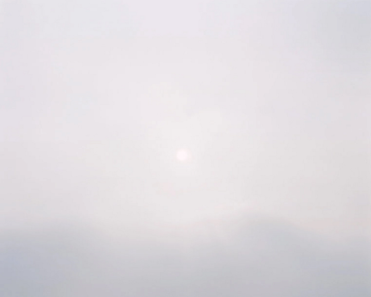
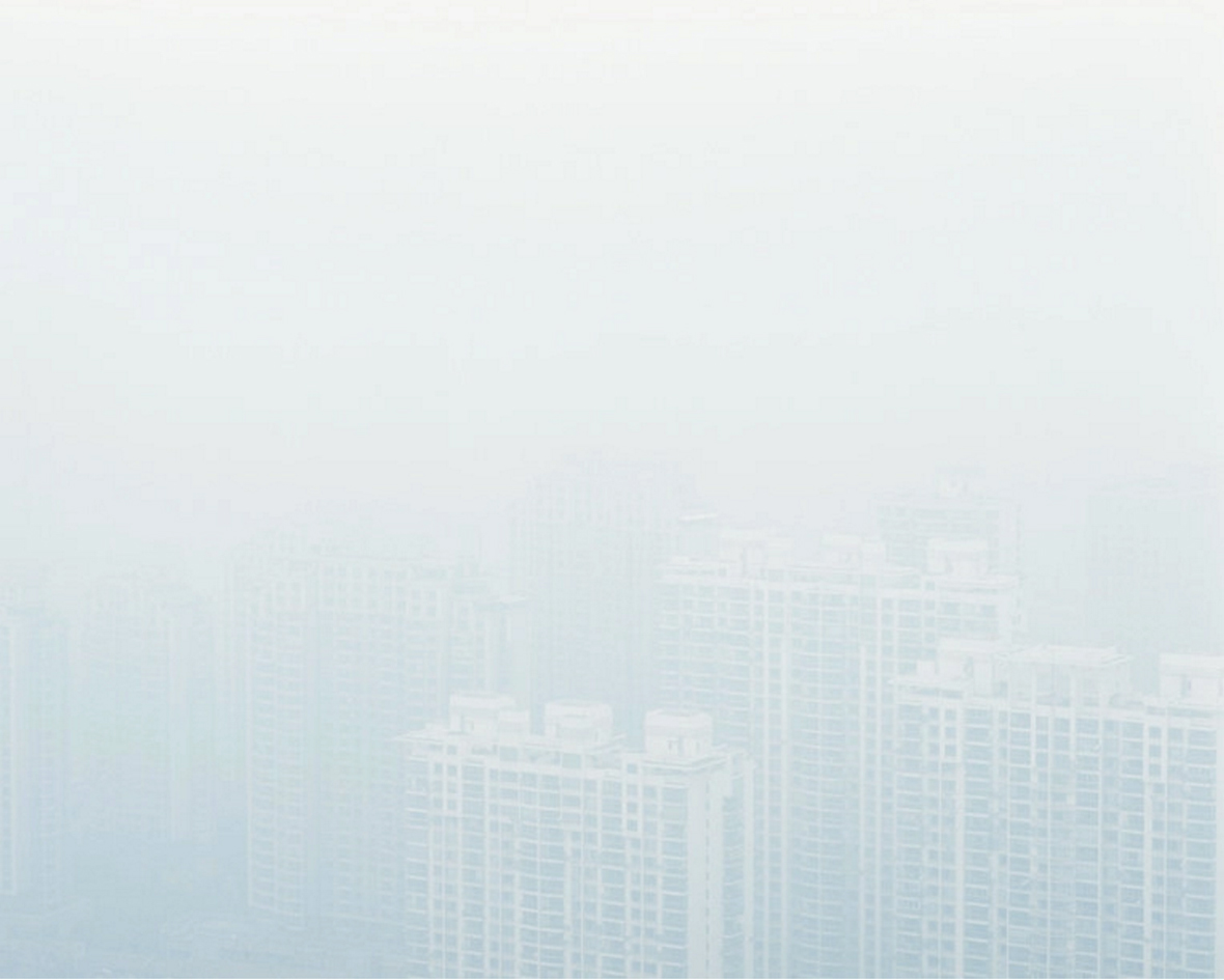
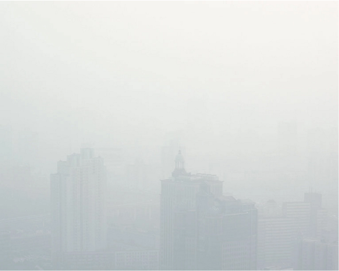
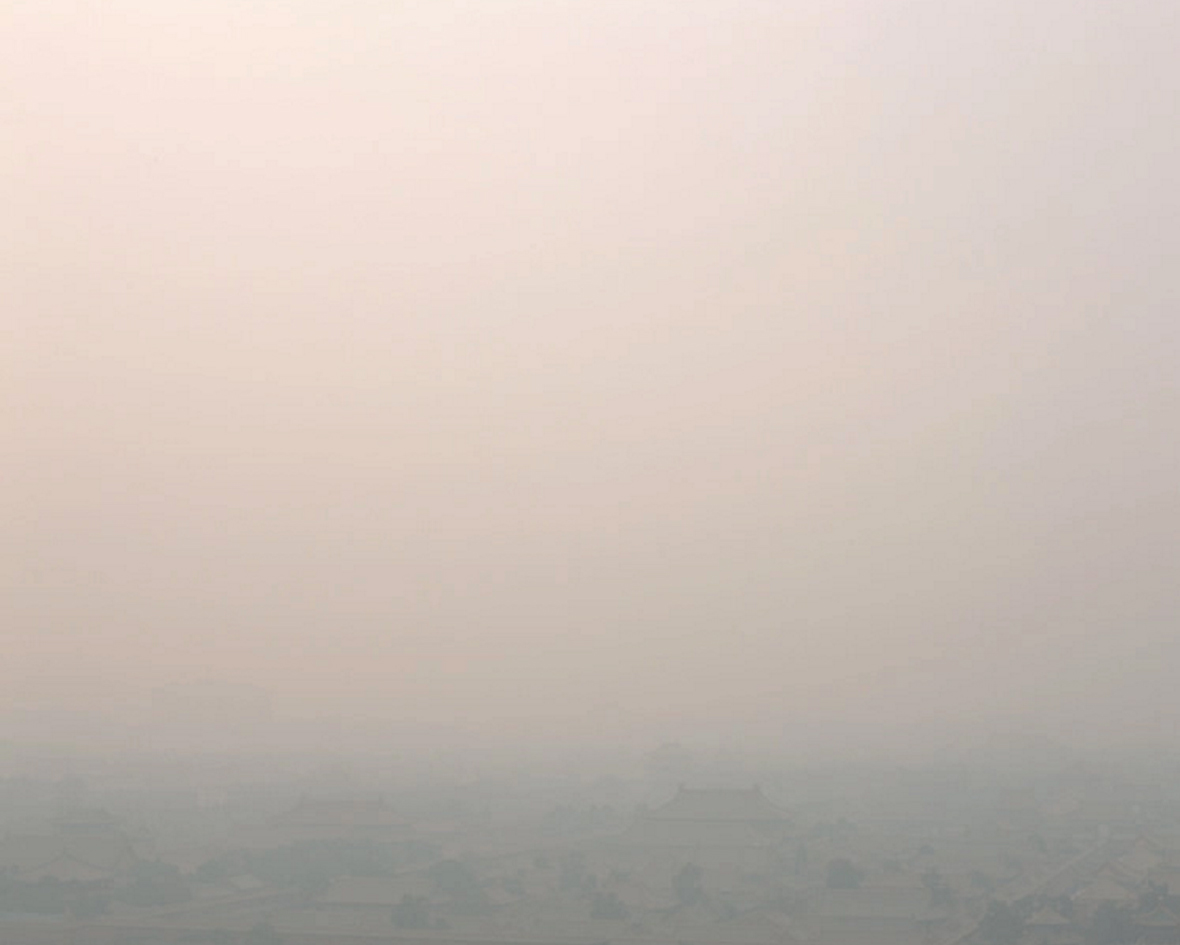
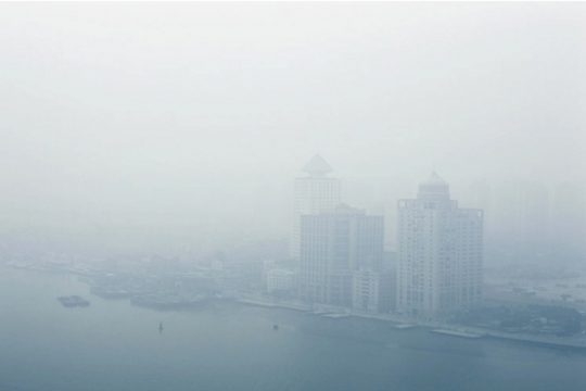
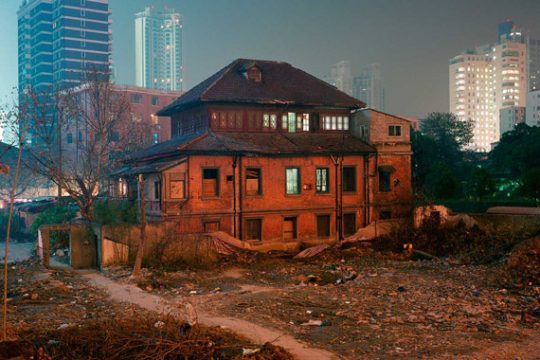
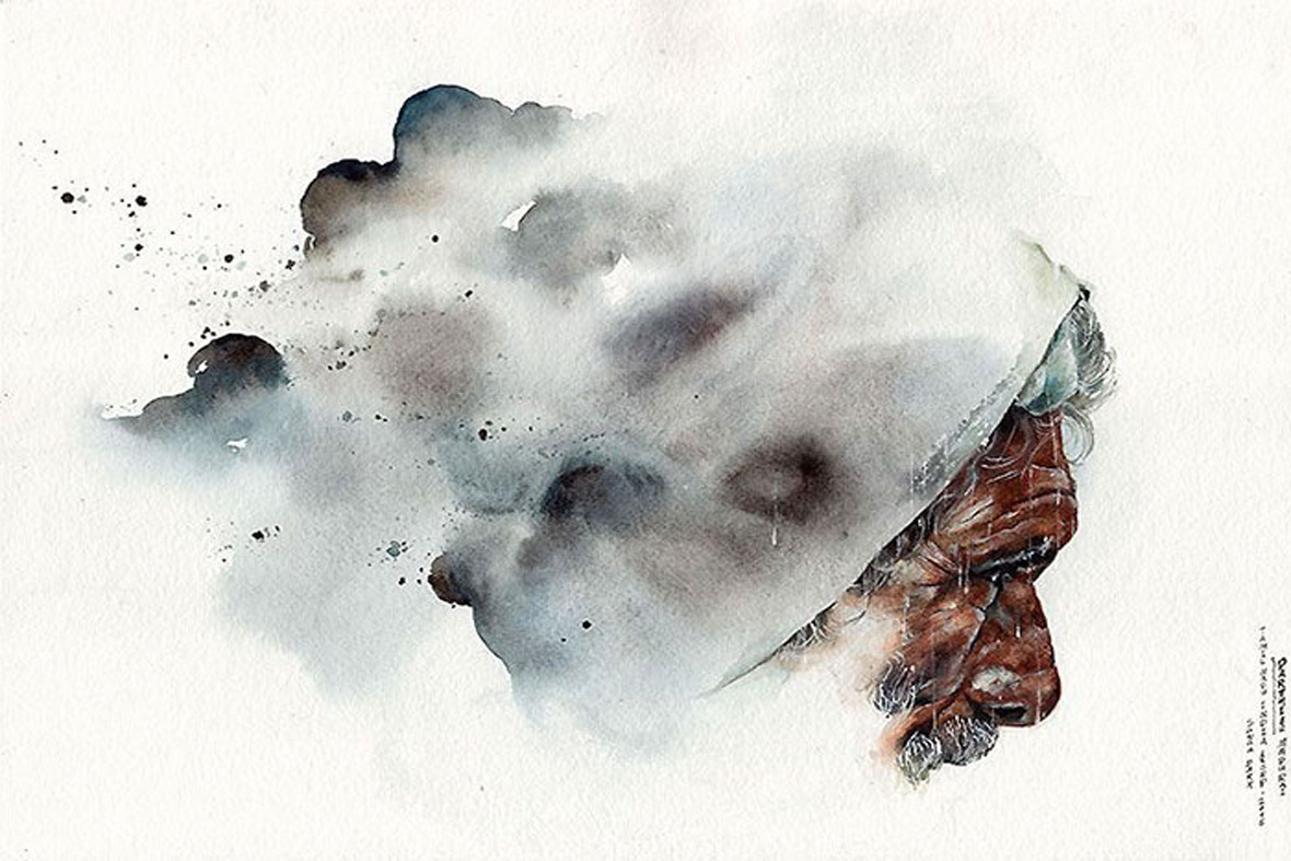
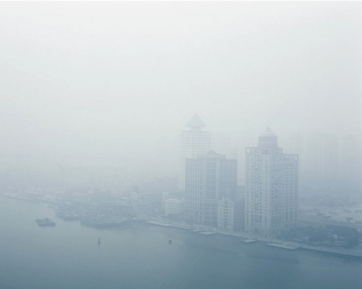
Upon first glance, photographer Benedikt Partenheimer’s Particulate Matter series appears to be a soothing collection of pastel colors and cloud-filled landscapes. However, the German native’s work aims to shed a harsh light on a problematic issue that plagues modern day China – the economic progression moving forward at the expensive of environmental and physical wellbeing. Partenheimer describes the photo series as a “the relationship between the revival and decline… the consequences that come with excessive economic growth and the combustion of carbon-based fuels”.

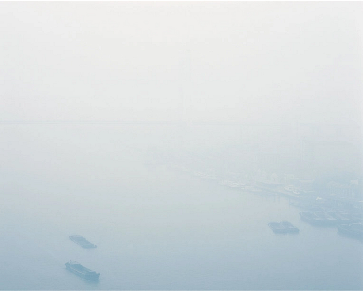
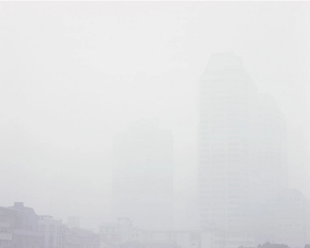
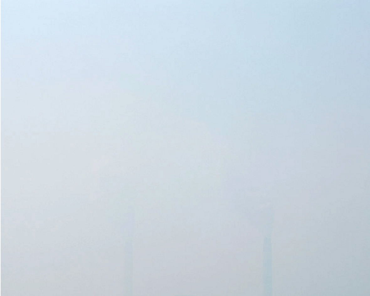
The majority of the series was photographed from above to emphasize an astounding lack of visibility on days where the air quality index (AQI) skirts dangerously above 301, which is globally classified as “hazardous” by governing bodies. On such days, even China’s most iconic sights such as Beijing’s Forbidden City and Shanghai’s Huangpu River are rendered unrecognizable.


乍看之下,德国摄影师 Benedikt Partenheimer的《Particulate Matter 》似乎只是一组色彩柔和,云雾萦绕的自然风景照片。然而, Partenheimer真正的创作意图是揭示一个困扰现代中国的问题–经济发展带来的环境和健康代价。Partenheimer形容这个摄影系列为“复兴与衰落之间的关系……过快的经济增长与过分使用碳基燃料的后果”。

系列中大部分作品以高空俯视的角度拍摄,以突显出在重污染日子里,城市惊人的低能见度。根据规定,当空气质量指数 (AQI) 达到 301以上时,即为”重度污染“。这些时候,即使是中国最具标志性的景点,如北京的故宫、上海的黄浦江等都会变得相当模糊无法辨认。

Shanghai 2014 - Air Quality Index 400 (Hazardous)
The Sun, Beijing 2014 - Air Quality Index 350 (Hazardous)
Shanghai 2014 - Air Quality Index 390 (Hazardous)
Shanghai 2014 - Air Quality Index 340 (Hazardous)
Huangpu River, Shanghai 2014 - Air Quality Index 440 (Hazardous)
Shanghai 2014 - Air Quality Index 420 (Hazardous)
Shanghai 2014 - Air Quality Index 380 (Hazardous)
Shijiazhuang 2014 - Air Quality Index 360 (Hazardous)
Beijing 2014 - Air Quality Index 330 (Hazardous)

Website: benedikt-partenheimer.com


Contributor: Whitney Ng


网站benedikt-partenheimer.com


供稿人: Whitney Ng

Victo Isn’t a Boy’s Name or a Typo

March 28, 2017 2017年3月28日

Growing up in Hong Kong as an only child, Victo Ngai spent much of her childhood drawing and creating imaginative stories from her artworks while her parents were away working long hours. Upon graduating from the Rhode Island School of Design, Ngai blossomed into a decorated illustrator, creating her visual stories on a much larger scale through her characteristically fluid and surreal drawing style. In 2014, Ngai was listed by Forbes in the 30 under 30 of the Art & Style category for her impressive illustrations. Her thought-provoking works are often featured in the likes of The New Yorker and The New York Times where she brings some of the world’s most pressing stories to life. Most recently, she collaborated with Apple to produce a Chinese New Year billboard in celebration of the Year of the Rooster, which was unveiled at the Apple Store on Canton Road in Hong Kong. “I like things that are not very realistic. That is the charm of illustration – it completely allows you to create your own magical world.”


来自香港的倪传婧(Victo Ngai )是家里的独生女。因为父母经常外出工作只留她在家,倪的童年大多数时间在一个人奇思妙想和画画中度过。从罗德岛设计学院毕业后, 倪传婧成为一名插画家,以流畅的线条和超现实主义的绘画风格,描绘出她脑中构想的故事。 2014 年,她凭借出色的插画作品,入选福布斯艺术与风格类“30 Under 30:Art & Style”榜单 (30位最具潜力的30岁以下的杰出新秀)。 她根据世界上发生的重大新闻事件,创作出发人深省的插画作品,并常常被发表于《纽约客》(New Yorker) 和《纽约时报》(The New York Times)等报刊杂志。最近,她与 Apple 公司合作,创作一个庆祝中国鸡年春节的广告牌,于香港广东道的Apple零售店展出。”我喜欢超现实风格的东西。这也是插图的魅力所在。它让你可以构建一个属于你自己的神奇世界。“

Website: victo-ngai.com
Facebook: ~/victo-ngai-倪傳婧
Instagram: @victongai
Behance: ~/victo


Contributor: Whitney Ng


网站: victo-ngai.com
脸书: ~/victo-ngai-倪傳婧
Instagram: @victongai
Behance: ~/victo


供稿人: Whitney Ng

20 Years of Convenience

March 23, 2017 2017年3月23日

For the last 20 years, South Korean artist Me Kyeoung Lee has traveled around her home country, armed with acrylic inks and a penchant for painting quaint little convenience stores. Throughout her childhood, Lee recalls frequenting these charming corner stores that are now becoming few and far between in modern-day South Korea. In each painting, she captures every little detail, highlighting each store’s idyllic features, its traditional signage, and miscellaneous bric-à-brac.


过去20年,韩国艺术家Me Kyeoung Lee带着她的丙烯颜料上路,走遍了韩国许多地方,寻找那些旧式街边小店。在时髦的韩国城市街头,这样传统的杂物小店越来越少,甚至只能在她的童年回忆中才能找到 ,Lee决定用画画的方式将它们保存下来。在这些作品中,Lee仔细描绘每间小店的一砖一瓦,画出小店丰富的杂物细节,也保留了它的传统特征和质朴的风味,

Artsy~/me-kyeuong-lee


Contributor: Whitney Ng


Artsy~/me-kyeuong-lee


供稿人: Whitney Ng

A Body of Portraits

March 13, 2017 2017年3月13日

When Jing Jin is not hand painting greeting cards or making larger than life blueberry bagels, she’s capturing portraits that are immersive and intimate. She likens the human body to landscape – “I like making images that look at the alienness of something that is so intrinsically us.”


Jing Jin不是在手绘贺卡或制作巨型蓝莓百吉饼时,她就是在用镜头近距离捕捉引人入胜的人像作品。 她将人体比作风景——“我喜欢描画出属于我们内心,但却让我们感到陌生的一面。”

Many of her portraits focus on the intricacies of female relationships; she enjoys capturing their various facets that are both powerful and delicate. These aspects of solidarity, nurturing, sisterhood, rivalry and jealousy as well as the process of growing into each other and growing against each other all resonate through her images. Originally from Hong Kong and now based in Shanghai, Jing is currently working on a photo series that encaptures the city’s transient inhabitants. “People are always coming and going in Shanghai; it’s rare to meet someone who stays here for the long haul. I want to make portraits that show a strong contrast between their ephemeral presence and this city’s permanency.”


女性关系是她的人像摄影作品的重要主题; 她喜欢捕捉女性既强大又柔弱的不同面。 她的照片让人们看到女性的团结、母爱、姐妹情、竞争和嫉妒, 以及她们不断相互亲近和疏远对方的过程。来自香港的 Jing Jin 现居上海,在她的最新摄影项目中,她希望用镜头捕捉这座城市形色 匆匆的过客。“在上海,人们总是来来去去, 很少会见到有人在这里生活很长的一段时间。我想通过影像记录这些 来去匆匆的模样与这个恒久之城的强烈反差。”

Websitej1ngj1n.tumblr.com
Tumblrjing-j.tumblr.com


Contributor: Whitney Ng


网站j1ngj1n.tumblr.com
Tumblrjing-j.tumblr.com


供稿人: Whitney Ng

You Might Also Like你可能会喜欢

Between Two Ideals

March 9, 2017 2017年3月9日

Sydney-based designer and illustrator Joy Li arrived in Australia at the age of one after her parents immigrated over from mainland China. Growing up in an Asian household while living amongst a Western society has meant that Li has spent her entire life “wedged between two ideals.” Her latest project, Living as an Asian Girl, aims to showcase the frustration that many Asian women living in Western societies experience. This three-part series takes inspiration from social media, pop culture and internet memes. Although the presentation is light-hearted and approachable, Li seeks to shed a truthful light on the “difficulty in reconciling with conflicting identities and its subsequent effect on our psychological well-being.”


Joy Li是一名设计师和插画家。一岁时,她随父母从中国移居澳大利亚。作为一个生活在西方社会,却在亚洲家庭里成长的女生,Li的人生注定会夹在“两种价值观之间”。因此,在她的最新的设计项目《Living as an Asian Girl》中,Li希望向观众传达许多亚洲女性在西方社会生活会遇到的挫败和苦恼。整个项目分为三部分,灵感来自社交媒体、流行文化和网络爆红现象——虽然Li的表现手法走的是轻松有趣的路线,但她希望这件作品能传达给观众“在不同的身份间找寻平衡的艰难,以及它对我们心理上的影响”。

Words to My Daughter – “Dear Joy, I ____ You.”

Li arranges snippets of her everyday household conversations into a chart that measures each phrase’s frequency, tonal value and emotional impact. The sizing of the text correlates to the frequency that these phrases are heard. While such phrases may be eerily common across most Asian households, often uttered as a means of showing affection, they’re atypical and unexpected in Western society. Li’s intention is to shed light on these cultural contrasts while documenting her personal struggle with defining her own identity.


对女儿说的话—— 《Dear Joy, I ____ You.》

在这个作品中,Li记录了生活中妈妈经常和她说的话,并根据这些短语出现的频率、音调和冲击力作为标准,将短语以不同大小排布在网格上。出现越频繁的短句尺寸就越大,而且排列在最显眼的位置。观众透过这幅作品仿佛可以瞬间代入Li的生活。这样“关心式”的语句在亚洲家庭很常见,但以西方社会崇尚自由的标准来说,就显得有些突兀了。Li将这种有趣的对比记录在她的作品里,向观众直面传达了她成长环境的矛盾和挣扎。

Visual Serenade of Twitter Sentiments  – “A Sad Ballad for Asian Girls”

In this second piece, Li explores how Asian girls are represented online by correlating tweets into an image based on their delivery. The data was derived from Twitter searches relating to the keywords “Asian women” and “Asian girls”, with results ranging from offensive to empowering.


Twitter帖子的视觉小夜曲——《A Sad Ballad for Asian Girls》

在第二部分里,Li 将Twitter上搜索的帖子内容和根据这些内容形成的图像放在一起,进而探讨亚洲女孩在网络上的形象。她在Twitter网站上搜索“亚洲女性”和“亚洲女孩”的关键词,收集了一系列的帖子,其中既有侮辱性的内容,也有倡导女性赋权的内容。

A Character Quiz – “Who’s Your Token Asian?”

Along with limited representation amongst mass media, Asian women are also constantly pigeonholed into certain stereotypes. Li created this visual flow chart that takes viewers through a series of questions to discover their “token Asian.”


一个性格测验——《Who’s Your Token Asian》

除了大众传媒上营造的狭隘形象,人们对亚洲女性也存在一定的刻板印象。Li创作了一个视觉流程图,通过一系列的问题,让观众一步步发现和反省自己对亚洲女性的刻板印象。

Li describes herself as someone who draws inspiration from the past as much as the future and hopes that her work can “delight the mind’s eye and invite a sense of nostalgia.” What started off as a personal project has evolved into a beacon of truth that resonates with Asian women from all over the world.


Li形容自己是一个从过去和未来中找寻灵感的设计师,她希望自己的作品能够取悦观众的心灵和触发怀旧感。在最初,这只是Li自己的一个个人项目,现在已慢慢转变成一个追寻真相之旅,一个让世界各地的亚洲女性都深有共鸣的项目。

Websitejoyli.com.au
Behance~/joyyli
Instagram@_joyli


Contributor: Whitney Ng


网站joyli.com.au
Behance~/joyyli
Instagram@_joyli


供稿人: Whitney Ng

The Wanderlust of Sunga Park

March 8, 2017 2017年3月8日

Jaded by the daily grind of work, South Korean graphic designer and illustrator Sunga Park found solace in traveling around the world. Inspired by her travels, she would draw the buildings that she saw and the people that she met as a means of retaining these precious memories. Drawing these exotic locations became a form of respite for her, a welcome relief from her day-to-day routine.


厌倦了在韩国单调重复的生活,平面设计师和插画家Sunga Park选择周游世界,以调节自己。旅行的确带给她新的灵感,Sunga把旅行中看到的建筑物和遇见的人画下来,以保存这些珍贵的记忆。在旅行中画画带给她一个喘息的机会,将她从苦闷的生活中释放出来。

What makes Park’s work distinctive is her soft and fluid use of pen and watercolor. “Watercolor is the best medium for creating my art; the unpredictable characteristic of water allows me to give my art a natural aspect. My repeated attempts of working with watercolor led to a ton of failures. In a way, this medium taught me a lot about life.”


Sunga Park作品的独特之处,在于她对钢笔和水彩的出色运用,呈现出柔美而流畅的风格。“水彩是我创作时最好的伙伴;水的“不可预知”让我的作品中有一种自然的风格。在不断尝试用水彩创作的过程中,我也有过无数的失败。某种程度上,水彩也教会了我许多生活的道理。”

Park felt that her move from using software to using watercolor on real paper was truly liberating. “In graphic design, we have easy commands such as Ctrl+Z and Ctrl+S. But in reality, no one can save their real experiences onto a storage device and what we’ve done cannot be undone.” Working with watercolors led her to create a slew of projects in which she combines her previous graphic design experience with her love of visual art – she feels that her web design for House at Khlebny is one such project that has defined her as an artist.


对她来说,从电脑作画转为使用纸张和水彩作画是一种真正的解放。“用电脑创作平面设计时,我们可以很方便按下Ctrl+ Z和 Ctrl+S来操作。但在现实中,没有人可以将自己的真实体验保存到某个存储设备中,所有的行为都是无法撤消的。”她的水彩作品为她带来了许多设计项目的机会,在这些项目中,她将自己的平面设计经验与对视觉艺术的热爱出色结合。为 House at Khlebny 打造的网页和插画设计更她真正确定自己作为一名艺术家的身份。

Her most memorable travel experience took place when she was sketching along the streets of India and around Central Asia. In these countries, where she was unable to communicate in any language, she used art to bridge the gap. “Locals become really open-minded as soon as they came to understand what I was doing. They wanted to see my sketchbooks and even asked me if I could draw them. This is one of the greatest things that art can do – it allows me to share my talents with people and even give them a laugh.”


她最难忘的旅行经历是她在印度和中亚国家的街道上写生。在这些国家,她无法通过语言与当地人沟通,于是,她转用艺术作为沟通的桥梁。“每当他们知道我在画画的时候,就会自然放下防备。有时他们还会想看看我的速写本,甚至问我能不能画一下他们。这就是艺术的魅力所在——让我能够与他人分享我的才艺,甚至为他们带来欢乐。”

Currently on the move, Sunga feels incredibly blessed that her art has enabled her to travel to wherever her heart desires. Her upcoming itinerary includes a journey to Europe via the Trans-Siberian railway as well as North America and South America. This trip will form the basis of her next project, a foldable travel map that will depict all of her adventures. “The idea is to create a map that is almost like a book, so that I can share all of my travel stories with people that I meet on the road. My art can’t be completed on my own. It’ll be created with the people that I meet along the way.”


现在,Sunga 还在旅途中,她觉得自己十分幸运,因为艺术带她前往自己想要拜访的所有地方。接下来,她将要乘搭西伯利亚大铁路前往欧洲,之后再去到北美和南美探险。这趟旅行是为她的下一个项目作准备——Sunga要打造一个可折叠的旅行地图,在上面描画她的冒险旅程。“我想要创造一本像书一样的地图,这样我就可以和我在路上认识的人分享我在旅途中的故事。我的艺术不是由我自己一个人完成的,而是我和我一路上遇到的人一起创造的。”

Website: parksunga.com
Facebook: ~/parksunga.art
Instagram: @park_sunga


Contributor: Whitney Ng


网站: parksunga.com
脸书: ~/parksunga.art
Instagram: @park_sunga


供稿人: Whitney Ng

Forest of Numbers

March 1, 2017 2017年3月1日


无法观看?前往优酷

Forest of Numbers is the brainchild of Tokyo-based architect and artist, Emannuelle Moureaux. Her largest installation to date was created to celebrate the 10th anniversary of Tokyo’s National Art Center (NACT), spanning 2000 square meters and utilising “100 colours”. This is the first time that the National Art Center has used the White Cube exhibition room without any partition walls.


《数字森林》是东京建筑师和艺术家Emannuelle Moureaux迄今为止最大型的艺术装置作品,是她为庆祝东京国家艺术中心(NACT)成立十周年而专门创作的。这个大型艺术装置占地2000平方米,一共使用了100种颜色。这是东京国家艺术中心的White Cube展厅首次在举办展览时没有设立任何隔墙。

The installation itself symbolises the next 10 years for NACT – the decade spanning between 2017 to 2026. More than 60,000 number figures ranging from zero to nine were aligned within a 3-D grid and suspended from above. A pathway was been purposefully created, cutting through the installation and allowing visitors to take a walk through the cascade of numerals.


装置本身象征着NACT的未来10年,即2017年到2026年之间的10年。超过60000件从0到9的数字构件悬浮在三维网格中。装置中间特意设置了一条供穿越的路径,以供参观者在这巨大的《数字森林》之中漫步。

As part of Moureaux’s 100 colors installation series, Forest of Numbers utilises 100 shades of colours across 10 layers of numbers. The walls that encapsulate the installation space feature a compilation of exhibition posters to commemorate the last 10 years, which are contrasted with white number cut outs on the opposite wall to symbolise the next 10 years to come.


作为Moureaux的“100色”系列艺术装置的一部分,《数字森林》在构建10层数字的时候共使用了100层颜色。装置所在的展览室的一面墙上展示着过去十年NACT的展览的海报,对面的墙上则展示着预示未来十年的白色数字。

Forest of Numbers was a true labour of love, created as a colourful celebration of the National Art Center’s anniversary and brought to life with the help of 300 volunteers. Moureaux’s playful installation creates joy from paper and thread, attracting over 20,000 visitors within the first ten days of its NATC debut.


色彩缤纷的《数字森林》是一个充满爱的作品——它是为庆祝东京国家艺术中心成立10 周年而诞生的,凝聚了300名参与制作的志愿者的努力。Moureaux用纸和线所创作的这个充满玩趣和快乐的艺术装置,在NATC首次亮相的前10天里就吸引了超过2万名观众。

Website: emmanuellemoureaux.com


Contributor: Whitney Ng
Video and Images Courtesy of Emmaneulle Moureaux


网站emmanuellemoureaux.com


供稿人: Whitney Ng
视频与图片由Emmanuelle Moureaux提供

The Warehouse Hotel

February 28, 2017 2017年2月28日

Once the epicentre of the Singapore spice trade, the original Warehouse Hotel was built in 1895, along the Singapore River. The building’s placement along the Straits of Malacca Trade route meant that it soon became “a hotbed of secret societies, underground activity, and liquor distilleries.”


毗邻新加坡河的Warehouse Hotel始建于1895年,前身是新加坡香料贸易中心。酒店所在的大楼地处马六甲海峡贸易路线,因此,在那个年代它很快就成为了一个“供秘密社团,地下活动和酒厂聚集的温床。”

Today, The Warehouse Hotel has been restored into a contemporary 37-room independent hotel that is characterised by the area’s rich heritage and Singapore’s unique local culture. 


现在,Warehouse Hotel经过翻修,被改造成为一家拥有37间客房的现代化酒店。酒店所在街区丰富的历史遗产和新加坡独特的本土文化成就了酒店独特的风格。

The hotel was revamped by a homegrown agency, The Asylum – head designer and founder, Chris Lee remarked “Our focus has been to protect the property’s legacy while creating a fresh perspective on the term ‘industrial’. The environment is warm and sophisticated to prevent it from being too obviously grounded in what has been before.”


酒店由本土公司The Asylum负责改造,首席设计师和创始人Chris Lee表示:“我们的重点是保留酒店大楼本身的历史感,同时呈现出一种全新的‘工业’式风格。整体的环境设计是偏温暖和精致的,以避免酒店前身的工业印象显得过于强烈。”

The industrial theme is continued through the Warehouse Hotel’s flagship restaurant, Po, named after “popo”, the Mandarin word for grandmother. The restaurant boasts a similar industrial chic style – seeking to serve creative renditions of Singapore’s unique culinary heritage by employing the very best of Asia’s ingredients.


Warehouse Hotel的旗舰餐厅Po延续了酒店的工业风设计。餐厅名字来自中文“祖母“的普通话发音“popo”。整间餐厅的设计体现出同样的别致工业风格,餐厅采用亚洲地区最上乘的食材,创意演绎新加坡的独特烹饪文化。

The Warehouse Hotel truly seeks to be “not just a hotel, but an entire experience.” The front desk doubles as a retail installation, curated by local furniture creator Gabriel Tan, in collaboration with Supermama’s Edwin Low. Each of the guest rooms features coffee and tea mugs made by a local ceramic studio, Mud Rock. Every aspect of the hotel’s design, from the lobby bar to the in-room amenities celebrates the country’s past and present.


Warehouse Hotel真正的目标“不只是成为一间酒店,而是提供给客人一种完整的体验”。酒店前台被设计为一个零售装置,由当地的家具设计师Gabriel TanSupermama的Edwin Low合作打造。每间客房均摆放着由当地陶瓷工作室Mud Rock制作的咖啡杯和茶杯。从大堂酒吧到客房设施,酒店各处的设计都体现着这个国家的过去和现在。

Address:
320 Havelock Road
Robertson Quay
Singapore

Tel:
+65 6828 0000


Website: thewarehousehotel.com
Facebook: ~/thewarehousehotel
Instagram: @thewarehousehotel


Contributor: Whitney Ng
Images Courtesy of Asylum Creative PTE LTD


地址:
新加坡
320 Havelock Road
Robertson Quay

电话号码:
+65 6828 0000


网站thewarehousehotel.com
脸书~/thewarehousehotel
Instagram@thewarehousehotel


供稿人: Whitney Ng
图片由 Asylum Creative PTE LTE 提供

You Might Also Like你可能会喜欢

Air-Ink: The Art of Pollution

February 22, 2017 2017年2月22日


无法观看?前往优酷

American author and inventor Richard Buckminster Fuller once said, “Pollution is merely a resource that isn’t being used properly.” Inspired by his words and the growing need to tackle this colossal environmental issue, Indian startup Graviky Labs had the idea to devise a truly way of repurposing pollution.


美国作家和发明家Richard Buckminster Fuller 曾经说过:“污染仅仅是没有被正确使用的资源。”这句话启发了印度初创公司 Graviky Labs,针对社会对于解决空气污染问题越来越迫切的需求,他们构想设计出一个真正的创意解决方案——将污染物重新利用。

Co-founders Anirudh Sharma, Nikhil Kaushik and Nitesh Kadyan began to prototype a device that could be retrofitted onto the tailpipe of pollution emitting vehicles in 2013. This device, known as KAALINK, was the key to upcycling pollution. Over the course of the next few years, copious amounts of research and development took place in order to detoxify the pollution particles gathered by KAALINK, in turn, creating a consistent and viable ink. The device manages to stop air pollution at the source, without hindering the performance of vehicle engines.


2013年,公司的创始人Anirudh Sharma, Nikhil Kaushik 和 Nitesh Kadyan研发出可以被改装在车辆排气管上的设备原型。这个被称为KAALINK的设备是回收污染废气的关键。在接下来的几年间,他们进行了大量的研究和开发,想办法去除由KAALINK收集的污染颗粒里的有害物质,以制作出品质稳定的油墨。这一设备试图在不影响车辆发动机的性能的前提下,从源头上控制空气污染。

First, KAALINK is retrofitted onto the exhaust of a car, truck, or diesel generator, capturing the outgoing pollutants at the source.


首先KAALINK会被安装到汽车或卡车的排气管上,或是柴油发动机上,在源头收集排出的污染物。

The collected soot then undergoes a series of purification in order to remove heavy metals and carcinogens. The result is a purified carbon-based pigment in powdered form.


然后,这些被收集到的烟尘污染物会经历一系列净化的过程,以除去其中的重金属和致癌物质。最终的产品是净化的粉状碳基颜料。

Finally, the carbon powdered pigment is processed to create different types of inks and paints.


粉状的碳基颜料被加工处理后就能形成不同的油墨和颜料。

Around 45 minutes of car emissions equate to 30ml of Air-Ink, which can be safely used. Recently, Graviky Labs partnered with Tiger Beer to introduce Air-Ink to the public. They also enlisted seven Hong Kong-based artists to help introduce this concept of painting with pollution. Air-Ink has been launched on Kickstarter and this series of environmentally savvy inks and paints will soon be readily available to creatives from around the world.


每 45 分钟的汽车废气排放量大约能产生 30 毫升可安全使用的 Air-Ink。最近,Graviky Labs 更与啤酒品牌 Tiger Beer合作,向公众推广Air-Ink。他们还邀请了7名来自香港的艺术家助力推广“用污染物绘画”这一概念。公司已经在众筹网站Kickstarter上推出了Air-Ink,不久之后,世界各地的创意人士们就能用到这一系列的环保油墨和颜料产品。

Websitegraviky.com
Facebook~/Graviky


Contributor: Whitney Ng
Video and Images Courtesy of Emmaneulle Moureaux


网站graviky.com
脸书: ~/Graviky


供稿人: Whitney Ng
视频与图片由Graviky Labs提供

Black Waves

February 13, 2017 2017年2月13日


无法观看?前往优酷

teamLab‘s digital installations are a roving series of artistic works that utilise light, sound, movement and motion to create interactive spaces. Recently, teamLab brought Dance! Art Exhibition, Learn & Play! Future Park to Taipei’s Huashan 1914 Creative Park, where the exhibition will remain until April 9th.


日本艺术团体teamLab所创作的数字装置是一系列利用光、声音和动作来创造互动空间的艺术作品。近日,teamLab在台北华山1914文化创意产业园区举办了名为《Dance!Art Exhibition, Learn & Play! Future Park》的展览,展览将一直持续至2017年4月9日。

Amongst the many vibrant installations, Black Waves stands alone as an emotive showcase of one consistent scene – that of the unforgiving great ocean. Upon entering the exhibition, visitors are boxed in to dark room, illuminated only by the rolls and roars of crashing waves.


在众多艺术装置中,《Black Waves》脱颖而出,它是无间断影像装置,通过不间断的海浪画面,引发观众的情感共鸣。一进入展览,观众就置身于黑暗的空间中,只剩层层翻滚的海浪发出的亮光。

The waves themselves are computer generated in a 3D virtual space and presented as a continuous body. This was achieved by calculating the interactions of hundreds of thousands of particles. These particles were then extracted and lines were drawn in relation to their movement to create the artwork; teamLab refers to this technique as creating an ultra-subjective space.


这些海浪是电脑模拟出的3D虚拟空间,连续不断地出现。创作者需要对几十万颗粒的相互作用进行计算,然后提取出这些颗粒,根据颗粒的动作绘画出线条,从而创作出这一艺术作品。teamLab 称这种创作方法为“创作超主观空间”。

Beyond the crushing sound of the ocean’s waves, which was designed by Hideki Takashashi, the exhibition remains mostly quiet. Visitors feel completely immersed into the exhibition – as time passes, it will almost feel as if the waves are physically engulfing all your senses. Beyond being an artistic spectacle, Black Waves is a solace for visitors who seek to soothe their mind. Despite it’s looping facade, one could easily spend hours here.


装置中的海浪声由Hideki Takashashi创作,除了这些海浪声之外,整个展览大部分时候都是安静无声的。观众能充分沉浸于展览中。随着时间的推移,让人感觉到好像海浪正席卷身体所有的感官。《Black Waves》除了是一个奇妙的视觉作品,更能抚慰和平静观看者的内心。尽管所有画面都是循环出现,但置身于展览中让人一不小心就会度过数小时。

teamLab remarked that Black Waves was inspired by Japanese paintings of oceans and rivers, where by these bodies of water were expressed as a series of lines; these lines allow the viewers to see the waves as a living entity. “This is a way of seeing the world that lures us in and allows us to feel that there is no boundary between ourselves and nature.”


teamLab表示,《Black Waves》受到了日本有关河流和大海的绘画作品的启发。在这些绘画作品中,画家多通过线条来表现水体,让观众将海浪看作是一个生命体。“这是一种观察世界的方式,十分引人入胜,让我们觉得自己与自然融为一体,没有分界。

Websiteteam-lab.net


Contributor & Photographer: Whitney Ng
Video and Additional Images Courtesy of teamLab


网站: team-lab.net


供稿人与摄影师: Whitney Ng
视频与附加图片由teamLab提供

You Might Also Like你可能会喜欢