All posts by admin

Cruising Utopia 骄傲曼波

June 8, 2021 2021年6月8日

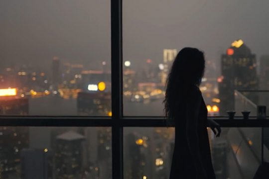
“Who do I have to fuck to get a visa?” a London-based friend once texted me, with equal parts exasperation and envy, in response to my Instagram stories of Taipei’s pandemic-era nightlife. Until a few weeks ago, it seemed that the island of 24 million would make it through the worst ravages of COVID-19 largely unscathed, with only around a dozen deaths and domestic transmissions largely squashed.

Now, as new variants slip through the cracks and the local and central governments scramble to rework their pandemic strategies as cases and deaths rise, it’s painfully clear just how good we had it. In particular, for Taiwan’s vibrant LGBTQ+ communities, this past year looks, in retrospect, almost utopian–a shimmering but fundamentally fragile celebration of queer life and pleasure at a time when most of the world has been stuck in mourning. Deep down, maybe we knew that it couldn’t last forever.

For those in the know, of course, Taipei has long been one of Asia’s queer cultural capitals. In 2019, Taiwan’s legislature garnered international attention when it made history by becoming the first in Asia to legalize same-sex marriage. In 2020, Taipei was able to boast the world’s largest LGBTQ+ Pride parade with the virus essentially contained within its borders. But Taiwan’s queer scene has never been reducible to rainbows and wedding rings. It is also home to some of the region’s most sought-after saunas, bars, clubs, and parties. Queer artists here continue to break new ground.


“想要拿到签证,我得和谁上床?”一位来自伦敦的朋友这样回复我的 Instagram,语气中带有几分懊恼和羡慕。那篇帖子的内容发布在疫情期间的台北,记录了我在当地的夜生活片段。在几周前,2400 万人口的台湾似乎还尽然有序,新冠肺炎的死亡人数维持在十几,本土疫情的传播源也已基本阻断。

但现在,随着病毒变异株的侵入,感染者和死亡人数攀升,这令地方和中央政府再度陷入紧张局面。或许在灾难面前,人们才体会到此前生活的幸福,对于活跃在台湾的 LGBTQ+ 群体来说更是如此。他们过去一年的生活堪称乌托邦——当哀嚎声在世界大多数地区此起彼伏,他们却沉迷在一片醉生梦死的梦幻境地。但同时,这番热闹却又显得脆弱,因为片刻的霓虹色难以持续至永恒。

众所周知,台北一直被奉为亚洲酷儿文化圣地。2019 年,台湾成为亚洲第一个同性婚姻合法化社会,引起了国际社会的广泛关注。2020年,在本土病毒传播问题基本控制的情形之下,台北举办了世界上最大型的 LGBTQ+ 骄傲游行。在台湾,“酷儿”文化并不只有骄傲游行和同性婚姻。这里还有着亚洲最炙手可热的桑拿浴室、俱乐部和派对场地,本地同性恋艺术家也正在不断开拓新的疆域。

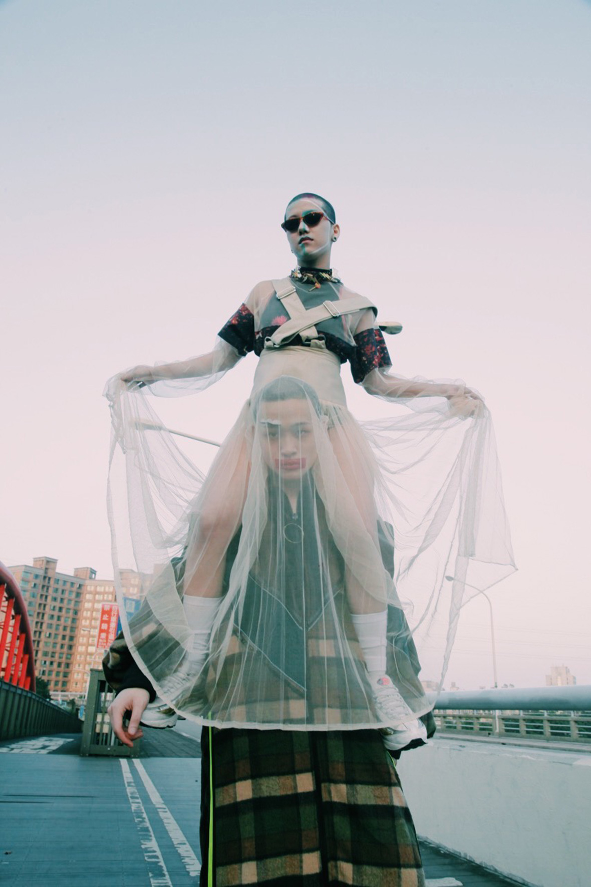
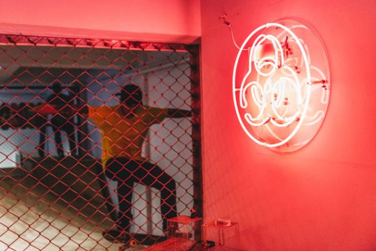
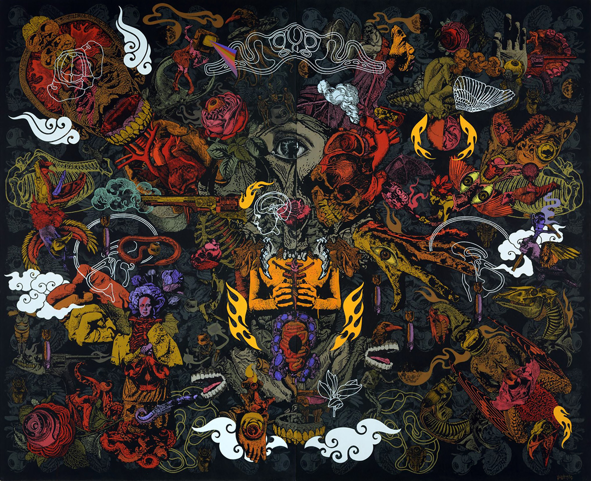
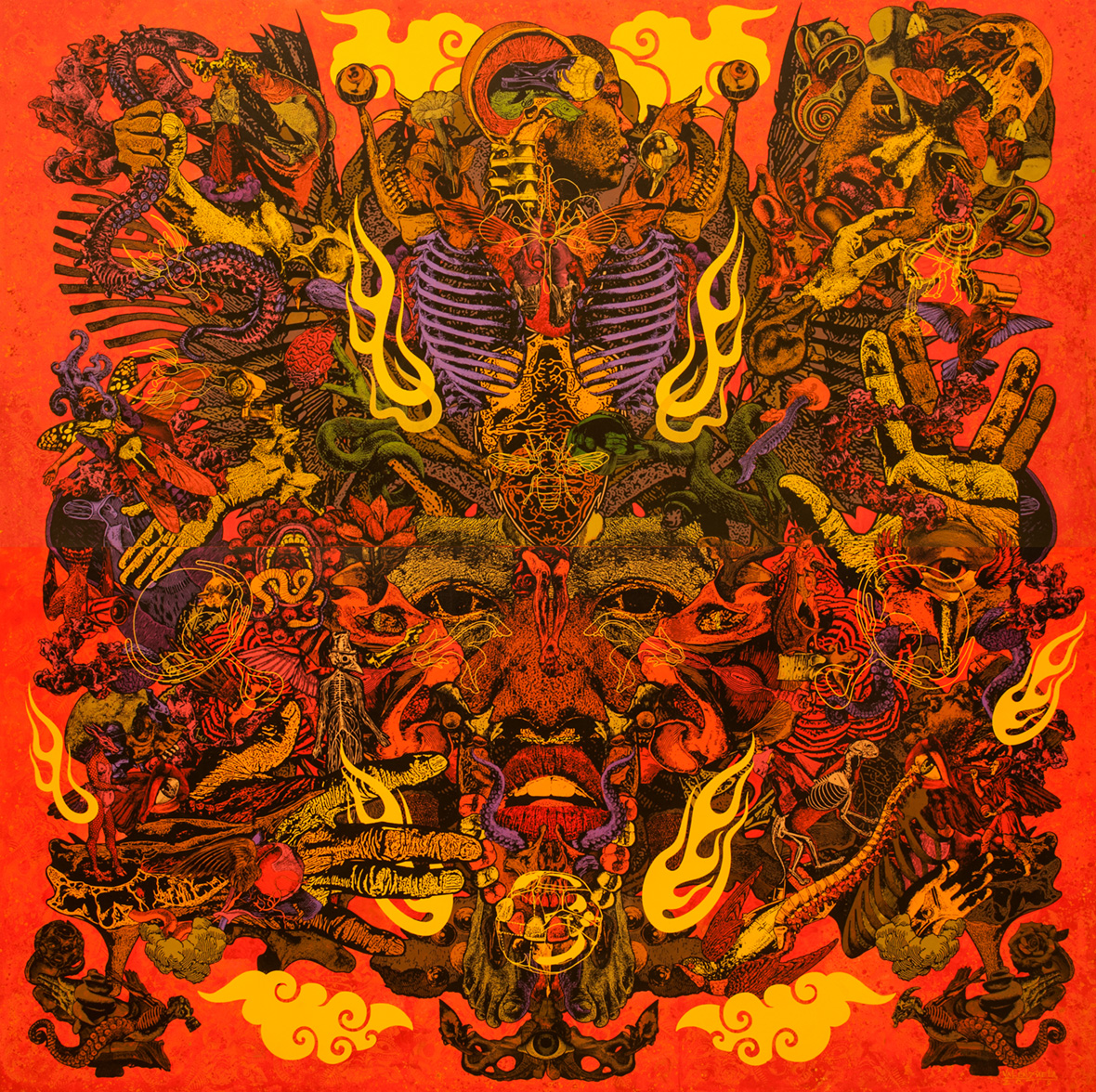
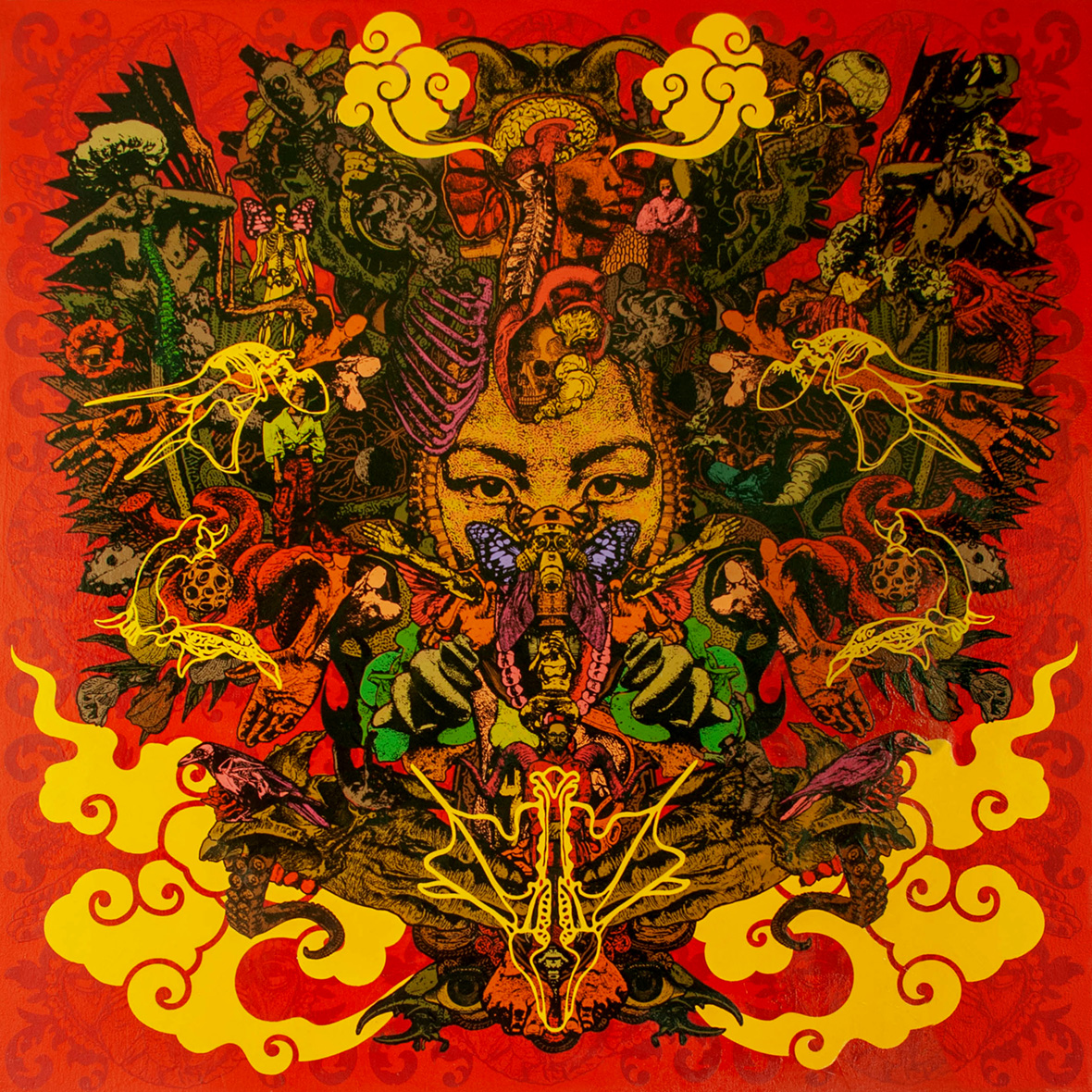
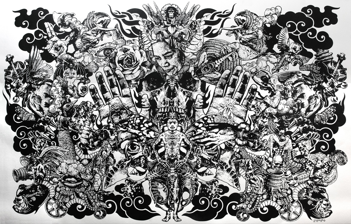
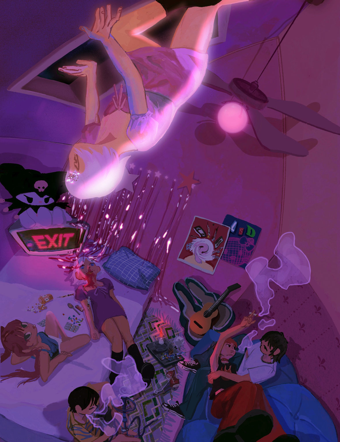
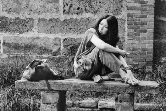
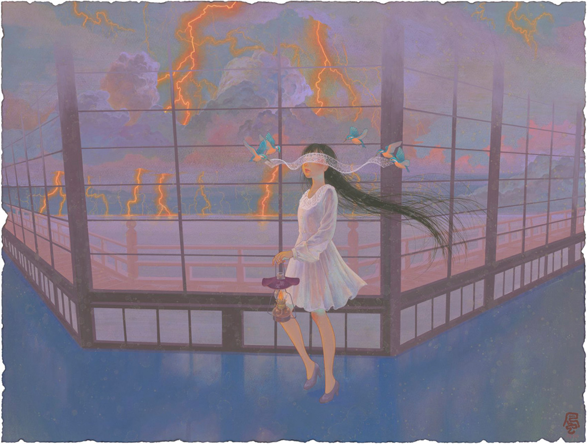
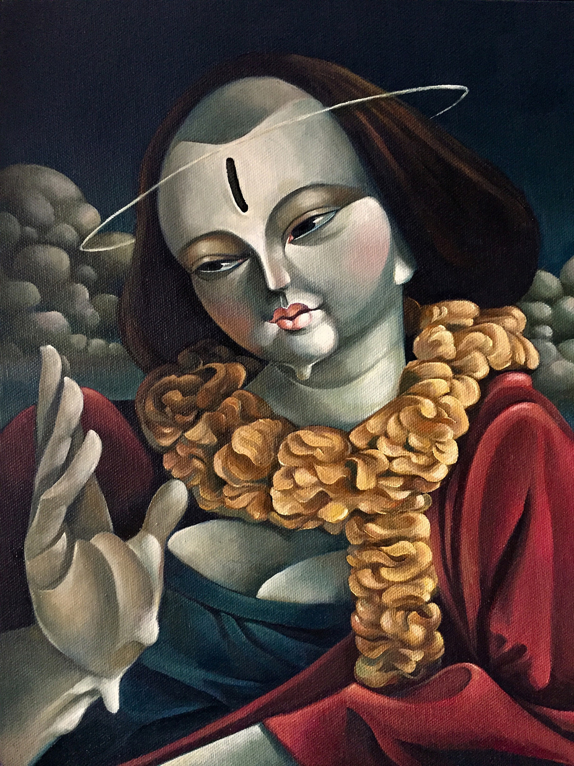
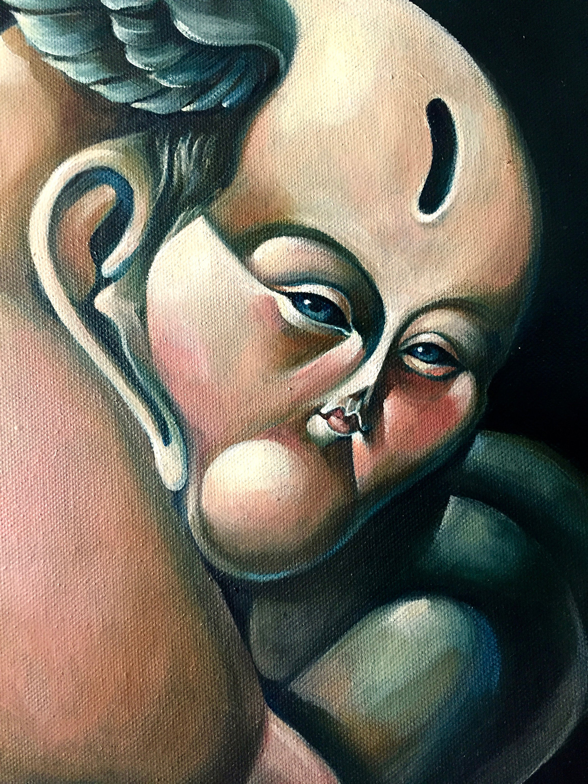
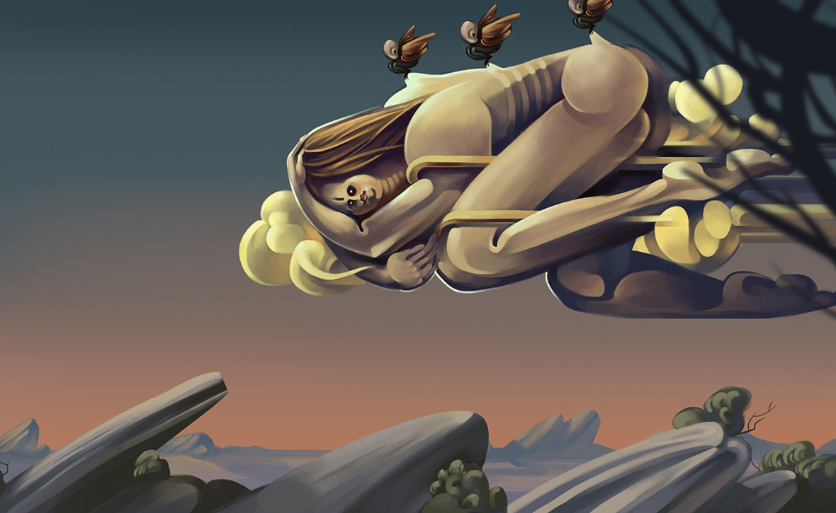
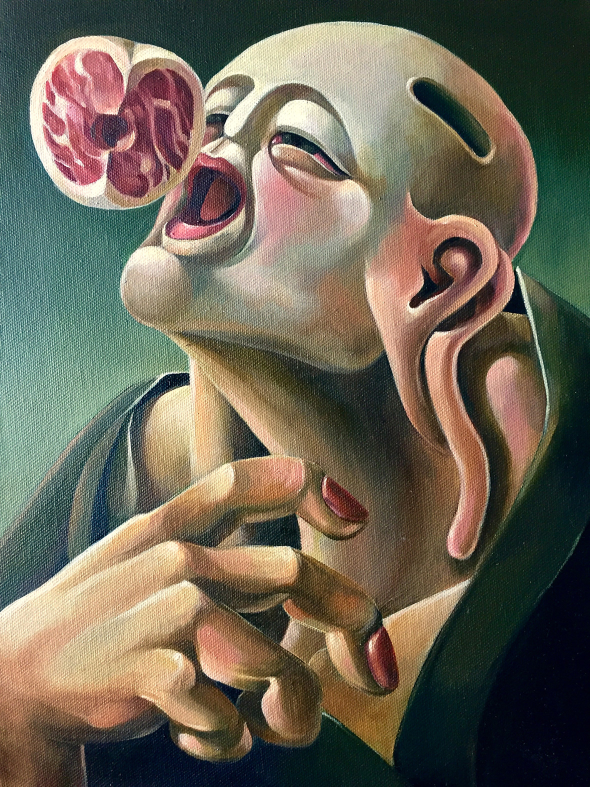
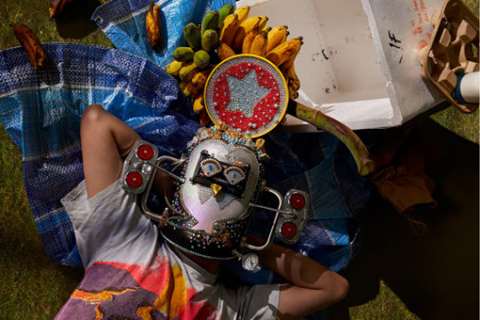
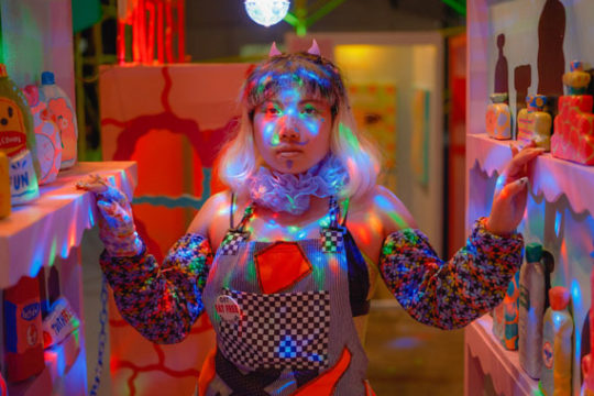
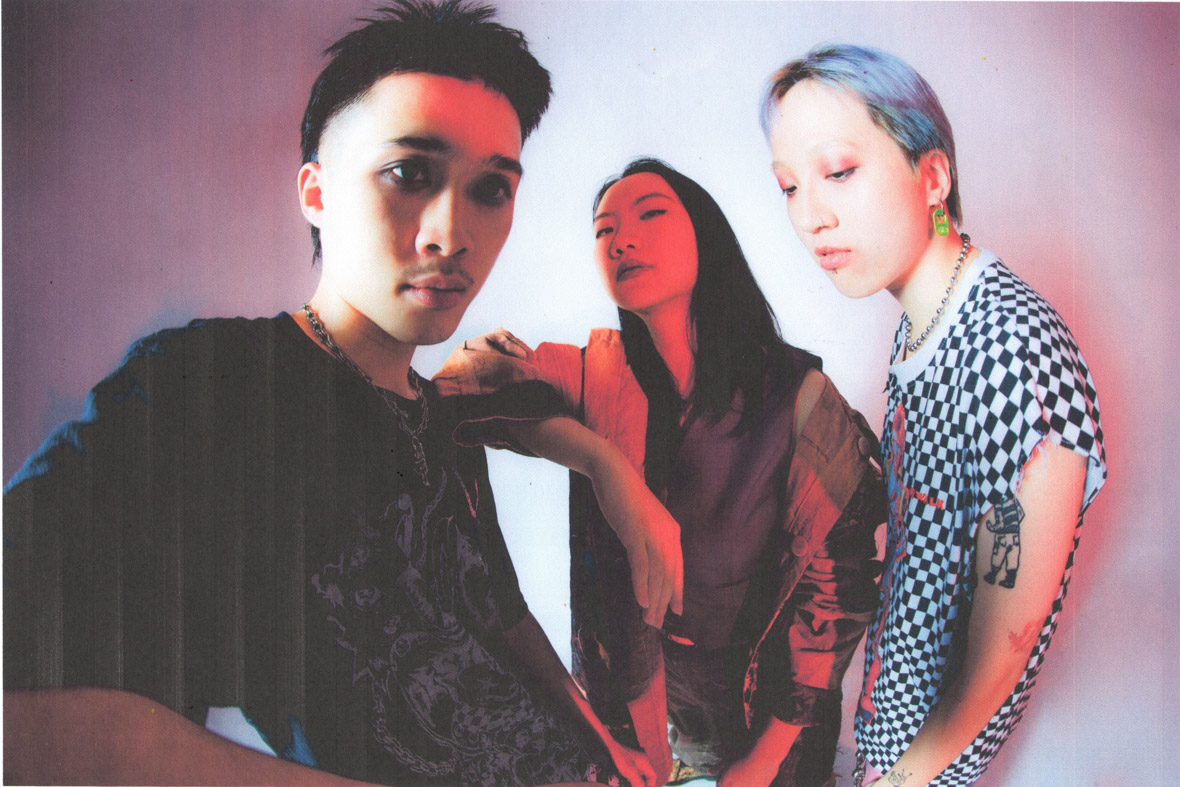
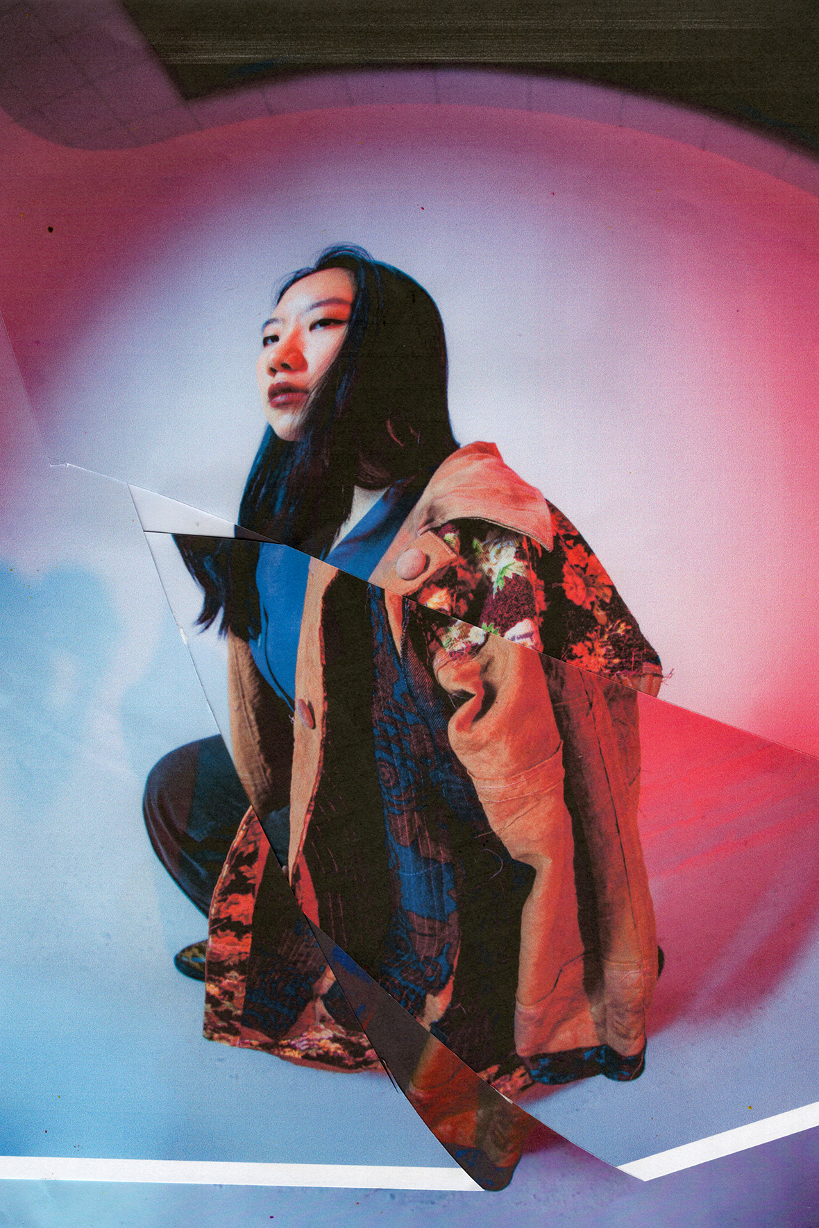
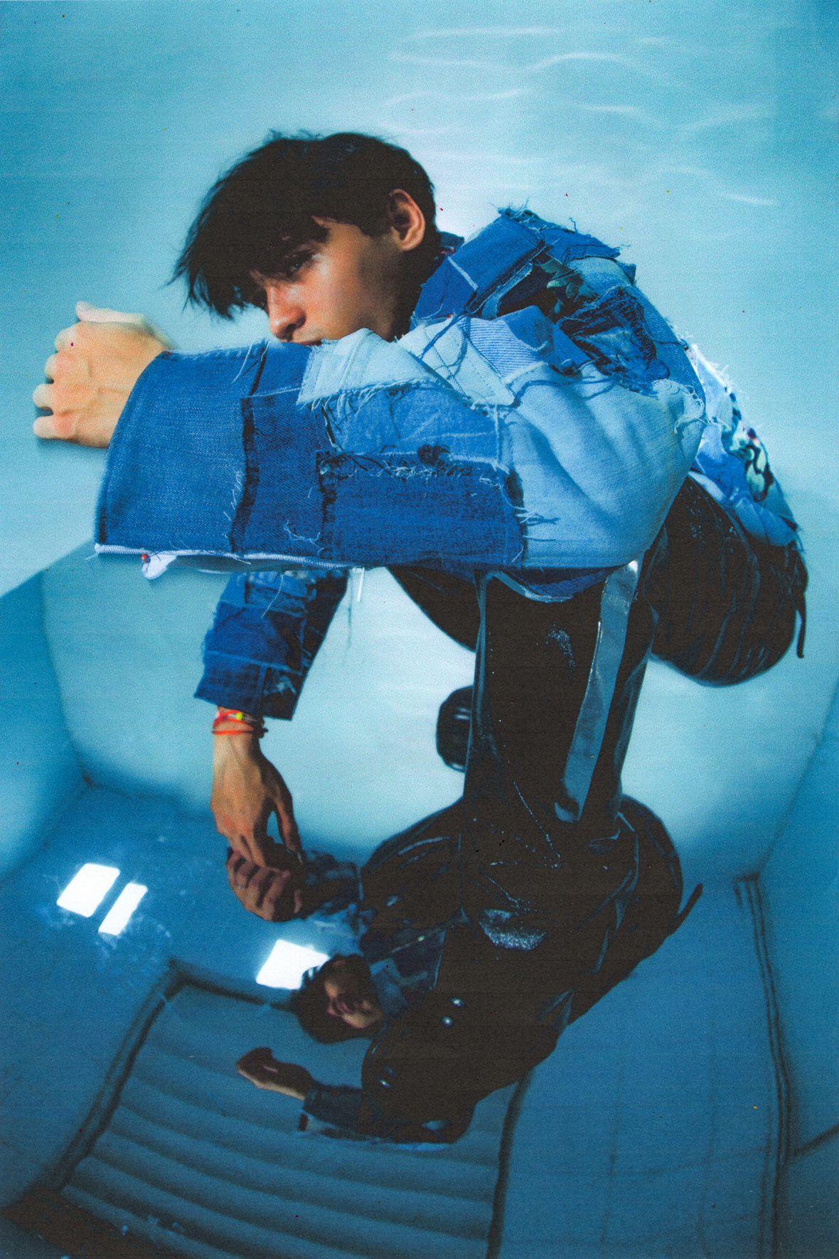
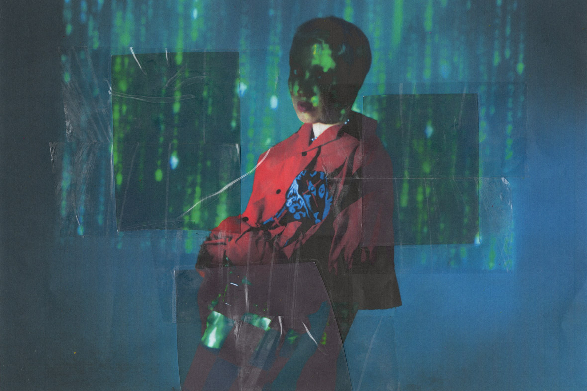
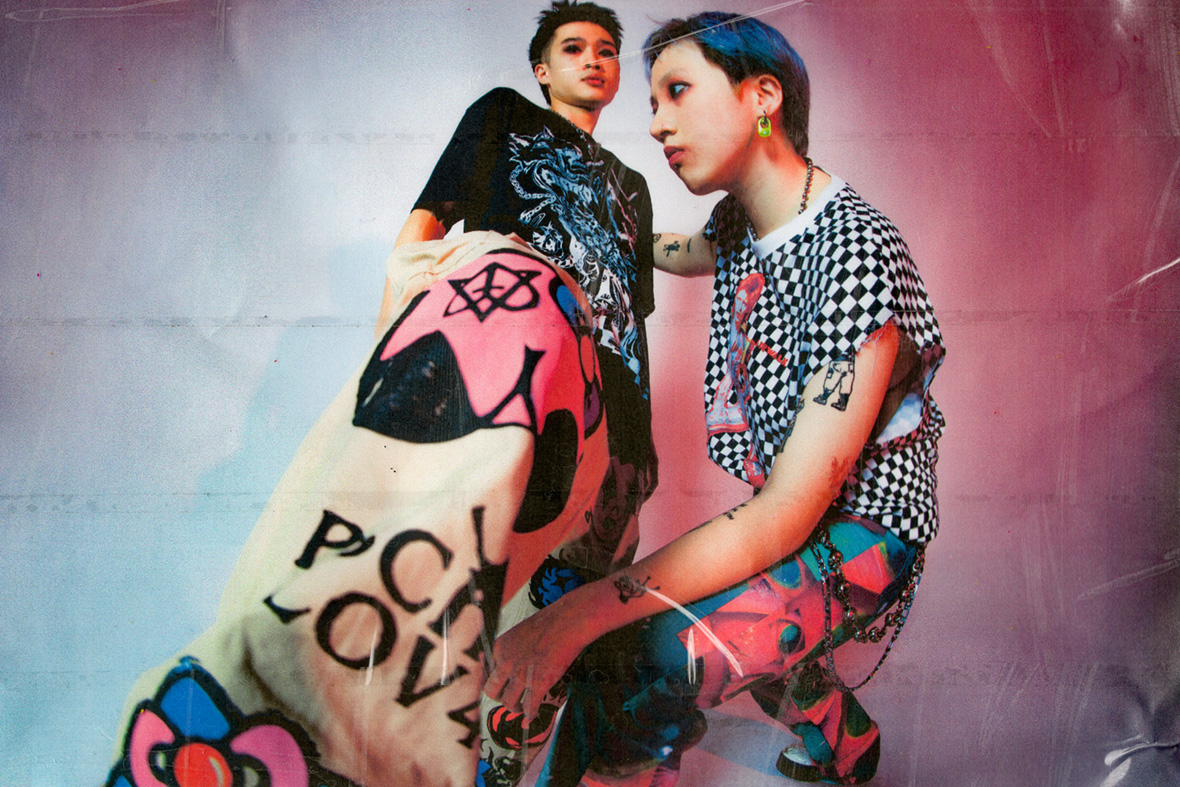
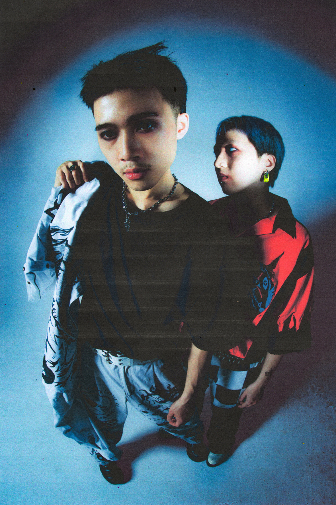
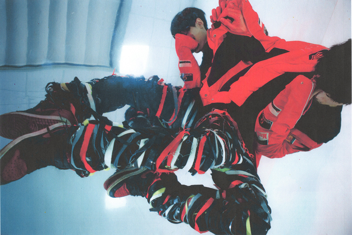
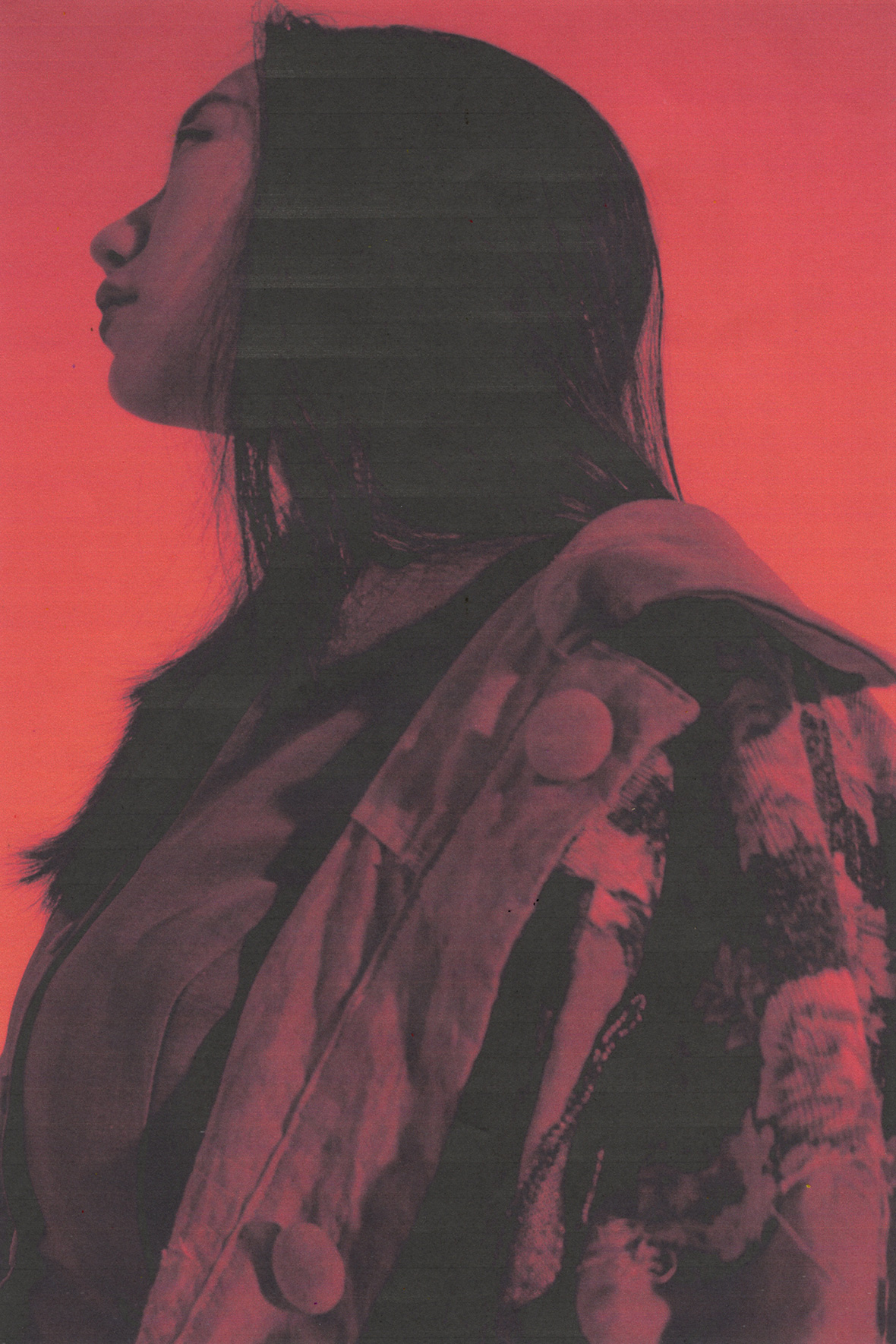
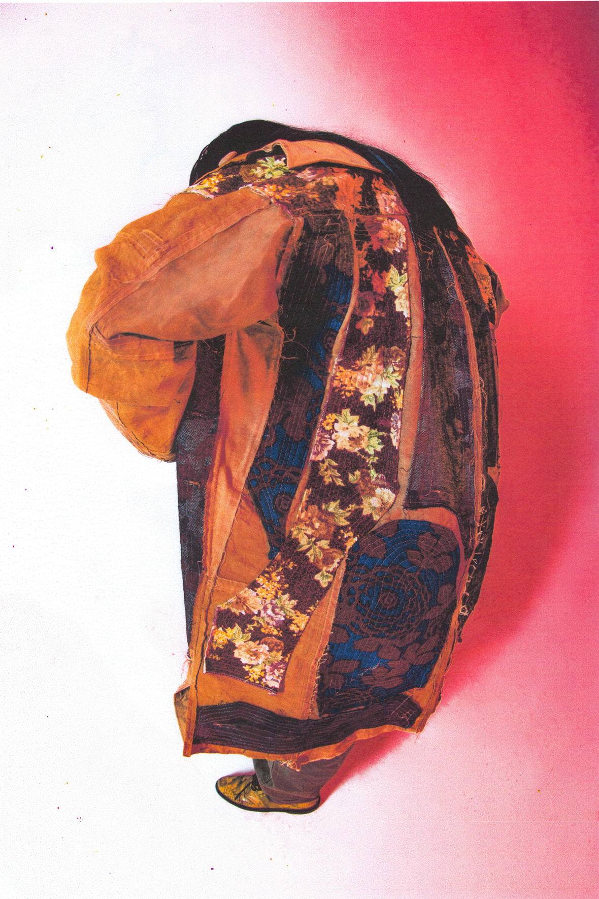
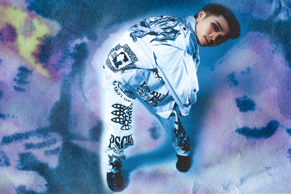
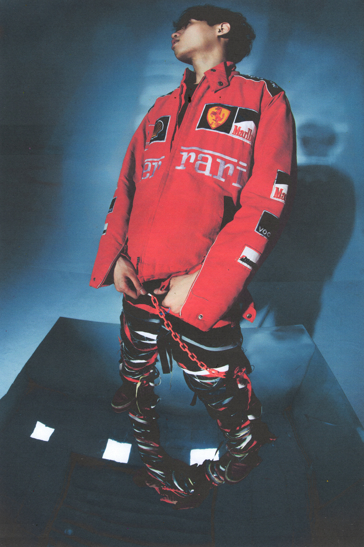
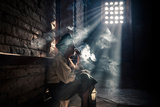
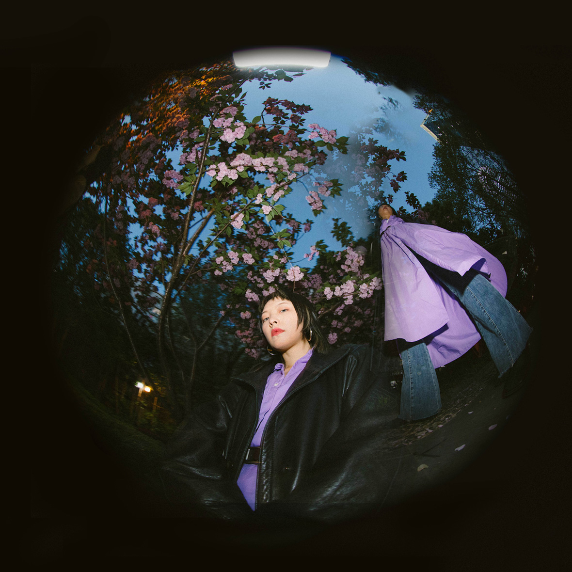
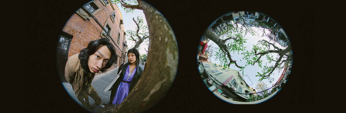
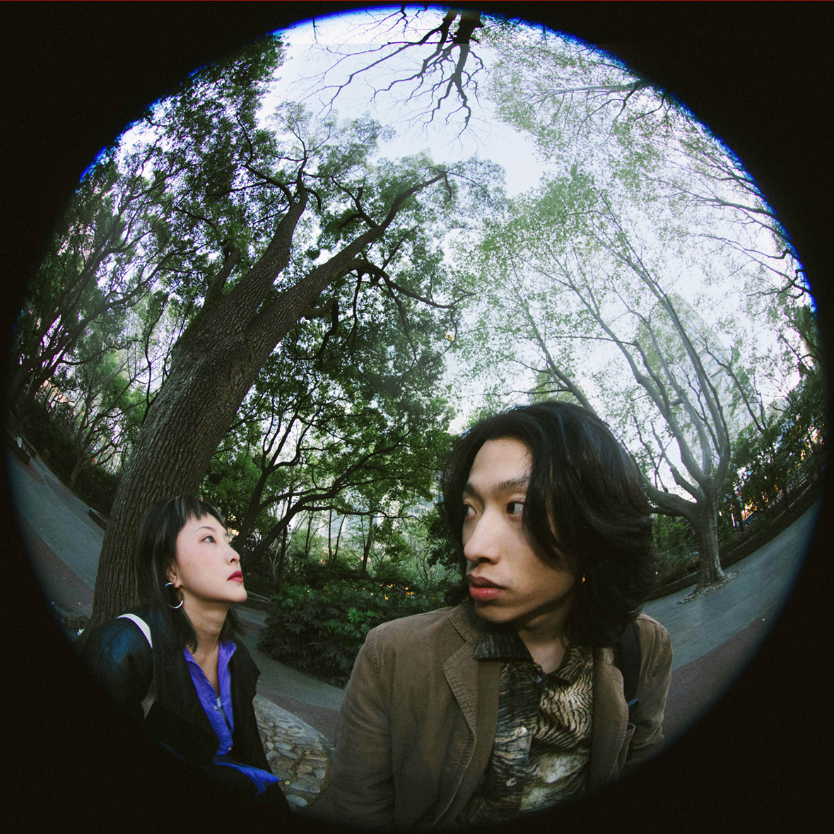
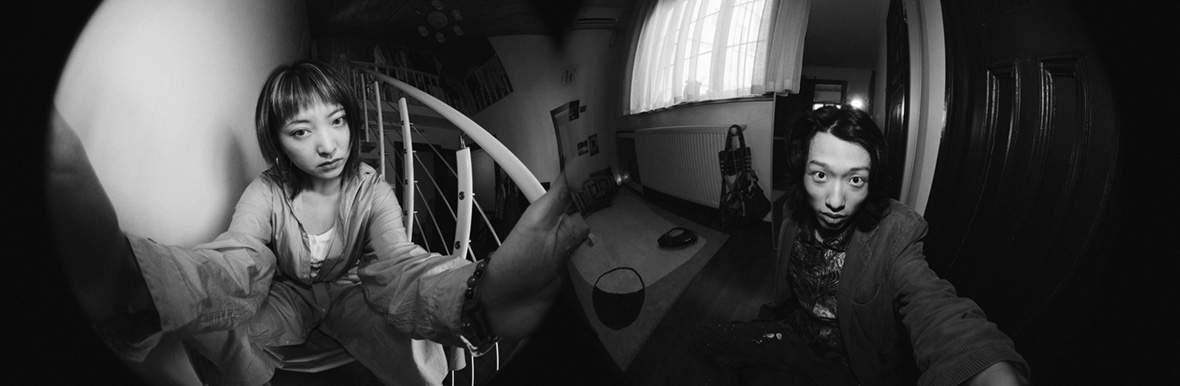
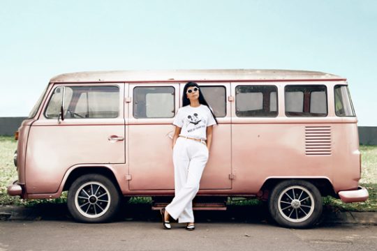
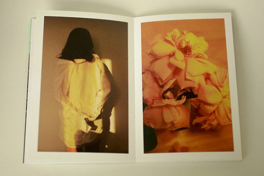
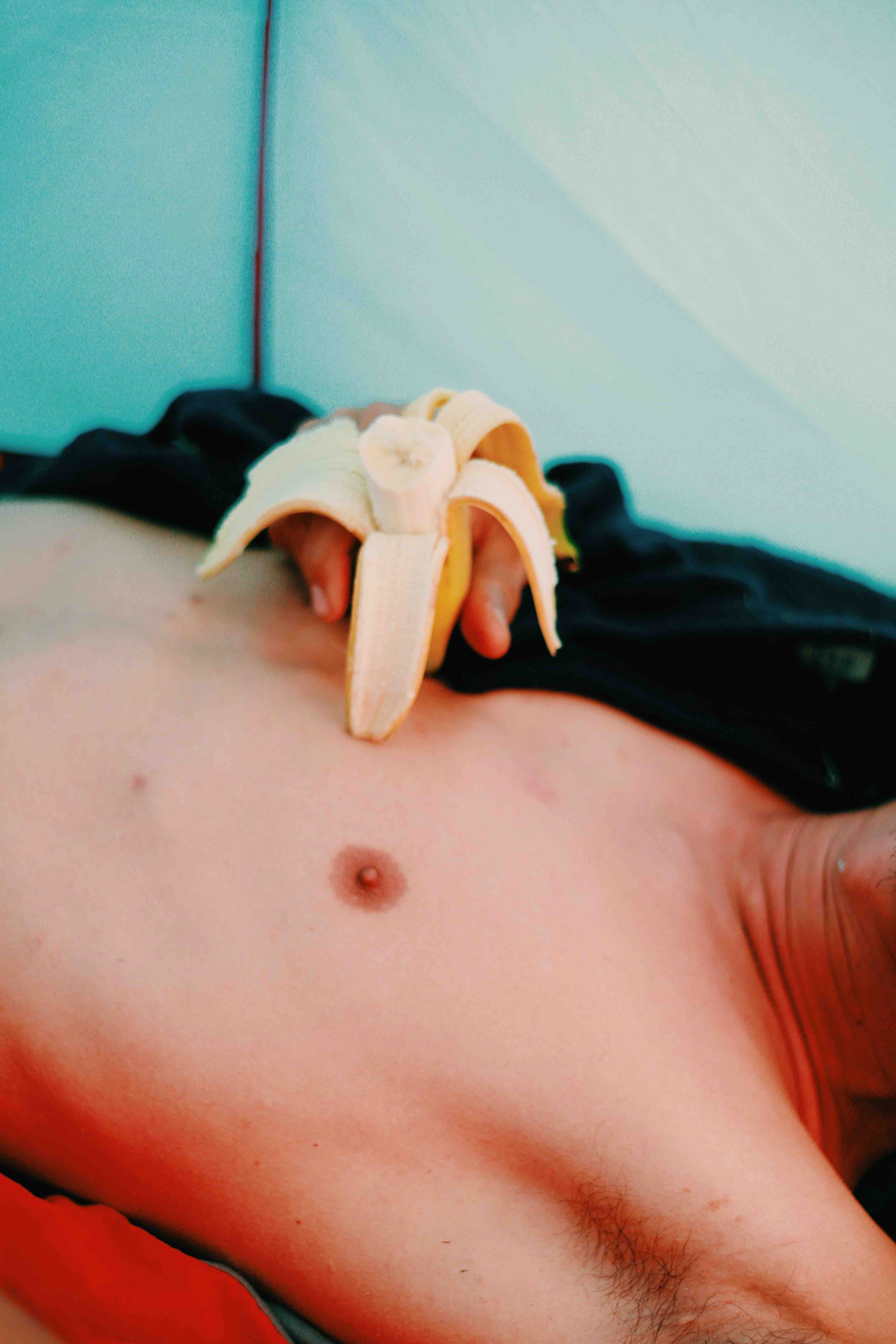
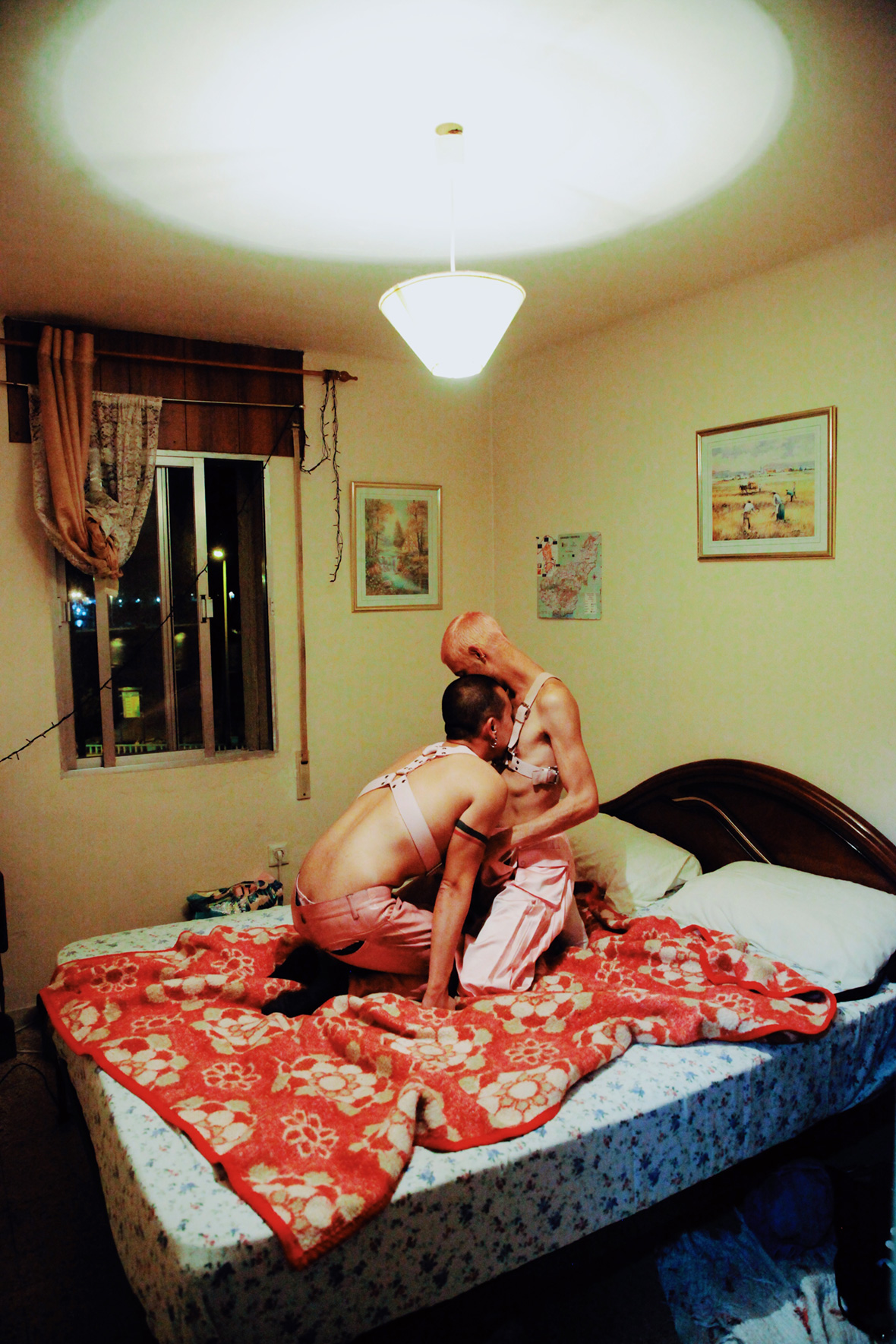
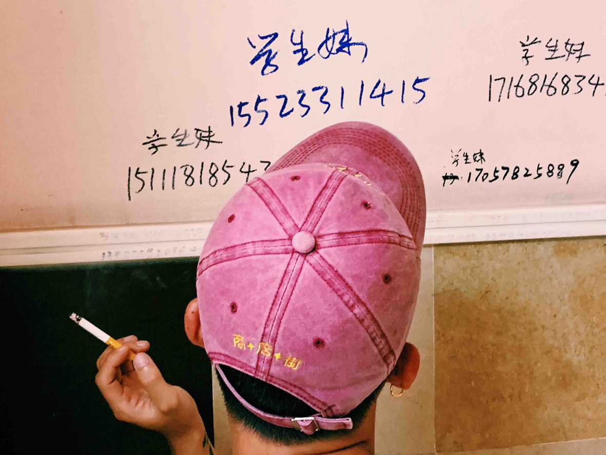
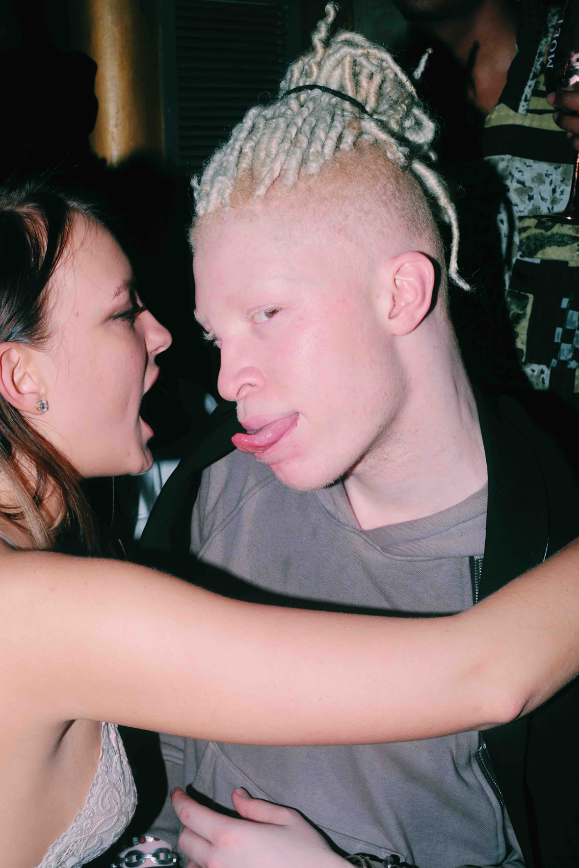
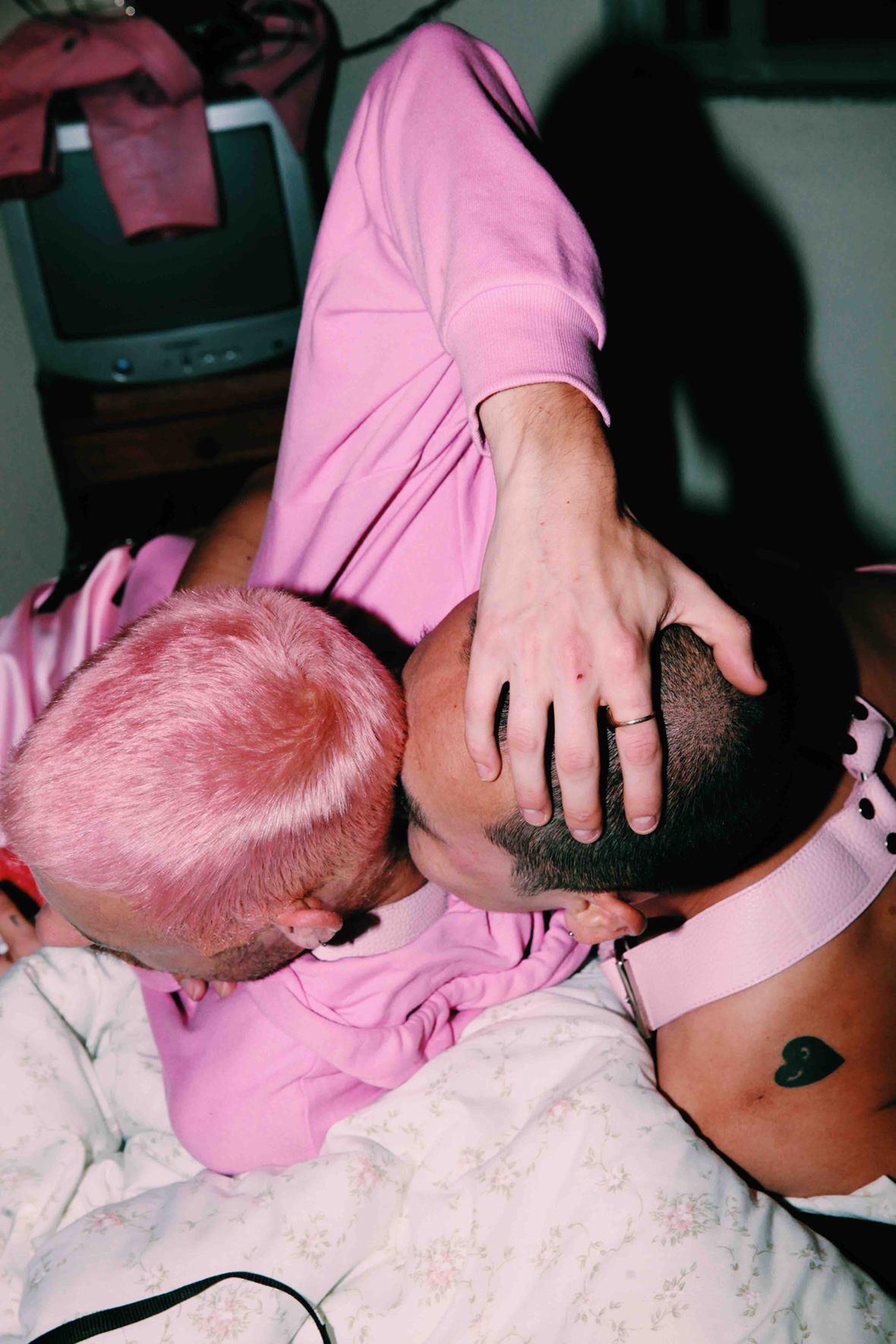
Perhaps no one’s work reflects this period of triumphant, resilient queer joy as well as Manbo Key’s. The photographer has been following and documenting Taipei’s underground queer scene for years. His photographs have appeared in the pages of Vogue and Marie Claire. Recently, he served as the director for Indigenous Taiwanese musician Amuyi’s music video “Matched!,” a love letter to the city’s queers on the prowl and its one-of-a-kind nightlife.


摄影师登曼波 (Manbo Key) 用镜头记录下了这百花齐放的时刻。多年来,他一直致力于追踪台北地下的酷儿场景,其视角之深度令他的摄影作品曾发表于《Vogue》和《Marie Claire》等国际著名杂志。最近,他还在台湾原住民音乐人吕蔷的音乐 MV《找》中担任导演,献给这座城的同性恋人群以及当地绝无仅有的夜生活面貌。


无法观看?前往腾讯视频

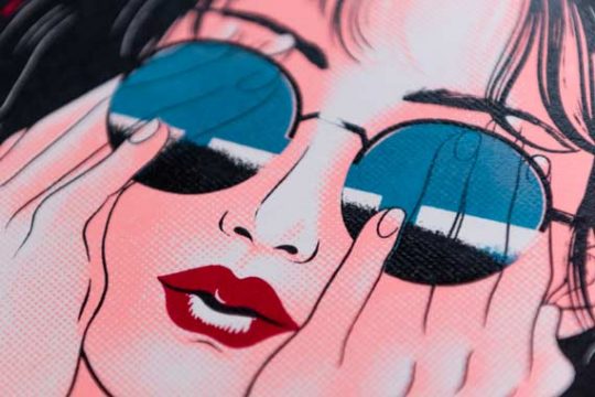
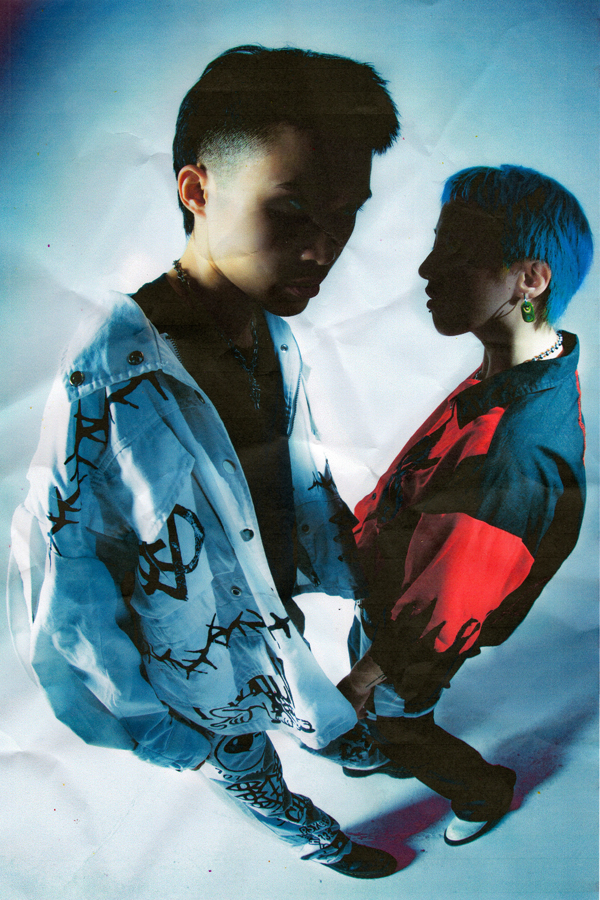
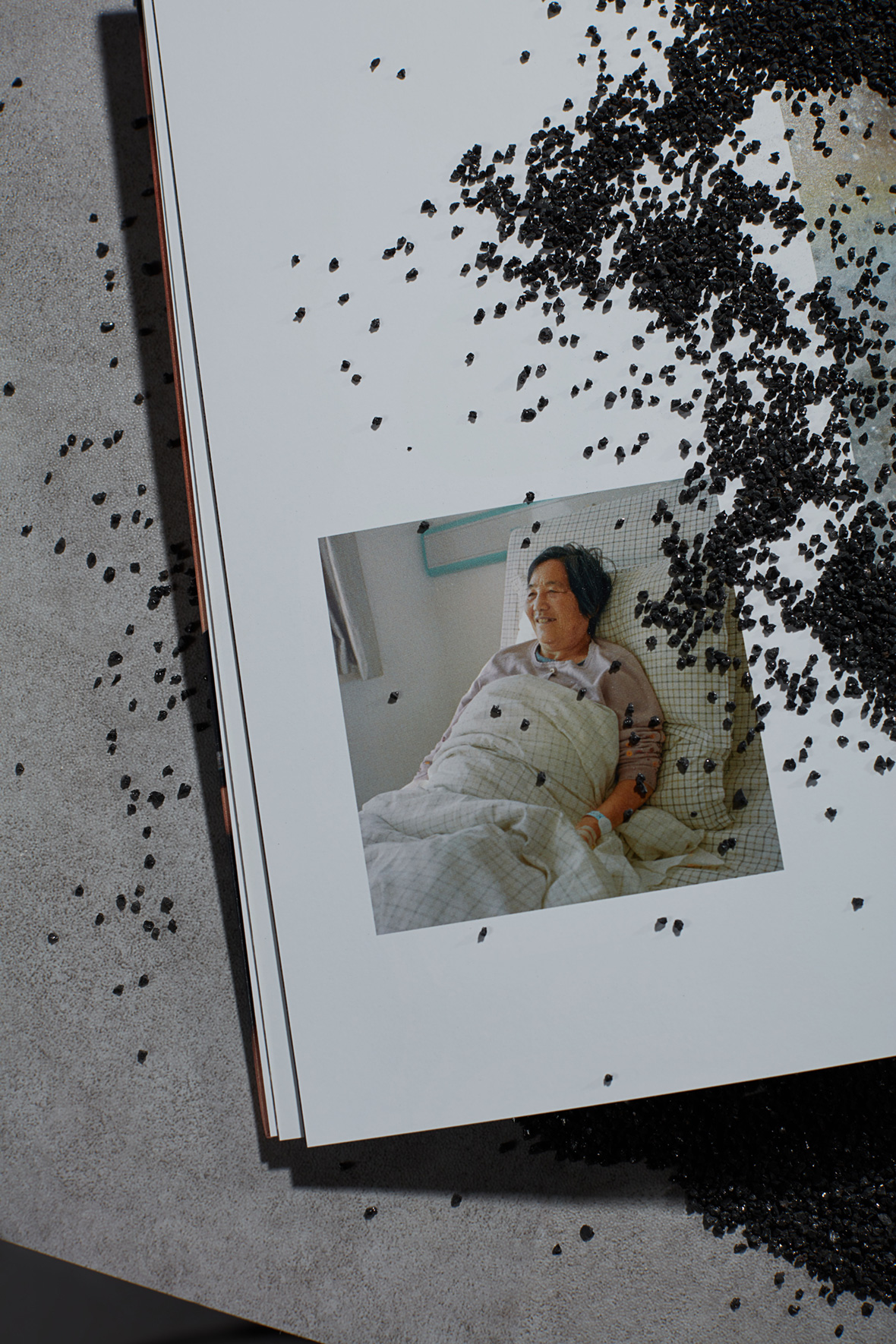
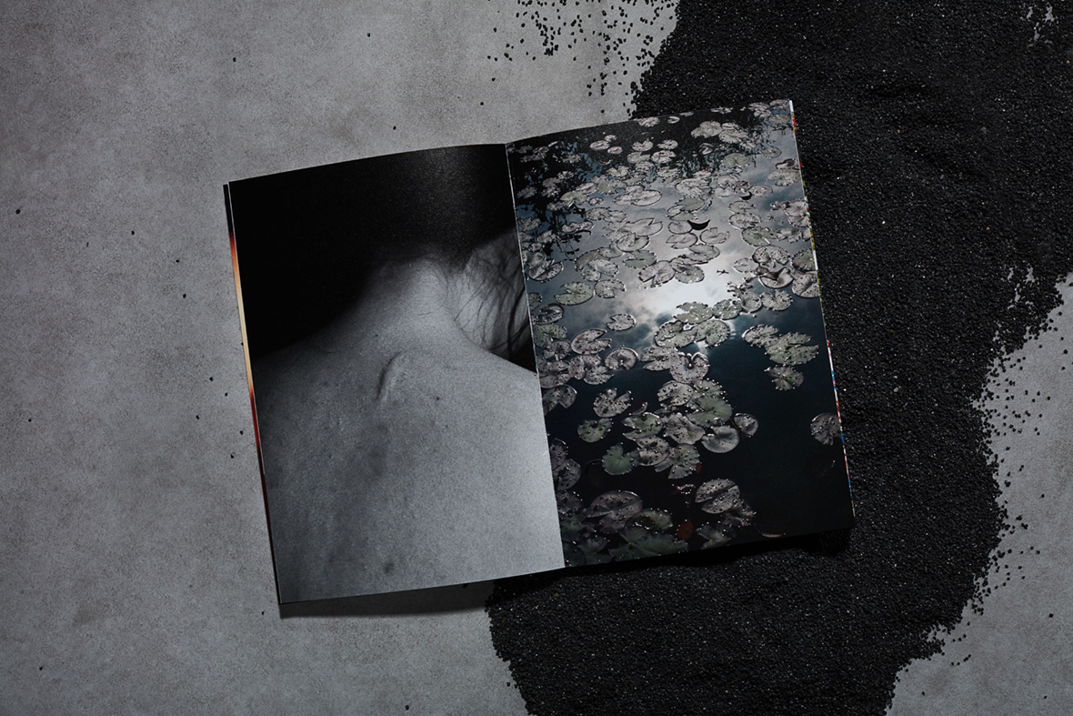
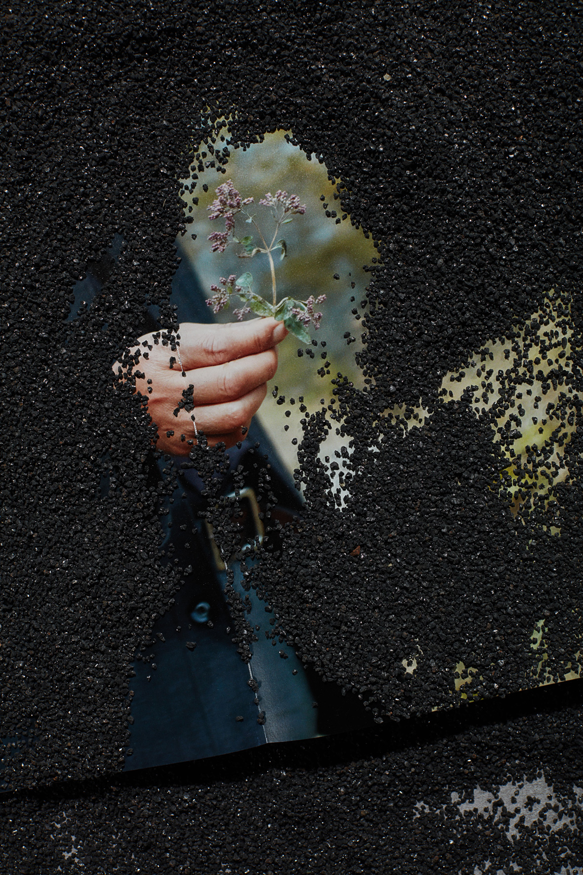
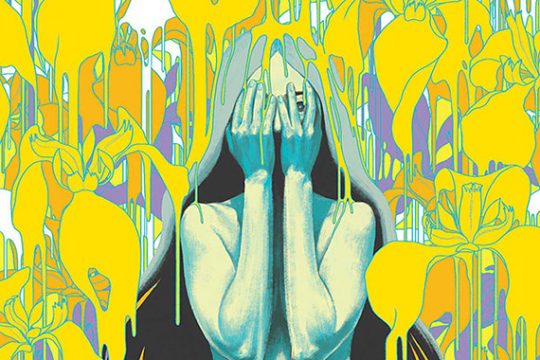
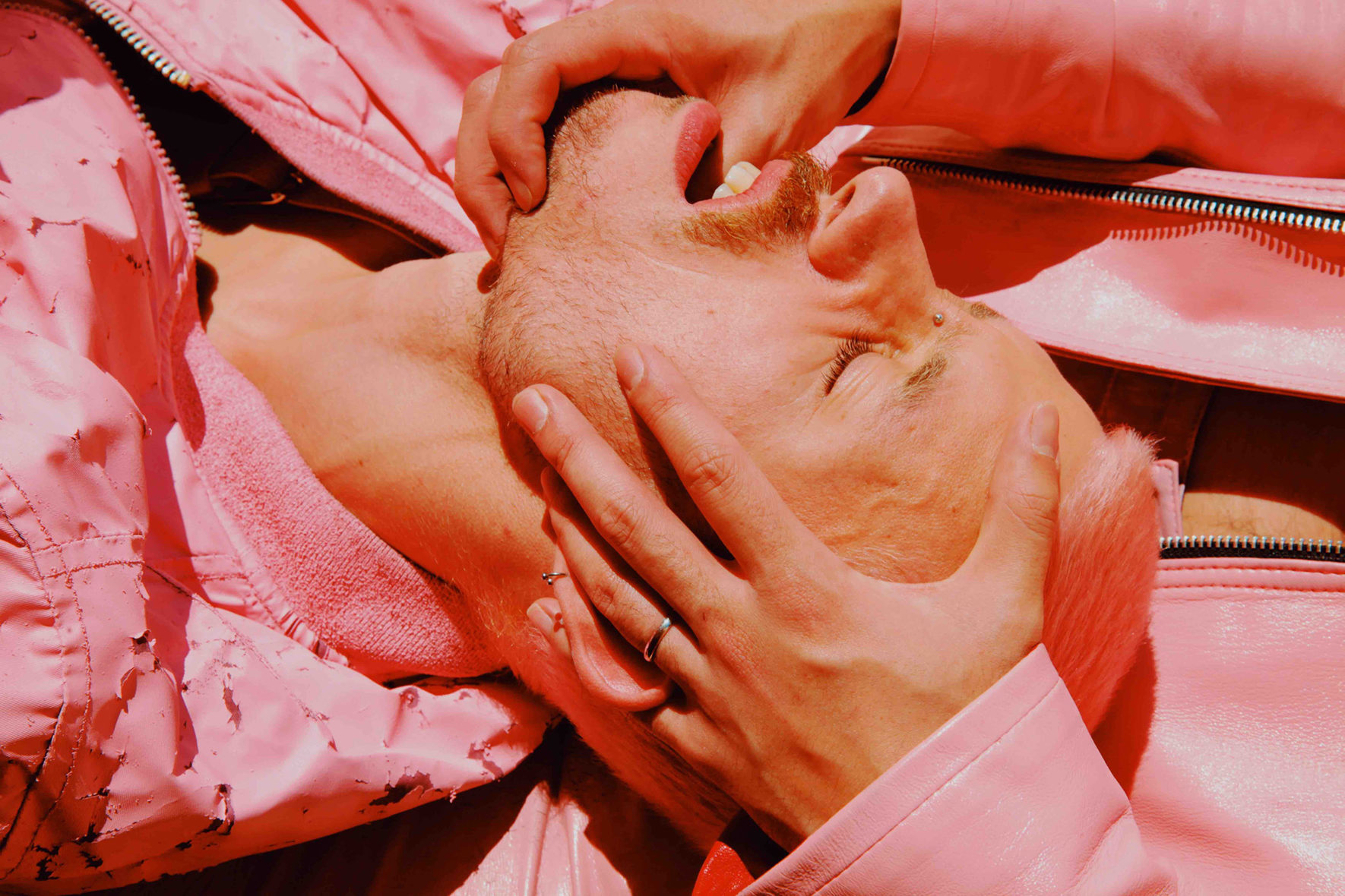
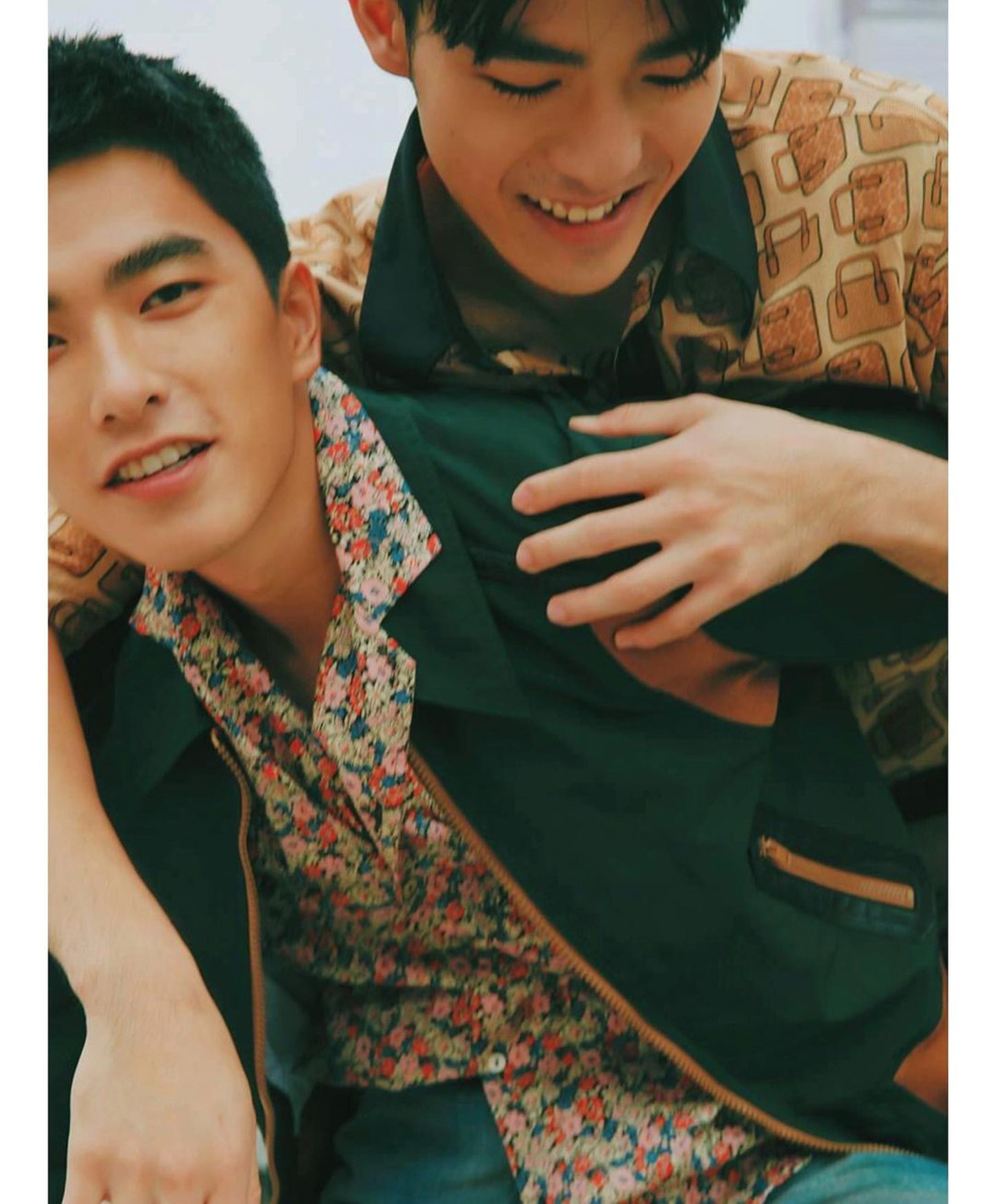
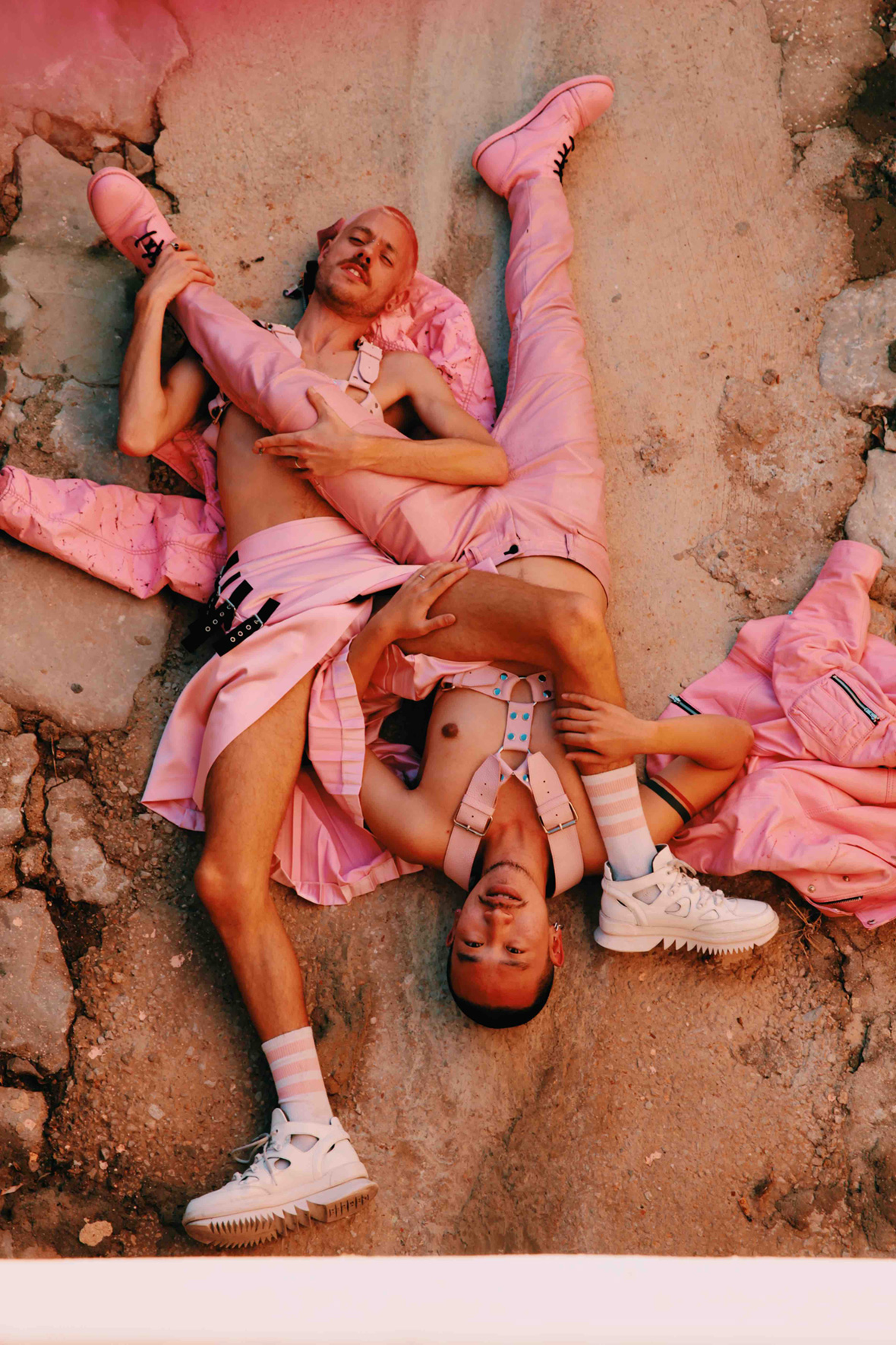
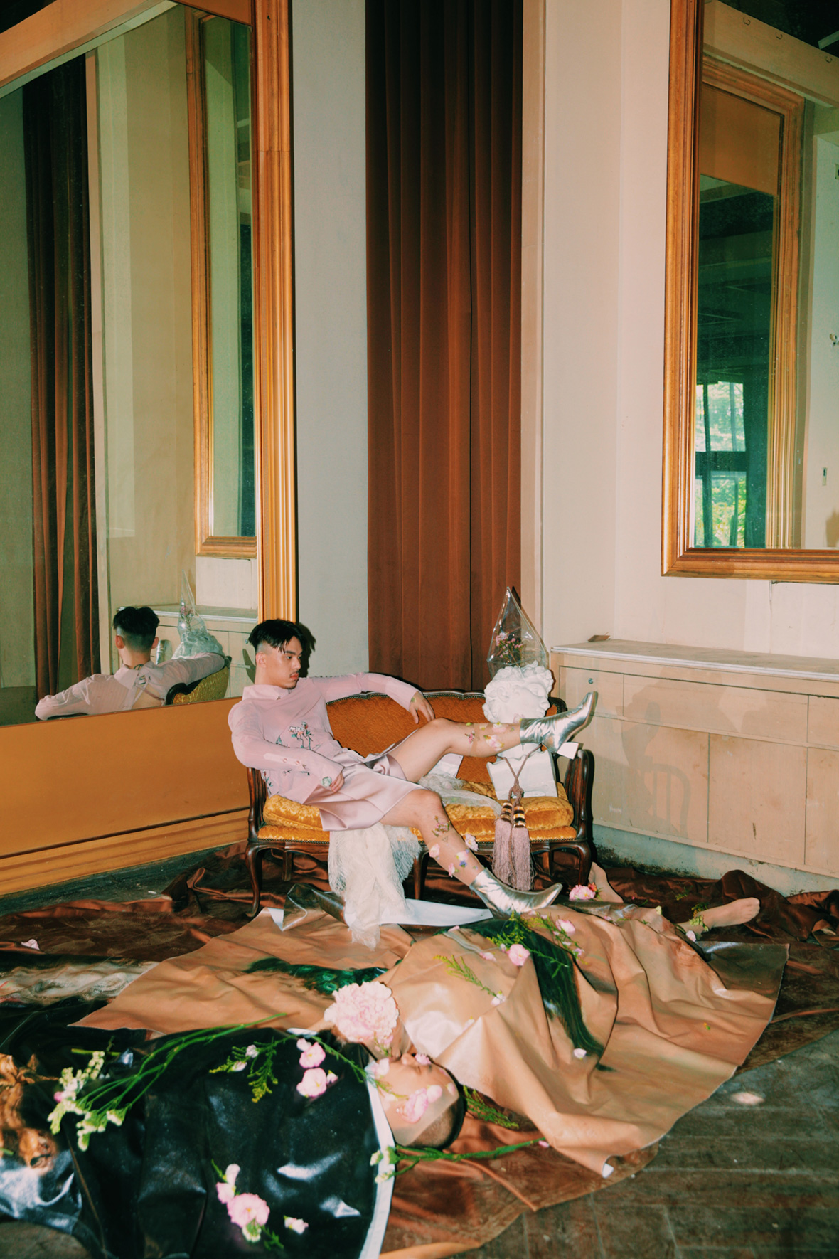
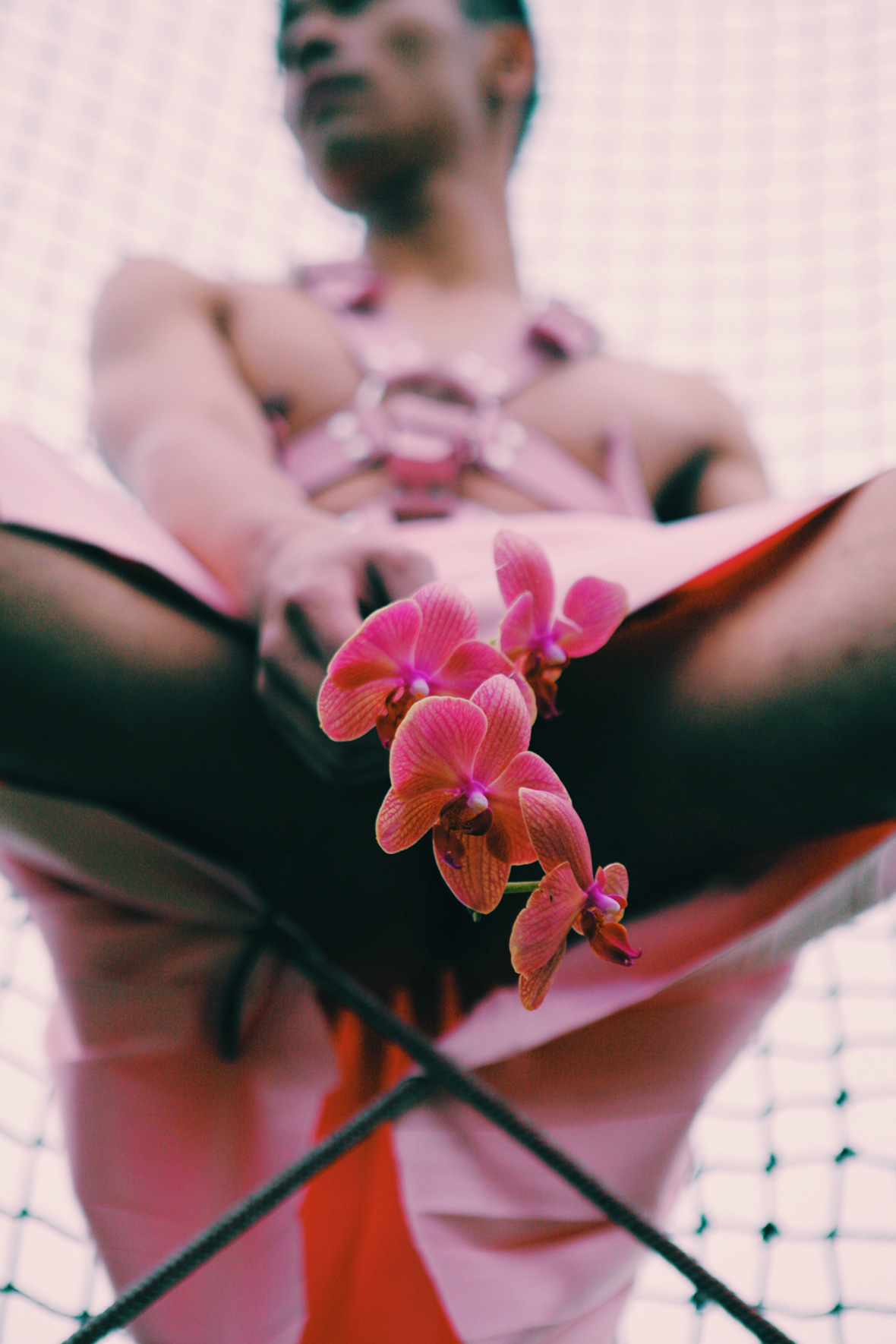
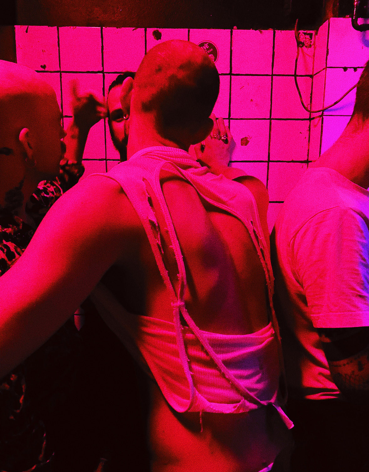
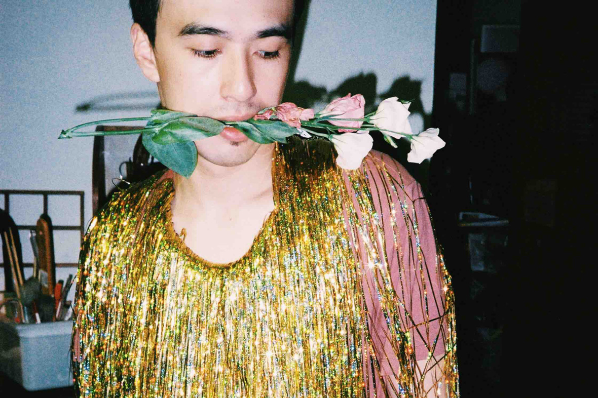
In place of newlyweds in suits, Key offers glimpses of musclebound men in corsets, lithe voguers, and the avant-garde drag queens and trans performers who make up the city’s underground queer culture. His “Bromance” photo series depicts the erotic ambiguities of male friendship (featuring Tseng Chin-hua and Edward Chen of Your Name Engraved Herein fame), while his latest exhibition explores queer life in connection with his father, who came out as bisexual. Outside of photography, he has also been active in theater with the Shakespeare’s Wild Sisters Group.


身着紧身胸衣、肌肉发达的男士、身材纤细的潮流人士、前卫的变装皇后以及跨性别表演者等等,他们是这座城市地下酷儿文化的主要构成者,同时纷纷出现在登曼波的作品中。《Bromance》(兄弟情)系列描画了男性之间的暧昧情色,由《刻在你心底的名字》的两位主演曾敬骅和陈昊森出境;在最近的展览中, 登曼波甚至还探讨了他双性恋父亲的“酷儿”生活;镜头之外,登曼波还常常活跃于戏剧舞台,例如此前参加的《莎士比亚的妹妹们的剧团》。

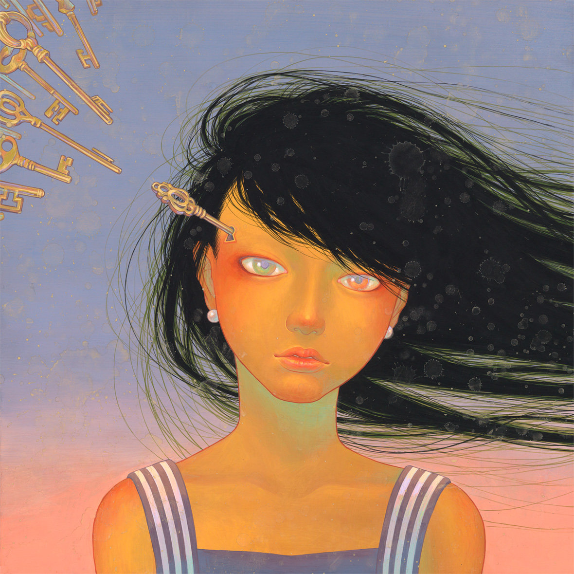
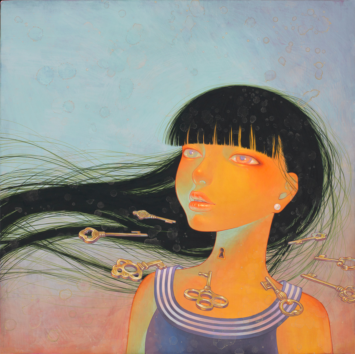
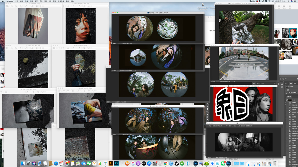
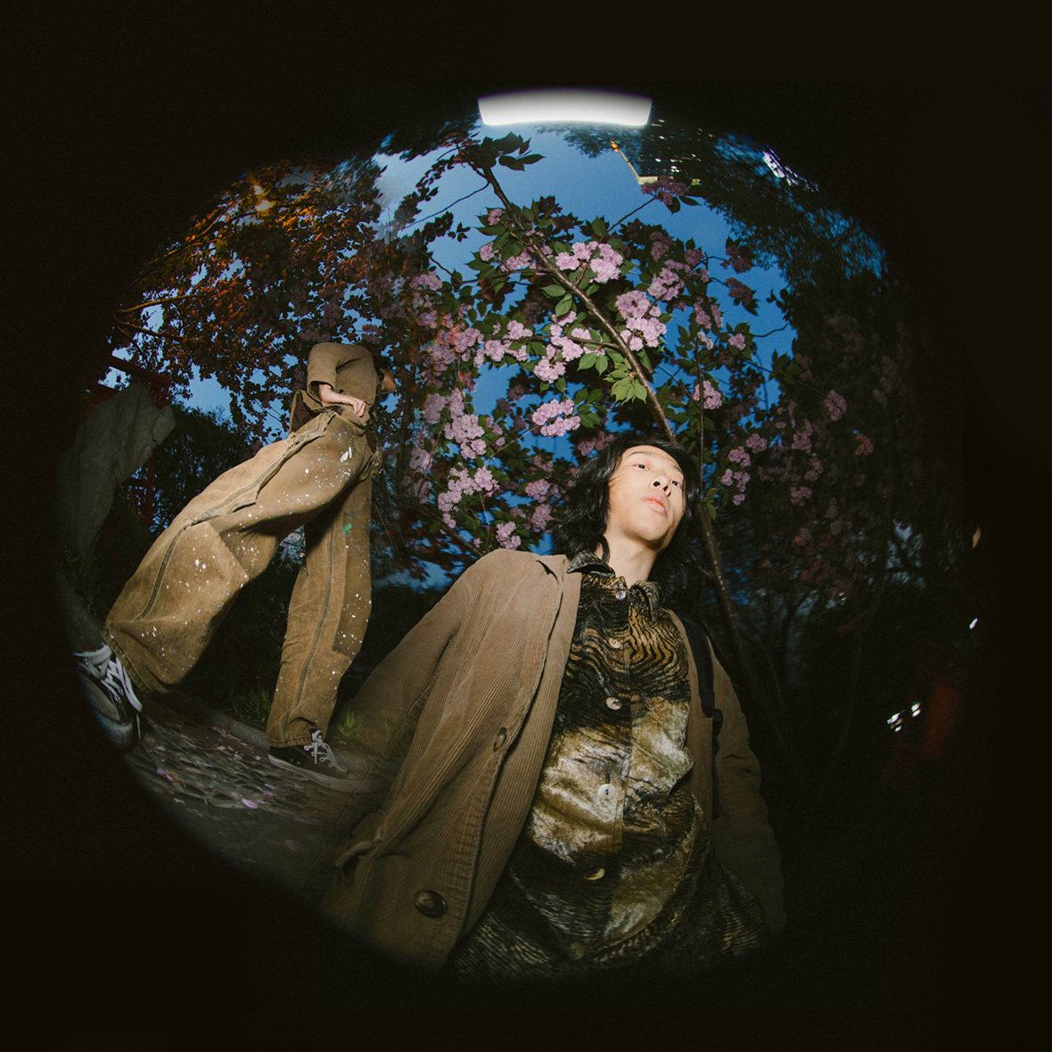
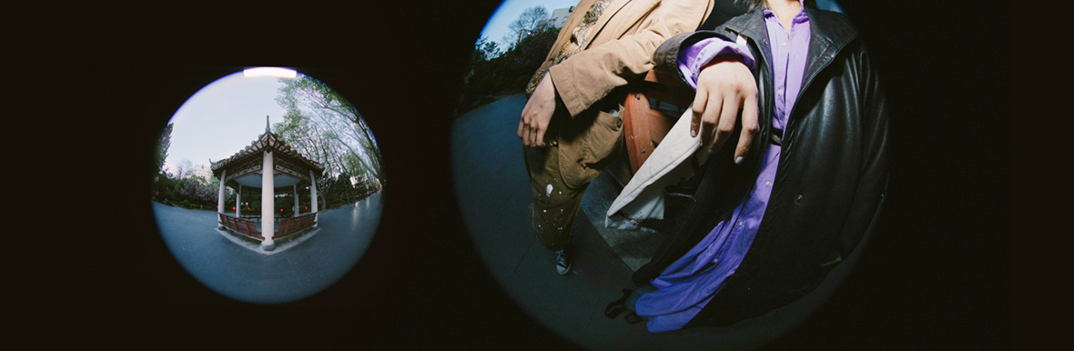
Stylistically, there are unmistakable touches of the late Chinese photographer Ren Hang and Hong Kong-based cinematographer Christopher Doyle on Key’s works, with each portrait saturated in dreamlike, sensuous colors and every scene a story in miniature animated by the diverse revellers at its center. Many are utopian in the original Greek sense, seeming to take place nowhere in particular. When pressed about these influences, Key tells me, “In fact, I knew Ren and considered him a friend. We met each other when we both had just started a filming project in 2008. He used to have an online magazine called Moon, and when we met in Beijing a few years ago, we talked about how we both work to live and to be ourselves.” He named Doyle’s Away with Words among his favorite films as well. While the artist alternates between conventional digital and film equipment, many of his works are unplanned, taken on an iPhone in the moment, giving them an inimitable sense of naturalness and spontaneity.


从作品风格来看,登曼波的作品显然受到了已故中国摄影师任航和香港摄影师杜可风的影响,每一幅肖像都浸透着感性与梦幻;每一个场景都以狂欢者的视角娓娓道来,讲述着形形色色的故事和人生。

那些带着古希腊雕像或乌托邦式的场景,仿佛不存在于任何一个特定的地方。登曼波说:“其实我认识任航,和他算是朋友。我们是在 2008 年的一个拍摄项目中认识,他那时候正在策划一部名为《月亮》的电子杂志。几年之后我们又在北京见面,聊了聊工作和人生。”登曼波还表示,杜可风的《三条人》是他最喜欢的电影之一,他说:“杜可风的许多作品都没有事先计划,即兴地用手机在现场完成拍摄,这样的创作方式给人一种无与伦比的随性美感。”

While Key’s photography in this sense lends itself to a kind of placeless, floating fantasy, for those who know his subjects and stomping grounds, it is also deeply rooted in Taipei’s unique techno and voguing scenes. As he puts it, “I have been to other queer-friendly cities, and I always feel that there are different layers to a city’s queer life, and I enjoy thinking about how those come to be, what they are, and what they could be.” At once singular and universal, they stand as archives of Taipei’s hard-won atmosphere of acceptance, and of the dreams that might become realities elsewhere as well.

In terms of his motivation, Key is clear that underlying his works is a message of freedom to explore and celebrate oneself and one’s desires. “Enjoy being whatever it is you want to be, learn more about yourself, and create using what you have in order to inspire the people you care about,” he advises anyone who finds his photographs compelling. As for inspiration, that comes naturally, he insists, through conversations and looking closely at the ever-changing queer scenes around him.


登曼波的摄影作品带有某种居无定所的飘渺,像是浮于心底的幻想。但对于那些身处酷儿场景的观众来说,他的作品却总能带来无比亲密的感受。他说:“我也曾走访过其他城市,总觉得每个城市的酷儿群体不尽相同。这激发我在创作过程中不断去思考,这些差别和城市文化有着怎样的联系?是什么造就了他们不同的面孔?” 这些思考的过程让他的摄影作品变得独特,裹挟着台北同性恋群体独有的氛围,也蕴藏着对外界现实的希冀。

谈及创作动机,登曼波表明他的作品便是自由探索,展现自我和个人欲望的概念。他建议:“成为你想成为的人,多了解自己,利用你所拥有一切的去极力创造,并激励你身边的人以及你所关心的人。”灵感始终在与他进行对话,因为酷儿场景总在不断改变,一些都在自然而然中发生。

Asked how he feels at this critical juncture, the artist says, “I felt entirely different in 2020, and even more seems up in the air in 2021 […] Overall, though, I feel more optimistic today about sharing queer images and memories to those outside of my inner circle, taking in the feedback and reactions, and just going from there.” He notes that his most recent project, a queer photography exhibition at National Chengchi University’s Art and Culture Center, which took place before the recent rise in COVID-19 cases, was a particularly reassuring experience. It allowed him to open up about intimate topics like his relationship with his father and explore them alongside his perennial obsessions.


对于当下,登曼波认为疫情让一切都充满不确定性。同时,创作步伐也相对以往变得慢了下来,他说道:“我现在会更愿意给陌生人分享酷儿影像及故事,聆听他人的反馈和意见,往往能激励我去创作更多可能。” 在最近疫情变得严峻之前,他曾在国立政治大学艺术和文化中心举办酷儿摄影展。他认为办展能让人变得更加自在,也更令人享受近距离敞开心扉的感觉。展览上,他和观众谈论了许多私密性话题,譬如他和父亲之间多年以来的特殊关系,并将这些话题与他常年专注的酷儿主题联系在一起。

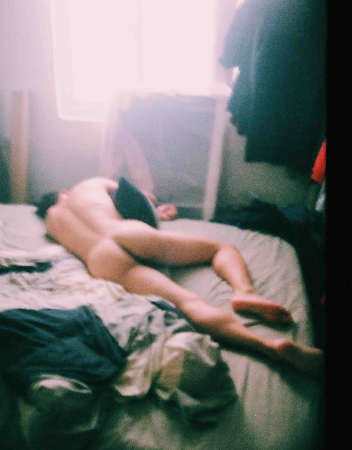
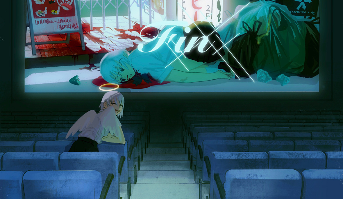
For the rest of us, Key’s works are more than just skillful portraits or personal confessionals. They are also memories of half-remembered nights, snapshots of queer desire and intimacy at a time when so many people are cut off from one another, records of Taipei’s transformation into one of Asia’s (and indeed, the world’s) most LGBTQ-friendly cities, and reminders to survive and get back to the dance floors and streets. As José Esteban Muñoz, the theorist of queer hope, once wrote: “We must dream and enact new and better pleasures, other ways of being in the world, and ultimately new worlds.” Gazing at these photos of Taipei’s pandemic-era nightlife, we glimpse reminisces and dreams of a world not in lockdown, but one where unbridled joy is as close as the sweat-soaked skin of strangers dancing away their pain in unison.


对于很多人来说,登曼波的作品绝不仅仅表达着高超的肖像摄影技艺、或是人物内心独白;丰富的影像背后,是台湾酷儿群体记忆中数个的朦胧的夜晚;是疫情封锁时期,同性欲望的袒露、亲密接触的快照瞬间;是亚洲 LGBTQ+ 群体最友好城市的真实一面;陪伴那里的人们度过这段寂寞,带着回归舞池和街道的美好祝愿。

正如 “酷儿理论” (queer theory,认为性别认同和性倾向不是“天然”的,而是通过社会和文化过程形成的) 学家 José Esteban Muñoz 曾经说过的一样:“我们必须畅想为世人创造更多乐趣,尽可能为所有人创造乐场,这样世界才会以更新的面貌呈现。”看过这些台北夜生活的照片,我们得以窥见和回味一个未被封锁的世界,感受那些通过舞蹈排解痛苦的灵魂,以及大汗淋漓中所透露的无拘无束和畅快感觉。

Like our stories? Follow us on Facebook and Instagram.


Instagram: @manbo_key


Contributor: Brandon Kemp
Chinese Translation: Olivia Li


喜欢我们的故事?欢迎关注我们的微博微信


Instagram: @manbo_key


供稿人: Brandon Kemp
英译中: Olivia Li

The L_st Album 那个年代的高光

June 3, 2021 2021年6月3日

Flipping through the old photo album of a total stranger can be a fascinating experience. We’re faced with the carefully arranged memories of someone who lived through different times, the people they cherished and chose to remember. This sensation of nostalgic bewilderment is what prompted Thai artist and graphic designer Pariwat Anantachina to create The L_st Album, a series of collages juxtaposing family photographs with user guides and manuals, all of which he collected from flea markets and thrift stores around Bangkok.

The series first debuted as a photo book printed by Palermo-based publishing house 89 Books in 2020. But as Anantachina’s collection grew, so did his artistic output, and he was given the chance to host a solo exhibition at SŌKO Art Gallery in Bangkok last February.


翻阅旧相册往往很有意思,你会重拾生命中不同时间发生的美好,那些珍惜和想要记住的人一下子浮现于眼前。受到念旧思绪的启发,泰国艺术家 Pariwat Anantachina 创作了《The L_st Album》拼贴系列,将复古家庭照片与类似模型拼装手册的元素组装在一起。作品中所有素材都来自他在曼谷附近的跳蚤市场和旧货店的收集。

《The L_st Album》系列最初以相册形式推出,由意大利巴勒莫出版社 89 Books 于 2020 年出版。随着 Pariwat 收集的素材不断丰富,作品也变得越来越多,去年 2 月,他获邀在曼谷 SŌKO 美术馆举办了个人展览。

The L_st Album‘s most striking aspect is that Anantachina cuts out the faces of the people in the original photographs, replacing them with pieces from manuals containing reference numbers and letters. “It’s a process of removing the original identity of the subject and simultaneously showing respect for their privacy,” he says.  

This cut-and-paste method results in a surreal effect, giving these photographs an ambiguity that encourages viewers to reflect on them through the lens of their own experiences and relationships. “Each artwork represents the relationships we share with our families, lovers, and friends,” he explains. “These are bonds that we sometimes unintentionally lose—just like the owners of these photographs accidentally lost their pictures.” 


通常,Pariwat 习惯将老照片中出现得人物面庞剪去,替换上各种参数和文字说明片段,这是他作品中的一大特色。他解释道:“这样做是为了删除照片人物原本的身份,同时也出于尊重他人隐私的考虑。”

特殊的剪贴方式带来某种超现实的观看体验,其模糊了人物具像化的直白,鼓励观众通过自己的经历和人际关系对照片进行思考。他说:“每一幅作品都代表了我们与家人、恋人和朋友的关系。人们有时会不知不觉地失去这些关系,正如照片的主人不小心弄丢了这些照片,两者是一样的道理。”

As a dedicated collector, Anantachina is constantly on the look out for artifacts with temporal value. He was first drawn to vintage photo albums because of the elaborate cover designs, the tactility of old film envelopes, and the appearance of the yellowing paper boxes used to store old photographs. However, when he looked into some of the pictures more carefully, he discovered a sense of universality that sparked his creativity. “I was not only curious about who the photographer and these people in the images were, but also perplexed by the background scenery. It was a fascinating thing to combine my imagination with these pictures endlessly,” he says.


作为一名收藏爱好者,Pariwat 喜欢在各地搜罗承载着时光印记的好物。最初引起他对旧相册兴趣的是过去那些设计精良出版物封面、发黄的胶片信封以及存放旧照片的斑驳纸盒。在翻看旧照片的过程中,Pariwat 渐渐发现了其中的魔力,他说道:“我不仅想知道照片的拍摄者和照片中人物的关系,就连照片背景的环境也让我深感好奇。照片往往可以激发人的更多幻想,这个过程很有趣。”

Since then, he’s collected thousands of photographs and film negatives, most of which are family photos taken in Thailand between the 1940s and 1980s. In black-and-white or faded colors, they show people in the prime of their lives, going on holidays, celebrating milestones, or simply congregating with loved ones. Because Anantachina removes their faces, their environments, wardrobe choices, and other objects in frame become more conspicuous. These photographs act as visual time capsules, revealing aspects of simpler and more innocent times—or at least that’s what they feel like in retrospect.

Many of the original photographs came with dates, names of places, or hand-written notes on their backs. They become clues to uncover the mystery behind the images. But, in most cases, they lead to dead ends, serving only as starting points for the imaginary narrations of Anantachina.


从那以后,他收集了数千张照片和底片,其中大部分是 1940 年代至 1980 年代在泰国拍摄的家庭照片。这些或黑白、或褪色的照片承载着那个年代的高光时刻:譬如节假日里的欢歌笑语、活动庆宴、或是亲朋好友的聚会等等。在人物脸部被忽略过后,照片中的环境、服饰以及更多其他元素被凸显出来。这些照片如同一个个时间胶囊,还原着当初简单、纯粹且真挚的年代。

许多照片背面都标记了日期、地点或备注,让观者拉起故事的线索。但绝大多数情况下,这些信息并不会提供答案,仅能作为想象的起点。

From Zin Zin Machinery #2 来自《Zin Zin Machinery #2》的作品

It’s not the first time user guides and manuals appear in Anantachina’s work. In his first art project, he used machine manuals as raw materials for a series of mixed media works. Zin Zin Machinery, as the series was called, was inspired by his family business, which dealt with agricultural machinery. These manuals symbolized his own family relations just as The L_st Album symbolizes the relations of several other families—the viewer’s included.


Pariwat 并不是第一次使用说明书手册元素进行创作。在他最早的一个艺术项目中,便以机械说明书作为素材,创作了一系列混合媒体作品。这个系列名为《Zin Zin Machinery》,创作灵感来自于的农作机械的拼装说明书。选择这些元素并非偶然,Pariwat 出身自农耕家庭,说明书元素恰恰反映了他个人与作品之间的联系。

Often, he embeds secret personal meanings in his collages. “Some of the numbers and letters in the photographs can be decoded into stories of my life, while others relate to social events,” he reveals. “I sincerely hope that some numbers and letters might also mean something to viewers.” It’s this ambiguity that attracts Anantachina the most about collages, an art medium that defines his practice to a great extent. “Collages create layers of information. They can captivate through the dimensions of time and space. Their meanings vary depending on who’s looking at them, the context, and surroundings.”


他也常常会在拼贴画中嵌入一些“彩蛋”。他透露道:“照片中的一些数字和字母隐晦地表达着我自己的故事、或是真实发生的社会事件。同时,我也希望观众能在这些数字和字母之间找到更多特殊的含义。”

而恰恰是因为数字的不确定性,引起了 Pariwat 对拼贴艺术的兴趣。这种艺术媒介如今已是他主要的创作手段。“拼贴画能形成丰富的信息层次,让各种元素在时间和空间维度上更具吸引力。具体的理解也取决于观众所处的环境。”

As we stare at the faceless figures in Anantachina’s collages, we can’t help but wonder what they looked like, what their lives might’ve been like, and what could have happened for that treasured moment of theirs to slip from their hands and end up in the artist’s hands. Stripped of their original narratives and contexts, the collages are enigmatic. But through his reimagining, we’re allowed the chance to fill in the blanks of their lives with our personal reflections and stories.


不漏声色的人物,令观众不禁好奇:人物原本的面貌是怎样的?他们当年过着怎样的生活?以及这些珍贵照片是如何流落到 Pariwat 的手中的?当原始的叙述和背景被抹除,为拼贴作品增添了几分神秘。然而,通过 Pariwat 的重新构想,我们可以发挥自己的思考和经历,填补出照片中属于我们自己的人生。

Like our stories? Follow us on Facebook and Instagram.


Website: www.pariwatstudio.com
Instagram
: @big_pariwat


Contributors: Tomas PinheiroLucas Tinoco
Chinese Translation: Olivia Li


喜欢我们的故事?欢迎关注我们 Neocha 的微博微信


网站: www.pariwatstudio.com
Instagram
: @big_pariwat


供稿人: Tomas PinheiroLucas Tinoco
英译中: Olivia Li

You Might Also Like你可能会喜欢

Rorschach Test 墨迹心理测试

June 1, 2021 2021年6月1日

The intricate prints of Wesley Valenzuela are deeply inspired by the city of Manila. He grew up close to Recto Avenue, a busy stretch of road known for its dense cluster of hawkers and diverse mix of visitors. The DIY band merch and comics sold in stalls packed tightly along the curbside; the gaudy art of jeepneys plying oil-stained asphalt; the baroque Christian imagery of the nearby Quiapo, one of the Philippines’ largest and most frequented churches. He absorbed all of this over the years and it manifests overtly in his work. “To this day I’m still inspired by Manila,” he says. “The sights, the sounds, all of it. Despite how crazy it is, I really love this place.”


Wesley Valenzuela 精妙绝伦的版画作品与他在马尼拉的生活有着千丝万缕的联系。他打小在雷克托大道(Recto)长大,这是一条繁忙的街道,以鱼龙混杂的小贩和游客闻名当地。地摊儿、杂货当铺、二手店……往往把人行横道搞得水泄不通;花哨的吉普尼中巴车在泥泞的沥青马路上穿行;巴洛克式的奎阿坡教堂(Quiapo)门前总汇集着很多游客,这是菲律宾最大且最受欢迎的教堂之一。多年以来,雷克托大道潜移默化地影响着 Wesley,街道上繁杂忙碌的景象在他的作品中体现地淋漓尽致。“直到今天,马尼拉仍然对我影响颇多。这里的人物、景色、声音,所有的一切,无论有多疯狂,都让我深深热爱着这座城市。” 他说道。如今 47 岁的他对马尼拉这座城市了如指掌。

At 47 years old, Valenzuela has seen a lot of Manila, and he credits his elementary school for sparking an interest in art. The school actively sought out talented students, encouraging them to take part in dancing and art events. They enrolled those interested in afterschool programs and helped enter them in competitions all over the city. “I was pretty educated about painting by the time I got to college,” he says. To take his knowledge in new directions, he enrolled in graphic-design courses during university. He later went on to teach art at a couple universities in the late ‘90s to the mid-2000s. Combining all these experiences, he looked to his city and popular culture to drive his personal work.


Wesley 对艺术的兴趣最早来自小学。当时学校为了激发学生的才华与天赋,鼓励他们参加舞蹈、歌唱等各类艺术活动。学校招募对此类课后项目感兴趣的学生,带他们到全市各地参加比赛。当时,Wesley 毫不犹豫地选择了绘画。直到大学的时候,他便早已受了很多绘画方面的训练,展现出颇具成熟的绘画功底。不过为了开拓新的领域,他在大学修读了平面设计专业。之后在 90 年代末到 00 年代中期,他陆续任教于当地几所大学。丰富经验的基础上,他开始把目光转向自己生活的城市及当地文化,以此来挖掘个人作品的更多可能性。

“I went through a few phases,” Valenzuela says. Under the spell of jeepney art, he picked up airbrushing for a while. And later on, he collected found objects to make sculptures. He experimented with print-transfer art for a time as well. You can still find some of these pieces in his studio, which is next door to his family’s home, where they’ve lived since before World War II when much of the city was destroyed. It was in the mid-2000s when he began toying with a rudimentary version of his current style, inspired by the earlier works of Banksy and Shepard Fairey. “There were students at my school who were a part of the nascent graffiti scene here, and since I was still kind of young, I went to a few spots with them where I first tried the style out.”


Wesley 说:“我的创作经历过几个不同阶段。”他曾就因为对吉普尼艺术感兴趣,甚至一段时间沉迷于喷绘;也有过热衷于收集旧物的经历,用它们来制作大型雕塑;有一段时间他还尝试了转印艺术(print-transfer art)。现在,那些昔日的作品就摆放在他的工作室里。 Wesley 的工作室就在他住处的旁边,他和家人自二战前就一直住在那里,当时,城市大部分地方已几近被战争摧毁。直到 2000 年代中期,他才逐渐形成现在的艺术风格,其灵感来自街头涂鸦艺术家 Banksy 和街头艺术家 Shepard Fairey 的早期作品。“当时正值涂鸦艺术在菲律宾盛行,那时我还比较年轻,和大学朋友第一次尝试了涂鸦。”

He took those stencil experiments and applied them to silkscreen printing, a medium he was familiar with thanks to an infatuation with local rock bands. “In the late ’80s and early ’90s, hardcore and punk bands were creating their own album artwork and shirts, which really inspired me,” he recalls. “I still play in bands, but it’s more chill stuff like shoegaze because I’m older now.” Although the style started with basic imagery, it evolved into the more maximalist style he’s now known for. “Filipino aesthetics are very baroque, just look at the jeeps and the churches.” He now uses about ten screens per canvas, changing them up each time. “I work in themed series but I never reproduce a piece exactly.” The objects that appear in his images are collected online and from his own photos, which he alters in Photoshop before assembling them in his massive collages. He starts each print with a black silk-screened outline, which he fills in with acrylic paints and adds additional layers of silkscreen on top. “It’s kind of like a coloring book.”


特别的是, Wesley 随后将涂鸦运用到丝网印刷的工艺上,这在当地很少有人尝试。而谈到他和丝网印刷的结缘,则要从他与摇滚乐之间的故事开始说起。他回忆道:“80年代末90年代初,当时的很多硬核和朋克乐队常常 DIY 专辑封面和文化体恤,他们通常以丝网印刷的形式来制作,让图案看上去更有质感。这对我启发很大。事实上,摇滚乐对我的影响很多,我现在也有自己的乐队,偶尔会去表演。”

Wesley 最初的个人创作从简单的意象开始,之后逐渐演变成现在的极繁主义风格。“菲律宾人喜欢巴洛克,你看那些吉普尼车和教堂就知道了。”现在, 他 每张画布大约会用十个丝网,每次创作都需要更换。“我的每一幅作品都有不同的表达和主题,所以从来不会照搬或复制任何一幅作品的模板。”作品中出现的一些具象事物来自于网络、另一些则来自他拍摄的照片。通常,他会先在 Photoshop 上对图像进行编辑,然后再放在丝网上进行加工和拼贴。每次创作版画时,他会先选择一个黑色的丝网轮廓,用丙烯颜料填充,然后再在上面添加其他的丝网层。“感觉有点像在上色,”他笑着说道。

If you study the spiraling motifs of his work, certain themes emerge. There are firearms, which represent violence in the city, especially since the drug war started. There are lots of cameras, bringing to mind the near-ubiquitous surveillance of our era. And there is plentiful religious iconography, including Buddhist-inspired imagery. He also includes Filipino animism, which overlaps with his other topics. The all-seeing eye of God is common, which blends Christianity with Filipino folklore and omniscient surveillance. Moths and dragonflies transmit the belief that departed loved ones revisit the living in the form of insects. Bones and skeletons further the topic of death while also blending with the pop-culture references scattered throughout. “Filipinos assimilate a lot of stuff, through colonization and imperialism. It changes us a lot, but we retain a lot of tradition as well, and we become something new,” he notes. “I want my audience to study my work and think about all the small details. They don’t need to know my actual intent but think for themselves and discover their own personal meaning. It’s almost like looking at an ink blot.”


如果你仔细观察作品中层叠的图案,不难发现其中暗藏的主题元素。譬如枪械,代表这座城市的暴力,尤其自从毒品战争开始以来诱发的暴力事件;摄像头,折射这个时代几乎无处不在的监视;还有大量的宗教元素,包括佛教图像。他还加入了菲律宾的泛灵论(Animism,起源于十七世纪,认为天下万物皆有灵魂或自然精神,并在控制间影响其他自然现象)。这些元素交织在一起,带带来十足的视觉震撼效果。

同时,作品也会传达种种“上帝视角”的隐喻,例如基督教、菲律宾民间传说和摄像头元素,表达被监视的生活。飞蛾和蜻蜓则传递某种信念,许多民间传统认为逝去的亲人会化成昆虫,探访在世的人;死亡的主题的骷髅头的意向中被进一步探讨,裹挟了各种菲律宾流行元素。他说:“在经历了殖民和帝国主义,菲律宾被同化了很多,也很大程度上改变了我们。但同时,传统也依然被保留了下来,与西方文化融合出全新的内容。我希望观众能仔细研究我的作品,琢磨其中的一些小细节。他们不需要猜出我的真实意图,只需要用心去思考,从中发现他们自己内心的解读,就像在进行墨迹心理测试那样。”(Rorschach Test,墨迹心理测试是二十世纪初瑞士医生斯齐曼用水墨卡来分析人内心状态的一种方式,测试由十张墨水卡组成,通过测试者对卡片内容的理解,来界定他们当前的心理状态)

Like our stories? Follow us on Facebook and Instagram.


Instagram: @wesndestroy


Contributor: Mike Steyels
Chinese Translation: Olivia Li


喜欢我们的故事?欢迎关注我们 Neocha 的微博微信


Instagram: @wesndestroy


供稿人: Mike Steyels
英译中: Olivia Li

You Might Also Like你可能会喜欢

Bloody but Unbowed 死亡,终将是永恒的话题

May 25, 2021 2021年5月25日

Illustrator congming has created a cinematic world of cartoonish violence through which she broaches weighty discussions of death and identity. In one piece, her soul sits in an empty theater, smiling happily as the finale of her short life plays on the silver screen. In another, she’s surrounded by funhouse mirrors depicting different versions of herself. Coffins and angels, blood and weapons, stuffed animals and school uniforms. These images all live comfortably together across her wild body of work.


congming(聪明)的插画作品拥有黑色电影的质感,以暴力和血腥的元素,探讨着死亡和身份认同的话题。在她的一幅作品中,女生将灵魂交给空荡的剧院,她盯着银幕上放映的自己短暂的一生,嘴角露出一抹不解的笑容;在另一幅作品中,数张镜子将女生团团围住,折射出她的不同人格。由 congming 打造的异想世界里,棺材与天使,血液与武器,毛绒玩具与校服都毫无遮掩地揉捏在一起。

The 24-year-old artist was first inspired to draw by anime and manga, and she honed her skills in notebooks throughout high school in Hunan. But it wasn’t until she started university in Hangzhou and got her first tablet when her blend of comedy and horror began to take shape in her work.

The outlandish brutality of Japanese animation, Hollywood crime films, and rap videos was key in molding her signature style, which can be best described as a blend of despair and kawaii. “Bad guys cradling kittens are much more attractive than outright villains,” she laughs.


这位 24 岁的艺术家最初因为喜欢动漫而开始画画。早在湖南上高中期间,她常常在笔记本上磨练自己的绘画技巧。直到她到杭州上大学,买了自己的第一台平板电脑后,她才逐渐形成这种恐怖喜剧的荒诞风格。

日本动画、好莱坞犯罪电影和说唱 MV里的野蛮残酷,是塑造她标志性绘画风格的关键,让她的创作能将暗黑与“卡哇伊”可爱风融合地恰到好处。她笑着说:“一个照顾小猫咪的坏蛋总比彻头彻尾的恶棍更吸引人。”

Death as a theme is a near-constant, with angels rising from corpses and wandering the land of the living. Although she’s not Christian, she finds the imagery useful for depicting the idea of the soul and afterlife. “Every day we see death on the news and on social media or in our lives,” she says. “All things are equal in death. Everyone will die.” She hopes her work will help people face the idea of passing with more serenity, including herself.

Whether it’s a view from inside a coffin being buried or a body decaying through multiple stages before floating off as a formless soul, congming wants to invite more balanced discussion around the too-often taboo subject. “People’s fear of death is nothing more than a fear of the unknown,” she says.


死亡,似乎是她作品中的永恒主题:死者化作天使,在凡间徘徊游荡;亡灵与世人一同祷告……她并不是基督徒,但她觉得这些元素很适合用来描绘灵魂和来世的主题。她说:“我们每天都会在新闻、社交媒体或生活中看到死亡。在死亡面前,万物皆平等,这是生命必经的一部分。”她希望自己的作品能帮助人们(包括她自己)更平静地面对死亡。埋葬、棺材、灵魂、祷告,congming 从这些角度着手创作,希望能围绕这些禁忌话题展开更为冷静的讨论。她说:“人们对死亡的恐惧无非是对未知的恐惧。”

One form of death that’s frequent in congming’s work is suicide. In one series, a character rushes into an empty hospital hallway, crashing into a mirror and stabbing her reflection until it breaks, leaving her slumped and lifeless on the floor. “The suicide rate among Chinese teenagers is increasing and I have a lot of friends who suffer from depression. They are oppressed by society while suppressing their emotions.” To counter those trappings, she lets herself express herself freely and sees no weakness in embracing her own problems.


congming 的作品里,很常见的一种死亡形式是自杀。在一个系列作品中,女生在空无一人的医院走廊上奔跑,她撞上镜子,用尖刀不断插向自己的映像,直到映像变得四分五裂,她才疲惫不堪地瘫在地板上。“中国青少年的自杀率在上升,我身边有很多患抑郁症的朋友。他们压抑自己的情绪,同时还要遭受来自社会的压力。”为了避免陷入这些情绪陷阱,她选择自由表达想法,坦然接受自己所面对的问题。

Congming thinks a big part of the problem is that people are forced into specific roles, and they end up unable to be true to themselves. “From birth to adulthood, we have been labeled by society. We can be students, artists, parents, or celebrities,” she says. “But we rarely think about who we really are and what our life is meant for.” To visualize this frustration, one series depicts an office worker pressing his face onto a photocopier and printing paper duplicates of himself. The flimsy doppelganger travels through the city, flopping around weakly with a drawn-on smile. In another piece, someone goes on a murdering spree in a theater full of replicas.


Congming 认为,出现这些问题,很大一部分原因是人们一直被迫担任特定的角色,最终让他们无法做真实的自己。她说:“从出生到成年,我们一直被社会贴上各种标签。我们可以是学生、艺术家、父母或名人,但我们很少思考自己到底是谁,以及我们生活的意义是什么。”她的一个作品系列便很好地体现着这种颓挫感:办公室白领男将自己的面庞放在复印机上,数个纸质副本被打印而出,这些脆弱的分身散布在城市,他们带着虚假的笑容随波逐流;与此同时,另一个男人正对着剧院里的分身进行疯狂的屠杀。

Whether it be through humor or bloody gore, the message of these works is the same: don’t be afraid of going against the grain. “I want to explore the fact that each of us is unique in this world,” she says. “We’re all multifaceted and need to accept every aspect of ourselves.”


无论是幽默或血腥的元素,这些作品所传达的信息是一致的:不要害怕与社会常规背道而弛。“我想表达一个事实,那就是,这个世界上每一个人都是独一无二的。每个人都是多面的,我们需要接受自己的不同面孔。”

Like our stories? Follow us on Facebook and Instagram.


Instagram: @congming33


Contributor: Mike Steyels
Chinese Translation: Olivia Li


喜欢我们的故事?欢迎关注我们 Neocha 的微博微信


Instagram: @congming33


供稿人: Mike Steyels
英译中: Olivia Li

Shanghairen 沪誌:“上海印象”

May 20, 2021 2021年5月20日
Left to right: Illustration by Yuan Sharpay, Liu Wen, and Liu Xinmei 左到右:插画师 Yuan Sharpay,Liu Wen 和 Liu Xinmei 的作品

Twenty-six million and going strong, Shanghai is a sprawling metropolis where tradition and modernity coexist. Its residents, old and young, locals and outsiders, share a frantic pace of life, each with a take of what the city means to them.

Seven years after moving to the city, French creative director Benoit Petrus still has the same sensation he had the first day. “It’s the feeling of a constant flow of energy and movement. That’s what makes this city so unique,” he says. When he arrived, it surprised him to find a leafy city, a more bucolic scenery than the dense urban landscape he was expecting. To this date, he’s still fascinated by how the trees form a canopy over some streets, especially in the Xuhui district. If he were to illustrate a magazine cover celebrating the city, that would be the sight he’d choose.

However, instead of creating his own magazine cover, Petrus invited other creatives to do so. He asked artists, illustrators, and designers who hold a special bond with the city to draw their “Shanghai moment” as a single cover page with the title The Shanghairen. Over eighty covers later, in early 2021, Petrus published a book, a fine-binding anthology of all covers up to now. It’s an ode from creative souls to the city that breeds them.


上海是一座传统与现代融合的大都市,2600万的人口还在不断增加。无论男女老少、本地人和外地人,统统投身于疯狂的生活节奏中,每个人都在感受着这座城市对他们的意义。

对于旅居上海 7 年的法国创意总监 Benoit Petrus 来说,时至今日的他仍然保留着初见上海的那种感觉。“那是一种能量和活力在不断涌动、流动的感觉,也是这座城市的独特魅力。”他说。初到上海时,他惊奇地发现这里竟然是一座绿树成荫的城市,和他想象中高楼林立的城市景观相比,更有田园气息。直到现在,他仍然会为那些街道两旁的繁茂树荫而着迷,特别是在徐汇区。如果他要为这座城市画一幅杂志封面插图,这将是他的取景框。

然而,Benoit 并没有亲自创作杂志封面,而是找了其他创意人来画。他邀请了一众与上海有着各种渊源的艺术家、插画师和设计师,把各自的“上海印象”表达成插画封面,以《The Shanghairen 沪誌》为标题。在创作了超过 80 个封面后,2021 年初,Benoit 出版了一本精装画集,展示所有封面插画,作为创意群体对这座孕育他们的城市的颂歌。

Illustration by Juan Er 插画师卷耳
Illustration by Shane Shine 插画师 Shane Shine

The idea of The Shanghairen came to Petrus when he discovered The Tokyoiter, which follows the same concept but pays tribute to the Japanese capital. As Petrus found out, there was also The Parisiener, the first of the sorts to appear in 2012. It was followed by Le Montréaler and then The Tokyoiter. “I was mind blown by the concept. My immediate reaction was, why not do it for Shanghai?” he says.

Different versions of this simple concept have also popped up in other parts of the world. Sometimes it’s an initiative that comes from a single designer, and sometimes it’s a larger group project. The Bangkokian, The Brusseler, The Petersburger… All independent from each other, yet identical in essence—inspired by the artful covers of The New Yorker.


在看到《The Tokyoiter》(《东京客》)杂志时,Benoit  就萌生了推出《The Shanghairen 沪誌》的想法。这本杂志遵循同样的理念,旨在向日本的首都城市致敬。之后 Benoit 发现原来还有 2012 年就推出的《The Parisiener》(《巴黎客》),这是首次出现的此类杂志;之后又陆续出现了《Le Montréaler》(《蒙特利尔人》),“这个概念令我眼前一亮。我的第一反应是,为什么不做一本上海主题的呢?”Benoit 说道。

在世界各地,这一概念又衍生出很多不同的版本。有时候是设计师个人发起的倡议,有时则是一个更大型的群体项目,“曼谷人”、“布鲁塞尔人”、“彼得堡人”……它们彼此独立,却又一脉相连,灵感都来自《纽约客》杂志设计巧妙的封面。

Illustration by Shi Kefan 插画师 Shi Kefan
Illustration by Luckya 插画师 Luckya
Illustration by South Island 插画师 South Island
Illustration by Weber Zhang 插画师 Weber Zhang

As the idea grew, Petrus couldn’t stop wondering what stories the artists would develop to express their feelings for Shanghai. While talking to them, his briefing was minimal: they were tasked with creating their “Shanghai moment,” which he defines as something original and unique to the city. “I could have suggested interesting topics since there’s so much to tell about this city. But it’s more fun to let them surprise you. They’re making art, so I don’t interfere,” he says.


有了这个想法后,Benoit 很好奇每位艺术家会讲述什么样的故事来表达他们对上海的感情。他向艺术家们介绍项目时非常简单:创作属于他们的“上海印象”,即这座城市的独特之处。他说:“我当然也可以提议一些有趣的主题,毕竟这座城市值得一讲的东西太多了。但我更喜欢让他们给我惊喜,这样更有趣。他们是在创作艺术,所以我不会去干涉。”

Illustration by Ju Lin 插画师 Ju Lin

The first cover came out in January 2019, created by illustrator Ju Lin who’s actually a Beijinger. She depicted a woman looking at her spectral reflection on the window with the night sky falling over Pudong’s barely lit skyscrapers. It’s an allegory to the often excruciating working hours and irregular shifts far too common due to the city’s relentless business activity.

The Shanghairen gained recognition in design and illustration circles. Petrus, who actively had to scout for artists to design covers at first, now receives submissions regularly. They come from everywhere in China, and sometimes from abroad. It’s a mixed assemblage that includes foreigners who live in Shanghai and Chinese expats, reflecting Shanghai’s diverse creative community and population, constantly in flux.


第一幅封面于 2019 年 1 月面世,由来自北京的插画师 Ju Lin 创作。她描绘了一个女人看着窗户上自己的映像,外面是昏暗夜空下的浦东摩天大楼。这幅插画表达了快节奏的城市商业活动所导致的畸形加班文化和不规律的工时现象。

《The Shanghairen 沪誌》在设计和插图界越来越受关注,Benoit 最初曾四处奔走来寻找艺术家设计封面,现在已经能定期收到投稿。稿件来自中国各地,有时也来自国外的艺术家,包括住在上海的外国人和在海外的中国人,这也折射出上海不断变化的多元化创意社区和人口。

Illustration by Fei Tufei 插画师 Fei Tufei
Illustration by James Wang 插画师 James Wang
Illustration by Nan Cao 插画师 Nan Cao
Illustration by Ioana Harasim 插画师 Ioana Harasim

“Most of the artists we feature are Chinese and based in Shanghai,” Petrus says. “Although, they’re not always Shanghainese. We’ve featured Chinese artists who study or work in the UK, US, and Europe. There are also people living in other major cities in China, such as Beijing, Chengdu, Nanjing. A few foreign artists are now living in different countries around the world too, after having lived in Shanghai.”


Benoit 说:“我们展示的作品大多数来自住在上海的中国艺术家,但不一定都是上海人,也会有在英国、美国和欧洲留学或工作的中国艺术家,或者是一些生活在其他中国城市的艺术家,如北京、成都和南京。还有一些是曾经在上海生活、现在移居世界各地的外国艺术家。”

Illustration by Bowen Tan 插画师谈博闻
Illustration by Ailadi 插画师 Ailadi

Freelance illustrator Bowen Tan reflected on his childhood memories to create his cover. He depicted men playing xiangqi, or Chinese chess, a common sight in Shanghai. “Not everyone in the group would focus on the game,” Tan says. “Some of them prefer to chat about their lives. Others would stay quiet and just smoke.” Tan points out that gathering around a xiangqi board is a priceless moment to these men, a temporary escape from their domestic and work lives. Touchingly, he includes his own father in the picture, who had passed away a few years before.

Similarly, Italian designer Ailadi expressed her amusement while seeing the relationship that Shanghai residents have with public spaces. “Two chairs and one box are enough for people in Shanghai to sip tea while playing cards or chess as if they were at the seaside. A street corner or a square is perfect for them to dance together to the sound of traditional music, tango, or macarena,” she says.


自由插画师谈博闻的封面灵感源自他的童年记忆,他画的是上海常见的下棋场景。他说:“棋盘四周的人并非都在专心看下棋,他们中有的人更喜欢和别人闲聊生活,有的人则喜欢安静地抽烟。” 谈博闻指出,对这些人来说,围在棋盘旁是一个难得的时刻,是他们暂时逃离家庭和工作生活的一种方式。令人备受触动的是,画中的人物之一是他几年前去世的父亲。

意大利设计师 Ailadi 画的是她所看到的上海人与公共空间的有趣关系。她说:“上海人只要有两把椅子和一个盒子,就可以坐下来一边喝茶,一边打牌或下棋,感觉就像在海边度假一样。只要有一个街角或广场,他们就能随着传统音乐、探戈或《Macarena》的伴奏跳舞。”

Illustration by Shane Li 插画师 Shane Li
Illustration by Lee Changxin 插画师 Lee Changxin

Shane Li depicted an elevated highway in Shanghai commonly illuminated with neon lights to express the city’s essence. “These stunning structures are like blood vessels of this fast-paced and dynamic city,” he says. 

Intimacy is a constant in the megacity. Changxin Lee‘s Shanghai moment reflects his experience living in one of Shanghai’s traditional alleyways, where, when the sun is out, there’s always laundry hanging up in public. Trousers, shirts, socks, underwear, blankets, sheets, and shoes.


Shane Li  描绘的是上海一条布满霓虹灯的高架公路,以此表达这座城市的本质。“这些令人惊叹的宏伟建筑结构仿佛是这座快节奏、活力四溢的城市的动脉。”他解释道。

在这座特大城市里,亲密是自然而然的事情。Changxin Lee所画的上海印象来自他所生活的上海传统里弄。每当太阳出来,大家都会把洗好的衣服放在外面晾晒:裤子、衬衫、袜子、内裤、毯子、床单和鞋子,各式各样。

Illustration by Peter Zhang 插画师咖喱牛
Illustration by Karen Yao 插画师 Karen Yao

Perhaps the dish best associated with Shanghai is the xiaolongbao, a steamed bun that’s more like a sack of soup. It almost requires technique to be eaten. Sometimes, when you bite it, boiling soup spills everywhere. That’s what illustrator Peter Zhang used for his Shanghai moment. “As a fan of xiaolongbao, I’ve had countless embarrassing and messy situations. My cover captures the moment when you take a bite of it, half nervous about the mess; half excited for the delicious taste to come,” he says.

From Hangzhou, Karen Yao depicts the infamous marriage market of People’s Square Park. There, elderly parents gather to find spouses for their unmarried children. “Often, marriage here is not based on love,” she explains. “Age, income, education levels, and other similar aspects are more important.” In the market, parents advertise their children, highlighting, beyond their physical attributes, their monthly salary, what car they drive, and their housing conditions. Her cover expresses the dichotomy of modern Shanghai, where traditional values are still predominant in love and marriage.


说到上海菜,人们首先想到的都是小笼包,一种装满汤汁的包子。吃小笼包也要讲究技巧,否则一口咬下去,沸腾的汤汁就会洒得到处都是——这正是插画家咖喱牛Peter Zhang) 所画的上海印象。他说:“作为一名小笼包爱好者,我经历过无数尴尬和混乱的场面。我的封面画的正是一口咬下小笼包的瞬间,一半是担心汤汁乱溅的紧张,一半是对美味入口的期待。”

来自杭州的 Karen Yao 画的是为人熟知的人民广场公园相亲角。在那里,年迈的父母聚在一起,为自己的单身子女找对象。她解释说:“这里的婚姻往往不是建立在爱情的基础上。年龄、收入、教育程度和其他方面显得更重要。”在相亲角里,父母给孩子做广告,除了身体条件,还会强调他们的收入,开什么车,住什么样的房子。她的封面旨在表达现代上海的两极分化——在爱情和婚姻中,传统价值观仍然占主导地位。

Illustration by Xin Yin 插画师尹昕

As covers piled up, Petrus noticed recurrent elements. Some iconic ones: the Pearl Tower, the qipao, the yulan magnolia. But one thing was particularly noticeable. “I found that most illustrators chose to depict women as their cover hero; men have smaller roles,” he says.

The cover that he chose for the book is an illustration by Xin Yin, also from Hangzhou. It’s the bipartite representation of a young woman. On one side, she wears a qipao, a pearl necklace, and short waved hair in the 1920s style. In the background, the magnolia flower, a symbol of elegance and gentleness. This side represents the golden age of Shanghai, a cosmopolitan city at the forefront of design, fashion, and architecture. On the other side, she wears a white business suit and her hair straight and long. In the background, the skyline of Pudong, the symbol of China’s financial powerhouse. The woman gazes back at us placidly, resolute, empowered—as the multifaceted old city itself.


随着收集的封面越来越多,Benoit 注意到了一些最常出现的元素,包括标志性的东方明珠塔、旗袍和玉兰花。除此之外,还有一点尤其引人注目。Benoit 说:“我发现大多数插画师都选择把女性作为自己的封面主角,而男性人物往往更不起眼一些。”

他为这本画集选择的封面是同样来自杭州的尹昕创作的插图,那是一个分饰两角的年轻女性:一边的她身穿旗袍,戴着珍珠项链,梳着1920年代的波浪短发,背景是象征优雅和温柔的玉兰花,这一面代表了上海的黄金时代,一个引领设计、时尚和建筑最前沿的国际大都市。而在另一边,她穿着白色的商务套装,一头长真黑发,背景是作为中国金融中心的浦东摩天大楼。封面中的她平静、坚定、自信地直视观众,一如这座多姿多彩的古老城市。

Like our stories? Follow us on Facebook and Instagram.


Website: www.theshanghairen.com
Instagram
@the_shanghairen


Contributors: Tomas PinheiroLucas Tinoco
Chinese Translation: Olivia Li


喜欢我们的故事?欢迎关注我们 Neocha 的微博微信


网站: www.theshanghairen.com
Instagram
@the_shanghairen


供稿人: Tomas PinheiroLucas Tinoco
英译中: Olivia Li

Force of Nature “生活在内心的光”

May 13, 2021 2021年5月13日

Fuco Ueda’s paintings lull viewers into a dream state. Characters float as if untethered by gravity, pillowy clouds and mist cast an air of mystery, and strange animals live alongside human companions. But just like the unconscious mind does in dreams, things often turn dark. Fires and shocks of lightning suggest danger, and the characters’ expressions are aloof and unmoored.


上田风子的绘画让观众如坠梦境。人物漂浮在空中,仿佛不受重力束缚,柔软云朵和薄雾令画面蒙上一层神秘氛围,各种怪奇动物与人类共同生活。但是,正如无意识的梦境,画面的风格逐渐暗黑。火焰与雷电预兆着危险,但人物的表情却超然物外,不为所动。

On her canvases, soft colors are delicately blended; dainty nightgowns are the preferred attire, and velvety textures envelop each scene. This is all contrasted with bloodshot eyes, threatening storms, and exposed skeletons. The mood is never outright angry, but there’s always a disturbing element lurking just below the calm surface.


在她的绘画作品中,柔和的色彩微妙融合在一起,人们通常穿着精美的睡袍,整个画面呈现出丝绒般质感。然而,人物充血的双眼、猛烈的暴风雨和赤裸裸的骷髅却与之形成了鲜明的对比。作品虽无一丝激烈的愤怒情绪,但在平静的表面之下,却总涌动着一股令人不安的气息。

Ueda has been fine-tuning her art for the past 20 years. She paints with acrylic paints and Japanese pigments on paper or canvas, which are then encased in a glassy, reflective resin. In person, her work is so deeply glazed it’s reflective, but that’s a quality that unfortunately doesn’t translate through photos. After applying the resin, she drips paint onto it as it dries, adding more texture and swirling colors. This final step in her process is an act largely out of her control, which is precisely the intent. She says she’s tapping into the concept of surrealist automatism—using her body’s unplanned movements to achieve designs she couldn’t otherwise. It’s a bridging of the conscious and subconscious through process, much like her subject matters. “My work is a fantasy, but it definitely corresponds with reality,” Ueda says. “The unconscious dream world touches the folds of the heart and can expand the imagination of human beings. It’s a place that lies between the subtleties of fiction and reality.”


在过去 20 年里,上田一直在打磨自己的作品。她采用丙烯酸颜料和日式颜料,选取纸面或帆布来作为媒介,然后装裱于玻璃般的反光树脂中。她的作品实物看起来就如同上了釉一般光滑,会折射出令人眼前一亮的光芒,但很遗憾,拍摄成照片后就往往无法传达出这一特点。在涂上树脂层、表面干燥了以后,她会再在上面滴颜料,增添画面的层次质感和颜色旋涡。最后的一步,是刻意地抑制自己有意识的控制。她解释说自己正在探索超现实主义自动化(surrealist automatism)的创作概念,利用身体的无意识动作,来呈现她原本无法做到的效果。在这个过程中,将意识与潜意识相联系,就好似她笔下的人物所呈现出来的状态那样。

上田说:“我的作品是一种幻想,但又能呼应现实。无意识的梦境可以触动内心,激发人们的想象力,界乎于虚幻和现实的微妙之间。

Much of her paintings are initially inspired by real places and experiences. Although the 42-year-old artist has lived in Tokyo since her university days, her countryside hometown in Tochigi prefecture plays an outsized role in her creations. She grew up surrounded by nature and animals, and it shows in her art. The area also has one of the highest rates of lightning storms in the country, something that’s also left an indelible impression on her. Thunderbolts strike often in her paintings, appearing as violent streaks of amber and peach across expanses of teal and violet.


上田大部分画作的灵感最初都来源于现实环境和经历。尽管这位 42 岁的艺术家从上大学以来就一直住在东京,但她的家乡枥木县对她的创作也有着深远影响。从小在大自然和动物的包围下长大的她,在作品中体现了出来。枥木县也是日本雷暴最频繁的地区之一,这给她留下了不可磨灭的印象。她经常在画中描绘雷电,在蓝绿色和紫罗兰色背景上,把雷电演绎为闪耀的琥珀色和桃红色条纹。

The elements rule Ueda’s world. The destruction and purification of fire, the elusive freedom of water, the vitality of air, and the fertility of earth. The women in her paintings often seem lost, adrift in the vastness of the natural world. They lay listless in shallow eddies or become swallowed by an endless fog. But she always aspires to conjure a sense of hope. One new series is called Tomoshibi, which in Japanese means a light that lives in the heart. A grain of hope.


在上田的艺术世界里,古老的地球元素占据着重要的创作比例——“火”的毁灭与净化,“水”的难以捉摸,“气”的蓬勃活力以及“土”的肥沃丰饶。她画中的女孩看上去一脸茫然,漂浮于自然世界的浩渺之中。她们冷淡地躺在浅浅的涟漪中,或者被无尽的雾气吞噬。但她始终想通过自己的作品,激发人们内心的希望。《Tomoshibi》是她最近的作品系列,在日语中意为“生活在内心的光”,即一线希望。

There’s an innocence to Ueda’s characters, revealed by their poses and expressions. Ueda hopes that people will use these characters as a judgeless mirror to reflect on themselves, both of what they’re aware of and what they might not be: “I believe that people desire art in order to come face to face with their hidden selves.”


上田所描绘的人物姿势和表情透露出一种纯真的气质。她希望观众能把这些角色当作一面客观的镜子来反思自己,包括意识到和未意识到的一面:“我觉得人们都希望能透过艺术来直面自己隐藏的一面。”

Like our stories? Follow us on Facebook and Instagram.


Website: www.fucoueda.com
Instagram
: @fucoueda


Contributor: Mike Steyels
Chinese Translation: Olivia Li


喜欢我们的故事?欢迎关注我们 Neocha 的微博微信


网站: www.fucoueda.com
Instagram
: @fucoueda


供稿人: Mike Steyels
英译中: Olivia Li

You Might Also Like你可能会喜欢

Creatures of Change 不如给信仰投个币?

May 11, 2021 2021年5月11日

In a parallel universe with auroral skies, enraged beasts soar and rule. These god-like creatures, whose spectral shapes penetrate and haunt the imagination, are the creations of Thai artist Vasan Suwannaka, more commonly known as Aitoy. They’re the symbolic exposition of his contemplations on government, religion, and social affairs, fusing the intricacies of modern-day Thailand with a broader range of issues unfolding now throughout the world.


在极光天空的平行宇宙,庞然巨兽正展翅翱翔,气势如虹。这些神兽般的生物形似幽灵,仿佛能穿透你的想象,在脑海中萦绕不去——这是泰国艺术家 Vasan Suwannaka(又名 Aitoy)所创造的艺术世界,其中寄寓了他对政府、宗教、社会时事的思考,并将泰国现代社会错综复杂的问题与当今世界所面临的一系列问题相提并论。

Born in 1988, Aitoy grew up in an Islamic district on the outskirts of Bangkok. His lower-middle-class family sent him to a private Catholic school where most of his classmates were either Thai-Chinese or Muslims—few were Catholics. Still, every morning the children had to line up and pray the Catholic way, after which they would sing the national anthem, followed by the royal anthem honoring the King. After school, Aitoy would go home to his mother, who was a devout Buddhist. “Conflicting beliefs and cultural confusion defined my childhood; I was constantly lobbied into different directions, pulled towards what different entities wanted me to be, rather than just being myself,” Aitoy recalls. “But those experiences became my muse. They charged my creativity and my passion. Art was my salvation.”


Aitoy 生于 1988 年,在曼谷郊区一个伊斯兰地区长大。来自中下阶层家庭的他被家人送到一所私立天主教学校上学,身边大多数同学都是泰籍华人或穆斯林,只有少数是天主教徒。尽管如此,每天早晨,孩子们仍然要排着队,按着天主教的方式祈祷,之后唱国歌,然后是颂赞国王的皇家国歌。直到放学后,Aitoy 又回到作为虔诚佛教徒的母亲身边。

“我的童年充满了冲突的信念和混乱的文化。我被不同的信仰游说、拉扯,希望我成为他们想要的样子,而不仅仅是做我自己。”Aitoy 回忆说,“不过这些经历也成为了我的创作灵感,激发着我的创意和创作热情。艺术是我的救赎。”

Aitoy’s work reflects the confusion of those childhood years. His paintings and drawings vary from ominous and frightful to holy and reassuring. Bearing a caustic Blakean quality, his art often borrows from mythical creatures in Thai culture. These beasts offer his scrutiny on certain religious practices. For instance, a coin hole is often visible on the foreheads of his chimeric beings, an allusion to the donation boxes almost invariably found in temples across Thailand. “It’s genius marketing, isn’t it? Asking followers to donate and they receive merits,” he asks. “I always wondered if they contribute candidly or if they just want to receive merits.”


Aitoy 的作品反映了他童年时代的困惑。他的作品中,有的充满不祥和可怖的氛围,有的却一派祥和。他的画作别具布莱克式(Blakean)风格,常常借鉴泰国文化中的神话生物,透过这些神兽对某些宗教习俗进行细致的研究。例如,他笔下的“奇美拉”神兽的额头上常常有一个硬币孔,以此映射泰国寺庙中四处可见的捐款箱。他问道:“这简直是天才般的营销方式!信徒捐款,就能收到功绩。我一直很好奇,到底这些人是真的想献爱心,或是纯粹想获得功绩。”

In The Four of Us, a series of drawings made with ink and pastel on cardstock, Aitoy represents the hierarchy of Thai society. The Four of Us No. 1 features a centaur-like figure holding a sickle, which he says represents the working class, those who earn just enough to sustain themselves but can’t go as far as dreaming of social mobility. Aitoy named the beast “Bovinabor,” blending the words bovine and labor. The bovine is a reference to “buffalo,” or “ควาย” in Thai, a term used when calling someone stupid or uneducated.


《The Four of Us》(《我们四人》)是 Aitoy 用墨水和蜡笔在卡纸上创作的一系列绘画,所表达的是泰国社会的等级制度。《The Four of Us No. 1》画了一个半人半马怪拿着镰刀,用来代表工人阶级,这些人的收入仅足以维持生活,要实现社会阶层的流动简直天方夜谭。Aitoy 将画中的野兽命名为“Bovinabor”,由 bovine(牛)和 labor(劳力)两个词组成。牛在泰文中是“ควาย”,用来指愚蠢或未受过教育的人。

The Four of Us No. 2 is focused on middle-class urbanites. The creature takes the shape of a sheep, an easily tamed animal that moves in herds. “Because they have some access to resources, this layer of society has no political ideology, especially the upper-middle-class, who are intoxicated by consumption and materialism,” Aitoy says。

The Four of Us No. 3 depicts a human-dog hybrid on a collar, holding a missile. “With hunter spirits, these ‘dogs’ were born to serve an imaginary state,” says Aitoy. Violent and dangerous, this creature represents the military, but it bows to the ground before a higher entity: The Four of Us No. 4 is based on the Hindu God Rama, and the deity in Aitoy’s drawing represents the Thai Kings of the current dynasty. The godly figure lies magnanimously on the clouds, with a protuberant belly and holding a champagne glass, while his subjects kneel before him.


《The Four of Us No. 2》聚焦于城市中产阶级。图中的神兽呈现出绵羊的外形,一种易于驯服、成群移动的动物。Aitoy 说:“这些人能够获得一定的资源,所以这个阶层的人们没有政治意识形态,特别是中上阶层,他们完全沉迷于消费和物质主义。”

《The Four of Us No. 3》画了戴着颈圈的人与狗的混合体,手上还拿着一枚导弹。Aitoy 说: “这些‘狗’充满狩猎精神,天生就为一个虚幻的政权服务。”画中的生物代表着军队,他们虽然暴力而危险,但却对更高的权力俯首称臣。而《The Four of Us No. 4》的原型则是印度教神罗摩(Rama),在 Aitoy 的画中代表了现代的泰国国王。这个尊贵的人物躺在云层之上,大腹便便,手上举着香槟杯,而他的臣民则跪在他身前。

Another series, The Holy Knee is a far more obvious triptych. Aitoy depicts Ku Klux Klan members kneeling on flames—a direct reference to the murder of George Floyd by a police officer. He distinguishes the three figures as The Racist, The Capitalist, and The Authoritarian. The dichotomy in their appearance is striking: despite their crazed eyes and violent act, they have angel wings and aureoles. Aitoy compares the George Floyd incident to similar issues of police brutality in Thailand. “Segregation and categorization always happen when people stand on the opposite side of ‘Thai ideals,'” he says.


他的另一个系列《The Holy Knee》(《神圣的膝盖》)是更明显的三联画。Aitoy 描画了三 K 党成员跪在火上,直指美国警察杀害乔治·弗洛伊德(George Floyd)的事件。他将三幅画中的人物分别定为“种族主义者”、“资本家”和“独裁者”,三人的外表充满着强烈的矛盾:尽管他们的眼神疯狂、行为暴虐,但身上却长着天使的翅膀和金色的光环。Aitoy 将弗洛伊德事件与泰国类似的警察暴行问题进行了比较。他说:“当人们站在‘理想泰国’的对立面时,总会出现种族隔离和类型化的问题。”

It’s also common for Aitoy to draw inspiration from the grandeur of nationalistic monuments. In Vahana of God: The Emblem of a Sacred State, a hyper-masculine figure stands heroically on a pedestal, a symbol of the hazards of inflamed patriotism. Once more, Aitoy’s looked to his school years for inspiration. “They taught me to feel proud of my national identity and to hate a neighboring country because of a war that happened centuries ago,” he says, referring to the Burmese–Siamese Wars.


除此之外,Aitoy 也常常从一些宏伟的民族古迹中汲取灵感。在《Vahana of God: The Emblem of a Sacred State》中,一个充满阳刚气息的男性形象以英雄的姿态站在台座上,寓意高涨的爱国主义情绪所潜藏的危险。除此之外,Aitoy 也常从自己的求学时代中找寻灵感。他说:“他们教我要为自己的民族身份感到自豪,同时因为几百年前发生的战争而仇恨邻国。”他指的是缅甸暹罗战争。

Even though Aitoy speaks loudly about his views of Thailand under the military junta, he has faced no problems with the authorities so far. “Most Thai officials can only think in very narrow ways. I can only assume my work is too complex for them,” he laughs. Despite the adversities he faces, he holds a rather optimistic outlook. Aitoy believes that change is underway and hopes his work can be a small part of it. His art unflinchingly puts the vicious sides of the modern world on full display. For those who read between the lines, these works send powerful messages capable of instigating thought—and perhaps action.


到目前为止,Aitoy 还未曾因为对军政府统治下的泰国大胆发声而遭到政府当局的为难。他笑着说:“大多数泰国官员的思维都非常狭獈,大概是我的作品对他们来说太复杂了。”尽管正值困境,但他对前景依然十分乐观。Aitoy 相信,变革已经开始,同时希望自己的作品可以成为变革的小小动力。他的作品大胆揭示了现代社会的罪恶的一面,对于那些愿意挖掘作品深意的观众来说,这些作品所传达的有力信息,将能激发人们的思想乃至行动。

Like our stories? Follow us on Facebook and Instagram.


Instagram@aitoycomics


Contributors: Tomas PinheiroLucas Tinoco
Chinese Translation: Olivia Li


喜欢我们的故事?欢迎关注我们 Neocha 的微博微信


Instagram@aitoycomics


供稿人: Tomas PinheiroLucas Tinoco
英译中: Olivia Li

Kotobuki 你不知道的 12 生肖

April 27, 2021 2021年4月27日

The paintings of feebee are rooted in classical Japanese tradition. They’re a window for learning the lessons of a tumultuous past, but they’re also comforting—in that they illustrate the strife of today is not entirely unique. In her work, mythical creatures in brilliant colors float on blank expanses of gold and earthen tones. They fly and thrash about in confusion or anger, sometimes eating or preening themselves, other times enraged or gazing at something out of frame.


日本艺术家 feebee 的绘画植根于日本古典传统,既提供了一个了解过往动荡历史的窗口,又能安抚人心——在一定程度上它们也是一种借鉴,告诉人们现今的世界冲突,也并非什么新鲜事。在她的作品中,色彩艳丽的神话生物漂浮于金色或大地色调的背景之上,因慌乱或愤怒而横冲直撞;时而在进食,时而在整理毛发,时而看上去怒气冲冲,又像是凝视着画面之外的什么东西。

feebee’s newest series is the Cycle of Transformation, a collection of twelve paintings depicting each animal from the zodiac calendar in chimeric form. These hybrid creatures are representations of conflict and coexistence. “I view the phenomena in our world to be part of a large cycle,” the self-taught artist from Kanagawa prefecture says, “and I’m interested in exploring how we can interact with it to create a better cycle for the next generation through my work.” The zodiac animals were introduced by China to Japan sometime around the 500s or 600s. “They represent the cycle that has existed since time immemorial, changing but repeating throughout the ages.”


feebee 最新系列《Cycle of Transformation》包括十二幅画作,描绘了“奇美拉”(希腊神话中狮首、羊身、蛇尾的神兽)式的十二生肖,用这“混血生物”来代表冲突与共存。feebee 来自日本神奈川县,是一名自学成才的艺术家,她说:“在我看来,世界所发生的事情本属于一个大循环,我热衷于探索如何与之互动,通过我的作品,为下一代创造更好的循环。”在公元 500 或 600 年期间,十二生肖由中国传入日本。“它们代表着远古时代以来一直存在的循环,不断变化,又不断重复。”

Her fascination with chimeras, or creatures comprised of different animal parts, began with the Kotobuki, a creature first imagined by Shigemitsu Enrousai for his ukiyo-e prints in the late 1800s. feebee even painted a series directly referencing him. But her most recent series takes that inspiration a step further, mixing and blending the creatures with the elements of nature. “Seeds germinate, shoots grow, roots spread, flowers blossom and bear fruit, and when the plants finally wither, they return to a seed.”


最初让她对“奇美拉”这种由不同动物部分组成的生物产生兴趣的是“Kotobuki”,来自 Segemitsu Enrousai 于 19 世纪后期创作的浮世绘。feebee 甚至曾以他的作品为灵感,创作了一整个系列。但是,她最近的系列作品进一步挖掘这一灵感,将各种生物与自然元素融合起来。 “从种子萌发,嫩芽生长,根部蔓延,开花结果,到最后植物枯萎时,又重新变回种子。”

Other Japanese chimeras predate the Kotobuki, including the Nue and the Baku. The Kirin even has roots in China stretching all the way back to at least the year 200. Her style of painted animal—with slinking, wavy bodies, and bulging, cartoonish eyes—can be found in East Asian art as far back as the 1200s, although it’s unclear where exactly they originated. She says that by combining different animals as one, she’s able to “depict the relationships between them, ranging from enmity, cooperation, and indifference as they coexist.”


在“Kotobuki”之前,其他的日本奇美拉式神兽还包括鵺(Nue)和梦枕貘(Baku),还有起源于中国、有着至少 200 年历史的麒麟。她的彩绘动物有着起伏的身体和鼓突的卡通眼睛。虽然不确定确切的起源,但这样的绘画风格在 13 世纪的东亚艺术中便已存在。她说,将不同的动物特征合而为一,可以“描述它们之间的关系,包括敌对、合作和冷漠。”

In some paintings, feebee expands her menagerie to include animals outside of the Japanese zodiac, such as the piece that depicts a cat crushing a frog and a weasel under its paws. “It represents the unknown,” she explains. “It suggests the possibility of changing the cycle that has been repeating forever. A lot of things that no one had predicted have happened, and they’ve caused a lot of disruption to our norms and traditions. This represents a break from the cyclical flow of time represented by the zodiac. One way the cycle has certainly changed is that time has sped up because of the internet.”


feebee 有时还会画十二生肖之外的动物,譬如青蛙、黄鼬和猫。她解释说:“这些动物代表未知,暗示一直重复的循环也可能会被改变。许多人们没有预料到的事情发生了,打断了我们一贯的规范和传统,这正是十二生肖所代表的时间循环的中断。可能肯定的变化之一是时间似乎流逝得更快了,而原因就在于互联网的出现。”

Her use of gold also builds on centuries of tradition. Gold leaf was first used in Japanese art to paint clay Buddhist sculptures in the 700s as an alternative to bronze sculptures. The use of gold in paintings was prominent by the 1200s as a way to present deities, Buddhist beings, and rays of light. Gold continued to be used in different ways in painting for centuries to come. feebee’s style of blending gold and earthy browns in the background grows out of that history. The way she places colorful characters on top of the gold can also be traced back to the 1400s, when a branch of Kanō school painters became known for using metallic colors as backgrounds for bright, polychromatic focal points.


除此之外,她在创作中对黄金的使用也源于流传数百年的传统。公元 700 年左右,金箔开始被用于日本艺术创作。当时人们用它来创作为黏土佛教雕塑,以替代青铜雕塑。到了 13 世纪,使用黄金绘画流行开来,黄金被用来描绘神灵、佛教形象以及各种光芒。在之后的几个世纪,黄金一直以不同的方式用于绘画创作,而 feebee 在背景中融合金色和土褐色的做法亦正是源于这段历史。她以金色作为色彩鲜艳的动物背景的做法,也可以追溯到 15 世纪。当时,日本狩猎画派(Kanō)的一部分画家以金属色为背景,搭配色彩缤纷的画像,并因此而为人熟知。

Buddhism first spread from India, making its way into China, Korea, and Japan, picking up new interpretations and incorporating local beliefs along the way. Different variations of the religion (and fluctuating degrees of Chinese and Korean influence) appear throughout the history of Japanese painting, although secular and domestic ideas also became prominent. The zodiac traveled with the Buddhists. Woodblock prints were also monopolized in Japan by Buddhists as a way to proselytize from the 800s until the 1600s when they started being used to bring art to the masses in the form of the ukiyo-e prints. Zodiac animals became common subject matter in ukiyo-e prints.


起源于印度的佛教,后来传入中国、韩国和日本,在这个过程中又不断获得新的诠释,并与当地的信仰相结合。纵观日本绘画历史,尽管世俗观念和日本当地信仰也很突出,但仍然能看到各种形式的佛教文化影响(取决于受到的中国和韩国文化影响程度)。十二生肖也随佛教文化一同传入。在日本,木刻版画几乎被佛教所垄断,在 800 年代到 1600 年代期间成为佛教的重要传播方式,以浮世绘版画的形式,向大众推广艺术。而十二生肖动物也成为了浮世绘中的常见元素

The ukiyo-e prints from the late 1800s, after a militarized Western presence had brought new techniques and ideas to Japanese painters—along with the era’s social upheaval—are major sources of inspiration for feebee, and she believes there are lessons that can be applied to the present day. “It was an era of rapid change and people were filled with new hopes and fears,” she says. “I think the current age we live in shares this tumultuous aspect.” 


19 世纪后期,西方军国主义为日本画家带来了新技术和新想法。这个时期的浮世绘连同那个时代的社会动荡是 feebee 的重要灵感源泉。在她看来,现代人们也能从这段历史中借鉴一些经验教训。她说:“这是一个瞬息万变的时代,人们充满了新的希望和恐惧。我们现在所处的时代也同样动荡不安。”

Like our stories? Follow us on Facebook and Instagram.


Website: www.feebee.jp
Instagram: @feebeejp
Facebook
: ~/feebeejp


Contributor: Mike Steyels
Chinese Translation: Olivia Li


喜欢我们的故事?欢迎关注我们 Neocha 的微博微信


网站: www.feebee.jp
Instagram: @feebeejp
Facebook
: ~/feebeejp


供稿人: Mike Steyels
英译中: Olivia Li

An Upcycling Renaissance 谁拿了你的旧衣服?

April 22, 2021 2021年4月22日
Left to right: Duc Thanh, Ngoc Ha Thu Le, Hoang Anh Nguyen 从左到右: Duc Thanh, Ngoc Ha Thu Le, Hoang Anh Nguyen

As we look back on a tumultuous year, it’s clear that parts of Southeast Asia, like much of the world in general, have been left in a trail of destruction. Typhoons of increasing strength and frequency have washed away areas in Vietnam and The Philippines. Thailand is bursting at the seams with plastic-waste pollution, which skyrocketed as a result of the coronavirus pandemic. And Jakarta continues sinking faster than any other city on Earth while its rainforests are set on fire. But what does any of this have to do with the latest T-shirt you wear? As it turns out, a lot.


回顾过去动荡的一年,世界上大部分地区都遭受了环境和经济的重创,许多东南亚国家也一样——频繁袭击的强台风彻底摧毁了越南和菲律宾的部分地区;在泰国,新冠肺炎疫情导致当地的塑料垃圾污染达至崩溃边缘;雅加达成为全球下沉最快的城市,大片热带雨林被付之一炬。

可是,这些问题与你有什么关系吗?确实有,而且可以说是息息相关——你身上的一件快时尚品牌 T 恤,可能就是“万恶之源”。

Ngoc Ha Thu Le in a floral-print coat that she redesigned with scrap material. Ngoc Ha Thu Le 穿着的碎花大衣是用废衣料重新设计的。
Hoang Duy Minh, the founder of Rockboy Clique, wearing a customized denim jacket Rockboy Clique 的创始人 Hoang Duy Minh 穿着定制的牛仔外套。

The Consequences of Fast Fashion

The fashion industry accounts for 10 percent of the world’s carbon emissions, according to the Intergovernmental Panel on Climate Change. It uses 1.5 trillion liters of water annually. It’s a major source of chemical waste and plastic pollution in the ocean. This is all due to things like the use of petroleum-based fabrics such as polyester, large amounts of wasted product, expansive supply chains, and untreated wastewater from textile factories.

With the fashion industry creating such grim environmental realities, it’s reaffirming to see a rise in upcycling and custom clothing, particularly in Vietnam, where the momentum is growing at an outsized pace compared to most neighboring countries.


1/ 为什么要“反快消文化”?

在制造时尚的同时,时尚产业也正在制造庞大的污染和浪费。根据联合国政府气候变化专门委员会的数据,时尚产业占世界碳排放量的 10%,而每年用水量更是高达 1.5 万亿升。此外,由于聚酯纤维等石油基织物的使用、大量废弃产品的流出,以及不断扩张的供应链等问题,这也导致了海洋化学废物和塑料污染的主要来源。

现实环境如此严峻,时尚行业有着不可推卸的责任,升级回收(Upcycling)和定制服装开始风行,与周边大多数国家相比,越南在这一方面显得很有“超前意识”。

LL Cool J wearing a custom track jacket by Dapper Dan LL Cool J 穿着 Dapper Dan 定制的运动外套。
A group of men wearing custom jackets from Dapper Dan 一群穿着 Dapper Dan 定制外套的人。
Dapper Dan in front of his shop in 1983 Dapper Dan 站在他的店铺 1983 前。

Upcycling is basically just recycling with a fancy name. It means taking an older product and reusing it for something new. So that old jacket you love with a big hole in it? Instead of throwing it out, you can repurpose it into a new shirt or bag. It’s not exactly a new concept though. In the past, sewing was a more integral part of our lives and mending clothes was more common than buying new ones. But one of the most notable examples from modern history before the term “upcycling” even existed is probably Harlem’s Dapper Dan in the 1990s. The Black designer was taking brand name clothes like Gucci and Louis Vuitton from customers and redesigning them into new fits and styles. Although Dapper Dan was sued for the practice back in the day, he’s now celebrated by the fashion industry, with big-name brands seeking out official collaborations with him.


你钟爱的那件旧夹克上破了个大洞?那不如把它重新加工,变成一件新衬衫或一个新手袋,而不是一扔了之——这就是升级回收,其实也就是指“回收利用”,利用旧产品制作新产品。虽然用词新鲜,但这并不是什么新奇的发明,在过去人们也经常“打布丁”,缝缝补补比买新衣服更常见。

但是,早在“升级回收”这个词出现之前,时装界便有一个著名的例子,那就是 1990 年代的 Dapper Dan。这位黑人设计师从顾客手中收集 Gucci 和 Louis Vuitton 等名牌服装,通过重新加工设计,变成全新款式。在过去,他曾因为这种做法而被起诉,但现在却备受时尚界的追捧,甚至有许多著名品牌前来邀请他一起合作。

Hoang Anh Nguyen, one of the co-founders of 1 of 1 Fashion Group Hoang Anh Nguyen,“1 of 1”的联合创始人之一。

Upcycling and custom designs are blowing up now in Vietnam. To see how fast things are growing in the country, you can look to the range of local brands that specialize in upcycling and customizations. There’s the casual wear of The Vandal; the Viet-punk look of 247 Art Club; the updated traditional garbs of Ugly Born; and the high-fashion wear of Môi Điên. And this doesn’t even account for individuals making clothes for themselves and friends, with no brand in mind. Perhaps the best spot to go at the moment to find out what’s bubbling underground is the Vietnamese 1 of 1 Fashion Group, a spot dedicated to creating a community around custom and upcycled clothing.


现在,升级回收和定制设计在越南迅速兴起,其受欢迎的程度从专门从事升级回收和定制设计的品牌就可见一斑:主打休闲着装的 The Vandal、 越南朋克风格的 247 Art Club复古服工装风潮的 Ugly Born;还有专注高级时装的 Môi Điên……林林总总,而这还未包括那些没有成立品牌,只给自己和朋友做衣服的个体设计师。

而如果你想要了解越南的地下流行时尚,1 of 1 Fashion Group 是最合适的地方,这是一个致力于打造定制服装和升级回收服装的社区。

Duc Thanh and Hoang Anh Nguyen, the two founders of 1 of 1 Fashion Group Duc Thanh 和 Hoang Anh Nguyen,“1 of 1”的创始人。

Custom Made

Founded by Hoang Anh Nguyen and Đức Thành, two upcycling enthusiasts from Hanoi, 1 of 1 is a place to share ideas, share work, talk about production methods, and spread the gospel of upcycling. It’s a meeting space for creators and customers alike. Nguyen is currently studying fine art and never expected to get involved with fashion, but when she met Đức, he taught her how to sew, and they’ve been making artsy clothes together ever since. “We don’t consider our work as a brand or anything like that,” she says. “We’re just a clothing shop reworking or destroying your old clothes. I’m always asking my friends for old clothes. Throw them away to me; I’m a hoarder!”

“All we do is recycle old clothes because we’re thinking about what we can do to protect the environment,” Nguyen adds. “ I’m not an environmental activist, but I do care about the environment, and I hate how the fast fashion industry works.”


2/谁在“逆势而为”?


“1 of 1”由两位来自河内的升级回收爱好者 Hoang Anh NguyenĐức Thành 创立,是一个分享创意与作品、讨论生产工艺和推广升级回收的地方,设计师和顾客可以在这里见面交流。Hoang Anh 正在大学学习美术,她从未想过会涉足时尚行业,但是自从认识 Đức 并学会缝纫后,他们就经常一起创作艺术服装。她说:“我们从来没有把作品当作是品牌或之类的东西。我们只是一间专门加工或毁掉旧衣服的服装店。我常常向朋友要旧衣服。把不要的衣服都给我吧,我是个囤积狂!”

Hoang Anh 又补充了一句:“我们的目的只是为了回收旧衣服,因为我们想为环保出一份力。我不是一个环保活动家,但我关心环境,同时很反感快时尚行业的运作方式。”

Duc Thanh and Hoang Anh Nguyen, the two founders of 1 of 1 Fashion Group Duc Thanh 和 Hoang Anh Nguyen,“1 of 1”的创始人。

Thrifting culture is also widespread in Vietnam and has proven to be a quick way to enter the fashion industry with very little capital. Creatives with a good eye can buy a piece they find for a dollar and flip it for double or triple that. A lot of people sell secondhand goods and many have started their fashion careers that way. Phương Vũ from Vietnamese creative collective Antiantiart, an artist widely known in fashion circles here, got his start selling secondhand goods online. Many brands sell their own designs alongside thrifted pieces. “I definitely loved going to the thrift shop before I ever thought about making my own clothes,” Ngyuen from 1 of 1 says.

“This upcycling movement, which grew out of streetwear and thrifting culture, is really democratic, in the way a customer who isn’t professionally trained can be a part of the design process,” says Ngoc Ha Thu Le, a sustainable fashion designer and blogger who was born, raised, and educated in Hanoi. “You don’t need to understand the techniques because you have pieces that are readymade, you just mix them together with basic sewing skills. It can be really empowering; they’re not just consuming but creating too. They may not even understand that what they’re doing is sustainable.”

The movement isn’t strictly, or even mainly, about the environment, but it dovetails with social and technological changes, as well as recent fashion trends. The antipathy toward fast fashion is widespread. With people now being exposed to styles from every corner of the world, a growing desire to dress expressively and with individuality is only to be expected. Customers no longer have to wait for the next season when the fashion gods reveal what’s cool. They can step outside these commercial cycles and dress on their own terms.

“I don’t care about the latest hype; I want my pieces to be timeless, to be appreciated forever,” says Hoang Duy Minh, who founded the Rockboy Clique brand about five years ago. Duy primarily uses new fabric for his work and specializes in customizing old pants. The Hanoi designer leans toward streetwear but bristles at being pigeonholed. “There are a lot of styles in Vietnam but I don’t think about what category I fall into. I just do my thing, I make clothes as a passion. I just want to make you feel good about the clothes you’re in.” He doesn’t upcycle much, preferring instead to use new materials for most pieces, but he follows the same ethos, placing an increasing value on vintage pieces and how they could be reused. “You can take pieces from your archive and deconstruct them and you have something no one else in the world has.” Escaping from the hype cycle can only be a good thing.


越南是一个有着节俭传统的国家,因此,很多人可以凭借微薄的资本,快速进入时尚产业。独具眼光的创意人可以用一美元买到一件衣服,然后以两倍或三倍的价格售出。很多创意人都在卖旧货,其中有很多人就是这样开始自己的职业生涯的。来自 Antiantiart 的 Phương Vũ 是当地时尚圈一位有名的艺术家,他就是靠在网上卖旧货起家的。和其他许多品牌一样,他们在出售自有商品的同时也会出售旧货。“我在自己做衣服之前,也一直很喜欢去逛旧货店。”来自 1 of 1 的 Hoang Anh 说道。

无独有偶,在河内出生、长大和接受教育的 Ngoc Ha Thu Le 是一名可持续发展时装设计师和博主,她说道:“这个地区由街头服饰和节俭文化发展起来,面向大众且很平易近人,即使没有受过专业训练的顾客也可以参与设计。你甚至不需要掌握复杂的制衣工艺,因为可以直接使用成衣为材料,你要做的只是用简单的缝纫技能,把这些材料拼贴缝合。这是一种真正的赋能,顾客不仅是在消费,也是在创造,虽然他们甚至不知道自己的所作所为是在推动可持续发展。”

这其实不算是一场严格意义上的环保运动,但却与当下的社会与技术变化,以及最近的流行趋势不谋而合。人们对快时尚的反感与日俱增,也受到到越来越多可持续和环保主义的影响,一件经久耐穿、凸显个性的设计师服装,或许已经在理念上打败了快时尚。人们不需要再等待时尚领袖来揭晓下一季的流行趋势,他们可以跳出商业流行趋势的周期,按照自己的个性打扮造型。

“我不关心什么最新潮流,我只想打造经典不过时的作品。” Hoang Duy Minh 说道,他在约五年前创立了 Rockboy Clique 品牌。Duy 喜欢用新面料创作,尤其擅长定制改造旧裤子。这位来自河内的设计师喜欢街头服装,但不喜欢被贴上特定标签。“越南的时尚风格多种多样,但我不认为自己就属于哪一类。我只是做我想做的事情,我做衣服就是因为我喜欢。我希望人们穿着我的衣服时能有个好心情。”虽然比起“以旧换新”,他更喜欢用新材料做衣服,但他非常认同升级回收的大趋势。“挑选你衣柜里的一些旧衣服,通过解构和重组,你就能打造出世界上独一无二的衣服。”他深刻地感受到,不跟从潮流是一件值得推崇的事情。

Hoang Duy Minh, wearing pieces from his brand, Rockboy Clique Hoong Duy Minh 穿着他品牌 Rockboy Clique 的衣服。

Many DIY designs combine dyes, fabric paints, and bleach in new ways to create different textures and colorways, which are mixed with prints, patchwork, and layers that resemble a collage. The Hidden is a good example of this approach, a Vietnamese brand of handmade T-shirts featuring psychedelic designs and striking color schemes, each piece looking a bit like an abstract painting. “Most shirts that teenagers wear are very similar, all printed and sewn by machine. Mass produced. It’s pretty much all the same piece,” says founder Nhi Kieu Le. “I figured I’d just create my own with different styles and forms to make them pop, make them unique.” Le is a medical student from Da Lat, a city outside Saigon. She got her start in fashion as a model and launched The Hidden about two years ago. They’ve made around 1000 pieces so far in batches of 30-50 at a time. Although she uses new fabrics, she handpicks them and brings them to a shop to have them sewn.


许多 DIY 的设计以新的方式,结合染料、织物涂料和漂白剂,创造出不同的纹理和色彩,像拼贴画一样,混合不同的印花、拼布和层次。越南手工 T 恤衫品牌 The Hidden 正是这种制衣风格的一个很好的例子,其作品特色是迷幻的图案与醒目的配色,每一件看起来都像是一幅抽象画。品牌创始人 Nhi Kieu Le 说:“现在很多年轻人穿的 T 恤衫都差不多,都是用机器印花和缝制的。大批量生产的成品看上去大同小异。所以我想创造属于我自己的风格和款式,做出独一无二的 T 恤衫。”

在进入这个行业之前,Nhi 是一名来自西贡郊外大叻的医学生。她是在做模特后开始进入时尚界的。The Hidden 到目前为止成立仅约两年,但他们已经一共制作了大约 1000 件衣服。和时尚快消品牌的理念不同,The Hidden 专精于品质而并非成衣数量,因此也不会有巨大的消耗与浪费,Nhi 表示,这些 T 恤全都是由她精心挑选出来的布料缝制,每一次制作数量约为 30-50 件不等。

Ngoc Ha Thu Le Ngoc Ha Thu Le

Being in direct touch with the various parts of their supply chain gives brands and designers the chance to make ethical choices. Le, the blogger and designer, has been studying sustainable fashion since high school. She recently won the Redress award for her upcycled menswear line and says she’ll be sourcing local, natural fabrics as a way to commercialize her winning entry. “I also plan to purchase deadstock, the leftover rolls of fabric from big international corporations, as a way to commercialize the Redress designs.”

Upcycling can happen at different levels of the supply chain. Bigger companies sign deals with manufacturers to buy large quantities of leftover fabrics. Smaller, under-the-radar brands buy their textile waste. Then finally the smallest scraps get used as installation in things like pillows and stuffed animals.


当品牌和设计师直接参与供应链的各个环节,就能作出合乎道德的选择。博主和设计师 Nhi 从高中起就开始研究可持续环保时尚。最近,她凭借升级回收理念的男装系列获得了 Redress 设计大奖。她考虑采购当地的天然面料,对获奖作品进行商业化生产,“我还计划向大型国际品牌购买他们的废货库存,来生产这次获得 Redress 大奖的作品。”

当然,升级回收也可以多管齐下。大公司与制造商签订协议,大批量购买库存布料;而小品牌则可以购买纺织废料。最后,细小的碎屑则可以用来填充枕头和玩偶等产品。

Duc Thanh in a full outfit he designed himself from upcycled material Duc Thanh 身上的全套服装都是用再生材料进行设计的。
Hoang Duy Minh, wearing pieces from his brand, Rockboy Clique Hoong Duy Minh 穿着他品牌 Rockboy Clique 的衣服。

Looking to the Future

At the macro level, fashion companies need to be properly registered with the Vietnamese government, but below that, people often start up their own businesses in Vietnam without needing to jump through regulatory hurdles. The relaxed laws make it easy to get started, and Vietnam’s longtime position as an outsourcing country means skilled workers are readily available. It’s easy to find a seamstress or a production house to help with designs. This partially explains upcycling and custom culture’s growth here. Minh from Rockboy is the son of a working tailor, for example. As upcycling grows in the country, it has the opportunity to open up a lot of local employment opportunities.

But the loose business rules can also have downsides. Health, labor, and environmental safety are often overlooked. In rural Vietnam, where a lot of the upcycled materials come from, the burning of leftovers pollutes the air while buried polyester leeches into groundwater.

Vietnam seems uniquely positioned to lead in the world of custom and upcycled clothing. All the pieces are there, and younger designers are already making the moves. Events like that of Hidden Archive, aimed at teaching sustainability, forums like 1 of 1, and outreach by people like Le are feeding that growth, educating designers about how to take the next steps and also why they should take them. These types of resources are essential in furthering the upcycling movement.

Of course, without government action across the globe to deal with industrial, agricultural, and corporate offenders, there won’t be enough change. But a creative culture that embraces the issues of sustainability as part of their everyday lives sends a message to the world, proclaiming that this is the change we want to see.


3/升级回收有未来吗?


在越南,开办大规模的时装企业需要向政府做好注册登记,但如果是较小规模的企业,人们往往能避开复杂的监管障碍。宽松的法律使创业变得更容易,加上越南长期作为一个外包国家,有大量的熟练工人,轻松就能找到裁缝或工厂来生产,这也是升级回收和定制文化在当地发展如此迅速的原因之一。例如,Rockboy 品牌的 Minh 的父亲本身就是一名裁缝。随着升级回收在越南进一步发展,这将会为当地提供大量的就业机会。

然而,宽松的商业法规也有其弊端。健康、劳工和环境安全常常被人们所忽视。在越南农村有许多回收填充物的工厂,人们直接焚烧剩余废料,造成空气污染,或是将合成聚酯纤维的残渣倒入地下水中。

在定制和回收服装方面,越南有着得天独厚的优势。这里可以说是万事俱备,年轻的设计师纷纷加入行动,加上 Hidden Archive 这类旨在宣传可持续发展的活动、“1 of 1”之类的论坛以及 Ngoc Ha Thu Le 等人的推广努力,无一不在促进这项运动的发展,并引导着设计师的下一步行动,帮助他们理解之所以要持续的原因。所有这些资源都是推广回收文化和个性定制必不可少的因素。

当然,如果没有政府在全球范围内一致去打击工业、农业和企业方面的违法之徒,真正意义上的环保变革也难以到来。但是,在日常的创意文化中纳入可持续发展的理念,就能向世界传达一个信息:这才是我们所希望看到的变化。

Like our stories? Follow us on Facebook and Instagram.


Contributor: Mike Steyels
Photographer: Nguyen Hoang Long

Chinese Translation: Olivia Li


喜欢我们的故事?欢迎关注我们 Neocha 的微博微信


供稿人: Mike Steyels
摄影师: Nguyen Hoang Long

英译中: Olivia Li

Beautiful Ambiguity 看见一张真正的照片

April 15, 2021 2021年4月15日

Xiangyue is an independent platform dedicated to building a community around art photography. In support of this effort, online, it publishes WeChat articles and Bilibili vlogs, its content running the gamut from artist interviews to explorations of how to analyze a photograph; offline, it hosts workshops and photography exhibitions. Based in Shanghai, it currently consists of a small team of three: Liu Bo, Ding Ding, and Zhong Linjiang. One of their various endeavors is their eponymous photo books, which compile the work of a few dozen photographers per issue.


象曰”是一家致力于构建艺术摄影社区的独立平台,在线上,他们通过微信文章和 B 站视频,分享艺术家访谈和照片分析等丰富内容;在线下,则举办了一系列工作坊和摄影展览。“象曰”总部位于上海,目前团队有三名成员:刘波、丁丁和钟林江。团队推出了一本同名摄影作品杂志,每期都会展示数十位摄影师的作品。

Zhong Linjiang 钟林江
Ding Ding 丁丁

In the early stages of building the Xiangyue community, the team started a WeChat group in which members could only share photos, and nothing else. The rule was strictly enforced, and whoever sent anything else was booted from the group. As the chat room became flooded with images, an idea began to form, one that ran counter to the conventional fascination with digitalization. “We thought it would be such a pity for these outstanding works to languish on a phone screen,” says Zhong. “If the pictures were in a book, presented in the medium of paper, it would allow these works to last forever—it would truly embody their value.” Inspired, they set up a crowdfunding page and opened a call for submissions for the first issue, which ultimately came out in October 2019. Three photobooks have been published since, and the fourth is imminently on the way.


在“象曰社区”成立初期,团队建了一个微信群,除了分享照片之外,群里不会发任何其他内容,否则就会被踢出群。随着群里分享的图片内容越来越丰富,他们逐渐有了一个与主流数字狂热背道而驰的想法。钟林江说:“我们觉得这些优秀的作品只能寂寂无闻地留在手机内是一件很可惜的事情。如果能印刷成书,以纸为媒介呈现,这些图片就能永远留存,真正体现它们的价值。”受此启发,他们创建了一个众筹页面,并为第一期征集投稿。最终,《象曰》杂志创刊号于 2019 年 10 月出版问世,自那以后,他们已经推出了三期摄影杂志,第四期也即将出版。

Issue 3 of Xiangyue 《象曰》第三期

In a world where so much has been invested into developing and proliferating digital media, it seems meaningful that Xiangyue sees the digital realm as the one where an image would stagnate. It’s easy to understand why, though: online, an image can drown among a billion others. In book format, by contrast, we can see and feel where a book begins and ends, and perhaps that familiar limitation still makes for a better experience of content than the limitlessness of the digital world.


在一个大力发展和普及数字媒体的时代,《象曰》却反其道而行,他们认为数字世界反而会让摄影沦为一潭死水。原因其实很好理解:在线上,一张照片会埋没在铺天盖地的图片信息里;而纸媒这种形式,却能让我们看见和感知一本书的始末,这种熟悉的边际感,比起无边无际的数字世界,或许更能为读者提供更好的内容体验。

Issue 3 of Xiangyue 《象曰》第三期

Zhong says many of their followers have asked about the origin of the name Xiangyue (象曰 in Chinese). The name was chosen by Xiangyue founder Shitou, who passed away last March, and to whom the third issue is dedicated.  Xiang is one way to say “appearance” or “image,” but its original meaning is “elephant”–and surprisingly, the double meaning illustrates something of Xiangyue’s ideology.

Since elephants were a seldom-seen animal in ancient times, they came to stand in for distant or abstract concepts; the character is thus often used in words involving “the indefinite, the ambiguous,” says Zhong, offering examples such as imagine [想象], abstract [抽象], impression [印象], and maybe most importantly, image or imagery [意象]. The second syllable yue [曰] means to say or convey, so the more direct interpretation is simply of an image saying something. But the name intentionally retains another sense that’s far more nebulous.


很多粉丝都曾问过钟林江“象曰”这个名字的来历。这个名字其实是由象曰创始人石头所取的,遗憾的是他已在去年 3 月离开世界,第三期杂志的诞生亦是为了向他致敬。“象”有“表象”或“图象”的意思,但其本义是“大象”,这种双重含义却恰好诠释了“象曰”背后的深层理念。

在古时,大象并不常见,因而会被用以代表遥远或抽象的概念;这个字也因此常被用于表达“不确定、模糊”的词义,他举了一些例子,如“想象”、“抽象”和“印象”,当然还有最为重要的“意象”。至于第二个字“曰”意为“说或传达”,更直接的解释就是一个传达着某种意思的意象。但“象曰”这个名字其实有意保留了另一层更朦胧的含义。

Issue 3 of Xiangyue 《象曰》第三期

This looser sense truly shows itself in the third issue of Xiangyue. Between the accessibility of smartphone cameras and photo editing software, the “perfect” shot seems more obtainable than ever – but that’s precisely what they’re veering away from. “There are many ways for a photo to be good,” says Zhong, initially shrugging off my question about how he curates photos for the books. “But personally,” he allows, “one kind of picture I would not select is the kind that underwent extremely painstaking polishing.”

The theme for the issue is a Chinese idiom, “the fish sink and the birds fall,” which describes animals’ reactions to profound beauty. Yet at a glance, some of the images in this volume might seem to be bewildering responses to such a prompt. A peeling decal of some cherry blossoms on the door of a dirty white car. A steamed-up washroom in somebody’s apartment, the sink counter full of soaps, detergents, a toothbrush in a mug. An uncomfortably close shot from just behind a swimmer about to dive into a river. Many other photos within are unfocused, blurry, or almost abstract. “We wanted to seek after beauty in an image, with no limit to form,” says Zhong, and indeed, this resulted in a book of images stretching the limits of what might be considered beautiful.

As rejections of the search for perfection in digital media, these images are ideal. Understanding them as responses to a theme related to beauty, though, requires the viewer to do some further digging on their own. One could push oneself to draw out poetic interpretations of the beauty of the above images. The decal: quiet, tired individuality. The bathroom: the warmth of a cluttered home. The swimmer: mankind’s vigor, in action. Alternatively, one might ask whether the photos themselves are meant to be beautiful, or if they actually depict the fish and birds responding to something else beautiful about the world.


这种宽泛的概念在《象曰》第三期“沉鱼落雁”征稿照片中得到了淋漓诠释。随着智能手机和照片编辑软件的普及,使得“完美定格”的照片似乎比以往任何时候都更易于获得,但本期主题却背道而弛。当我问及作为主编的他是如何选择照片时,他有点不以为然,只回道:“一张好的照片可以是各种各样的。但就我个人而言,有一种照片是我绝对不会选的,就是那种明显经过大量后期修图的照片。”

本期期刊的主题是“沉鱼落雁”,这个成语描述的是动物看到绝色美人之后的反应。然而,乍一看,本期所选的一些照片却似乎与这个主题差之千里:破旧的白色汽车,车门上斑驳脱落的樱花贴纸;某个公寓里雾气弥漫的浴室,水槽上堆满肥皂、清洁剂,以及一支装在杯子里的牙刷;还有一张是从即将纵深一跃跳入河中的游泳者身后捕捉的特写镜头,其拍摄角度看上去感觉份外别扭。里面的许多照片都是失焦、模糊或抽象的。“我们试图在意象中寻找美,不设任何形式的限制。”钟林江解释道,于是便有了这一本“用不同意象拓展美的界限”的杂志。

若说是要驳斥数字媒体对完美的追求,这些照片已经足以诠释。但如何让观众理解这其实更是“对美的延伸”,则需要人们自行深入探索。要在这些列举照片中,推敲出诗意的阐述,读者是需要下功夫去思索的。车门上的贴纸暗指着安静和疲惫的个体;浴室代表着一个乱哄哄的家所带来的温馨感;以及纵深跳下水的泳者,他是人类活力与能动性的体现。或许人们也会问,这些照片本身就是为了表现美丽,抑或它们代表了“鱼”和“雁”对美丽事物的真实反应。

Suffice it to say that Xiangyue is interested in the way that an image that seems nondescript, framed the right way, can flick a switch in a viewer’s imagination. To the attentive eye, the apparently imperfect image becomes more worthy of attention than the perfect; the ordinary moment reveals itself to be more unique than the rare; the unfocused lens shows something that would otherwise never have been seen. Ultimately, if a picture doesn’t seem to be about beauty at first, one has to admit that its inclusion in the book’s narrative elevates it to be part of the conversation.

In the editor’s letter of the issue, Zhong asks whether the photo book is a work of art in its own right, then humbly declines to answer—but in fact, the editorial choices are no small part of what makes it engaging. “Editing a photography book, one needs to pay close attention to story and rhythm,” he says. “There were some photographs that I liked but, to my regret, didn’t select, because they didn’t align with either the given theme or the overall style of the book.” Photos are arranged with great attention to detail, and distracting information, such as photographers’ names, is left to the end credits so that the images can tell their story unimpeded. Certain photos are isolated to give them space to soliloquize; others are juxtaposed to put them in conversation with each other, or so they can amplify each other’s respective messages.


毋庸置疑,《象曰》想传达的是,看似无可名状的图像,若加以恰当的装裱,却能触动观者想象力的开关。对于细心的观众来说,表面上不完美的意象比完美的意象更引人入胜;平凡的瞬间比难得的时刻更为独特;失焦的镜头反而展示出原本看不到的东西。归根结底,如果一幅画初看之下并不那么美,那当它被纳入本书时,便使得它成为对话的一部分。

在本期杂志的“编辑之语”中,钟林江提出一个问题:这本摄影书本身是否是一件艺术品,但又谦虚地拒绝回答。事实上,本书引人入胜之处也在于编辑的选图。“在编辑摄影书时,要特别注意故事性和节奏。有些照片我很喜欢,但很遗憾没有收录,因为它们不符合给定的主题或书的整体风格。”在排版上,也要特别注重照片细节,一些容易分散注意力的信息(如摄影师的名字)都放到了书的最后部分,以使照片自身可以一气呵成地讲述故事。一些照片被隔离出来,留出独白的空间;有些则被并列排放,可供彼此对话呼应,或强调各自所传达的信息。

Left to right: Ding Ding & Zhong Linjiang 左到右:丁丁与钟林江

Near the back of the book is a page that simply reads, “Every book of Xiangyue is a seed.” What do they hope will grow out of that seed? “Our objective, on some level, is to inject fresh blood into Chinese photography,” he says, “and to change some of the status quo of photography and art circles.” He notes that the majority of China’s photography enthusiasts aren’t pursuing the medium as a means to make contemporary art. In the photography section of video platform Bilibili, most channels tend to focus on technical subjects such as camera specs and lenses. Xiangyue’s channel is an anomaly in the photography section of video platform Bilibili, where other channels tend to focus on technical subjects such as camera specs and lenses.


这本摄影书结尾有一页写着:“每一本《象曰》杂志都是一颗种子。”那他们希望这颗种子能长出什么?“从某种程度上说,我们的目标是为中国摄影注入新鲜血液,改变摄影和艺术界的一些现状。”他解释道。他指出,中国大多数摄影爱好者并不是把摄影作为创作当代艺术的手段。在 B 站的摄影版块中,大多数账号都侧重于研究相机、镜头等技术题材。而“象曰频道”是平台上的一个异类,它侧重于提供艺术家采访和讨论如何分析一张照片之类的视频内容。

The upcoming fourth issue of Xiangyue will come in a transparent dust jacket. 即将发售的《象曰》第四期会有一个透明外壳

None of this is to say that Xiangyue is explicitly anti-digital, anti-photo editing, or anti-technique. Their logo, inspired by the curvature of a fish-eye lens, is tied to their belief in viewing the world from different perspectives. And in a way, the Xiangyue ethos certainly seems to be a response to contemporary trends in Shanghai; for instance, the team’s humble workshop is not far from glitzy high-rise malls that grant pride of place to virtual reality pop-ups, increasingly sophisticated interactive media displays, and sportswear ads with models edited to look somewhere between unreal and hyper-real. For the upcoming fourth issue, they draw inspiration from Zhuangzi’s belief in uncovering the merits of nothingness, which feels particularly aligned with the team’s overall vision. Amid all this rush for faster, more advanced, higher quality, new and improved, Xiangyue prefers to slow down. They find the beauty that already exists all around us, turn it into a seed, plant it, and wait patiently for it to grow.


但这一切并不代表“象曰”就是反数码、反后期或反技术,形似鱼眼的 Logo 更像是一种看世界的眼光,以作为某种对上海当代潮流的回应;例如,团队简陋的工作室不远处就是繁华的大型购物中心,而这些购物中心往往是各种虚拟现实装置和复杂交互式媒体的展示平台,还常常能看到一些运动服装广告中,经过后期修图,看上去近乎虚幻与超真实的模特。在这座城市急切追逐更快、更先进、更高级、更新颖和不断提升的浪潮中,《象曰》的第四期“无何有之乡”诞生了——它的本意是什么都没有的地方,用来指一种精神境界,并影射某种价值观。不过,眼下尚且的荒芜又有什么呢?只要你愿意放慢脚步,发现我们周围本已存在的美,把它变成一粒种子,播撒下去,然后耐心地等待它破土而生,无有便是所有。

Like our stories? Follow us on Facebook and Instagram.


Website: www.xiangyue2020.com
Instagram: @xiangyue2020
Weibo: ~/elefantfoto
Bilibili
: ~/象曰


Contributor: Kiril Bolotnikov
Photographer: Chan Qu

Chinese Translation: Olivia Li


喜欢我们的故事?欢迎关注我们 Neocha 的微博微信


网站: www.xiangyue2020.com
Instagram: @xiangyue2020
微博: ~/elefantfoto
哔哩哔哩: ~/象曰


供稿人: Kiril Bolotnikov
摄影师: Chan Qu
英译中: Olivia Li

You Might Also Like你可能会喜欢