All posts by admin

White Night 在白夜下行走

May 31, 2018 2018年5月31日

Chengdu-based photographer Feng Li has worked on a single project, White Night, for over a decade now. The series, quirky and surreal, is a visceral exploration of the odd moments between and behind those we most often pay attention to. With no plans to stop or start on another, he says the series will only come to an end if he loses interest in taking pictures altogether.

Though in his early days he experimented with black-and-white and film photography, he now works primarily with a Sony digital camera and a mounted flash. Capturing everything in flash is a purposeful decision, often making it difficult to distinguish the time of day, a hallmark of the series.


来自成都的摄影师冯立,已经在单个摄影项目《白夜》(White Night)上进行创作逾 10 年了。这个系列离奇而超现实,它是对那些我们最会关注的人之间和其背后的古怪时刻的一种本能探索。由于还未计划停止或开始另一个摄影项目,冯立说,只有当他对拍照完全失去兴趣时,这个系列才会结束。

尽管冯立早年曾尝试过黑白摄影,但现在他主要使用索尼的数码相机和外接闪光灯。冯立此系列的一个显著特点,是在一瞬间捕捉一切,而这个决定带着明确的目的性,常会让人难以分辨出照片究竟是在一天中何时所拍摄的。

In an old article, the interviewer attempted to draw a comparison between Feng’s photography and his original field of study – Chinese medicine and acupuncture – writing, “It’s as though he approaches portrait photography as clinical cases. When the bulb’s warning light flashes, he’s able to accurately pinpoint the illness’s acupuncture point.” When I asked Feng, however, if he thought his previous profession influenced his artistic work, he replied that he thought the period had at most an indirect connection.

In such a response, one sees ties to the fact that even within the realm of artistic photography, he does not seem to care for either comparisons or a discussion of influences. White Night began when he was taking photos for his job as a photographer with the Chengdu propaganda department; that evening, he recalls, was particularly foggy, and the fog and the lights wrapped themselves around each other in surreal ways which reminded him of scenes from films by influential directors such as Angelopolous or Tarkovski. When I brought up this story, however, with a shrug, he replies, “It happens those are a few of what amount to the few films I’ve seen.” When I asked about photographers he’s named in the past as being of interest – Diane Arbus, William Eggleston, Nobuyoshi Araki, Han Lei – he said he had never used his own photographs to draw any comparisons to those of others, and that he rarely looks at photo books himself.


在一篇先前的文章中,采访者试图将冯立的摄影与他最初的研究领域──中医和针灸──进行比较,曾论及:“拍照时像是将人作为临床病例,总能在闪光灯发出警示的刹那找准病症的穴位。”然而,当我再问冯立他是否认为他以前的职业影响了他的艺术作品时,他的回答却是,他认为这段时期至多是一种间接的联系罢了。

即使在摄影领域,冯立似乎也不太爱比较或讨论影响的作用。《白夜》这个系列,开始于他在成都市宣传部门当摄影师的时候。在他记忆里的那个夜晚尤其模糊,蒸腾的雾气和朦胧的灯光,以超现实的方式把夜包裹,这让冯立想起了安杰洛波卢斯(Angelopolous)或塔尔科夫斯基(Tarkovski)等导演的电影场景。然而,当我提起这些的时候,他却淡然地答道:“碰巧这些只是我看过的为数不多的几部电影中的一部分。”当我问及他曾提起过感兴趣的摄影师,诸如黛安娜·阿伯斯(Diane Arbus)、威廉·埃格尔斯顿(William Eggleston)、荒木经惟和韩磊时,他说他从来没有用自己的照片来和这些人作比较,他自己也很少看影集。

It is difficult even to say that Feng considers himself an artist. Instead, he says, “I think of myself as a photographer, but use an artist’s style in order to think.” He has not tried other artistic mediums, and expresses no desire to do so. His primary inspiration, he says, is life, and his sole aim seems to be to approach life as a kind of unreal, storied fabric; he looks for unreal moments that to him ultimately comprise our chaotic reality. Nor does he spend his time fastidiously choosing the photos he likes best. There aren’t any unpublished White Nights photos, he says; basically anytime he takes a picture, he releases it online. Asked whether he minds that some have evaluated his work as ugly and amateurish, he said he’s never minded others’ experiences, and that ugly and amateurish are good evaluations as far as he’s concerned. Indeed, when I asked him to talk about composition and aesthetic, he claimed his photos have neither.


甚至,说冯立自认为是个艺术家也很难。反之,他说:“冯立没有尝试过其他艺术形式,也没有表达过这种想法。据他而言,他的主要灵感是生活,唯一的目标似乎就是把生活当作一种虚幻的、传奇式的材质来对待;他寻找不真实的时刻,且对他来说,这些时刻最终构成了我们混乱的现实世界。

对待自己喜欢的照片,冯立也毫不犹豫地直接发布,不经过任何选择。他说,《白夜》系列几乎没有未发布的照片,基本上任何时候拍下的任何照片,都会立刻在网上公开。

而当问及冯立是否介意有人评判他的作品丑陋又业余时,他的回答是,他从不关心别人的评论,而且就他而言,无论丑陋还是业余,那都是很棒的评价。事实上,当我请他谈论构图和美学时,他甚至声称他的照片根本不包含这些东西。

What, then, does Feng Li look for when he is photographing? Tellingly, when I asked him to describe a moment he’d been unable to capture, he said he was unable to describe it – “just like the moments I captured.” He told another interviewer that a good photo prevents you from understanding what happened and that it is filled with unknown, mystery, and uncertainty. I tried to go a step farther and ask what he thought a successful photo is, only to have him tell me that there is no such thing as a successful photograph – “just difficult-to-put-to-words photographs, no-way-to-use-writing photographs, or no-need-to-use-writing-to-describe photographs.” In terms of subjects, he says he can only run into them, that they cannot be sought out.


那么,冯立在摄影时在寻找什么呢?我请他描述一个他无法捕捉到的瞬间,但他却说这无法描述──“就像那些拍到的瞬间一样。” 他说,“一张好照片,它阻止了你理解发生的事情。它充满了未知、神秘和不确定的因素。”

我试着再进一步追问,问他认为一张成功的照片究竟是怎样的,结果他却告诉我,根本没有成功的照片这一说──“而对于被拍摄的对象,冯立说,他唯一能做的是与他们偶遇,而不是去寻找他们。

But despite his reticence to discuss influence, style, form, aesthetic, Feng Li has in fact expressed a pretty clear worldview throughout interviews and in his own artist’s statement: the world is problematic and in a state essentially of primeval chaos, such that a distinction between the real and the unreal is difficult to achieve. The moments he seize tell a story of a dangerous world, “reality’s others face,” an underbelly of existence that essentially is our reality, only too many people are too afraid to look directly at it. The only way to live, in Feng Li’s mind, is to do one’s utmost to understand the reality of existence through experiencing the world around oneself, the value of which cannot be replaced by others’ stories and experiences.


然而,尽管他不愿讨论影响、风格、形式、美学,但事实上,在整个采访和他发言中,冯立都表达出了相当清晰的世界观:这个世界是有问题的,本质上是一种原始的混乱状态,以至于很难区分真实与虚幻之间的差别。他拍下的一个个瞬间,都在讲述这个世界的危险故事,“现实世界是他人的脸庞”,我们所处的现实本质上正是存在的阴暗面,只是太多的人不敢直视它。在冯立的心中,唯一的方式就是通过体验周遭的世界,尽最大的努力去了解存在的现实,这种存在的价值是其他故事和经验所无法取代的。

For all that, though, he does not claim to understand reality; far from it. When previously asked to define his works in a few words, he responded he had finally reduced it to one: “Why?”

He calls eternity a question mark and says that he is still unable to understand the world, in the same way that he can’t express in words what his photographs might mean. This is a particular paradox: Feng thinks it of utmost importance to understand the chaotic world but rejects attempts to define or contextualize the photographs that attempt to capture that chaos. But paradoxes by nature wrap in on themselves: so perhaps the paradoxical nature of Feng Li’s mission – finding the unreal cracks that make our reality so real – made further inconsistency inevitable, and perhaps ultimately that is this artist’s point.


但即便如此,冯立却并不认为他理解了现实,甚至远不及理解。此前,冯立被要求用几句话来定义自己的作品,他最终简化为一句话作答,即:“为什么?”

他把永恒称为一个问号,并说他仍不能理解这个世界,就像他不能用语言表达他的照片的意味何在一样。而在这,矛盾显得尤其特殊:冯立认为了解混乱的世界是至关重要的,但他拒绝给那些试图捕捉混乱的照片下定义或加以语境。但这种矛盾自然而然地出现,所以,也许冯立的使命也正是相互矛盾的──去寻找使我们的现实如此真实的虚幻裂缝──以使得进一步无常性不可避免,或许最终,这就代表了这位艺术家的观点所在吧。

Website: fengli-photo.com
Instagram: @fenglee313


Contributor: Kiril Bolotnikov


网站: fengli-photo.com
Instagram: @fenglee313


供稿人: Kiril Bolotnikov

You Might Also Like你可能会喜欢

Heavy Metal Mongolia 呐喊吧,你并不是唯一

May 29, 2018 2018年5月29日

It’s 1985 – about 100 people are standing around in a local concert hall in Ulaanbaatar, the capital city of Mongolia. Cigarette smoke and the murmur of social activity fill the air in equal measure. Members of the band Ayasiin Salkhi step onto the stage to set up their instruments.

Despite the country’s Soviet-allied government placing restrictions on anything it deems as promoting western ideals, many in the city are familiar with rock and roll, thanks to records and tapes that made their way into the country via black market smugglers or people returning from traveling through the Soviet Union, where contraband from the West is easier to obtain. But once the first guitar chords strike, it’s apparent that Ayasiin Salkhi aren’t playing the rock and roll on those black market records. This is something strange and new – this is heavy metal.


时间回到1985年,大约有100人挤在蒙古首都乌兰巴托的一间音乐厅里,二手烟的烟雾和人们交谈的低语声弥漫于此。这时 Ayasiin Salkhi 乐队的成员走上舞台设置乐器。

尽管当时因为蒙古政府与苏联结盟的关系,所有有助于传播西方思想的行为都被禁止,但许多人对于摇滚乐还是相当熟悉,这要感谢来往于黑市的走私者和从苏联旅行回来的人,他们将唱片和录音带带进蒙古,因为在苏联这些来自西方的违禁品更容易取得。但是,当 Ayasiin Salkhi 弹下第一个和弦,很显然的这不是从黑市那里听得到的摇滚乐—这既新奇又古怪—这是重金属。

As Mongolia’s­ first-ever metal band, Ayasiin Salkhi were pariahs in the 1980s.

Heavy metal was relegated to the fringes of Mongolia’s contemporary musical conscience. But metal has clawed its way back over the last 30 years, and now boasts a growing, dedicated following and its own festival in the steppe nation.

One of the Mongolian metal scene’s most ardent supporters is Unenkhuu Umbanyamba, or Uugii, the man behind Mongolia’s biggest annual heavy metal event – Noise Metal Festival – which marks its five-year anniversary this coming autumn.

After seeing how heavy metal festivals in other countries brought like-minded fans together, Uugii felt Mongolia’s metal community needed one of its own.

“We needed this festival to play, to express ourselves – to, you know, just let our energy and emotions go,” he says.


作为蒙古有史以来第一支金属乐队,生长在 80年代的 Ayasiin Salkhi 是被社会放逐的。

重金属处在蒙古当代音乐场景的最边缘。它花了过去30年的时间慢慢找回自己的地位,现在在这个草原国度里,重金属乐已经拥有为数众多的热忱追随者,甚至还有自己的金属音乐节。

Unenkhuu Umbanyamba(Uugii) 是金属乐最狂热的拥护者之一,他同时也是 “噪音金属节” 的幕后操手。噪音金属节是蒙古金属乐界最具代表性的活动 ,今年秋季即将迎来第五周年。

在看到其他国家的金属音乐节是如何将志同道合的乐迷聚集在一起后,Uugii 认为蒙古也需要这样的活动。“我们需要这个音乐节来表达自己,一个让我们尽情宣泄能量和情绪的地方” 他说。

Uugii, the founder of Noise Metal Festival

The first Noise Metal Festival took place in 2014 at UB Palace, a venue in the capital. Uugii was equal parts excited and nervous at the uncertainty surrounding that inaugural event.

Ten bands were booked – eight local and two foreign acts – yet the execution of the event fell short of Uugii’s expectations. “It was a failure, but a big learning experience,” he recollects, noting production difficulties and the sizeable debt he incurred from renting all the equipment at exorbitant rates.

When asked why the difficulties didn’t deter him from throwing a second festival the following year, Uugii put it simply: “First is the passion I have for the music. Secondly, if I didn’t do it, nobody else would.”


第一届噪音金属节于2014年在首都乌兰巴托的 UB Palace 举行。 Uugii 对于首次举办这种活动,感到既兴奋又紧张。

他总共预定了10组乐队——8个本地乐团和2个外国乐团,但第一次音乐节的执行成效不如 Uugii 的预期。 “这是一次失败的经验,但我们从中学习到很多。” 他回忆起筹办中遇到的各种困难,还有当时因为租用高价设备所留下的巨额债务。

当被问到为什么这些困难没有阻止他举办第二届音乐节,Uugii 回答:“首先是我对音乐的热情。 其次,如果我不去做,就没有人会去做了。”

Subsequent iterations of Noise Metal Festival have gone much better, with the turnout growing each year and international acts from Canada, Russia, Japan and Singapore joining the home-grown lineups.

But Andy Teesh remembers when that wasn’t the case in Mongolia. He was the front-man for Ayasiin Salkhi at that 1985 show.

As a high school student, Teesh’s grades and aptitude in extra-curricular activities earned him a scholarship to study in Russia at a police training school in Volgograd. An Iron Maiden tape made its way into Teesh’s possession when he was visiting Moscow, giving the young Mongolian his first taste of the music that would divert his trajectory as an aspiring officer.

Because Mongolia had close ties to the Soviet Union in the 1980s, many of the steppe nation’s citizens were living, working, and studying in Russia. Teesh met other compatriots who also fell in love with heavy metal – so much so that they wanted to play it.

“I got the idea to start the band in 1984. I met this kid in Moscow that was still in high school but could play the guitar . . . I met another kid who used to live in Odessa that played the drums really well, another kid who played bass,” he says. “We all thought that we needed to start a heavy metal band back home.”

And the group became Ayasiin Salkhi, or “Fair Wind” in English, a name that served as something of an antonym to one more suited to a death metal band – “like ‘Death Hurricane,’” Teesh says with a laugh. The name also kept the band off any intrepid censor’s radar.


噪音金属节后来进行的越来越顺利,到场人次逐年增加,演出乐队也更国际化,来自加拿大、俄罗斯、日本和新加坡的乐队都曾加入演出阵容。

但是当 Ayasiin Salkhi 乐队的主唱 Andy Teesh,回想起以前金属乐还默默无闻的时候——那时 Teesh 还是高中生,课外活动的优异成绩让他获得一笔奖学金,可以在俄罗斯伏尔加格勒的警察培训学校学习。当他访问莫斯科,拿到了一卷铁娘子乐团的录音带。这是这位蒙古年轻人第一次品尝到金属乐,这改变了他的人生轨道,转移了他原本要成为一个军官的目标。

80年代由于蒙古与苏联的密切关系,许多蒙古公民都会去俄罗斯生活、工作和学习。Teesh 在那里遇见了同样喜爱重金属的同好,他们决定要组一个乐队。

“1984年我有了创建一个乐队的想法。我在莫斯科遇到了一个还在念高中、会弹吉他的小子…… 后来我遇到了另一个住在敖得萨的小子,他鼓演奏的很好,还有另一个会弹贝斯的。” 他说,“我们一致认为,我们需要在家乡组一个重金属乐队。”

“这个组合即是后来的 Ayasiin Salkhi (在蒙古语中意思是“正义的风”),这个名字恰好是一个 “死亡金属乐队” 的反义词。“可能 ‘死亡飓风’ 这样的名字会更适合金属乐队吧。”  Teesh 笑着说,但这个名字让他们成功躲过了审查员的雷达。

By 1985, all members of Ayasiin Salkhi were back in Ulaanbaatar, having spent the previous year practicing their sound. In that time, Teesh landed a job with the Investigation Department of Mongolia’s Ministry of Justice, a position he is still proud of. In stark contrast to the long-hair, black skull cap, heavy Iron Maiden shirt and combat boots dons on any given day, Teesh still has black-and-white pictures of the clean-cut, fresh-faced investigator he was back then, complete with the crisp, grey uniform of his profession. But that didn’t stop the band from practicing constantly.

“When I came back, I earned the rank of lieutenant,” he says. “I even played in the Investigation Department’s band. However, I started to put Ayasiin Salkhi first and spent more time practicing because, in the end, I was a metal head.”

That was the same year Ayasiin Salkhi had their inaugural, ill-fated show.


到了1985年,Ayasiin Salkhi 乐队所有成员都回到了乌兰巴托,他们花了一整年的时间不断地练习。当时 Teesh 在蒙古司法部的调查部门已经找到一份工作,想到这段过往,他仍然不掩骄傲的神情。工作所需保持的形象和平常留着长发、带着黑色骷髅帽子、身穿铁娘子乐队的衣服和一双军靴的他,形成了鲜明的对比。Teesh 拥有一张他还是调查员的黑白照片,照片中的他干净俐落、神态轻松、穿着整齐的灰色制服。但这份工作没有阻止乐队继续发展。

“当我回来时我获得了中尉的职位。” 他说。“我甚至参加了调查部门的乐队。 但是我开始将 Ayasiin Salkhi 放在我的首位,花上更多时间练习。因为我终究是一个金属迷。“

Ayasiin Salkhi 在同年举行了第一次登台表演,而这是一场不幸的表演。

Teesh recalls: “Our show was really badly received. It was very different in Mongolia back then. The way we were behaving on stage, with the head-banging, our look, and our singing style – for most of the people in the audience, it was very nightmare-like, almost like we were evil.”

There was an almost immediate media blackout enforced on Ayasiin Salkhi. No newspapers were allowed to write about them, no TV stations were allowed to broadcast about them, no radio stations were allowed to play their music. Teesh started to get pressure to abandon heavy metal from family members, friends, and by his superiors at the Investigation Department.

“My bosses told me: ‘Criminals and gangsters listen to this music, so if you are an investigator, be an investigator.’ If you played metal music during communist times, you were seen as supporting Western ideology, as well as disrespecting your own art and culture. In other words, you lacked communist ethics and ideals,” says Teesh.


Teesh 回忆起:“我们那年的表演真的很糟糕。这种音乐当时在蒙古非常少见。我们在舞台上表演的方式,撞击彼此的头,我们的穿着打扮、演唱风格——这对于大多数观众来说是噩梦般的体验,几乎像我们是邪恶的。”

随之而来的,是对 Ayasiin Salkhi 乐队立即的媒体封锁。没有报纸、电视台、广播电台被允许刊登他们的信息,也不能播放他们的音乐。Teesh 开始受到来自家人朋友以及工作上级长官,说服他放弃重金属的压力。

“我的老板告诉我:‘只有犯罪分子或流氓会听这种音乐,如果你是一个调查员,就要有调查员的样子。如果你在共产时期玩金属音乐,你会被认为支持西方意识形态,不尊重你本身的艺术文化。换句话说,你缺乏共产主义的道德和理想。”Teesh 说。

Mongolia ended its status as a satellite state of the Soviet Union with a democratic revolution in 1990. Just as the country had chosen a new direction, Teesh too had a choice to make that year: a career as an investigator or a life in heavy metal. He chose metal.

“There were few fans, no income, and no respect for us,” says Teesh, who still fronts the band today. “Our families and friends even told us to quit, but it didn’t matter because our hearts were in metal music that much.”

Mongolia’s revolution ushered in a new wave of openness to the outside world in the 1990s, but some of the old biases against what many deemed as western culture remained.


1990年,蒙古发起了民主革命,结束它长期与苏联结盟的关系。正如同国家选择了一个新方向,Teesh 也面临一个抉择:调查人员的职业生涯或是重金属。他选择了重金属。

“我们几乎没有粉丝,没有收入,也没有人尊重我们。” Teesh 说,他今天仍然是 Ayasiin Salkhi 乐队的核心人物。 “当时我们的家人朋友甚至直接告诉我们放弃,但这并不重要,因为金属乐在我们心里实在太重要了。”

当时的革命为蒙古迎来了一股改革开放的新浪潮,但还是有许多人对于西方文化抱持一些难以革除的偏见。

Uugii is a member of the generation of Mongolian metal heads that really embraced the genre in the 1990s. Rock and roll was now celebrated, commemorated with a monument dedicated to The Beatles erected in Ulaanbaatar – one of the bands many growing up in communist Mongolia became fans of through illegal record swaps.

Still, heavy metal and the culture that came with it chafed against the social sensibilities of 1990s Mongolia. “Back in the day, people would say ‘Those metal-heads, or whoever listens to rock, are potheads who are just into drugs and sex,’” says Uugii. “This kind of perception carried onto the next generation and people saw people like me and would say, ‘Oh, you guys who listen to this really heavy music probably do drugs,’ but I don’t even smoke cigarettes.”

That experience sowed the seeds for Uugii to later launch Noise Metal Festival, seeing it as his “mission” to one day “help people here understand metal music more as a form of art.”


Uugii,也就是噪音金属节的主办人,是上世纪90年代拥护这种音乐类型的元老级人物。那时最盛行的是摇滚乐,一个向披头士致敬的纪念碑竖立在乌兰巴托街头,以缅怀这个伟大的乐队。许多成长在共产主义的蒙古之下的人,都是通过黑市的唱片交易认识到披头四的。

尽管如此,重金属及其伴随的文化仍然无法被当时敏感的社会所接纳。 “当时,人们会说 ‘那些听金属或是摇滚乐的人,都是大麻和性爱上瘾的毒虫。’ ” Uugii 说。 “这种观念传到下一代,人们看到像我这样的人,会说 ‘哦,听这种金属乐的人可能都在吸毒’。可是我甚至连烟都不抽。”

这样的经验,在 Uugii 心中种下举办噪音金属节的念头,并将其视为他有朝一日要完成的 “使命”——要帮助人们更理解作为一种艺术形式的金属乐。”

The genre has come a long way in Mongolia since then. Local heavy metal albums can be found in the capital’s music stores, and the internet has ushered in a new era of music discovery for the country’s mostly young population. The new generation of Mongolia’s metal heads faces much less resistance in society. According to some, that fact has fostered a greater willingness in the youth to express themselves how they see fit. And Noise Metal Festival has become a place where all generations of the country’s metal heads gather.

Battulga Khurelbaatar is the lead singer of one of Ulaanbaatar’s up-and-coming heavy metal bands, Growl of Clown. The 21-year-old has taken the stage at Noise Metal Festival with his band for the past three years. With a greater ability to express oneself, he says it’s a lot easier for metal fans to build a sense of community in the country.

The young metal head also sees the genre as having a positive influence, a departure from the biases of the past. “This whole metal thing, I’ve never regretted pursuing it or the things I’m doing. Some people may think they may be better off if they chose a different route, but listening to metal music has been a very positive influence on me,” says Khurelbaatar.


从那之后,金属乐走过了很长一段路。现在在乌兰巴托的唱片行可以找到金属乐专辑,网络的兴起让年轻人更容易接触到新音乐,新一代金属迷在社会上承受的压力要小得多。有些人认为,这波浪潮促使年轻人更愿意表达自己。噪音金属节已经成为各世代金属迷相聚的地方。

Battulga Khurelbaatar 是乌兰巴托崛起的重金属乐队 “Growl of Clown” (“咆哮小丑”) 的主唱。这位21岁年轻人的乐队在过去三年里曾在噪音金属节登台。少了社会的压力,金属迷可以更好的表达自己,他认为现在要在蒙古金属乐迷之间建立凝聚力,再也不是一件困难的事。

年轻的金属乐迷也认为这种音乐类型具有积极的影响力,因为它消除了过去的偏见。“关于金属乐这件事,我从来没有后悔过追求它和做我现在正在做的事情。有些人可能会认为如果当初选择了不同的路,他们现在会过得更好。但金属乐对我而言有非常正向的影响。” Khurelbaatar 说。

Ayasiin Salkhi has also graced the stages of Noise Metal Festivals. After the turbulence of their first 20 years as a band, they released their first album in 2004. They’ve also racked up countless performances both at home and abroad. Yet, to Teesh, Noise Metal Festival is still an important event for both his band and Mongolia’s metal community as a whole.

“The festival is helping the Mongolian metal scene to grow further. Hopefully, it will attract more metal bands and attendees from abroad to come and experience Mongolia, to see this scene,” says Teesh. “I want more people to experience Mongolian heavy metal.”

While Mongolia’s heavy metal scene has grown, Uugii is still the main force behind its biggest event. Support from outside the metal scene ebbs and flows; the festival has test-driven three venues in its four years of existence, though none is quite a perfect fit. Promises of sponsorship and more commercial funding for Noise Metal Festival often come and go. He generally bears the brunt of the work and financial responsibilities of organizing it. Last-minute changes to the lineup have happened at every festival. Still, the growing turnout year on year means that things are still going more right than wrong.

Despite the difficulties, Uugii expresses no intention of stepping away from keeping the fest going: “When I think about myself, you know, ten years from now, I’ll probably still be doing Noise Metal Fest. I’ll do it for as long as I can. I don’t really feel like I have any other options except to keep doing it.”


Ayasiin Salkhi 乐队的确为噪音金属节增色不少。即使乐队从成立到现在,20年以来经历各种动荡不安,到了2004年终于发行第一张专辑,现在已获得无数国内外的演出机会。然而对 Teesh 来说,噪音金属节对他的乐队和整体乐界来说,仍然是一件重要的事情。

“这个音乐节正在帮助蒙古金属乐市场进一步发展。希望它可以吸引到更多金属乐队和来自国外的乐迷来看看这个地方。” Teesh说,“我希望能有更多人能体验到蒙古的重金属场景。”

尽管蒙古的金属乐版图已经越来越大,但 Uugii 仍然是活动背后的主力军。外界的支持力量时好时坏,四年来他们在三个场地试办过,尽管没有一个是完全适合的。赞助和商业合作的机会总是来来去去,不太稳定。总体上 Uugii 承担着首要的组织工作和财务责任。每次在最后一刻总会发生阵容上的变化。尽管如此,噪音金属节依然年复一年的成长,意味着这件事情是走在正确的方向上,而不是错误的。

即使困难重重,但 Uugii 并不打算放弃这场盛事:“当我试想十年后的自己,我可能还在办噪音金属节,我会尽可能做到这一点。除了继续做下去之外,我并不觉得自己有其他选择。”

Contributor & Photographer: Bejan Siavoshy


供稿人与摄影师: Bejan Siavoshy

Rise of Mongolian Street Art 乌兰巴托的涂鸦印记

May 23, 2018 2018年5月23日
Noetwo

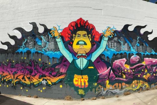
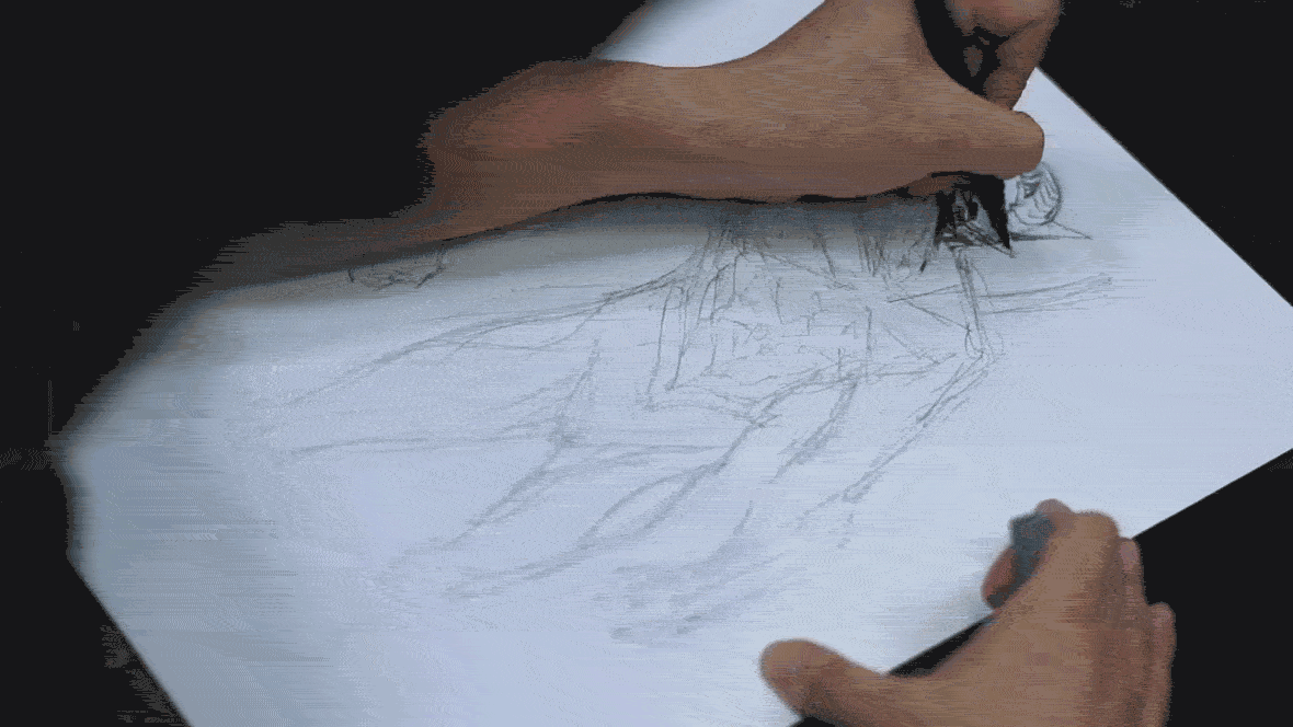
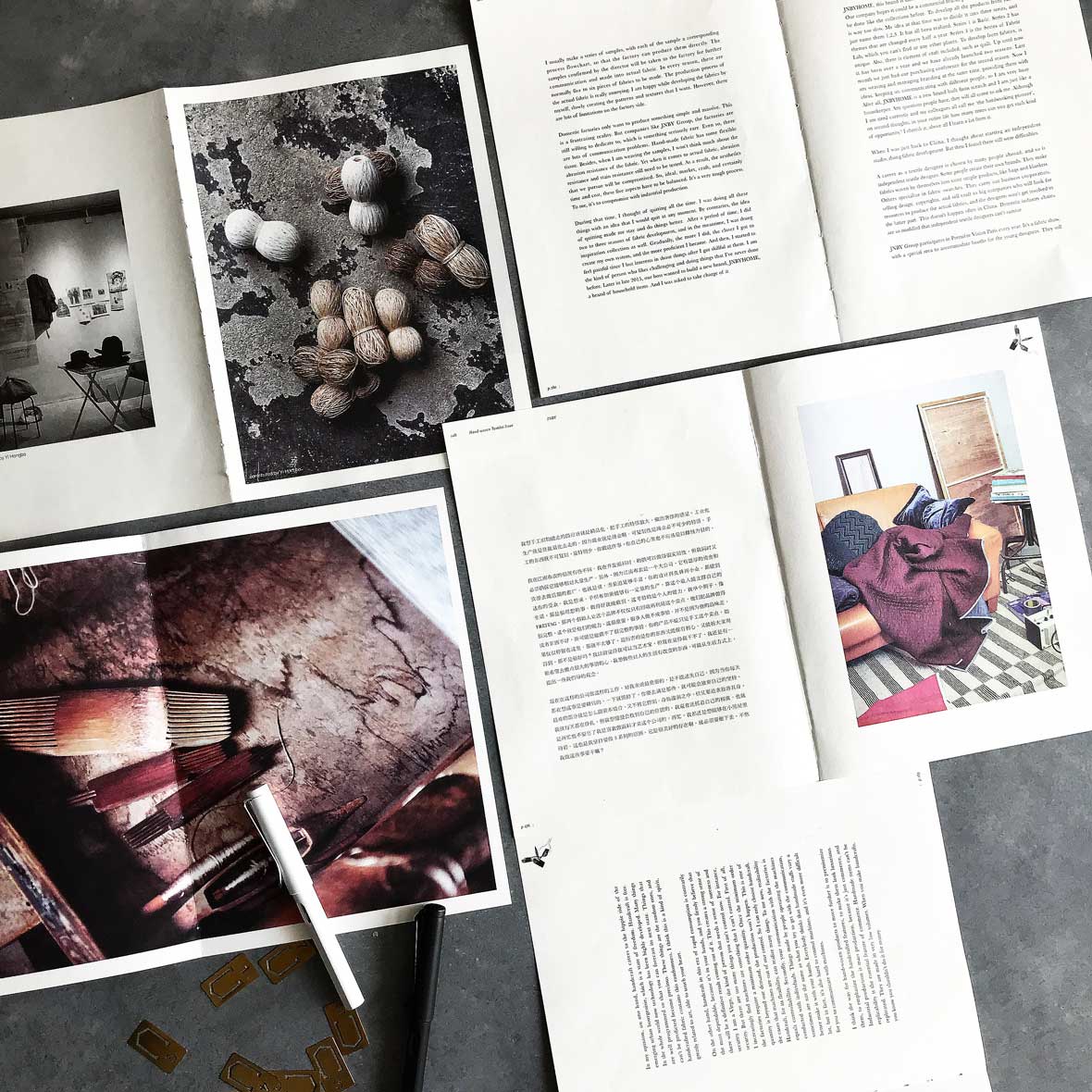
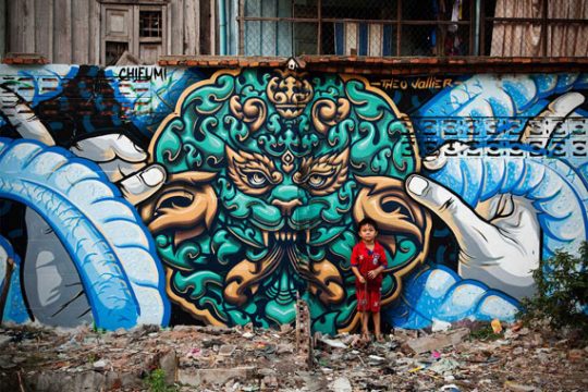
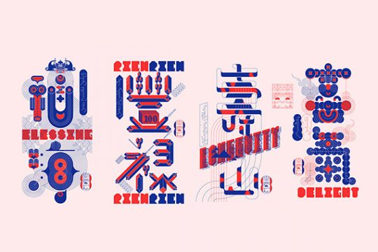
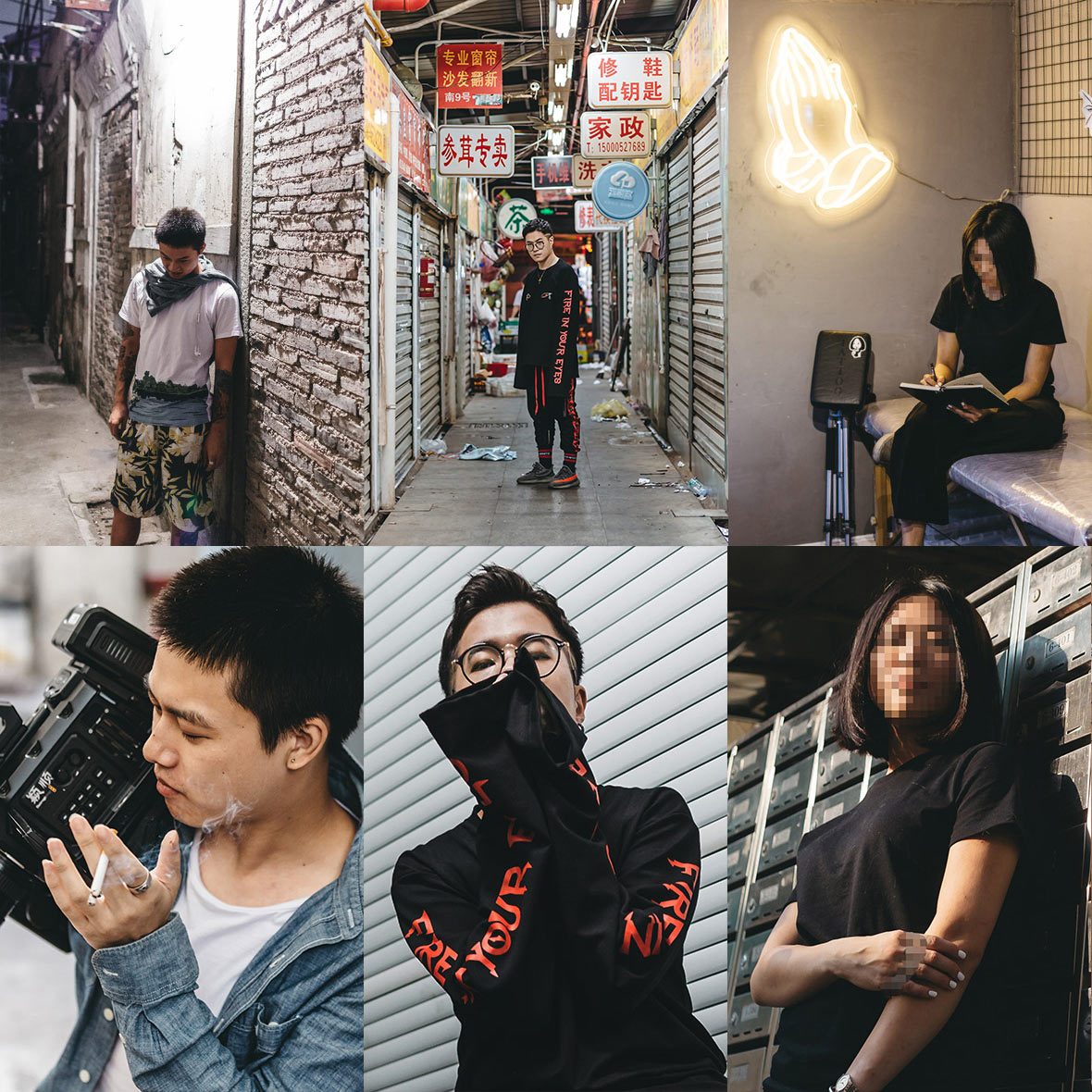
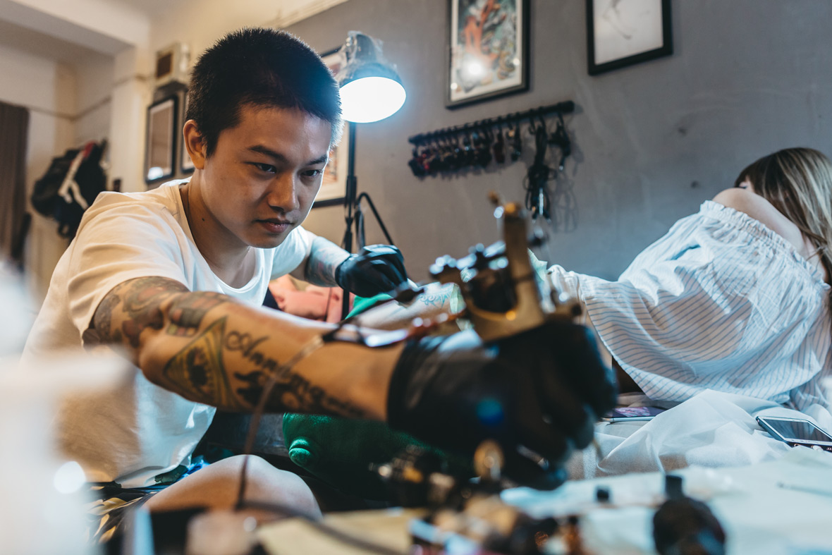
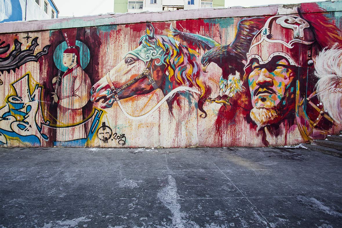
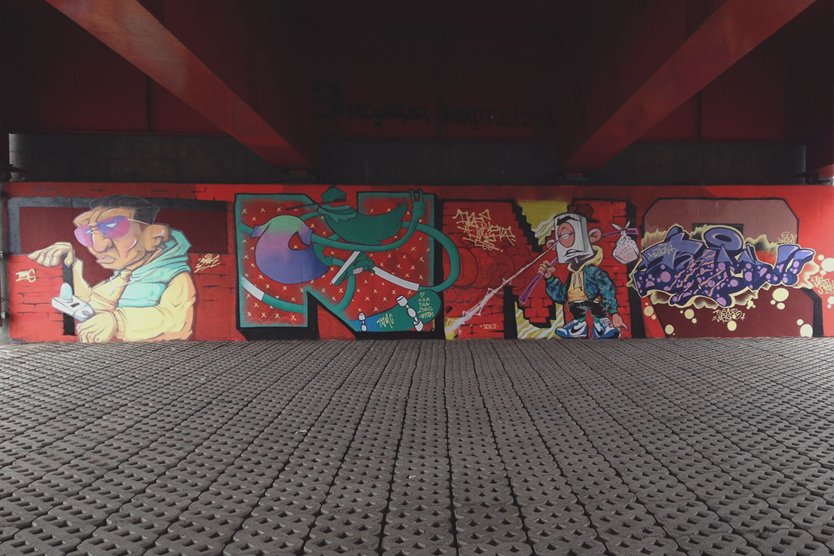
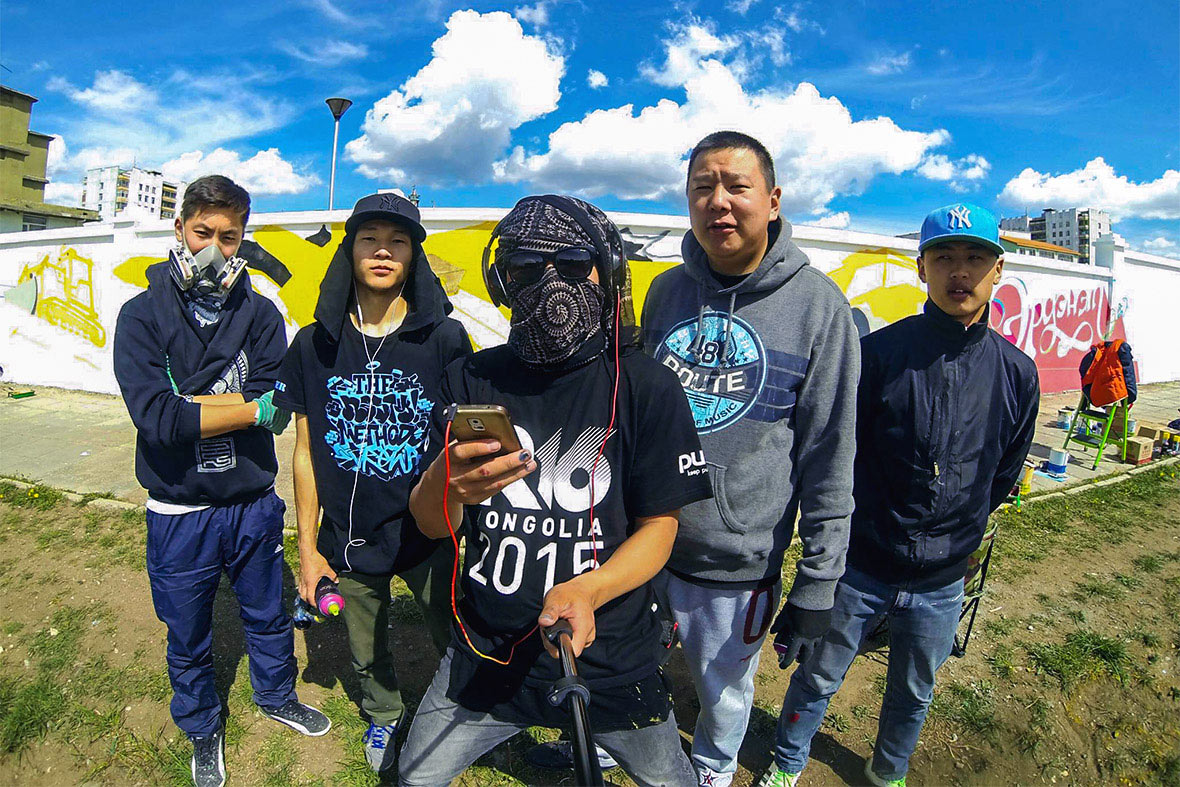
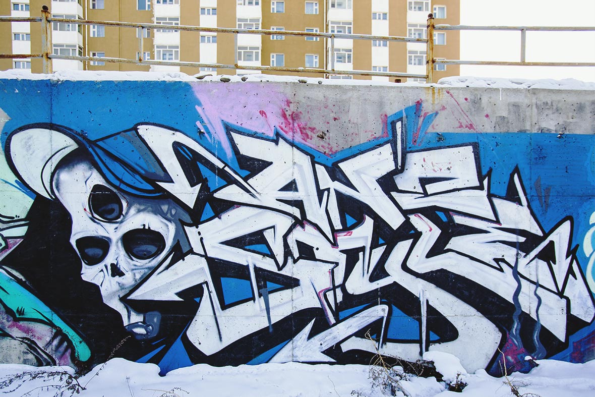
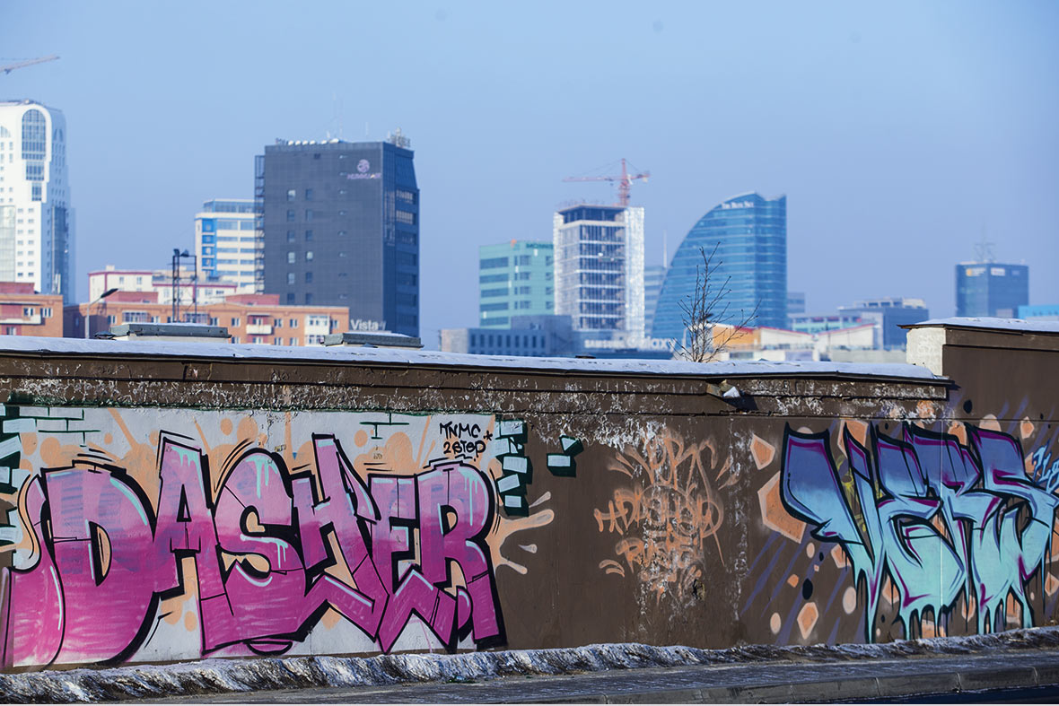
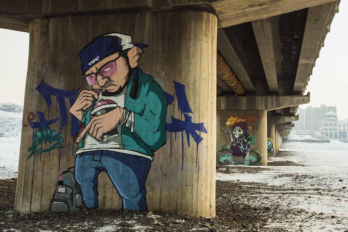
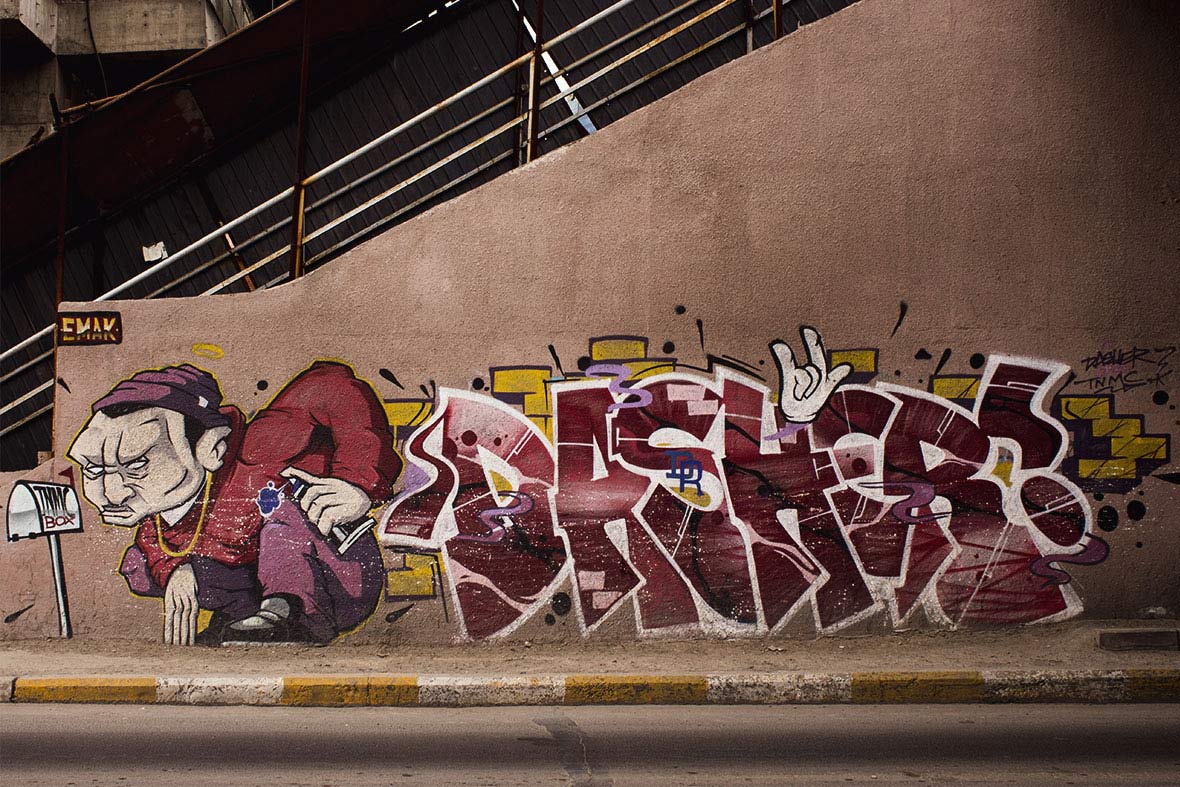
Ulaanbaatar’s booming street art scene has deep roots. Three generations of artists, all still active, have left their mark on the alleyways and underpasses of the city. The earliest got its start in the 1990s, when the artist ANZ – widely regarded as the godfather of Mongolian graffiti, and even today cited as a source of inspiration – began creating his murals. In the mid-2000s, a second generation emerged, with the artists Deez, Eto, Heesco, and others, who were driven by restlessness and a need to make their voices heard. They in turn mentored and inspired the current generation, a group of internet-savvy kids who used online forums to meet up and form crews. Of these, the most well known is probably The Nasty Methods Crew (TNMC), formed in 2014 by the artists Dasher, Sane2, Risky, Emak, and TEM.


蒙古乌兰巴托蓬勃发展的街头艺术,有着源远流长的历史。缘起至今的三代艺术家都仍然活跃着,如今已在城市的小巷和地下通道上留下了他们的印记。最早始于 20 世纪 90 年代,当时艺术家 ANZ ──被普遍认为是蒙古族涂鸦教父,甚至如今还依然是街头创作的灵感来源──已经开始创作他的壁画了。在上世纪中叶,第二代艺术家为不安和渴望被聆听的动力所驱使,Deez、Eto、Heesco 和其他艺术家出现了。这群精通网络的孩子,他们利用网络论坛聚在一起,组成团队,反过来引导并激励了当代人。其中最著名的可能是 The Nasty Methods Crew(TNMC),它是由艺术家 Dasher、Sane2、Risky、Emak 和TEM 于 2014 年成立。

Hulegt
Spone

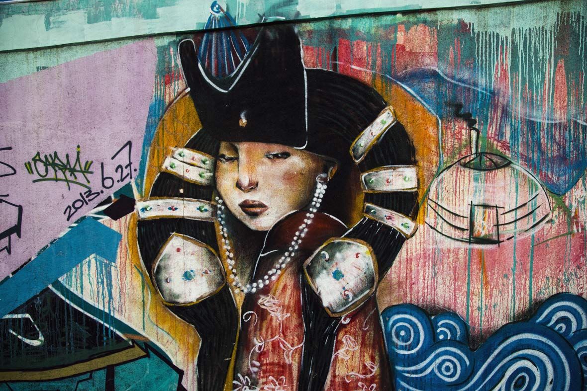
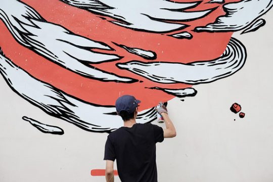
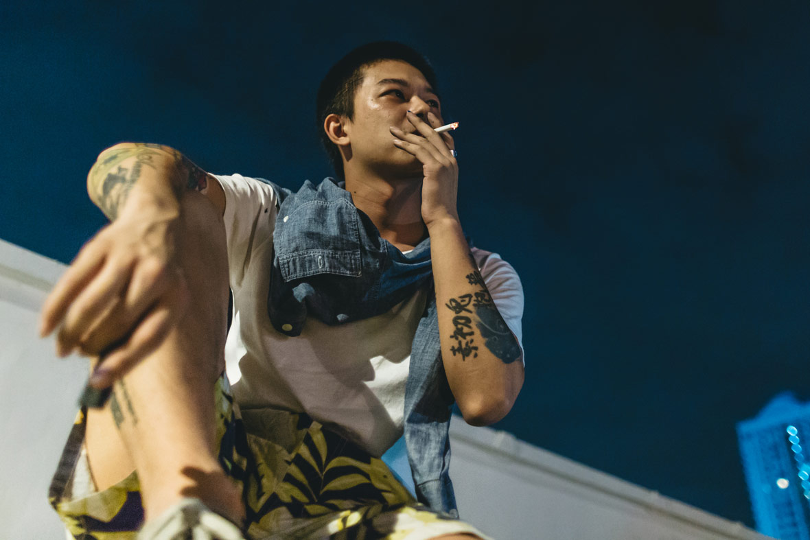
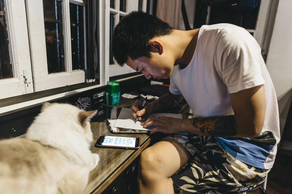
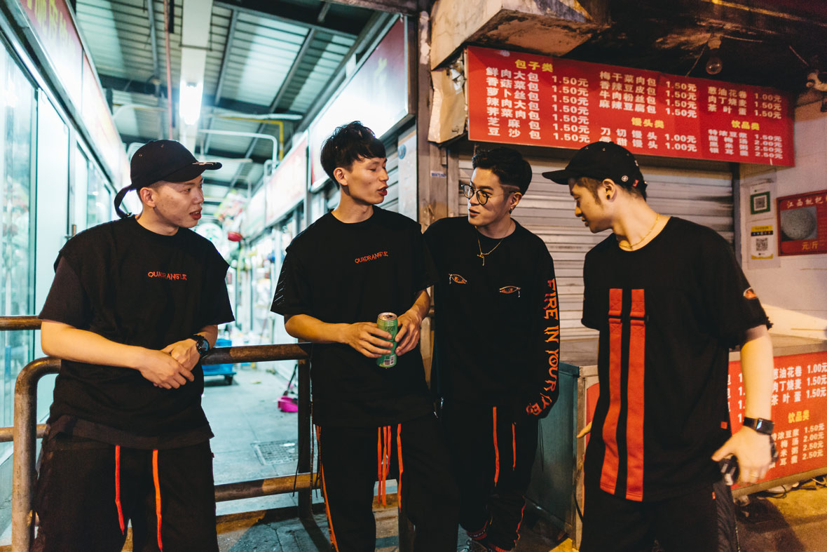
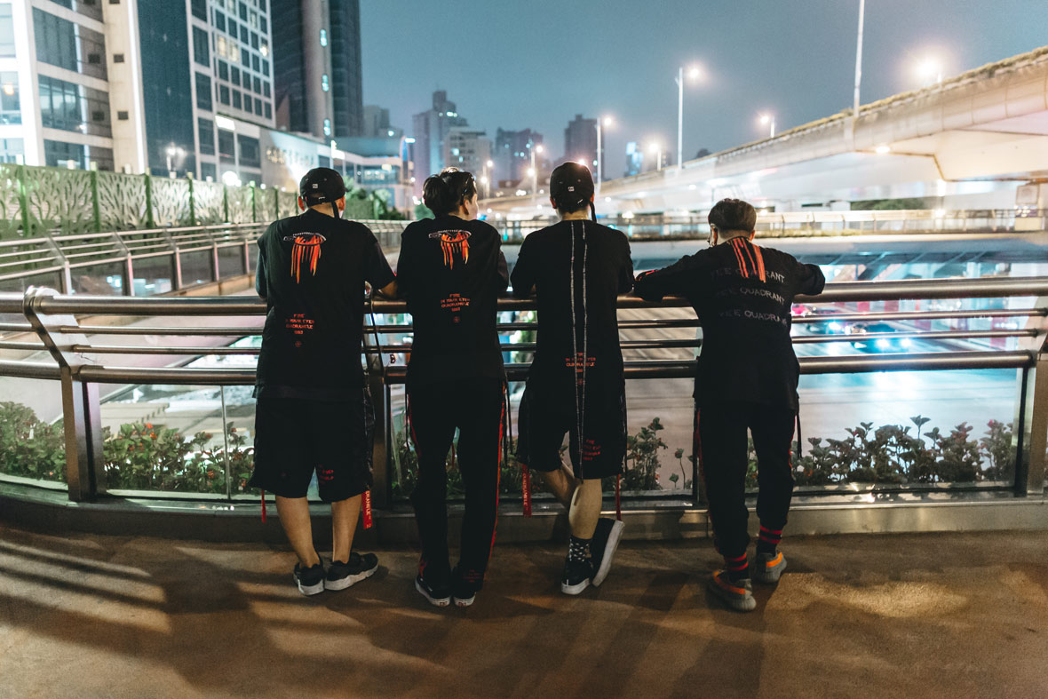
Each member of TNMC has their own style and approach, but they’re united in the belief that by working together they can raise the bar on the local graffiti scene. Some of the artists, like Dasher, believe in preserving graffiti’s original anti-authoritarian spirit: he’s out on the streets, hunting for new (and often illegal) spots for his throw-ups. Others, like Sane2, want to move away from those rebellious roots to shift public perceptions of the art form. Despite their different approaches, the joint goal is to create art that can be enjoyed by all.


TNMC 中的每一位成员都有着各自鲜明的风格和创作方式,但有一种信念让他们走到了一起:团结一致,提升当地涂鸦文化的发展。他们当中有人认为,涂鸦艺术应该延续其反权威的精神,譬如 Dasher,他常常会走到街上,去寻找新的、甚至是被禁止的地方来涂鸦;但像 Sane2 却认为,涂鸦艺术应该抛离这种反叛的根源,改变公众对涂鸦艺术的偏见。虽然创作思维不同,但他们目标相同:创作一种能让所有人欣赏的艺术。

Emak, Tem, Dasher, Sane2

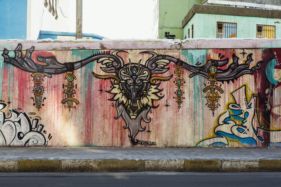
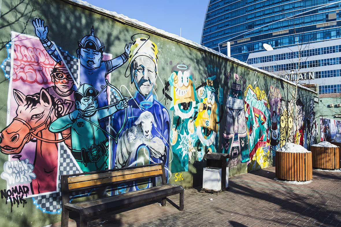
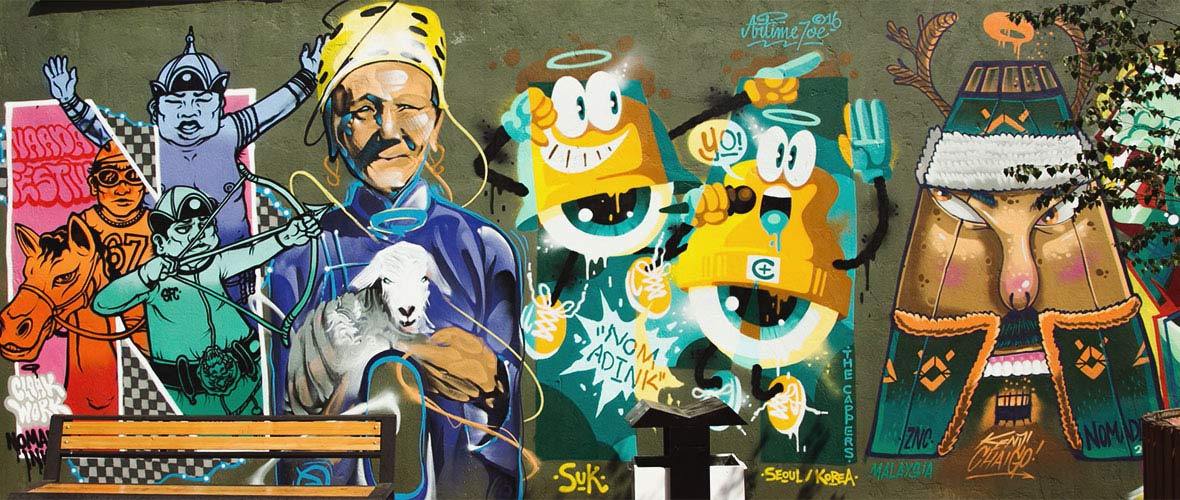
TEM, the newest member to join TNMC, is the man behind Nomadink, the biggest street art festival in the country. The event has boosted public interest in graffiti by bringing together street artists from around the world to work on collaborative murals with Mongolian artists. “I started Nomadink as a way to push modern art to the masses, and the local artists can learn from the experience,” says TEM. Over the years, artists from Korea, Singapore, Malaysia, Australia, and USA have participated and created work throughout Ulaanbaatar.


TEM 是新加入 TNMC 的成员,同时也是蒙古国内最大型的街头艺术节 Nomadink 的创办者。这个艺术节邀请来自世界各地的街头艺术家与蒙古当地艺术家一起合作涂鸦作品,以此来提升大众对涂鸦艺术的兴趣。“创办 Nomadink 的初衷是为了向大众推广现代艺术,同时给本地艺术家提供学习的机会。” TEM 解释道。多年来,通过这个艺术节,来自韩国、新加坡、马来西亚、澳大利亚和美国的艺术家,已在乌兰巴托城市里的各个角落里留下了印记。

CloakWork, Beggie MRCK, Artime Joe, Kenji Chai, Dasher, Mosho, Emak, R.Dog
CloakWork, Beggie MRCK, Artime Joe, Kenji Chai

Surprisingly, given the festival’s success, some of TNMC’s members see a declining interest in street art, and even gloomily complain that the golden age of Mongolian graffiti is over. Today’s internet offers so much entertainment,” says Dasher, shaking his head. “A lot of kids probably see going out and tagging as a hassle, when they can just have fun at home.” Sane2 nods in agreement. Their pessimism may prove premature. In a few years, another generation of artists may come of age – and look to TNMC for inspiration.


意外的是,尽管艺术节本身十分成功,但有部分 TNMC 成员认为,公众对涂鸦文化的兴趣依然在减少,甚至有些沮丧地表示,蒙古涂鸦艺术的黄金时代已经结束了。“因为今天的互联网提供了如此多的娱乐。”Dasher 摇着头说道:“现在的小孩都觉得出去是一件很麻烦的事情,他们宁愿在家玩。”一旁的 Sane2 点头表示同意。但他们的悲观情绪可能来得太早,或许再过几年,新一代的艺术家就会与之接轨,并在 TNMC 和他们的作品中受到启发。

From left to right: Emak, Dasher, Eto, Rusty, Sane2

ANZ, for his part, takes a long view. Even though he notes a growing commercialism in younger artists, he’s still optimistic about street art in his country. “Nowadays, a lot of people look at things with a more commercial mindset, asking ‘How can I sell this? How can I get more attention from this?’” he says. “But I remain hopeful. I’m still impressed by the younger generation, especially TNMC and what they’re doing. They’re the future of Mongolian graffiti.”


对此,已有数十年经验的 ANZ 则以更长远的目光来看待。他表示,虽然自己也注意到年轻一代的艺术家中普遍存在一种商业化的倾向,但他依然保持乐观。“现在人们的想法可能更商业化一点,总是想‘我怎样才能卖掉这幅作品’,‘怎样才能通过作品提升曝光度’。但我还是很乐观,年轻艺术家中还是有很多让我觉得很不错的作品,尤其是 TNMC 这个团队和他们的努力,他们是蒙古涂鸦艺术的未来。”

ANZ
Dasher & Vers
Emak
Emak & Dasher

Contributor: Anand Tumurtogoo
Photographers: Anand Tumurtogoo & Byamba-Ochir Byambasuren
Additional Images Courtesy of TNMC & TEM


供稿人: Anand Tumurtogoo
摄影师: Anand Tumurtogoo & Byamba-Ochir Byambasuren
附加图片由 TNMC 与 TEM提供

You Might Also Like你可能会喜欢

An Eye for Change 蒸汽朋克眼里的美国文化

May 21, 2018 2018年5月21日

As a child, Pat Lee, the colorist perhaps best known for his comic-book adaptation of Transformers, spent hours leafing through penny-bin comics, taking in all that he could from every corner of the world. Heavily influenced by Japanese works like AKIRA, Gundam, Ghost in the Shell, and Fist of the North Star, Lee integrates manga into a traditional Western style, a skill that landed him his first job at Image Comics and eventually established his reputation in the comics industry.


从小时候开始,Pat Lee 这位以改编《变形金刚》漫画作品而出名的漫画上色师,就喜欢把自己沉浸在漫画的世界里,常常一看就是好几个小时的时光飞逝。他从来自世界各地的漫画书中吸取不同的灵感刺激,其中对他影响最深的是日本漫画,譬如《阿基拉》(Akira)、《机动战士高达》(Gundam)、《攻壳机动队》(Ghost in the Shell)和《北斗神拳》(Fist of the North Star)等作品。他尤其擅长将日本漫画美学融合进传统的西方漫画,这样显着的风格不仅为他带来在美国漫画出版商 Image Comics 的第一份工作,最终也让他在漫画界获得一席之地。

“I kind of teetered off a bit when I was doing Marvel and DC stuff – it was very dark with a strong presence of very heavy blacks,” says Lee. “But I’ve realized I truly love making work that’s a hybrid of Japanese anime and American culture. It’s interesting to fuse things together.”

That’s exactly what he’s done with his ongoing series, Interference. Over the last 6 months, Lee has been gradually transforming images of Western pop-culture icons like Mickey Mouse and Marilyn Monroe into something more foreign.


Lee 说:“每当我给漫威或 DC 创作时,总是感到不太有把握。这些作品风格非常黑暗,像是压抑着一大片深沉的黑色色调。我意识到自己真正喜欢的是将日本动漫和美国文化相结合的作品。把不同的东西融合在一起比较有趣。”

他目前进行中的系列作品《Interference》(《干扰》)正是遵循这一理念来创作。在过去六个月里,Lee 将米老鼠和玛丽莲·梦露这些西方流行文化中的经典形象进行创新的演绎。

Each iteration of a figure changes in subtle ways, challenging the viewer to spot minor alterations, like an iris turned into a camera shutter, or a shoelace that’s actually a fiber-optic cable. While some pieces in the series involve futuristic technology, with aliens and robots seated alongside a bionic Bambi with exposed brain matter, all are a part of a larger narrative about technological development in a structure that mirrors that of a comic book.


他以极为微妙的方式去重新设计每一个角色,挑战观众是否能发现那些微乎其微的变化。譬如将角色眼睛的虹膜画成相机快门,或是将鞋带变成光纤。虽然系列中有一些作品涉及未来的科技,像是一只暴露着大脑、和外星人和机器人坐在一起的仿生小鹿斑比,但所有角色都座落于一个更宏观的叙事里——对于科技发展问题的探讨。

Lee, known for his work with Copic markers, primarily uses acrylic for the paintings in Interference, which he often makes in quick succession. “Acrylic is just fun to apply, because it’s not as technical as Copic,” he says. “If you compare the two, acrylic has a kind of glow to it, this shine, texture, tone. It’s a thicker feeling, where Copic is very light, very illustrative. Really, they’re a pair – I have to have both.”


Lee 先前以他用 Copic 马克笔(源于日本的马克笔品牌,因其优良品质深受设计人士喜爱)来作画的作品闻名,但在《Interference》中他改用压克力颜料,这让他的创作过程更加一气呵成。他解释道:“压克力用起来比较有趣,因为它不像 Copic 马克笔那样讲究技巧。如果你认真比较一下这两种媒介:压克力颜料会有一种光泽,更有质感和色调,有一种更浓厚的感觉;而 Copic 马克笔则更加轻盈,更加清晰。应该说它们是一种互补吧,两种颜料我都需要。”

Lee says he doesn’t know what his paintings are going to look like when starting – he works backward and forward without a final image in mind. His process aligns with how he sees the development in technology, be that VR, the sex industry, or personal communications, playing out – in steps, leaps, and sometimes sprints. “I think Interference is about asking if we’re prepared for the technology that’s coming. Is our society ready for these kinds of tools, this tech? Should we be scared about our future, or is it exciting?”


Lee 表示,一开始创作时他不会知道自己最终会画出什么样子,过程中他会不断地来回调整,但不会去预先设定一个最终结果。他的创作方式体现了他对未来科技,像是虚拟现实、性行业或个人通讯等等,如何一步一步、或者说是大步发展的看法。“我认为《Interference》其实是在提问,我们是否已经为即将到来的科技做好了准备?我们的社会是否准备好迎接这些工具和科技?我们应该对未来感到害怕?还是感到兴奋?”

Lee’s work draws no conclusions on its own but asks viewers to actively notice changes, both big and small. Interference can help train our eyes and minds to focus on what’s happening right now, and to ask where we want technology to take us.


Lee 的作品本身并没有提供任何结论,但他要求观众去主动发现其中或大或小的变化。《Interference》可以帮助训练我们的眼睛和头脑,去专注于当下发生的事情,并提出问题:我们到底希望科技带領我们到哪里?

Website: www.patleeart.com
Instagram
: @patleeart


Contributor: Sarah Forman


网站www.patleeart.com
Instagram
: @patleeart


供稿人: Sarah Forman

Salt 在生活中撒点盐 加点味

May 16, 2018 2018年5月16日

“The idea behind Salt is to add flavor to people’s lives. It can’t be too little or too much. Sometimes my friends ask, why do you persist, when it’s so tough to put out this magazine? I can’t really explain why. People say if you really want to do something, you have to just make it happen. I guess that just about sums it up.”

– Songbing, designer / Co-founder and editor-in-chief of Salt


盐巴,是给生活加点味道的意思,但须有,无须多。有些朋友问我,这本杂志做得那么别扭,为什么还要做。其实我也说不清楚。“心里想要做的事,就去做出来”,我想,大概就是这样吧。

—— 松饼,设计师 /《盐巴》创刊人之一、主编

It all began with a simple idea: Songbing and Juzi, whose nicknames mean “muffin” and “tangerine,” wanted to publish their own magazine. The two women didn’t worry much about the business side of it and went ahead and launched Salt. It’s about finding joy in the simple things. With a friendly, intimate tone, it offers readers reflections on lifestyles and thoughts for how to live.

Busy city dwellers can open Salt and find a moment of respite, with practical tips and artisanal techniques – the little things in life that are the most important. It showcases products, but its real focus is on the creators who make them.

Following the positive reception of their 2011 inaugural issue, “An Ambiguous Life,” they released a series of issues centered around a narrow theme. So far, they’ve covered natural dyes, botany, needlework, printmaking, and with their latest release, hand-woven textiles. The writing is like the scent of grass after a fresh rain: it’s earthy and simple and lingers in your mind.


两个女生松饼和桔子,因为一个简单的念头, 就想去做一本独立杂志。她们没有考虑太多的市场运营,就这样开始了《盐巴》的生命,不断尝试去探索生活中的小确幸,用亲切自然的方式娓娓道来,和产品使用者共同分享对生活方式的解读以及对生活的思考。

对于忙碌的都市人而言,打开杂志的那一刻,内心会进入一个独特的宁静国度,生活常识、手工艺技巧,这些都你生活中最重要的小事。不仅如此,相比那些生活的产物,《盐巴》更关注的是产物的创造者。

自 2011 年创刊号“生活分不清”之后,“草木染”、“种植”、“针线活”和“版画”的主题也接踵而来,一期一个主题,在这些生活甚至市井的主题下,每个文字都透露着雨后青草香气的清新,扑鼻而来,质朴却留痕。

Honestly, cultivating your own individual habits isn’t easy. Salt seeps through the cracks in your life, and becomes that little bit of flavor you can’t give up.

Independent magazines are often considered niche publications that cover obscure, non-mainstream topics. Through the medium of paper, they’re a vehicle of self-expression. But how does Songbing define indie magazines?

“Independent magazines are just a different method of expression,” she says, drawing on her years of experience as an independent publisher. “Just because someone creates a magazine or decides on its content by themselves doesn’t make it independent. If they have something to say, and if their understanding of what’s true, what’s right, and what’s beautiful is untainted by commercialism, they’ll be discovered by more people.”


坦白说,培养一个人的习惯其实并不易,然而《盐巴》却洒进你生活的缝隙,成为那个戒不掉的“小味道”。

有人说,独立杂志,远离日常视野的小众读物,关注主流之外,以纸张为载体,书写自我主张。那么,独立杂志到底在松饼眼里是什么?

“其实独立杂志只是一种途径,一种方式,”松饼用她几年的运作经验告诉我们,“独立杂志不是说你自己独自参与其中,内容你自己说了算,就是独立的。而是你要有所表达,没有被商业控制的价值观伴随着你对真善美的理解,被更多人发现。”

Unlike many other independent magazines, which are a collective endeavor, Salt is often written entirely by Songbing. “A lot of my friends would ask if the magazine was still active. I’d joke and say, ‘Yeah, but it’s an annual publication now.’ I’m an optimist and can laugh at myself. It helps me endure the stress and loneliness.”


不同于很多独立杂志的团队操作,《盐巴》更多时候是松饼独立执笔完成。“不少朋友问我杂志还在进行中吗,我也开玩笑地回答是呀,变成了一本年刊了。我总是习惯乐观地开自己玩笑,这样一来才不会被所背负的压力和孤单击倒。”

What’s kept Songbing going are her devoted readers. But an abrupt two-year hiatus had many of them asking, “Did she give up? Did she get sick of it?” To these questions Songbing replies:

“As your worldview changes, so do the topics that interest you. You can’t stay in the same place you started from. I don’t want to be repetitive. I want to start again and introduce a new Salt to the world. So after the two-year break, Salt’s relaunch marks the beginning of a new chapter for the magazine. The new narrative-driven approach makes every story that much more immersive . . . The willingness to experiment and overcome new challenges is the essence of life. I believe that good things come to those who persevere, and this belief has led to many surprises and delights along the way.”


对于松饼和她的《盐巴》来说,有读者有聆听,就是她坚持下去最大的理由。可是突然间,熟悉的“小味道”消失了,而且一去就是两年。是放弃了么?是疲惫了么?面对各种各样的疑问,松饼是这样说的:

“当你对世界的看法在改变,所感兴趣的领域也发生了改变,你就不会还只是停留在原地。我不想重复自己,我想再次出发,带来了一个完全不一样的盐巴。于是两年后的再次出发,全新的故事性架构让我们看到一种更生动的方式……还能尝试和挑战新的东西,这就是生活该有的姿态,继续坚持下去,最好的总会出现,要这样相信,就能得到生活给予的惊喜。”

Fitting to the name, Salt adds a certain piquancy to the blandness of everyday life. It’s a jolt of savoriness that helps bring out the complex flavors of life. There’s not too little and not too much. It feels just right.

The sixth issue of Salt is now available on the Neocha Shop in limited supply.


正如杂志名《盐巴》,翻开第一页到合上最后一页的过程里,它留给你的,好似淡白开水里加了一点盐,就是那么一点两点,舌尖突然有了滋味。生活看似平淡,细细品味,总有着简单的深刻。正是那所谓的“但须有,无须多”。

《Salt》第六期现已于 Neocha商店限量发售。

To pay via PayPal or international credit card, please check out through our Shopify. To pay with AliPay or WeChat, please visit our Weidian.


如需使用PayPal或国际信用卡支付,请转至我们的 Shopify 页面;如需使用支付宝或微信支付,请至我们的微店

/**/


《盐巴》第六期 “手工织物”

¥150

立刻购买

Product Details:

  • Year of Publication: 2017
  • Number of Pages: 196
  • Dimensions: 18.5 cm x 25 cm
  • Price: 24 USD

详情

  • 出版年份:2017
  • 页数:196
  • 尺寸: 18.5 x 25 厘米
  • 价格:150 RMB

Additional Recommendations from Salt’s Editor-in-Chief

“I’m actually not that in tune with indie magazine in other parts of Asia. But within China, I’d recommend LOSTBe Water Journal, and Chengdu’s Keyi. Especially Keyi – the design of every issue is so creative. And if Seeds hadn’t folded, it’d be one to follow.”


 《盐巴》主编推荐

“关于其他亚洲独立杂志,坦白说我关注的并不多。国内我比较推荐的,《LOST》、《水象》,以及成都的《可以》,特别是《可以》每一期都在工艺上有很多创新。無早的《Seeds》如果能一直做下去,也很值得持续拥有。”

Contributor: Handowin Ho


供稿人: Handowin Ho

You Might Also Like你可能会喜欢

Type-of-Graphics 设计一套中文字体有多难?

May 9, 2018 2018年5月9日

This story is part of a content partnership and media exchange between Neocha and MAEKAN. To see more of MAEKAN’s content on Neocha, click here.


Typefaces are to text what accent and cadence are to speech: they create an immediately recognizable “voice.” Thanks to digital typography, designers have access to tens of thousands of different typefaces, each of which can steer a project in a different direction and give it a different visual identity. Don’t like the fonts on offer? You can always create your own — you just need to design some 250 characters, including upper- and lower-case letters and punctuation. If you’re working in a language like English, that is.

But what if you’re a designer working in Chinese, creating a typeface that needs tens of thousands of characters to be considered “complete”? How do you tackle a project that’s bound to outlive you, and why even start in the first place?

I sat down with Caspar Lam, of the New York-based studio Synoptic Office, to talk about his team’s new typeface, Ming Romantic, and the challenges of Chinese font innovation.


本篇文章来自新茶媒体合作伙伴 MAEKAN 的内容交换。在 Neocha 上阅读更多 MAEKAN 的文章,请 点击此处


字体设计之于文字,就像声调和抑扬顿挫之于一篇演讲来说一样重要,同样都提供后者一个能轻易被辨识出来的 “风格”。归功于数位排版,设计师现在可以在网上接触到上千万种不同的字体,让作品的视觉风格更加多元化。但如果你还是找不到想要的字体呢?你还有另一种选择:设计出 250 个大小写字母和标点符号,创建属于你自己的字体。当然了,前提是你用的语言是英语。

但是,如果你是一名中文设计师,创建一套数位的中文字体则需要设计出上千万个不同的字元,才能称得上“完整”。要如何完成这项说不定一辈子都做不完的工作,更重要的是,为何一开始还选择去做这件事?

我带着这样的疑问来到了纽约设计工作室 Synoptic Office,和字体设计师 Caspar Lam 一起讨论 明日体 的构思,以及在设计中文字体时所面临的挑战。

It all began with a simple enough request.

Before founding Synoptic Office, while working at a design studio, Lam was tasked with finding a romantic Chinese font for his client, Vogue China, which was looking something akin to Didone — an unadorned, modern typeface characterized by a striking contrast between thin horizontal and thick vertical lines.

The problem? No such type existed.


这一切都始于一个简单的提问。

在创立 Synoptic Office 之前,Caspar 曾在纽约一间工作室工作。当时他在为客户《Vogue China》寻找一种风格浪漫的中文字体,类似 Didone 字体这样的设计——简洁、现代、横竖笔画的对比强烈,竖线要细,而横线要粗。

问题是,并没有这样的中文字体。

After completing the project with Vogue China, Lam discussed the idea of creating a font with Synoptic’s co-founder and creative director, YuJune Park, and their design team, which included Abby Chen, Dustin Tong and Gabriela Carnabuci. “We were sitting together in a room and we said, ‘Oh, why don’t we make a Chinese typeface?’” Lam recalls. “How hard could that be? Literally, it was that naive.”

Thus began Synoptic’s five-year journey to explore and reinvent the way modern Chinese typefaces are created.


结束这个项目后,Caspar 与工作室共同创办人暨创意总监 YuJune Park 以及其团队成员,包括设计师 Abby Chen、Dustin Tong 和 Gabriela Carnabuci,一起讨论了设计字体的想法。Caspar 回忆说:“我们坐在一个房间里,讨论着 ‘我们为什么不自己去制作中文字体?这能有多难呢?’ 我们当时的想法就是这么天真。”

就这样,Synoptic Office 开启了一项长达五年的项目,重新探索和塑造了中文字体的设计方式。

Ming Romantic came about from a combination of circumstance, curiosity and, as Lam concedes, “youthful optimism.”

The team originally wanted to include an accompanying Korean typeface in a similar style, a plan they abandoned within the first month, once the enormity of the project became apparent.

Why? Several factors make creating a new Chinese typeface exceedingly difficult, many of which have existed since antiquity.

For starters, written Chinese is vast and intricate.

This complexity gives the script its richness, but it has also hindered its ability to make full use of technological innovations that elsewhere proved transformative.


明日体是對周遭环境的審視、好奇心、以及 Caspar 所说 “年轻的乐观主义” 结合之下的产物。

团队最初原本還计划创建一款类似风格的韩文字体。但是在项目开始的一个月后,他们就放弃了这个想法,因为很快他们就意识到这个项目的艰巨性。

为什么?创建新的中文字体之所以如此困难有很多原因,其中一些原因甚至可以说是自古以来一直存在的。

首先,汉字的数量非常庞大,结构复杂。

这种复杂性既丰富了语言,同时也阻碍了它像其它语言一样充分应用于新兴科技。

For the Western world, the impact of the printing press was huge. It’s probably a simplification, but when every book had to be copied by hand by a team of monks, a machine that could churn out Bibles at the pull of a lever was revolutionary.

It led to the greater dissemination and democratization of knowledge in the West. And as printing technology progressed, so did the typefaces conceived to meet different design challenges, such as cost-saving italics, which allowed a printer to fit more letters onto a block.


对于西方国家来说,印刷技术的影响是巨大的,毕竟在一个只能手抄《圣经》的时代,突然出现一个拉一下开关,就能大批生产出畅销书的机器,在当时绝对称得上是一项革命性的发明。

打印机的出现让知识得以在西方国家更大范围地传播出去。随着印刷技术的不断发展,字体设计也在不断向前推进,以迎合更多不同的设计挑战。例如,人们发明斜体字,让打印机可以将更多字母装入同一个方格,以节省成本。

“If they created a block for every character, that’s also a huge undertaking. You needed an emperor or somebody with a lot of money hire a lot of people to do this type of work and sustain it.”

“如果你为每个字都创造一个方格,那将是一个巨大的工程。你首先需要一个像皇帝一样富有的人的资助,才能去雇用一大堆人来做这件事。”

These developments would eventually lead to the first modern” Roman typefaces, Bodoni and Didot, with their sharp serifs and high contrast between vertical and horizontal line weights. The set of typefaces that descend from these two, collectively known as Didone, would also become the conceptual basis for Ming Romantic.

In case you’re wondering why it’s called Ming Romantic, it’s named for the dynasty during which ceramic, wood, and bronze movable type gained popularity, in a marked a shift away from calligraphic script styles based on brush strokes. And the Mingti typeface, also named for this period, marked the starting point for their exploration.

Although movable type was invented in China as early as 1040 AD, printing was long limited by the costs of producing large character sets.

Individual characters or even whole texts were carved onto woodblocks, which were then inked and stamped onto paper, in a process known as xylography. But this process required the support of a wealthy patron such as the emperor. If there was no block for a given character, a new one had to be carved.


发展到后来,诞生了第一批现代罗马字体 Bodoni 和 Didot,这些字体有着明显的衬线、和强烈的横竖线粗细对比。以这两种字体为基础发展的字体都被统称为 Didone,同时也是明日体的灵感之源。

也许你会想知道为什么取名为 “明日体”,它的命名取自明朝。在这个朝代,陶瓷、木材和铜板活字印刷术得到了广大的普及,意味着中文字体开始有了不同于手写书法字体的风格转变。同样的 “明日体” 也标志了一个世代,是对中文字体重新探索的开端。

虽然活字印刷术早在公元 1040 年就在中国被发明和使用,但关于中文印刷业及字体的后续发展,最大的限制因素是生产如此大量字符模具,随之而来的巨大成本。

在古代,人们喜欢在木版刻上文字或整篇文章,然后再将印有墨水的木版压印到纸上,这一过程被称为 “木版印刷术”。但这背后需要相当雄厚的资金支持,通常只有皇帝才做得到。因为这项工作必须有人随时待命,一旦木板被用完了,就必须马上再雕刻一个新的出来。

And a similar issue persists today. A non-designer can do a quick browse of DaFont and find tens of thousands of different typefaces for English, but a committed search of similar sites for Chinese will yield only a fraction of that number — even as the demand for new Chinese typefaces has grown.

While an alphabetic typeface can be created by a single designer with sufficient passion or compensation, making a usable Chinese typeface requires a team of designers working together over several months — or in Synoptic Office’s case, several years.

This is because a typical Western typeface needs only about 250 characters, a number that includes the alphabet in upper and lower case, punctuation marks, and special characters like currency signs and the ampersand.

The problem is that a modern Chinese typeface needs those Roman characters along with 2,500 to 3,000 common-use Chinese characters to be useable for simple texts such as titles.

As it happens, the 250 or so Western characters used in most Chinese typefaces are included for completeness and are usually copied from other typefaces. The results are Roman characters that are jarringly out of place next to the Chinese typeface, something of a bastardized Times New Roman. Lam and I joked that these characters look like an afterthought, a job left to a hapless intern.

But for a typeface intended for professional use – for body text, for example – where the variety of characters is bound to be greater, thousands more are needed. Some estimate that as many as 80,000 are needed for a typeface to truly be considered “complete.”


同样的问题至今仍然存在。即使你不是设计师,也能在 DaFont 这样的字体网站上轻松找到成千上万种英文字体。但是當搜索中文字体时,结果却廖廖无几。然而人们现在对于新的中文字体的需求正在与日具增,也有越来越多人愿意资助这项工作。

要创建新的罗马字母字体,只要有资金资助和足够的热情,一位设计师单枪匹马就能完成这项工作。然而,要创建一款可用的中文字体仍然需要一个团队的设计师工作好几个月,或是像 Synoptic Office 这样,努力了数年才行。

一般来说,西方字体只需要大约 250 个字符,其中包括大写和小写字母、标点符号以及其他特殊符号如$或 &。

问题是在现代中文里,除了需要那些罗马字符外,光要写出一个简单的标题,就需要 2500到 3000个常用中文字符了。

大多数中文字体中附带的 250 个西方字符只是为了确保其完整性,通常都是直接借用其它字体的。结果是两者摆在一起看起来极不协调,像是一种变异的 Times New Roman 字体。Caspar 和我开玩笑,这些被借用的字符感觉就像是一个倒霉的实习生,被派去收拾別人的烂摊子。

但是对于一款用于专业用途的设计字体,譬如用在正文部分,字符的种类一定要更丰富才行。起码需要超过八万个字符以上,才能算的上 “完整”。

“Theoretically, you could work on this forever, because the character set is so huge. If we want people to use it quickly, maybe we should set expectations and say ‘well, maybe we won’t complete it on the first go.”

“理论上,你可以花上一辈子的时间去设计,因为中文字实在太多了。如果想要人们可以更快的使用到,也许我们应该换个方式,不用一次就全部完成所有的字。”

It bears mentioning that Synoptic Office isn’t a type foundry – that is to say, they don’t create typefaces full-time. I asked Lam how they executed a project of such magnitude in the background, while working on other jobs, over five years.

He began by comparing approaches used by type foundries. One of these involves writing a character by hand, scanning it into a graphics program and live-tracing it. But as Lam notes, this was not a suitable approach for Ming Romantic, as their design aim was to distance it from handwriting and instead explore typography.

Taking a page out of the software development playbook, Synoptic is releasing Ming Romantic in successive versions. This means the team’s work can be published even before it’s complete – and with so many characters left to go, it can be hard to pinpoint when that will be.


值得一提的是,Synoptic Office 并不是一间专门的字体设计公司,他们没办法投入所有时间来做这件事。于是我问 Caspar,他们是如何在五年多的时间里,利用工作之余持续进行一个如此大规模的项目?

他首先跟我比较了字体设计公司和 Synoptic Office 使用方法的不同。其中一种方法是先手写,扫描进绘图软件里再描图。但是正如 Caspar 所说的,这种方式不太适合明日体,因为它的设计精神本来就是要摆脱手写字型,以去探索更多印刷字体的风格。

Synoptic Office 则是采取分阶段,以不同版本推出的发布形式。这意味着字体可以在完成前就先曝光,毕竟这个项目要完成的字符如此之多,很难精确的预定出具体的完成日期。

Yet even with the advantages of graphic design software and scripting languages that can produce characters with similar elements based on successful iterations, individual characters still need to be finessed or adjusted to be visually pleasing, Lam explains.

That means carving out time every day for drawing a character on a blank grid on a screen. In the beginning, the time commitment meant the net output was maybe only one to three characters a day.

These characters sit on a large master list that the team goes through over and over again until items are completed, with milestones set in increments of 500 characters.

Intrigued, I ask him how the team celebrates.

“With a cup of coffee,” he laughs. “Or maybe just walking around, because it takes a toll on your eyes. I already have very bad eyesight, so you can feel your eyes degenerating after a while, and you know that this is actually not good for you in the long run!”

Besides the consistency of the entire character set, Lam points out another crucial criterion – Does it look Chinese?

“After the initial explorations were done, it became a little more robust and efficient. Because then you could copy a lot of the forms you drew previously and then modify them for forms that are similar,” he says.


因为绘图软件和脚本语言的帮助,他们可以依据重复的笔画元素去创作更多字符。但是 Caspar 解释说,即便如此,他们仍然需要一个一个字去加工处理或调整,视觉上才能达到一致平衡,让人看得舒服。

这意味着他们每天要抽出时间在电脑上绘制字符。一开始,他们每天只能做一至三个字符。

“最初试验工作的阶段完成后,工作流程就变得更加顺畅和高效率。因为你可以复制之前绘制过的偏旁,然后在做类似字符时直接在它的基础上修改就行了。”

团队把这些所有字符列成一份工作清单,过了一遍又一遍直到项目完成。每完成 500 个字符,对他们来说都算得上是一个里程碑。

有趣的是,当我问团队会如何庆祝时,他笑着说:“就喝杯咖啡。或者是起来走走,因为这项工作挺伤眼睛的。我的视力本来就不好,过了一段时间又感觉到视力在退化。长远来看,这其实对健康不是很好。”

但是,除了要针对所有字符的一致性进行测量和调整之外,Caspar 还指出另一个关键的标准——新的字体看起来够像中文吗?

Contrary to a popular myth, Chinese characters are not pictograms. Over 80% of characters are logosyllabic (or pictophonetic, if you prefer). What that means, simply, is that a typical character contains an element that hints at its meaning (the character’s “radical”), and an element that hints at its pronunciation.

In their countless combinations, these elements take on slightly different shapes and proportions that the design has to account for. What’s more, not only do characters have to follow universal visual design principles, they also have to look authentic.

As someone whose Chinese handwriting, acquired at university, looks like the legible but clumsy penmanship of a child, I don’t have the lifetime of practice necessary to judge authenticity.

But authenticity is important, and to show why, Lam mentioned the contrasting case of writing by Chinese learners of English. Sure enough, a glimpse at some writing samples shows a few extra features that are decidedly not native to English handwriting styles. These anomalies are pretty easy to spot, especially if you’re just working with the standard 26-letter Roman alphabet.

For example, you’d likely think something was off if the capital ‘D’ in Delaware appeared as small as the adjacent lower case ‘e.’

With so many “moving parts” in a character, in both typography and writing, there are a lot of extra things that could look off to the Chinese eye. This made creating Ming Romantic more daunting, but also more interesting.


人们向来有个误解,以为每个汉字都是 “图画” 一样的象形字。但其实超过 80%的中文字都是意音文字,或者说是形声字。大部分中文字由不同的 ‘偏旁’ 组成,有些偏旁表示发音,有些则表示意义。一部份的字仅由一个偏旁组成,一部份则由不同偏旁共组、或者是延伸的变体。

在这些由无数种偏旁组合出的中文字中,偏旁的形状、大小比例、位置会稍有不同,都会影响到字体的设计。除了要符合客观的美学要求,更重要的是,它们必须拥有 ‘正宗性’,也就是看起来要够像中文字。

由于我自己一直到大学才开始学写中文,写字看起来就像小学生那种一笔一划、很生疏。我可能还没有资格去判断明日体是否真的像正宗的汉字。

但这件事却很重要,例如在一些英文的书写样本中,你可以察觉到一些不符合传统英文手写的装饰细节。这些不对劲的小地方很容易就能被发现,特别是当我们用标准的 26个罗马字母时。

例如, Delaware 这个单词的大写字母 D 与相邻的小写字母 e 一样大时,即使这是字体的设计意图,你也能看出有点不对。

中文字里面有这么多组合的部分,不论是印刷体还是手写体,更为容易出现让你觉得去看來奇怪的小地方。这也让设计明日体的过程充满更多难关和乐趣。

“We wanted to pursue it because it was such an interesting topic for us. In our studio, we tend to pursue projects that we find to be of cultural relevance and of cultural interest.”

It would be unfair to suggest that the point of Ming Romantic was simply to see how a Chinese typeface could be created from scratch. Aside from the practical challenge of producing a typeface through more intuitive and efficient methods, Ming Romantic also poses a stylistic, and even cultural challenge to the existing visual norms of printed Chinese.

Despite the small but growing body of innovative Chinese typefaces, Chinese culture remains heavily attached to its history in the calligraphic arts for its expressiveness.

Lam describes a sort of “mental barrier” in the Chinese context, offering the example of his family and friends’ questions about Ming Romantic.

When they’d ask what kind of calligraphic face he was working on, he’d have to explain the difference between typography and calligraphy: the former has “an aspect of mechanical reproduction and product,” while the latter is a means of personal expression.

It’s this ingrained attachment to an esteemed tradition that makes giving the two arts “their space” a great, if unacknowledged, challenge for Chinese typography.


“我们之所以投入这件事,是因为它对我们来说非常有趣。我们喜欢做与文化相关或具文化意义的工作。”

如果说明日体,仅仅是为了试验看看中文字如何从头开始创作,这是不恰当的。除了一一克服创建中文字体的困难,明日体的创作尝试用更直观、更有效的方法去制作中文字体。这在视觉设计、甚至文化领域上都是一大挑战,也是对现存中文视觉规范的突破。

尽管中文设计字体目前为数不多,但有在逐步成长。其中很多设计都包含书法的元素,这项传统艺术凭借其丰富的表现力,始终是中华文化的代表。

Caspar 指出人们对于汉字有一种 “认知上的障碍”。他举例道,当他与家人朋友谈论自己在创建明日体时,他们都会问他是在研究哪种书法。这时他必须解释印刷体和书法之间的区别,前者是 “机械复制的产品”,后者是 “个人表达的手段”。

正是对这种根深蒂固的想法进行质问,使得区分这两种字体艺术,成为一个尚未被人们意识到的挑战。

“Even Chairman Mao was a calligrapher. It’s a very reactionary activity for a revolutionary, but it highlights the sort of myth we have as part of our cultural identity, or who we are as Chinese.”

“就连毛主席也是一位书法家。对于他这位革命家来说这是一种相对保守的行为。但书法确实强调了一种文化上的身份认同,充分说明了 ‘我是一个中国人’ 的概念。”

As the first combination of traditional Chinese characters and a high-contrast modern Western typeface, Ming Romantic is an exciting development, but Lam points out that history isn’t entirely devoid of similar attempts.

When he and Park discussed their font at the Typographics 2016 design festival, they showed many remarkable examples of typefaces from the 1950s and after – a relatively unrecognized heritage of Chinese experimentation in typography.

“Experimentation in Chinese type has a somewhat rocky history, because Chinese has tended to allow the forms which are considered canonical, while the rest of the experimentations tend to get buried,” he explains. Outside the art and design worlds, the visible lack of provocative Chinese fonts in everyday life seems to confirm this.

“So you always hear about the great calligraphers or the things that worked. And the things that haven’t worked, you have to search really hard to find them.”


作为中文传统字体和西方现代字体的首次结合,明日体是中文印刷字体中一次令人兴奋的发展。但 Caspar 说其实之前早就有过类似的尝试。

当和 YuJune 在 Typographics 2016 设计节上讨论明日体时,他们展示了1950年代以来许多重要的字体设计案例。这些字体可以说是中文印刷体被埋没的文化遗产。

“中文印刷字体的发展并非一帆风顺,因为中国自古以来只鼓励符合常规的东西,而其余实验性的设计往往会被埋没掉。”他解释道。在艺术和设计界之外,日常生活中很难看到有趣的中文字体。这正好印证了 Caspar 所说的。

“所以你总是能听到人们在谈论哪位伟大书法家,或是哪些已经成功的事迹。而那些还没成功的,你往往要很努力、花上更多力气才能找得到。”

To fully grasp the impact of an achievement like Ming Romantic, you could think of it this way: how many projects fail to reach their full potential, or are never even started, because they lack a typeface to express their visual identity? It’s as if you only had, say, Times New Roman, Arial and (perish the thought) Comic Sans at your disposal.

While Lam stops short of suggesting Chinese design would “mushroom” if it had more typefaces for its creative energies, he does believe more typefaces would allow for more directions and greater freedom. For now, he can proudly count Ming Romantic as the first Didone-style Chinese font and celebrate the end of the first leg of a much longer journey.

At the time of this writing, Ming Romantic’s initial release, unveiled in New York on February 1st, included 2,300 traditional characters in three weights.


要真正明白明日体的成就,你可以这样来思考:有多少失败的设计项目尝试做到跟他们一样的事情、或根本还没开始,因为缺乏合适的字体基础来符合设计上的需求。这就好像跟你说:你当然可以自己设计,但只能用 Times New Roman、Arial、Comic Sans 这三种字体来做一样。

虽然 Caspar 并未明说,但如果中国能有更多创新字体来引导其创作能量,中文设计字体的发展会更快速。更多的字体选择可以为设计作品提供更多方向和创作空间。现在,他们可以自豪地把明日体称为第一款 Didone 风格的中文字体,团队也终于可以庆祝,在这一段漫长旅程中取得了阶段性的胜利。

在写这篇文章的同时,明日体于2月1日在纽约推出第一版,一共收录 2300个繁体字,三种不同的粗细版本。

After our chat, I asked Lam by email what was next for Ming Romantic. Aside from taking some much-needed rest to distance and reflect on the project, he mused about a potential simplified Chinese version, subject to demand.

True to Ming Romantic’s original spirit, there may even be bolder explorations down the road.

“One idea which I find fascinating is exploring ‘ligatures’ in the typeface,” he writes, referring to combinations of two or more characters into one, such as in Æ. But in light of the very history that inspired Ming Romantic, that could be a slippery slope.

“In some way, this is a dangerous idea because ligatures have their origins in handwriting, and going too deeply into this area would turn a typeface into a script.”


上次见面后,我又发了邮件问 Caspar 明日体的下一步计划是什么。Caspar 表示,除了打算休息一下,也要继续思考明日体更多可能性,例如创建简体字的版本。

忠于创建明日体的初心,他们之后可能会有更大胆的作为。

“我还有一个想法一直很感兴趣,那就是字体中的 “连字”。指的是将几个字元组合成一个字元,类似英语的Æ。但有鉴于当初启发他们创建明日体的那些经验,这种想法可能会带来 ‘滑坡效应’。

“某种意义上说,这是一个危险的想法,因为连字起源于手写体。如果在这个领域继续深入,这一款印刷字体可能会再次变为手写体。”

Media Partner: MAEKAN

Contributor: Nate Kan
Images Courtesy of Synoptic Office


媒体合作伙伴: MAEKAN

供稿人: Nate Kan
图片由 Synoptic Office 提供

You Might Also Like你可能会喜欢

Summer Love Aria 恋恋夏日咏叹

May 8, 2018 2018年5月8日


无法观看?前往秒拍

“Summer Love Aria” is a long-overdue collaboration between Shanghai-based musicians ChaCha and Akin. The instrumental, produced by the ever-versatile HARIKIRI, works in tandem with ChaCha and Akin’s crooning vocals to form a soundscape that’s equal parts dreamy and funky. Pairing Akin’s buttery smooth delivery with ChaCha’s sultry and seductive voice, the single captures the feel-good vibes of a summer romance from two different perspectives.


《恋恋夏日咏叹》由常驻上海的音乐人ChaCha 及 Akin 合作而成。多才多艺的音乐制作人 HARIKIRI 担任编曲与后期制作,为二人的低吟浅唱构建了一个梦幻却时髦的音景。Akin 绵滑的唱腔与 ChaCha 诱人的歌声两相融合,从两个角度演绎出夏日恋曲的浪漫情调。


“My life revolves around love,” ChaCha tells us. “But it’s not limited to romantic love. It includes the love between family and friends, the love for our world and for Mother Nature, the love you feel when pursuing your passions, and the love you feel for yourself. These are the things that make life worth living.”


“爱,是我赖以生活的空气。” ChaCha说,“但它不仅仅是恋人之爱,亲情之爱、友情之爱、对世界和自然的爱、对所做之事的爱,以及对自己的爱,都是保持生活运转的最核心的动力。”

Weibo:
~/xhaxha
~/lilakin


Contributor: David Yen
Images Courtesy of PaulbtRose


微博:
~/xhaxha
~/lilakin


供稿人: David Yen
图片由PaulbtRose提供

You Might Also Like你可能会喜欢

Her

May 1, 2018 2018年5月1日

Seen Lin is a Taiwanese photographer who uses photography as a means for her to better understand femininity. She believes her role as a photographer goes beyond making aesthetically pleasing images – it’s to guide the women she photographs to show the most authentic version of themselves. Instead of the stereotypical images depicting women as sensitive and fragile beings, her photography is a celebration of empowered women, an ode to those who are unafraid of subverting traditional gender roles and defying mainstream notions of beauty.


对于台湾摄影师 Seen Lin 来说,摄影是更好地了解女性的途径。她认为,作为一名摄影师,不应只限于创作好看的影像,更应该去引导她的摄影对象坦露最真实的一面。和许多肖像摄影师的作品不同,她所呈现的女性形象并非是人们刻板印象中那些柔美、顺从或脆弱的女性。相反,在她镜头下,女性总是以赋权的姿态,颠覆传统的女性角色,挑战着社会对女性的主流观念。

As an analog-only photographer, Lin’s fondness for film doesn’t stem from a higher-than-thou attitude of believing digital to be inferior. In fact, she confesses that she’s rather clueless when it comes to operating a digital camera. Having begun her foray into photography with an analog camera, she hasn’t ever felt the need to transition to digital. Even for commercial projects, she still shies away from the industry standards of working in a digital format. “I’ve been lucky. Clients come to me because they like my film shots,” she tells us. “Of course, there are clients that request I deliver digital work. When that happens I just recommend other photographers.


虽然她只用胶片拍摄,但这绝非出于一种认为胶片比数码摄影更优越的想法。事实上,她说自己只是不太会操作数码相机,因为她一开始接触摄影就是用胶卷相机拍摄,所以一直都没有转用数码相机。即使是在拍摄商业项目,她也拒绝按照行业标准来用数码相机拍摄。“我很幸运。客户找我也是因为他们喜欢我的胶卷作品。”她告诉我们,“当然,也会碰到要求我提供数码作品的客户。遇到这种情况,我一般会跟他们推荐其他摄影师。”

While feminity has always been at the crux of her work, Lin’s perspective on the topic has constantly changed over the years. Back in 2012, when Lin released the photo album HER∞, she believed that men couldn’t see the true beauty of women, an idea that she now acknowledges as a misconception. “To produce great photos, it’s more dependent on the relationship between the photographer and subject and the emotions being exchanged by them,” she explains. “Presenting emotion in an authentic way is a key part of creating compelling creative work. The gender of the person creating the work shouldn’t matter.


虽然一直以来,女性都是她的作品主题,但是关于女性这个话题,她的看法在多年来一直不断改变。2012年,Lin发表了自己的《HER∞》摄影作品系列,当时的她认为,男人都看不到女人真正的美丽,而现在的她承认,这是一种误解。我现在明白到,性别并不重要。她说,要拍出好的照片,更重要的是摄影师和拍摄对象之间的关系。情感才是主导一切的关键。”

Website: www.seenlin.com
Instagram: @seenlin


Contributor: David Yen


网站: www.seenlin.com
Instagram: @seenlin


供稿人: David Yen

You Might Also Like你可能会喜欢

Seeking Sacred 追寻神圣的常人

April 25, 2018 2018年4月25日

When visiting new places, traveling off the beaten path can often yield unexpected surprises, as was the case with photographer Enoch Contreras’s trip to Cambodia. Jaded by the hordes of tourists on his visit to Angkor Wat, he wandered off from the crowds in search for a moment of quiet and ended up stumbling upon an adjacent monastery. There, he was met with a monk covered in tattoos, a look that Contreras hadn’t ever associated with Buddhist practitioners. Intrigued by the disparity between his preconceived notions of monkhood and the monk’s actual appearances, he sought to learn more about their lifestyles. For the next few days, with the aid of a younger monk at the monastery who spoke passable English, he embedded himself within their community and produced the Seeking Sacred photo series.


每到一个新地方,独辟蹊径往往能让人收获意想不到的惊喜。摄影师 Enoch Contreras 在柬埔寨的旅程正是如此。前往历史悠久的吴哥窟旅游时,Enoch 避开了热门的旅游景点,却在偶然间发现了附近的一个寺院。

在这间寺院,他遇到一个身上布满纹身的僧人正在切菜,这位僧人看上去与 Enoch 印象中的僧侣形象如此不同,让他感到十分好奇。在接下来的几天里,通过一位会一点英语的年轻和尚的帮助,Enoch 得以融入到这座寺院的生活中,拍摄了《Seeking Sacred》(《寻找神圣》)这一系列的作品。

“I thought that all monks were serious practitioners who chose their path because they wanted to dedicate their lives to the teachings of Buddha,” Contreras told us.

But as it turns out, many from this particular monastery didn’t join out of religious devotion alone. For many of the monks there, Buddhism was more than a religious belief. The monastery provided shelter and food, and so, following the path of Dharma became a practical way for them to survive.

“Many of the younger monks especially,” Contreras tells us. “Their families couldn’t afford to provide for them so they were brought to live there where they knew their kids’ basic necessities would be taken care of. Others were orphans who came for the same reason, as a means of survival. One of the older monks became an orphan during the Cambodian genocide when he lost his entire family. He chose this path in order to maintain a life off the streets.”


“我一直以为僧侣都是严肃的教徒,他们之所以选择成为僧侣,都是想为佛陀的教诲奉献出自己的生命。”Enoch 说。

然而,他发现,在这座寺院里,许多僧侣最初都不是出于纯粹的宗教信仰而加入的。对于这里的许多僧侣来说,佛教不单只是一种宗教信仰。寺院能为他们提供住所和食物,所以,遵循佛法的道路也成为了他们生存的途径。

“对于许多年轻的僧侣,尤其如此。”Enoch 解释道,“他们的家人因为无法负担他们的生活,才把他们带到这里,因为他们知道,小孩在这里可以得到基本的生活必需品。而另一些僧侣则原本就是孤儿,来这里也是出于同样的原因——生存下去。寺院里有一位较年长的僧侣在柬埔寨大屠杀期间成了孤儿,为了免于流落街头,他也选择成为了僧人。”

With an authentic interest in these monks’ lives, Contreras was able to create compelling photos that are a refreshing departure from the typical, detached perspectives of a photographer experiencing a new culture for the first time. Seeking Sacred shows these monks not as mysterious zealots. but reveals them for who they really are, as regular people with their own hopes and struggles. “When there were no tourists around, they relaxed and allowed themselves to be exactly who they were without any masks,” he tells us. “They were gritty and playful, yet balanced by their beliefs. Despite their decision to walk the path of Dharma, they were still holding on to who they were before they became devoted. That’s exactly what I wanted to show.”


通过深入了解生活在那里的僧侣,Enoch 的照片不同于业余摄影师照片中那种置身事外的视角。在《Seeking Sacred》镜头下的僧人,并不属于一个神秘的狂热宗教,相反,这些照片呈现了他们内心真实的一面,和普通人一样,他们也有着自己的希望、梦想和奋斗。“我想表达的是,尽管他们选择了佛教,但他们仍然坚持着做真正的自己。当周围没有游客时,他们会放松下来,卸下面具,做真实的自己。他们坚强又风趣,同时有着自己的信念。”

Websitewww.enochcontreras.com
Instagram: @enochcontreras


Contributor: David Yen


网站www.enochcontreras.com
Instagram: @enochcontreras


供稿人: David Yen

Motion Type Project 当汉字开始舞蹈

April 23, 2018 2018年4月23日

With the advent of digital media, motion graphic design’s role in the dissemination of information is becoming even more important. By using a combination of animated images, text, and other dynamic elements, motion graphics help convey information in an easily digestible and visually engaging way. But despite the ubiquity of motion graphics today, most projects rely on the Latin alphabet and relatively few projects with Chinese characters even exist.

Due to the complex nature of Chinese script – where shape, sound, and meaning are interwoven into each character – design guidelines tailored for Western script aren’t suitable for the Chinese written language.

To help Chinese-speaking designers reconsider the possibilities of Chinese motion design, Taiwanese designer and creative director of Studio 411 Ting-An He created Motion Type Project. The project, which was showcased via a series of exhibition, highlights how a Chinese character’s square-block limitations, strokes, and polysemous nature can be reimagined as moving text. The innovative project went on to take Best Design at the 2017 Golden Pin Design Award.


随着数字媒体的发展,动态图文设计也逐渐扮演起资讯图像传播的重要角色。通过文字、图画和动态元素的结合,动态图文帮助传达更易于理解的视觉资讯。然而到目前为止,在多数动态图文的著名案例中,都以西文字体为主,很少见到特别针对中文动态设计做探讨的相关实验创作。

中文的造字系统和书写方式,与西文的拉丁字母有多处不同,其“形音义”能够相互结合。若套用西文动态设计的方法,则未必全然合适。

为了帮助中文设计师重新思考汉字动态设计的可能性,来自台湾的汉字动态专案的设计师何庭安、台北市411影像工作室的创意总监,借此发展出《汉字动态专案》,并举办了一系列大规模的动态设计实验巡迴展览,呈现汉字所独有的横竖撇捺、复杂笔画、方正结构、一字多义等特性。

《汉字动态专案》就是为完全从中文字出发创作的动态设计展览,荣获了 2017 年金点设计奖年度最佳设计奖

Dōng (or 东 in simplified Chinese) translates to "east."
Zhù (or 筑) translates to "build."
Yóu (油) translates to "oil."
Shuǐ (水) translates to "water."

“Soon after Motion Type Project was launched, a large number of Chinese graphic and motion designers responded,” Ting-An He tells us, beaming with pride. “It created a more experimental and boldly creative atmosphere around motion design and typography in the region. Although many people will imitate or plagiarize our work, I have long dreamed of seeing this scene come to life in the graphic design industry.”


“在专案上线后不久,涌现了大量同样使用中文的平面与动态设计师同业们,他们也引发了对于字体的动态设计更加实验、大胆的创作风气。虽然有不少人将之认定为模仿或抄袭,但这反而是我对于平面设计界期待已久、极度乐见的景况。”何庭安如是说。

Fēng (or 风 in simplified Chinese) translates to "wind."
Tàn (弹 in simplified Chinese) translates to "elastic."
Jié (截) translates to "cut."
Kuāng (框) translates to "frame."
(玉) translates to "jade."

You Might Also Like你可能会喜欢