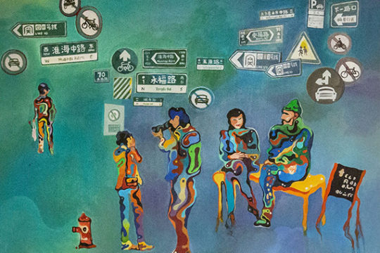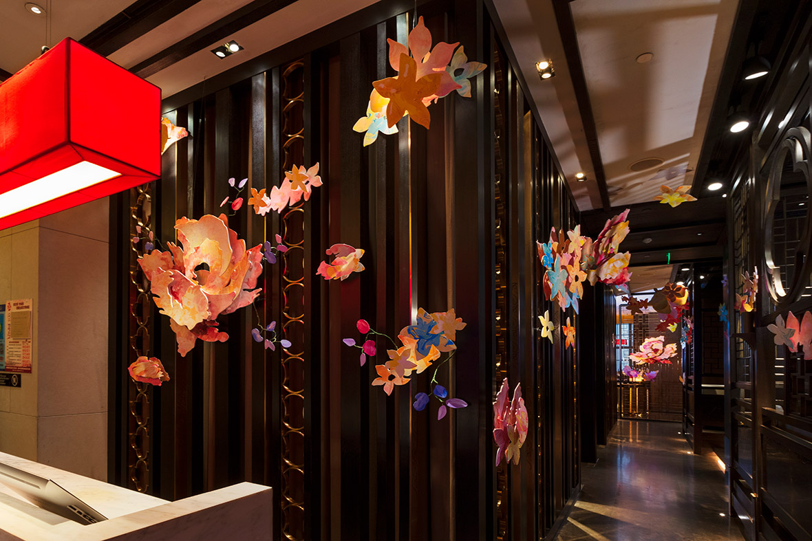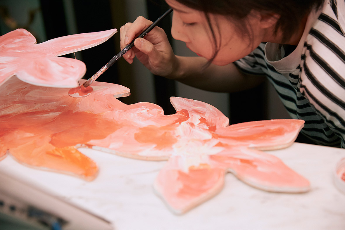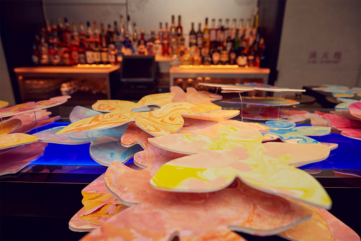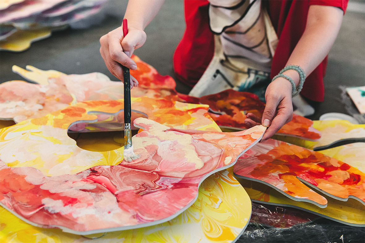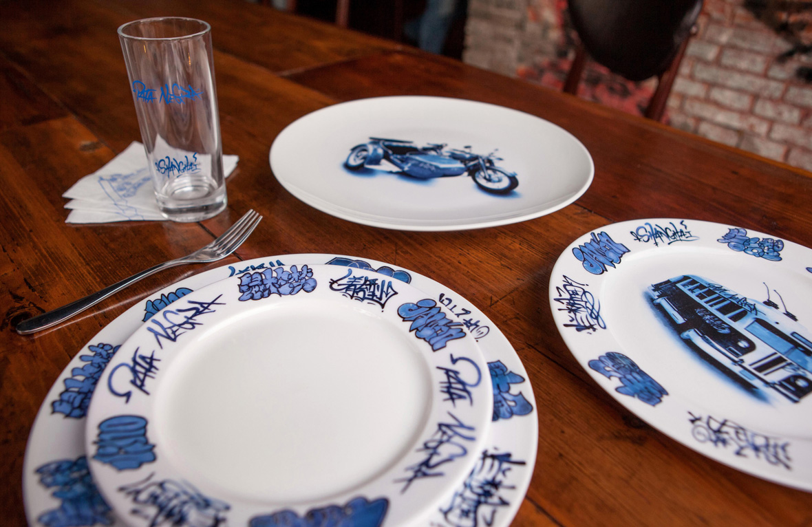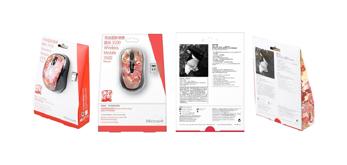
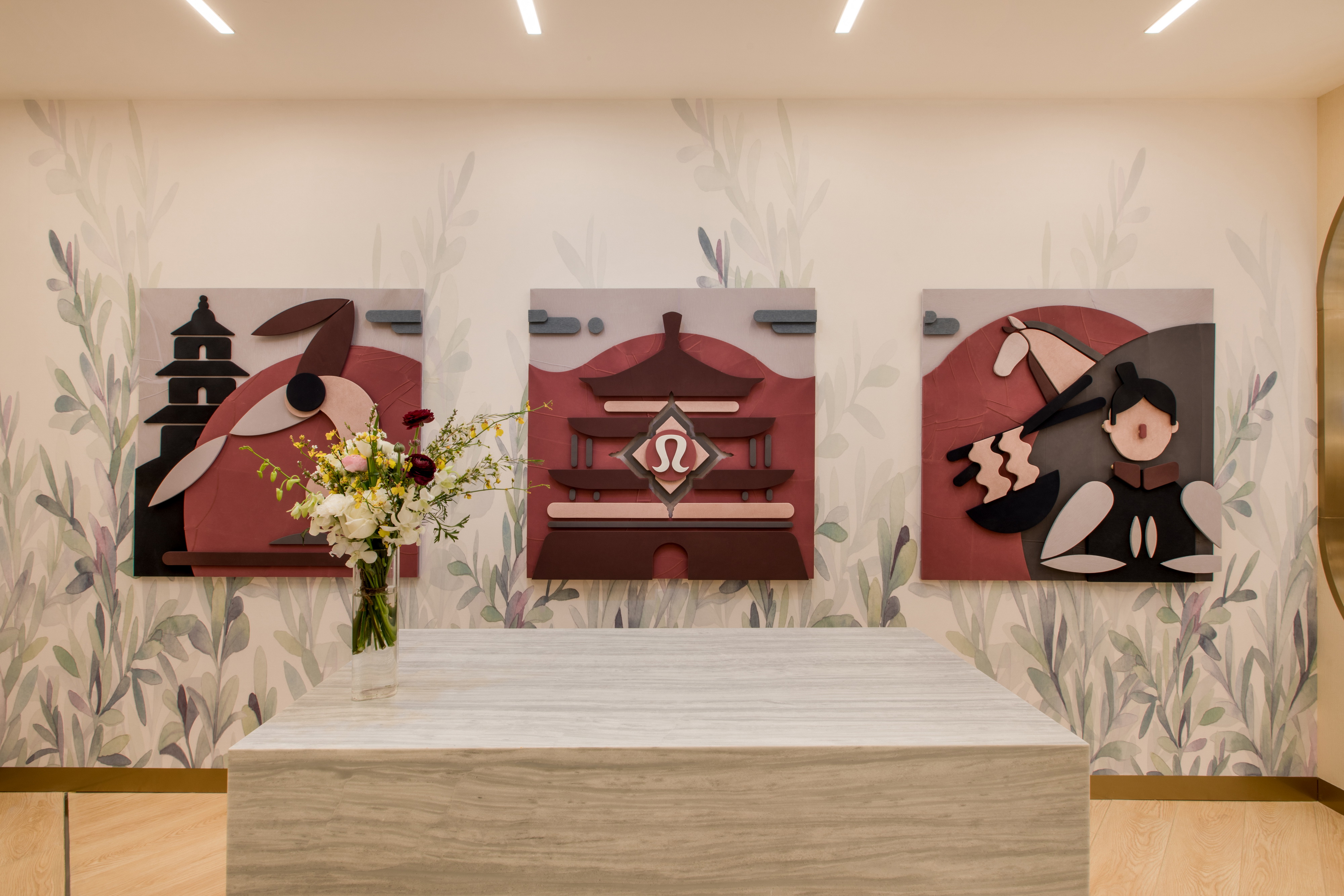
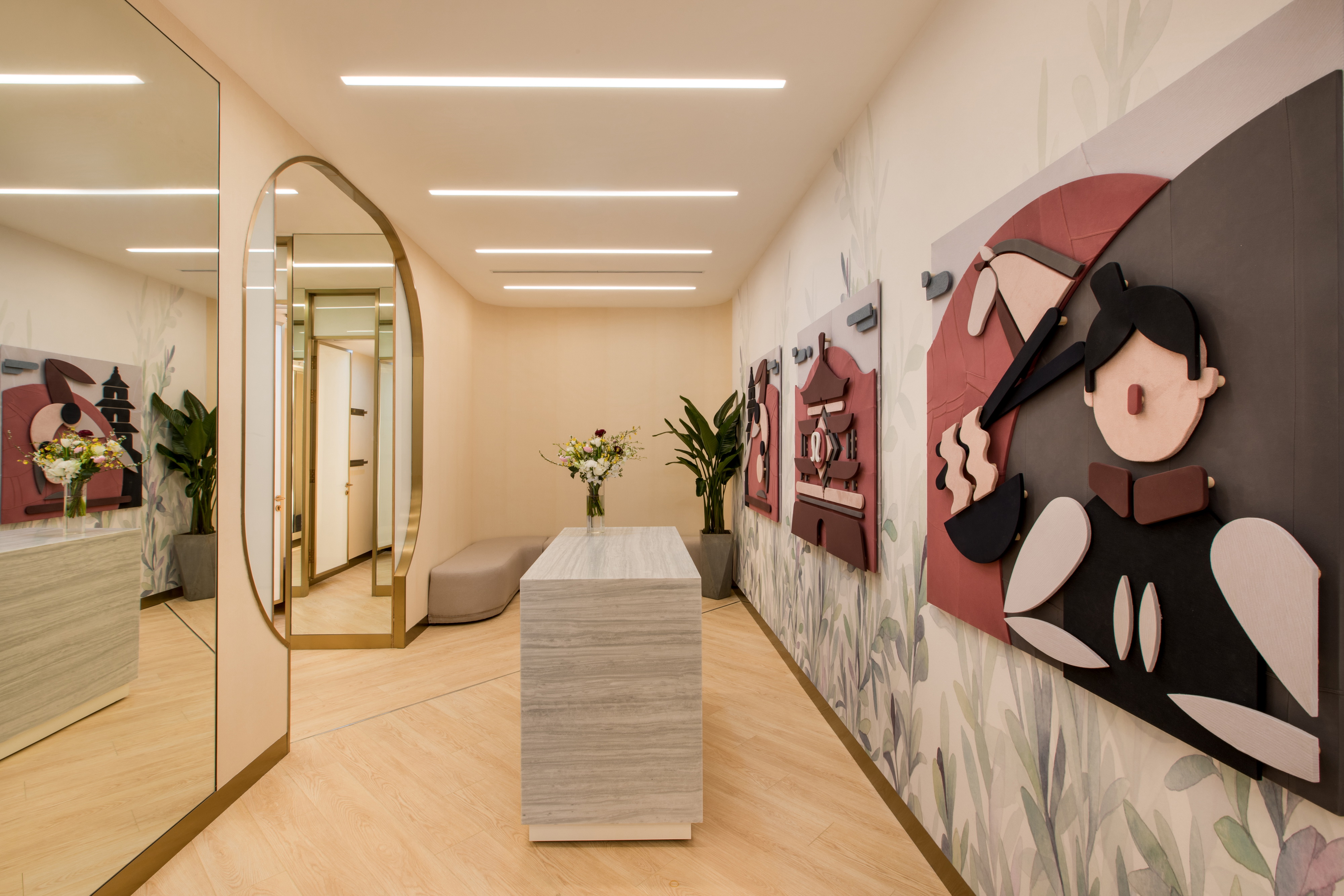
We developed a series of in-store art installations for Lululemon retail outlets throughout China (Xi’an, Chongqing, Shenzhen, Xiamen, Shanghai, Beijing, etc.)
The installations integrate local culture and storytelling with the spirit of the Lululemon brand (fun, dynamic, pioneering, active lifestyle) to present a vibrant and creative consumer experience.
我们为服装品牌Lululemon在西安、重庆、厦门、上海等新开的指定门店创作了一系列墙面装饰艺术作品。
该系列在基于品牌一直强调的乐趣、动感等特性的同时,将当地的城市文化元素巧妙的融入在这几幅作品中。
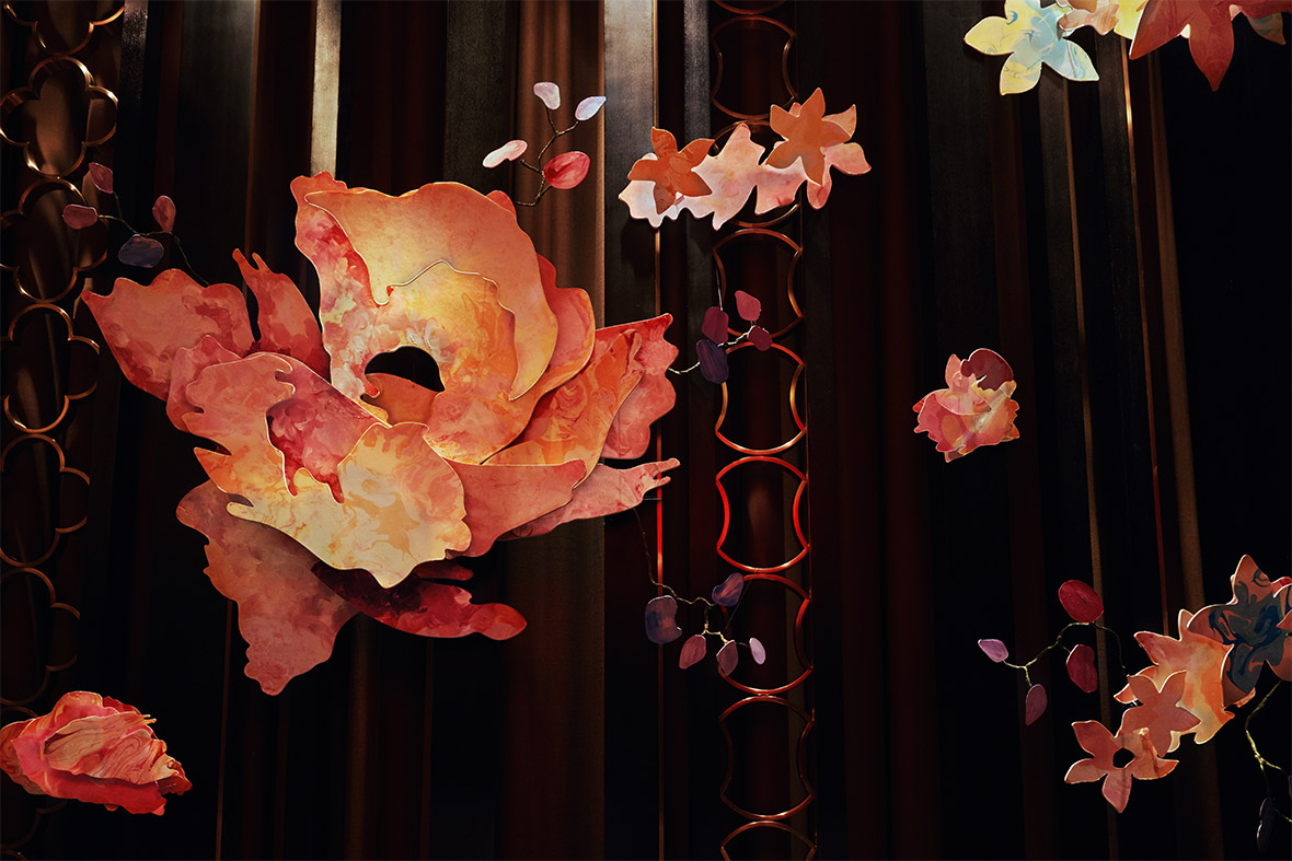
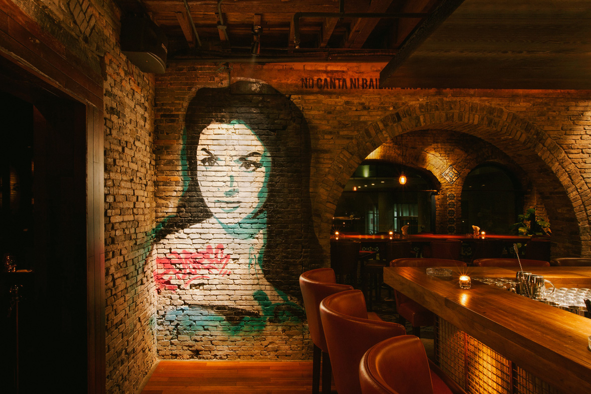
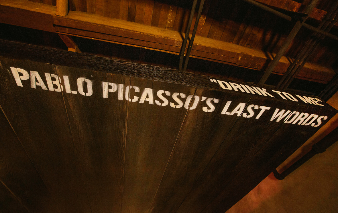
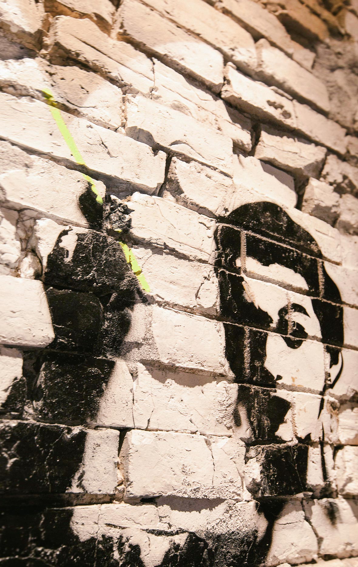
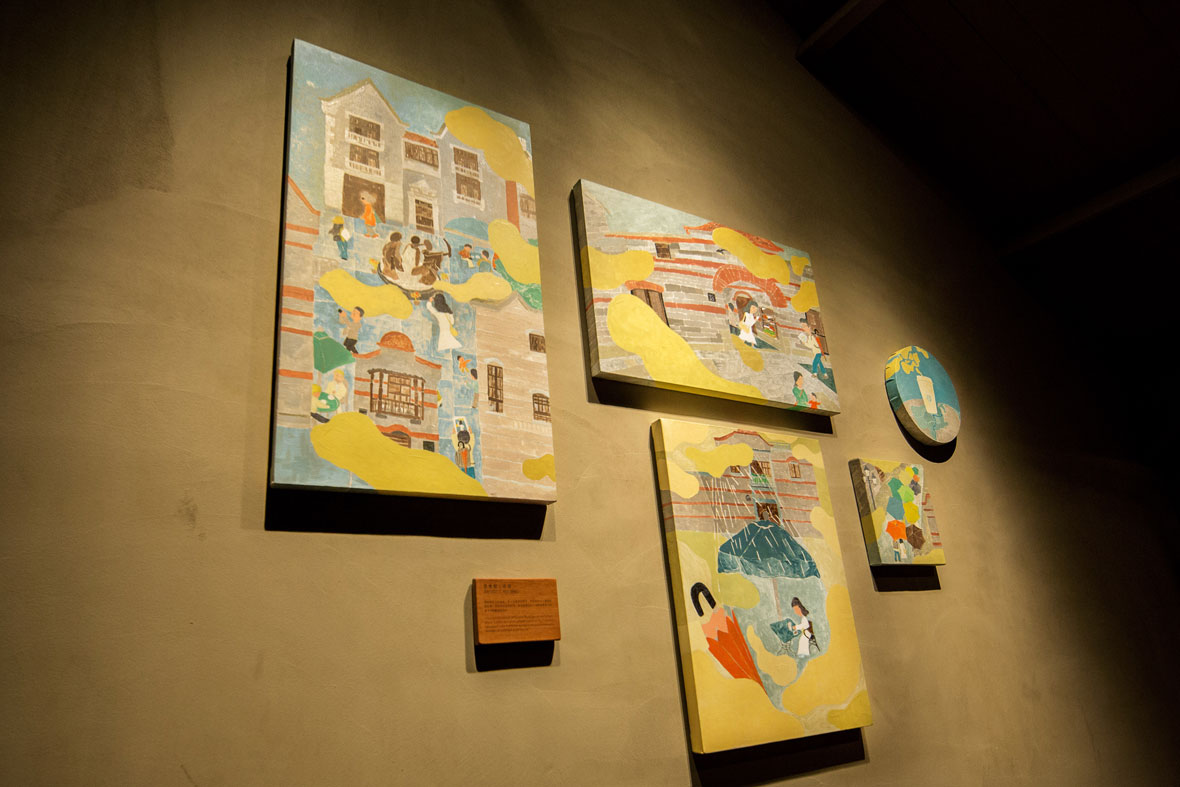
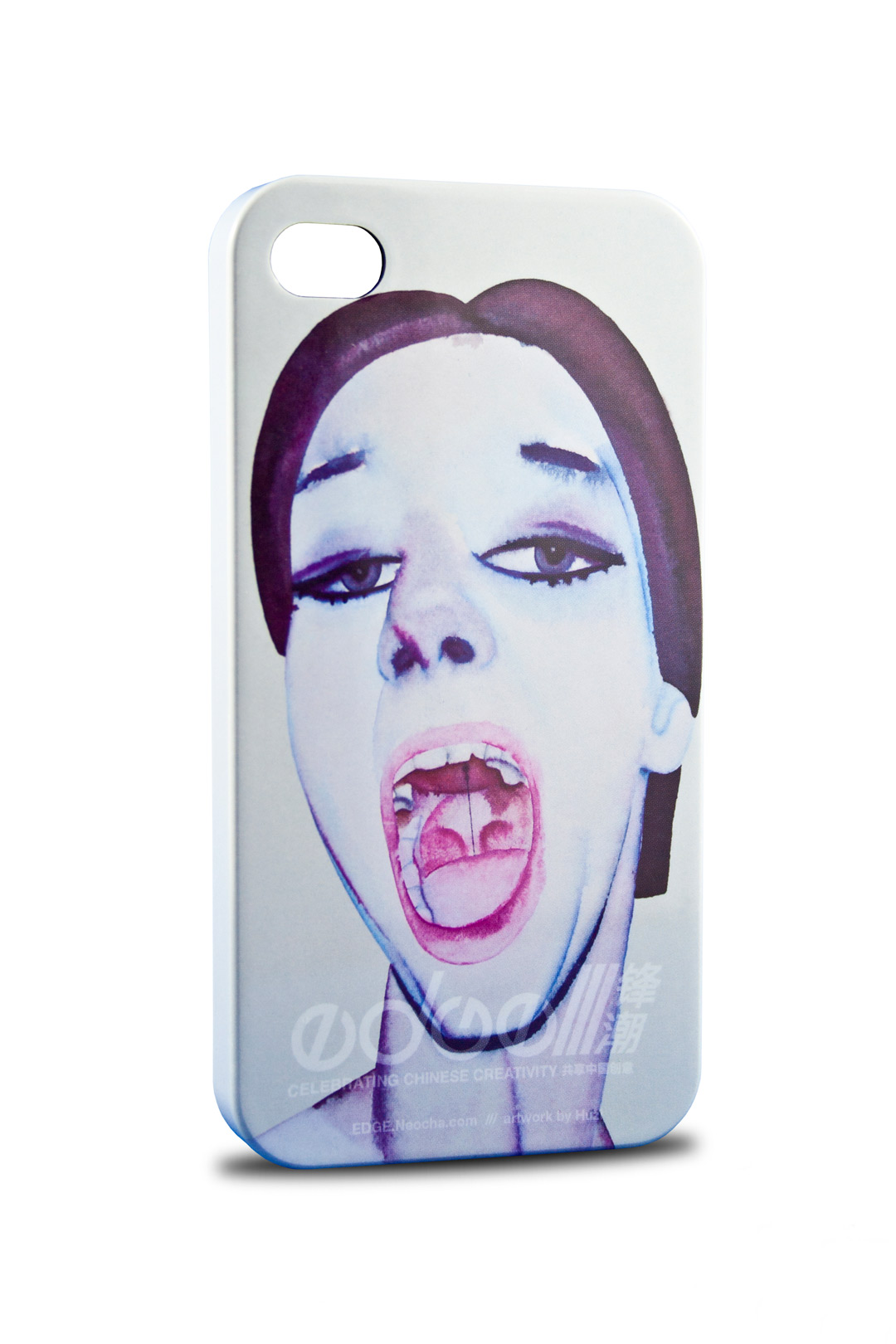
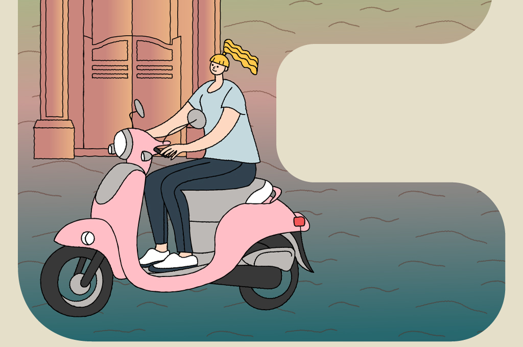
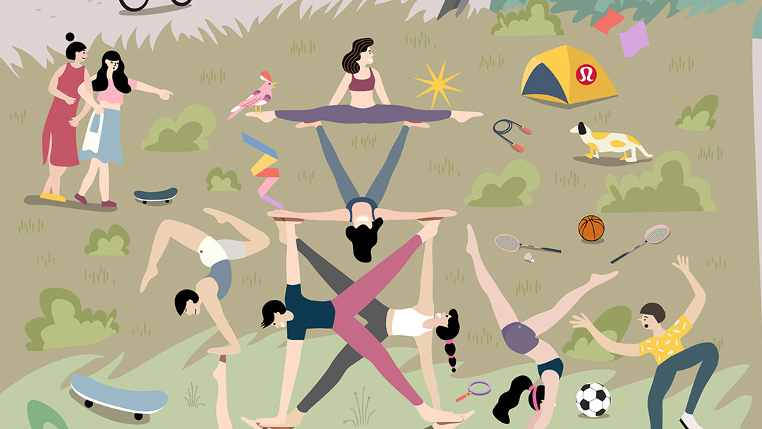
重庆 CHONGQING / Spicy Happiness

Spicy Happiness
It’s no secret that Chongqing‘ers love spicy food and hotpot. With that in mind, this artwork centers on these two quintessential elements of the Chongqing lifestyle.
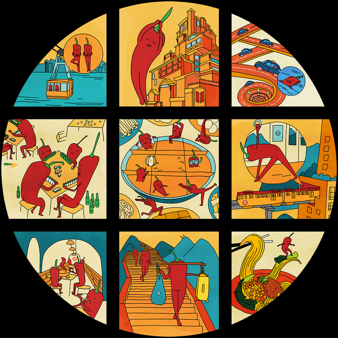
Modeled after traditional Chongqing-style hotpot, the artwork’s circular composition is divided into nine frames. In each standalone scene, a cast of humanoid hot peppers is shown going about their day.
Whether it be exercising, bonding with friends over hotpot, enjoying street food, playing mahjong, or riding on subway lines that cut through high rises, these familiar Chongqing activities are brought to life through together with the brand in our playful illustrations.
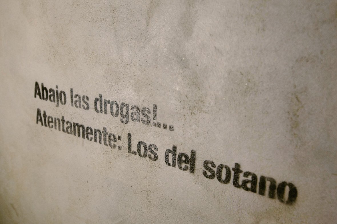
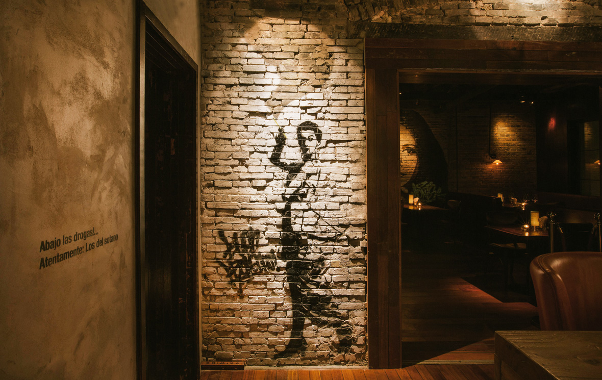
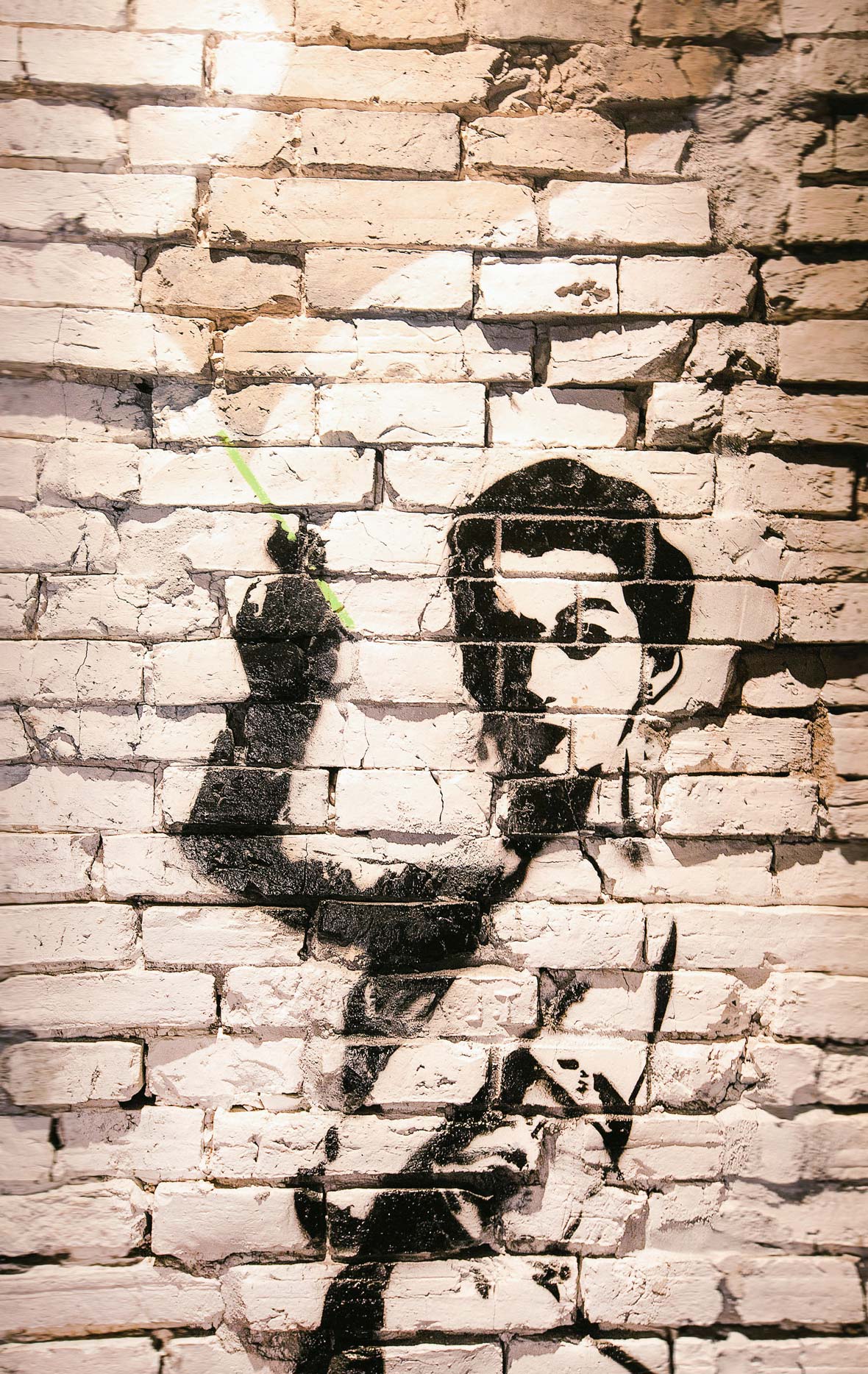
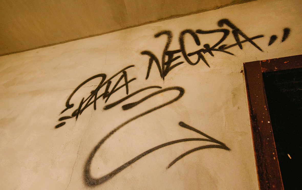
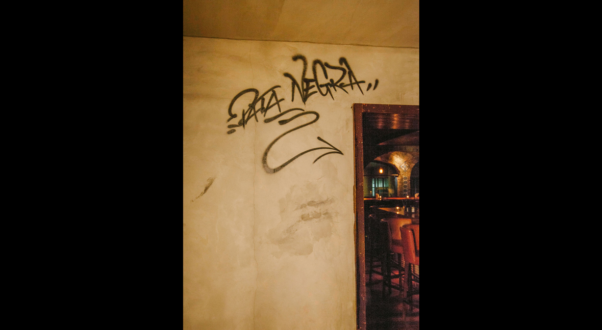
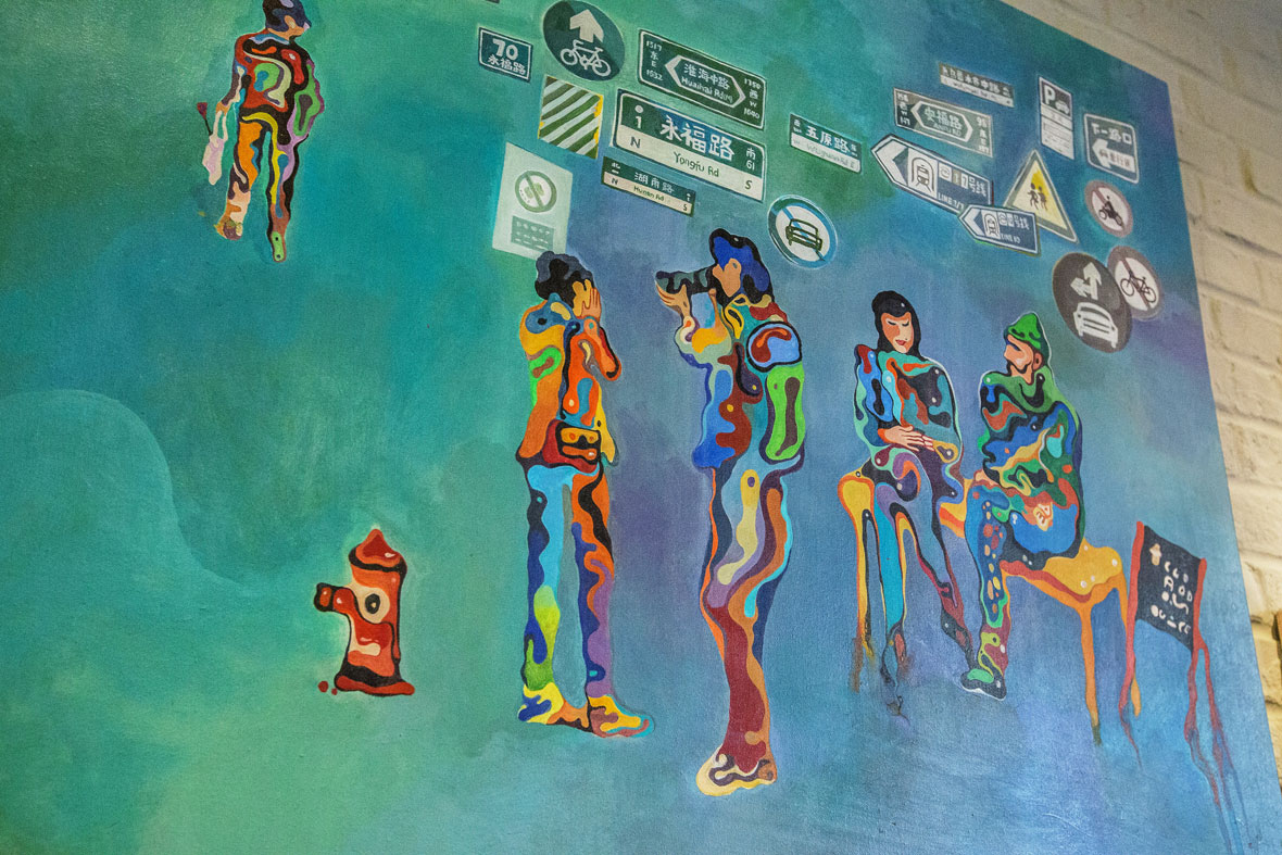
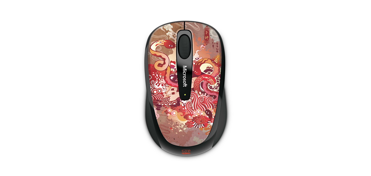
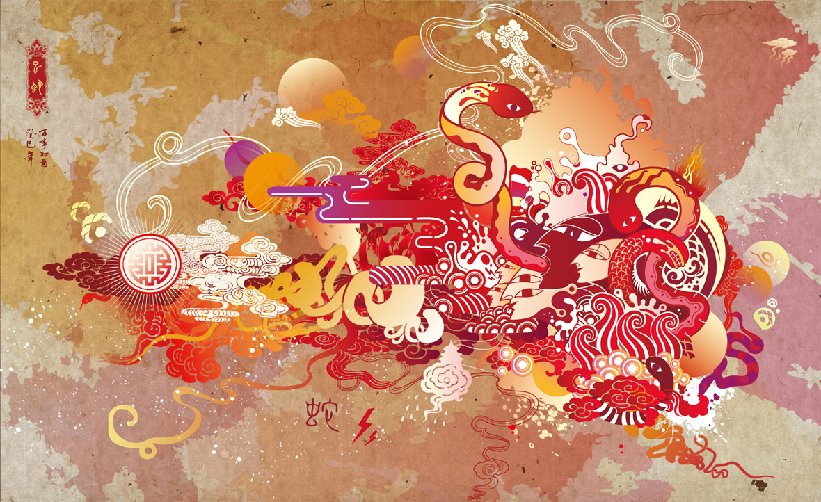
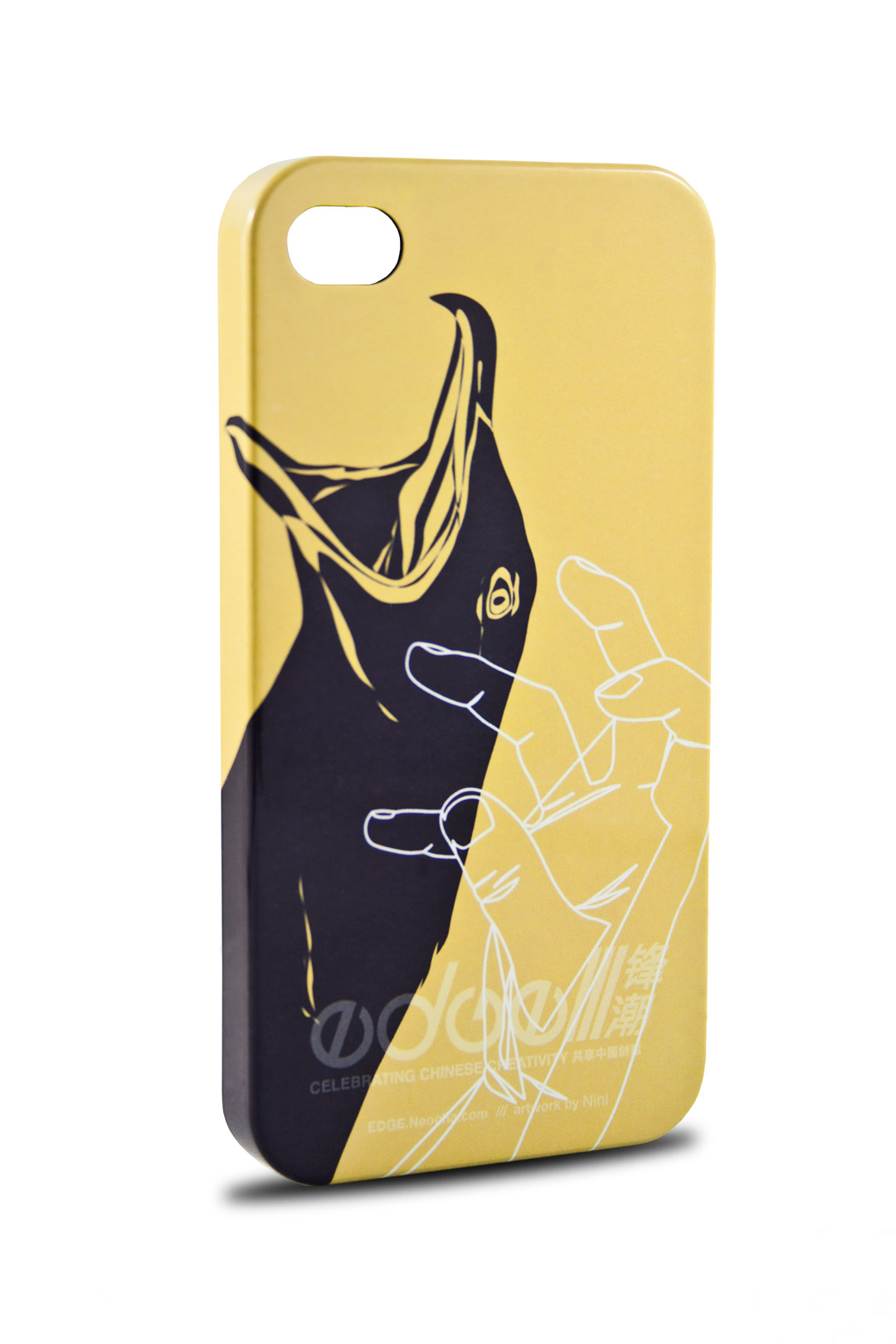
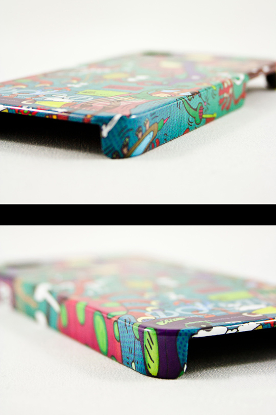
《无辣不欢》
众做周知,重庆人嗜辣,视火锅如命。
从“辣”出发,将整幅作品的外型结构以传统九宫格火锅为基底,将lululemon品牌形象拟作“辣椒人”,利用轻松幽默的插画形式展现“lululemon辣椒人”的重庆一日体验。
巧妙的将运动/吃火锅/吃串串//打麻将集结在一张完整的画面中,而重庆的地标建筑也跃然穿插于每块故事场景。
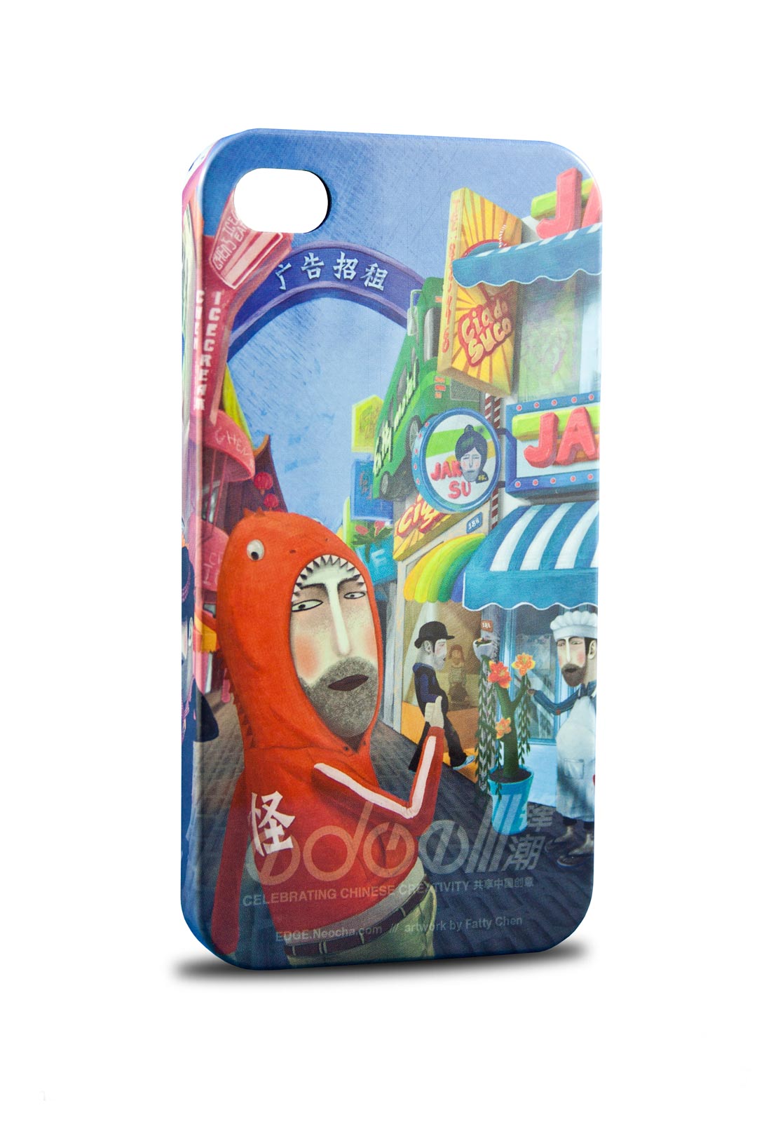
厦门 XIAMEN / City Treasures

City Treasures
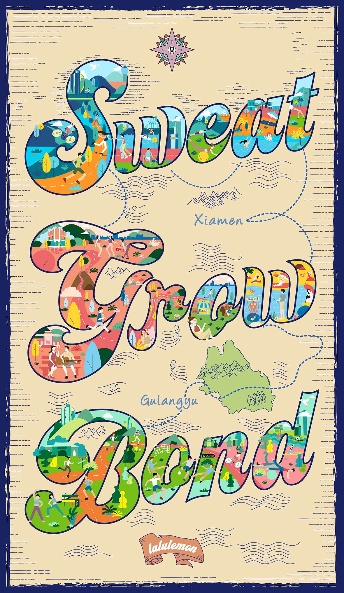
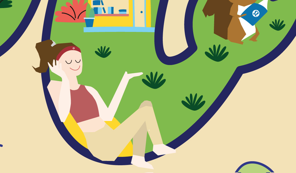
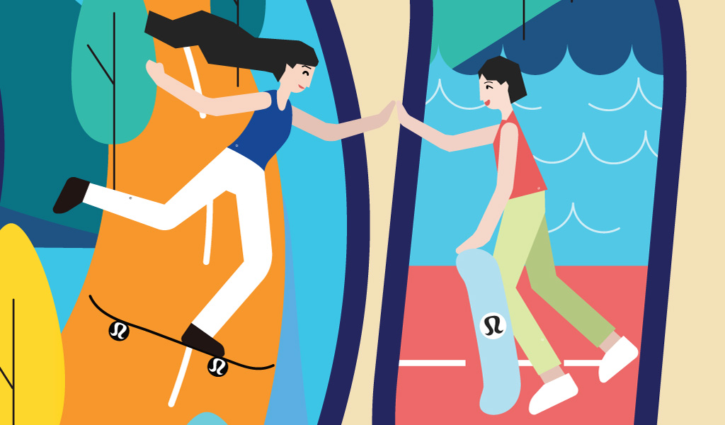
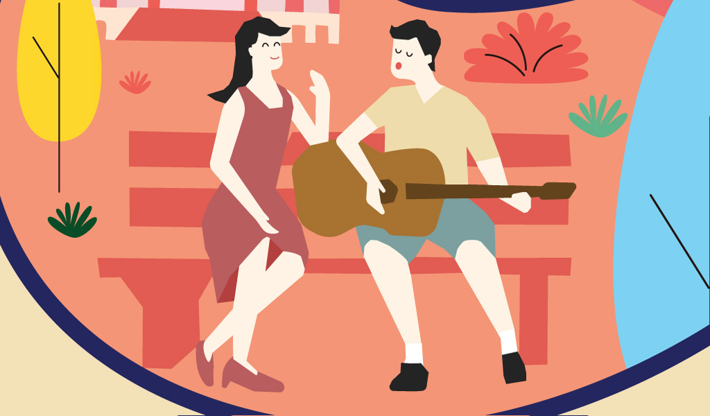
The artwork for Xiamen features Lululemon’s brand mantra of “Sweat, Grow, Bond” was reinterpreted in a type treatment designed in the likeness of a treasure map.
Housed inside the type design are illustrations depicting some of the city’s most distinctive characteristics, such as its beautiful coasts and the active, yet un-rushed, lifestyle of the locals.
The map leads consumers on a treasure hunt where they’ll discover iconic Xiamen cityscapes and Lululemon-themed easter eggs throughout.
《城市寻宝》
作品结合品牌宣言中的”Sweat, Grow, Bond”三个关键词,精心设计了一副悠闲厦门的城市寻“宝”图。
利用字母空间进行画面填充,展现出厦门靠水,有岛的地域特征以及丰富的休闲运动。
观者可跟随寻“宝”的路径,探索每个关键词中所藏匿的厦门标志建筑特色与品牌logo“彩蛋”。
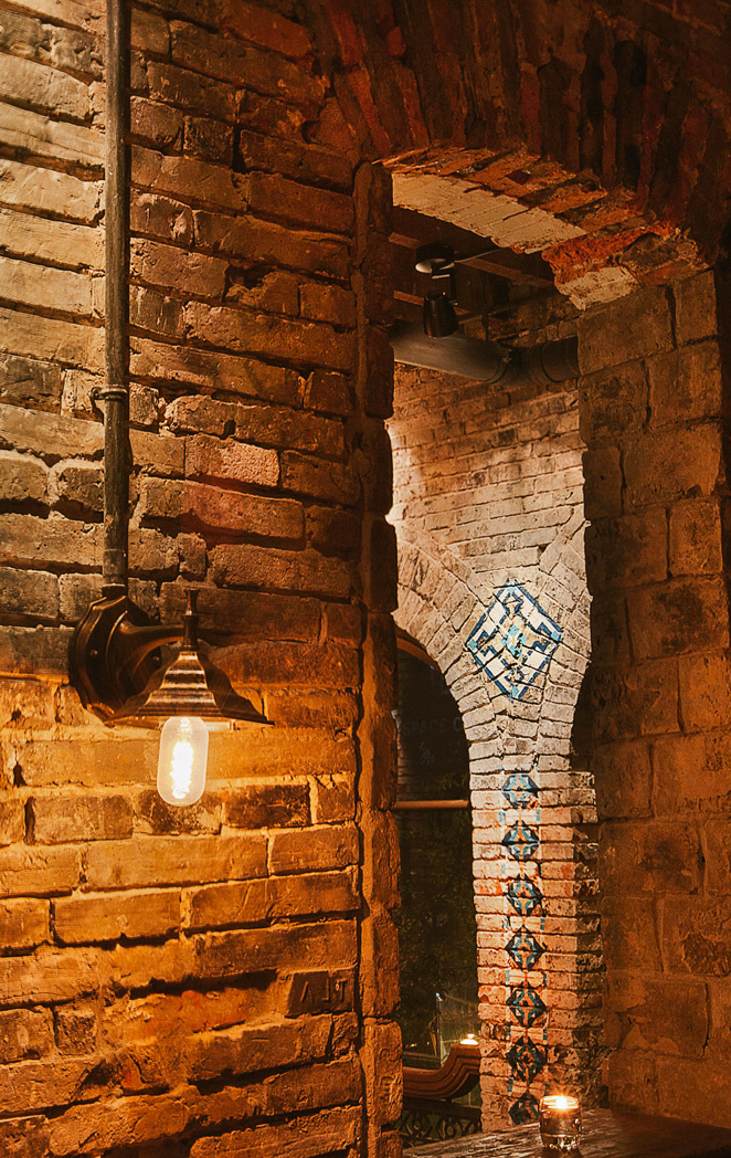
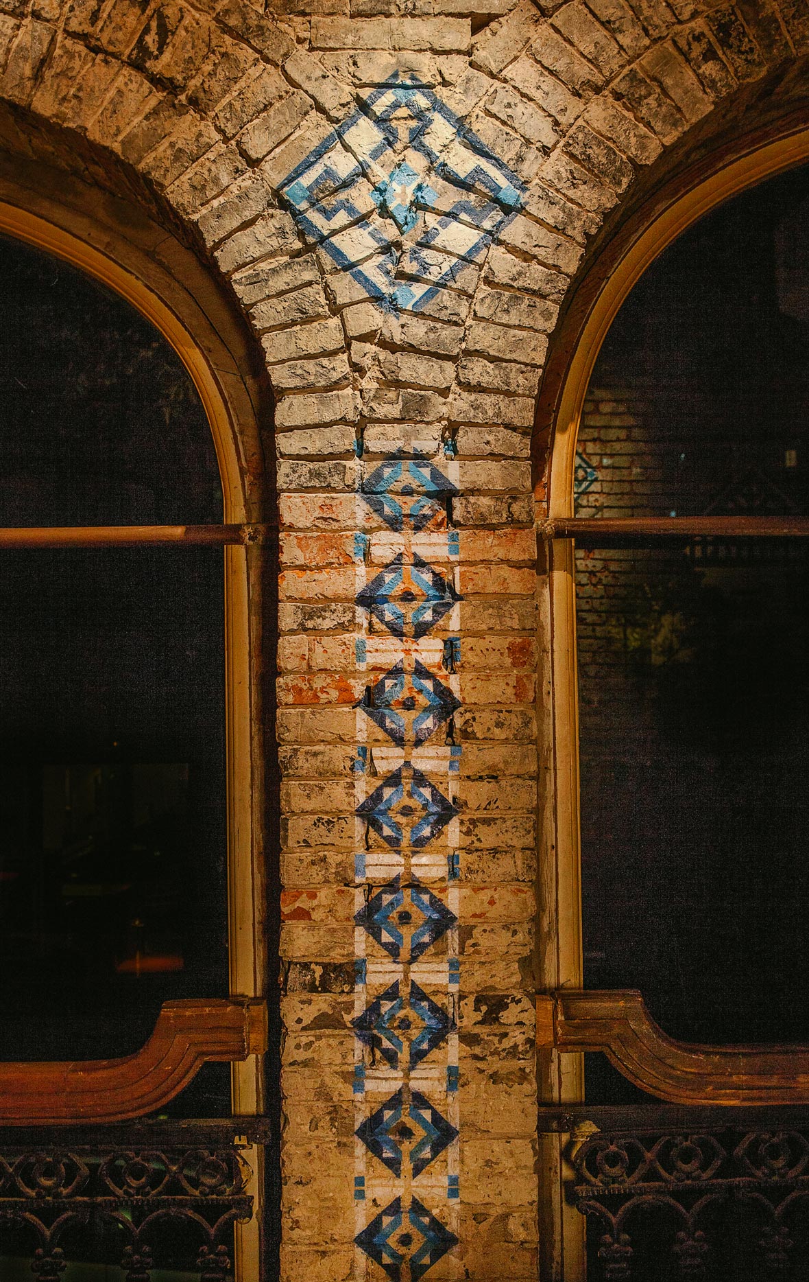
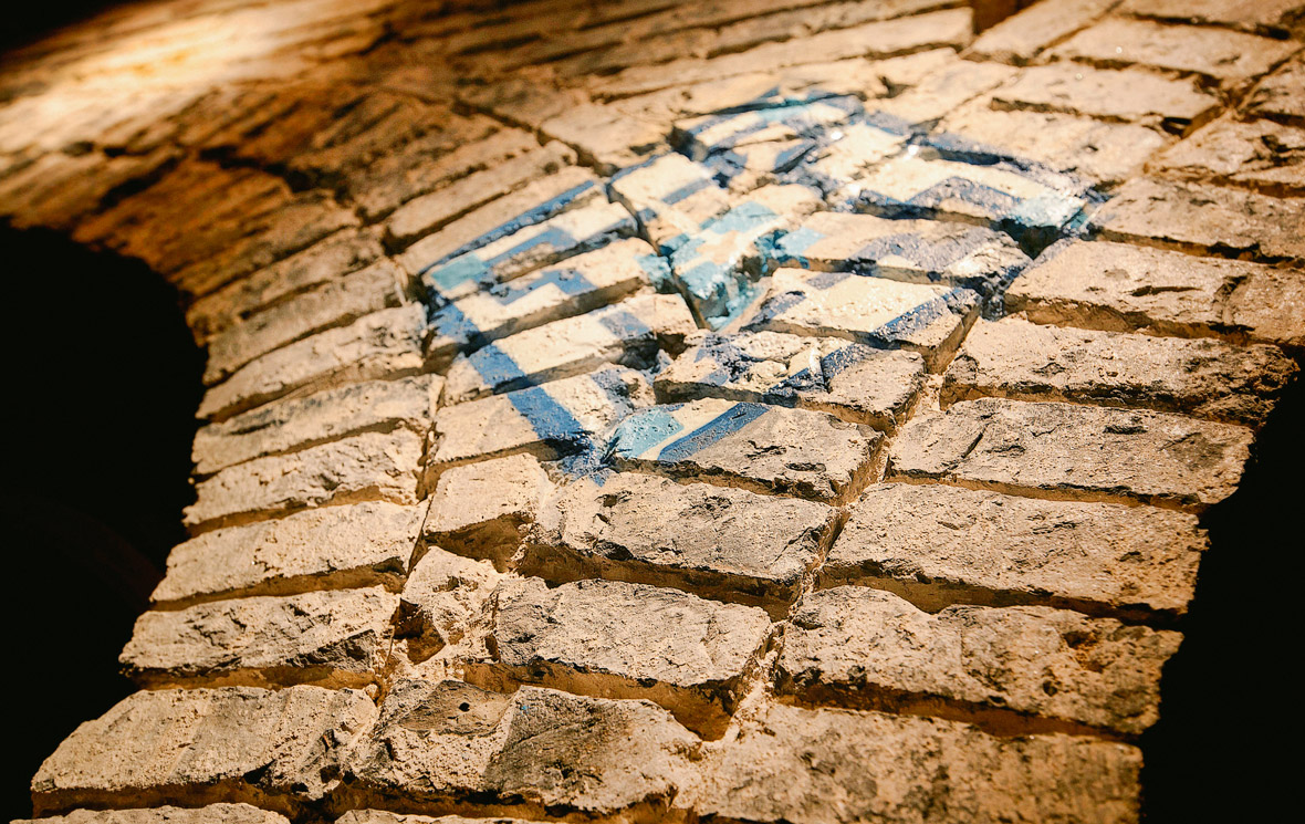
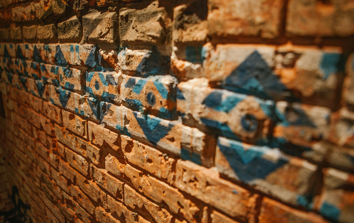
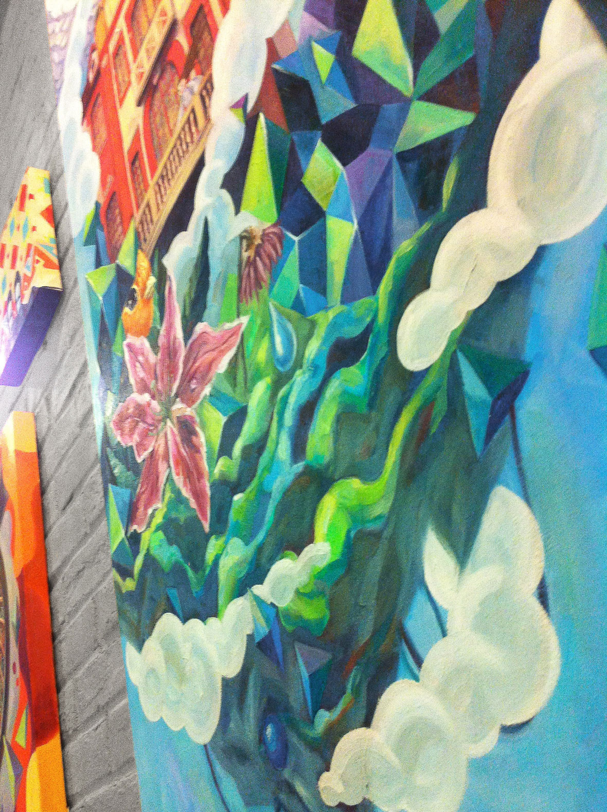
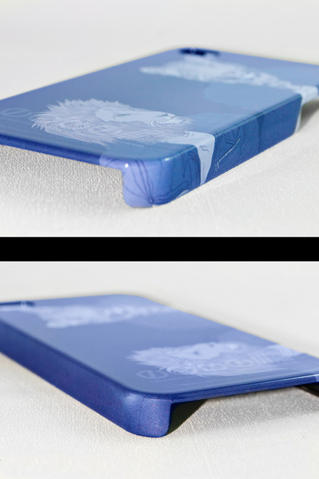
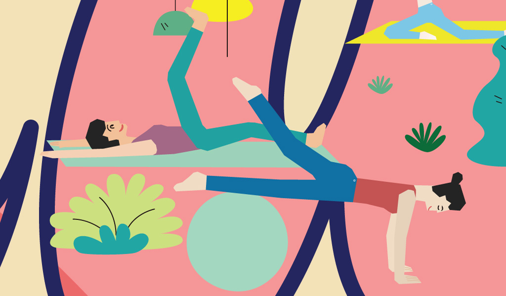
西安 XI’AN / Yoga Pagoda

Yoga Pagoda
Centered on Xi’an as an ancient capital and renowned foodie destination, this three-panel installation uses layered 3D elements and fabrics from Lululemon product to show the city from a fresh perspective.
Each design uses colors and materials from the brand’s apparel and yoga mats to evoke the historic charm of old Xi’an, featuring sites like the Wild Goose Pagoda and the Terracotta Army.
Different yoga poses give the terracotta warrior a sporty look, perfectly combining the traditional and the modern.
《瑜伽兵马俑》
以西安特色美食及古都形象为创意核心,通过3幅面料画的设计,将品牌面料特性以另一种方式表达我们眼中的西安。
每幅画由lululemon服装及瑜伽垫面料进行颜色搭配及制作,通过作品使观者畅游于西安古都历史魅力之处,从大雁塔到兵马俑。
多变的瑜伽动作让兵马俑的形象更为灵动,全然体现了现代与传统的完美结合。
深圳 SHENZHEN / Hi-Tech Urban Explorations
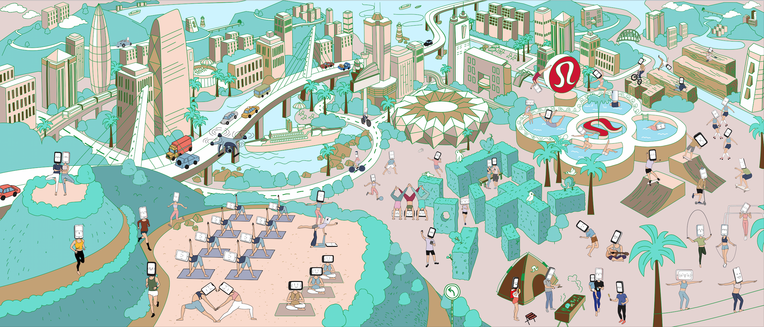
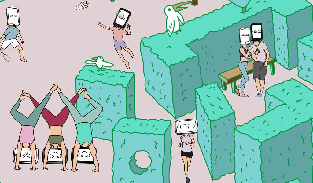
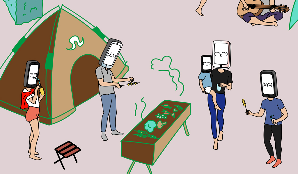
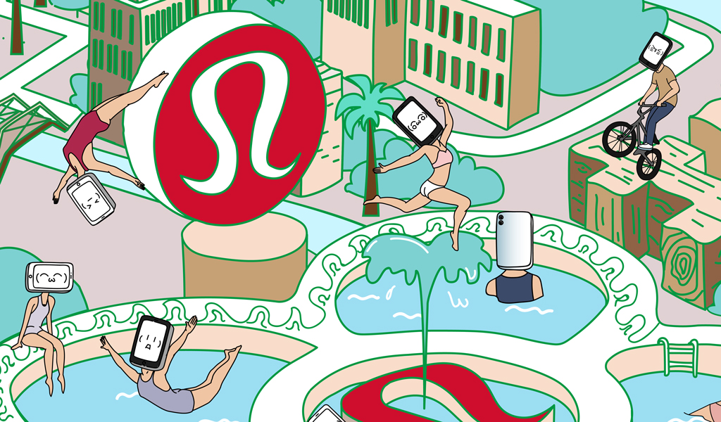
Hi-Tech Urban Explorations
Shenzhen is the heart of China’s electronics industry, as such, for this design we created a series of “Screenhead” characters to encourage people to put down their devices, head outdoors, and work up a sweat.
In a city panorama surrounded by green mountains, this installation shows the Screenhead characters in Lululemon apparel engaged in healthy lifestyle activities like yoga, biking, jogging, and skipping rope.
Brand elements and everyday details from Shenzhen are interspersed throughout, showing the spirit of Lululemon and the fun of getting out into the city.
《悠游数码城》
深圳是中国的数码产品生产中心,由此衍射出“手机人”的概念,以提醒大家应该适时的放下手中的数码产品出来多多做一些出汗运动。
作品以绿植环绕中深圳城市景观为基底。“手机人”与Lululemon独特的健康运动元素结合构成一幅栩栩如生的景象,运动内容如:瑜伽,自行车,跑步,跳绳等。
在细枝末节处穿插品牌元素及深圳日常生活元素,展现Lululemon的品牌精神和与城市融合的趣味性。
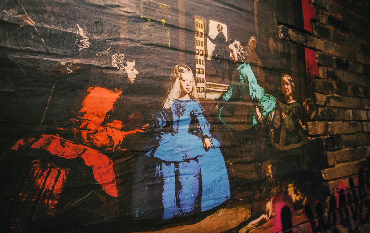
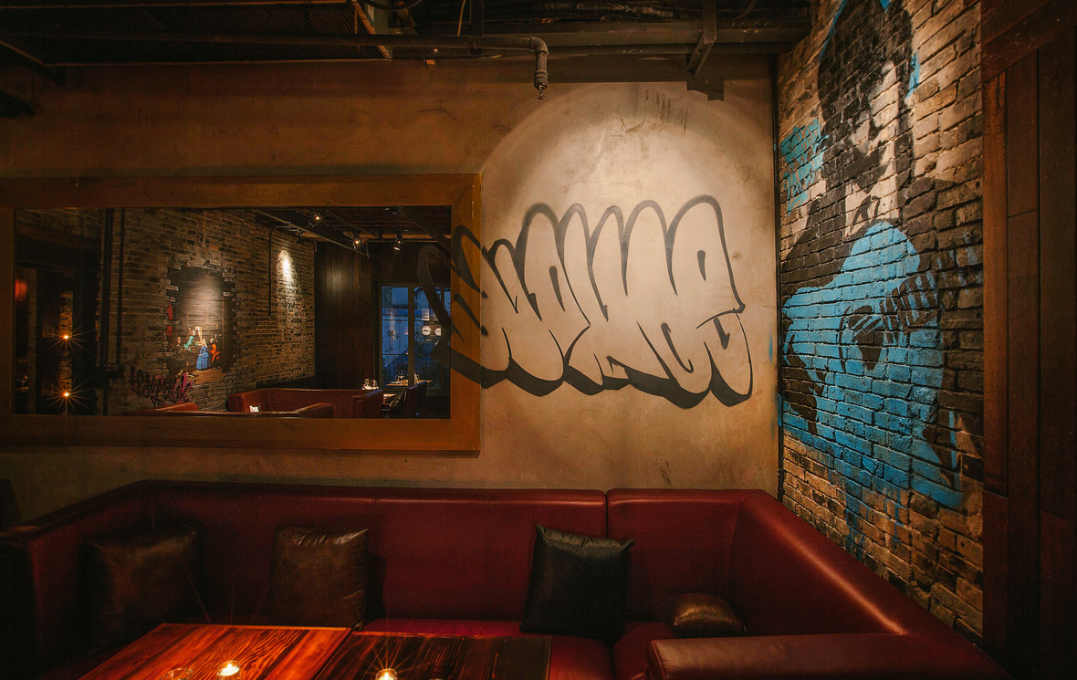
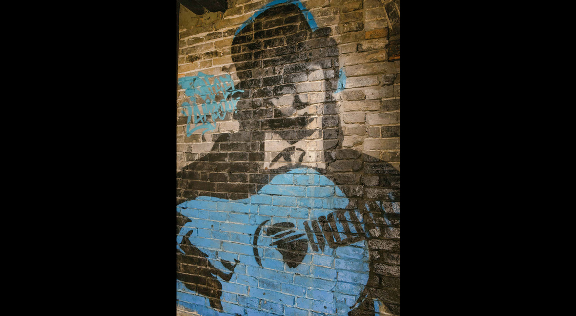
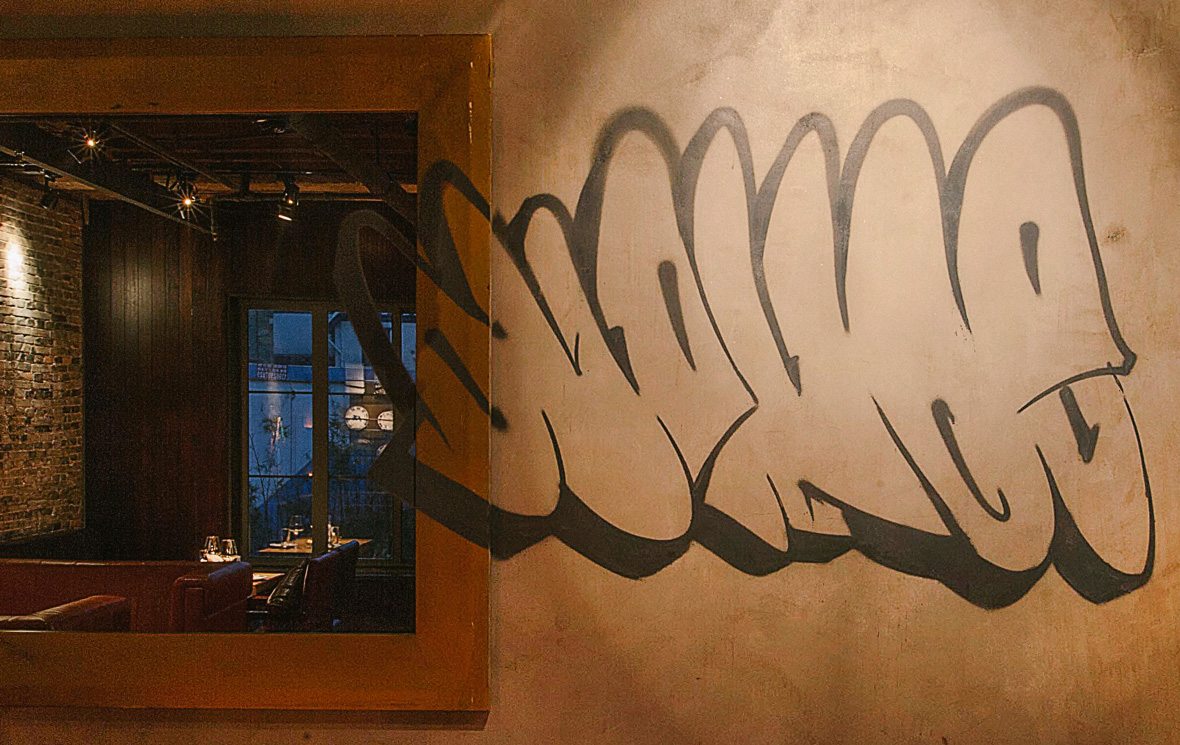
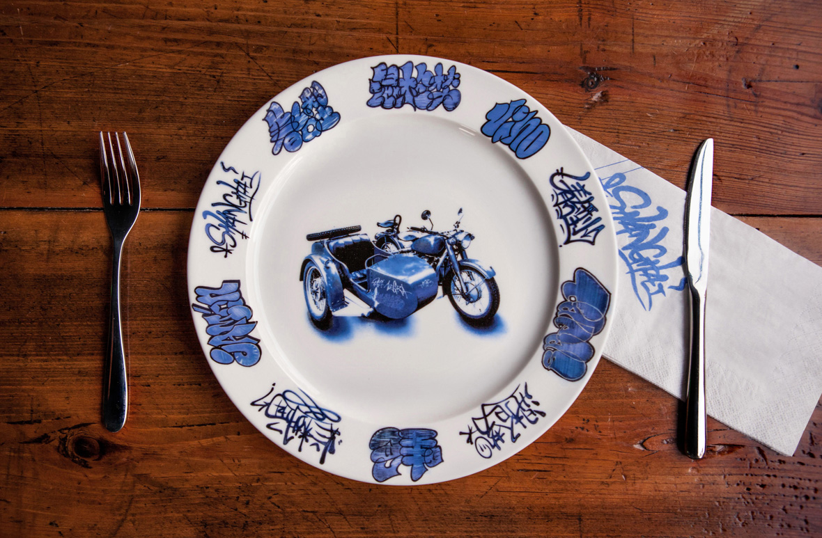
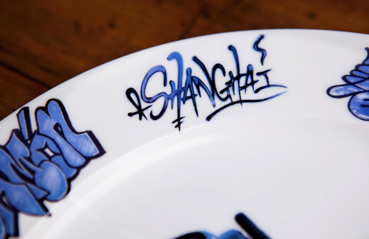
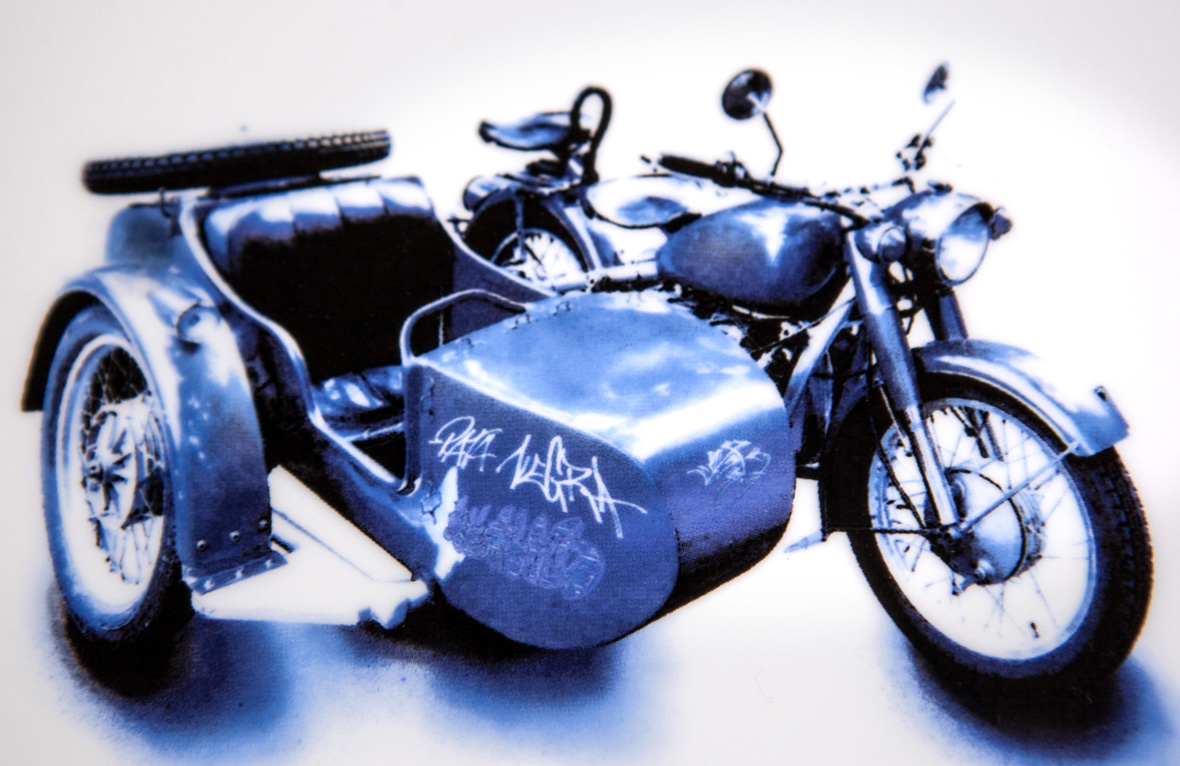
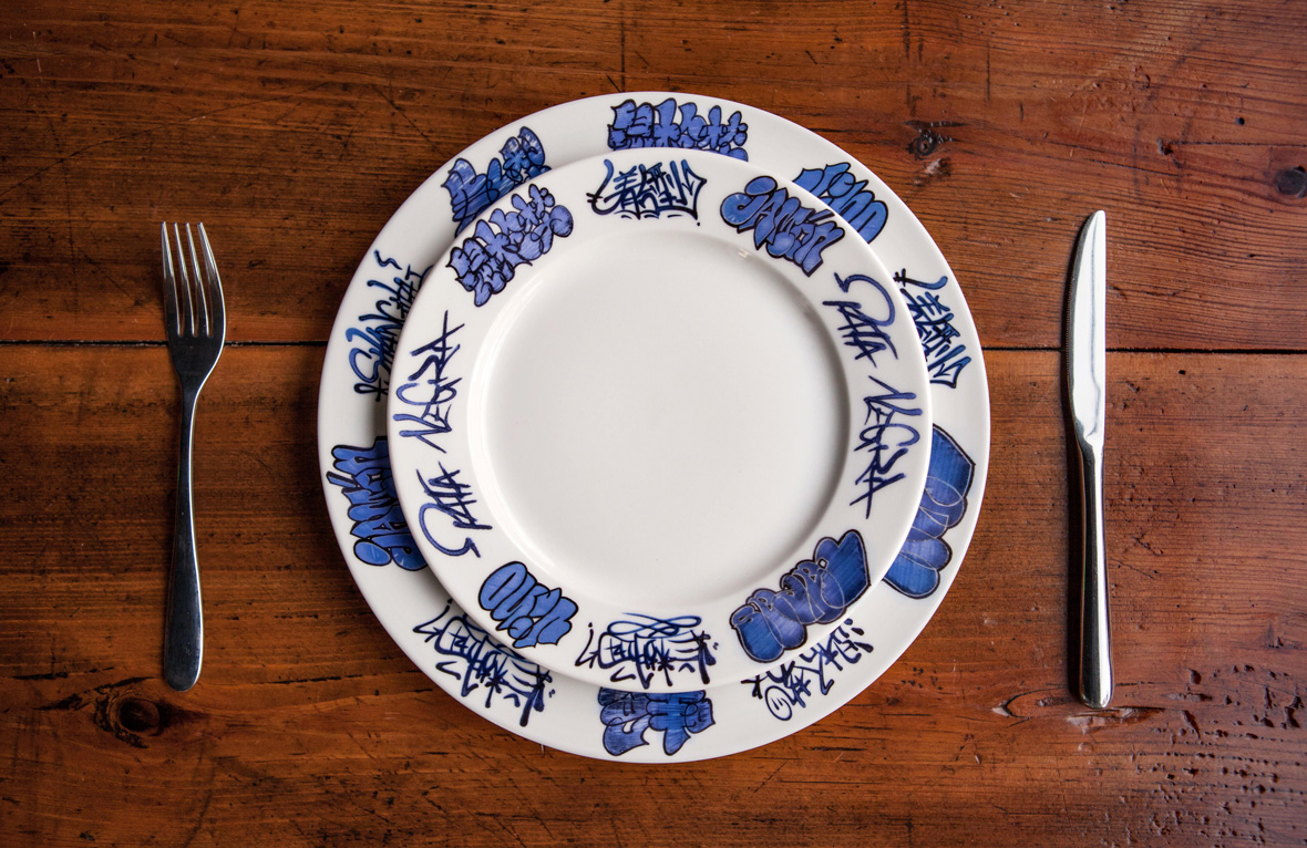
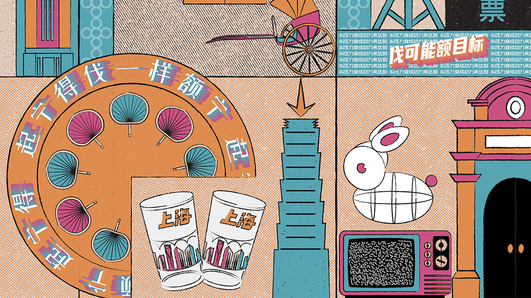
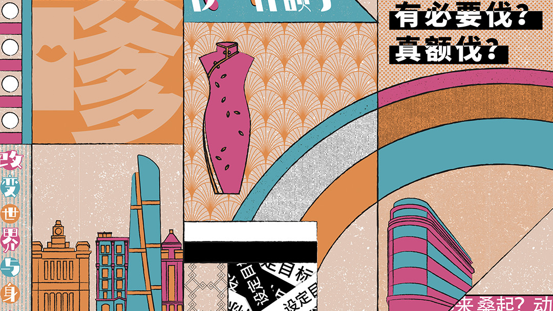
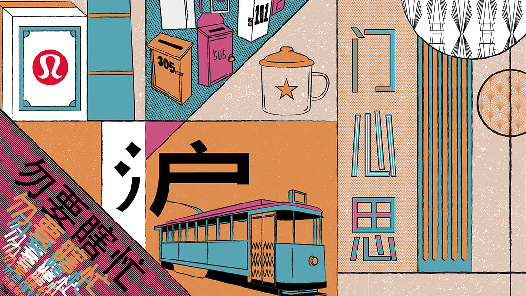
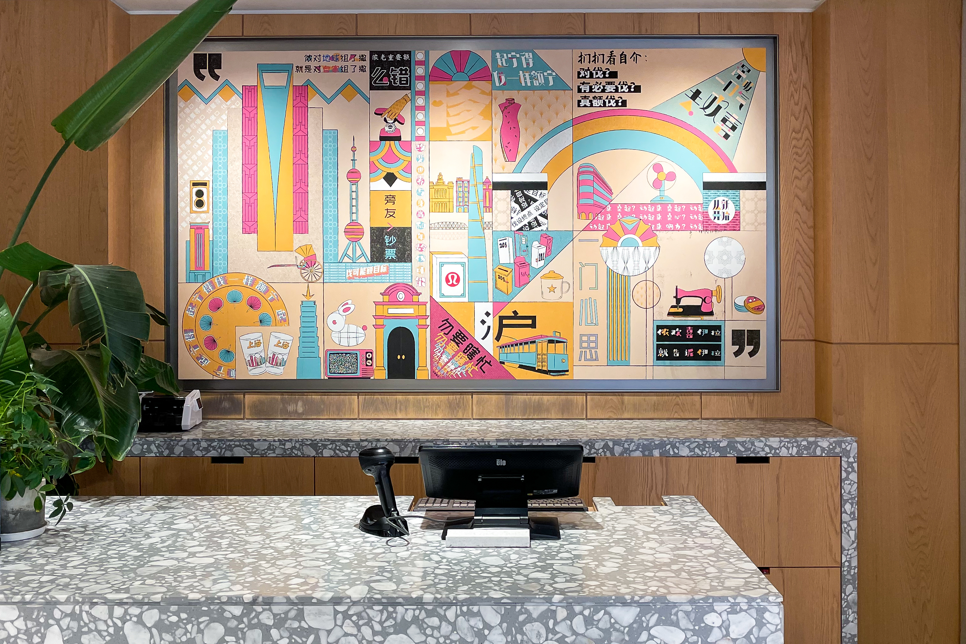
上海七宝 SHANGHAI QIBAO / Multiverse


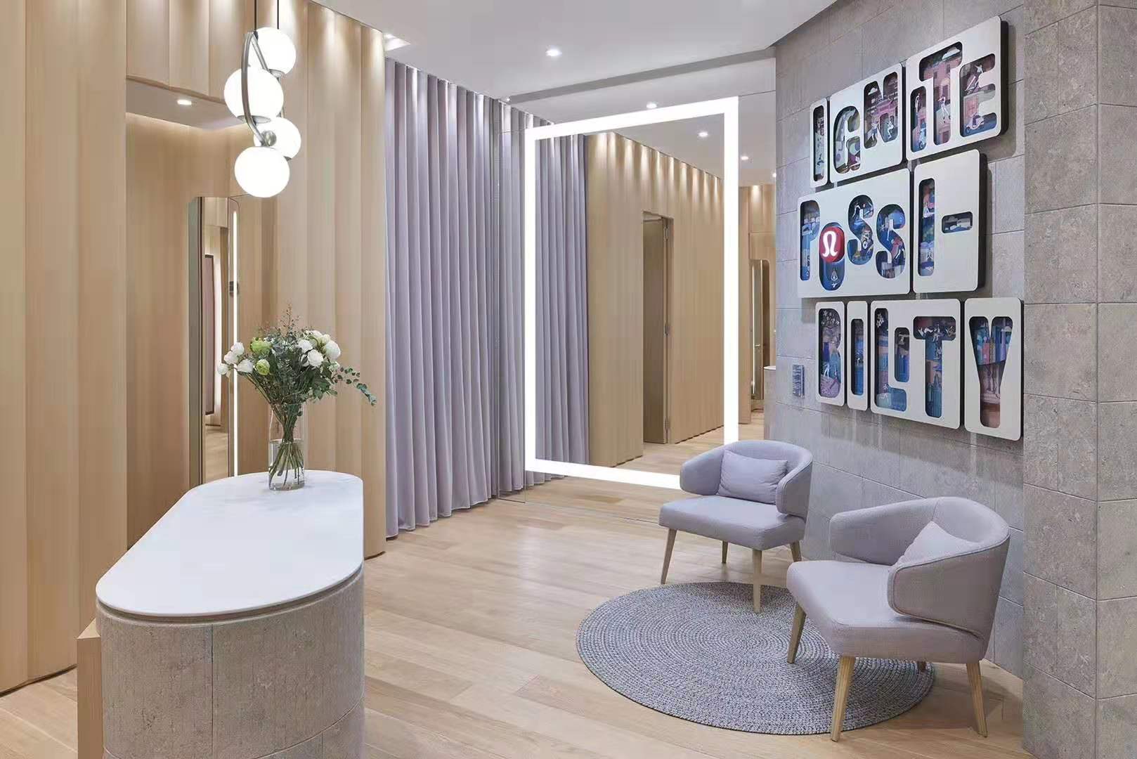
Multiverse
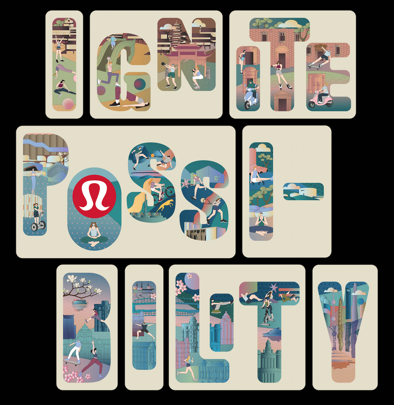
Inspired by the tagline “Ignite Possibility,” we’ve created an art installation that uses layered elements, staggered placement, and masked alphabet letters in an imaginative type design.
Within each letter, viewers are given a glimpse into the whimsical universe of Lululemon, a world populated by sports lovers and active lifestyle enthusiasts.
The bottom and middle row depict familiar modern Shanghai landmarks and surrounding areas while the top row features the nearby ancient town of Qibao (where the store is located). With this installation, we pay homage to the active lifestyle long celebrated by Lululemon and Shanghai residents alike.
《次元》
利用lululemon英文品牌宣言中的”Ignite Possibility”为设计圆心。
通过不规则排列及表层镂空再叠加多层的艺术手法,让整个艺术作品更富有想象力,打造出一个lululemon的次元空间。
从一层字体延伸至二层的lululemon运动小人再进入第三层的上海城市与七宝古镇,层层推进,将观者带入一个生动且极具趣味的世界,同时也体现出lululemon所强调的生活方式和运动精神。
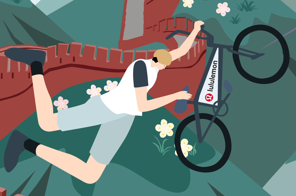
北京 BEIJING / Winter Games
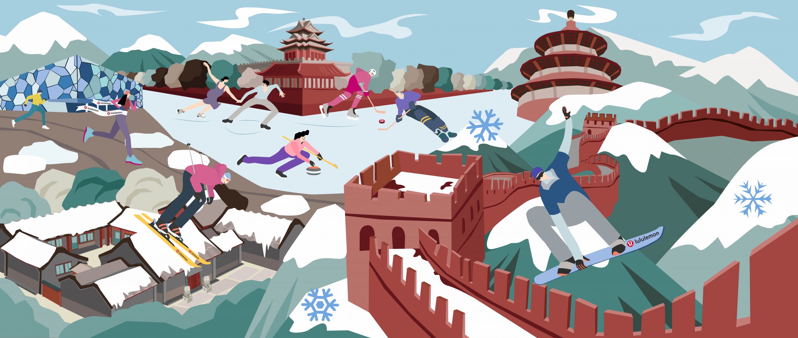
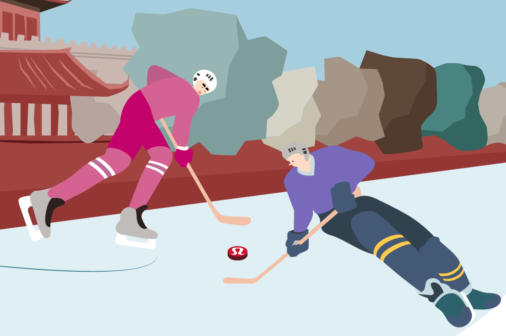
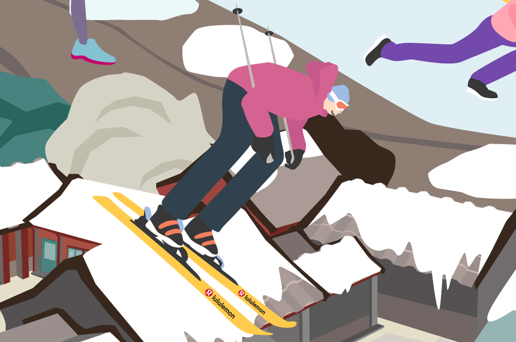
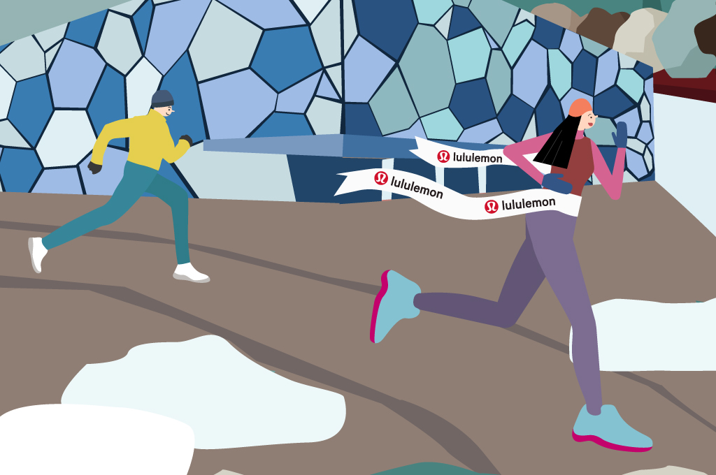
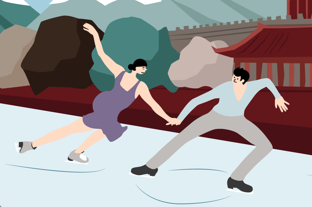
Winter Games
Inspired by the 2022 Beijing Winter Olympics, this imaginative design spotlights iconic architecture in the Chinese capital and a cast of winter athletes. The installation communicates the competitive spirit that sports enthusiasts can expect to see out of the ancient city in the forthcoming Games. Further, the in-store execution of the artwork is layered with several elements mechanically animated bringing alive the athletes throughout the composition.
Fun details are sprinkled throughout the composition: a snowboarder can be seen catching air over the Great Wall, a free climber is scaling the Temple of Heaven, while a skier speeds down the snow-covered roof of a traditional siheyuan. In the upper section, the moat surrounding the Forbidden City is shown frozen over, turning into an ice rink for figure skaters and hockey players. Beijing’s National Aquatic Center—the venue set to host the Winter Games—also appears in frame, teasing the upcoming competitions. All these elements come together to celebrate Beijing as the first-ever city to host both the Summer and Winter Games.
《冬运会》
受2020北京冬季奥运会的启发,该作品中将极具北京特色及代表性的建筑及景观与冬季运动相融合,用插画语言传达了将各项冬季运动以及夸张且富冲击力的画风表现在整个装置作品中,运动和建筑巧妙交织在一起,体现出北京皇城根下的冬季奥运竞技精神。此外,店铺橱窗所陈列的作品中的一些运动元素通过机械运动的形式进行了更有互动性的展示,让运动员在整个作品中更充满活力。
细细品味作品,你会发现画面中有滑雪的人越过在长城、攀岩者出现在天坛、四合院的屋顶也成为滑雪斜坡、角楼前的湖水结冰后成为冰上运动爱好者的乐园。同时,画面中的水立方也体现出现代代奥林匹克精神,预示着北京即将成为第一个举办过夏季奥运会和冬季奥运会的城市。
北京 BEIJING / Summer Games
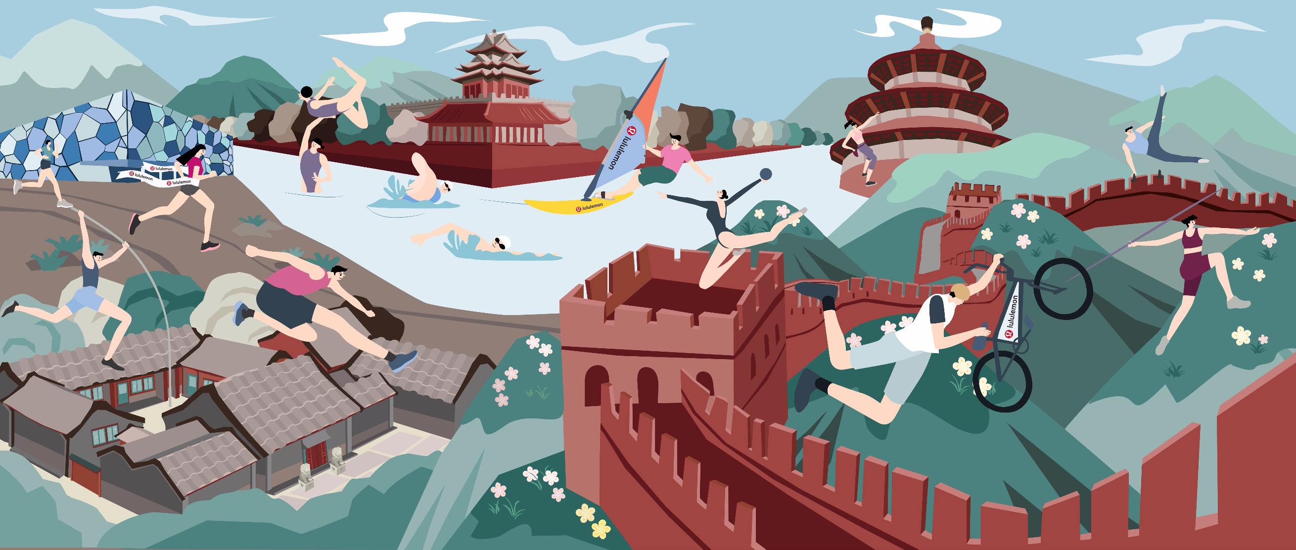
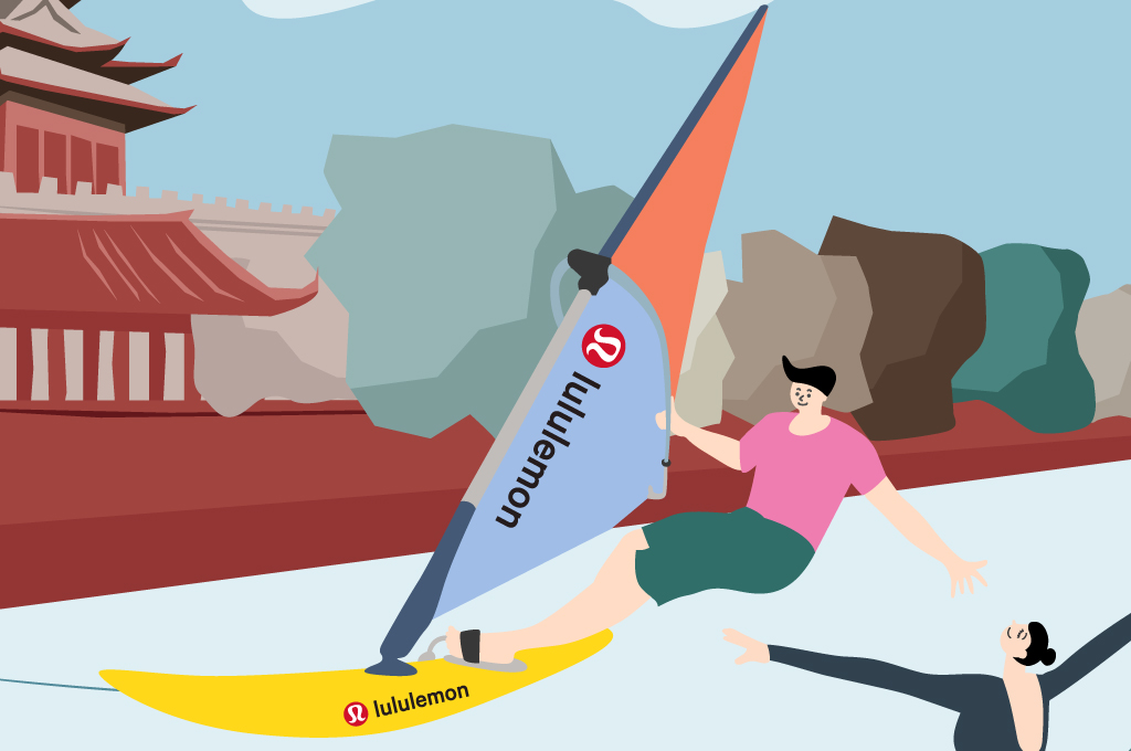

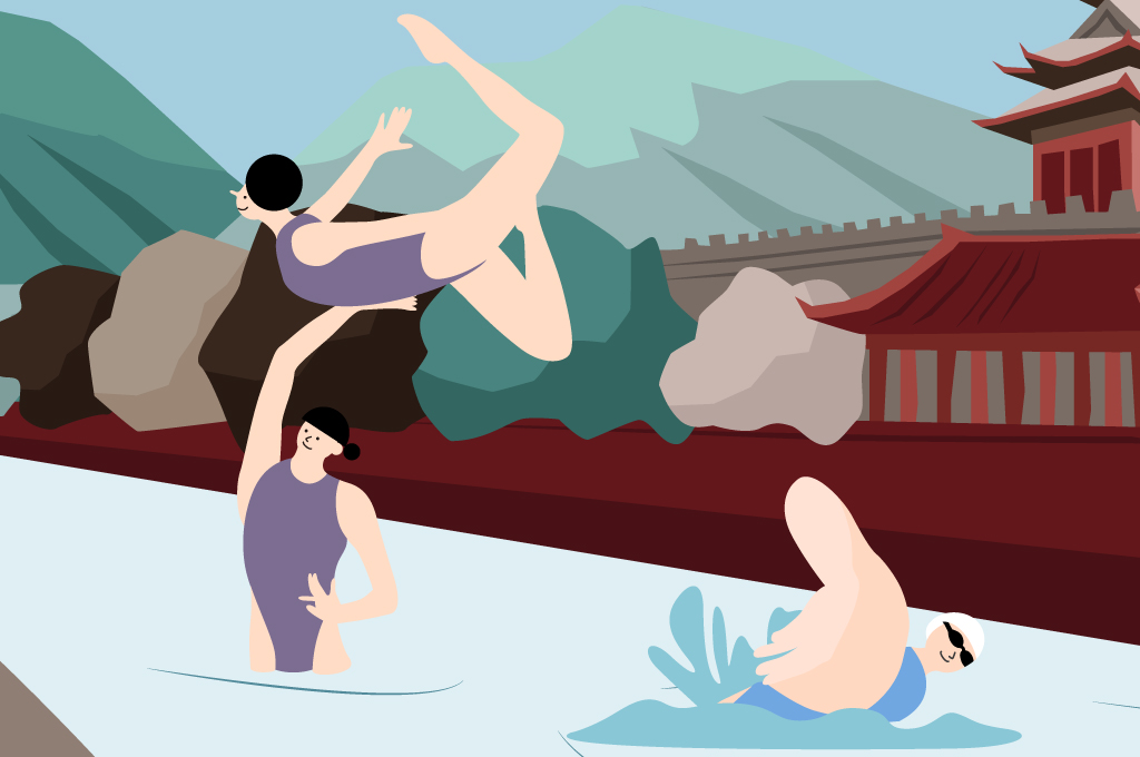
Summer Games
Inspired by the Summer Olympics, this imaginative illustration spotlights iconic architecture in the Chinese capital and a cast of summer athletes. The installation communicates the competitive spirit that sports enthusiasts can expect to see out of the ancient city in the forthcoming Games. Further, the in-store execution of the artwork is layered with several elements mechanically animated bringing alive the athletes throughout the composition.
Fun details are sprinkled throughout the composition: a BMXer can be seen catching air over the Great Wall, a free climber is scaling the Temple of Heaven, while a hurdler jumps over the roof of a traditional siheyuan. In the upper section, the lake surrounding the Forbidden City, its turned into a water wonderland for synchronized swimmers and wind-surfers. Beijing’s National Aquatic Center—the venue set to host the Winter Games—also appears in frame, teasing the upcoming competitions. All these elements come together to celebrate Beijing as the first-ever city to host both the Summer and Winter Games.
《夏运会》
创意来源于夏运会,作品中将极具北京特色及代表性的建筑及景观与夏季运动相融合,用插画语言将各项夏季运动以夸张且富冲击力的画风表现在整个装置作品中,运动和建筑巧妙交织在一起,体现出北京皇城根下的夏季奥运精神。
细细品味作品,你会发现画面中有自行车选手越过长城、攀岩者出现在天坛、四合院的屋顶也成为跨栏辅助、角楼前的湖水成为水上运动爱好者的乐园。同时,画面中的水立方也体现出现代代奥林匹克精神,预示着北京即将成为第一个举办过夏季奥运会和冬季奥运会的城市。
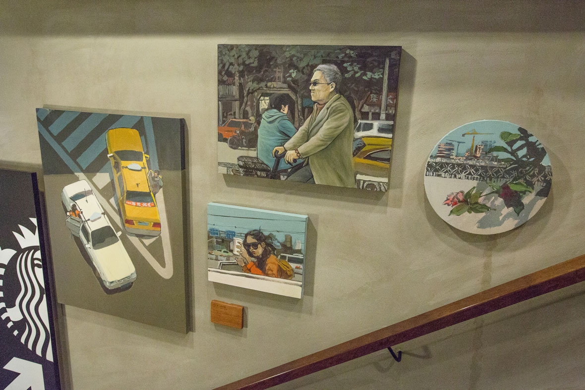
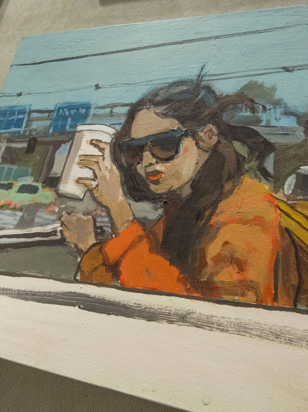
上海 SHANGHAI / Physical Education

Physical Education
Located in Shanghai’s Wujiaochang, the Hopson One lululemon store is situated within a buzzing hub of college life.
This artwork captures the youthful energy of the neighborhood, showcases the area’s distinctive architecture, and celebrates the athletic lifestyles led by local students.
《活力大学》
合生汇坐落于上海五角场,以大学社团生活与五角场特色建筑融合为灵感创作这幅画作。
充满活力的大学生展现年轻的生活方式。将观者带入一个生动且活力的大学时代,同时也体现出lululemon所强调的生活方式和运动精神。
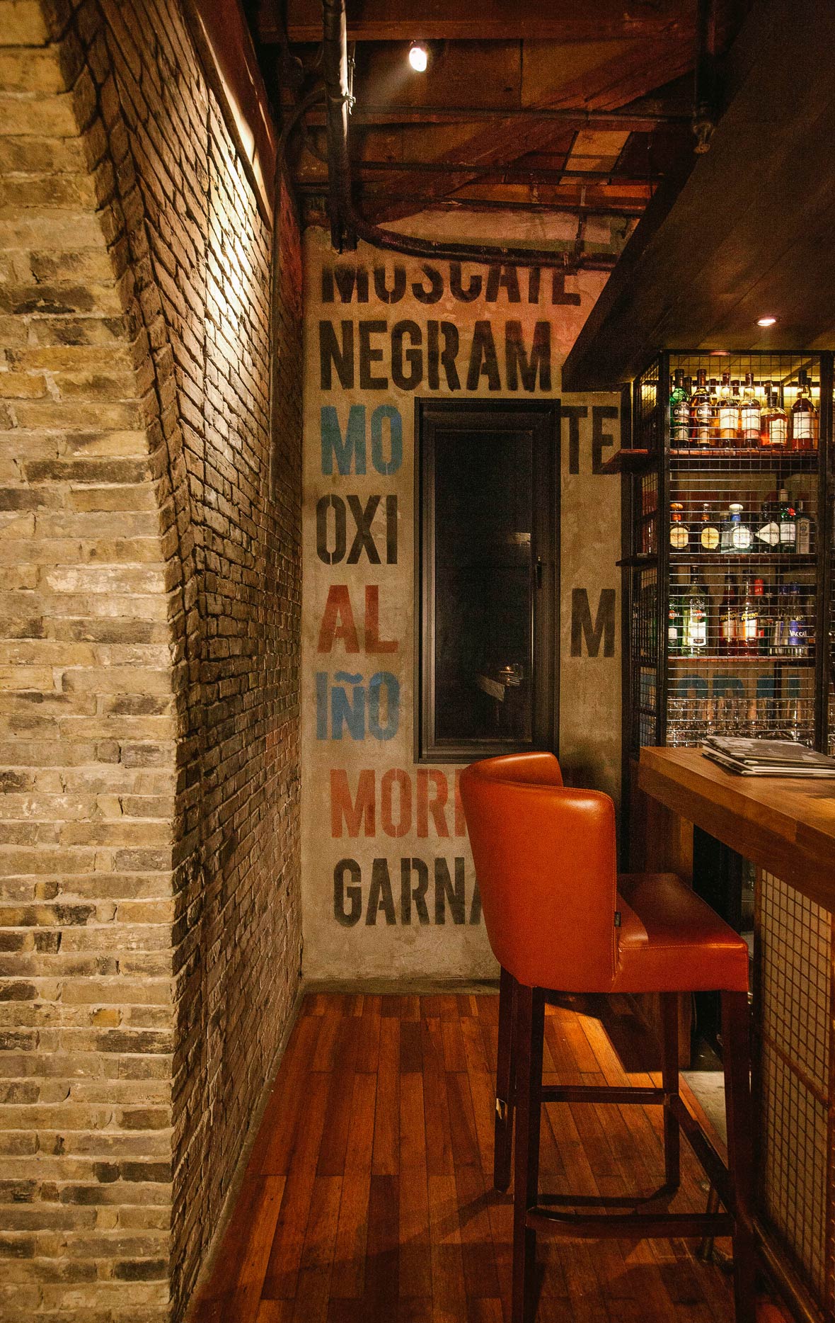
上海 SHANGHAI / Shanghai Deco Slang
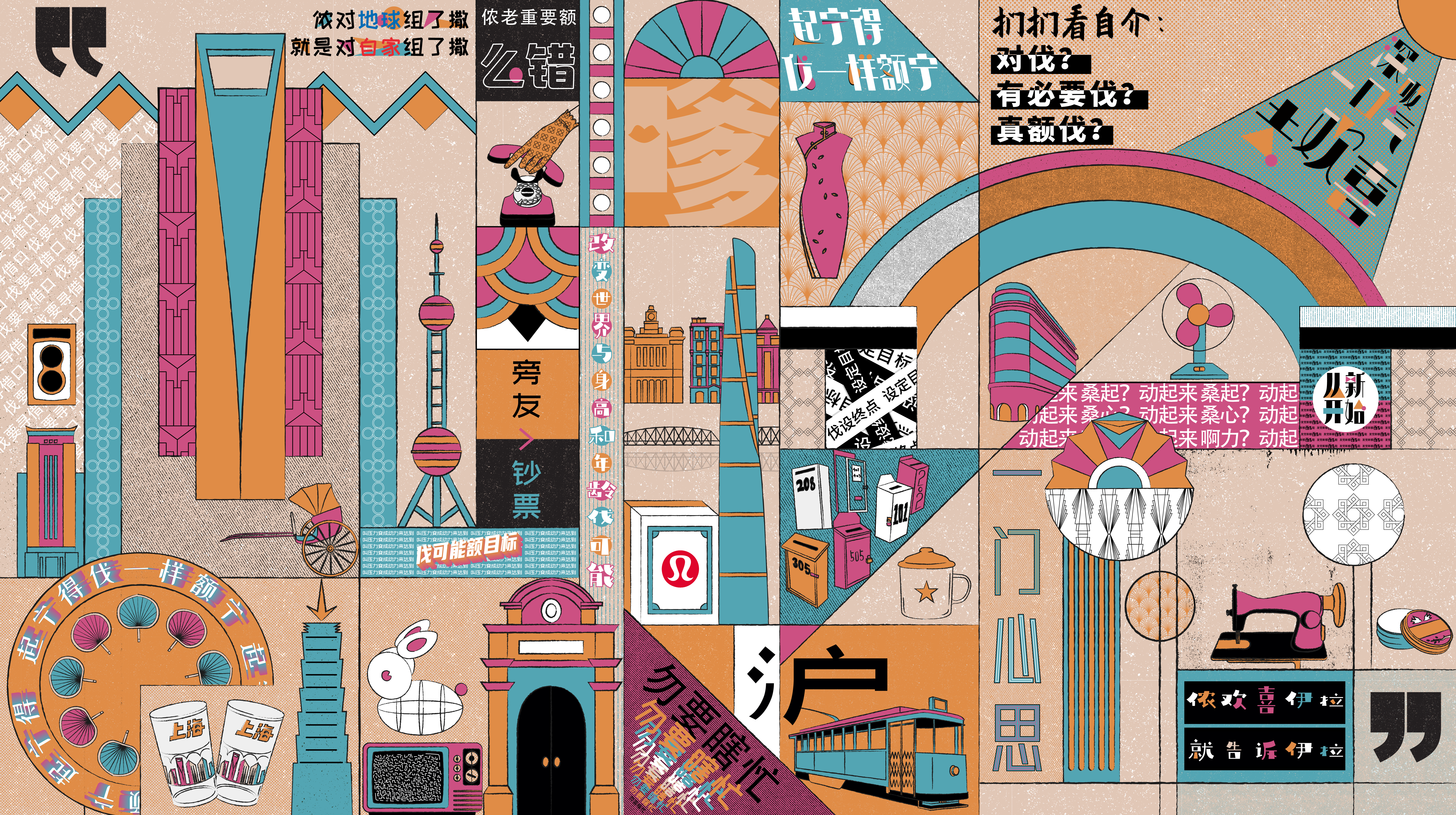
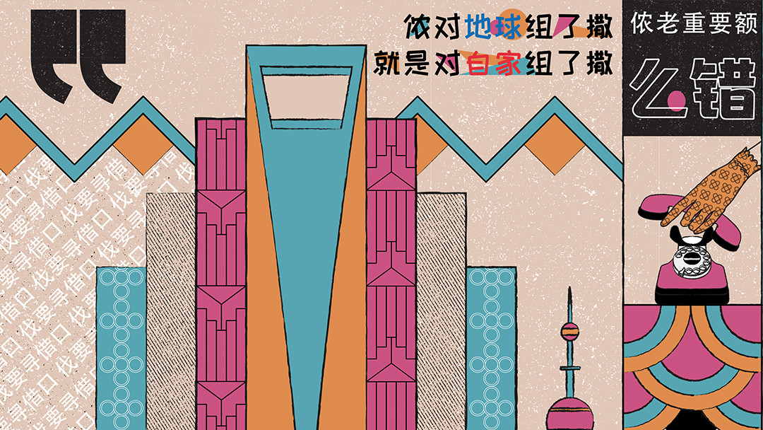

Shanghai Deco Slang
Inspired by the lululemon brand spirit and the tagline “be all in,” this mural blends iconic elements of Shanghai art deco architecture with key phrases from the brand manifesto. These phrases, rewritten with linguistic flourishes based on colloquial Shanghainese, are brought together in a cohesive geometric design.
《沪上腔调》
以品牌精神与be all in.墙面为灵感,用老上海风情建筑局部及老物件等元素中穿插manifesto中的单句,并以沪语的形式呈现manifesto的含义,将这些分散的元素用平面设计的方式重组,打造出趣味十足的艺术作品。
上海 SHANGHAI / Rhythm of the City
Rhythm of the City
Inspired by the lululemon brand spirit and the tagline “be all in,” this mural blends iconic elements of Shanghai art deco architecture with key phrases from the brand manifesto. These phrases, rewritten with linguistic flourishes based on colloquial Shanghainese, are brought together in a cohesive geometric design.
《律动城市》
上海是一座拥有自由灵魂的城市,是一个停不下来的地方,快与慢不断交替。通过流动的画面元素和流畅的画面节奏,带出运动瑜伽和城市之间的动态交融,展现城市动感和lululemon的动态生活方式。我们将人的运动轨迹可视化,利用产品面料包覆部分元素,平面和3D元素结合,组合成有节奏韵律的视觉画面。
北京蓝色港湾 BEIJING SOLANA
Beijing is a city of perpetual motion, a place where people are free to be themselves. When people first visit, they’re often in awe at its lively bustle. For those who choose to stay, they’ll quickly find themselves moving in rhythm with the city’s quickness. With considerations to these aspects of the Chinese capital, and lululemon’s focus on body and spirit, along with the brand’s commitment to an athletic lifestyle, the artwork for the lululemon store in Beijing’s SOLANA shopping mall illustrates the ways that Beijing culture and lululemon’s brand ethos intersect. Through a seemingly fluid, flowing composition, the dynamic pace of Beijing and the movement-driven mindset of the lululemon brand are brought to life.
自在动感,自在北京。人们来到北京,被首都的氛围所鼓舞和影响,不可自拔的融入到这座城市自有的节奏之中。lululemon注重身心的体验,利用科技创造身体的自由。让穿着的人可以抛开顾虑,安心自在地决定自己的感受。
北京蓝色港湾店铺内的艺术装置,希望可以通过流动的画面元素和流畅的画面节奏,带出lululemon和北京之间的动态交融,展现北京的城市动感和lululemon的动态生活方式。让北京这座城市也能随着lululemon一起动起来。

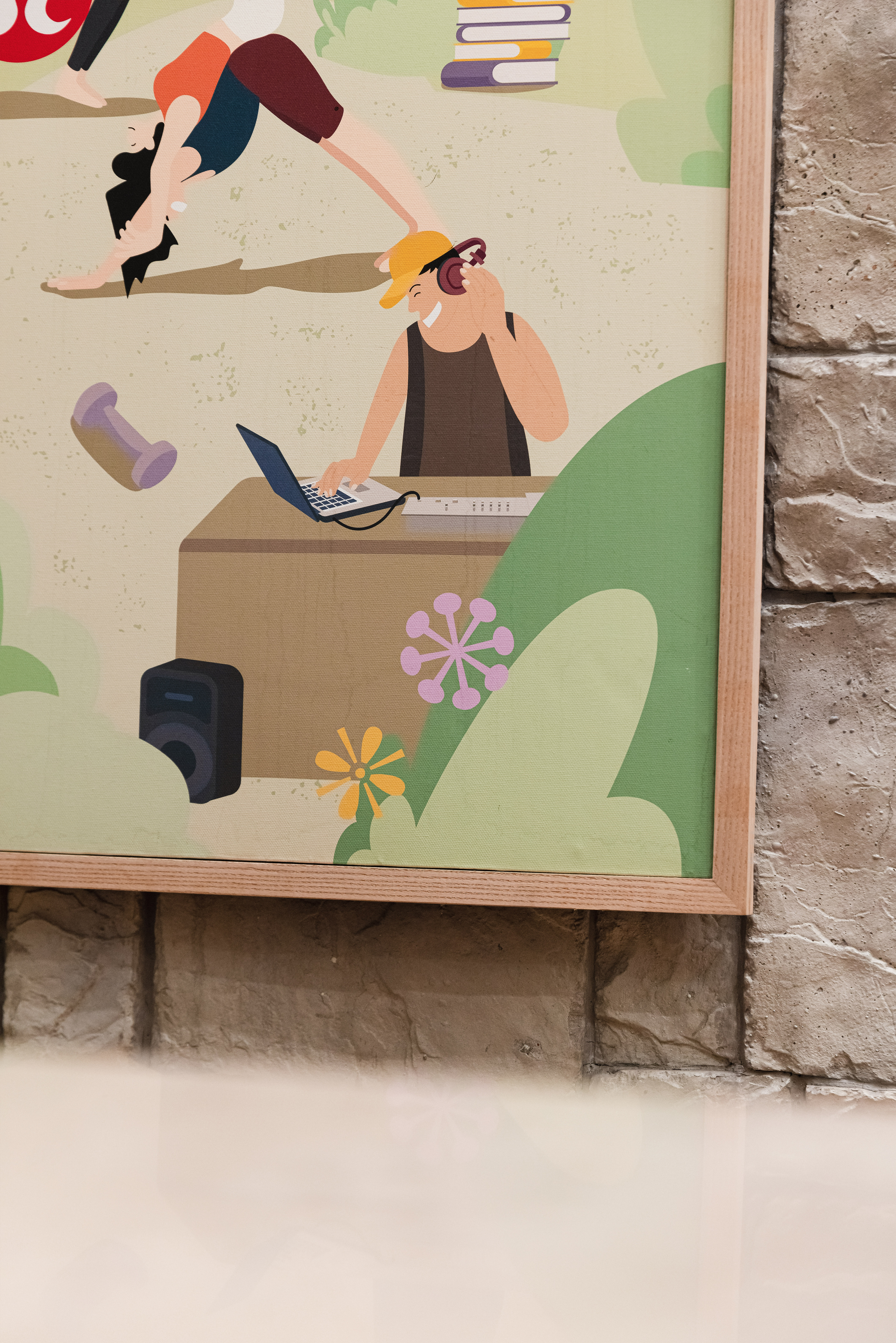
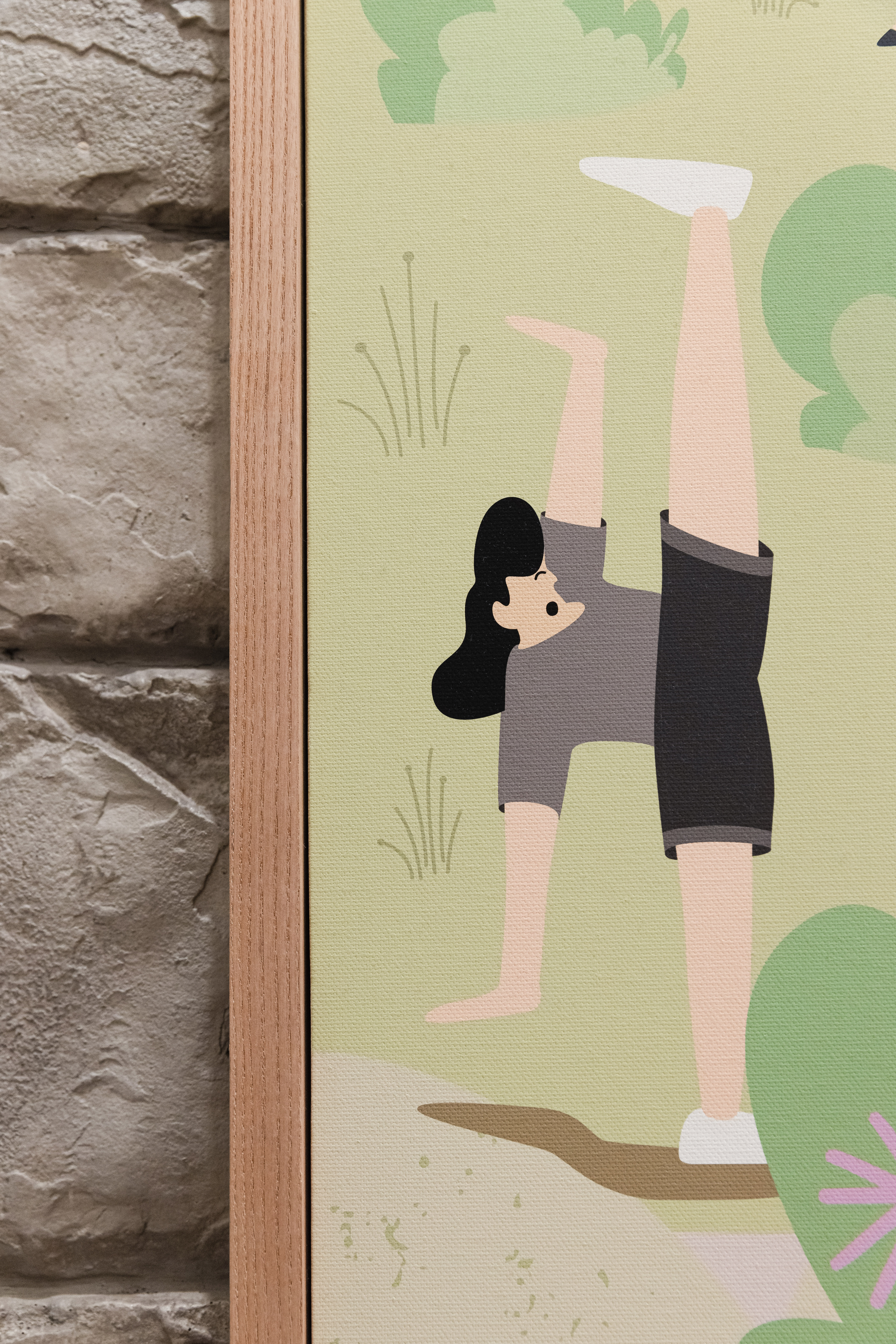
White Collar Yoga
Beijing doesn’t take breaks. Day or night, the city is forever moving. The grind doesn’t stop for Beijingers, and through this artwork, we look to visualize the urban hustle. Office workers are depicted in a variety of situations—grabbing coffee, racing off to the metro station, typing away in front of their computer, or responding to work messages. Through it all, they’ve managed to keep their love of yoga alive. In this artwork, exaggerated yoga movements and colorful characters give shape to Beijing’s bustle.
《白领瑜伽》
北京是一个永动机,一个不分白天黑夜在运转的庞大机器,日夜灯火通明,每一个北京人都努力维系着自己与这座城市的关系。这幅画通过一系列的瑜伽体式和北京白领坐在办公桌前、买咖啡、追地铁、刷手机等等的日常生活串联起来。通过人物和动作的串联叠加,带出北京生活的动感。
Beijing Attitude
No matter how busy it gets, Beijingers always seem able to maintain a positive mindset. By sticking with their sporty interests, they’re able to shed the anxiety and stress that comes with the urban hustle. Through this art work, we visualize the importance of unwinding from work through an active lifestyle—whether it be running, yoga, or even a game of ping pong.
《北京态度》
即使忙到⻜起来,也还是能保持乐观积极的状态,不骄不躁享受这⻜一般的感觉,这才是都市人向往的终极人生态度。这幅作品通过将现代人追逐时间的状态和瑜伽运动体式结合,鼓励即使在奔忙中也要自在放松的心态。
Weekend in Beijing
What do weekends look like in the older parts of Beijing? Whether it be roller blading in Houhai Park, strolling through Sanlitun, or cycling through the hutongs, Beijingers have their own ways of relaxing. This art piece, depicting different sports and Bejing landmarks, is inspired by young Beijing inhabitants who look to an active lifestyle as a means of relaxation, an ethos similarly promoted by lululemon.
《京城周末》
老北京怎么过周末的? 后北海公园滑冰,胡同遛弯,三里屯逛街,骑车乐逛胡同,北京人也有自己的放松方式。以城市生活为灵感,通过画面展现北京城市中不同的运动特色及地标,描绘当代年轻人在北京这座大城市里不断寻找自己的舒适感与轻松一刻,同时体现了lululemon所倡导的健康生活方式。
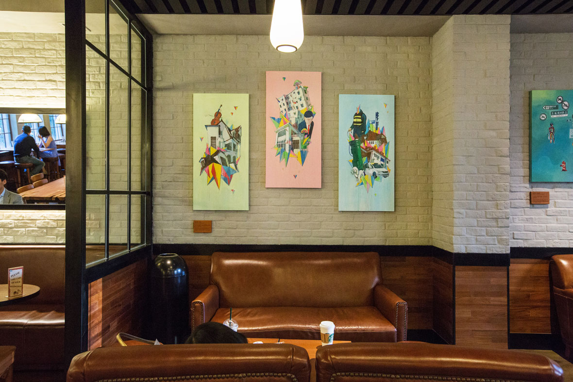
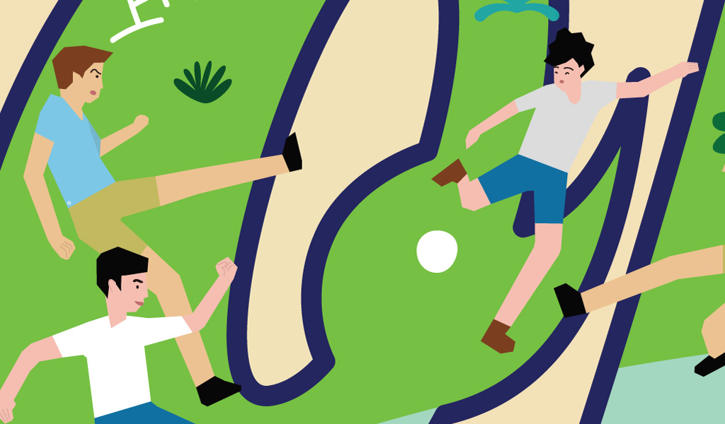
成都太古里 CHENGDU TAIKOOLI
At the mere mention of Chengdu, many things come to mind: giant pandas, tea houses, and the regional cuisine are obvious, but these barely scratch the surface of the city’s deep cultural heritage. Tapping into the visual motifs that people associate with the city, we unveiled a mural that captures the laidback lifestyle of Chengdu. From local folk culture and traditional dishes to the city’s architecture and youthful lifestyle, the characteristics that define the city share many parallels with lululemon’s brand ethos.
成都两个字就意味着大熊猫,悠闲喝茶,各种美食,蜀地文化底蕴深厚,以大众对成都的印象为这次墙面创意的主概念命名为——闲都成都,把成都当地的民俗文化,传统美食与现代化的建筑,年轻人的生活方式做结合,用有趣味性的方式呈现,体现出成都这座城市的专属特征,这与lululemon想体现的生活态度不谋而合。
Mahjong Capital
Riffing on Chengdu’s love of Mahjong, tiles from the beloved game are used to spell out “Chengdu” in Chinese. Atop the tiles, rather than the expected designs, lululemon logos and characters assuming yoga positions appear instead. Alongside them, recognizable landmarks from across Chengdu, the city’s folk art traditions, and its renowned cuisine are also imprinted for an additional playful touch.
《麻将之都》
从成都人以麻将为乐的点出发,将麻将牌作为主元素,并将麻将上的图案巧妙的用lululemon的logo和专属运动小人拼构起来,融入成都一些标志性的建筑地标,民间艺术和当地美食,以此打造出一副趣味性十足的麻将“成都”拼贴字。

Yogo Stronghold
For this artwork, mahjong tiles designed with disparate references to Chengdu culture and the lululemon brand are laid face up. On them, the city’s landmarks appear along with characters striking a range of yoga poses. Together, these designs reflect lululemon’s brand spirit and how its attitude towards living an athletic life can exist alongside Chengdu’s cultural roots.
《Yogo围城》
具有成都与lululemon特色的麻将错落有致地在麻将桌上,展现了成都悠闲与慢的文化及生活方式。该设计同样利用了lululemon的logo和专属运动小人构成lululemon专属麻将牌,更为生动的展现出品牌的生活及运动理念。
Laidback Chengdu
Pandas, bamboo grove, Sanxingdui, tea houses, chili-oil dumpings, and other aspects of Chengdu culture all make cameos on the colorful composition. The landmark building that houses this particular lululemon store even makes an appearance. The city’s inhabitants strike yoga poses against this backdrop, demonstrating the sporty but laidback lifestyle of the city and the lululemon brand.
《闲适蜀都》
结合成都的竹子,熊猫,三星堆,喝茶,钟水饺等具有代表性的地方元素,将lululemon所在店铺的地标建筑加入其中,并用各种姿态的瑜伽人物营造出成都悠闲轻松的生活氛围, 展现运动与生活处处相容的和谐理念。
上海办公室 SHANGHAI OFFICE / The Sweatlife


The Sweatlife
Without movement, life is dull. Staying active, getting sweaty, and being passionate about life are essential to a person’s well-being. “The Sweatlife” is a slogan that captures this idea to a tee, and this concept is the axis that this artwork revolves around. With overlapping characters and shapes, this art piece gives shape to movement via bold colors and abstract patterns. In the scene, the lululemon spirit is shown through a community of athletes getting sweaty in their own ways.
《热汗生活》
The sweatlife, 生活中无处不动,无处不流汗,动起来,爱生活。以Slogan为创作灵感,人物与运动的各种元素相互叠加串联起来。用生动有趣的方式来结合日常生活中的元素,让抽象场景里的人物之间产生联结。这幅作品将色块状人物进行的大胆地分割和重叠,呈现出流畅线条画面来展现运动、冥想和社群生活的结合,体现出lululemon一直在践行的价值观。
上海东平 SHANGHAI DONGPING / Shanghai Looking Glass

Shanghai Looking Glass
The aged villas of Shanghai tell stories that span centuries. Their windows are the witness to an evolution of haipai (海派) culture, and through them, they’ve lent a multitude of perspectives for generations throughout the city’s history.
Through a large stained-glass installation that has replaced the building’s windows, we present a story of Shanghai as it changes from day to night. On the installation, we depict youth engaged in a variety of fitness pursuits, dapper grandpas and qipao-wearing grandmas strolling the streets, and highlight iconic haipai motifs—such as white magnolias, shikumen designs, and haipai-inspired interior designs. Together, these human elements and architectural details showcase the unique local character that can be found on any ordinary day in Shanghai.
《群窗万象》
我们从老洋房建筑读到百年的历史文化,透过窗户领略不同海派文化。透过窗户看到历史建筑和当下的人文故事,如果说老洋房承载历史,那么窗户就是在述说一代又一代的故事。画面选取上海老洋房的彩窗来作为视觉语言,呈现了上海在日夜更替中的热汗氛围。
画面中我们可以看到正在享受运动的小伙伴、老克勒及穿旗袍女性人物,同时也有丰富的海派元素:白玉兰花、石库门建筑特色、老洋房内饰花纹、具有海派风情的地砖图案等,两者相融合勾勒出一副充满活力与能量的群窗万象。
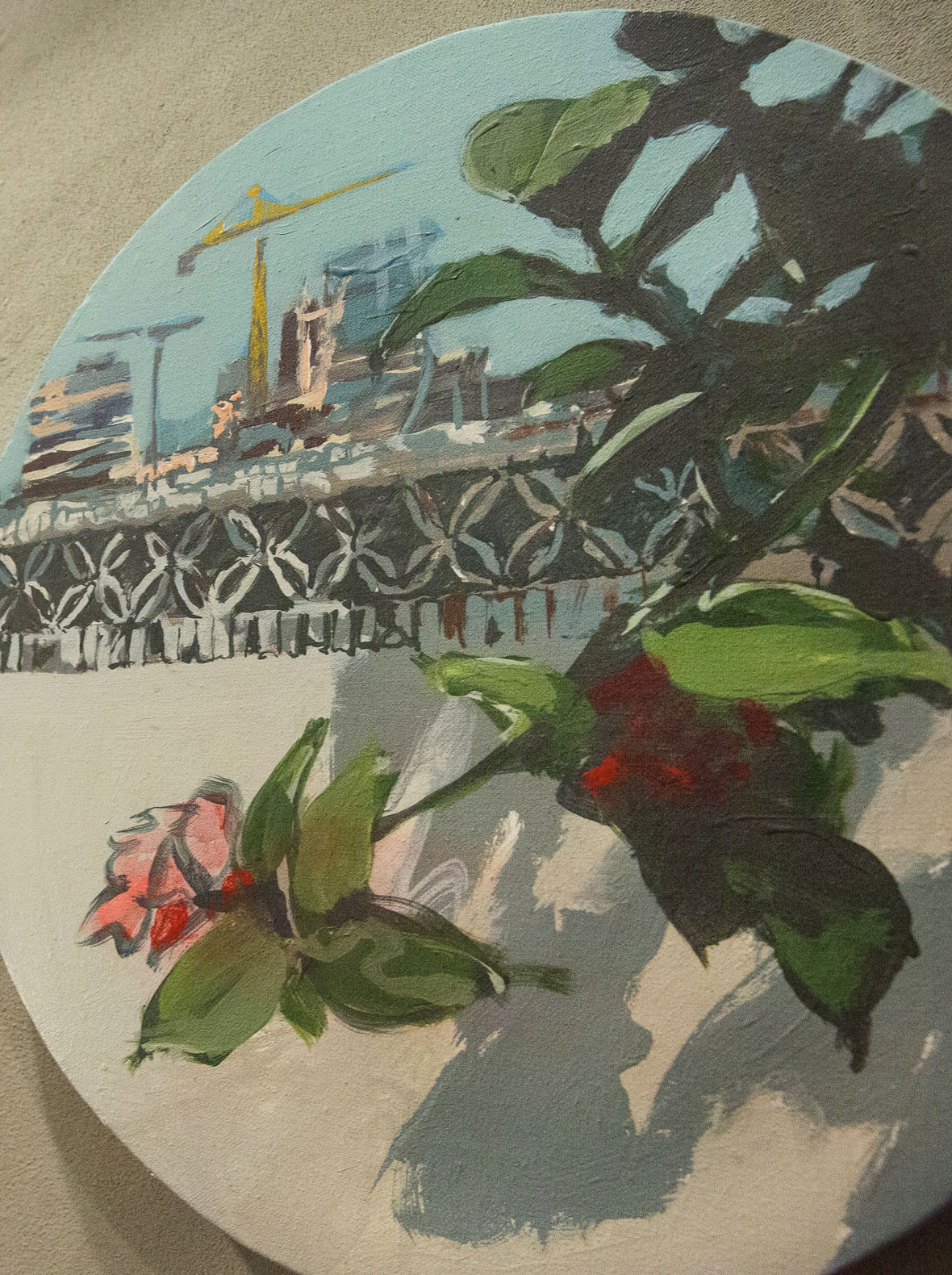
上海嘉里中心 SHANGHAI KERRY CENTER / Flowing Through
Flowing Through
This mural showcases the growth and development of the Lululemon brand from West to East. A diverse community of athletes start in Vancouver and flow their way across the frame from right to left, crossing the Pacific Ocean and arriving in Shanghai. Along the way, the group engages in a variety of activities and sports as an expression of the brand’s active lifestyle DNA. The mural shows the evolution of a “yoga pants” brand into a global athleisure phenomenon and lifestyle fashion brand with industry-leading functional sportswear technology. The commonality within the group is a commitment to living in the moment, connected, flowing, and full of vitality. The mural was executed in Lululemon’s brand new Shanghai Flagship store covering a wall approximately 8 meters long and 3 meters high.
《穿流》
该作品通过巧妙地画面设计呈现了Lululemon从西到东的发展历程,队伍从右到左代表了lululmeon与它息息相关的群体发展。lululemon的品牌灵魂与精神以加拿大西海岸的瑜伽教室为起点,发展至席卷全球生活方式的穿戴潮流,逐步注重开发功能化技术的运动服饰,再到打造多样化的品牌社区,最终也在中国扎下了足迹。队伍中所有人的共性就是活在当下,互相连接,流动,轻松,充满生命力。此墙长约8米,高约3米。
上海太古汇 SHANGHAI TAIKOOHUI / Flowing Through

Modern Community
The mural design is inspired by traditional “Shikumen” alley life of local Shanghai residents in the area nearby TaiKoo Hui, where the Lululemon store is located. The maze of dense lanes shows a group of childhood friends playing and having fun as part of a large, interconnected community. The mural is an evolution of the same group of friends growing up and blossoming into the world with different trajectories but retaining a spirt of play and a passion for an active lifestyle. The concept brings together people who love sports and fitness but live in different times and of different backgrounds: some are kicking a shuttlecock, office workers are enjoying a morning jog, while others practice yoga or play tennis. The past is intertwined with modern life as we pursue an active lifestyle. Throughout the composition you can also find slogans and sayings from Shanghaiese dialect created in a font style reminiscent of old Shanghai editorial magazines. The mural was executed in Lululemon’s new Taikoo Hui store covering a wall approximately 10 meters long and 3 meters high.
《摩登社区》
该设计灵感源于太古汇所处区域的旧时本地居民的石库门生活,儿时的玩伴在不同的里弄之间充满乐趣玩耍,就像是一个大型社区,如今儿时的玩伴已长大,成为有着不同背景和生活轨迹的人。
我们希望通过此画面将热爱运动和生活在不同时间与不同背景的人们聚集在此。画面中可以看到有人在老上海石库⻔中踢毽玩乐,有人在摩登太古汇享受晨跑的上班族。过去与摩登生活相互交织。另以老上海画报字体风格构成的沪语点缀,让整个画面更加富有城市的印记,既生动,又富有活力和朝气。此墙长约10米,高约3米。
深圳海岸城 SHENZHEN COSTAL CITY / Dynamic Move

Dynamic Move
Our team designed the artwork and installations for Lululemon’s new store in Shenzhen, bringing their vision of sustainability and community vitality to life.
Lululemon has long championed eco-friendly values, seamlessly blending them with a sense of relaxation and vibrant urban culture. To reflect this, we incorporated geometric color blocks and fluid curves that symbolize the energy and passion of local community activities.
Outside the store, we created a dynamic grid of abstract geometric patterns that reimagine familiar sports elements—swimming lanes, courts, tracks, yoga mats, and sports balls. These designs are mixed with subtle, nature-inspired motifs, such as stylized leaves, flowing water, and mountains, adding layers of depth and visual harmony with larger environment.
Our interactive modular installations further enhance the experience, offering opportunities for customers to relax, take photos, and engage with the space. Designed to be versatile, these installations also function as stages for themed events and community activities, fostering interaction and connection.
The work helps Lululemon amplify its mission to inspire positivity and sustainability while connecting with the community in meaningful ways.
《活力悦动》
我们将lululemon一直专注于可持续发展和推广环保理念与社区活力和简约轻松的氛围相结合,通过几何色块和曲线条人物形象描绘出当地社团活动给城市带来的活力和激情。该创意被呈现于品牌在深圳开设的海岸城店。
在门店外区的地面上,可以看到我们运用抽象几何色块以网格切格状进行重构设计日常运动元素:游泳、球场、跑道、瑜伽垫、球类等。同时,也会看到以几何方式巧妙的将叶子、流水、山脉隐藏在画面中,除此之外,可互动的模块式组件更方便来往顾客休息与拍照打卡,并增加了可满足主题活动及社团活动的舞台。以此为lululemon营造出积极向上的品牌形象。