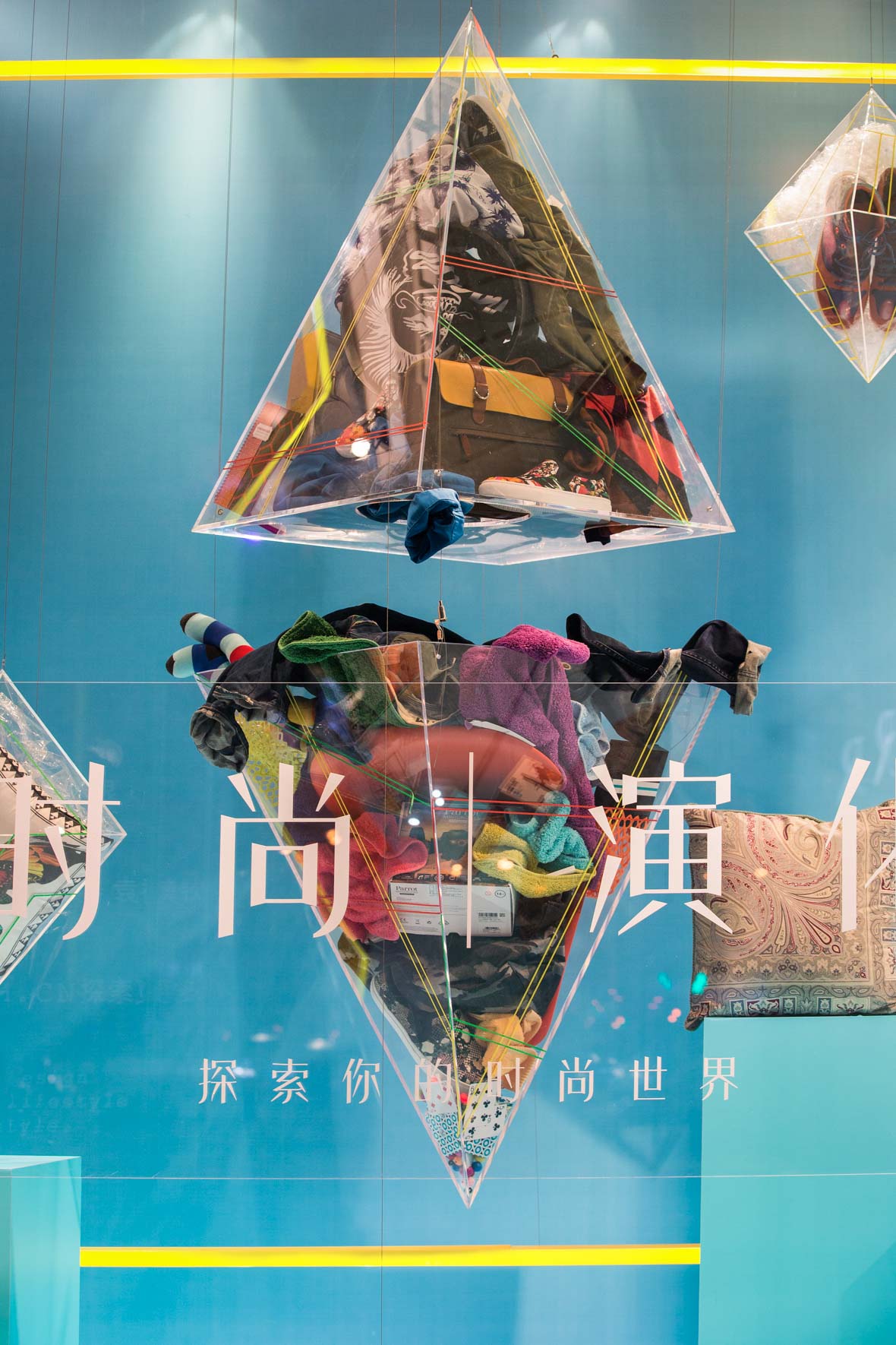
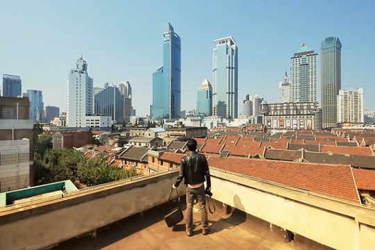
无法观看?前往优酷
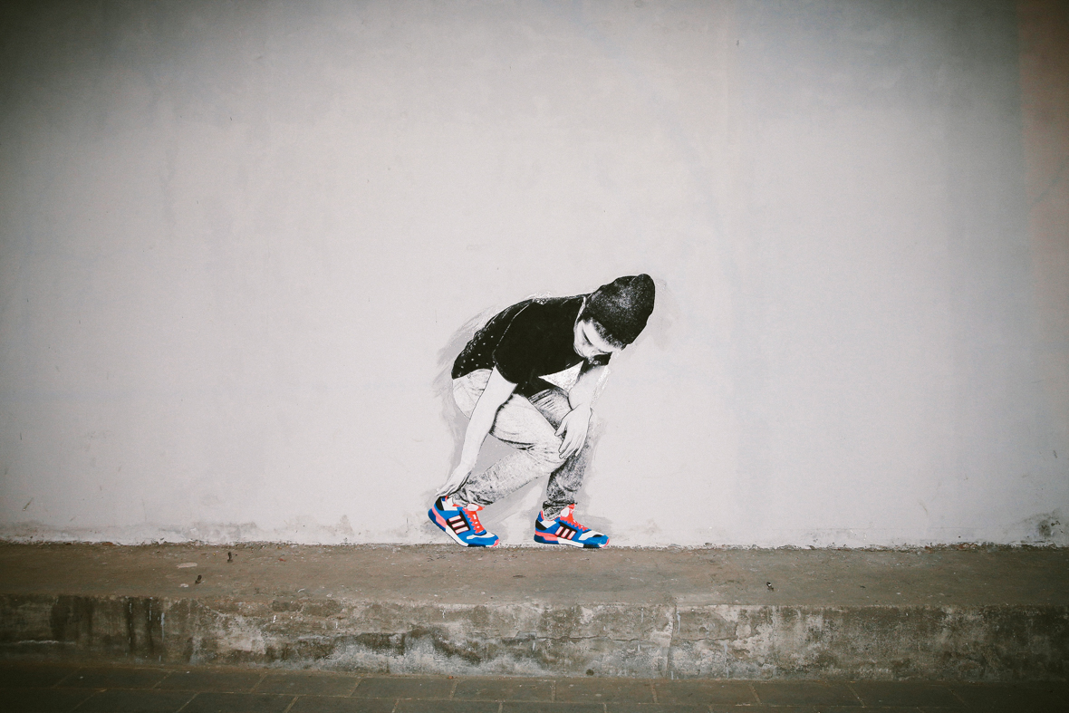
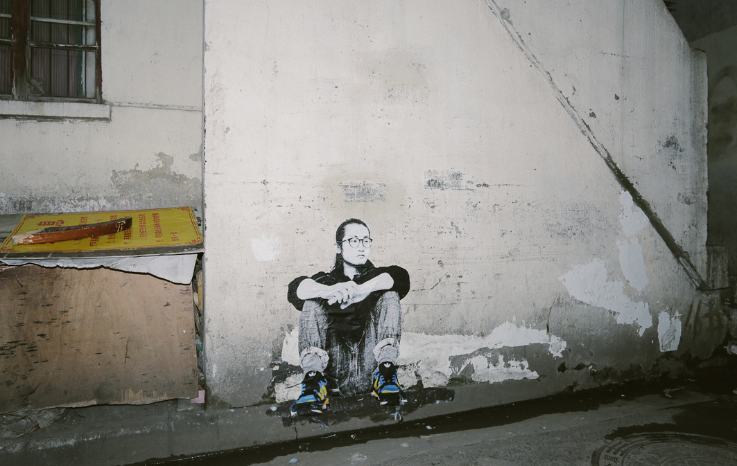
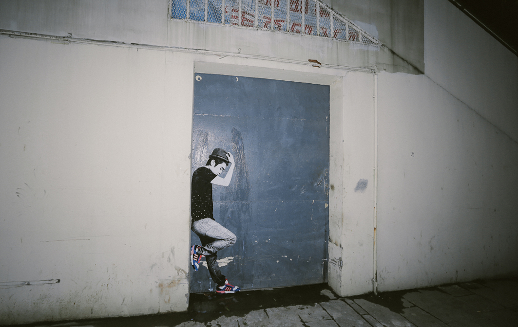
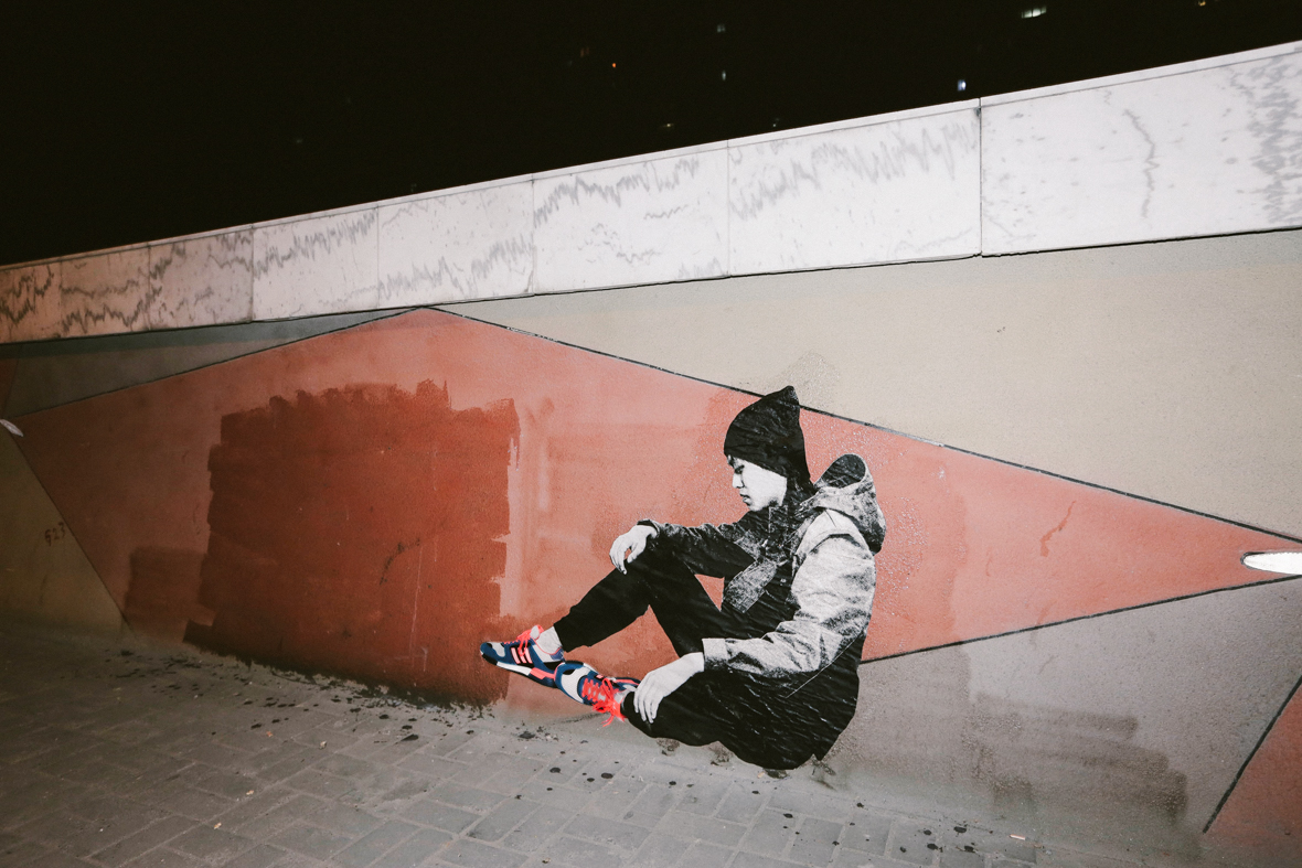
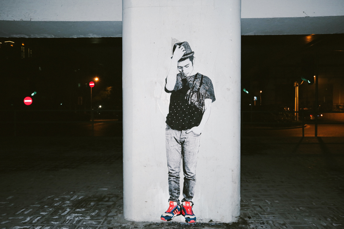
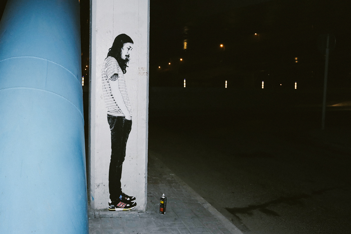
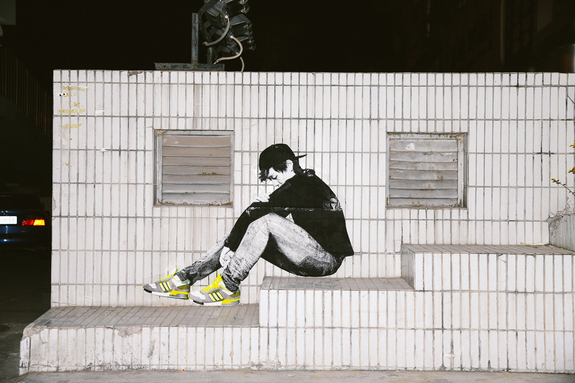
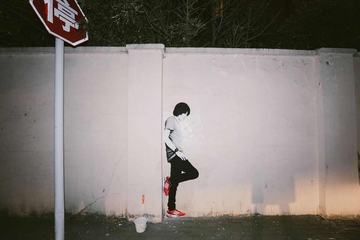
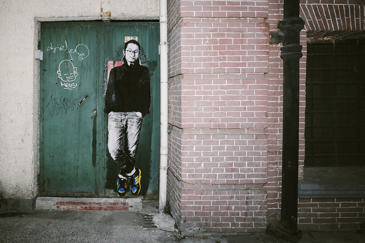
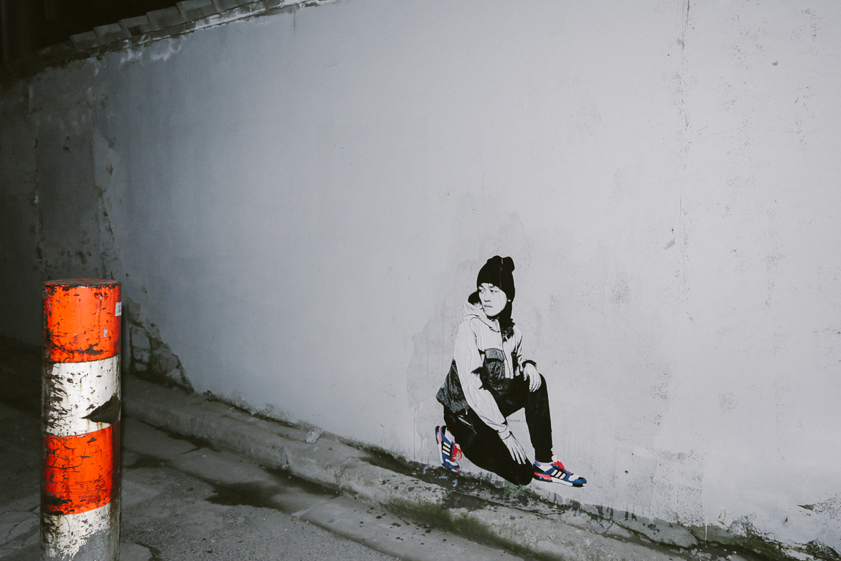
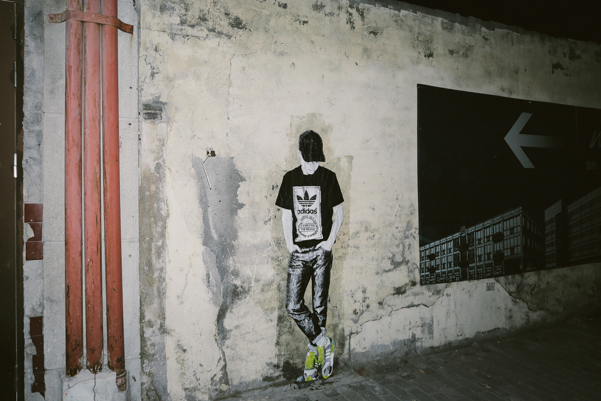
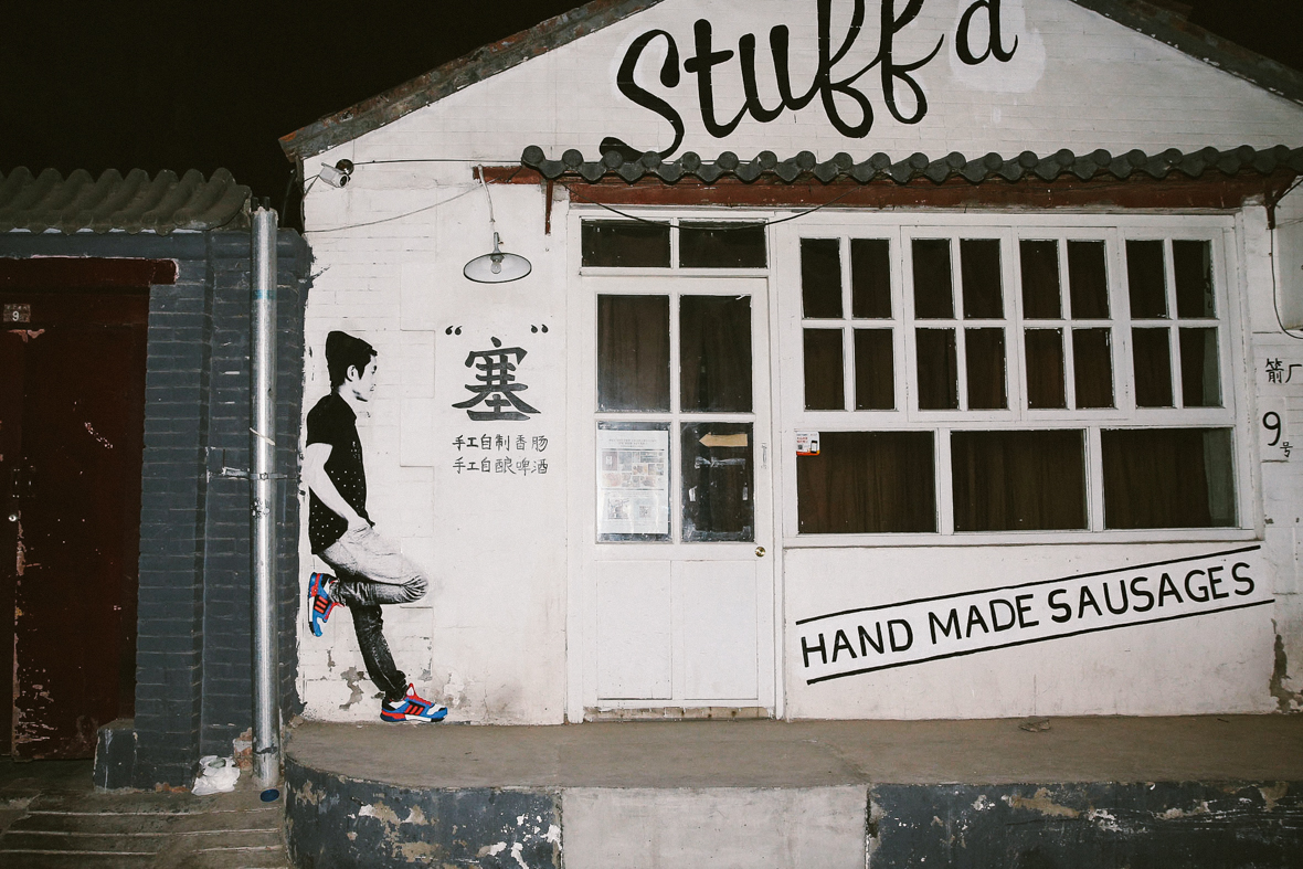
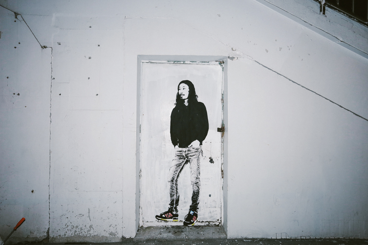
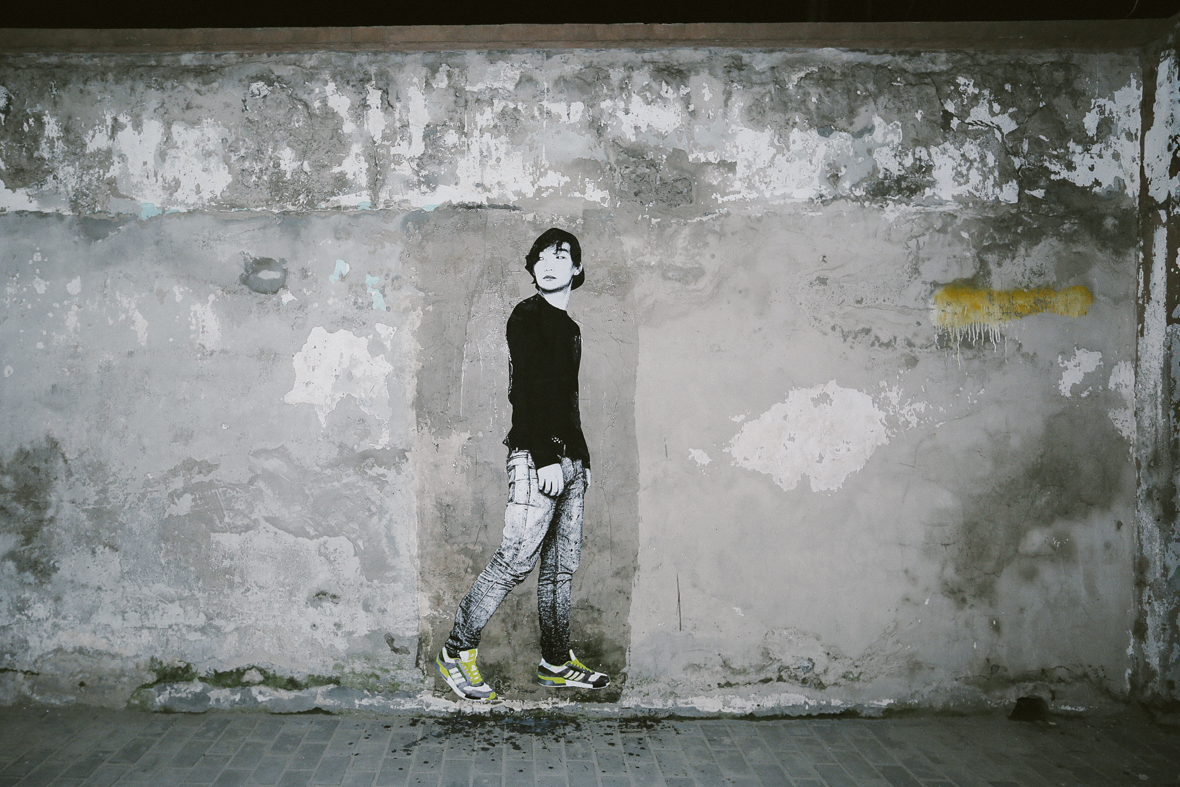
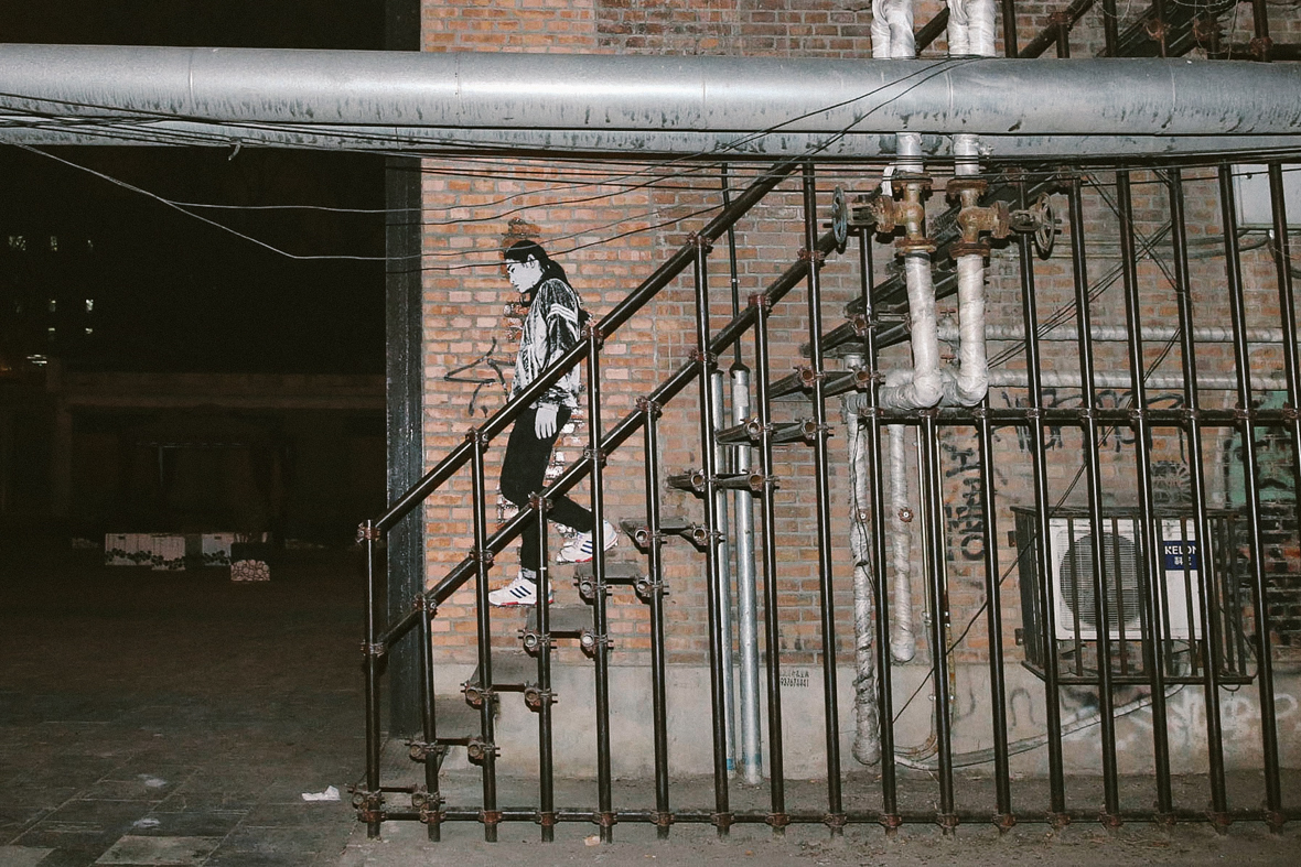
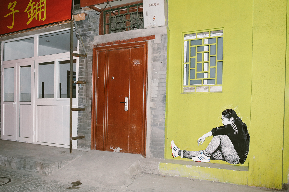
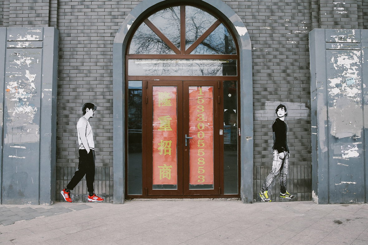
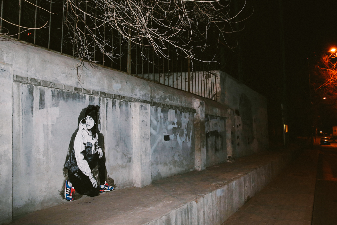
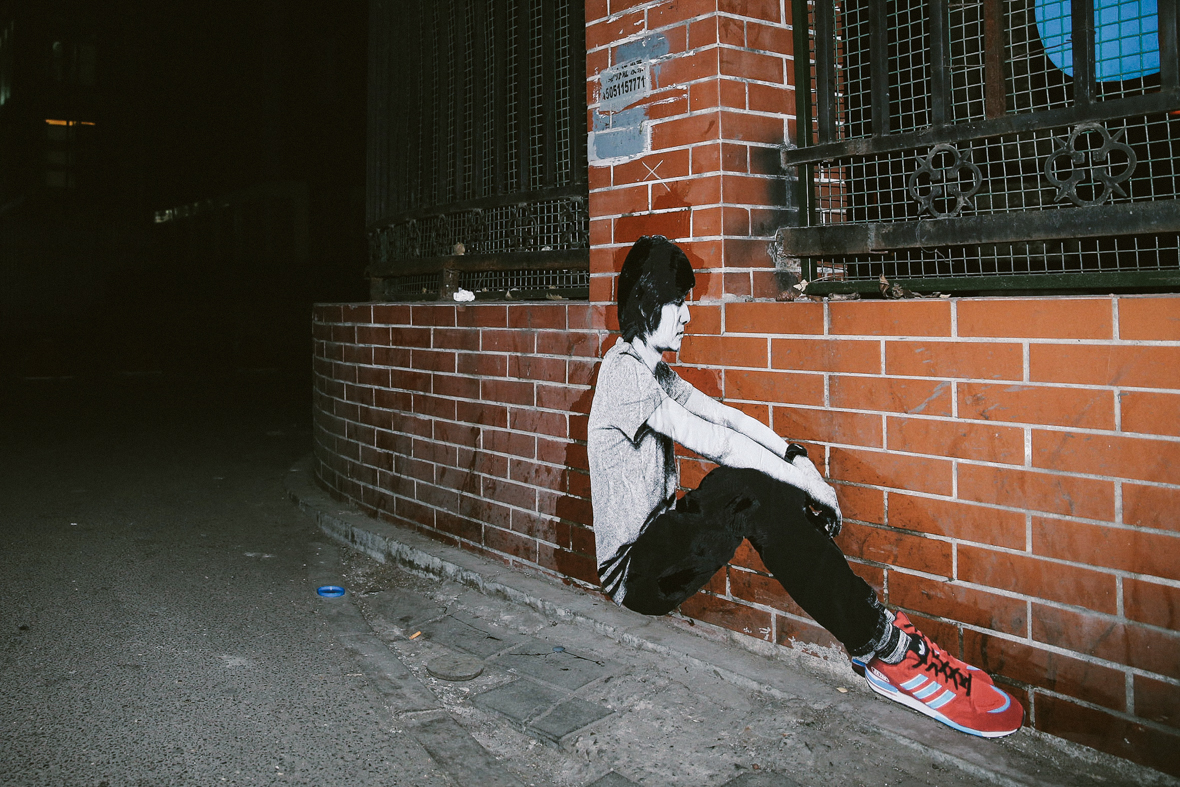
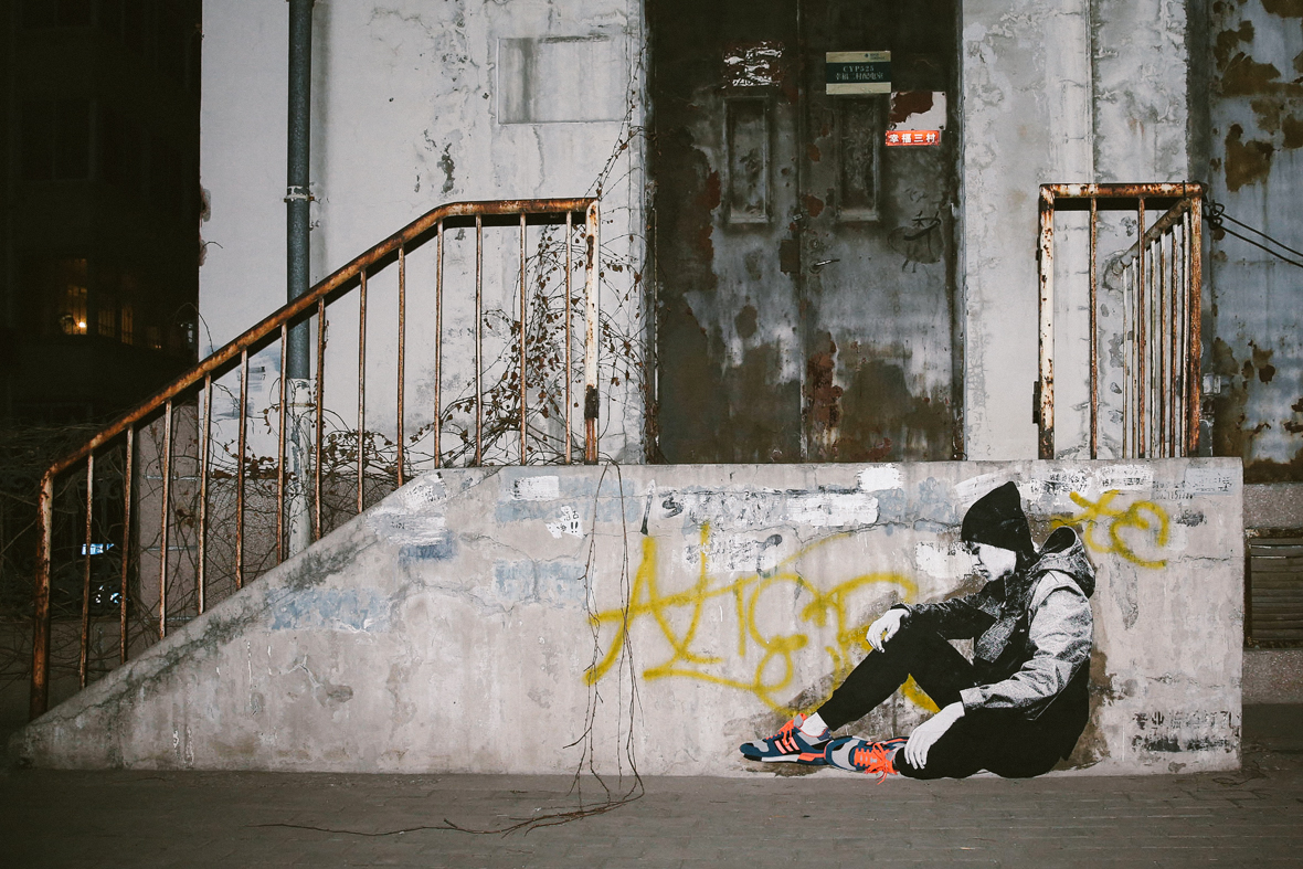
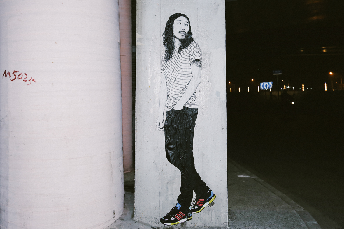
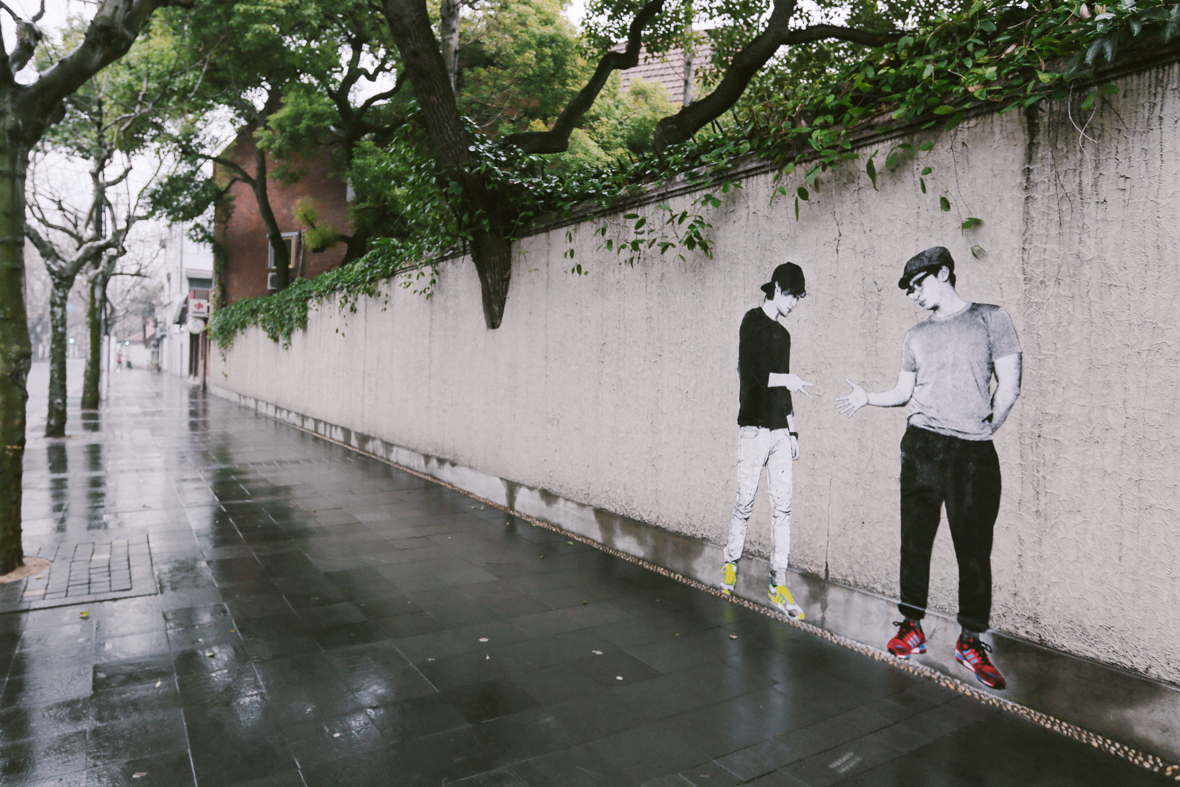
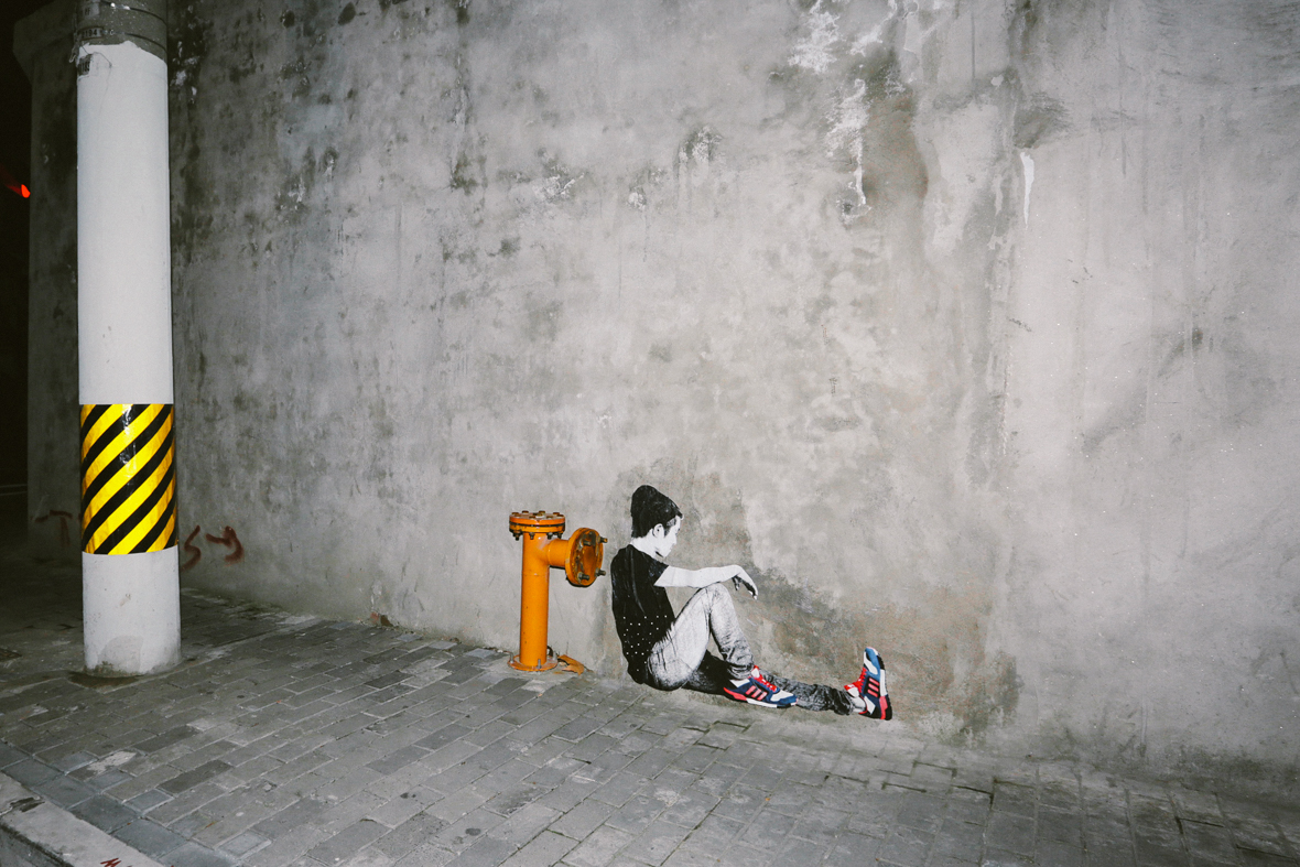
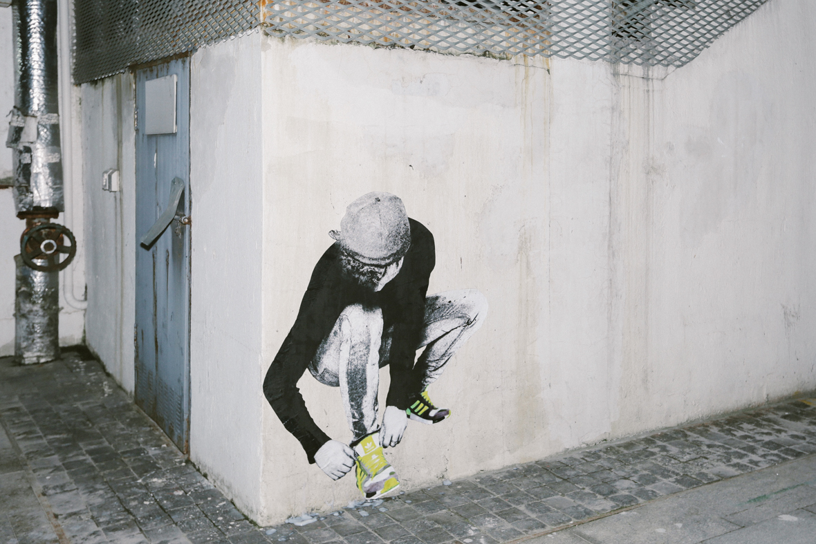
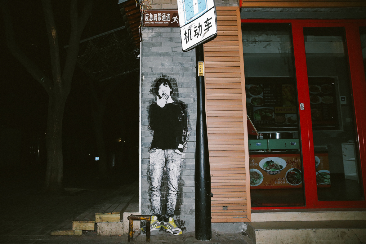
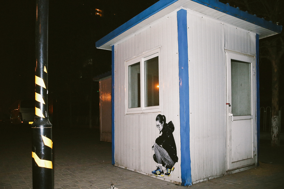
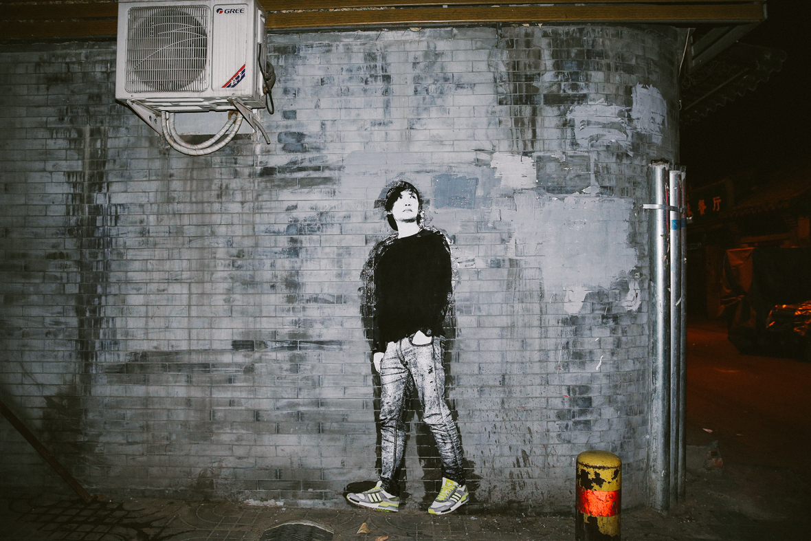
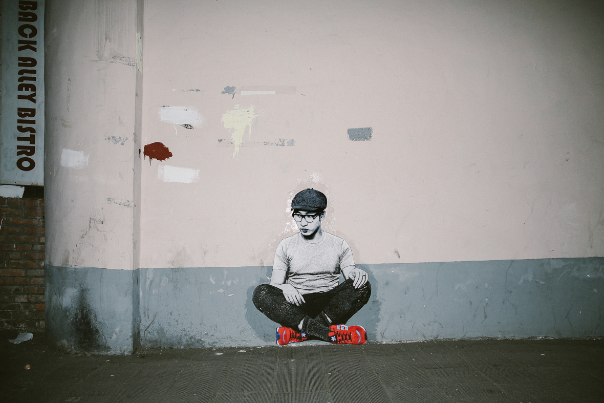
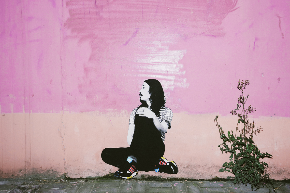
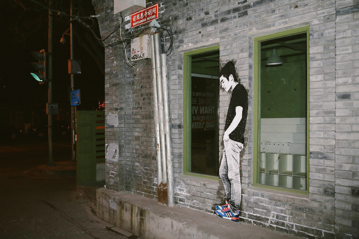
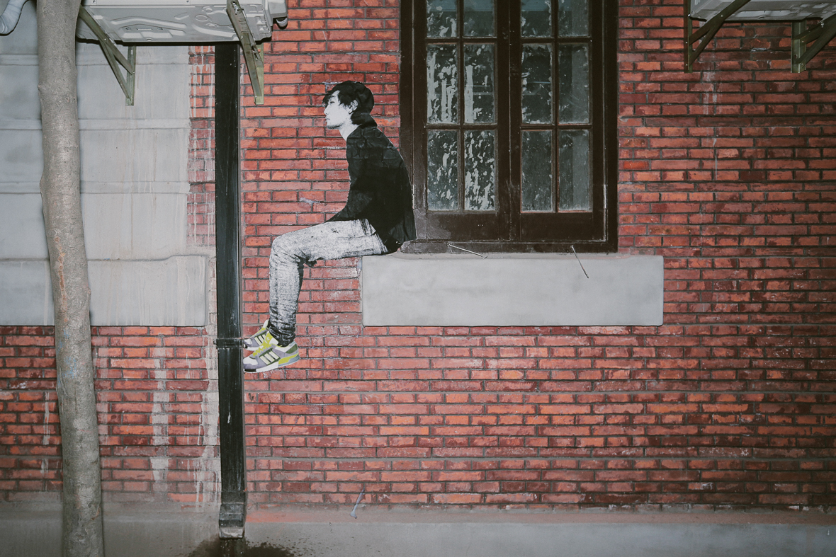
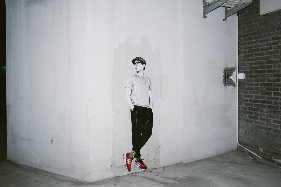
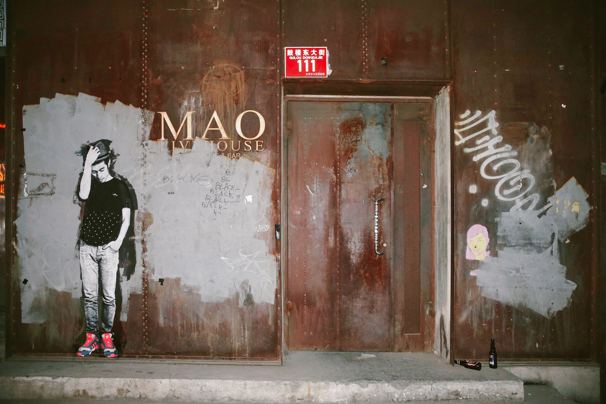
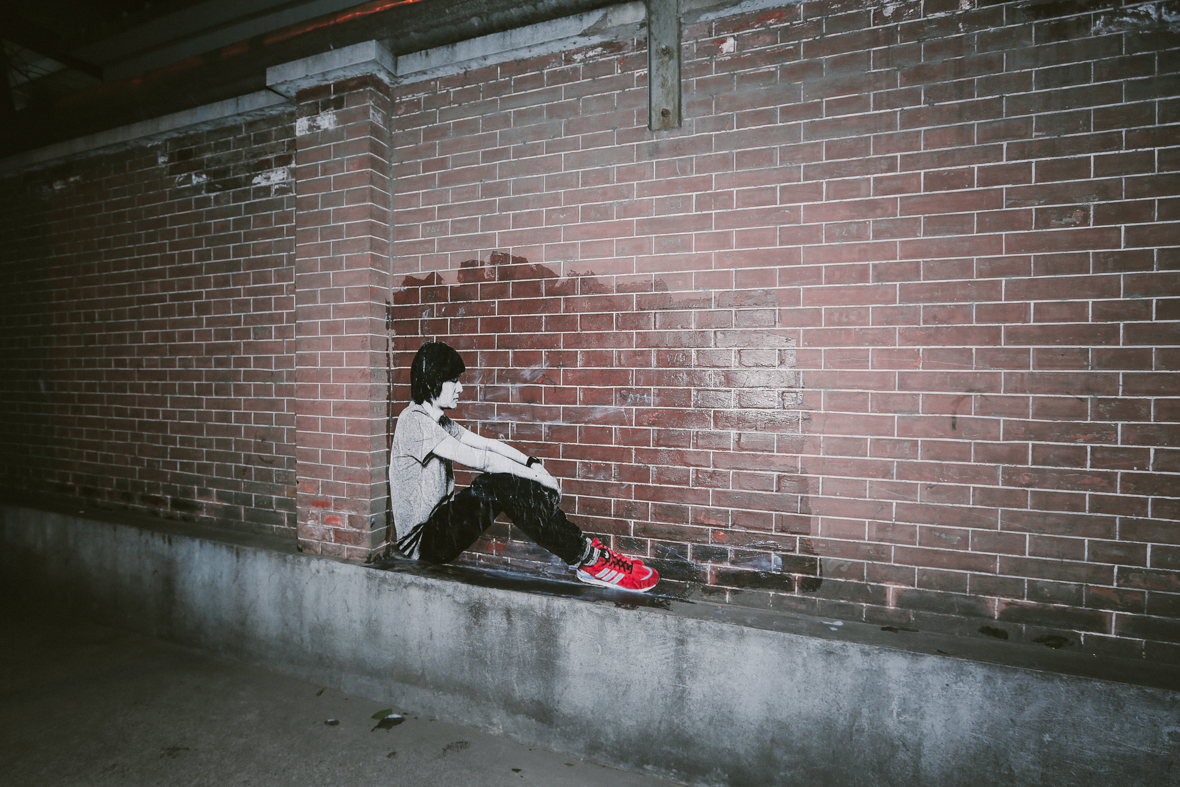
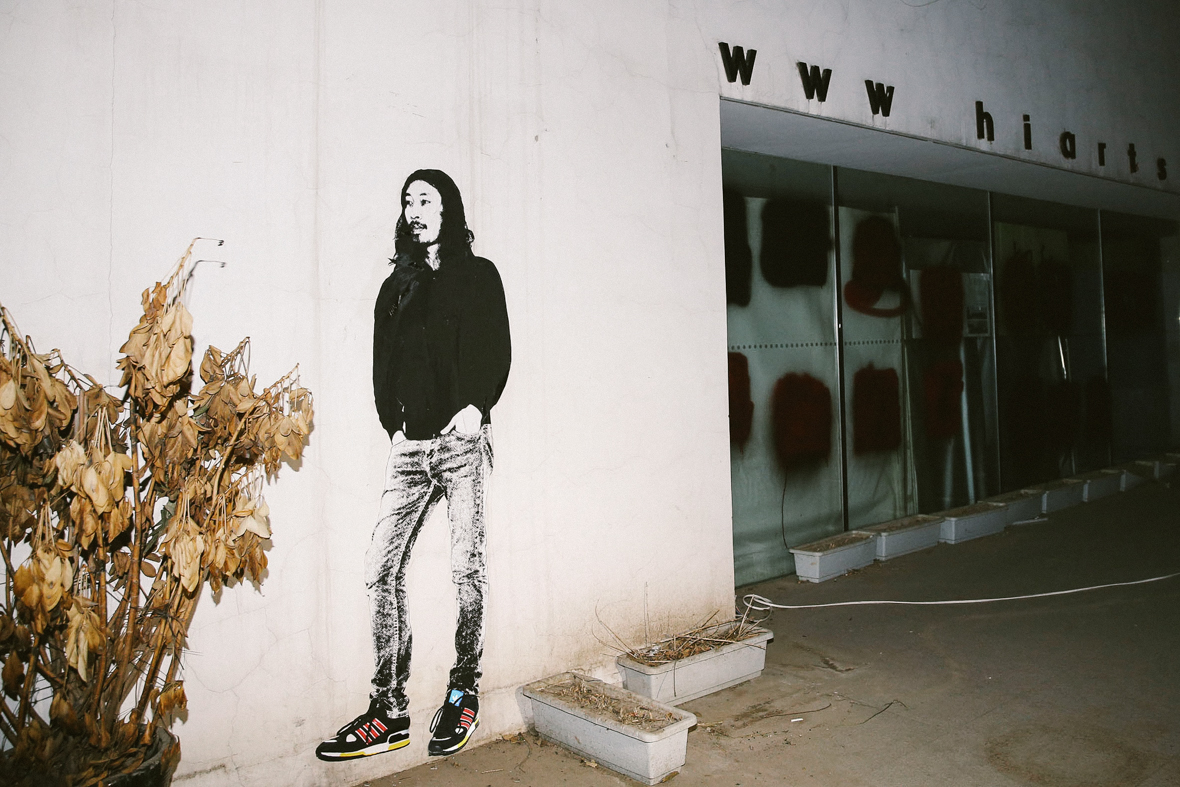
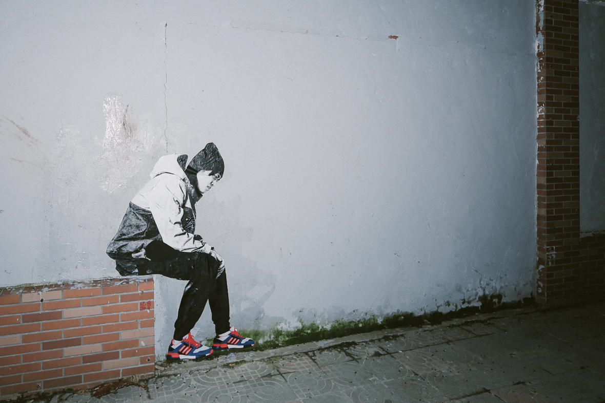
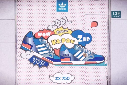
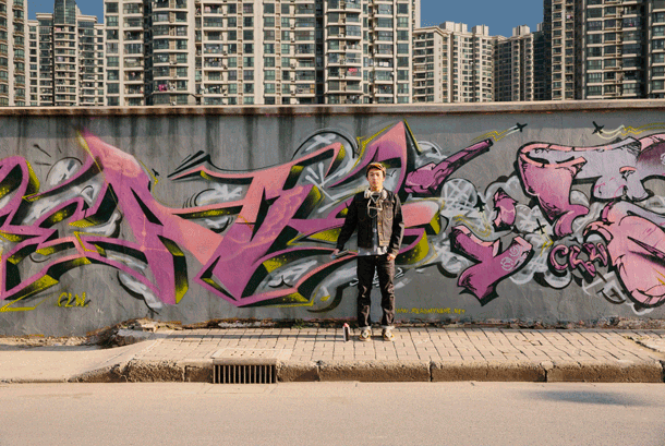
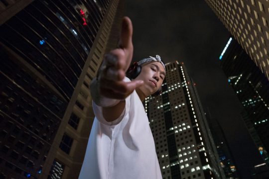
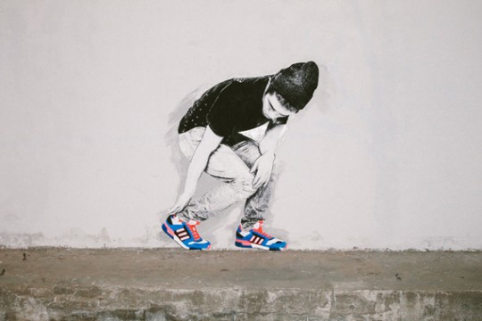
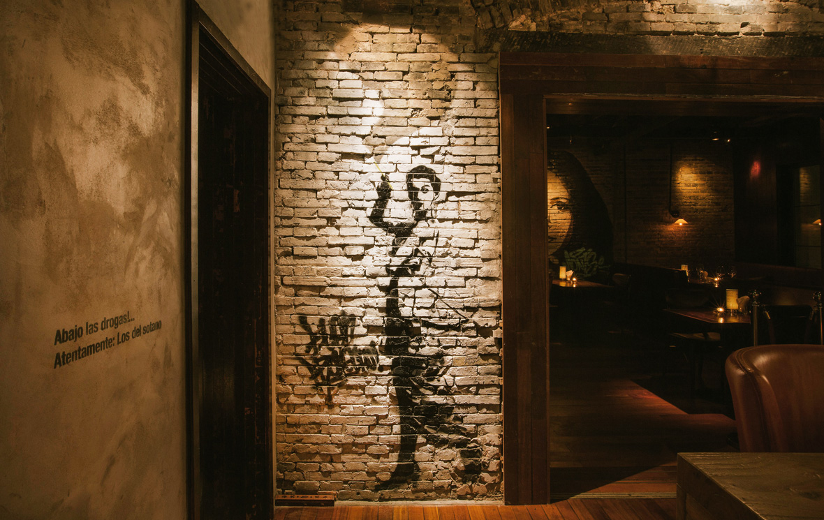
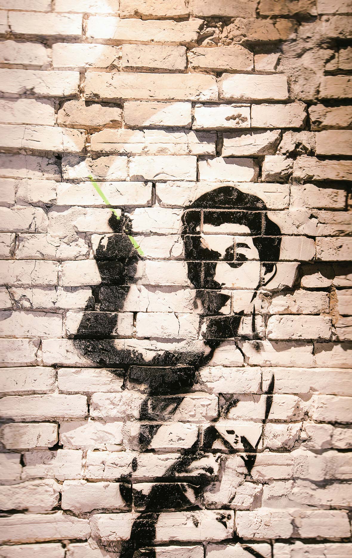
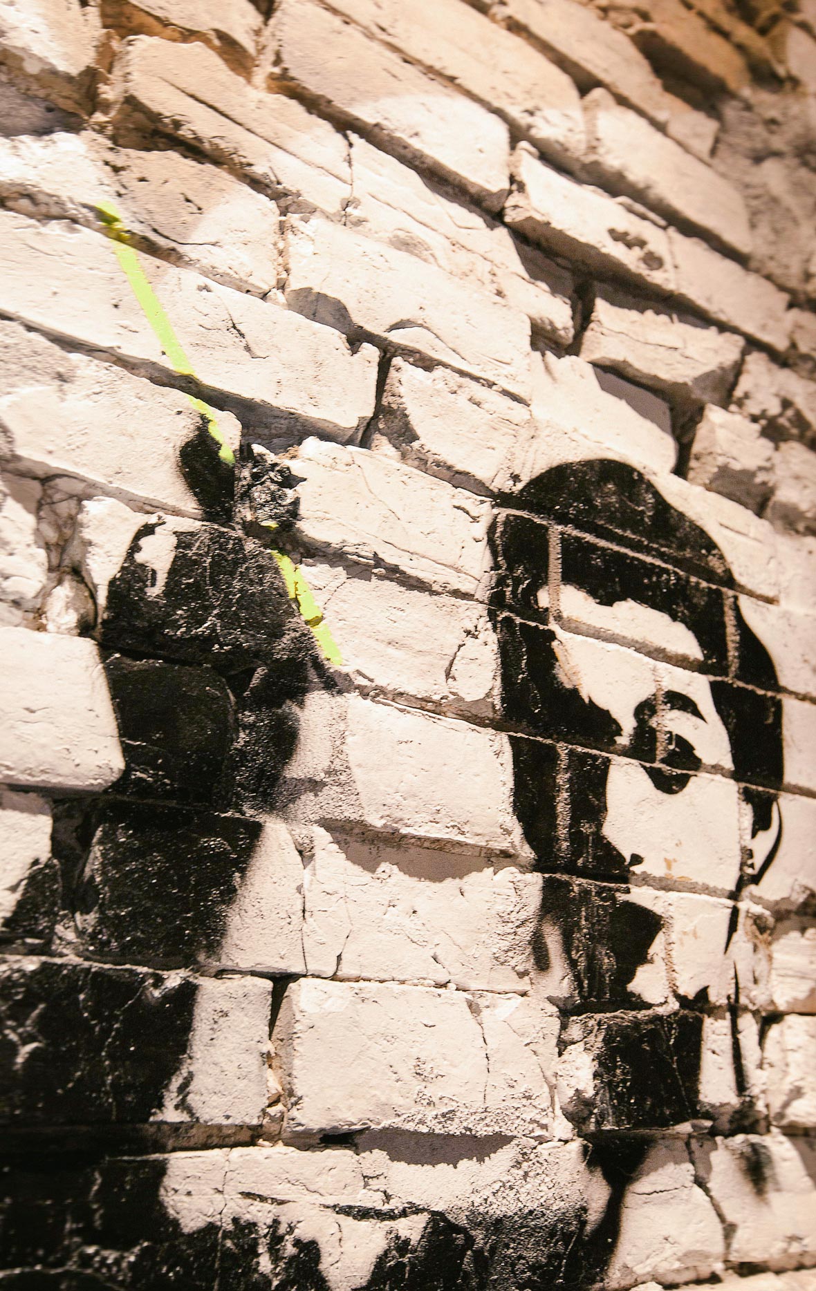
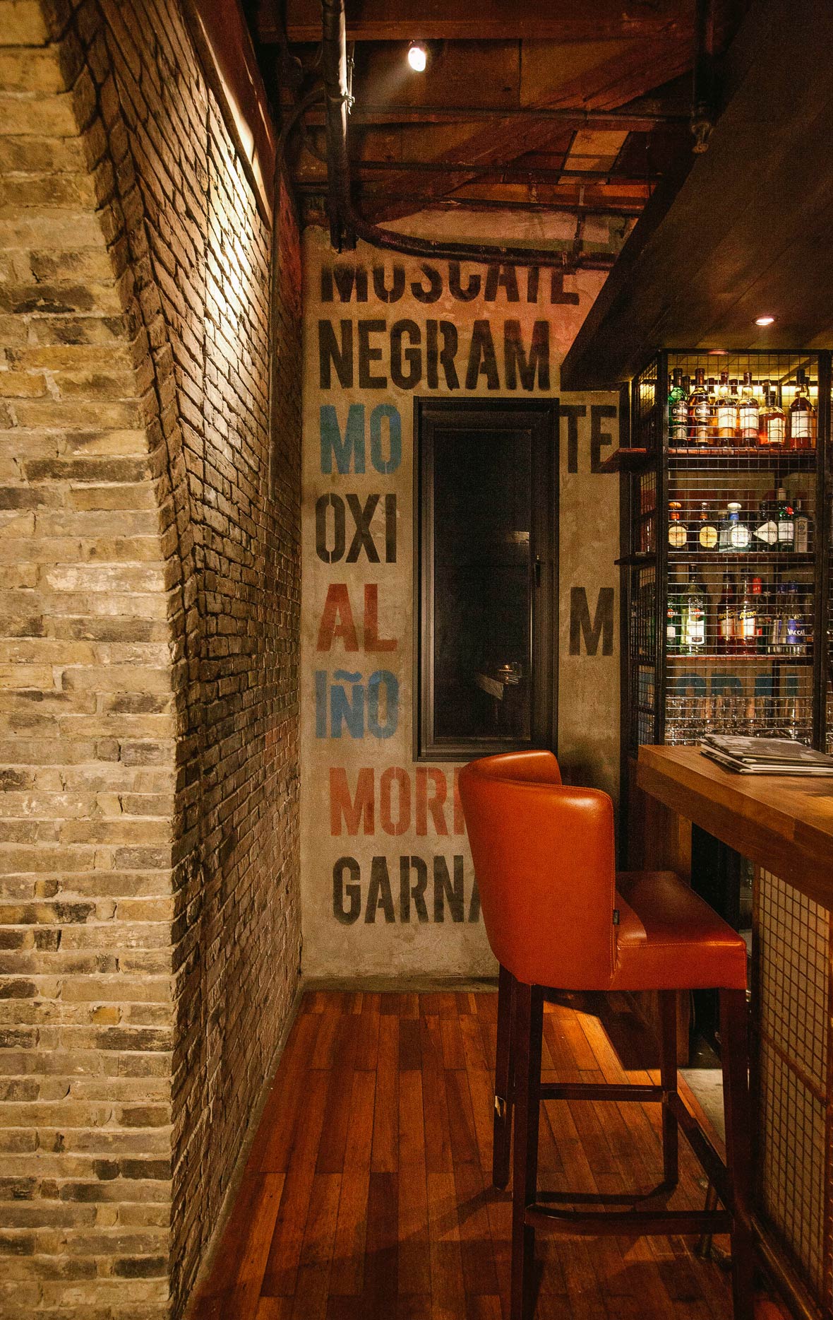
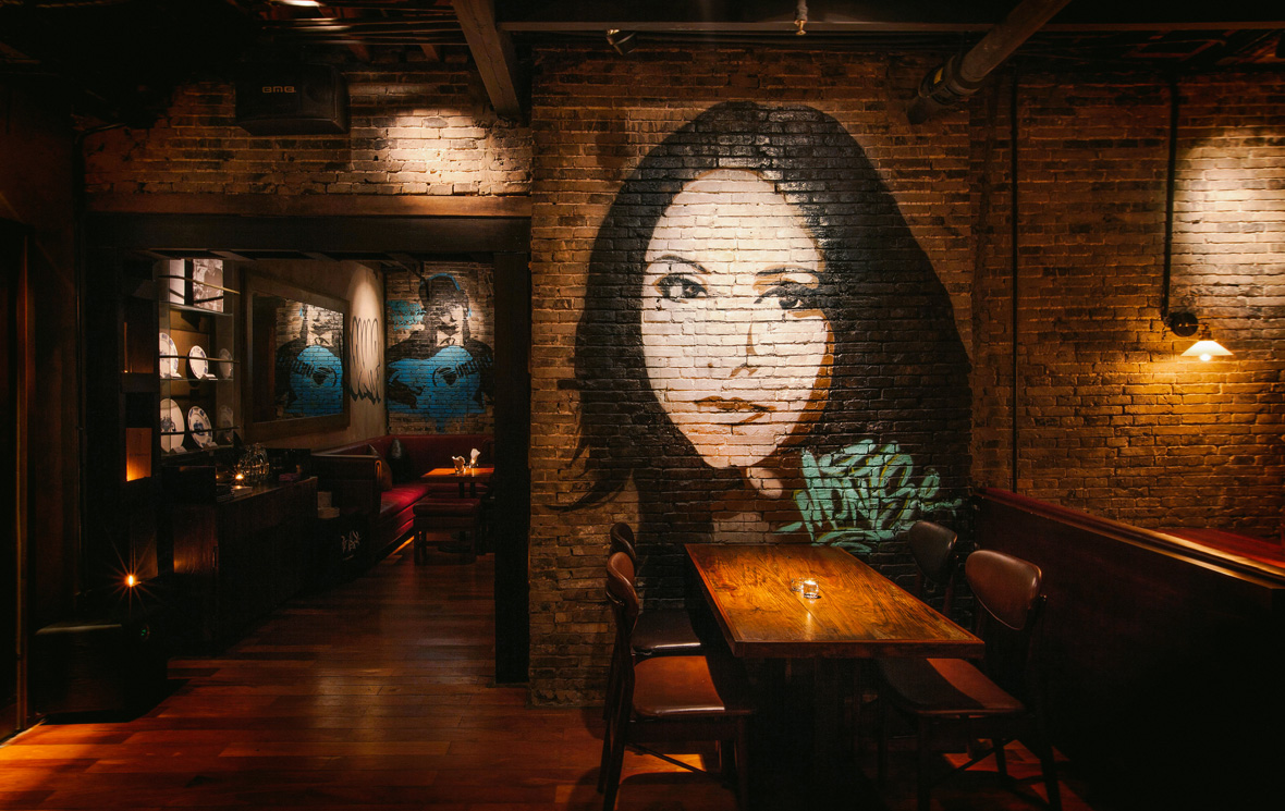
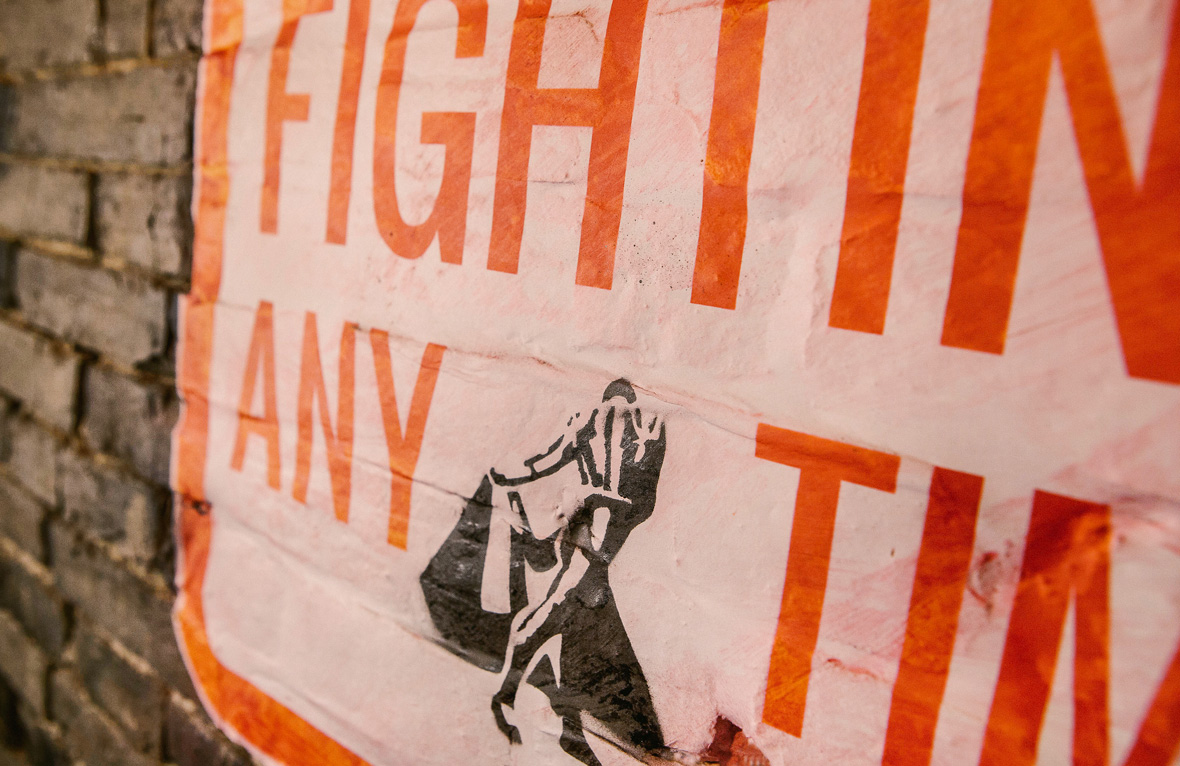
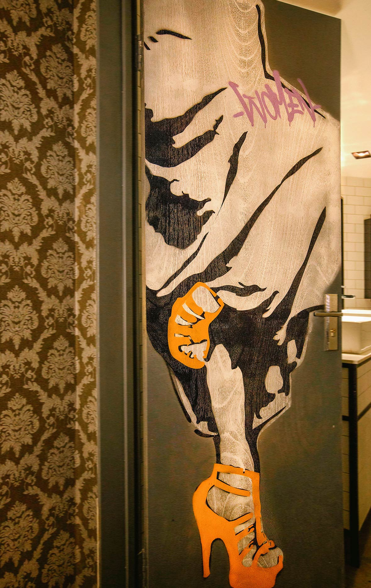
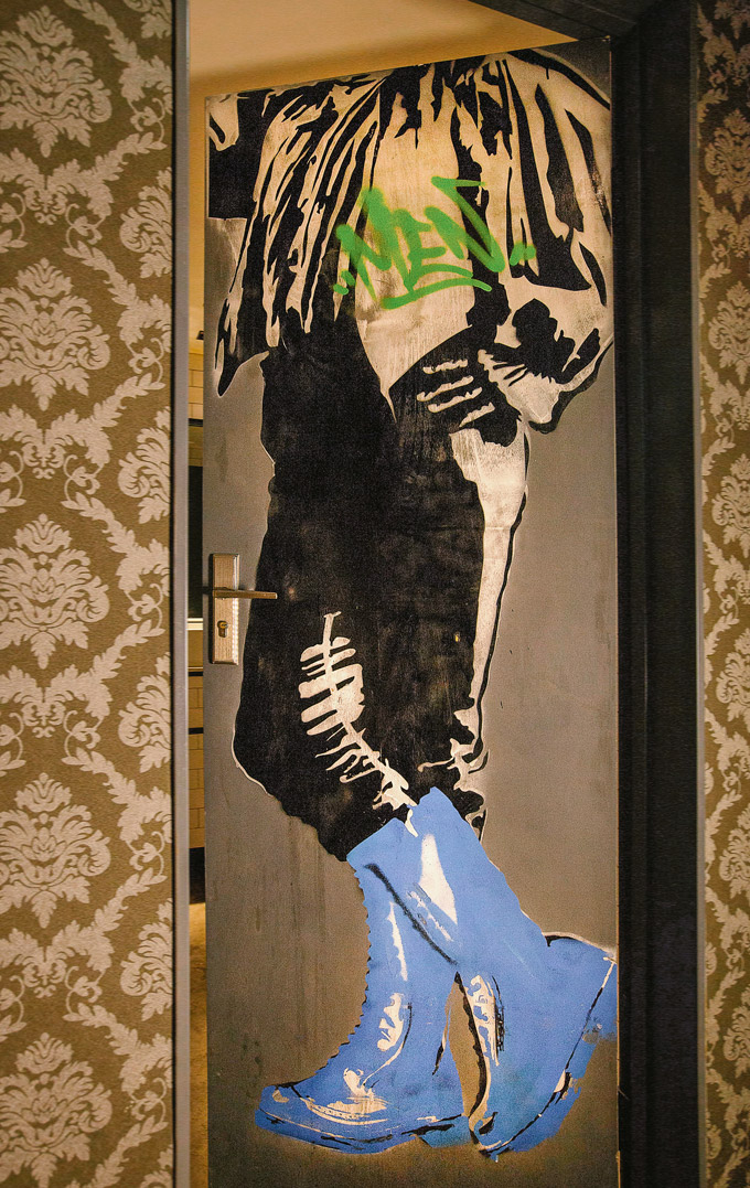
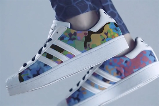
We developed an out-of-home (OOH) campaign to support adidas Originals’ ZX Family “Take It To The Streets” campaign. The campaign leveraged guerrilla-style executions of wheatpaste street art posters throughout Beijing and Shanghai.
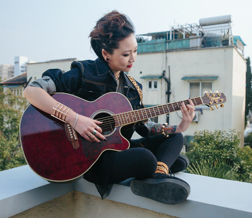
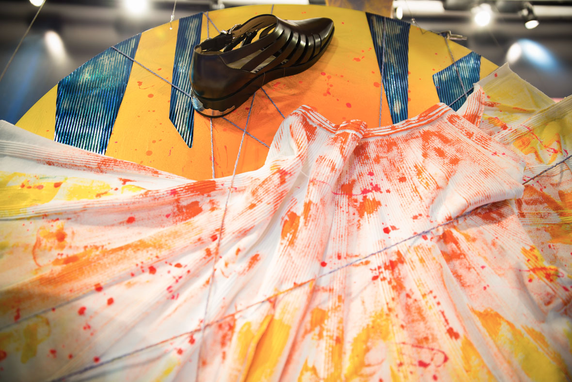
The posters were 1-to-1 full body-sized photography portraits of street-fashion models styled in adidas Originals’ looks wearing different ZX footwear. The posters were given a raw, selective desaturated treatment in which the models were made a muted black-and-white, while the ZX footwear were made bright and bold. The model poses in the posters were pre-designed to fit a variety of unexpected and interactive urban environments. The concept integrates different ZX footwear with street fashion and culture in an authentic, creative way.
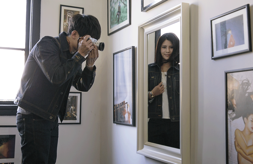
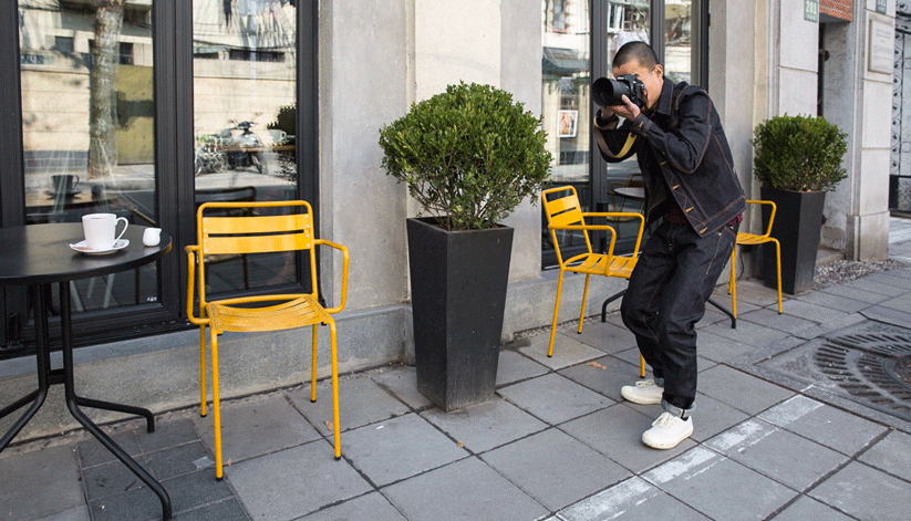
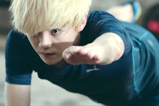
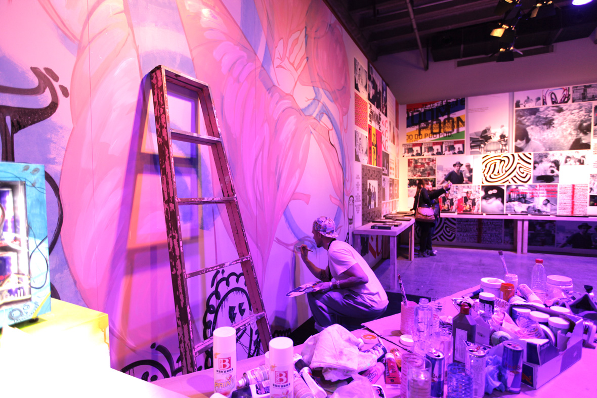
We created a short documentary to capture the whole effort, from model photography and styling in our studio, to the graphic design and poster production, through to our street art teams in Beijing and Shanghai executing the artwork in the cover of night.
我们为配合adidas Originals ZX Family系列的“Take it to the Streets”宣传活动展开了一场游击式街头艺术活动,该活动在北京和上海两座城市以wheatpaste的街头海报形式呈现。
这些街头海报将穿着Originals服装配以不同ZX鞋款的街头造型依照真人比例印制而成。海报中的模特部分均呈低饱和度黑白原始效果,旨在让脚上的ZX系列鞋款以其固有配色凸显出来。让其巧妙地与城市环境相容并带有互动性,我们预先设计了这些模特姿势。此次概念将不同的ZX系列鞋款与街头时尚、文化和态度以极具创意且真实的方式完美融合。
我们同时为此次执行拍摄了一条短片以记录整个创作过程,从模特造型、棚拍到图片设计,再到最我们在北京和上海的连夜执行全过程。